Why You Should Choose HTML5 <article> Over <section>

Why You Should Choose HTML5 <article> Over <section>

Why You Should Choose HTML5 <article> Over <section>

Bruce Lawson

A few days ago, I was having a chat with some friends, one of whom asked me the difference between <article> and <section> in HTML. This is one of the eternal mysteries of web development, up there with “why is it white-space: nowrap, not white-space: no-wrap?” and “why is CSS ‘gray’ a darker color than ‘darkgray’?”.

I gave my usual answer: think of <article> not just as a newspaper article, or a blog post, but as an article of clothing — a discrete entity that can be reused in another context. So your trousers are an article, and you can wear them with a different outfit; your shirt is an article, and can be worn with different trousers; your knee-length patent leather stiletto boots are an article (you wouldn’t wear just one of them, would you?).

The spec says:

“The article element represents a complete, or self-contained, composition in a document, page, application, or site and that is, in principle, independently distributable or reusable, e.g. in syndication. This could be a forum post, a magazine or newspaper article, a blog entry, a user-submitted comment, an interactive widget or gadget, or any other independent item of content.”

So a homepage with a list of blog posts would be a <main> element wrapping a series of <article> elements, one for each blog post. You would use the same structure for a list of videos (think YouTube) with each video being wrapped in an <article>, a list of products (think Amazon) and so on. Any of those <article>s is conceptually syndicatable — each could stand alone on its own dedicated page, in an advert on another page, as an entry in an RSS feed, and so on.

Apple’s WatchOS contains Reader which uses the <article> element to know the primary content of your page. Apple says:

“We’ve brought Reader to watchOS 5 where it automatically activates when following links to text-heavy web pages. It’s important to ensure that Reader draws out the key parts of your web page by using semantic markup to reinforce the meaning and purpose of elements in the document. Let’s walk through an example. First, we indicate which parts of the page are the most important by wrapping it in an article tag.”

Combining <article> with HTML5 microdata helps Reader construct the optimal display for small watch screens:

“Specifically, enclosing these header elements inside the article ensure that they all appear in Reader. Reader also styles each header element differently depending on the value of its itemprop attribute. Using itemprop, we’re able to ensure that the author, publication date, title, and subheading are prominently featured.”

So What About <section>?

My usual advice continues: don’t bother with <section> or worry about how it differs from <article>. It was invented as a generic wrapper for headings so that the browser could determine the HTML5 document outline.

The what? The document outline algorithm is a way to use only one heading tag — <h1> — and have it magically “become” the correct level of heading (e.g. turn into an <h2>, <h3>, etc.), depending on how deeply it’s nested in HTML5 sectioning elements:<article>, <section>, and so on.

So, for example, here’s what you’ve typed into your CMS:

<h1>My Fabulous article</h1>

<p>Lorem Ipsum Trondant Fnord</p>

This works brilliantly when shown as a standalone article. But what about on your homepage, which is a list of your latest articles?

<h1>My latest posts</h1>

<article>

  <h1>My fabulous article</h1>

 <p>Lorem Ipsum Trondant Fnord</p>

</article>

<article>

  <h1>Another magnum opus</h1>

  <p>Magnum solero paddlepop</p>

</article>

In this example, according to the specification, the <h1>s inside the <article> elements “become” logical <h2>s, because <article>, like <section>, is a sectioning element.

Note: This isn’t a new idea. Way back in 1991, Sir Uncle Timbo wrote:

“I would in fact prefer, instead of <h1>, <h2>, etc. for headings [those come from the AAP DTD] to have a nestable <SECTION>...</SECTION> element, and a generic <H>...</H> which at any level within the sections would produce the required level of Heading.”

Unfortunately, however, no browser implements HTML5 outlining, so there is no point in using <section>. At one point, the JAWS screen reader attempted to implement the document outlining algorithm (in IE, but not on Firefox) but implemented it buggily. It seems that browser developers simply aren’t interested (more sordid details in the Further Reading section for true anoraks).

“But,” interjected another friend in the conversation, “now browsers display different sizes of font depending on how deeply the <h1> is nested in <section>s”, and proceeded to prove it. Mind blown!

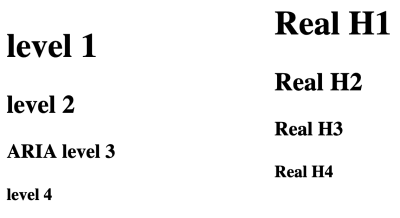
Here’s a similar demo. The left column shows four <h1>s, nested in sections; the right column shows a, <h1>, <h2>, <h3>, <h4> with no nesting. The Firefox screenshot shows that the nested <h1>s default to the same font as the traditional <h1><h4> tags:

Screenshot showing that the nested h1 elements, and the real heading elements display in the same sizes
A comparison of <h1>s nested in <section> elements and <h1>, <h2>, <h3>, <h4> (Large preview)

The results are the same in Chrome, Chromium derivatives such as Edge beta for Mac, and Safari on Mac.

So does this mean that we should all happily start using <h1> as our only heading element, nesting it in <section>s?

No. Because this is only a change in the visual styling of the h1s. If we crack open the Firefox Accessibility inspector in devtools, we can see that the text “level 2” is styled to look like an H2, but is still set at “level 1” — the Accessibility Tree hasn’t been changed to be level 2.
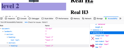
Screenshot of the firefox accessibility inspector selecting a nested h1 element
Firefox’s Accessibility Inspector shows that a nested <h1> appears visually the same as an <h2> but its aria-level is incorrectly set to “1”, not “2” (Large preview)

Compare this with the Real H2 in the right column:
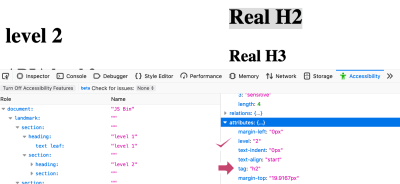
Screenshot of the firefox accessibility inspector selecting a real h2 element
Firefox’s Accessibility Inspector shows that a real <h2> has a computed aria-level of “2”, which is correct (Large preview)

This shows the accessibility tree has been correctly informed that this is a level 2 heading. In fact, Mozilla did try communicating the computed level to the accessibility tree:

“We experimented a bit with that... but had to revert it because people in our a11y team complained about too many regressions (accidentally lowering <h1> levels and such).”

For assistive technology users, a proper hierarchy of headings is vital. As the eighth WebAIM screenreader user survey shows,

“The usefulness of proper heading structures is very high, with 86.1% of respondents finding heading levels very or somewhat useful.”

Therefore, you should continue to use <h1> until <h6>, and ignore section.

Never Say Never

“But..” you might now be spluttering indignantly, “there’s a <section> element right on this very page!”. And you would be right, dear reader. The “quick summary” is wrapped in a <section>, for accessibility reasons. When screen reader user Léonie Watson gave her webinar “How A Screen Reader User Accesses The Web”, she pointed out an area where Smashing Magazine’s markup could be tweaked to make her experience better.

As you can see from the screenshot, Smashing articles are preceded by a quick summary, followed by a horizontal line separating the summary from the article proper.
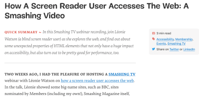
Screenshot of the top of a Smashing Magazine article
The Smashing “Quick Summary” is separated from its full article by a horizontal line. (Large preview)

But the separator is purely decorative, so Léonie couldn’t tell where the summary ends and the article begins. She suggested a fix: we wrapped the summary in a <section> element:

<section aria-label="quick summary">

    Summary text

</section>

In most screen readers, a <section> element isn’t announced unless it has an accessible name. In this case, the text of the aria label. Now, her screen reader announced “Quick summary region”, and after the summary “Quick summary region end”. This simple markup also makes it possible for a screen reader user to jump over the summary if they want to.

We could have used a simple <div> but then, as Marco Zehe writes,

“As a rule of thumb, if you label something via aria-label or aria-labelledby, make sure it has a proper widget or landmark role.”

So rather than use <div role=”region” aria-label=”quick summary”>, we chose <section> as that has a built-in role of region and Bruce’s infallible law of ARIA™ applies: built-in beats bolt-on. Bigly.

Conclusion

Hopefully, you’ve come away with these take-homes:

  • Don’t use loads of <h1>s. Make <h1> the main heading of your page, then use <h2>, <h3>, <h4>, etc. in a proper hierarchy without skipping levels.
  • <section> can be used with aria-label to signal to a screen reader user where a particular sub-part of an article begins and ends. Otherwise, forget about it, or use another element, such as <aside aria-label=”quick summary”> or <div role=”region” aria-label=”quick summary”>.
  • <main>, <header>, <footer> and <nav> are very useful for screen reader users, and entirely transparent to those who don’t use assistive technology. So use them.
  • <article> isn’t just for blog posts — it’s for any self-contained thing. It also helps WatchOS display your content properly.

I gratefully acknowledge Léonie Watson’s help writing this article. Any errors are totally her fault.

Further Reading

  • Headings And Sections,” HTML 5.2 W3C Recommendation (14 Dec. ’17)
    Note its warning: “There are currently no known native implementations of the outline algorithm … Therefore the outline algorithm cannot be relied upon to convey document structure to users. Authors should use heading rank (h1-h6) to convey document structure.”
  • There Is No Document Outline Algorithm,” Adrian Roselli
    All the gory details of how the specification for the sectioning algorithm has changed.
  • ARIA in HTML,” W3C Editor’s Draft (19 Dec. ’19)
    Rules to live by if you do find yourself adding ARIA roles and attributes to HTML.
  • The Practical Value Of Semantic HTML,” Bruce Lawson
    My own article, linking to details of how WatchOS uses HTML5 and microdata.
Smashing Editorial (ra, il)

Meet “Art Direction For The Web,” A New Smashing Book By Andy Clarke

Meet “Art Direction For The Web,” A New Smashing Book By Andy Clarke

Meet “Art Direction For The Web,” A New Smashing Book By Andy Clarke

Bruce Lawson

A page on the Web isn’t like a printed page. Many of us learned that the hard way when we abandoned fixed-width layouts and embraced the web’s inherent flexibility and responsiveness. Read the excerpt chapter.

Modern web technologies like CSS Grid, Flexbox and Shapes have made it possible for us to implement print’s often distinctive designs, and the web’s now full of tutorials on how to use them. But the most important question is not “how” we can use art direction techniques to improve our designs for the web, but instead “when” and “why”.

A hardcover book laying on a wooden floor, called “Art Direction for the Web”

eBook

$14.90 $19Get the eBook

PDF, ePUB, Kindle.
Free for Smashing Members.

Hardcover

$29 $39Get the Print (incl. eBook)

Printed, quality hardcover.
Shipping starts mid-April.

This is the reason why Andy Clarke wrote his new book Art Direction for the Web. This is a book about why art direction matters and how you can art-direct compelling and effective experiences across devices and platforms.

Andy explores the work of some of the most influential art directors, luminaries like Alexey Brodovitch, Bea Feitler, and Neville Brody. He doesn’t encourage us to merely mimic work from a previous era and medium, but to understand their thinking and learn how to apply that knowledge to art direction for the web.

Andy writes,

“You needn’t have been to art school to learn and apply the principles I teach you. Just like art direction itself, they’re something which everyone — no matter what your background and current area of expertise — can use every day to improve the effectiveness of a product or website’s design.”

Andy’s goal is to teach people about the importance of art direction for the web and explain how art direction can help people tell stories by using design. That way, products and websites will connect with audiences and also manage to keep them engaged. After a thorough investigation of the methodology of art direction, Andy teaches how to accomplish it by embracing the web using modern CSS.

Art Direction for the Web will help you make your sites more effective at communicating, persuading, and selling. If you develop products, this book will make them more compelling and more enjoyable to use. Read the excerpt chapter →

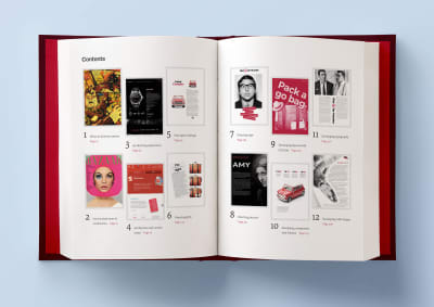
A hardcover book laying open on a light blue background, with two pages open that are showing the table of contents

Table Of Contents

Part 1: Explaining Art Direction

  • What Art Direction Means
    Ask what art direction means to developers, and they might answer: using the <picture> element or sizes attribute in HTML for responsive images; presenting alternative crops, orientations, or sizes at various screen sizes. But there’s more to it.
  • One Hundred Years Of Art Direction
    Bradley, Brodovitch, Brody, and Feitler — together, their names sound like a Mad Men-era advertising agency. In this chapter, we’ll take a look at their iconic works, from the 1930’s to the 1980’s.
  • Art-Directing Experiences
    Whether we write fact or fiction, sell or make products, the way to engage people, create desire, make them happy, and encourage them to stay that way, is by creating narratives. So what do we need to consider when doing so?
  • Art Direction And Creative Teams
    Let’s take a look at how we can embrace collaboration and form teams who follow strategies built around common goals.
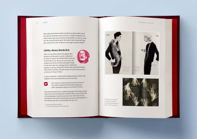
A hardcover book laying open on a light blue background, with two pages open that are showing some artwork examples from the 1930s, by Alexey Brodovitch

Part 2: Designing For Art Direction

  • Principles Of Design
    Are the principles which have guided design in other media for generations relevant to the world of digital products and websites? Of course! In this chapter, we’ll explore the principles of symmetry, asymmetry, ratios, and scale.
  • Directing Grids
    Grids have a long and varied history in design, from the earliest books, through movements like constructivism right up to the present-day popularity of grids in frameworks like Bootstrap and material design. This chapter explains grid anatomy and terminology and how to use modular and compound grids.
  • Directing Type
    White space, typographic scale, and creative uses of type are the focus in this chapter.
  • Directing Pictures
    Images and how we display them have an enormous impact on how people perceive our designs, whether that be on a commercial or editorial website, or inside a product. In this chapter, you’ll learn how to position and arrange images to direct the eye.
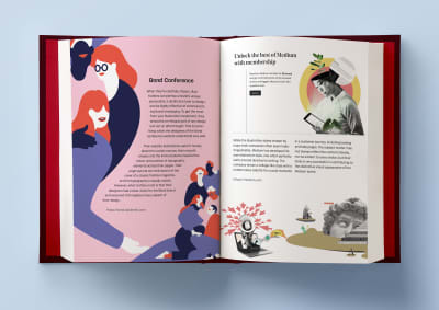
A hardcover book laying open on a light blue background, with two pages open that are showing some artwork examples of Bond conference and Medium Memberships

Part 3: Developing For Art Direction

  • Developing Layouts With CSS Grids
    CSS Grid plus thoughtful, art-directed content offers us the best chance yet of making websites which are better at communicating with our audiences. In this chapter, Andy explains properties and techniques which are most appropriate for art direction.
  • Developing Components With Flexbox
    While Grid is ideal for implementing art-directed layouts, Flexbox is often better suited to developing molecules and organisms such as navigation links, images, captions, search inputs, and buttons. This chapter explores how to make use of it.
  • Developing Typography
    From multi-column layout and arranging type with writing modes to text orientation and decorative typography, this chapter dives deep into the code side of type.
  • Developing With Images
    How do you fit your art-directed images to a user’s viewport? And what do CSS shapes and paths have in store for your design? Let’s find out in this final chapter.
A hardcover book laying open on a light blue background, with two pages open that are showing some artwork examples of Bond conference and Medium Memberships

Smashing TV Webinars

To accompany this book, Andy is also giving a series of webinars on Smashing TV. Webinars are free with Smashing Membership, which costs a couple of cups of coffee a month (cancel anytime).

Andy Clarke is running a webinar on Art Direction.

About The Author

Andy Clarke is a well-known designer, design consultant, and mentor. He has been called plenty of things since he started working on the web. His ego likes terms such as “Ambassador for CSS,” “industry prophet,” and “inspiring,” but he’s most proud that Jeffrey Zeldman once called him a “triple-talented bastard.”

With his wife, Sue, Andy founded Stuff & Nonsense in 1998. They’ve helped companies around the world to improve their designs by providing consulting and design expertise.

Andy’s written several popular books on website design and development, including Hardboiled Web Design: Fifth Anniversary Edition, Hardboiled Web Design, and Transcending CSS: The Fine Art Of Web Design. He’s a popular speaker and gives talks about art direction and design-related topics all over the world.

Testimonials

It has been our goal to make the book as inspiring, practical, and useful as possible, and we feel honored to have already received such positive reviews.

“With ‘Art Direction for the Web,’ Andy provides a framework for harnessing the web’s potential. With historical context and real-life examples, Andy inspires each of us to be more purposeful about the choices we make. And true to form, he follows up all that inspiration with demos and the practical knowledge needed to see our ideas manifest online.”

— Trent Walton, co-founder of Paravel Inc.

Why This Book Is For You

The content of this book is based on Andy’s twenty years’ experience of working with clients, plus the expertise of the art directors and designers he interviewed. You’ll learn:

  1. What art direction means, why it matters, and who can do it.
  2. How to make art direction work for digital products and websites.
  3. How to improve conversions and bring your customers’ journeys to life.
  4. How to maintain brand values and design principles by connecting touch points across marketing, product design, and websites.
  5. How to use art direction priciples such as layout, typography, proportions, ratio, and grids in a more imaginative way to communicate what you’re trying to do much better.
  6. How to implement your designs on any platform with the latest HTML and CSS.
  7. …Plus, we’ll explore outstanding designs from 100 years of media and print publishing for some extra art direction inspiration.
A hardcover book laying on a wooden floor, called “Art Direction for the Web”
Andy’s new book explores 100 years of art direction and how we can use this knowledge and the newest web technologies to create better digital products.

eBook

$14.90 $19Get the eBook

PDF, ePUB, Kindle. Free for Smashing Members.

Hardcover

$29 $39Get the Print (incl. eBook)

Printed, quality hardcover.
Shipping starts mid-April.

Technical Details

  • 344 pages, 14 × 21 cm (5.5 × 8.25 inches)
  • ISBN: 978-3-945749-76-0 (print)
  • Quality hardcover with stitched binding and a ribbon page marker.
  • The eBook is available in PDF, ePUB, and Amazon Kindle.
  • Free worldwide airmail shipping from Germany. Starting mid-April. (See delivery times.)
  • Available as printed, quality hardcover and eBook.

Smashing Editorial (cm, bl, il)

How A Screen Reader User Accesses The Web: A Smashing Video

How A Screen Reader User Accesses The Web: A Smashing Video

How A Screen Reader User Accesses The Web: A Smashing Video

Bruce Lawson

Two weeks ago, I had the pleasure of hosting a Smashing TV webinar with Léonie Watson on how a screen reader user accesses the web. In the talk, Léonie showed some big-name sites, such as BBC, sites nominated by Members (including my own!), Smashing Magazine itself, and the popular third-party service Typeform, because so many of us (including us at Smashing) just assume that the popular services have been checked for accessibility. Throughout, Léonie explained how the sites’ HTML was helping (or hindering) her use of the sites.

We felt that the webinar was so valuable that we would open it up so that it’s free for everybody to use. Hopefully, it will serve as a resource for the whole web development community to understand how — and why — semantic markup matters.

What We Learned

I was pleased that my personal site’s use of HTML5 landmark regions (main, nav, header, footer, etc) helped Léonie form a mental model of the structure of the page. Although I’ve always been scrupulous to avoid link text like “click here” because WCAG guidelines require “The purpose of each link can be determined from the link text alone”, it hadn’t occurred to me before that because I have hundreds of weekly “Reading List” articles, it’s impossible for a screen reader user to tell one from the other when navigating by headings. Since the webinar, I’ve made each new reading list’s heading unique by including its number in the heading (“Reading List 222”).

We also learned that being technically accessible is good, but even better is to be usably accessible. The Smashing Team learned that before Léonie can read her own article on our site, there’s loads of preamble (author bio, email sign-up form) that she can’t easily skip over. We’re correcting this at the moment. There’s also an issue with our quick summaries; Léonie gets no indication when the summary has finished and the article proper has begun. Sighted users get a dividing line, but what can we do for non-sighted users?

After the webinar, Léonie suggested using a semantic HTML element and a sprinkling of ARIA:

<section aria-label="Summary">
</section>

This is announced as “Summary region start” and “Summary region end”, and can be skipped over if desired.

Thank You!

We’d like to thank Léonie for giving the webinar, and also our magnificant Smashing Magazine members whose support allows us to commission such content, pay our contributors fairly, and reduce advertising on the site.

Shameless plug: if you enjoyed this webinar, why not consider becoming a Member yourself? There are around three webinars a month free, Smashing eBooks and discounts galore. It costs around two cups of coffee a month, and you can cancel anytime.

Smashing Editorial (ra, il)