
Postgres performs better than some other databases because it supports concurrent write operations without the need of read/write locks. Because it is completely ACID-compliant and provides transaction isolation and snapshots, many applications are using Postgres these days. Unfortunately, while PostgreSQL is great for storing and comparing UUID data, it lacks capabilities for creating UUID values in its core. Instead, it relies on third-party modules to create UUIDs using specified techniques. In this article, you'll learn about the PostgreSQL UUID data type and how to generate UUID values with examples utilizing various functions and modules.
What Is a UUID?
UUID stands for Universal Unique Identifier, defined by RFC 4122 and other related standards. A UUID is a series of lower-case hexadecimal digits separated by hyphens. UUIDs are a combination of 36-character sequences of numbers, letters, and dashes that are intended to be globally unique.
Performance Differences Between Postgres and MySQL

Introduction
In the Arctype Community, we answer a lot of questions about database performance, especially between Postgres and MySQL. Performance is a vital yet complex task when managing a database. It can be affected by the configuration, the hardware, or even the design of the system. Interestingly, both PostgreSQL and MySQL are configured with compatibility and stability but depend on our database design's hardware infrastructure.
Not all relational database management systems (RDBMS) are created equal. Although PostgreSQL (or Postgres) and MySQL share some similarities, they also have unique qualities that make one a better choice over the other in specific situations. We discussed a lot of these differences in a previous post. Still, in terms of performance, they have a lot of differences.
Animating React Components With GreenSock

During the early days of the World Wide Web, things were rather static and boring. Webpages were mostly based on graphic design and layouts from the print world until animations were introduced. Animation can engage and hold people’s attention longer than a static web page and communicates an idea or concept more clearly and effectively.
However, when not done right, animations can hamper user interactions with your product and negatively impact traction. The GreenSock Animation Platform AKA (GSAP) is a powerful JavaScript library that enables front-end developers, animators and designers to create performant timeline based animations. It allows animation lovers take precise control of their animation sequences rather than the sometimes constraining keyframe and animation properties that CSS offers.
In this article, I’ll introduce you to some features of GSAP such as scrollTriggers, Timelines, Easing etc, at the end we’ll build an intuitive user interface by animating a React app with this features👌. Check out the finished project on codesandbox.
This article will be useful to you if:
- You have been building animations on web applications with HTML, CSS, and JavaScript.
- You are already building animated webpages in a React apps with packages like animate.css, React-motion, Framer-motion, and React-Spring, plus you want to check out alternatives.
- You are a React enthusiast, and you’d like to build complex animations on React-based web applications.
We will look at how to build a variety of animations from an existing web project. Let’s get to it!
Note: This article assumes you are comfortable with HTML, CSS, JavaScript, and React.js.
What Is GSAP?
GreenSock Animation Platform also known as GSAP is an Ultra high-performance, professional-grade animation for the modern web that allows developers to animate their apps in a modular, declarative, and re-usable fashion. It is framework-agnostic and can be used across any JavaScript based project, it has a very minimal bundle size and will not bloat your app.
GSAP can perform canvas animations, used to create WebGL experiences, and create dynamic SVG animations and as great browser support.
Why Use GSAP?
Maybe you’re not quite ready to betray other frameworks yet, or you haven’t been convinced to embrace the goodies that come with GSAP. Allow me to give you a few reason why you may want to consider GSAP.
You Can Build Complex Animations
GSAP JavaScript library makes it possible for developers to build simple to very complex physics-based animations like in the case of these sites, it allows developers and designers sequence motion and controls the animation dynamically. It has lots of plugins such as DrawSVGPlugin, MorphSVGPlugin, and more, which makes creating SVG based animations and 2D/3D animations a reality. Asides integrating GSAP on DOM elements, you can use them within WebGL/Canvas/ Three.js context-based animations.
Furthermore, the easing capacity of GSAP is quite sophisticated, hence making it possible to create advance effects with multiple beziers as compared to the regular CSS animation.
Performance
GSAP has an impressive high performance across different browsers.
According to GSAP’s team, in their website, “GSAP is 20x faster than jQuery, plus GSAP is the fastest full-featured scripted animation tool on the planet. It's even faster than CSS3 animations and transitions in many cases.” Confirm speed comparison for yourself.
Furthermore, the GSAP animations perform effortlessly on both desktop computers, tablets, and smartphones. It is not needed to add a long list of prefixes, this is all being taken care of under the hood by GSAP.
You can check out more benefits on GSAP or see what Sarah Drasner as to say about it here.
Cons Of GSAP
Are you saying I should always use GSAP for every project? Of course not! I feel like, there’s only one reason you might not want to use GSAP. Let’s find out!
- GSAP is solely a JavaScript-based animation library, hence it requires some knowledge of JavaScript and DOM manipulation to effectively utilize its methods and APIs. This learning curve downside leaves even more room for complications for a beginner starting out with JavaScript.
- GSAP doesn’t cater to CSS based animations, hence if you are looking for a library for such, you might as well use
keyframesin CSS animation.
If you’ve got any other reason, feel free to share it in the comment section.
Alright, now that your doubts are cleared, let’s jump over to some nitty-gritty in GSAP.
GSAP Basics
Before we create our animation using React, let’s get familiar with some methods and building blocks of GSAP.
If you already know the fundamentals of GSAP, you can skip this section and jump straight to the project section, where we’ll make a landing page skew while scrolling.
Tween
A tween is a single movement in an animation. In GSAP, a tween has the following syntax:
TweenMax.method(element, duration, vars)Let’s take a look at what this syntax represents;
methodrefers to the GSAP method you’ll like to tween with.elementis the element you want to animate. If you want to create tweens for multiple elements at the same time, you can pass in an array of elements toelement.durationis the duration of your tween. It is an integer in seconds (without thessuffix!).varsis an object of the properties you want to animate. More on this later.
GSAP methods
GSAP provides numerous methods to create animations. In this article, we’d mention only a few such as gsap.to, gsap.from, gsap.fromTo. You can check out other cool methods in their documentation. The methods discussed in this section will be used in building our project later in this tutorial.
gsap.to()the values to which an object should be animated i.e the end property values of an animated object — as shown below:gsap.to('.ball', {x:250, duration: 5})
To demonstrate the to method the codepen demo below shows that an element with a class of ball 250px will move across the x-axis in five seconds when the components mounts. If a duration isn't given, a default of 500 milliseconds would be used.
See the Pen GSAP REACT DEMO1 by Blessing Krofegha.
Note: x and y-axis represent the horizontal and vertical axis respectively, also in CSS transform properties such as translateX and translateY they are represented as x and y for pixel-measured transforms and xPercent and yPercent for percentage-based transforms.
To view the complete snippet of the code check the codepen playground.
gsap.from()— Defines the values an object should be animated from — i.e., the start values of an animation:gsap.from('.square', {duration:3, scale: 4})
The codepen demo show how an element with a class of square is resized from a scale of 4 in 3seconds when the components mounts. Check for the complete code snippet on this codepen.
See the Pen GSAP REACT DEMO2 by Blessing Krofegha.
gsap.fromTo()— lets you define the starting and ending values for an animation. It is a combination of both thefrom()andto()method.
Here’s how it looks;
gsap.fromTo('.ball',{opacity:0 }, {opacity: 1 , x: 200 , duration: 3 });
gsap.fromTo('.square', {opacity:0, x:200}, { opacity:1, x: 1 , duration: 3 });
This code would animates the element with a class of ball from an opacity of 0 to an opacity of 1 across the x-axis in 3 seconds and the square class is animated the from an opacity of 0 to 1 in 3 seconds across the x-axis only when the component mounts. To see how the fromTo method works and the complete code snippet, check the demo on CodePen below.
See the Pen React GSAP FromTo demo by Blessing Krofegha.
Note: Whenever we’re animating positional properties, such as left and top, we must ensure that the elements concerned must have a CSS position property of either relative, absolute, or fixed.
Easing
GSAP official documentation defined easing as the primary way to change the timing of your Tweens. It determines how an object changes position at different points. Ease controls the rate of change of animation in GSAP and is used to set the style of an object’s animation.
GSAP provides different types of eases and options to give you more control over how your animation should behave. It also provides an Ease Visualizer to help you choose your preferred ease settings.
There are three types of eases, and they vary in their operations.
in()— Motion starts slowly, then picks up the pace toward the end of the animation.out()— The animation starts fast then slows down at the end of the animation.inOut()— The animation begins slow, picks up the pace halfway through, and ends slowly.
See the Pen React GSAP Easing demo by Blessing Krofegha.
In these easing example, we chained the tweens that displayed the three types of eases bounce.in, bounce.out and bounce.inOut, and set a delay of the number of seconds it takes the animation to complete before starting the next one only when the component is mounts. This pattern is repetitive, in the next next section we would see how we could use a timeline to do this better.
Timelines
A Timeline acts as a container for multiple tweens. It animates tweens in sequential order, and it is not dependent on the duration of the previous tween. Timeline makes it simple to control tweens as a whole and precisely manage their timing.
Timelines can be written by creating an instance of a timeline like so:
gsap.timeline();You can also chain multiple tweens to a timeline in two different ways, in the code below:
##Method 1
const tl = gsap.timeline(); // create an instance and assign it a variable
tl.add(); // add tween to timeline
tl.to('element', {});
tl.from('element', {});

##Method 2
gsap.timeline()
    .add() // add tween to timeline
    .to('element', {})
    .from('element', {})
Let’s recreate the previous example with a timeline:
const { useRef, useEffect } = React;

const Balls = () => {
    useEffect(() => {
    const tl = gsap.timeline();
    tl.to('#ball1', {x:1000, ease:"bounce.in", duration: 3})
    tl.to('#ball2', {x:1000, ease:"bounce.out", duration: 3, delay:3 })
    tl.to('#ball3', {x:1000, ease:"bounce.inOut", duration: 3, delay:6 })
  }, []);
}

ReactDOM.render(, document.getElementById('app'));
Inside a useEffect hook, we created a variable(tl) that holds an instance of a timeline, next we used the tl variable to animate our tween in sequential without depending on the previous tween to animate, passing the same properties as it were in the previous example. For the complete code snippet of this demo check the codepen playground below.
See the Pen React GSAP (Easing with Timeline) demo by Blessing Krofegha.
Now that we have gotten a feel of some the basic building blocks of GSAP, let’s see how we could build a complete animation in a typical React app in the next section. Let’s begin the flight! 🚀
Building an Animated Landing Page with React and GSAP
Let’s get to animate a React App. Ensure you clone the repo before you begin and run npm install, to install the dependencies.
What are we building?
Currently, our landing page contains a few texts a white background, a menu that doesn’t drop down, with really no animation. The following are what we’ll be adding to the landing page;
- Animate the text and the logo on the homepage, so it eases out when the component is mounted.
- Animate the menu, so it drops down when the menu is clicked.
- Make the images in the gallery page skew
20degwhen the page scrolls.
Check out the demo on codesandbox.
We’ll break the process of our landing page into components, so it will be easy to grasp. Here’s the process;
- Define the animation methods,
- Animate text and logo,
- Toggle menu,
- Make images skew
20degon page scroll.
components
Animate.js— Defined all animation methods,Image.js— import galley images,Menu.js— Contains the menu toggle functionality,Header.js— Contains navigation links.
Define animation methods
Create a component folder inside the src directory, and create an animate.js file. Copy and paste the following code into it.
import gsap from "gsap"
import { ScrollTrigger } from "gsap/ScrollTrigger";
//Animate text
export const textIntro = elem => {
  gsap.from(elem, {
    xPercent: -20,
    opacity: 0,
    stagger: 0.2,
    duration: 2,
    scale: -1,
    ease: "back",
  });
};
Here, we imported gsap . We wrote an exported arrow function that animates the text on the landing page. Remember that gsap.from() method defines the values an object should be animated from. The function has an elem parameter that represents the class which needs to be animated. It takes a few properties and assigns values such as xPercent: -20 (transforms the object by -20%), gives the object no opacity, makes the object scale by -1, makes the object ease back in 2sec.
To see if this works, head over to App.js and include the following code.
...
//import textIntro
import {textIntro} from "./components/Animate"

...
//using useRef hook to access the textIntro DOM
 let intro = useRef(null)
  useEffect(() => {
    textIntro(intro)
  }, [])

function Home() {
  return (
    <div className='container'>
      <div className='wrapper'>
        <h5 className="intro" ref={(el) => (intro = el)}></h5>
          The <b>SHOPPER</b>, is a worldclass, innovative, global online ecommerce platform,
          that meets your everyday daily needs.
        </h5>
      </div>
    </div>
  );
}
Here, we import the textIntro method from the Aminate component. To access the DOM we used to useRef Hook. We created a variable intro whose value is set to null. Next, inside the useEffect hook, we called the textIntro method and the intro variable. Inside our home component, in the h5 tag, we defined the ref prop and passed in the intro variable.
Next, we have got a menu, but it isn’t dropping down when it’s clicked. Let’s make it work! Inside the Header.js Component, add the code below.
import React, { useState, useEffect, useRef } from "react";
import { withRouter, Link, useHistory } from "react-router-dom";
import Menu from "./Menu";
const Header = () => {
  const history = useHistory()
  let logo = useRef(null);
  //State of our Menu
  const [state, setState] = useState({
    initial: false,
    clicked: null,
    menuName: "Menu",
  });
  // State of our button
  const [disabled, setDisabled] = useState(false);
  //When the component mounts
  useEffect(() => {
    textIntro(logo);
    //Listening for page changes.
    history.listen(() => {
      setState({ clicked: false, menuName: "Menu" });
    });
  }, [history]);
  //toggle menu
  const toggleMenu = () => {
    disableMenu();
    if (state.initial === false) {
      setState({
        initial: null,
        clicked: true,
        menuName: "Close",
      });
    } else if (state.clicked === true) {
      setState({
        clicked: !state.clicked,
        menuName: "Menu",
      });
    } else if (state.clicked === false) {
      setState({
        clicked: !state.clicked,
        menuName: "Close",
      });
    }
  };
  // check if out button is disabled
  const disableMenu = () => {
    setDisabled(!disabled);
    setTimeout(() => {
      setDisabled(false);
    }, 1200);
  };
  return (
    <header>
      <div className="container">
        <div className="wrapper">
          <div className="inner-header">
            <div className="logo" ref={(el) => (logo = el)}>
              <Link to="/">SHOPPER.</Link>
            </div>
            <div className="menu">
              <button disabled={disabled} onClick={toggleMenu}>
                {state.menuName}
              </button>
            </div>
          </div>
        </div>
      </div>
      <Menu state={state} />
    </header>
  );
};
export default withRouter(Header);
In this component, we defined our menu and button state, inside the useEffect hook, we listened for page changes using useHistory hook, if the page changes we set the clicked and menuName state values to false and Menu respectively.
To handle our menu, we checked if the value of our initial state is false, if true, we change the value of initial , clicked and menuName to null, true and Close. Else we check if the button is clicked, if true we’d change the menuName to Menu. Next, we have a disabledMenu function that disables our button for 1sec when it’s clicked.
Lastly, in our button, we assigned disabled to disabled which is a boolean value that will disable the button when its value is true. And the onClick handler of the button is tied to the toggleMenu function. All we did here was toggle our menu text and passed the state to a Menu component, which we would create soonest. Let’s write the methods that will make our menu dropdown before creating the actual Menu component. Head over to Animate.js and paste this code into it.
....
//Open menu
export const menuShow = (elem1, elem2) => {
  gsap.from([elem1, elem2], {
    duration: 0.7,
    height: 0,
    transformOrigin: "right top",
    skewY: 2,
    ease: "power4.inOut",
    stagger: {
      amount: 0.2,
    },
  });
};
//Close menu
export const menuHide = (elem1, elem2) => {
  gsap.to([elem1, elem2], {
    duration: 0.8,
    height: 0,
    ease: "power4.inOut",
    stagger: {
      amount: 0.07,
    },
  });
};
Here, we have a function called menuShow, which skews the menu horizontally by 2degrees, eases the menu, offset’s the animation using the stagger property, and transforms the menu from right to top in 0.7sec, the same properties go for the menuHide function. To use these functions, create Menu.js file inside the components and paste this code into it.
import React, {useEffect, useRef} from 'react'
import { gsap } from "gsap"
import { Link } from "react-router-dom"
import {
  menuShow,
  menuHide,
  textIntro,
} from './Animate'
const Menu = ({ state }) => {
   //create refs for our DOM elements

  let menuWrapper = useRef(null)
  let show1 = useRef(null)
  let show2 = useRef(null)
  let info = useRef(null)
  useEffect(() => {
    // If the menu is open and we click the menu button to close it.
    if (state.clicked === false) {
      // If menu is closed and we want to open it.
      menuHide(show2, show1);
      // Set menu to display none
      gsap.to(menuWrapper, { duration: 1, css: { display: "none" } });
    } else if (
      state.clicked === true ||
      (state.clicked === true && state.initial === null)
    ) {
      // Set menu to display block
      gsap.to(menuWrapper, { duration: 0, css: { display: "block" } });
      //Allow menu to have height of 100%
      gsap.to([show1, show2], {
        duration: 0,
        opacity: 1,
        height: "100%"
      });
      menuShow(show1, show2);
      textIntro(info);

    }
  }, [state])

  return (
    <div ref={(el) => (menuWrapper = el)} className="hamburger-menu">
      <div
        ref={(el) => (show1 = el)}
        className="menu-secondary-background-color"
      ></div>
      <div ref={(el) => (show2 = el)} className="menu-layer">
        <div className="container">
          <div className="wrapper">
            <div className="menu-links">
              <nav>
                <ul>
                  <li>
                    <Link
                      ref={(el) => (line1 = el)}
                      to="/about-us"
                    >
                      About
                    </Link>
                  </li>
                  <li>
                    <Link
                      ref={(el) => (line2 = el)}
                      to="/gallery"
                    >
                      Gallery
                    </Link>
                  </li>
                  <li>
                    <Link
                      ref={(el) => (line3 = el)}
                      to="/contact-us"
                    >
                      Contact us
                    </Link>
                  </li>

                </ul>
              </nav>
              <div ref={(el) => (info = el)} className="info">
                <h3>Our Vision</h3>
                <p>
                  Lorem ipsum dolor sit amet consectetur adipisicing elit....
                </p>
              </div>
            </div>
          </div>
        </div>
      </div>
    </div>
  );
}
export default Menu
What we did in the Menu component was to import the animated functions, which are menuShow, menuHide, and textIntro. Next, we assigned variables for each created refs for our DOM elements using the useRef hook and passed null as their values. Inside the useEffect hook, we check for the state of the menu, if clicked is false, we call the menuHide function, otherwise, if the clicked state is true we call the menuShow function. Lastly, we ensured that the DOM elements concerned are passed their specific refs which are menuWrapper, show1, show2. With that, we’ve got our menu animated.
Let’s see how it looks.
The last animation we would implement is make our images in our gallery skew when it scrolls. Let’s see the state of our gallery now.
To implement the skew animation on our gallery, let’s head over to Animate.js and add a few codes to it.
....
//Skew gallery Images
export const skewGallery = elem1 => {
  //register ScrollTrigger
  gsap.registerPlugin(ScrollTrigger);
  // make the right edge "stick" to the scroll bar. force3D: true improves performance
    gsap.set(elem1, { transformOrigin: "right center", force3D: true });
    let clamp = gsap.utils.clamp(-20, 20) // don't let the skew go beyond 20 degrees.
    ScrollTrigger.create({
      trigger: elem1,
      onUpdate: (self) => {
        const velocity = clamp(Math.round(self.getVelocity() / 300));
        gsap.to(elem1, {
          skew: 0,
          skewY: velocity,
          ease: "power3",
          duration: 0.8,
        });
      },
    });
}
We created a function called skewGallery, passed elem1 as a param, and registered ScrollTrigger.
ScrollTrigger is a plugin in GSAP that enables us to trigger scroll-based animations, like in this case of skewing the images while the page scrolls.
To make the right edge stick to the scroll bar we passed right center value to the transformOrigin property, we also set the force3D property to true in other to improve the performance.
We declared a clamp variable that calculates our skew and ensures it doesn’t exceed 20degs. Inside the ScrollTrigger object, we assigned the trigger property to the elem1 param, which would be the element that needs to be triggered when we call this function. We have an onUpdate callback function, inside it is a velocity variable that calculates the current velocity and divides it by 300.
Lastly, we animate the element from their current values by setting other values. We set skew to initially be at 0 and skewY to be the velocity variable at 0.8.
Next, we’ve got to call this function in our App.js file.
....
import { skewGallery } from "./components/Animate"
function Gallery() {
  let skewImage = useRef(null);
  useEffect(() => {
    skewGallery(skewImage)
  }, []);
  return (
    <div ref={(el) => (skewImage = el)}>
      <Image/>
    </div>
  )
}

....
Here, we imported skewGalley from ./components/Animate, created a skewImage ref that targets the image element. Inside the useEffect hook, we called the skewGallery function and passed the skewImage ref as a param. Lastly, we passed the skewImage to the ref to attribute.
You’d agree with me it was such a pretty cool journey thus far. Here’s the preview on CodeSanbox 👇
The supporting repo for this article is available on Github.
Conclusion
We’ve explored the potency of GSAP in a React project, we only scratched the surface in this article, there’s no limit to what you can do with GSAP as it concerns animation. GSAP’s official website offers additional tips to help you gain a thorough understanding of methods and plugins. There’s a lot of demos that would blow your mind away with what people have done with GSAP. I’d love to hear your experience with GSAP in the comment section.
Resources
A Practical Guide To Product Tours In React Apps
A Practical Guide To Product Tours In React Apps
Blessing Krofegha“Product tours — sometimes called product walkthroughs — introduce users to a new product and help them find their bearings.”
Usually, when it needs to showcase a new feature or complex UI functionality in a web app, the customer-success team would send a campaign email to all of its users. While this is a great way to create such awareness, some users might not have the opportunity to see the added feature; hence, the purpose of the email would be defeated.
A better way to increase user awareness of a particular feature in a web app is by integrating concise, self-explanatory UI tips, called product tours.
Product tours guide users to “a-ha” moments, or showcase high-value features that are being underused. Product tours can be powerful tools to introduce users to a new product and to help them find their bearings. They can draw attention to product launches, promo offers, and product sales.
But when done wrong, product tours can end up feeling like a backseat driver. And no one likes a backseat driver, do they?
In this tutorial, you’ll learn about what a product tour is and the types of product-tour packages in the React ecosystem, along with their pros and cons.
If you are building customer-facing products using React, then you might be keen to implement this in your React application. By the end, we’ll have built a product tour for a simple shopping-cart UI using React Joyride.
We won’t go through React and JavaScript’s syntax basics, but you don’t have to be an expert in either of these languages to follow along.

Product Tour Guidelines
Product tours are a tricky aspect of web apps, requiring some user-experience expertise to drive results. I’d recommend going through Appcues’ tips for product tours. The following are a few guidelines to consider.
Never Lecture
Putting a lot of tours on a web page is tempting. But users are usually not keen on long introductory tutorials. They become anxious when they have to ingest a lot of information before being able to use a feature in the app.
Break It Down
Don’t teach everything. Focus on a single feature, and create a tour of two to three steps to showcase that feature. Show many small tours, rather than a single long tour. Prioritize their sequence.
Add Value
Do you enjoy taking your own tour? How about your teammates? Present the tour in such a way that users will understand. Showcase value, rather than stories.
Now that we know the value of product tours and seen some guidelines for building them, let’s cover some React libraries for product tours and learn how to use them.
There are only a few React-based libraries for implementing tours. Two of the most popular are React Tour and React Joyride.
React Tour
React Tour has around 1,600 stars on GitHub and is being actively developed. The best use case for React Tour is a simple product tour in which little customization is required. A demo is available.
How It Works
With React Tour, you pass the className selector and content for each step to the component. The library will render the tour’s user interface based on a button click, or after you’ve mounted the component. It’s simple for static pages and UIs:
 const steps = [
  {
    selector: '.first-tour',
    content: 'This is the content for the first tour.',
  },
  {
    selector: '.second-tour',
    content: 'Here is the content for the second Tour.',
  }
  // ...
]
Pros
- React Tour is best for tours that need little customization.
- It works well for static content and for dynamic content whose selector labels always exist in the UI.
- Fans of styled-components might find it interesting because it has a hard dependency on styled-components.
Cons
- If your project has no dependency on styled-components, then you might not find it easy to implement.
- Your creativity will be limited because it doesn’t support customization.
React Joyride
The other main product-tour library is React Joyride, which has about 3,100 stars on GitHub and is also actively maintained.
How It Works
We pass the className as a target and the content. The state stores the tour. The Joyride component uses steps as props.
state = {
steps: [
{
target: '.my-first-step',
content: 'This is my awesome feature!',
},
{
target: '.my-other-step',
content: 'This is another awesome feature!',
},
...
]
};
render () {
const { steps } = this.state;
return (
Pros
- Integrating React Joyride in a web app is less rigid than with React Tour, and it has no hard dependency on other libraries.
- Events and actions are made available, which fosters customization.
- It’s frequently improved.
Cons
- The UI isn’t as elegant as React Tour’s.
Why React Joyride?
Product tours, especially for really big web apps, require customization, and that sets React Joyride apart from React Tour. The example project we’ll make demands some creativity and customization — hence, we’ll go with React Joyride.
Building A Simple Product Tour
First, we’ll build a simple React tour using the props available to us in React Joyride. Next, we’ll use the useReducer hook to automate the tour’s processes.
Clone the “standard-tour” branch in the GitHub repository, or use the web page of your choice, as long as you’re able to follow along.
Install the packages by running npm install.
To start the app, run npm run start.
We’ll be covering the following steps:
- define the tour’s steps;
- enable a skip option in each step;
- change text labels on buttons and links;
- customize styles like button colors and text alignment.
Then, we’ll add some custom features:
- autostart the tour;
- start the tour manually (i.e. with a link or button click);
- hide the blinking beacon.
The props in React Joyride enable us to perform some basic functionality.
For this tutorial, we’ll build a product tour of the UI shown below:
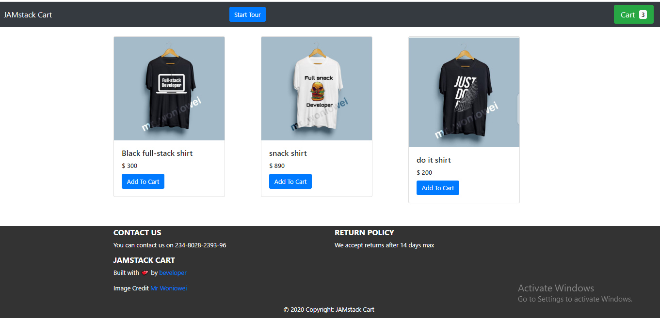
Define The Tour’s Steps
To begin with, ensure that you’re targeting the particular classNames that will hold the content of the tour on the page — that is, according to whether you’ll be using your UI instead of the shopping-cart UI.
In the component folder, create a Tour.js file, and paste the following code into it. Also, ensure that the target classNames exist in your style sheet. Throughout this article, we’ll tweak the Tour.js component to suit the task at hand.
import React from "react";
import JoyRide from "react-joyride";
const TOUR_STEPS = [
  {
    target: ".tour-logo",
    content: "This is our tour’s logo",
  },
  {
    target: ".tour-cart",
    content:
      "View the cart you’ve added here",
  },
  {
    target: ".tour-contact",
    content: "Contact the developer",
  },
  {
    target: ".tour-policy",
    content: "We accept returns after 14 days max",
  },
];
What we’ve done is simply define our tour’s steps by targeting the classNames that will form the bedrock of our content (the text). The content property is where we define the text that we want to see when the tour starts.
Enable Skip Option in Each Step
A skip option is important in cases where a user isn’t interested in a particular tour. We can add this feature by setting the showSkipButton prop to true, which will skip the remaining steps. Also, the continuous prop comes in handy when we need to show the Next button in each step.
 const Tour = () => {
  return (
    <>
      <JoyRide steps={TOUR_STEPS} continuous={true} showSkipButton={true} />
    </>
  );
};
Change Text Labels On Buttons And Links
To change the text labels on either buttons or links, we’ll use the locale prop. The locale prop has two objects, last and skip. We specified our last tour as the End tour, while skip is the Close tour.
 const Tour = () => {
  return (
    <>
      <JoyRide
        steps={TOUR_STEPS}
        continuous={true}
        showSkipButton={true}
        locale={{
          last: "End tour",
          skip: "Close tour"
        }}
      />
    </>
  );
};
Customize Styles, Like Button Colors And Text Alignment
The default color of buttons is red, and text alignment is always set right. Let’s apply some custom styles to change button colors and align text properly.
We see in our code that the styles prop is an object. It has other objects with unique values, including:
tooltipContainer
Its key istextAlign, and its value isleft.buttonNext
Its key isbackgroundColor, and its value isgreen.buttonBack
Its key ismarginRight, and its value is10px.locale
Its keys arelastandskip, and its values areEnd TourandClose Tour, respectively.
const Tour = () => {
  return (
    <>
      <JoyRide
        steps={TOUR_STEPS}
        continuous={true}
        showSkipButton={true}
        styles={{
          tooltipContainer: {
            textAlign: "left"
          },
          buttonNext: {
            backgroundColor: "green"
          },
          buttonBack: {
            marginRight: 10
          }
        }}
        locale={{
          last: "End tour",
          skip: "Close tour"
        }}
      />
    </>
  );
};
The library exposes some props to use on our elements in place of the default elements, some of which are:

useReducer
We’ve seen how to create a product tour and how to customize it using the various props of Joyride.
The problem with props, however, is that, as your web app scales and you need more tours, you don’t just want to add steps and pass props to them. You want to be able to automate the process by ensuring that the process of managing tours is controlled by functions, and not merely props. Therefore, we’ll use useReducer to revamp the process of building tours.
In this segment, we are going to take control of the tour by using actions and events, made available by the library through a callback function.
To make this process feel less daunting, we’ll break this down into steps, enabling us to build the tour in chunks.
The complete source code is available, but I’d advise you to follow this guide, to understand how it works. All of our steps will be done in the Tour.js file in the components folder.
Define the Steps
import React from "react";
import JoyRide from "react-joyride";
const TOUR_STEPS = [
  {
    target: ".tour-logo",
    content: "This is our tour’s logo.",
  },
  {
    target: ".tour-cart",
    content:
      "View the cart you’ve added here",
  },
  {
    target: ".tour-contact",
    content: "Contact the developer",
  },
  {
    target: ".tour-policy",
    content: "We accept returns after 14 days max",
  },
];
In this first step, we define our steps by targeting the appropriate classNames and setting our content (text).
Define the Initial State
 const INITIAL_STATE = {
  run: false,
  continuous: true,
  loading: false,
  stepIndex: 0, // Make the component controlled
  steps: TOUR_STEPS,
  key: new Date(), // This field makes the tour to re-render when the tour is restarted
};
In this step, we define some important states, including:
- Set the
runfield tofalse, to ensure that the tour doesn’t start automatically. - Set the
continuousprop totrue, because we want to show the button. stepIndexis the index number, which is set to0.- The
stepsfield is set to theTOUR_STEPSthat we declared in step 1. - The
keyfield makes the tour re-render when the tour is restarted.
Manage The State With Reducer
 const reducer = (state = INITIAL_STATE, action) => {
  switch (action.type) {
    // start the tour
    case "START":
      return { ...state, run: true };
    // Reset to 0th step
    case "RESET":
      return { ...state, stepIndex: 0 };
    // Stop the tour
    case "STOP":
      return { ...state, run: false };
    // Update the steps for next / back button click
    case "NEXT_OR_PREV":
      return { ...state, ...action.payload };
    // Restart the tour - reset go to 1st step, restart create new tour
    case "RESTART":
      return {
        ...state,
        stepIndex: 0,
        run: true,
        loading: false,
        key: new Date()
      };
    default:
      return state;
  }
};
In this step, using a switch statement when case is START, we return the state and set the run field to true. Also, when case is RESET, we return the state and set stepIndex to 0. Next, when case is STOP, we set the run field to false, which will stop the tour. Lastly, when case is RESET, we restart the tour and create a new tour.
According to the events (start, stop, and reset), we’ve dispatched the proper state to manage the tour.
Listen to the Callback Changes and Dispatch State Changes
 import JoyRide, { ACTIONS, EVENTS, STATUS } from "react-joyride";
const callback = data => {
    const { action, index, type, status } = data;
    if (action === ACTIONS.CLOSE
                ||
       (status === STATUS.SKIPPED && tourState.run)
                ||
      status === STATUS.FINISHED
    ) {
      dispatch({ type: "STOP" });
    } else if (type === EVENTS.STEP_AFTER || type === EVENTS.TARGET_NOT_FOUND) {
      dispatch({
        type: "NEXT_OR_PREV",
        payload: { stepIndex: index + (action === ACTIONS.PREV ? -1 : 1) }
      });
    }
};
Using the exposed EVENTS, ACTIONS, and STATUS labels offered by React Joyride, we listen to the click events and then perform some conditional operations.
In this step, when the close or skip button is clicked, we close the tour. Otherwise, if the next or back button is clicked, we check whether the target element is active on the page. If the target element is active, then we go to that step. Otherwise, we find the next-step target and iterate.
Autostart the Tour With useEffect
useEffect(() => {
  if(!localStorage.getItem("tour"){
    dispatch({ type: "START"});
  }
}, []);
In this step, the tour is auto-started when the page loads or when the component is mounted, using the useEffect hook.
Trigger The Start Button
const startTour = () => {
  dispatch({ type: "RESTART" });
};
The function in this last step starts the tour when the start button is clicked, just in case the user wishes to view the tour again. Right now, our app is set up so that the tour will be shown every time the user refreshes the page.
Here’s the final code for the tour functionality in Tour.js:
import React, { useReducer, useEffect } from "react";
import JoyRide, { ACTIONS, EVENTS, STATUS } from "react-joyride";

// Define the steps
const TOUR_STEPS = [
  {
    target: ".tour-logo",
    content: "This is our tour’s logo.",
    disableBeacon: true,
  },
  {
    target: ".tour-cart",
    content:
      "View the cart you’ve added here",
  },
  {
    target: ".tour-contact",
    content: "Contact the developer",
  },
  {
    target: ".tour-policy",
    content: "We accept returns after 14 days max",
  },
];

// Define our state
const INITIAL_STATE = {
  key: new Date(),
  run: false,
  continuous: true,
  loading: false,
  stepIndex: 0,
  steps: TOUR_STEPS,
};

// Set up the reducer function
const reducer = (state = INITIAL_STATE, action) => {
  switch (action.type) {
    case "START":
      return { ...state, run: true };
    case "RESET":
      return { ...state, stepIndex: 0 };
    case "STOP":
      return { ...state, run: false };
    case "NEXT_OR_PREV":
      return { ...state, ...action.payload };
    case "RESTART":
      return {
        ...state,
        stepIndex: 0,
        run: true,
        loading: false,
        key: new Date(),
      };
    default:
      return state;
  }
};

// Define the Tour component
const Tour = () => {
  const [tourState, dispatch] = useReducer(reducer, INITIAL_STATE);
  useEffect(() => {
    if (!localStorage.getItem("tour")) {
      dispatch({ type: "START" });
    }
  }, []);
  const callback = (data) => {
    const { action, index, type, status } = data;
    if (
      action === ACTIONS.CLOSE ||
      (status === STATUS.SKIPPED && tourState.run) ||
      status === STATUS.FINISHED
    ) {
      dispatch({ type: "STOP" });
    } else if (type === EVENTS.STEP_AFTER || type === EVENTS.TARGET_NOT_FOUND) {
      dispatch({
        type: "NEXT_OR_PREV",
        payload: { stepIndex: index + (action === ACTIONS.PREV ? -1 : 1) },
      });
    }
  };
  const startTour = () => {
    dispatch({ type: "RESTART" });
  };
  return (
    <>
      <button className="btn btn-primary" onClick={startTour}>
        Start Tour
      </button>
      <JoyRide
        {...tourState}
        callback={callback}
        showSkipButton={true}
        styles={{
          tooltipContainer: {
            textAlign: "left",
          },

          buttonBack: {
            marginRight: 10,
          },
        }}
        locale={{
          last: "End tour",
        }}
      />
    </>
  );
};
export default Tour;
Conclusion
We’ve seen how to build a product tour in a web UI with React. We’ve also covered some guidelines for making product tours effective.
Now, you can experiment with the React Joyride library and come up with something awesome in your next web app. I would love to hear your views in the comments section below.
Resources
- Documentation, React Joyride
- “Seven Exceptional Product Tours, and the Best Practices They Teach Us”, Morgan Brown, Telepathy
- “The Ultimate Guide to Product Tours and Walkthroughs”, Margaret Kelsey, Appcues
 (ks, ra, al, yk, il)
Understanding Client-Side GraphQl With Apollo-Client In React Apps
Understanding Client-Side GraphQl With Apollo-Client In React Apps
Blessing KrofeghaAccording to State of JavaScript 2019, 38.7% of developers would like to use GraphQL, while 50.8% of developers would like to learn GraphQL.
Being a query language, GraphQL simplifies the workflow of building a client application. It removes the complexity of managing API endpoints in client-side apps because it exposes a single HTTP endpoint to fetch the required data. Hence, it eliminates overfetching and underfetching of data, as in the case of REST.
But GraphQL is just a query language. In order to use it easily, we need a platform that does the heavy lifting for us. One such platform is Apollo.
The Apollo platform is an implementation of GraphQL that transfers data between the cloud (the server) to the UI of your app. When you use Apollo Client, all of the logic for retrieving data, tracking, loading, and updating the UI is encapsulated by the useQuery hook (as in the case of React). Hence, data fetching is declarative. It also has zero-configuration caching. Just by setting up Apollo Client in your app, you get an intelligent cache out of the box, with no additional configuration required.
Apollo Client is also interoperable with other frameworks, such as Angular, Vue.js, and React.
Note: This tutorial will benefit those who have worked with RESTful or other forms of APIs in the past on the client-side and want to see whether GraphQL is worth taking a shot at. This means you should have worked with an API before; only then will you be able to understand how beneficial GraphQL could be to you. While we will be covering a few basics of GraphQL and Apollo Client, a good knowledge of JavaScript and React Hooks will come in handy.
GraphQL Basics
This article isn’t a complete introduction to GraphQL, but we will define a few conventions before continuing.
What Is GraphQL?
GraphQL is a specification that describes a declarative query language that your clients can use to ask an API for the exact data they want. This is achieved by creating a strong type schema for your API, with ultimate flexibility. It also ensures that the API resolves data and that client queries are validated against a schema. This definition means that GraphQL contains some specifications that make it a declarative query language, with an API that is statically typed (built around Typescript) and making it possible for the client to leverage those type systems to ask the API for the exact data it wants.
So, if we created some types with some fields in them, then, from the client-side, we could say, “Give us this data with these exact fields”. Then the API will respond with that exact shape, just as if we were using a type system in a strongly typed language. You can learn more in my Typescript article.
Let’s look at some conventions of GraphQl that will help us as we continue.
The Basics
- Operations
In GraphQL, every action performed is called an operation. There are a few operations, namely:- Query
This operation is concerned with fetching data from the server. You could also call it a read-only fetch. - Mutation
This operation involves creating, updating, and deleting data from a server. It is popularly called a CUD (create, update, and delete) operation. - Subscriptions
This operation in GraphQL involves sending data from a server to its clients when specific events take place. They are usually implemented with WebSockets.
- Query
In this article, we will be dealing only with query and mutation operations.
- Operation names
There are unique names for your client-side query and mutation operations. - Variables and arguments
Operations can define arguments, very much like a function in most programming languages. Those variables can then be passed to query or mutation calls inside the operation as arguments. Variables are expected to be given at runtime during the execution of an operation from your client. - Aliasing
This is a convention in client-side GraphQL that involves renaming verbose or vague field names with simple and readable field names for the UI. Aliasing is necessary in use cases where you don’t want to have conflicting field names.

What Is Client-Side GraphQL?
When a front-end engineer builds UI components using any framework, like Vue.js or (in our case) React, those components are modeled and designed from a certain pattern on the client to suit the data that will be fetched from the server.
One of the most common problems with RESTful APIs is overfetching and underfetching. This happens because the only way for a client to download data is by hitting endpoints that return fixed data structures. Overfetching in this context means that a client downloads more information than is required by the app.
In GraphQL, on the other hand, you’d simply send a single query to the GraphQL server that includes the required data. The server would then respond with a JSON object of the exact data you’ve requested — hence, no overfetching. Sebastian Eschweiler explains the differences between RESTful APIs and GraphQL.
Client-side GraphQL is a client-side infrastructure that interfaces with data from a GraphQL server to perform the following functions:
- It manages data by sending queries and mutating data without you having to construct HTTP requests all by yourself. You can spend less time plumbing data and more time building the actual application.
- It manages the complexity of a cache for you. So, you can store and retrieve the data fetched from the server, without any third-party interference, and easily avoid refetching duplicate resources. Thus, it identifies when two resources are the same, which is great for a complex app.
- It keeps your UI consistent with Optimistic UI, a convention that simulates the results of a mutation (i.e. the created data) and updates the UI even before receiving a response from the server. Once the response is received from the server, the optimistic result is thrown away and replaced with the actual result.
For further information about client-side GraphQL, spare an hour with the cocreator of GraphQL and other cool folks on GraphQL Radio.
What Is Apollo Client?
Apollo Client is an interoperable, ultra-flexible, community-driven GraphQL client for JavaScript and native platforms. Its impressive features include a robust state-management tool (Apollo Link), a zero-config caching system, a declarative approach to fetching data, easy-to-implement pagination, and the Optimistic UI for your client-side application.
Apollo Client stores not only the state from the data fetched from the server, but also the state that it has created locally on your client; hence, it manages state for both API data and local data.
It’s also important to note that you can use Apollo Client alongside other state-management tools, like Redux, without conflict. Plus, it’s possible to migrate your state management from, say, Redux to Apollo Client (which is beyond the scope of this article). Ultimately, the main purpose of Apollo Client is to enable engineers to query data in an API seamlessly.
Features of Apollo Client
Apollo Client has won over so many engineers and companies because of its extremely helpful features that make building modern robust applications a breeze. The following features come baked in:
- Caching
Apollo Client supports caching on the fly. - Optimistic UI
Apollo Client has cool support for the Optimistic UI. It involves temporarily displaying the final state of an operation (mutation) while the operation is in progress. Once the operation is complete, the real data replaces the optimistic data. - Pagination
Apollo Client has built-in functionality that makes it quite easy to implement pagination in your application. It takes care of most of the technical headaches of fetching a list of data, either in patches or at once, using thefetchMorefunction, which comes with theuseQueryhook.
In this article, we will look at a selection of these features.
Enough of the theory. Tighten your seat belt and grab a cup of coffee to go with your pancakes, as we get our hands dirty.
Building Our Web App
This project is inspired by Scott Moss.
We will be building a simple pet shop web app, whose features include:
- fetching our pets from the server-side;
- creating a pet (which involves creating the name, type of pet, and image);
- using the Optimistic UI;
- using pagination to segment our data.
To begin, clone the repository, ensuring that the starter branch is what you’ve cloned.
Getting Started
- Install the Apollo Client Developer Tools extension for Chrome.
- Using the command-line interface (CLI), navigate to the directory of the cloned repository, and run the command to get all dependencies:
npm install. - Run the command
npm run appto start the app. - While still in the root folder, run the command
npm run server. This will start our back-end server for us, which we’ll use as we proceed.
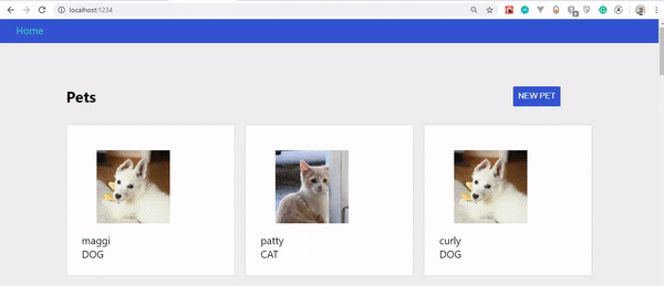
The app should open up in a configured port. Mine is http://localhost:1234/; yours is probably something else.
If everything worked well, your app should look like this:

You’ll notice that we’ve got no pets to display. That’s because we haven’t created such functionality yet.
If you’ve installed Apollo Client Developer Tools correctly, open up the developer tools and click on the tray icon. You’ll see “Apollo” and something like this:

Like the Redux and React developer tools, we will be using Apollo Client Developer Tools to write and test our queries and mutations. The extension comes with the GraphQL Playground.
Fetching Pets
Let’s add the functionality that fetches pets. Move over to client/src/client.js. We’ll be writing Apollo Client, linking it to an API, exporting it as a default client, and writing a new query.
Copy the following code and paste it in client.js:
import { ApolloClient } from 'apollo-client'
import { InMemoryCache } from 'apollo-cache-inmemory'
import { HttpLink } from 'apollo-link-http'

const link = new HttpLink({ uri: 'https://localhost:4000/' })
const cache = new InMemoryCache()
const client = new ApolloClient({
  link,
  cache
})
export default client
Here’s an explanation of what is happening above:
ApolloClient
This will be the function that wraps our app and, thus, interfaces with the HTTP, caches the data, and updates the UI.InMemoryCache
This is the normalized data store in Apollo Client that helps with manipulating the cache in our application.HttpLink
This is a standard network interface for modifying the control flow of GraphQL requests and fetching GraphQL results. It acts as middleware, fetching results from the GraphQL server each time the link is fired. Plus, it’s a good substitute for other options, likeAxiosandwindow.fetch.- We declare a link variable that is assigned to an instance of
HttpLink. It takes auriproperty and a value to our server, which ishttps://localhost:4000/. - Next is a cache variable that holds the new instance of
InMemoryCache. - The client variable also takes an instance of
ApolloClientand wraps thelinkandcache. - Lastly, we export the
clientso that we can use it across the application.
Before we get to see this in action, we’ve got to make sure that our entire app is exposed to Apollo and that our app can receive data fetched from the server and that it can mutate that data.
To achieve this, let’s head over to client/src/index.js:
import React from 'react' import ReactDOM from 'react-dom' import { BrowserRouter } from 'react-router-dom' import { ApolloProvider } from '@apollo/react-hooks' import App from './components/App' import client from './client' import './index.css' const Root = () => ( <BrowserRouter><ApolloProvider client={client}> <App /> </ApolloProvider></BrowserRouter> ); ReactDOM.render(<Root />, document.getElementById('app')) if (module.hot) { module.hot.accept() }
As you’ll notice in the highlighted code, we’ve wrapped the App component in ApolloProvider and passed the client as a prop to the client. ApolloProvider is similar to React’s Context.Provider. It wraps your React app and places the client in context, which allows you to access it from anywhere in your component tree.
To fetch our pets from the server, we need to write queries that request the exact fields that we want. Head over to client/src/pages/Pets.js, and copy and paste the following code into it:
import React, {useState} from 'react' import gql from 'graphql-tag' import { useQuery, useMutation } from '@apollo/react-hooks' import PetsList from '../components/PetsList' import NewPetModal from '../components/NewPetModal' import Loader from '../components/Loader'const GET_PETS = gql` query getPets { pets { id name type img } } `;export default function Pets () { const [modal, setModal] = useState(false)const { loading, error, data } = useQuery(GET_PETS); if (loading) return <Loader />; if (error) return <p>An error occured!</p>;const onSubmit = input => { setModal(false) } if (modal) { return <NewPetModal onSubmit={onSubmit} onCancel={() => setModal(false)} /> } return ( <div className="page pets-page"> <section> <div className="row betwee-xs middle-xs"> <div className="col-xs-10"> <h1>Pets</h1> </div> <div className="col-xs-2"> <button onClick={() => setModal(true)}>new pet</button> </div> </div> </section> <section><PetsList pets={data.pets}/></section> </div> ) }
With a few bits of code, we are able to fetch the pets from the server.
What Is gql?
It’s important to note that operations in GraphQL are generally JSON objects written with graphql-tag and with backticks.
gql tags are JavaScript template literal tags that parse GraphQL query strings into the GraphQL AST (abstract syntax tree).
- Query operations
In order to fetch our pets from the server, we need to perform a query operation.- Because we’re making a
queryoperation, we needed to specify thetypeof operation before naming it. - The name of our query is
GET_PETS. It’s a naming convention of GraphQL to use camelCase for field names. - The name of our fields is
pets. Hence, we specify the exact fields that we need from the server(id, name, type, img). useQueryis a React hook that is the basis for executing queries in an Apollo application. To perform a query operation in our React component, we call theuseQueryhook, which was initially imported from@apollo/react-hooks. Next, we pass it a GraphQL query string, which isGET_PETSin our case.
- Because we’re making a
- When our component renders,
useQueryreturns an object response from Apollo Client that contains loading, error, and data properties. Thus, they are destructured, so that we can use them to render the UI. useQueryis awesome. We don’t have to includeasync-await. It’s already taken care of in the background. Pretty cool, isn’t it?loading
This property helps us handle the loading state of the application. In our case, we return aLoadercomponent while our application loads. By default, loading isfalse.error
Just in case, we use this property to handle any error that might occur.data
This contains our actual data from the server.- Lastly, in our
PetsListcomponent, we pass thepetsprops, withdata.petsas an object value.
At this point, we have successfully queried our server.
To start our application, let’s run the following command:
- Start the client app. Run the command
npm run appin your CLI. - Start the server. Run the command
npm run serverin another CLI.

If all went well, you should see this:

Mutating Data
Mutating data or creating data in Apollo Client is almost the same as querying data, with very slight changes.
Still in client/src/pages/Pets.js, let’s copy and paste the highlighted code:
.... const GET_PETS = gql` query getPets { pets { id name type img } } `;const NEW_PETS = gql` mutation CreateAPet($newPet: NewPetInput!) { addPet(input: $newPet) { id name type img } } `;const Pets = () => { const [modal, setModal] = useState(false) const { loading, error, data } = useQuery(GET_PETS);const [createPet, newPet] = useMutation(NEW_PETS);const onSubmit = input => { setModal(false)createPet({ variables: { newPet: input } }); } if (loading || newPet.loading) return <Loader />; if (error || newPet.error) return <p>An error occured</p>;if (modal) { return <NewPetModal onSubmit={onSubmit} onCancel={() => setModal(false)} /> } return ( <div className="page pets-page"> <section> <div className="row betwee-xs middle-xs"> <div className="col-xs-10"> <h1>Pets</h1> </div> <div className="col-xs-2"> <button onClick={() => setModal(true)}>new pet</button> </div> </div> </section> <section> <PetsList pets={data.pets}/> </section> </div> ) } export default Pets
To create a mutation, we would take the following steps.
1. mutation
To create, update, or delete, we need to perform the mutation operation. The mutation operation has a CreateAPet name, with one argument. This argument has a $newPet variable, with a type of NewPetInput. The ! means that the operation is required; thus, GraphQL won’t execute the operation unless we pass a newPet variable whose type is NewPetInput.
2. addPet
The addPet function, which is inside the mutation operation, takes an argument of input and is set to our $newPet variable. The field sets specified in our addPet function must be equal to the field sets in our query. The field sets in our operation are:
idnametypeimg
3. useMutation
The useMutation React hook is the primary API for executing mutations in an Apollo application. When we need to mutate data, we call useMutation in a React component and pass it a GraphQL string (in our case, NEW_PETS).
When our component renders useMutation, it returns a tuple (that is, an ordered set of data constituting a record) in an array that includes:
- a
mutatefunction that we can call at any time to execute the mutation; - an object with fields that represent the current status of the mutation’s execution.
The useMutation hook is passed a GraphQL mutation string (which is NEW_PETS in our case). We destructured the tuple, which is the function (createPet) that will mutate the data and the object field (newPets).
4. createPet
In our onSubmit function, shortly after the setModal state, we defined our createPet. This function takes a variable with an object property of a value set to { newPet: input }. The input represents the various input fields in our form (such as name, type, etc.).
With that done, the outcome should look like this:

If you observe the GIF closely, you’ll notice that our created pet doesn’t show up instantly, only when the page is refreshed. However, it has been updated on the server.
The big question is, why doesn’t our pet update instantly? Let’s find out in the next section.
Caching In Apollo Client
The reason our app doesn’t update automatically is that our newly created data doesn’t match the cache data in Apollo Client. So, there is a conflict as to what exactly it needs to be updated from the cache.
Simply put, if we perform a mutation that updates or deletes multiple entries (a node), then we are responsible for updating any queries referencing that node, so that it modifies our cached data to match the modifications that a mutation makes to our back-end data.
Keeping Cache In Sync
There are a few ways to keep our cache in sync each time we perform a mutation operation.
The first is by refetching matching queries after a mutation, using the refetchQueries object property (the simplest way).
Note: If we were to use this method, it would take an object property in our createPet function called refetchQueries, and it would contain an array of objects with a value of the query: refetchQueries: [{ query: GET_PETS }].
Because our focus in this section isn’t just to update our created pets in the UI, but to manipulate the cache, we won’t be using this method.
The second approach is to use the update function. In Apollo Client, there’s an update helper function that helps modify the cache data, so that it syncs with the modifications that a mutation makes to our back-end data. Using this function, we can read and write to the cache.
Updating The Cache
Copy the following highlighted code, and paste it in client/src/pages/Pets.js:
...... const Pets = () => { const [modal, setModal] = useState(false) const { loading, error, data } = useQuery(GET_PETS);const [createPet, newPet] = useMutation(NEW_PETS, { update(cache, { data: { addPet } }) { const data = cache.readQuery({ query: GET_PETS }); cache.writeQuery({ query: GET_PETS, data: { pets: [addPet, ...data.pets] }, }); }, } );.....
The update function receives two arguments:
- The first argument is the cache from Apollo Client.
- The second is the exact mutation response from the server. We destructure the
dataproperty and set it to our mutation (addPet).
Next, to update the function, we need to check for what query needs to be updated (in our case, the GET_PETS query) and read the cache.
Secondly, we need to write to the query that was read, so that it knows we’re about to update it. We do so by passing an object that contains a query object property, with the value set to our query operation (GET_PETS), and a data property whose value is a pet object and that has an array of the addPet mutation and a copy of the pet’s data.
If you followed these steps carefully, you should see your pets update automatically as you create them. Let’s take a look at the changes:

Optimistic UI
A lot of people are big fans of loaders and spinners. There’s nothing wrong with using a loader; there are perfect use cases where a loader is the best option. I’ve written about loaders versus spinners and their best use cases.
Loaders and spinners indeed play an important role in UI and UX design, but the arrival of Optimistic UI has stolen the spotlight.
What Is Optimistic UI?
Optimistic UI is a convention that simulates the results of a mutation (created data) and updates the UI before receiving a response from the server. Once the response is received from the server, the optimistic result is thrown away and replaced with the actual result.
In the end, an optimistic UI is nothing more than a way to manage perceived performance and avoid loading states.
Apollo Client has a very interesting way of integrating the Optimistic UI. It gives us a simple hook that allows us to write to the local cache after mutation. Let’s see how it works!
Step 1
Head over to client/src/client.js, and add only the highlighted code.
import { ApolloClient } from 'apollo-client' import { InMemoryCache } from 'apollo-cache-inmemory' import { HttpLink } from 'apollo-link-http'import { setContext } from 'apollo-link-context' import { ApolloLink } from 'apollo-link' const http = new HttpLink({ uri: "http://localhost:4000/" }); const delay = setContext( request => new Promise((success, fail) => { setTimeout(() => { success() }, 800) }) ) const link = ApolloLink.from([ delay, http ])const cache = new InMemoryCache() const client = new ApolloClient({ link, cache }) export default client
The first step involves the following:
- We import
setContextfromapollo-link-context. ThesetContextfunction takes a callback function and returns a promise whosesetTimeoutis set to800ms, in order to create a delay when a mutation operation is performed. - The
ApolloLink.frommethod ensures that the network activity that represents the link (our API) fromHTTPis delayed.
Step 2
The next step is using the Optimistic UI hook. Slide back to client/src/pages/Pets.js, and add only the highlighted code below.
..... const Pets = () => { const [modal, setModal] = useState(false) const { loading, error, data } = useQuery(GET_PETS); const [createPet, newPet] = useMutation(NEW_PETS, { update(cache, { data: { addPet } }) { const data = cache.readQuery({ query: GET_PETS }); cache.writeQuery({ query: GET_PETS, data: { pets: [addPet, ...data.pets] }, }); }, } ); const onSubmit = input => { setModal(false) createPet({ variables: { newPet: input },optimisticResponse: { __typename: 'Mutation', addPet: { __typename: 'Pet', id: Math.floor(Math.random() * 10000 + ''), name: input.name, type: input.type, img: 'https://via.placeholder.com/200' } }}); } .....
The optimisticResponse object is used if we want the UI to update immediately when we create a pet, instead of waiting for the server response.
The code snippets above include the following:
__typenameis injected by Apollo into the query to fetch thetypeof the queried entities. Those types are used by Apollo Client to build theidproperty (which is a symbol) for caching purposes inapollo-cache. So,__typenameis a valid property of the query response.- The mutation is set as the
__typenameofoptimisticResponse. - Just as earlier defined, our mutation’s name is
addPet, and the__typenameisPet. - Next are the fields of our mutation that we want the optimistic response to update:
id
Because we don’t know what the ID from the server will be, we made one up usingMath.floor.name
This value is set toinput.name.type
The type’s value isinput.type.img
Now, because our server generates images for us, we used a placeholder to mimic our image from the server.
This was indeed a long ride. If you got to the end, don’t hesitate to take a break from your chair with your cup of coffee.
Let’s take a look at our outcome. The supporting repository for this project is on GitHub. Clone and experiment with it.
Conclusion
The amazing features of Apollo Client, such as the Optimistic UI and pagination, make building client-side apps a reality.
While Apollo Client works very well with other frameworks, such as Vue.js and Angular, React developers have Apollo Client Hooks, and so they can’t help but enjoy building a great app.
In this article, we’ve only scratched the surface. Mastering Apollo Client demands constant practice. So, go ahead and clone the repository, add pagination, and play around with the other features it offers.
Please do share your feedback and experience in the comments section below. We can also discuss your progress on Twitter. Cheers!
References
- “Client-Side GraphQL In React”, Scott Moss, Frontend Master
- “Documentation”, Apollo Client
- “The Optimistic UI With React”, Patryk Andrzejewski
- “True Lies Of Optimistic User Interfaces”, Smashing Magazine
(ks, ra, al, yk, il)
Implementing Dark Mode In React Apps Using styled-components
Implementing Dark Mode In React Apps Using styled-components
Blessing KrofeghaOne of the most commonly requested software features is dark mode (or night mode, as others call it). We see dark mode in the apps that we use every day. From mobile to web apps, dark mode has become vital for companies that want to take care of their users’ eyes.
Dark mode is a supplemental feature that displays mostly dark surfaces in the UI. Most major companies (such as YouTube, Twitter, and Netflix) have adopted dark mode in their mobile and web apps.
While we won’t go in depth into React and styled-components, a basic knowledge of React, CSS, and styled-components would come in handy. This tutorial will benefit those who are looking to enhance their web applications by catering to those who love dark mode.

A few days before the writing of this article, StackOverflow announced its release of dark mode, giving users the chance to toggle between the two modes.
Dark mode reduces eye strain and helps when you’re working for a long time on a computer or mobile phone.
What Is Dark Mode?
Dark mode is the color scheme of any interface that displays light text and interface elements on a dark background, which makes the screen a little easier to look at mobile phones, tablets, and computers. Dark mode reduces the light emitted by the screen, while maintaining the minimum color-contrast ratios required for readability.
Why Should You Care About Dark Mode?
Dark mode enhances visual ergonomics by reducing eye strain, adjusting the screen to current light conditions, and providing ease of use at night or in dark environments.
Before implementing dark mode in our app, let’s look at its benefits.
Battery Saving
Dark mode in web and mobile apps can prolong the battery life of a device. Google has confirmed that dark mode on OLED screens has been a huge help to battery life.
For example, at 50% brightness, dark mode in the YouTube app saves about 15% more screen energy than a flat white background. At 100% screen brightness, the dark interface saves a whopping 60% of screen energy.
Dark Mode Is Beautiful
Dark mode is beautiful, and it can significantly enhance the appeal of the screen.
While most products are going for that similar bland white look, dark mode offers something different that feels mysterious and new.
It also provides great opportunities to present graphic content such as dashboards, pictures, and photos in a fresh way.

Now that you know why you should implement dark mode in your next web app, let’s dive deep into styled-components, which is the defining resource of this tutorial.
“
What Are styled-components?
Throughout this article, we will be using the styled-components library very often. There have always been many ways to style a modern web app. There’s the traditional method of styling at the document level, which includes creating an index.css file and linking it to the HTML or styling inside the HTML file.
A lot has changed in the ways that web apps are styled recently, since the introduction of CSS-in-JS.
CSS-in-JS refers to a pattern in which CSS is composed using JavaScript. It utilizes tagged template literals to style components in a JavaScript file.
To learn more about CSS-in-JS, check out Anna Monus’s article on the subject.
styled-components is a CSS-in-JS library lets you use all of the features of CSS that you love, including media queries, pseudo-selectors, and nesting.
Why styled-components?
styled-components was created for the following reasons:
- No class name hell
Instead of you scratching your head to find a class name for an element, styled-components generates unique class names for your styles. You’ll never have to worry about misspellings or using class names that have no meaning. - Using props
styled-components allow us to extend styling properties using thepropsparameter, commonly used in React — thus, dynamically affecting the feel of a component via the application’s state. - Supports Sass syntax
Writing Sass syntax out of the box without having to set up any preprocessors or extra build tools is possible with styled-components. In your style definitions, you can use the&character to target the current component, use pseudo-selectors, and experiment with nesting. - Theming
styled-components have full theming support by exporting aThemeProviderwrapper component. This component provides a theme to all React components within itself via the Context API. In the rendering tree, all styled-components will have access to the provided theme, even when they are multiple levels deep. As we continue in this tutorial, we will look deeper into the theming features of styled-components.
To learn more advantages of styled-components, check out Kris Guzman’s article.
Implementing Dark Mode
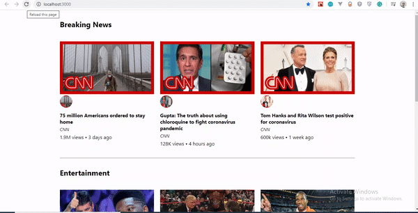
In this article, we are going to implement dark mode on a simple YouTube-like web page.
To follow along, ensure that you clone the original repository from the starter branch.
Setting Up
Let’s install all of the dependencies in our package.json file. From the terminal, run the following command:
npm install
Upon its successful installation, run npm start. Here is what the web page looks like without dark mode implemented on it.
To install styled-components, in your terminal run npm install styled-components.
Implementation
To implement dark mode, we need to create four different components.
Theme
This contains the color properties of our light and dark themes.GlobalStyles
This contains the global styles for the entire document.Toggler
This holds the button element that toggles the functionality.useDarkMode
This custom hook handles the logic behind the change of theme and the persistence of our theme in localStorage.
Theme Component
In the src folder, you’ll see components in the components folder. Create a Themes.js file, and add the following code to it.
export const lightTheme = {
    body: '#FFF',
    text: '#363537',
    toggleBorder: '#FFF',
    background: '#363537',
}
export const darkTheme = {
    body: '#363537',
    text: '#FAFAFA',
    toggleBorder: '#6B8096',
    background: '#999',
}
Here, we’ve defined and exported lightTheme and darkTheme objects with distinct color variables. Feel free to experiment and customize the variables to suit you.
globalStyles Component
Remaining in your components folder, create a globalStyles.js file, and add the following code:
import { createGlobalStyle} from "styled-components"
export const GlobalStyles = createGlobalStyle`
  body {
    background: ${({ theme }) => theme.body};
    color: ${({ theme }) => theme.text};
    font-family: Tahoma, Helvetica, Arial, Roboto, sans-serif;
    transition: all 0.50s linear;
  }
  `
We’ve imported createGlobalStyle from styled-components. The createGlobalStyle method replaces the now deprecated injectGlobal method from styled-components version 3. This method generates a React component, which, when added to your component tree, will inject global styles into the document, in our case, App.js.
We defined a GlobalStyle component and assigned background and color properties to values from the theme object. Thus, every time we switch the toggle, the values will change depending on the dark theme or light theme objects that we are passing to ThemeProvider (which will be created later, as we proceed).
The transition property of 0.50s enables this change to occur a little more smoothly, so that as we toggle back and forth, we can see the changes happen.
Creating Theme-Toggling Functionality
To implement the theme-toggling functionality, we need to add only a few lines of code. In the App.js file, add the following code (note that the highlighted code is what you should add):
import React, { useState, useEffect } from "react";
import {ThemeProvider} from "styled-components";
import { GlobalStyles } from "./components/Globalstyle";
import { lightTheme, darkTheme } from "./components/Themes"
import "./App.css";
import dummyData from "./data";
import CardList from "./components/CardList";
const App = () => {
const [videos, setVideos] = useState([]);
const [theme, setTheme] = useState('light');
const themeToggler = () => {
  theme === 'light' ? setTheme('dark') : setTheme('light')
}
useEffect(() => {
    const timer = setTimeout(() => {
      setVideos(dummyData);
    }, 1000);
    return () => clearTimeout(timer);
  }, []);
  return (
    <ThemeProvider theme={theme === 'light' ? lightTheme : darkTheme}>
      <>
      <GlobalStyles/>
          <div className="App">
            <button onClick={themeToggler}>Switch Theme</button>
      {
      videos.map((list, index) => {
        return (
          <section key={index}>
            <h2 className="section-title">{list.section}</h2>
            <CardList list={list} />
            <hr />
          </section>
        );
      })}
        </div>
      </>
    </ThemeProvider>

  );
};
export default App;
The highlighted code is the one newly added to App.js. We’ve imported ThemeProvider from styled-components. ThemeProvider is a helper component in the styled-components library that provides theming support. This helper component injects a theme into all React component below itself via the Context API.
In the rendering tree, all styled-components will have access to the provided theme, even when they are multiple levels deep. Check out the section on “Theming”.
Next, we import the GlobalStyle wrapper from ./components/Globalstyle. Lastly, from the top, we import both the lightTheme and darkTheme objects from ./components/Themes.
In order for us to create a toggling method, we need a state that holds our theme’s initial color value. So, we create a theme state, and set the initial state to light, using the useState hook.
Now, for the toggling functionality.
The themeToggler method uses a ternary operator to check the state of the theme, and it toggles either dark or light based on the value of the condition.
ThemeProvider, a styled-components helper component, wraps everything in the return statement and injects any components below it. Remember that our GlobalStyles inject global styles into our components; hence, it’s called inside the ThemeProvider wrapper component.
Lastly, we created a button with an onClick event that assigns our themeToggler method to it.
Let’s see the outcome thus far.
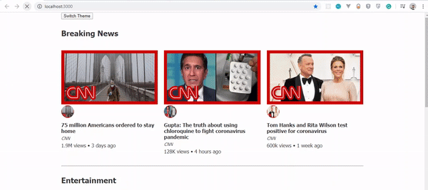
Our App.js file needs to be refactored; a lot of its code is not DRY. (DRY stands for “don’t repeat yourself”, a basic principle of software development aimed at reducing repetition.) All of the logic seems to be in App.js; it’s good practice to separate our logic for the sake of clarity. So, we’ll create a component that handles the toggling functionality.
Toggle Component
Still within the components folder, create a Toggler.js file, and add the following code to it:
import React from 'react'
import { func, string } from 'prop-types';
import styled from "styled-components"
const Button = styled.button`
  background: ${({ theme }) => theme.background};
  border: 2px solid ${({ theme }) => theme.toggleBorder};
  color: ${({ theme }) => theme.text};
  border-radius: 30px;
  cursor: pointer;
  font-size:0.8rem;
  padding: 0.6rem;
  }
\`;
const Toggle = ({theme,  toggleTheme }) => {
    return (
        <Button onClick={toggleTheme} >
          Switch Theme
        </Button>
    );
};
Toggle.propTypes = {
    theme: string.isRequired,
    toggleTheme: func.isRequired,
}
export default Toggle;
To keep things neat, we’ve styled our toggle button in the Toggle component, using the styled function from styled-components.
This is purely for presentation; you can style the button as you see fit.
Inside the Toggle component, we pass two props:
- the
themeprovides the current theme (light or dark); - the
toggleThemefunction will be used to switch between themes.
Next, we return the Button component and assign a toggleTheme function to the onClick event.
Lastly, we use propTypes to define our types, ensuring that our theme is a string and isRequired, while our toggleTheme is func and isRequired.
Using Custom Hooks (useDarkMode)
When building an application, scalability is paramount, meaning that our business logic must be reusable, so that we can use it in many places and even in different projects.
That is why it would be great to move our toggling functionality to a separate component. For that, we would create our own custom hook.
Let’s create a new file named useDarkMode.js in the components folder, and move our logic to this file, with some tweaks. Add the following code to the file:
import { useEffect, useState } from 'react';
export const useDarkMode = () => {
    const [theme, setTheme] = useState('light');

    const setMode = mode => {
        window.localStorage.setItem('theme', mode)
        setTheme(mode)
    };

    const themeToggler = () => {
        theme === 'light' ? setMode('dark') : setMode('light')
    };

    useEffect(() => {
        const localTheme = window.localStorage.getItem('theme');
        localTheme && setTheme(localTheme)
    }, []);
    return [theme, themeToggler]
};
We’ve added a few things here.
setModeWe uselocalStorageto persist between sessions in the browser. So, if a user has chosen the dark or light theme, that’s what they’ll get upon their next visit to the app or if they reload the page. Hence, this function sets our state and passesthemetolocalStorage.themeTogglerThis function uses a ternary operator to check the state of the theme and toggles either dark or light based on the truth of the condition.useEffectWe’ve implemented theuseEffecthook to check on component mounting. If the user has previously selected a theme, we will pass it to oursetThemefunction. In the end, we will return ourtheme, which contains the chosenthemeand thethemeTogglerfunction to switch between modes.
I think you’ll agree that our dark-mode component looks sleek.
Let’s head over to App.js for the final touches.
import React, { useState, useEffect } from "react";
import {ThemeProvider} from "styled-components";
import  {useDarkMode} from "./components/useDarkMode"
import { GlobalStyles } from "./components/Globalstyle";
import { lightTheme, darkTheme } from "./components/Themes"
import Toggle from "./components/Toggler"
import "./App.css";
import dummyData from "./data";
import CardList from "./components/CardList";
const App = () => {
const [videos, setVideos] = useState([]);
const [theme, themeToggler] = useDarkMode();
const themeMode = theme === 'light' ? lightTheme : darkTheme;

useEffect(() => {
  const timer = setTimeout(() => {
    setVideos(dummyData);
  }, 1000);
  return () => clearTimeout(timer);
}, []);

return (
  <ThemeProvider theme={themeMode}>
    <>
      <GlobalStyles/>
        <div className="App">
        <Toggle theme={theme} toggleTheme={themeToggler} />
          {
            videos.map((list, index) => {
              return (
                <section key={index}>
                  <h2 className="section-title">{list.section}</h2>
                  <CardList list={list} />
                  <hr />
                </section>
              );
            })}
        </div>
      </>
    </ThemeProvider>
  );
};
export default App;
The highlighted code is newly added to App.js.
First, we import our custom hook, destructure the theme and themeToggler props, and set it with the useDarkMode function.
Note that the useDarkMode method replaces our theme state, which was initially in App.js.
We declare a themeMode variable, which renders either a light or dark theme based on the condition of the theme mode at the time.
Now, our ThemeProvider wrapper component is assigned our just recently created themeMode variable to the theme prop.
And lastly, in place of the regular button, we pass in the Toggle component.
Remember that in our Toggle component, we defined and styled a button and passed both theme and toggleTheme to them as props. So, all we have to do is pass these props appropriately to the Toggle component, which will act as our button in App.js.
Yes! Our dark mode is set, and it persists, not changing color when the page is refreshed or visited in a new tab.
Let’s see the outcome in action:
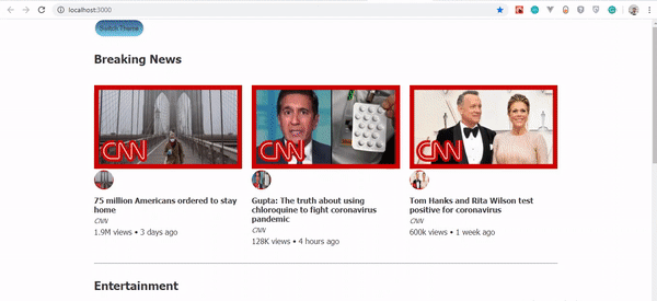
Almost everything works well, but there is one small thing we can do to make our experience splendid. Switch to the dark theme and then reload the page. Do you see that the blue color in the button loads before the gray for a brief moment? That happens because our useState hook initiates the light theme initially. After that, useEffect runs, checks localStorage, and only then sets the theme to dark. Let’s jump over to our custom hook useDarkMode.js and add a little code:
import { useEffect, useState } from 'react';
export const useDarkMode = () => {
    const [theme, setTheme] = useState('light');
    const [mountedComponent, setMountedComponent] = useState(false)
    const setMode = mode => {
        window.localStorage.setItem('theme', mode)
        setTheme(mode)
    };
    const themeToggler = () => {
        theme === 'light' ? setMode('dark') : setMode('light')
    };
    useEffect(() => {
        const localTheme = window.localStorage.getItem('theme');
        localTheme ? setTheme(localTheme) : setMode('light')
        setMountedComponent(true)
    }, []);
    return [theme, themeToggler, mountedComponent]
};
The highlighted code is the only one added to useDarkMode.js. We’ve created another state named mountedComponent and set the default value to false using the useState hook. Next, inside the useEffect hook, we set the mountedComponent state to true using setMountedComponent. Lastly, in the return array, we include the mountedComponent state.
Finally, let’s add a bit of code in App.js to make it all work.
import React, { useState, useEffect } from "react";
import {ThemeProvider} from "styled-components";
import  {useDarkMode} from "./components/useDarkMode"
import { GlobalStyles } from "./components/Globalstyle";
import { lightTheme, darkTheme } from "./components/Themes"
import Toggle from "./components/Toggler"
import "./App.css";
import dummyData from "./data";
import CardList from "./components/CardList";
const App = () => {
  const [videos, setVideos] = useState([]);
  const [theme, themeToggler, mountedComponent] = useDarkMode();
  const themeMode = theme === 'light' ? lightTheme : darkTheme;
  useEffect(() => {
    const timer = setTimeout(() => {
      setVideos(dummyData);
    }, 1000);
    return () => clearTimeout(timer);
  }, []);
  if(!mountedComponent) return <div/>
  return (
    <ThemeProvider theme={themeMode}>
      <>
      <GlobalStyles/>
        <div className="App">
          <Toggle theme={theme} toggleTheme={themeToggler} />
          {
            videos.map((list, index) => {
              return (
                <section key={index}>
                  <h2 className="section-title">{list.section}</h2>
                  <CardList list={list} />
                  <hr />
                </section>
              );
            })}
        </div>
      </>
    </ThemeProvider>

  );
};
export default App;
We’ve added our mountedComponent state as a prop in our useDarkMode hook, and we’ve checked whether our component has mounted, because this is what happens in the useEffect hook. If it hasn’t happened yet, then we will render an empty div.
Let’s see the outcome of our dark-mode web page.
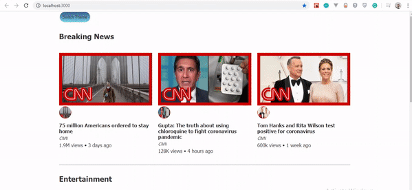
Now, you’ll notice that while in dark mode, when the page reloads, the button’s color doesn’t change.
Conclusion
Dark mode is increasingly becoming a user preference, and implementing it in a React web app is a lot easier when using the ThemeProvider theming wrapper in styled-components. Go ahead and experiment with styled-components as you implement dark mode; you could add icons instead of a button.
Please do share your feedback and experience with the theming feature in styled-components in the comments section below. I’d love to see what you come up with!
The supporting repository for this article is available on GitHub. Also, check it out on CodeSandbox.
References
- “Documentation”, styled-components
- “Create a Dark Mode of your app using Styled Components”, Tom Nolan, Medium
(ks, ra, il, al)
Building A Web App With Headless CMS And React
Building A Web App With Headless CMS And React
Blessing KrofeghaIn this tutorial, you’ll learn what Headless CMS is, and the pros and cons of Headless CMS. In the end, youll have built a shopping cart using GraphCMS (a (backend-only content management system). After that, you can go ahead and build any web app of your choice using a headless CMS and React.
To follow along, you need to have Node and npm/yarn installed on your machine. If you do not have that done already, follow these quick guides to install yarn or npm on your machine. You also need to have a basic understanding of React, Node.js and GraphQL queries. (You can always brush up on React and GraphQL skills, of course!)
As digital products continue to evolve, so does the content we consume. A scalable, cross-platform content management system is crucial to ensuring a product’s growth velocity. Traditional CMS gives the comfort of having the content, the editing interface, templates and custom codes, in a single environment. But with the changes in this mobile era, that’s no longer enough. We need a new breed of CMS — one that can make content available through any channel at which point a Headless CMS is required. A headless CMS gives you the benefits of managing the content and delivering it to any channel. The API makes contents available through any channel and on any device using most favorite tools and programming languages plus it also provides a higher level of security and much better scalability.
What Does This Look Like In Practice?
What happens when you take away the frontend of a CMS? The biggest distinction is that a website can’t be built with a headless CMS on its own. With a traditional CMS, everything happens in the same place.
A headless CMS doesn’t have the features that let you build your site — it doesn’t have site themes or templates. To use a headless CMS, you have to build a site or app, or other experience first, then use the CMS’s API to plug your content into it.
Why Should You Care About Headless?
A headless CMS comes with an API friendly approach, which makes it possible to publish content through an API (either RESTful or GraphQL). It allows you to use the same API to deliver content across various channels such as Android or IOS apps, smartwatches, AR/VR, etc. A headless CMS gives developers the ability to harness creativity quickly. With a traditional CMS, changes can be time-consuming, for example, to tweak a part of your site, you need to re-implement the entire CMS. With a headless CMS, you can make changes to your frontend without having any impact on the back-end infrastructure, hence saving yourself time and resources, which makes it much better.
Traditional vs Headless CMS: The Pros And Cons
It can be complicated to choose between a headless and a traditional CMS. The fact is, they both have potential advantages and drawbacks.
Traditional CMS Pros
- It allows for easy customization. A lot of them have drag and drop, this makes it easy for a person without programming experience to work seamlessly with them.
- It’s easier to set up your content on a traditional CMS as everything you need (content management, design, etc) are already available.
Traditional CMS Cons
- The coupled front-end and back-end results in more time and money for maintenance and customization.
- Traditional CMS e.g Wordpress relies heavily on plugins and themes which may contain malicious codes or bugs and slow the speed of the website or blog. Here’s a list of 18,305 vulnerable WordPress plugins, themes. Here are security measures for Drupal developers. Check here for more facts.
Headless CMS Pros
- Since the frontend and backend are separated from each other, it makes it possible for you to pick which front-end technology suits your needs. This also gives the developer flexibility during the development stage.
- Platforms (blogs, websites, etc) built with headless CMS can be deployed to work on various displays such as web, mobile, AR/VR, and so on.
Headless CMS Cons
- They give you the hassle of managing back-end infrastructures, setting up the presentation component of your site, app.
- They can be more costly to implement — the cost involved in building a user-friendly platform with analytics is high when compared to using traditional CMS.
Best Use Cases For Headless CMS
Headless CMS can have the following use cases:
- Static Site Generators (e.g. Gridsome, Gatsby)
Many Jamstack sites created with static site generators like Gridsome, Hugo or Gatsby make use of the headless CMS to manage content, they cannot access a database, Hence content can be stored in a headless CMS and fetched through an API during build time and deployed as static files.
- Mobile Apps (iOS, Android)
The advantage of a headless CMS for mobile engineers is that the API enables them to deliver content to an IOS/Android app from the same backend that manages content for their web site, which keeps things in sync.
- Web Applications
This approach involves serving content through an API which is then consumed by a web application but offers a centralized place for managing content. An example is an e-commerce application built using HTML, CSS, and JavaScript with content and product data that are maintained in the CMS and served via an external API.
Types Of Headless CMS
There is a list of headless CMSs you might what to check out.
Please note that this article is not written to promote any services or products.
- Contentful
An API-driven headless CMS designed to create, manage and distribute content to any platform. Unlike a traditional CMS, they offer the ability to create your content model so that you can decide what type of content you want to manage. - GraphCMS
A headless CMS for users who want to build a GraphQL content infrastructure for their digital products. This CMS is fully built as API focused from the ground up, allowing creators to define the structures, permissions, and relations for the API parameters. In this article, we’d be using GraphCMS because of its GraphQL API approach. - ButterCMS
A CMS that gives complete freedom to build a website or a branded blog with full SEO and supports any tech stack. This tool saves you money and the time for site development time. Butter CMS is a maintenance-free headless CMS tool and can integrate with any language or framework. The powerful interface helps you define and customize every element of your website without any hassle. - Directus
An open-source tool that wraps custom SQL databases with a dynamic API and provides an intuitive admin app for managing its content. Self-host for free, or use the on-demand Cloud service to manage all your omnichannel digital experiences. - Sanity
Another API driven platform for managing structured content. With Sanity, you can manage your text, images, and other media with APIs. You can also use the open-source single page application Sanity Studio to quickly set up an editing environment that you can customize. - Agility
A JAMStack focused Headless CMS with Page Management built-in. Faster to build, manage, and deploy. Agility CMS is a Content-First Headless CMS, allowing you to choose any programming language while also getting the flexibility, speed, and power that comes from lightweight APIs. From there, add features like Page Management, Ecommerce, Online Ticketing, and Search. Agility CMS becomes a complete Digital Experience Platform–saving time, removing limitations and allowing for seamless experiences across all digital channels. - Netlify CMS
A free and open-source, git-based CMS created by Netlify. It allows you to define your content model, integrates third-party authentication and extends the capabilities of its backend (a single-page app built on React).
Note: All of the examples mentioned above have free and paid versions, except Directus and Netlify CMS which are free. For a list of more headless CMS, check here.
In this article, we’re using GraphCMS — a GraphqQL API-oriented headless content management system that takes care of our back-end architecture.
Using GraphCMS
Content is both dynamic and multi-channeled, however current content management systems (CMS) lack the flexibility to meet the demands of modern-day digital content distribution. GraphCMS is the first HeadlessCMS built around GraphQL and offers a solution to this problem with its mission to facilitate painless content flow between content creators, developers, and consumers.
GraphCMS accept almost any kind of data you can imagine ranging from images, maps, etc. It even makes roles and permissions easy. While other headless CMS solutions exist, GraphCMS aims to provide a hassle-free experience for developers; through leveraging an API specification called GraphQL. It eliminates the need for multiple SDKs to interact with content delivery and provides simple multi-channel content accessibility. It makes creating rich content apps very easy.
GraphCMS And GraphQL
GraphCMS sorely relies on GraphQL, its backbone API specification. GraphQL is API query language and runtime. It was developed by Facebook in 2012 and released open-sourced in 2015. Since then, the likes of Pinterest, Github, Twitter, Intuit, Coursera have all adopted GraphQL to power their mobile apps, websites, and APIs. GraphQL is similar to REST in its core purpose of providing a specification for building and utilizing APIs. However, unofficially dubbed “REST 2.0”, GraphQL has optimized different key functionality offered by REST.
The main uniqueness of GraphQL includes protocol-agnostic usage, controlled data fetching, editable fields, and types and in-depth error handling. The results include removal of code redundancy, prevention of over and under fetching data, and significant reduction of network requests.
As a concrete example, let’s take the relationship of a query to a newsfeed. A newsfeed post has an author, a title and comments. If we use a REST-based CMS, we would have to make 3 different server requests for these 3 different endpoints, whereas, in a GraphQL based CMS, we would only have to make 1 request for all 3. Consequently, the results offer relatively quicker queries and less network flooding — in a practical use case, it would not just be one entity making multiple requests, but thousands and millions.
GraphQL reduces the complexity of building APIs by abstracting all requests to a single endpoint. Unlike traditional REST APIs, it is declarative; whatever is requested is returned.
GraphCMS has a generous free tier of 1 million API operations requests per month and 500 GB assets traffic. Also, GraphCMS provides a Graphiql admin interface that provides you full access to your data and you could just download it all and then execute a create many mutations against your new backend to migrate everything over.
In this article, we’ll be using the free tier of 1 million API operations per month and 500 GB asset traffic. You can make use of the same tier for testing, for projects that need more than this, do well to check out their pricing page.
Building Our Project
To see the power of Headless CMS using GraphCMS we would be building a simple shopping cart.
Getting Started
To get started with GraphCMS follow the steps.
- Create an account on GraphCMS. You can use the free tier.

- At successful signup, you’ll be taken to your dashboard. Click on create a new project.

- Ensure you click on create a project from scratch.

- Set project details for the project fill in what is in the image below and click create.

- In our dashboard, we would create our models and content.
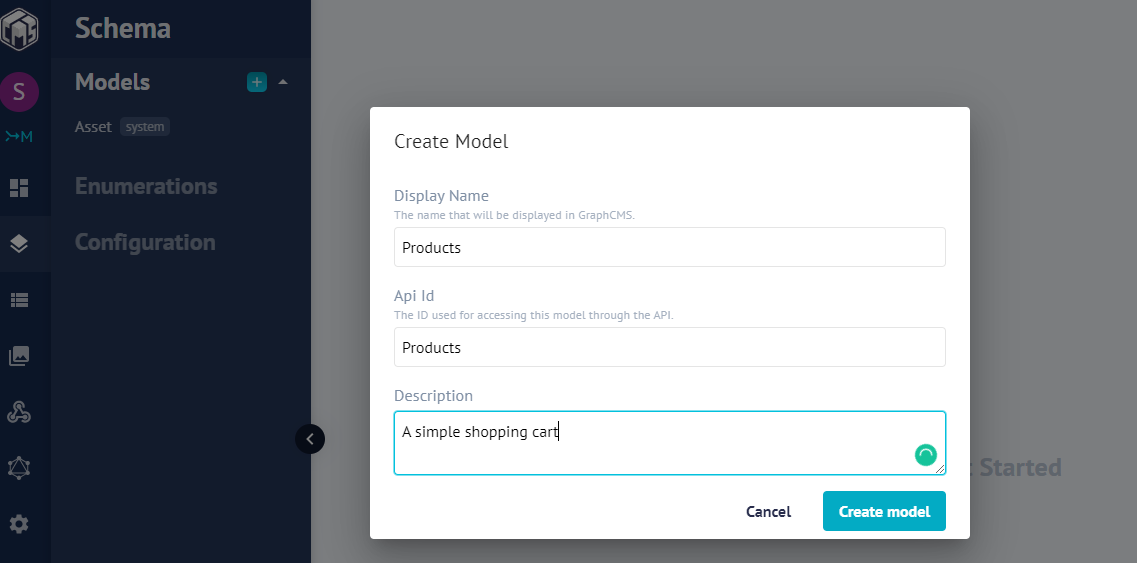
- Select the schema in the sidebar of the dashboard to create a schema.
GraphCMS has an awesome drag and drop UI, that make it easy to seamlessly create schema in minutes.

Let’s go ahead and create our
system fieldsin our schema.- name: “”
- type: The field type is a String, Single line Text.
- Is required
- description: It’s the name of the product.
- price: “”
- type: The field type is int.
- Is required
- description: It will contain the price of our product.
- description: “”
- type: The field type is a String, Multi-line Text.
- Is required
- description: This field will contain the description of our product.
- image: “”
- type: The field type is the file, which is an Asset Picker.
- Is required
- description: This image field will contain the image of our product.
- name: “”
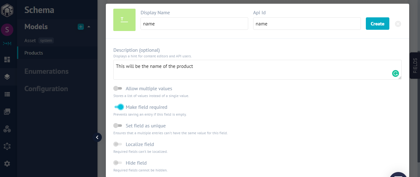
Note: Click on the ‘Advance’ tab to select the required option in our fields.
- If all went well, you should have our schema looking the image below:

- Currently, we have no content. Click on ‘Content’ in the sidebar that should take you the Content section, and click on ‘Create New’.
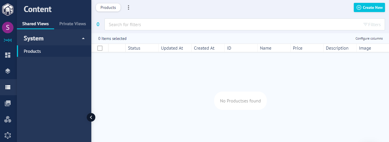
- Let’s add a few contents so we can display them later in our app using React.

- Add a few more content if you desire. Here’s our result.
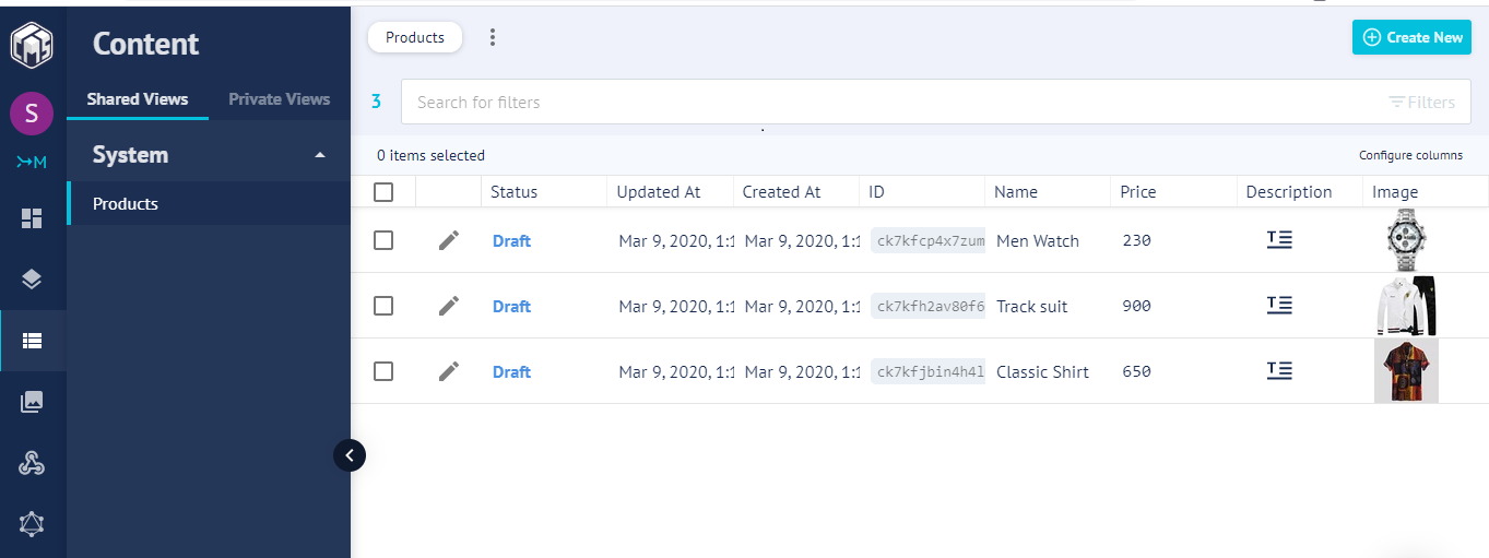
- Next, copy the API endpoint URL (Click on the Dashboard) — this is the single endpoint for communication between our React front end and GraphCMS back end.

Next, let’s make our API endpoint accessible.
- Navigate to Settings Under Public API Permission and click on the drop-down and select OPEN and click the update button.
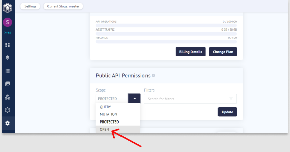
Setting Up React
The easiest way to set up React is to use Create-React-App. (This is an officially supported way to create single-page React applications, and offers a modern build setup with no configuration.) We’ll make use of it to bootstrap the application we’ll be building.
From your terminal, run the command below:
npx create-react-app smashing-stores && cd smashing-storesOnce the installation is successful, start the React server by running npm start.

Creating Our Layout
In creating the layout for our project, we will have five different components.
Navbar |
To hold our navigation and cart icon |
Allproducts |
To display a list of all products |
Product |
The markup for a single product |
Footer |
The footer of our app |
Cart |
To hold the items in our cart |
For a quick setup, we will be using Bootstrap to create our components. To include Bootstrap, we would use bootstrap CDN, open up your index.html in the public folder, add the link to the head section:
https://stackpath.bootstrapcdn.com/bootstrap/4.4.1/css/bootstrap.min.cssNow we can make use of bootstrap classes in our application.
Next, create a /components folder and create the following files inside it:
- Navbar.js
- Allproducts.js
- Product.js
- Footer.js
- Cart.js
Creating Our Navbar
Open up the Navbar.js and add the following code:
import React from 'react';

const Navbar = () => {
  return (
    <nav className="navbar navbar-light bg-light">
      <a href="/" className="navbar-brand">Smashing Stores</a>
        <button className="btn btn-outline-success my-2 my-sm-0" type="submit">Cart</button>
    </nav>
  );
};
export default Navbar;
We declared a functional component Navbar, we return our nav tag with a bootstrap class of navbar navbar-light bg-light. What these classes do is to apply a Navbar with a light background. Inside our nav element, we included an anchor tag with a link to just forward-slash(Homepage) and a class of navbar-brand.
The styled button in the Navbar component has a class named navbar navbar-light bg-light. What this class does it to ensure that our button has a light blue background color and a shadow when hovered.
Creating Our Footer.js
Next, let’s create our Footer. Open up the Footer.js file and add the following code to it:
import React from 'react';
import '../App.css';
const Footer = () => {
  return (
      <footer className="page-footer font-small bg-blue pt-4">
        <div className="container text-center text-md-left">
          <div className="row">
            <div className="col-md-6 mt-md-0 mt-3">
              <h5 className="text-uppercase font-weight-bold">Contact Us</h5>
              <p>You can contact us on hi@smashingstores.com</p>
            </div>
            <div className="col-md-6 mb-md-0 mb-3">
              <h5 className="text-uppercase font-weight-bold">Smashing Stores</h5>
              <p>Built with 💕 by <a href="https://twitter.com/beveloper">beveloper</a></p>
            </div>
          </div>
        </div>
        <div className="footer-copyright text-center py-3">© 2020 Copyright
          <span> Smashing Stores</span>
        </div>
      </footer>
  );
};
export default Footer;
We added contact-us email using h5 and paragraph element. Lastly, on this footer section, we added copyright with the name “Smashing Stores”.
Our footer needs some styling so we’d add the following styles to the App.css file:
footer {
  position: absolute;
  bottom: -55px;
  width: 100%;
  background-color: #333;
  color:#fff;
}
Before we create our product component, we need to query GraphCMS to send us our product details to display. Let’s do that now.
Connecting To The GraphCMS Backend With GraphQL
To connect our application to the backend, we need to install a couple of GraphQL packages. One of the libraries we can use is apollo-boost which gives a client the avenue for connecting to the GraphQL backend using a URI (Uniform Resource Identifier).
The URI is the endpoint provided by GraphCMS and is available on the endpoint section of the dashboard.
Run the following command in your terminal to install the necessary packages:
npm install apollo-boost graphql graphql-tag react-apolloOnce you’re done with the installation update the index.js file in the /src directory to the following code:
import React from 'react';
import ReactDOM from 'react-dom';
import './index.css';
import App from './App';
import { ApolloProvider } from "react-apollo";
import ApolloClient from "apollo-boost";
import * as serviceWorker from './serviceWorker';

const client = new ApolloClient({
  uri: "<YOUR_GRAPHCMS_ENDPOINT>"
});

ReactDOM.render(
  <ApolloProvider client={client}>
    <App />
  </ApolloProvider>,
  document.getElementById('root')
);

serviceWorker.unregister();
Here, we wrapped our entire application with the ApolloProvider which takes a single prop: the client. The ApolloProvider loads the Graph CMS schema and gives us access to all properties of the data model inside our application which is possible because our App component is a child of the ApolloProvider component.
Displaying Our Products
If you got this far, pat yourself on the back. 👍 We’ve been able to load our schema from GraphCMS into our application.
The next step is to fetch and display our products. Create an /all-product folder under the /component folder and then create an index.js file and add the following to it:
import gql from "graphql-tag";
const PRODUCTS_QUERY = gql`
  query {
    productses {
      id
      name
      price
      description
      createdAt
      image {
        id
        url
      }
    }
  }
`;
export default PRODUCTS_QUERY;
What are “productses”? Our model name is products, but GraphQL pluralizes models, hence the name.
Next, we created a variable called PRODUCTS_QUERY that stores the query from our GraphQl back end. The gql function is used to parse (analyze an object, as it were in our schema) the plain string that contains the GraphQL code (if you’re unfamiliar with the backtick-syntax, you can read up on JavaScript’s tagged template literals).
GraphCMS provides a handy GraphQL explorer named (graphiql) specifically for testing our query.

Now that our query works as it should. Let’s go ahead and create our product’s components.
Creating The Allproducts Component
Open up the Allproducts.js file and add the following code to it:
import React, { Component } from 'react';
import { Query } from 'react-apollo';
import PRODUCTS_QUERY from './all-products/index';
import Product from './Product';
import Cart from './Cart';
import Navbar from './Navbar';
class Allproducts extends Component {
  constructor(props) {
    super(props);
    this.state = {
      cartitems: []
    };
  }
    addItem = (item) => {
      this.setState({
          cartitems : this.state.cartitems.concat([item])
      });
    }
  render() {
    return (
      <Query query={PRODUCTS_QUERY}>
       {({ loading, error, data }) => {

          if (loading) return <div>Fetching products.....</div>
          if (error)   return <div>Error fetching products</div>

          const items = data.productses;
          return (
            <div>
              <Navbar/>
              <div className="container mt-4">
                <div className="row">
                   {items.map(item => <Product key={item.id} product={item} addItem={this.addItem} />)}
                </div>
              </div>
            </div>
          )
        }}
      </Query>
    );
  }

};
export default AllProducts;
Here, we wrapped our products with the <Query/> component and passed the PRODUCTS_QUERY as props. Apollo injected several props into the component’s render prop function. These props themselves provide information about the state of the network request:
loading |
This occurs during ongoing requests. |
error |
This occurs when the requests fail. |
data |
This is data received from the server. |
Finally, we loop through all the received items and pass them as a prop to our Product component. Before we see what it looks like, let’s create our Product component.
Creating Product Component
Open up Product.js and add the following code to it:
import React from 'react';
const Product = (props) => {
  return (
      <div className="col-sm-4">
          <div className="card" style={{width: "18rem"}}>
            <img src={props.product.image.url} className="card-img-top" alt="shirt"/>
            <div className="card-body">
              <h5 className="card-title">{props.product.name}</h5>
              <p className="card-title">$ {props.product.price}</p>
              <p className="card-title">{props.product.description}</p>
              <button className="btn btn-primary" onClick={() => props.addItem(props.product)}>Buy now</button>
            </div>
          </div>
      </div>
  );
}
export default Product;
Since our Product.js is a functional component that receives product details via props and displays them, we call the addItem function on the onClick event listener to add the current product to the cart when it clicked.
Importing Our Components Into App.js
With our components setup, it’s time we import our components into our App.js base component.
Open it up and add the following to it:
import React from 'react';
import './App.css';
import Footer from './components/Footer';
import Products from './components/Allproducts';
function App() {
  return (
    <div className="App">
      <Products />
      <Footer/>
    </div>
  );
}
export default App;- From lines 3-4, we imported both Footer and Products component in the App component.
Next, type npm start in your terminal then navigate to https://localhost:3000 in your browser, and you will see the following:

We’re close to the end of our project, but our products need a feature that adds items to the cart.
Creating Our Cart Component
To include our cart functionality, we’d need to add some methods to our components.
Let’s update our Allproducts.js file to this:
import React, { Component } from 'react';
import { Query } from 'react-apollo';
import PRODUCTS_QUERY from './all-products/index';
import Product from './Product';
import Cart from './Cart';
import Navbar from './Navbar';
class Allproducts extends Component {
  constructor(props) {
    super(props);
    this.state = {
      cartitems: [],
      show: false
    };
  }
    addItem = (item) => {
      this.setState({
          cartitems : this.state.cartitems.concat([item])
      });
    }
    showModal = () => {
      this.setState({ show: true });
    };
    hideModal = () => {
      this.setState({ show: false });
    };
  render() {
    return (
          <Query query={PRODUCTS_QUERY}>
           {({ loading, error, data }) => {
              if (loading) return <div>Fetching</div>
              if (error)   return <div>Error</div>
              const items = data.productses
              const itemssent = this.state.cartitems;
               return (
                <div>
                 <Navbar cart={itemssent} show={this.showModal} />
                 <Cart show={this.state.show} items={itemssent} handleClose={this.hideModal}>
                  </Cart>
                  <div className="container mt-4">
                    <div className="row">
                       {items.map(item => <Product key={item.id} product={item} addItem={this.addItem} />)}
                    </div>
                  </div>
                </div>
              )
            }}
          </Query>
      )
   };
};
export default Allproducts;
showModal
This method sets the show state to true so that the modal can be visible to the user.hideModal
This method sets the show state to false to hide the modal.- We created a variable named
itemssentthat holds the state of all cart items we get from the backend.
Navbar
cart
It passes the items in the cart data to our Navbar.show
It triggers our modal method.
Cart
show
It opens up the cart modal.Items
It receives and stores the data sent from the Navbar so it can be displayed when needed.handleClose
It closes the modal.
Updating Navbar
Let’s update our Navbar.js file with the following code:
import React from 'react';

const Navbar = (props) => {
  return (
    <nav className="navbar navbar-light bg-light">
      <h3>Smashing Stores</h3>
        <button className="btn btn-outline-success my-2 my-sm-0" onClick={() => props.show()}>Cart {(props.cart.length)}</button>
    </nav>
  );
};
export default Navbar;- We added an on click event that takes a function, which triggers that cart modal.
- Lastly, we check for the number of items in our cart by using the
.lengthJavaScript method.
Next, create a Cart.js file and add the following code to it:
import React from 'react';

const Cart = ({ handleClose, show, items }) => {
  return (
    <div className={show ? "modal display-block" : "modal display-none"}>
      <section className="main-modal">
        {items.map(item =>
           <div className="card" style={{width: "18rem"}}>
              <img src={item.image.url} className="card-img-top" alt="shirt"/>
              <div className="card-body">
                <h5 className="card-title">{item.name}</h5>
                <h6 className="card-title">$ {item.price}</h6>
              </div>
            </div>
        )}
         Total items: {items.length}
        <button className="btn btn-warning ml-2" onClick={handleClose}>close</button>
      </section>
    </div>
  );
};
export default Cart;
In our parent div, we used a ternary operator that toggles between visibility and hidden state. Next, in other for us to display the items in our cart modal we map through our items.
Lastly, in this section to check out for the total number of items in our cart we used the .length JavaScript method.
Open up your app.css and add the following code to it:
.modal {
  position: fixed;
  top: 0;
  left: 0;
  width:100%;
  height: 100%;
  background: rgba(0, 0, 0, 0.6);
}
.main-modal {
  position:fixed;
  background: white;
  width: 80%;
  height: auto;
  top:50%;
  left:50%;
  padding: 10px;
  transform: translate(-50%,-50%);
}
.display-block {
  display: block;
}
.display-none {
  display: none;
}
Finally open the shopping cart, add items to it and view it via the ‘Cart’ button:
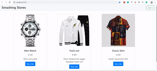
Conclusion
The concept learned in this article can help you create almost anytime of web apps without paying so much attention to your back-end infrastructure. You can take it further by creating a full-fledged e-commerce store and adding payment etc. I’ll love to see what you were able to make in the comments section.
The supporting repo for this article is available on Github.
References
(ks, yk, il)
Setting Up Tailwind CSS In A React Project
Setting Up Tailwind CSS In A React Project
Blessing KrofeghaIn the dispensation of CSS libraries and frameworks, a ton of awesome libraries have been built to simplify the work of a developer in the quest to create intuitive interfaces. However, quite a lot of them (Bootstrap, Foundation) impose design decisions that are difficult to undo; they come with predefined components, therefore, eliminating the need for dynamic customization. This is the reason why Tailwind CSS is considered to be a good choice for building 21st-century web interfaces.
With Tailwind CSS, you get to create the components that suit what you want or what you are working on. These components can be created by harnessing the power of the utility-first prowess of Tailwind CSS. If you are tired of making use of Bootstrap and its likes, you’ll find Tailwind CSS a good fit for working on beautiful interfaces as you implement the designs you need using the utility classes it provides.
In this tutorial, you will learn what Tailwind CSS is and how to work with it. In the end, you’ll have built a profile card that uses Tailwind CSS utility classes. After that, you can go on to build a portfolio website that showcases your skills and other things you have worked on.
Note: While we won’t be writing CSS in this tutorial, a good knowledge of CSS will come in handy as you work through what we will be covering.
Styling In Modern Web Apps
There are different ways of organizing styling in modern applications which often have complex interfaces and design patterns. Let’s walk through BEM, preprocessors, CSS-in-JS and even design systems to find out what works best for you. Learn more →
What Is Tailwind CSS?
Tailwind CSS is a utility-based low-level CSS framework intended to ease building web applications with speed and less focus to writing custom CSS, without leaving the comfort zone of your HTML code, yet achieve awesome interfaces.
For example, you could style a button with just a few classes (instead of always having to declare a single big class separately from your HTML and writing a bunch of properties to make something):
<button class="bg-blue-500 hover:bg-blue-700 text-white font-bold py-2 px-4 rounded ml-4 mt-4">
  Button
</button>
Other CSS frameworks (such as Bootstrap, Foundation, Bulma, and so on) present you with diverse predefined components (such as modals, buttons, alerts, cards). But with Tailwind CSS, you get to make your own, or you’re forced to make your own depending on your project model. Another way to put it, you actually own the components, and you get to harness your customization power on any component of your choice. This means that there is no more need to fight against the framework, and trying to figure out which classes need to be overridden in order to get results you initially aimed for.
Why Use Tailwind CSS?
Maybe you’re not quite ready to betray other frameworks yet, or you haven’t been convinced to embrace the goodies that come with Tailwind CSS. Allow me to give you a few reasons why you may want to consider Tailwind CSS.
No Naming Conventions
One of the most stressful parts of writing custom CSS is having to name classes. At every point, you’re pondering which class should be generic or specific. How do you organize them and ensure they’re cascaded? Tailwind CSS solves those problems seamlessly by providing utility-based classes that can be used all the time.
However, cases may arise where you need to name some classes. Sometimes this tends to happen when you need to extract certain components and use them later in your design (with the help of the @apply directives).
Cache Benefits
When writing custom CSS (or using any other traditional CSS framework), you always have to make changes to your CSS files when making changes in your designs. With Tailwind CSS, you need not worry a bit about that since you’re using the same classes over and over again within the markup. This means that you do not have to bust your CSS cache everytime in order to make small changes to your design.
When Not To Use Tailwind CSS
Are you saying I should always use Tailwind CSS for every project? Of course not! There are a few use cases where you may not want to use Tailwind CSS.
If You’re Working On A Small Projects
When you need to get started with a mini-project that has a very short deadline (especially something a few users would be using or only yourself), then Tailwind CSS is not the best option. In those cases, I’d recommend using Bootstrap, Foundation or any other framework instead. That’s because they come with predefined ready-to-use components (themes to get started with). With Tailwind CSS, you have to creatively create your own.
If You’re A CSS Beginner
Before diving into Tailwind CSS for any project, its advisable to know CSS. Beginners that desire to use Tailwind CSS for web-based projects should first master CSS to a certain degree. It provides utility classes that are linked to the underlying CSS, therefore, only those with a solid knowledge of CSS can easily build with it.
If You Dislike Adding A Lot Of Classes To Your Elements
When writing Tailwind CSS, you always have to write lots of classes, which makes your codebase (HTML) look busy and sometimes difficult to read. If you prefer keeping your code neat, you may want to consider writing custom CSS or use any other CSS framework (such as Bootstrap).
With these reasons, it’s about time to move over to the business of the day: let’s set up Tailwind CSS in a React project together!
Getting Started
To set up our project, we’ll scaffold a new React app using create-react-app. If you have already done this, skip this process, otherwise, run the command below:
npx create-react-app react-tailwindcss && cd react-tailwindcss
Next, we install a few development dependencies. You can use any of the options that work for you.
Using npm
npm install tailwindcss postcss-cli autoprefixer -D
Using Yarn
yarn add tailwindcss postcss-cli autoprefixer -D
We need to initialize Tailwind CSS by creating the default configurations. Type the command below in your terminal:
npx tailwind init tailwind.js --full
This command creates a tailwind.js in your project’s base directory; the file contains the configuration, such as our colors, themes, media queries, and so on. It’s a useful file that helps with predefined sets of properties which will aid the need to re-brand certain conventions or properties if the need arises.
How To Configure PostCSS?
The PostCSS documentation states that:
“PostCSS is a tool for transforming styles with JS plugins. These plugins can lint your CSS, support variables and mixins, transpile future CSS syntax, inline images, and more.”
Why Autoprefixer?
It’s necessary to install Autoprefixer alongside Tailwind CSS because Autoprefixer usually tracks caniuse.com to see which CSS properties need to be prefixed. Hence, Tailwind CSS does not provide any vendor prefixing. If you’re curious as a cat in regards to PostCSS navigate to their documentation.
Create a PostCSS configuration file in your base directory manually or using the command:
touch postcss.config.js
Add the following lines of code to your PostCSS file:
const tailwindcss = require('tailwindcss');
module.exports = {
    plugins: [
        tailwindcss('./tailwind.js'),
        require('autoprefixer')
    ],
};
Because PostCSS is necessary to lint our CSS, hence this configuration.
Code Steps
- We fetched the Tailwind CSS package and placed it in a variable.
- We wrapped tailwind.js (our default base configuration) in our
tailwindcssvariable. - We fetched the
autoprefixerpackage.
How To Inject Tailwind’s Components, Utilities And Base Styles To Your App
Inside your src folder create a folder, name it assets, this is where all your styles would be stored. In that folder, create a tailwind.css file and main.css file respectively. The tailwind.css file will be used by us to import Tailwind CSS styles, and for custom configurations and rules. The main.css will hold the styles that are generated as a result of what we have in the tailwind.css file.
Next, we need to import the base styles and configurations. We will do that in one of the CSS files we created above. Add the following to your tailwind.css file.
@tailwind base;

@tailwind components;

@tailwind utilities;
Note that we used the @tailwind directive to inject Tailwind’s base, components, and utilities styles into our CSS:
@tailwind base
This injects Tailwind’s base styles, which is a combination ofNormalize.cssand some additional base styles.
Note: If you’d like to get the complete references of all the styles applied by Preflight, see this stylesheet.@tailwind components
This injects any component (reusable styles like cards and form elements, etc.) classes registered by plugins based in our config file.@tailwind utilities
This injects all of Tailwind’s utility classes(including the default and your own utilities) they are generated based on our config file.
Tailwind CSS will swap these directives out at build time with all of its generated CSS. If you’re using postcss-import, use this instead:
@import "tailwindcss/base";

@import "tailwindcss/components";

@import "tailwindcss/utilities";
How To Configure Your App To Build Your CSS
Next, we need to configure our project to build our CSS styles each time we run either the npm start or yarn start command.
Open your package.json file and use the snippet below in place of the script part of your package.json file:
"scripts": {
    "start": "npm run watch:css && react-scripts start",
    "build": "npm run build:css && react-scripts build",
    "test": "react-scripts test",
    "eject": "react-scripts eject",
    "build:css": "postcss src/assets/tailwind.css -o src/assets/main.css",
    "watch:css": "postcss src/assets/tailwind.css -o src/assets/main.css"
  },
Importing Our CSS
We need to import our CSS file appropriately to ensure that it’s properly watched and built when we run yarn start or npm start.
Open your index.js file and make the following changes:
- Import our main.css file and delete
import './index.css';.
Your *index.js* should look like this after the changes:import './assets/main.css'import React from "react"; import ReactDOM from "react-dom"; import './assets/main.css'; import App from "./App"; ReactDOM.render(<App />, document.getElementById("root")); - Head over to App.js and delete
import logo from './logo.svg';leaving onlyimport React from 'react';. Also delete everything inside theAppcomponent. (Don’t worry if our App.js looks barren now — we’ll add some code as we proceed in this post.)
Let’s Build A Profile Card Project
Now that our setup works well, and everything looks good, let’s build a Profile Card. However, I’d like to show you what the state of our app before we begin.

To start your app, type this command npm start or yarn start.
You’d observe that our Tailwind CSS is building the necessary files needed in main.css.
Let’s get started in our project. Here’s what our code (App.js) looks like without implementing Tailwind CSS classes.
import React from 'react';
function App() {
  return (

    <div className="">
      <img className="" src={require('./profile.jpg')} alt="Display" />
      <div className="">
        <div className="">
          Blessing Krofegha
        </div>
        <p className="">
          When i’m not coding i switch to netflix with biscuits and cold tea as my companion. <span></span>😜
        </p>
      </div>
      <div className="">
        <span className="">#Software Engineer</span>
        <span className="">#Writter</span>
        <span className="">#Public Speaker</span>
      </div>
    </div>
  );
}
export default App;
The outcome of the above code snippet is thus the following:

As you can see, all of the text has been aligned to the left by default. The image is pretty big because there is no styling. The App component has four main divs to which we’ll be adding classes to. This will then, of course, change the styling of the elements.
First div
import React from 'react';
function App() {
  return (

    <div className="max-w-sm rounded overflow-hidden shadow-lg">
      <img className="w-full" src={require('./profile.jpg')} alt="Display" />
      <div className="">
        <div className="">
          Blessing Krofegha
        </div>
        <p className="">
          When I’m not coding, I switch to Netflix with biscuits and cold tea as my companion. <span></span>😜
        </p>
      </div>
      <div className="">
        <span className="">#Software Engineer</span>
        <span className="">#Writter</span>
        <span className="">#Public Speaker</span>
      </div>
    </div>
  );
}
export default App;
Code Steps
We gave the div max-width with max-w-sm for small screens and have added border-radius using the rounded class. To prevent scrolling bars from showing up, we used overflow-hidden.
On the first div, we garnished our background with a shadow effect using box-shadow with the shadow-lg class. Using this means that we’d be having a box-shadow(shadow effect) of 0px from the top, 10px from the right, 15px from the bottom, and -3px from the left (with a faint black on the left axis).
On the right axis, we’ve got 0px from the top, 4px from right, 6px from the bottom and -2px from the bottom (with a lighter shade of black rgba(0,0,0, 0.05)).
Do you mean a simple class name such as max-w-sm rounded overflow-hidden shadow-lg is responsible for all of this awesomeness? Yes! That’s the awesomeness of Tailwind CSS!
Next, we gave img a width of 100% with w-full and an src attribute and, of course, an alt attribute.
Here’s how our new Profile card should look like:

Second div
Add this class px-6 py-4 to our second div:
import React from 'react';
function App() {
  return (

    <div className="max-w-sm rounded overflow-hidden shadow-lg">
      <img className="w-full" src={require('./profile.jpg')} alt="Display" />
      <div className="px-6 py-4">
        <div className="">
          Blessing Krofegha
        </div>
        <p className="">
          When i’m not coding i switch to netflix with biscuits and cold tea as my companion. <span></span>😜
        </p>
      </div>
      <div className="">
        <span className="">#Software Engineer</span>
        <span className="">#Writter</span>
        <span className="">#Public Speaker</span>
      </div>
    </div>
  );
}
export default App;
Code Steps
In our second div, we gave it a padding-right/left of 1rem representing px-6 in the x-axis and padding-top/bottom of 1.5rem which is py-4 in the y-axis.

Third div
Add the class font-bold text-purple-500 text-xl mb-2 to our second div:
import React from 'react';
function App() {
  return (

    <div className="max-w-sm rounded overflow-hidden shadow-lg">
      <img className="w-full" src={require('./profile.jpg')} alt="Display" />
      <div className="px-6 py-4">
        <div className="font-bold text-purple-500 text-xl mb-2">
          Blessing Krofegha
        </div>
        <p className="text-gray-700 text-base">
          When i’m not coding i switch to netflix with biscuits and cold tea as my companion. <span></span>😜
        </p>
      </div>
      <div className="">
        <span className="">#Software Engineer</span>
        <span className="">#Writter</span>
        <span className="">#Public Speaker</span>
      </div>
    </div>
  );
}
export default App;
Code Steps
We set the font-weight to a value of 700 with font-bold class. Next, we gave our div a light purple color using text-purple-500 and made our font-size extra small by using text-xl. We gave our div a margin-bottom of 0.5rem by using mb-2. We also added a paragraph and made its color a darker shade of gray using text-gray-700.
We added a light text color to our paragraph with text-gray-700 and a font size of 1em using text-base. Therefore, text-base is equal font-size: 1rem and text-gray-700 is equal color: #4a5568;
Let’s see what changes were made with our 3rd div:

Fourth div
import React from 'react';
function App() {
  return (

    <div className="max-w-sm rounded overflow-hidden shadow-lg">
      <img className="w-full" src={require('./profile.jpg')} alt="Display" />
      <div className="px-6 py-4">
        <div className="font-bold text-purple-500 text-xl mb-2">
          Blessing Krofegha
        </div>
        <p className="text-gray-700 text-base">
          When i’m not coding i switch to netflix with biscuits and cold tea as my companion. <span></span>😜
        </p>
      </div>
      <div className="px-6 py-4">
        <span className="inline-block bg-gray-200 rounded-full px-3 py-1 text-sm font-semibold text-gray-700 mr-2">#Software Engineer</span>
        <span className="inline-block bg-gray-200 rounded-full px-3 py-1 text-sm font-semibold text-gray-700 mr-2">#Writter</span>
        <span className="inline-block bg-gray-200 rounded-full px-3 py-1 text-sm font-semibold text-gray-700 mt-2 ml-20">#Public Speaker</span>
      </div>
    </div>
  );
}
export default App;
Code Steps
Like the previous div mentioned above, we added a padding-right/left of 1rem representing px-6 in the x-axis and padding-top/bottom of 1.5rem respectively representing py-4 in the y-axis.
Lastly, we added a few classes to our spans which include inline-block. What this does is sets the display of the span which means the element is treated like other inline elements but allows the use of block properties.
We added a background-color of gray using bg-gray-200 and created a border-radius of 9999px using the rounded-full class; px3 adds padding to the x-axis while py-1 adds padding in the y-axis. text-sm is added to make the font-size of the text small and text-gray-700 was used to add a dark shade of gray color to the text. We went on to add margin-right to the span element.
If you’ve been carefully following along, then you should have something similar:

Note: You can replace the image with an image of your choice (preferably yours) and also personalize the content any way you wish.
Conclusion
I hope you enjoyed this tutorial. Of course, you can take always take it a bit further by making this a little profile application that says much more about you beyond the little information we have above. For example, you could go on to share a list of skillsets that you have, or add a table to projects you have worked on and possibly a contact form. Let your creativity flow, and please do share your projects in the comments section below — I’d love to see what you come up with!
The supporting repo for this article is available on GitHub.
Tailwind CSS Documentation (official Tailwind CSS website)
“Tailwind CSS In JavaScript,” Christoph Benjamin Weber
(ks, il)