Graphs and charts are some of the most visually complex and difficult elements for designers to execute to a high standard. The range of different elements and requirement for cohesiveness make it all the more impressive when a great example is included in website design.
Some of the best examples incorporate plenty of color for visual differentiation, clean connecting lines and shapes, and easy-to-understand axis. When designed to a high standard, the results can have a dramatic impact on the overall visual design and user experience of the website.
Your Web Designer Toolbox
Unlimited Downloads: 500,000+ Web Templates, Icon Sets, Themes & Design Assets

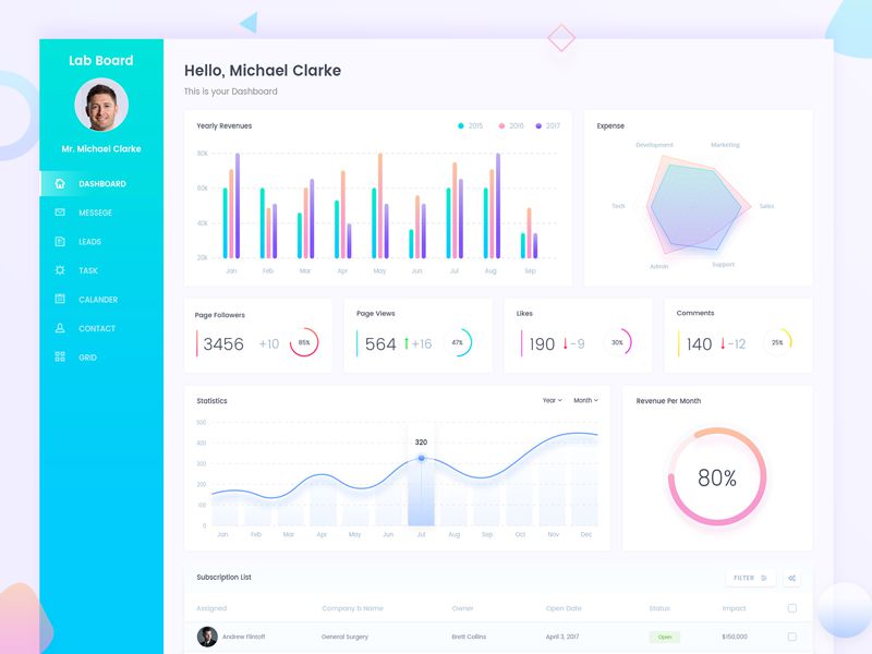
Lab Board
Lab Board uses a beautiful consistent selection of colors, subtle gradients, and large drop shadows in their dashboard design.
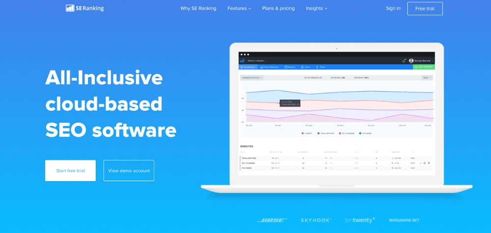
SE Ranking
SE Ranking shows off their graphical user interface dashboard via the homepage. The graphs are simple and easy to understand, using a selection of light colors which complement each other perfectly.
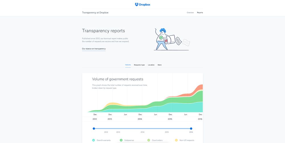
Dropbox Transparency
Dropbox’s Transparency web page highlights some interesting data on how many government requests they receive. The graph is designed beautifully with great color selection and separation, and a clearly defined key to match.
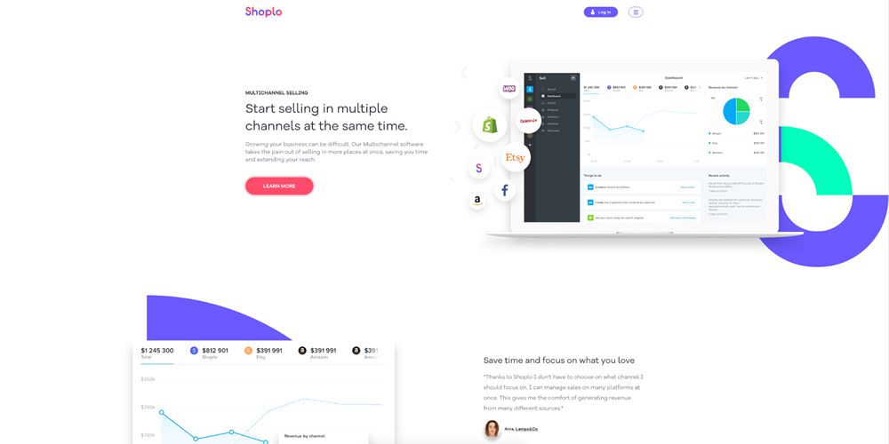
Shoplo
Shoplo’s website is impressive in its unique use of background elements and bright multitude of color throughout. The graphs used in their dashboard follow this trend using subtle gradients and strokes to outline data trends to the user.
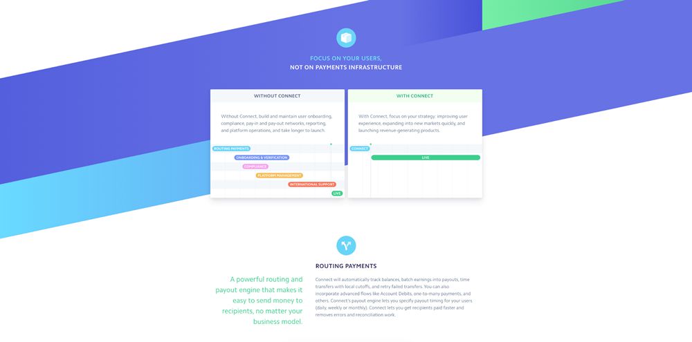
Stripe Connect
Stripe Connect uses Gantt charts to illustrate how their platform can speed up several aspects of payment processing. The design is much simplified and uses a selection of brand colors to differentiate each aspect within the chart.
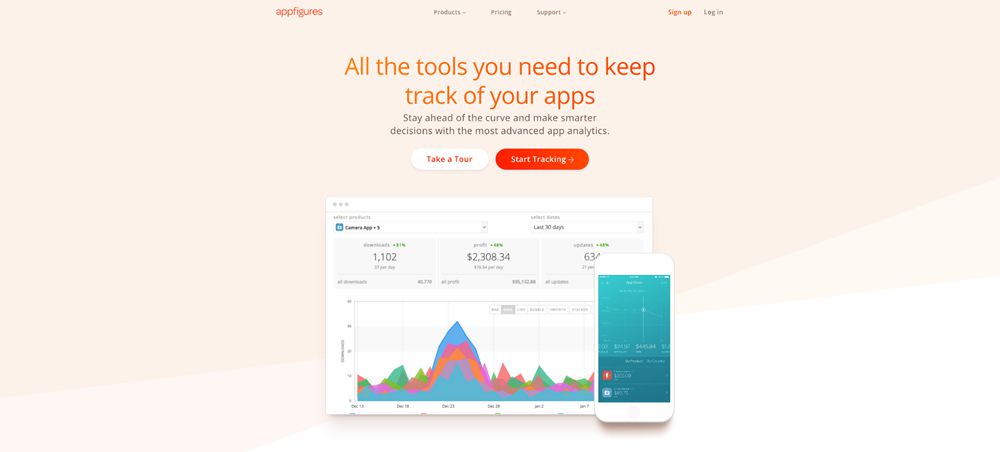
Appfigures
Appfigures’ tools present many challenges in the fact they have to often display an enormous quantity of data at once. They have solved this issue beautifully by incorporating transparency into the vibrant graph background colors.
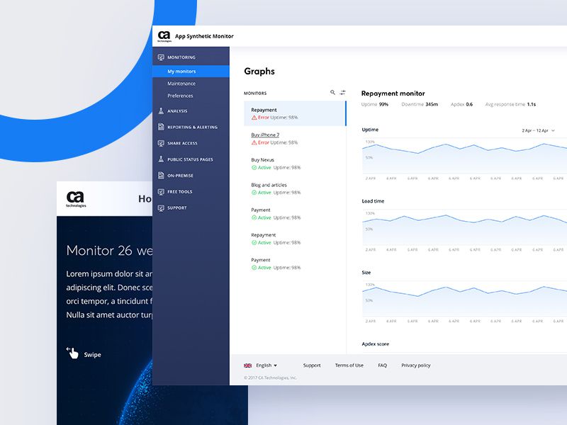
CA Technologies
CA Technologies keeps it simple for the graphs within their website. It uses a blue stroke with an underlying gradient which fades out to the x-axis. The simplicity makes it extremely easy to understand and fits perfectly with their brand direction and user interface colors.
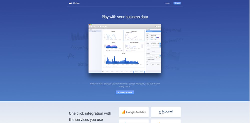
Median for Mac
Median for Mac’s website focuses on a screenshot of their Mac application with is almost entirely graph and chart based. The graph and chart designs are simple and keep the colors within those of the Median brand.
Unamo
Unamo uses line graphs within their search engine optimisation software. The lines are plotted with circular strokes and use a beautiful on-brand, three-tone color system of green, purple and blue.

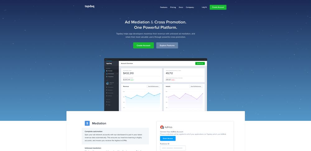
Tapdaq
Tapdaq’s homepage also uses line graphs within the dashboard preview. The blue and purple line strokes compliment each other beautifully, while the fade-out gradient brings attention to the axis and overall volume of data.