4 Web Design Hacks You Can Use to Enhance Your Website on a Budget

web design hacks

Image credit

Having a functional, usable, and super fast website doesn’t have to cost an arm and a leg.

As a web designer, you can use a few pieces of code or some minor tweaks to ensure a much faster and better appealing web design.

Without having to fork out thousands of dollars to a designer, and without having to change the underlying infrastructure of your website, here are four simple web design hacks that can enhance your website today:

  1. Use HTML5 DOM Storage (Instead of Cookies) to Ensure a Faster Website 
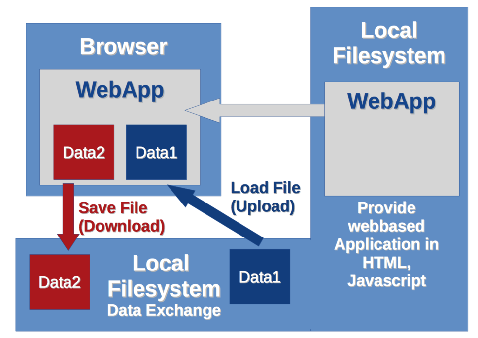
local storage

Image Credit

Depending on how big a website/web page is, it “costs” quite a bit of data and bandwidth to load that website when you rely only on cookies. When this website is loaded repeatedly for a lot of users, depending on the server it is hosted on, the result can be a slower website (due to increased strain on available server resources) and increased hosting costs.

Often, this is because of how cookies are used: cookies are generally only necessary when there is a need for client-server communication between a user’s browser and your server.

If there’s no need for a user’s browser to interact with your server before the user experience is fulfilled, you should consider using DOM storage instead of cookies.

DOM Storage can take the following forms:

  • sessionStorage in which data is stored in a user’s browser for the current session
  • localStorage in which data is stored in a user’s browser without an expiration date

You generally want to focus on localStorage. With this, data is stored in the user’s browser and won’t be deleted even if they close their current browsing session. This will reduce server connection requests and make your website a lot faster for the user.

So how does this work? Assuming you want to store the “name” value in a user’s browser, for example, you will have:

// Store 
localStorage.name = “Firstname Lastname”; 

To retrieve the value:

// Retrieve 
document.getElementById(“result”).innerHTML = localStorage.name;

To remove the value:

localStorage.removeItem(“lastname”);

What if you want to check if localStorage is available? You can use:

function supports_html5_storage() {
try {
return ‘localStorage’ in window && window[‘localStorage’] !== null;
} catch (e) {
return false;
}
}

  1. Achieve Better Image Styling by Using the <Picture> Element

Image credit

In a world that is heavily reliant on images — research shows that our brains process images a lot faster than text — being able to effectively manipulate images is one of the key advantages you can have as a web designer; and this goes beyond looking for the best photo editing app out there today.

Being able to properly style images is a web design super power for a few key reasons:

  • It makes your web design a lot faster since you’re able to control when and how images should load.
  • It gives you a lot of flexibility when it comes to which image/version of your design users should see depending on their device.
  • It allows you to serve different images/image formats for different browser types.
  • It allows you to save money you’d have otherwise spent creating different design versions with different image elements.

So how do you go about achieving this? By effectively leveraging the HTML <picture> tag.

Here’s an example code:

<picture>
<source media=”(min-width: 600px)” srcset=”img001.jpg”>
<source media=”(min-width: 250px)” srcset=”img123.jpg”>
<img src=”img234.jpg” alt=”Header” style=”width:auto;”>
</picture>

In essence, the above code involves three images; the original “img234.jpg” which is displayed. Under certain conditions, however, other images could be served. For example, the code says “img001.jpg” should be served for devices with a minimum width of 600px, “img123.jpg” should be served for devices with a minimum width of 250px. You could add more lines of code to specify more possibilities.

Some sub-elements and attributes that can be used for this tag include:

  • The <source> subelement to specify media resources.
  • The <img> subelement to define an image.
  • The srcset attribute that is used to specify different images that could be loaded depending on the size of the viewport; you use this when dealing with a set of images as opposed to just one image (in which case you use the src attribute).
  • The media attribute that the user agent evaluates for every source element.
  1. Enable GZIP Compression via .htaccess to Boost Site Speed

Image credit

No matter how well-designed a website is, it won’t make much of a difference if the website is slow.

This is why it is important to make sure you enable proper compression to minimize the number of files that have to be loaded and as a result get a website speed boost. The best way to do this is via GZIP compression.

You can enable GZIP compression by adding the following code to a web server’s .htaccess file:

<ifModule mod_gzip.c>
mod_gzip_on Yes
mod_gzip_dechunk Yes

mod_gzip_item_include file .(html?|txt|css|js|php|pl)$
mod_gzip_item_include handler ^cgi-script$
mod_gzip_item_include mime ^text/.*

mod_gzip_item_include mime ^application/x-javascript.*
mod_gzip_item_exclude mime ^image/.*
mod_gzip_item_exclude rspheader ^Content-Encoding:.*gzip.*
</ifModule>

If your web server doesn’t have .htaccess, there are also instrunctions for NGINXApache, and Litespeed.

  1. Combine Fonts to Spice Up Your Design

Typography is generally believed to be the most important part of a design, so the fonts you use will go a long way to influence how your design is perceived.

So much has been written about selecting fonts, so I won’t be covering that again in this article. One hack I’d like to recommend you give a shot, however, is combining multiple fonts.

You can combine two, three, or more fonts to make your web design look a lot more appealing. Fonts can be combined in a logo, layout, or the actual web design itself, combining fonts can go a long way to make your website look different.

That said, there are a few rules you might want to stick to if you want to get results from combining fonts. These include:

  • Choosing fonts from the same superfamily. This is especially important if you’re a beginner designer or not familiar with how to pair fonts.
  • If you’re not sure where to start, you might want to start by pairing a serif font with sans serif and see how that looks.
  • Consider the flow of content on your web design when combining fonts — since fonts influence content readability, you want to make sure that the fonts you use match the attribute of the message that will be displayed and as a result flows.
  • You also want to make sure that the fonts you pair contrast with each other — this is one of the reasons why pairing serif and sans serif might be a good place to start. Contrast can be achieved through size, style, spacing, and weight.

Read More at 4 Web Design Hacks You Can Use to Enhance Your Website on a Budget

4 Web Design Principles You Should Never, Ever Violate

Web design is both a science and an art. While you could be very talented and creative when it comes to web design, there are scientific principles you must never, ever violate.

For example, do you know that there is a right and a wrong way to go about redesigning a website — and that there is a principle you must never violate? Snapchat wouldn’t have suffered badly after its redesign if it operated in accordance with this principle. Do you also know that you shouldn’t just design CTAs because you like a color, or because a particular color performed really well according to an article comparing the performance of different CTA colors? Instead, there is a principle you must follow.

While there are many web design principles you should gradually familiarize yourself with, there are four key principles you must never, ever violate as a web designer. The principles are listed below:

Principle #1: Fitts’ Law

In the most basic sense, Fitts’ law states that the time it will take a person to move a pointer to a target area will be determined by the distance to the target divided by the size of the target. Consequently, a small target size over a long distance leads to poor UX, a big target size over a long distance leads to better UX, and a big target size over a short distance leads to the best UX.

Fitts law

Image Credit

When you design important elements in violation of Fitts’ law, it becomes increasingly difficult for users to interact with key elements in your design and conversion offers. 

The core lesson is this: when designing elements that will require quite some distance to interact with, make them bigger. If your elements cannot be bigger, then try to reduce the distance required by a user to locate them.

Principle #2: Law of Neural Adaptation

There has been a lot of debate in the web design world about the use of color when it comes to CTAs; in particular, designers are crazed about whether the color red, or blue, or orange is the best when it comes to CTAs, but it wouldn’t really matter once you understand the law of neural adaptation.

In essence, the law of neural adaptation states that we eventually tune out stimulus after repeated (or long) exposure to it. For you as a web designer, this affects your use of color. For example, if you designed a long sales page with the blue color scheme in which most of the elements are blue, using a blue CTA as well will result in poor conversions. This is because users are already accustomed to the blue color and are less likely to pay attention to the blue CTA; it doesn’t stand out to them and as a result is ignored.

The solution is simple then: use a color that contrasts with the main color of your design. In our example, a site that uses a blue color scheme that then uses an orange CTA is likely to perform better. This is because the orange color is different from the main color scheme used on the site — users are yet to adapt to it — and it is likely to stand out and be noticed when it is suddenly introduced.

The comparison of website builders in the screenshot below is a very good example that illustrates this point. The site generally uses a blue color scheme but uses an orange CTA that stands out and is easily noticeable.

neural adaptation example

The lesson for you as a web designer is simple: pay attention to neural adaptation and learn to make use of the power of contrast when designing key elements. Important elements of your web design should use a different color from that of the main color scheme to help them stand out.

Principle #3: Hick’s Law

If you want to design websites that convert, your website must be designed with an understanding of the principle of choice. More importantly, you want to understand Hick’s Law and design your website based on it.

Hicks law

Image Credit

Named after British psychologist William Edmund Hick, Hick’s law states that the amount of choice a person is given will logarithmically influence how long it will take the person to reach a decision: in basic terms, increasing the number of choices presented to users will logarithmically increase their decision time and decreasing the number of choices will likewise decrease users’ decision time logarithmically.

While it might be a bit difficult to truly understand this concept just yet, take a look at the following interesting facts:

  • A one-second delay in how long it takes a page to load will result in a 7 percent decrease in conversions.
  • Removing just one form field can boost conversions by up to 50 percent.
  • 60 percent of online job seekers abandon a web form due to its length or complexity.

As you can see from the above statistics, true to Hick’s law, increasing the number of your form fields will increase the time required to complete the fields and bring about a resulting drop in conversions while decreasing the number of your form fields will reduce the time required to complete the fields and bring about a drop in conversions.

As a web designer, you should avoid violating Hick’s law by limiting the choices presented to users when designing options that will give them choices that they have to act on.

Principle #4: Weber’s Law of Just Noticeable Difference

While, as web designers, we’re very familiar with more than a few instances of backlashes as a result of a web design change, perhaps no web design woe stands out in recent memory like that of Snapchat.  

Snapchat’s redesign was such a failure that it got public condemnation from highly-influential celebrity and one of its most high-profile users, Kylie Jenner, resulting in a $1.5 billion loss in Snapchat’s value in just one day!

What web design principle did Snapchat violate to bring about such wide public rebuke? It is Weber’s Law of Just Noticeable Difference.

In Weber’s law of just noticeable difference, “just noticeable difference” refers to the minimum amount by which stimulus intensity must change before it can be perceived by the senses. In other words, if the change is barely noticeable then there won’t be a reaction; if the change is too drastic, however, there could be a backlash.

For you as a web designer, the key lesson is to embrace an iterative approach to web design: spread out your design changes and introduce them gradually until users have a completely new design that they gradually grew accustomed to. Depending on the size of your audience, making design changes that are too drastic can easily backfire.

Ayodeji Onbalusi is the founder of digital marketing agency Effective Inbound Marketing and online reputation management agency BoostMyMedia.com. He’s an experienced content marketing strategist and can be reached via LinkedIn.

Read More at 4 Web Design Principles You Should Never, Ever Violate