In Part 1 of this article, we developed a web component for an interactive Gantt Chart. Now we will enhance the Gantt Chart component with some interaction possibilities for editing the jobs: the job bars are made resizable by mouse-dragging, and we also implement an editing dialogue that can be used to modify the start and end dates of a job. In doing so, we will continue to work with Vanilla JS and Web Components. In the end, we will look at some JavaScript libraries that can greatly simplify the effort of developing a fully functional Gantt Chart.
The following video shows what we are going to build in this article. First, we will add a drag handle on the right-hand side of each job that can be used for resizing the job bar (in the picture, it’s shown as a narrow gray vertical bar). In the next step, we will further extend the behavior of the jobs so that double-clicking on a job bar opens an editing dialogue.
Building on this, the functionality of the chart can be extended further.
JavaScript Gantt Chart By Bryntum
Another example that is worth considering is the Bryntum Gantt library, “a super-fast and fully customizable Gantt chart suite.”
After downloading a free trial of the library, you will get a build folder with CSS and JavaScript files for creating interactive Gantt charts. You can integrate these files into your web app and then immediately configure your individual chart. A simple getting started guide provides a quick introduction to the component. For example, a basic chart could look like this with the Bryntum Gantt library:
You will learn a lot about the numerous customization options in the full Bryntum Gantt documentation. You will also explore how the tool can be integrated with popular frameworks like Angular, React, Vue, and many more or how to organize the loading and saving of data (CRUD data management).
The examples section provides a visual overview of the various features of Bryntum Gantt.
They also offer Bryntum Scheduler — a library for resource planning.
JavaScript Gantt Chart By Webix
With Webix Gantt, another commercial Gantt library with rich functionality is available. The uncomplicated steps for installing, creating, and configuring a Gantt chart are documented in detail.
Gantt Charts are a valuable visualization for project management, planning, and task organization. There are many ways to integrate Gantt Charts into a web application. In the last two articles, we built an interactive Gantt Chart from scratch, and in doing so, we learned a lot about CSS grids, Web Components, and JavaScript events. If you have more complex requirements, it is worth looking at the commercial JS libraries, which are often very powerful.
If you work with time data in your app, a graphical visualization as a calendar or Gantt chart is often very useful. At first glance, developing your own chart component seems quite complicated. Therefore, in this article, I will develop the foundation for a Gantt chart component whose appearance and functionality you can customize for any use case.
These are the basic features of the Gantt chart that I would like to implement:
The user can choose between two views: year/month or month/day.
The user can define the planning horizon by selecting a start date and an end date.
The chart renders a given list of jobs that can be moved by drag and drop. The changes are reflected in the state of the objects.
Below you can see the resulting Gantt chart in both views. In the monthly version, I have included three jobs as an example.
Below you can see the resulting Gantt chart in both views. In the monthly version, I have included three jobs as an example.
Sample Files And Instructions For Running The Code
You can find the full code snippets of this article in the following files:
Since the code contains JavaScript modules, you can only run the example from an HTTP server and not from the local file system. For testing on your local PC, I’d recommend the module live-server, which you can install via npm.
I decided to implement the Gantt chart as a web component. This allows us to create a custom HTML element, in my case <gantt-chart></gantt-chart>, which we can easily reuse anywhere on any HTML page.
You can find some basic information about developing web components in the MDN Web Docs. The following listing shows the structure of the component. It is inspired by the “counter” example from Alligator.io.
The component defines a template containing the HTML code needed to display the Gantt chart. For the complete CSS specifications, please refer to the sample files. The specific selection fields for year, month or date cannot be defined here yet, as they depend on the selected level of the view.
The selection elements are projected in by one of the two renderer classes instead. The same applies to the rendering of the actual Gantt chart into the element with the ID gantt-container, which is also handled by the responsible renderer class.
The class VanillaGanttChart now describes the behavior of our new HTML element. In the constructor, we first define our rough template as the shadow DOM of the element.
The component must be initialized with two arrays, jobs, and resources. The jobs array contains the tasks that are displayed in the chart as movable green bars. The resources array defines the individual rows in the chart where tasks can be assigned. In the screenshots above, for example, we have 4 resources labeled Task 1 to Task 4. The resources can therefore represent the individual tasks, but also people, vehicles, and other physical resources, allowing for a variety of use cases.
Currently, the YearMonthRenderer is used as the default renderer. As soon as the user selects a different level, the renderer is changed in the changeLevel method: First, the renderer-specific DOM elements and listeners are deleted from the Shadow DOM using the clear method of the old renderer. Then the new renderer is initialized with the existing jobs and resources and the rendering is started.
import {YearMonthRenderer} from './YearMonthRenderer.js';
import {DateTimeRenderer} from './DateTimeRenderer.js';

const template = document.createElement('template');

template.innerHTML =
 `<style> … </style>

  <div id="gantt-settings">

    <select name="select-level" id="select-level">
      <option value="year-month">Month / Day</option>
      <option value="day">Day / Time</option>
    </select>

    <fieldset id="select-from">
      <legend>From</legend>
    </fieldset>

    <fieldset id="select-to">
      <legend>To</legend>
    </fieldset>
  </div>

  <div id="gantt-container">
  </div>`;

export default class VanillaGanttChart extends HTMLElement {

    constructor() {
      super();
      this.attachShadow({ mode: 'open' });
      this.shadowRoot.appendChild(template.content.cloneNode(true));
      this.levelSelect = this.shadowRoot.querySelector('#select-level');
    }

    _resources = [];
    _jobs = [];
    _renderer;

    set resources(list){…}
    get resources(){…}
    set jobs(list){…}
    get jobs(){…}
    get level() {…}
    set level(newValue) {…}
    get renderer(){…}
    set renderer(r){…}

    connectedCallback() {
      this.changeLevel = this.changeLevel.bind(this);

      this.levelSelect.addEventListener('change', this.changeLevel);
      this.level = "year-month";

      this.renderer = new YearMonthRenderer(this.shadowRoot);
      this.renderer.dateFrom = new Date(2021,5,1);
      this.renderer.dateTo = new Date(2021,5,24);
      this.renderer.render();
    }

    disconnectedCallback() {
      if(this.levelSelect)
        this.levelSelect.removeEventListener('change', this.changeLevel);
      if(this.renderer)
        this.renderer.clear();
    }

    changeLevel(){
      if(this.renderer)
        this.renderer.clear();

      var r;

      if(this.level == "year-month"){
        r = new YearMonthRenderer(this.shadowRoot);
      }else{
        r = new DateTimeRenderer(this.shadowRoot);
      }

      r.dateFrom = new Date(2021,5,1);
      r.dateTo = new Date(2021,5,24);
      r.resources = this.resources;
      r.jobs = this.jobs;
      r.render();
      this.renderer = r;
    }
  }

  window.customElements.define('gantt-chart', VanillaGanttChart);
Before we get deeper into the rendering process, I would like to give you an overview of the connections between the different scripts:
index.html is your web page where you can use the tag <gantt-chart></gantt-chart>
index.js is a script in which you initialize the instance of the web component that is associated with the Gantt chart used in index.html with the appropriate jobs and resources (of course you can also use multiple Gantt charts and thus multiple instances of the web component)
The component VanillaGanttChart delegates rendering to the two renderer classes YearMonthRenderer and DateTimeRenderer.
Rendering Of The Gantt chart With JavaScript And CSS Grid
In the following, we discuss the rendering process using the YearMonthRenderer as an example. Please note that I have used a so-called constructor function instead of the class keyword to define the class. This allows me to distinguish between public properties (this.render and this.clear) and private variables (defined with var).
The rendering of the chart is broken down into several sub-steps:
initSettings Rendering of the controls which are used to define the planning horizon.
initGantt Rendering of the Gantt chart, basically in four steps:
initFirstRow (draws 1 row with month names)
initSecondRow (draws 1 row with days of the month)
initGanttRows (draws 1 row for each resource with grid cells for each day of the month)
initJobs (positions the draggable jobs in the chart)
export function YearMonthRenderer(root){

    var shadowRoot = root;
    var names = ["Jan", "Feb", "Mar", "Apr", "May", "Jun", "Jul", "Aug", "Sep", "Oct", "Nov", "Dec"];

    this.resources=[];
    this.jobs = [];

    this.dateFrom = new Date();
    this.dateTo = new Date();

    //select elements
    var monthSelectFrom;
    var yearSelectFrom;
    var monthSelectTo;
    var yearSelectTo;

    var getYearFrom = function() {…}
    var setYearFrom = function(newValue) {…}

    var getYearTo = function() {…}
    var setYearTo = function(newValue) {…}

    var getMonthFrom = function() {…}
    var setMonthFrom = function(newValue) {…}

    var getMonthTo = function() {…}
    var setMonthTo = function(newValue) {…}

    this.render = function(){
      this.clear();
      initSettings();
      initGantt();
    }

    //remove select elements and listeners, clear gantt-container
    this.clear = function(){…}

    //add HTML code for the settings area (select elements) to the shadow root, initialize associated DOM elements and assign them to the properties monthSelectFrom, monthSelectTo etc., initialize listeners for the select elements
    var initSettings = function(){…}

    //add HTML code for the gantt chart area to the shadow root, position draggable jobs in the chart
    var initGantt = function(){…}

    //used by initGantt: draw time axis of the chart, month names
    var initFirstRow = function(){…}

    //used by initGantt: draw time axis of the chart, days of month
    var initSecondRow = function(){…}

    //used by initGantt: draw the remaining grid of the chart
    var initGanttRows = function(){…}.bind(this);

    //used by initGantt: position draggable jobs in the chart cells
    var initJobs = function(){…}.bind(this);

   //drop event listener for jobs
   var onJobDrop = function(ev){…}.bind(this);

   //helper functions, see example files
   ...
}
Rendering The Grid
I recommend CSS Grid for drawing the diagram area because it makes it very easy to create multi-column layouts that adapt dynamically to the screen size.
In the first step, we have to determine the number of columns of the grid. In doing so, we refer to the first row of the chart which (in the case of the YearMonthRenderer) represents the individual months.
Consequently, we need:
one column for the names of the resources, e.g. with a fixed width of 100px.
one column for each month, of the same size and using the full space available.
This can be achieved with the setting 100px repeat(${n_months}, 1fr) for the property gridTemplateColumns of the chart container.
This is the initial part of the initGantt method:
var container = shadowRoot.querySelector("#gantt-container");
container.innerHTML = "";

var first_month = new Date(getYearFrom(), getMonthFrom(), 1);
var last_month = new Date(getYearTo(), getMonthTo(), 1);

//monthDiff is defined as a helper function at the end of the file
var n_months =  monthDiff(first_month, last_month)+1;

container.style.gridTemplateColumns = `100px repeat(${n_months},1fr)`;
In the following picture you can see a chart for two months with n_months=2:
After we have defined the outer columns, we can start filling the grid. Let's stay with the example from the picture above. In the first row, I insert 3 divs with the classes gantt-row-resource and gantt-row-period. You can find them in the following snippet from the DOM inspector.
In the second row, I use the same three divs to keep the vertical alignment. However, the month divs get child elements for the individual days of the month.
For the child elements to be arranged horizontally as well, we need the setting display: grid for the class gantt-row-period. In addition, we do not know exactly how many columns are required for the individual months (28, 30, or 31). Therefore, I use the setting grid-auto-columns. With the value minmax(20px, 1fr); I can ensure that a minimum width of 20px is maintained and that otherwise the available space is fully utilized:
The remaining rows are generated according to the second row, however as empty cells.
Here is the JavaScript code for generating the individual grid cells of the first row. The methods initSecondRow and initGanttRows have a similar structure.
var initFirstRow = function(){

  if(checkElements()){
        var container = shadowRoot.querySelector("#gantt-container");

        var first_month = new Date(getYearFrom(), getMonthFrom(), 1);
        var last_month = new Date(getYearTo(), getMonthTo(), 1);

        var resource = document.createElement("div");
        resource.className = "gantt-row-resource";
        container.appendChild(resource);

        var month = new Date(first_month);

        for(month; month <= last_month; month.setMonth(month.getMonth()+1)){
          var period = document.createElement("div");
          period.className = "gantt-row-period";
          period.innerHTML = names[month.getMonth()] + " " + month.getFullYear();
          container.appendChild(period);
        }
  }
}
Rendering The Jobs
Now each job has to be drawn into the diagram at the correct position. For this I make use of the HTML data attributes: every grid cell in the main chart area is associated with the two attributes data-resource and data-date indicating the position on the horizontal and vertical axis of the chart (see function initGanttRows in the files YearMonthRenderer.js and DateTimeRenderer.js).
As an example, let's look at the first four grid cells in the first row of the chart (we are still using the same example as in the pictures above):
In the DOM inspector you can see the values of the data attributes that I have assigned to the individual cells:
Let's now see what this means for the function initJobs. With the help of the function querySelector, it is now quite easy to find the grid cell into which a job should be placed.
The next challenge is to determine the correct width for a job element. Depending on the selected view, each grid cell represents a unit of one day (level month/day) or one hour (level day/time). Since each job is the child element of a cell, the job duration of 1 unit (day or hour) corresponds to a width of 1*100%, the duration of 2 units corresponds to a width of 2*100%, and so on. This makes it possible to use the CSS calc function to dynamically set the width of a job element, as shown in the following listing.
var initJobs = function(){

    this.jobs.forEach(job => {

        var date_string = formatDate(job.start);

        var ganttElement = shadowRoot.querySelector(`div[data-resource="${job.resource}"][data-date="${date_string}"]`);

        if(ganttElement){

          var jobElement = document.createElement("div");
          jobElement.className="job";
          jobElement.id = job.id;

          //helper function dayDiff - get difference between start and end in days
          var d = dayDiff(job.start, job.end);

          //d --> number of grid cells covered by job + sum of borderWidths
          jobElement.style.width = "calc("+(d*100)+"% + "+ d+"px)";
          jobElement.draggable = "true";

          jobElement.ondragstart = function(ev){
              //the id is used to identify the job when it is dropped
              ev.dataTransfer.setData("job", ev.target.id);
          };

          ganttElement.appendChild(jobElement);
        }
    });
  }.bind(this);
In order to make a jobdraggable, there are three steps required:
Set the property draggable of the job element to true (see listing above).
Define an event handler for the event ondragstart of the job element (see listing above).
Define an event handler for the event ondrop for the grid cells of the Gantt chart, which are the possible drop targets of the job element (see function initGanttRows in the file YearMonthRenderer.js).
The event handler for the event ondrop is defined as follows:
var onJobDrop = function(ev){

      // basic null checks
      if (checkElements()) {

        ev.preventDefault();

        // drop target = grid cell, where the job is about to be dropped
        var gantt_item = ev.target;

        // prevent that a job is appended to another job and not to a grid cell
        if (ev.target.classList.contains("job")) {
          gantt_item = ev.target.parentNode;
        }

        // identify the dragged job
        var data = ev.dataTransfer.getData("job");
        var jobElement = shadowRoot.getElementById(data);

        // drop the job
        gantt_item.appendChild(jobElement);

        // update the properties of the job object
        var job = this.jobs.find(j => j.id == data );

        var start = new Date(gantt_item.getAttribute("data-date"));
        var end = new Date(start);
        end.setDate(start.getDate()+dayDiff(job.start, job.end));

        job.start = start;
        job.end = end;
        job.resource = gantt_item.getAttribute("data-resource");
      }
    }.bind(this);
All changes to the job data made by drag and drop are thus reflected in the list jobs of the Gantt chart component.
Integrating The Gantt Chart Component In Your Application
You can use the tag <gantt-chart></gantt-chart> anywhere in the HTML files of your application (in my case in the file index.html) under the following conditions:
The script VanillaGanttChart.js must be integrated as a module so that the tag is interpreted correctly.
You need a separate script in which the Gantt chart is initialized with jobs and resources (in my case the file index.js).
For example, in my case the file index.js looks as follows:
import VanillaGanttChart from "./VanillaGanttChart.js";

var chart = document.querySelector("#g1");

chart.jobs = [
    {id: "j1", start: new Date("2021/6/1"), end: new Date("2021/6/4"), resource: 1},
    {id: "j2", start: new Date("2021/6/4"), end: new Date("2021/6/13"), resource: 2},
    {id: "j3", start: new Date("2021/6/13"), end: new Date("2021/6/21"), resource: 3},
];

chart.resources = [{id:1, name: "Task 1"}, {id:2, name: "Task 2"}, {id:3, name: "Task 3"}, {id:4, name: "Task 4"}];
However, there is still one requirement open: when the user makes changes by dragging jobs in the Gantt chart, the respective changes in the property values of the jobs should be reflected in the list outside the component.
We can achieve this with the use of JavaScript Proxy Objects: Each job is nested in a proxy object, which we provide with a so-called validator. It becomes active as soon as a property of the object is changed (function set of the validator) or retrieved (function get of the validator). In the set function of the validator, we can store code that is executed whenever the start time or the resource of a task is changed.
The following listing shows a different version of the file index.js. Now a list of proxy objects is assigned to the Gantt chart component instead of the original jobs. In the validator set I use a simple console output to show that I have been notified of a property change.
import VanillaGanttChart from "./VanillaGanttChart.js";

var chart = document.querySelector("#g1");

var jobs = [
    {id: "j1", start: new Date("2021/6/1"), end: new Date("2021/6/4"), resource: 1},
    {id: "j2", start: new Date("2021/6/4"), end: new Date("2021/6/13"), resource: 2},
    {id: "j3", start: new Date("2021/6/13"), end: new Date("2021/6/21"), resource: 3},
];
var p_jobs = [];

chart.resources = [{id:1, name: "Task 1"}, {id:2, name: "Task 2"}, {id:3, name: "Task 3"}, {id:4, name: "Task 4"}];

jobs.forEach(job => {

    var validator = {
        set: function(obj, prop, value) {

          console.log("Job " + obj.id + ": " + prop + " was changed to " + value);
          console.log();

          obj[prop] = value;
          return true;
        },

        get: function(obj, prop){

            return obj[prop];
        }
    };

    var p_job = new Proxy(job, validator);
    p_jobs.push(p_job);
});

chart.jobs = p_jobs;
Outlook
The Gantt chart is an example that shows how you can use the technologies of Web Components, CSS Grid, and JavaScript Proxy to develop a custom HTML element with a somewhat more complex graphical interface. You are welcome to develop the project further and/or use it in your own projects together with other JavaScript frameworks.
How To Create A Particle Trail Animation In JavaScript
How To Create A Particle Trail Animation In JavaScript
Anna Prenzel
Have you ever thought about distracting visitors of your website with a fancy, glittering particle animation for a few moments, while some data is loaded in the background? Fortunately, it’s not necessary to go very deep into graphics programming with 3D libraries like three.js. All you need instead is some basic knowledge of CSS and JavaScript and a lightweight animation library such as anime.js. In the end, we should have the following result:
A spiral shaped particle trail animation
Download And Integration Of Anime.js
You can download the anime.js library from the official GitHub site. Download the file anime.js or anime.min.js from the lib/ folder.
The CSS file styles.css defines the background color for the page and for the individual particles. The position settings are necessary so that we can later position the particles freely on the page using the CSS properties left and top.
The content of the file script.js is covered in the following section.
Generating The Particles
As the name suggests, a particle animation consists of many small particles moving in space while following a certain pattern. All particles are generated simultaneously before the animation starts.
In my example, the particles are located on an Archimedean spiral. The x and y position of a particle on the screen (aka left and top in CSS) is calculated from its position angle on the spiral:
x=a*angle*cos(angle)
y=a*angle*sin(angle)
The number of angles and thus the length of the spiral is determined by the parameter l. With the parameter a, you can control the density of the spiral.
var container = document.querySelector(".anime-container");
var n = 15;
var a = 20;
var l = 110;
for (var i = 0; i <= l; i += 1) {
  var angle = 0.1 * i;
  //shift the particles to the center of the window
  //by adding half of the screen width and screen height
  var x = (a*angle) * Math.cos(angle) + window.innerWidth / 2;
  var y = (a*angle) * Math.sin(angle) + window.innerHeight / 2;
  var dot = document.createElement("div");
  dot.classList.add("dot");
  container.appendChild(dot);
  var size = 5;
  dot.style.width = size + "px";
  dot.style.height = size + "px";
  dot.style.left = x + "px";
  dot.style.top = y + "px";
  dot.style.backgroundColor = "hsl(60, 100%, 80%)";
  }
}
This way, we get a spiral with exactly one particle per position, but a real trail effect can only be achieved if more than one particle is generated at each position. For the trail to look bushy, the positions of the individual particles must be slightly different. The anime-library provides a practical helper function for this:
anime.random(minValue, maxValue);
The size of the particles also varies randomly:
for (var i = 0; i <= l; i += 1) {
  var angle = 0.1 * i;
  //shift particles to the center of the window
  //by adding half of the screen width and screen height
  var x = (a*angle) * Math.cos(angle) + window.innerWidth / 2;
  var y = (a*angle) * Math.sin(angle) + window.innerHeight / 2;
  var n = 15;

  //create n particles for each angle
  for (var j = 0; j < n; j++) {
    var dot = document.createElement("div");
    dot.classList.add("dot");
    container.appendChild(dot);
    var size = anime.random(5, 10);
    dot.style.width = size + "px";
    dot.style.height = size + "px";
    dot.style.left = x + anime.random(-15, 15) + "px";
    dot.style.top = y + anime.random(-15, 15) + "px";
    dot.style.backgroundColor = "hsl(60, 100%, 80%)";
  }
}
The spiral with randomly placed particles (Large preview)
Here you can play around with the intermediate result:
See the Pen [anime js particles wip](https://codepen.io/smashingmag/pen/JjdqBve) by Anna Prenzel.
In the next step I will animate various CSS properties of my targets. The basic steps for CSS animation can be found in the properties chapter of the anime.js documentation.
Animation Of Opacity
This is what our first property animation looks like, in which all particles are slowly made visible within 50ms:
And now I will finally reveal the trick that creates a spiral movement of the particles! The idea is to make the particles visible with a certain time delay (e.g. in an interval of 2ms). The particles in the middle of the spiral are made visible at first, followed by all the other particles from inside to outside. The stagger function of anime.js is perfectly suited for this. In my opinion, staggering is one of the biggest strengths of the library that allows you to achieve great effects.
To create the illusion of a flying trail, the particles must start disappearing slowly as soon as they have appeared. Fortunately anime.js provides a keyframe notation for properties:
My comet trail should appear larger at the front end than at the back end. For this purpose, I let the particles shrink within 500ms to a diameter of 2px. It is important to choose the same time delay as for the opacity animation, so that each particle starts to shrink only after it has appeared:
The typical thing about a particle animation is the individual, unpredictable behavior of the particles. I finally bring the particles to life with an individual movement in the x and y direction:
Again, it is important that the movement starts with the same time delay as the appearance of the particles.
Furthermore, it is absolutely necessary in this case to have functions calculating the values for translateX and translateY. Here we are using the parameters as function-based parameters whose values are determined for each target individually. Otherwise all targets would be shifted by the same (albeit randomly determined) amount.
Final Thoughts
You can see the final result over here:
See the Pen [anime js particles](https://codepen.io/smashingmag/pen/yLNWqRP) by Anna Prenzel.
You can modify the animation to your own taste by simply tweaking all the values. I have a little tip for the final touches: Now that we are familiar with function-based parameters, the opacity animation can be improved a bit:
The duration before a particle disappears is now set for each particle individually. This makes our animation visually even more sophisticated.
I hope you are now as excited as I am about the possibilities that anime.js offers for particle animations! I recommend a visit to CodePen where you can see many more impressive examples.
CSS Grid provides us with a powerful layout system for websites. The CSS-Tricks guide gives you a comprehensive overview of Grid’s properties with layout examples. What we’re going to do here is a reverse approach to show you the smallest possible set of grid properties you need to know to meet most of your layout needs.
These five properties will get you up and running:
display (for the grid value)
grid-template-columns
grid-gap
grid-auto-flow
grid-column / grid-row
Here’s how simple it is. Let’s assume you want to implement the following layout for small, medium and large screens.
If we apply a few baseline styles, this is what we get, which is already sufficient for small screens:
Now we can get into the grid properties!
Use display: grid to divide the page into independent layout containers
First, we need to determine which parts of the page should be aligned with grid layouts. It is possible to define a single grid layout for the whole page. However, for websites with a very complex structure (e.g. news websites), handling a large grid quickly becomes complicated to wrangle. In this case, I recommend breaking things down into several, independent grid containers.
Like this:
Where do you draw the line between what is and isn’t a grid? Here’s a personal rule of thumb I follow:
If the layout in a particular part of the page does not fit into the grid of an adjacent or surrounding part of the page, make that part its own grid container.
I have drawn the grid lines into the page section with the class .container-main in the following image You may notice that the section with the .container-inner class from the markup does not fit exactly into the grid of rows.
Here’s another possible layout where the small sections fit into the surrounding grid if a finer line raster is chosen. A separate grid container is not absolutely necessary here.
To kick this off, let’s .container-main into a grid container. This is the basic building block for CSS Grid — turning an element into a grid container with the display property:
.container-main {
  display: grid;
}
We’ll want to do the same with our other grid containers:
Use grid-template-columns to define the required columns
Next, we’re going to define the number of columns we need in each grid container and how wide those columns should be. My guideline for the number of columns: use the smallest common multiple of the maximum number of columns required for the different screen sizes.
How does that work? The .container-main element has a total of two columns on medium-sized screens. If we take that and multiply it by the number of columns on large screens (three), we get a total of six columns.
We can do the same for our navigation, the .container-inner element. There are three columns on medium-sized screens, which we multiple by one column on large screens to get a total of three columns.
The .container-nav element provides no number of columns. In this case, the grid system should automatically adjust the number of columns to the number of menu elements. It’s common to add or remove items in a navigation, and it’d be great if it responded accordingly, which is something grid can help us with a little later on.
OK, so we defined the number of columns for each grid container. Let’s use the grid-template-columns property to set those into place. But, first a couple of minor details:
The grid-template-columns property is only used on the grid container. In other words, you won’t find it being used (at least correctly) on a grid item inside the container.
The property accepts a bunch of different values that both define the number of columns and how wide they should be. The one we’re interested in here is the fractional (fr) unit. I’d highly suggest checking out Robin’s overview because it’s unique to grid and does an amazing job doing calculations to decide how grid elements fit inside a grid container.
We need six equal-width columns in .container-main. We can write that like this:
By default, grid uses all the space it has in a grid container to fit in grid items. Having elements flush next to one another might be a design requirement, but not for the particular layout we’re making. We want some breathing room between things!
We have the grid-gap property for that. Again, this is a property that’s just for grid containers and what it does is create vertical and horizontal spacing between grid items. It’s actually a shorthand property that combines the vertical spacing powers of grid-row-gap and horizontal spacing powers of grid-column-gap. It’s handy that we’re able to break things out like that but, in times like this where we’re working with the same amount of spacing in each direction, the shorthand grid-gap is much nicer to write.
We want 20px of space between grid items in .container-main, 10px of space in .container-inner, and 5px of space in .container-nav. No problem! All it takes is a one-liner on each grid container.
Use grid-column and grid-row to determine the size of the individual grid items
Now it is time to put the layout into the shape we want it!
First is the grid-column property, which allows us to extend a grid item across n columns, where n is the number of columns to span. If you’re thinking this sounds an awful lot like the rowspan attribute that lets us extend cells across multiple rows in HTML tables, you wouldn’t be wrong.
It looks like this when we use it on a grid .item in our .container-main element, and on the .inner-item elements in .container-inner:
What we’re saying here is that each item span six rows in our main container and three rows in our inner container — which is the total number of columns in each container.
An interesting thing about CSS Grid is that we are able to name the lines of the grid. They come with implicit names out of the box but naming them is a powerful way to distinguish between the starting and ending lines for each column on the track.
We can change the number of columns and rows the items should span at different breakpoints:
Using grid-auto-flow to control the placing of the elements
CSS Grid places elements one row after the other. This is why the result in our example looks like this at the moment:
A column-by-column placement can be achieved by setting the grid-auto-flow property to column (row is the default value). Our layout will profit from column-wise placement in two cases. First, it makes our menu items finally appear in a horizontal orientation. Secondly, it brings the elements of the container class into the desired grouping.
The final result
Conclusion: More or less specification?
The grid system allows us to work under the motto, “make as many specifications as necessary, but as few as possible.” We’ve only covered a few of the specifications necessary to turn elements into a CSS grid container and the items inside it into grid items for the sake of showing just how little you need to know to build even complex layouts with CSS Grid.
CSS Grid supports additional use cases where:
We want to make even fewer specifications in order to instead rely more on automatic positioning.
We want to make even more specifications in order to determine more details of the resulting layout.
If the first case applies, then it’s worth considering the following additional grid options:
When creating the grid with grid-template-columns, you can have the grid system automatically determine the width of individual columns with the auto keyword or adapt it to the existing content with the settings min-content, max-content, or fit-content.
You can let the grid system automatically determine the number of required columns with the help of repeat, auto-fill, auto-fit, and minmax. Even media queries can become redundant and these tools help make things flexible without adding more media queries.
If the second case applies, CSS Grid offers even more settings options for you:
You can explicitly specify the width of the columns in the unit of your choice (e.g. px or %) using the grid-template-columns property. In addition, the property grid-template-rows is available to define the number and width of rows, should there be a specific number of them.
You can also define specific column or row numbers for positioning as values for grid-column and grid-row (or use the properties grid-column-start, grid-column-end, grid-row-start, or grid-row-end).
And we haven’t even gotten into CSS Grid alignment! Still, the fact that we can accomplish so much without even broaching that topic shows how powerful CSS Grid is.
How To Create A Card Matching Game Using Angular And RxJS
How To Create A Card Matching Game Using Angular And RxJS
Anna Prenzel
Today, I’d like to focus on data streams resulting from click events on the user interface. The processing of such clickstreams is particularly useful for applications with an intensive user interaction where many events have to be processed. I’d also like to introduce you to RxJS a bit more; it’s a JavaScript library that can be used to express event handling routines compactly and concisely in a reactive style.
What Are We Building?
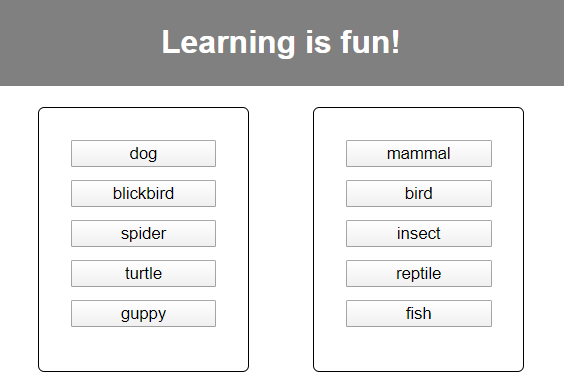
Learning games and knowledge quizzes are popular both for younger and older users. An example is the game “pair matching”, where the user has to find related pairs in a mixture of images and/or text snippets.
The animation below shows a simple version of the game: The user selects two elements on the left and right side of the playing field one after the other, and in any order. Correctly matched pairs are moved to a separate area of the playing field, while any wrong assignments are immediately dissolved so that the user has to make a new selection.
A sneak peek of the game we’ll be creating today
In this tutorial, we will build such a learning game step by step. In the first part, we will build an Angular component that is just showing the playing field of the game. Our aim is that the component can be configured for different use cases and target groups — from an animal quiz up to a vocabulary trainer in a language learning app. For this purpose, Angular offers the concept of content projection with customizable templates, which we will make use of. To illustrate the principle, I will build two versions of the game (“game1” and “game2”) with different layouts.
In the second part of the tutorial, we will focus on reactive programming. Whenever a pair is matched, the user needs to get some sort of feedback from the app; it is this event handling that is realized with the help of the library RxJS.
Source Code
The source code of this tutorial can be found here (14KB).
1. Building An Angular Component For The Learning Game
How To Create The Basic Framework
First, let’s create a new project named “learning-app”. With the Angular CLI, you can do this with the command ng new learning-app. In the file app.component.html, I replace the pre-generated source code as follows:
<div style="text-align:center">
  <h1>Learning is fun!</h1>
</div>
In the next step, the component for the learning game is created. I’ve named it “matching-game” and used the command ng generate component matching-game. This will create a separate subfolder for the game component with the required HTML, CSS and Typescript files.
As already mentioned, the educational game must be configurable for different purposes. To demonstrate this, I create two additional components (game1 and game2) by using the same command. I add the game component as a child component by replacing the pre-generated code in the file game1.component.html or game2.component.html with the following tag:
<app-matching-game></app-matching-game>
At first, I only use the component game1. In order to make sure that game 1 is displayed immediately after starting the application, I add this tag to the app.component.html file:
<app-game1></app-game1>
When starting the application with ng serve --open, the browser will display the message “matching-game works”. (This is currently the only content of matching-game.component.html.)
Now, we need to test the data. In the /app folder, I create a file named pair.ts where I define the class Pair:
Our next goal: The game component matching-game has to accept the game data from the parent component (e.g. game1) as input. The input is an array of “pair” objects. The user interface of the game should be initialized with the passed objects when starting the application.
For this purpose, we need to proceed as follows:
Add the property pairs to the game component using the @Input decorator.
Add the arrays solvedPairs and unsolvedPairs as additional private properties of the component. (It is necessary to distinguish between already “solved” and “not yet solved” pairs.)
When the application is started (see function ngOnInit) all pairs are still “unsolved” and are therefore moved to the array unsolvedPairs.
Furthermore, I define the HTML template of the matching-game component. There are containers for the unsolved and solved pairs. The ngIf directive ensures that the respective container is only displayed if at least one unsolved or solved pair exists.
In the container for the unsolved pairs (class container unsolved), first all left (see the left frame in the GIF above) and then all right (see the right frame in the GIF) components of the pairs are listed. (I use the ngFor directive to list the pairs.) At the moment, a simple button is sufficient as a template.
With the template expression {{{pair.leftpart}} and {{{pair.rightpart}}}, the values of the properties leftpart and rightpart of the individual pair objects are queried when iterating the pair array. They are used as labels for the generated buttons.
The assigned pairs are listed in the second container (class container solved). A green bar (class connector) indicates that they belong together.
The corresponding CSS code of the file matching-game.component.css can be found in the source code at the beginning of the article.
Obviously, our matching game is not too difficult yet, because the left and right parts of the pairs are directly opposite each other. So that the pairing is not too trivial, the right parts should be mixed. I solve the problem with a self-defined pipe shuffle, which I apply to the array unsolvedPairs on the right side (the parameter test is needed later to force the pipe to be updated):
The source code of the pipe is stored in the file shuffle.pipe.ts in the app folder (see source code at the beginning of the article). Also note the file app.module.ts, where the pipe must be imported and listed in the module declarations. Now the desired view appears in the browser.
Extended Version: Using Customizable Templates To Allow An Individual Design Of The Game
Instead of a button, it should be possible to specify arbitrary template snippets to customize the game. In the file matching-game.component.html I replace the button template for the left and right side of the game with an ng-template tag. I then assign the name of a template reference to the property ngTemplateOutlet. This gives me two placeholders, which are replaced by the content of the respective template reference when rendering the view.
We are here dealing with the concept of content projection: certain parts of the component template are given from outside and are “projected” into the template at the marked positions.
When generating the view, Angular must insert the game data into the template. With the parameter ngTemplateOutletContext I tell Angular that a variable contextPair is used within the template, which should be assigned the current value of the pair variable from the ngFor directive.
The following listing shows the replacement for the container unsolved. In the container solved, the buttons have to be replaced by the ng-template tags as well.
In the file matching-game.component.ts, the variables of both template references (leftpart_temp and rightpart_temp) must be declared. The decorator @ContentChild indicates that this is a content projection, i.e. Angular now expects that the two template snippets with the respective selector (leftpart or rightpart) are provided in the parent component between the tags <app-matching-game></app-matching-game> of the host element (see @ViewChild).
The attribute let-animalPair="contextPair" is used to specify that the context variable contextPair is used in the template snippet with the name animalPair.
The template snippets can now be changed to your own taste. To demonstrate this I use the component game2. The file game2.component.ts gets the same content as game1.component.ts. In game2.component.html I use an individually designed div element instead of a button. The CSS classes are stored in the file game2.component.css.
After adding the tags <app-game2></app-game2> on the homepage app.component.html, the second version of the game appears when I start the application:
An alternative view of the game in the component game2
The design possibilities are now almost unlimited. It would be possible, for example, to define a subclass of Pair that contains additional properties. For example, image addresses could be stored for the left and/or right parts. The images could be displayed in the template along with the text or instead of the text.
2. Control Of User Interaction With RxJS
Advantages Of Reactive Programming With RxJS
To turn the application into an interactive game, the events (e.g. mouse click events) that are triggered at the user interface must be processed. In reactive programming, continuous sequences of events, so-called “streams”, are considered. A stream can be observed (it is an “observable”), i.e. there can be one or more “observers” or “subscribers” subscribing to the stream. They are notified (usually asynchronously) about every new value in the stream and can react to it in a certain way.
With this approach, a low level of coupling between the parts of an application can be achieved. The existing observers and observables are independent of each other and their coupling can be varied at runtime.
The JavaScript library RxJS provides a mature implementation of the Observer design pattern. Furthermore, RxJS contains numerous operators to convert streams (e.g. filter, map) or to combine them into new streams (e.g. merge, concat). The operators are “pure functions” in the sense of functional programming: They do not produce side effects and are independent of the state outside the function. A program logic composed only of calls to pure functions does not need global or local auxiliary variables to store intermediate states. This, in turn, promotes the creation of stateless and loosely coupled code blocks. It is therefore desirable to realize a large part of the event handling by a clever combination of stream operators. Examples of this are given in the section after next, based on our matching game.
Integrating RxJS Into The Event Handling Of An Angular Component
The Angular framework works with the classes of the RxJS library. RxJS is therefore automatically installed when Angular is installed.
The image below shows the main classes and functions that play a role in our considerations:
A model of the essential classes for event handling in Angular/RxJS
Class Name
Function
Observable (RxJS)
Base class that represents a stream; in other words, a continuous sequence of data. An observable can be subscribed to. The pipe function is used to apply one or more operator functions to the observable instance.
Subject (RxJS)
The subclass of observable provides the next function to publish new data in the stream.
EventEmitter (Angular)
This is an angular-specific subclass that is usually only used in conjunction with the @Output decorator to define a component output. Like the next function, the emit function is used to send data to the subscribers.
Subscription (RxJS)
The subscribe function of an observable returns a subscription instance. It is required to cancel the subscription after using the component.
With the help of these classes, we want to implement the user interaction in our game. The first step is to make sure that an element that is selected by the user on the left or right side is visually highlighted.
The visual representation of the elements is controlled by the two template snippets in the parent component. The decision how they are displayed in the selected state should therefore also be left to the parent component. It should receive appropriate signals as soon as a selection is made on the left or right side or as soon as a selection is to be undone.
For this purpose, I define four output values of type EventEmitter in the matching-game.component.ts file. The types Output and EventEmitter have to be imported from the core package.
@Output() leftpartSelected = new EventEmitter<number>();
@Output() rightpartSelected = new EventEmitter<number>();
@Output() leftpartUnselected = new EventEmitter();
@Output() rightpartUnselected = new EventEmitter();
In the template matching-game.component.html, I react to the mousedown event on the left and right side, and then send the ID of the selected item to all receivers.
<div *ngFor="let pair of unsolvedPairs" class="item" (mousedown)="leftpartSelected.emit(pair.id)">
...
<div *ngFor="let pair of unsolvedPairs | shuffle:test" class="item" (mousedown)="rightpartSelected.emit(pair.id)">
In our case, the receivers are the components game1 and game2. There you can now define the event handling for the events leftpartSelected, rightpartSelected, leftpartUnselected and rightpartUnselected. The variable $event represents the emitted output value, in our case the ID. In the following you can see the listing for game1.component.html, for game2.component.html the same changes apply.
In game1.component.ts (and similarly in game2.component.ts), the event handler functions are now implemented. I store the IDs of the selected elements. In the HTML template (see above), these elements are assigned the class selected. The CSS file game1.component.css defines which visual changes this class will bring about (e.g. color or font changes). Resetting the selection (unselect) is based on the assumption that the pair objects always have positive IDs.
In the next step, event handling is required in the matching game component. It must be determined if an assignment is correct, that is, if the left selected element matches the right selected element. In this case, the assigned pair can be moved into the container for the resolved pairs.
I would like to formulate the evaluation logic using RxJS operators (see the next section). For preparation, I create a subject assignmentStream in matching-game.component.ts. It should emit the elements selected by the user on the left or right side. The goal is to use RxJS operators to modify and split the stream in such a way that I get two new streams: one stream solvedStream which provides the correctly assigned pairs and a second stream failedStream which provides the wrong assignments. I would like to subscribe to these two streams with subscribe in order to be able to perform appropriate event handling in each case.
I also need a reference to the created subscription objects, so that I can cancel the subscriptions with “unsubscribe” when leaving the game (see ngOnDestroy). The classes Subject and Subscription must be imported from the package “rxjs”.
private assignmentStream = new Subject<{pair:Pair, side:string}>();

private solvedStream = new Observable<Pair>();
private failedStream = new Observable<string>();

private s_Subscription: Subscription;
private f_Subscription: Subscription;

ngOnInit(){

  ...
  //TODO: apply stream-operators on
  //leftpartClicked und rightpartClicked
  this.s_Subscription = this.solvedStream.subscribe(pair =>
  handleSolvedAssignment(pair));
  this.f_Subscription = this.failedStream.subscribe(() =>
  handleFailedAssignment());
}

ngOnDestroy() {
   this.s_Subscription.unsubscribe();
   this.f_Subscription.unsubscribe();
}
If the assignment is correct, the following steps are done:
The assigned pair is moved to the container for the solved pairs.
The events leftpartUnselected and rightpartUnselected are sent to the parent component.
No pair is moved if the assignment is incorrect. If the wrong assignment was executed from left to right (side1 has the value left), the selection should be undone for the element on the left side (see the GIF at the beginning of the article). If an assignment is made from right to left, the selection is undone for the element on the right side. This means that the last element that was clicked on remains in a selected state.
For both cases, I prepare the corresponding handler functions handleSolvedAssignment and handleFailedAssignment (remove function: see source code at the end of this article):
private handleSolvedAssignment(pair: Pair):void{
   this.solvedPairs.push(pair);
   this.remove(this.unsolvedPairs, pair);
   this.leftpartUnselected.emit();
   this.rightpartUnselected.emit();
   //workaround to force update of the shuffle pipe
   this.test = Math.random() * 10;
}
private handleFailedAssignment(side1: string):void{

   if(side1=="left"){
        this.leftpartUnselected.emit();
   }else{
        this.rightpartUnselected.emit();
   }

}
Now we have to change the viewpoint from the consumer who subscribes to the data to the producer who generates the data. In the file matching-game.component.html, I make sure that when clicking on an element, the associated pair object is pushed into the stream assignmentStream. It makes sense to use a common stream for the left and right side because the order of the assignment is not important for us.
Design Of The Game Interaction With RxJS Operators
All that remains is to convert the stream assignmentStream into the streams solvedStream and failedStream. I apply the following operators in sequence:
pairwise
There are always two pairs in an assignment. The pairwise operator picks the data in pairs from the stream. The current value and the previous value are combined into a pair.
For example, we get the combination ({pair1, left}, {pair3, right}) when the user selects dog (id=1) on the left side and insect (id=3) on the right side (see array ANIMALS at the beginning of the article). These and the other combinations result from the game sequence shown in the GIF above.
filter
You have to remove all combinations from the stream that were made on the same side of the playing field like ({pair1, left}, {pair1, left}) or ({pair1, left}, {pair4, left}).
The filter condition for a combination comb is therefore comb[0].side != comb[1].side.
partition
This operator takes a stream and a condition and creates two streams from this. The first stream contains the data that meets the condition and the second stream contains the remaining data. In our case, the streams should contain correct or incorrect assignments. So the condition for a combination comb is comb[0].pair===comb[1].pair.
Only the individual pair object is required for further processing of a correct assignment, such as pair2. The map operator can be used to express that the combination comb should be mapped to comb[0].pair. If the assignment is incorrect, the combination comb is mapped to the string comb[0].side because the selection should be reset on the side specified by side.
The pipe function is used to concatenate the above operators. The operators pairwise, filter, partition, map must be imported from the package rxjs/operators.
By using the operators, the game logic could be described declaratively. We only described the properties of our two target streams (combined into pairs, filtered, partitioned, remapped) and did not have to worry about the implementation of these operations. If we had implemented them ourselves, we would also have had to store intermediate states in the component (e.g. references to the last clicked items on the left and right side). Instead, the RxJS operators encapsulate the implementation logic and the required states for us and thus raise the programming to a higher level of abstraction.
Conclusion
Using a simple learning game as an example, we tested the use of RxJS in an Angular component. The reactive approach is well suited to process events that occur on the user interface. With RxJS, the data needed for event handling can be conveniently arranged as streams. Numerous operators, such as filter, map or partition are available for transforming the streams. The resulting streams contain data that is prepared in its final form and can be subscribed to directly. It requires a little skill and experience to select the appropriate operators for the respective case and to link them efficiently. This article should provide an introduction to this.


