Inspired Design Decisions With Emmett McBain: Art Direction As Social Equity
Andrew ClarkeAlong with advertising, selling is a skill that people often frown on. It’s true: no one likes someone coercing or misleading them, and nobody enjoys being interrupted.
But being sold to well — by a salesperson who understands your aspirations, motivations, and needs — can be an experience that benefits buyers and sellers.
Learning how to sell was one of the best things I did early on in my working life. Back then, I sold photographic equipment, and although I never enjoyed the stress which came from meeting sales targets, I always enjoyed meeting with photographers.
Finding new customers often meant cold-calling, knocking on a studio door, and frequently being rejected. I spent time talking about someone’s work before I mentioned the products my company paid me to sell. I was genuinely interested in photography, but also I’d learned that understanding someone’s problems was as crucial as explaining how my products could help solve them.
What I learned has served me immeasurably well since I stopped selling cameras and started selling my talent. It’s helped me deal with people, not least in presenting (read: selling) my ideas to clients.
It’s a fact of life that not always the best idea or the best execution wins a pitch or presentation. It’s often the idea which is being sold by the best salesperson.
Selling ideas should become one of your best skills, so learn to sell. Learn how to talk about your work so that the person you’re selling to understands your ideas and why they should buy them from you. Learn to inspire people with your words as well as your work. Make them feel like they’re so much a part of your ideas that they simply must buy from you.
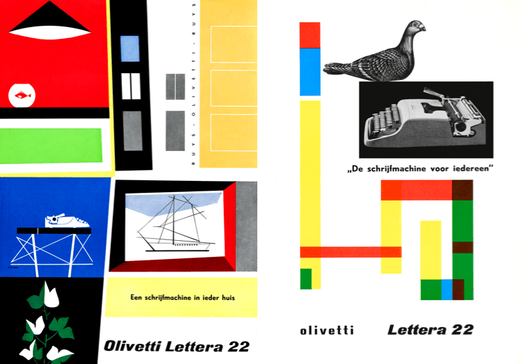
As a Black American graphic designer who worked in advertising during the 1950s, ’60s, and ’70s, Emmett McBain not only had incredible talent, he also understood how to sell to other African Americans.
He knew that to sell his clients’ products, his designs needed to resonate with Black audiences, by showing images they related to and language which was familiar to them.
As a grey-bearded Englishman, it’s not easy for me to understand cultural perspectives which are different from mine. But, I’ve learned the value of making designs that speak to people whatever they look like and wherever they live. Not only to sell my clients’ products to them but so that everyone feels their needs are being listened to and their importance understood.
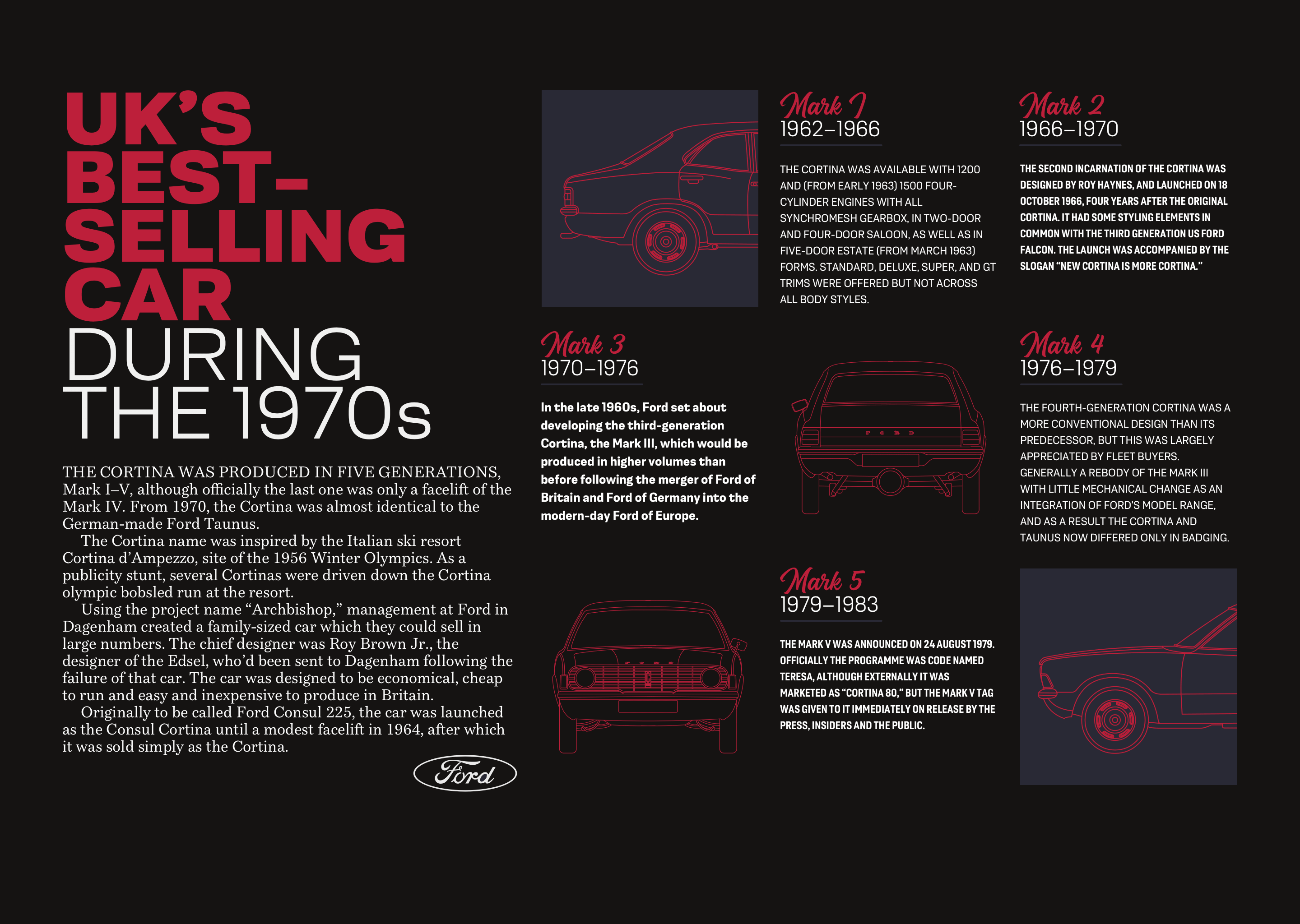
Born in Chicago in 1935, Emmett McBain was an African American graphic designer whose work had a remarkable impact on the representation of African Americans in advertising.
McBain studied at several art schools and graduated after studying commercial art at the American Academy of Art in Chicago.
Vince Cullers and Associates—the first African American-owned full-service advertising agency in the USA was founded in 1958. Cullers believed that “selling Black” needed “thinking Black” if advertisers were to reach African American consumers. He not only sold to African Americans but helped to educate them in advertising and employ them at his agency. One of those employees was the newly graduated Emmett McBain.

With two years of commercial experience behind him, McBain left Vince Cullers and moved to Playboy Records as an assistant art editor. But, he didn’t stay in a junior role for long and quickly became Playboy’s promotion art director. McBain carved out a niche as a cover artist, and in 1958 his Playboy Jazz All-Stars album art was named Billboard Magazine’s Album Cover of the Week.
In 1959, McBain moved on from Playboy, but he didn’t leave behind his work on album covers. His newly-founded design studio McBain Associates regularly worked with Mercury Records, and he designed over 75 album covers by the time he was 24.

McBain returned to Vince Cullers Advertising as its creative director in 1968 and made some of his most important contributions to advertising for Black Americans.
Before the 1960s, Black consumers were largely ignored by brand-name manufacturers and the mainstream advertising industry which served them. Advertising to African Americans was limited mainly to newspapers specific to Black audiences.
White clients were reticent to spend money selling to African Americans as advertisers saw black consumers as having little disposable income. In the politically charged atmosphere of the time, companies were also afraid to associate their brands with African Americans.
African Americans were unrepresented in the advertising industry too, and the number of Black people working in advertising was tiny. But, in the mid-1960s, advertising agencies began to recruit African Americans. These agencies hoped their experiences would make clients’ messages more relatable to African American audiences who, by then, spent almost $30 billion each year.

McBain’s work featured positive messages for African Americans and the Black community. He used images of everyday people in usual surroundings for clients who included Newport’s menthol cigarettes, Philip Morris’ Marlboro, and SkinFood Cosmetics’ beauty products specifically for Black skin. Like Vince Cullers, McBain knew that selling to Black consumers meant understanding their different needs. He understood that — as his future partner, copywriter Thomas Burrell said — “Black people are not dark-skinned white people.”
In 1971, Emmett McBain partnered with Burrell to form Burrell-McBain Inc., which they described in an advertisement as “An Advertising Agency for the Black Commercial Market.” Rather than exploit Black Americans, Burrell and McBain aimed to form authentic and respectful relationships with Black audiences.
Before Burrell and McBain, the iconic white cowboy was the face of Marlboro cigarettes. But, McBain’s Marlboro man was more relatable to African American smokers. Whereas Marlboro’s cowboy was shown in an idealized version of the American West, McBain’s Black characters were seen smoking in everyday surroundings.
Their Marlboro campaign was a huge success and Burrell and McBain went on to win Coca-Cola and McDonald’s as clients, helping them become the largest Black-owned advertising agency in America.
McBain left the agency he co-founded in 1974 and set out on a career as an artist. He opened his art gallery, The Black Eye, and formed a consultancy — also called The Black Eye — which helped agencies to better connect with the African American community.
Emmett McBain died of cancer in 2012 and since then has been recognized by AIGA, the Society of Typographic Arts, and the Art Directors Clubs of Chicago and Detroit.
Sadly, there hasn’t been a book published about Emmett McBain and his contribution to advertising and design. I haven’t heard his name mentioned at design conferences or seen him referenced in articles relating to modern-day design and particularly the web.
McBain’s later work had a profound impact on advertising from the 1960s onwards, but I’m especially fond of his record cover designs. The burst with energy which reflects the jazz music McBain loved. His colors are exciting and vibrant. His choice of typefaces and the ways he deconstructed and rebuilt type are inspiring. There’s plenty to inspire us in the work of Emmett McBain.
Aligning Vertical Content
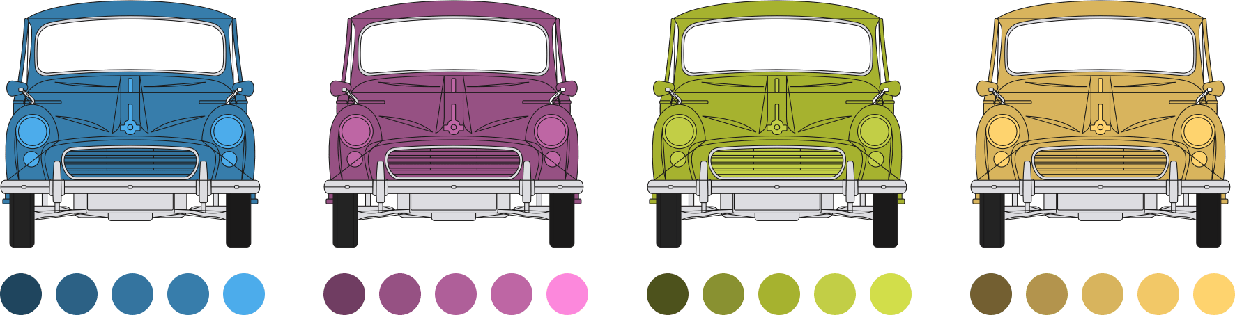
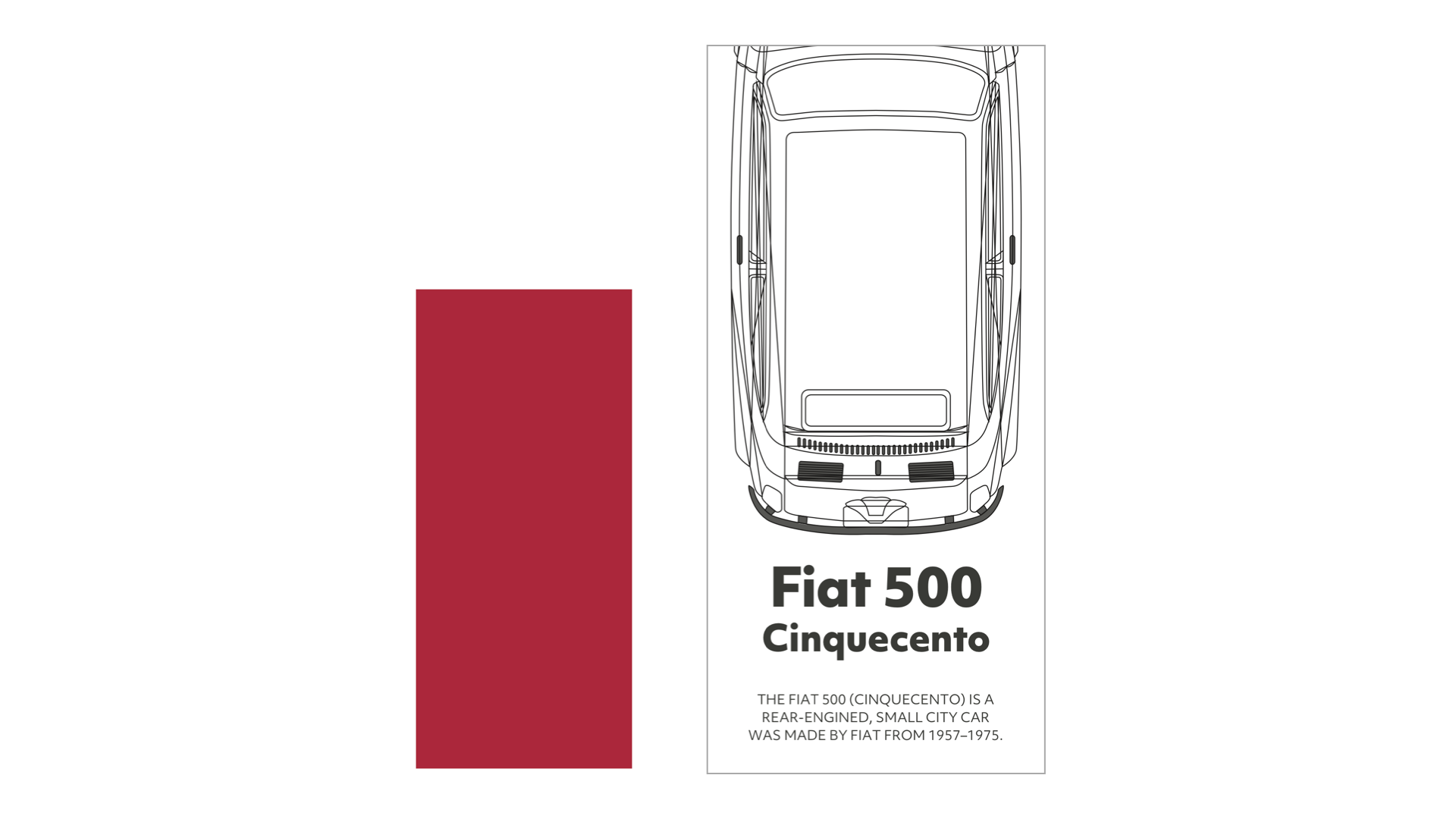
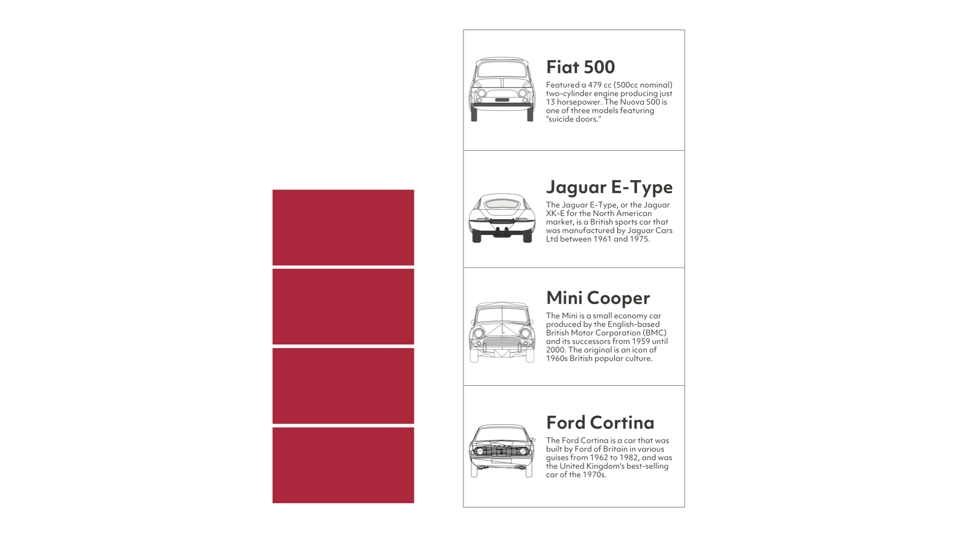
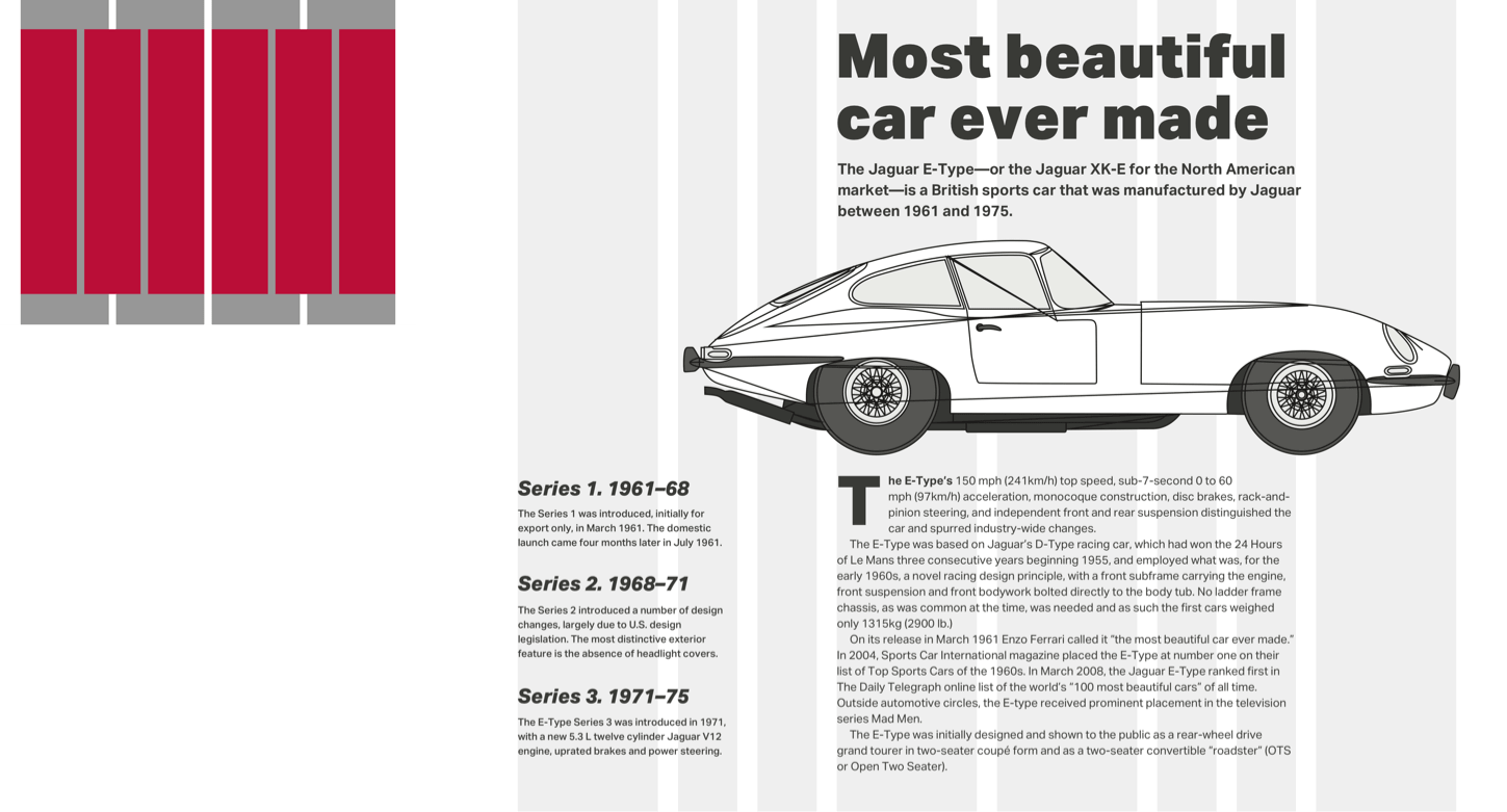
Whichever graphic style I choose, the HTML needed to implement this first McBain-inspired design is identical. I need three structural elements; a header which contains my SVG logo and headlines, main, and an aside which includes a table of Citroën DS production numbers:
<header>
  <svg>…</svg>

  <div>
    <svg>…</svg>
    <svg>…</svg>
  </div>
</header>

<main>
  <p>…</p>
</main>

<aside>
  <table>…</table>
</aside>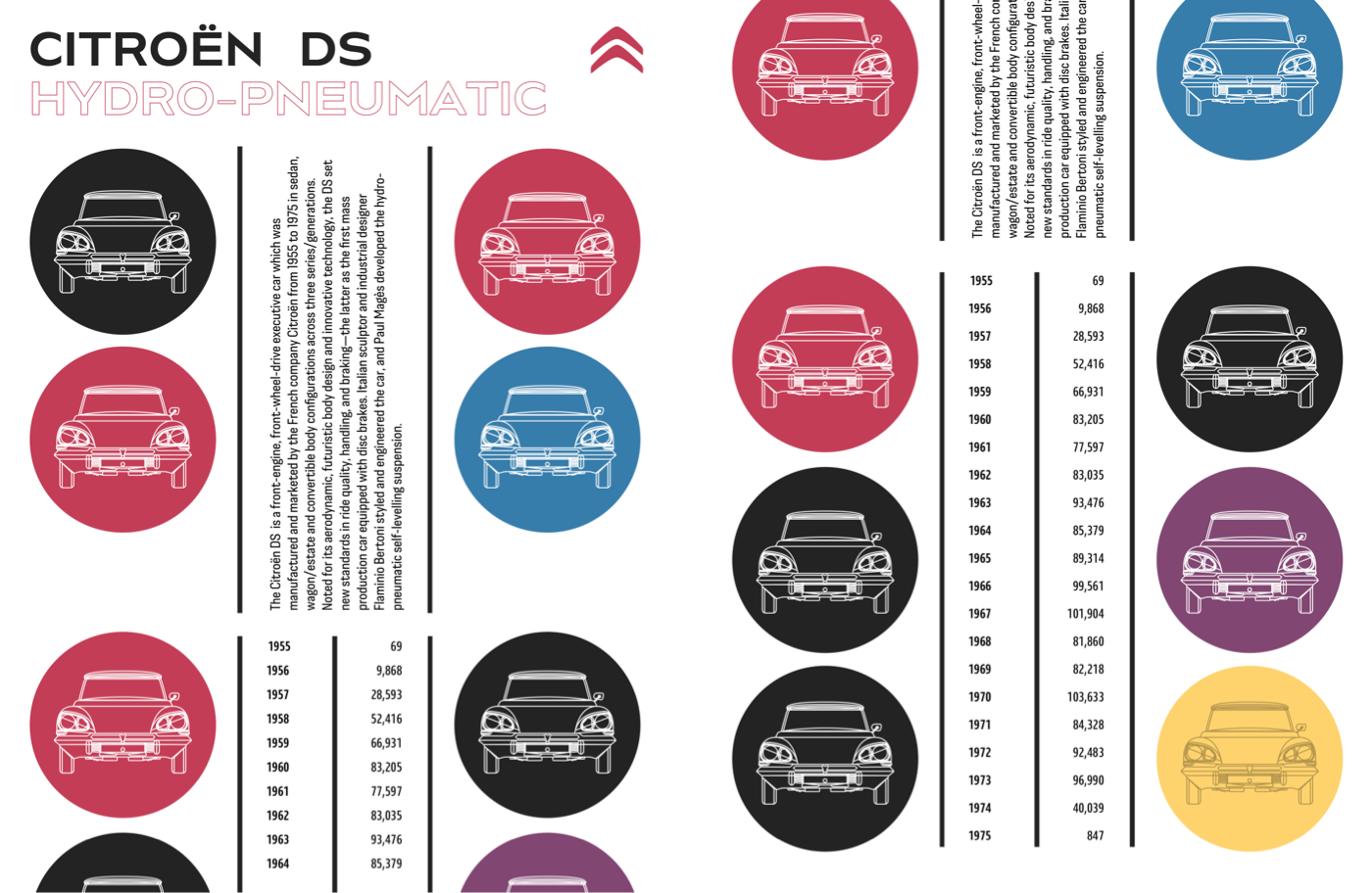
For scalability across screen sizes, I use SVGs for the two headlines in my header. Using SVG provides an extra degree of consistency for the second headline’s stroked text, but I mustn’t forget accessibility.
In issue 8, I explained how to help people who use assistive technology using adding ARIA to SVGs. I add an ARIA role attribute, plus a level attribute which replaces the missing semantics. Adding a title element also helps assistive technology understand the difference between several blocks of SVG, but browsers won’t display this title:
<svg role="heading" aria-level="1" aria-label="Citroën DS">
  <title>Citroën DS</title>
  <path>…</path>
</svg>
To begin this design, I add basic foundation styles for every screen size starting with foreground and background colours:
body {
background-color: #fff;
color: #262626; }
I add pixel precise dimensions to the SVG elements in my header, then use auto horizontal margins to centre the Citroën logo:
header > svg {
margin: 0 auto;
width: 80px; }

header div svg {
max-height: 80px; }
In his inspiring design, Emmet McBain included vertical black stripes to add structure to his layout. To achieve a similar effect without adding extra elements to my HTML, I add dark borders to both the left and right sides of my main paragraph:
main p {
padding: .75rem 0;
border-right: 5px solid #262626;
border-left: 5px solid #262626; }
The same technique adds a similar effect to my table of Citroën DS production numbers. I add the two outer borders to my table:
aside table {
width: 100%;
border-right: 5px solid #262626;
border-left: 5px solid #262626;
border-collapse: collapse; }
Then, I add a third rule to the right of my table headers:
aside th {
padding-right: .75rem;
padding-left: .75rem;
border-right: 5px solid #262626; }
By ensuring every cell fills half the width of my table, this vertical stripe runs down the centre, from top to bottom:
aside th,
aside td {
width: 50%;
box-sizing: border-box; }
When someone reads numerical tabular data like these pairs of years and production numbers, their eyes scan down the year column. Then, they follow across to see how many cars Citroën manufactured during that year. People might also compare production numbers looking for either high or low numbers.
To make their comparisons easier, I align production numbers to the right:
aside td {
text-align: right; }
Depending on the OpenType features available in the font you’ve chosen, you can also improve tabular data readability by specifying lining rather than old-style numerals. Some old-style numerals—including 3, 4, 7, and 9 — have descenders which can drop below the baseline. These make longer strings of numbers more difficult to read. Lining numerals, on the other hand, include numbers that sit on the baseline.

OpenType features also control the width of numerals which makes comparing strings of numbers in a table easier. Whereas proportional numbers can be different sizes, tabular numerals are all the same width so tens, hundreds, and thousands will be more precisely aligned:
aside td {
font-variant-numeric: lining-nums tabular-nums; }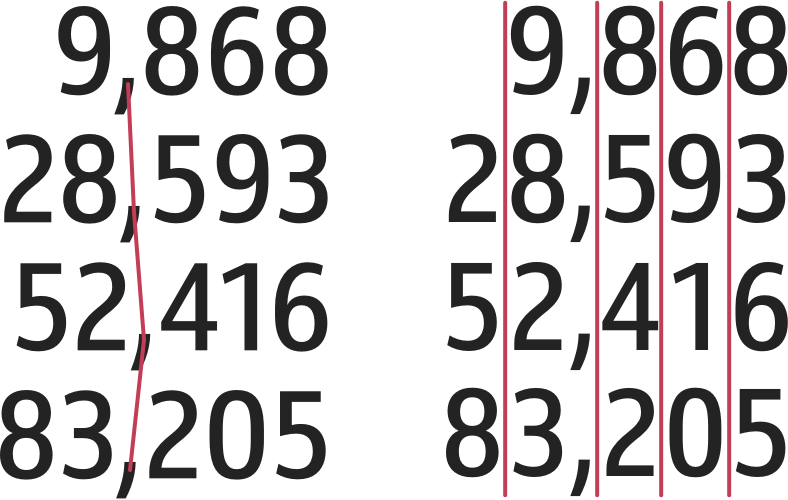
Finally, I introduce the circle motif to the bottom of this small screen design. I don’t want to include these circular images in my HTML, so I use a CSS generated content data URI where the image file is encoded into a string:
aside:after {
content: url("data:image/svg+xml…"); }I’m frequently surprised at how few changes I need to make to develop designs for multiple screen sizes. Switching from small screens to medium-size designs often requires no more than minor changes to type sizes and introducing simple layout styles.
I start by horizontally aligning the Citroën logo and SVG headlines in my header. On medium and large screens, this logo comes first in my HTML, and the headlines come second. But visually the elements are reversed. Flexbox is the ideal tool for making this switch, simply by changing the default flex-direction value from row to flex-direction: row-reverse:
@media (min-width: 48em) {

header {
display: flex;
flex-direction: row-reverse;
align-items: flex-start; }
}
Earlier, I gave my logo a precise width. But, I want the headlines to fill all the remaining horizontal space, so I give their parent division a flex-grow value of 1. Then, I add a viewport-based margin to keep the headlines and logo apart:
header div {
flex-grow: 1;
margin-right: 2vw; }
For this medium-size design, I developed the layout using a symmetrical three-column grid, which I apply to both main and aside elements:
main,
aside {
display: grid;
grid-template-columns: repeat(3, 1fr);
gap: 1rem; }
Then, using the same technique I used for the aside element previously, I generate two images for the main element and place them into the first and third columns in my grid:
main:before {
grid-column: 1;
content: url("data:image/svg+xml…"); }

main:after {
grid-column: 3;
content: url("data:image/svg+xml…"); }
I repeat the process for the aside element, with this new :after content replacing the generated image I added for small screens:
aside:before {
grid-column: 1;
content: url("data:image/svg+xml…"); }

aside:after {
grid-column: 3;
content: url("data:image/svg+xml…"); }
The extra space available on medium-size screens allows me to introduce more of the vertical stripe motif, which is inspired by Emmett McBain’s original design. The vertical borders on the left and right of the main paragraph are already in place, so all that remains is for me to change its writing-mode to vertical-rl and rotate it by 180 degrees:
main p {
justify-self: center;
writing-mode: vertical-rl;
transform: rotate(180deg); }
Some browsers respect grid properties and will stretch a table to the full height of the grid row without help. Others need a little help, so for them, I give my production numbers table an explicit height which adds an even amount of space between its rows:
aside table {
height: 100%; }
The full effect of this McBain-inspired design comes when screens are wide enough to display main and aside elements side-by-side. I apply a simple two-column symmetrical grid:
@media (min-width: 64em) {

body {
display: grid;
grid-template-columns: 1fr 1fr;
gap: 1rem; }
}
Then, I place the main and aside elements using line numbers, with the header spanning the full-width of my layout:
header {
grid-column: 1 / -1; }

main {
grid-column: 1; }

aside {
grid-column: 2; }
Looking Unstructured
The bright colours and irregular shapes of blocks in this next design are as unexpected as the jazz which inspired Emmett McBain’s original. While the arrangement of these layout might look unstructured, the code I need to develop it certainly isn’t. In fact, there are just two structural elements, header and main:
<header>
  <svg id="logo">…</svg>
  <h1>…</h1>
  <p>…</p>
  <svg>…</svg>
</header>

<main>
  <small>…</small>
  <h2>…</h2>
  <p>…</p>
</main>
I start by applying background and foreground colours, plus a generous amount of padding to allows someone’s eyes to roam around and through spaces in the design:
body {
padding: 2rem;
background-color: #fff;
color: #262626; }
Those brightly coloured blocks would dominate the limited space available on a small screen. Instead, I add the same bright colours to my header:
header {
padding: 2rem 2rem 4rem;
background-color: #262626; }

header h1 {
color: #c2ce46; }

header p {
color: #fc88dc; }
Irregular shapes are an aspect of this design which I want visible at every screen size, so I use a polygon path to clip the header. Only areas inside the clip area remain visible, everything else turns transparent:
header {
-webkit-clip-path: polygon(…);
clip-path: polygon(…); }
Attention to even the smallest details of typography lets people know that every aspect of a design has been carefully considered. A horizontal line in the small element at the start of my main content changes length alongside the text.
I don’t want to add a presentational horizontal rule to my HTML, and instead opt for a combination of Flexbox and pseudo-elements in my CSS. First, I style the small element’s text:
main small {
font-size: .8em;
letter-spacing: .15em;
line-height: .8;
text-transform: uppercase; }
Then, I add an :after pseudo-element with a thin bottom border which matches the colour of my text:
main small:after {
content: "";
display: block;
margin-left: .75rem;
border-bottom: 1px solid #262626; }
Adding flex properties aligns the text and my pseudo-element to the bottom of the small element. By giving the pseudo-element a flex-grow value of 1 allows it to change its width to compliment longer and shorter strings of text:
main small {
display: flex;
align-items: flex-end; }

main small:after {
flex-grow: 1; }
I enjoy surprises, and there’s more to my second-level “Champion de France” headline than meets the eye.
Almost ten years ago, Dave Rupert released Lettering.js, a jQuery plugin which uses Javascript to wrap individual letters, lines, and words text with span elements. Those separate elements can then be styled in any number of ways. With just one multi-coloured element in this design, I apply the same technique without serving a script:
<h2>Champion <span>d</span><span>e</span> <span>F</span><span>r</span><span>a</span><span>n</span><span>c</span><span>e</span></h2>Then, I give each selected letter its own colour:
h2 span:nth-of-type(1) {
color: #c43d56; }

h2 span:nth-of-type(2) {
color: #905dd8; }

h2 span:nth-of-type(3) {
color: #377dab; }
I’ve always viewed the challenge of responsive design as an opportunity to be creative and to make the most of every screen size. The extra space available on medium and large screens allows me to introduce the large, irregularly shaped blocks of color, which makes this design unexpected.
First, I apply grid properties and an eight-column symmetrical grid to the body element:
@media (min-width: 48em) {

body {
display: grid;
grid-template-columns: repeat(8, 1fr); }
}
Then, I place my header into three of those columns. With the coloured blocks now visible, I change the header’s background colour to a dark grey:
header {
grid-column: 4 / 7;
background-color: #262626; }
Centring content both horizontally and vertically was a challenge before Flexbox, but now aligning and justifying my header content is simple:
header {
display: flex;
flex-direction: column;
align-items: center;
justify-content: center; }
I change the colour of my header’s text elements:
header h1 {
color: #fed36e; }

header p {
color: #fff; }
Then, I apply negative horizontal margins, so my header overlaps elements close to it:
header {
margin-right: 1.5vw;
margin-left: -1.5vw; }
My main element needs no extra styling, and I place it onto my grid using line numbers:
main {
grid-column: 7 / -1; }
Elements needed to develop a design needn’t be in HTML. Pseudo-elements created in CSS can take their place, which keeps HTML free from any presentation. I use a :before pseudo-element applied to the body:
body:before {
display: block;
content: ""; }
Then, I add a data URI background image which will cover the entire pseudo-element regardless of its size:
body:before {
background-image: url("data:image/svg+xml…");
background-position: 0 0;
background-repeat: no-repeat;
background-size: cover; }
CSS Grid treats pseudo-elements just like any other, allowing me to place those colourful blocks into my grid using line numbers:
body:before {
grid-column: 1 / 4; }
Whereas developers mostly use media query breakpoints to introduce significant changes to a layout, sometimes, only minor changes are needed to tweak a design. Jeremy Keith calls these moments “tweakpoints.”
This medium-size McBain-inspired design works well at larger sizes, but I want to tweak its layout and add more detail to the very largest screens. I start by adding four extra columns to my grid:
@media (min-width: 82em) {

body {
grid-template-columns: repeat(12, 1fr); }
}
Then I reposition the generated colour blocks, header, and main elements using new line numbers:
body:before {
grid-column: 1 / 8; }

header {
grid-column: 7 / 10; }

main {
grid-column: 9 / -1; }
These elements now overlap, so to prevent them from forming new rows in my grid, I give them all the same grid-row value:
body:before,
header,
main {
grid-row: 1; }
This tweak to my design adds another block of colour between the header and main. To preserve the semantics of my HTML, I add a pseudo-element and a data URI image before my main content:
main:before {
display: block;
content: url("data:image/svg+xml…");
float: left;
margin-right: 2vw;
width: 10vw; }
Deconstructing Type-images
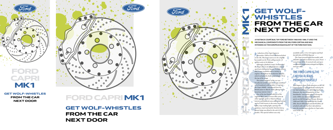
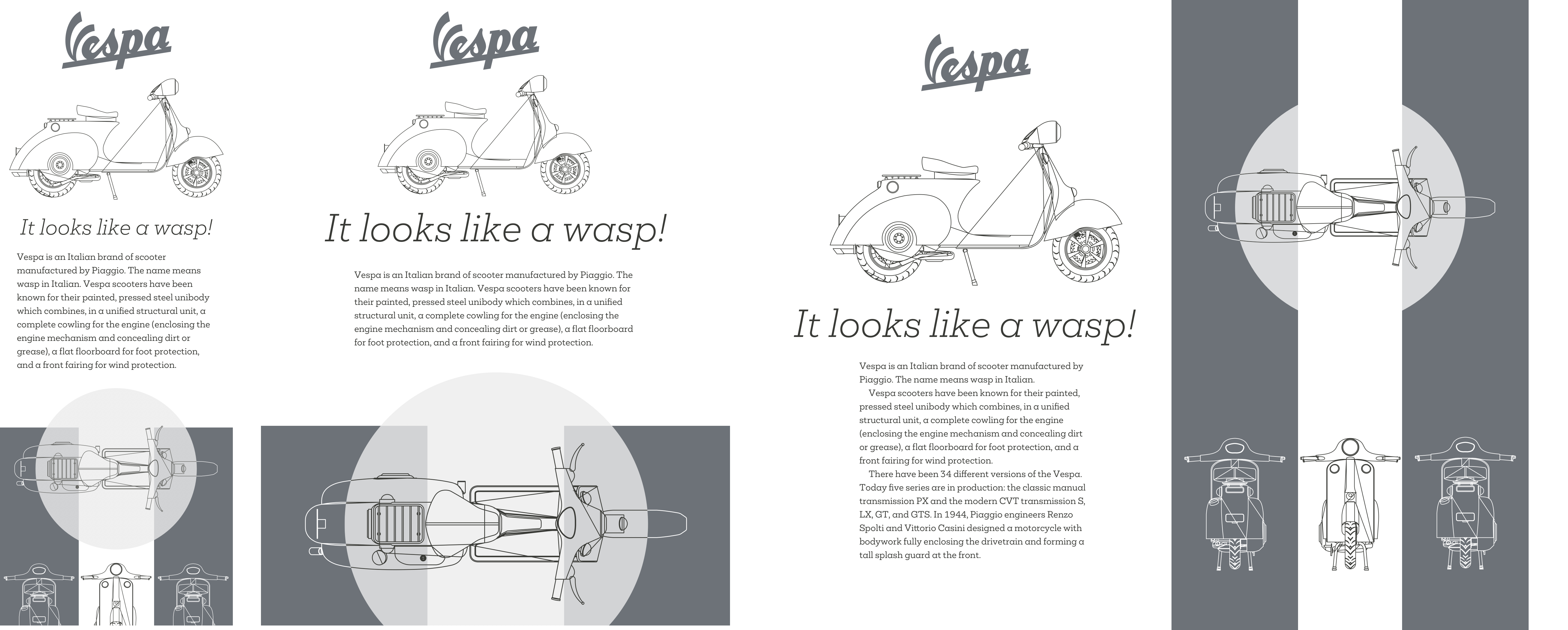
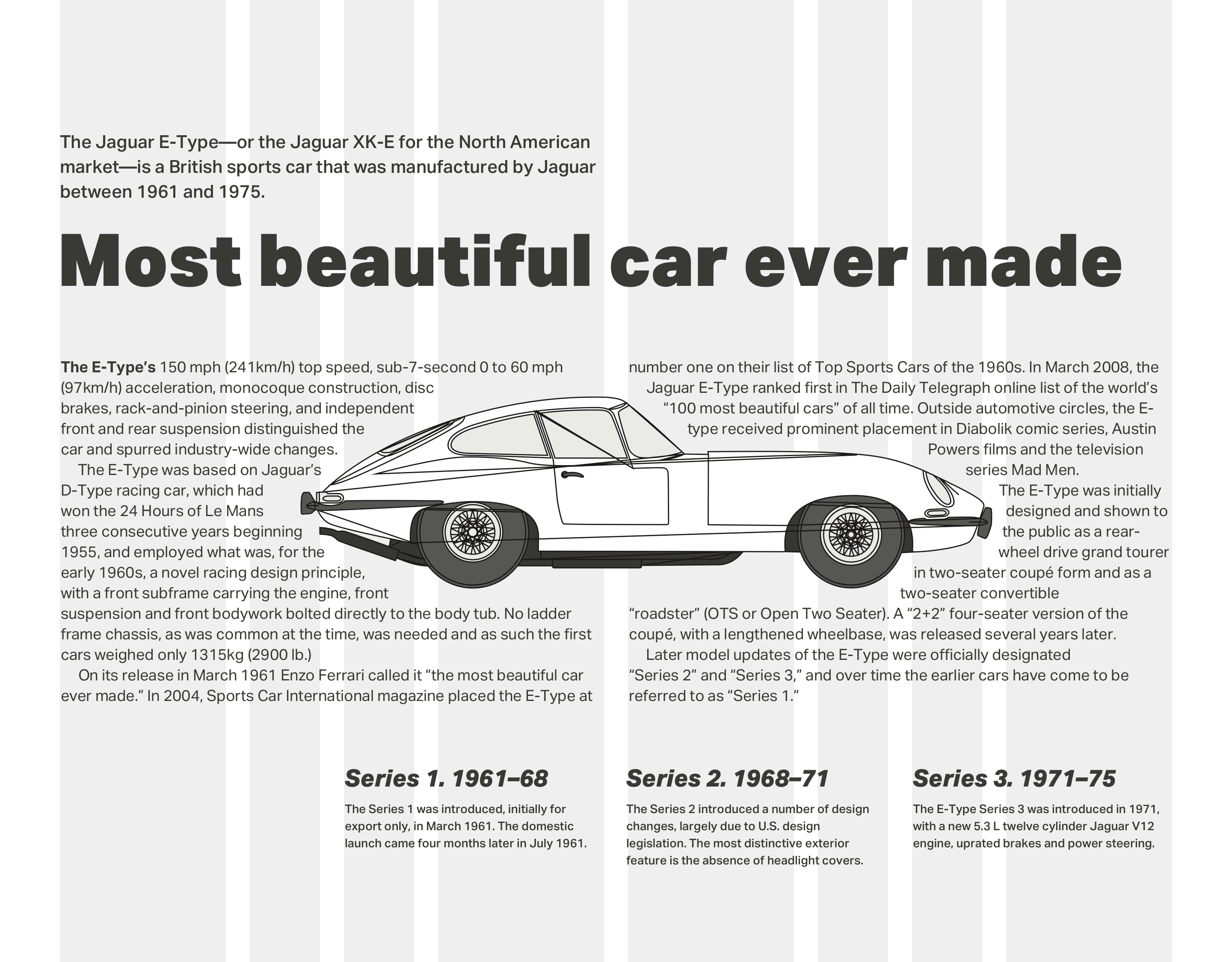
Early in his career, Emmett McBain’s record cover designs showed he had a flair for typography. He was often playful with type, deconstructing, and rebuilding it to form unexpected shapes. This control over type has never been easy online, but SVG makes almost everything possible.

This next McBain-inspired design relies on SVG and just two structural HTML elements; a header which contains the large type-based graphic, a main element for my content:
<header>
  <h1>…</h1>
  <p>…</p>
  <svg>…</svg>
</header>

<main>
  <h2>…<h2>
  <div>…</div>
  <svg>…</svg>
</main>
I need very few foundation styles to start developing this design. First, I add background and foreground colours and padding inside my two elements:
body {
background-color: #fff;
color: #262626; }

header,
main {
padding: 2rem; }
Second, I define styles for my type which includes both headings and the paragraph of text which follows them:
h1,
h2,
h1 + p {
letter-spacing: .05em;
line-height: 1.4;
text-transform: uppercase; }
I give my main content a rich purple background which matches the Citroën’s colour in the panel opposite:
main {
background-color: #814672;
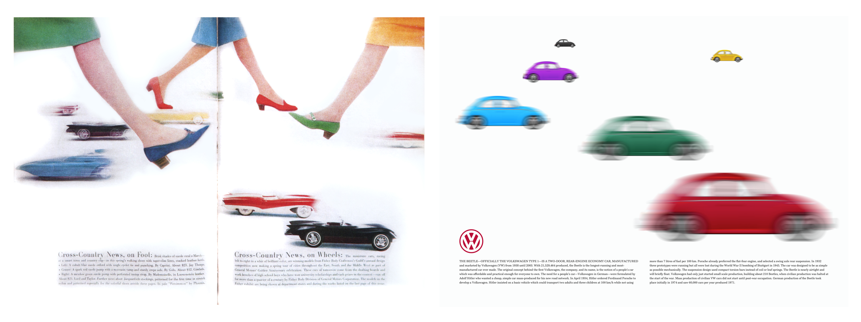
color: #fff; }This design is dominated by a large graphic that includes a profile of the Citroën DS and a stylized type-image of the words “Champion de France.” The arrangement of its letters would be tricky to accomplish using CSS positioning and transforms, making SVG the perfect choice.
This SVG contains three groups of paths. The first includes outlines of the words “Champion de:”
<svg>

<g id="champion-de">
  <path>…</path>
</g>

</svg>
The next group includes paths for the brightly coloured arrangement of letters. I give each letter a unique id attribute to make it possible to style them individually:
<g id="france">
  <path id="letter-f">…</path>
  <path id="letter-r">…</path>
  <path id="letter-a">…</path>
  <path id="letter-n">…</path>
  <path id="letter-c">…</path>
  <path id="letter-e">…</path>
</g>
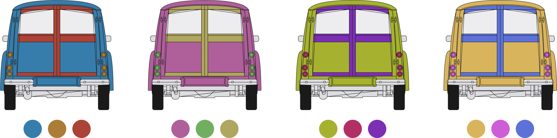
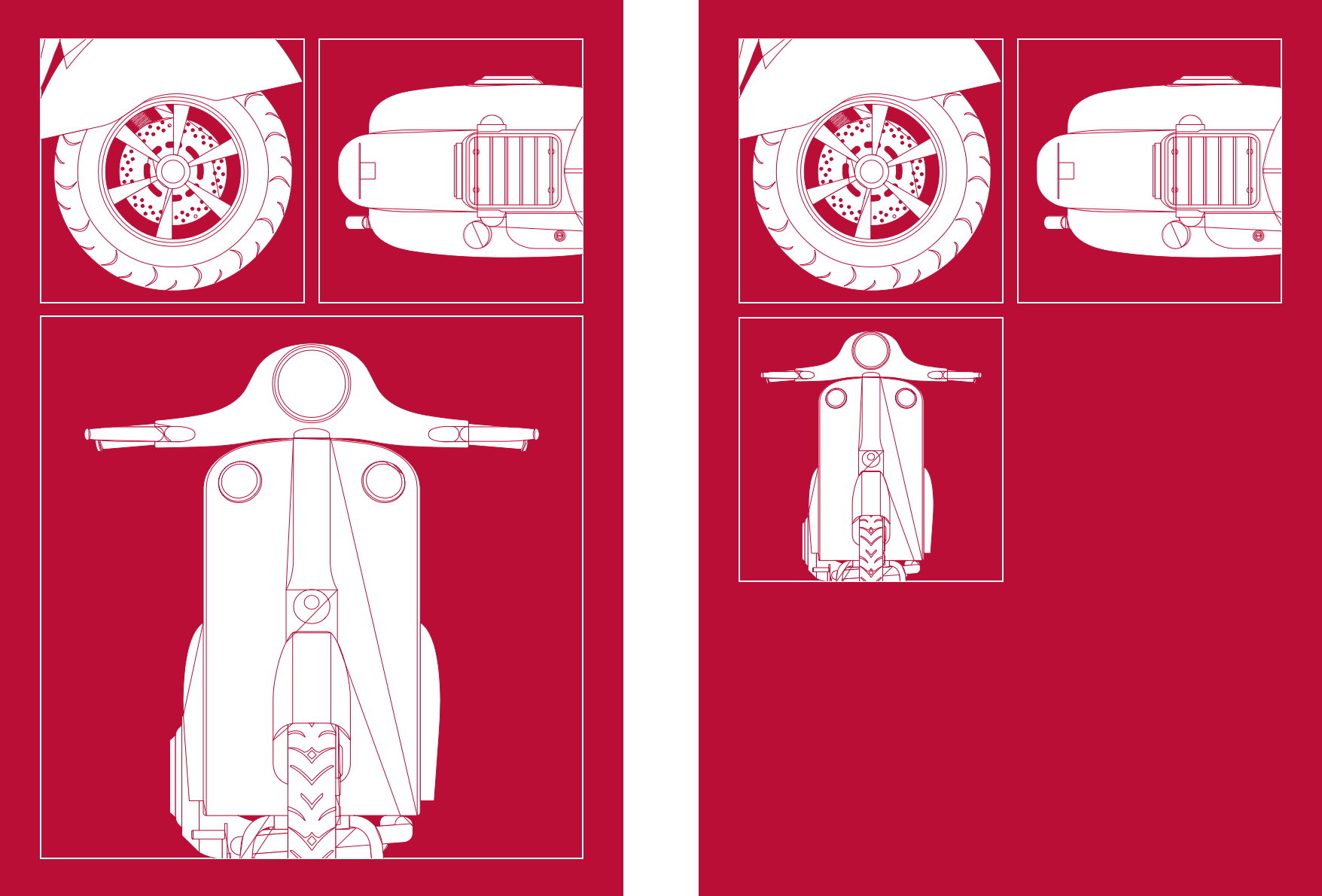
Then, I add class attributes to group of paths which make up the Citroën DS profile. With these attributes in place, I can adjust the car’s colours to complement different colour themes and even change them across media query breakpoints:
<g id="citroen">
  <path class="car-paint">…</path>
  <path class="car-tyres">…</path>
  <path class="car-wheels">…</path>
  <path class="car-shadow">…</path>
  <path class="car-lights">…</path>
  <path class="car-stroke">…</path>
</g>
Medium-size screens allow me to tweak the positions of my Citroën DS profile and type-image:
@media (min-width: 48em) {

header svg {
margin-bottom: -6rem;
transform: scale(.85) translateY(-4rem) rotate(-20deg); }
}
The order of these transforms is important, as various combinations of rotate, scale, and translate give subtly different results. Then, I add columns to my main content:
main div {
column-width: 14em;
column-gap: 2rem; }
Until now, this main content comes after my header in the document flow. For larger screens, I want those elements to sit side-by-side, so I apply grid properties and twelve columns to the body:
@media (min-width: 48em) {

body {
display: grid;
grid-template-columns: repeat(12, 1fr); }
}
I place the header and main into my grid using line numbers. The header spans seven columns, while the main content spans only five, producing an asymmetrical layout from a symmetrical grid:
header {
grid-column: 1 / 8; }

main {
grid-column: 8 / -1; }
Scaling Graphical Text
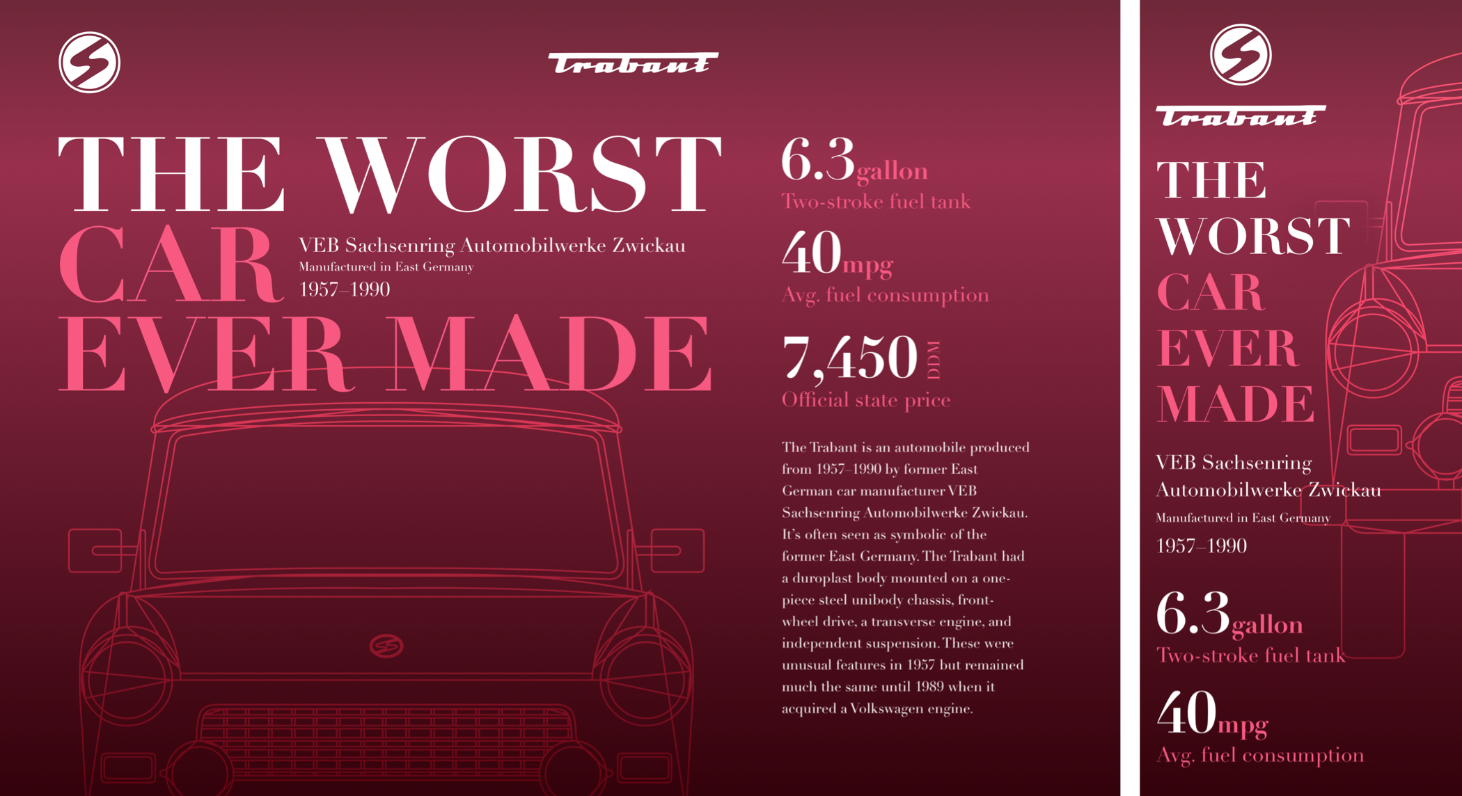
The distinction between SVG and HTML has become blurred, the more I use SVG into my work. SVG is an XML-based format and is entirely at home when it’s incorporated into HTML. This final McBain-inspired design relies on SVG in HTML not just for its striking imagery, but also for text.

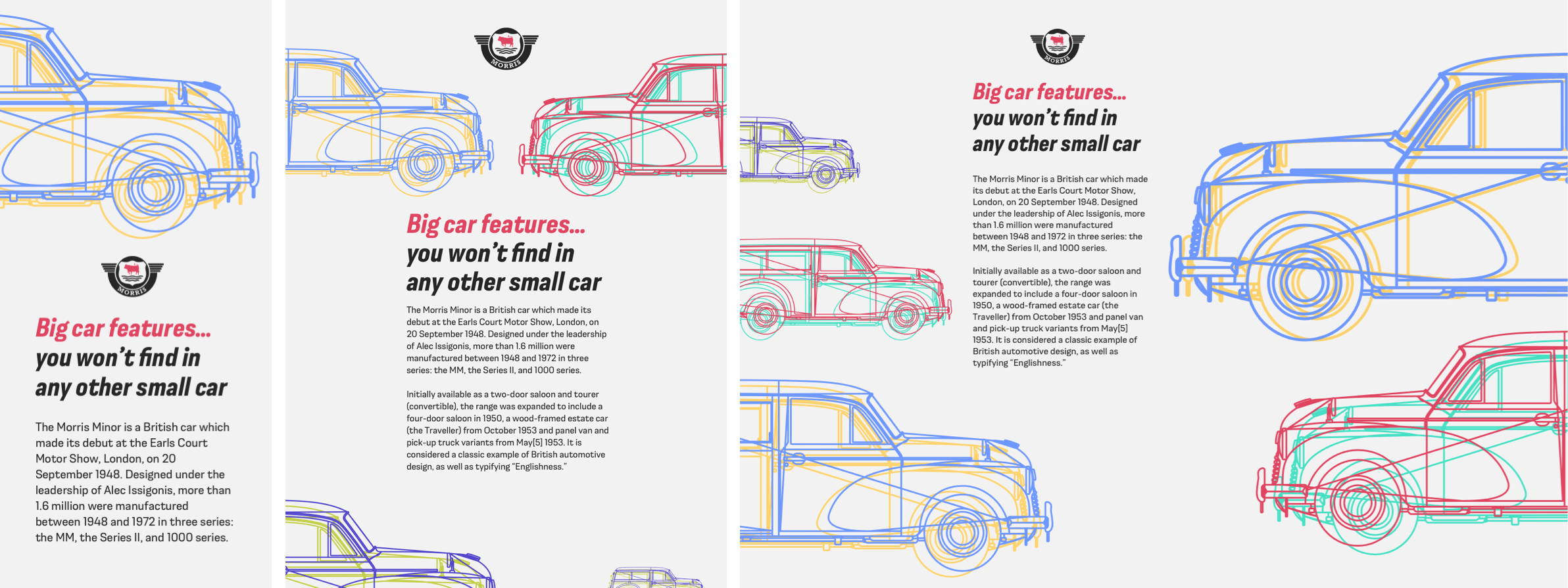
To develop this striking red and black design, I need four structural HTML elements. A header contains an image of the iconic Citroën DS. The banner division includes a large headline developed using SVG text. The main element includes my running text, and finally an aside for supplementary content:
<svg>…</svg>

<header>
  <svg>…</svg>
</header>

<div id="banner">
  <svg>…</svg>
</div>

<main>
  <div id="heading">
    <svg role="heading" aria-level="1">…</svg>
  </div>

  <div class="content">
    <p class="dropcap">…</p>
    <p>…</p>
  </div>
</main>

<aside>
  <small>…</small>
  <svg role="heading" aria-level="2">…</svg>
  <p>…</p>
  <figure>…</figure>

  <svg role="heading" aria-level="2">…</svg>
  <p>…</p>
</aside>
I used to think using SVG to render text was as inappropriate as setting text within images but having used SVG more, I realize I was wrong.
In issue 8, I explained how like HTML text, SVG text is accessible and selectable. It also has the advantage of being infinitely style-able using clipping paths, gradient fills, filters, masks, and strokes.
The banner division’s headline includes two text elements. The first contains the large word “Champion,” the second contains “de France.” Pairs of x and y coordinates on each tspan element place those words precisely where I want them to develop a solid slab of text:
<svg xmlns="http://www.w3.org/2000/svg" viewBox="0 0 850 360">

<title>Champion de France</title>

<g fill="#ff" fill-rule="evenodd">

<text>
  <tspan class="title__dropcap" x="0" y="240">C</tspan>
  <tspan class="title" x="180" y="160">hampion</tspan>
</text>

<text>
  <tspan class="title__small" x="600" y="260">de France</tspan>
</text>

</g>
</svg>
Whether I choose to incorporate this SVG into my HTML or link to it as an external image, I can use CSS to define its style. This headline is a linked image, so I add my styles to the SVG file:
<svg>

<style type="text/css">
<![CDATA[

text {
color: #fff; }

.title {
font-family: Clarendon URW;
font-size: 150px; }

.title__dropcap {
font-family: Clarendon URW;
font-size: 300px;
text-transform: lowercase; }

.title__small {
font-family: Obviously;
font-size: 85px;
text-transform: uppercase; }

]]>
</style>

</svg>
I start by adding foundation colour and typography styles. I’ve chosen to indent the start of each new paragraph, so I remove all bottom margins and add a 2ch wide indent to every subsequent paragraph:
body {
background-color: #a73448;
color: #fff; }

.content p {
margin-bottom: 0; }

.content p + p {
text-indent: 2ch; }
The dark grey background and red text of my aside element are opposite to those elsewhere in my design. Increasing lightness and saturation makes colours appear more vibrant against dark backgrounds:
aside {
background-color: #262626;
color: #d33c56; }
Medium-size screens allow me to tweak the design of my content to get the most from the extra space available. I use two different multiple-column layout properties. First, specifying two columns of variable widths for my content division. Then, any number of columns which will all have a width of 16em:
@media (min-width: 48em) {

.content {
column-count: 2;
column-gap: 2rem; }

aside {
column-width: 16em;
column-gap: 2rem; }
}
Most of my styling is visible to people who use even the smallest screens, so developing a large-screen layout involves applying grid properties and twelve columns to the body element:
@media (min-width: 64em) {

body {
display: grid;
grid-template-columns: repeat(12, 1fr); }
}
I place the Citroën logo into the first column:
body > svg {
grid-column: 1; }
Then, the header which contains an image of the iconic DS spans four columns:
header {
grid-column: 3 / span 4; }
Both the banner division with its stylish SVG headline and my main content’s running text occupy eight columns:
#banner,
main {
grid-column: 1 / span 8; }
And finally, the reversed-theme aside element occupies three columns on the right of my design. To ensure this content spans every row from the top to bottom of my layout, I place it using row line numbers:
aside {
grid-column: 10 / -1;
grid-row: 1 / 6; }
Read More From The Series
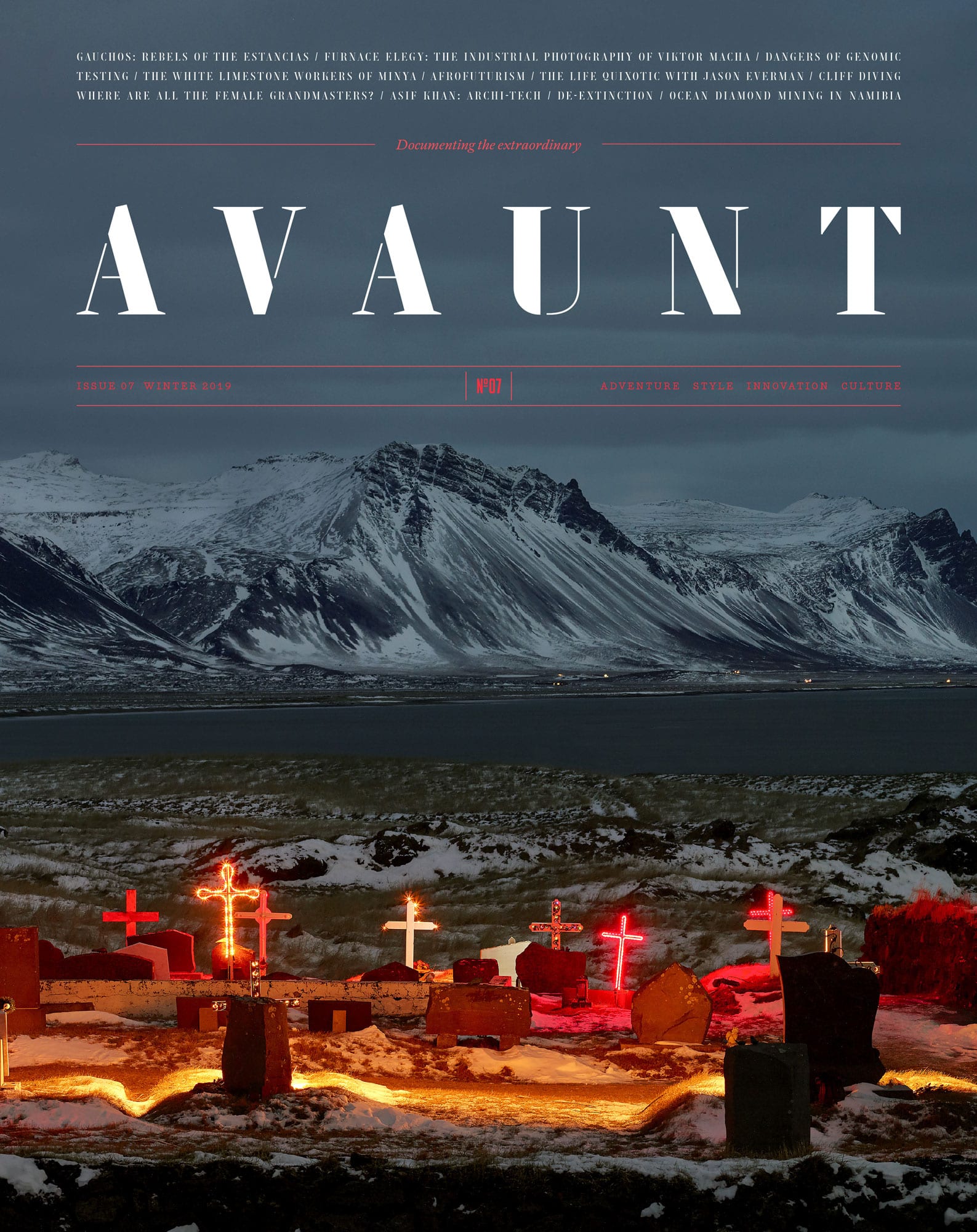
- Inspired Design Decisions: Avaunt Magazine
- Inspired Design Decisions: Pressing Matters
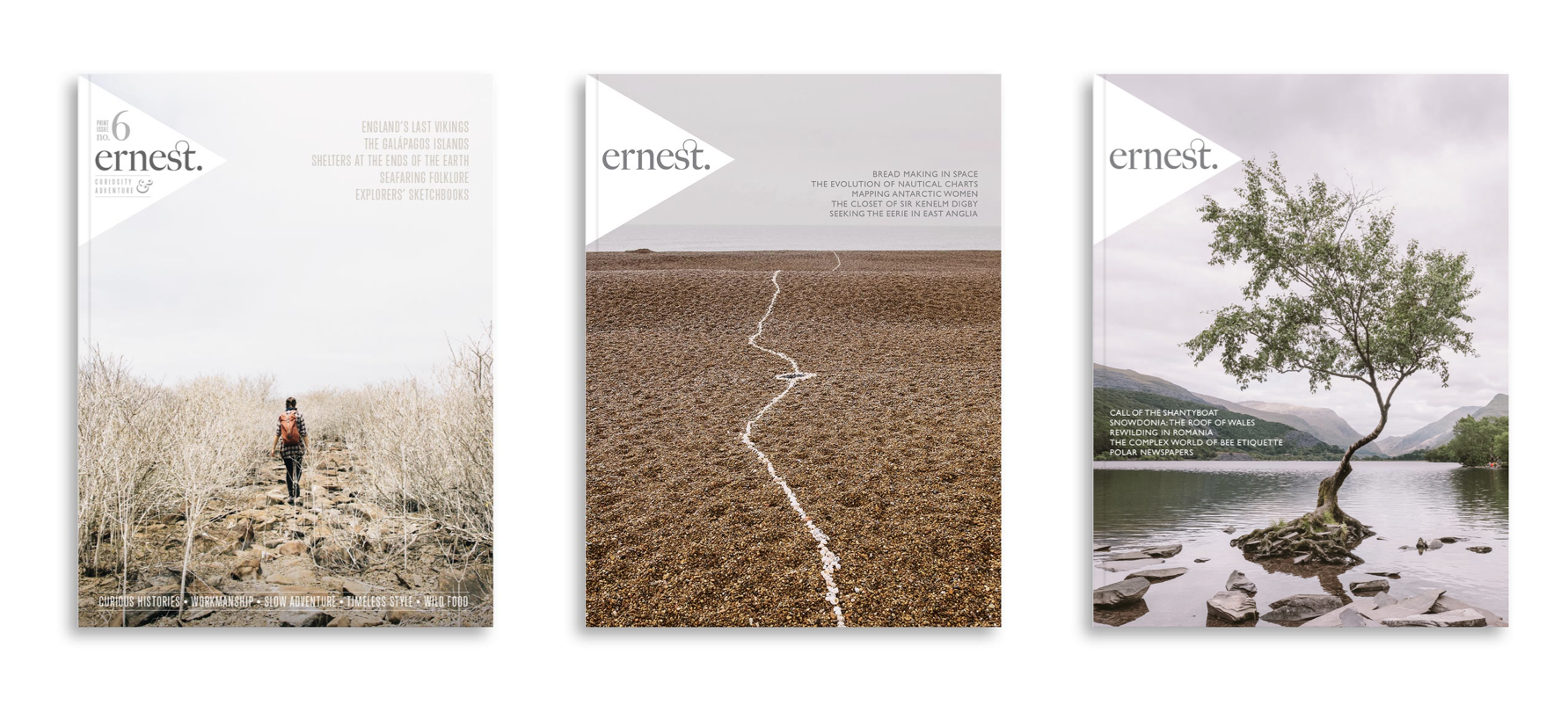
- Inspired Design Decisions: Ernest Journal
- Inspired Design Decisions: Alexey Brodovitch
- Inspired Design Decisions: Bea Feitler
- Inspired Design Decisions: Neville Brody
- Inspired Design Decisions: Otto Storch
- Inspired Design Decisions: Herb Lubalin
- Inspired Design Decisions: Max Huber
- Inspired Design Decisions: Giovanni Pintori
NB: Smashing members have access to a beautifully designed PDF of Andy’s Inspired Design Decisions magazine and full code examples from this article. You can also buy the PDF and examples from this, and every issue from Andy’s website.
 (ra, yk, il)