Scrapestack Review – The best scraping API?

Let’s be honest here, web scraping isn’t the most fun task in the world. Unfortunately, it’s not the easiest, either. Scrapestack aims to change all of that by making things simple. No, you probably won’t be screaming with joy while running a scraping API, but thanks to Scrapestack, you won’t be pulling your hair out or losing any sleep over it, either.

scrapestack

What makes Scrapestack different?

If you’ve ever used a web scraping API, you know that it’s just a bunch of data. Scrapestack, like any other good scraping API makes all of this data easy to digest. But, they do it in milliseconds. Yeah you heard me, milliseconds. You’ll be gathering data faster than the web developers can produce it. Okay, maybe that’s an exaggeration, but you catch my drift. It’s 

quick.

scrapestack

What does Scrapestack have to offer?

Ah, the real reason we’re all here. Talk is cheap in the SaaS world. What really matters is what you offer. So, the wait is over, here’s what you’ll get:


  • Millions of proxies and IPs

Use Scrapestack’s massive network of 35+ million datacenter and residential IP addresses spread across dozens of global ISPs.


  • 100+ Global locations

You have lots of choices when it comes to sending your web scraping API requests. In fact, you have over 100. Or, you can simply use random geo-targets. It’s up to you.


  • Unrivaled infrastructure

Scrape the web with speed that even The Flash would be jealous of. Enjoy advanced features that you won’t find anywhere else while you’re at it.


  • Free option

Let’s be frank again and say that of course they have premium options. But, the free option is always a good place to start, and not everyone offers one. Scrapestack does, however, and it comes with everything you need to get started. But, I’m pretty sure you’ll be upgrading before too long.

Scrapestack is the world’s most trusted web scraping API

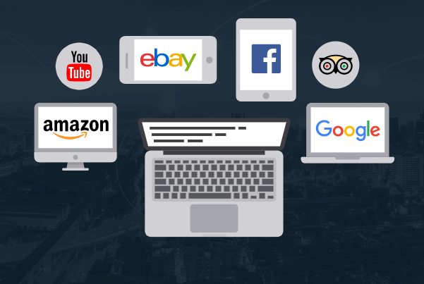
I’ve always felt much better when buying an online tool if I see that a big brand uses it, too. Well, the story for Scrapestack is a little different. They don’t have one single trusted brand… they have a ton. In fact, they have some of the biggest brands in the world using them.

scrapestack

With names like YouTube, Facebook, and even Amazon, you can pretty much guarantee that Scrapestack is a beast. These are all titans in their given industries, and they all choose Scrapestack.

Bringing it home

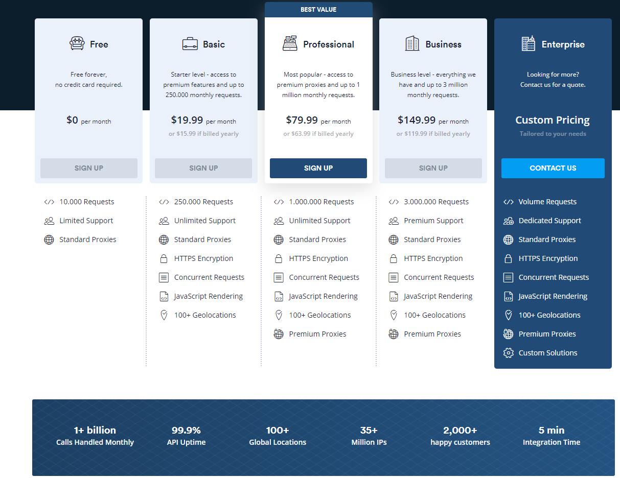
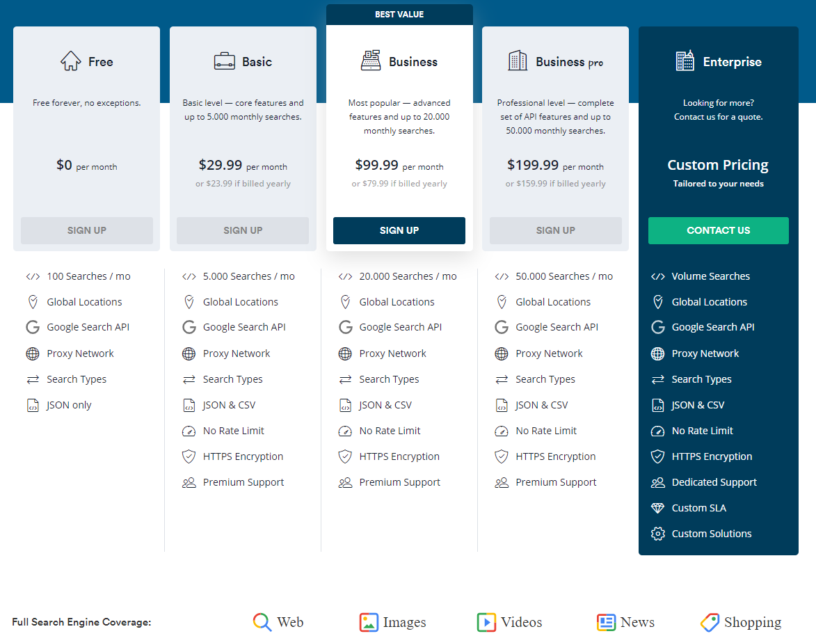
Scrapestack currently offers 5 different packages. Each level completely depends on your needs, as they all scale depending on the size of the requests needed. 

scrapestack

I’ll be real, each package is an absolute steal based on what you get. I really appreciate how they have an option for any company at any size. I mean, depending on the package, you can get anywhere from 10,000 requests all the way up to 3,000,000 and beyond. The capabilities truly are limitless.


So the takeaway? You’re spending way too much time reading this! You should be signing up right now. Thank me later. You know, after you’ve signed up and all. Enjoy!


Read More at Scrapestack Review – The best scraping API?

Inspirational Designer of The Week – Meet Gal Shir

Welcome to this edition of Web Design Ledger’s Inspirational Designer of the Week!

And now, I’d like to welcome Gal Shir to the scene, our pick for the most inspirational designer of the week.


Gal Shir is a graphic designer, illustrator and motion designer who has been designing from age 13.

The aspiring, self-taught designer at just age 13 got his first version of photoshop and started designing away.

[source]

He says that in school, his teachers liked him because he didn’t cause many problems, but he was always drawing during class or designing on his laptop.

What started out as a passion and doing small projects for friends, families, and small businesses,  led to his long-term passion and career.

He had a special talent when it came to designing, and when he realized someone would actually pay for what he’s passionate about doing, he was ecstatic.

He once used to design wedding invitations for friends, but now he’s working alongside start-up businesses to help them better embody the aesthetic they’re looking for and the message they want to spread through UX.

When asked where he gets his inspiration from, he says, “I think inspiration is all around, sometimes even a bit too much.

For a designer, almost every daily-use objects are something to learn from.

Each one of those was designed, good or bad.

I love to get to know new tech products, gadgets, applications, and websites.

[source]

My favorite website for inspiration is the one and only Dribbble, which has the most variety [in] design fields, up-to-date trends and hourly-updated feed of design works made by talented people.”

And speaking of Dribbble, he posts lots of inspirational and quality content for his 100,000+ followers.

And if you thought that was impressive, take a look at his Instagram numbers: 699k followers!

After a long day of work, he says he likes to clear his mind by being on social media.

You can see all the amazing videos of him drawing on his Instagram page.

So how does the creative process start?

Gal says that his creative process all starts from a concept in his mind.

He tries to think of a scenario that he would like to freeze in time and try to create an image out of it.

When he works together with a client, he tries to portray and represent the company’s goal and product through his art.

How can an aspiring designer enhance their design skills?

Gal shir says, “I believe that any skill is achievable, and that persistence is a key to enhancement. I found out that having a daily routine of a small drawing a day can be very effective.”

He advises all aspiring designers to surround themselves with content and other designers that inspire them.

Find people on social media that inspire you to do better and start from there.

So what does a typical day look like for Gal Shir?

He says he wakes up around 9 am and then starts his morning off with a brisk 20-minute walk to the office where he is currently working.

His workdays consist of meetings, brainstorming, designing, illustrating, working with product developers.

And after work, Gal Shir says that creating these flawless drawing videos that we all love so much, is meditative for him.

Besides drawing and creating being his job, it’s also how he escapes from the real world for a bit to recharge.

And I know I speak for all of us when I say, we’re glad this is the way you relax because as meditative as it is for him, it is as well for all of us.

Gal Shir is truly an inspiration for and to all and we were honored to represent him on this week’s edition of inspirational designers.

Let us know who your favorite designer is in the comment below for a chance to have them featured on next week’s piece about inspirational designers!

Until next time,

Stay creative!


Read More at Inspirational Designer of The Week – Meet Gal Shir

12 Free Christmas Fonts for You to Use to Spread Christmas Cheer

beyond-wonderland-font-5-big

Thanksgiving has come and gone, and now it’s time to start preparing for Christmas designs if you haven’t already!

We provided you with what we believe to be the ultimate list of free Christmas design resources a few weeks ago, but I saved the best for last.

Free Christmas fonts!

I found an abundance of free Christmas fonts to help you spread cheer this year through your designs, but I picked my absolute favorites for this list.

12 Free Christmas Fonts for You to Use

Prepare to be “sleighed” by this amazing list of free Christmas fonts!

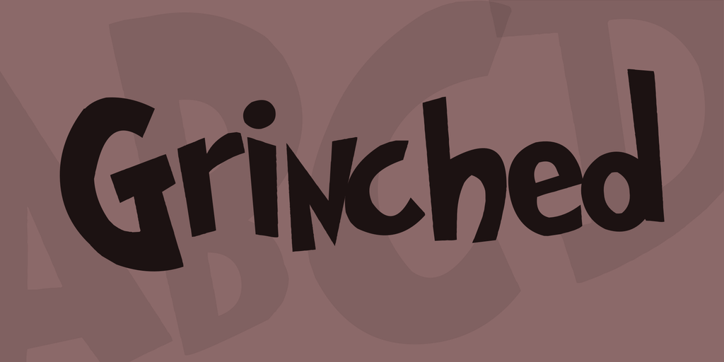
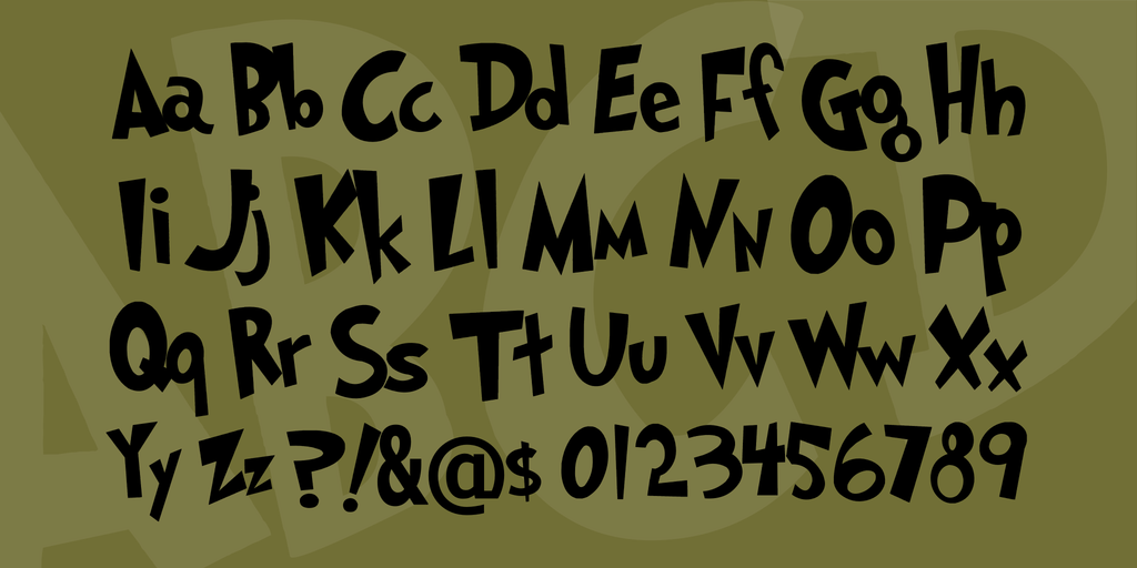
1. Grinched

grinched-font-2-big grinched-font-3-big

Did somebody call my childhood and ask them to show up in this picture?

Everyone will recognize this font as the one from The Grinch book and movie. It’s perfect for you to use this Christmas and it’s free to use for personal use, and for commercial use, you’ll need to get in touch with the owner.

I think this font will forever be my favorite Christmas font.

Download here: https://www.1001fonts.com/grinched-font.html

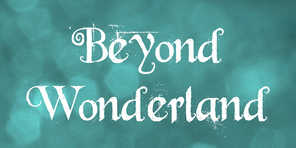
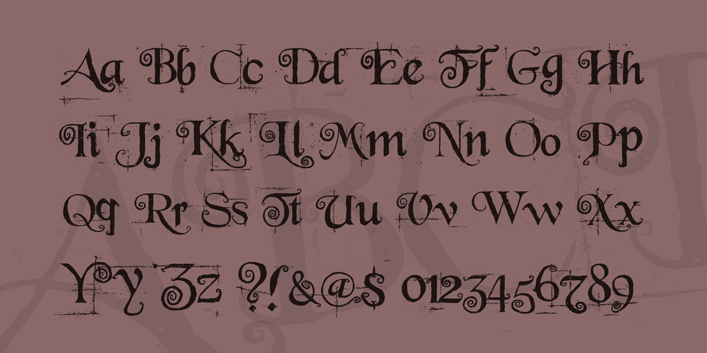
2. Beyond Wonderland

beyond-wonderland-font-5-big

beyond-wonderland-font-3-big

This font screams wintertime. Within the font itself, it looks like it’s snowing!

This handwritten font is free for personal use, and you can contact the owner for commercial use.

Download here: https://www.1001fonts.com/beyond-wonderland-font.html

3. The Gingerbread House

the-gingerbread-house-font-5-big the-gingerbread-house-font-4-big

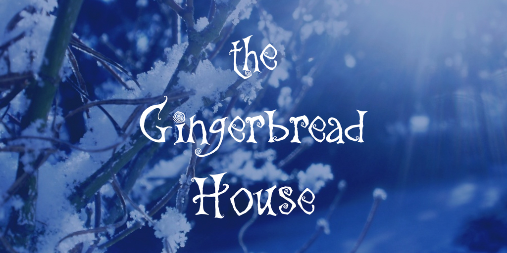
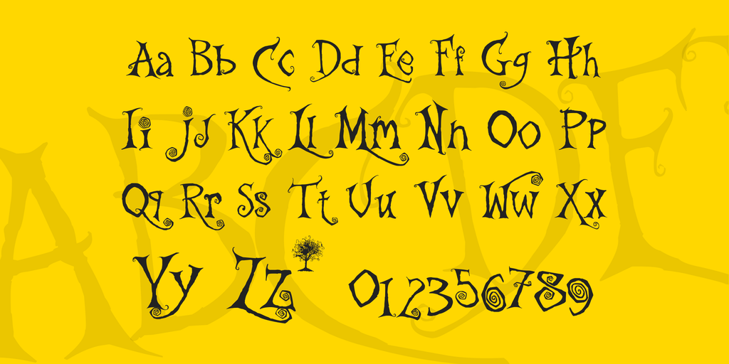
Next up, we have this curly, handwritten Christmas font called The Gingerbread House.

Handwritten fonts for Christmas are a must. It brings back some sort of nostalgia and everyone, even people with absolutely no design skills, can recognize that this font is Christmassy.

This font is free for personal use.

Download here: https://www.1001fonts.com/the-gingerbread-house-font.html

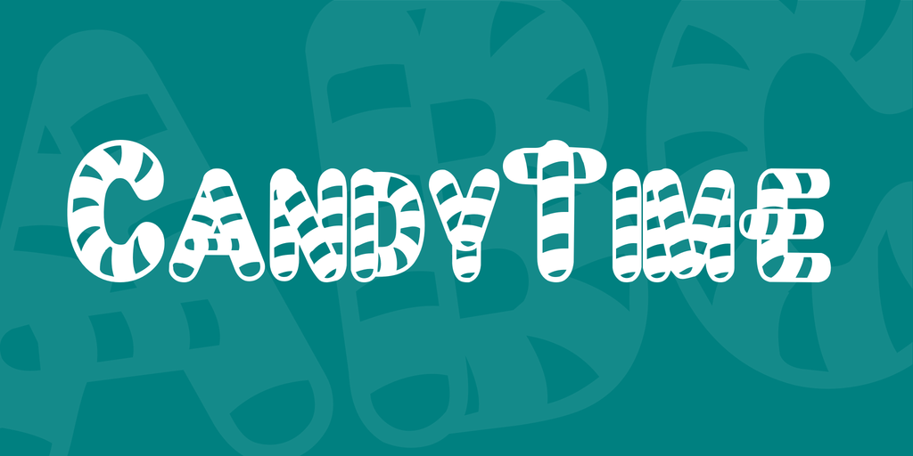
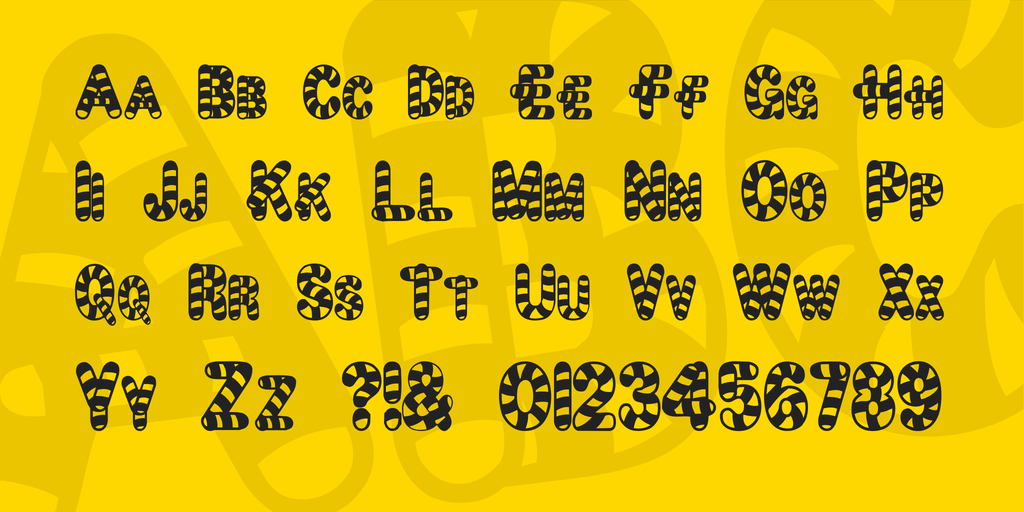
4. Candy Time

candytime-font-1-big candytime-font-2-big

Candy Time looks absolutely delicious.

This Christmas candy cane font would go perfect with any type of cooking project or a project for a game for children, or really anything you put your creativity and mind to.

This font is very versatile and perfect for the season.

Download here: https://www.1001fonts.com/candytime-font.html

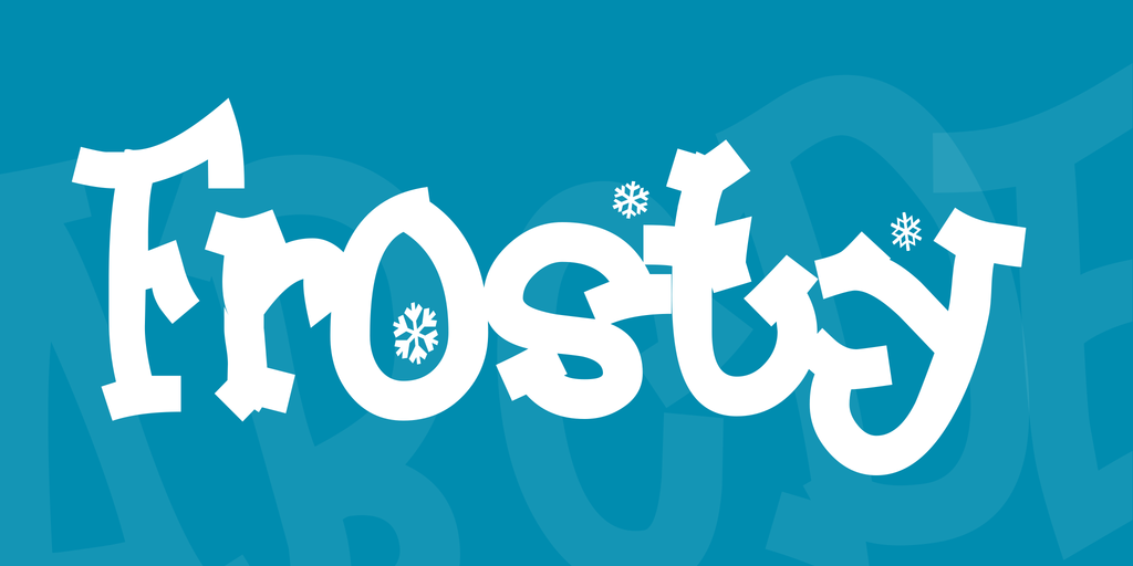
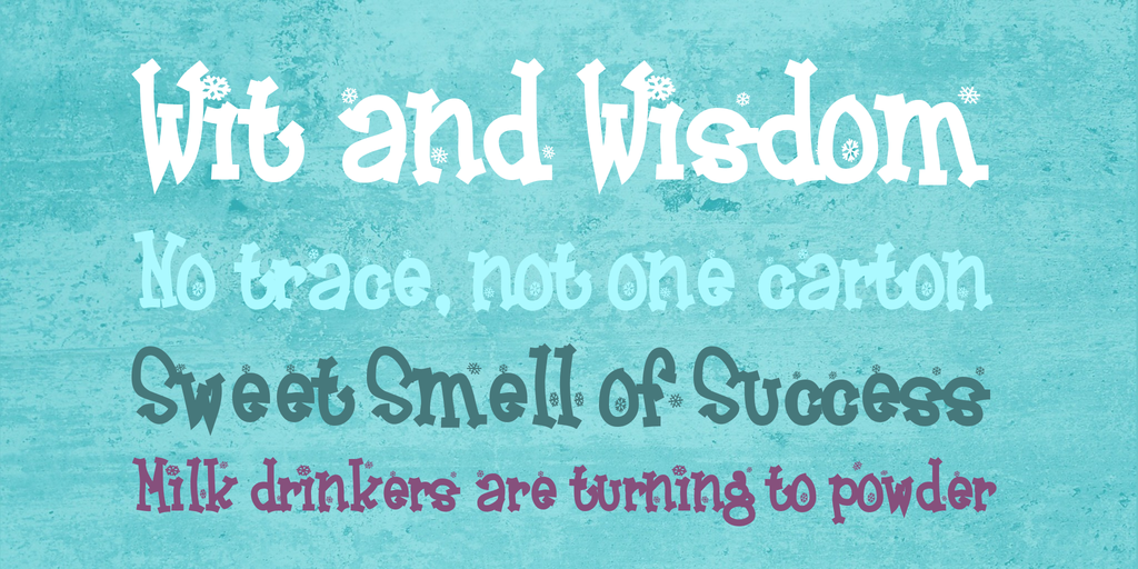
5. Frosty

frosty-font-4-big frosty-font-3-big

Frosty the snowman! I mean… frost the font.

This font is so magical and is the perfect embodiment of winter.

The font is full of character and literally has little snowflakes floating around amongst the letters.

This font is perfect for the Christmas season.

This font is also free for personal and commercial use.

Download here: https://www.1001fonts.com/frosty-font.html

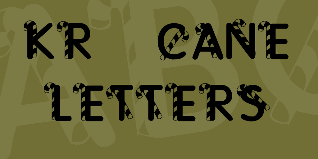
6. Cane Letters

kr-cane-letters-font-1-big

Another scrumptious free Christ font for you to use.

This font gives off a 3D effect due to the canes shadowing the letters.

Very festive, cute, and Christmassy.

Download here: https://www.1001fonts.com/kr-cane-letters-font.html

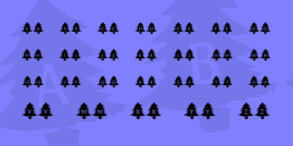
7. Oh Christmas Tree

kr-oh-christmas-tree-font-2-big

Oh Christmas Treeeeeee, oh Christmas Tree!

This font makes me hear my crazy aunt singing in the living room at the top of her lungs.

This decorative font is perfect for spreading Christmas cheer.

Download here: https://www.1001fonts.com/kr-oh-christmas-tree-font.html

8. Cartoon Blocks

cartoon-blocks-christmas-font-5-big

This playful Christmas font is free for you to use on any of your upcoming personal Christmas projects.

Contact the owner for a commercial license to use it.

This 3D Christmas font is jolly and perfect for the season!

Download here: https://www.1001fonts.com/cartoon-blocks-christmas-font.html

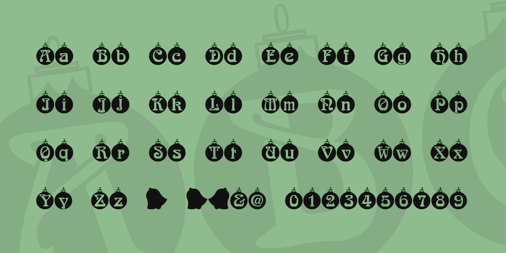
9. Christbaumkugeln

christbaumkugeln-font-2-big

Just have a look at this festive font.

The font inside of the ornaments is so festive, it hurts.

This font is calling your name. Use the link below to download it!

Download here: https://www.1001fonts.com/christbaumkugeln-font.html

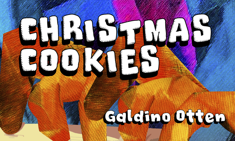
10. Christmas Cookies

christmas-cookies-font-1-big

Check out this 3D Christmas font.

Can you just smell the Christmas cookies by looking at it?

Because I know I can.

Download here: https://www.1001fonts.com/christmas-cookies-font.html

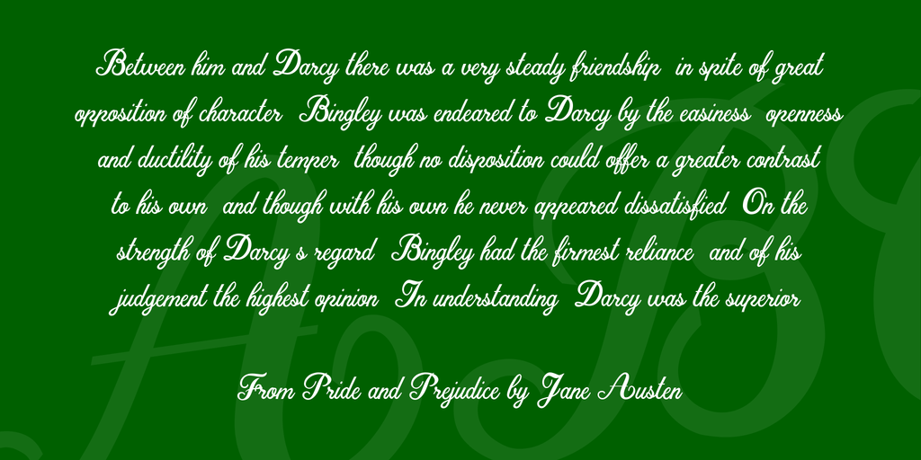
11. Christmas Time

christmas-time-personal-use-font-3-big

Our second-to-last Christmas font looks like a classic.

It could be on the cover of any classic Christmas book.

This beautiful, cursive, handwritten font is free and available for personal use.

Download here: https://www.1001fonts.com/christmas-time-personal-use-font.html

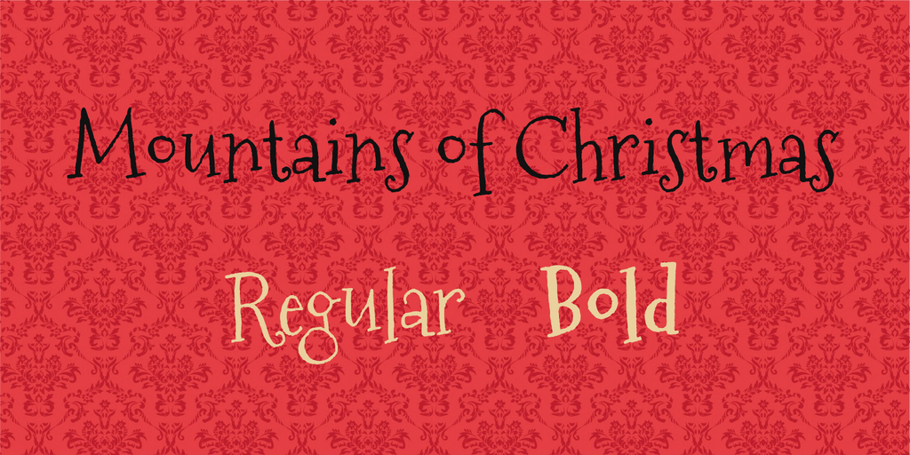
12. Mountains of Christmas

mountains-of-christmas-font-1-big

And finally, we’ve come to our final Christmas font.

This gorgeous handwritten font is just waiting for you to use on your next design project!

So what are you waiting for?

Download it here: https://www.1001fonts.com/mountains-of-christmas-font.html

“Wrapping” up

We hope you enjoyed our list of free Christmas fonts for you to use this jolly season.

We wish you all the most magical holidays!


Read More at 12 Free Christmas Fonts for You to Use to Spread Christmas Cheer

What is Serpstack, and how can it help you?

serpstack

I’m sure many of you know what SERP data is, but I think the best way to start this would be to give a brief explanation of what exactly Serpstack is. So…. what is it?


Serpstack is an API that was built for automated targeted search result (SERP) data gathering. The data is collected using a powerful proxy network as well as proprietary and scalable web scraping CAPTCHA solving technology. Phew, what a mouth full.


Now, again without all that technical mumbo jumbo: It’s an API that gathers SERP data and displays it in a JSON REST format.

serpstack

Features

So what do you get with Serpstack. I’m glad you asked. Take a look below:


  • Super simple integration – It doesn’t take much to integrate Serpstack into your routine. Within minutes, you’ll be scraping with the best of them.


  • Bank-level security protection – All data streams sent to and from the Serpstack API are 100% protected using bank-grade 256-bit SSL Encryption.
  • JSON, HTML, CSV & XML API – It’s easy to use and it’s incredibly quick. The serpstack API is capable of delivering API results in JSON, CSV, XML, and HTML format.
  • Full page scraping – A Google SERP consists of a few elements, including maps, answers, aps and even more — Serpstack will deliver all results to your application.
  • Use it anywhere – Serpstack will gather info from any city, state, country, and continent world wide.
  • Unrivaled speed – Just in case it wasn’t mentioned enough before, this API is fast. All data is in real-time, and it’s collected and sent back in a matter of milliseconds.
  • Incredible support – Serpstack is pretty easy to use, but just incase you do have questions of any kind, they have an incredible support and sales team ready for any question you can throw at them.


Packages

serpstack

For something as intuitive as Serpstack, you would expect it to break the bank. But that couldn’t be any farther from the truth. Serpstack has a total of 5 packages, and one of them is free. 


This API is truly scalable to any business. If you only need a few searches a week, no problem. What about a few thousand a day? They thought about that, too. There is a package for everyone, and it’s well worth the already miniscule cost.

Example of Serpstack at work

I’m always a fan of seeing things in action, so check this out:

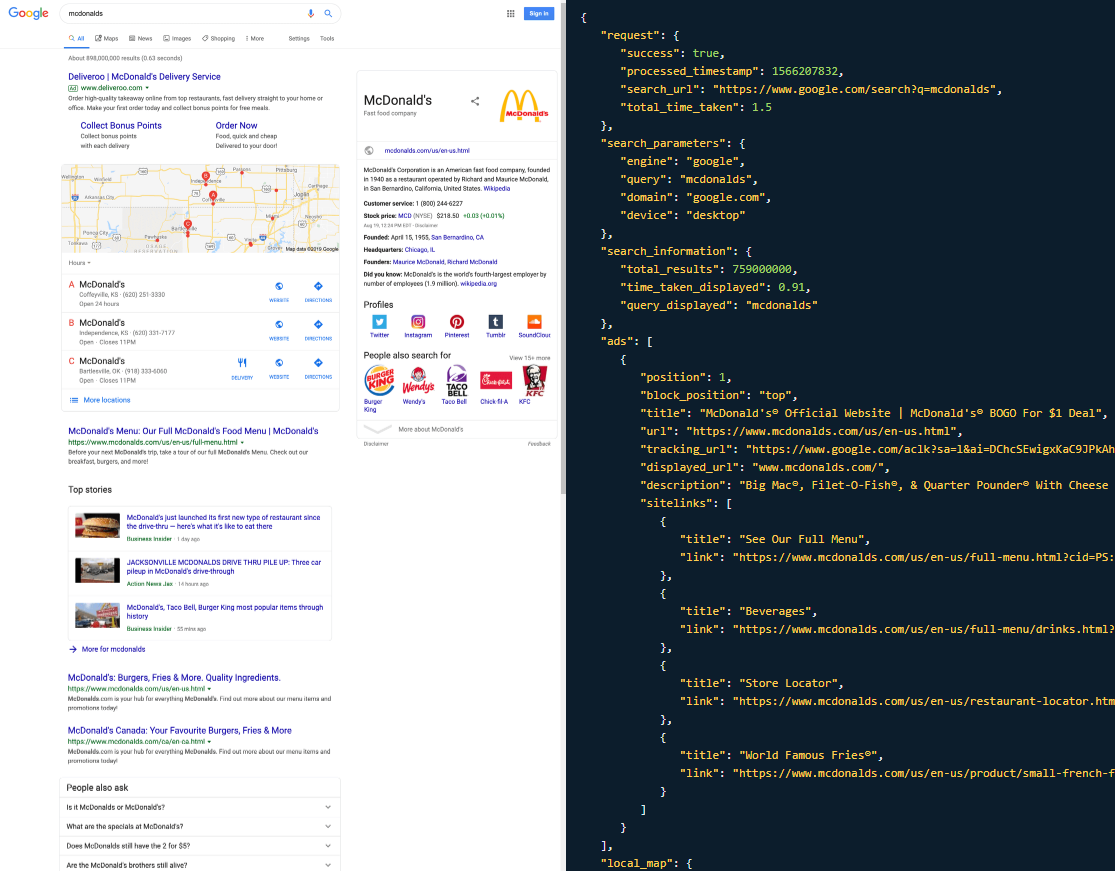
serpstack

Here we have a search for McDanold’s. Of course, this is just a small sample, and I couldn’t even fit all the data on screen. Nonetheless, this is a very good example of what the data the API collects will look like for you. It’s fairly simple and straightforward, but it’s still super cool.

Now what?

So we’ve gone over all the cool features and talked about what you can expect from Serpstack. Now what? Now you go and check it out yourself! 


Like I said before, it’s a very easy tool to learn. You won’t need any special training or anything like that to use it. Trust me, it’s a great bargain, and you’ll find a package, whether it’s premium or free that’s perfect for you. 


Read More at What is Serpstack, and how can it help you?

Warner Bros New Logo Design and Identity – Honest Thoughts?

Warner Bros.


Don’t those two words just spark loads of childhood memories for you? 


Anyone else?


Harry Potter, Lord of the Rings, Friends, and basically all good movies/shows ever!


I gotta be honest, I really didn’t know how to feel when I heard about the brand new logo and identity that WB was going for.


And after looking at it and letting it sink in, I think I can properly voice my opinion. 


But first, let’s get into a brief history of WB Studios. 


A Brief History of the Warner Bros Studio


Warner Bros has been around since 1923 and is surely one of the most well-known entertainment companies ever.


 With great, recognizable shows and movies like The Big Bang Theory, The DC Universe, Harry Potter, The Lego movie and loads and loads more, the library has more than 100,000, let me say that again, 100,000 hours of programming.


Not only do they have movies and tv shows, but they also have, as you probably know, comics books, video games that we all know and love. 


And now that they’re coming up on their centenary, they are celebrating with a brand new logo. 

Out with the old and in with the new. 


We can thank Pentagram for this new design that will suit all branches of the studio. 


Keeping many of the same, iconic elements of the original logo, we can look at this rebranding as kind of a great make-over, rather than a brand new reinvention of the logo.


Vice president of public affairs and worldwide corporate communications, DeeDee Myers, said that the “visual identity looked a little dated.


And that’s where Emily and her team came in. 


Emily Oberman, who headed up the redesign team, said she wanted to keep the original and iconic shield, but make it “more sleek and clean”. 


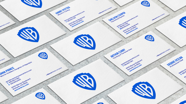
Here you can see the process of the redesign.


Instead of looking at the old logo as dated and needing an entirely new look, they kept the original elements and just kind of gave it a pick-me-up. 


By just making some simple changes and tweaking things here and there, a whole new design came out of the process. 


Even though the changes may have been small, they were able to maintain the original identity of the logo and brand, while giving it a whole new look.


The team said that they wanted the new logo to give people a sense of WB Studios moving into the future with us. 


While the shield has suffered a few changes, it was vital to the team and WB Studio that it was still easily recognizable to all fans and viewers. 


And I truly believe they were able to do just that.


It is more sleek and clean, just like they wanted. 


The shield was put into a golden ratio and thinned out a bit, and the letters were redrawn to give it a better sense of balance.


The iconic blue color of the WB Studios Logo was made more modern by brightening it just enough.


With this new logo came room for variation. 


This new logo needed to fit across all platforms and needed to look natural. 


The new logo can be modified to fit any occasion, or as DeeDee Myers liked to call it, logo soup. 


This logo comes in two different variations. A flat version, and a more dimensional version. 

This logo needs to fit any movie, show, comic book, etc, and that’s why it is so important that it can be easily modified to fit any occasion, while simultaneously keeping that originality and recognizability. 


Myers told us that “There is a tremendous ability to play with it and bring it to life.”. 


And that’s what Emily Oberman and the team were going for when they said, they wanted the logo to be “contemporary, while also being able to be used as a sponge for any story they wanted to tell,”. 


Amongst the two new design variations of this logo is also a new font. 

Warner Bros Sans is an original font that came from the original shield of the logo and was inspired by the 1920s Art Deco. 


By doing this, Oberman said that the brand would still be present through the custom font, even if the shield was not there. 


“We’re excited about refreshing the brand,” says Myers, “connecting it to the past, but with eyes firmly ahead.”


This project that took 3 years to complete is finally here, and it’s here to stay. 


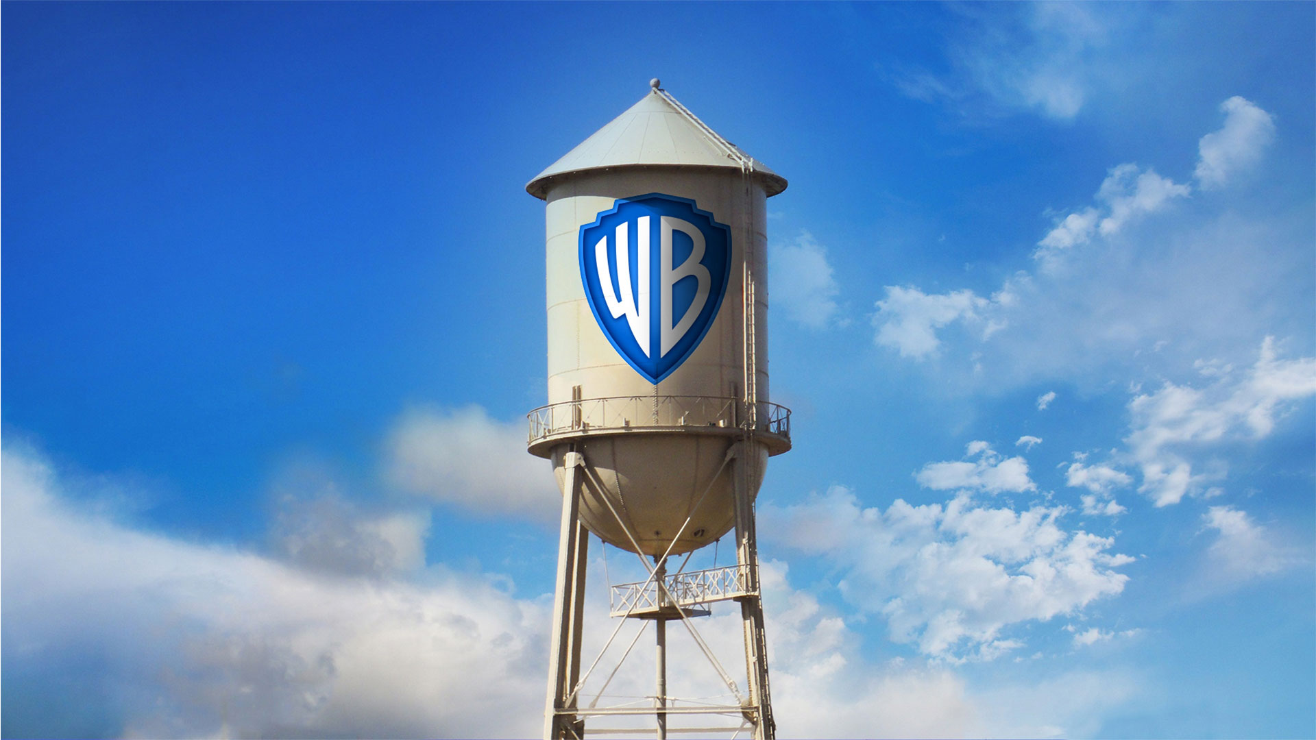
The new logo is on the iconic water tower located on the WB Studio lot, and will soon be everywhere, from literature to social media, to big screens and on the sides of trucks.

We’re curious what you think about the new logo redesign that Warner Brothers Studio went through.


Are you a fan? Will you be missing the old logo? 


Let us know all of your opinions in the comment section below.


Until next time,


Stay creative, folks!  


Read More at Warner Bros New Logo Design and Identity – Honest Thoughts?

The Ultimate Collection of Free Christmas Design Resources

gift boxes free design resources for Christmas

With Christmas coming up very soon, you might be swamped with Christmas-themed designs.


Everyone wants to get their job done as efficiently and quickly as possible. 


That’s why I collected loads of free Christmas design resources for you.

Everything from free Christmas icons to free Christmas PNGs, vectors and images, I’ve got you covered. 


You’ll be “sleigh-in’” it this winter season with all these free Christmas design resources, let’s get right into it.


Free Christmas Icons


Last week I wrote The Ultimate Collection of Design Resources that you should definitely check out for your day to day use. 


But today, we’re talking all about free Christmas design resources.


Having some free Christmas icons will surely save you lots of time, so you don’t have to start from scratch. 


3Here is my pick of free Christmas icons that you can use. 


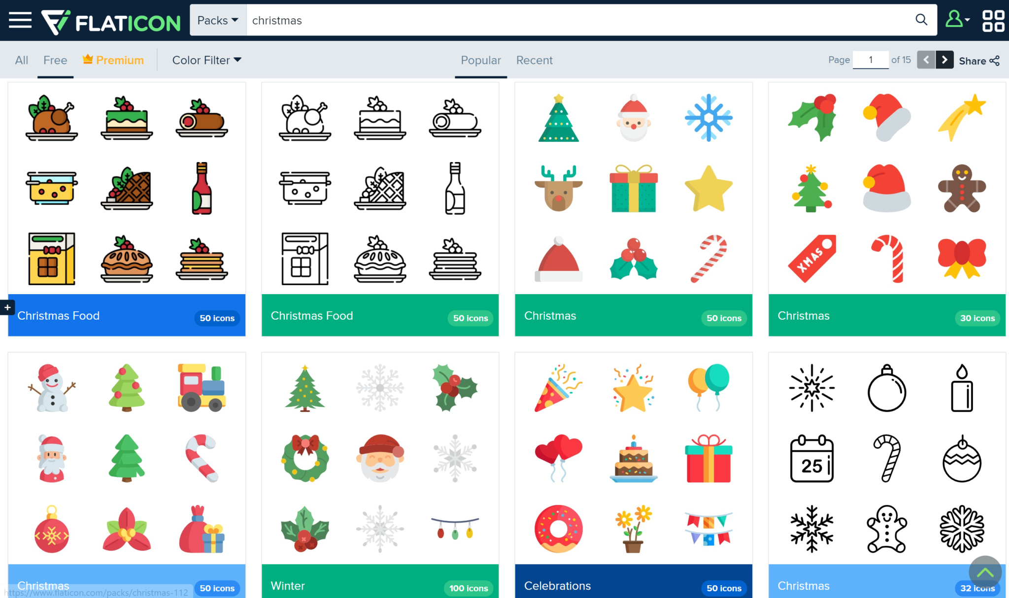
Flaticon

free christmas icons

Flaticon has lots of free Christmas icons for you to use for any of your Christmas projects that are coming up.


 It’ll save you lots of time, and the fact that hundreds of these icons are free will help you save a buck as well! 


Upgrade to premium in order to get thousands of icons! 


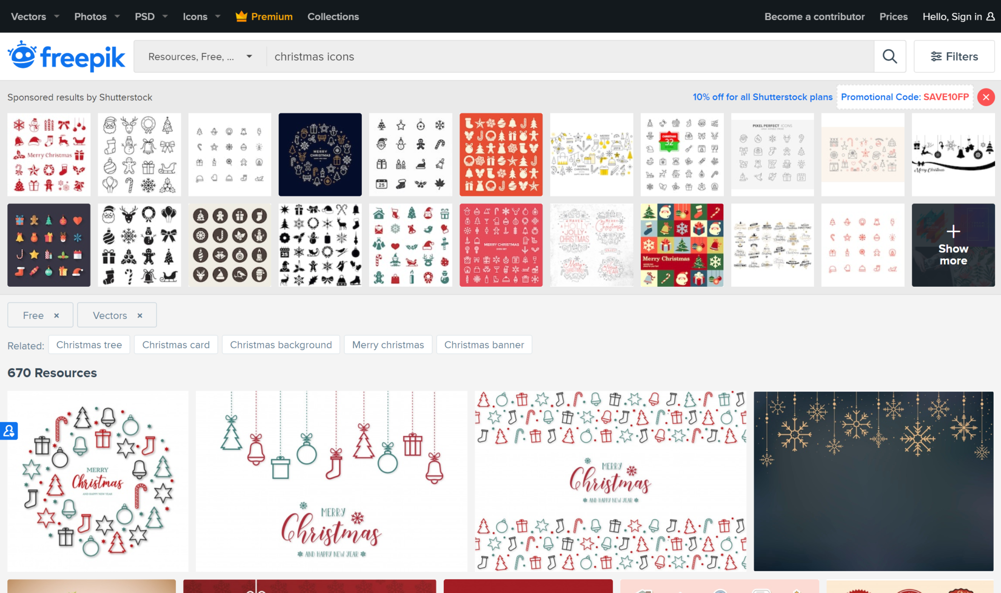
Freepik

free christmas icon design

Freepik will help you spread tons of Christmas cheer with their hundreds of free Christmas elements. 


They have flat designs and 3D designs alike in their Christmas icons. You don’t want to miss out! 


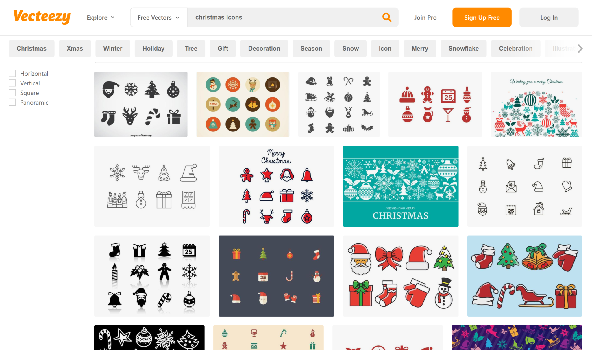
Vecteezy

free vectors for christmas holidays

Vecteezy has lots of color and happy icons for you to use for free. 


Just choose the ones you like, download, and use to your liking! 


Free Christmas PNGs


Make your clients happy with the best Christmas PNGs out there. 


Here are my top favorite free PNG websites that will certainly help you out this season. 


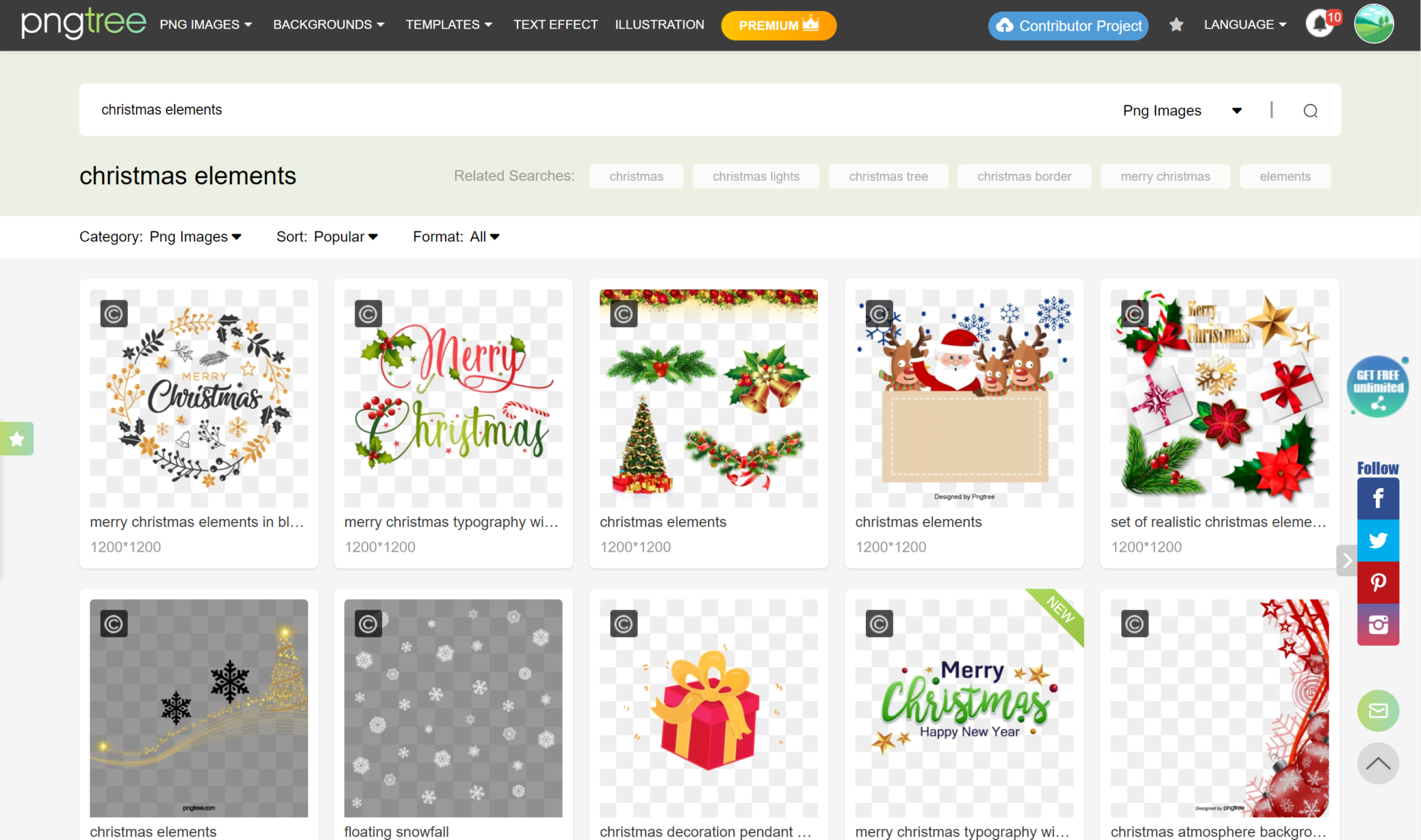
Pngtree

free pngs for christmas

Pngtree is great for everyday use but especially has some great Christmas PNGs. 


Their quality has never once disappointed me.


The only downside to their site, in my opinion, is that you only get 2 free PNGs a day.


So choose wisely, or consider upgrading to a premium account! 


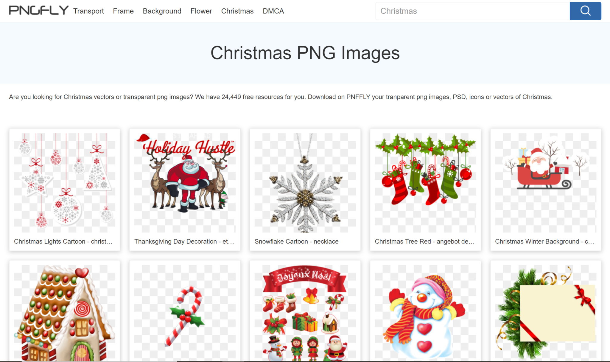
Pngfly

free christmas png icons and images

Pngfly has over 20,000 free resources for you to use this Christmas. That’s definitely not an offer you want to miss out on.


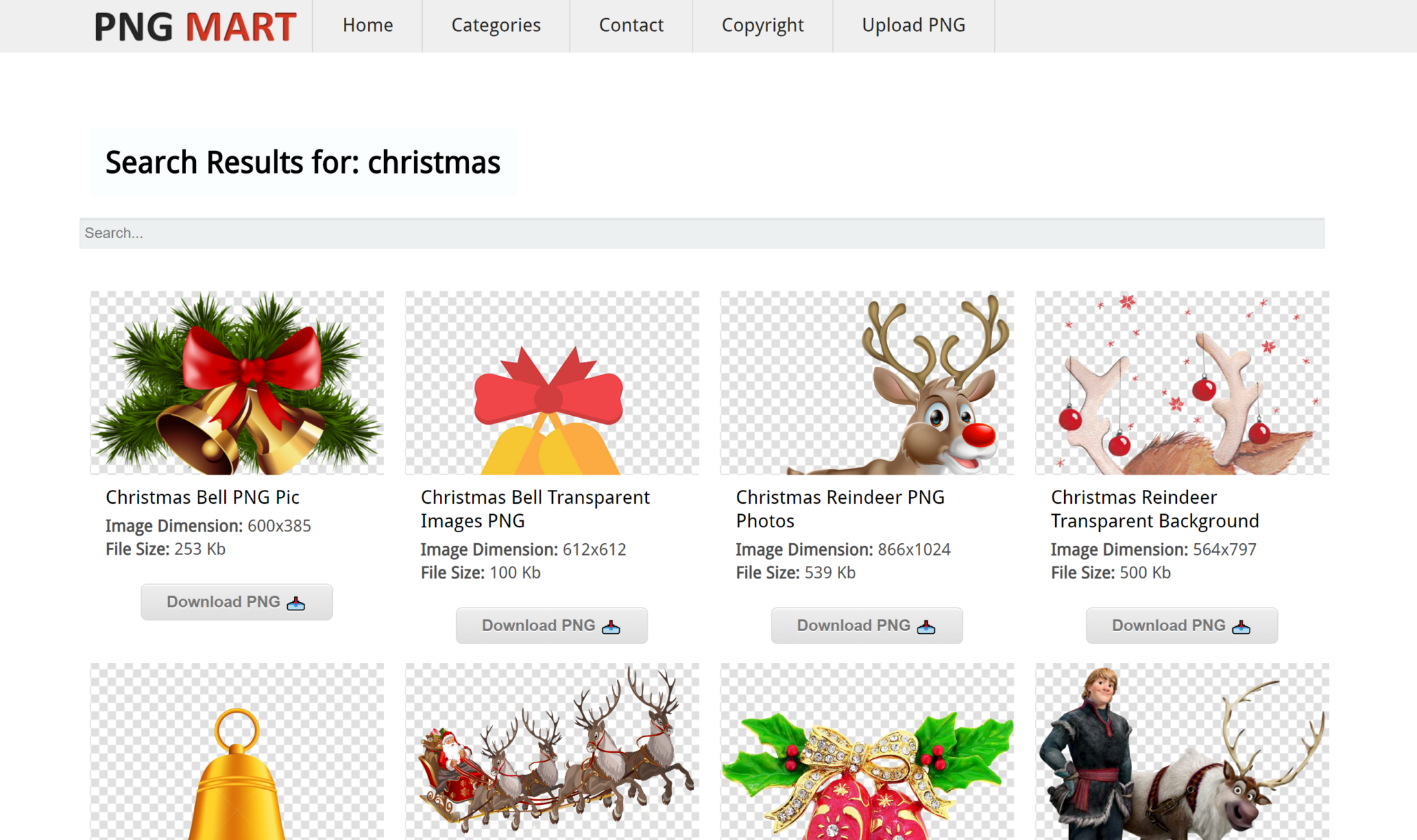
Pngmart

free pngs for christmas desgin

Pngmart has tens of pages for you to browse through when looking for the perfect free Christmas PNGs. 


Check em out!


Free Christmas Vectors


Vectors are a huge part of graphic design, so it’s only right that we go over the best websites with the best free Christmas vectors that the internet has to offer.


Let’s do it.


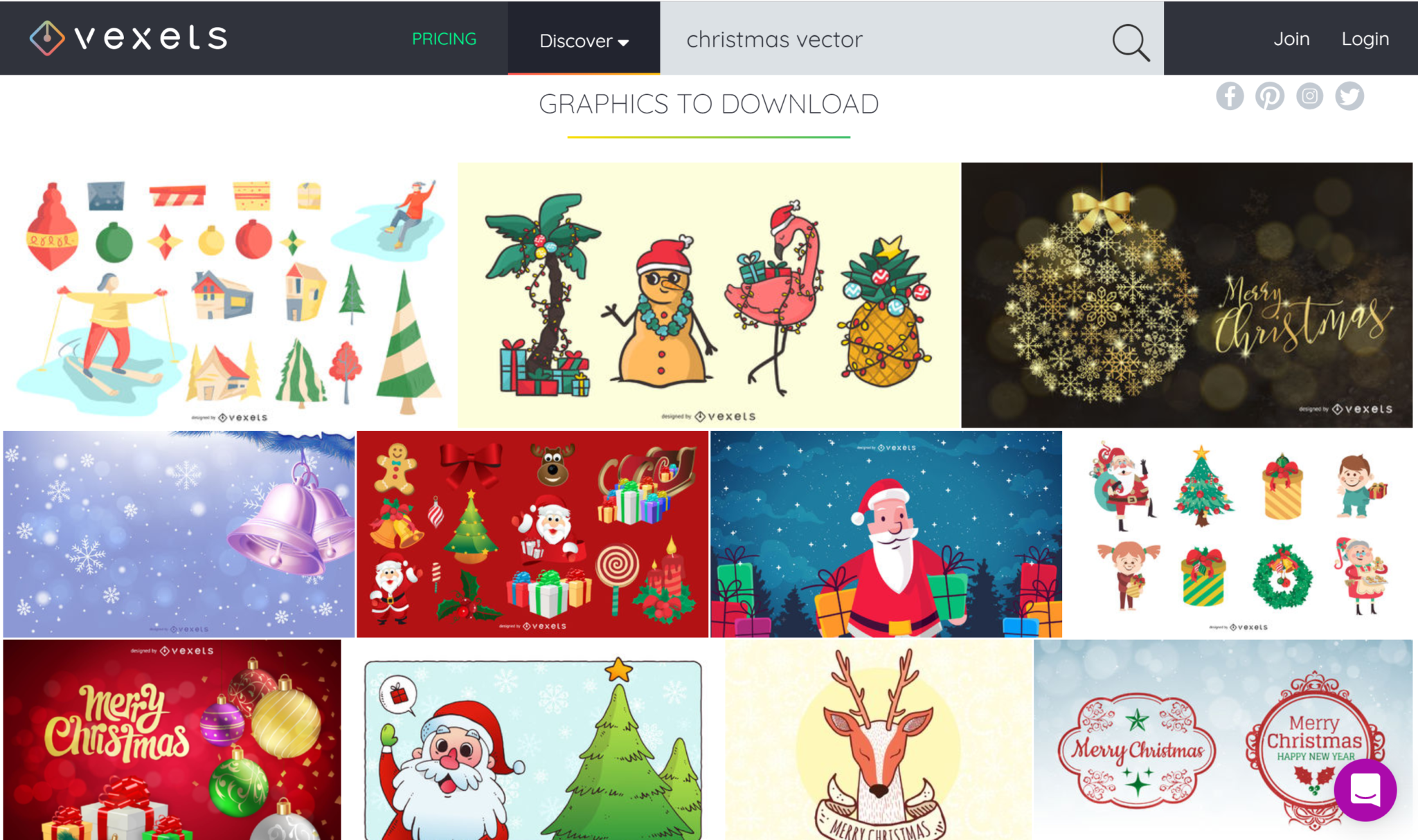
Vexels

free vectors for holidays and christmas

Vexels has some of the best vectors I’ve laid my eyes on. Colorful, cheerful, perfect for Christmas. 


If you’re looking for great free Christmas vectors, then you definitely need to check them out!


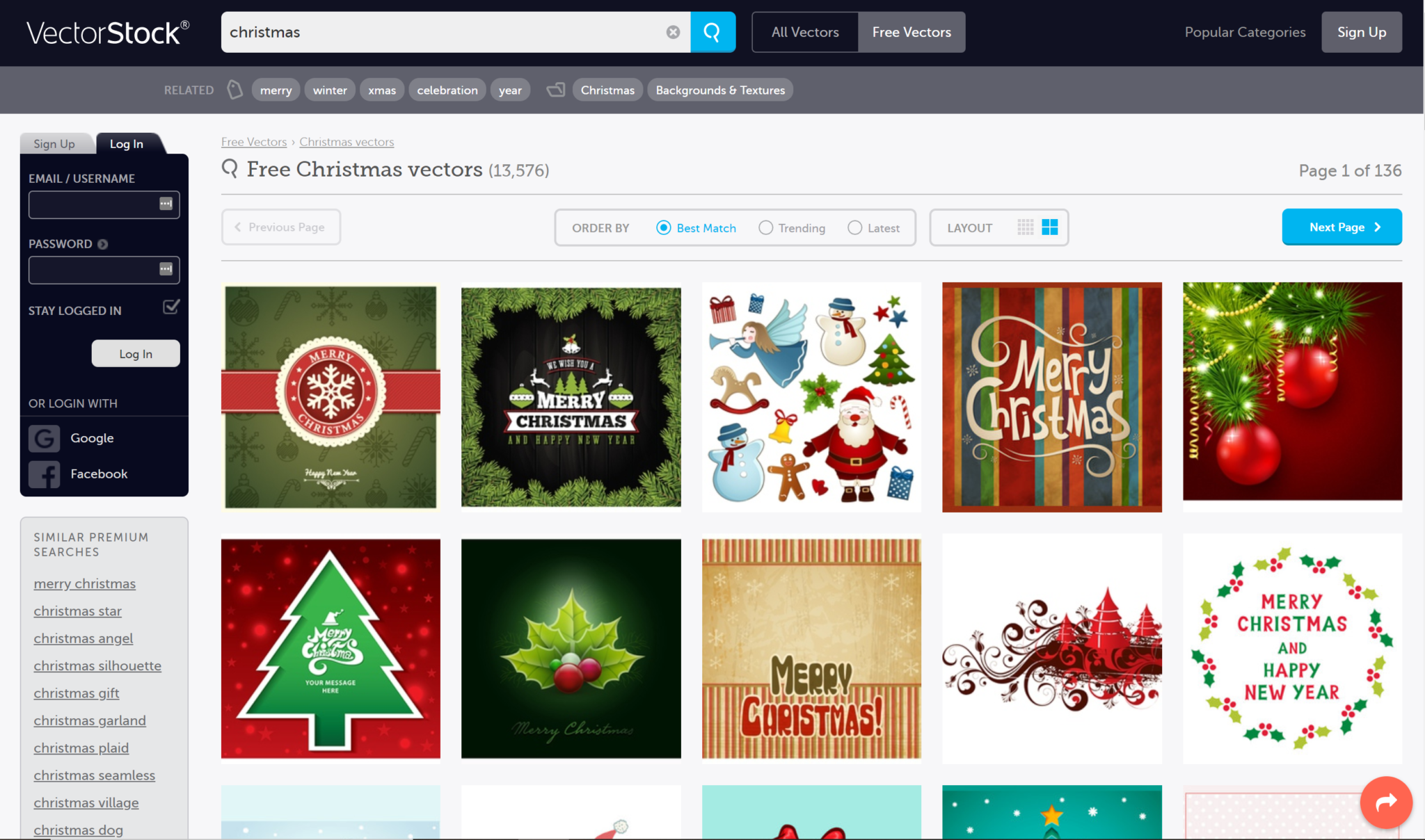
Vectorstock

free christmas vectors design

But wait—there’s “myrrh”. Vectorstock has over 13,000 free Christmas vectors for you to use!


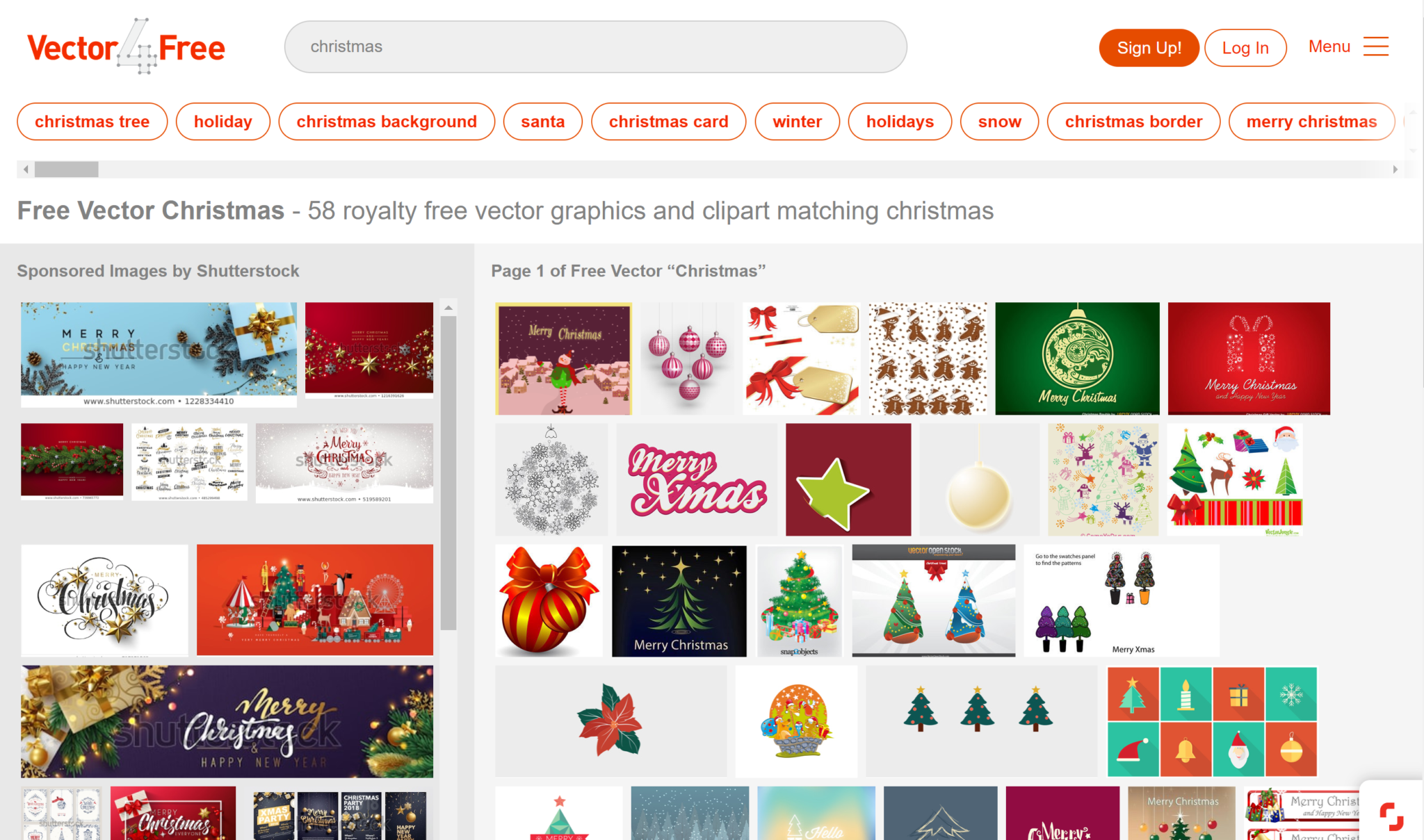
Vector4free

free vectors reindeer christmas holidays santa

Vector4free is a great choice for using in your everyday designs, but not only.


They have lots of Christmas vectors for you to choose from, so I recommend you get to it! 


Free Christmas Images


Christmas images will give a warm, homey feel to any project. 


If you don’t have a camera or time to take any Christmas pictures, definitely give these free Christmas stock images websites for your work! 


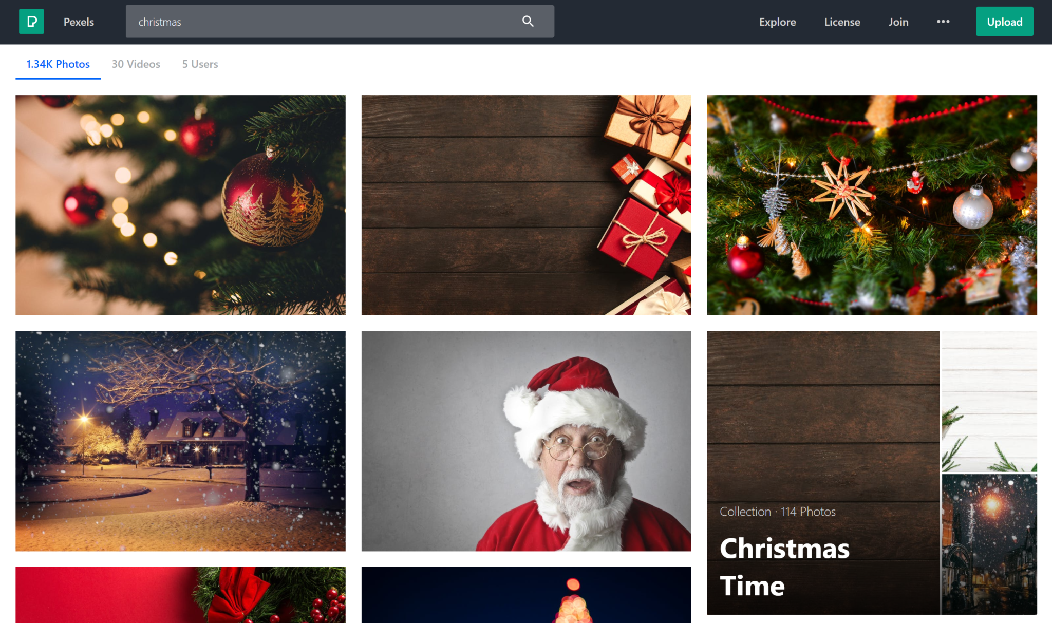
Pexels

free christmas stock images

Pexels is definitely one of my personal favorite stock images websites. 


They have lots of high-quality images from great individual photographers.


 And if you want to, you can support the artist, by donating to them! 


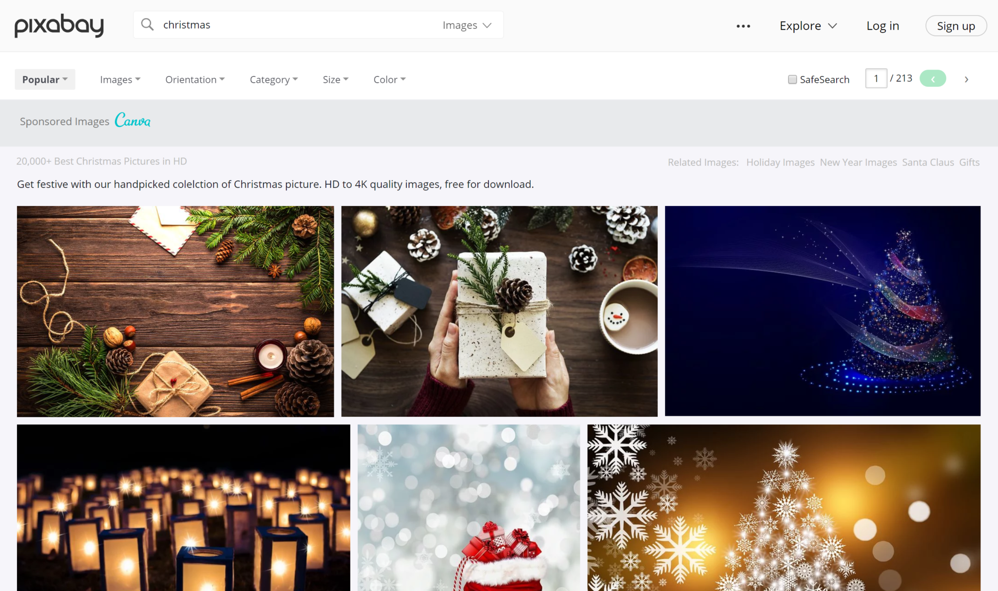
Pixabay

christmas stock images for free

Pixabay has loads of photo choices for you to choose from.


With over 20,00 free images solely dedicated to Christmas time, you’re bound to find the photo you’re looking for.


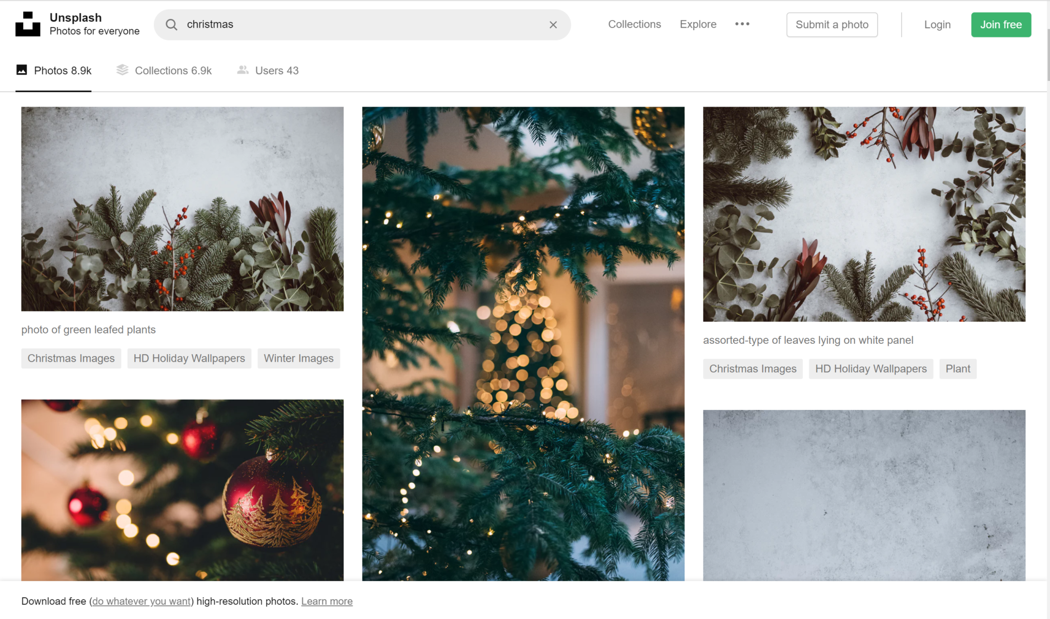
Unsplash

free images for christmas holidays

And finally, we have Unsplash


Unsplash has tons of Christmas photos for you to choose from, that are extremely festive.


Check out their site and find all your Christmas photo needs there! 


“Wrapping” up


Well, you guys snow the drill. This is the end of our time together.


I hope you found these design resources helpful! 


Until next time,


Stay creative, folks!


Read More at The Ultimate Collection of Free Christmas Design Resources

The 10 Elements of Every Great Logo + 10 Logo Examples

When establishing a brand, you should never put your logo on the back burner. 


If your logo doesn’t represent you well or it looks unprofessional, then your customers are going to bounce, leaving your business to plummet. 


We’re going to go over the 10 elements of every great logo, that you can implement into your logo design. 


Let’s get straight into it. 


1. Memorable


The first, most important element of every great logo is that it’s memorable. If your logo isn’t memorable, then you’ve got a huge problem. Because people won’t remember who you are, what you offer, and you won’t come to mind in the future when they need the product you have to offer. 


Being memorable is key. Make an original first impression on people so that they’ll always remember you when they need to. 


2. Simple


A good logo is simple. If you have a great design, then it doesn’t need to be super intricate. Yes, get all the little details and hidden images in there. That’s amazing, but it should still, in its essence, be simple and easy to grasp.


3. Easy to understand


This goes hand-in-hand with simplicity. If your logo is so complicated that no one understands it, then you’ve done something wrong. Your logo shouldn’t need a huge in-depth explanation of what it represents and means. Of course, your logo can have some subliminal messages and hidden images, but it shouldn’t be so hidden that people awkwardly say “oh… okay”.


So make sure your logo comes across well, is creative and original, but also is easy to understand.


4. Recognizable


You want to be easily recognized. On the street, in the store, online- people should see your logo and go “Hey! I know that brand.” This is just as important as memorability. If people don’t remember who you are and don’t recognize you, then your company is going to die. That’s that. 


So make sure you’re recognizable, make a statement, and are memorable.


5. Timeless


How terrible if you work months and months on your logo and company, and you fall into some crazy fads, and next year your company logo looks a little bit crazy. You definitely want to follow some great trends, but make sure that your company logo will look just as good this year as it will the next five. 


6. Scalable


Your work should look good, big or small. Whether you’re being displayed on a tiny little RDA or a giant billboard in your town. This also means that you need to have a high-quality logo design, so when you blow it up or scale it down, it looks just as good, quality-wise. 


7. Relevant


Ask yourself when designing your logo, “Why this logo design? What does it represent for me?” If your logo doesn’t describe what you’re doing and isn’t relevant to your brand… then you may be doing something wrong. You want to make sure people understand why your logo is the way it is, and you want to make sure that your target audience will vibe with it. 


8. Attention-grabbing


You’ll want your logo to turn heads. When some3one is walking by and sees your logo, you’ll want them to stop for a minute and dedicate their full attention to you. For this, you can have a cool geometrical design or some bright colors. As long as your intricate design is memorable, relevant and attention-grabbing. 


9. Be Different Than Your Competition


The worst thing you can be classified as, if you want to be a reputable company, is a knock-off. If you’re trying to have your own company, then for the love of all things good, don’t copy your competition. Yes, be inspired by them, but don’t try to be exactly like them. Look at them, take some notes, and move forward and do better. You’ve got this! 


10. Don’t be afraid of change


Everything evolves, and that means your company logo will evolve as well. Maybe not this year or the next, but somewhere down the road, you’ll need to make adjustments to make your customers happy. So don’t be set in stone, afraid to change. Change is good and should be embraced. 


And Finally


Be yourself and have some fun when designing your company brand and logo. 


Let us know in the comments what some of your personal tips are when it comes to designing a logo.


Until next time,


Stay creative, folks! 

Read More at The 10 Elements of Every Great Logo + 10 Logo Examples

The Best Packaging Design Ideas for 2019 You Need to See

sofias tea packaging design ideas

Your product could be the most amazing and useful product in the world, but if your packaging is not on point, then your entire business could be in some major trouble.

Imagine this scenario: You’ve designed the best product in your field, invested all of your funds into creating the product, and put packaging design on the back burner. You get on a free mock-up website, make something in an hour, call it day, and show it to your investors. 

Terrible idea. 

juice summery packaging ideas

In my personal opinion, you should put just as much effort into the packaging design of your product as you put into the product itself.

According to science, it only takes a person 1/10th of a second to create or form an opinion about someone or something. That gives you literally not even one second to give someone a great first impression. 

The first thing your potential customer is going to see is your packaging. And you better hope to goodness that you’ve aced your first impression and wowed your target audience with your packaging design.

Best Packaging Design Ideas for 2019

I’ve rounded up 20 of my favorite packaging designs for you to be inspired by for your next design project.

Let’s check em out!

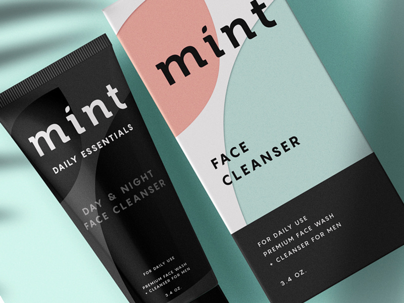
1. Mint

mint pastel color packaging design

[source]

This face wash for men is so simplistic in its design that it’s easy and enjoyable for the eye to look at. The black color of the face wash gives off tones of luxury and the pastel colors on the box, combined with flat design, simply works for this packaging. 


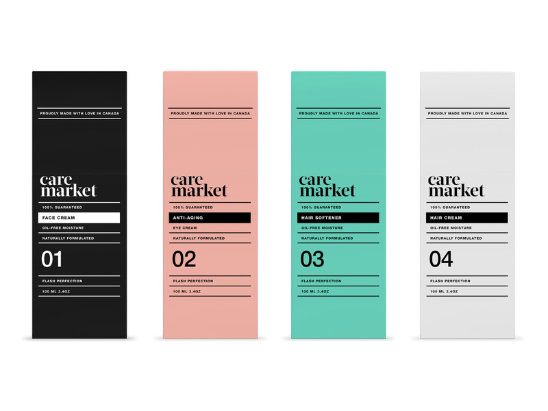
2. Care Market

care-market-pt2_5_2x packaging design pastels

Continuing on with the pastel trend, we have Care Market packaging design. The palette they chose here is lovely, as pastels have been all over the place this year. The consistency in font usage is just perfect, using only two different fonts and using dividing lines between each new phrase. 


This packaging design shows us that you don’t need elaborate graphic designs to exude elegance and professionalism. All you need is a great color palette, and nice, coinciding fonts. 

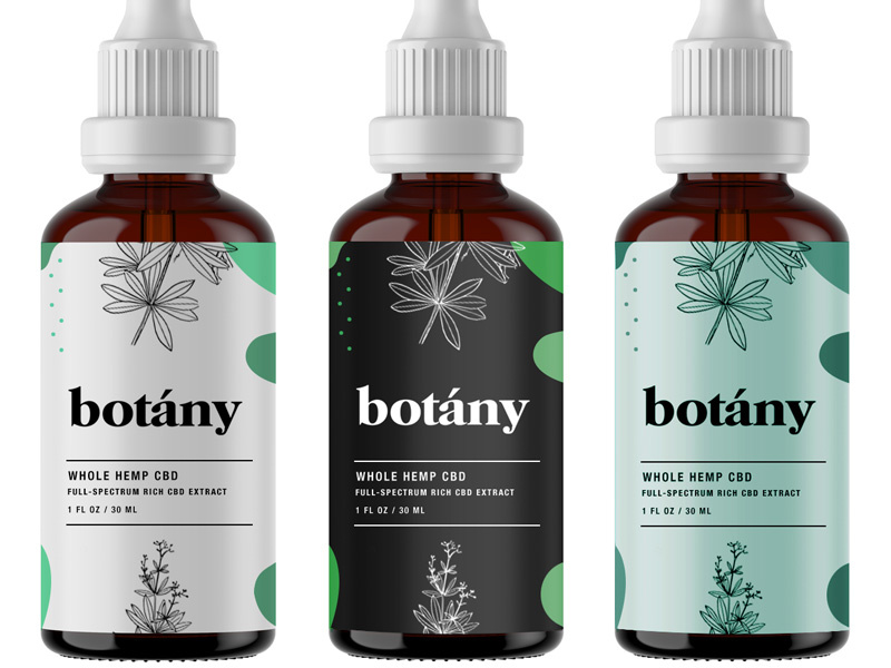
3. Botany

botany-hemp-packaging-design

[source]

Less is more, as the saying goes, and botany nailed it. Minimalist, flat design is the key here and with three different color schemes that all complement each other, I can wholeheartedly say, I believe this design will catch the eye of anyone who is looking for a high-quality serum. 

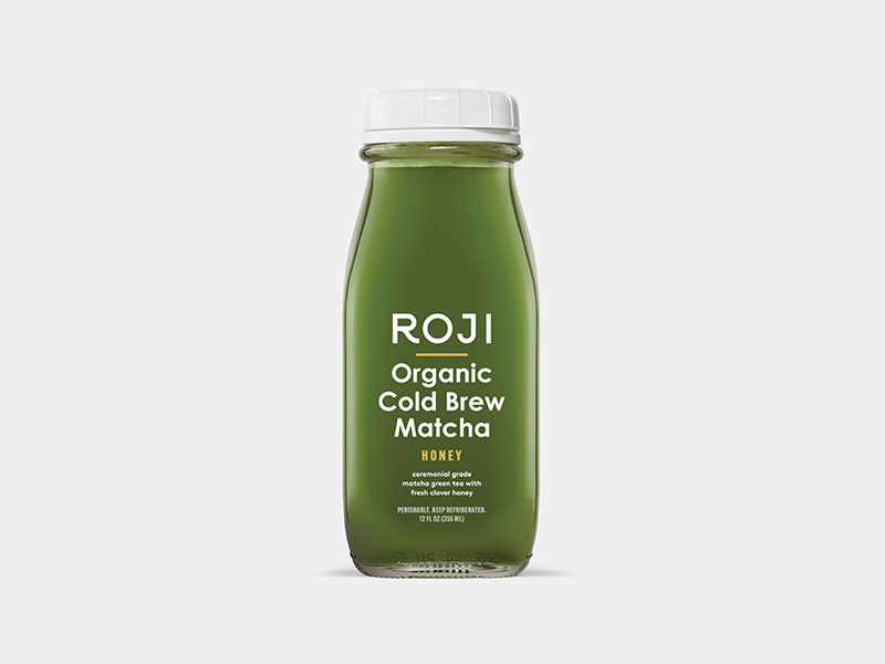
4. Roji

roji juice packaging design

When someone is looking for a healthy drink, they’re going to be looking for sleek, professional fonts that look organic. My favorite part of this packaging design is that the designer thought through the choice of font colors. 


Since the bottle is made of glass, you’ll be able to see its contents and the yellow font matches the beverage inside the bottle. The yellow-colored font perfectly complements the contents of the bottle. A simple, well-thought-out packaging design overall.


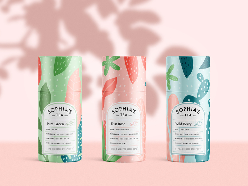
5. Sophia’s Tea

sofias tea packaging design ideas

Stepping out a little bit from the pastel color palettes and into something a little bolder, we have Sophia’s Tea packaging design. Flat design really has taken the lead in 2019. We see it all over the place. And luckily for us designers, it makes our job a little easier. 


What I appreciate about this design is that the name of each drink matches the design of each recipient. The color scheme on each bottle matches each other, making a buyer recognize the brand, if they were to see each bottle on a shelf in a store. 

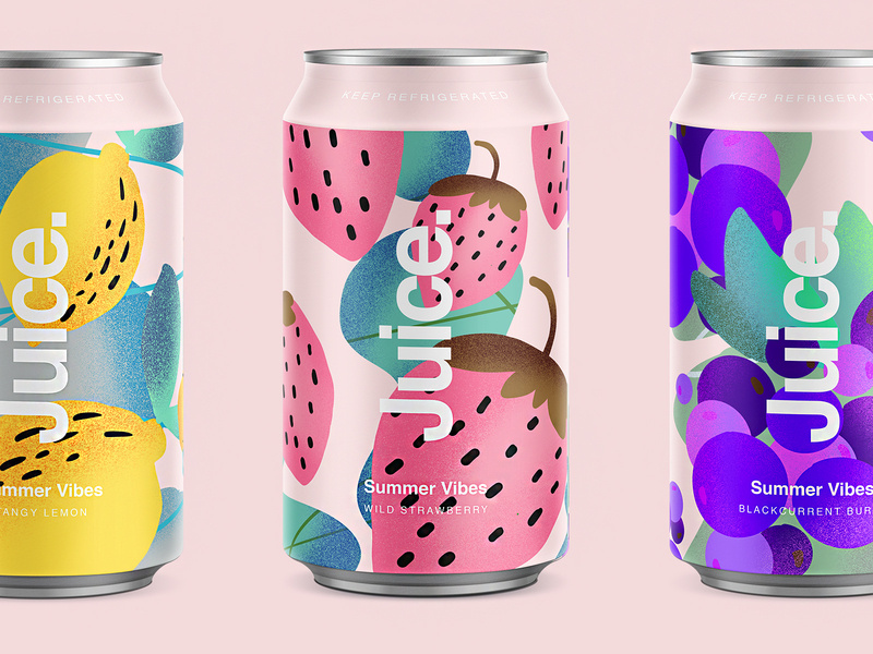
6. Juice.

juice summery packaging ideas

Since we’re on a drink roll, check out this summery packaging design for juice. Again, we’re hit with flat design and beautiful colors. The font sticks out perfectly on the foreground of the design. Juice. Simple, clean, clear, and to the point. 

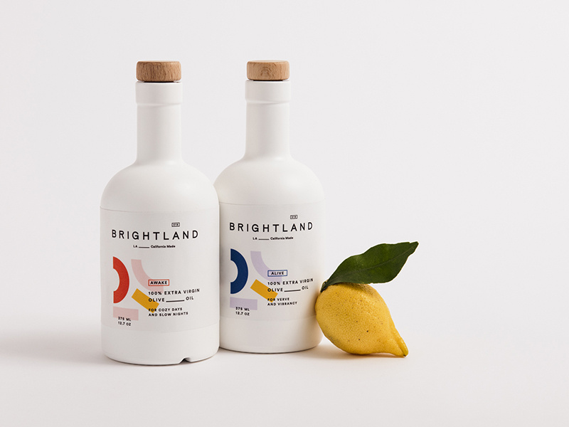
7. Brightland

brightland_packaging ideas

I’ve never seen an olive oil packaged quite like this. At first glance, you would wonder what this beautiful bottle is doing in the oil section. 


You’re inclined to pick it up, you read that it’s olive oil, you’re shook, you compare prices between this and another oil, you realize it’s the same price, and naturally you buy the more beautiful packaging design of the two products. Hit people with original, innovative designs and you’re sales will skyrocket. 


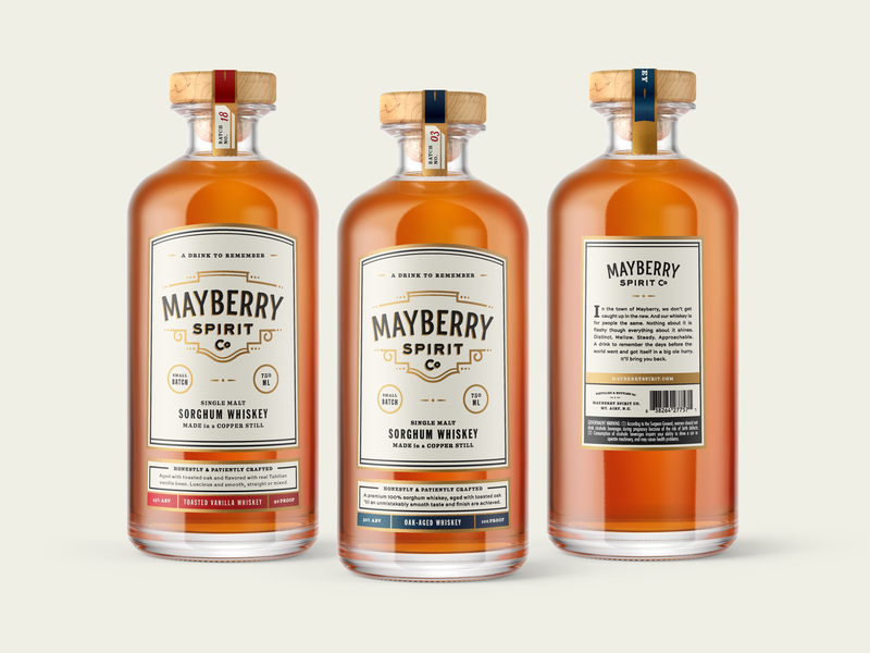
8. Mayberry Spirit Co.

mayberrylables_2x packaging whiskey ideas

[source

This bottle makes me want to have a nice, classy night at home with all my friends. The vintage font works beautifully with the design of the bottle, and I love that the color schemes match the rich color of the whiskey itself. 

9. Gatorade

gatorade_iconoptions_packaging_design

Here are some rebranding sketches for Gatorade. Simple design that gets across, yet still embraces the originality of the Gatorade logo. You won’t lose any brand recognizability, and it looks more modern.


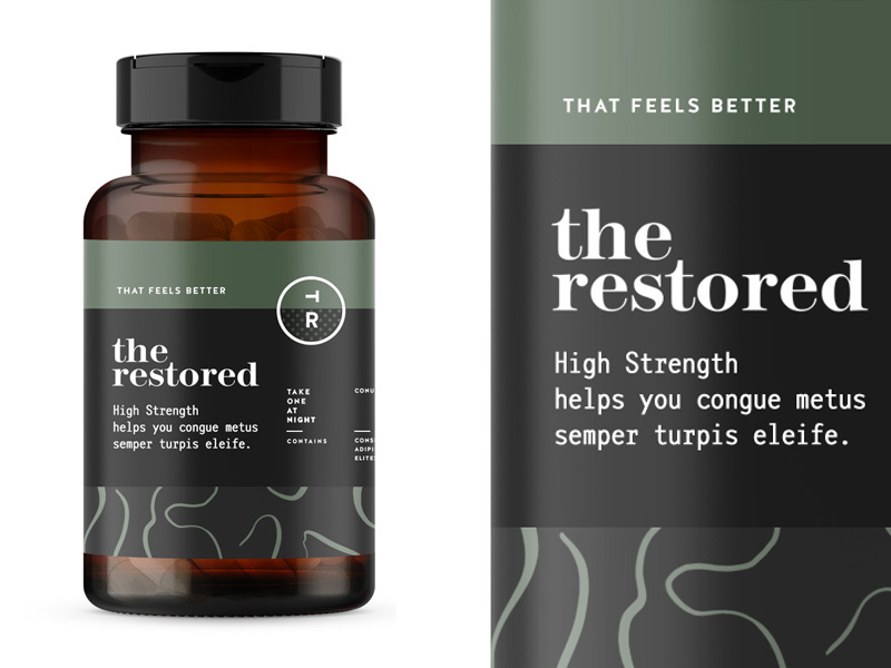
10. The Restored 

the-restored-packaging design for vitamins

The packaging design for these vitamins is everything. The manly, muted earth tones will remind a person of organic produce, making them trust your brand even more. Color association is very important when it comes to designing your packaging and establishing your brand, so choose wisely! 


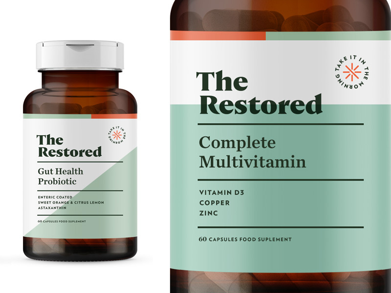
11. The Restored

the restored womens vitamins packaging design ideas

Here’s a second version to Restored vitamins. This packaging design is a touch more feminine, using a more pastel green, and creating more dimension in the background by using two different colors. The pop of orange in the corner brings the eyes to the directions.


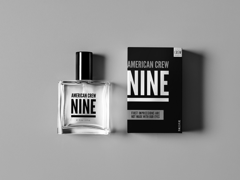
12. American Crew Fragrance

american_crew_fragrance packaging ideas

This simplistic design is one way on the box and reversed on the bottle. By using one font, they really had to play with the scaling and spacing of letters and words to make it interesting and captivating. Again, packaging design can be simple and just as engaging as a super complicated design.  


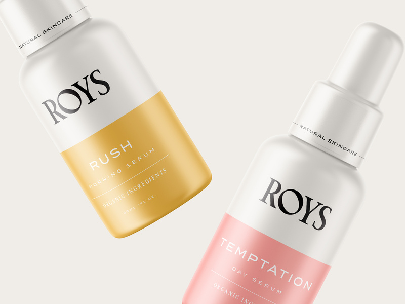
13. Roys Morning Serum


roys morning serum packaging ideas and design

Roys morning serum has two beautiful colors: a muted pink and a relaxing gold. Color association is everything. If you can convince your customers that your product is what they need and you really sell your product by having a luxurious packaging, you’ll have clients talking about you for days. 


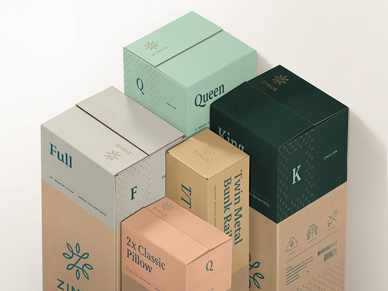
14. Zinus

zinus-packaging-design box


You can recognize an eco-friendly package design from a mile away, and most people are becoming very concerned and aware of their consumerism and trash contribution to the world. Using a bio-degradable packaging or using recycled material will help you loads when it comes to sales. And you’ll be helping the world. It’s a win-win.

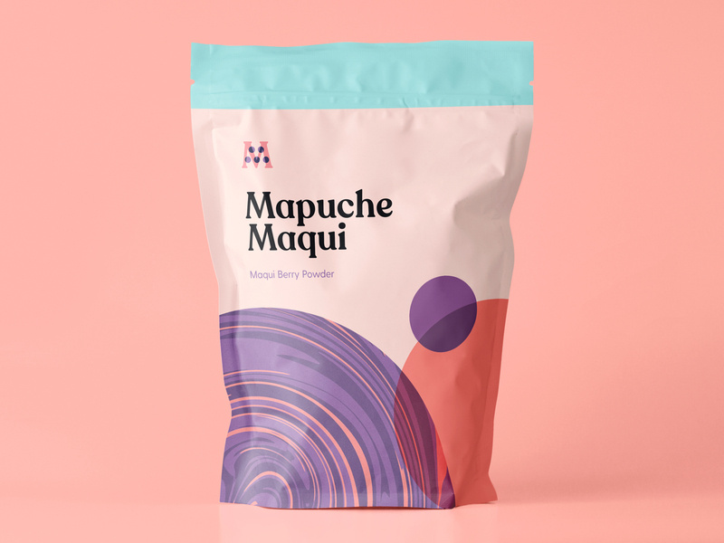
15. Mapuche Maqui

Sometimes, making healthy choices isn’t the easiest or most fun, so presenting a fun looking health product can be key in your sales. This berry powder packaging design looks fun and friendly, used flat design, a beautiful color palette, and bold font. With all these elements combined, surely it’ll catch the eye of a customer. 


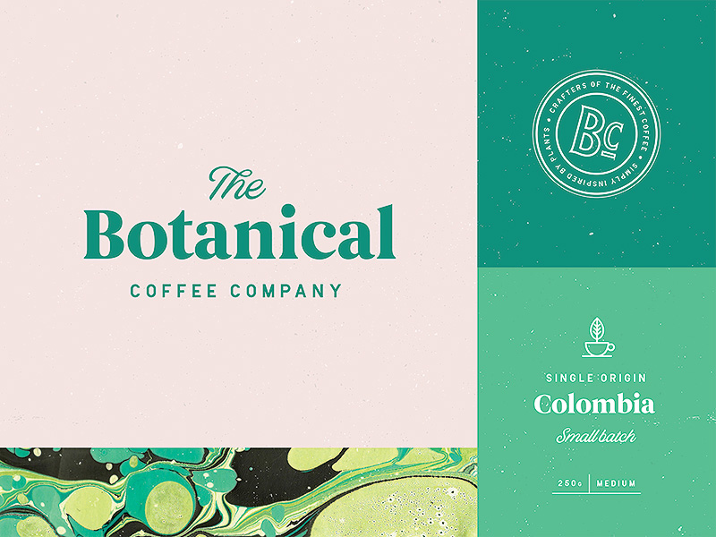
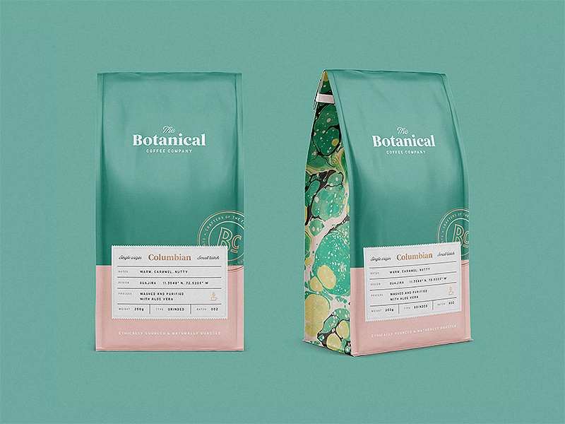
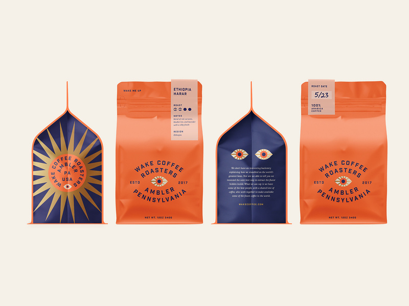
16. Botanical Coffee Co

This coffee design is so relaxing to look at. The intricate design on the sides, the simplicity on the front, and the choice of font combinations are just lovely. Again, going with flat design and pastels. See the pattern? 


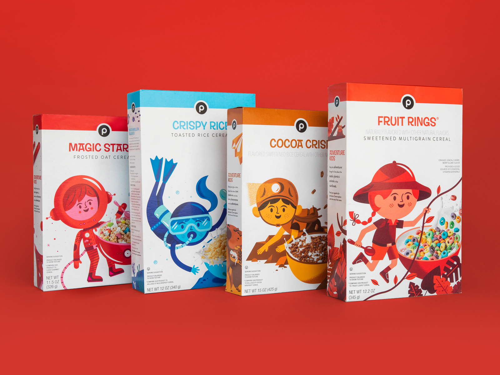
17. Publix Cereal Line

magic star snack packaging for kids

Did you know that the color red increases your appetite significantly? The designer here for kids cereal certainly knew what they were doing. By combining real-life elements and flat design, kids will surely be intrigued by this design and be inclined to beg their parents for the cereal. 


18. Coffee

easy_on_the_eyes_coffee packaging desing

This coffee packaging is so bright and captivating, yet still has colors that are easy on the eyes. When choosing your color palette, you need to be sure that you’re choosing colors that soothe and colors that people want to look at. And of course, brand colors that represent you and that your audience will enjoy. 


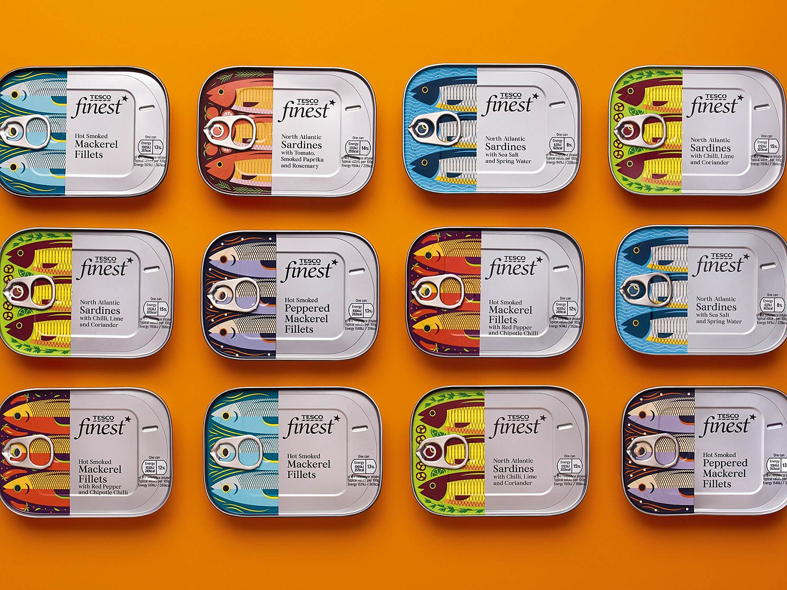
19. Tesco Fish

fish packaging branding design

Check out these “fishy” illustrations! What I really enjoyed about this packaging design was the fish. I love the very finely defined, cut-off design of the fish, and then the can and text. Each fish is design to represent its kind, and I find this design very creative, colorful, and appetizing. 


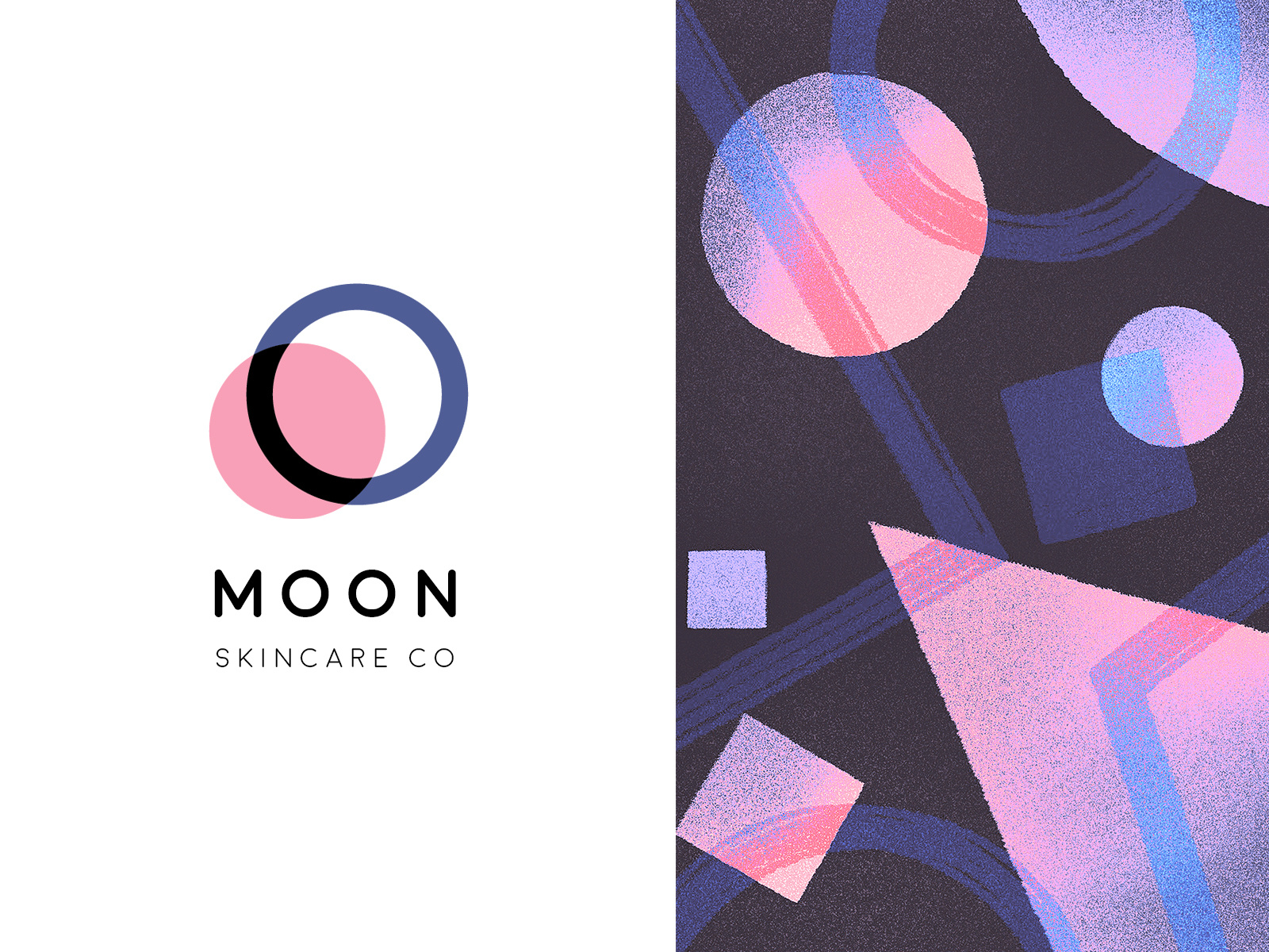
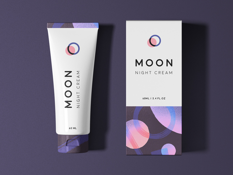
20. Moon 

And finally, we have Moon Night Cream. Notice how to colors and graphic designs represent the night. So simple, clean, and fresh-looking that you actually can’t wait to use this cream tonight before bed.


Wrapping things up 

As we all know, packaging is everything when it comes down to actually selling your product. Make sure your design represents you, your brand, and your product, and is creative and makes people feel like they need what you have to offer, in their lives. 

I hope you found this article inspiring and you’re more than ready to jump into your next design project.

Until next time,

Stay creative! 

Read More at The Best Packaging Design Ideas for 2019 You Need to See

The Ultimate Collection of Free Design Rersources

the mock up club website free mockups

I believe I speak for everyone when I say that I love to find amazing, high-quality design resources for free.

 Sometimes, when you’re in the middle of a design process, you find that you’re about to have to invest more money than you originally intended. You should save money when you can and you should spend money on things that require investment. 

That’s why I came up with the ultimate collection of free design resources for you to check out. 

Whether it’s free vectors or mockups, or free images and presets you’re looking for, I have it all right here in one incredibly comprehensive list for you, so you don’t have to search all around for your answers. Everything is right here, in one place.

Now, let’s get into it.

Free Stock Images

Photography has been and will always be a key piece of design. Stock photos are no longer what they used to be, luckily. No longer will you be seeing just those awkward group photos of people laughing or two businessmen shaking hands. 

No, there are so many stock photo sites for you to choose from with quality work from real photographers. Check out these 10 awesome free stock images websites!

Unsplash

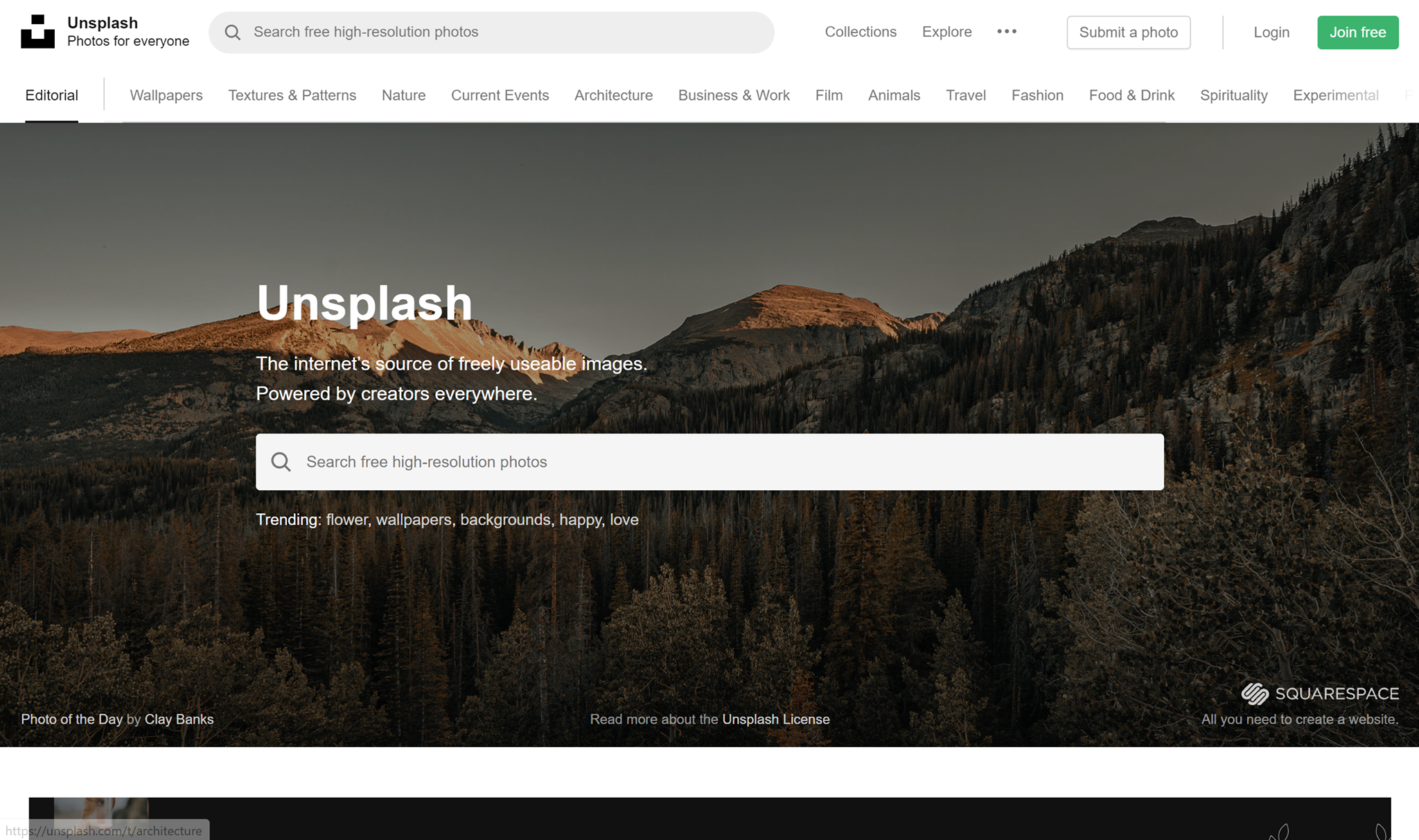
unsplash free stock images

I want to start this list off with a bang. Unsplash is my personal favorite free stock image website. I use it for everything from article writing to making designs. Unsplash has a huge collection of images, consisting of over 110,000 high-quality free stock images. Just type in a keyword and see hundreds of images that can suit your needs. All images are released under Unsplash’s copyright policy.

Stocksnap

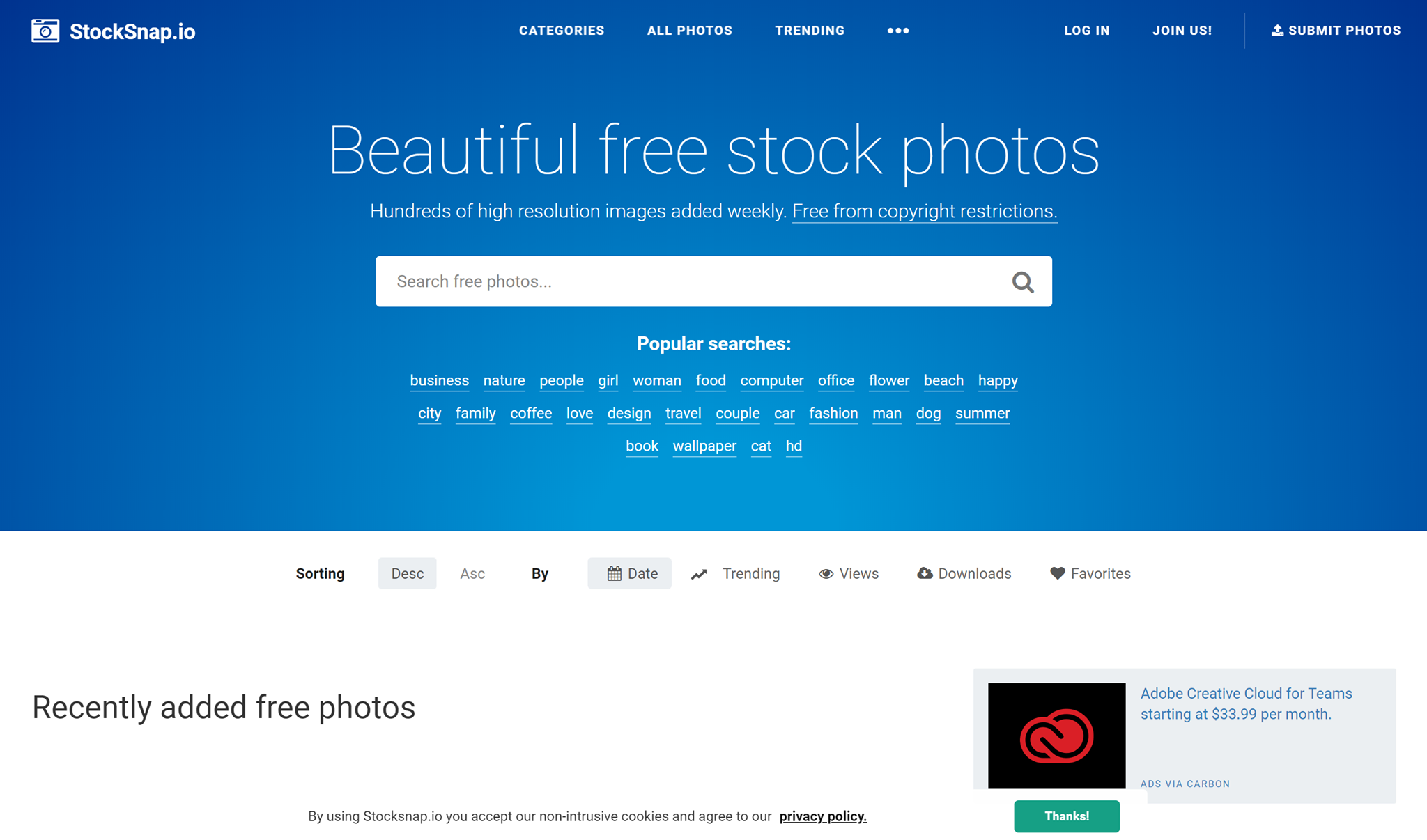
stocksnap website free stock images

Stocksnap has hundreds of new high-quality free stock images added to their library every week. They have stock images to fit just about any occasion you can think of. From website building to brochure making, they having everything you need. You can find any image you need by typing in tag words, and you’ll be presented with hundreds of images that will be perfect for you. All images are free for you to use! 

Pexels

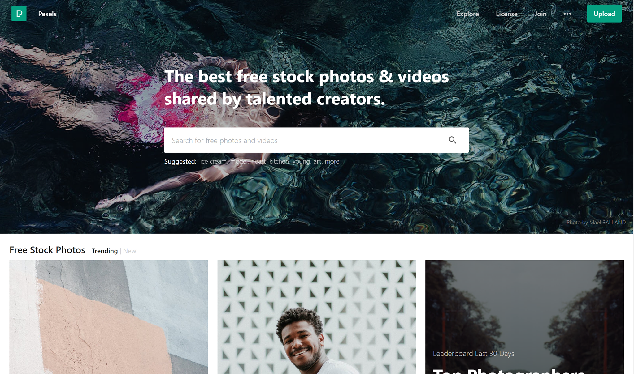
pexels user interface free stock images

Pexels has one of the most beautiful stock images website interfaces I’ve ever seen. Pexels provides tons of high-quality stock images that are free for you to use under their license. With hundreds of thousands of beautiful free images of you to choose from, surely you’ll find what you need here. 

Reshot

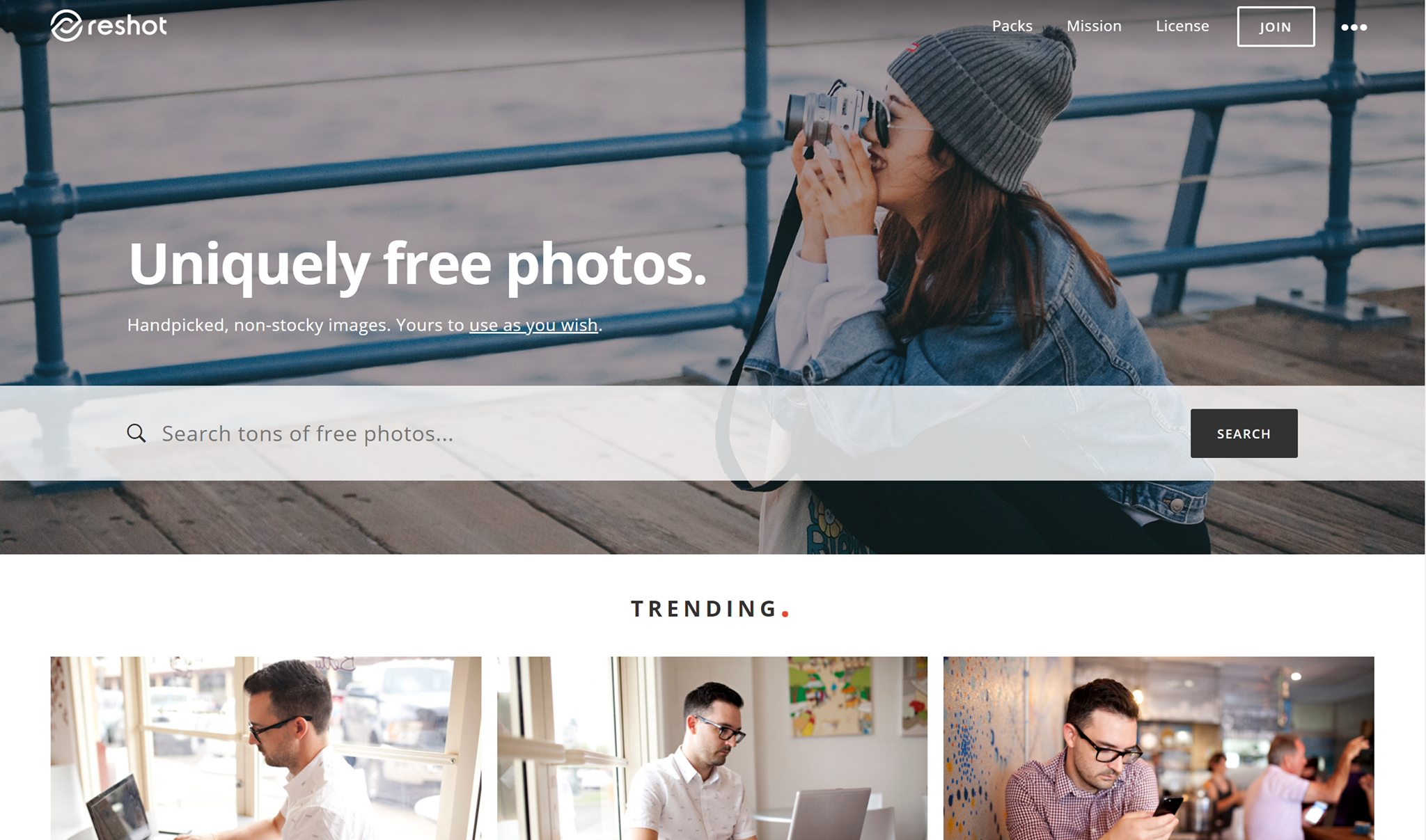
reshot free stock images website

Reshot. Uniquely free photos. Handpicked, non-stocky images. Yours to use as you wish”. That’s a pretty self-explanatory and sweet tagline. They work hand-in-hand with amazing professional photographers and give them a great place to display their work and be discovered. Find amazing free stock images on Reshot!

Pixabay

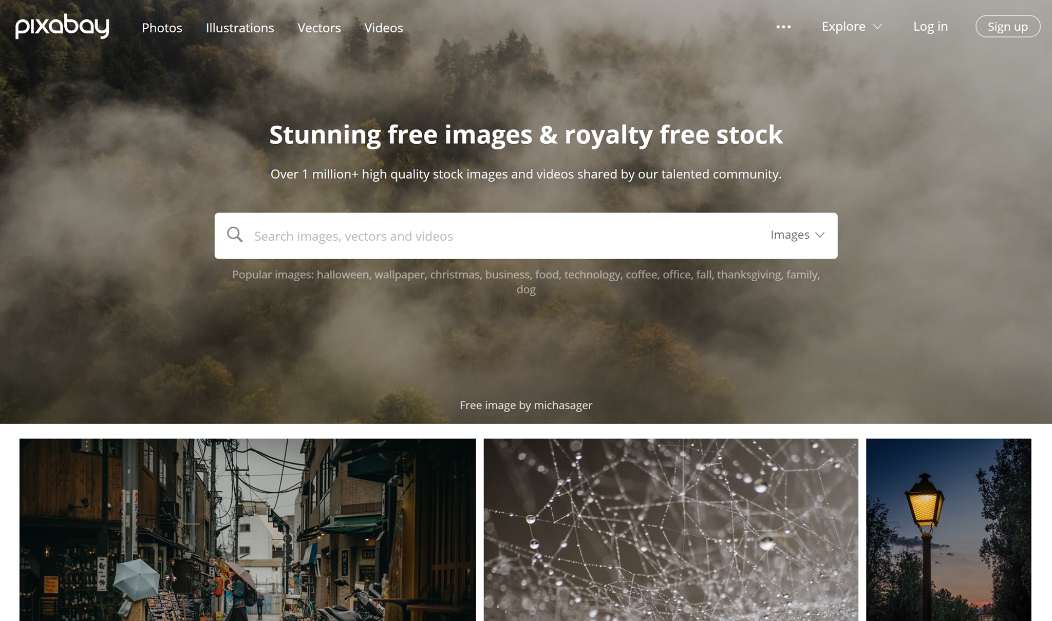
pixa website free stock photos and images

Pixabay has loads of free photos, but not only. They also have art illustrations and vectors. All images, art illustrations vectors, etc are released under Creative Commons CC0.

Life of Pix

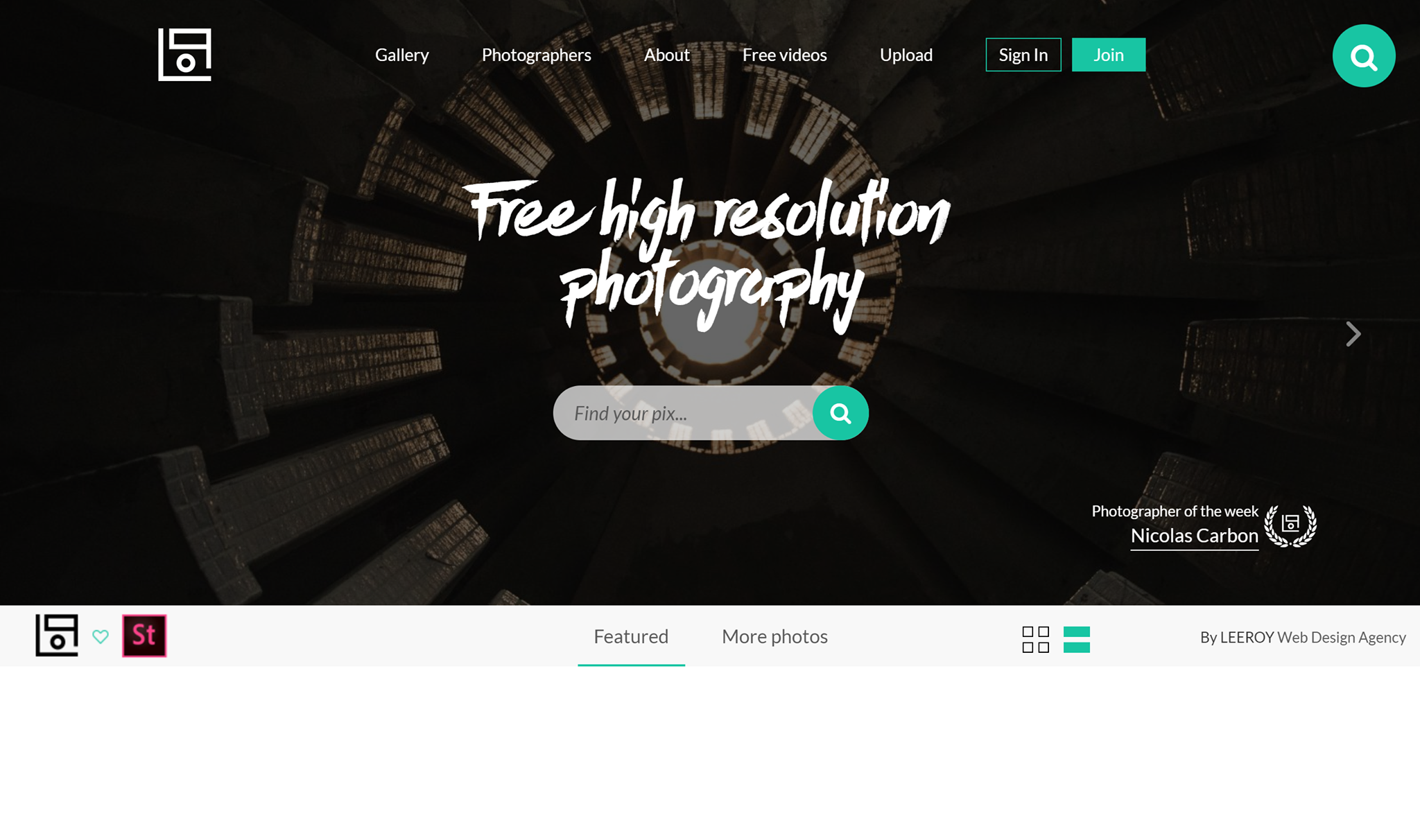
life of pix free high quality images stock

Next up, we have Life of Pix. Free high-resolution photography for everyone. Besides having loads of amazing photos to choose from, they also feature a new photographer of the week. Find new photographers whose work you love every week and in turn, have tons of stock photos to choose from! 

Foodiesfeed

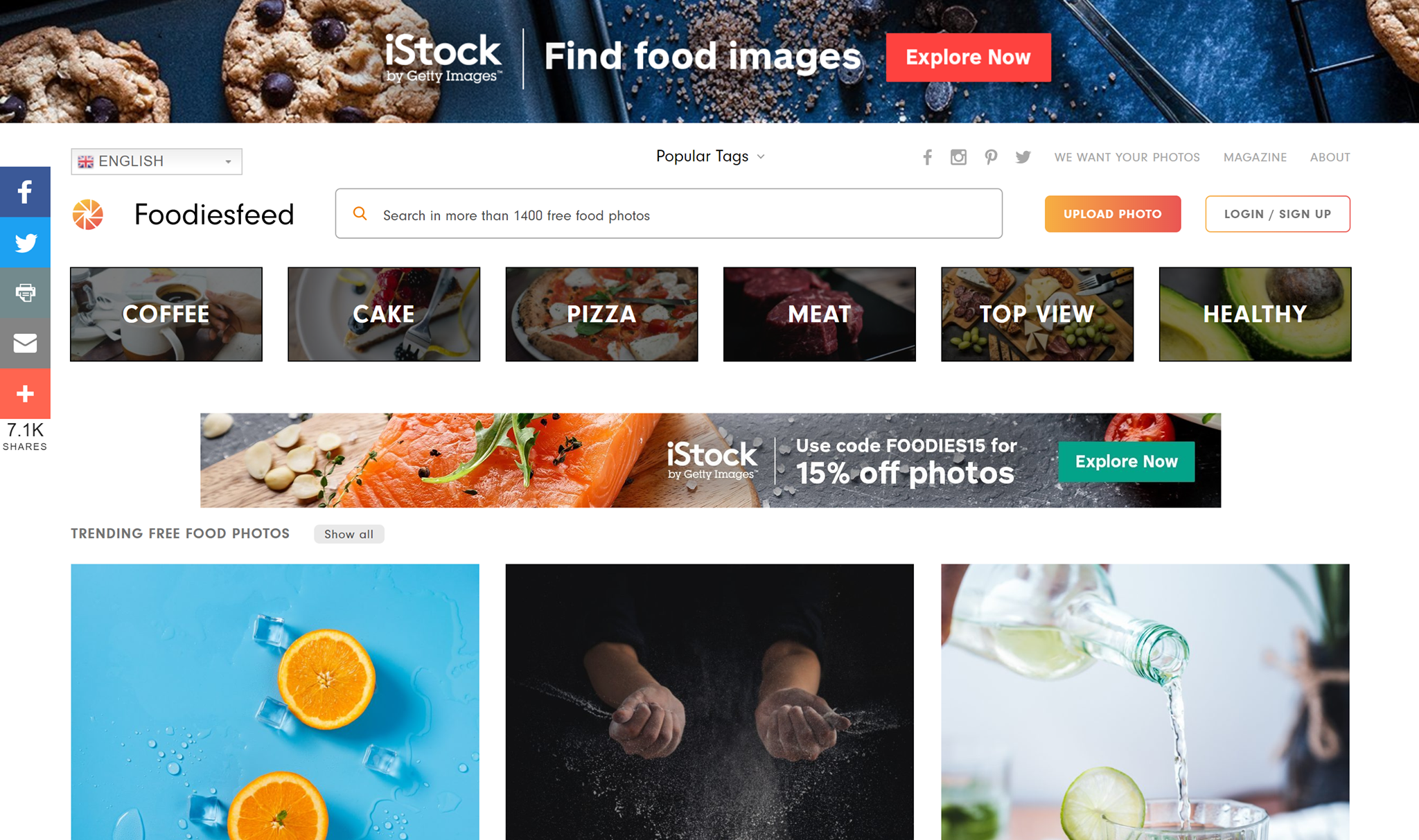
food photography free stock images foodies websiteFoodiesfeed is for the foodie at heart. Which gorgeous, appetizing stock images that look so delicious that you can almost smell them just by looking at them. If you have a food blog or just need some inspiration, check out this awesome stock image site. 

Gratisography

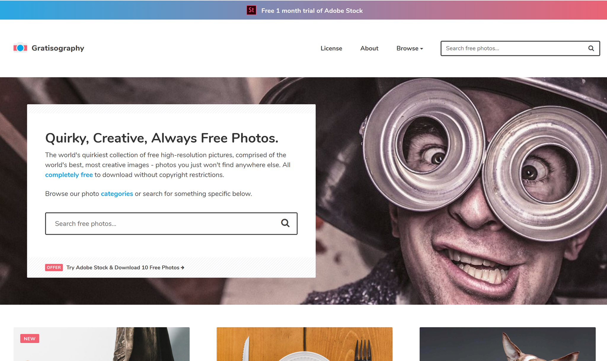
gratisography website free unique images

Gratisography is for the non-mainstream person. If you’re looking for the complete opposite of the classic boring stock photo, this website is for you. You truly won’t find photos like these anywhere else.

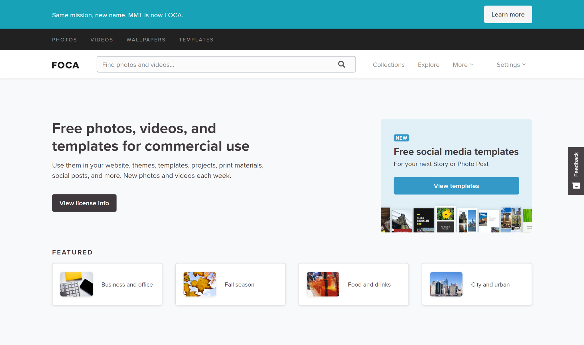
Foca

free stock images foca website

FOCA is a great stock website if you’re looking for a little more than just some stock images. They have everything from free photos to videos and templates! 

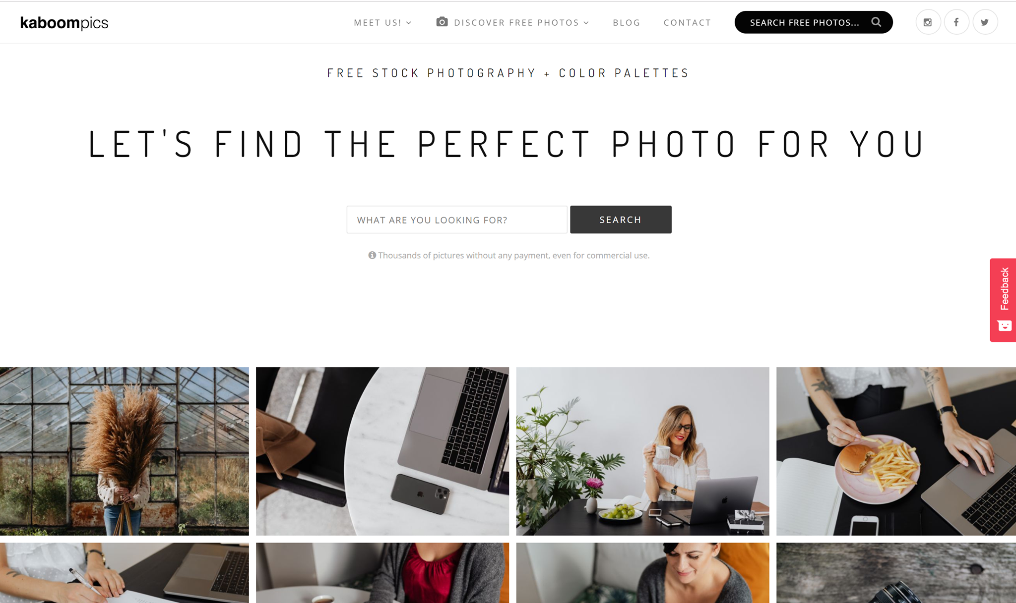
Kaboompics

kaboompics website free stock images for blogs

Kaboompics is so aesthetically pleasing, it hurts. The amazing blog pictures are everything. According to their about page, Kaboompics is one of the most popular sources of free images for lifestyle, interior design and specialized bloggers in the world. 

Free Vectors 

Creating your own vectors can take up so much of your precious time, and that’s why finding perfect vector art or vector icons can be a major time-saver, but finding them for free is like finding treasure. That’s why I picked out my 10 favorite free vector websites. Check ‘em out.

Vexels

vexels website vectors free

Vexels has great free vectors for you to use for personal and commercial use. What I really like about their vectors is that many of them are editable. You can get everything from icons to backgrounds and designs that are ready for print. Give them a try!

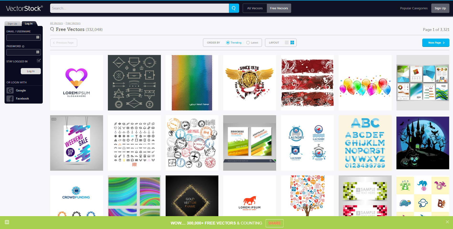
Vector Stock

free vector stock website

Vector stock has over 300,000 vectors for you to choose from. With such a wide variety of vectors, surely you’ll find something that’ll suit your project and save you loads of time. 

The Noun Project

the noun project website free vectors

The Noun Project can be summed up in icons, icons, icons! They have over 2 million royalty-free vector icons for you to use. And what’s better? You can edit them. That is insane, people. Don’t sleep on the noun-project. They have all those quality things you’re looking for.

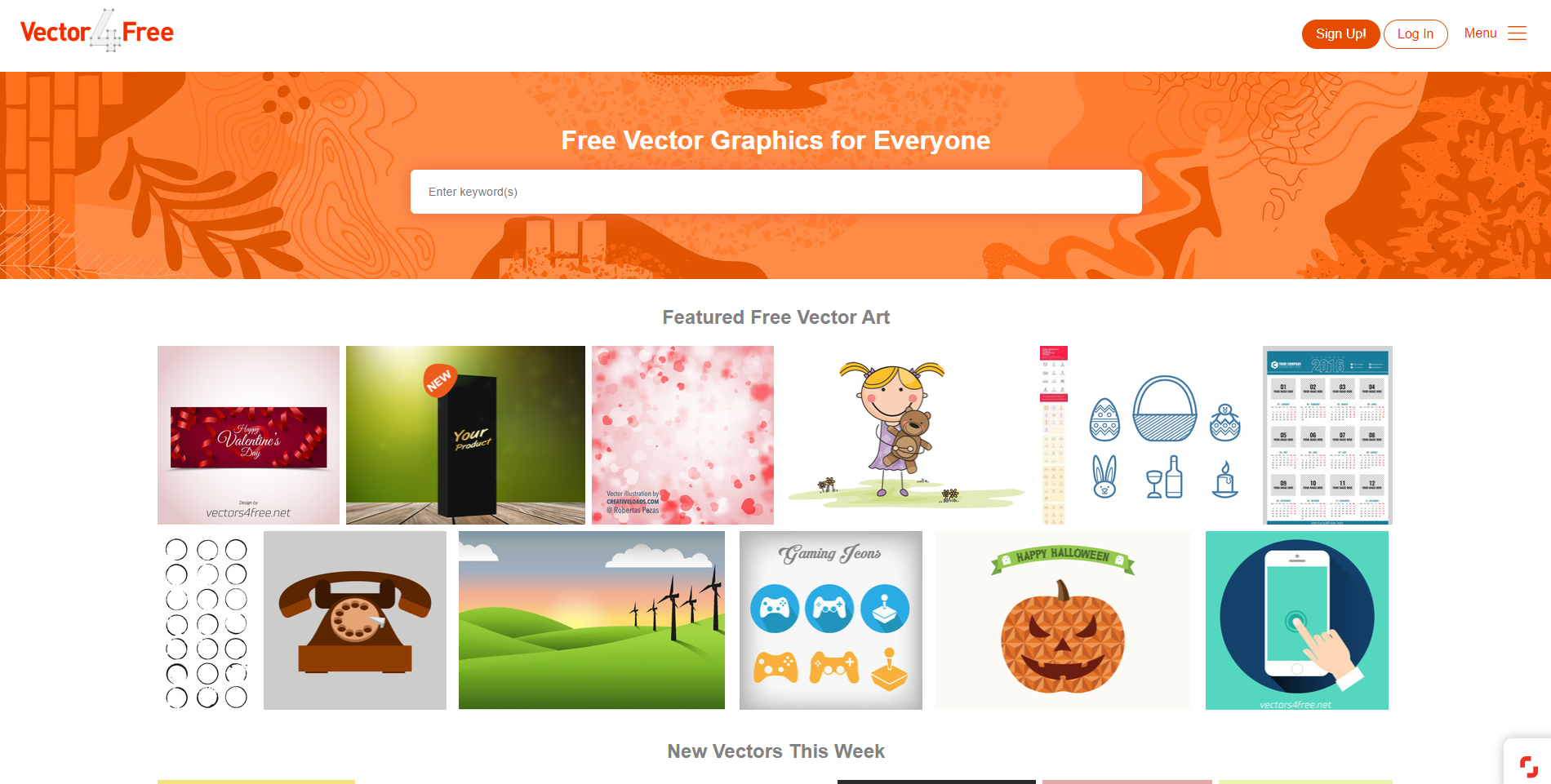
Vector 4 Free

vectors 4 free website free vectors

Vector 4 Free has vector art for everyone. Their goal is to share vector art created by professional designers with everyone. They have all sorts of formats, such as .ai format, but also .eps, .pdf, .svg, and even .cdr. All of their vectors are free for personal use, but for commercial use, you have to check each artist’s terms of use, as they all differ. 


Freepik 

Freepik free vector interface

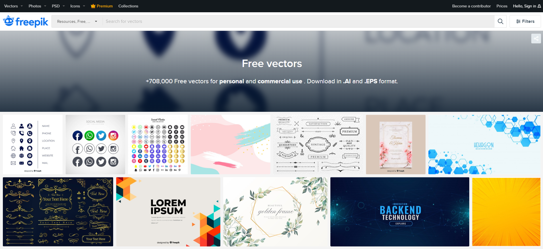
Freepik has over 708,000 free vectors for you to use for personal use and also for commercial use. The styles vary as far as feminine and elegant-looking invitations to vectors that are perfect for backend technology promotion. You’ll find every style you could need here, and you can download everything in .Ai and .EPS formats.

Free Vector

free_vector interface

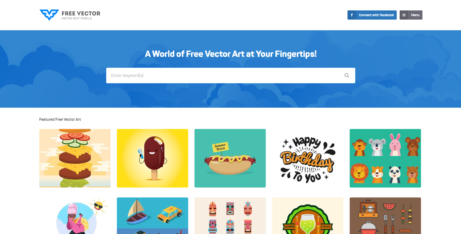
Free Vector is full of fun and colorful cartoonish vectors. They are basically a world full of free vector art that is simply at your fingertips. Type in your keywords in the search bar to find vectors that suit your style, or scroll to the end of the page and find tons of categories to browse through.

Vecteezy

vecteezy free vectors graphic design

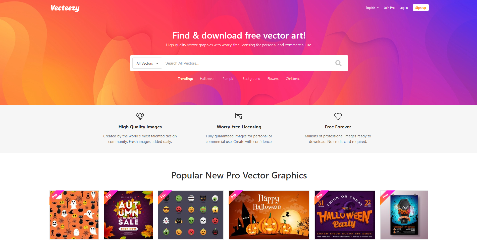
Vecteezy has thousands of gorgeous vector art for you to use. Everything is copyright free, so you never have to worry about that. There are tons of free vectors for you to use, or you can upgrade your account to a pro account and have access to everything at your fingertips. 

Flat Icon

free vector website

Flat Icon is the largest database of free icons that are available in PNG, SVG, EPS, PSD, and BASE 64 formats to date! With a free account, you can access thousands of free icons, or you can upgrade your account and get millions of icons for free. 

Pngtree

png tree website free vectors

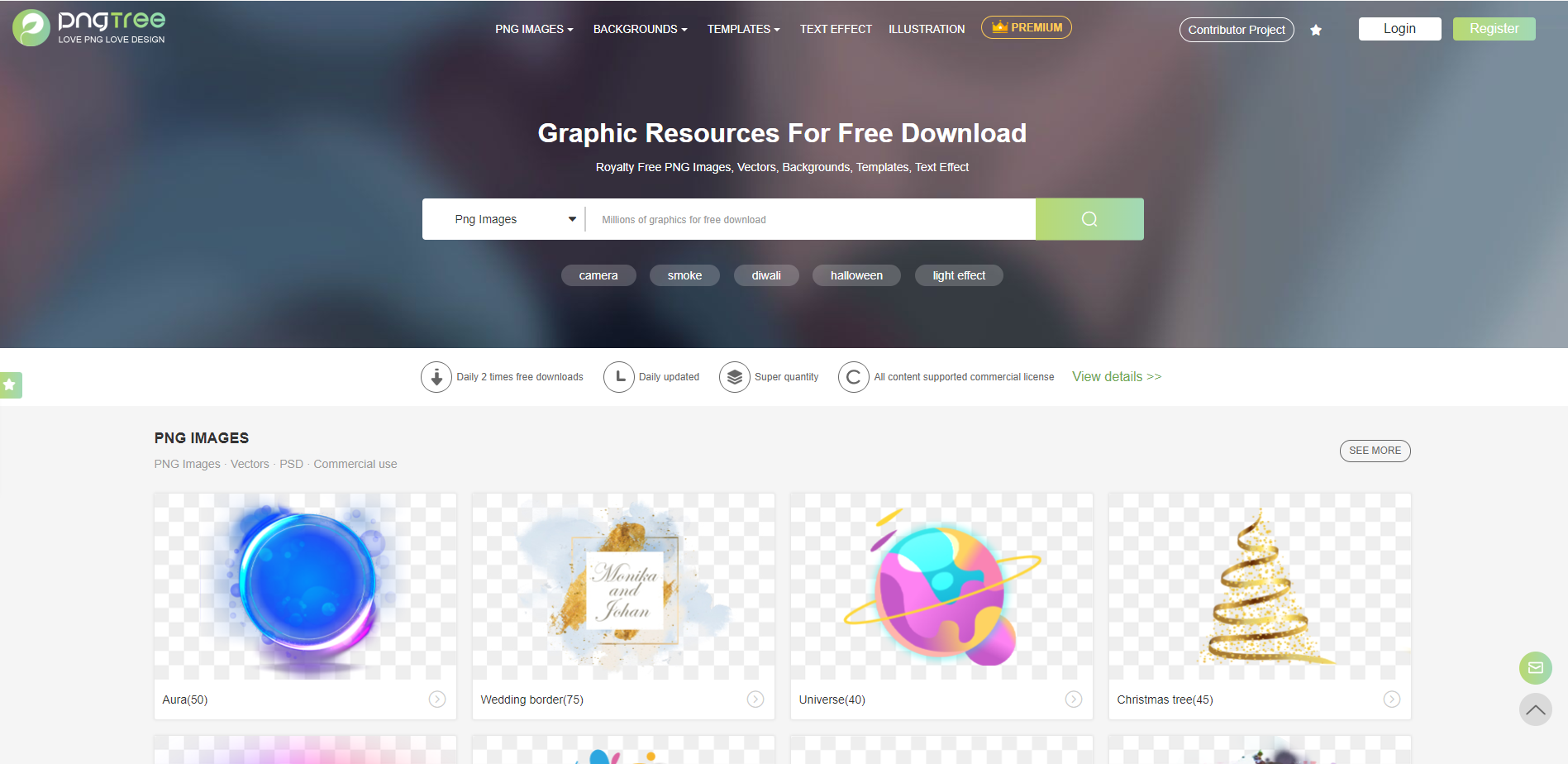
Pngtree has wonderful vectors for you to choose from, and with a free account, you have access to 2 daily downloads. Get royalty-free PNG images, vectors, backgrounds, templates, and text effects from Pngtree. 

Free Mockups 

Showing real-life visuals of your work to your client is a vital selling point, and that’s one of the huge reasons that mockups are so crucially important. Here are 10 free amazing mockup websites for you to use for your next project.

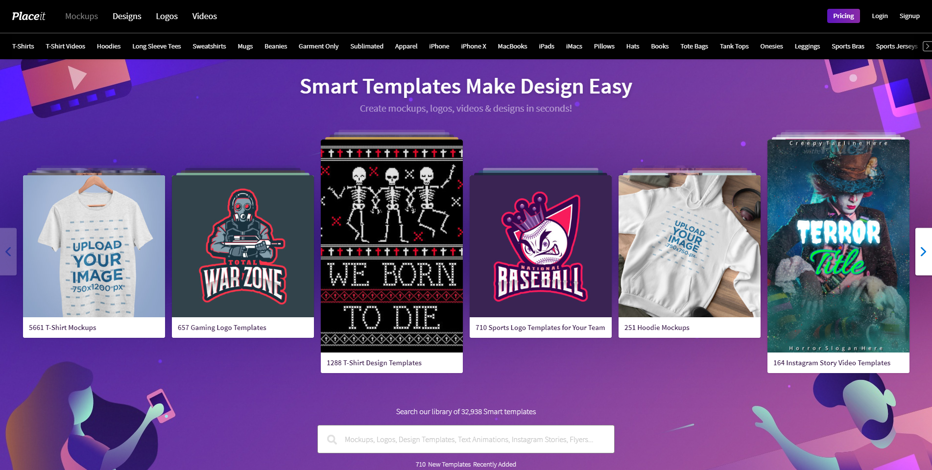
Placeit

placeit free mock up platform

Placeit is a site where you can visualize all of your designs on products within seconds. Not only can you just upload your images, but you can also make designs on the platform, and create videos. Create your own design, or try out one of their 32,938 smart templates! 

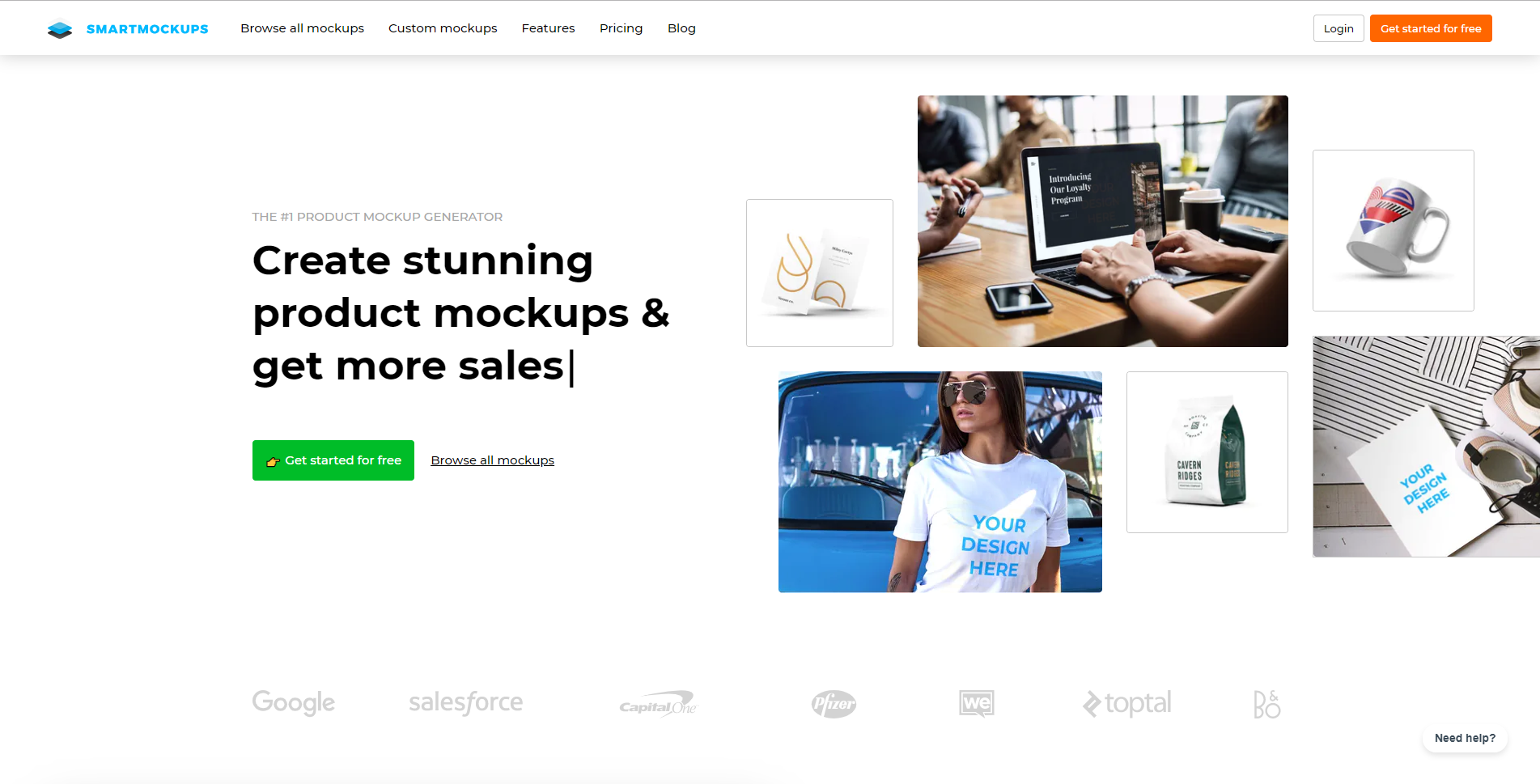
Smart Mockups

free mockups website

Smart Mockups is the fastest web-based mockup tool out there right now. It’s user-friendly in the manner that advanced designers and beginners alike can use and understand their product. You can use a free account and create 200 mockups and use basic features, or you can upgrade your account and have access to all mockups and features. 

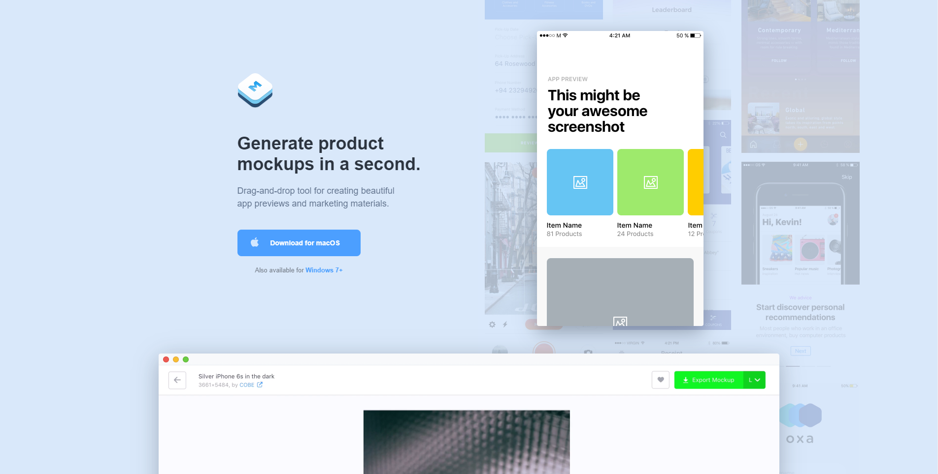
Mockuuups

mockuuups website free mockups

Mockuuups will generate tour product mockups in literally a second. The tool is easy to use, as it is drag-and-drop based. Download the app to your computer to start using. You can use a free account and still have access to lots of features and mockups, or you can upgrade your account to have access to everything! 

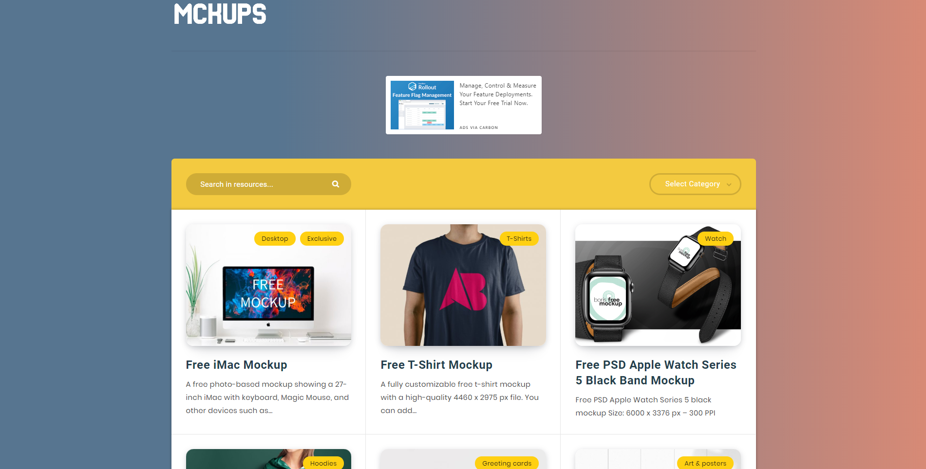
Mckups

mckups mockups website free app

Mckups has a beautiful, minimalist interface and beautiful, free mockups for you to use. The mockups are hand-crafted by professional designers and are just waiting for you to use them. 

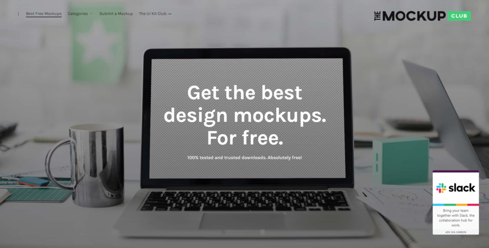
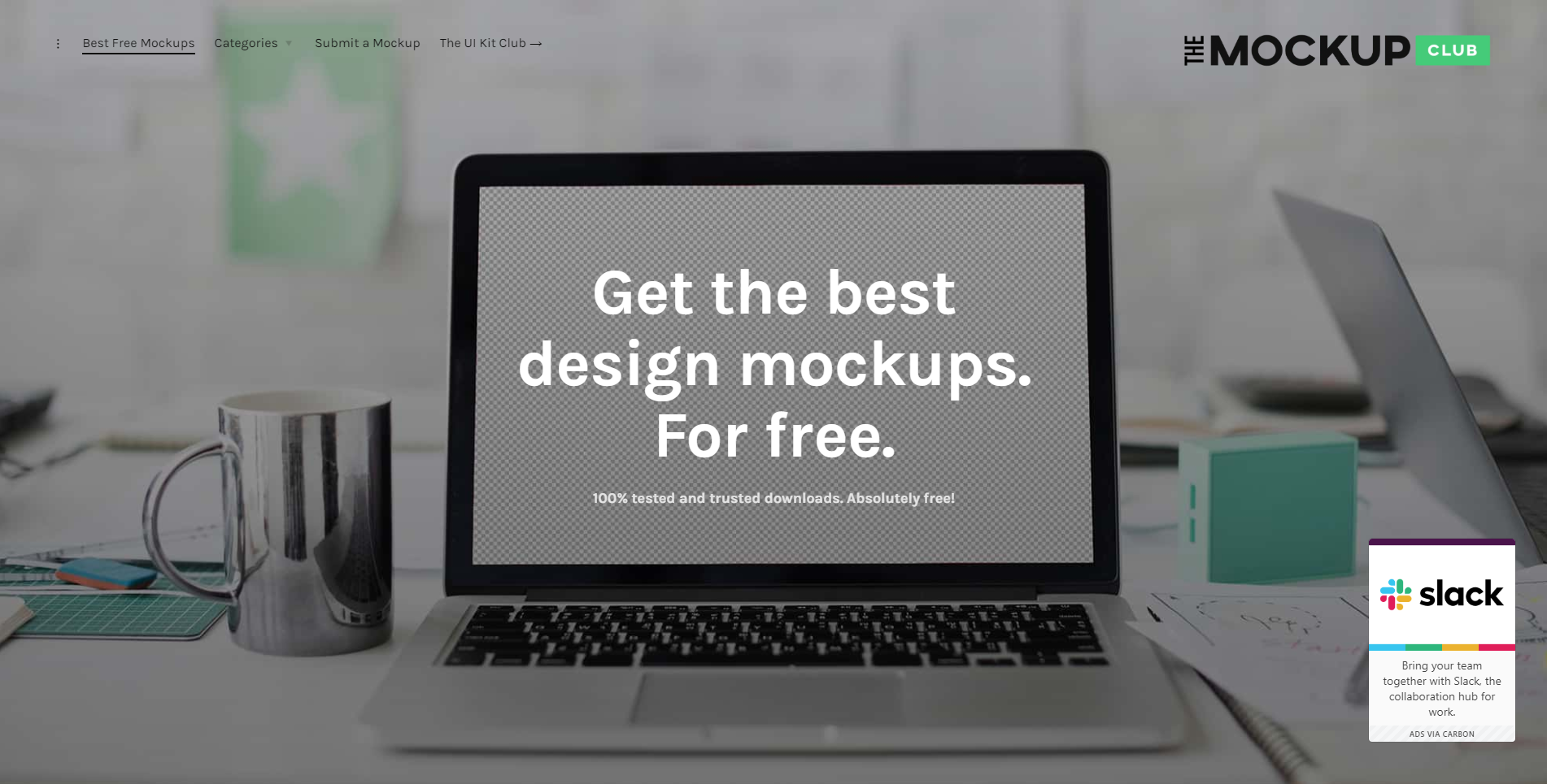
The Mockup Club

the mock up club website free mockups

The Mockup Club is absolutely free and that might just be my favorite part. It’s a one-stop shop with loads of free mockups for you to use to showcase your lovely designs. 

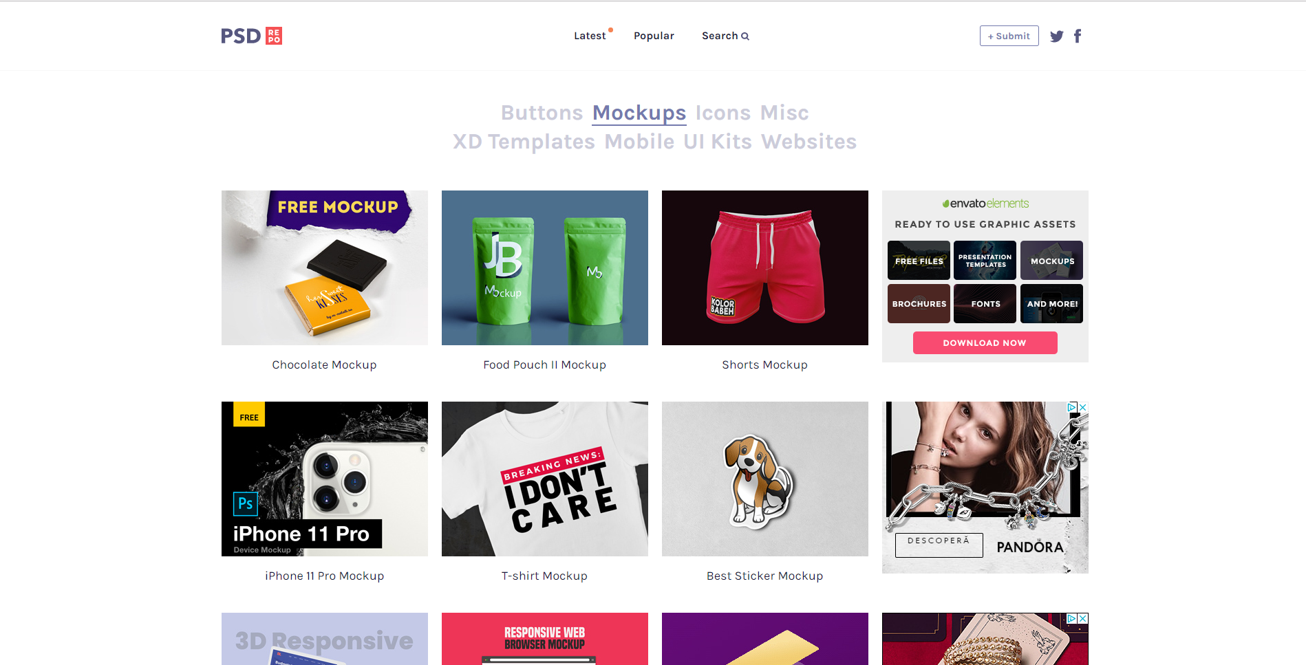
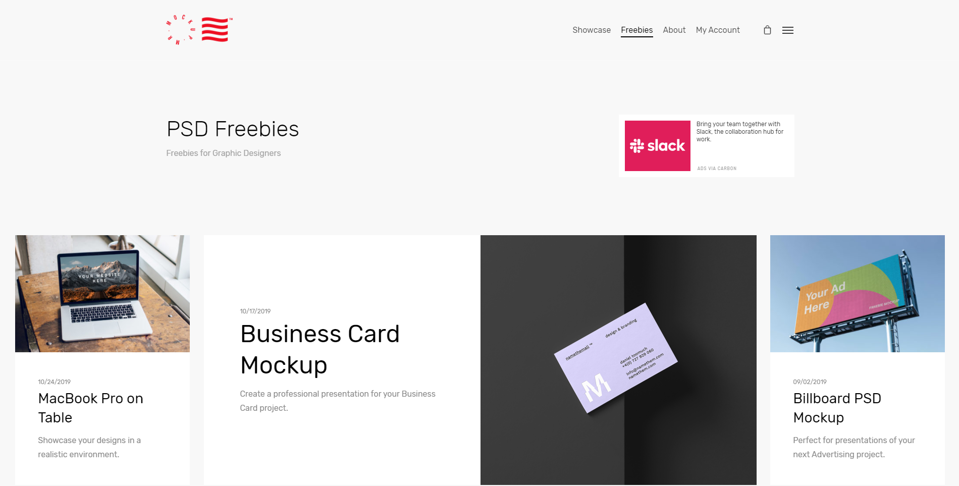
Psd Repo

free psd mock up website

Psd Repo has every mockup imaginable. From key-chains to shorts, to t-shirts, to protein powder packaging, I think I can safely say they have it all. The mockups are made by talented designers who want to share their work with you for free. Download your favorite mockup as a PSD file and get to designing! 

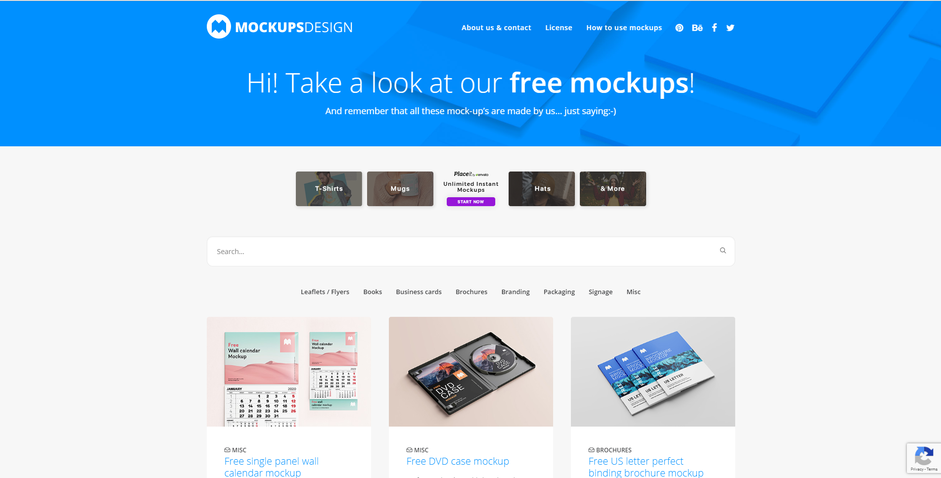
Mockups Design

mockups design interface free mockup

Mockups Design is an easy-to-use website where designers can find professional mockups for free to use in their next design project. From DVDs and CD to letterheads and brochures. They have lots to choose from.  

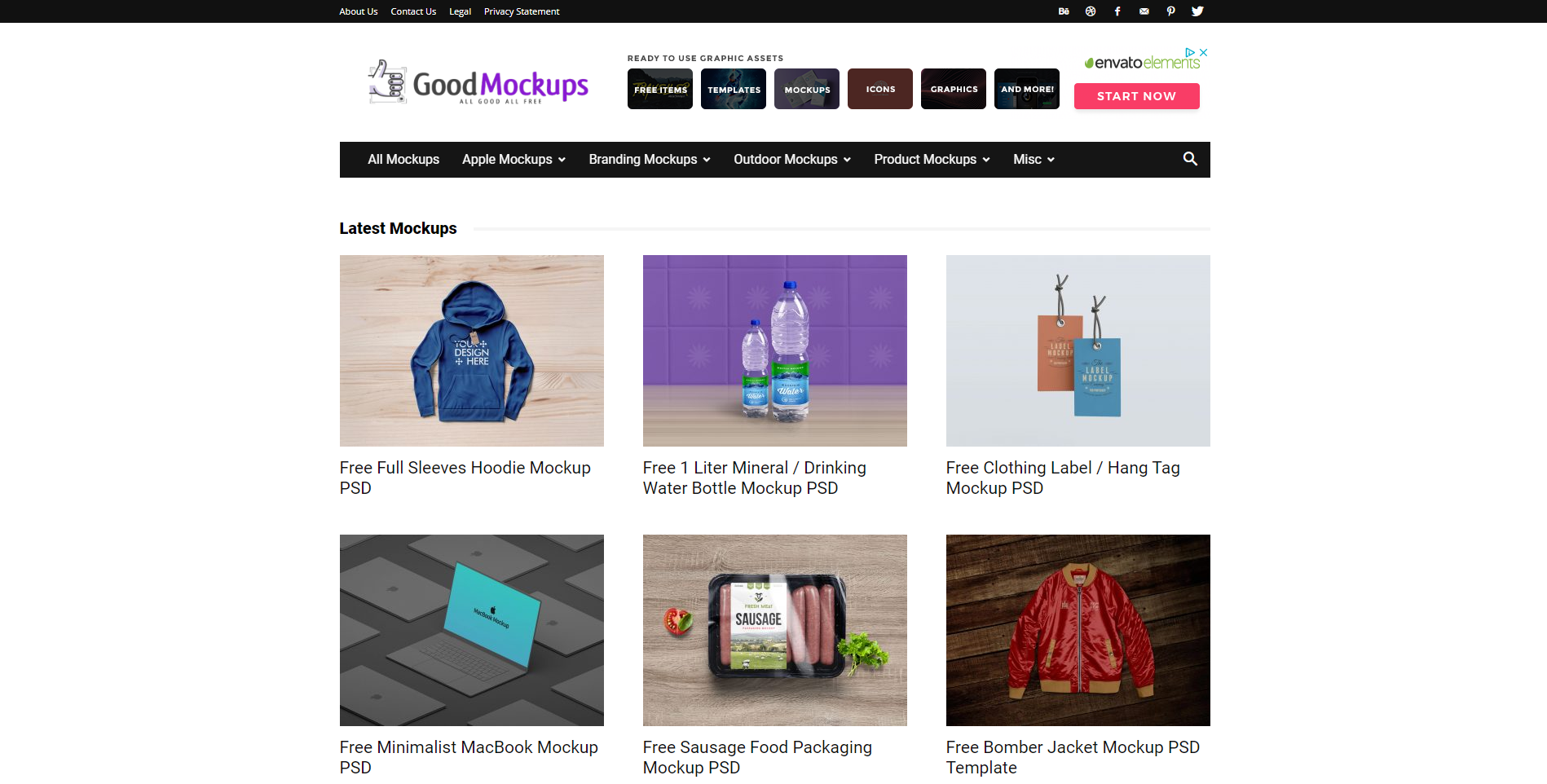
Good Mockups

good mock ups website free mock ups

Good Mockups can be summed up about something like this: High-quality, hand-picked, premium mockups for all to use. They strive to have mockups to fit everyone and every design. With an entire list for you to go through, I believe that they are truly well worth your time. 

Mr. Mockup

mr mockups website free mockups

Last but not least, we have Mr. Mockup. They have a team of professional and creative designers working to mockups for everyone. With a vast experience in designing just about anything, you can count on them to find beautiful mockups for your next design project.

Wrapping up 

I hope you guys found this ultimate collection of free design resources helpful! Let us know in the comment section below what sites you’ll be using in the near future, or tell us about a website you know that you think is worth mentioning.

Until next time, 

Stay creative! 

Read More at The Ultimate Collection of Free Design Rersources

Top 8 Best Development Tools You Need in 2020

Best developer tools of 2020 ipstack home page

Each year, loads of development tools come out. It’s becoming harder and harder to decide what tools you actually need and which ones you can live without.

 Honestly, it’s probably a personal preference, but it really helps me decide what I need when I have a list of useful tools to look over.

 So here we go: the top 8 development tools you absolutely need in 2020.

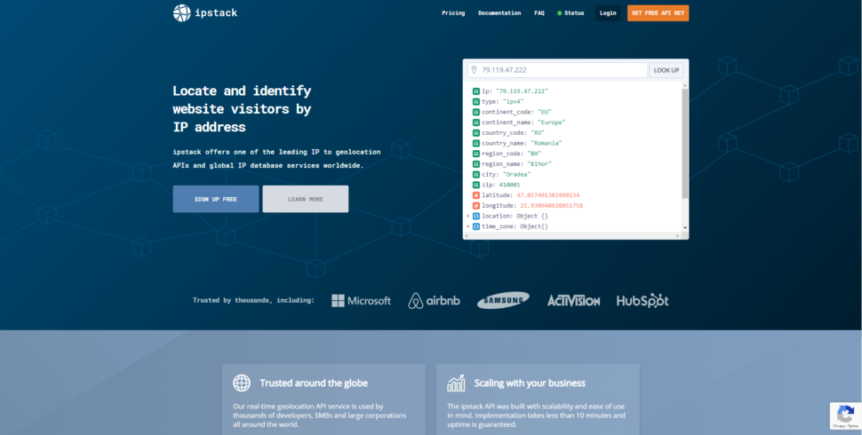
1. IPstack

Best developer tools of 2020 ipstack home page

IPstack allows you to locate and identify website visitors with an IP address. This is extremely helpful for a lot of reasons, but simply knowing who is coming to your website is one of the most valuable tools anyone can ever ask for.


Built within this tool are 5 different modules that are definitely worth mentioning:

  • Location module

This module gives you all the information for the visitor’s location. All the way down to the zip code. With this information, you can optimize your ad targeting based on geolocation.

  • Currency Module

Using the information above, you’ll also get an accurate report on the primary currency being used in the visitor’s region.

  • Time zone module

The time zone module instantly lets you know the local time of the visitor. No more guessing and counting in your head.

  • Connection module

Gather valuable information about the ASN and the hostname of the ISP your website visitors are using.

  • Security module

IPstack will also detect any proxies, crawlers, or tor users. Security is a big deal for many users, and Ipstack makes sure you feel comfortable at all times.

Ipstack is fast and trusted by literally the biggest names in tech. To top it all off, they partner with the largest ISPs around the world, so you can rest assured that the information you’re getting is 100% accurate.

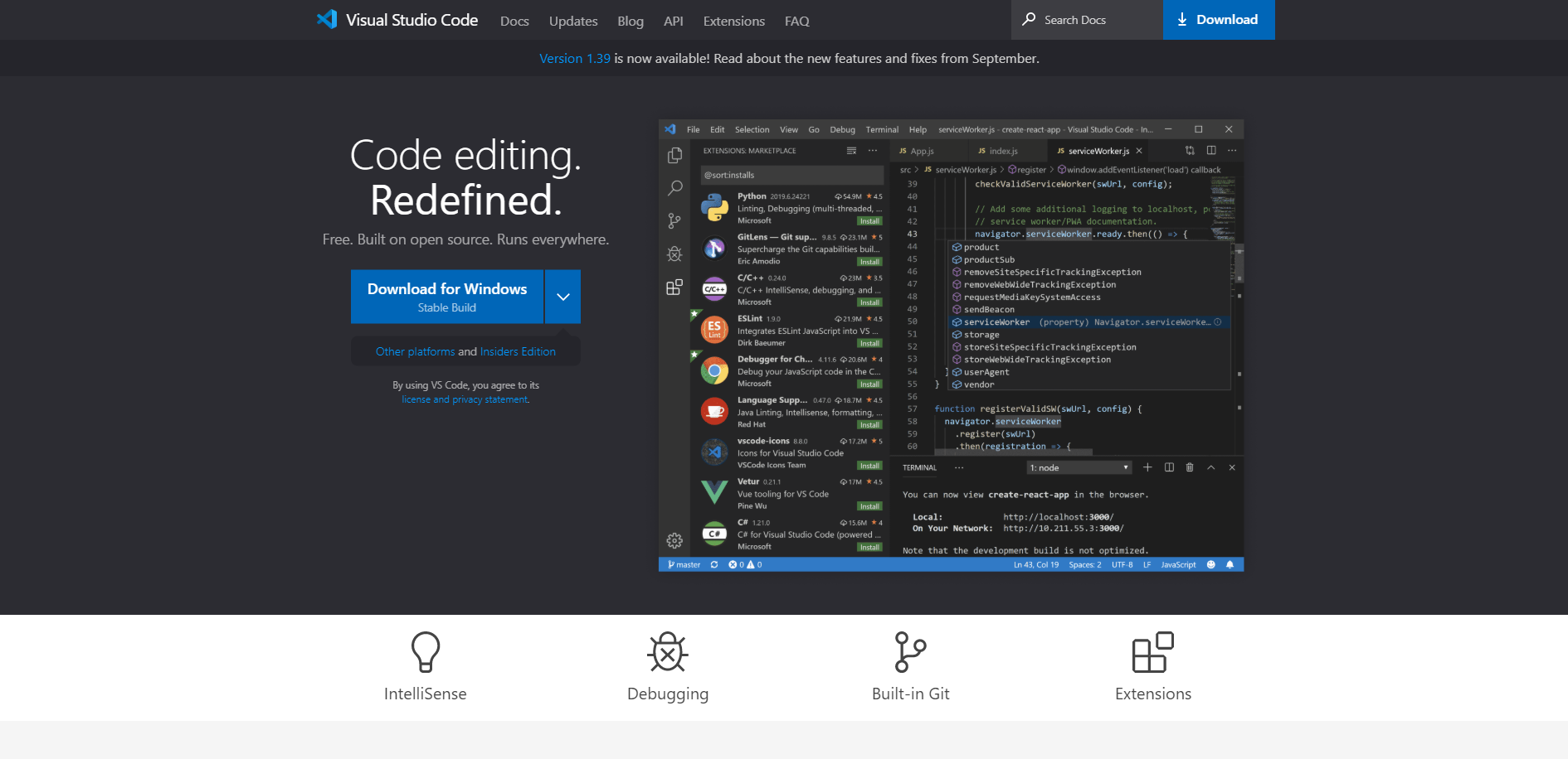
2. VSCode

Best developer tools of 2020 visual studio home page

VSCode is an open-source code editor that makes editing code as easy as pie. The developers of this tool basically took everything that sucked about coding and reinvented it to be easier.

So for example, they use InteliSense, which provides smart completions based on variable types, function definitions, and imported modules.

Possibly the worst thing about coding is debugging. At the very least, it can be quite time-consuming. But not so much with VSCode. You will no longer have to print out a debugging statement. Now, you can simply identify the bug and fix it right from the editor. Attach this to your running apps and debug with breakpoints, call stacks, and an awesome interactive console.

VSCode has built-in Git commands, it’s completely customizable, and it’s completely free. Check it out.

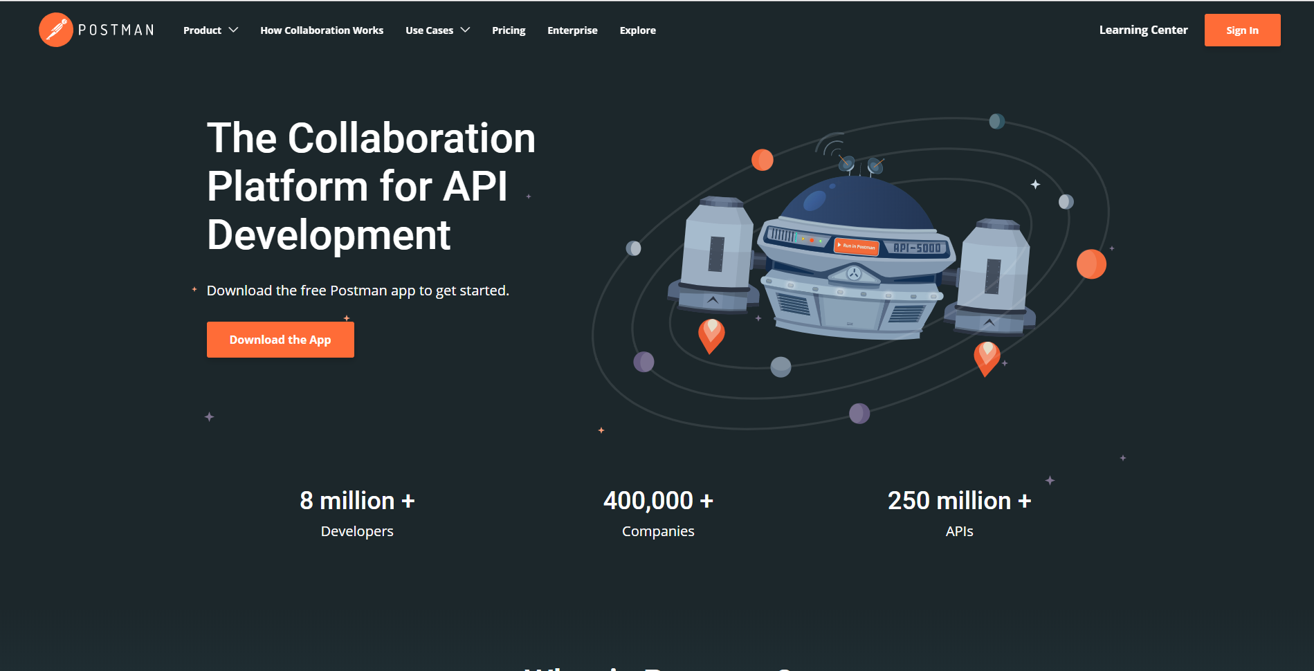
3. Postman

Best developer tools of 2020 postman home page

Postman is a collaboration platform for API development, and it has a lot to offer. Essentially, it’s your all-in-one tool for creating APIs. Here’s a list of some of the features you’ll have access to:


  • API client

Send REST, SOAP, and GraphQL requests super fast.

  • Automated testing

Automate your manual testing process.

  • App mock

Run simulated endpoints and predict potential behaviors of the app.

  • Monitor

After all is said and done, keep an updated report of the performance of the app.

Of course, there are quite a few features that Postman offers. Overall, it’s definitely worth checking out and using. It will make your life so much easier, and the amount you end up paying compared to the value you get out of it is incredible.

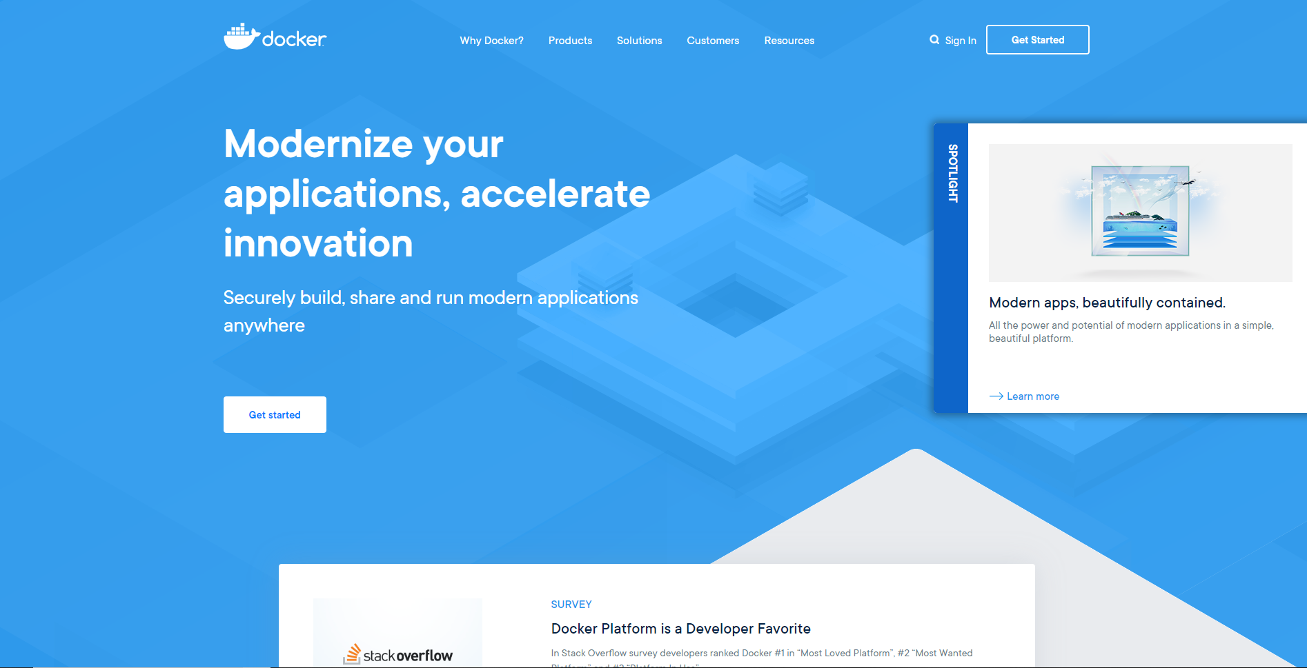
4. Docker

Best developer tools of 2020 docker home page

Docker is a platform for building, testing, and deploying applications. As simple as that sounds, it has quite a bit to offer. When I say a lot, I really mean a ton. There is a wide variety of development tools ready to go at any time. 

Docker has been a developer favorite for a while now, and it’s only getting better. If I added absolutely everything you have to look forward to on the list, we’d be here for a while. My best advice is to go and check it out for yourself to see what you think.

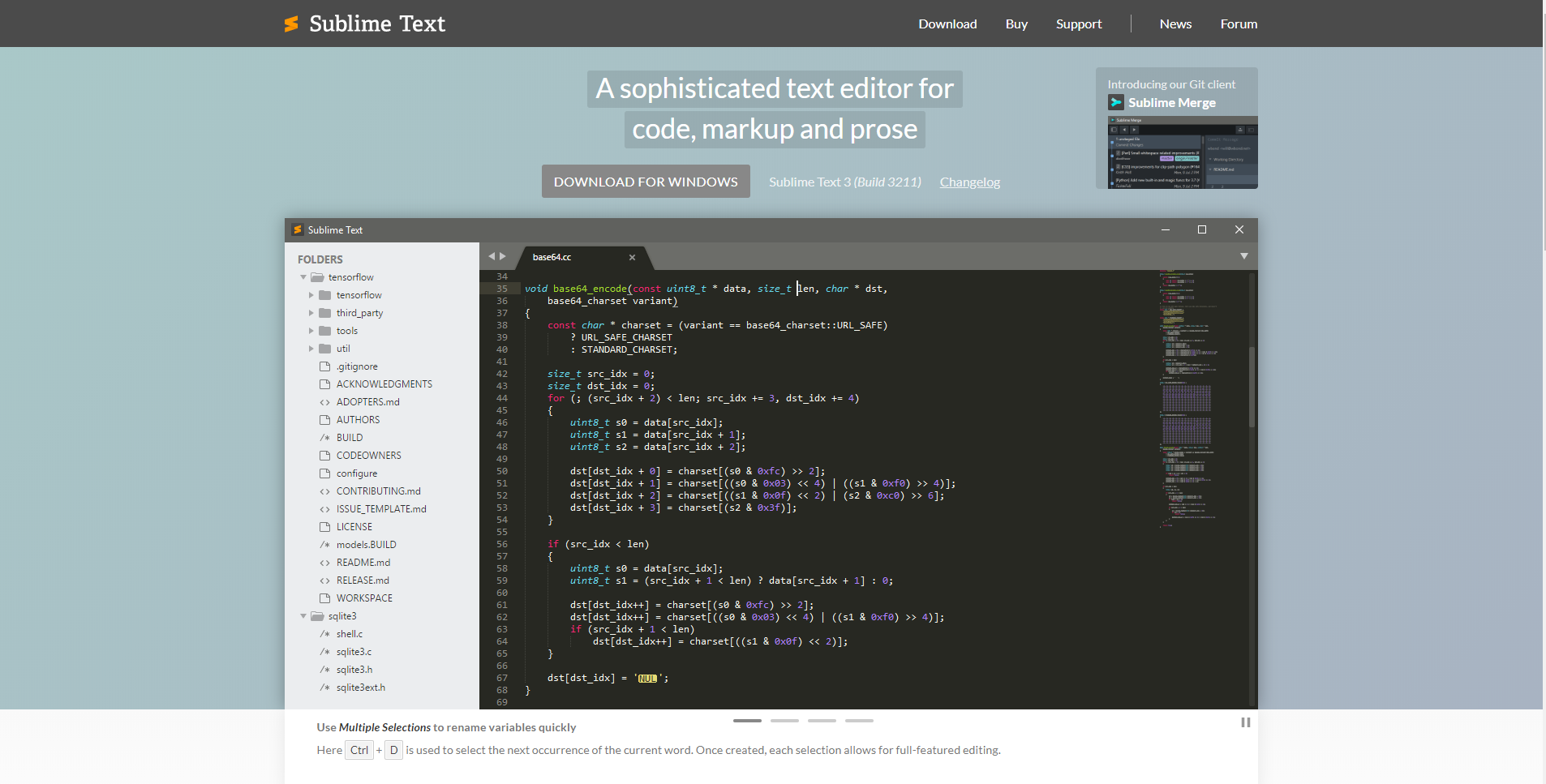
5. Sublime Text

Best developer tools of 2020 sublime text home page

I think Sublime Text said it best when they described themselves as a sophisticated text editor for code, markups, and prose. Even if they didn’t use the Oxford comma in their original description. 

In fact, just watching the demo on their main page shows you just how easy it is to fix and create text. Across the board, Sublime is getting great reviews for its ease of use, friendly interface, and for being the best text editor on the market. 

You may want to take the time to learn all of the specific commands for making the process even faster, as there are quite a few to memorize. But, all-in-all, you really won’t find a better product for editing text for code.

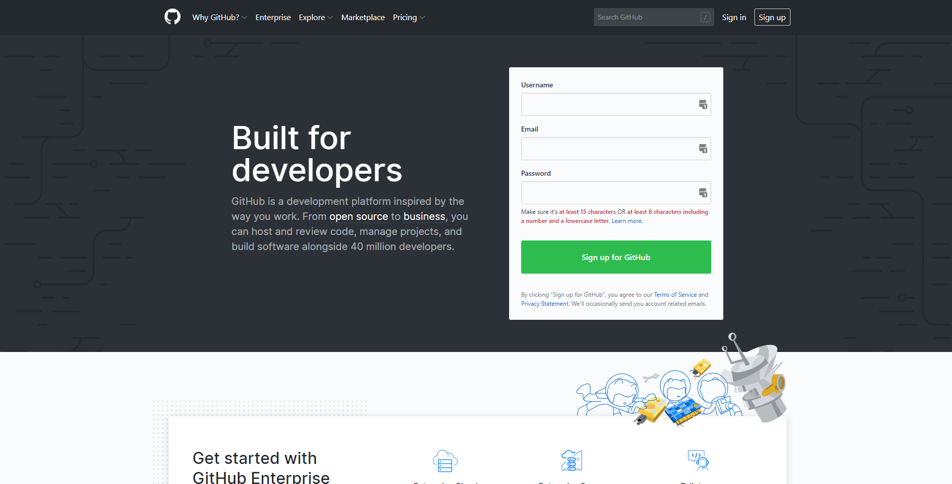
6. GitHub

Best developer tools of 2020 gituhub home page

Github has been a fan favorite for many years now. Some even consider it to be the best social coding and social sharing platform on the market.

The concept is simple: code together with your team to avoid confusion and delays. It sounds kind of messy, but I can assure you that it works pretty flawlessly. It really streamlines the process of bug fixing as well. Instead of making changes on a local device and then sending off the patches to be approved and implemented, you can simply (if approved by the lead developer) fix it on the spot.

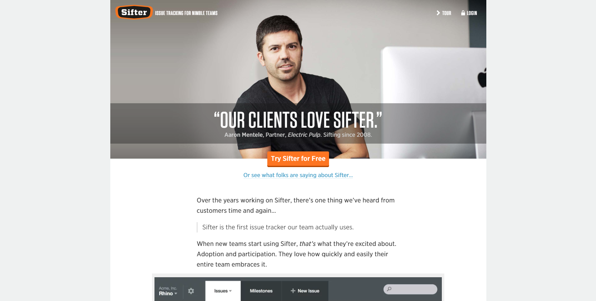
7. Sifter

Best developer tools of 2020 sifter home page

Sifter is definitely one of the best issue tracking software out there today. Possibly one of the best things about Sifter is how easy it is to learn and use. I would be very confident in suggesting this tool to even beginners.

Sifter brings all the issues it found to one platform. From there, the lead developer can label, attach files (screenshots, Docs, etc.), and assign them to qualified team members in basically minutes. On top of that, Sifter leaves a progression trail so that you can track exactly who did what.

Sifter also integrates really well with Slack, GitHub, and others to make sure that you have absolutely everything you need to make your app perfect.

8. Microsoft Visual Studio

Best developer tools of 2020 visual studio home page

Visual Studio by Microsoft is an IDE that is a great fit for anyone. It uses IntelliSense to autocomplete code and is notorious for the massive amount of languages it can support.

Visual Studio is jam-packed with all sorts of integration, plugins, and shortcuts to make your life easier. And that’s what we all really want, right?

Wrapping up

Now don’t get me wrong, there are thousands of development tools out there to get lost in. This is simply a list of the top 8 development tools you need in 2020. Or the top 8 that you should at least look into.

Regardless of your skill level, I think you’ll find something on this list that will help you out tremendously. Be sure to check out each link and take advantage of those free trials!


Read More at Top 8 Best Development Tools You Need in 2020

2019 Newsletter Design Trends You Have to Know About

summer sale campaign newsletter pink

As we continue through this eventful 2019, there are many newsletter design trends that have already come and gone. But, there are also quite a few that have stuck around, and even more that are just beginning to show up. 

So what are they? Great question. Newsletters are one of the most simple and effective marketing strategies out there, so it’s worth knowing what’s trending and what you should avoid. With that said, here are some of the best 2019 newsletter design trends that you’ve gotta know.

Interactive newsletters

Interactivity has been a trend in the design world for a while now. The reason is as cut and dry as it gets: people love to be entertained. There’s just something about being able to navigate, click, and watch the screen evolve in front of you that just can’t be beaten.

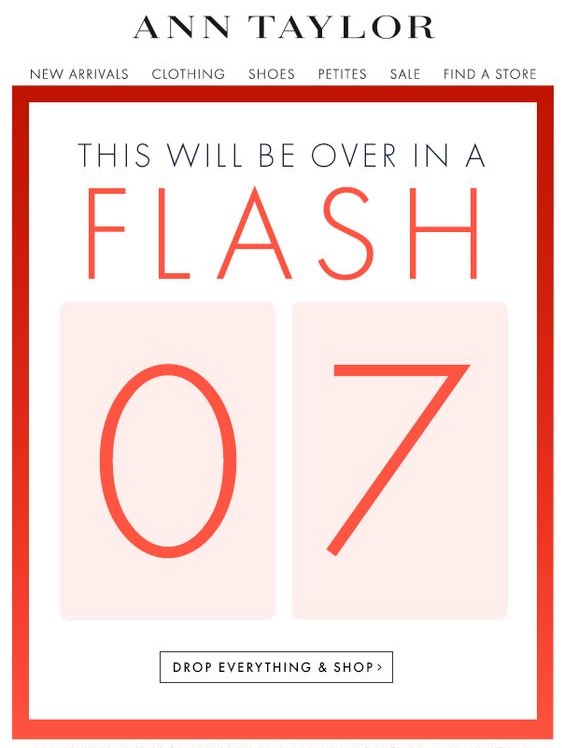
Take this newsletter from Ann Taylor, for example. It has a simple design that allows users to interact with it, see all the new products, and even go straight to the online store. Things like sidebars, drop-down tabs, and shopping links are actually taking off as a trend. This is an interactive email newsletter if I’ve ever seen one. As long as you don’t go overboard with it, this is a great trend to follow.

Simple and clean design

Minimalism is a huge trend in design right now. It’s no big surprise that it’s snuck its way into newsletter design trends, too.

There’s nothing more annoying than getting a newsletter, opening it, and finding an explosion of information that you can’t seem to click away from fast enough. The whole point of a newsletter is to grab someone’s attention quickly and direct them to the announcement.

summer sale campaign newsletter pink

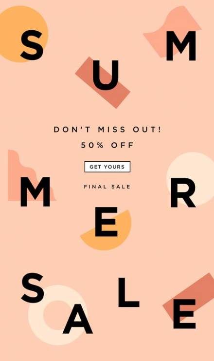
Something like this simple newsletter design clearly shows the reader that there’s a summer sale, it’s 50% off, and then gives them a link to go shopping. There’s nothing overwhelming or misleading about it. By definition, this is a perfectly simply newsletter, and it does the trick.

Catchy newsletter names

You may think that a name really isn’t part of the design, but I think that the name is the first thing that really grabs the reader’s attention. Amidst the absolute ocean of emails that some of us get daily, the subject lines can easily blend in with the background.

It helps to have a name that people not only recognize as your own but by having a name that stands out. There’s really no guideline for this other than be creative. Overall, you should just try to avoid names like (insert company name)’s newsletter.

Infographics in newsletters

If you absolutely need to give a lot of information, a nice infographic can really help maintain your clean design. One particular style of infographics that a lot of businesses are using is video infographics.

Video marketing, in general, has really rocketed forward in recent years. For many businesses, it’s their main focus. A simple video infographic is an easy way to pump out a lot of your information and still keep the target audience engaged.

Personalization

Creating a newsletter design that is easy to adapt to any reader can be hard to do, but it drives opening rates and engagement like crazy.

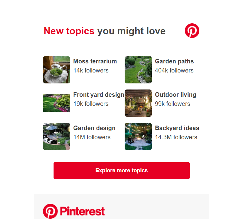
A good example of this would be Pinterest. For years now, they have sent you Pins via email based on the things that you like. 

pinterest based on what you like

On top of that, they will often use your name in the subject line. It makes it feel less like a corporate cash-grab, and more like a friendly email from a close friend. I don’t know about you, but when scrolling through my inbox, my name in a subject line stands out drastically. Many times, it’s all I look for.

Videos in newsletters

The reason videos work well in newsletters is simple: people love to be entertained. On top of that, listening to a video requires much less effort than reading.


That being said, adding a video to a newsletter can be tricky. If someone has rendering issues, or they can’t watch the video the moment they open it, then they may leave and never come back. There has to be a balance between making the video catchy enough to grab their attention and keep it and being short enough to not waste their time. Basically, keep it short and sweet.

Bright and contrasting colors

A little splash of color never hurt anyone. This statement rings true for a lot of things, but with design, it’s a little more complicated. It’s true that the right colors can really help any design. But, notice I said the RIGHT colors.

Just because you toss in some bright and contrasting colors doesn’t mean that people are going to love it. In fact, if you don’t get the colors almost exactly right, most people are going to hate it.

The colors you choose have to make sense. They have to match your brand’s tone, but they don’t necessarily have to be the brand’s colors. Take this newsletter for example:

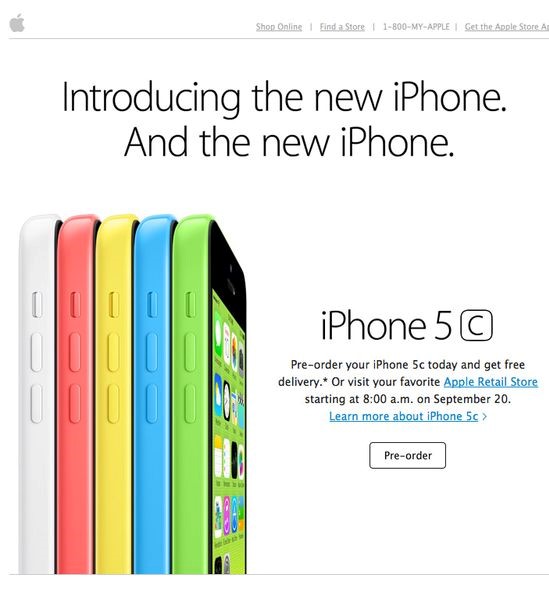
iphone 5c different colors white red yellow blue green campaign

We’re all familiar with the trillion-dollar company, Apple. They’re infamous for their simplicity in design. Most of the time, their devices are simple gold, black, grey, or white. It was quite a shock when they released the 5c, simply because they were like nothing Apple fans had ever seen.

Granted, this email newsletter design is a few years old at this point, but you can see the strategy in using these colors. They absolutely pop off the screen at you. They used the phone’s colors to highlight the phones themselves on the screen.

Or, how about this one:

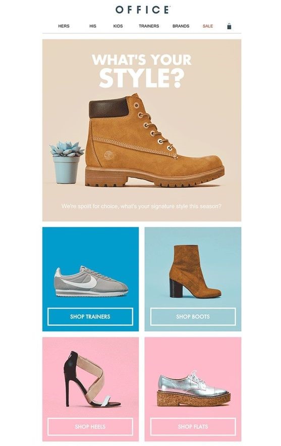
boots and high heel shoe sale

Again, what we have here is an ingeniously implemented design with contrasting colors. They’re not wildly different from each other, but they certainly do a great job of highlighting the products. These colors make sense, and they look good.

Full-width images

Just like the colors, images have become the main focal point of the newsletter in 2019. And, just like the example above with Apple, the images have quickly started to take up the majority of the newsletter.

It makes sense if you think about it. Let your product do the talking for you. Even if you’re newsletter is a software or a simple announcement, you should be confident enough with what you’re proposing in the newsletter. 

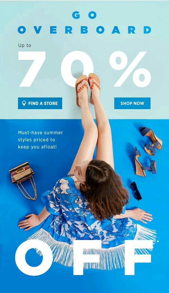
shoe sale for summer blue campaign trend

This newsletter advertisement is a perfect example of this. The image of the woman in the middle takes up nearly the entire thing, from end to end. 


In fact, this particular design hits on a few of the points we talked about, so we’ll end it here. You have a nice big image, contrasting and bold colors, a simple image, and interactivity.

Get creative

As I hinted at several times throughout this article, creativity is key. Most people will scan their emails, look for only the most important emails, and forget about the rest, newsletters included.

A combination of many or all the design elements above will definitely give you a competitive edge, but don’t forget to play around a little. Just because someone doesn’t open a newsletter email of yours once, doesn’t mean they’ll never do it again. This process will have a lot of trial and error, but you will get the hang of it eventually. Especially is you use these 2019 newsletter design trends.


Read More at 2019 Newsletter Design Trends You Have to Know About

Dark UI: The Good, Bad, and Ugly

sony dark user interface

Dark design is and always will be a trend. The level of darkness will always vary, but basically, it’s really hard to screw up a simple, dark design. This is especially true for dark UI design.


Not everyone gets it right all the time. There are a few things you have to keep in mind when working with a Dark UI. But, don’t pull your hair out yet. We’re going to go over the elements that you need to keep in mind, and a few you’ll probably want to avoid. This is the basics to dark UI: the good, bad, and of course, the ugly.

Why use dark UI?

To be completely honest here, I don’t think every site can pull of dark UI. It is an interesting design tactic, but it sometimes just doesn’t fit the overall style or brand.


But, putting that aside, it is a very visually striking change. For starters, you don’t see lots of dark UI in the digital world. It’s way easier to put dark text on a light background. Most blogs, for example, choose to go with the light UI simply because they pump out a lot of content.


But, what about the other types of sites? I mean, even a blog can pull it off if they try hard enough. You just have to make sure the dark theme will work. And with that in mind, remember that “dark” doesn’t always mean “black”.

darkness with light strobes

A dark background can be a variety of colors. As long as it’s not completely light, or at least has more than half its elements in a dark color, you could consider it to be a dark UI theme.


To be fair to those who don’t choose dark UI, you have a little more maintenance with a dark background. You have to choose everything (fonts, font size, icons, images, colors, etc.) perfectly. If you have a font that’s too small, it will be engulfed by the dark background. If you have a color that contrasts just a little too much, it can make the entire design theme look cheap.


So, why use dark UI? It’s bold and awesome.

Good examples of dark UI

I’m always a fan of examples, so this is where that portion is going to start. Don’t get me wrong, there are plenty of horrible dark UI examples, but let’s save those for the finale. For now, let’s talk about good examples of dark UI and discuss what they’re doing right.

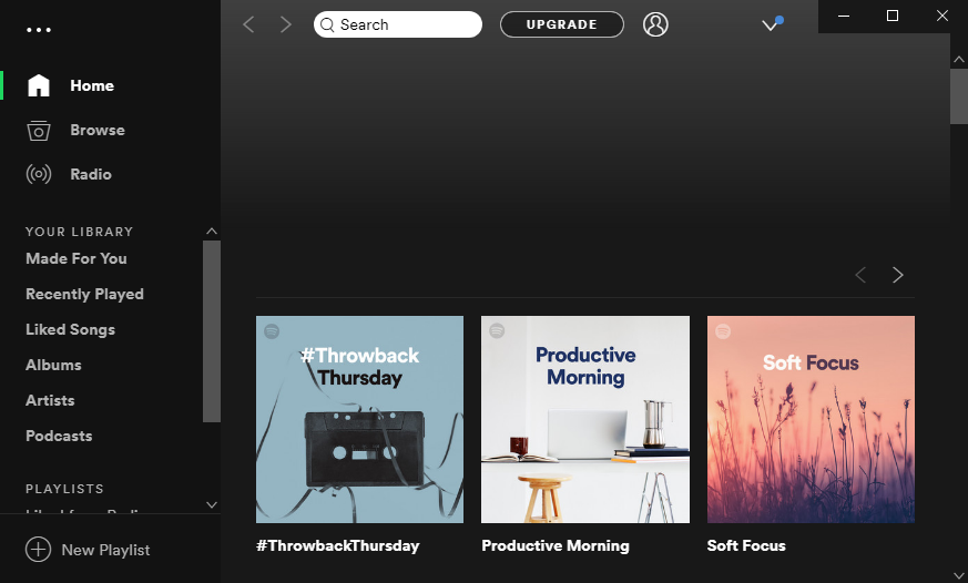
Spotify

spotify main menu dark user interface

Welcome to the Spotify app. This is the application window that you get when you download Spotify to your device. Spotify is notorious for their dark UI, and it’s for good reason.


For starters, “dark” doesn’t always mean black. There is a slight color gradient that breaks up the normal “black” scheme. It’s very smart because they only integrated the gradient into the middle and right side. If you notice on the left, the sidebar is still solid black, outlining it subtly, but just enough.

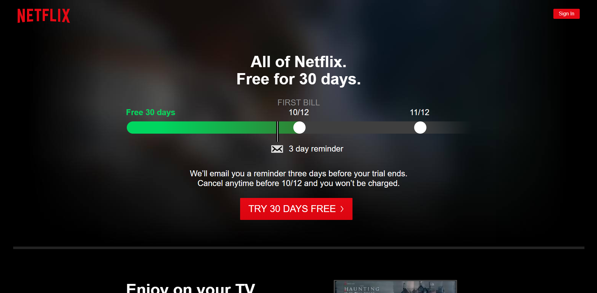
Netflix

dark user interface of netflix

Here’s another name we’re all fairly familiar with: Netflix. Netflix has a beautifully dark UI throughout. Most of us already know the dark UI they have when selecting a show to watch, but few of us probably remember the signup screen.


The reason I selected this screenshot is to highlight another element of dark UI that you need to remember: consistency. You simply cannot have a dark UI in one area, and then switch to a light. Visually, this is kind of an eye sore.

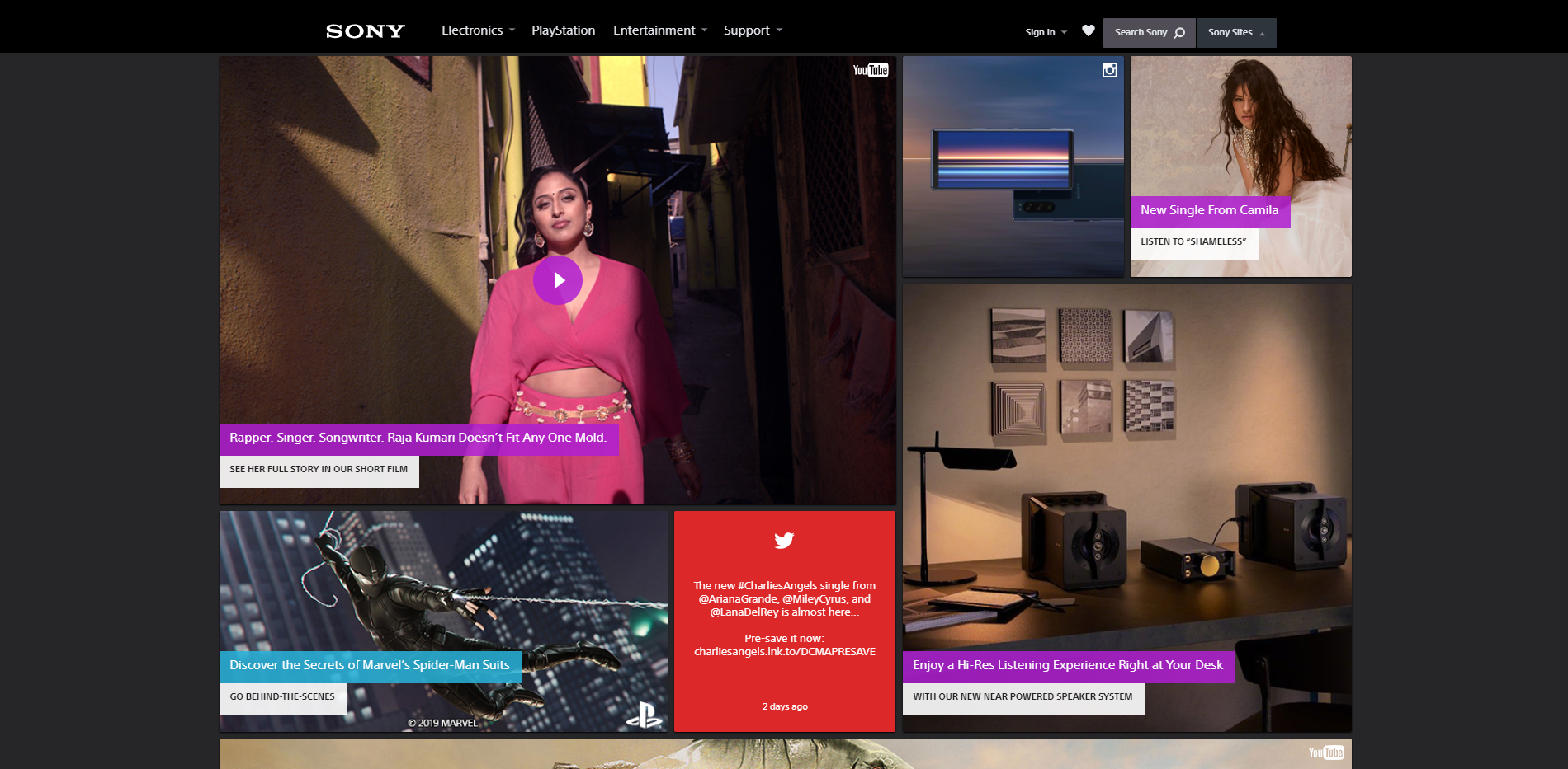
Sony

sony dark user interface

Here we have Sony’s main site. The dark background draws your eyes instantly to the center where all the content is gathered. It’s very, very simple, but it does the job. Plus, Sony’s logo is notoriously white, so a light background would’ve been a poor choice.


So what is Sony getting right? The lack of elements. The dark UI is contrast enough, and they know that. They don’t need to load up their main page with gradients and contrasting colors. They went with black, plain and simple. 

The bad and ugly dark UI

In order for there to be good examples of dark UI, there also has to be at least a few bad ones, too. Honestly, we can probably learn the most from bad examples. They teach us what not to do instead of giving us examples that we just copy. 

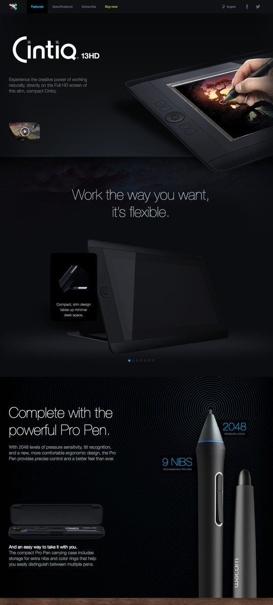
dark user interface

I don’t really like calling anyone out, so we’ll avoid names here and just jump straight to what’s wrong with the UI. To do that, let’s play a little game involving the image above. I like to call this game: Spot the tablet. Believe it or not, there are 2 tablets in that image. Can you spot number 2?


The point of this is to show you that not all images work well with dark UI. Sure, they could of had limited options. But this all points back to one of our original points when using dark UI – pick your images wisely. The fact is that the tablet blends in almost perfectly into the background. It doesn’t work.

dark user interface apple watch

This one I want you to really look at. From a glance, it looks pretty okay. There’s nothing special about it, but it’s certainly not the worst thing I’ve ever seen.


What they did wrong here is the overuse of contrasting colors. Bright redish-pink, lime green, and neon blue all come clashing together to make this app look like the inside of a cheap nightclub. It simply doesn’t work. 


Now, if they had gone with fewer colors, or maybe turned the intensity of the colors down a little bit, this could work very well. But, as it sits now, there are better designs out there.

Additional things to avoid with dark UI

We hit the basics on things to avoid with dark UI (too much color, poor image choices, etc.) but there are a few guidelines that I want to leave you with here:


  • Avoid a lot of text

We briefly mentioned how choosing the right size font makes a big difference. Well, the amount of text does, too. If you have too much light colored text on screen, it can be hard to focus.


  • Avoid a lot of content

In general, you’ll probably want to avoid too much content on screen at one time. Again, it can be very hard to focus.


  • Don’t use too many colors

Even if the design has nothing but dark colors, using too many can cause a lot of headache. With a dark UI, your brain will automatically be attracted to anything that stands out. Including varying colors. The quick change for your eyes can and will be straining.


There you have it everyone: dark UI. Overall, it can be quite a challenge to pull off dark UI design. But, if it’s done right, it will definitely make you stand out. But of course remember, dark UI is absolutely not for everyone.

Read More at Dark UI: The Good, Bad, and Ugly

What The Heck is Conversational Design and Why You Should Know About It

person drawing graphic designs

In the golden era of technology, we as humans find ourselves less fascinated by the machine-like design most websites boast, and more attracted to conversational design. But, that does leave us with one overwhelming question: What the heck is conversational design?

What the heck is conversational design?

Conversational design isn’t as foreign as it sounds. In fact, you’re probably very familiar with the concept.


For websites, conversational design is considered user-centric design. Basically, that means that instead of conversing through a computer screen, the content is designed to sound more like a face-to-face conversation. 


Why is this a good idea? Well, that’s a concept you’re probably pretty familiar with, too. People don’t want to talk to read content that sounds like it’s computer-generated. They want to have a conversation, not be lectured.

two designers having coffee

Overall, this design tone is very polite. And, as you can imagine, this can change UI and UX completely. Right now, one of the most conversational design elements is that of a chatbot.


Can you ever remember a time when you had a question, sent it into customer service via live chat, and you got the generic reply:


“One of our agents will be with you shortly. Average wait time: 5-10 minutes.”


It’s awful. For me, I don’t seem like a priority in the slightest. In fact, I feel like they don’t even want to talk to me. Maybe I’m overreacting a little, but think about how much better you would feel if instead, the automated chatbot replied with a:


“Good afternoon, and welcome to [insert company’s name]! Please bear with us as we connect you to someone who can help.”


There are two very different tones here. In the first, you have a very unenthusiastic voice, putting you in a line, and simply hoping that you hang up.


The second, although it’s not much longer, not only implies that they’re happy you’re here, but it sounds like there’s actually a person that typed that out.

Tips to pulling off conversational design

Remember, conversational design is not just text on a screen. It’s anything that can alter the UI/UX. So we’re talking about any interactions as a user might have. Of course, this does mostly come off in your tone of voice, but you can still apply the following tips to things like machine learning with chatbots, or even video content. It’s all about making them feel like they’re part of a friendly conversation.

two guys having a podcast

Be human

This is the biggest tip than anyone can give you, and it’s actually pretty easy. Just remember that conversational design is not always the most convenient for you. Instead of just typing out a ton of information, you have to consider how the reader will actually read it. Remember, it’s a conversation!

Avoid ending the conversation

This can be a little bit more tricky. You always want to give the user the option to end the conversation. So we’ll use the example of a chatbot again. 


Chatbots have the ability to decipher what most people are saying, but sometimes there just isn’t an answer that they can give. Instead of not replying, or replying with an “I don’t have an answer for that,” you could give them common queries by other users. This way, they always have an option.

people holding shapes

Use loads of rich content

We live in a day and age where people want to be constantly entertained. But with that said, it does go too far sometimes. Videos, images, and playful designs are a great way to engage your users in a conversational way without actually having a conversation.


Of course, there are lots more ways to strike up a conversation, but these are just a few of the basics. The key is to have a rhythm and stick to it.

How to design a conversation

person drawing graphic designs

When I say design a conversation, I imagine that a lot of you are picturing an image like the one above. Fortunately, it’s not all that hard. In fact, there are a few very basic steps you can take to get started:


  • Create an outline

Like an essay or article, there needs to be an outline first. This will act as your structure for any conversation that could take place. This might be questions people may ask, keywords within the questions, or both.


  • Create a conversation flow

You have to connect the dots in the conversation. Basically, your bot has to know what to say and the order in which to say it, all based on the answer from the user. This includes the main flows, which consists of a few conversation routes the user can take.


  • The bot script

Now, you have to create a friendly and conversation script. Again, remember that the golden rule is to be human. Make it sound like a real human being is answering them, not a robot.


  • Greetings and goodbyes

You definitely need to have a friendly greeting and goodbye for your bot once the conversation is over. 


  • Safety net

Let’s be blunt for a second and just say that there’s a 100% chance that your bot will break. Technology is nice, but it’s not perfect. You’ll need a sort of safety net response to help you in these situations. A message like, “Um, I got super confused. Can we start again please?” Goes a long way, and it lets people know that there really isn’t a response made for that particular question yet.

Why you need conversational design

The short answer to the header above: most people like conversations. The long answer: People like to feel important. Nothing can make you feel less important than short and very vague answers.


A great example of conversational design is Apple’s Siri. Now, I know what you’re thinking. 


“I can think of so many times when Siri didn’t do what I asked.”

siri saying hello on iphone

But, let’s think about how much Siri has evolved since release. Let’s think about Siri directs us when she doesn’t understand. And since she’s connected to the internet, she can look it up there if she doesn’t have an answer. She can even tell jokes.


I think as far as conversational design in AI goes, Siri has nailed it. At least on a basic consumer’s level.

Start your conversation

Don’t get me wrong, there’s a lot all of us could learn about conversational design. The fact is that it’s not an exact science at all. There will always be times where you fail, but there will also be plenty of times where you succeed.


The key is to follow the main points I gave up above, use the steps we listed for designing a conversation, and remember to think about your design not as text on a screen, but words with a real person.

two designers having coffee

Read More at What The Heck is Conversational Design and Why You Should Know About It

What Most People Don’t Tell You About Designing Your Own Logo

For a lot of people, the first thing they think of when they hear the names of big companies is their logo. In truth, the logo is probably the biggest marketing decision you can make. It might sound simple, but there are quite a few things you need to keep in mind when designing a logo of your own. So without further ado, let’s talk about the basics behind designing your own logo.

Why do you need a logo?

Ideally, you’ll want to hire a professional to create your logo, but that doesn’t mean you shouldn’t bring some ideas of your own to the table. In fact, it’s best that you have a pretty good idea of what you want before the big design meeting. 

man looking at logos on wall

But let’s say that you want to go through most, if not all of this process by yourself. Where do you even begin? You need to start this journey off by understanding why you need the logo.


Your logo is an extension of your brand. It’s important that it represents you. That can be hard to do in a single picture, but that’s why this takes time. 

Pick something that scales as a favicon

A favicon is that little image that sits in the address bar when a tab is opened. It’s a small detail, but it’s very crucial.


The reason it’s so crucial is because those big, fancy, and incredibly detailed images will look absolutely terrible as a favicon. This is something that a lot of people don’t think about because they generally regard a big and fancy logo as perfect. 


One of my favorite examples of a favicon is that of Mailchimp.

chimp on yellow background logo mail chimp

This logo is simple, yes, but it still manages to capture the brand perfectly. Now, if you pay attention, you’ll notice that the main focus of the logo (the chimp) is its own entity. That makes it very easy to scale as a favicon. Just like this:

chimp on yellow background logo mail chimp

This is the Mailchimp favicon. They definitely couldn’t have put the entire logo in the address tab, and they knew that. So, they went into the logo design process with that in mind, and came out with this.

Test multiple colors

Speaking of being scalable, you want to make sure the logo looks good on multiple backgrounds in multiple colors. If you don’t you could end up having to redo this entire process when something as simple as a WordPress theme change comes up.


A good example of this would be Slack

slack logo purple and white

As unusual and controversial as the Slack logo has been here lately, we all have to admit that  it works well with multiple colors. Of course, the logo itself has a variety of colors in it, but that really only helps it.


The Slack logo can be seen around the world with all sorts of background and font colors. It’s an iconic logo, so it was important that they got all the design elements right.

Be consistent with the brand

A logo means nothing if it doesn’t embody the brand. This is especially important for startups that are looking to get their name out there. 


I don’t think I need to go into this too much, but we definitely need to mention it here. Every tiny little detail is crucial. They have to match the brand’s story, their tone of voice, and their mission.


So, for example, the choice of font is a big one. If you run a SaaS company, you probably don’t want to use a script font. Something like that makes much for sense for a small town candle shop.

lemon logo lemonade stand

Something like this classy lemonade stand logo is perfect. It’s simple, it will scale well as a favicon, and it’s on brand. The colors work well and the font stands out, but it’s not over the top.

Make your logo easy to incorporate into your brand

This point sort of goes along to the one above, but it deserves its own mention. That being said, even if your logo is on brand, it doesn’t mean that it will be easy to incorporate into the rest of your brand.


What do I mean by that? Well, looks aren’t always everything. Even if you logo looks great and embodies your brand, it might not be easy to use. Yes, there is such a thing as a logo that is too detailed to use.


A logo should not be so complicated that it takes more than a few seconds for someone to recognize what it is. If it’s simple and straightforward, it will be easy to incorporate into your brand anywhere.

Other tips to follow

There are tons of tips to take into consideration here. But, whether you’re designing it yourself or paying someone else to do it, there are some that are pretty fundamental. So, in addition to the ones above, here are some quick tips that you should consider:


  • Pick a style and stick to it

Just like a good party, a logo has a theme. This is a combination of all the elements. From the typography to the colors, everything should be perfectly thought out and implemented with a purpose. Each element needs to pay respect to the others.


  • Keep constant communication with the designer

If you choose to hire someone, you have to keep constant communication with them. In the design world, you build off of your own ideas. So if the designer gets one tiny detail wrong, then the entire logo can be off in the end.


  • Stay inspired

You are designing the face of your company. If you lack inspiration in the project, you should stop and brainstorm a bit. Or, if you really can’t handle it anymore, step away for a bit. Nothing is worse than rushed work in design, so don’t make your logo suffer.


  • Get a lot of opinions

You’re not designing this logo for your own personal use. This logo will be seen by a lot of people, so get a lot of opinions. Show it off to colleagues, friends, family, or even random strangers. The more input you can get, the better your logo will come out.

Be yourself

This is probably the most important rule in design, so we’ll end here. Being yourself is what got you to the place where you can design your own logo in the first place. Don’t fall into the norms of the industry that you’re in. Be unique!


Read More at What Most People Don’t Tell You About Designing Your Own Logo

10 Best Free Insta Story Apps That Will Help You Slay the Instagram Game

unfold best free insta story app

Seeing all the time, effort, emojis, drawings, and true works of art put into an Insta story, we know for sure stories are not what they once were. They’re no longer just pictures and videos shot in real-time. Stories have become a true marketing platform, with intensely strategic moves behind each piece of content published. Every Insta story most likely has a cool (maybe expensive) story app that was used to produce the content.  


With Insta stories looking more polished and aesthetically pleasing than ever, as a designer, you have to be on top of your game. But to what end and to what cost? 


I’m here to help you save a good buck. I’ve got the 10 best free Insta story apps for you to use to improve your Insta stories game without breaking the bank. Without further ado, let’s jump right in.


10 Best Free Insta Story Apps


1. Unfold

unfold best free insta story app

Unfold is an amazing Insta story app that is free, but also has in-app purchases if you fancy a certain look and template theme. With many texts and elements to choose from, and themes spanning from elegant or retro, there’s something for everyone.

Try it out today for free: https://unfoldstori.es/


2. Jane

best free insta story app jane

A very underappreciated and not talked about enough app, in my opinion, is Jane. The app is free and has very many free beautiful templates for you to use to spice up your stories. They are quite girly and are perfect for maintaining an elegant or playful story vibe. Create amazing videos with royalty-free music and amazing visuals. Again, this app is free but has in-app purchases. 

Try it out free today: https://apps.apple.com/us/app/%E7%AE%80%E6%8B%BC-jane/id891640660


3. Canva

canva free insta story app


Canva is hands-down one of the best online CMP’s out there. It’s great for beginner and advanced designers alike. With tons of templates to choose from and customize, you’ll surely find the one that suits your style best. The mobile app is free and has in-app purchases, although you can totally rock with all the free elements and templates and just tune them to your liking.

Try out this app out for free today:https://www.canva.com/app/


4. Hype Type

hype type free insta story app

With a vast and wide collection of fonts, you can do some serious designing with this app. Hype type is absolutely killing the font game. If you’re focused on spreading a message, then this is absolutely the app for you. The app is free with some paid features, but it’s up to you to decide if they’re a necessary buy. 

Check out their app now: https://apps.apple.com/us/app/hype-type-moving-text-photo-s/id1152687277


5. Cut Story

Cut story free insta story app

Another great app for managing your stories is Cut Story. Cut Story’s is an amazing video editing app where you can create engaging videos and add music, texts, elements, your logo and more to your video. There are special features that you can buy to enhance your UX, but only if you deem necessary.

Try out their free Insta story app now:https://apps.apple.com/us/app/cutstory-for-instagram-stories/id917630934


6. Mojo Story Maker

free insta story app mojo story

Mojo is the way to go for Insta stories because they have 100 templates for you to choose from! Customize your stories with text to create relevance, engage with your followers and make them feel what you feel, and share the message you want to portray with them. A huge plus to this app is that you can share your new and improved story directly to your Instagram and also your Snapchat!

Try this Insta story app now: https://apps.apple.com/us/app/mojo-stories-editor/id1434861974


7. InShot

in shot free insta story app

For all my influencers out here, Inshot is the app for you. We don’t always have time to film, import, and edit our footage on our laptops or computers, so having this app will be a valuable asset for you. Edit all your video content in a single app on your phone and import it directly to your Instagram. This app is truly a gift to all of us creators out there.

Give it a try if you haven’t already: https://play.google.com/store/apps/details?id=com.camerasideas.instashot&hl=en 


8. Adobe Spark Post

free insta story app adobe spark

Adobe, king of all things editing programs, in my own personal opinion. Adobe has great editing programs, from video-editing to photoshopping images, and when they saw an opportunity to create an app to help you create amazing stories to tell your followers, well, we all know they wouldn’t pass that up. With this app you can do more than edit stories photos, you can also edit video and image posts. The app is initially free and then they offer you the chance to upgrade if you end up falling in love with the app.

Go ahead and give this Insta story maker a go: https://spark.adobe.com/features 


10. Over

over best free insta story app best free insta story app Over


And last, but not least, we have the app called Over. I love that when you visit their webpage, it’s just absolutely inspiring. It inspires you to be different, to stand out, the influence others. A great app for you to use to for free to make your Insta stories more engaging for your followers and for you to really create a brand name and grow your recognizability.

Stand out of the crowd and try this amazing app free today: https://www.madewithover.com/


Now that you have 10 new and fresh apps for you to choose from to start stepping up your Insta story game, it’s time for you to hop on it. Download any one of these apps and tag us in any of your Instagram stories for a chance to be featured on our stories. Our Instagram handle is @webdesignledger.


Don’t sleep on these amazing free Insta story apps! Try them out today. 


Until next time, 

Stay creative.


Read More at 10 Best Free Insta Story Apps That Will Help You Slay the Instagram Game

Design Trends That Have Been Taking Over This Year

So you thought you could make a functional website and leave it at that.

Don’t worry, it’s a mistake that happens often, mostly because consumers frequently emphasize the importance of functionality when it comes to (web) design. However, they forget to mention that there’s nothing that catches their eye more than an interesting design.

To put it simply, functionality is the bare-boned proposal, but a fancy design is what’s going to seal the deal.

Since 2018 was a whirlwind in many fields (especially in AR/AI development), web design found itself at a crossroads. We’ve never had as many features that can be included to enhance customer satisfaction, nor have we ever had so many opposing thoughts when it comes to web design.

We have been seeing and expecting great things from web design this year, and these web design trends we’re witnessing may just change the way we drive conversion.


#1 – The Rise of Interactive Visuals in Web Design


While simple design works okay, you wanna channel your inner kangaroo when it comes to web design.

How?

By jumping through hoops to keep your customers entertained.

2018 saw a rise of web designers customizing their approach to customers who want to be entertained. After all, you don’t have to be an entertainment company to keep your website visitors engaged.

The rise of interactive visuals in web design and different types of content (more than the traditional text & image formula) will become even more prominent in 2019. The old Romans said panem et circenses (food and games), so let’s do as Romans do. If you’ve got a great offer, give the people fun, as well.

A good example of fully using interactive visuals is The Disruption Company.
 

[GIF source]

The Disruption Company use animations and videos to keep their customers engaged. Then they absolutely raise the bar for the rest of us commoners by switching up the content visitors see every time they visit their site.

This provides the website visitors with a unique and interesting experience and raises their conversion rate automatically.

Another great example of interactive content that website visitors enjoy is APPS’ site. APPS is a company for apple cider production, and they show how much effort they put into their main product by having a cider-making action simulator on their front page.
[image source]

You can go through their entire cider-making process as though you were a part of it and even though most of us couldn’t make a cider to save our lives, APPS makes it fun and interesting from the very start.

2019 is going to be the year of consumer journey, so it’s important to integrate features that enrich the end consumer’s journey. If APPS gets anything, they get the need for a vivid experience.

Consumers today want interaction, not just plain text and images. They’ll lose their appeal in 2019, especially since many companies are already catching on to the interactive trend.

And speaking of interaction, another big trend to expect in 2019 is…


#2- Gamification in Web Design


Gamification has been a big deal in design and marketing this past year, but only as a keyword. If you Google gamification, you’ll see a lot of articles but very little substance – especially on how you can use it to boost your marketing efforts.

The trick to gamification is helping customers fully immerse themselves into the process of consuming the product. Good marketers and designers know that this immersion starts with the website.

Gamification can be used in different ways, such as:

  • Visitors and consumers competing with each other (with the goal of winning a prize)
  • Comparing results
  • Interactivity
  • Actual games

Obviously, everything about gamification is pretty fun and serves to engage visitors, but there’s nothing like real mini-games.

Now, you can integrate them into the site as a separate product, but you can also create entire websites with gamification in mind.

A great example of gamification is Polish Christmas Guide.
[image source]

Polish Christmas Guide is a website that helps visitors learn more about Christmas traditions in Poland, and even though it’s not a typical example of a for-profit website design, there’s a lot to learn from it.

Polish Christmas Guide uses animated SVG graphics and scroll-triggered CSS animations with custom SFX effects. The main mission behind the project is to motivate visitors to donate to Nobody’s Children Foundation, which helps abused children.

This design is driven by visuals, and visitors play a game where they ride around in Santa’s sleigh and collect presents while also learning about Polish traditions.

It’s great content, as far as content marketing goes, as it ultimately serves its main two purposes: consumer education, and emotional conversion.

Again, gamification really strives to create unique consumer experiences that can be considered separate products, but in coexistence with the actual product create an entire story.

For example, Habitica allows you to gamify your life and motivate yourself to achieve your goals.
[IMAGE SOURCE]

It’s essentially a habit-tracker that uses the mechanics of role-playing games such as achieving points, earning rewards (snazzier armor, weapons, pets, etc.), and battling monsters with other friends.

While the web design itself isn’t as interactive, gamification starts from the get-go. The website is designed with the end experience in mind, allowing consumers to immerse themselves into the experience even before they’ve downloaded the apps.

Gamification is incredibly effective, especially because 70% of business transformation efforts fail due to lack of engagement. Gamification successfully combats that and increases both engagement and conversion.

Plus, it’s really darn fun. And we all need a bit more fun in 2019.


#3 – Mobile Design Giving as Much as Web


In 2015, we saw that mobile searches increased in comparison to web searches, and that trend kept rising in the last few years.

People use their phones more than they use desktop, and Google is the alpha and omega of resources, so it doesn’t surprise anyone to find that Google’s algorithms are also prioritizing mobile over web.

When it comes to web design and marketing, we’ve had to adjust our efforts to accommodate the rise of mobile. A lot of constraints come with that new direction of design, but we shouldn’t compromise on quality.

Consumers still want what consumers want, and an important trend in 2019 is going to be adjusting mobile to provide as much as web design does. This means that mobile shouldn’t only be an addition to standard design of your website, but a design in its own right.

A great example of mobile design that will gain even more significance in 2019 is the website of Adrian Zumbrunnen, a UX designer and writer.
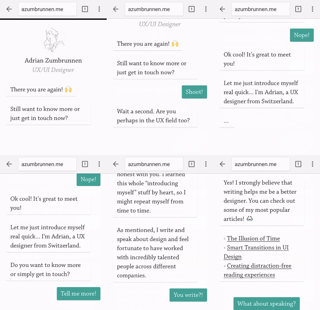
[GIF source: https://blog.hubspot.com/hs-fs/hubfs/adrian-zumbrunnen.gif?width=350&name=adrian-zumbrunnen.gif ]

Zumbrunnen’s mobile website experience is conversation-driven, and the customers can “have a conversation” with him, telling him more about their needs.

Again, interactivity is going to be huge in 2019 so if you don’t want to miss out, you can learn from Zumbrunnen.

Mobile isn’t the perfect platform for a lot of animations and videos, but great designers and marketers know that they don’t have to make compromises when it comes to unique user experience. It’s the main way of converting prospects to customers, so when thinking about mobile design, think interesting.

Then adapt to platform.

Lean Labs does the same, as they understand that mobile design is different from website design – but equally as important. They’re a marketing agency, and have a “10x formula.”
[IMAGE source: https://blog.hubspot.com/hs-fs/hubfs/lean-labs-mobile-website-2.png?width=350&name=lean-labs-mobile-website-2.png ]

Customers can understand their 10x formula by scrolling through the site, and everything is adapted to the sleekness and simplicity of the mobile experience.

Lean Labs also show their expertise in the field of design and marketing by using appropriate typefaces, color schemes and visuals.

When we take a look at Zumbrunnen and Lean Labs’ websites and compare them to other mobile sites which weren’t created with mobile-first in mind, a few things become immediately clear:

  • Mobile isn’t the second-place prize.
  • Interactivity is just as important with mobile (and it’s achievable).
  • Content matters, but so do the visuals.

We’re going to see a lot more mobile-first websites in 2019 so forget about scaling your usual website CTA buttons, and focus on creating a different, unique, but on-brand experience.


#4 – A Different Kind of Design Minimalism

Back in the day (by which we mean 2016, as that seems like it was twenty centuries ago), minimalism meant black & white color schemes, and not much to see.

Fortunately, we’ve grown up and realized that minimalism in the traditional sense won’t give the consumers what they need. So today, we’re seeing a paradigm shift towards content-first meaningful experiences that are focused on one goal (e.g. everything driving the consumer to sign up, as opposed to stuffing them with information and providing very little direction).

In order for the design to function properly, this design minimalism should be empowered by visual choices. With minimalism, colors are used to stimulate the purchasing decisions depending on the industries, and each design choice may be small, but it says a lot about the designers and marketers’ decisions.

Evoulve starts off mesmerizingly and cosmically. They’re a digital innovation company, and it becomes clear that they’re seamlessly passing through previously untouched frontiers from their website design.
[IMAGE SOURCE: http://evoulve.com/]

Their brand message is conveyed with their website’s minimalist design. From the very start, visitors are motivated towards bigger and better things with the color scheme and the planet animation.

Evoulve only has a simple left side bar where visitors can navigate to find more information on the company. When pressed, there’s a translucent layover over the main animation, and a navigator with information on the company and technologies, and getting in touch with them.

This example is a great example to show how design and field of work can go hand in hand, especially when the principles of minimalism are utilized for that purpose.

With minimalism, each design choice goes on to say a lot about the purpose of the company. A great example of that is a product designer’s, Mikiya Kobayashi’s site.
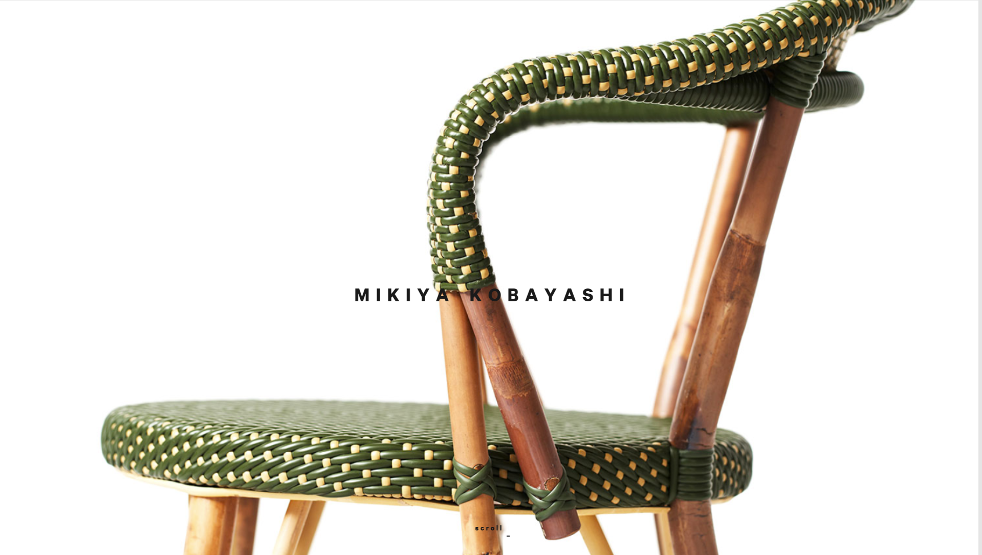
[IMAGE SOURCE: http://www.mikiyakobayashi.com/ ]

Kobayashi’s site’s main focus is on the products that he creates. He only briefly mentions his name and invites website visitors to scroll and focus on how he creates the products.

Some designers may even say that the placement of images in regard to his brand name is unfortunate. However, it’s a very bold and minimalist design choice that conveys the “product first” message from the very start.

In 2019, minimalism is going to take on a different meaning – one that will be more meaningful for the end consumers.

And designers who understand that minimalism is essentially a focus towards the central purchasing decision will be the ones making the most out of web design in 2019.


#5 – Chatbots and Machine Learning Integrated with Web Design

Bots and machine learning have changed the way we communicate, especially in sales.

Instead of manually fielding emails and customer questions, companies are increasingly using chatbots and machine learning to reduce the workload – and provide customers with much faster responses.

It’s only natural that changed design, as well. Currently, we’re seeing a lot of website integrations (usually in the form of ZenDesk pop-up on the right side) that are only a passing solutions.

Marketers and designers who want to fully utilize the possibilities of chatbots and machine learning will have to adapt their design to new technology in 2019, and make it a crucial part of website user experience.

Chatbots and machine learning are another feature of the push towards a more all-encompassing user experience. Hipmunk, a platform that helps people search for flights, hotels and rental cars, understand that, and they’ve created Slack, Facebook and Skype integrations to help users communicate with them when they need them.
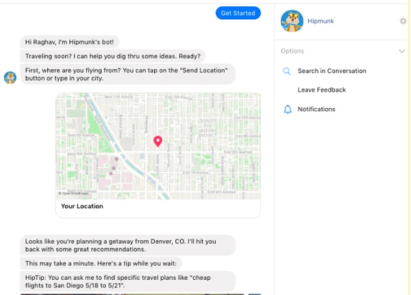
[IMAGE SOURCE: https://www.impactbnd.com/hs-fs/hubfs/Hipmunk-Messenger-Chatbot-example.jpg?width=600&name=Hipmunk-Messenger-Chatbot-example.jpg ]

Again, the convenience of web design is again exemplified by features that a company offers their customers. The goal is providing a complete service.

Landbot.io, even though they’re a chatbot provider, has a great website that shows exactly how their chatbots work.
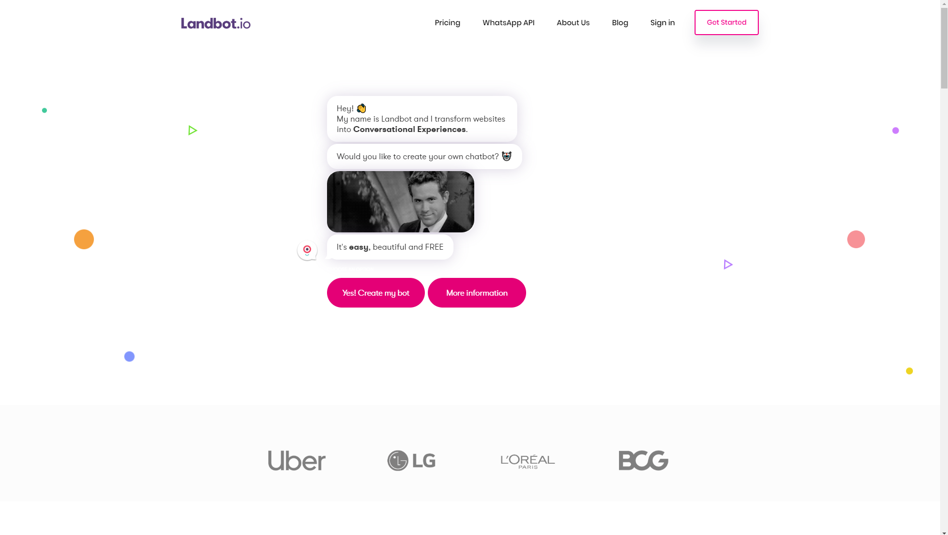
[IMAGE SOURCE: https://landbot.io/ ]

If you remember the conversational website that was a great example of interactivity, then you’ll see how much Landbot.io helps with that. Customers can have full-blown conversations (that range from product offers to customer service) with websites.

This not only helps provide excellent customer service but also cuts overhead costs for many companies, so chatbot integration is going to become a major design player in 2019.

Let’s just hope Skynet doesn’t take over the world.


#6 – Visually Intriguing Design Choices

Websites are no longer just resources – they’re becoming a major conversation and conversion drivers. Engagement matters, and it starts with them.

That’s why visually intriguing design choices will become a big trend in the way we design websites in 2019. It’s important to capture attention and provoke engagement, and what better way to do it than by making bold choices that stand out from the majority?

When we talk about visual design choices, we can talk about animations, cinemagraphs, and we can also talk about design lines and points of focus.

Traditionally, we’ve used straight and horizontal lines to separate different content. However, using diagonal line design has been proven as more effective.

An example of using diagonal line web design is Startup Giraffe. It’s immediately clear that this is a company that’s trying to present itself as fun and comfortable, but that brand image is further empowered by their design choices.
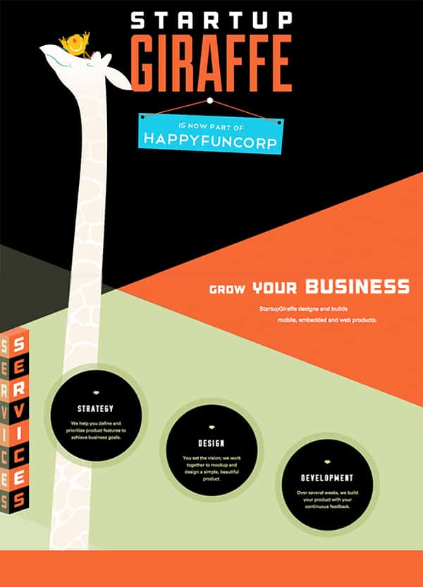
[IMAGE SOURCE: https://www.bluecompass.com/filesimages/News%20and%20Blog/Design/startup-giraffe-pin.jpg ]

These angled lines not only come off as interesting to website visitors, but also motivate visitors to keep scrolling and find out more.

Startup Giraffe’s website is a great example of a website that uses visually intriguing design to motivate conversions and education, but they can also be used to create a more dynamic user experience.

Dunlop Tires use angled lines for the purpose of creating a dynamic feeling, which is on par with their industry (automotive).
[IMAGE SOURCE: https://www.bluecompass.com/filesimages/News%20and%20Blog/Design/dunlop-tires.jpg ]

Generally, there are a lot of ways that diagonal lines can be used, but the main appeal of them (for companies and customers alike) is that they’re visually interesting and stand out from the crowd.

A lot of designers have already started using these principles in the way they shape user experience for their clients, and as a marketing tool, they’re incredibly powerful. That’s why we’ll be seeing a lot more of them in 2019.

Another way to choose something more interesting for your web design in 2019 is to use bright colors.

Gradients and grayscale have been very popular in the last few years, but we’re seeing a push towards bright colors, which will only become more prominent in 2019.

For example, MamboMambo’s website is very striking. From the collage elements to bright colors which immediately stand out, they’re presenting their brand identity from the very start.
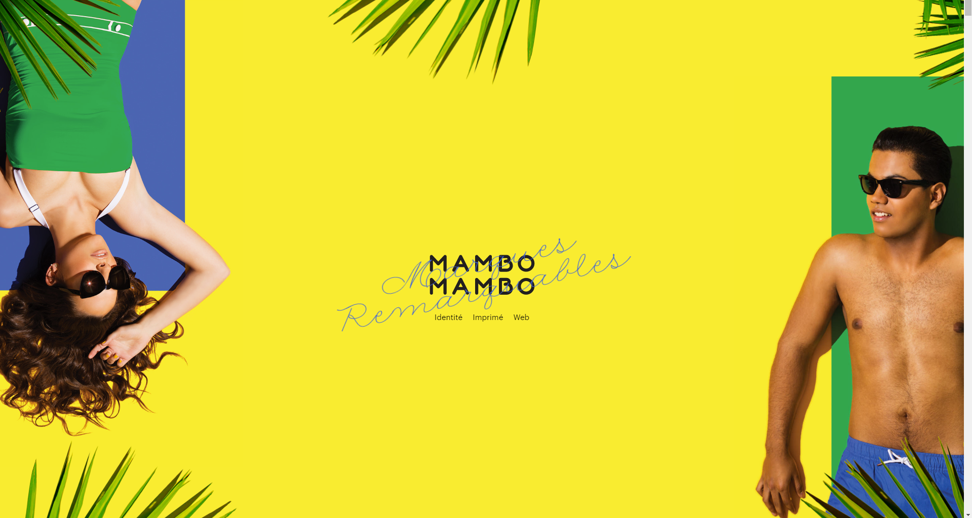
[IMAGE SOURCE: http://mambomambo.ca/ ]

Again, their website is very minimalist, but their color palette shows everything a visitor should know in order to become a customer as soon as possible.

Mambomambo also utilize scroll features and micro-animations to add to the visual appeal and show how dynamic their creative work is.

There are a lot of ways to design with curiosity in mind, and the best thing is that in 2019, that’s exactly what customers will need.


#7 – Different Scrolling in Web Design

When we think about traditional scrolling, we think from top to bottom. However, that’s become the standard, and if we’ve learned anything that we want to take into 2019, it’s that the best way to approach web design is with diversity in mind.

An increasing number of web designers are now experimenting with different scrolling. This is great from the customer’s standpoint, as it automatically creates an experience (which increases engagement and conversion rates).

There’s always competition, and creating a unique experience for the customer comes off as a promise that the purchasing experience will be more unique, as well.

A great example of different scrolling in web design which will get more popular in 2019 is Aces, a baseball recruiting agency.
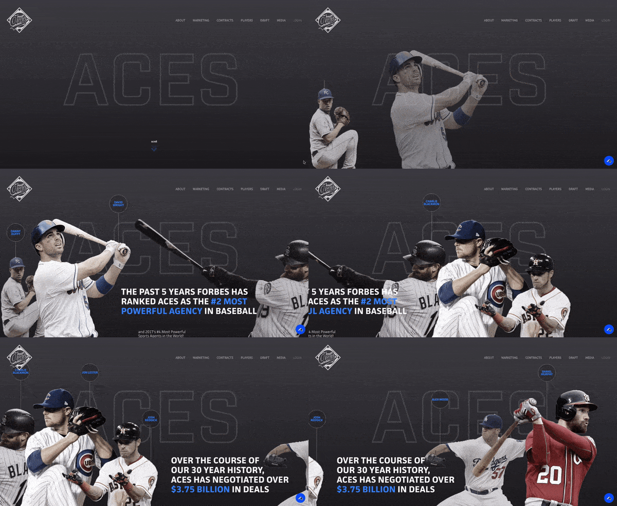
[ANIMATION SOURCE: https://www.bluecompass.com/filesimages/News%20and%20Blog/Design/aces-v2.gif ]

The first thing Aces do right is starting the page loading by showing how many baseball careers they’ve secured. And when customers reach the loaded page, they’re invited to scroll.

Scrolling is diagonal, and each movement opens up a new player whose career Aces managed. Additionally, Aces also provide statistical information about the work they do, successfully showing customers from the very start what their mission is.

They negotiate deals by showing results, not by talking, and it’s something that’s positioned them very highly in the world of baseball. However, it’s important that their web design follows suit, as well.

Long scrolling is also another type of different scrolling that can help brands tell their story more seamlessly, as opposed to stuffing website visitors with content that they can’t process.

Le Mugs is a restaurant that successfully uses long scrolling and different visual perspectives to create a unique user experience.
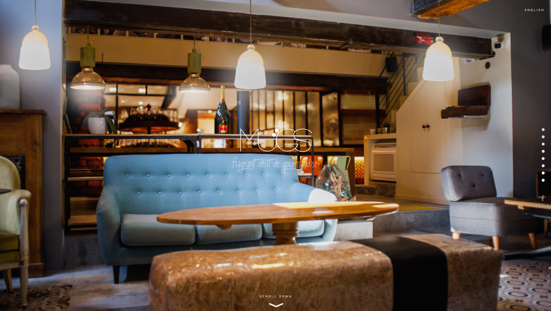
[IMAGE SOURCE: http://le-mugs.com/ ]

Website visitors are immediately invited (and pulled in) to explore their hedonistic offer, and immerse themselves into the gourmet experience.

They use bold and striking visuals and unique scrolling mechanisms to keep the attention on their site and their offer.

Long scrolling is also great for websites where it’s important for visitors to explore, and reach the purchasing decision through that.

Parallax scrolling is typical for the entertainment industry, but it can also be used to great success in different professional areas if done right. When we talk about parallax scrolling, we presume that there are two images which move at different paces.

This makes it a perfect option for storytelling and creating more dynamic in a website.

A great example of parallax scrolling is the website for The Walking Dead. A TV show about zombies, their website sticks to comic format.
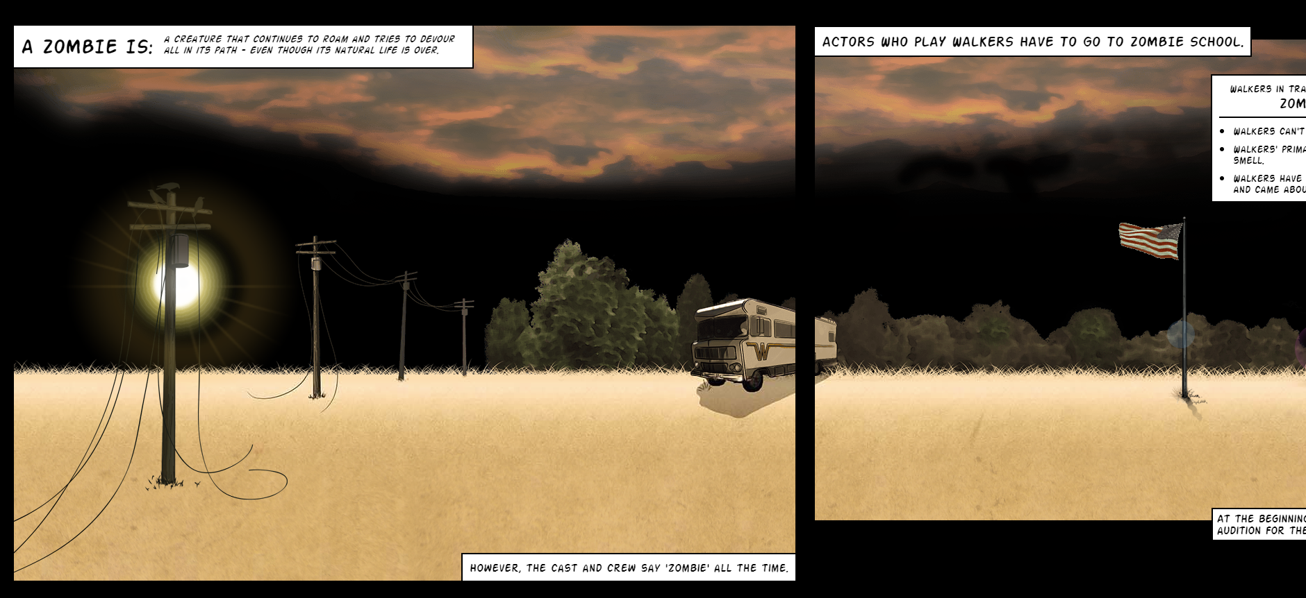
[IMAGE SOURCE: https://www.cabletv.com/the-walking-dead ]

When scrolling, we follow the character in the yellow shirt through different scenes. Some of them contain additional animations but even if they didn’t, it would still be an interesting way to scroll. Who’d say no to the show after that?

Additionally, keep scroll-triggered animations in mind. When visitors scroll, this triggers different engagement-provoking animations and interactions. Again, the focus in 2019 is definitely going to be on creating an all-encompassing user experience, and scroll-triggered animations are a very interesting way to keep the visitors on your site and convert them to customers.

[ANIMATION SOURCE: https://www.bluecompass.com/filesimages/News%20and%20Blog/Design/igor.gif ]

A great example of this is Igor, a website for an IoT company. Visitors are invited to scroll through to see the entire offer, and can see a variety of resources which they may find useful.

When it comes to different scrolling types which are a big trend for 2019, keep in mind that loading times are incredibly important.

If you don’t want to compromise on the experience just so your website is faster, try to create an interesting loading page that will stop the visitors from navigating away.


#8 – Big and Bold

If you’ve got it, flaunt it. That’s going to be website design in a nutshell in the upcoming year, so make sure you’re not falling behind.

Many web designers use a combination of big statements (literally, the font size is going to be huge) and simplified details to create a dynamic user experience. Think of billboards, only on the screens of laptops or mobile phones.

This is another play on interesting visuals and bold statements which can create a very powerful effect for customers.

A great example of big and bold as a mission of web design in 2019 is Austin Eastciders. A cider-production company, they use their slogan “Cider Y’All” as an inspiration for their design.
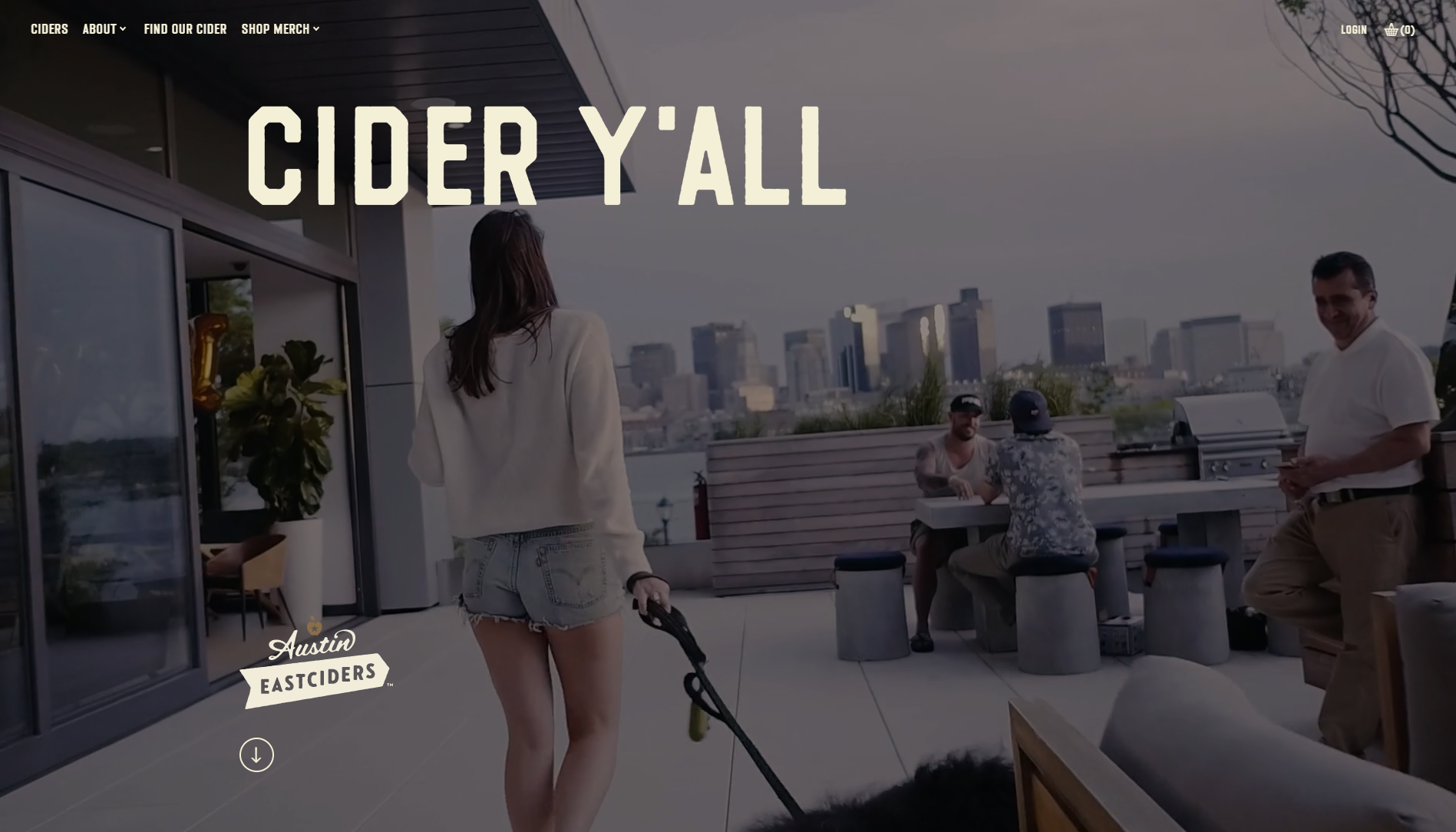
Austin Eastciders use big and bold titles with smaller copy, and let the animations and video direct the customers towards purchases.

The videos show different occasions where people can enjoy their ciders, and that’s another example of storytelling done right. People don’t buy because products are great – they buy because they want the lifestyle.

Austin Eastciders win in this category because they know that the appeal of the lifestyle in 2019 starts with web design.


#9 – Making Footers Interesting

The trend of interactivity and experience improvement in 2019 also means that each part of the website should be fully used to create a great experience for the end user and consumer.

This means that we can no longer be content with WordPress themes and a footer that contains basic information, and call it a day.

Instead, 2019 is going to make us go all kangaroo again and start jumping around in an effort to provide more to customers, instead of breaking the 4th wall with an uninspiring footer.

After all, details matter. And they’ll matter even more in 2019.

Consider 360gardalife’s website. A website for sports activities on Lake Garda in Italy, every design choice on the site caters towards the customer experience. They show details about diverse offers, offers instructions on how to book, and everything else athletic people visiting Lake Garda may enjoy.

However, the real magic starts when you reach their footer and realize that it’s not just basic information.
[IMAGE SOURCE: https://360gardalife.com/en ]

Instead of just providing visitors with basic contact information, Lake Garda designers also use the footer to display: weather reports, webcams, and icons reminding people of their diverse offer.

Additionally, visitors can also select sports they’re interested in, add their email address, and receive a personalized offer with activities that suit their preferences.

Naturally, this creates a more inclusive feeling to the entire web design (which will be an absolute necessity in 2019), and if visitors weren’t convinced, they will be upon seeing the footer.

#10 – 3D Web design

People want to be entertained, and using the principles of three-dimensionality can be a great way to provide more flavor.

There are typically two ways of using 3D web design, and that’s either through 3D elements (creating depth in the visuals) or by using animations.

A great example of 3D web design which uses animations is Future Living. Designers behind the site were inspired by the topic and created a variety of animations and micro-interactions to improve user experience.
[IMAGE SOURCE: http://future-living.tv/en/home]

They reimagine the way we live, creating a future with shell cities that are capable of protecting themselves and to drive the point home, they’ve created incredible animations that’ll make the most of us go full-blown eco.

Again, web design in 2019 will be centered on storytelling and immersing the visitors into a unique experience. Future Living realize that, and they’ve created a beautiful website with illustrations (which evoke positive feelings) and simple explanations.

When it comes to using the principles of three-dimensionality, Future Living also create depth with shadows and different colors, not only animations.

However, the best example of using colors to create the 3D effect is Mortgage Hub. While not heavy on animations, the mortgage providers create depth by mixing different color tones and visuals.
[IMAGE SOURCE: https://www.bluecompass.com/filesimages/News%20and%20Blog/Design/mortgage-hub.png ]

Since they also consider themselves to be a friendlier way to mortgage, they’ve selected designs that help the visitors feel as though they’re friends with them.

However, the principles of three-dimensionality also go a long way towards creating a dynamic (as opposed to flat) feeling of design, and add to the user experience.

2019 Is Going to Change the Way We Design for Web

But it won’t be bad.

In fact, the trends we’re currently seeing, and the ones we’ll see in 2019, will help all of us become more creative.

Of course, innovative design raises the bar, but companies which understand their consumers’ journeys (and are willing to step forward and approach them in the right way) will see an increase in revenue.

Why?

Because of creativity.

After all, we have a lot of technology at our disposal, and customers know it. It’s time our design started showing just how far we’ve come.

Read More at Design Trends That Have Been Taking Over This Year

5 Inspirational Designs Trends to Follow for 2019

Graphic Design trends for 2019

5 Inspirational Designs Trends to Follow for 2019


Design is all about expressing yourself through your art and showing people the beauty in simple or incredibly intricate designs. While you should always stay true to yourself and be authentically you through your designs, it is also good to stay on top of the trend game. 

Today we’re going to go over 10 design trends that we stan this year. And hopefully, always. 

We’ve got 6 months left in 2019 so we better make our designs count. 

So let’s just get right into it, shall we? 


   1. GO BOLD

 You know the saying, go bold or go home. And it rings absolutely true in design. We have two different types of “bold” that we’re going to go over in this section: bold colors and bold text.

Design trends for 2019

Source: https://www.behance.net/erikmusin

Design trends for 2019

Source: https://www.behance.net/erikmusin

Design trends for 2019

Source: https://www.behance.net/erikmusin

Design trends for 2019

Source: https://www.behance.net/erikmusin


Here are some examples where minimalist background color meets bold product color. When photographing and editing a product, enhance its color by using a light, neutral color as the background. When you do this, the eye of your client will be drawn directly to your product. Make sure that the color you choose complements the product’s color and really enhances what you have to offer. This is definitely my favorite trend right now. Hats off to Erik Musen for hitting us with some sweet designs. 


The next bold section is all about text. You have a message to share and you need to grab the attention of your readers. Do this with the same concept as with the products. Beetroot did an awesome job of using big and bold fonts to grab your attention. There’s no missing what you have to say when you use this bold technique. 

Graphic Design trends for 2019

Source: https://www.behance.net/beetrootdesign


    2. 3D Design

Really stand out, literally, with a 3D design. Incorporate real-looking elements into your graphic design to make your design truly unique and eye-catching. Take these designs for example. 

Graphic Design trends for 2019

Source: https://www.behance.net/STATE7

Graphic Design trends for 2019

Source: https://www.behance.net/gallery/71276031/Mulher-3D-Type


3D design is just about everywhere right now, and as you could see above, there’s no specific font that is the set-in-stone font to use. Try out any font you’d like! A font that is skinny, bold, a sans-serif, script, or any other type of font can be rendered in 3D. Use this technique in your next project and drop the link to your portfolio in the comments below so we can check it out! 


  3. Flat Design meets Realism

Another huge design trend right now is flat design combined with realism. Here are some prime examples of what I’m talking about. 

Graphic Design trends for 2019

source:https://dribbble.com/shots/5591883-Puma-sneaker-shop

Graphic Design trends for 2019

Source: https://dribbble.com/shots/4854300-Panda-UI

Graphic Design trends for 2019

Source: https://dribbble.com/shots/3951710-Adidas-Online-Store

Feeding off of the 3D trend, flat design + realism is truly impressive. Two complete opposites, yet the perfect combination that gives a vibe of futuristic design. You can expect to see this trend in the E-commerce world, but not only. Add elements that look like they are floating or fly to add an aesthetic that is overall abstract. Combine 3D objects with a flat design to achieve this amazing look. 


  4. Open composition

We’re taking a step back from mainstream, and a step forward in creativity. This trend exudes art. It’s chaotic, yet beautiful. For this look, the goal is to achieve a free-flowing final product. So say goodbye to a “perfect” framed finish. This trend is a combination of things: combine images with ideas. This is magic in real life. It gives people a sense that they’re just seeing a small piece of a bigger picture. The real magic of open-composition is that gives people the freedom to explore their creative side and see the deeper meaning of what the combined elements could mean. 

Graphic Design trends for 2019

Source: https://www.behance.net/temicoker

Graphic Design trends for 2019

Source: https://www.behance.net/temicoker

Graphic Design trends for 2019

Source: https://www.behance.net/temicoker

Graphic Design trends for 2019

Source: https://www.behance.net/temicoker

Graphic Design trends for 2019

Source: https://www.behance.net/temicoker

And my all-time favorite designer for this technique is Temiloluwa Coker.  Check out his work on Behance. All the images above are all his.


  5. Electrified

I’m about to end this article with a bang. Maybe this trend is actually my favorite. 

Graphic Design trends for 2019

Source: https://www.behance.net/cristianmg

Graphic Design trends for 2019

Source: https://www.behance.net/cristianmg

Graphic Design trends for 2019

Source: https://www.behance.net/gallery/66723565/FETE-DE-TROP-__-Eddy-de-Pretto

Graphic Design trends for 2019

Source: https://www.inspirationde.com/image/85051/


One of my favorite things about social media today is that we’re all pushing for authenticity and being real. There’s no excuse for designers. In this technique, designers are encouraged to let their inner-creator out by drawing, writing, doodling, splashing, and using unique brush strokes and color stains. Imperfections and mistakes are embraced in this trend because there’s absolutely no right or wrong in this style. And I think that’s why I love it so much.


Sadly, our time has come to an end…


But no worries, we’ll be back soon! 

Let us know in the comments below what your favorite design trend was in this article, and if you have any other favorite design trends we didn’t cover, mention those down below as well. 

Drop your portfolio down in the comments for us designers to support each other. 

Until next time, 

Be kind and stay positive.

Read More at 5 Inspirational Designs Trends to Follow for 2019

How to Make Your Splash Page a Smashing Success

how to create a splash page

How to Make Your Splash Page a Smashing Success


Splash pages are a great way for you to communicate in a deeper, more personal way with your user base. In today’s business landscape, it can be difficult to attract visitors to your page over your competitor’s page. Competition is fierce, and businesses everywhere use design and marketing to create an effective message that resonates with their audience.

As you start to design your website, you might find that adding an extra layer—a splash page—can help you bridge a gap, filling the spaces for anything you feel is missing from a traditional landing page.

In some cases, a splash page can more clearly deliver a message than your homepage can. But in a world where the average attention span is lowering, you need to execute your splash page right to make it a success. Here’s what you should know:


What Is a Splash Page?

It’s important to understand that the splash page isn’t the same as your landing page or homepage. A landing page’s sole purpose is to act a conversion hotspot: with a landing page, you’re seeking to fulfill a goal, whether that goal is to encourage visitors to subscribe or to make a purchase.


A splash page’s purchase is to serve as a creative introduction and is much more personalized. Think of your splash page a welcome screen and teaser for users visiting your page for the first time.

This is what they see before they officially reach your landing page, and it’s a great way for you to set the mood and tone for your site.

As you start to think about how you can create a splash page of your own, you can take a look at how others are executing splash pages to communicate their vision and mission. Use this as inspiration for your personal creative efforts. Take a look at these example splash pages for some ideas.


Two Key Components

There are two key components that need to be integrated into your splash page. The first should be a clear message and purpose for the splash page. The second should be a clear exit that takes them to the actual landing page. These two simple elements are the crux of a splash page, and without both, you’ll most likely have a crappy user experience.

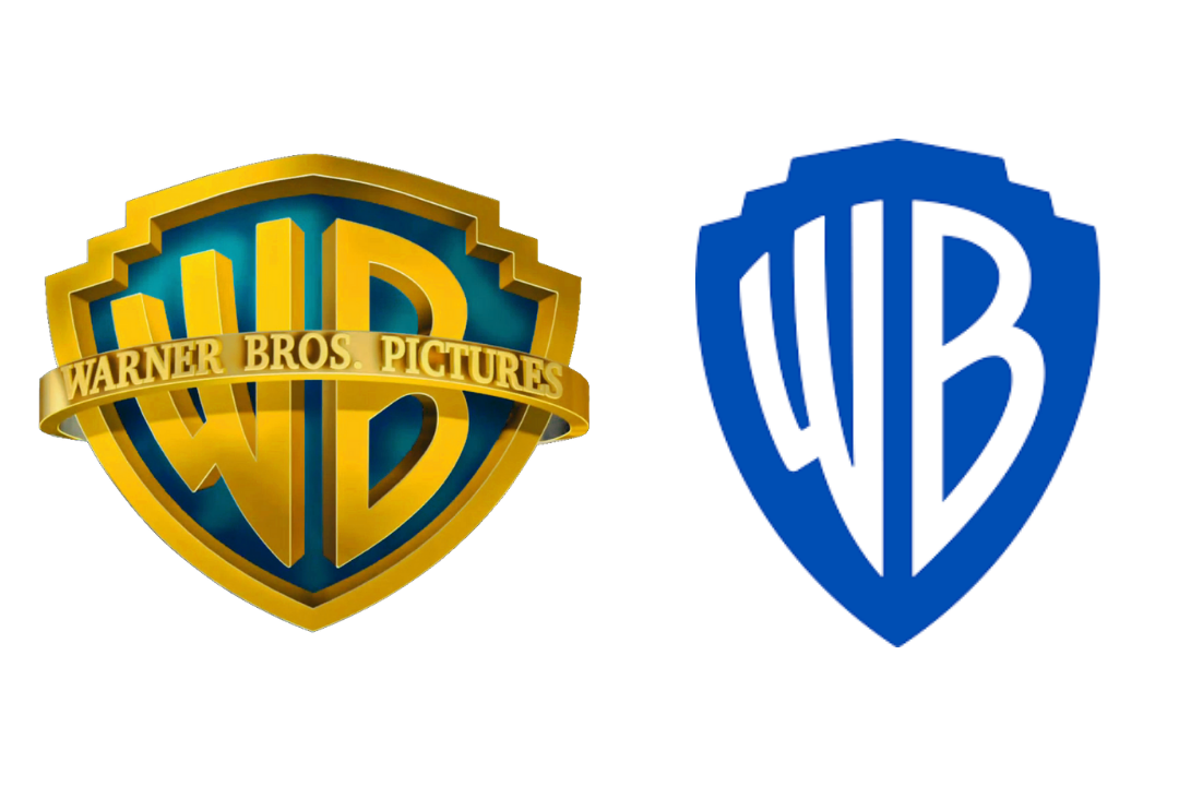
 

The text should be clear and to the point. Any visitor should be able to read the splash page and take action within just a few seconds. As such, the copy should veer on the short and snappy side. A heading and subheading should easily cover your most basic splash page needs. Graphics and images, a CTA, and bullet points are all helpful to add.
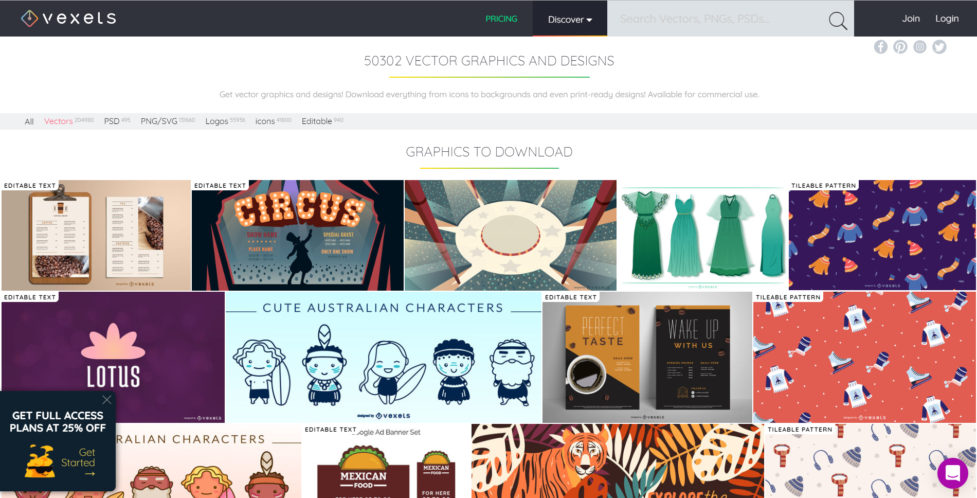
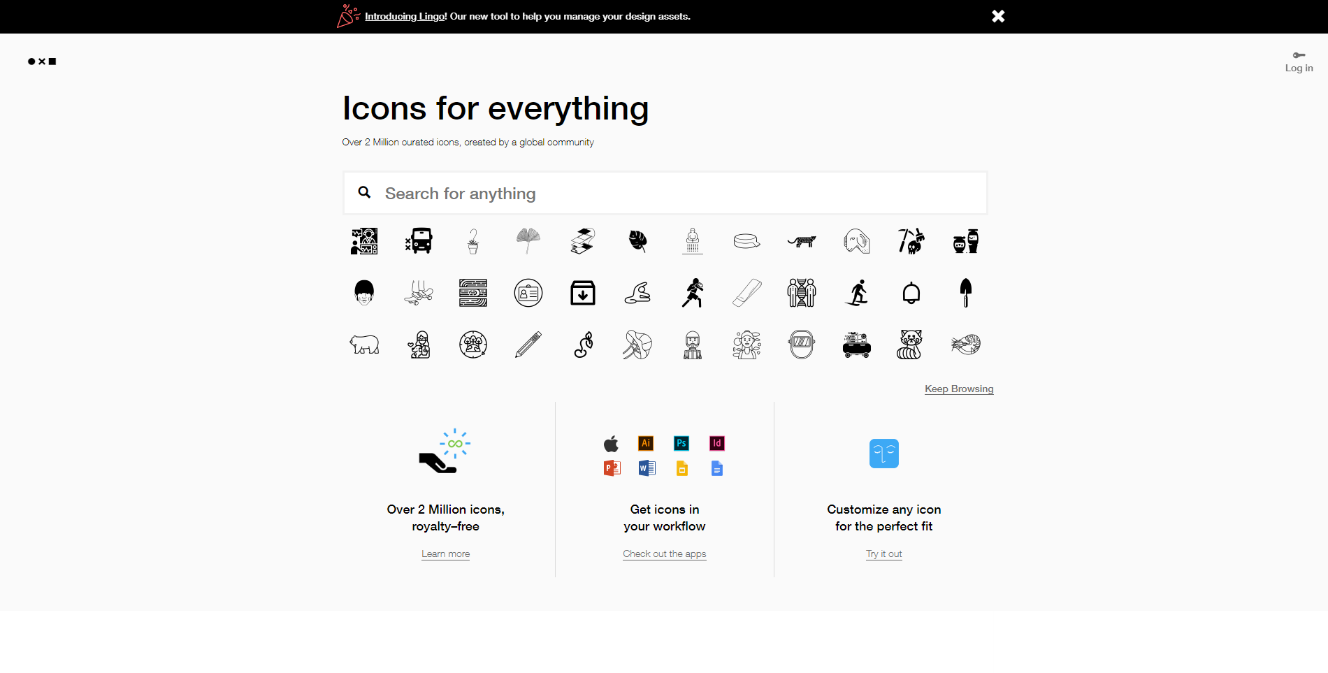
 

Pay Close Attention to Design

Design is one of the most important aspects of a splash page. Today’s users will spend less than four seconds deciding whether they want to engage further with a page, and your business should capture attention quickly.

Your imagery should be captivating, and your content should be equally as attention-grabbing. There are plenty of splash page templates that make creating a great design easier than ever.


When to Use a Splash Page

While splash pages can be a great feature on your site, not everyone needs them. Determining whether splash pages are for you is a great first step towards making the best decision for you and your site.


One of the best reasons for offering a splash page is if you have multiple types of experiences for the user. For example, Football.com asks visitors if they want to know more about American football or World football.

Their user experience will differ depending on the choices they make. There are other preferences that can be communicated via splash page too, such as languages or currency—ideal for businesses who service multiple worldwide locations.


You can also use a splash page for age verification purposes, which is ideal if your business is centered around delivering age-appropriate content. For example, alcohol-based businesses are required to verify age before users can learn more about the product on the homepage. And lastly, you can use a splash page as a “coming soon” banner if your website is still in its production phase.


Read More at How to Make Your Splash Page a Smashing Success