Teamstack: Everything You Need, All in One Place

access management platform Teamstack

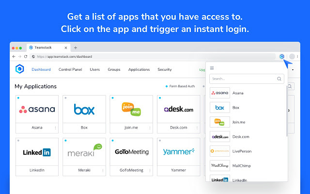
You know what sucks? Having to navigate through dozens of tools, all on separate dashboards, just to get one job done.

Nowadays, there’s a tool for everything, and while that’s amazing, it’s very overwhelming sometimes. Oftentimes, some tools are forgotten about completely.

How on earth do we tackle this situation? I mean, as time goes on, your digital tool belt will most likely expand.

This whole headache of remembering which tools you and your team use, logins, and so on will only get worse.

access management platform Teamstack

Unless, of course, you use Teamstack.

What is Teamstack? Other than being the answer to all your problems, Teamstack is a cloud identity and access management platform that provides your workforce with secure, convenient access.

It works with 500+ applications, greatly simplifying the entire process.

By automating the ability for employees, contractors, and customers to access the apps you use every day, working together becomes a seamless experience.

But this is just the tip of the iceberg. There are loads of features that will get you admittedly more excited than you should be about work. Don’t worry, we’re going to cover those down below. 

Single Sign On (SSO) and Form Based Authentication (FBA)

Having to make an account for everyone is… exhausting. I know it, you know it, everyone knows it. Teamstack knows that, too.

That’s why you and your entire team of hard-working individuals can use single sign-on via SAML.

access management platform Teamstack

Form-based authentication provides Teamstack with their own way to authenticate logins via web form. FBA is currently available through web browsers, but it’ll soon support mobile apps via IOS and Android.

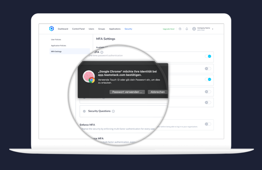
Multi-factor authentication

Weak or compromised passwords are the most common reason security is compromised. Teamstack wants to prevent that from happening, so they promote a multi-factor authentication method as their standard.

access management platform Teamstack

  • Multiple factor types

Apply different authentication factors that range across different security levels for your entire organization in order to protect against unauthorized access, all while providing user flexibility..

  • Policy-based MFA enforcement

Set user/application policies in order to implement additional authentication factors for sensitive applications or individual users and give access only to those who need it.

  • Prevent unauthorized access

Define failed MFA challenges and protect your company from unauthorized access.

  • Context based denials

Restrict access to certain applications based on contextual data. From high-risk locations, to certain IP-addresses, you can input many different factors that can restrict access to any user.

Secure Cloud Directory

When dealing with a large number of employees, security and privacy can get out of hand easily.

With Teamstack’s Cloud Directory, it is easy to manage anything from users and groups to permission levels and authentication methods.

The web interface also allows you to secure store users and passwords. 

Real-Time Synchronization

Don’t worry about missing out on anything!

TeamStack makes sure that your data is synchronized in real time, keeping you on top of all your applications.

Moreover, this amazing feature makes the onboarding process a piece of cake and it protects you against any users looking to bamboozle you.

Customizable User and Group Profiles

Call Teamstack your right hand man, because this feature makes your life a whole lot easier.

All user and group profiles are highly customizable, allowing you to set specific policies and settings.

This will ensure you have total control over your company and each team in particular.

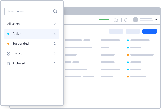
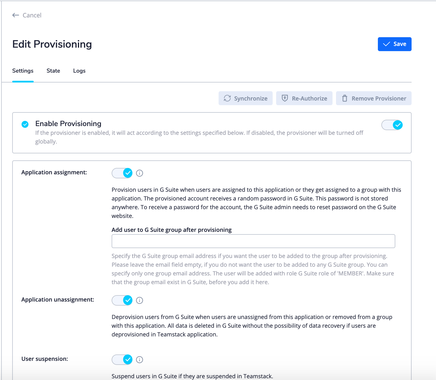
User Lifecycle Management

When working with a large number of tools and colleagues, it’s important to keep up with lifecycle management.

With Teamstack, you can easily gain an overview and manage all the different stages (Active, Suspended, Invited and Archived) of the user lifecycle.

access management platform Teamstack

One-click provisioning

One-click provisioning allows you to add and remove people from certain tool integrations.

Why is this helpful? Take a look below:

  • Increased security

Instead of going through a huge process of adding and deleting accounts, it’s as simple as 1 single click. This ensures that anyone that might want to do harm can be taken care of quickly.

  • Streamlined onboarding and offboarding

We all know how much of a headache can be. Going through and adding a user to every single tool you use is exhausting, to say the least.

At least it was until now.

Teamstack’s one-click provisioning makes the onboarding and offboarding process literally as easy as a click.

access management platform Teamstack

  • Group-based provisions

Have an entire group of people that need/no longer need to use a tool? No worries. Add and remove entire groups of people with automated group-based application provisioning.

  • Reduce IT complexity

Thanks to one-click provisioning, the complexity of application management is greatly reduced. Now, all of your provisioning is done from a single source.

Integrations

As mentioned before, Teamstack supports over 500 applications which greatly simplifies anyone’s work. Essentially, the list of integrations is massive, and it grows constantly.

Any tool you can think of is most likely on that list.
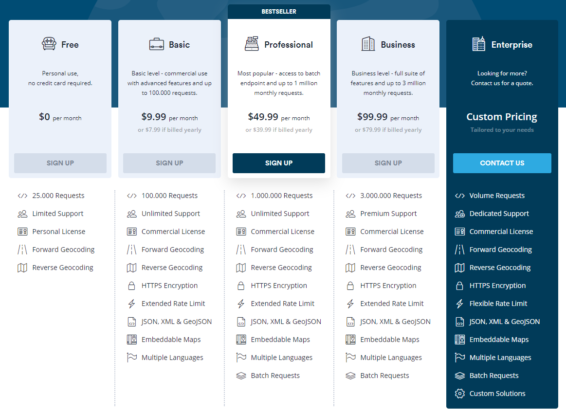
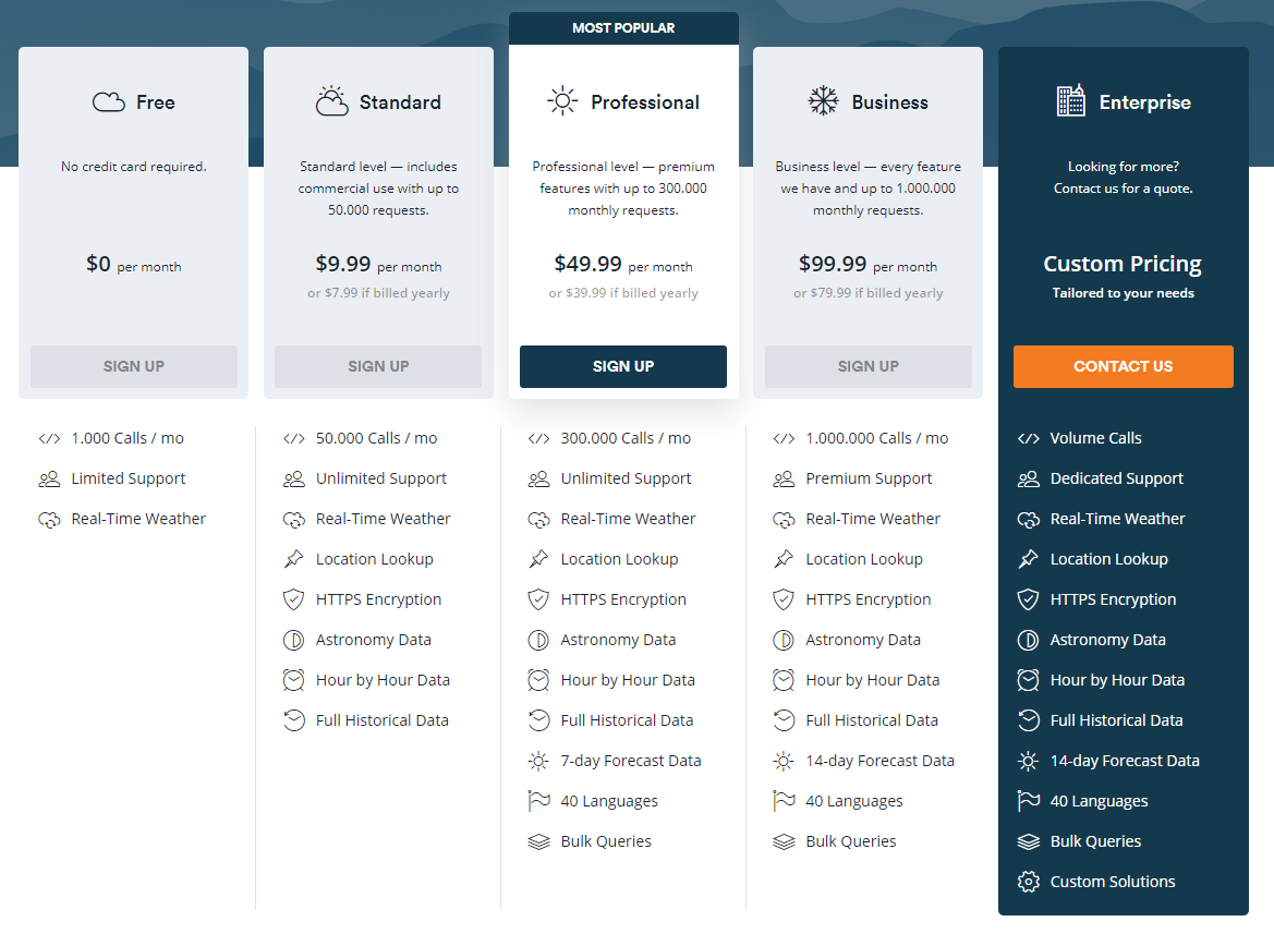
 access management platform Teamstack

Pricing

Now for the question that’s on everyone’s mind: How much is it?

Well, you might be thinking that a tool as useful as this would cost a boat-load. But the truth is, it’s actually surprisingly cheap.

access management platform Teamstack

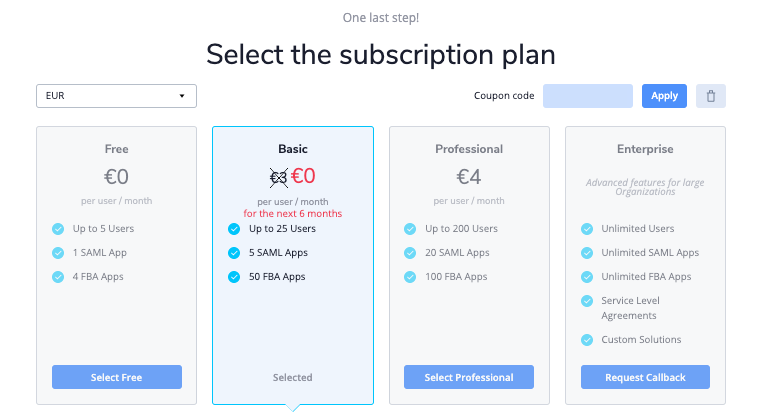
As you can see, the plans are quite affordable.

They have a free plan to give it a try, and for first time users, the basic plan is free for the first six months.

Even for the professional plan, only 4€ per person per month is an incredible deal.

To top it all off, they also offer custom plans that can scale to anyone. TeamStack truly is a life-saver.

Conclusion

For anyone in any industry, online tools have quickly become unavoidable. As time goes on, the list of tools you use will most likely grow.

That means that anyone you add to your team will bring a list of tools with them, too. It can get complicated to say the least.

From all this info, it’s clear to see that Teamstack is an essential tool on anyone’s toolbelt.

Not only are you getting an incredibly powerful tool, but it costs pennies compared to other tools out there. So check it out and let them know that we sent you. 

Read More at Teamstack: Everything You Need, All in One Place

20 Symmetrical Logo Design Examples That Will Satisfy Your Soul

Starbucks logo design symmetrical

We all love that satisfying feeling you get when 2 objects just fit perfectly together.

If you’re anything like me, I bet you love watching a good satisfying video that occasionally pops up on my Instagram feed, or seeing the most satisfying logo ever.

One sure-fire way to create and design the perfect, aesthetically-pleasing logo is by creating a symmetrical logo.

What is a symmetrical logo?

A symmetrical is a logo that mirrors itself perfectly from the left side to the right side.

There’s a reason why symmetrical logos work so perfectly together, though.

Actually, there are quite a few reasons why symmetrical logos work so well.

The first reason why symmetrical logos work so well is because our brains automatically and subconsciously love to organize and group the things that it sees in order to make sense of it all. A symmetrical logo makes it easier for the brain to digest and process than, perse, a different type of logo.

Secondly, symmetrical logos create a sense of balance. Having a symmetrical design naturally creates a great sense of balance. Now, whether or not your viewers and clients realize that consciously or not, will always be a mystery.

Thirdly, we all know that symmetrical designs and logos are just aesthetically-pleasing as heck. And who doesn’t love some aesthetically pleasing content? I know I do.

Finally, creating and designing a symmetrical logo could be easier for you. First, you just have to create the perfect half-design, duplicate it, and mirror it, and you’re done! Not to say that that ever actually happens though. We all know designers put (or at least, we try to…) our entire hearts and souls into our designs. If we’re passionate about our project, that is.

20 Symmetrical Logos That Will Have You Shook

There are probably loads more famous symmetrical logo designs out there than you ever realized.

Today, we’re going over 20 symmetrical logos that you can be inspired from in order to create your own.

Let’s do this!

1. McDonald’s

Symmetrical Logos Mcdonalds

You probably weren’t expecting this one to be our first pick, were you?

Mcdonald’s is a prime example of a symmetrical design, but did you ever consciously realize that?

Also, did you know that the color red is scientifically proven to raise your sense of appetite?

McDonald’s surely had a great design and marketing team on their side.

2. Target

Target Symmetrical logo

Target. Only my favorite retailer of all time. Besides the fact that they literally have everything you could ever want in one place, they have amazing branding and a symmetrical logo. Also, how cute is that iconic dog you see in all their advertisements?

3. Airbnb

Need a place to stay, anywhere, ever? Airbnb has got you covered. Also, just check out that intricate, symmetrical logo design.

4. Mercedes

Mercedes logo symmetrical logoa

Next up we have Mercedes. I know, you never thought about putting them into your list of symmetrical designs, but here we are. This gorgeous and simplistic logo will always be iconic.

5. Adidas

6. Starbucks

8. Chanel

chanel logo symmetry

9. Volkswagen

10. Honda

11. Xbox

12. Walmart

13. Audi

14. Toyota

15. Mazda

16. Motorola 

17. Snapchat

18. Batman

19. Shell

20. Mitsubishi 

We hope you enjoyed looking over all these famous symmetrical logos and felt inspired to create your own.

Until next time,

Stay creative, folks!


Read More at 20 Symmetrical Logo Design Examples That Will Satisfy Your Soul

BMW Gets A New Logo and Brand Identity After 100+ Years

new logo bmw

After nearly 100 years, BMW has decided to change up its old logo and give us something new and fresh.

With every new and upcoming generation, BMW loves to switch things up and give us a new logo.

“The new logo and brand design symbolizes the importance and relevance of the brand for mobility and the joy of driving in the future,” Jens Thiemer, Senior Vice President BMW Customer Brand

The logo has seen 6 facelifts in its time, each corresponding to an appropriate design of the era.

BMW new logo evolution

The BMW logo that I grew up with (1997-2019) is quite different than the new one of 2020.

To me, it seems BMW really took it back to its roots when they retired their gradients and 3D effects and traded it for a flat design.

The colors are obviously changed from a lighter blue to a dark blue and the font also got the slightest facelift.

The new and improved logo has kept its original shape, but it’s withing the logo that we’re going to see some major differences.

Of course, the bavarian colors of the iconic BMW emblem are still a must and are prevalent in the design.

And the outer ring is now flat, as opposed to what it used to be.

It is with these identity changes and visual changes that BMW wants their clients to view them as more accessible and available to all.

Also, I need to mention that BMW’s subbrands, BMW i and BMW m, will also stand to get new identities.

I personally am a huge fan of the new logo. It’s the perfect combo of modern-yet-vintage-and-a-little-bit-of-luxurious, but we want to know your thoughts on the new BMW logo.

Are you a huge fan or could you pass?

Let us know in the comments!

Until next time,

Stay creative, folks!

Read More at BMW Gets A New Logo and Brand Identity After 100+ Years

5 Striking Color Trends You’ll Want to Hop on in 2020

Your color scheme is going to make or break your design.

And we want you to make it.

That’s why today we’re going to go over 5 color trends that you should be using in 2020.

2020 is the start of a new decade, and your colors are going to speak volumes, whether you go with neutrals, bolds, soft, or neon.

5 Striking Color Trends You’ll Want To Hop on In 2020

Whatever you choose, it needs to complement your design, so get inspired by these 7 color trends for 2020!

Monochromatic

There aren’t many things more satisfying than looking at a beautiful monochromatic design.

[source]

There’s nothing quite like it. It’s easy on the eyes to look at and it’s so satisfying to see so many shades of the same color that work perfectly together.

And the more unique color you choose the better. People expect to see black and white, but hit them with a beautiful blue or royal purple and watch your clients be in awe of your work.

[source]

[source]

[source]

[source]


Neon

[source]

Nothing says bold and confident like neon. Some designs just call for bold and nothing else, and that’s why neon is on the rise this year.

[source]

It’s definitely a bold choice and takes lots of confidence to rock, but if you choose to go with neon, you won’t regret it.

[source]

You’ll stand out like nothing else, and people will appreciate the confidence you had to go with neon colors.

[source]

Also, neon colors aren’t easily forgotten. We highly recommend you try using different hues and shades of neon this year in your designs.

[source]

Neutrals

Neutrals will always be in style and will always be a great choice.

Although it is great to stand out with bright, demanding colors, it has to be the right situation.

And sometimes, the better choice is to go with something soft, to really enhance your product or whatever it is that you’re designing.

[source]

[source]

[source]

[source]

[source]

Earthy Tones

Nothing is more natural and subconsciously attractive than earthy tones.

Especially if you’re designing some sort of eco-friendly packaging or website, just by using earthy tones you inspire people to trust you.

Earthy tones are calming and relaxing to look like, giving you the feeling that you’re connecting with nature.

[source]

[source]

[source]

[source]

[source]

[source]

[source]

Coral and Turquoise

Coral and turquoise are certainly some striking colors that won’t be easily passed by.

The dynamic duo is irresistible to look at and is going to be a major hit this summer. I just know it.

The contrast between the two colors is absolutely perfect, but coral also works well with teal and other variants of blue.

Definitely experiment with the colors and see what masterpieces you’ll come up with!

[source]

[source]

[source]


We hope you enjoyed this inspirational piece on color trends for 2020.

What do you expect to see this upcoming year?

Let us know in the comments.

Until next time,

Stay creative, folks!


Read More at 5 Striking Color Trends You’ll Want to Hop on in 2020

10 Free Modern Fonts That Will Spice Up Your Futuristic Projects

Some designs just absolutely call for an edgier look than usual.

You can’t just be happy with a simple, everyday font.

You need something more, and more specifically, something that won’t break the bank.

This is why I scoured the internet and found my top 10 picks of free modern fonts.

And yes, you’re welcome.

So without further ado, let’s just jump right into our list of 10 free modern fonts, shall we?


1. Manrope

I thought that I would start this list out with my absolute favorite font and visual.

Manrope.

Pixel Surplus created this gorgeous and functional sans-serif that has amazing readability whether it’s upper or lowercased. This font is so sleek and elegant, and what really had me hooked was this visual.

I mean, just look at all that creativity wrapped up in one image.

Here’s what the creator of Manrope had to say about their font.

“Sometimes, creativity comes from simplicity, elegance, and readability. This font is an extra mile towards, guided by optical balance, and packed with modern features.”

Get it for free by clicking on the link below!

Download here: https://www.behance.net/gallery/70262447/MANROPE-FREE-MODERN-GEOMETRIC-SANS-SERIF-FONT-FAMILY

2. Oneday

Moving on to my next favorite font of this list, here I present to you Oneday.

This font is like a modern-day font that is presented in stencil style. As you can see, almost all of the letters have disconnections in them, which make them stand out and look quite futuristic, in my opinion.

Check it out through the link below and get it for free!

Download here: https://www.dafontfree.io/one-day-font-free/

3. Coco Gothic

Coco Gothic. I’m definitely vibing with this font.

This san font is so modern, sleek, and elegant that it makes you kind of want to use it on all of your upcoming product and packaging designs.

This font comes in 6 different weights and also has different variants for the letter’s “g” and “a” which I find to be very considerate.

Check out the link below to get this modern font for free.

Download here: https://www.behance.net/gallery/25341907/Coco-Gothic-NEW-2-FREE-WEIGHTS

4. Cornerstone

Cornerstone screams professional, modern, and no-nonsense. This modular font is a bit elongated and is great for things like banners, logos, and headers.

It’s definitely got that modern feel that many people are looking for nowadays, and the best part is that it is “free-ninety-nine”! Aka, 100% free.

Check it out via the download link below!

Download here: https://www.behance.net/gallery/29835665/Cornerstone-Free-Font

5. Tenre

Tenre, designed by Jacopo Severitano, is a beautiful, geometric font that comes in 4 different styles.

It’s sleek and unique, perfect for any upcoming projects that you have going on that need a bit of modern feel to them.

Download it by using the link below!

Download here: https://www.behance.net/gallery/8313635/TENRE-Font-Free-Modern

6. Vanity

This classic modern serif called Vanity is absolutely stunning.

With the perfect combination of thick and thin lines, this classic yet modern font is ready for you to use for any beauty product packaging or magazines.

This font that was created by Hendrick Rolandez is ready for you to download for free via the link below.

Download here: https://dribbble.com/shots/1559859-Vanity-Free-Modern-Type-Family

7. Kontanter

Kontanter is so interesting to look at.

Kontanter is loosely based on Gotham bold, but has an amazingly unique look about it.

This font is perfect for those designs that just need a little extra spice about them that really makes them stand out and pop.

Download it for free by using the link below!

Download here:  https://www.behance.net/gallery/17725611/Kontanter-FREE-FONT

8. Arkhip

Next up, we have Arkhip.

What’s amazing about this font is that you can use it in both Russian and English, and it’s still free!

We know how hard it can be to find a free font that supports both languages, so when we found Arkhip, we knew we hit the jackpot.

Check it out below if you want to use this font for free!

Download here: https://dribbble.com/shots/1953924-Arkhip-Free-Font

9. Headache

Second to last, we present to you Headache.

This incredibly unique and geometric font is perfect for projects that you’re working on that need a touch of futuristic and modern vibes.

This font is available in 2 different styles, and when you combine the two, the outcomes are endless.

This font will truly stand out amongst the others, and we highly recommend you try it out.

Download here:

10. Bondi

And finally, we come to our last font called Bondi.

This fun and bubbly font will give your projects an undeniably happy feel to them.

This font is modern with a touch of futuristic and has all its thick lines on the left, which give it lots of dimension and balance.

If you want to use this font, click on the link below to download it.

Download here: https://dribbble.com/shots/3611615-Headache-Free-Font

And Finally…

We hope that you enjoyed this article of our top 10 picks of free modern fonts in 2020.

Use them to your advantage, and of course…

Until next time,

Stay creative, folks!

Read More at 10 Free Modern Fonts That Will Spice Up Your Futuristic Projects

5 Unexpected Places to Find Inspiration For Your Next Graphic Design Project

Every single day, we have to come into our jobs needing to be creative.

And it’s hard to always have that kind of pressure on us. A lovely, lovely pressure that we obviously love having.

But sometimes, just like writers, we go through some type of block.

I like to call it a creativity block.

So today, I want to go over what you can do when you go through a creative design block, and unexpected places to find it.

5 Unexpected Places to Get Inspiration From For Your Next Graphic Design Project 

So today, I want to go over what you can do when you go through a creative design block, and unexpected places to find it. Let’s do it!

1. Vintage Magazines & Posters

design inspiration vintage magazines

There’s a reason we all feel a little nostalgic and proud when we find a vintage diamond in the rough.

Everyone loves a blast to the past, and you can do that through your work.

One place that you can find unique designs and inspiration from is vintage literature.

vintage posters graphic design inspiration

Whether it’s a poster or magazine, take a deep look at these vintage pieces, find the smallest details and be inspired by them.

I recommend taking a stroll through your local thrift shop and take a look through the vintage literature.

You’re bound to find something there, a hidden gem, that will make your work have that extra pizzaz that you need.

2. Construction & Home Decor Stores

Another crazily unexpected place that you can find design inspiration is at construction or home goods stores.

I know, sounds crazy, but hear me out.

I don’t think I speak just for myself when I say that seeing modern home decor totally inspires my inner designer.

Some of the shapes and designs of home decor just get my design wheels spinning.

Whether it’s a shape, a color scheme, or just a walk around the store, I feel like I always come home with a good idea that I need to immediately jot down.

where to find design inspiration

So my advice is that you look down an aisle with things you love, whether it’s little knick-knacks and toys, or lights and chandeliers, keep your eye out for sleek designs that you could implement into your next design.

3. Graphic Tees From Thrift Shops

Can you tell that I love thrift shops?

Listen, besides being a sustainable way to shop and dress, going, searching, and shopping for graphic tees is an amazing, and let me say it again for those in the back, amazing way to find design inspiration.

Just head on over the graphic tee section of any thrift store or vintage store and start taking a look at the t-shirts.

You’ll find some terrible, terrible designs that will definitely show you what not to do, but on the flip side, you might just find the basis for your next design project.

Shirts from the ’70s, ’80s, and 2010s will surely inspire you in one way or another.

Take it from me!

And of course, you can always purchase the shirt that inspires you so you can mark the moment.

4. Architecture

Architecture.

👏 I 👏love 👏 it.

There are literally millions of different designs, and each one is so unique.

So many amazing, unexpected shapes, corners, and designs everywhere you look.

I recommend using Pinterest and searching for architecture, and you’ll be presented with hundreds of thousands of creations that you can gain inspiration from.

5. Walks in Nature

And finally, we come to our last, not so unexpected place to find inspiration.

Nature is the mother of all design.

And so, it’s no surprise that the ultimate place for you to find inspiration is in your own backyard, town, and national parks.

Everywhere you look in nature, you will always find beauty.

Everything has an intricate design if you look close enough.

So take a break, take a walk, and find your inspiration in nature.

Wrapping up

So take a stroll outside, to your nearest thrift store, or scroll on Pinterest.

Beauty is all around you, all you have to do is look for it.

Until next time,

Stay inspired, folks.

Read More at 5 Unexpected Places to Find Inspiration For Your Next Graphic Design Project

Aviationstack: Real-time flight data, from the ground

aviation stack real time flight tracker

Isn’t it cool that we’ve come so far in technology that we’re able to not only fly from one side of the globe to the other in a matter of hours but track the airplane that does it from the ground? It may seem like a tall order, but there’s a tool out there that makes it possible.

Aviationstack is a free, real-time flight status and global aviation data API. But how does it work and what can you expect from it? Prepare for take-off.

aviation stack real time flight tracker

How does Aviationstack work?

Although it may sound complicated, I can assure you that it’s not. Once you sign up and receive your API key, you simply attach the access_key parameter to any valid API endpoint URL.

Once all is said and done, you can request real-time data for any flight at any time. Everything will be displayed in a simple, easy-to-read JSON format. This is something like what you can expect to see:

aviation stack real time flight tracker

Of course, this is a very simplified example. Aviationstack is capable of displaying all kinds of information on flights worldwide.

Features

Aviationstack comes with loads of helpful features, some you may have never even known you needed. Here’s what you have to look forward to:

  • Live flight tracking
  • Historical flight data
  • Airline route lookup
  • Airport lookup
  • Airline lookup
  • Airplane lookup
  • City lookup
  • Country lookup
  • Aviation tax lookup
  • And more

As you can see, you can get basically any bit of information you need about any flight at any time. They boast quite an extensive list of flights, airlines, and related things that they can track with the press of a button.

aviation stack real time flight tracker

How can you get Aviationstack?

Aviationstack can be used on a personal or commercial level. That being said, the free version is for personal use only, so keep that in mind. 

Depending on your needs, there are a few packages that you can snag. On their pricing page, they list 5 pricing options, including the free one. As the plans scale up, the number of flights you can track monthly scales up, too.

aviation stack real time flight tracker

If Aviationstack looks like something that would be of us to you, then you’re going to get a killer deal. For the price and performance, there’s simply nothing else like it on the market. That’s certainly what the 5,000+ trusted companies around the world have come to find out.

To top it all off, Aviationstack is easily integrated. Any language, framework, and application is setup and running within minutes with their straightforward documentation and interactive endpoints.

aviation stack real time flight tracker

The conclusion

There’s only one conclusion to draw from this review: Aviationstack is a powerful flight data API that is the best (by far) on the market.

With the amount of data you can gather on any flight in any country at any time, the price is more than manageable, too. 

Check it out, poke around their main page, and give the free trial a spin. You won’t be disappointed.

Read More at Aviationstack: Real-time flight data, from the ground

Positionstack: The Best Geocoding API in the World

position stack geocoding api

I think it’s safe to say that there are many benefits to geocoding. But it’s not always easy to find a tool that allows you to geocode easily and reliably. That is, of course, until now.

Positionstack is the world’s best forward and reverse geocoding API. I know that’s a big claim, but let’s talk about this a little bit.

position stack geocoding api

What is geocoding used for?

At its core, geocoding is simply a list of coordinates. But, it’s what you do with those coordinates that really matters. Geocoding provides very useful data for businesses worldwide. Of course, this completely depends on the company, but here are a few uses for geocoding:

  • Identifying geographic patterns

This is a simple concept. But gathering many addresses/coordinates could reveal some sort of pattern that businesses can take advantage of, whether it’s in marketing or sales in general.

  • Targeted marketing strategies

Speaking of marketing, geocoding can help you gather customer data in order to better implement targeted marketing strategies.

  • Government uses

The government uses geocoding to track developmental and population growth. They take this data into consideration when deciding whether or not to build a school, public parks, and so on.

How Positionstack makes geocoding easy

In the past, geocoding has been a rather drawn-out process. Now, with the aid of Positionstack’s API, it’s as simple as typing in an address.

But Positionstack also does reverse geocoding. What does that mean? Well, instead of using an address to get coordinates, you can use coordinates to get a real address.

To put it simply: Positionstack is light-weight, scalable, and easy to use. Plus, it’s easy to integrate.

Features

So what kind of features can you expect from Positionstack? The answer might be surprising. Here’s what you have to look forward to:

  • Real-time forward/reverse geocoding
  • Batch requests
  • Embeddable maps
  • JSON, XML, and GeoJSON
  • Multiple languages
  • Worldwide coverage

The API is powered by a cloud infrastructure, which means it’s able to handle billions of requests at once. The average response time for each request is only 10-100ms. That’s lightning-fast.

The JSON format

Whether you’re familiar with JSON format or not, it’s incredibly easy to use and understand. I think you’ll honestly be surprised at the amount of data that you can get with one simple address. Take a look at this:

position stack geocoding api

These are the coordinates to a McDonald’s in Vatican City. But, if you take a closer look, there’s a lot more data than just latitude and longitude. 

As you scroll down, you can see the exact street, postal code, region, country, and even continent. Scroll even further down, and you will even find information on the currency used at said location:

To say that Positionstack is all-inclusive might be an understatement. With nothing but an address or coordinates, you can get more information about a location than you probably thought you needed.

The conclusion

One of the things I like most about Positionstack is how affordable it is. With the most powerful geocoding API on the market, you would expect a hefty price tag, but that couldn’t be further from reality.

position stack geocoding api

No matter the scale of your business, you will definitely find a plan that works for you. Even if you just want to try it out, there’s a free version that gives you a good taste of what the Positionstack API is capable of. Go and check it out.


Read More at Positionstack: The Best Geocoding API in the World

4 Tips on How to Simplify Your Website Design And Win Over New Customers

We’ve all seen a website so busy and unorganized that it literally makes every fiber in your being cringe.

I’m talking 0 effort in maintaining a color scheme, fonts galore, tons of pictures everywhere, no organization, and just terrible design overall.

That’s why today we’re going to go over 4 tips that explain how you can simplify your website and win over new customers!

4 Changes You Can Implement Today to Simplify Your Website Design and Make It Better 

You will lose clients faster than the speed of light with a terribly cluttered website design.

I mean, just take a look at the next two examples I’m gonna show you.

So here we have a busy website, with no specific focal point, and you don’t really know where to look, and it immediately stresses you out. You lose the client because he clicks off your site.

But then, we compare it to this…

[source]

When I look at this minimalist website design, especially compared to the other, my eyes are immediately set to ease. It’s literally like the inner designer in me just had the most amazing glass of wine and I’m just enjoying myself, admiring the design.

Alright, enough comparisons. Let’s just get things rolling over here.

Into the 4 tips we dive!

1. Simplify the Text

[source]

The most important page of all your website will be your homepage.

It’s the page that will set the tone for the rest of your site.

So it’s important that you get across what you’re trying to say quickly, efficiently, and simply.

There’s no need to clutter your website by writing so much text.

Most people just skim your website anyway! So, write your main text in bold headlines, add some details below, but not too much.

Only a small percentage of people will read the entire thing, so use your headlines to your advantage wisely!

2. Stick To A Color Scheme

[source]

A good color scheme always warms my heart, like grandma’s homemade apple pie on a summer’s day.

Maintaining a color scheme amongst your text, background elements, and images will automatically make you look more organized.

By using a color scheme, you can also bring focus to certain elements and manipulate the eye to go where you want it to.

By no means do you ever want a green font on a bright red background with orange and silver elements floating around the background. Unless you want you website to look like Christmas got a little wild at the Christmas staff party and vomited all over your website.

Go online or on any design inspiration website and type in popular color schemes on 2020, or color palettes, and save time and effort by finding beautiful palettes!

3. Limit Your Homepage To The Essentials

[source]

This kinda goes hand in hand with our first tip about limiting text.

Limit everything on the homepage and only keep what is essential.

Ask yourself, “What am I trying to achieve with this website and the homepage? What am I trying to show the customer?”

When you find the answer to that question, design your homepage accordingly.

Don’t add secondary/tertiary elements to the first bit of the homepage.

That’s what your menu tab and other secondary pages are for!

And speaking of menu tabs…

4. Scale Down Your Menu Tabs

[source]

For the love of simple design, keep your menu bar clean.

You don’t need a menu tab for 👏every 👏single 👏 element 👏of your website.

We’ve seen this way too many times than we’d personally like to admit, but some people give you the option of clicking on 20 different tabs.

As an alternative, create drop-down menu tabs where you have subcategories.

This will keep things squeaky-clean and peaceful for the eyes to look at.

No one will be frantically looking around for what they’re trying to find.

When things on your site and aesthetically pleasing and well-organized, your sales will go up.

And That’s It! 

I hope you found these 4 simple tips helpful and inspiring for your next minimalist website design.

Until next time,

Keep it simple and stay creative, folks!


Read More at 4 Tips on How to Simplify Your Website Design And Win Over New Customers

5 Productivity Tools You Can’t Be Without in 2020

Welcome to the new year, people!

Are you ready to make 2020 your year?

Without proper planning, all the best and most enthusiastic ideas can come to a complete halt, or never even begin at all.

Proper planning and productivity tools can be life-changing and can help you and your career thrive this year.

If you’ve found yourself in a creative rut, then you’re in luck. We just shared our 5 tips and tricks on how to get and stay creative this year.

Once your creativity wheels are spinning, it’s time to make those creative ideas come to life.

5 Productivity Tools You Can’t Be Without in 2020

Alright, let’s talk about it! Here are the 5 productivity tools you need in your life this year.

1. Evernote

Ah, Evernote. The place where all my best ideas go first, but not only. You can also capture and prioritize ideas, projects, and to-do lists. In this way, nothing will ever fall through the cracks.

Evernote helps you prioritize everything and focus on what matters most to you. From big business plans or projects to personal endeavors, you can organize and schedule the things that matter most.

You can also share your ideas with anyone using Evernote. Take voice memos, copy and paste images, make mental notes that make sense to you however you choose. It’s amazing.

Evernote offers you a free basic plan, and from there you can upgrade to premium or business. The prices are very affordable and definitely worth it in my opinion.

Check them out here: https://evernote.com/

2. Trello

If you’re working closely with other designers on a team project, or you’re managing a team of designers, then Trello is a great app for you to consider using.

With most things on Trello being free, you can see the status of any project that any designer is working on.

You can set up tasks for yourself and others and set due dates and receive reminders via email or notifications on your phone.

Trello works on desktop, iOS, and Android.

Our team has personally used Trello and we swear by it. It helps you stay focused, and get things done in an organized and timely fashion.

Check them out here: https://trello.com/

3. Airfocus

Next up on our list of productivity tools that you need to use in 2020 is airfocus.

Airfocus is a roadmapping prioritization tool that will help you glide through the year with ease.

Using airfocus is pretty much 👏 the 👏 most 👏 powerful way you can prioritize what to do and you can build more effective roadmaps. If you have a whole team or are working with multiple designers, you can share views and have everyone aligned so that you can get the right stuff done on time.

They have tons of unique features, but my personal favorite is the chart view. Once you plug in all of your tasks, you can click on the chart view and see where each task and its priority falls.

You can use airfocus with your team for free for 14 days, and then once you fall in love with the product just like we have, you can upgrade your plan to a starter plan, team plan, or enterprise plan!

Check it out here: https://airfocus.com/

4. Momentum

Momentum is a personal dashboard designed to eliminate distraction and provide inspiration, focus, and productivity.

The internet is full of distractions. Social media and YouTube distract me daily if I’m completely honest.

We’ve all been there. You tell yourself, just one more meme. One more video. And then three hours have gone by and you haven’t been productive at all.

Momentum is the perfect solution for anti-procrastinating. Add the extension on Google Chrome or Firefox and be saved from all the sites that you lose hours upon hours on.

When you add Momentum to your browser, it will replace the new tab page with a personal dashboard that will show you your to-do list, the weather, and some inspiration.

Every time you open a new tab, you’ll be reminded of your goal for the day.

Try it out here: https://momentumdash.com/


5. Noizio

And finally, we come to our last productivity app of the day. Noizio.

I love to listen to music when I’m working. It helps me stay focused.

But sometimes, I get sick of listening to the same songs every single day. Or in the other extreme, I’ll get to hype and lose focus and have my own karaoke time.

So here’s the solution. You can listen to the relaxing sounds of nature or places and adjust any sounds you want to be louder or quieter.

Not only will it make you more productive, but you can also use it to help you fall asleep sooner.

Try it out here: https://noiz.io/

Wrapping up

We hope you found these productivity apps interesting and helpful!

Let us know in the comments what you think about these apps and what other apps you guys use to stay productive during the work day.

Until next time,

Stay creative, folks!

Read More at 5 Productivity Tools You Can’t Be Without in 2020

5 Ways to Boost Your Creativity as a Graphic Designer in 2020

New year, new me.

Or for me, as a graphic designer, new year, new designs.

Just like writers, sometimes we get a major creativity block.

It’s hard to be creativity 24/7, especially when your job depends on it.

Sometimes the ideas will just come to you out of the blue, and other times, it comes down to discipline and trial + error.

Today we’re going to go over 5 different ways you can boost your creativity and thrive as a graphic designer in 2020.

5 Ways to Boost Your Creativity as a Graphic Designer in 2020

So let’s get right into the nitty-gritty of it, shall we?

1. Read Loads of Design Blogs 

From Dribbble to Behance, and back to Dribbble, you need to be on these websites daily.

The internet has so much to offer us. From people who love to design using flat-design, to incredible 3D art, you’ll find just the thing you’re looking for.

Just scrolling through these design websites will surely inspire you and you’re bound to find designs that you admire and would like to recreate with your own twist and style.

It’s like being on the Instagram of Design. And speaking of Instagram…

2. Follow People and Designers Who Inspire You

You don’t have to be on a designated graphic design website to find your inspiration and creativity.

Social media platforms are a great place for you to find that spark of creativity that you’re desperately looking for.

Search for design trends and styles via hashtags and find people who just simply inspire you.

Follow people who have different styles than you.

If you always keep yourself limited to the style that you’re comfortable with, you risk not growing any further than you’ve come.

Follow hundreds of designers, and over time, find out who are some of your favorite designers and unfollow the rest.

Great websites and apps to use would include Instagram, Pinterest, Tumblr, and more.

3. A Design a Day Keeps Creativity at Bay

You’ve heard the saying, “An apple a day keeps the doctor away.”.

Well people, I’m taking it one step further and tweaking this little saying to, “A design a day keeps creativity at bay.”

Practice makes perfect.

And that doesn’t exclude designing.

Even if you don’t have a lick of creativity left in you, design something. Draw something, do something cool with typography. Take 5 minutes to create something, or take 2 hours.

It doesn’t matter what you do, as long as you 👏just 👏keep 👏designing.

The more you practice, the more creativity will come to you.

In my experience, not every time will one of my daily designs become a masterpiece, but it turns into a discipline, which in the long-haul will only make me a better person and designer.

It’s definitely something I recommend every design to at least try.

Try for a month and let us know in the comments how it goes for you!

4. Back to Basics: Keep a Sketchbook

Sometimes, you’ll just be enjoying a book or coffee in the middle of town, without your laptop or tablet, and you just have this brilliant design idea come to mind.

You’ve got to jot it down, and quick.

Go back to basics and carry a little sketch pad with you so that you’re always prepared to jot down your next great idea.

Whether you’re on a walk and you see something in nature that inspires you, or you’re looking through a classic magazine and see a beautiful design trend that you want to bring back, keep that sketchbook with you and use it to your advantage.

5. Challenge Yourself

Finally and most importantly, challenge yourself.

Growth never happens when you’re comfortable.

It happens when you push yourself outside the box.

So this year, challenge yourself.

Challenge yourself to one design a week that doesn’t necessarily fit your style, or try a new design trend you never tried before because you were scared of failure.

Watch yourself grown and thrive daily.

Wrapping up

Take 2020 into your own hands and make this your year to thrive and grow.

We wish you all this best in 2020 and we’re excited to see what all this year holds for each of us.

We hope you enjoyed our 5 tips to boost creativity. What are some things you do when you’re feeling like you’re stuck in rut? Let us know in the comment section below.

Until next time,

Stay creative, folks!


Read More at 5 Ways to Boost Your Creativity as a Graphic Designer in 2020

Graphic Design Trends in 2020 You Need To Look Out For

vibrant colors graphic designs 2020

2020 is literally just hours away and we want to talk about 5 graphic design trends in 2020 that you’ll need to be looking out for.

We all know that there are some design trends that are bomb and some that should just hide under a rock and go away forever.

Today, we only want to go over the best of the best of graphic design trends in 2020.

So let’s do this.

Graphic Design Trends in 2020 You Need To Look Out For

So let’s do this. May the new year bring loads of good times and good graphic design trends!

Realism

Realism and 3D designs are a trend that reigned all of 2019, and we expect it to become even more popular during 2020.

design trends 2020

Technology is constantly evolving and improving and we’re always impressed and excited to see what designers will do with this. We’re convinced that we will continue to see 3D designs all throughout 2020.

realism design trend

[source]

Lots of people always like to combine real objects and images into their designs, but if this is something you choose to do, make sure you avoid the uncanny effect!

realism design trends 2020

[source]

lemonade ad design trends 2020 realism

[source]

Minimalism

Another trend we don’t expect to take a back seat this upcoming year is minimalism.

Minimalism has been slowly creeping in on us for a while, and almost everyone seems to embrace it with open arms.

And the best part about minimalism you may ask? Less work.

I’m just kidding. Designing something minimally can be just as much work and take just as much brainpower as making a 3D intricate design.

It has to be aesthetically pleasing to the eye and make sense within a single glance.

Let’s take a look at some examples.

minimalism design trends 2020

[source]

[source]

minimalism design trends 2020

[source]

Vibrant Color Palletes 

I’ve been reading a lot about color associations recently and I’ve learned that people will ignore neutral colors or worse, won’t even notice them, whereas when someone sees a vibrant color after seeing lots of neutrals, it’ll break the boredom and they will feel notions of excitement and fun.

This year in 2020, break all of the rules and embrace the vibrant colors that this world has to offer.

Life is short, use all the colors!

Stand out of the crowd by using bright and vibrant colors.

design trends 2020

[source]

[source]

vibrant colors graphic designs 2020

[source]

Metallics 

Following more color schemes, we present to you, the shiny metals trend.

This is definitely something that I like to see and you’ll see it a lot on packaging.

design trends 2020

[source]

Line Art

And finally, we come to our last graphic design trend of 2020 for this article which is line art.

Line art is a branch of minimalism and is a simplified illustration style that takes a lot of creativity.

It is clean and elegant and very intriguing to look at. See for yourself!

[source]

[source]

Saying Goodbye to 2019

Thanks for sticking by our side another year and we are more than thrilled to see what design trends this next year holds for each of us.

We wish you a happy New Year’s and all our best wishes.

We hope you enjoyed the 2020 design trends that you can expect to see. What trends do you expect to see in 2020? Let us know in the comment sections below.

Happy New Year’s, everyone!


Read More at Graphic Design Trends in 2020 You Need To Look Out For

The New Facebook Logo and Reasons Behind This Change

new facebook logo

new facebook logo 2019

[source]

Facebook has been around for 15 years and we all know that it needs little to no introduction.

With a boasting 1.63 billion daily active users, Facebook is easily the most popular app to date.

Since 2004, Facebook has been connecting friends and family from all over the globe.

We probably all use it, and we probably use more Facebook apps than we think.

Facebook is the parent company of 74 companies total, which include some of the most popular apps out there, such as Instagram, Whatsapp, Oculus VR and more.

So what started as a single app, grew into something bigger. Connecting families and loved ones from across the world, helping businesses grow, and find other communities.

[source]

But Facebook is more than just a social app. They have an astounding 43,000+ employees that work in over 60 offices around the world.

And although they do have great apps that we all probably enjoy using or enjoyed using at one time, we can’t forget about the major scandal of selling private information that went down last year.

But we’re not here to talk about that today.

Today we are talking about Facebook’s new logo design that was created in-house by Dalton Maag and Saffron.

To quote the reason why they’re updating their logo…

“The new company branding is designed to help us better represent the diversity of products we build, establish a distinction from the Facebook app and communicate our purpose in the world.

Through the process [of redesigning], three foundational design behaviors that informed our brand system emerged:

  • Clarity: a brand that simplifies and builds understanding
  • Empathy: a system that is respectful of context and environment
  • Creating Space: design that supports people and their stories”

[source]

Think of the new logo redesign as a design for the parent company. This way the logo can be distinguished from the app to the parent company.

“Today, when people hear “Facebook” they think of the Facebook app. This posed a unique design challenge. We needed the wordmark to establish distinction from the Facebook app and allow for a clearer connection to the full family of technologies. The new brand system uses custom typography, rounded corners, open tracking and capitalization to create visual distinction between the company and the app.”


facebook corporation new logo

[source]

As opposed to the Facebook app logo, the corporate logo is written in all caps, in a unique font that was designed in-house. It was designed with an openness of mind and clarity. With a horizontal structure and consistent stroke width, I can’t deny that the new corporate Facebook logo is as beautiful as it is simple.

You may be wondering what color the Facebook corporate logo will be. There is a more complicated answer to that.

The new logo will be fluid when it comes to color. It will adjust according to its environment and present a matching color or gradient. This is great because it could match the green of Whatsapp, the beautiful Instagram color gradient, or the recognizable blue of Facebook.

new facebook logo

I personally like the simplicitiy of the new Facebook logo.

But I want to know what you guys have to say. What do you think? Are you here for it, or will you have to go with a hard pass?

Let us know in the comment section down below.


Until next time,

Stay creative, folks!

Read More at The New Facebook Logo and Reasons Behind This Change

5 Creative Web Design Trends for Small Businesses in 2019

If you are the owner of a small business, then you know just how hard it is for you and your business to stand out of the crowd.


 Especially when you live in a big town or city and have loads of competitors surrounding you.


Luckily enough, word-of-mouth marketing is beginning to take a backseat when it comes to people deciding on whether or not they should use your services.


This is because 81% of people perform some sort of online research about your business before actually visiting or using your services. 

One crucial way you can stand out from your tens or hundreds of competitors is by having an amazing website to represent you and your business. 


I know from personal experience, that before I go anywhere new, I will look up the business or place online, and if their website is out-dated or not easy-to-use, then I simply will not go and search for the next similar place and check out their website, and so on. 


Because having a great online presence is so important, I’ve rounded up some of my favorite website designs for small businesses from all around the globe.


Creative Web Design Trends for Small Businesses


Whether you’re an aspiring business owner looking for great websites to gather some inspiration from for your own website, or you’re a graphic designer working on your newest project, we can all learn a little something from these amazing websites.


 So, let’s get to it!


Dentistry Website Design


Now there are lots of different ways to present your dental clinic, which the dental marketing guy makes very clear to us. 


Because medical services are very personal, it can be an intimidating task for a person to decide which doctors and practices to go with. 


That’s why presenting your team front and center on the home page could be a crucial part of winning over a new patient. 


Take this website for example. 


[source

When a person is trying to decide which dental clinic to go to and they search for “Dental clinics near me”, and this website shows up, they’ll surely feel a sense of relief. 


Dentists are many times portrayed as scary, but when you present your team on the home page like this, all giving off kind smiles, a person will feel more comfortable and will be more inclined to go with your practice. 


This website is clean, clear, and to the point. It’s easy to navigate and the dominating color is blue, which gives a person a sense of trust, loyalty, and calm.


High-quality candid videos and friendly photos on your homepage are a great idea for your website design. 


If you specialize in dentistry and want a professional and sleek design for your webpage, but don’t have the time to make it yourself, definitely check out what The Dental Marketing Guy has to offer. 


Dermatology Website Design


Next up, we have skincare websites. 


And the main point I want to touch on for the next two websites is representation.

[

[source]

In the image above, we see four stunning women, who are all different but reminding each of us that beauty is diverse and comes in all shades, shapes, and sizes.


I don’t think there’s anything more beautiful than that.


Not to mention the website is minimalist and easy to navigate. A major win-win.

[source]

Next up we see Raleigh Dermatology killing the game, by representing both women and men. 


We love to see firms being inclusive.


The matching color gradient is top-notch.  


Law Firm Website Design


When you are in need of a lawyer, you need someone who is going to fight for you and represent you.


What better way to get a taste of who is going to be representing you, than by being able to see the firm’s representatives on the home page? 

[source]


YLAW isn’t playing around when it comes to clever visuals that stick with you. The creativity of play on words in these visuals is incredible. 


Check out a few more examples.

[source]

[source]

[source]

These are the kind of people you want to fight for you. Check out their website for more inspirational visuals! 

Interior Design Website Trends


Everyone loves their house to be just their style. 


And that’s where you come in. 


You know the competition is high, but no one’s design skills compare to yours! 


Display those design skills at the forefront of your website like these people did.

[source]


When you’re showing people what you’re capable, it’s best to put your absolute best work on the front page.


That way you keep people interested and looking for more! 


Car Repairs Website Design


We’ve all been there; you’ve got somewhere you need to be, and suddenly, your car breaks down. 


Or at least, it’s one of the most common excuses we all use to get out of an awkward dinner we don’t want to go to. 


When looking for a mechanic online, you’ll want to see a website like one of these! 

[source]


When I hear the words “Family-owned”, for some reason I instantly trust them. 


Make sure to highlight the best qualities of your services on the front page to convince people why you’re the best and they should go with you and not someone else. 

[source]

The minimalism of this homepage is just right, and the contrasting colors really give it something interesting for the eyes to gravitate towards.


The logo is then brought to the attention to the viewer and the color is so captivating, they’re bound to read what you have to say, and now you gained more brand recognition. 


And Finally


We’ve come to the end of this inspirational article. I hope you found it helpful and inspiring for your next design project.


Drop us a link in the comment section down below to some of your favorite locally-owned business websites that you find inspiring or some you made yourself! 


Until next time, folks


Stay creative! 

Read More at 5 Creative Web Design Trends for Small Businesses in 2019

The Best of Logo Redesigns in 2019 – Our Top 8 Picks

You know the saying, out with the old and in with the new! 


And 2019 was definitely a big year of change.


With each new year, comes new changes, and we’re greatly anticipating next year’s big design changes. 


But until then, we want to reminisce and talk about the best 8 logo redesigns in 2019.


There were some pretty big and iconic changes that happened this year, and we’re going to go over all of them.

Logo redesign is a common practice because no matter how good your logo looked when you created it, in most cases, it’ll become dated.


With new trends coming around every season, and with new things being implemented into a business, it’s hard for a logo to stay relevant and fresh.


So today, we’ll be going over the top 8 logo redesigns of 2019. 


Let’s get into it. 


Warner Bro’s


Warner Bro’s logo redesign was a shocker for all of us. After a century of having the same iconic logo, they decided it was time to make the logo a little more versatile. 


With a new shade of blue, a little reshaping of the shield, and a new flat design, I can say that Warner Bro’s was definitely my favorite logo redesign of 2019. 


What do you all think of the new design? Let us know in the comment section below what your first impressions were.


Volkwagen


[source]


Another recent and iconic logo redesign was from Volkswagen.


Volkswagen, being internationally renowned for its cars, definitely doesn’t need much of an introduction from us.


Volkswagen stated the following in their press release regarding the new logo.


 “The new brand design marks the start of the new era for Volkswagen,” says Jürgen Stackmann, Member of the Brand Board of Management responsible for Sales, Marketing and After-Sales. “By formulating new content and with new products, the brand is undergoing a fundamental transformation towards a future with a neutral emission balance for everyone. Now is the right time to make the new attitude of our brand visible to the outside world.”

[source]


We’re happy with the steps that VW is taking to help the environment. And we also like the new flat and versatile design of the logo. 


A new era, a new logo.


Firefox


When we heard that Firefox’s new logo was accidentally leaked via Twitter over the summer, we were actually thrilled.


With every new redesign Firefox goes through, it continues to get sleeker and sleeker. 


The fox obviously had some grooming over the summer, as its coat is much smoother now. The gradient is very very similar to the old one, and now we can actually see the sly fox’s face.


Overall, we’re very pleased with the facelift that Mozilla underwent, and we’re looking forward to what they’ll put out next. 


Grey Goose 


Oh Grey Goose, you beautiful bottle of fun and joy. 


Grey Goose also went through quite a surprising redesign this summer. 


They left all their former, intricate designs behind and embraced minimalism in their design.


But not only did they embrace minimalism in their graphic design, but also in their wording.


And as we said in a previous article all about their redesign, this still rings true. 


“From a marketing perspective, the shorter tagline that spells just ‘Vodka’ now instead of ‘World’s best tasting Vodka’ makes a lot of sense. Most people shop for alcohol based on the label. In recent years, more and more consumers will go for a more minimal tag.”


Minimalism is definitely a trend we’ve been seeing all throughout 2019. 


Let’s see what we have up next. 


Discovery Channel


[source]

Next up, it’s time to “discover” another logo redesign. See what I did there? 


I need to stop. 


Anywho, Discovery came up with a new logo design. They ditched the 3D world model and went for a flat design. They also shortened it by removing the stand alone D and just including the logo in the actual written word.


If I’m completely honest, I think I like the previous logo design better. What do you guys think?


Slack


Alright, let’s cut them some “slack” with the new logo design. 


I’m kidding you guys, I really like the new look of their logo. I really need to quit on these puns. 


We all know and love Slack and loved the liveliness of their logo. I genuinely can say that I vouch for both logos! But let’s hear what Slack themselves have to say about it.


“Our first logo was created before the company launched. It was distinctive, and playful, and the octothorpe (or pound sign, or hash, or whatever name by which you know it) resembled the same character that you see in front of channels in our product.


It was also extremely easy to get wrong. It was 11 different colors—and if placed on any color other than white, or at the wrong angle (instead of the precisely prescribed 18º rotation), or with the colors tweaked wrong, it looked terrible. It pained us. 


So here we are. Our in-house design and brand team, together with Michael Bierut and the team from Pentagram, worked to create a new and more cohesive visual identity. And we’re starting, today, with the logo. It uses a simpler color palette and, we believe, is more refined, but still contains the spirit of the original. It’s an evolution, and one that can scale easily, and work better, in many more places. “

[souce]

So there you have it! 


Reebok


Whether you’re in dance, track, crossfit, or yoga, Reebok has the shoes for you. 


They also went through quite a big design change this year. 


The iconic Delta sign in their old logo has taken a back seat to the new design. 


The new design is actually just a return of their design from 1990, with some nice tweaks. 


Fox Entertainment


[source]


And finally, we come to our final logo redesign. 


Some logo redesigns require an entire make-over, and others just need a little, teeny-tiny tweak.


Fox Entertainment went for a tiny little tweak. 


The Entertainment text is the main change. 


They changed the font and they also made it quite bold. 


It definitely is more eye-catching now and looks a lot better.


Sometimes all you need is the smallest adjustment to make a huge difference!


And Finally…


We hope you guys enjoyed our collection of logo redesigns. We are looking forward to a brand new year and a new start in 2020. 


Let us know what your favorite logo redesign of the year was! 


Happy holidays!


Read More at The Best of Logo Redesigns in 2019 – Our Top 8 Picks

Inspirational Designer of The Week – Meet Aurélien Salomon

Welcome back to this week’s edition of Inspirational Designer of The Week!

Today, I’m honored to welcome Aurélien Salomon to the scene.

[source]

Aurélien Salomon is an exceptionally talented French UI/UX designer who plays by his own rules.

And by doing so, he’s been able to work with famous enterprises that favored him, such as Apple, Google, Tinder, and Uber, just to name a few.


[source]

So what’s his design philosophy?

Well, he says, “I believe in simplicity, I love solving problems and crafting amazing experiences.”

And this shows clearly in his work.

[source]

He has worked on loads of different design projects, extending from web design to creating IOS apps from scratch.

If you’re on Dribbble as much as I am, then you will surely recognize his work for its simplicity and originality.

[source]

Aurélien Salomon is from Martinique (a small French island in the Caribbean), and studied engineering in Paris and Montreal.

How did he get into design?

Salomon has loved designing ever since he can remember.

[source]

He says it all started when he was a kid, and his love for design showed through the way he played with legos.

He had always had a passion for designing and engineering, so he specialized in cognitive ergonomics, which proves to be a very useful field for a designer.

[source]

What was his growth experience like?

In the beginning, he worked for a start-up and then moved on to a design agency.

But we all know that being your own boss can be the best thing ever, in my opinion, so he moved onto bigger and better things: freelancing.

[source]

And in his words, once he began to freelance, he “[I] was lucky enough to work with big companies like Apple, Google, Tinder, Uber and more.

One of the projects he is most proud of and that he can share with us is this MacOS redesign concept.

[source]

And speaking of Apple, here are some other Apple design projects and concepts that he’s worked on that we’re obsessed with.

[source]

When Aurélien starts a new design project with a new client, he says that he always that it is vital to understand their business, what the business is trying to achieve and how you as a designer can impact their project in the best way possible.

[source]

When he begins working with new clients, he starts by communicating clearly with the client what their goals are and what the want to achieve.

Once they get a solid foundation to work from, he then takes a look at the competition.

[source]

After all of this, he starts to gain inspiration from various platforms, such as Dribbble, Behance, or even real-life things, such as books and movies.

When asked what is the most important element of UX design, he said… 

“The most important part of UX is to come up with a holistic approach.”

[source]

There are many steps a designer should follow and never neglect, such as user research, understanding, brainstorming, prototyping, and testing.

A typical day in Aurélien Salomon’s life looks like this…

He starts every morning like this:

He wakes up at 8 am, brews his white tea, and then meditates.

That sounds like my morning goals, to be completely honest here.

[source]

He then works very hard until around 7 or 8 pm.

Between the working hours, he tries to take breaks to stretch or go on runs, in order to be sure he gets sufficient exercise.

Wrapping things up

Aurélien is an inspiration to us all.

You can be anything you want to be.

To find more of Aurélien’s work, you can follow him on Dribbble and Behance.

Until next time, folks.

Stay creative!


Read More at Inspirational Designer of The Week – Meet Aurélien Salomon

Weatherstack – The best weather API on the planet

weatherstack

Curious to know what the weather conditions are like in Kampala Uganda? How about the temperature in Santiago Chile? It’s not as easy as just looking it up.


What if I told you that there is a way to not only get this information, but the real-time weather information of any location on the planet? But wait, I’ll do you one better. All of this info is collected in one place.


Weatherstack is a real-time and historical world weather data API that is lightweight and incredibly easy to use. All of the data is displayed in JSON format, so it’s quick and easy. Check this out:

weatherstack

Just from a glance, you can get all the information you need about any location, and maybe even some information you didn’t know you need. In this case, we’re looking at the conditions in San Francisco. Not only will you be able to look at current weather conditions, but you’ll also be able to look at the forecast and weather history, too.

Features

weatherstack

But this is just the tip of the iceberg. There are loads of insane features that Weatherstack comes with. Let’s take a closer look at what they have to offer:


  • Reliable data sources – Weatherstack boasts the most reliable data sources on the market, insuring that the data that you’re seeing is 100% accurate.
  • Lightning fast response – The irony here is that it’s a weather API and it’s lightning fast. Get it?
  • Scalable infrastructure – Because it’s backed by a scalable cloud infrastructure that’s built and maintained by apilayer, the capabilities are basically limitless.
  • Location lookup – This is an important feature. Not only can you just type in a city, but you can look up weather based on zip codes, IP address, or even latitude and longitude if you fancy.
  • Bank-level security – All data streams sent to and from the weatherstack API are secured using industry-standard 256-bit HTTPS (SSL) encryption.


Used by the biggest names

I know what I’ve said far sounds great in an article, but is it actually practical? Well, 75,000+ companies around the world think so. Some of them you might be pretty familiar with.

weatherstack

And these are just a few. The list of happy customers seems to be growing daily, and it’s easy to understand why. You get a lot of bang for your buck, but that’s only if you’re on one of their premium plans. They also have a free plan that you can use to try it out. 

The conclusion

Overall, Weatherstack is an advanced API that makes use of all the latest and greatest tech. It’s easy to use, includes a lot of information, and it’s free. 

weatherstack

There’s a plan for everyone, no matter the size of the requests needed. The conclusion? It’s an absolute steal. Anyone from a startup to a global empire can take advantage of the Weatherstack API. Go and check it out and see just how awesome it is.


Read More at Weatherstack – The best weather API on the planet

32 Jolly Christmas Card Design Ideas – The Best of Christmas Card Graphic Design

Creativity is sparking and so is the fire in the fireplace. Christmas time is almost here!

With Christmas being only a few weeks away, it’s the perfect time to start getting your Christmas cards ready.

Nothing shows your friends and family that you care more than a homemade gift and a Christmas card.

Design your own Christmas cards to give away to your loved ones, or make designs to sell online!

No matter the reason behind why you’re creating Christmas card designs, you’re ultimately spreading Christmas cheer through your passion: designing.

32 Jolly Christmas Card Design Ideas

Without further ado, let’s get into 32 Incredible Christmas Card Design ideas.

[source]

[source]

[source]

[source]

[source]

[source]

[source]

[source]

[source]

[source]

[source]

[source]

[source]

[source]

[source]


We hope you enjoyed these 32 Christmas Card Design Ideas…

We wish you all the happiness in the world and happy holidays with those you love.

We hope these Christmas card design ideas inspired you to create your own!

Read More at 32 Jolly Christmas Card Design Ideas – The Best of Christmas Card Graphic Design