Using Absolute Value, Sign, Rounding and Modulo in CSS Today

For quite a while now, the CSS spec has included a lot of really useful mathematical functions, such as trigonometric functions (sin(), cos(), tan(), asin(), acos(), atan(), atan2()), exponential functions (pow(), exp(), sqrt(), log(), hypot()), sign-related functions (abs(), sign()) and stepped value functions (round(), mod(), rem()).

However, these are not yet implemented in any browser, so this article is going to show how, using CSS features we already have, we can compute the values that abs(), sign(), round() and mod() should return. And then we’ll see what cool things this allows us to build today.

Screenshot collage - a 2x2 grid. The first one shows the items of a full-screen navigation sliding down with a delay that's proportional to the distance to the selected one. The second one shows a cube with each face made of neon tiles; these tiles shrink and go inwards, into the cube, with a delay that depends on the distance from the midlines of the top face. The third one is a time progress with a tooltip showing the elapsed time in a mm::ss format. The fourth one is a 3D rotating musical toy with wooden and metallic stars and a wooden crescent moon hanging from the top.
A few of the things these functions allow us to make.

Note that none of these techniques were ever meant to work in browsers from back in the days when dinosaurs roamed the internet. Some of them even depend on the browser supporting the ability to register custom properties (using @property), which means they’re limited to Chromium for now.

The computed equivalents

--abs

We can get this by using the new CSS max() function, which is already implemented in the current versions of all major browsers.

Let’s say we have a custom property, --a. We don’t know whether this is positive or negative and we want to get its absolute value. We do this by picking the maximum between this value and its additive inverse:

--abs: max(var(--a), -1*var(--a));

If --a is positive, this means it’s greater than zero, and multiplying it with -1 gives us a negative number, which is always smaller than zero. That, in turn, is always smaller than the positive --a, so the result returned by max() is equal to var(--a).

If --a is negative, this means it’s smaller than zero, and that multiplying it by -1 gives us a positive number, which is always bigger than zero, which, in turn, is always bigger than the negative --a. So, the result returned by max() is equal to -1*var(--a).

--sign

This is something we can get using the previous section as the sign of a number is that number divided by its absolute value:

--abs: max(var(--a), -1*var(--a));
--sign: calc(var(--a)/var(--abs));

A very important thing to note here is that this only works if --a is unitless, as we cannot divide by a number with a unit inside calc().

Also, if --a is 0, this solution works only if we register --sign (this is only supported in Chromium browsers at this point) with an initial-value of 0:

@property --sign {
  syntax: '<integer>';
  initial-value: 0;
  inherits: false /* or true depending on context */
}

This is because --a, being 0, also makes --abs compute to 0 — and dividing by 0 is invalid in CSS calc() — so we need to make sure --sign gets reset to 0 in this situation. Keep in mind that this does not happen if we simply set it to 0 in the CSS prior to setting it to the calc() value and we don’t register it:

--abs: max(var(--a), -1*var(--a));
--sign: 0; /* doesn't help */
--sign: calc(var(--a)/var(--abs));

In practice, I’ve also often used the following version for integers:

--sign: clamp(-1, var(--a), 1);

Here, we’re using a clamp() function. This takes three arguments: a minimum allowed value -1, a preferred value var(--a) and a maximum allowed value, 1. The value returned is the preferred value as long as it’s between the lower and upper bounds and the limit that gets exceeded otherwise.

If --a is a negative integer, this means it’s smaller or equal to -1, the lower bound (or the minimum allowed value) of our clamp() function, so the value returned is -1. If it’s a positive integer, this means it’s greater or equal to 1, the upper bound (or the maximum allowed value) of the clamp() function, so the value returned is 1. And finally, if --a is 0, it’s between the lower and upper limits, so the function returns its value (0 in this case).

This method has the advantage of being simpler without requiring Houdini support. That said, note that it only works for unitless values (comparing a length or an angle value with integers like ±1 is like comparing apples and oranges — it doesn’t work!) that are either exactly 0 or at least as big as 1 in absolute value. For a subunitary value, like -.05, our method above fails, as the value returned is -.05, not -1!

My first thought was that we can extend this technique to subunitary values by introducing a limit value that’s smaller than the smallest non-zero value we know --a can possibly take. For example, let’s say our limit is .000001 — this would allow us to correctly get -1 as the sign for -.05, and 1 as the sign for .0001!

--lim: .000001;
--sign: clamp(-1*var(--lim), var(--a), var(--lim));

Temani Afif suggested a simpler version that would multiply --a by a very large number in order to produce a superunitary value.

--sign: clamp(-1, var(--a)*10000, 1);

I eventually settled on dividing --a by the limit value because it just feels a bit more intuitive to see what minimum non-zero value it won’t go below.

--lim: .000001;
--sign: clamp(-1, var(--a)/var(--lim), 1);

--round (as well as --ceil and --floor)

This is one I was stuck on for a while until I got a clever suggestion for a similar problem from Christian Schaefer. Just like the case of the sign, this only works on unitless values and requires registering the --round variable as an <integer> so that we force rounding on whatever value we set it to:

@property --round {
  syntax: '<integer>';
  initial-value: 0;
  inherits: false /* or true depending on context */
}

.my-elem { --round: var(--a); }

By extension, we can get --floor and --ceil if we subtract or add .5:

@property --floor {
  syntax: '<integer>';
  initial-value: 0;
  inherits: false /* or true depending on context */
}

@property --ceil {
  syntax: '<integer>';
  initial-value: 0;
  inherits: false /* or true depending on context */
}

.my-elem {
  --floor: calc(var(--a) - .5);
  --ceil: calc(var(--a) + .5)
}

--mod

This builds on the --floor technique in order to get an integer quotient, which then allows us to get the modulo value. This means that both our values must be unitless.

@property --floor {
  syntax: '<integer>';
  initial-value: 0;
  inherits: false /* or true depending on context */
}

.my-elem {
  --floor: calc(var(--a)/var(--b) - .5);
  --mod: calc(var(--a) - var(--b)*var(--floor))
}

Use cases

What sort of things can we do with the technique? Let’s take a good look at three use cases.

Effortless symmetry in staggered animations (and not only!)

While the absolute value can help us get symmetrical results for a lot of properties, animation-delay and transition-delay are the ones where I’ve been using it the most, so let’s see some examples of that!

We put --n items within a container, each of these items having an index --i. Both --n and --i are variables we pass to the CSS via style attributes.

- let n = 16;

.wrap(style=`--n: ${n}`)
  - for(let i = 0; i < n; i++)
    .item(style=`--i: ${i}`)

This gives us the following compiled HTML:

<div class='wrap' style='--n: 16'>
  <div class='item' style='--i: 0'></div>
  <div class='item' style='--i: 1'></div>
  <!-- more such items -->
</div>

We set a few styles such that the items are laid out in a row and are square with a non-zero edge length:

$r: 2.5vw;

.wrap {
  display: flex;
  justify-content: space-evenly;
}

.item { padding: $r; }
Screenshot showing the items lined in a row and DevTools with the HTML structure and the styles applied.
The result so far.

Now we add two sets of keyframes to animate a scaling transform and a box-shadow. The first set of keyframes, grow, makes our items scale up from nothing at 0% to full size at 50%, after which they stay at their full size until the end. The second set of keyframes, melt, shows us the items having inset box shadows that cover them fully up to the midway point in the animation (at 50%). That’s also when the items reach full size after growing from nothing. Then the spread radius of these inset shadows shrinks until it gets down to nothing at 100%.

$r: 2.5vw;

.item {
  padding: $r;
  animation: a $t infinite;
  animation-name: grow, melt;
}

@keyframes grow {
  0% { transform: scale(0); }
  50%, 100% { transform: none; }
}

@keyframes melt {
  0%, 50% { box-shadow: inset 0 0 0 $r; }
  100% { box-shadow: inset 0 0; }
}
Animated gif. Shows 16 black square tiles in a row growing from nothing to full size, then melting from the inside until they disappear. The cycle then repeats. In this case, all tiles animate at the same time.
The base animation (live demo).

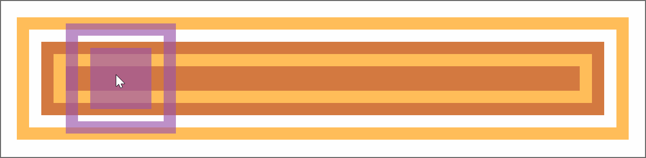
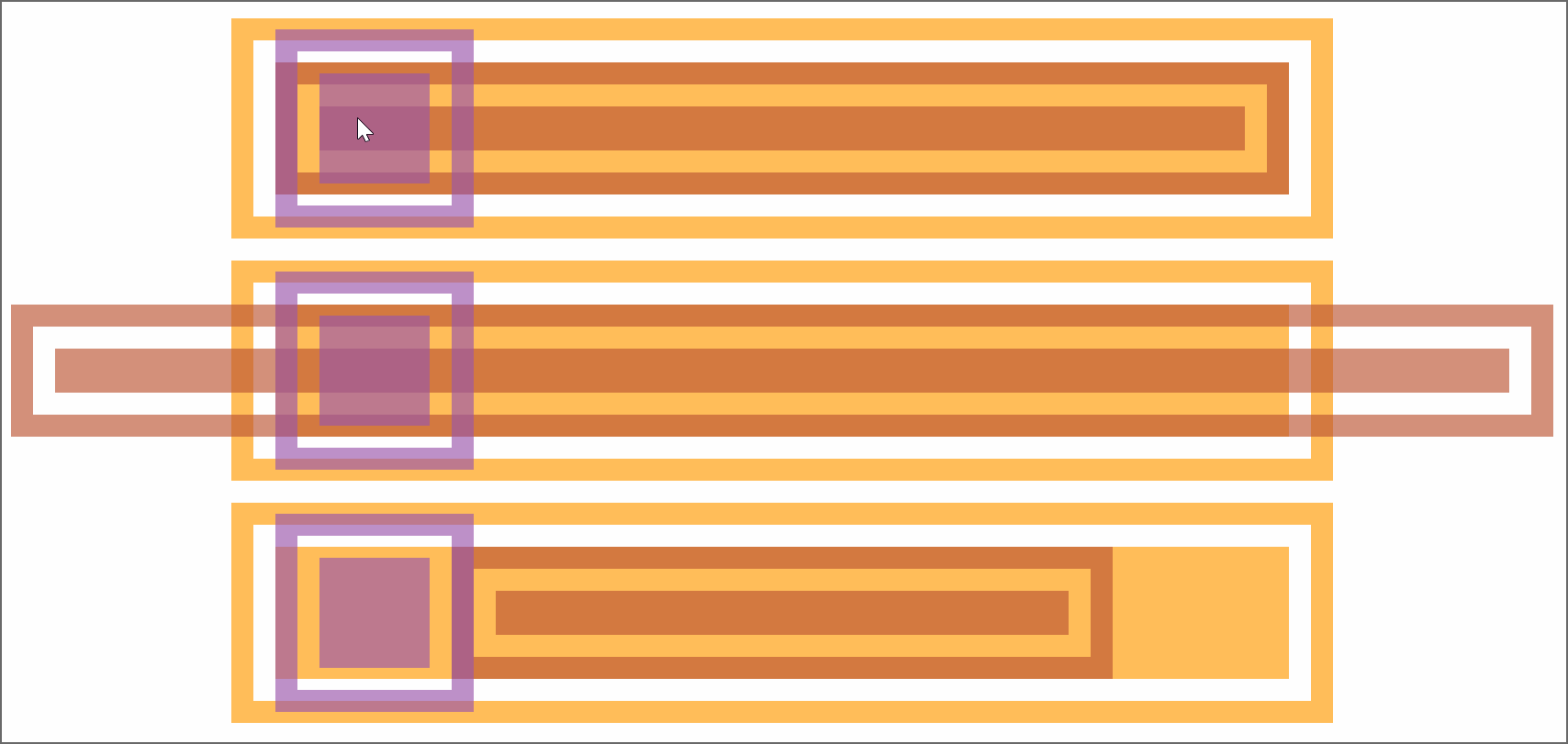
Now comes the interesting part! We compute the middle between the index of the first item and that of the last one. This is the arithmetic mean of the two (since our indices are zero-based, the first and last are 0 and n - 1 respectively):

--m: calc(.5*(var(--n) - 1));

We get the absolute value, --abs, of the difference between this middle, --m, and the item index, --i, then use it to compute the animation-delay:

--abs: max(var(--m) - var(--i), var(--i) - var(--m));
animation: a $t calc(var(--abs)/var(--m)*#{$t}) infinite backwards;
animation-name: grow, melt;

The absolute value ,--abs, of the difference between the middle, --m, and the item index, --i, can be as small as 0 (for the middle item, if --n is odd) and as big as --m (for the end items). This means dividing it by --m always gives us a value in the [0, 1] interval, which we then multiply with the animation duration $t to ensure every item has a delay between 0s and the animation-duration.

Note that we’ve also set animation-fill-mode to backwards. Since most items will start the animations later, this tells the browser to keep them with the styles in the 0% keyframes until then.

In this particular case, we wouldn’t see any difference without it either because, while the items would be at full size (not scaled to nothing like in the 0% keyframe of the grow animation), they would also have no box-shadow until they start animating. However, in a lot of other cases, it does make a difference and we shouldn’t forget about it.

Another possibility (one that doesn’t involve setting the animation-fill-mode) would be to ensure the animation-delay is always smaller or at most equal to 0 by subtracting a full animation-duration out of it.

--abs: max(var(--m) - var(--i), var(--i) - var(--m));
animation: a $t calc((var(--abs)/var(--m) - 1)*#{$t}) infinite;
animation-name: grow, melt;

Both options are valid, and which one you use depends on what you prefer to happen at the very beginning. I generally tend to go for negative delays because they make more sense when recording the looping animation to make a gif like the one below, which illustrates how the animation-delay values are symmetrical with respect to the middle.

Animated gif. Shows 16 black square tiles in a row, each of them growing from nothing to full size, then melting from the inside until they disappear, with the cycle then repeating. Only now, they don't all animate at the same time. The closer they are to the middle, the sooner they start their animation, those at the very ends of the row being one full cycle behind those in the very middle.
The staggered looping animation.

For a visual comparison between the two options, you can rerun the following demo to see what happens at the very beginning.

A fancier example would be the following:

Navigation links sliding up and then back down with a delay proportional to how far they are from the selected one.

Here, each and every one of the --n navigation links and corresponding recipe articles have an index --idx. Whenever a navigation link is hovered or focused, its --idx value is read and set to the current index, --k, on the body. If none of these items is hovered or focused, --k gets set to a value outside the [0, n) interval (e.g. -1).

The absolute value, --abs, of the difference between --k and a link’s index, --idx, can tell us whether that’s the currently selected (hovered or focused) item. If this absolute value is 0, then our item is the currently selected one (i.e. --not-sel is 0 and --sel is 1). If this absolute value is bigger than 0, then our item is not the currently selected one (i.e. --not-sel is 1 and --sel is 0).

Given both --idx and --k are integers, it results that their difference is also an integer. This means the absolute value, --abs, of this difference is either 0 (when the item is selected), or bigger or equal to 1 (when the item is not selected).

When we put all of this into code, this is what we get:

--abs: Max(var(--k) - var(--idx), var(--idx) - var(--k));
--not-sel: Min(1, var(--abs));
--sel: calc(1 - var(--not-sel));

The --sel and --not-sel properties (which are always integers that always add up to 1) determine the size of the navigation links (the width in the wide screen scenario and the height in the narrow screen scenario), whether they’re greyscaled or not and whether or not their text content is hidden. This is something we won’t get into here, as it is outside the scope of this article and I’ve already explained in a lot of detail in a previous one.

What is relevant here is that, when a navigation link is clicked, it slides out of sight (up in the wide screen case, and left in the narrow screen case), followed by all the others around it, each with a transition-delay that depends on how far they are from the one that was clicked (that is, on the absolute value, --abs, of the difference between their index, --idx, and the index of the currently selected item, --k), revealing the corresponding recipe article. These transition-delay values are symmetrical with respect to the currently selected item.

transition: transform 1s calc(var(--abs)*.05s);

The actual transition and delay are actually a bit more complex because more properties than just the transform get animated and, for transform in particular, there’s an additional delay when going back from the recipe article to the navigation links because we wait for the <article> element to disappear before we let the links slide down. But what were’re interested in is that component of the delay that makes the links is closer to the selected one start sliding out of sight before those further away. And that’s computed as above, using the --abs variable.

You can play with the interactive demo below.

Things get even more interesting in 2D, so let’s now make our row a grid!

We start by changing the structure a bit so that we have 8 columns and 8 rows (which means we have 8·8 = 64 items in total on the grid).

- let n = 8;
- let m = n*n;

style
  - for(let i = 0; i < n; i++)
    | .item:nth-child(#{n}n + #{i + 1}) { --i: #{i} }
    | .item:nth-child(n + #{n*i + 1}) { --j: #{i} }
.wrap(style=`--n: ${n}`)
  - for(let i = 0; i < m; i++)
    .item

The above Pug code compiles to the following HTML:

<style>
  .item:nth-child(8n + 1) { --i: 0 } /* items on 1st column */
  .item:nth-child(n + 1) { --j: 0 } /* items starting from 1st row */
  .item:nth-child(8n + 2) { --i: 1 } /* items on 2nd column */
  .item:nth-child(n + 9) { --j: 1 } /* items starting from 2nd row */
  /* 6 more such pairs */
</style>
<div class='wrap' style='--n: 8'>
  <div class='item'></div>
  <div class='item'></div>
  <!-- 62 more such items -->
</div>

Just like the previous case, we compute a middle index, --m, but since we’ve moved from 1D to 2D, we now have two differences in absolute value to compute, one for each of the two dimensions (one for the columns, --abs-i, and one for the rows, --abs-j).

--m: calc(.5*(var(--n) - 1));
--abs-i: max(var(--m) - var(--i), var(--i) - var(--m));
--abs-j: max(var(--m) - var(--j), var(--j) - var(--m));

We use the exact same two sets of @keyframes, but the animation-delay changes a bit, so it depends on both --abs-i and --abs-j. These absolute values can be as small as 0 (for tiles in the dead middle of the columns and rows) and as big as --m (for tiles at the ends of the columns and rows), meaning that the ratio between either of them and --m is always in the [0, 1] interval. This means the sum of these two ratios is always in the [0, 2] interval. If we want to reduce it to the [0, 1] interval, we need to divide it by 2 (or multiply by .5, same thing).

animation-delay: calc(.5*(var(--abs-i)/var(--m) + var(--abs-j)/var(--m))*#{$t});

This gives us delays that are in the [0s, $t] interval. We can take the denominator, var(--m), out of the parenthesis to simplify the above formula a bit:

animation-delay: calc(.5*(var(--abs-i) + var(--abs-j))/var(--m)*#{$t});

Just like the previous case, this makes grid items start animating later the further they are from the middle of the grid. We should use animation-fill-mode: backwards to ensure they stay in the state specified by the 0% keyframes until the delay time has elapsed and they start animating.

Alternatively, we can subtract one animation duration $t from all delays to make sure all grid items have already started their animation when the page loads.

animation-delay: calc((.5*(var(--abs-i) + var(--abs-j))/var(--m) - 1)*#{$t});

This gives us the following result:

Animated gif. Shows an 8x8 grid of tiles, each of them growing from nothing to full size, then melting from the inside until they disappear, with the cycle then repeating. The smaller the sum of their distances to the middle is, the sooner they start their animation, those at the very corners of the grid being one full cycle behind those in the very middle.
The staggered 2D animation (live demo).

Let’s now see a few more interesting examples. We won’t be going into details about the “how” behind them as the symmetrical value technique works exactly the same as for the previous ones and the rest is outside the scope of this article. However, there is a link to a CodePen demo in the caption for each of the examples below, and most of these Pens also come with a recording that shows me coding them from scratch.

In the first example, each grid item is made up of two triangles that shrink down to nothing at opposite ends of the diagonal they meet along and then grow back to full size. Since this is an alternating animation, we let the delays to stretch across two iterations (a normal one and a reversed one), which means we don’t divide the sum of ratios in half anymore and we subtract 2 to ensure every item has a negative delay.

animation: s $t ease-in-out infinite alternate;
animation-delay: calc(((var(--abs-i) + var(--abs-j))/var(--m) - 2)*#{$t});
Grid wave: pulsing triangles (live demo)

In the second example, each grid item has a gradient at an angle that animates from 0deg to 1turn. This is possible via Houdini as explained in this article about the state of animating gradients with CSS.

Field wave: cell gradient rotation (live demo)

The third example is very similar, except the animated angle is used by a conic-gradient instead of a linear one and also by the hue of the first stop.

Rainbow hour wave (live demo)

In the fourth example, each grid cell contains seven rainbow dots that oscillate up and down. The oscillation delay has a component that depends on the cell indices in the exact same manner as the previous grids (the only thing that’s different here is the number of columns differs from the number of rows, so we need to compute two middle indices, one along each of the two dimensions) and a component that depends on the dot index, --idx, relative to the number of dots per cell, --n-dots.

--k: calc(var(--idx)/var(--n-dots));
--mi: calc(.5*(var(--n-cols) - 1));
--abs-i: max(var(--mi) - var(--i), var(--i) - var(--mi));
--mj: calc(.5*(var(--n-rows) - 1));
--abs-j: max(var(--mj) - var(--j), var(--j) - var(--mj));
animation-delay: 
  calc((var(--abs-i)/var(--mi) + var(--abs-j)/var(--mj) + var(--k) - 3)*#{$t});
Rainbow dot wave: dot oscillation (live demo)

In the fifth example, the tiles making up the cube faces shrink and move inwards. The animation-delay for the top face is computed exactly as in our first 2D demo.

Breathe into me: neon waterfall (live demo and a previous iteration)

In the sixth example, we have a grid of columns oscillating up and down.

Column wave (live demo)

The animation-delay isn’t the only property we can set to have symmetrical values. We can also do this with the items’ dimensions. In the seventh example below, the tiles are distributed around half a dozen rings starting from the vertical (y) axis and are scaled using a factor that depends on how far they are from the top point of the rings. This is basically the 1D case with the axis curved on a circle.

Circular grid melt (live demo)

The eighth example shows ten arms of baubles that wrap around a big sphere. The size of these baubles depends on how far they are from the poles, the closest ones being the smallest. This is done by computing the middle index, --m, for the dots on an arm and the absolute value, --abs, of the difference between it and the current bauble index, --j, then using the ratio between this absolute value and the middle index to get the sizing factor, --f, which we then use when setting the padding.

--m: calc(.5*(var(--n-dots) - 1));
--abs: max(var(--m) - var(--j), var(--j) - var(--m));
--f: calc(1.05 - var(--abs)/var(--m));
padding: calc(var(--f)*#{$r});
Travel inside the sphere (live demo)

Different styles for items before and after a certain (selected or middle) one

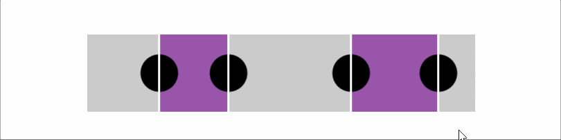
Let’s say we have a bunch of radio buttons and labels, with the labels having an index set as a custom property, --i. We want the labels before the selected item to have a green background, the label of the selected item to have a blue background and the rest of the labels to be grey. On the body, we set the index of the currently selected option as another custom property, --k.

- let n = 8;
- let k = Math.round((n - 1)*Math.random());

body(style=`--k: ${k}`)
  - for(let i = 0; i < n; i++)
    - let id = `r${i}`;
    input(type='radio' name='r' id=id checked=i===k)
    label(for=id style=`--i: ${i}`) Option ##{i}

This compiles to the following HTML:

<body style='--k: 1'>
  <input type='radio' name='r' id='r0'/>
  <label for='r0' style='--i: 0'>Option #0</label>
  <input type='radio' name='r' id='r1' checked='checked'/>
  <label for='r1' style='--i: 1'>Option #1</label>
  <input type='radio' name='r' id='r2'/>
  <label for='r2' style='--i: 2'>Option #2</label>
  <!-- more options -->
</body>

We set a few layout and prettifying styles, including a gradient background on the labels that creates three vertical stripes, each occupying a third of the background-size (which, for now, is just the default 100%, the full element width):

$c: #6daa7e, #335f7c, #6a6d6b;

body {
  display: grid;
  grid-gap: .25em 0;
  grid-template-columns: repeat(2, max-content);
  align-items: center;
  font: 1.25em/ 1.5 ubuntu, trebuchet ms, sans-serif;
}

label {
  padding: 0 .25em;
  background: 
    linear-gradient(90deg, 
      nth($c, 1) 33.333%, 
      nth($c, 2) 0 66.667%, 
      nth($c, 3) 0);
  color: #fff;
  cursor: pointer;
}
Screenshot showing radio inputs and their labels on two grid columns. The labels have a vertical three stripe background with the first stripe being green, the second one blue and the last one grey.
The result so far.

From the JavaScript, we update the value of --k whenever we select a different option:

addEventListener('change', e => {
  let _t = e.target;
	
  document.body.style.setProperty('--k', +_t.id.replace('r', ''))
})

Now comes the interesting part! For our label elements, we compute the sign, --sgn, of the difference between the label index, --i, and the index of the currently selected option, --k. We then use this --sgn value to compute the background-position when the background-size is set to 300% — that is, three times the label’s width because we may have of three possible backgrounds: one for the case when the label is for an option before the selected one, a second for the case when the label is for the selected option, and a third for the case when the label is for an option after the selected one.

--sgn: clamp(-1, var(--i) - var(--k), 1);
background: 
  linear-gradient(90deg, 
      nth($c, 1) 33.333%, 
      nth($c, 2) 0 66.667%, 
      nth($c, 3) 0) 
    calc(50%*(1 + var(--sgn)))/ 300%

If --i is smaller than --k (the case of a label for an option before the selected one), then --sgn is -1 and the background-position computes to 50%*(1 + -1) = 50%*0 = 0%, meaning we only see the first vertical stripe (the green one).

If --i is equal --k (the case of the label for the selected option), then --sgn is 0 and the background-position computes to 50%*(1 + 0) = 50%*1 = 50%, so we only see the vertical stripe in the middle (the blue one).

If --i is greater than --k (the case of a label for an option after the selected one), then --sgn is 1 and the background-position computes to 50%*(1 + 1) = 50%*2 = 100%, meaning we only see the last vertical stripe (the grey one).

A more aesthetically appealing example would be the following navigation where the vertical bar is on the side closest to the selected option and, for the selected one, it spreads across the entire element.

This uses a structure that’s similar to that of the previous demo, with radio inputs and labels for the navigation items. The moving “background” is actually an ::after pseudo-element whose translation value depends on the sign, --sgn. The text is a ::before pseudo-element whose position is supposed to be in the middle of the white area, so its translation value also depends on --sgn.

/* relevant styles */
label {
  --sgn: clamp(-1, var(--k) - var(--i), 1);
  
  &::before {
    transform: translate(calc(var(--sgn)*-.5*#{$pad}))
  }
  &::after {
    transform: translate(calc(var(--sgn)*(100% - #{$pad})))
  }
}

Let’s now quickly look at a few more demos where computing the sign (and maybe the absolute value as well) comes in handy.

First up, we have a square grid of cells with a radial-gradient whose radius shrinks from covering the entire cell to nothing. This animation has a delay computed as explained in the previous section. What’s new here is that the coordinates of the radial-gradient circle depend on where the cell is positioned with respect to the middle of the grid — that is, on the signs of the differences between the column --i and row --j indices and the middle index, --m.

/* relevant CSS */
$t: 2s;

@property --p {
  syntax: '<length-percentage>';
  initial-value: -1px;
  inherits: false;
}

.cell {
  --m: calc(.5*(var(--n) - 1));
  --dif-i: calc(var(--m) - var(--i));
  --abs-i: max(var(--dif-i), -1*var(--dif-i));
  --sgn-i: clamp(-1, var(--dif-i)/.5, 1);
  --dif-j: calc(var(--m) - var(--j));
  --abs-j: max(var(--dif-j), -1*var(--dif-j));
  --sgn-j: clamp(-1, var(--dif-j)/.5, 1);
  background: 
    radial-gradient(circle
      at calc(50% + 50%*var(--sgn-i)) calc(50% + 50%*var(--sgn-j)), 
      currentcolor var(--p), transparent calc(var(--p) + 1px))
      nth($c, 2);
  animation-delay: 
    calc((.5*(var(--abs-i) + var(--abs-j))/var(--m) - 1)*#{$t});
}

@keyframes p { 0% { --p: 100%; } }
Sinking feeling (live demo)

Then we have a double spiral of tiny spheres where both the sphere diameter --d and the radial distance --x that contributes to determining the sphere position depend on the absolute value --abs of the difference between each one’s index, --i, and the middle index, --m. The sign, --sgn, of this difference is used to determine the spiral rotation direction. This depends on where each sphere is with respect to the middle – that is, whether its index ,--i, is smaller or bigger than the middle index, --m.

/* relevant styles */
--m: calc(.5*(var(--p) - 1));
--abs: max(calc(var(--m) - var(--i)), calc(var(--i) - var(--m)));
--sgn: clamp(-1, var(--i) - var(--m), 1);
--d: calc(3px + var(--abs)/var(--p)*#{$d}); /* sphere diameter */
--a: calc(var(--k)*1turn/var(--n-dot)); /* angle used to determine sphere position */
--x: calc(var(--abs)*2*#{$d}/var(--n-dot)); /* how far from spiral axis */
--z: calc((var(--i) - var(--m))*2*#{$d}/var(--n-dot)); /* position with respect to screen plane */
width: var(--d); height: var(--d);
transform: 
  /* change rotation direction by changing x axis direction */
  scalex(var(--sgn)) 
  rotate(var(--a)) 
  translate3d(var(--x), 0, var(--z)) 
  /* reverse rotation so the sphere is always seen from the front */
  rotate(calc(-1*var(--a))); 
  /* reverse scaling so lighting on sphere looks consistent */
  scalex(var(--sgn))
No perspective (live demo)

Finally, we have a grid of non-square boxes with a border. These boxes have a mask created using a conic-gradient with an animated start angle, --ang. Whether these boxes are flipped horizontally or vertically depends on where they are with respect to the middle – that is, on the signs of the differences between the column --i and row --j indices and the middle index, --m. The animation-delay depends on the absolute values of these differences and is computed as explained in the previous section. We also have a gooey filter for a nicer “wormy” look, but we won’t be going into that here.

/* relevant CSS */
$t: 1s;

@property --ang {
  syntax: '<angle>';
  initial-value: 0deg;
  inherits: false;
}

.box {
  --m: calc(.5*(var(--n) - 1));
  --dif-i: calc(var(--i) - var(--m));
  --dif-j: calc(var(--j) - var(--m));
  --abs-i: max(var(--dif-i), -1*var(--dif-i));
  --abs-j: max(var(--dif-j), -1*var(--dif-j));
  --sgn-i: clamp(-1, 2*var(--dif-i), 1);
  --sgn-j: clamp(-1, 2*var(--dif-j), 1);
  transform: scale(var(--sgn-i), var(--sgn-j));
  mask:
    repeating-conic-gradient(from var(--ang, 0deg), 
        red 0% 12.5%, transparent 0% 50%);
  animation: ang $t ease-in-out infinite;
  animation-delay: 
    calc(((var(--abs-i) + var(--abs-j))/var(--n) - 1)*#{$t});
}

@keyframes ang { to { --ang: .5turn; } }
Consumed by worms (live demo)

Time (and not only) formatting

Let’s say we have an element for which we store a number of seconds in a custom property, --val, and we want to display this in a mm:ss format, for example.

We use the floor of the ratio between --val and 60 (the number of seconds in a minute) to get the number of minutes and modulo for the number of seconds past that number of minutes. Then we use a clever little counter trick to display the formatted time in a pseudo-element.

@property --min {
  syntax: '<integer>';
  initial-value: 0;
  inherits: false;
}

code {
  --min: calc(var(--val)/60 - .5);
  --sec: calc(var(--val) - var(--min)*60);
  counter-reset: min var(--min) sec var(--sec);
  
  &::after {
    /* so we get the time formatted as 02:09 */
    content: 
      counter(min, decimal-leading-zero) ':' 
      counter(sec, decimal-leading-zero);
  }
}

This works in most situations, but we encounter a problem when --val is exactly 0. In this case, 0/60 is 0 and then subtracting .5, we get -.5, which gets rounded to what’s the bigger adjacent integer in absolute value. That is, -1, not 0! This means our result will end up being -01:60, not 00:00!

Fortunately, we have a simple fix and that’s to slightly alter the formula for getting the number of minutes, --min:

--min: max(0, var(--val)/60 - .5);

There are other formatting options too, as illustrated below:

/* shows time formatted as 2:09 */
content: counter(min) ':' counter(sec, decimal-leading-zero);

/* shows time formatted as 2m9s */
content: counter(min) 'm' counter(sec) 's';

We can also apply the same technique to format the time as hh:mm:ss (live test).

@property --hrs {
  syntax: '<integer>';
  initial-value: 0;
  inherits: false;
}

@property --min {
  syntax: '<integer>';
  initial-value: 0;
  inherits: false;
}

code {
  --hrs: max(0, var(--val)/3600 - .5);
  --mod: calc(var(--val) - var(--hrs)*3600);
  --min: max(0, var(--mod)/60 - .5);
  --sec: calc(var(--mod) - var(--min)*60);
  counter-reset: hrs var(--hrs) var(--min) sec var(--sec);
  
  &::after {
    /* so we get the time formatted as 00:02:09 */
    content: 
      counter(hrs, decimal-leading-zero) ':' 
      counter(min, decimal-leading-zero) ':' 
      counter(sec, decimal-leading-zero);
  }
}

This is a technique I’ve used for styling the output of native range sliders such as the one below.

Screenshot showing a styled slider with a tooltip above the thumb indicating the elapsed time formatted as mm:ss. On the right of the slider, there's the remaining time formatted as -mm:ss.
Styled range input indicating time (live demo)

Time isn’t the only thing we can use this for. Counter values have to be integer values, which means the modulo trick also comes in handy for displaying decimals, as in the second slider seen below.

Screenshot showing three styled sliders withe second one having a tooltip above the thumb indicating the decimal value.
Styled range inputs, one of which has a decimal output (live demo)

A couple more such examples:

Screenshot showing multiple styled sliders with the third one being focused and showing a tooltip above the thumb indicating the decimal value.
Styled range inputs, one of which has a decimal output (live demo)
Screenshot showing two styled sliders with the second one being focused and showing a tooltip above the thumb indicating the decimal value.
Styled range inputs, one of which has a decimal output (live demo)

Even more use cases

Let’s say we have a volume slider with an icon at each end. Depending on the direction we move the slider’s thumb in, one of the two icons gets highlighted. This is possible by getting the absolute value, --abs, of the difference between each icon’s sign, --sgn-ico (-1 for the one before the slider, and 1 for the one after the slider), and the sign of the difference, --sgn-dir, between the slider’s current value, --val, and its previous value, --prv. If this is 0, then we’re moving in the direction of the current icon so we set its opacity to 1. Otherwise, we’re moving away from the current icon, so we keep its opacity at .15.

This means that, whenever the range input’s value changes, not only do we need to update its current value, --val, on its parent, but we need to update its previous value, which is another custom property, --prv, on the same parent wrapper:

addEventListener('input', e => {
  let _t = e.target, _p = _t.parentNode;
	
  _p.style.setProperty('--prv', +_p.style.getPropertyValue('--val'))
  _p.style.setProperty('--val', +_t.value)
})

The sign of their difference is the sign of the direction, --sgn-dir, we’re going in and the current icon is highlighted if its sign, --sgn-ico, and the sign of the direction we’re going in, --sgn-dir, coincide. That is, if the absolute value, --abs, of their difference is 0 and, at the same time, the parent wrapper is selected (it’s either being hovered or the range input in it has focus).

[role='group'] {
  --dir: calc(var(--val) - var(--prv));
  --sgn-dir: clamp(-1, var(--dir), 1);
  --sel: 0; /* is the slider focused or hovered? Yes 1/ No 0 */
  
  &:hover, &:focus-within { --sel: 1; }
}

.ico {
  --abs: max(var(--sgn-dir) - var(--sgn-ico), var(--sgn-ico) - var(--sgn-dir));
  --hlg: calc(var(--sel)*(1 - min(1, var(--abs)))); /* highlight current icon? Yes 1/ No 0 */
  opacity: calc(1 - .85*(1 - var(--hlg)));
}

Another use case is making property values of items on a grid depend on the parity of the sum of horizontal --abs-i and vertical --abs-j distances from the middle, --m. For example, let’s say we do this for the background-color:

@property --floor {
  syntax: '<integer>';
  initial-value: 0;
  inherits: false;
}

.cell {
  --m: calc(.5*(var(--n) - 1));
  --abs-i: max(var(--m) - var(--i), var(--i) - var(--m));
  --abs-j: max(var(--m) - var(--j), var(--j) - var(--m));
  --sum: calc(var(--abs-i) + var(--abs-j));
  --floor: max(0, var(--sum)/2 - .5);
  --mod: calc(var(--sum) - var(--floor)*2);
  background: hsl(calc(90 + var(--mod)*180), 50%, 65%);
}
Screenshot showing a 16x16 grid where each tile is either lime or purple.
Background depending on parity of sum of horizontal and vertical distances to the middle (live demo)

We can spice things up by using the modulo 2 of the floor of the sum divided by 2:

@property --floor {
  syntax: '<integer>';
  initial-value: 0;
  inherits: false;
}

@property --int {
  syntax: '<integer>';
  initial-value: 0;
  inherits: false;
}

.cell {
  --m: calc(.5*(var(--n) - 1));
  --abs-i: max(var(--m) - var(--i), var(--i) - var(--m));
  --abs-j: max(var(--m) - var(--j), var(--j) - var(--m));
  --sum: calc(var(--abs-i) + var(--abs-j));
  --floor: max(0, var(--sum)/2 - .5);
  --int: max(0, var(--floor)/2 - .5);
  --mod: calc(var(--floor) - var(--int)*2);
  background: hsl(calc(90 + var(--mod)*180), 50%, 65%);
}
Screenshot showing a 16x16 grid where each tile is either lime or purple.
A more interesting variation of the previous demo (live demo)

We could also make both the direction of a rotation and that of a conic-gradient() depend on the same parity of the sum, --sum, of horizontal --abs-i and vertical --abs-j distances from the middle, --m. This is achieved by horizontally flipping the element if the sum, --sum, is even. In the example below, the rotation and size are also animated via Houdini (they both depend on a custom property, --f, which we register and then animate from 0 to 1), and so are the worm hue, --hue, and the conic-gradient() mask, both animations having a delay computed exactly as in previous examples.

@property --floor {
  syntax: '<integer>';
  initial-value: 0;
  inherits: false;
}

.🐛 {
  --m: calc(.5*(var(--n) - 1));
  --abs-i: max(var(--m) - var(--i), var(--i) - var(--m));
  --abs-j: max(var(--m) - var(--j), var(--j) - var(--m));
  --sum: calc(var(--abs-i) + var(--abs-j));
  --floor: calc(var(--sum)/2 - .5);
  --mod: calc(var(--sum) - var(--floor)*2);
  --sgn: calc(2*var(--mod) - 1); /* -1 if --mod is 0; 1 id --mod is 1 */
  transform: 
    scalex(var(--sgn)) 
    scale(var(--f)) 
    rotate(calc(var(--f)*180deg));
  --hue: calc(var(--sgn)*var(--f)*360);
}
Grid wave: triangular rainbow worms (live demo).

Finally, another big use case for the techniques explained so far is shading not just convex, but also concave animated 3D shapes using absolutely no JavaScript! This is one topic that’s absolutely massive on its own and explaining everything would take an article as long as this one, so I won’t be going into it at all here. But I have made a few videos where I code a couple of such basic pure CSS 3D shapes (including a wooden star and a differently shaped metallic one) from scratch and you can, of course, also check out the CSS for the following example on CodePen.

Musical toy (live demo)


The post Using Absolute Value, Sign, Rounding and Modulo in CSS Today appeared first on CSS-Tricks. You can support CSS-Tricks by being an MVP Supporter.

Variable Aspect Ratio Card With Conic Gradients Meeting Along the Diagonal

I recently came across an interesting problem. I had to implement a grid of cards with a variable (user-set) aspect ratio that was stored in a --ratio custom property. Boxes with a certain aspect ratio are a classic problem in CSS and one that got easier to solve in recent years, especially since we got aspect-ratio, but the tricky part here was that each of the cards needed to have two conic gradients at opposite corners meeting along the diagonal. Something like this:

A 3 by 3 grid of square cards with color backgrounds made from conic gradients. The gradients appear like stripes that extend from opposite corners of the card. Each card reads Hello Gorgeous in a fancy script font.
User set aspect ratio cards.

The challenge here is that, while it’s easy to make an abrupt change in a linear-gradient() along the diagonal of a variable aspect ratio box using for example a direction like to top left which changes with the aspect ratio, a conic-gradient() needs either an angle or a percentage representing how far it has gone around a full circle.

Check out this guide for a refresher on how conic gradients work.

The simple solution

The spec now includes trigonometric and inverse trigonometric functions, which could help us here — the angle of the diagonal with the vertical is the arctangent of the aspect ratio atan(var(--ratio)) (the left and top edges of the rectangle and the diagonal form a right triangle where the tangent of the angle formed by the diagonal with the vertical is the width over the height — precisely our aspect ratio).

Illustration. Shows a rectangle of width w and height h with a diagonal drawn from the bottom left corner to the top right one. This diagonal is the hypotenuse of the right triangle whose catheti are the left and top edges of the rectangle. In this right triangle, the tangent of the angle between the hypotenuse (diagonal of original rectangle) with the vertical (left edge of original rectangle) is the top edge (w) over the left edge (h).
The angle of the diagonal with the vertical (edge).

Putting it into code, we have:

--ratio: 3/ 2;
aspect-ratio: var(--ratio);
--angle: atan(var(--ratio));
background: 
  /* below the diagonal */
  conic-gradient(from var(--angle) at 0 100%, 
      #319197, #ff7a18, #af002d  calc(90deg - var(--angle)), transparent 0%), 
  /* above the diagonal */
  conic-gradient(from calc(.5turn + var(--angle)) at 100% 0, 
      #ff7a18, #af002d, #319197 calc(90deg - var(--angle)));

However, no browser currently implements trigonometric and inverse trigonometric functions, so the simple solution is just a future one and not one that would actually work anywhere today.

The JavaScript solution

We can of course compute the --angle in the JavaScript from the --ratio value.

let angle = Math.atan(1/ratio.split('/').map(c => +c.trim()).reduce((a, c) => c/a, 1));
document.body.style.setProperty('--angle', `${+(180*angle/Math.PI).toFixed(2)}deg`)

But what if using JavaScript won’t do? What if we really need a pure CSS solution? Well, it’s a bit hacky, but it can be done!

The hacky CSS solution

This is an idea I got from a peculiarity of SVG gradients that I honestly found very frustrating when I first encountered.

Let’s say we have a gradient with a sharp transition at 50% going from bottom to top since in CSS, that’s a gradient at a angle. Now let’s say we have the same gradient in SVG and we change the angle of both gradients to the same value.

In CSS, that’s:

linear-gradient(45deg, var(--stop-list));

In SVG, we have:

<linearGradient id='g' y1='100%' x2='0%' y2='0%' 
                gradientTransform='rotate(45 .5 .5)'>
  <!-- the gradient stops -->
</linearGradient>

As it can be seen below, these two don’t give us the same result. While the CSS gradient really is at 45°, the SVG gradient rotated by the same 45° has that sharp transition between orange and red along the diagonal, even though our box isn’t square, so the diagonal isn’t at 45°!

Screenshot. Shows a rectangle with a CSS gradient at 45° (left) vs. a rectangle with a bottom to top SVG gradient rotated by 45° (right). This angle is adjustable via the slider at the bottom. The CSS gradient is really at 45°, but the line of the SVG gradient is perpendicular onto the rectangle's diagonal.
45° CSS vs. SVG gradient (live demo).

This is because our SVG gradient gets drawn within a 1x1 square box, rotated by 45°, which puts the abrupt change from orange to red along the square diagonal. Then this square is stretched to fit the rectangle, which basically changes the diagonal angle.

Note that this SVG gradient distortion happens only if we don’t change the gradientUnits attribute of the linearGradient from its default value of objectBoundingBox to userSpaceOnUse.

Basic idea

We cannot use SVG here since it only has linear and radial gradients, but not conic ones. However, we can put our CSS conic gradients in a square box and use the 45° angle to make them meet along the diagonal:

aspect-ratio: 1/ 1;
width: 19em;
background: 
  /* below the diagonal */
  conic-gradient(from 45deg at 0 100%, 
      #319197, #ff7a18, #af002d 45deg, transparent 0%), 
  /* above the diagonal */
  conic-gradient(from calc(.5turn + 45deg) at 100% 0, 
      #ff7a18, #af002d, #319197 45deg);

Then we can stretch this square box using a scaling transform – the trick is that the ‘/’ in the 3/ 2 is a separator when used as an aspect-ratio value, but gets parsed as division inside a calc():

--ratio: 3/ 2;
transform: scaley(calc(1/(var(--ratio))));

You can play with changing the value of --ratio in the editable code embed below to see that, this way, the two conic gradients always meet along the diagonal:

Note that this demo will only work in a browser that supports aspect-ratio. This property is supported out of the box in Chrome 88+ (current version is 90), but Firefox still needs the layout.css.aspect-ratio.enabled flag to be set to true in about:config. And if you’re using Safari… well, I’m sorry!

Screenshot showing how to enable the Firefox flag. Go to about:config (type that in the address bar - you may be asked if you're sure you want to mess with that stuff before you're allowed to enter). Use the search bar to look for 'aspect' - this should be enough to bring up the flag. Set its value to true.
Enabling the flag in Firefox.

Issues with this approach and how to get around them

Scaling the actual .card element would rarely be a good idea though. For my use case, the cards are on a grid and setting a directional scale on them messes up the layout (the grid cells are still square, even though we’ve scaled the .card elements in them). They also have text content which gets weirdly stretched by the scaley() function.

Screenshot. Shows how the card elements are scaled down vertically, yet the grid cells they're occupying have remained square, just like the cards before the directional scaling.

The solution is to give the actual cards the desired aspect-ratio and use an absolutely positioned ::before placed behind the text content (using z-index: -1) in order to create our background. This pseudo-element gets the width of its .card parent and is initially square. We also set the directional scaling and conic gradients from earlier on it. Note that since our absolutely positioned ::before is top-aligned with the top edge of its .card parent, we should also scale it relative to this edge as well (the transform-origin needs to have a value of 0 along the y axis, while the x axis value doesn’t matter and can be anything).

body {
  --ratio: 3/ 2;
  /* other layout and prettifying styles */
}

.card {
  position: relative;
  aspect-ratio: var(--ratio);

  &::before {
    position: absolute;
    z-index: -1; /* place it behind text content */

    aspect-ratio: 1/ 1; /* make card square */
    width: 100%;
    	
    /* make it scale relative to the top edge it's aligned to */
    transform-origin: 0 0;
    /* give it desired aspect ratio with transforms */
    transform: scaley(calc(1/(var(--ratio))));
    /* set background */
    background: 
      /* below the diagonal */
      conic-gradient(from 45deg at 0 100%, 
      #319197, #af002d, #ff7a18 45deg, transparent 0%), 
      /* above the diagonal */
      conic-gradient(from calc(.5turn + 45deg) at 100% 0, 
      #ff7a18, #af002d, #319197 45deg);
    content: '';
  }
}

Note that we’ve moved from CSS to SCSS in this example.

This is much better, as it can be seen in the embed below, which is also editable so you can play with the --ratio and see how everything adapts nicely as you change its value.

Padding problems

Since we haven’t set a padding on the card, the text may go all the way to the edge and even slightly out of bounds given it’s a bit slanted.

Screenshot. Shows a case where the text goes all the way to the edge of the card and even goes out a tiny little bit creating an ugly result.
Lack of padding causing problems.

That shouldn’t be too difficult to fix, right? We just add a padding, right? Well, when we do that, we discover the layout breaks!

Animated gif. Shows the dev tools grid overlay t highlight that, while the background (created with the scaled pseudo) still has the desired aspect ratio, the grid cell and the actual card in it are taller.
Adding a padding breaks the layout. (Demo)

This is because the aspect-ratio we’ve set on our .card elements is that of the .card box specified by box-sizing. Since we haven’t explicitly set any box-sizing value, its current value is the default one, content-box. Adding a padding of the same value around this box gives us a padding-box of a different aspect ratio that doesn’t coincide with that of its ::before pseudo-element anymore.

In order to better understand this, let’s say our aspect-ratio is 4/ 1 and the width of the content-box is 16rem (256px). This means the height of the content-box is a quarter of this width, which computes to 4rem (64px). So the content-box is a 16rem×4rem (256px×64px) rectangle.

Now let’s say we add a padding of 1rem (16px) along every edge. The width of the padding-box is therefore 18rem (288px, as it can be seen in the animated GIF above) — computed as the width of the content-box, which is 16rem (256px) plus 1rem (16px) on the left and 1rem on the right from the padding. Similarly, the height of the padding-box is 6rem (96px) — computed as the height of the content-box, which is 4rem (64px), plus 1rem (16px) at the top and 1rem at the bottom from the padding).

This means the padding-box is a 18rem×6rem (288px×96px) rectangle and, since 18 = 3⋅6, it has a 3/ 1 aspect ratio which is different from the 4/ 1 value we’ve set for the aspect-ratio property! At the same time, the ::before pseudo-element has a width equal to that of its parent’s padding-box (which we’ve computed to be 18rem or 288px) and its aspect ratio (set by scaling) is still 4/ 1, so its visual height computes to 4.5rem (72px). This explains why the background created with this pseudo — scaled down vertically to a 18rem×4.5rem (288px×72px) rectangle — is now shorter than the actual card — a 18rem×6rem (288px×96px) rectangle now with the padding.

So, it looks like the solution is pretty straightforward — we need to set box-sizing to border-box to fix our problem as this applied the aspect-ratio on this box (identical to the padding-box when we don’t have a border).

Sure enough, this fixes things… but only in Firefox!

Screenshot collage. Shows how the text is not middle aligned in Chromium browsers (top), while Firefox (bottom) gets this right.
Showing the difference between Chromium (top) and Firefox (bottom).

The text should be middle-aligned vertically as we’ve given our .card elements a grid layout and set place-content: center on them. However, this doesn’t happen in Chromium browsers and it becomes a bit more obvious why when we take out this last declaration — somehow, the cell in the card’s grid gets the 3/ 1 aspect ratio too and overflows the card’s content-box:

Animated gif. For some reason, the grid cell inside the card gets the set aspect ratio and overflows the card's content-box.
Checking the card’s grid with vs. without place-content: center.

Fortunately, this is a known Chromium bug that should probably get fixed in the coming months.

In the meantime, what we can do to get around this is remove the box-sizing, padding and place-content declarations from the .card element, move the text in a child element (or in the ::after pseudo if it’s just a one-liner and we’re lazy, though an actual child is the better idea if we want the text to stay selectable) and make that a grid with a padding.

.card {
  /* same as before, 
     minus the box-sizing, place-content and padding declarations 
     the last two of which which we move on the child element */
  
  &__content {
    place-content: center;
    padding: 1em
  }
}

Rounded corners

Let’s say we also want our cards to have rounded corners. Since a directional transform like the scaley on the ::before pseudo-element that creates our background also distorts corner rounding, it results that the simplest way to achieve this is to set a border-radius on the actual .card element and cut out everything outside that rounding with overflow: hidden.

Screenshot. Shows an element that's not scaled at all on the left. This has a perfectly circular border-radius. In the right, there's a non-uniform scaled element - its border-radius is not perfectly circular anymore, but instead distorted by the scaling.
Non-uniform scaling distorts corner rounding. (Demo)

However, this becomes problematic if at some point we want some other descendant of our .card to be visible outside of it. So, what we’re going to do is set the border-radius directly on the ::before pseudo that creates the card background and reverse the directional scaling transform along the y axis on the y component of this border-radius:

$r: .5rem;

.card {
  /* same as before */
  
  &::before {
    border-radius: #{$r}/ calc(#{$r}*var(--ratio));
    transform: scaley(calc(1/(var(--ratio))));
    /* same as before */
  }
}

Final result

Putting it all together, here’s an interactive demo that allows changing the aspect ratio by dragging a slider – every time the slider value changes, the --ratio variable is updated:


The post Variable Aspect Ratio Card With Conic Gradients Meeting Along the Diagonal appeared first on CSS-Tricks.

You can support CSS-Tricks by being an MVP Supporter.

Taming Blend Modes: `difference` and `exclusion`

Up until 2020, blend modes were a feature I hadn’t used much because I rarely ever had any idea what result they could produce without giving them a try first. And taking the “try it and see what happens” approach seemed to always leave me horrified by the visual vomit I had managed to create on the screen.

The problem stemmed from not really knowing how they work in the back. Pretty much every article I’ve seen on the topic is based on examples, comparisons with Photoshop or verbose artistic descriptions. I find examples great, but when you have no clue how things work in the back, adapting a nice-looking demo into something that would implement a different idea you have in your head becomes a really time-consuming, frustrating and ultimately futile adventure. Then Photoshop comparisons are pretty much useless for someone coming from a technical background. And verbose artistic descriptions feel like penguin language to me.

So I had a lightbulb moment when I came across the spec and found it also includes mathematical formulas according to which blend modes work. This meant I could finally understand how this stuff works in the back and where it can be really useful. And now that I know better, I’ll be sharing this knowledge in a series of articles.

Today, we’ll focus on how blending generally works, then take a closer look at two somewhat similar blend modes — difference and exclusion — and, finally, get to the meat of this article where we’ll dissect some cool use cases like the ones below.

A few examples of what we can achieve with these two blend modes.

Let’s discuss the “how” of blend modes

Blending means combining two layers (that are stacked one on top of the other) and getting a single layer. These two layers could be two siblings, in which case the CSS property we use is mix-blend-mode. They could also be two background layers, in which case the CSS property we use is background-blend-mode. Note that when I talk about blending “siblings,” this includes blending an element with the pseudo-elements or with the text content or the background of its parent. And when it comes to background layers, it’s not just the background-image layers I’m talking about — the background-color is a layer as well.

When blending two layers, the layer on top is called the source, while the layer underneath is called the destination. This is something I just take as it is because these names don’t make much sense, at least to me. I’d expect the destination to be an output, but instead they’re both inputs and the resulting layer is the output.

Illustration showing two layers. The top layer is the source, while the bottom one is the destination.
Blending terminology

How exactly we combine the two layers depends on the particular blend mode used, but it’s always per pixel. For example, the illustration below uses the multiply blend mode to combine the two layers, represented as grids of pixels.

Illustration showing two corresponding pixels of the two layers being blended, which results in the corresponding pixel of the resulting layer.
How blending two layers works at a pixel level

Alright, but what happens if we have more than two layers? Well, in this case, the blending process happens in stages, starting from the bottom.

In a first stage, the second layer from the bottom is our source, and the first layer from the bottom is our destination. These two layers blend together and the result becomes the destination for the second stage, where the third layer from the bottom is the source. Blending the third layer with the result of blending the first two gives us the destination for the third stage, where the fourth layer from the bottom is the source.

Illustration showing the process described above.
Blending multiple layers

Of course, we can use a different blend mode at each stage. For example, we can use difference to blend the first two layers from the bottom, then use multiply to blend the result with the third layer from the bottom. But this is something we’ll go a bit more into in future articles.

The result produced by the two blend modes we discuss here doesn’t depend on which of the two layers is on top. Note that this is not the case for all possible blend modes, but it is the case for the ones we’re looking at in this article.

They are also separable blend modes, meaning the blending operation is performed on each channel separately. Again, this is not the case for all possible blend modes, but it is the case for difference and exclusion.

More exactly, the resulting red channel only depends on the red channel of the source and the red channel of the destination; the resulting green channel only depends on the green channel of the source and the green channel of the destination; and finally, the resulting blue channel only depends on the blue channel of the source and the blue channel of the destination.

R = fB(Rs, Rd)
G = fB(Gs, Gd)
B = fB(Bs, Bd)

For a generic channel, without specifying whether it’s red, green or blue, we have that it’s a function of the two corresponding channels in the source (top) layer and in the destination (bottom) layer:

Ch = fB(Chs, Chd)

Something to keep in mind is that RGB values can be represented either in the [0, 255] interval, or as percentages in the [0%, 100%] interval, and what we actually use in our formulas is the percentage expressed as a decimal value. For example, crimson can be written as either rgb(220, 20, 60) or as rgb(86.3%, 7.8%, 23.5%) — both are valid. The channel values we use for computations if a pixel is crimson are the percentages expressed as decimal values, that is .863, .078, .235.

If a pixel is black, the channel values we use for computations are all 0, since black can be written as rgb(0, 0, 0) or as rgb(0%, 0%, 0%). If a pixel is white, the channel values we use for computations are all 1, since white can be written as rgb(255, 255, 255) or as rgb(100%, 100%, 100%).

Note that wherever we have full transparency (an alpha equal to 0), the result is identical to the other layer.

difference

The name of this blend mode might provide a clue about what the blending function fB() does. The result is the absolute value of the difference between the corresponding channel values for the two layers.

Ch = fB(Chs, Chd) = |Chs - Chd|

First off, this means that if the corresponding pixels in the two layers have identical RGB values (i.e. Chs = Chd for every one of the three channels), then the resulting layer’s pixel is black since the differences for all three channels are 0.

Chs = Chd
Ch = fB(Chs, Chd) = |Chs - Chd| = 0

Secondly, since the absolute value of the difference between any positive number and 0 leaves that number unchanged, it results in the corresponding result pixel having the same RGB value as the other layer’s pixel if a layer’s pixel is black (all channels equal 0).

If the black pixel is in the top (source) layer, replacing its channel values with 0 in our formula gives us:

Ch = fB(0, Chd) = |0 - Chd| = |-Chd| = Chd

If the black pixel is in the bottom (destination) layer, replacing its channel values with 0 in our formula gives us:

Ch = fB(Chs, 0) = |Chs - 0| = |Chs| = Chs

Finally, since the absolute value of the difference between any positive subunitary number and 1 gives us the complement of that number, it results that if a layer’s pixel is white (has all channels 1), the corresponding result pixel is the other layer’s pixel fully inverted (what filter: invert(1) would do to it).

If the white pixel is in the top (source) layer, replacing its channel values with 1 in our formula gives us:

Ch = fB(1, Chd) = |1 - Chd| = 1 - Chd

If the white pixel is in the bottom (destination) layer, replacing its channel values with 1 in our formula gives us:

Ch = fB(Chs, 1) = |Chs - 1| = 1 - Chs

This can be seen in action in the interactive Pen below, where you can toggle between viewing the layers separated and viewing them overlapping and blended. Hovering the three columns in the overlapping case also reveals what’s happening for each.

exclusion

For the second and last blend mode we’re looking at today, the result is twice the product of the two channel values, subtracted from their sum:

Ch = fB(Chs, Chd) = Chs + Chd - 2·Chs·Chd

Since both values are in the [0, 1] interval, their product is always at most equal to the smallest of them, so twice the product is always at most equal to their sum.

If we consider a black pixel in the top (source) layer, then replace Chs with 0 in the formula above, we get the following result for the corresponding result pixel’s channels:

Ch = fB(0, Chd) = 0 + Chd - 2·0·Chd = Chd - 0 = Chd

If we consider a black pixel in the bottom (destination) layer, then replace Chd with 0 in the formula above, we get the following result for the corresponding result pixel’s channels:

Ch = fB(Chs, 0) = Chs + 0 - 2·Chs·0 = Chs - 0 = Chs

So, if a layer’s pixel is black, it results that the corresponding result pixel is identical to the other layer’s pixel.

If we consider a white pixel in the top (source) layer, then replace Chs with 1 in the formula above, we get the following result for the corresponding result pixel’s channels:

Ch = fB(1, Chd) = 1 + Chd - 2·1·Chd = 1 + Chd - 2·Chd = 1 - Chd

If we consider a white pixel in the bottom (destination) layer, then replace Chd with 1 in the formula above, we get the following result for the corresponding result pixel’s channels:

Ch = fB(Chs, 1) = Chs + 1 - 2·Chs·1 = Chs + 1 - 2·Chs = 1 - Chs

So if a layer’s pixel is white, it results that the corresponding result pixel is identical to the other layer’s pixel inverted.

This is all shown in the following interactive demo:

Note that as long as at least one of the layers only has black and white pixels, difference and exclusion produce the exact same result.

Now, let’s turn to the “what” of blend modes

Here comes the interesting part — the examples!

Text state change effect

Let’s say we have a paragraph with a link:

<p>Hello, <a href='#'>World</a>!</div>

We start by setting a few basic styles to put our text in the middle of the screen, bump up its font-size, set a background on the body and a color on both the paragraph and the link.

body {
  display: grid;
  place-content: center;
  height: 100vh;
  background: #222;
  color: #ddd;
  font-size: clamp(1.25em, 15vw, 7em);
}

a { color: gold; }

Doesn’t look like much so far, but we’ll soon change that!

Screenshot of the result after setting the initial styles. The paragraph text is in the middle. Its normal text is while, while the link text is gold.
What we have so far (demo)

The next step is to create an absolutely positioned pseudo-element that covers the entire link and has its background set to currentColor.

a {
  position: relative;
  color: gold;
  
  &::after {
    position: absolute;
    top: 0;
    bottom: 0;
    right: 0;
    left: 0;
    background: currentColor;
    content: '';
  }
}
Screenshot of the result after creating and setting a few basic styles on the link pseudo: this now covers the entire link text.
The result we now have with the pseudo-element on the link (demo)

The above looks like we’ve messed things up… but have we really? What we have here is a gold rectangle on top of gold text. And if you’ve paid attention to how the two blend modes discussed above work, then you’ve probably already guessed what’s next — we blend the two sibling nodes within the link (the pseudo-element rectangle and the text content) using difference, and since they’re both gold, it results that what they have in common — the text — becomes black.

p { isolation: isolate; }

a {
  /* same as before */
  
  &::after {
    /* same as before */
    mix-blend-mode: difference;
  }
}

Note that we have to isolate the paragraph to prevent blending with the body background. While this is only an issue in Firefox (and given we have a very dark background on the body, it’s not too noticeable) and is fine in Chrome, keep in mind that, according to the spec, what Firefox does is actually correct. It’s Chrome that’s behaving in a buggy way here, so we should have the isolation property set in case the bug gets fixed.

Screenshot of the result after blending the link pseudo with the link text. Since they're both gold, the result is black text on gold background.
The mix-blend-mode: difference effect (demo)

Alright, but we want this to happen only if the link is focused or hovered. Otherwise, the pseudo-element isn’t visible — let’s say it’s scaled down to nothing.

a {
  /* same as before */
  text-decoration: none;
  
  &::after {
    /* same as before */
    transform: scale(0);
  }

  &:focus { outline: none }
  &:focus, &:hover { &::after { transform: none; } }
}

We’ve also removed the link underline and the focus outline. Below, you can now see the difference effect on :hover (the same effect occurs on :focus, which is something you can test in the live demo).

Animated gif. On hover, the gold pseudo rectangle suddenly shows up and is blended with the gold link text using the difference blend mode, thus making the latter black.
The mix-blend-mode: difference effect only on :hover (demo)

We now have our state change, but it looks rough, so let’s add a transition!

a {
  /* same as before */
  
  &::after {
    /* same as before */
    transition: transform .25s;
  }
}

Much better!

Animated gif. On hover, the gold pseudo rectangle smoothly grows from nothing and is blended with the gold link text using the difference blend mode, thus making their intersection black.
The mix-blend-mode: difference effect only on :hover, now smoothed by a transition (demo)

It would look even better if our pseudo grew not from nothing in the middle, but from a thin line at the bottom. This means we need to set the transform-origin on the bottom edge (at 100% vertically and whatever value horizontally) and initially scale our pseudo to something slightly more than nothing along the y axis.

a {
  /* same as before */
  
  &::after {
    /* same as before */
    transform-origin: 0 100%;
    transform: scaleY(.05);
  }
}
Animated gif. On hover, the gold pseudo rectangle smoothly grows from a thin underline to a rectangle covering its link parent's bounding box and is blended with the gold link text using the difference blend mode, thus making their intersection black.
The mix-blend-mode: difference effect only on :hover, now smoothed by a transition between a thin underline and a rectangle containing the link text (demo)

Something else I’d like to do here is replace the font of the paragraph with a more aesthetically appealing one, so let’s take care of that too! But we now have a different kind of problem: the end of the ‘d’ sticks out of the rectangle on :focus/:hover.

Screenshot illustrating the problem with slanted text — the last letter ends outside of the pseudo-element rectangle.
The problem illustrated: the end of the “d” sticks out when we :focus or :hover the link (demo)

We can fix this with a horizontal padding on our link.

a {
  /* same as before */
  padding: 0 .25em;
}

In case you’re wondering why we’re setting this padding on both the right and the left side instead of just setting a padding-right, the reason is illustrated below. When our link text becomes “Alien World,” the curly start of the ‘A’ would end up outside of our rectangle if we didn’t have a padding-left.

Screenshot illustrating the problem with only setting a lateral padding in the direction on the slant (right in this case): if our link text becomes 'Alien World', the curly start of the 'A' falls outside the pseudo-element rectangle. This is solved by having a lateral padding on both sides.
Why we have padding on both lateral sides (demo)

This demo with a multi-word link above also highlights another issue when we reduce the viewport width.

Animated gif. Shows how in the case of a multi-line link, the pseudo-element is just between the left of the first word in the link text and the last word in the same link text.
The problem with multi-line links (demo)

One quick fix here would be to set display: inline-block on the link. This isn’t a perfect solution. It also breaks when the link text is longer than the viewport width, but it works in this particular case, so let’s just leave it here now and we’ll come back to this problem in a little while.

Animated gif. Shows the inline-block fix in action in this particular case.
The inline-block solution (demo)

Let’s now consider the situation of a light theme. Since there’s no way to get white instead of black for the link text on :hover or :focus by blending two identical highlight layers that are both not white, we need a bit of a different approach here, one that doesn’t involve using just blend modes.

What we do in this case is first set the background, the normal paragraph text color, and the link text color to the values we want, but inverted. I was initially doing this inversion manually, but then I got the suggestion of using the Sass invert() function, which is a very cool idea that really simplifies things. Then, after we have this dark theme that’s basically the light theme we want inverted, we get our desired result by inverting everything again with the help of the CSS invert() filter function.

Tiny caveat here: we cannot set filter: invert(1) on the body or html elements because this is not going to behave the way we expect it to and we won’t be getting the desired result. But we can set both the background and the filter on a wrapper around our paragraph.

<section>
  <p>Hello, <a href='#'>Alien World</a>!</p>
</section>
body {
  /* same as before, 
     without the place-content, background and color declarations, 
     which we move on the section */
}

section {
  display: grid;
  place-content: center;
  background: invert(#ddd) /* Sass invert(<color>) function */;
  color: invert(#222); /* Sass invert<color>) function */;
  filter: invert(1); /* CSS filter invert(<number|percentage>) function */
}

a {
  /* same as before */
  color: invert(purple); /* Sass invert(<color>) function */
}

Here’s an example of a navigation bar employing this effect (and a bunch of other clever tricks, but those are outside the scope of this article). Select a different option to see it in action:

Something else we need to be careful with is the following: all descendants of our section get inverted when we use this technique. And this is probably not what we want in the case of img elements — I certainly don’t expect to see the images in a blog post inverted when I switch from the dark to the light theme. Consequently, we should reverse the filter inversion on every img descendant of our section.

section {
  /* same as before */
  
  &, & img { filter: invert(1); }
}

Putting it all together, the demo below shows both the dark and light theme cases with images:

Now let’s get back to the wrapping link text issue and see if we don’t have better options than making the a elements inline-block ones.

Well, we do! We can blend two background layers instead of blending the text content and a pseudo. One layer gets clipped to the text, while the other one is clipped to the border-box and its vertical size animates between 5% initially and 100% in the hovered and focused cases.

a {
  /* same as before */
  -webkit-text-fill-color: transparent;
     -moz-text-fill-color: transparent;
  --full: linear-gradient(currentColor, currentColor);
  background: 
    var(--full), 
    var(--full) 0 100%/1% var(--sy, 5%) repeat-x;
  -webkit-background-clip: text, border-box;
          background-clip: text, border-box;
  background-blend-mode: difference;
  transition: background-size .25s;
	
  &:focus, &:hover { --sy: 100%; }
}

Note that we don’t even have a pseudo-element anymore, so we’ve taken some of the CSS on it, moved it on the link itself, and tweaked it to suit this new technique. We’ve switched from using mix-blend-mode to using background-blend-mode; we’re now transitioning background-size of transform and, in the :focus and :hover states; and we’re now changing not the transform, but a custom property representing the vertical component of the background-size.

Animated gif. Shows the result when we blend two background layers on the actual link: one clipped to text and the other one clipped to border-box.
The background layer blending solution (demo).

Much better, though this isn’t a perfect solution either.

The first problem is one you’ve surely noticed if you checked the caption’s live demo link in Firefox: it doesn’t work at all. This is due to a Firefox bug I apparently reported back in 2018, then forgot all about until I started toying with blend modes and hit it again.

The second problem is one that’s noticeable in the recording. The links seem somewhat faded. This is because, for some reason, Chrome blends inline elements like links (note that this won’t happen with block elements like divs) with the background of their nearest ancestor (the section in this case) if these inline elements have background-blend-mode set to anything but normal.

Even more weirdly, setting isolation: isolate on the link or its parent paragraph doesn’t stop this from happening. I still had a nagging feeling it must have something to do with context, so I decided to keep throwing possible hacks at it, and hope maybe something ends up working. Well, I didn’t have to spend much time on it. Setting opacity to a subunitary (but still close enough to 1 so it’s not noticeable that it’s not fully opaque) value fixes it.

a {
  /* same as before */
  opacity: .999; /* hack to fix blending issue ¯_(ツ)_/¯ */
}
Animated gif. Shows the result after applying the opacity hackaround.
Result after fixing the blending issue (demo)

The final problem is another one that’s noticeable in the recording. If you look at the ‘r’ at the end of “Amur” you can notice its right end is cut out as it falls outside the background rectangle. This is particularly noticeable if you compare it with the ‘r’ in “leopard.”

I didn’t have high hopes for fixing this one, but threw the question to Twitter anyway. And what do you know, it can be fixed! Using box-decoration-break in combination with the padding we have already set can help us achieve the desired effect!

a {
  /* same as before */
  box-decoration-break: clone;
}

Note that box-decoration-break still needs the -webkit- prefix for all WebKit browsers, but unlike in the case of properties like background-clip where at least one value is text, auto-prefixing tools can take care of the problem just fine. That’s why I haven’t included the prefixed version in the code above.

Animated gif. Shows the result after applying the box-decoration-break solution.
Result after fixing the text clipping issue (demo).

Another suggestion I got was to add a negative margin to compensate for the padding. I’m going back and forth on this one — I can’t decide whether I like the result better with or without it. In any event, it’s an option worth mentioning.

$p: .25em;

a {
  /* same as before */
  margin: 0 (-$p); /* we put it within parenthesis so Sass doesn't try to perform subtraction */
  padding: 0 $p;
}
Animated gif. Shows the result after setting a negative margin to compensate for the padding.
Result when we have a negative margin compensating for the padding (demo)

Still, I have to admit that animating just the background-position or the background-size of a gradient is a bit boring. But thanks to Houdini, we can now get creative and animate whatever component of a gradient we wish, even though this is only supported in Chromium at the moment. For example, the radius of a radial-gradient() like below or the progress of a conic-gradient().

Animated gif. Shows a random bubble growing from nothing and being blended with the text of a navigation link every time this is being hovered or focused.
Bubble effect navigation (demo)

Invert just an area of an element (or a background)

This is the sort of effect I often see achieved by either using element duplication — the two copies are layered one on top of the other, where one of them has an invert filter and clip-path is used on the top one in order to show both of layers. Another route is layering a second element with an alpha low enough you cannot even tell it’s there and a backdrop-filter.

Both these approaches get the job done if we want to invert a part of the entire element with all its content and descendants, but they cannot help us when we want to invert just a part of the background — both filter and backdrop-filter affect entire elements, not just their backgrounds. And while the new filter() function (already supported by Safari) does have effect solely on background layers, it affects the entire area of the background, not just a part of it.

This is where blending comes in. The technique is pretty straightforward: we have a background layer, part of which we want to invert and one or more gradient layers that give us a white area where we want inversion of the other layer and transparency (or black) otherwise. Then we blend using one of the two blend modes discussed today. For the purpose of inversion, I prefer exclusion (it’s one character shorter than difference).

Here’s a first example. We have a square element that has a two-layer background. The two layers are a picture of a cat and a gradient with a sharp transition between white and transparent.

div {
  background: 
    linear-gradient(45deg, white 50%, transparent 0), 
    url(cat.jpg) 50%/ cover;
}

This gives us the following result. We’ve also set dimensions, a border-radius, shadows, and prettified the text in the process, but all that stuff isn’t really important in this context:

Screenshot. Shows a square where the photo of a cat is covered in the lower left half (below the main diagonal) by a solid white background.
The two backgrounds layered

Next, we just need one more CSS declaration to invert the lower left half:

div {
  /* same as before */
  background-blend-mode: exclusion; /* or difference, but it's 1 char longer */
}

Note how the text is not affected by inversion; it’s only applied to the background.

Screenshot. Shows a square with a cat background, where the lower left half (below the main diagonal) has been inverted (shows the image negative).
Final result (demo)

You probably know the interactive before-and-after image sliders. You may have even seen something of the kind right here on CSS-Tricks. I’ve seen it on Compressor.io, which I often use to compress images, including the ones used in these articles!

Our goal is to create something of the kind using a single HTML element, under 100 bytes of JavaScript — and not even much CSS!

Our element is going to be a range input. We don’t set its min or max attributes, so they default to 0 and 100, respectively. We don’t set the value attribute either, so it defaults to 50, which is also the value we give a custom property, --k, set in its style attribute.

<input type='range' style='--k: 50'/>

In the CSS, we start with a basic reset, then we make our input a block element that occupies the entire viewport height. We also give dimensions and dummy backgrounds to its track and thumb just so that we can start seeing stuff on the screen right away.

$thumb-w: 5em;

@mixin track() {
  border: none;
  width: 100%;
  height: 100%;
  background: url(flowers.jpg) 50%/ cover;
}

@mixin thumb() {
  border: none;
  width: $thumb-w;
  height: 100%;
  background: purple;
}

* {
  margin: 0;
  padding: 0;
}

[type='range'] {
  &, &::-webkit-slider-thumb, 
  &::-webkit-slider-runnable-track { -webkit-appearance: none; }
  
  display: block;
  width: 100vw; height: 100vh;
  
  &::-webkit-slider-runnable-track { @include track; }
  &::-moz-range-track { @include track; }
  
  &::-webkit-slider-thumb { @include thumb; }
  &::-moz-range-thumb { @include thumb; }
}
Screenshot. Shows a tall slider with an image background and a tall narrow purple thumb.
What we have so far (demo)

The next step is to add another background layer on the track, a linear-gradient one where the separation line between transparent and white depends on the current range input value, --k, and then blend the two.

@mixin track() {
  /* same as before */
  background:
    url(flowers.jpg) 50%/ cover, 
    linear-gradient(90deg, transparent var(--p), white 0);
  background-blend-mode: exclusion;
}

[type='range'] {
  /* same as before */
  --p: calc(var(--k) * 1%);
}

Note that the order of the two background layers of the track doesn’t matter as both exclusion and difference are commutative.

It’s starting to look like something, but dragging the thumb does nothing to move the separation line. This is happening because the current value, --k (on which the gradient’s separation line position, --p, depends), doesn’t get automatically updated. Let’s fix that with a tiny bit of JavaScript that gets the slider value whenever it changes then sets --k to this value.

addEventListener('input', e => {
  let _t = e.target;
  _t.style.setProperty('--k', +_t.value)
})

Now all seems to be working fine!

But is it really? Let’s say we do something a bit fancier for the thumb background:

$thumb-r: .5*$thumb-w;
$thumb-l: 2px;

@mixin thumb() {
  /* same as before */
  --list: #fff 0% 60deg, transparent 0%;
  background: 
    conic-gradient(from 60deg, var(--list)) 0/ 37.5% /* left arrow */, 
    conic-gradient(from 240deg, var(--list)) 100%/ 37.5% /* right arrow */, 
    radial-gradient(circle, 
      transparent calc(#{$thumb-r} - #{$thumb-l} - 1px) /* inside circle */, 
      #fff calc(#{$thumb-r} - #{$thumb-l}) calc(#{$thumb-r} - 1px) /* circle line */, 
      transparent $thumb-r /* outside circle */), 
    linear-gradient(
      #fff calc(50% - #{$thumb-r} + .5*#{$thumb-l}) /* top line */, 
      transparent 0 calc(50% + #{$thumb-r} - .5*#{$thumb-l}) /* gap behind circle */, 
      #fff 0 /* bottom line */) 50% 0/ #{$thumb-l};
  background-repeat: no-repeat;
}

The linear-gradient() creates the thin vertical separation line, the radial-gradient() creates the circle, and the two conic-gradient() layers create the arrows.

The problem is now obvious when dragging the thumb from one end to the other: the separation line doesn’t remain fixed to the thumb’s vertical midline.

When we set --p to calc(var(--k)*1%), the separation line moves from 0% to 100%. It should really be moving from a starting point that’s half a thumb width, $thumb-r, until half a thumb width before 100%. That is, within a range that’s 100% minus a thumb width, $thumb-w. We subtract a half from each end, so that’s a whole thumb width to be subtracted. Let’s fix that!

--p: calc(#{$thumb-r} + var(--k) * (100% - #{$thumb-w}) / 100);

Much better!

But the way range inputs work, their border-box moving within the limits of the track’s content-box (Chrome) or within the limits of the actual input’s content-box (Firefox)… this still doesn’t feel right. It would look way better if the thumb’s midline (and, consequently, the separation line) went all the way to the viewport edges.

We cannot change how range inputs work, but we can make the input extend outside the viewport by half a thumb width to the left and by another half a thumb width to the right. This makes its width equal to that of the viewport, 100vw, plus an entire thumb width, $thumb-w.

body { overflow: hidden; }

[type='range'] {
  /* same as before */
  margin-left: -$thumb-r;
  width: calc(100vw + #{$thumb-w});
}

A few more prettifying tweaks related to the cursor and that’s it!

A fancier version of this (inspired by the Compressor.io website) is to put the input within a card whose 3D rotation also changes when the mouse moves over it.

We could also use a vertical slider. This is slightly more complex as our only reliable cross-browser way of creating custom styled vertical sliders is to apply a rotation on them, but this would also rotate the background. What we do is set the --p value and these backgrounds on the (not rotated) slider container, then keep the input and its track completely transparent.

This can be seen in action in the demo below, where I’m inverting a photo of me showing off my beloved Kreator hoodie.

We may of course use a radial-gradient() for a cool effect too:

background: 
  radial-gradient(circle at var(--x, 50%) var(--y, 50%), 
    #000 calc(var(--card-r) - 1px), #fff var(--card-r)) border-box, 
  $img 50%/ cover;

In this case, the position given by the --x and --y custom properties is computed from the mouse motion over the card.

The inverted area of the background doesn’t necessarily have to be created by a gradient. It can also be the area behind a heading’s text, as shown in this older article about contrasting text against a background image.

Gradual inversion

The blending technique for inversion is more powerful than using filters in more than one way. It also allows us to apply the effect gradually along a gradient. For example, the left side is not inverted at all, but then we progress to the right all the way to full inversion.

In order to understand how to get this effect, we must first understand how to get the invert(p) effect, where p can be any value in the [0%, 100%] interval (or in the [0, 1] interval if we use the decimal representation).

The first method, which works for both difference and exclusion is setting the alpha channel of our white to p. This can be seen in action in the demo below, where dragging the slider controls the invrsion progress:

In case you’re wondering about the hsl(0, 0%, 100% / 100%) notation, this is now a valid way of representing a white with an alpha of 1, according the spec.

Furthermore, due to the way filter: invert(p) works in the general case (that is, scaling every channel value to a squished interval [Min(p, q), Max(p, q)]), where q is the complement of p (or q = 1 - p) before inverting it (subtracting it from 1), we have the following for a generic channel Ch when partly inverting it:

1 - (q + Ch·(p - q)) = 
= 1 - (1 - p + Ch·(p - (1 - p))) = 
= 1 - (1 - p + Ch·(2·p - 1)) = 
= 1 - (1 - p + 2·Ch·p - Ch) = 
= 1 - 1 + p - 2·Ch·p + Ch = 
= Ch + p - 2·Ch·p

What we got is exactly the formula for exclusion where the other channel is p! Therefore, we can get the same effect as filter: invert(p) for any p in the [0%, 100%] interval by using the exclusion blend mode when the other layer is rgb(p, p, p).

This means we can have gradual inversion along a linear-gradient() that goes from no inversion at all along the left edge, to full inversion along the right edge), with the following:

background: 
  url(butterfly_blues.jpg) 50%/ cover, 
  linear-gradient(90deg, 
    #000 /* equivalent to rgb(0%, 0%, 0%) and hsl(0, 0%, 0%) */, 
    #fff /* equivalent to rgb(100%, 100%, 100%) and hsl(0, 0%, 100%) */);
background-blend-mode: exclusion;
Screenshot of the original butterfly image on the left and the gradually inverted one on the right.
Gradual left-to-right inversion (demo)

Note that using a gradient from black to white for gradual inversion only works with the exclusion blend mode and not with the difference. The result produced by difference in this case, given its formula, is a pseudo gradual inversion that doesn’t pass through the 50% grey in the middle, but through RGB values that have each of the three channels zeroed at various points along the gradient. That is why the contrast looks starker. It’s also perhaps a bit more artistic, but that’s not really something I’m qualified to have an opinion about.

Screenshot of the gradually inverted butterfly image (using the exclusion blend mode) on the left and the pseudo-gradually inverted one (using the difference blend mode) on the right.
Gradual left-to-right inversion vs. pseudo-inversion (demo)

Having different levels of inversion across a background doesn’t necessarily need to come from a black to white gradient. It can also come from a black and white image as the black areas of the image would preserve the background-color, the white areas would fully invert it and we’d have partial inversion for everything in between when using the exclusion blend-mode. difference would again give us a starker duotone result.

This can be seen in the following interactive demo where you can change the background-color and drag the separation line between the results produced by the two blend modes.

Hollow intersection effect

The basic idea here is we have two layers with only black and white pixels.

Ripples and rays

Let’s consider an element with two pseudos, each having a background that’s a repeating CSS gradient with sharp stops:

$d: 15em;
$u0: 10%;
$u1: 20%;

div {
  &::before, &::after {
    display: inline-block;
    width: $d;
    height: $d;
    background: repeating-radial-gradient(#000 0 $u0, #fff 0 2*$u0);
    content: '';
  }
  
  &::after {
    background: repeating-conic-gradient(#000 0% $u1, #fff 0% 2*$u1);
  }
}

Depending on the browser and the display, the edges between black and white may look jagged… or not.

Screenshot showing jagged edges between black and white areas in the two gradients.
Jagged edges (demo)

Just to be on the safe side, we can tweak our gradients to get rid of this issue by leaving a tiny distance, $e, between the black and the white:

$u0: 10%;
$e0: 1px;
$u1: 5%;
$e1: .2%;

div {
  &::before {
    background: 
      repeating-radial-gradient(
        #000 0 calc(#{$u0} - #{$e0}), 
        #fff $u0 calc(#{2*$u0} - #{$e0}), 
        #000 2*$u0);
  }
  
  &::after {
    background: 
      repeating-conic-gradient(
        #000 0% $u1 - $e1, 
        #fff $u1 2*$u1 - $e1, 
        #000 2*$u1);
  }
}
Screenshot showing smoothed edges between black and white areas in the two gradients.
Smooth edges (demo)

Then we can place them one on top of the other and set mix-blend-mode to exclusion or difference, as they both produce the same result here.

div {
  &::before, &::after {
    /* same other styles minus the now redundant display */
    position: absolute;
    mix-blend-mode: exclusion;
  }
}

Wherever the top layer is black, the result of the blending operation is identical to the other layer, whether that’s black or white. So, black over black produces black, while black over white produces white.

Wherever the top layer is white, the result of the blending operation is identical to the other layer inverted. So, white over black produces white (black inverted), while white over white produces black (white inverted).

However, depending on the browser, the actual result we see may look as desired (Chromium) or like the ::before got blended with the greyish background we’ve set on the body and then the result blended with the ::after (Firefox, Safari).

Screenshot collage. On the left, we have the expected black and white result, something like a XOR between the radial gradient generated ripples and the conic gradient generated rays — this is what we get in Chrome. On the right, we have the same result blended with the lightish grey background — this is what we get in Firefox and Safari.
Chromium 87 (left): result looks as desired; Firefox 83 and Safari 14 (right): cloudy from being blended with the body layer (demo)

The way Chromium behaves is a bug, but that’s the result we want. And we can get it in Firefox and Safari, too, by either setting the isolation property to isolate on the parent div (demo) or by removing the mix-blend-mode declaration from the ::before (as this would ensure the blending operation between it and the body remains the default normal, which means no blending) and only setting it on the ::after (demo).

Of course, we can also simplify things and make the two blended layers be background layers on the element instead of its pseudos. This also means switching from mix-blend-mode to background-blend-mode.

$d: 15em;
$u0: 10%;
$e0: 1px;
$u1: 5%;
$e1: .2%;

div {
  width: $d;
  height: $d;
  background: 
    repeating-radial-gradient(
      #000 0 calc(#{$u0} - #{$e0}), 
      #fff $u0 calc(#{2*$u0} - #{$e0}), 
      #000 2*$u0), 
    repeating-conic-gradient(
      #000 0% $u1 - $e1, 
      #fff $u1 2*$u1 - $e1, 
      #000 2*$u1);;
  background-blend-mode: exclusion;
}

This gives us the exact same visual result, but eliminates the need for pseudo-elements, eliminates the potential unwanted mix-blend-mode side effect in Firefox and Safari, and reduces the amount of CSS we need to write.

The desired black and white result, something like a XOR between the radial gradient generated ripples and the conic gradient generated rays.
Desired result with no pseudos (demo)
Split screen

The basic idea is we have a scene that’s half black and half white, and a white item moving from one side to the other. The item layer and the scene layer get then blended using either difference or exclusion (they both produce the same result).

When the item is, for example, a ball, the simplest way to achieve this result is to use a radial-gradient for it and a linear-gradient for the scene and then animate the background-position to make the ball oscillate.

$d: 15em;

div {
  width: $d;
  height: $d;
  background: 
    radial-gradient(closest-side, #fff calc(100% - 1px), transparent) 
      0/ 25% 25% no-repeat,
    linear-gradient(90deg, #000 50%, #fff 0);
  background-blend-mode: exclusion;
  animation: mov 2s ease-in-out infinite alternate;
}

@keyframes mov { to { background-position: 100%; } }
Animated gif. Shows a white ball oscillating left and right and being XORed with the background that's half white (thus making the ball black) and half black (leaving the ball white).
Oscillating ball (demo)

We can also make the ::before pseudo the scene and the ::after the moving item:

$d: 15em;

div {
  display: grid;
  width: $d;
  height: $d;
  
  &::before, &::after {
    grid-area: 1/ 1;
    background: linear-gradient(90deg, #000 50%, #fff 0);
    content: '';
  }
  
  &::after {
    place-self: center start;
    padding: 12.5%;
    border-radius: 50%;
    background: #fff;
    mix-blend-mode: exclusion;
    animation: mov 2s ease-in-out infinite alternate;
  }
}

@keyframes mov { to { transform: translate(300%); } }

This may look like we’re over-complicating things considering that we’re getting the same visual result, but it’s actually what we need to do if the moving item isn’t just a disc, but a more complex shape, and the motion isn’t just limited to oscillation, but it also has a rotation and a scaling component.

$d: 15em;
$t: 1s;

div {
  /* same as before */
  
  &::after {
    /* same as before */
    /* creating the shape, not detailed here as
       it's outside the scope of this article */
    @include poly;
    /* the animations */
    animation: 
      t $t ease-in-out infinite alternate, 
      r 2*$t ease-in-out infinite, 
      s .5*$t ease-in-out infinite alternate;
  }
}

@keyframes t { to { translate: 300% } }
@keyframes r {
  50% { rotate: .5turn; }
  100% { rotate: 1turn;; }
}
@keyframes s { to { scale: .75 1.25 } }
Animated gif. Shows a white triangle oscillating left and right (while also rotating and being squished) and being XORed with the background that's half white (thus making the triangle black) and half black (leaving the triangle white).
Oscillating and rotating plastic shape (demo)

Note that, while Safari has now joined Firefox in supporting the individual transform properties we’re animating here, these are still behind the Experimental Web Platform features flag in Chrome (which can be enabled from chrome://flags as shown below).

Screenshot showing the Experimental Web Platform Features flag being enabled in Chrome.
The Experimental Web Platform features flag enabled in Chrome.
More examples

We won’t be going into details about the “how” behind these demos as the basic idea of the blending effect using exclusion or difference is the same as before and the geometry/animation parts are outside the scope of this article. However, for each of the examples below, there is a link to a CodePen demo in the caption and a lot of these Pens also come with a recording of me coding them from scratch.

Here’s a crossing bars animation I recently made after a Bees & Bombs GIF:

4 squares distributed in a cross pattern turn out to be, two by two, the broken halves of two bars. They rotate back into position and stretch out vertically, then the bars rotate and get XORed to give us the initial cross pattern.
Crossing bars (demo)

And here’s a looping moons animation from a few years back, also coded after a Bees & Bombs GIF:

Animated gif. Shows 12 moons in the last quarter phase distributed on a circle such that they overlap and XOR each other. In that position they then rotate around themselves with a delay depending on their index/ position on a circle, thus making the intersection/XOR pattern rotate as well.
Moons (demo)

We’re not necessarily limited to just black and white. Using a contrast filter with a subunitary value (filter: contrast(.65) in the example below) on a wrapper, we can turn the black into a dark grey and the white into a light grey:

Animated gif. We start with four squares left in the corners of a square out of which we subtracted another inner square whose vertices are on the middle of the edges of the first (outer) square. This turns out two be the result of XOR-ing the inner square with the two triangular halves of the outer square. These triangular halves move out in the direction of their right angle corner, rotate by 45 and shrink until their catheti equal the small square edges and they don't intersect the inner square anymore and the middle of their hypotenuse is perpendicular onto a diagonal of the inner square. The inner square then splits in half along the other diagonal and the halves move out in the direction of their right angle corner until we get the initial shape again.
Discovery: two squares/ four triangles (demo, source)

Here’s another example of the same technique:

Animated gif. We start with the 8 triangles that result when we XOR two squares rotated at 45. Triangles 1, 2, 5, 6 move inwards forming two squares rotated at 45 which, when XORed, give us the initial shape again. The other triangles move out and disappear.
Eight triangles (demo, source)

If we want to make it look like we have a XOR effect between black shapes on a white background, we can use filter: invert(1) on the wrappers of the shapes, like in the example below:

Animated gif. We start with 4 bars on the outside of a square. These bars move inwards until opposing ones touch. XORing them gives us the initial shape again.
Four bars (demo, source)

And if we want something milder like dark grey shapes on a light grey background, we don’t go for full inversion, but only for partial one. This means using a subunitary value for the invert filter like in the example below where we use filter: invert(.85):

Animated gif. We start with the 6 triangles we get when out of a 6 point star we subtract the hexagon formed by its 6 inner vertices. 2 opposing triangles out of these 6 grow and move inwards to intersect eventually giving us the same shape as we had initially, while the other 4 move out and shrink to nothing.
Six triangles (demo, source)

It doesn’t necessarily have to be something like a looping or loading animation. We can also have a XOR effect between an element’s background and its offset frame. Just like in the previous examples, we use CSS filter inversion if we want the background and the frame to be black and their intersection to be white.

Screenshot. Shows square boxes of text XORed with their offset frames that use the same `color` as the `background-color` of the box (either black or white).
Offset and XOR frame (demo).

Another example would be having a XOR effect on hovering/ focusing and clicking a close button. The example below shows both night and light theme cases:

Bring me to life

Things can look a bit sad only in black and white, so there are few things we can do to put some life into such demos.

The first tactic would be to use filters. We can break free from the black and white constraint by using sepia() after lowering the contrast (as this function has no effect over pure black or white). Pick the hue using hue-rotate() and then fine tune the result using brightness() and saturate() or contrast().

For example, taking one of the previous black and white demos, we could have the following filter chain on the wrapper:

filter: 
  contrast(.65) /* turn black and white to greys */
  sepia(1) /* retro yellow-brownish tint */
  hue-rotate(215deg) /* change hue from yellow-brownish to purple */
  blur(.5px) /* keep edges from getting rough/ jagged */
  contrast(1.5) /* increase saturation */
  brightness(5) /* really brighten background */
  contrast(.75); /* make triangles less bright (turn bright white dirty) */
We start with four dirty white squares on a purple background. These four squares are what's left in the corners of a square out of which we subtracted another inner square whose vertices are on the middle of the edges of the first (outer) square. This turns out two be the result of XOR-ing the inner square with the two triangular halves of the outer square. These triangular halves move out in the direction of their right angle corner, rotate by 45 and shrink until their catheti equal the small square edges and they don't intersect the inner square anymore and the middle of their hypotenuse is perpendicular onto a diagonal of the inner square. The inner square then splits in half along the other diagonal and the halves move out in the direction of their right angle corner until we get the initial shape again.
Discovery: two squares/four triangles — a more lively version (demo)

For even more control over the result, there’s always the option of using SVG filters.

The second tactic would be to add another layer, one that’s not black and white. For example, in this radioactive pie demo I made for the first CodePen challenge of March, I used a purple ::before pseudo-element on the body that I blended with the pie wrapper.

body, div { display: grid; }

/* stack up everything in one grid cell */
div, ::before { grid-area: 1/ 1; }

body::before { background: #7a32ce; } /* purple layer */

/* applies to both pie slices and the wrapper */
div { mix-blend-mode: exclusion; }

.a2d { background: #000; } /* black wrapper */

.pie {
  background: /* variable size white pie slices */
    conic-gradient(from calc(var(--p)*(90deg - .5*var(--sa)) - 1deg), 
      transparent, 
      #fff 1deg calc(var(--sa) + var(--q)*(1turn - var(--sa))), 
      transparent calc(var(--sa) + var(--q)*(1turn - var(--sa)) + 1deg));
}

This turns the black wrapper purple and the white parts green (which is purple inverted).

Animated gif. Starts out with 9 pies all stacked one on top of the other and XORed (XORing an odd number of identical layers outputs a layer just like the input ones). They gradually slide out and get reduced to a slice that's one ninth of the pie, then slide back in order to together form a full pie again. Then it all repeats itself.
Radioactive 🥧 slices (demo)

Another option would be blending the entire wrapper again with another layer, this time using a blend mode different from difference or exclusion. Doing so would allow us more control over the result so we’re not limited to just complementaries (like black and white, or purple and green). That, however, is something we’ll have to cover in a future article.

Finally, there’s the option of using difference (and not exclusion) so that we get black where two identical (not necessarily white) layers overlap. For example, the difference between coral and coral is always going to be 0 on all three channels, which means black. This means we can adapt a demo like the offset and XOR frame one to get the following result:

Screenshot. Shows square boxes of text XORed with their offset frames that use the same `color` as the `background-color` of the box (not necessarily black or white).
Offset and XOR frame — a more lively version (demo).

With some properly set transparent borders and background clipping, we can also make this work for gradient backgrounds:

Screenshot. Shows square boxes of text XORed with their offset frames that use the same gradient as the background of the box.
Offset and XOR frame example — a gradient version (demo).

Similarly, we can even have an image instead of a gradient!

Screenshot. Shows square boxes of text XORed with their offset frames that use the same image as the background of the box.
Offset and XOR frame — an image version (demo).

Note that this means we also have to invert the image background when we invert the element in the second theme scenario. But that should be no problem, because in this article we’ve also learned how to do that: by setting background-color to white and blending the image layer with it using background-blend-mode: exclusion!

Closing thoughts

Just these two blend modes can help us get some really cool results without resorting to canvas, SVG or duplicated layers. But we’ve barely scratched the surface here. In future articles, we’ll dive into how other blend modes work and what we can achieve with them alone or in combination with previous ones or with other CSS visual effects such as filters. And trust me, the more tricks you have up your sleeve, the cooler the results you’re able to achieve get!


The post Taming Blend Modes: `difference` and `exclusion` appeared first on CSS-Tricks.

You can support CSS-Tricks by being an MVP Supporter.

When Sass and New CSS Features Collide

Recently, CSS has added a lot of new cool features such as custom properties and new functions. While these things can make our lives a lot easier, they can also end up interacting with preprocessors, like Sass, in funny ways.

So this is going to be a post about the issues I’ve encountered, how I go around them, and why I still find Sass necessary these days.

The errors

If you’ve played with the new min() and max() functions, you may have ran into an error message like this when working with different units: “Incompatible units: vh and em.”

Screenshot. Shows the `Incompatible units: 'em' and 'vh'` error when trying to set `width: min(20em, 50vh)`.
An error when working with different types of units in the min()/ max() function

This is because Sass has its ownmin() function, and ignores the CSS min() function. Plus, Sass cannot perform any sort of computation using two values with units that don’t have a fixed relation between them.

For example, cm and in units have a fixed relation between them, so Sass can figure out what’s the result of min(20in, 50cm) and doesn’t throw an error when we try to use it in our code.

The same things goes for other units. Angular units, for example, all have a fixed relation between them: 1turn, 1rad or 1grad always compute to the same deg values. Same goes for 1s which is always 1000ms, 1kHz which is always 1000Hz, 1dppx which is always 96dpi, and 1in which is always 96px. This is why Sass can convert between them and mix them in computations and inside functions such as its own min() function.

But things break when these units don’t have a fixed relation between them (like the earlier case with em and vh units).

And it’s not just different units. Trying to use calc() inside min() also results in an error. If I try something like calc(20em + 7px), the error I get is, “calc(20em + 7px) is not a number for min.”

Screenshot. Shows the `'calc(20em + 7px)' is not a number for 'min'` error when trying to set `width: min(calc(20em + 7px), 50vh)`.
An error when using different unit values with calc() nested in the min()function

Another problem arises when we want to use a CSS variable or the result of a mathematical CSS function (such as calc(), min() or max()) in a CSS filter like invert().

In this case, we get told that “$color: 'var(--p, 0.85) is not a color for invert.”

Screenshot. Shows the `$color: 'var(--p, 0.85)' is not a color for 'invert'` error when trying to set `filter: invert(var(--p, .85))`.
var() in filter: invert() error

The same thing happens for grayscale(): “$color: ‘calc(.2 + var(--d, .3))‘ is not a color for grayscale.”

Screenshot. Shows the `$color: 'calc(.2 + var(--d, .3))' is not a color for 'grayscale'` error when trying to set `filter: grayscale(calc(.2 + var(--d, .3)))`.
calc() in filter: grayscale() error

opacity() causes the same issue: “$color: ‘var(--p, 0.8)‘ is not a color for opacity.”

Screenshot. Shows the `$color: 'var(--p, 0.8)' is not a color for 'opacity'` error when trying to set `filter: opacity(var(--p, 0.8))`.
var() in filter: opacity() error

However, other filter functions — including sepia(), blur(), drop-shadow(), brightness(), contrast() and hue-rotate()— all work just fine with CSS variables!

Turns out that what’s happening is similar to the min() and max() problem. Sass doesn’t have built-in sepia(), blur(), drop-shadow(), brightness(), contrast(), hue-rotate() functions, but it does have its own grayscale(), invert() and opacity() functions, and their first argument is a $color value. Since it doesn’t find that argument, it throws an error.

For the same reason, we also run into trouble when trying to use a CSS variable that lists at least two hsl()or hsla() values.

Screenshot. Shows the `wrong number of arguments (2 for 3) for 'hsl'` error when trying to set `color: hsl(9, var(--sl, 95%, 65%))`.
var() in color: hsl() error.

On the flip side, color: hsl(9, var(--sl, 95%, 65%)) is perfectly valid CSS and works just fine without Sass.

The exact same thing happens with the rgb()and rgba() functions.

Screenshot. Shows the `$color: 'var(--rgb, 128, 64, 64)' is not a color for 'rgba'` error when trying to set `color: rgba(var(--rgb, 128, 64, 64), .7)`.
var() in color: rgba() error.

Furthermore, if we import Compass and try to use a CSS variable inside a linear-gradient() or inside a radial-gradient(), we get another error, even though using variables inside conic-gradient() works just fine (that is, if the browser supports it).

Screenshot. Shows the At least two color stops are required for a linear-gradient error when trying to set background: linear-gradient(var(--c, pink), gold).
var() in background: linear-gradient() error.

This is because Compass comes with linear-gradient() and radial-gradient() functions, but has never added a conic-gradient() one.

The problems in all of these cases arise from Sass or Compass having identically-named functions and assuming those are what we intended to use in our code.

Drat!

The solution

The trick here is to remember that Sass is case-sensitive, but CSS isn’t.

That means we can write Min(20em, 50vh)and Sass won’t recognize it as its own min() function. No errors will be thrown and it’s still valid CSS that works as intended. Similarly, writing HSL()/ HSLA()/ RGB()/ RGBA() or Invert() allows us to avoid issues we looked at earlier.

As for gradients, I usually prefer linear-Gradient() and radial-Gradient() just because it’s closer to the SVG version, but using at least one capital letter in there works just fine.

But why?

Almost every time I tweet anything Sass-related, I get lectured on how it shouldn’t be used now that we have CSS variables. I thought I’d address that and explain why I disagree.

First, while I find CSS variables immensely useful and have used them for almost everything for the past three years, it’s good to keep in mind that they come with a performance cost and that tracing where something went wrong in a maze of calc() computations can be a pain with our current DevTools. I try not to overuse them to avoid getting into a territory where the downsides of using them outweigh the benefits.

Screenshot. Shows how `calc()` expressions are presented in DevTools.
Not exactly easy to figure out what’s the result of those calc() expressions.

In general, if it acts like a constant, doesn’t change element-to-element or state-to-state (in which case custom properties are definitely the way to go) or reduce the amount of compiled CSS (solving the repetition problem created by prefixes), then I’m going to use a Sass variable.

Secondly, variables have always been a pretty small portion of why I use Sass. When I started using Sass in late 2012, it was primarily for looping, a feature we still don’t have in CSS. While I’ve moved some of that looping to an HTML preprocessor (because it reduces the generated code and avoids having to modify both the HTML and the CSS later), I still use Sass loops in plenty of cases, like generating lists of values, stop lists inside gradient functions, lists of points inside a polygon function, lists of transforms, and so on.

Here’s an example. I used to generate n HTML items with a preprocessor. The choice of preprocessor matters less, but I’ll be using Pug here.

- let n = 12;

while n--
  .item

Then I would set the $n variable into the Sass (and it would have to be equal to that in the HTML) and loop up to it to generate the transforms that would position each item:

$n: 12;
$ba: 360deg/$n;
$d: 2em;

.item {
  position: absolute;
  top: 50%; left: 50%;
  margin: -.5*$d;
  width: $d; height: $d;
  /* prettifying styles */

  @for $i from 0 to $n {
    &:nth-child(#{$i + 1}) {
      transform: rotate($i*$ba) translate(2*$d) rotate(-$i*$ba);
			
      &::before { content: '#{$i}' }
    }
  }
}

However, this meant that I would have to change both the Pug and the Sass when changing the number of items, making the generated code very repetitive.

Screenshot. Shows the generated CSS, really verbose, almost completely identical transform declaration repeated for each item.
CSS generated by the above code

I have since moved to making Pug generate the indices as custom properties and then use those in the transform declaration.

- let n = 12;

body(style=`--n: ${n}`)
  - for(let i = 0; i < n; i++)
    .item(style=`--i: ${i}`)
$d: 2em;

.item {
  position: absolute;
  top: 50%;
  left: 50%;
  margin: -.5*$d;
  width: $d;
  height: $d;
  /* prettifying styles */
  --az: calc(var(--i)*1turn/var(--n));
  transform: rotate(var(--az)) translate(2*$d) rotate(calc(-1*var(--az)));
  counter-reset: i var(--i);
	
  &::before { content: counter(i) }
}

This significantly reduces the generated code.

Screenshot. Shows the generated CSS, much more compact, no having almost the exact same declaration set on every element separately.
CSS generated by the above code

However, looping in Sass is still necessary if I want to generate something like a rainbow.

@function get-rainbow($n: 12, $sat: 90%, $lum: 65%) {
  $unit: 360/$n;
  $s-list: ();
	
  @for $i from 0 through $n {
    $s-list: $s-list, hsl($i*$unit, $sat, $lum)
  }
	
  @return $s-list
}

html { background: linear-gradient(90deg, get-rainbow()) }

Sure, I could generate it as a list variable from Pug, but doing so doesn’t take advantage of the dynamic nature of CSS variables and it doesn’t reduce the amount of code that gets served to the browser, so there’s no benefit coming out of it.

Another big part of my Sass (and Compass) use is tied to built-in mathematical functions (such as trigonometric functions), which are part of the CSS spec now, but not yet implemented in any browser. Sass doesn’t come with these functions either, but Compass does and this is why I often need to use Compass.

And, sure, I could write my own such functions in Sass. I did resort to this in the beginning, before Compass supported inverse trigonometric functions. I really needed them, so I wrote my own based on the Taylor series. But Compass provides these sorts of functions nowadays and they are better and more performant than mine.

Mathematical functions are extremely important for me as I’m a technician, not an artist. The values in my CSS usually result from mathematical computations. They’re not magic numbers or something used purely for aesthetics. A example is generating lists of clip paths points that create regular or quasi-regular polygons. Think about the case where we want to create things like non-rectangular avatars or stickers.

Let’s consider a regular polygon with vertices on a circle with a radius 50% of the square element we start from. Dragging the slider in the following demo allows us to see where the points are placed for different numbers of vertices:

Putting it into Sass code, we have:

@mixin reg-poly($n: 3) {
  $ba: 360deg/$n; // base angle
  $p: (); // point coords list, initially empty
	
  @for $i from 0 to $n {
    $ca: $i*$ba; // current angle
    $x: 50%*(1 + cos($ca)); // x coord of current point
    $y: 50%*(1 + sin($ca)); // y coord of current point
    $p: $p, $x $y // add current point coords to point coords list
  }
	
  clip-path: polygon($p) // set clip-path to list of points
}

Note that here we’re also making use of looping and of things such as conditionals and modulo that are a real pain when using CSS without Sass.

A slightly more evolved version of this might involve rotating the polygon by adding the same offset angle ($oa) to the angle of each vertex. This can be seen in the following demo. This example tosses in a star mixin that works in a similar manner, except we always have an even number of vertices and every odd-indexed vertex is situated on a circle of a smaller radius ($f*50%, where $f is sub-unitary):

We can also have chubby stars like this:

Or stickers with interesting border patterns. In this particular demo, each sticker is created with a single HTML element and the border pattern is created with clip-path, looping and mathematics in Sass. Quite a bit of it, in fact.

Another example are these card backgrounds where looping, the modulo operation and exponential functions work together to generate the dithering pixel background layers:

This demo just happens to rely heavily on CSS variables as well.

Then there’s using mixins to avoid writing the exact same declarations over and over when styling things like range inputs. Different browsers use different pseudo-elements to style the components of such a control, so for every component, we have to set the styles that control its look on multiple pseudos.

Sadly, as tempting as it may be to put this in our CSS:

input::-webkit-slider-runnable-track, 
input::-moz-range-track, 
input::-ms-track { /* common styles */ }

…we cannot do it because it doesn’t work! The entire rule set is dropped if even one of the selectors isn’t recognized. And since no browser recognises all three of the above, the styles don’t get applied in any browser.

We need to have something like this if we want our styles to be applied:

input::-webkit-slider-runnable-track { /* common styles */ }
input::-moz-range-track { /* common styles */ }
input::-ms-track { /* common styles */ }

But that can mean a lot of identical styles repeated three times. And if we want to change, say, the background of the track, we need to change it in the ::-webkit-slider-runnable-track styles, in the ::-moz-range-track styles and in the ::-ms-track styles.

The only sane solution we have is to use a mixin. The styles get repeated in the compiled code because they have to be repeated there, but we don’t have to write the same thing three times anymore.

@mixin track() { /* common styles */ }

input {
  &::-webkit-slider-runnable-track { @include track }
  &::-moz-range-track { @include track }
  &::-ms-track { @include track }
}

The bottom line is: yes, Sass is still very much necessary in 2020.

The post When Sass and New CSS Features Collide appeared first on CSS-Tricks.

Cool Little CSS Grid Tricks for Your Blog

I discovered CSS about a decade ago while trying to modify the look of a blog I had created. Pretty soon, I was able to code cool things with more mathematical and, therefore, easier-to-understand features like transforms. However, other areas of CSS, such as layout, have remained a constant source of pain.

This post is about a problem I encountered about a decade ago and, until recently, did not know how to solve in a smart way. Specifically, it’s about how I found a solution to a long-running problem using a modern CSS grid technique that, in the process, gave me even cooler results than I originally imagined.

That this is not a tutorial on how to best use CSS grid, but more of a walk through my own learning process.

The problem

One of the first things I used to dump on that blog were random photos from the city, so I had this idea about having a grid of thumbnails with a fixed size. For a nicer look, I wanted this grid to be middle-aligned with respect to the paragraphs above and below it, but, at the same time, I wanted the thumbnails on the last row to be left-aligned with respect to the grid. Meanwhile, the width of the post (and the width of the grid within it) would depend on the viewport.

The HTML looks something like this:

<section class='post__content'>
  <p><!-- some text --></p>
  <div class='grid--thumbs'>
    <a href='full-size-image.jpg'>
      <img src='thumb-image.jpg' alt='image description'/>
    </a>
    <!-- more such thumbnails -->
  </div>
  <p><!-- some more text --></p>
</section>

It may seem simple, but it turned out to be one of the most difficult CSS problems I’ve ever encountered.

Less than ideal solutions

These are things I have tried or seen suggested over the years, but that never really got me anywhere.

Floating impossibility

Floats turned out to be a dead end because I couldn’t figure out how to make the grid be middle aligned this way.

.grid--thumbs { overflow: hidden; }

.grid--thumbs a { float: left; }

The demo below shows the float attempt. Resize the embed to see how they behave at different viewport widths.

inline-block madness

At first, this seemed like a better idea:

.grid--thumbs { text-align: center }

.grid--thumbs a { display: inline-block }

Except it turned out it wasn’t:

The last row isn’t left aligned in this case.

At a certain point, thanks to an accidental CSS auto-complete on CodePen, I found out about a property called text-align-last, which determines how the last line of a block is aligned.

Unfortunately, setting text-align-last: left on the grid wasn’t the solution I was looking for either:

At this point, I actually considered dropping the idea of a middle aligned grid. Could a combo of text-align: justified and text-align-last: left on the grid produce a better result?

Well, turns out it doesn’t. That is, unless there’s only a thumbnail on the last row and the gaps between the columns aren’t too big. Resize the embed below to see what I mean.

This is pretty where I was at two years ago, after nine years of trying and failing to come up with a solution to this problem.

Messy flexbox hacks

A flexbox solution that seemed like it would work at first was to add an ::after pseudo-element on the grid and set flex: 1 on both the thumbnails and this pseudo-element:

.grid--thumbs {
  display: flex;
  flex-wrap: wrap;
	
  a, &::after { flex: 1; }
	
  img { margin: auto; }
	
  &:after { content: 'AFTER'; }
}

The demo below shows how this method works. I’ve given the thumbnails and the ::after pseudo-element purple outlines to make it easier to see what is going on.

This is not quite what I wanted because the grid of thumbnails is not middle-aligned. Thats said, it doesn’t look too bad… as long as the last row has exactly one item less image than the others. As soon as that changes, however, the layout breaks if it’s missing more items or none.

Screenshot collage. Shows how the layout breaks when the last row is not missing exactly one item to be full.
Why the ::after hack is not reliable.

That was one hacky idea. Another is to use a pseudo-element again, but add as many empty divs after the thumbnails as there are columns that we’re expecting to have. That number is something we should be able to approximate since the size of the thumbnails is fixed. We probably want to set a maximum width for the post since text that stretches across the width of a full screen can visually exhausting for eyes to read.

The first empty elements will take up the full width of the row that’s not completely filled with thumbnails, while the rest will spill into other rows. But since their height is zero, it won’t matter visually.

This kind of does the trick but, again, it’s hacky and still doesn’t produce the exact result I want since it sometimes ends up with big and kind of ugly-looking gaps between the columns.

A grid solution?

The grid layout has always sounded like the answer, given its name. The problem was that all examples I had seen by then were using a predefined number of columns and that doesn’t work for this particular pattern where the number of columns is determined by the viewport width.

Last year, while coding a collection of one element, pure CSS background patterns, I had the idea of generating a bunch of media queries that would modify a CSS variable, --n, corresponding to the number of columns used to set grid-template-columns.

$w: 13em;
$h: 19em;
$f: $h/$w;
$n: 7;
$g: 1em;

--h: #{$f*$w};
display: grid;
grid-template-columns: repeat(var(--n, #{$n}), var(--w, #{$w}));
grid-gap: $g;
place-content: center;
	
@for $i from 1 to $n {
  @media (max-width: ($n - $i + 1)*$w + ($n - $i + 2)*$g) {
    --n: #{$n - $i}
  }
}

I was actually super proud of this idea at the time, even though I cringe looking back on it now. One media query for every number of columns possible is not exactly ideal, not to mention it doesn’t work so well when the grid width doesn’t equal the viewport width, but is still somewhat flexible and also depends on the width of its siblings.

A magic solution

I finally came across a better solution while working with CSS grid and failing to understand why the repeat() function wasn’t working in a particular situation. It was so frustrating and prompted me to go to MDN, where I happened to notice the auto-fit keyword and, while I didn’t understand the explanation, I had a hunch that it could help with this other problem, so I dropped everything else I was doing and gave it a try.

Here’s what I got:

.grid--thumbs {
  display: grid;
  justify-content: center;
  grid-gap: .25em;
  grid-template-columns: repeat(auto-fit, 8em);
}

I also discovered the minmax() function, which can be used in place of fixed sizes on grid items. I still haven’t been able to understand exactly how minmax() works — and the more I play with it, the less I understand it — but what it looks like it does in this situation is create the grid then stretch its columns equally until they fill all of the available space:

grid-template-columns: repeat(auto-fit, minmax(8em, 1fr));

Another cool thing we can do here is prevent the image from overflowing when it’s wider than the grid element. We can do this by replacing the minimum 8em with min(8em, 100%) That essentially ensures that images will never exceed 100%, but never below 8em. Thanks to Chris for this suggestion!

Note that the min() function doesn’t work in pre-Chromium Edge!

Keep in mind that this only produces a nice result if all of the images have the same aspect ratio — like the square images I’ve used here. For my blog, this was not an issue since all photos were taken with my Sony Ericsson W800i phone, and they all had the same aspect ratio. But if we were to drop images with different aspect ratios, the grid wouldn’t look as good anymore:

We can, of course, set the image height to a fixed value, but that distorts the images… unless we set object-fit to cover, which solves our problem!

Another idea would be to turn the first thumbnail into a sort of banner that spans all grid columns. The one problem is that we don’t know the number of columns because that depends on the viewport. But, there is a solution — we can set grid-column-end to -1!

.grid--thumbs {
  /* same styles as before */
	
  a:first-child {
    grid-column: 1/ -1;
		
    img { height: 13em }
  }
}

The first image gets a bigger height than all the others.

Of course, if we wanted the image to span all columns except the last, one we’d set it to -2 and so on… negative column indices are a thing!

auto-fill is another grid property keyword I noticed on MDN. The explanations for both are long walls of text without visuals, so I didn’t find them particularly useful. Even worse, replacing auto-fit with auto-fill in any of the grid demos above produces absolutely no difference. How they really work and how they differ still remains a mystery, even after checking out articles or toying with examples.

However, trying out different things and seeing what happens in various scenarios at one point led me to the conclusion that, if we’re using a minmax() column width and not a fixed one (like 8em), then it’s probably better to use auto-fill instead of auto-fit because, the result looks better if we happen to only have a few images, as illustrated by the interactive demo below:

I think what I personally like best is the initial idea of a thumbnail grid that’s middle-aligned and has a mostly fixed column width (but still uses min(100%, 15em) instead of just 15em though). At the end of the day, it’s a matter of personal preference and what can be seen in the demo below just happens to look better to me:

I’m using auto-fit in this demo because it produces the same result as auto-fill and is one character shorter. However, what I didn’t understand when making this is that both keywords produce the same result because there are more items in the gallery than we need to fill a row.

But once that changes, auto-fit and auto-fill produce different results, as illustrated below. You can change the justify-content value and the number of items placed on the grid:

I’m not really sure which is the better choice. I guess this also depends on personal preference. Coupled with justify-content: center, auto-fill seems to be the more logical option, but, at the same time, auto-fit produces a better-looking result.

The post Cool Little CSS Grid Tricks for Your Blog appeared first on CSS-Tricks.

Background Patterns, Simplified by Conic Gradients

For those who have missed the big news, Firefox now supports conic gradients!

Starting with Firefox 75, released on the April 7, we can go to about:config, look for the layout.css.conic-gradient.enabled flag and set its value to true (it’s false by default and all it takes to switch is double-clicking it).

Screenshot. Shows the Firefox URL bar at `about:config`, a search for 'conic' giving the `layout.css.conic-gradient.enabled` flag as the sole result and its value set to `true`.
Enabling conic gradients in Firefox 75+

With that enabled, now we can test our CSS including conic gradients in Firefox as well.

While some of the demos in this article work just fine when using a polyfill, some use CSS variables inside the conic gradient and therefore require native support for this feature.

One thing I particularly like about conic gradients is just how much they can simplify background patterns. So let’s take a few linear-gradient() patterns from the gallery created by Lea Verou about a decade ago and see how we can now simplify them with conic-gradient!

Pyramid

Screenshot. Shows the original pyramid pattern with the code that was used to create it.
The pyramid pattern

The pattern above uses four linear gradients:

background:
  linear-gradient(315deg, transparent 75%, #d45d55 0) -10px 0,
  linear-gradient(45deg, transparent 75%, #d45d55 0) -10px 0,
  linear-gradient(135deg, #a7332b 50%, transparent 0) 0 0,
  linear-gradient(45deg, #6a201b 50%, #561a16 0) 0 0 #561a16;
background-size: 20px 20px;

That’s quite a bit of CSS and perhaps even a bit intimidating. It’s not easy to just look at this and understand how it all adds up to give us the pyramid pattern. I certainly couldn’t do it. It took me a while to get it, even though gradients are one of the CSS features I’m most comfortable with. So don’t worry if you don’t understand how those gradients manage to create the pyramid pattern because, one, it is complicated and, two, you don’t even need to understand that!

Using conic-gradient(), we can now get the same result in a much simpler manner, with a single background layer instead of four!

What I like to do when coding repeating patterns is draw equidistant vertical and horizontal lines delimiting the rectangular boxes defined by the background-size. In this case, it’s pretty obvious we have square boxes and where their limits are, but it’s a really useful technique for more complex patterns.

Annotated screenshot. Shows the rectangles (squares in this case) defined by the `background-size`.
Highlighting the pattern’s cells

By default, conic gradients start from 12 o’clock and go clockwise. However, in our case, we want to offset the start of the gradient by 45° in the clockwise direction and afterwards make every one of the four shades occupy a quarter (25%) of the available space around the midpoint of our square box.

SVG illustration. Shows how we place a conic gradient into a single pattern cell by rotating the gradient start point 45° in the clockwise (positive) direction.
A pattern cell with a conic gradient’s hard stops at every 25% starting from 45° w.r.t. the vertical axis (live).

This means our pyramid pattern can be reduced to:

$s: 20px;
background:
  conic-gradient(from 45deg, 
    #561a16 25%, 
    #6a201b 0% 50%, 
    #a7332b 0% 75%, 
    #d45d55 0%) 
    50%/ #{$s $s};

Not only does the code look simpler, but we’ve also gone from 260 bytes to 103 bytes, reducing the code needed to get this pattern by more than half.

We’re using the double position syntax as that’s also well supported these days.

We can see it in action in the Pen below:

Checkerboard

Screenshot. Shows the original checkerboard pattern with the code that was used to create it.
The checkerboard pattern

This pattern above is created with two linear gradients:

background-color: #eee;
background-image:
  linear-gradient(45deg, black 25%, transparent 25%, 
    transparent 75%, black 75%, black),
  linear-gradient(45deg, black 25%, transparent 25%, 
    transparent 75%, black 75%, black);
background-size: 60px 60px;
background-position: 0 0, 30px 30px;

Let’s see how we can simplify this CSS when replacing these linear gradients with a conic one!

Just like in the previous case, we draw vertical and horizontal lines in order to better see the rectangles defined by the background-size.

Annotated screenshot. Shows the rectangles (squares in this case) defined by the `background-size`.
Highlighting the pattern’s cells

Looking at the square highlighted in deeppink in the illustration above, we see that, in this case, our conic gradient starts from the default position at 12 o’clock. A quarter of it is black, the next quarter is dirty white and then we have repetition (the same black and then dirty white quarter slices once more).

SVG illustration. Shows how we place a conic gradient into a single pattern cell and then make it repeat after the 50% point.
A pattern cell with a conic gradient’s hard stops at every 25%, starting from the default at 12 o’clock and repeating after 50% (demo).

This repetition in the second half of the [0%, 100%] interval means we can use a repeating-conic-gradient(), which gives us the following code (bringing the compiled CSS from 263 bytes down to only 73 bytes – that’s reducing it by over 70%):

$s: 60px;
background:
  repeating-conic-gradient(#000 0% 25%, #eee 0% 50%) 
    50%/ #{$s $s};

The Pen below shows it in action:

Diagonal checkerboard

Screenshot. Shows the original diagonal checkerboard pattern with the code that was used to create it.
The diagonal checkerboard pattern

Again, we have a pattern created with two linear gradients:

background-color: #eee;
background-image: 
  linear-gradient(45deg, black 25%, transparent 25%, 
    transparent 75%, black 75%, black),
  linear-gradient(-45deg, black 25%, transparent 25%, 
    transparent 75%, black 75%, black);
background-size: 60px 60px;

We draw horizontal and vertical lines to split this pattern into identical rectangles:

Annotated screenshot. Shows the rectangles (squares in this case) defined by the `background-size`.
Highlighting the pattern’s cells

What we now have is pretty much the same checkerbox pattern as before, with the sole difference that we don’t start from the default position at 12 o’clock, but from 45° in the clockwise direction.

If you’re having trouble visualising how simply changing the start angle can make us go from the previous pattern to this one, you can play with it in the interactive demo below:

Note that this demo does not work in browsers that have no native support for conic gradients.

This means our code looks as follows:

$s: 60px;
background:
  repeating-conic-gradient(from 45deg, 
    #000 0% 25%, #eee 0% 50%) 
  50%/ #{$s $s};

We can see it in action below:

Again, not only is the code simpler to understand, but we’ve also gone from 229 bytes to only 83 bytes in the compiled CSS, reducing it by almost two-thirds!

Half-Rombes

Screenshot. Shows the original Half-Rombes pattern with the code that was used to create it.
The half-rombes pattern

This pattern was created with four linear gradients:

background: #36c;
background:
  linear-gradient(115deg, transparent 75%, rgba(255,255,255,.8) 75%) 0 0,
  linear-gradient(245deg, transparent 75%, rgba(255,255,255,.8) 75%) 0 0,
  linear-gradient(115deg, transparent 75%, rgba(255,255,255,.8) 75%) 7px -15px,
  linear-gradient(245deg, transparent 75%, rgba(255,255,255,.8) 75%) 7px -15px,
  #36c;
background-size: 15px 30px;

Just like in the previous cases, we draw equidistant vertical and horizontal lines in order to better see the repeating unit:

Annotated screenshot. Shows the rectangles (squares in this case) defined by the `background-size`.
Highlighting the pattern’s cells.

What we have here is a pattern that’s made up of congruent isosceles triangles (the angled edges are equal and the dark blue triangles are a reflection of the light blue ones) formed by the intersection of equidistant parallel lines that are either horizontal, angled clockwise, or the other way. Each of these three types of parallel lines is highlighted in the illustration below:

Illustration. Shows the equidistant parallel lines which create the pattern of isosceles triangles.
Parallel guides

Every pattern cell contains a full triangle and two adjacent triangle halves in the upper part, then a reflection of this upper part in the lower part. This means we can identify a bunch of congruent right triangles that will help us get the angles we need for our conic-gradient():

SVG illustration. Shows how we place a conic gradient into a single pattern cell by rotating the gradient start point by an angle β in the clockwise (positive) direction such that the 0% line goes through the top right corner and then all the other hard stops are either horizontal or going through the cell corners.
A pattern cell with a conic gradient’s hard stops such that they’re either horizontal or go through the cell corners, all starting from β w.r.t. the vertical axis (demo)

This illustration shows us that the gradient starts from an angle, β, away from the default conic gradient start point at 12 o’clock. The first conic slice (the top right half triangle) goes up to α, the second one (the bottom right dark triangle) up to 2·α, and the third one (the bottom light triangle) goes halfway around the circle from the start (that’s 180°, or 50%). The fourth one (the bottom left dark triangle) goes to 180° + α and the fifth one (the top left light triangle) goes to 180° + 2·α, while the sixth one covers the rest.

SVG illustration. Highlights the right triangle from where we can get α knowing the catheti and shows how we can then compute β.
Getting α and β (demo)

From the highlighted right triangle we get that:

tan(α) = (.5·h)/(.5·w) = h/w

Knowing the width (w) and height (h) of a pattern cell, we can get the angles α and β:

α = atan(h/w)
β = 90° - α

It results in the pattern that’s generated by the following code:

$w: 15px;
$h: 30px;
$a: atan($h/$w)*180deg/pi();
$b: 90deg - $a;
$c0: #36c;
$c1: #d6e0f5;

html {
  background: 
    conic-gradient(from $b, 
      $c1 0% $a, 
      $c0 0% 2*$a, 
      $c1 0% 50%, 
      $c0 0% 180deg + $a, 
      $c1 0% 180deg + 2*$a, 
      $c0 0%) 
    0 0/ #{$w $h};
}

This means going from 343 bytes to only 157 bytes in the compiled CSS. The result can be seen below:

You can tweak the pattern width ($w) and height ($h) in the Sass code in order to see how the pattern gets squished and stretched for different aspect ratios.

In the particular case where the angle between 2*$a and 50% (or 180deg) is also $a, it results that $a is 60deg, our isosceles triangles are equilateral, and our gradient can be reduced to a repeating one (and under 100 bytes in the compiled CSS):

$a: 60deg;
$b: 90deg - $a;
$w: 15px;
$h: $w*tan($a);
$c0: #36c;
$c1: #d6e0f5;

html {
  background: 
    repeating-conic-gradient(from $b, 
      $c1 0% $a, $c0 0% 2*$a) 
    0 0/ #{$w $h}
}

The live result can be seen below:

Bonus: Intersecting line backgrounds!

Screenshot. Shows the original intersecting lines pattern with the code that was used to create it.
Intersecting line background examples

While these are not repeating patterns, they’re examples of a situation where a single conic gradient achieves an effect that would have previously needed a bunch of linear ones.

What we have here is a conic-gradient() created starting from two straight lines intersecting within the rectangular box where we set the background.

SVG illustration. Shows a rectangular box and two random lines intersecting inside it. This intersection point (x,y) is the point the conic gradient goes around, while the gradient's start is from the angle β formed by the line segment closest to the top right corner with the vertical. The hard stops are at α, the angle between the start segment and the next one in clockwise order, at 50% and at 180° + α.
Bonus pattern structure (ldemo)

The gradient goes around the point of coordinates, x,y, where the two straight lines intersect. It starts from an angle, β, which is the angle of the line segment that’s closest to the top-right corner, then has hard stops at α, 50% (or 180°) and 180° + α.

If we want to have multiple elements with similar such patterns created with the help of different intersecting lines and different palettes, we have the perfect use case for CSS variables:

.panel {
  background: 
    conic-gradient(from var(--b) at var(--xy), 
      var(--c0) var(--a), var(--c1) 0% 50%, 
      var(--c2) 0% calc(180deg + var(--a)), var(--c3) 0%);
}

All we have to do is set the position (--xy), the start angle (--b), the first angle (--a) and the palette (--c0 through --c3).

.panel {
  /* same as before */
  
  &:nth-child(1) {
    --xy: 80% 65%; 
    --b: 31deg;
    --a: 121deg; 
    --c0: #be5128;
    --c1: #ce9248;
    --c2: #e4c060;
    --c3: #db9c4e
  }
  
  /* similarly for the other panels */
}

Instead of hardcoding, we could also generate these values randomly or extract them from a data object with the help of a CSS or HTML preprocessor. In this second case, we’d set these custom properties inline, which is precisely what I did in the Pen below:

Since we’re using custom properties inside the conic gradients, this demo does not work in browsers that don’t support them natively.

Well, that’s it! I hope you’ve enjoyed this article and that it gives you some ideas about how conic gradients can make your life easier.

The post Background Patterns, Simplified by Conic Gradients appeared first on CSS-Tricks.

Adventures in CSS Semi-Transparency Land

Recently, I was asked to make some tweaks to a landing page and, among the things I found in the code, there were two semitransparent overlays — both with the same RGB values for the background-color — on top of an image. Something like this:

<img src='myImage.jpg'/>
<div class='over1'></div>
<div class='over2'></div>

There was no purpose to having two of them other than the fact that having just one didn't tint the image enough. For some reason, whoever initially coded that page thought that adding another semitransparent overlay was a better idea than increasing the opacity of the first.

So, I decided to ditch a layer and give the remaining one an opacity value that would give a visual result equivalent to the initial one, given by using two layers. Alright, but how do we get the opacity of the one layer equivalent?

If you remember my crash course in mask compositing, then you may have guessed the answer because it's the exact same formula that we also use for the add compositing operation! Given two layers with alphas a0 and a1, the resulting alpha is:

a0 + a1 - a0⋅a1

The interactive demo below shows a comparative look at a two-layer overlay with alphas a0 and a1 (which you can control via the range inputs) versus a one layer overlay with an alpha of a0 + a1 - a0⋅a1.

See the Pen by thebabydino (@thebabydino) on CodePen.

Funny enough, they look identical if we remove the image (via the checkbox at the bottom of the demo), but seem a bit different with the image underneath. Perhaps the difference is just my eyes playing tricks on me given the image is lighter in some parts and darker in others.

It definitely doesn't look different if we don't have them side by side and we just switch between the two layers of alphas a0 and a1 and the one layer of alpha a0 + a1 - a0⋅a1.

See the Pen by thebabydino (@thebabydino) on CodePen.

This can be extended to multiple layers. In this case, we compute the equivalent layer of the bottom two layers, then the equivalent layer of this result and the layer right on top of it, and so on:

Diagram. Illustrates how a bunch of semitransparent layers of various alphas are reduced to a single one. We start by taking the first two from the bottom and computing their equivalent, then we take this result and the third layer from the bottom and combine them into a single layer and so on.
Reducing multiple semitransparent layers to a single one.

Playing with this has also made me wonder about the solid background equivalent of a solid layer (c0) with a semitransparent overlay (c1 with an alpha of a) on top. In this case, the background of the one layer equivalent is computed on a per channel basis, with the resulting channels being:

ch0 + (ch1 - ch0)*a

...where ch0 is a channel (red, green or blue) of the solid bottom layer, ch1 the corresponding channel of the top semitransparent layer, and a the alpha of the same top semitransparent layer.

Putting this into Sass code, we have:

/* per channel function */
@function res-ch($ch0, $ch1, $a) {
  @return $ch0 + ($ch1 - $ch0)*$a
}

@function res-col($c0, $c1, $a) {
  $ch: 'red' 'green' 'blue'; /* channel names */
  $nc: length($ch); /* number of channels */
  $ch-list: ();

  @for $i from 0 to $nc {
    $fn: nth($ch, $i + 1);
    $ch-list: $ch-list, 
      res-ch(call($fn, $c0), call($fn, $c1), $a);
  }

  @return RGB($ch-list)
}

The interactive demo below (which lets us pick the RGB values of the two layers as well as the alpha of the top one by clicking the swatches and the alpha value, respectively) shows a comparative look at the two layer versus our computed one layer equivalent.

See the Pen by thebabydino (@thebabydino) on CodePen.

Depending on the device, operating system and browser, you may see the two panels in the demo above have identical backgrounds... or not. The formula is correct, but how different browsers on different operating systems and devices deal with the two layer case may vary.

Screenshot collage.
Expected result with panels being identical on the left vs. the slightly different result we may sometimes get between the two layer scenario (top right) and the one layer scenario (bottom right).

I asked for screenshots of a simplified test case on Twitter and, from the replies that I got, the two panels always seem to look the same on mobile browsers, regardless of whether we're talking about Android or iOS devices as well as Firefox, regardless of the operating system. They also seem to almost always be identical on Windows, though I did receive a reply letting me know both Chrome and Chromium Edge may sometimes show the two panels differently.

When it comes to WebKit browsers on macOS and Linux, results are very much mixed, with the panels slightly different in most cases. That said, switching to a sRGB profile could make them identical. The funniest thing here is, when using a two monitor setup, dragging the window from one monitor to the other can make the difference whether the two panels appear or disappear.

However, in a real use case scenario, the difference is pretty small and we're never going to have the two panels side-by-side. Even if there's a difference, nobody is going to know about it unless they test the page in different scenarios, which is something probably only a web developer would do anyway. And it's not like we don't also have differences between how the same plain old solid backgrounds look on different devices, operating systems and browsers. For example, #ffa800, which gets used a lot here on CSS-Tricks, doesn't look the same on my Ubuntu and Windows laptops. The same can be said about the way people's eyes may perceive things differently.

The post Adventures in CSS Semi-Transparency Land appeared first on CSS-Tricks.

Unfortunately, clip-path: path() is Still a No-Go

I was extremely excited when I first heard that clip-path: path() was coming to Firefox. Just imagine being able to easily code a breathing box like the one below with just one HTML element and very little CSS without needing SVG or a huge list of points inside the polygon function!

Chris was excited about the initial implementation, too.

How fun would this be:

Animated gif. Shows a square breathing in and out - its waistline smoothly contracts and then expands.
Breathing box.

I decided to give it a try. I went on CodePen, dropped a <div> in the HTML panel, gave it dimensions in viewport units so that it scales nicely, added a background so that I could see it. Then I went on MDN to check out some usage examples... and my fluffy cloud of a dream began to crash!

Note that clip-path: path() only works in Firefox 63-70 with the layout.css.clip-path-path.enabled flag set to true in about:config and in Firefox 71+ without needing to enable any flag. (Source: MDN.)

These were the examples I found:

path('M0 200L0 110A110 90 0 0 1 240 100L 200 340z')
path('M.5 1C.5 1 0 .7 0 .3A.25 .25 1 1 1 .5 .3 .25 .25 1 1 1 1 .3C1 .7 .5 1 .5 1Z')

What are those coordinates? The sad answer is pixel values! Those are used because the path() function takes an SVG <path> string as an argument which — like the value of the SVG d attribute on a <path> element — only contains one kind of coordinate value: unit-less pixels. In the SVG case, these pixels scale with the viewBox of the <svg> element but they don't scale at all inside the CSS path() function!

This means the element always gets clipped to the same fixed area if we have a responsive element with a path() value for the clip-path property. For example, consider a square .box whose edge length is 35vw. We clip it to a heart using the path() function:

clip-path: path('M256 203C150 309 150 309 44 203 15 174 15 126 44 97 73 68 121 68 150 97 179 68 227 68 256 97 285 126 285 174 256 203')

This heart shape stays the same size while the dimensions of our actual .box element changes with the viewport:

Animated gif. Shows how the heart clipped using a fixed pixel path() doesn't fit within the element's bounding rectangle when its viewport-depending size goes down at small screen sizes.
The issue with a fixed pixel path().

This is bad news here in 2020, where responsive design is the standard, not the exception. Save for the odd case where the element we want to clip actually has a fixed pixel size, the path() function is completely useless! We're still better off using an actual SVG today, or even a polygon() approximation value for clip-path. In short, path() is still in need of improvement, despite getting off the ground.

Amelia Bellamy-Royds has suggested two possibilities here:

Option 1: Allow calc() values/units inside path data. This would probably be done while extending SVG path syntax in general.

Option 2: Specify viewBox in clip-path declaration, scale path to fit.

I personally prefer the first option. The only advantage the second one offers over using SVG is the fact that we don't have to include an actual SVG. That said, including an actual SVG is always going to have better support.

The first option, however, could be a huge improvement over using SVG — at least enough of an improvement to justify using clip-path on an HTML element instead of including an SVG inside it. Let's consider the breathing box at the top of this post. Using SVG, we have the following markup:

<svg viewBox='-75 -50 150 100'>
  <path/>
</svg>

Note that the viewBox is set such that the 0,0 point is dead in the middle. This means we've got to make the coordinates of the top-left corner (i.e. first two viewBox values) equal to minus half the viewBox dimensions (i.e. the last two viewBox values).

In SCSS, we set the edge length ($l) of the initial square box as the smallest viewBox dimension (which is the smallest of the last two values). This is 100 in our case.

We start the path from the top-left corner of our square box. This means a move to (M) command to this point, with coordinates that are both equal to minus half the length of the edge.

We then go down to the bottom-left corner. This requires drawing a vertical line with a length that equals an edge length ($l) and goes down, in the positive direction of the y axis. So, we'll use the v command.

Next, we go to the bottom-right corner. We'll draw a horizontal line with a length that equals an edge length ($l) and goes right, in the positive direction of the x axis. We'll use the h command to make that happen.

Going to the top-right corner means drawing another vertical line of with a length equal to the edge length ($l), so we will use the v command again — only this time, the difference is the fact that we go in the opposite direction of the y axis, meaning we use the same coordinates, but with a minus sign.

Putting it all together, we have the SCSS that allows us to create the initial square box:

.box {
  d: path('M#{-.5*$l},#{-.5*$l} v#{$l} h#{$l} v#{-$l}');
  fill: darkorange
}

The generated CSS (where $l is replaced with 100) looks like this:

.box {
  d: path('M-50,-50 v100 h100 v-100');
  fill: darkorange;
}

The result can be seen in the interactive demo below where hovering a part of the path data highlights the corresponding part in the resulting SVG and the other way around:

See the Pen by thebabydino (@thebabydino) on CodePen.

However, if we want the lateral edges to breathe, we can't use straight lines. Let's replace those with quadratic Bézier (q) ones. The end point remains the same, which is one edge length down along the same vertical line. We travel by 0,#{$l} to get there.

But what about the control point we need to specify before that? We place the point to be vertically midway between the start and end points, meaning we go down to it by half of we travel to get to the end point.

And let's say that, horizontally, we place it by a quarter of an edge length to the side in one direction or the other. If we want the lines to protrude to widen the box or squeeze them in to narrow it, we need to do something like this:

d: path('M#{-.5*$l},#{-.5*$l} 
         q#{-.25*$l},#{.5*$l} 0,#{$l} 
         h#{$l} 
         v#{-$l}'); /* swollen box */

d: path('M#{-.5*$l},#{-.5*$l} 
         q#{.25*$l},#{.5*$l} 0,#{$l} 
         h#{$l} 
         v#{-$l}'); /* squished box */

This compiles to the following CSS:

d: path('M-50,-50 
         q-25,50 0,100 
         h100 
         v-100'); /* swollen box */

d: path('M-50,-50 
         q25,50 0,100 
         h100 
         v-100'); /* squished box */

The interactive demo below shows how this path works. You can hover over path data components to see them highlighted on the SVG graphic. You can also toggle between the swollen and squished versions.

See the Pen by thebabydino (@thebabydino) on CodePen.

This is only the left edge. We need to do the same thing for the right edge as well. The difference here is that we're going from the bottom-right corner to the top-right corner instead, which is up (in the negative direction of the y axis). We'll place the control point outside the box to get the wide ox effect, which also means placing it to the right of its endpoints (in the positive direction of the x axis). Meanwhile, we'll place the control point inside to get the narrow box effect, which means placing it to the left of its endpoints (in the negative direction of the x axis).

d: path('M#{-.5*$l},#{-.5*$l} 
         q#{-.25*$l},#{.5*$l} 0,#{$l} 
         h#{$l} 
         q#{.25*$l},#{-.5*$l} 0,#{-$l}'); /* swollen box */

d: path('M#{-.5*$l},#{-.5*$l} 
         q#{.25*$l},#{.5*$l} 0,#{$l} 
         h#{$l} 
         q#{-.25*$l},#{-.5*$l} 0,#{-$l}'); /* squished box */

The above SCSS generates the CSS below:

d: path('M-50,-50 
         q-25,50 0,100 
         h100 
         q25,-50 0,100'); /* swollen box */

d: path('M-50,-50 
         q25,50 0,100 
         h100 
         q-25,-50 0,-100'); /* squished box */

See the Pen by thebabydino (@thebabydino) on CodePen.

In order to get the breathing effect, we animate between the swollen state and the squished state:

.box {
  d: path('M#{-.5*$l},#{-.5*$l} 
           q#{-.25*$l},#{.5*$l} 0,#{$l} 
           h#{$l} 
           q#{.25*$l},#{-.5*$l} 0,#{-$l}'); /* swollen box */
  animation: breathe .5s ease-in-out infinite alternate
}

@keyframes breathe {
  to {
    d: path('M#{-.5*$l},#{-.5*$l} 
             q#{.25*$l},#{.5*$l} 0,#{$l} 
             h#{$l} 
             q#{-.25*$l},#{-.5*$l} 0,#{-$l}'); /* squished box */
  }
}

Since the only thing that differs between the two states is the sign of the horizontal difference to the control points (the sign of the first number after the quadratic Bézier curve q command), we can simplify things with a mixin:

@mixin pdata($s: 1) {
  d: path('M#{-.5*$l},#{-.5*$l} 
           q#{-.25*$s*$l},#{.5*$l} 0,#{$l} 
           h#{$l} 
           q#{.25*$s*$l},#{-.5*$l} 0,#{-$l}')
}

.box {
  @include pdata();
  animation: breathe .5s ease-in-out infinite alternate
}

@keyframes breathe { to { @include pdata(-1) } }

This is pretty much what I'm doing for the actual breathing box demo, though the motion is slightly more discreet. Still, this does absolutely nothing for the generated CSS — we still have two long, ugly and almost identical paths in the compiled code.

However, if we were able to use a <div>, clipped with a clip-path: path() that supported all sorts of values, including calc() values inside, then we could make the sign a custom property --sgn, which we could then animate between -1 and 1 with the help of Houdini.

div.box {
  width: 40vmin; height: 20vmin;
  background: darkorange;
  --sgn: 1;
  clip-path: path(M 25%,0%
                  q calc(var(--sgn)*-25%),50% 0,100%
                  h 50%
                  q calc(var(--sgn)*25%),-50% 0,-100%);
  animation: breathe .5s ease-in-out infinite alternate
}

@keyframes breathe { to { --sgn: -1 } }

Being able to do this would make a whole world of difference. Our element would scale nicely with the viewport and so would the breathing box we clip out of it. And, most importantly, we wouldn't need to repeat this clipping path in order to get the two different versions of it (the swollen one and the squished one), because using the sign custom property (--sgn) inside a calc() value would do the trick. As it is right now, however, clip-path: path() is pretty much useless.

The post Unfortunately, clip-path: path() is Still a No-Go appeared first on CSS-Tricks.

Weaving a Line Through Text in CSS

Earlier this year, I came across this demo by Florin Pop, which makes a line go either over or under the letters of a single line heading. I thought this was a cool idea, but there were a few little things about the implementation I felt I could simplify and improve at the same time.

First off, the original demo duplicates the headline text, which I knew could be easily avoided. Then there's the fact that the length of the line going through the text is a magic number, which is not a very flexible approach. And finally, can't we get rid of the JavaScript?

So let's take a look into where I ended up taking this.

HTML structure

Florin puts the text into a heading element and then duplicates this heading, using Splitting.js to replace the text content of the duplicated heading with spans, each containing one letter of the original text.

Already having decided to do this without text duplication, using a library to split the text into characters and then put each into a span feels a bit like overkill, so we're doing it all with an HTML preprocessor.

- let text = 'We Love to Play';
- let arr = text.split('');

h1(role='image' aria-label=text)
  - arr.forEach(letter => {
    span.letter #{letter}
  - });

Since splitting text into multiple elements may not work nicely with screen readers, we've given the whole thing a role of image and an aria-label.

This generates the following HTML:

<h1 role="image" aria-label="We Love to Play">
  <span class="letter">W</span>
  <span class="letter">e</span>
  <span class="letter"> </span>
  <span class="letter">L</span>
  <span class="letter">o</span>
  <span class="letter">v</span>
  <span class="letter">e</span>
  <span class="letter"> </span>
  <span class="letter">t</span>
  <span class="letter">o</span>
  <span class="letter"> </span>
  <span class="letter">P</span>
  <span class="letter">l</span>
  <span class="letter">a</span>
  <span class="letter">y</span>
</h1>

Basic styles

We place the heading in the middle of its parent (the body in this case) by using a grid layout:

body {
  display: grid;
  place-content: center;
}
Screenshot of grid layout lines around the centrally placed heading when inspecting it with Firefox DevTools.
The heading doesn't stretch across its parent to cover its entire width, but is instead placed in the middle.

We may also add some prettifying touches, like a nice font or a background on the container.

Next, we create the line with an absolutely positioned ::after pseudo-element of thickness (height) $h:

$h: .125em;
$r: .5*$h;

h1 {
  position: relative;
  
  &::after {
    position: absolute;
    top: calc(50% - #{$r}); right: 0;
    height: $h;
    border-radius: 0 $r $r 0;
    background: crimson;
  }
}

The above code takes care of the positioning and height of the pseudo-element, but what about the width? How do we make it stretch from the left edge of the viewport to the right edge of the heading text?

Line length

Well, since we have a grid layout where the heading is middle-aligned horizontally, this means that the vertical midline of the viewport coincides with that of the heading, splitting both into two equal-width halves:

SVG illustration. Shows how the vertical midline of the viewport coincides with that of the heading and splits both into equal width halves.
The middle-aligned heading.

Consequently, the distance between the left edge of the viewport and the right edge of the heading is half the viewport width (50vw) plus half the heading width, which can be expressed as a % value when used in the computation of its pseudo-element's width.

So the width of our ::after pseudo-element is:

width: calc(50vw + 50%);

Making the line go over and under

So far, the result is just a crimson line crossing some black text:

What we want is for some of the letters to show up on top of the line. In order to get this effect, we give them (or we don't give them) a class of .over at random. This means slightly altering the Pug code:

- let text = 'We Love to Play';
- let arr = text.split('');

h1(role='image' aria-label=text)
  - arr.forEach(letter => {
    span.letter(class=Math.random() > .5 ? 'over' : null) #{letter}
  - });

We then relatively position the letters with a class of .over and give them a positive z-index.

.over {
  position: relative;
  z-index: 1;
}

My initial idea involved using translatez(1px) instead of z-index: 1, but then it hit me that using z-index has both better browser support and involves less effort.

The line passes over some letters, but underneath others:

Animate it!

Now that we got over the tricky part, we can also add in an animation to make the line enter in. This means having the crimson line shift to the left (in the negative direction of the x-axis, so the sign will be minus) by its full width (100%) at the beginning, only to then allow it to go back to its normal position.

@keyframes slide { 0% { transform: translate(-100%); } }

I opted to have a bit of time to breathe before the start of the animation. This meant adding in the 1s delay which, in turn, meant adding the backwards keyword for the animation-fill-mode, so that the line would stay in the state specified by the 0% keyframe before the start of the animation:

animation: slide 2s ease-out 1s backwards;

A 3D touch

Doing this gave me another idea, which was to make the line go through every single letter, that is, start above the letter, go through it and finish underneath (or the other way around).

This requires real 3D and a few small tweaks.

First off, we set transform-style to preserve-3d on the heading since we want all its children (and pseudo-elements) to a be part of the same 3D assembly, which will make them be ordered and intersect according to how they're positioned in 3D.

Next, we want to rotate each letter around its y-axis, with the direction of rotation depending on the presence of the randomly assigned class (whose name we change to .rev from "reverse" as "over" isn't really suggestive of what we're doing here anymore).

However, before we do this, we need to remember our span elements are still inline ones at this point and setting a transform on an inline element has absolutely no effect.

To get around this issue, we set display: flex on the heading. However, this creates a new issue and that's the fact that span elements that contain only a space (" ") get squished to zero width.

Screenshot showing how the span containing only a space gets squished to zero width when setting `display: flex` on its parent.
Inspecting a space only <span> in Firefox DevTools.

A simple fix for this is to set white-space: pre on our .letter spans.

Once we've done this, we can rotate our spans by an angle $a... in one direction or the other!

$a: 2deg;

.letter {
  white-space: pre;
  transform: rotatey($a);
}

.rev { transform: rotatey(-$a); }

Since rotation around the y-axis squishes our letters horizontally, we can scale them along the x-axis by a factor ($f) that's the inverse of the cosine of $a.

$a: 2deg;
$f: 1/cos($a)

.letter {
  white-space: pre;
  transform: rotatey($a) scalex($f)
}

.rev { transform: rotatey(-$a) scalex($f) }

If you wish to understand the why behind using this particular scaling factor, you can check out this older article where I explain it all in detail.

And that's it! We now have the 3D result we've been after! Do note however that the font used here was chosen so that our result looks good and another font may not work as well.

The post Weaving a Line Through Text in CSS appeared first on CSS-Tricks.

While You Weren’t Looking, CSS Gradients Got Better

One thing that caught my eye on the list of features for Lea Verou's conic-gradient() polyfill was the last item:

Supports double position syntax (two positions for the same color stop, as a shortcut for two consecutive color stops with the same color)

Surprisingly, I recently discovered most people aren't even aware that double position for gradient stops is something that actually exists in the spec, so I decided to write about it.

According to the spec:

Specifying two locations makes it easier to create solid-color "stripes" in a gradient, without having to repeat the color twice.

I completely agree, this was the first thing I thought of when I became aware of this feature.

Let's say we want to get the following result: a gradient with a bunch of equal width vertical stripes (which I picked up from an earlier post by Chris):

Screenshot. Shows 8 vertical rainbow stripes, from left to right: violet, magenta, red, orange, yellow, yellowish green, teal, blue.
Desired gradient result.

The hex values are: #5461c8, #c724b1, #e4002b, #ff6900, #f6be00, #97d700, #00ab84 and #00a3e0.

Let's first see how we'd CSS this without using double stop positions!

We have eight stripes, which makes each of them one-eighth of the gradient width. One eighth of 100% is 12.5%, so we go from one to the next at multiples of this value.

This means our linear-gradient() looks as follows:

linear-gradient(90deg, 
             #5461c8 12.5% /* 1*12.5% */, 
  #c724b1 0, #c724b1 25%   /* 2*12.5% */, 
  #e4002b 0, #e4002b 37.5% /* 3*12.5% */, 
  #ff6900 0, #ff6900 50%   /* 4*12.5% */, 
  #f6be00 0, #f6be00 62.5% /* 5*12.5% */, 
  #97d700 0, #97d700 75%   /* 6*12.5% */, 
  #00ab84 0, #00ab84 87.5% /* 7*12.5% */, 
  #00a3e0 0)

Note that we don't need to repeat stop position % values because, whenever a stop position is smaller than a previous one, we automatically have a sharp transition. That's why it's always safe to use 0 (which is always going to be smaller than any positive value) and have #c724b1 25%, #e4002b 0 instead of #c724b1 25%, #e4002b 25%, for example. This is something that can make our life easier in the future if, for example, we decide we want to add two more stripes and make the stop positions multiples of 10%.

Not too bad, especially compared to what gradient generators normally spit out. But if we decide one of those stripes in the middle doesn't quite fit in with the others, then changing it to something else means updating in two places.

Again, not too bad and nothing we can't get around with a little bit of help from a preprocessor:

$c: #5461c8 #c724b1 #e4002b #ff6900 #f6be00 #97d700 #00ab84 #00a3e0;

@function get-stops($c-list) {
  $s-list: ();
  $n: length($c-list);
  $u: 100%/$n;
	
  @for $i from 1 to $n {
    $s-list: $s-list, 
             nth($c-list, $i) $i*$u, 
             nth($c-list, $i + 1) 0
  }

  @return $s-list
}

.strip {
  background: linear-gradient(90deg, get-stops($c)))
}

This generates the exact CSS gradient we saw a bit earlier and now we don't have to modify anything in two places anymore.

See the Pen by thebabydino (@thebabydino) on CodePen.

However, even if a preprocessor can save us from typing the same thing twice, it doesn't eliminate repetition from the generated code.

And we may not always want to use a preprocessor. Leaving aside the fact that some people are stubborn or have an irrational fear or hate towards preprocessors, it sometimes feels a bit silly to use a loop.

For example, when we barely have anything to loop over! Let's say we want to get a much simpler background pattern, such as a diagonal hashes one, which I'd imagine is a much more common use case than an over-the-top rainbow one that's probably not a good fit on most websites anyway.

Screenshot. Shows a pattern of diagonal light grey hashes on a white background.
Desired hashes result

This requires using repeating-linear-gradient() and this means a bit of repetition, even if we don't have the same long list of hex values as we did before:

repeating-linear-gradient(-45deg, 
    #ccc /* can't skip this, repeating gradient won't work */, 
    #ccc 2px, 
    transparent 0, 
    transparent 9px /* can't skip this either, tells where gradient repetition starts */)

Here, we cannot ditch the first and last stops because those are precisely what indicate how the gradient repeats within the rectangle defined by the background-size.

If you want to understand why it's better to use repeating-linear-gradient() instead of a plain old linear-gradient() combined with the proper background-size in order to create such hashes, check out this other article I wrote a while ago.

This is precisely where such feature comes to the rescue — it allows us to avoid repetition in the final CSS code.

For the rainbow stripes case, our CSS becomes:

linear-gradient(90deg, 
    #5461c8 12.5%, 
    #c724b1 0 25%, 
    #e4002b 0 37.5%, 
    #ff6900 0 50%, 
    #f6be00 0 62.5%, 
    #97d700 0 75%, 
    #00ab84 0 87.5%, 
    #00a3e0 0)

And to recreate the hashes, we only need:

repeating-linear-gradient(-45deg, 
    #ccc 0 2px, 
    transparent 0 9px)

See the Pen by thebabydino (@thebabydino) on CodePen.

What about support? Well, glad you asked! It actually happens to be pretty good! It works in Safari, Chromium browsers (which now includes Edge as well!) and Firefox. Pre-Chromium Edge and maybe some mobile browsers could still hold you back, but if you don't have to worry about providing support for every browser under the sun or it's fine to provide a fallback, go ahead and start using this!

The post While You Weren’t Looking, CSS Gradients Got Better appeared first on CSS-Tricks.

Multi-Thumb Sliders: Particular Two-Thumb Case

This is a concept I first came across a few years back when Lea Verou wrote an article on it. Multi-range sliders have sadly been removed from the spec since, but something else that has happened in the meanwhile is that CSS got better — and so have I, so I recently decided to make my own 2019 version.

In this two-part article, we'll go through the how, step-by-step, first building an example with two thumbs, then identify the issues with it. We'll solve those issues, first for the two-thumb case then, in part two, come up with a better solution for the multi-thumb case.

Note how the thumbs can pass each other and we can have any possible order, with the fills in between the thumbs adapting accordingly. Surprisingly, the entire thing is going to require extremely little JavaScript.

Article Series:

  1. Multi-Thumb Sliders: Particular Two-Thumb Case (This Post)
  2. Multi-Thumb Sliders: General Case (Coming Tomorrow!)

Basic structure

We need two range inputs inside a wrapper. They both have the same minimum and maximum value (this is very important because nothing is going to work properly otherwise), which we set as custom properties on the wrapper (--min and --max). We also set their values as custom properties (--a and --b).

- let min = -50, max = 50
- let a = -30, b = 20;

.wrap(style=`--a: ${a}; --b: ${b}; --min: ${min}; --max: ${max}`)
  input#a(type='range' min=min value=a max=max)
  input#b(type='range' min=min value=b max=max)

This generates the following markup:

<div class='wrap' style='--a: -30; --b: 20; --min: -50; --max: 50'>
  <input id='a' type='range' min='-50' value='-30' max='50'/>
  <input id='b' type='range' min='-50' value='20' max='50'/>
</div>

Accessibility considerations

We have two range inputs and they should probably each have a <label>, but we want our multi-thumb slider to have a single label. How do we solve this issue? We can make the wrapper a <fieldset>, use its <legend> to describe the entire multi-thumb slider, and have a <label> that's only visible to screen readers for each of our range inputs. (Thanks to Zoltan for this great suggestion.)

But what if we want to have a flex or grid layout on our wrapper? That's something we probably want, as the only other option is absolute positioning and that comes with its own set of issues. Then we run into a Chromium issue where <fieldset> cannot be a flex or grid container.

To go around this, we use the following ARIA equivalent (which I picked up from this post by Steve Faulkner):

- let min = -50, max = 50
- let a = -30, b = 20;

.wrap(role='group' aria-labelledby='multi-lbl' style=`--a: ${a}; --b: ${b}; --min: ${min}; --max: ${max}`)
  #multi-lbl Multi thumb slider:
  label.sr-only(for='a') Value A:
  input#a(type='range' min=min value=a max=max)
  label.sr-only(for='b') Value B:
  input#b(type='range' min=min value=b max=max)

The generated markup is now:

<div class='wrap' role='group' aria-labelledby='multi-lbl' style='--a: -30; --b: 20; --min: -50; --max: 50'>
  <div id='multi-lbl'>Multi thumb slider:</div>
  <label class='sr-only' for='a'>Value A:</label>
  <input id='a' type='range' min='-50' value='-30' max='50'/>
  <label class='sr-only' for='b'>Value B:</label>
  <input id='b' type='range' min='-50' value='20' max='50'/>
</div>

If we set an aria-label or an aria-labelledby attribute on an element, we also need to give it a role.

Basic styling

We make the wrapper a middle-aligned grid with two rows and one column. The bottom grid cell gets the dimensions we want for the slider, while the top one gets the same width as the slider, but can adjust its height according to the group label's content.

$w: 20em;
$h: 1em;

.wrap {
  display: grid;
  grid-template-rows: max-content $h;
  margin: 1em auto;
  width: $w;
}

To visually hide the <label> elements, we absolutely position them and clip them to nothing:

.wrap {
  // same as before
  overflow: hidden; // in case <label> elements overflow
  position: relative;
}

.sr-only {
  position: absolute;
  clip-path: inset(50%);
}

Some people might shriek about clip-path support, like how using it cuts out pre-Chromium Edge and Internet Explorer, but it doesn't matter in this particular case! We're getting to the why behind that in a short bit.

We place the sliders, one on top of the other, in the bottom grid cell:

input[type='range'] {
  grid-column: 1;
  grid-row: 2;
}

See the Pen by thebabydino (@thebabydino) on CodePen.

We can already notice a problem however: not only does the top slider track show up above the thumb of the bottom one, but the top slider makes it impossible for us to even click and interact with the bottom one using a mouse or touch.

In order to fix this, we remove any track backgrounds and borders and highlight the track area by setting a background on the wrapper instead. We also set pointer-events: none on the actual <input> elements and then revert to auto on their thumbs.

@mixin track() {
  background: none; /* get rid of Firefox track background */
  height: 100%;
  width: 100%;
}

@mixin thumb() {
  background: currentcolor;
  border: none; /* get rid of Firefox thumb border */
  border-radius: 0; /* get rid of Firefox corner rounding */
  pointer-events: auto; /* catch clicks */
  width: $h; height: $h;
}

.wrap {
  /* same as before */
  background: /* emulate track with wrapper background */ 
    linear-gradient(0deg, #ccc $h, transparent 0);
}

input[type='range'] {
  &::-webkit-slider-runnable-track, 
  &::-webkit-slider-thumb, & { -webkit-appearance: none; }
  
  /* same as before */
  background: none; /* get rid of white Chrome background */
  color: #000;
  font: inherit; /* fix too small font-size in both Chrome & Firefox */
  margin: 0;
  pointer-events: none; /* let clicks pass through */
  
  &::-webkit-slider-runnable-track { @include track; }
  &::-moz-range-track { @include track; }
  
  &::-webkit-slider-thumb { @include thumb; }
  &::-moz-range-thumb { @include thumb; }
}

Note that we've set a few more styles on the input itself as well as on the track and thumb in order to make the look consistent across the browsers that support letting clicks pass through the actual input elements and their tracks, while allowing them on the thumbs. This excludes pre-Chromium Edge and IE, which is why we haven't included the -ms- prefix — there's no point styling something that wouldn't be functional in these browsers anyway. This is also why we can use clip-path to hide the <label> elements.

If you'd like to know more about default browser styles in order to understand what's necessary to override here, you can check out this article where I take an in-depth look at range inputs (and where I also detail the reasoning behind using mixins here).

See the Pen by thebabydino (@thebabydino) on CodePen.

Alright, we now have something that looks functional. But in order to really make it functional, we need to move on to the JavaScript!

Functionality

The JavaScript is pretty straightforward. We need to update the custom properties we've set on the wrapper. (For an actual use case, they'd be set higher up in the DOM so that they're also inherited by the elements whose styles that depend on them.)

addEventListener('input', e => {
  let _t = e.target;
  _t.parentNode.style.setProperty(`--${_t.id}`, +_t.value)
}, false);

See the Pen by thebabydino (@thebabydino) on CodePen.

However, unless we bring up DevTools to see that the values of those two custom properties really change in the style attribute of the wrapper .wrap, it's not really obvious that this does anything. So let's do something about that!

Showing values

Something we can do to make it obvious that dragging the thumbs actually changes something is to display the current values. In order to do this, we use an output element for each input:

- let min = -50, max = 50
- let a = -30, b = 20;

.wrap(role='group' aria-labelledby='multi-lbl' style=`--a: ${a}; --b: ${b}; --min: ${min}; --max: ${max}`)
  #multi-lbl Multi thumb slider:
  label.sr-only(for='a') Value A:
  input#a(type='range' min=min value=a max=max)
  output(for='a' style='--c: var(--a)')
  label.sr-only(for='b') Value B:
  input#b(type='range' min=min value=b max=max)
  output(for='b' style='--c: var(--b)')

The resulting HTML looks as follows:

<div class='wrap' role='group' aria-labelledby='multi-lbl' style='--a: -30; --b: 20; --min: -50; --max: 50'>
  <div id='multi-lbl'>Multi thumb slider:</div>
  <label class='sr-only' for='a'>Value A:</label>
  <input id='a' type='range' min='-50' value='-30' max='50'/>
  <output for='a' style='--c: var(--a)'></output>
  <label class='sr-only' for='b'>Value B:</label>
  <input id='b' type='range' min='-50' value='20' max='50'/>
  <output for='b' style='--c: var(--b)'></output>
</div>

We display the values in an ::after pseudo-element using a little counter trick:

output {
  &::after {
    counter-reset: c var(--c);
    content: counter(c);
  }
}

See the Pen by thebabydino (@thebabydino) on CodePen.

It's now obvious these values change as we drag the sliders, but the result is ugly and it has messed up the wrapper background alignment, so let's add a few tweaks! We could absolutely position the <output> elements, but for now, we simply squeeze them in a row between the group label and the sliders:

.wrap {
  // same as before
  grid-template: repeat(2, max-content) #{$h}/ 1fr 1fr;
}

[id='multi-lbl'] { grid-column: 1/ span 2 }

input[type='range'] {
  // same as before
  grid-column: 1/ span 2;
  grid-row: 3;
}

output {
  grid-row: 2;
  
  &:last-child { text-align: right; }
  
  &::after {
    content: '--' attr(for) ': ' counter(c) ';'
    counter-reset: c var(--c);
  }
}

Much better!

See the Pen by thebabydino (@thebabydino) on CodePen.

Setting separate :focus styles even gives us something that doesn't look half bad, plus allows us to see which value we're currently modifying.

input[type='range'] {
  /* same as before */
  z-index: 1;

  &:focus {
    z-index: 2;
    outline: dotted 1px currentcolor;
    
    &, & + output { color: darkorange }
  }
}

See the Pen by thebabydino (@thebabydino) on CodePen.

All we need now is to create the fill between the thumbs.

The tricky part

We can recreate the fill with an ::after pseudo-element on the wrapper, which we place on the bottom grid row where we've also placed the range inputs. This pseudo-element comes, as the name suggests, after the inputs, but it will still show up underneath them because we've set positive z-index values on them. Note that setting the z-index works on the inputs (without explicitly setting their position to something different from static) because they're grid children.

The width of this pseudo-element should be proportional to the difference between the higher input value and the lower input value. The big problem here is that they pass each other and we have no way of knowing which has the higher value.

First approach

My first idea on how to solve this was by using width and min-width together. In order to better understand how this works, consider that we have two percentage values, --a and --b, and we want to make an element's width be the absolute value of the difference between them.

Either one of the two values can be the bigger one, so we pick an example where --b is bigger and an example where --a is bigger:

<div style='--a: 30%; --b: 50%'><!-- first example, --b is bigger --></div>
<div style='--a: 60%; --b: 10%'><!-- second example, --a is bigger --></div>

We set width to the second value (--b) minus the first (--a) and min-width to the first value (--a) minus the second one (--b).

div {
  background: #f90;
  height: 4em;
  min-width: calc(var(--a) - var(--b));
  width: calc(var(--b) - var(--a));
}

If the second value (--b) is bigger, then the width is positive (which makes it valid) and the min-width negative (which makes it invalid). That means the computed value is the one set via the width property. This is the case in the first example, where --b is 70% and --a is 50%. That means the width computes to 70% - 50% = 20%, while the min-width computes to 50% - 70% = -20%.

If the first value is bigger, then the width is negative (which makes it invalid) and the min-width is positive (which makes it valid), meaning the computed value is that set via the min-width property. This is the case in the second example, where --a is 80% and --b is 30%, meaning the width computes to 30% - 80% = -50%, while the min-width computes to 80% - 30% = 50%.

See the Pen by thebabydino (@thebabydino) on CodePen.

Applying this solution for our two thumb slider, we have:

.wrap {
  /* same as before */
  --dif: calc(var(--max) - var(--min));
  
  &::after {
    content: '';
    background: #95a;
    grid-column: 1/ span 2;
    grid-row: 3;
    min-width: calc((var(--a) - var(--b))/var(--dif)*100%);
    width: calc((var(--b) - var(--a))/var(--dif)*100%);
  }
}

In order to represent the width and min-width values as percentages, we need to divide the difference between our two values by the difference (--dif) between the maximum and the minimum of the range inputs and then multiply the result we get by 100%.

See the Pen by thebabydino (@thebabydino) on CodePen.

So far, so good... so what?

The ::after always has the right computed width, but we also need to offset it from the track minimum by the smaller value and we can't use the same trick for its margin-left property.

My first instinct here was to use left, but actual offsets don't work on their own. We'd have to also explicitly set position: relative on our ::after pseudo-element in order to make it work. I felt kind of meh about doing that, so I opted for margin-left instead.

The question is what approach can we take for this second property. The one we've used for the width doesn't work because there is no such thing as min-margin-left.

A min() function is now in the CSS spec, but at the time when I coded these multi-thumb sliders, it was only implemented by Safari (it has since landed in Chrome as well). Safari-only support was not going to cut it for me since I don't own any Apple device or know anyone in real life who does... so I couldn't play with this function! And not being able to come up with a solution I could actually test meant having to change the approach.

Second approach

This involves using both of our wrapper's (.wrap) pseudo-elements: one pseudo-element's margin-left and width being set as if the second value is bigger, and the other's set as if the first value is bigger.

With this technique, if the second value is bigger, the width we're setting on ::before is positive and the one we're setting on ::after is negative (which means it's invalid and the default of 0 is applied, hiding this pseudo-element). Meanwhile, if the first value is bigger, then the width we're setting on ::before is negative (so it's this pseudo-element that has a computed width of 0 and is not being shown in this situation) and the one we're setting on ::after is positive.

Similarly, we use the first value (--a) to set the margin-left property on the ::before since we assume the second value --b is bigger for this pseudo-element. That means --a is the value of the left end and --b the value of the right end.

For ::after, we use the second value (--b) to set the margin-left property, since we assume the first value --a is bigger this pseudo-element. That means --b is the value of the left end and --a the value of the right end.

Let's see how we put it into code for the same two examples we previously had, where one has --b bigger and another where --a is bigger:

<div style='--a: 30%; --b: 50%'></div>
<div style='--a: 60%; --b: 10%'></div>
div {
  &::before, &::after {
    content: '';
    height: 5em;
  }
  
  &::before {
    margin-left: var(--a);
    width: calc(var(--b) - var(--a));
  }

  &::after {
    margin-left: var(--b);
    width: calc(var(--a) - var(--b));
  }
}

See the Pen by thebabydino (@thebabydino) on CodePen.

Applying this technique for our two thumb slider, we have:

.wrap {
  /* same as before */
  --dif: calc(var(--max) - var(--min));
  
  &::before, &::after {
    grid-column: 1/ span 2;
    grid-row: 3;
    height: 100%;
    background: #95a;
    content: ''
  }
  
  &::before {
    margin-left: calc((var(--a) - var(--min))/var(--dif)*100%);
    width: calc((var(--b) - var(--a))/var(--dif)*100%)
  }
  
  &::after {
    margin-left: calc((var(--b) - var(--min))/var(--dif)*100%);
    width: calc((var(--a) - var(--b))/var(--dif)*100%)
  }
}

See the Pen by thebabydino (@thebabydino) on CodePen.

We now have a nice functional slider with two thumbs. But this solution is far from perfect.

Issues

The first issue is that we didn't get those margin-left and width values quite right. It's just not noticeable in this demo due to the thumb styling (such as its shape, dimensions relative to the track, and being full opaque).

But let's say our thumb is round and maybe even smaller than the track height:

See the Pen by thebabydino (@thebabydino) on CodePen.

We can now see what the problem is: the endlines of the fill don't coincide with the vertical midlines of the thumbs.

This is because of the way moving the thumb end-to-end works. In Chrome, the thumb's border-box moves within the limits of the track's content-box, while in Firefox, it moves within the limits of the slider's content-box. This can be seen in the recordings below, where the padding is transparent, while the content-box and the border are semi-transparent. We've used orange for the actual slider, red for the track and purple for the thumb.

Animated gif. Chrome only moves the thumb within the left and right limits of the track's content-box.
Recording of the thumb motion in Chrome from one end of the slider to the other.

Note that the track's width in Chrome is always determined by that of the parent slider - any width value we may set on the track itself gets ignored. This is not the case in Firefox, where the track can also be wider or narrower than its parent <input>. As we can see below, this makes it even more clear that the thumb's range of motion depends solely on the slider width in this browser.

Animated gif. Firefox moves the thumb within the left and right limits of the actual range input's content-box.
Recording of the thumb motion in Firefox from one end of the slider to the other. The three cases are displayed from top to bottom. The border-box of the track perfectly fits the content-box of the slider horizontally. It's longer and it's shorter).

In our particular case (and, to be fair, in a lot of other cases), we can get away with not having any margin, border or padding on the track. That would mean its content-box coincides to that of the actual range input so there are no inconsistencies between browsers.

But what we need to keep in mind is that the vertical midlines of the thumbs (which we need to coincide with the fill endpoints) move between half a thumb width (or a thumb radius if we have a circular thumb) away from the start of the track and half a thumb width away from the end of the track. That's an interval equal to the track width minus the thumb width (or the thumb diameter in the case of a circular thumb).

This can be seen in the interactive demo below where the thumb can be dragged to better see the interval its vertical midline (which we need to coincide with the fill's endline) moves within.

See the Pen by thebabydino (@thebabydino) on CodePen.

The demo is best viewed in Chrome and Firefox.

The fill width and margin-left values are not relative to 100% (or the track width), but to the track width minus the thumb width (which is also the diameter in the particular case of a circular thumb). Also, the margin-left values don't start from 0, but from half a thumb width (which is a thumb radius in our particular case).

$d: .5*$h; // thumb diameter
$r: .5*$d; // thumb radius
$uw: $w - $d; // useful width

.wrap {
  /* same as before */
  --dif: calc(var(--max) - var(--min));
	
  &::before {
    margin-left: calc(#{$r} + (var(--a) - var(--min))/var(--dif)*#{$uw});
    width: calc((var(--b) - var(--a))/var(--dif)*#{$uw});
  }
  
  &::after {
    margin-left: calc(#{$r} + (var(--b) - var(--min))/var(--dif)*#{$uw});
    width: calc((var(--a) - var(--b))/var(--dif)*#{$uw});
  }
}

Now the fill starts and ends exactly where it should, along the midlines of the two thumbs:

See the Pen by thebabydino (@thebabydino) on CodePen.

This one issue has been taken care of, but we still have a way bigger one. Let's say we want to have more thumbs, say four:

Animated gif. Shows a slider with four thumbs which can pass each other and be in any order, while the fills are always between the two thumbs with the two smallest values and between the two thumbs with the two biggest values, regardless of their order in the DOM.
An example with four thumbs.

We now have four thumbs that can all pass each other and they can be in any order that we have no way of knowing. Moreover, we only have two pseudo-elements, so we cannot apply the same techniques. Can we still find a CSS-only solution?

Well, the answer is yes! But it means scrapping this solution and going for something different and way more clever — in part two of this article!

Article Series:

  1. Multi-Thumb Sliders: Particular Two-Thumb Case (This Post)
  2. Multi-Thumb Sliders: General Case (Coming Tomorrow!)

The post Multi-Thumb Sliders: Particular Two-Thumb Case appeared first on CSS-Tricks.

Logical Operations with CSS Variables

Very often, while using switch variables (a variable that's either 0 or 1, a concept that's explained in a greater detail in in this post), I wish I could perform logical operations on them. We don't have functions like not(var(--i)) or and(var(--i), var(--k)) in CSS, but we can emulate these and more with arithmetic operations in a calc() function.

This article is going to show you what calc() formulas we need to use for each logical operation and explain how and why they are used with a couple of use cases that lead to the writing of this article.

How: the formulas

not

This is a pretty straightforward one: we subtract the switch variable (let's call it --j) from 1:

--notj: calc(1 - var(--j))

If --j is 0, then --notj is 1 (1 - 0). If j is 1, then --notj is 0 (1 - 1).

and

Now, if you've ever taken electronics classes (particularly something like Programmed Logic Systems or Integrated Circuits), then you already know what formula we need to use here. But let's not jump straight into it.

The and of two operands is true if and only if both are true. The two operands in our case are two switch variables (let's call them --k and --i). Each of them can be either 0 or 1, independently of the other. This means we can be in one out of four possible scenarios:

  • --k: 0, --i: 0
  • --k: 0, --i: 1
  • --k: 1, --i: 0
  • --k: 1, --i: 1

The result of the and operation is 1 if both our switch variables are 1 and 0 otherwise. Looking at it the other way, this result is 0 if at least one of the two switch variables is 0.

Now you need to think of it this way: the result of what arithmetic operation is 0 if at least one of the two operands is 0? That's multiplication, as multiplying anything by 0 gives us 0!

So, our --and formula is:

--and: calc(var(--k)*var(--i))

Considering each of our four possible scenarios, we have:

  • for --k: 0, --i: 0, we have that --and is 0 (0*0)
  • for --k: 0, --i: 1, we have that --and is 0 (0*1)
  • for --k: 1, --i: 0, we have that --and is 0 (1*0)
  • for --k: 1, --i: 1, we have that --and is 1 (1*1)

nand

Since nand is not and, we need to replace the --j in the not formula with the formula for and:

--nand: calc(1 - var(--k)*var(--i))

For each of our four possible scenarios, we get:

  • for --k: 0, --i: 0, we have that --nand is 1 (1 - 0*0 = 1 - 0)
  • for --k: 0, --i: 1, we have that --nand is 1 (1 - 0*1 = 1 - 0)
  • for --k: 1, --i: 0, we have that --nand is 1 (1 - 1*0 = 1 - 0)
  • for --k: 1, --i: 1, we have that --nand is 0 (1 - 1*1 = 1 - 1)

or

The result of the or operation is 1 if at least one of our switch variables is 1 and 0 otherwise (if both of them are 0).

The first instinct here is to go for addition, but while that gives us 0 if both --k and --i are 0 and 1 if one is 0 and the other one is 1, it gives us 2 if both of them are 1. So that doesn't really work.

But we can use the good old De Morgan's laws, one of which states:

not (A or B) = (not A) and (not B)

This means the result of the or operation is the negation of the and operation between the negations of --k and --i. Putting this into CSS, we have:

--or: calc(1 - (1 - var(--k))*(1 - var(--i)))

For each scenario, we get:

  • for --k: 0, --i: 0, we have that --or is 0 (1 - (1 - 0)*(1 - 0) = 1 - 1*1 = 1 - 1)
  • for --k: 0, --i: 1, we have that --or is 1 (1 - (1 - 0)*(1 - 1) = 1 - 1*0 = 1 - 0)
  • for --k: 1, --i: 0, we have that --or is 1 (1 - (1 - 1)*(1 - 0) = 1 - 0*1 = 1 - 0)
  • for --k: 1, --i: 1, we have that --or is 1 (1 - (1 - 1)*(1 - 1) = 1 - 0*0 = 1 - 0)

nor

Since nor is not or, we have:

--nor: calc((1 - var(--k))*(1 - var(--i)))

For each of our four possible scenarios, we get:

  • for --k: 0, --i: 0, we have that --nor is 1 ((1 - 0)*(1 - 0) = 1*1)
  • for --k: 0, --i: 1, we have that --nor is 0 ((1 - 0)*(1 - 1) = 1*0)
  • for --k: 1, --i: 0, we have that --nor is 0 ((1 - 1)*(1 - 0) = 0*1)
  • for --k: 1, --i: 1, we have that --nor is 0 ((1 - 1)*(1 - 1) = 0*0)

xor

The result of the xor operation is 1 when one of the two operands is 1 and the other one is 0. This feels trickier at first, but, if we think this means the two operands need to be different for the result to be 1 (otherwise it's 0), we stumble upon the right arithmetic operation to use inside calc(): subtraction!

If --k and --i are equal, then subtracting --i from --k gives us 0. Otherwise, if we have --k: 0, --i: 1, the result of the same subtraction is -1; if we have --k: 1, --i: 0, the result is 1.

Close, but not quite! We get the result we want in three out of four scenarios, but we need to get 1, not -1 in the --k: 0, --i: 1 scenario.

However, one thing that -1, 0 and 1 have in common is that multiplying them with themselves gives us their absolute value (which is 1 for both -1 and 1). So the actual solution is to multiply this difference with itself:

--xor: calc((var(--k) - var(--i))*(var(--k) - var(--i)))

Testing each of our four possible scenarios, we have:

  • for --k: 0, --i: 0, we have that --xor is 0 ((0 - 0)*(0 - 0) = 0*0)
  • for --k: 0, --i: 1, we have that --xor is 1 ((0 - 1)*(0 - 1) = -1*-1)
  • for --k: 1, --i: 0, we have that --xor is 1 ((1 - 0)*(1 - 0) = 1*1)
  • for --k: 1, --i: 1, we have that --xor is 0 ((1 - 1)*(1 - 1) = 0*0)

Why: Use cases

Let's see a couple of examples that make use of logical operations in CSS. Note that I won't detail other aspects of these demos as they're outside the scope of this particular article.

Hide disabled panel only on small screens

This is a use case I came across while working on an interactive demo that lets users control various parameters to change a visual result. For more knowledgeable users, there's also a panel of advanced controls that's disabled by default. It can, however, be enabled in order to get access to manually controlling even more parameters.

Since this demo is supposed to be responsive, the layout changes with the viewport. We also don't want things to get crammed on smaller screens if we can avoid it, so there's no point in showing the advanced controls if they're disabled and we're in the narrow screen case.

The screenshot collage below shows the results we get for each the four possible scenarios.

Screenshot collage.
Collage of the possible cases.

So let's see what this means in terms of CSS!

First off, on the <body>, we use a switch that goes from 0 in the narrow screen case to 1 in the wide screen case. We also change the flex-direction this way (if you want a more detailed explanation of how this works, check out my second article on DRY switching with CSS variables).

body {
  --k: var(--wide, 0);
  display: flex;
  flex-direction: var(--wide, column);
	
  @media (orientation: landscape) { --wide: 1 }
}

We then have a second switch on the advanced controls panel. This second switch is 0 if the checkbox is unchecked and 1 if the checkbox is :checked. With the help of this switch, we give our advanced controls panel a disabled look (via a filter chain) and we also disable it (via pointer-events). Here, not comes in handy, as we want to decrease the contrast and the opacity in the disabled case:

.advanced {
  --i: var(--enabled, 0);
  --noti: calc(1 - var(--i));
  filter: 
    contrast(calc(1 - var(--noti)*.9)) 
    opacity(calc(1 - var(--noti)*.7));
  pointer-events: var(--enabled, none);
	
  [id='toggle']:checked ~ & { --enabled: 1 }
}

We want the advanced controls panel to stay expanded if we're in the wide screen case (so if --k is 1), regardless of whether the checkbox is :checked or not, or if the checkbox is :checked (so if --i is 1), regardless of whether we're in the wide screen case or not.

This is precisely the or operation!

So we compute an --or variable:

.advanced {
  /* same as before */
  --or: calc(1 - (1 - var(--k))*(1 - var(--i)));
}

If this --or variable is 0, this means we're in the narrow screen case and our checkbox is unchecked, so we want to zero the height of the advanced controls panel and also its vertical margin:

.advanced {
  /* same as before */
  margin: calc(var(--or)*#{$mv}) 0;
  height: calc(var(--or)*#{$h});
}

This gives us the desired result (live demo).

Use the same formulas to position multiple faces of a 3D shape

This is a use case I came across while working on the personal project of CSS-ing the Johnson solids this summer.

Let's take a look at one of these shapes, for example, the gyroelongated pentagonal rotunda (J25), in order to see how logical operations are useful here.

The shape we want to get.

This shape is made up out of a pentagonal rotunda without the big decagonal base and a decagonal antiprism without its top decagon. The interactive demo below shows how these two components can be built by folding their nets of faces into 3D and then joined to give us the shape we want.

See the Pen by thebabydino (@thebabydino) on CodePen.

As it can be seen above, the faces are either a part of the antiprism or a part of the rotunda. This is where we introduce our first switch variable --i. This is 0 for the faces that are a part of the antiprism and 1 for the faces that are a part of the rotunda. The antiprism faces have a class of .mid because we can add another rotunda to the other antiprism base and then the antiprism would be in the middle. The rotunda faces have a class of .cup because this part does look like a coffee cup... without a handle!

The rotunda looks like an upside down up cup without a handle.
.mid { --i: 0 }
.cup { --i: 1 }

Focusing only on the lateral faces, these can have a vertex pointing up or down. This is where we introduce our second variable --k. This is 0 if they have a vertex pointing up (such faces have a .dir class) and 1 if they're reversed and have a vertex pointing down (these faces have a class of .rev)

.dir { --k: 0 }
.rev { --k: 1 }

The antiprism has 10 lateral faces (all triangles) pointing up, each attached to an edge of its decagonal base that's also a base for the compound shape. It also has 10 lateral faces (all triangles as well) pointing down, each attached to an edge of its other decagonal base (the one that's also the decagonal base of the rotunda and is therefore not a base for the compound shape).

The rotunda has 10 lateral faces pointing up, alternating triangles and pentagons, each attached to the decagonal base that's also a base for the antiprism (so it's not a base for the compound shape as well). It also has 5 lateral faces, all triangles, pointing down, each attached to an edge of its pentagonal base.

The interactive demo below allows us to better see each of these four groups of faces by highlighting only one at a time. You can use the arrows at the bottom to pick which group of faces gets highlighted. You can also enable the rotation around the y axis and change the shape's tilt.

See the Pen by thebabydino (@thebabydino) on CodePen.

As previously mentioned, the lateral faces can be either triangles or pentagons:

.s3gon { --p: 0 }
.s5gon { --p: 1 }

Since all of their lateral faces (.lat) of both the antiprism and the rotunda have one edge in common with one of the two base faces of each shape, we call these common edges the base edges of the lateral faces.

The interactive demo below highlights these edges, their end points and their mid points and allows viewing the shapes from various angles thanks to the auto-rotations around the y axis which can be started/ paused at any moment and to the manual rotations around the x axis which can be controlled via the sliders.

See the Pen by thebabydino (@thebabydino) on CodePen.

In order to make things easier for ourselves, we set the transform-origin of the .lat faces on the middle of their base edges (bottom horizontal edges).

SVG illustration.
Highlighting the base edges and their midpoints (live).

We also make sure we position these faces such as to have these midpoints dead in the middle of the scene element containing our entire 3D shape.

Having the transform-origin coincide with the midpoint the base edge means that any rotation we perform on a face is going to happen around the midpoint of its base edge, as illustrated by the interactive demo below:

See the Pen by thebabydino (@thebabydino) on CodePen.

We place our lateral faces where we want them to be in four steps:

  1. We rotate them around their y axis such that their base edges are now parallel to their final positions. (This also rotates their local system of coordinates — the z axis of an element always points in the direction that element faces.)
  2. We translate them such that their base edges coincide with their final positions (along the edges of the base faces of the two components).
  3. If they need to have a vertex pointing down, we rotate them around their z axis by half a turn.
  4. We rotate them around their x axis into their final positions

These steps are illustrated by the interactive demo below, where you can go through them and also rotate the entire shape (using the play/pause button for the y axis rotation and the slider for the x axis rotation).

See the Pen by thebabydino (@thebabydino) on CodePen.

The y axis rotation value is based mostly on the face indices and less on our switch variables, though it depends on these as well.

The structure is as follows:

- var n = 5; //- number of edges/ vertices of small base

section.scene
  //- 3D shape element
  .s3d
    //- the faces, each a 2D shape element (.s2d)
    
    //- lateral (.lat) antiprism (.mid) faces, 
    //- first half pointing up (.dir), others pointing down (.rev)
    //- all of them being triangles (.s3gon)
    - for(var j = 0; j < 4*n; j++)
      .s2d.mid.lat.s3gon(class=j < 2*n ? 'dir' : 'rev')
    
    //- lateral (.lat) rotunda (.cup) faces that point up (.dir), 
    //- both triangles (.s3gon) and pentagons (.s5gon)
    - for(var j = 0; j < n; j++)
      .s2d.cup.lat.s3gon.dir
      .s2d.cup.lat.s5gon.dir
    //- lateral (.lat) rotunda (.cup) faces that point down (.rev)
    //- all of them triangles (.s3gon)
    - for(var j = 0; j < n; j++)
      .s2d.cup.lat.s3gon.rev

    //- base faces, 
    //- one for the antiprism (.mid), 
    //- the other for the rotunda (.cup)
    .s2d.mid.base(class=`s${2*n}gon`)
    .s2d.cup.base(class=`s${n}gon`)

Which gives us the following HTML:

<section class="scene">
  <div class="s3d">
    <!-- LATERAL faces -->
    <div class="s2d mid lat s3gon dir"></div>
    <!-- 9 more identical faces, 
         so we have 10 lateral antiprism faces pointing up -->

    <div class="s2d mid lat s3gon rev"></div>
    <!-- 9 more identical faces, 
         so we have 10 lateral antiprism faces pointing down -->

    <div class="s2d cup lat s3gon dir"></div>
    <div class="s2d cup lat s5gon dir"></div>
    <!-- 4 more identical pairs, 
         so we have 10 lateral rotunda faces pointing up -->

    <div class="s2d cup lat s3gon rev"></div>
    <!-- 4 more identical faces, 
         so we have 5 lateral rotunda faces pointing down -->

    <!-- BASE faces -->
    <div class="s2d mid base s10gon"></div>
    <div class="s2d cup base s5gon"></div>
  </div>
</section>

This means faces 0... 9 are the 10 lateral antiprism faces pointing up, faces 10... 19 are the 10 lateral antiprism faces pointing down, faces 20... 29 are the 10 lateral rotunda faces pointing up and faces 30... 34 are the 5 lateral rotunda faces pointing down.

So what we do here is set an index --idx on the lateral faces.

$n: 5; // number of edges/ vertices of small base

.lat {
  @for $i from 0 to 2*$n {
    &:nth-child(#{2*$n}n + #{$i + 1}) { --idx: #{$i} }
  }
}

This index starts at 0 for each group of faces, which means the indices for faces 0... 9, 10... 19 and 20... 29 go from 0 through 9, while the indices for faces 30... 34 go from 0 through 4. Great, but if we just multiply these indices with the base angle1 of the common decagon to get the y axis rotation we want at this step:

--ay: calc(var(--idx)*#{$ba10gon});

transform: rotatey(var(--ay))

...then we get the following final result. I'm showing the final result here because it's a bit difficult to see what's wrong by looking at the intermediate result we get after only applying the rotation around the y axis.

See the Pen by thebabydino (@thebabydino) on CodePen.

This is... not quite what we were going for!

So let's see what problems the above result has and how to solve them with the help of our switch variables and boolean operations on them.

The first issue is that the lateral antiprism faces pointing up need to be offset by half of a regular decagon's base angle. This means adding or subtracting .5 from --idx before multiplying with the base angle, but only for these faces.

See the Pen by thebabydino (@thebabydino) on CodePen.

The faces we want to target are the faces for which both of --i and --k are 0, so what we need here is multiply the result of their nor with .5:

--nor: calc((1 - var(--k))*(1 - var(--i)));
--j: calc(var(--idx) + var(--nor)*.5);
--ay: calc(var(--j)*#{$ba10gon});

transform: rotatey(var(--ay));

The second issue is that the lateral rotunda faces pointing down are not distributed as they should be, such that each of them has a base edge in common with the base pentagon and the vertex opposing the base in common with the triangular rotunda faces pointing up. This means multiplying --idx by 2, but only for these faces.

See the Pen by thebabydino (@thebabydino) on CodePen.

What we're targeting now are the faces for which both --i and --k are 1 (so the faces for which the result of the and operation is 1), so what we need is to multiply --idx with 1 plus their and:

--and: calc(var(--k)*var(--i));
--nor: calc((1 - var(--k))*(1 - var(--i)));
--j: calc((1 + var(--and))*var(--idx) + var(--nor)*.5);
--ay: calc(var(--j)*#{$ba10gon});

transform: rotatey(var(--ay));

The next step is the translation for which we use translate3d(). We don't move any of our faces left or right, so the value along the x axis is always 0. We do move them however vertically (along the y axis) and forward (along the z axis)

Vertically, we want the cup faces that will later get rotated to point down to have their base edge in the plane of the small (pentagonal) base of the cup (and of the compound shape). This means the faces for which --i is 1 and --k is 1 get moved up (negative direction) by half the total height of the compound shape (a total height which we have computed to be $h). So we need the and operation here.

// same as before
--and: calc(var(--i)*var(--k));
--y: calc(var(--and)*#{-.5*$h});

transform: rotatey(var(--ay)) 
           translate3d(0, var(--y, 0), var(--z, 0));

We also want all the other cup faces as well as the antiprism faces that will eventually point down to have their base edge in the common plane between the cup and the antiprism. This means the faces for which --i is 1 and --k is 0 as well as the faces for which --i is 0 and --k is 1 get translated down (positive direction) by half the height of the compound shape and then back up (negative direction) by the height of the antiprism ($h-mid). And what do you know, this is the xor operation!

// same as before
--xor: calc((var(--k) - var(--i))*(var(--k) - var(--i)));
--and: calc(var(--i)*var(--k));
--y: calc(var(--xor)*#{.5*$h - $h-mid} - 
          var(--and)*#{.5*$h});

transform: rotatey(var(--ay)) 
           translate3d(0, var(--y, 0), var(--z, 0));

Finally, we want the antiprism faces that will remain pointing up to be in the bottom base plane of the compound shape (and of the antiprism). This means the faces for which --i is 0 and --k is 0 get translated down (positive direction) by half the total height of the compound shape. So what we use here is the nor operation!

// same as before
--nor: calc((1 - var(--k))*(1 - var(--i)));
--xor: calc((var(--k) - var(--i))*(var(--k) - var(--i)));
--and: calc(var(--i)*var(--k));

--y: calc(var(--nor)*#{.5*$h} + 
          var(--xor)*#{.5*$h - $h-mid} - 
          var(--and)*#{.5*$h});

transform: rotatey(var(--ay)) 
           translate3d(0, var(--y, 0), var(--z, 0));

See the Pen by thebabydino (@thebabydino) on CodePen.

Along the z direction, we want to move the faces such that their base edges coincide with the edges of the base faces of the compound shape or the edges of the common base (which is not a face of the compound shape) shared by the two 3D components. For the top faces of the cup (which we later rotate to point down), the placement is on the edges of a pentagon, while for all the other faces of the compound shape, the placement is on the edges of a decagon.

This means the faces for which --i is 1 and --k is 1 get translated forward by the inradius of the pentagonal base while all the other faces get translated forward by the inradius of a decagonal base. So the operations we need here are and and nand!

// same as before
--and: calc(var(--i)*var(--k));
--nand: calc(1 - var(--and));
--z: calc(var(--and)*#{$ri5gon} + var(--nand)*#{$ri10gon});

transform: rotatey(var(--ay)) 
           translate3d(0, var(--y, 0), var(--z, 0));

See the Pen by thebabydino (@thebabydino) on CodePen.

Next, we want to make all .rev (for which --k is 1) faces point down. This is pretty straightforward and doesn't require any logical operation, we just need to add a half a turn rotation around the z axis to the transform chain, but only for the faces for which --k is 1:

// same as before
--az: calc(var(--k)*.5turn);

transform: rotatey(var(--ay)) 
           translate3d(0, var(--y), var(--z))
           rotate(var(--az));

See the Pen by thebabydino (@thebabydino) on CodePen.

The pentagonal faces (for which --p is 1) are then all rotated around the x axis by a certain angle:

--ax: calc(var(--p)*#{$ax5});

In the case of the triangular faces (for which --p is 0, meaning we need to use --notp), we have a certain rotation angle for the faces of the antiprism ($ax3-mid), another angle for the faces of the rotunda that point up ($ax3-cup-dir) and yet another angle for the rotunda faces pointing down ($ax3-cup-red).

The antiprism faces are those for which --i is 0, so we need to multiply their corresponding angle value with --noti here. The rotunda faces are those for which --i is 1, and out of these, the ones pointing up are those for which --k is 0 and the ones pointing down are those for which --k is 1.

--notk: calc(1 - var(--k));
--noti: calc(1 - var(--i));
--notp: calc(1 - var(--p));

--ax: calc(var(--notp)*(var(--noti)*#{$ax3-mid} + 
                        var(--i)*(var(--notk)*#{$ax3-cup-dir} + var(--k)*#{$ax3-cup-rev})) +
           var(--p)*#{$ax5});

transform: rotatey(var(--ay)) 
           translate3d(0, var(--y), var(--z))
           rotate(var(--az)) 
           rotatex(var(--ax));

This gives us the final result!

See the Pen by thebabydino (@thebabydino) on CodePen.


1 For any regular polygon (such as any of the faces of our shapes), the arc corresponding to one edge, as well as the angle between the circumradii to this edge's ends (our base angle) is a full circle (360°) over the number of edges. In the case of an equilateral triangle, the angle is 360°/3 = 120°. For a regular pentagon, the angle is 360°/5 = 72°. For a regular decagon, the angle is 360°/10 = 36°. ↪️

See the Pen by thebabydino (@thebabydino) on CodePen.

The post Logical Operations with CSS Variables appeared first on CSS-Tricks.

Various Methods for Expanding a Box While Preserving the Border Radius

I've recently noticed an interesting change on CodePen: on hovering the pens on the homepage, there's a rectangle with rounded corners expanding in the back.

Animated gif recording the CodePen expanding box effect on hover.
Expanding box effect on the CodePen homepage.

Being the curious creature that I am, I had to check how this works! Turns out, the rectangle in the back is an absolutely positioned ::after pseudo-element.

Collage. On the left side, there is a DevTools screenshot showing the initial styles applied on the ::after pseudo-element. The relevant ones are those making it absolutely positioned with an offset of 1rem from the top and left and with an offset of -1rem from the right and bottom. On the right side, we have an illustration of these styles, showing the parent element box, the ::after box and the offsets between their edges.
Initial ::after styles. A positive offset goes inwards from the parent's padding limit, while a negative one goes outwards.

On :hover, its offsets are overridden and, combined with the transition, we get the expanding box effect.

Collage. On the left side, there is a DevTools screenshot showing the :hover styles applied on the ::after pseudo-element. These are all offsets overriding the initial ones and making the boundary of the ::after shift outwards by 2rem in all directions except the right. On the right side, we have an illustration of these styles, showing the parent element box, the ::after box and the offsets between their edges.
The ::after styles on :hover.

The right property has the same value (-1rem) in both the initial and the :hover rule sets, so it's unnecessary to override it, but all the other offsets move by 2rem outwards (from 1rem to -1rem for the top and left offsets and from -1rem to -3rem for the bottom offset)

One thing to notice here is that the ::after pseudo-element has a border-radius of 10px which gets preserved as it expands. Which got me to think about what methods we have for expanding/shrinking (pseudo-) elements while preserving their border-radius. How many can you think of? Let me know if you have ideas that haven't been included below, where we take a look at a bunch of options and see which is best suited for what situation.

Changing offsets

This is the method used on CodePen and it works really well in this particular situation for a bunch of reasons. First off, it has great support. It also works when the expanding (pseudo-) element is responsive, with no fixed dimensions and, at the same time, the amount by which it expands is fixed (a rem value). It also works for expanding in more than two directions (top, bottom and left in this particular case).

There are however a couple of caveats we need to be aware of.

First, our expanding element cannot have position: static. This is not a problem in the context of the CodePen use case since the ::after pseudo-element needs to be absolutely positioned anyway in order to be placed underneath the rest of this parent's content.

Second, going overboard with offset animations (as well as, in general, animating any property that affects layout with box properties the way offsets, margins, border widths, paddings or dimensions do) can negatively impact performance. Again, this is not something of concern here, we only have a little transition on :hover, no big deal.

Changing dimensions

Instead of changing offsets, we could change dimensions instead. However, this is a method that works if we want our (pseudo-) element to expand in, at most, two directions. Otherwise, we need to change offsets as well. In order to better understand this, let's consider the CodePen situation where we want our ::after pseudo-elements to expand in three directions (top, bottom and left).

The relevant initial sizing info is the following:

.single-item::after {
  top: 1rem;
  right: -1rem;
  bottom: -1rem;
  left: 1rem;
}

Since opposing offsets (the top-bottom and left-right pairs) cancel each other (1rem - 1rem = 0), it results that the pseudo-element's dimensions are equal to those of its parent (or 100% of the parent's dimensions).

So we can re-write the above as:

.single-item::after {
  top: 1rem;
  right: -1rem;
  width: 100%;
  height: 100%;
}

On :hover, we increase the width by 2rem to the left and the height by 4rem, 2rem to the top and 2rem to the bottom. However, just writing:

.single-item::after {
  width: calc(100% + 2rem);
  height: calc(100% + 4rem);
}

...is not enough, as this makes the height increase the downward direction by 4rem instead of increasing it by 2rem up and 2rem down. The following demo illustrates this (put :focus on or hover over the items to see how the ::after pseudo-element expands):

See the Pen by thebabydino (@thebabydino) on CodePen.

We'd need to update the top property as well in order to get the desired effect:

.single-item::after {
  top: -1rem;
  width: calc(100% + 2rem);
  height: calc(100% + 4rem);
}

Which works, as it can be seen below:

See the Pen by thebabydino (@thebabydino) on CodePen.

But, to be honest, this feels less desirable than changing offsets alone.

However, changing dimensions is a good solution in a different kind of situation, like when we want to have some bars with rounded corners that expand/shrink in a single direction.

See the Pen by thebabydino (@thebabydino) on CodePen.

Note that, if we didn't have rounded corners to preserve, the better solution would be to use directional scaling via the transform property.

Changing padding/border-width

Similar to changing the dimensions, we can change the padding or border-width (for a border that's transparent). Note that, just like with changing the dimensions, we need to also update offsets if expanding the box in more than two dimensions:

See the Pen by thebabydino (@thebabydino) on CodePen.

In the demo above, the pinkish box represents the content-box of the ::after pseudo-element and you can see it stays the same size, which is important for this approach.

In order to understand why it is important, consider this other limitation: we also need to have the box dimensions defined by two offsets plus the width and the height instead of using all four offsets. This is because the padding/ border-width would only grow inwards if we were to use four offsets rather than two plus the width and the height.

See the Pen by thebabydino (@thebabydino) on CodePen.

For the same reason, we cannot have box-sizing: border-box on our ::after pseudo-element.

See the Pen by thebabydino (@thebabydino) on CodePen.

In spite of these limitations, this method can come in handy if our expanding (pseudo-) element has text content we don't want to see moving around on :hover as illustrated by the Pen below, where the first two examples change offsets/ dimensions, while the last two change paddings/ border widths:

See the Pen by thebabydino (@thebabydino) on CodePen.

Changing margin

Using this method, we first set the offsets to the :hover state values and a margin to compensate and give us the initial state sizing:

.single-item::after {
  top: -1rem;
  right: -1rem;
  bottom: -3rem;
  left: -1rem;
  margin: 2rem 0 2rem 2rem;
}

Then we zero this margin on :hover:

.single-item:hover::after { margin: 0 }

See the Pen by thebabydino (@thebabydino) on CodePen.

This is another approach that works great for the CodePen situation, though I cannot really think of other use cases. Also note that, just like changing offsets or dimensions, this method affects the size of the content-box, so any text content we may have gets moved and rearranged.

Changing font size

This is probably the trickiest one of all and has lots of limitations, the most important of which being we cannot have text content on the actual (pseudo-) element that expands/shrinks — but it's another method that would work well in the CodePen case.

Also, font-size on its own doesn't really do anything to make a box expand or shrink. We need to combine it with one of the previously discussed properties.

For example, we can set the font-size on ::after to be equal to 1rem, set the offsets to the expanded case and set em margins that would correspond to the difference between the expanded and the initial state.

.single-item::after {
  top: -1rem;
  right: -1rem;
  bottom: -3rem;
  left: -1rem;
  margin: 2em 0 2em 2em;
  font-size: 1rem;
}

Then, on :hover, we bring the font-size to 0:

.single-item:hover::after { font-size: 0 }

See the Pen by thebabydino (@thebabydino) on CodePen.

We can also use font-size with offsets, though it gets a bit more complicated:

.single-item::after {
  top: calc(2em - 1rem);
  right: -1rem;
  bottom: calc(2em - 3rem);
  left: calc(2em - 1rem);
  font-size: 1rem;
}

.single-item:hover::after { font-size: 0 }

Still, what's important is that it works, as it can be seen below:

See the Pen by thebabydino (@thebabydino) on CodePen.

Combining font-size with dimensions is even hairier, as we also need to change the vertical offset value on :hover on top of everything:

.single-item::after {
  top: 1rem;
  right: -1rem;
  width: calc(100% + 2em);
  height: calc(100% + 4em);
  font-size: 0;
}

.single-item:hover::after {
  top: -1rem;
  font-size: 1rem
}

Oh, well, at least it works:

See the Pen by thebabydino (@thebabydino) on CodePen.

Same thing goes for using font-size with padding/border-width:

.single-item::after {
  top: 1rem;
  right: -1rem;
  width: 100%;
  height: 100%;
  font-size: 0;
}

.single-item:nth-child(1)::after {
  padding: 2em 0 2em 2em;
}

.single-item:nth-child(2)::after {
  border: solid 0 transparent;
  border-width: 2em 0 2em 2em;
}

.single-item:hover::after {
  top: -1rem;
  font-size: 1rem;
}

See the Pen by thebabydino (@thebabydino) on CodePen.

Changing scale

If you've read pieces on animation performance, then you've probably read it's better to animate transforms instead of properties that impact layout, like offsets, margins, borders, paddings, dimensions — pretty much what we've used so far!

The first issue that stands out here is that scaling an element also scales its corner rounding, as illustrated below:

See the Pen by thebabydino (@thebabydino) on CodePen.

We can get around this by also scaling the border-radius the other way.

Let's say we scale an element by a factor $fx along the x axis and by a factor $fy along the y axis and we want to keep its border-radius at a constant value $r.

This means we also need to divide $r by the corresponding scaling factor along each axis.

border-radius: #{$r/$fx}/ #{$r/$fy};
transform: scale($fx, $fy)

See the Pen by thebabydino (@thebabydino) on CodePen.

However, note that with this method, we need to use scaling factors, not amounts by which we expand our (pseudo-) element in this or that direction. Getting the scaling factors from the dimensions and expansion amounts is possible, but only if they're expressed in units that have a certain fixed relation between them. While preprocessors can mix units like in or px due to the fact that 1in is always 96px, they cannot resolve how much 1em or 1% or 1vmin or 1ch is in px as they lack context. And calc() is not a solution either, as it doesn't allow us to divide a length value by another length value to get a unitless scale factor.

This is why scaling is not a solution in the CodePen case, where the ::after boxes have dimensions that depend on the viewport and, at the same time, expand by fixed rem amounts.

But if our scale amount is given or we can easily compute it, this is an option to consider, especially since making the scaling factors custom properties we then animate with a bit of Houdini magic can greatly simplify our code.

border-radius: calc(#{$r}/var(--fx))/ calc(#{$r}/var(--fy));
transform: scale(var(--fx), var(--fy))

Note that Houdini only works in Chromium browsers with the Experimental Web Platform features flag enabled.

For example, we can create this tile grid animation:

Looping tile grid animation (Demo, Chrome with flag only)

The square tiles have an edge length $l and with a corner rounding of $k*$l:

.tile {
  width: $l;
  height: $l;
  border-radius: calc(#{$r}/var(--fx))/ calc(#{$r}/var(--fy));
  transform: scale(var(--fx), var(--fy))
}

We register our two custom properties:

CSS.registerProperty({
  name: '--fx', 
  syntax: '<number>', 
  initialValue: 1, 
  inherits: false
});

CSS.registerProperty({
  name: '--fy', 
  syntax: '<number>', 
  initialValue: 1, 
  inherits: false
});

And we can then animate them:

.tile {
  /* same as before */
  animation: a $t infinite ease-in alternate;
  animation-name: fx, fy;
}

@keyframes fx {
  0%, 35% { --fx: 1 }
  50%, 100% { --fx: #{2*$k} }
}

@keyframes fy {
  0%, 35% { --fy: 1 }
  50%, 100% { --fy: #{2*$k} }
}

Finally, we add in a delay depending on the horizontal (--i) and vertical (--j) grid indices in order to create a staggered animation effect:

animation-delay: 
  calc((var(--i) + var(--m) - var(--j))*#{$t}/(2*var(--m)) - #{$t}), 
  calc((var(--i) + var(--m) - var(--j))*#{$t}/(2*var(--m)) - #{1.5*$t})

Another example is the following one, where the dots are created with the help of pseudo-elements:

Looping spikes animation (Demo, Chrome with flag only)

Since pseudo-elements get scaled together with their parents, we need to also reverse the scaling transform on them:

.spike {
  /* other spike styles */
  transform: var(--position) scalex(var(--fx));

  &::before, &::after {
    /* other pseudo styles */
    transform: scalex(calc(1/var(--fx)));
  }
}

Changing... clip-path?!

This is a method I really like, even though it cuts out pre-Chromium Edge and Internet Explorer support.

Pretty much every usage example of clip-path out there has either a polygon() value or an SVG reference value. However, if you've seen some of my previous articles, then you probably know there are other basic shapes we can use, like inset(), which works as illustrated below:

Illustration showing what the four values of the inset() function represent. The first one is the offset of the top edge of the clipping rectangle with respect to the top edge of the border-box. The second one is the offset of the right edge of the clipping rectangle with respect to the right edge of the border-box. The third one is the offset of the bottom edge of the clipping rectangle with respect to the bottom edge of the border-box. The fourth one is the offset of the left edge of the clipping rectangle with respect to the left edge of the border-box.
How the inset() function works. (Demo)

So, in order to reproduce the CodePen effect with this method, we set the ::after offsets to the expanded state values and then cut out what we don't want to see with the help of clip-path:

.single-item::after {
  top: -1rem;
  right: -1rem;
  bottom: -3em;
  left: -1em;
  clip-path: inset(2rem 0 2rem 2rem)
}

And then, in the :hover state, we zero all insets:

.single-item:hover::after {
  clip-path: inset(0)
}

This can be seen in action below:

See the Pen by thebabydino (@thebabydino) on CodePen.

Alright, this works, but we also need a corner rounding. Fortunately, inset() lets us specify that too as whatever border-radius value we may wish.

Here, a 10px one for all corners along both directions does it:

.single-item::after {
  /* same styles as before */
  clip-path: inset(2rem 0 2rem 2rem round 10px)
}

.single-item:hover::after {
  clip-path: inset(0 round 10px)
}

And this gives us exactly what we were going for:

See the Pen by thebabydino (@thebabydino) on CodePen.

Furthermore, it doesn't really break anything in non-supporting browsers, it just always stays in the expanded state.

However, while this is method that works great for a lot of situations — including the CodePen use case — it doesn't work when our expanding/shrinking elements have descendants that go outside their clipped parent's border-box, as it is the case for the last example given with the previously discussed scaling method.

The post Various Methods for Expanding a Box While Preserving the Border Radius appeared first on CSS-Tricks.

Color Inputs: A Deep Dive into Cross-Browser Differences

In this article, we'll be taking a look at the structure inside <input type='color'> elements, browser inconsistencies, why they look a certain way in a certain browser, and how to dig into it. Having a good understanding of this input allows us to evaluate whether a certain cross-browser look can be achieved and how to do so with a minimum amount of effort and code.

Here's exactly what we're talking about:

But before we dive into this, we need to get into...

Accessibility issues!

We've got a huge problem here: for those who completely rely on a keyboard, this input doesn't work as it should in Safari and in Firefox on Windows, but it does work in Firefox on Mac and Linux (which I only tested on Fedora, so feel free to yell at me in the comments if it doesn't work for you using another distribution).

In Firefox on Windows, we can Tab to the input to focus it, press Enter to bring up a dialog... which we then cannot navigate with the keyboard!

I've tried tabbing, arrow keys, and every other key available on the keyboard... nothing! I could at least close the dialog with good old Alt + F4. Later, in the bug ticket I found for this on Bugzilla, I also discovered a workaround: Alt + Tab to another window, then Alt + Tab back and the picker dialog can be navigated with the keyboard.

Things are even worse in Safari. The input isn't even focusable (bug ticket) if VoiceOver isn't on. And even when using VoiceOver, tabbing through the dialog the inputs opens is impossible.

If you'd like to use <input type='color'> on an actual website, please let browsers know this is something that needs to be solved!

How to look inside

In Chrome, we need to bring up DevTools, go to Settings and, in the Preferences section under Elements, check the Show user agent shadow DOM option.

How to view the structure inside an input in Chrome.

Then, when we return to inspect our element, we can see inside its shadow DOM.

In Firefox, we need to go to about:config and ensure the devtools.inspector.showAllAnonymousContent flag is set to true.

How to view the structure inside an input in Firefox.

Then, we close the DevTools and, when we inspect our input again, we can see inside our input.

Sadly, we don't seem to have an option for this in pre-Chromium Edge.

The structure inside

The structure revealed in DevTools differs from browser to browser, just like it does for range inputs.

In Chrome, at the top of the shadow DOM, we have a <div> wrapper that we can access using ::-webkit-color-swatch-wrapper.

Inside it, we have another <div> we can access with ::-webkit-color-swatch.

Screenshot of Chrome DevTools showing the shadow DOM of the <input type='color'>. Right at the top, we have a div which is the swatch wrapper and can be accessed using ::-webkit-color-swatch-wrapper. Inside it, there's another div which is the swatch and can be accessed using ::-webkit-color-swatch. This div has the background-color set to the value of the parent color input.
Inner structure in Chrome.

In Firefox, we only see one <div>, but it's not labeled in any way, so how do we access it?

On a hunch, given this <div> has the background-color set to the input's value attribute, just like the ::-webkit-color-swatch component, I tried ::-moz-color-swatch. And it turns out it works!

Screenshot of Firefox DevTools showing what's inside an <input type='color'>. Unlike in Chrome, here we only have a div which is the swatch and can be accessed using ::-moz-color-swatch. This div has the background-color set to the value of the parent color input.
Inner structure in Firefox.

However, I later learned we have a better way of figuring this out for Firefox!

We can go into the Firefox DevTools Settings and, in the Inspector section, make sure the "Show Browser Styles" option is checked. Then, we go back to the Inspector and select this <div> inside our <input type='color'>. Among the user agent styles, we see a rule set for input[type='color']::-moz-color-swatch!

Animated gif. Shows how to enable viewing applied user agent styles in Firefox DevTools: Settings > Inspector > check the Show Browser styles checkbox.
Enable viewing browser styles in Firefox DevTools.

In pre-Chromium Edge, we cannot even see what kind of structure we have inside. I gave ::-ms-color-swatch a try, but it didn't work and neither did ::-ms-swatch (which I considered because, for an input type='range', we have ::-webkit-slider-thumb and ::-moz-range thumb, but just ::-ms-thumb).

After a lot of searching, all I found was this issue from 2016. Pre-Chromium Edge apparently doesn't allow us to style whatever is inside this input. Well, that's a bummer.

How to look at the browser styles

In all browsers, we have the option of not applying any styles of our own and then looking at the computed styles.

In Chrome and Firefox, we can also see the user agent stylesheet rule sets that are affecting the currently selected element (though we need to explicitly enable this in Firefox, as seen in the previous section).

Screenshot collage of Chrome DevTools and Firefox DevTools showing where to look for user agent styles: Elements > Styles in Chrome and Inspector > Styles in Firefox.
Checking browser styles in Chrome and Firefox.

This is oftentimes more helpful than the computed styles, but there are exceptions and we should still always check the computed values as well.

In Firefox, we can also see the CSS file for the form elements at view-source:resource://gre-resources/forms.css.

Screenshot showing view-source:resource://gre-resources/forms.css open in Firefox to allow us seeing user agent styles for form elements.
Checking browser styles in Firefox.

The input element itself

We'll now be taking a look at the default values of a few properties in various browsers in order to get a clear picture of what we'd really need to set explicitly in order to get a custom cross-browser result.

The first property I always think about checking when it comes to <input> elements is box-sizing. The initial value of this property is border-box in Firefox, but content-box in Chrome and Edge.

Comparative screenshots of DevTools in the three browsers showing the computed values of box-sizing for the actual input.
The box-sizing values for <input type='color'> compared in Chrome, Firefox and Edge (from top-to-bottom).

We can see that Firefox is setting it to border-box on <input type='color'>, but it looks like Chrome isn't setting it at all, so it's left with the initial value of content-box (and I suspect the same is true for Edge).

In any event, what it all means is that, if we are to have a border or a padding on this element, we also need to explicitly set box-sizing so that we get a consistent result across all these browsers.

The font property value is different for every browser, but since we don't have text inside this input, all we really care about is the font-size, which is consistent across all browsers I've checked: 13.33(33)px. This is a value that really looks like it came from dividing 40px by 3, at least in Chrome.

Comparative screenshots of DevTools in the three browsers showing the font values for the actual input.
The font values for <input type='color'> compared in Chrome, Firefox and Edge (from top-to-bottom).

This is a situation where the computed styles are more useful for Firefox, because if we look at the browser styles, we don't get much in terms of useful information:

Screenshot of what we get if we look at the browser styles where the font was set for Firefox. The value for the font is -moz-field, which is an alias for the look of a native text field. Expanding this to check the longhands shows us empty instead of actual values.
Sometimes the browser styles are pretty much useless (Firefox screenshot).

The margin is also consistent across all these browsers, computing to 0.

Comparative screenshots of DevTools in the three browsers showing the margin values for the actual input.
The margin values for <input type='color'> compared in Chrome, Firefox and Edge (from top-to-bottom).

The border is different for every single browser. In both Chrome and Edge, we have a solid 1px one, but the border-color is different (rgb(169, 169, 169) for Chrome and rgb(112, 112, 112) for Edge). In Firefox, the border is an outset 2px one, with a border-color of... ThreeDLightShadow?!

Comparative screenshots of DevTools in the three browsers showing the border values for the actual input.
The border values for <input type='color'> compared in Chrome, Firefox and Edge (from top-to-bottom).

What's the deal with ThreeDLightShadow? If it doesn't sound familiar, don't worry! It's a (now deprecated) CSS2 system value, which Firefox on Windows shows me to be rgb(227, 227, 227) in the Computed styles tab.

Screenshot of Computed panel search in Firefox on Windows, showing that the ThreeDLightShadow keyword computes to rgb(227, 227, 227).
Computed border-color for <input type='color'> in Firefox on Windows.

Note that in Firefox (at least on Windows), the operating system zoom level (SettingsSystemDisplayScale and LayoutChange the size of text, apps and other items) is going to influence the computed value of the border-width, even though this doesn't seem to happen for any other property I've checked and it seems to be partially related to the border-style.

Screenshot showing the Windows display settings window with the zoom level options dropdown opened.
Zoom level options on Windows.

The strangest thing is the computed border-width values for various zoom levels don't seem to make any sense. If we keep the initial border-style: outset, we have:

  • 1.6px for 125%
  • 2px for 150%
  • 1.7px for 175%
  • 1.5px for 200%
  • 1.8px for 225%
  • 1.6px for 250%
  • 1.66667px for 300%

If we set border-style: solid, we have a computed border-width of 2px, exactly as it was set, for zoom values that are multiples of 50% and the exact same computed values as for border-style: outset for all the other zoom levels.

The padding is the same for Chrome and Edge (1px 2px), while Firefox is the odd one out again.

Comparative screenshots of DevTools in the three browsers showing the padding values for the actual input.
The padding values for <input type='color'> compared in Chrome, Firefox and Edge (from top-to-bottom).

It may look like the Firefox padding is 1px. That's what it is set to and there's no indication of anything overriding it — if a property is overridden, then it's shown as grey and with a strike-through.

Screenshot of Firefox DevTools highlighting how the border set on input[type='color'] overrides the one set on input and the look (grey + strike-through) of overridden properties.
Spotting overrides in Firefox.

But the computed value is actually 0 8px! Moreover, this is a value that doesn't depend on the operating system zoom level. So, what the hairy heck is going on?!

Screenshot of Firefox DevTools showing how the computed padding value on <input type='color'> isn't the one that was set on input, even if no override seems to be happening.
Computed value for padding in Firefox doesn't match the value that was set on input.

Now, if you've actually tried inspecting a color input, took a close look at the styles set on it, and your brain works differently than mine (meaning you do read what's in front of you and don't just scan for the one thing that interests you, completely ignoring everything else...) then you've probably noticed there is something overriding the 1px padding (and should be marked as such) — the flow-relative padding!

Screenshot of Firefox DevTools showing the flow-relative padding overriding the old padding due to higher specificity of selector (input[type='color'] vs. input).
Flow-relative padding overrides in Firefox.

Dang, who knew those properties with lots of letters were actually relevant? Thanks to Zoltan for noticing and letting me know. Otherwise, it probably would have taken me two more days to figure this one out.

This raises the question of whether the same kind of override couldn't happen in other browsers and/or for other properties.

Edge doesn't support CSS logical properties, so the answer is a "no" in that corner.

In Chrome, none of the logical properties for margin, border or padding are set explicitly for <input type='color'>, so we have no override.

Concerning other properties in Firefox, we could have found ourselves in the same situation for margin or for border, but with these two, it just so happens the flow-relative properties haven't been explicitly set for our input, so again, there's no override.

Even so, it's definitely something to watch out for in the future!

Moving on to dimensions, our input's width is 44px in Chrome and Edge and 64px in Firefox.

Comparative screenshots of DevTools in the three browsers showing the width values for the actual input.
The width values for <input type='color'> compared in Chrome, Firefox and Edge (from top-to-bottom).

Its height is 23px in all three browsers.

Comparative screenshots of DevTools in the three browsers showing the height values for the actual input.
The height values for <input type='color'> compared in Chrome, Firefox and Edge (from top-to-bottom).

Note that, since Chrome and Edge have a box-sizing of content-box, their width and height values do not include the padding or border. However, since Firefox has box-sizing set to border-box, its dimensions include the padding and border.

Comparative screenshots of DevTools in the three browsers showing the layout boxes.
The layout boxes for <input type='color'> compared in Chrome, Firefox and Edge (from top-to-bottom).

This means the content-box is 44pxx23px in Chrome and Edge and 44xpxx19px in Firefox, the padding-box is 48pxx25 in Chrome and Edge and 60pxx19px in Firefox and the border-box is 50pxx27px in Chrome and Edge and 64pxx23 in Firefox.

We can clearly see how the dimensions were set in Chrome and I'd assume they were set in the same direct way in Edge as well, even if Edge doesn't allow us to trace this stuff. Firefox doesn't show these dimensions as having been explicitly set and doesn't even allow us to trace where they came from in the Computed tab (as it does for other properties like border, for example). But if we look at all the styles that have been set on input[type='color'], we discover the dimensions have been set as flow-relative ones (inline-size and block-size).

Screenshot of the Firefox user agent styles showing flow relative dimensions being set on input[type='color'].
How <input type='color'> dimensions have been set in Firefox.

The final property we check for the normal state of the actual input is background. Here, Edge is the only browser to have a background-image (set to a top to bottom gradient), while Chrome and Firefox both have a background-color set to ButtonFace (another deprecated CSS2 system value). The strange thing is this should be rgb(240, 240, 240) (according to this resource), but its computed value in Chrome is rgb(221, 221, 221).

Comparative screenshots of DevTools in the three browsers showing the background values for the actual input.
The background values for <input type='color'> compared in Chrome, Firefox and Edge (from top-to-bottom).

What's even stranger is that, if we actually look at our input in Chrome, it sure does look like it has a gradient background! If we screenshot it and then use a picker, we get that it has a top to bottom gradient from #f8f8f8 to #ddd.

Screenshot of the input in Chrome. A very light, almost white, grey to another light, but still darker grey gradient from top to bottom can be seen as the background, not the solid background-color indicated by DevTools.
What the actual input looks like in Chrome. It appears to have a gradient, in spite of the info we get from DevTools telling us it doesn't.

Also, note that changing just the background-color (or another property not related to dimensions like border-radius) in Edge also changes the background-image, background-origin, border-color or border-style.

Animated gif. Shows the background-image, background-origin, border-color, border-style before and after changing the seemingly unrelated background-color - their values don't get preserved following this change.
Edge: side-effects of changing background-color.

Other states

We can take a look at the styles applied for a bunch of other states of an element by clicking the :hov button in the Styles panel for Chrome and Firefox and the a: button in the same Styles panel for Edge. This reveals a section where we can check the desired state(s).

Screenshot collage highlighting the buttons that bring up the states panel in Chrome, Firefox and Edge.
Taking a look at other states in Chrome, Firefox, Edge (from top to bottom).

Note that, in Firefox, checking a class only visually applies the user styles on the selected element, not the browser styles. So, if we check :hover for example, we won't see the :hover styles applied on our element. We can however see the user agent styles matching the selected state for our selected element shown in DevTools.

Also, we cannot test for all states like this and let's start with such a state.

:disabled

In order to see how styles change in this state, we need to manually add the disabled attribute to our <input type='color'> element.

Hmm... not much changes in any browser!

In Chrome, we see the background-color is slightly different (rgb(235, 235, 228) in the :disabled state versus rgb(221, 221, 221) in the normal state).

Chrome DevTools screenshot showing the background being set to rgb(235, 235, 228) for a :disabled input.
Chrome :disabled styling.

But the difference is only clear looking at the info in DevTools. Visually, I can tell tell there's a slight difference between an input that's :disabled and one that's not if they're side-by-side, but if I didn't know beforehand, I couldn't tell which is which just by looking at them, and if I just saw one, I couldn't tell whether it's enabled or not without clicking it.

Disabled and enabled input side by side in Chrome. There is a slight difference in background-color, but it's pretty much impossible to tell which is which just by looking at them.
Disabled (left) versus enabled (right) <input type='color'> in Chrome.

In Firefox, we have the exact same values set for the :disabled state as for the normal state (well, except for the cursor, which realistically, isn't going to produce different results save for exceptional cases anyway). What gives, Firefox?!

Comparison of styles set in Firefox for <input type='color'> in its normal state and its :disabled state. The padding and border set in the :disabled case are exactly the same as those set in the normal case.
Firefox :disabled (top) versus normal (bottom) styling.

In Edge, both the border-color and the background gradient are different.

Chrome DevTools screenshot showing border-color and the background-image being set to slightly different values for a :disabled input.
Edge :disabled styling (by checking computed styles).

We have the following styles for the normal state:

border-color: rgb(112, 112, 112);
background-image: linear-gradient(rgb(236, 236, 236), rgb(213, 213, 213));

And for the :disabled state:

border-color: rgb(186, 186, 186);
background-image: linear-gradient(rgb(237, 237, 237), rgb(229, 229, 229));

Clearly different if we look at the code and visually better than Chrome, though it still may not be quite enough:

Disabled and enabled input side by side in Edge. There is a slight difference in background-image and a bigger difference in border-color, but it still may be difficult to tell whether an input is enabled or not at first sight without having a reference to compare.
Disabled (left) versus enabled (right) <input type='color'> in Edge.
:focus

This is one state we can test by toggling the DevTools pseudo-classes. Well, in theory. In practice, it doesn't really help us in all browsers.

Starting with Chrome, we can see that we have an outline in this state and the outline-color computes to rgb(77, 144, 254), which is some kind of blue.

Chrome DevTools screenshot showing an outline for an input having <code>:focus</code>.
Chrome :focus styling.

Pretty straightforward and easy to spot.

Moving on to Firefox, things start to get hairy! Unlike Chrome, toggling the :focus pseudo-class from DevTools does nothing on the input element, though by focusing it (by tab click), the border becomes blue and we get a dotted rectangle within — but there's no indication in DevTools regarding what is happening.

Animated gif. Shows how, on :focus, our input gets a blue border and a dark inner dotted rectangle.
What happens in Firefox when tabbing to our input to :focus it.

If we check Firefox's forms.css, it provides an explanation for the dotted rectangle. This is the dotted border of a pseudo-element, ::-moz-focus-inner (a pseudo-element which, for some reason, isn't shown in DevTools inside our input as ::-moz-color-swatch is). This border is initially transparent and then becomes visible when the input is focused — the pseudo-class used here (:-moz-focusring) is pretty much an old Firefox version of the new standard (:focus-visible), which is currently only supported by Chrome behind the Experimental Web Platform features flag.

Firefox DevTools screenshot where the inner dotted rectangle on :focus comes from: it is set as a transparent border on the ::-moz-focus-inner pseudo-element and it becomes visible when the input should have a noticeable :focus indicator.
Firefox: where the inner dotted rectangle on :focus comes from.

What about the blue border? Well, it appears this one isn't set by a stylesheet, but at an OS level instead. The good news is we can override all these styles should we choose to do so.

In Edge, we're faced with a similar situation. Nothing happens when toggling the :focus pseudo-class from DevTools, but if we actually tab to our input to focus it, we can see an inner dotted rectangle.

Animated gif. Shows how, on :focus, our input gets an inner dotted rectangle.
What happens in Edge when tabbing to our input to :focus it.

Even though I have no way of knowing for sure, I suspect that, just like in Firefox, this inner rectangle is due to a pseudo-element that becomes visible on :focus.

:hover

In Chrome, toggling this pseudo-class doesn't reveal any :hover-specific styles in DevTools. Furthermore, actually hovering the input doesn't appear to change anything visually. So it looks like Chrome really doesn't have any :hover-specific styles?

In Firefox, toggling the :hover pseudo-class from DevTools reveals a new rule in the styles panel:

Screenshot of Firefox DevTools showing the rule set that shows up for the :hover state.
Firefox :hover styling as seen in DevTools.

When actually hovering the input, we see the background turns light blue and the border blue, so the first thought would be that light blue is the -moz-buttonhoverface value and that the blue border is again set at an OS level, just like in the :focus case.

Animated gif. Shows that, on actually hovering our <input type='color'>, it gets a light blue background and a blue border.
What actually happens in Firefox on :hover.

However, if we look at the computed styles, we see the same background we have in the normal state, so that blue background is probably really set at an OS level as well, in spite of having that rule in the forms.css stylesheet.

Screenshot of Firefox DevTools showing the computed value for background-color in the :hover state.
Firefox: computed background-color of an <input type='color'> on :hover.

In Edge, toggling the :hover pseudo-class from DevTools gives our input a light blue (rgb(166, 244, 255)) background and a blue (rgb(38, 160, 218)) border, whose exact values we can find in the Computed tab:

Screenshot of Edge DevTools showing the computed value for background-color and border-color in the :hover state.
Edge: computed background-color and border-color of an <input type='color'> on :hover.
:active

Checking the :active state in the Chrome DevTools does nothing visually and shows no specific rules in the Styles panel. However, if we actually click our input, we see that the background gradient that doesn't even show up in DevTools in the normal state gets reversed.

Screenshot of the input in :active state in Chrome. A very light, almost white, grey to another light, but still darker grey gradient from bottom to top can be seen as the background, not the solid background-color indicated by DevTools.
What the actual input looks like in Chrome in the :active state. It appears to have a gradient (reversed from the normal state), in spite of the info we get from DevTools telling us it doesn't.

In Firefox DevTools, toggling the :active state on does nothing, but if we also toggle the :hover state on, then we get a rule set that changes the inline padding (the block padding is set to the same value of 0 it has in all other states), the border-style and sets the background-color back to our old friend ButtonFace.

Screenshot of Firefox DevTools showing the rule set that shows up for the :active state.
Firefox :active styling as seen in DevTools.

In practice, however, the only thing that matches the info we get from DevTools is the inline shift given by the change in logical padding. The background becomes a lighter blue than the :hover state and the border is blue. Both of these changes are probably happening at an OS level as well.

Animated gif. Shows that, on actually clicking our <input type='color'>, it gets a light blue background and a blue border in addition to sliding 1 pixel in the inline direction as a result of changing the inline padding.
What actually happens in Firefox in an :active state.

In Edge, activating the :active class from DevTools gives us the exact same styles we have for the :hover state. However, if we have both the :hover and the :active states on, things change a bit. We still have a light blue background and a blue border, but both are darker now (rgb(52, 180, 227) for the background-color and rgb(0, 137, 180) for the border-color):

Screenshot of Edge DevTools showing the computed value for background-color and border-color in the :active state.
The computed background-color and border-color of an <input type='color'> on :active viewed in Edge.

This is the takeaway: if we want a consistent cross-browser results for <input type='color'>, we should define our own clearly distinguishable styles for all these states ourselves because, fortunately, almost all the browser defaults — except for the inner rectangle we get in Edge on :focus — can be overridden.

The swatch wrapper

This is a component we only see in Chrome, so if we want a cross-browser result, we should probably ensure it doesn't affect the swatch inside — this means ensuring it has no margin, border, padding or background and that its dimensions equal those of the actual input's content-box.

In order to know whether we need to mess with these properties (and maybe others as a result) or not, let's see what the browser defaults are for them.

Fortunately, we have no margin or border, so we don't need to worry about these.

Chrome DevTools screenshot showing the margin and border values for the swatch wrapper.
The margin and border values for the swatch wrapper in Chrome.

We do however have a non-zero padding (of 4px 2px), so this is something we'll need to zero out if we want to achieve a consistent cross-browser result.

Chrome DevTools screenshot showing the padding values for the swatch wrapper.
The padding values for the swatch wrapper in Chrome.

The dimensions are both conveniently set to 100%, which means we won't need to mess with them.

Chrome DevTools screenshot showing the size values for the swatch wrapper.
The size values for the swatch wrapper in Chrome.

Something we need to note here is that we have box-sizing set to border-box, so the padding gets subtracted from the dimensions set on this wrapper.

Chrome DevTools screenshot showing the <code>box-sizing</code> value for the swatch wrapper.
The box-sizing value for the swatch wrapper in Chrome.

This means that while the padding-box, border-box and margin-box of our wrapper (all equal because we have no margin or border) are identical to the content-box of the actual <input type='color'> (which is 44pxx23px in Chrome), getting the wrapper's content-box involves subtracting the padding from these dimensions. It results that this box is 40pxx15px.

Chrome DevTools screenshot showing the box model for the swatch wrapper.
The box model for the swatch wrapper in Chrome.

The background is set to transparent, so that's another property we don't need to worry about resetting.

Chrome DevTools screenshot showing the background values for the swatch wrapper.
The background values for the swatch wrapper in Chrome.

There's one more property set on this element that caught my attention: display. It has a value of flex, which means its children are flex items.

Chrome DevTools screenshot showing the display value for the swatch wrapper.
The display value for the swatch wrapper in Chrome.

The swatch

This is a component we can style in Chrome and Firefox. Sadly, Edge doesn't expose it to allow us to style it, so we cannot change properties we might want to, such as border, border-radius or box-shadow.

The box-sizing property is one we need to set explicitly if we plan on giving the swatch a border or a padding because its value is content-box in Chrome, but border-box in Firefox.

Comparative screenshots of DevTools in the two browsers showing the computed values of box-sizing for the swatch component.
The box-sizing values for the swatch viewed in Chrome (top) and Firefox (bottom).

Fortunately, the font-size is inherited from the input itself so it's the same.

Comparative screenshots of DevTools in the two browsers showing the computed values of font-size for the swatch component.
The font-size values for the swatch viewed in Chrome (top) and Firefox (bottom).

The margin computes to 0 in both Chrome and Firefox.

Comparative screenshots of DevTools in the two browsers showing the computed values of margin for the swatch component.
The margin values for the swatch viewed in Chrome (top) and Firefox (bottom).

This is because most margins haven't been set, so they end up being 0 which is the default for <div> elements. However, Firefox is setting the inline margins to auto and we'll be getting to why that computes to 0 in just a little moment.

Screenshot of Firefox DevTools.
The inline margin for the swatch being set to auto in Firefox.

The border is solid 1px in both browsers. The only thing that differs is the border-color, which is rgb(119, 119, 119) in Chrome and grey (or rgb(128, 128, 128), so slightly lighter) in Firefox.

Comparative screenshots of DevTools in the two browsers showing the computed values of border for the swatch component.
The border values for the swatch viewed in Chrome (top) and Firefox (bottom).

Note that the computed border-width in Firefox (at least on Windows) depends on the OS zoom level, just as it is in the case of the actual input.

The padding is luckily 0 in both Chrome and Firefox.

Comparative screenshots of DevTools in the two browsers showing the computed values of padding for the swatch component.
The padding values for the swatch viewed in Chrome (top) and Firefox (bottom).

The dimensions end up being exactly what we'd expect to find, assuming the swatch covers its parent's entire content-box.

Comparative screenshots of DevTools in the two browsers showing the box model for the swatch component.
The box model for the swatch viewed in Chrome (top) and Firefox (bottom).

In Chrome, the swatch parent is the <div> wrapper we saw earlier, whose content-box is 4pxx15px. This is equal to the margin-box and the border-box of the swatch (which coincide as we have no margin). Since the padding is 0, the content-box and the padding-box for the swatch are identical and, subtracting the 1px border, we get dimensions that are 38pxx13px.

In Firefox, the swatch parent is the actual input, whose content-box is 44pxx19px one. This is equal to the margin-box and the border-box of the swatch (which coincide as we have no margin). Since the padding is 0, the content-box and the padding-box for the swatch are identical and, subtracting the 1px border, we get that their dimensions are 42pxx17px.

In Firefox, we see that the swatch is made to cover its parent's content-box by having both its dimensions set to 100%.

Comparative screenshots of DevTools in the two browsers showing the size values for the swatch component.
The size values for the swatch viewed in Chrome (top) and Firefox (bottom).

This is the reason why the auto value for the inline margin computes to 0.

But what about Chrome? We cannot see any actual dimensions being set. Well, this result is due to the flex layout and the fact that the swatch is a flex item that's made to stretch such that it covers its parent's content-box.

Chrome DevTools screenshot showing the flex value for the swatch wrapper.
The flex value for the swatch wrapper in Chrome.

Final thoughts

Phew, we covered a lot of ground here! While it may seem exhaustive to dig this deep into one specific element, this is the sort of exercise that illustrates how difficult cross-browser support can be. We have our own styles, user agent styles and operating system styles to traverse and some of those are always going to be what they are. But, as we discussed at the very top, this winds up being an accessibility issue at the end of the day, and something to really consider when it comes to implementing a practical, functional application of a color input.

Remember, a lot of this is ripe territory to reach out to browser vendors and let them know how they can update their implementations based on your reported use cases. Here are the three tickets I mentioned earlier where you can either chime in or reference to create a new ticket:

The post Color Inputs: A Deep Dive into Cross-Browser Differences appeared first on CSS-Tricks.

Blurred Borders in CSS

Say we want to target an element and just visually blur the border of it. There is no simple, single built-in web platform feature we can reach for. But we can get it done with a little CSS trickery.

Here's what we're after:

Screenshot of an element with a background image that shows oranges on a wooden table. The border of this element is blurred.
The desired result.

Let's see how we can code this effect, how we can enhance it with rounded corners, extend support so it works cross-browser, what the future will bring in this department and what other interesting results we can get starting from the same idea!

Coding the basic blurred border

We start with an element on which we set some dummy dimensions, a partially transparent (just slightly visible) border and a background whose size is relative to the border-box, but whose visibility we restrict to the padding-box:

$b: 1.5em; // border-width

div {
  border: solid $b rgba(#000, .2);
  height: 50vmin;
  max-width: 13em;
  max-height: 7em;
  background: url(oranges.jpg) 50%/ cover 
                border-box /* background-origin */
                padding-box /* background-clip */;
}

The box specified by background-origin is the box whose top left corner is the 0 0 point for background-position and also the box that background-size (set to cover in our case) is relative to. The box specified by background-clip is the box within whose limits the background is visible.

The initial values are padding-box for background-origin and border-box for background-clip, so we need to specify them both in this case.

If you need a more in-depth refresher on background-origin and background-clip, you can check out this detailed article on the topic.

The code above gives us the following result:

See the Pen by thebabydino (@thebabydino) on CodePen.

Next, we add an absolutely positioned pseudo-element that covers its entire parent's border-box and is positioned behind (z-index: -1). We also make this pseudo-element inherit its parent's border and background, then we change the border-color to transparent and the background-clip to border-box:

$b: 1.5em; // border-width

div {
  position: relative;
  /* same styles as before */
  
  &:before {
    position: absolute;
    z-index: -1;
    /* go outside padding-box by 
     * a border-width ($b) in every direction */
    top: -$b; right: -$b; bottom: -$b; left: -$b;
    border: inherit;
    border-color: transparent;
    background: inherit;
    background-clip: border-box;
    content: ''
  }
}

Now we can also see the background behind the barely visible border:

See the Pen by thebabydino (@thebabydino) on CodePen.

Alright, you may be seeing already where this is going! The next step is to blur() the pseudo-element. Since this pseudo-element is only visible only underneath the partially transparent border (the rest is covered by its parent's padding-box-restricted background), it results the border area is the only area of the image we see blurred.

See the Pen by thebabydino (@thebabydino) on CodePen.

We've also brought the alpha of the element's border-color down to .03 because we want the blurriness to be doing most of the job of highlighting where the border is.

This may look done, but there's something I still don't like: the edges of the pseudo-element are now blurred as well. So let's fix that!

One convenient thing when it comes to the order browsers apply properties in is that filters are applied before clipping. While this is not what we want and makes us resort to inconvenient workarounds in a lot of other cases... right here, it proves to be really useful!

It means that, after blurring the pseudo-element, we can clip it to its border-box!

My preferred way of doing this is by setting clip-path to inset(0) because... it's the simplest way of doing it, really! polygon(0 0, 100% 0, 100% 100%, 0 100%) would be overkill.

See the Pen by thebabydino (@thebabydino) on CodePen.

In case you're wondering why not set the clip-path on the actual element instead of setting it on the :before pseudo-element, this is because setting clip-path on the element would make it a stacking context. This would force all its child elements (and consequently, its blurred :before pseudo-element as well) to be contained within it and, therefore, in front of its background. And then no nuclear z-index or !important could change that.

We can prettify this by adding some text with a nicer font, a box-shadow and some layout properties.

What if we have rounded corners?

The best thing about using inset() instead of polygon() for the clip-path is that inset() can also accommodate for any border-radius we may want!

And when I say any border-radius, I mean it! Check this out!

div {
  --r: 15% 75px 35vh 13vw/ 3em 5rem 29vmin 12.5vmax;
  border-radius: var(--r);
  /* same styles as before */
  
  &:before {
    /* same styles as before */
    border-radius: inherit;
    clip-path: inset(0 round var(--r));
  }
}

It works like a charm!

See the Pen by thebabydino (@thebabydino) on CodePen.

Extending support

Some mobile browsers still need the -webkit- prefix for both filter and clip-path, so be sure to include those versions too. Note that they are included in the CodePen demos embeded here, even though I chose to skip them in the code presented in the body of this article.

Alright, but what if we need to support Edge? clip-path doesn't work in Edge, but filter does, which means we do get the blurred border, but no sharp cut limits.

Well, if we don't need corner rounding, we can use the deprecated clip property as a fallback. This means adding the following line right before the clip-path ones:

clip: rect(0 100% 100% 0)

And our demo now works in Edge... sort of! The right, bottom and left edges are cut sharply, but the top one still remains blurred (only in the Debug mode of the Pen, all seems fine for the iframe in the Editor View). And opening DevTools or right clicking in the Edge window or clicking anywhere outside this window makes the effect of this property vanish. Bug of the month right there!

Alright, since this is so unreliable and it doesn't even help us if we want rounded corners, let's try another approach!

This is a bit like scratching behind the left ear with the right foot (or the other way around, depending on which side is your more flexible one), but it's the only way I can think of to make it work in Edge.

Some of you may have already been screaming at the screen something like "but Ana... overflow: hidden!" and yes, that's what we're going for now. I've avoided it initially because of the way it works: it cuts out all descendant content outside the padding-box. Not outside the border-box, as we've done by clipping!

This means we need to ditch the real border and emulate it with padding, which I'm not exactly delighted about because it can lead to more complications, but let's take it one step at a time!

As far as code changes are concerned, the first thing we do is remove all border-related properties and set the border-width value as the padding. We then set overflow: hidden and restrict the background of the actual element to the content-box. Finally, we reset the pseudo-element's background-clip to the padding-box value and zero its offsets.

$fake-b: 1.5em; // fake border-width

div {
  /* same styles as before */
  overflow: hidden;
  padding: $fake-b;
  background: url(oranges.jpg) 50%/ cover 
                padding-box /* background-origin */
                content-box /* background-clip */;
  
  &:before {
    /* same styles as before */
    top: 0; right: 0; bottom: 0; left: 0;
    background: inherit;
    background-clip: padding-box;
  }
}

See the Pen by thebabydino (@thebabydino) on CodePen.

If we want that barely visible "border" overlay, we need another background layer on the actual element:

$fake-b: 1.5em; // fake border-width
$c: rgba(#000, .03);

div {
  /* same styles as before */
  overflow: hidden;
  padding: $fake-b;
  --img: url(oranges.jpg) 50%/ cover;
  background: var(--img)
                padding-box /* background-origin */
                content-box /* background-clip */,  
              linear-gradient($c, $c);
  
  &:before {
    /* same styles as before */
    top: 0; right: 0; bottom: 0; left: 0;
    background: var(--img);
  }
}

See the Pen by thebabydino (@thebabydino) on CodePen.

We can also add rounded corners with no hassle:

See the Pen by thebabydino (@thebabydino) on CodePen.

So why didn't we do this from the very beginning?!

Remember when I said a bit earlier that not using an actual border can complicate things later on?

Well, let's say we want to have some text. With the first method, using an actual border and clip-path, all it takes to prevent the text content from touching the blurred border is adding a padding (of let's say 1em) on our element.

See the Pen by thebabydino (@thebabydino) on CodePen.

But with the overflow: hidden method, we've already used the padding property to create the blurred "border". Increasing its value doesn't help because it only increases the fake border's width.

We could add the text into a child element. Or we could also use the :after pseudo-element!

The way this works is pretty similar to the first method, with the :after replacing the actual element. The difference is we clip the blurred edges with overflow: hidden instead of clip-path: inset(0) and the padding on the actual element is the pseudos' border-width ($b) plus whatever padding value we want:

$b: 1.5em; // border-width

div {
  overflow: hidden;
  position: relative;
  padding: calc(1em + #{$b});
  /* prettifying styles */
	
  &:before, &:after {
    position: absolute;
    z-index: -1; /* put them *behind* parent */
    /* zero all offsets */
    top: 0; right: 0; bottom: 0; left: 0;
    border: solid $b rgba(#000, .03);
    background: url(oranges.jpg) 50%/ cover 
                  border-box /* background-origin */
                  padding-box /* background-clip */;
    content: ''
  }
	
  &:before {
    border-color: transparent;
    background-clip: border-box;
    filter: blur(9px);
  }
}

See the Pen by thebabydino (@thebabydino) on CodePen.

What about having both text and some pretty extreme rounded corners? Well, that's something we'll discuss in another article - stay tuned!

What about backdrop-filter?

Some of you may be wondering (as I was when I started toying with various ideas in order to try to achieve this effect) whether backdrop-filter isn't an option.

Well, yes and no!

Technically, it is possible to get the same effect, but since Firefox doesn't yet implement it, we're cutting out Firefox support if we choose to take this route. Not to mention this approach also forces us to use both pseudo-elements if we want the best support possible for the case when our element has some text content (which means we need the pseudos and their padding-box area background to show underneath this text).

Update: due to a regression, the backdrop-filter technique doesn't work in Chrome anymore, so support is now limited to Safari and Edge at best.

For those who don't yet know what backdrop-filter does: it filters out what can be seen through the (partially) transparent parts of the element we apply it on.

The way we need to go about this is the following: both pseudo-elements have a transparent border and a background positioned and sized relative to the padding-box. We restrict the background of pseudo-element on top (the :after) to the padding-box.

Now the :after doesn't have a background in the border area anymore and we can see through to the :before pseudo-element behind it there. We set a backdrop-filter on the :after and maybe even change that border-color from transparent to slightly visible. The bottom (:before) pseudo-element's background that's still visible through the (partially) transparent, barely distinguishable border of the :after above gets blurred as a result of applying the backdrop-filter.

$b: 1.5em; // border-width

div {
  overflow: hidden;
  position: relative;
  padding: calc(1em + #{$b});
  /* prettifying styles */
	
  &:before, &:after {
    position: absolute;
    z-index: -1; /* put them *behind* parent */
    /* zero all offsets */
    top: 0; right: 0; bottom: 0; left: 0;
    border: solid $b transparent;
    background: $url 50%/ cover 
                  /* background-origin & -clip */
                  border-box;
    content: ''
  }
	
  &:after {
    border-color: rgba(#000, .03);
    background-clip: padding-box;
    backdrop-filter: blur(9px); /* no Firefox support */
  }
}

Remember that the live demo for this doesn't currently work in Firefox and needs the Experimental Web Platform features flag enabled in chrome://flags in order to work in Chrome.

Eliminating one pseudo-element

This is something I wouldn't recommend doing in the wild because it cuts out Edge support as well, but we do have a way of achieving the result we want with just one pseudo-element.

We start by setting the image background on the element (we don't really need to explicitly set a border as long as we include its width in the padding) and then a partially transparent, barely visible background on the absolutely positioned pseudo-element that's covering its entire parent. We also set the backdrop-filter on this pseudo-element.

$b: 1.5em; // border-width

div {
  position: relative;
  padding: calc(1em + #{$b});
  background: url(oranges.jpg) 50%/ cover;
  /* prettifying styles */
	
  &:before {
    position: absolute;
    /* zero all offsets */
    top: 0; right: 0; bottom: 0; left: 0;
    background: rgba(#000, .03);
    backdrop-filter: blur(9px); /* no Firefox support */
    content: ''
  }
}

Alright, but this blurs out the entire element behind the almost transparent pseudo-element, including its text. And it's no bug, this is what backdrop-filter is supposed to do.

Screenshot.
The problem at hand.

In order to fix this, we need to get rid of (not make transparent, that's completely useless in this case) the inner rectangle (whose edges are a distance $b away from the border-box edges) of the pseudo-element.

We have two ways of doing this.

The first way (live demo) is with clip-path and the zero-width tunnel technique:

$b: 1.5em; // border-width
$o: calc(100% - #{$b});

div {
  /* same styles as before */
	
  &:before {
    /* same styles as before */

    /* doesn't work in Edge */
    clip-path: polygon(0 0, 100% 0, 100% 100%, 0 100%, 
                       0 0, 
                       #{$b $b}, #{$b $o}, #{$o $o}, #{$o $b}, 
                       #{$b $b});
  }
}

The second way (live demo) is with two composited mask layers (note that, in this case, we need to explicitly set a border on our pseudo):

$b: 1.5em; // border-width

div {
  /* same styles as before */
	
  &:before {
    /* same styles as before */

    border: solid $b transparent;

    /* doesn't work in Edge */
    --fill: linear-gradient(red, red);
    -webkit-mask: var(--fill) padding-box, 
                  var(--fill);
    -webkit-mask-composite: xor;
            mask: var(--fill) padding-box exclude, 
                  var(--fill);
  }
}

Since neither of these two properties works in Edge, this means support is now limited to WebKit browsers (and we still need to enable the Experimental Web Platform features flag for backdrop-filter to work in Chrome).

Future (and better!) solution

The filter() function allows us to apply filters on individual background layers. This eliminates the need for a pseudo-element and reduces the code needed to achieve this effect to two CSS declarations!

border: solid 1.5em rgba(#000, .03);
background: $url 
              border-box /* background-origin */
              padding-box /* background-clip */, 
            filter($url, blur(9px)) 
              /* background-origin & background-clip */
              border-box

As you may have guessed, the issue here is support. Safari is the only browser to implement it at this point, but if you think the filter() is something that could help you, you can add your use cases and track implementation progress for both Chrome and Firefox.

More border filter options

I've only talked about blurring the border up to now, but this technique works for pretty much any CSS filter (save for drop-shadow() which wouldn't make much sense in this context). You can play with switching between them and tweaking values in the interactive demo below:

See the Pen by thebabydino (@thebabydino) on CodePen.

And all we've done so far has used just one filter function, but we can also chain them and then the possibilities are endless - what cool effects can you come up with this way?

See the Pen by thebabydino (@thebabydino) on CodePen.

The post Blurred Borders in CSS appeared first on CSS-Tricks.

Mask Compositing: The Crash Course

At the start of 2018, as I was starting to go a bit deeper into CSS gradient masking in order to create interesting visuals one would think are impossible otherwise with just a single element and a tiny bit of CSS, I learned about a property that had previously been completely unknown to me: mask-composite.

As this is not a widely used property, I couldn't find any comprehensive resources on this topic. So, as I began to use it more and learn more about it (some may remember I've mentioned it before in a couple of other articles), I decided to create such a resource myself and thus this article was born! Here, I'm covering how mask-composite works, why it's useful, what values it can take, what each of them does, where we are in terms of support and what alternatives we have in non-supporting browsers.

What mask compositing does

Mask compositing allows us to combine different mask layers into a single one using various operations. Combine them how? Well, pixel by pixel! Let's consider two mask layers. We take each pair of corresponding pixels, apply a certain compositing operation (we'll discuss each possible operation in detail a bit later) on their channels and get a third pixel for the resulting layer.

Illustration showing two corresponding pixels of the two layers being composited, which results in the corresponding pixel of the resulting layer.
How compositing two layers works at a pixel level.

When compositing two layers, the layer on top is called the source, while the layer underneath is called the destination, which doesn't really make much sense to me because source sounds like an input and destination sounds like an output, but, in this case, they're both inputs and the output is the layer we get as a result of the compositing operation.

Illustration showing two layers. The top layer is the source, while the bottom one is the destination.
Compositing terminology.

When we have more than two layers, compositing is done in stages, starting from the bottom.

In a first stage, the second layer from the bottom is our source and the first layer from the bottom is our destination. These two layers get composited and the result becomes the destination for the second stage, where the third layer from the bottom is the source. Compositing the third layer with the result of compositing the first two gives us the destination for the third stage, where the fourth layer from the bottom is the source.

.
Compositing multiple layers.

And so on, until we get to the final stage, where the topmost layer is composited with the result of compositing all the layers beneath.

Why mask compositing is useful

Both CSS and SVG masks have their limitations, their advantages and disadvantages. We can go around the limitations of SVG masks by using CSS masks, but, due to CSS masks working differently from SVG masks, taking the CSS route leaves us unable to achieve certain results without compositing.

In order to better understand all of this, let's consider the following image of a pawesome Siberian tiger cub:

Fluffy Siberian tiger cub dashing through the snow.
The image we want to have masked on our page.

And let's say we want to get the following masking effect on it:

Image out of which rhombic shapes at the intersection of thick hashes angled in two different directions get shown, while the hash lines are transparent, allowing us to see the element behind.
Desired result.

This particular mask keeps the rhombic shapes visible, while the lines separating them get masked and we can see through the image to the element behind.

We also want this masking effect to be flexible. We don't want to be tied to the image's dimensions or aspect ratio and we want to be able to easily switch (just by changing a % value to a px one) in between a mask that scales with the image and one that doesn't.

In order to do this, we first need to understand how SVG and CSS masks each work and what we can and cannot do with them.

SVG masking

SVG masks are luminance masks by default. This means that the pixels of the masked element corresponding to the white mask pixels are fully opaque, the pixels of the masked element corresponding to black mask pixels are fully transparent and the pixels of the masked element corresponding to mask pixels somewhere in between black and white in terms of luminance (grey, pink, lime) are semitransparent.

The formula used to get the luminance out of a given RGB value is:
.2126·R + .7152·G + .0722·B

For our particular example, this means we need to make the rhombic areas white and the lines separating them black, creating the pattern that can be seen below:

Pattern with white rhombic shapes at the intersection of thick black hashes angled in two different directions.
Black and white rhombic pattern used as an SVG mask.

In order to get the pattern above, we start with a white SVG rectangle element rect. Then, one might think we need to draw lots of black lines... but we don't! Instead, we only add a path made up of the two diagonals of this rectangle and ensure its stroke is black.

To create the first diagonal (top left to bottom right), we use a "move to" (M) command to the top left corner, followed by a "line to" (L) command to the bottom right corner.

To create the second diagonal (top right to bottom left), we use a "move to" (M) command to the top right corner, followed by a "line to" (L) command to the bottom left corner.

Our code so far is:

svg(viewBox=[0, 0, w, h].join(' '))
  rect(width=w height=h fill='#fff')
  path(d=`M0 0
          L${w} ${h} 
					
          M${w} 0
          L0 ${h}` stroke='#000')

The result so far doesn't seem to look anything like the rhombic pattern we want to get...

See the Pen by thebabydino (@thebabydino) on CodePen.

... but that's about to change! We increase the thickness (stroke-width) of the black diagonal lines and make them dashed with the gaps between the dashes (7%) bigger than the dashes themselves (1%).

svg(viewBox=[0, 0, w, h].join(' '))
  rect(width=w height=h fill='#fff')
  path(d=`M0 0
          L${w} ${h} 
					
          M${w} 0
          L0 ${h}` stroke='#000' 
       stroke-width='15%'
       stroke-dasharray='1% 7%')

Can you now see where this is going?

See the Pen by thebabydino (@thebabydino) on CodePen.

If we keep increasing the thickness (stroke-width) of our black diagonal lines to a value like 150%, then they end up covering the entire rectangle and giving us the pattern we've been after!

See the Pen by thebabydino (@thebabydino) on CodePen.

Now we can wrap our rect and path elements inside a mask element and apply this mask on whatever element we wish - in our case, the tiger image.

svg(viewBox=[0, 0, w, h].join(' '))
  mask#m
    rect(width=w height=h fill='#fff')
    path(d=`M0 0
            L${w} ${h} 
					
            M${w} 0
            L0 ${h}` stroke='#000' 
         stroke-width='15%'
         stroke-dasharray='1% 7%')
img(src='image.jpg' width=w)
img { mask: url(#m) }

The above should work. But sadly, things are not perfect in practice. At this point, we only get the expected result in Firefox (live demo). Even worse, not getting the desired masked pattern in Chrome doesn't mean our element stays as it is unmasked - applying this mask makes it disappear altogether! Of course, since Chrome needs the -webkit- prefix for the mask property (when used on HTML elements), not adding the prefix means that it doesn't even try to apply the mask on our element.

The most straightforward workaround for img elements is to turn them into SVG image elements.

svg(viewBox=[0, 0, w, h].join(' ') width=w)
  mask#m
    rect(width=w height=h fill='#fff')
    path(d=`M0 0
            L${w} ${h} 
					
            M${w} 0
            L0 ${h}` stroke='#000' 
         stroke-width='15%'
         stroke-dasharray='1% 7%')
  image(xlink:href=url width=w mask='url(#m)')

See the Pen by thebabydino (@thebabydino) on CodePen.

This gives us the result we've been after, but if we want to mask another HTML element, not an img one, things get a bit more complicated as we'd need to include it inside the SVG with foreignObject.

Even worse, with this solution, we're hardcoding dimensions and this always feels yucky.

Of course, we can make the mask ridiculously large so that it's unlikely there may be an image it couldn't cover. But that feels just as bad as hardcoding dimensions.

We can also try tackling the hardcoding issue by switching the maskContentUnits to objectBoundingBox:

svg(viewBox=[0, 0, w, h].join(' '))
  mask#m(maskContentUnits='objectBoundingBox')
    rect(width=1 height=1 fill='#fff')
    path(d=`M0 0
            L1 1 
					
            M1 0
            L0 1` stroke='#000' 
         stroke-width=1.5
         stroke-dasharray='.01 .07')
  image(xlink:href=url width='100%' mask='url(#m)')

But we're still hardcoding the dimensions in the viewBox and, while their actual values don't really matter, their aspect ratio does. Furthermore, our masking pattern is now created within a 1x1 square and then stretched to cover the masked element.

Shape stretching means shape distortion, which is why is why our rhombic shapes don't look as they did before anymore.

See the Pen by thebabydino (@thebabydino) on CodePen.

Ugh.

We can tweak the start and end points of the two lines making up our path:

svg(viewBox=[0, 0, w, h].join(' '))
  mask#m
    rect(width=1 height=1 fill='#fff')
    path(d=`M-.75 0
            L1.75 1 
					
            M1.75 0
            L-.75 1` stroke='#000' 
         stroke-width=1.5
         stroke-dasharray='.01 .07')
  image(xlink:href=url width='100%' mask='url(#m)')

See the Pen by thebabydino (@thebabydino) on CodePen.

However, in order to get one particular rhombic pattern, with certain angles for our rhombic shapes, we need to know the image's aspect ratio.

Sigh. Let's just drop it and see what we can do with CSS.

CSS masking

CSS masks are alpha masks by default. This means that the pixels of the masked element corresponding to the fully opaque mask pixels are fully opaque, the pixels of the masked element corresponding to the fully transparent mask pixels are fully transparent and the pixels of the masked element corresponding to semitransparent mask pixels are semitransparent. Basically, each and every pixel of the masked element gets the alpha channel of the corresponding mask pixel.

For our particular case, this means making the rhombic areas opaque and the lines separating them transparent, so let's how can we do that with CSS gradients!

In order to get the pattern with white rhombic areas and black separating lines, we can layer two repeating linear gradients:

See the Pen by thebabydino (@thebabydino) on CodePen.

repeating-linear-gradient(-60deg, 
  #000 0, #000 5px, transparent 0, transparent 35px), 
repeating-linear-gradient(60deg, 
  #000 0, #000 5px, #fff 0, #fff 35px)

This is the pattern that does the job if we have a luminance mask.

But in the case of an alpha mask, it's not the black pixels that give us full transparency, but the transparent ones. And it's not the white pixels that give us full opacity, but the fully opaque ones - red, black, white... they all do the job! I personally tend to use red or tan as this means only three letters to type and the fewer letters to type, the fewer opportunities for awful typos that can take half an hour to debug.

So the first idea is to apply the same technique to get opaque rhombic areas and transparent separating lines. But in doing so, we run into a problem: the opaque parts of the second gradient layer cover parts of the first layer we'd like to still keep transparent and the other way around.

See the Pen by thebabydino (@thebabydino) on CodePen.

So what we're getting is pretty far from opaque rhombic areas and transparent separating lines.

My initial idea was to use the pattern with white rhombic areas and black separating lines, combined with setting mask-mode to luminance to solve the problem by making the CSS mask work like an SVG one.

This property is only supported by Firefox, though there is the non-standard mask-source-type for WebKit browsers. And sadly, support is not even the biggest issue as neither the standard Firefox way, nor the non-standard WebKit way give us the result we're after (live demo).

Fortunately, mask-composite is here to help! So let's see what values this property can take and what effect they each have.

mask-composite values and what they do

First, we decide upon two gradient layers for our mask and the image we want masked.

The two gradient mask layers we use to illustrate how each value of this property works are as follows:

--l0: repeating-linear-gradient(90deg, 
          red, red 1em, 
          transparent 0, transparent 4em);
--l1: linear-gradient(red, transparent);

mask: var(--l1) /* top (source) layer */, 
      var(--l0) /* bottom (destination) layer */

These two layers can be seen as background gradients in the Pen below (note that the body has a hashed background so that the transparent and semitransparent gradient areas are more obvious):

See the Pen by thebabydino (@thebabydino) on CodePen.

The layer on top (--l1) is the source, while the bottom layer (--l0) is the destination.

We apply the mask on this image of a gorgeous Amur leopard.

Gorgeous Amur leopard looking up towards the camera.
The image we apply the mask on.

Alright, now that we got that out of the way, let's see what effect each mask-composite value has!

add

This is the initial value, which gives us the same effect as not specifying mask-composite at all. What happens in this case is that the gradients are added one on top of the other and the resulting mask is applied.

Note that, in the case of semitransparent mask layers, the alphas are not simply added, in spite of the value name. Instead, the following formula is used, where α₁ is the alpha of the pixel in the source (top) layer and α₀ is the alpha of the corresponding pixel in the destination (bottom) layer:

α₁ + α₀ – α₁·α₀

Wherever at least one mask layer is fully opaque (its alpha is 1), the resulting mask is fully opaque and the corresponding pixels of the masked element are shown fully opaque (with an alpha of 1).

If the source (top) layer is fully opaque, then α₁ is 1, and replacing in the formula above, we have:

1 + α₀ - 1·α₀ = 1 + α₀ - α₀ = 1

If the destination (bottom) layer is fully opaque, then α₀ is 1, and we have:

α₁ + 1 – α₁·1 = α₁ + 1 – α₁ = 1

Wherever both mask layers are fully transparent (their alphas are 0), the resulting mask is fully transparent and the corresponding pixels of the masked element are therefore fully transparent (with an alpha of 0) as well.

0 + 0 – 0·0 = 0 + 0 + 0 = 0

Below, we can see what this means for the mask layers we're using - what the layer we get as a result of compositing looks like and the final result that applying it on our Amur leopard image produces.

Three column illustration of mask-composite: add in action. On the first column, we have the individual gradient layers (both the visual results and the generating code). On the second column, we can see what the layer resulting as a result of compositing using the add operation looks like. And on the third column, we see this resulting mask layer applied on an image of an Amur leopard. Wherever either layer is fully opaque, our image is fully opaque (not masked out at all). Wherever both layers are fully transparent, our image is fully transparent (completely masked out) as well.
What using mask-composite: add for two given layers does.

subtract

The name refers to "subtracting" the destination (layer below) out of the source (layer above). Again, this does not refer to simply capped subtraction, but uses the following formula:

α₁·(1 – α₀)

The above formula means that, since anything multiplied with 0 gives us 0, wherever the source (top) layer is fully transparent or wherever the destination (bottom) layer is fully opaque, the resulting mask is also fully transparent and the corresponding pixels of the masked element are also fully transparent.

If the source (top) layer is fully transparent, replacing its alpha with 0 in our formula gives us:

0·(1 – α₀) = 0

If the destination (bottom) layer is fully opaque, replacing its alpha with 1 in our formula gives us:

α₁·(1 – 1) = α₁·0 = 0

This means using the previously defined mask and setting mask-composite: subtract, we get the following:

Three column illustration of mask-composite: subtract in action. On the first column, we have the individual gradient layers (both the visual results and the generating code). On the second column, we can see what the layer resulting as a result of compositing using the subtract operation looks like. And on the third column, we see this resulting mask layer applied on an image of an Amur leopard. Wherever the top (source) layer is fully opaque or the bottom (destination) layer is fully transparent, our image is fully transparent (completely masked out) as well.
What using mask-composite: subtract for two given layers does.

Note that, in this case, the formula isn't symmetrical, so, unless α₁ and α₀ are equal, we don't get the same thing if we swap the two mask layers (α₁·(1 – α₀) isn't the same as α₀·(1 – α₁)). This means we have a different visual result if we swap the order of the two layers!

Three column illustration of mask-composite: subtract in action. On the first column, we have the individual gradient layers (both the visual results and the generating code), swapped - the one that was previously on top is now at the bottom and the other way around. On the second column, we can see what the layer resulting as a result of compositing using the subtract operation looks like. And on the third column, we see this resulting mask layer applied on an image of an Amur leopard.
Using mask-composite: subtract when the two given layers have been swapped.

intersect

In this case, we only see the pixels of the masked element from where the two mask layers intersect. The formula used is the product between the alphas of the two layers:

α₁·α₀

What results from the formula above is that, wherever either mask layer is fully transparent (its alpha is 0), the resulting mask is also fully transparent and so are the corresponding pixels of the masked element.

If the source (top) layer is fully transparent, replacing its alpha with 0 in our formula gives us:

0·α₀ = 0

If the destination (bottom) layer is fully transparent, replacing its alpha with 0 in our formula gives us:

α₁·0 = 0

Also, wherever both mask layers are fully opaque (their alphas are 1), the resulting mask is fully opaque and so are the corresponding pixels of the masked element. This because, if the alphas of the two layers are both 1, we have:

1·1 = 1

In the particular case of our mask, setting mask-composite: intersect means we have:

Three column illustration of mask-composite: subtract in action. On the first column, we have the individual gradient layers (both the visual results and the generating code). On the second column, we can see what the layer resulting as a result of compositing using the intersect operation looks like. And on the third column, we see this resulting mask layer applied on an image of an Amur leopard. Wherever both mask layers are fully opaque, our image is fully opaque (not masked out at all). Wherever either mask layer is fully transparent, our image is fully transparent (completely masked out) as well.
What using mask-composite: intersect for two given layers does.

exclude

In this case, each layer is basically excluded from the other, with the formula being:

α₁·(1 – α₀) + α₀·(1 – α₁)

In practice, this formula means that, wherever both mask layers are fully transparent (their alphas are 0) or fully opaque (their alphas are 1), the resulting mask is fully transparent and the corresponding pixels of the masked element are fully transparent as well.

If both mask layers are fully transparent, our replacing their alphas with 0 in our formula results in:

0·(1 – 0) + 0·(1 – 0) = 0·1 + 0·1 = 0 + 0 = 0

If both mask layers are fully opaque, our replacing their alphas with 1 in our formula results in:

1·(1 – 1) + 1·(1 – 1) = 1·0 + 1·0 = 0 + 0 = 0

It also means that, wherever one layer is fully transparent (its alpha is 0), while the other one is fully opaque (its alpha is 1), then the resulting mask is fully opaque and so are the corresponding pixels of the masked element.

If the source (top) layer is fully transparent, while the destination (bottom) layer is fully opaque, replacing α₁ with 0 and α₀ with 1 gives us:

0·(1 – 1) + 1·(1 – 0) = 0·0 + 1·1 = 0 + 1 = 1

If the source (top) layer is fully opaque, while the destination (bottom) layer is fully transparent, replacing α₁ with 1 and α₀ with 0 gives us:

1·(1 – 0) + 0·(1 – 1) = 1·1 + 0·0 = 1 + 0 = 1

With our mask, setting mask-composite: exclude means we have:

Three column illustration of mask-composite: subtract in action. On the first column, we have the individual gradient layers (both the visual results and the generating code). On the second column, we can see what the layer resulting as a result of compositing using the exclude operation looks like. And on the third column, we see this resulting mask layer applied on an image of an Amur leopard. Wherever one layer is fully opaque and the other one fully transparent, our image is fully opaque (not masked out at all) too. Wherever both layers are either fully opaque or fully transparent, our image is fully transparent (completely masked out) as well.
What using mask-composite: exclude for two given layers does.

Applying this to our use case

We go back to the two gradients we attempted to get the rhombic pattern with:

--l1: repeating-linear-gradient(-60deg, 
          transparent 0, transparent 5px, 
          tan 0, tan 35px);
--l0: repeating-linear-gradient(60deg, 
          transparent 0, transparent 5px, 
          tan 0, tan 35px)

If we make the completely opaque (tan in this case) parts semitransparent (let's say rgba(tan, .5)), the visual result gives us an indication of how compositing could help here:

$c: rgba(tan, .5);
$sw: 5px;

--l1: repeating-linear-gradient(-60deg, 
          transparent 0, transparent #{$sw}, 
          #{$c} 0, #{$c} #{7*$sw});
--l0: repeating-linear-gradient(60deg, 
          transparent 0, transparent #{$sw}, 
          #{$c} 0, #{$c} #{7*$sw})

See the Pen by thebabydino (@thebabydino) on CodePen.

The rhombic areas we're after are formed at the intersection between the semitransparent strips. This means using mask-composite: intersect should do the trick!

$sw: 5px;

--l1: repeating-linear-gradient(-60deg, 
          transparent 0, transparent #{$sw}, 
          tan 0, tan #{7*$sw});
--l0: repeating-linear-gradient(60deg, 
          transparent 0, transparent #{$sw}, 
          tan 0, tan #{7*$sw});
mask: var(--l1) intersect, var(--l0)

Note that we can even include the compositing operation in the shorthand! Which is something I really love, because the fewer chances of wasting at least ten minutes not understanding why masj-composite, msdk-composite, nask-composite, mask-comoisite and the likes don't work, the better!

Not only does this give us the desired result, but, if now that we've stored the transparent strip width into a variable, changing this value to a % value (let's say $sw: .05%) makes the mask scale with the image!

If the transparent strip width is a px value, then both the rhombic shapes and the separating lines stay the same size as the image scales up and down with the viewport.

Screenshot collage. Shows the masked image using a non-scaling mask (transparent strips have a px-based width) in the wide viewport case (left) and in the narrow viewport case (right). The opaque rhombic areas and the transparent strips have the same dimensions in both cases, even though the image has scaled down with the viewport in the narrow screen case.
Masked image at two different viewport widths when the transparent separating lines in between the rhombic shapes have a px-valued width.

If the transparent strip width is a % value, then both the rhombic shapes and the separating lines are relative in size to the image and therefore scale up and down with it.

Screenshot collage. Shows the masked image using a scaling mask (transparent strips have a %-based width) in the wide viewport case (left) and in the narrow viewport case (right). The opaque rhombic areas and the transparent strips have scaled down with the image in the narrow screen case.
Masked image at two different viewport widths when the transparent separating lines in between the rhombic shapes have a %-valued width.

Too good to be true? What's the support for this?

The bad news is that mask-composite is only supported by Firefox at the moment. The good news is we have an alternative for WebKit browsers, so we can extend the support.

Extending support

WebKit browsers support (and have supported for a long, long time) a non-standard version of this property, -webkit-mask-composite which needs different values to work. These equivalent values are:

  • source-over for add
  • source-out for subtract
  • source-in for intersect
  • xor for exclude

So, in order to have a cross-browser version, all we need to is add the WebKit version as well, right?

Well, sadly, things are not that simple.

First off, we cannot use this value in the -webkit-mask shorthand, the following does not work:

-webkit-mask: var(--l1) source-in, var(--l0)

And if we take the compositing operation out of the shorthand and write the longhand after it, as seen below:

-webkit-mask: var(--l1), var(--l0);
-webkit-mask-composite: source-in;
        mask: var(--l1) intersect, var(--l0)

... the entire image completely disappears!

And if you think that's weird, check this: using any of the other three operations add/ source-over, subtract/ source-out, exclude/ xor, we get the expected result in WebKit browsers as well as in Firefox. It's only the source-in value that breaks things in WebKit browsers!

See the Pen by thebabydino (@thebabydino) on CodePen.

What gives?!

Why is this particular value breaking things in WebKit?

When I first came across this, I spent a few good minutes trying to find a typo in source-in, then copy pasted it from a reference, then from a second one in case the first reference got it wrong, then from a third... and then I finally had another idea!

It appears as if, in the case of the non-standard WebKit alternative, we also have compositing applied between the layer at the bottom and a layer of nothing (considered completely transparent) below it.

For the other three operations, this makes absolutely no difference. Indeed, adding, subtracting or excluding nothing doesn't change anything. If we are to take the formulas for these three operations and replace α₀ with 0, we always get α₁:

  • add/ source-over: α₁ + 0 – α₁·0 = α₁ + 0 - 0 = α₁
  • subtract/ source-out: α₁·(1 – 0) = α₁·1 = α₁
  • exclude/ xor: α₁·(1 – 0) + 0·(1 – α₁) = α₁·1 + 0 = α₁

However, intersection with nothing is a different story. Intersection with nothing is nothing! This is something that's also illustrated by replacing α₀ with 0 in the formula for the intersect/ source-in operation:

α₁·0 = 0

The alpha of the resulting layer is 0 in this case, so no wonder our image gets completely masked out!

So the first fix that came to mind was to use another operation (doesn't really matter which of the other three, I picked xor because it has fewer letters and it can be fully selected by double clicking) for compositing the layer at the bottom with this layer of nothing below it:

-webkit-mask: var(--l1), var(--l0);
-webkit-mask-composite: source-in, xor;
        mask: var(--l1) intersect, var(--l0)

And yes, this does work!

You can resize the embed below to see how the mask behaves when it scales with the image and when it doesn't.

See the Pen by thebabydino (@thebabydino) on CodePen.

Note that we need to add the non-standard WebKit version before the standard one so that when WebKit browsers finally implement the standard version as well, this overrides the non-standard one.

Well, that's about it! I hope you've enjoyed this article and learned something new from it.

A couple more demos

Before closing, here are two more demos showcasing why mask-composite is cool.

The first demo shows a bunch of 1 element umbrellas. Each "bite" is created with a radial-gradient() that we exclude from the full circular shape. Chrome has a little rendering issue, but the result looks perfect in Firefox.

Screenshot. Shows a bunch of pastel umbrella shapes as if seen from above on top of the image of a beach.
1 element umbrellas using mask-composite (live demo).

The second demo shows three 1 element loaders (though only the second two use mask-composite). Note that the animation only works in Chrome here as it needs Houdini.

Animated gif. Shows three gradient loaders made up of segments that vary in opacity over the course of the loading animation.
1 element loaders using mask-composite (live demo).

How about you - what other use cases can you think of?

The post Mask Compositing: The Crash Course appeared first on CSS-Tricks.

Slice and Dice a Disc with CSS

I recently came across an interesting sliced disc design. The disc had a diagonal gradient and was split into horizontal slices, offset a bit from left to right. Naturally, I started to think what would the most efficient way of doing it with CSS be.

Screenshot. Shows a diagonal gradient disc that has been split into eight horizontal slices, one on top of the other, with tiny gaps in between them and slightly offset to the left or right (with respect to the vertical axis of the disc) based on parity.
Sliced gradient disc.

The first thought was that this should be doable with border-radius, right? Well, no! The thing with border-radius is that it creates an elliptical corner whose ends are tangent to the edges it joins.

My second thought was to use a circle() clipping path. Well, turns out this solution works like a charm, so let's take a close look at it!

Note that the following demos won't work in Edge as Edge doesn't yet support clip-path on HTML elements. It could all be emulated with nested elements with overflow: hidden in order to have cross-browser support, but, for simplicity, we dissect the clip-path method in this article.

Slicing a disc into equal parts

As far as the HTML structure goes, we generate it with a preprocessor to avoid repetition. First off, we decide upon a number of slices n. Then we pass this number to the CSS as a custom property --n. Finally, we generate the slices in a loop, passing the index of each to the CSS as another custom property --i.

- var n = 8;

style :root { --n: #{n} }

- for(var i = 0; i < n; i++)
  .slice(style=`--i: ${i}`)

Moving on to the CSS, we first decide upon a diameter $d for our disc. This is the width of our slices. The height is the diameter divided by the number of items calc(#{$d}/var(--n)).

In order to be able to tell them apart, we give our slices dummy backgrounds determined by parity.

$d: 20em;

.slice {
  --parity: 0;
  width: $d;
  height: calc(#{$d}/var(--n));
  background: hsl(36, calc(var(--parity)*100%), calc(80% - var(--parity)*30%));
  
  &:nth-of-type(2n) { --parity: 1 }
}

We also position our slices in the middle with a column flex layout on their container (the body in our case).

See the Pen by thebabydino (@thebabydino) on CodePen.

To get the disc shape we use a circle() clipping path having the radius $r equal to half the diameter .5*$d and the central point dead in the middle of the assembly. Since we set this clip-path on the slices, the position of the central point for each slice is relative to the slice itself.

Horizontally, it's always in the middle, at 50% of the slice. Vertically, it needs to be in the middle of the assembly, so that's where the total number of items and the item's index which we've passed as CSS variables from the preprocessor code come into play.

In the middle of the assembly means at half the height of the assembly from the top of the assembly. Half the height of the assembly is half the diameter .5*$d, which is equivalent to the radius $r. But this value is relative to the whole assembly and we need one that's relative to the current slice. In order to get this, we subtract the vertical position of the current slice relative to the assembly, that is, how far the top of the current slice is relative to the top of the assembly.

The first slice (of index --i: 0) is at the very top of the assembly, so the amount we subtract in this case is 0.

The second slice (of index --i: 1) is at one slice height from the top of the assembly (the space occupied by the first slice), so the amount we subtract in this case is 1 slice heights.

The third slice (of index --i: 2) is at two slice heights from the top of the assembly (the space occupied by the first and second slices), so the amount we subtract in this case is 2 slice heights.

In the general case, the amount we subtract for each slice is the slice's index (--i) multiplied by one slice height.

--h: calc(#{d}/var(--n)); /* slice height */
clip-path: circle($r at 50% calc(#{$r} - var(--i)*var(--h))

See the Pen by thebabydino (@thebabydino) on CodePen.

After doing this, we can offset the slices based on parity.

--sign: calc(1 - 2*var(--parity));
transform: translate(calc(var(--sign)*2%))

We now have our sliced disc!

See the Pen by thebabydino (@thebabydino) on CodePen.

Spacing out the slices

The first thought that comes to mind here is to use a margin on each slice.

See the Pen by thebabydino (@thebabydino) on CodePen.

This may be a good result in some cases, but what if we don't want our disc to get elongated?

Well, we have the option of limiting the background to the content-box and adding a vertical padding:

box-sizing: border-box;
padding: .125em 0;
background: hsl(36, calc(var(--parity)*100%), calc(80% - var(--parity)*30%)) 
            content-box;

Of course, in this case, we need to make sure box-sizing is set to border-box so that the vertical padding doesn't add to the height.

See the Pen by thebabydino (@thebabydino) on CodePen.

The one little problem in this case is that it also cuts off the top of the first slice and the bottom of the last slice. This may not be an issue in some cases and we can always reset the padding-top on the :first-of-type and the padding-bottom on the :last-of-type to 0:

.slice {
  /* other styles */
  padding: .125em 0;
  
  &:first-of-type { padding-top: 0 }
  &:last-of-type { padding-bottom: 0 }
}

However, we also have a one-line solution to this problem of creating gaps in between the slices: add a mask on the container!

This mask is a repeating-linear-gradient() which creates transparent stripes of the thickness of the gap $g, repeats itself after a slice height and is limited to the disc diameter $d horizontally and to the disc diameter $d minus a gap $g vertically (so that we don't mask out the very top and the very bottom as we also did initially with the padding approach).

mask: repeating-linear-gradient(red 0, red calc(var(--h) - #{$g}), 
                                transparent 0, transparent var(--h)) 
        50% calc(50% - #{.5*$g})/ #{$d} calc(#{$d} - #{$g})

Note that in this case we need to set the slice height variable --h on the container as we're using it for the mask.

See the Pen by thebabydino (@thebabydino) on CodePen.

Continuous background

In order to have a continuous gradient background, we need to give this background a height equal to that of the disc and set its vertical position relative to each slice such that it always starts from the top of the assembly... wherever that may be located relative to the slice.

The top of the first slice (of index --i: 0) coincides with that of the assembly, so our background starts from 0 vertically.

The top of the second slice (of index --i: 1) is 1 slice height below that of the assembly, so its background starts from 1 slice height above vertically. Since the positive direction of the y axis is down, this means our background-position along the y axis is calc(-1*var(--h)) in this case.

The top of the third slice (of index --i: 2) is 2 slice heights below that of the assembly, so its background starts from 2 slice heights above vertically. This makes our background-position along the y axis is calc(-2*var(--h)).

We notice a pattern here: in general, the background-position along the y axis for a slice is calc(-1*var(--i)*var(--h)).

background: 
  linear-gradient(#eccc05, #c26e4c, #a63959, #4e2255, #333f3d)
 
    /* background-position */
    50% calc(-1*var(--i)*var(--h))/ 

    100% $d /* background-size */

See the Pen by thebabydino (@thebabydino) on CodePen.

But if we want a left to right gradient, then our background isn't continuous anymore, something that becomes really obvious if we tweak the stop positions a bit in order to have abrupt changes:

background: linear-gradient(90deg, 
       #eccc05 33%, #c26e4c 0, #a63959 67%, #4e2255 0, #333f3d) 
 
    /* background-position */
    50% calc(-1*var(--i)*var(--h))/ 

    100% $d /* background-size */

See the Pen by thebabydino (@thebabydino) on CodePen.

In order to fix this issue, we set the offset as a Sass variable $o, set the horizontal background-size to the slice width (100% or $d) plus twice the offset and make sure we attach the background for the slices that move to the left (in the negative direction of the x axis, so by -$o) on the left side of the slice (background-position along the x axis is 0%) and for the slices that move to the right (in the positive direction of the x axis, so by $o) on the right side of the slice (background-position along the x axis is 100%).

$o: 2%;
transform: translate(calc(var(--sign)*#{$o}));
background: linear-gradient(90deg, 
       #eccc05 33%, #c26e4c 0, #a63959 67%, #4e2255 0, #333f3d) 
 
    /* background-position */
    calc((1 - var(--parity))*100%) calc(-1*var(--i)*var(--h))/ 

    calc(100% + #{2*$o}) $d /* background-size */

See the Pen by thebabydino (@thebabydino) on CodePen.

This works for gradients at any angle, as it can be seen in the interactive demo below - drag to change the gradient angle:

See the Pen by thebabydino (@thebabydino) on CodePen.

It also works for images, though in this case we need to remove the second background-size value so the image doesn't get distorted, which leaves us with the caveat of getting vertical repetition if the image's aspect ratio is greater than calc(#{$d} + #{2*$o}) : #{$d}. This isn't the case for the square image we're using below, but it's still something to keep in mind.

See the Pen by thebabydino (@thebabydino) on CodePen.

Another thing to note is that above, the top of the image is attached to the top of of the assembly. If we want the middle of the image to be attached to the middle of the assembly, we need to tweak the vertical component of the background-position a bit.

First off, to attach the middle of the image to the middle of a slice, we use a background-position value of 50%. But we don't want the middle of the image in the middle of each slice, we want it in the middle of the assembly for all slices. We already know the distance from the top of each slice to the vertical midpoint of the whole assembly - it's the y coordinate of the clipping circle's central point:

--y: calc(#{$r} - var(--i)*var(--h));
clip-path: circle($r at 50% var(--y))

The distance from the vertical midpoint of each slice to that of the assembly is this value --y minus half a slice's height. So it results that the background-position we need along the y axis in order to have the vertical midpoint of the image attached to that of the assembly is calc(50% + var(--y) - .5*var(--h)).

See the Pen by thebabydino (@thebabydino) on CodePen.

Incremental slices

This means our slices don't have the same height anymore. For example, the first one could have a unit height, the second one twice this height, the third one three times this height and so on...

The added heights of all these slices should equal the disc diameter. In other words, we should have the following equality:

h + 2*h + 3*h + ... + n*h = d

This can also be written as:

h*(1 + 2 + 3 + ... + n) = d

which makes it easier to notice something! Within the parenthesis, we have the sum of the first n natural numbers, which is always n*(n + 1)/2!

So our equality becomes:

h*n*(n + 1)/2 = d

This allows us to get the unit height h:

h = 2*d/n/(n + 1)

Applying this to our demo, we have:

--h: calc(#{2*$d}/var(--n)/(var(--n) + 1));
height: calc((var(--i) + 1)*var(--h));

See the Pen by thebabydino (@thebabydino) on CodePen.

Just like in the case of equal slices, the y coordinate of the central point of the clipping circle() is the disc radius $r minus the distance from the top of the assembly to the top of the current slice. This is the sum of the heights of all previous slices.

In the case of the first slice (--i: 0), we have no previous slice, so this sum is 0.

In the case of the second slice (--i: 1), we only have the first slice before and its height is the unit height (--h).

In the case of the third slice (--i: 2), the sum we want is that between the height of the first slice, which equals the unit height and that of the second slice, which is twice the unit height. That's calc(var(--h) + 2*var(--h)) or calc(var(--h)*(1 + 2)).

In the case of the third slice (--i: 3), the sum is that between the height of the first slice, which equals the unit height, that of the second slice, which is twice the unit height and that of the third slice, which is three times the unit height. That's calc(var(--h) + 2*var(--h) + 3*var(--h)) or calc(var(--h)*(1 + 2 + 3)).

Now we can see a pattern emerging! For every slice of index --i, we have that the added height of its previous slices is the unit height --h times the sum of the first --i natural numbers (and the sum of the first --i natural numbers is calc(var(--i)*(var(--i) + 1)/2)). This means our clip-path value becomes:

circle($r at 50% calc(var(--h)*var(--i)*(var(--i) + 1)/2))

We add the offset back in and we have the following result:

See the Pen by thebabydino (@thebabydino) on CodePen.

Sadly, having incremental slices means the repeating-linear-gradient() mask method of creating gaps cannot work anymore. What still works however just fine is the vertical padding method and we can set the padding values such that the top one is 0 for the first slice and the bottom one is 0 for the last slice.

padding: 
  calc(var(--i)*#{$g}/var(--n)) /* top */
  0 /* lateral */
  calc((var(--n) - 1 - var(--i))*#{$g}/var(--n)) /* bottom */

See the Pen by thebabydino (@thebabydino) on CodePen.

For a gradient background, the main idea remains the same as in the case of the equal slices. There are just two things we need to take into account.

One, the background-position along the y axis is minus the distance (in absolute value) between the top of the assembly and the top of the current slice. This distance isn't calc(var(--i)*var(--h)) like in the case of equal slices of height --h anymore. Instead it's, as computed a bit earlier, calc(var(--i)*(var(--i) + 1)/2*var(--h)). So the background-position along the y axis is calc(-1*var(--i)*(var(--i) + 1)/2*var(--h)).

And two, we want our background clipped to the content-box so that we keep the gaps, but we need to keep the background-origin to its initial value of padding-box so that our gradient stays continuous.

background: 
  linear-gradient(var(--a), 
                #eccc05, #c26e4c, #a63959, #4e2255, #333f3d) 

    /* background-position */
    calc((1 - var(--parity))*100%) /* x component */ 
    calc(-1*var(--i)*(var(--i) + 1)/2*var(--h)) /* y component */ / 

    /* background-size */
    calc(100% + #{2*$o}) $d 

    padding-box /* background-origin */
    content-box /* background-clip */;

See the Pen by thebabydino (@thebabydino) on CodePen.

For an image background whose midpoint is attached to the middle of our assembly, we need to take into account the fact that half a slice height isn't the same value for all slices anymore. Now the height of a slice is calc((var(--i) + 1)*var(--h)), so this is the value we need to subtract in the formula for the y component of the background-position.

--y: calc(#{$r} - .5*var(--i)*(var(--i) + 1)*var(--h));
background: 
  url(/amur_leopard.jpg) 

    /* background-position */
    calc((1 - var(--parity))*100%) /* x component */
    calc(50% + var(--y) - .5*(var(--i) + 1)*var(--h)) /* y component */ / 

    /* background-size */
    calc(100% + #{2*$o}) 

    padding-box /* background-origin */
    content-box /* background-clip */;
clip-path: circle($r at 50% var(--y));

See the Pen by thebabydino (@thebabydino) on CodePen.

Vertical slices

We can also slice our disc along the other direction. This means removing the flex-direction: column declaration from the container and letting the flex-direction be the initial one (row), switching the width and the height, the x and y coordinates of the circular clipping path's central point, the direction along which we shift the slices, the dimensions and x and y positions of the masking gradient, which we also need to rotate so that it goes along the x axis.

body {
  /* same as before */
  --w: calc(#{$d}/var(--n));
  mask: repeating-linear-gradient(90deg, 
                                  red 0, red calc(var(--w) - #{$g}), 
                                  transparent 0, transparent var(--w)) 
          calc(50% - #{.5*$g}) 50% / calc(#{$d} - #{$g}) #{$d}
}

.slice {
  /* same as before */
  width: var(--w); height: $d;
  transform: translatey(calc(var(--sign)*2%));
  background: hsl(36, calc(var(--parity)*100%), calc(80% - var(--parity)*30%));
  clip-path: circle($r at calc(#{$r} - var(--i)*var(--w)) 50%)
}

This gives us equal vertical slices with alternating backgrounds:

See the Pen by thebabydino (@thebabydino) on CodePen.

For the gradient case, we need to also reverse the two background dimensions and the background positions along the x and y axes:

background: 
  linear-gradient(135deg, 
      #eccc05 15%, #c26e4c, #a63959, #4e2255, #333f3d 85%) 

    /* background-position */
    calc(-1*var(--i)*var(--w)) calc((1 - var(--parity))*100%)/ 

    #{$d} calc(100% + #{2*$o}) /* background-size */

See the Pen by thebabydino (@thebabydino) on CodePen.

For incremental slices, we combine the incremental case with the vertical case, which means swapping the values we have for the previous incremental case along the two axes:

--w: calc(#{2*$d}/var(--n)/(var(--n) + 1));
width: calc((var(--i) + 1)*var(--w)); height: $d;
clip-path: circle($r at calc(#{$r} - .5*var(--i)*(var(--i) + 1)*var(--w)) 50%);

See the Pen by thebabydino (@thebabydino) on CodePen.

To create the gaps, we use the padding method. But since we're now in the vertical case, we need horizontal paddings, on the left and on the right and to make sure the padding-left for the first slice is 0 and the padding-right for the last slice is also 0:

box-sizing: border-box;
padding: 
  0 /* top */
  calc((var(--n) - 1 - var(--i))*#{$g}/var(--n)) /* right */
  0 /* bottom */
  calc(var(--i)*#{$g}/var(--n)) /* left */;
background: 
  hsl(36, calc(var(--parity)*100%), calc(80% - var(--parity)*30%)) 
  content-box

See the Pen by thebabydino (@thebabydino) on CodePen.

Finally, we have the gradient case:

background: 
  linear-gradient(135deg, 
      #eccc05 15%, #c26e4c, #a63959, #4e2255, #333f3d 85%)
    
    /* background-position */ 
    calc(-.5*var(--i)*(var(--i) + 1)*var(--w)) /* x component */
    calc((1 - var(--parity))*100%) /* y component */ / 

    /* background-size */
    #{$d} calc(100% + #{2*$o}) 

    padding-box /* background-origin */
    content-box /* background-clip */;

See the Pen by thebabydino (@thebabydino) on CodePen.

2D case

Again, we generate it with a bit of Pug, the total number of items being the product between the number of columns and the number of rows. For simplicity, we keep the number of rows and the number of columns equal.

- var n = 8, m = Math.pow(n, 2);

style :root { --n: #{n}; --i: 0; --j: 0 }
  - for(var i = 1; i < n; i++) {
    | .tile:nth-of-type(#{n}n + #{i + 1}) { --i: #{i} }
    | .tile:nth-of-type(n + #{n*i + 1}) { --j: #{i} }
  - }
- for(var i = 0; i < m; i++)
  .tile

We've also passed the column and row indices (--i and --j respectively) to the CSS.

Since we're in the 2D case, we switch from using a 1D layout (flex) to using a 2D one (grid). We also start with the disc diameter $d and, given the number of columns is equal to that of rows (--n), our disc gets divided into identical tiles of edge length --l: calc(#{$d}/var(--n)).

$d: 20em;

body {
  --l: calc(#{$d}/var(--n));
  display: grid;
  place-content: center;
  grid-template: repeat(var(--n), var(--l))/ repeat(var(--n), var(--l))
}

To create the gaps in between the tiles, we use the padding approach on the .tile elements and combine the horizontal and vertical cases such that we have the padding-top for the first row is 0, the padding-left for the first column is 0, the padding-bottom for the last row is 0 and the padding-right for the last-column is 0.

padding: 
  calc(var(--j)*#{$g}/var(--n)) /* top */
  calc((var(--n) - 1 - var(--i))*#{$g}/var(--n)) /* right */
  calc((var(--n) - 1 - var(--j))*#{$g}/var(--n)) /* bottom */
  calc(var(--i)*#{$g}/var(--n)) /* left */

Note that we've used the row index --j for the top to bottom direction (vertical paddings) and the column index --i from the left to right direction (lateral paddings).

To get the disc shape, we again combine the horizontal and vertical cases, using the column index --i to get the x coordinate of the circular clipping path's central point and the row index --j to get its y coordinate.

clip-path: 
  circle($r at calc(#{$r} - var(--i)*var(--l)) 
               calc(#{$r} - var(--j)*var(--l)))

See the Pen by thebabydino (@thebabydino) on CodePen.

For a gradient background, it's again combining the horizontal and the vertical cases and taking into account that here we have no offset at this point, which means the background-size is the disc diameter $d along both axes.

background: 
  linear-gradient(135deg, 
      #eccc05 15%, #c26e4c, #a63959, #4e2255, #333f3d 85%) 

    /* background-position */
    calc(-1*var(--i)*var(--l)) 
    calc(-1*var(--j)*var(--l)) / 

    #{$d} #{$d} /* background-size */
    padding-box /* background-origin */
    content-box /* background-clip */

See the Pen by thebabydino (@thebabydino) on CodePen.

For an image background, we remove the second background-size value so we prevent the image from getting stretched if it's not square. We also adapt the code for attaching the image's midpoint to that of the grid from the 1D case to the 2D case:

--x: calc(#{$r} - var(--i)*var(--l));
--y: calc(#{$r} - var(--j)*var(--l));
background: url(/amur_leopard.jpg)

    /* background-position */ 
    calc(50% + var(--x) - .5*var(--l)) 
    calc(50% + var(--y) - .5*var(--l)) / 

    #{$d} /* background-size */
    padding-box /* background-origin */ 
    content-box /* background-clip */;
clip-path: circle($r at var(--x) var(--y))

See the Pen by thebabydino (@thebabydino) on CodePen.

In the incremental case, we don't have the same dimensions for all tiles, so we use auto sizing for grid-template:

body {
  /* same as before */
  grid-template: repeat(var(--n), auto)/ repeat(var(--n), auto)
}

Just like in the 1D case, we start by computing a unit edge length --u:

--u: calc(#{2*$d}/var(--n)/(var(--n) + 1))

We then set incremental dimensions along both axes for our tile elements:

width: calc((var(--i) + 1)*var(--u));
height: calc((var(--j) + 1)*var(--u))

We also need to adapt the coordinates of the clipping circle's central point to the incremental case:

clip-path: 
  circle($r at calc(#{$r} - .5*var(--i)*(var(--i) + 1)*var(--u)) 
               calc(#{$r} - .5*var(--j)*(var(--j) + 1)*var(--u)))

See the Pen by thebabydino (@thebabydino) on CodePen.

For a gradient background, we adapt the equal tiles version to the incremental case. This means tweaking the background-position as we did before for the incremental slices, only this time we do it along both axes, not just along one:

background: 
  linear-gradient(135deg, 
      #eccc05 15%, #c26e4c, #a63959, #4e2255, #333f3d 85%) 

    /* background-position */
    calc(-.5*var(--i)*(var(--i) + 1)*var(--l)) 
    calc(-.5*var(--j)*(var(--j) + 1)*var(--l)) / 

    #{$d} #{$d} /* background-size */
    padding-box /* background-origin */
    content-box /* background-clip */

See the Pen by thebabydino (@thebabydino) on CodePen.

Finally, we have the image background option for the incremental 2D case:

background: url(/amur_leopard.jpg)  

    /* background-position */
    calc(50% + var(--x) - .5*(var(--i) + 1)*var(--u)) 
    calc(50% + var(--y) - .5*(var(--j) + 1)*var(--u)) / 

    #{$d} /* background-size */
    padding-box /* background-origin */
    content-box /* background-clip */

See the Pen by thebabydino (@thebabydino) on CodePen.

There are probably more variations we could be coming up with, but we'll stop here. If you have more ideas on how to push this further, I'd love to hear about them!

The post Slice and Dice a Disc with CSS appeared first on CSS-Tricks.