My Struggle to Use and Animate a Conic Gradient in SVG

The wonderful company I work for, Payoneer, has a new logo, and my job was to recreate it and animate it for a loader component in our app. I’ll explain exactly how I did it, share the problems I had, and walk you through the solution I came up with. And, as a bonus, we’ll look at animating it!

But first, I guess some of you are asking yourselves… Recreate it? Why?

The branding agency that designed our logo sent us a full set of assets categorized by themes. They came in all sizes and in every available format. We had everything, including SVGs, for the logo and the loader animation. But we couldn’t use them.

Here’s why. Let’s take a look at the logo:

We call the new logo “The Halo.”

The logo is a ring with a conic gradient that consists of five colors, and… that’s it. The problem is that SVG doesn’t support angled gradients (for now, at least), so when we export a design that has a conic gradient as an SVG, we need some sort of hack to get the desired result.

Now, I’m no expert when it comes to working with vector graphic software, so there might be a different (and perhaps better) way to do this, but I know that the most common way to export conic gradients to SVG is to convert the gradient element to an image and insert that image into the SVG as a base64 string. That’s also what we got from the branding agency, and I trust them to know the best way to export an SVG.

But, since the final SVG file now contains a PNG base64 string, the file size jumped to nearly 1MB, which might not be a total disaster, but it’s much higher than the 2KB that it should be. Multiply that difference by three themes (no text, light text, and dark text variations), and we’re looking at 3MB worth of images instead of 3KB worth of code. That’s a big difference, so we’ve decided to recreate the logo with SVG.

But how?!

Even though CSS fully supports conic gradients, SVG does not. So the first question I asked myself was how to create a conic gradient in SVG. Actually, I asked Google. And what I found was a lot of cool, unique, creative ways to add a conic gradients to SVG, most of them relying on some sort of clip-path implementation. I first created a short <path> that represents the shape of the ring and used it as a clip-path on a simple <rect> element.

Next, I needed to fill the <rect> with conic gradients, but first, I had to find all the correct color stops to recreate the look. That took a while, but after a lot of fine tuning, I got a result I’m happy with:

div.gradient {
  background-image: conic-gradient(from 270deg, #ff4800 10%, #dfd902 35%, #20dc68, #0092f4, #da54d8 72% 75%, #ff4800 95%);
}

The last step was to replace the <rect> with something else that supports conic gradients, and the simplest way I’ve found is to use an SVG <foreignObject> element with a regular <div> inside it, and a conic-gradient as a background-image. Then all I needed to do was to set the clip-path on the <foreignObject> element, and that’s it.

So, that’s how I used a conic gradient in an SVG to keep the design fully vector and scalable with less than 20 lines of code, and less than 2KB in file size.

But that was the easy part. Now let’s talk animation.

The loader

Our app shows a loading animation every time a user logs in. We had been using a GIF file for it, but I had been meaning to update it to a pure CSS/SVG animation for months. The benefits are obvious: faster render means a more seamless loading experience, and a smaller file size means even faster loading. We simply get more for less, which is especially ideal for a loading animation.

Here’s the animation I was aiming for:

This type of animation is actually fairly easy with SVG. All we really need is a trick using stroke-dasharray and stroke-dashoffset. That was my starting point. I created a new <path> in the center of the ring, removed the fill, added a stroke with the right stroke-width, and then worked on the animation.

It took me some playing around to get the movement just like the designers wanted it. I ended up using two animations, actually: one controls the stroke-dashoffset, and the second rotates the entire <path> a full turn.

But, since the clip-path property refers to the fill of the shape, animating the stroke meant I had to solve one of two problems: I could either find a different way to animate the movement, or find a different way to add the colors to the stroke.

So I went back to Google and all of the creative ideas I found before, but most of them were pretty much un-animatable, so I started looking for a good non-clip-path way to add colors to the stroke. I looked at a few “out-of-the-box” solutions, checked out masking, and ended up with the simplest perfect solution:

.logoBlend {
  mix-blend-mode: lighten;
}

A lighten blend mode looks at the RGB colors of each pixel of the rendered element, compares it to the RGB value of the background pixel that’s behind it, and keeps whichever is highest. That means that the parts of the element that are white will remain white, and the dark parts will get the values of the background pixel.

By adding a white <rect> to the black path, I essentially blocked anything that’s behind it. Meanwhile, everything that’s behind the animated black stroke is visible. That meant I could bring back the <foreignObject> with the conic-gradient, put it behind the mix-blend-mode layer, and give it a simple rotate animation to match the design.

Note that the end result of this method will have a white background, not transparent like the static logo, but I was fine with that. If you need to, you can flip it around, use black background, and hide the light parts of your element by setting the blend mode to darken.

Final touches

I was pretty much done at this point, and quite happy with the end result. But a couple of days later, I got a Lottie-based JSON file from the branding agency with the exact same animation. In retrospect, maybe I could spare my work and use their file, it would have worked just fine. Even the file size was surprisingly small, but it was still 8✕ bigger than the SVG, so we ended up using my animation anyway.

But, that meant I had one last thing to do. The Lottie animation had a “start animation” where the small orange dot grows into view, and I had to add it to my animation as well. I added a short 0.5s delay to all three animations as well as a scaling animation in the beginning.

Click on “Rerun” on the Pen to see the animation again from the initial dot.

That’s it! Now my company has a new logo and a set of lightweight, fully scalable assets to use across our web platforms.

And for those of you wondering, yes, I did end up creating a nice little Logo component in React since we’re using it. It even renders the SVG according to a theme passed to it as a prop, making the implementation easier, and keeping all future changes in a single location.

What about you?

Do you think there’s a better way to get the same result? Share your thoughts in the comments! And thank you for reading.


The post My Struggle to Use and Animate a Conic Gradient in SVG appeared first on CSS-Tricks. You can support CSS-Tricks by being an MVP Supporter.

How to Map Mouse Position in CSS

Let’s look at how to get the user’s mouse position and map it into CSS custom properties: --positionX and --positionY.

We could do this in JavaScript. If we did, we could do things like make make an element draggable or move a background. But actually, we can still do similar things, but not use any JavaScript!

I’ve used this method as a part of a demo I’ve made for getting a ‘Click and drag’ effect with pure CSS. I used the perspective tips from my pervious article. It’s a pretty neat effect to get this done entirely in CSS, which might have wider usefulness than my demo, so let’s take a look.

The setup

Our first demo is going to use --positionX and --positionY custom properties to set the width and height of an element.

Heads up that we’re only using SCSS here for brevity, but all of this can be done in pure CSS.

This is our initial state. We have here a ‘wrapper’ <div> with a .content class of that is spread to the width and height of the body. This <div> will host the content of our project, and the elements we want to control using the mouse position – in this case, the .square element.

We’ve also added the two custom-properties to the content. we will use the mouse position to set the value of these properties, and then use them set the .square element’s width and height accordingly.

Once we have mapped the custom properties for mouse position, we can use them to do pretty much anything we want . For example, we could use them to set the top / left properties of an absolute positioned element, control a transform property, set the background-position, manipulate colors, or even set the content of a pseudo-element. We’ll see some of these bonus demos at the end of the article.

The grid

The goal is to create an invisible grid on the screen, and use the :hover pseudo-class to map each ‘cell’ to a set of values that we will allocate to the custom properties. So, when the mouse cursor moves to the right side of the screen, the value of the --positionX will be higher; and when it moves to left, it gets lower. We’ll do the same with --positionY: the value will be lower as the cursor moves to the top, and higher when it moves to the bottom.

A few words about the grid size we’re using: We can actually make the grid whatever size we want. The larger it is, the more accurate our custom property values will be. But that also means we will have more cells, which can lead to performance issues. It’s important to maintain proper balance and adjust the grid size to the specific needs of each project.

For now, lets say that we want a 10×10 grid for a total of 100 cells in our markup. (And yes, it’s OK to use Pug for that, even though I won’t in this example.)

<div class="cell"></div>
<!-- 97 more cells -->

<div class="content">
  <div class="square"></div>
</div>

You’re probably wondering why the .cell elements come before the .content. That’s because of the cascade.

We want to use the .cell class to control the .square, and the way the cascade works (for now) is that an element can only control its children (or descendants) and its siblings (or their descendants) — but only as long as the sibling is after the controlling element.

That means two things:

  1. Each .cell must come before the element we want to control (in this case, the .square).
  2. We can’t put those .cells in a container, because if we do, the .content is no longer their sibling.

Positioning the cells

There are a few ways to position the .cells. we can position: absolute them and offset them with the top and left properties. Or we can translate them into position using transform. But the easiest option is likely using display: grid.

body {
  background-color: #000;
  height: 100vh;
  display: grid;
  grid-template: repeat(10, 1fr) / repeat(10, 1fr);
}

.cell {
  width: 100%;
  height: 100%;
  border: 1px solid gray;
  z-index: 2;
}
  • The border is just temporary, so we could see the cells on the screen. we’ll remove it later on.
  • the z-index is important, because we want the cells to be in front of the content.

Here’s what we have so far:

Adding values

We want to use .cell to set the --positionX and --positionY values.

When we hover over a .cell that is in the first (left) column, the value of --positionX should be 0. When we hover over a .cell in the second column, the value should be 1. It should be 2 in the third column, and so on.

The same goes for the y-axis. When we hover over a .cell that is in the first (top) row, --positionY should be 0, and when we hover over a cell in the second row, the value should be 1, and so on.

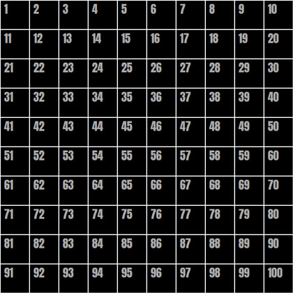
A black ten by ten grid of squares with white borders and numbers in sequential order from left to right.

The numbers in this image represent the numbers of the cell elements in the grid. If we take just a single .cell as an example — let’s say cell 42 — we can select it using :nth-child():

.cell:nth-child(42) { }

But we need to remember a couple of things:

  1. We only want this selector to work when we hover over the cell, so we will attach :hover to it.
  2. We want to select the .content instead of the cell itself, so we’ll use the General Sibling Combinator (~) to do that.

So now, to set --positionX to 1 and --positionY to 3 for .content when the 42nd cell is hovered, we need to do something like this:

.cell:nth-child(42):hover ~ .content {
  --positionX: 1;
  --positionY: 3;
}

But who wants to do that 100 times!? There are a few approaches to make things easier:

  1. Use a Sass @for loop to go through all 100 cells, and do some math to set the proper --positionX and --positionY values for each iteration.
  2. Separate the x- and y-axes to select each row and each column individually with :nth-child’s functional notation.
  3. Combine those two approaches and use a Sass @for loop and :nth-child functional notation.

I thought long and hard about what would be the best and easiest approach to take, and while all of then have pros and cons, I landed on the third approach. The amount of code to write, the quality of the compiled code, and the math complexity all went into my thinking. Don’t agree? Tell my why in the comments!

Setting values with a @for loop

@for $i from 0 to 10 {
 .cell:nth-child(???):hover ~ .content {
    --positionX: #{$i};
  }
  .cell:nth-child(???):hover ~ .content {
    --positionY: #{$i};
  }
}

This is the basic loop. We’re going over it 10 times since we have 10 rows and 10 columns. And we’ve separated the x- and y-axes to set --positionX for each column, and the --positionY for each row. All we need to do now is to replace those ??? things with the proper notation to select each row and column.

Let’s start with the x-axis

Going back to our grid image (the one with numbers),We can see that the numbers of all the cells in the second column are multiples of 10, plus 2. The cells in the third column are multiples of 10 plus 3. And so on.

Now let’s ‘translate’ it into the :nth-child functional notation. Here’s how that looks for the second column:

:nth-child(10n + 2)
  • 10n selects every multiple of 10.
  • 2 is the column number.

And for our loop, we will replace the column number with #{$i + 1} to iterate sequentially:

.cell:nth-child(10n + #{$i + 1}):hover ~ .content {
  --positionX: #{$i};
}

Now lets deal with the y-axis

Look again at the grid image and focus on the fourth row. The cell numbers are somewhere between 41 and 50. The cells in the fifth row are between 51 to 60, and so on. To select each row, we’ll need to define its range. For example, the range for the fourth row is:

.cell:nth-child(n + 41):nth-child(-n + 50)
  • (n + 41) is the start of the range.
  • (-n + 50) is the end of the range.

Now we’ll replace the numbers with some math on the $i value. For the start of the range, we get (n + #{10 * $i + 1}), and for the end of the range we get (-n + #{10 * ($i + 1)}).

So the final @for loop is:

@for $i from 0 to 10 {
 .cell:nth-child(10n + #{$i + 1}):hover ~ .content {
    --positionX: #{$i};
  }
  .cell:nth-child(n + #{10 * $i + 1}):nth-child(-n + #{10 * ($i + 1)}):hover ~ .content {
    --positionY: #{$i};
  }
}

The mapping is done! When we hover over elements, --positionX and --positionY change according to the mouse position. That means we can use them to control the elements inside the .content.

Handling the custom properties

OK, so now we have the mouse position mapped to two custom-properties, The next thing is to use them to control the .square element’s width and height values.

Let’s start with the width and say that we want the minimum width of the .square to be 100px (i.e. when the mouse cursor is at the left side of the screen), and we want it to grow 20px for each step the mouse cursor moves to the right.

Using calc(), we can do that:

.square {
  width: calc(100px + var(--positionX) * 20px);
}

And of course, we’ll do the same for the height, but with --positionY instead:

.square {
  width: calc(100px + var(--positionX) * 20px);
  height: calc(100px + var(--positionY) * 20px);
}

That’s it! Now we have a simple .square element, with a width and height that is controlled by the mouse position. Move your mouse cursor over the window, and see how the square changes its width and height accordingly.

I added a small transition to make the effect smoother. That’s not required, of course. And I’ve also commented out on the .cell border.

Let’s try an alternative method

There might be a case where you want to ‘bypass’ --positionX and --positionY, and set the end value directly inside the @for loop. So, for our example it would look like this:

@for $i from 0 to 10 {
 .cell:nth-child(10n + #{$i + 1}):hover ~ .content {
    --squareWidth: #{100 + $i * 20}px;
  }
  .cell:nth-child(n + #{10 * $i + 1}):nth-child(-n + #{10 * ($i + 1)}):hover ~ .content {
    --squareHeight: #{100 + $i * 20}px;: #{$i};
  }
}

Then the .square would use the custom properties like this:

.square {
  width: var(--squareWidth);
  height: var(--squareHeight);
}

This method is a little more flexible because it allows for more advanced Sass math (and string) functions. That said, the general principle is absolutely the same as what we already covered.

What’s next?

Well, the rest is up to you — and the possibilities are endless! How do you think you’d use it? Can you take it further? Try using this trick in your CSS, and share your work in the comments or let me know about it on Twitter. It will be great to see a collection of these come together.

Here are a few examples to get your hamster wheel turning:


The post How to Map Mouse Position in CSS appeared first on CSS-Tricks.

You can support CSS-Tricks by being an MVP Supporter.
How CSS Perspective Works

As someone who loves creating CSS animations, one of the more powerful tools I use is perspective. While the perspective property is not capable of 3D effects all by itself (since basic shapes can’t have depth), you can use the transform property to move and rotate objects in a 3D space (with the X, Y, and Z axes), then use perspective to control depth.

In this article, I’ll try to explain the concept of perspective, starting with the very basics, as we work up to a fully animated 3D cube.

The basics of perspective

We’ll start with a simple green square and and we’ll move it on all three axes.

While moving the object on the X and Y axes is pretty straightforward, if we’ll move it on the Z axis, it will look like the square stays exactly the same, and that’s because when the object is moving on the Z axis, the animation moves it closer to us and then further from us, but the size (and location) of the square remains the same. That’s where the CSS perspective property comes into play.

While perspective has no influence on the object when it’s moving on the X or Y axes, when the object is moving on the Z axis, perspective makes the square look bigger when it moves closer to us, and smaller when it moves further away. Yes, just like in “real” life.

The same effect occurs when we’re rotating the object:

Rotating the square on the Z axis looks like the regular rotation we all know and love, but when we rotate the square on the X or Y axes (without using perspective), it only looks like the square is getting smaller (or narrower) rather than rotating. But when we add perspective, we can see that when the square is rotating, the closer side of the square seems bigger, and the further side looks smaller, and the rotation looks as expected.

Note that when the rotation of the object on the X or Y axes is at 90° (or 270°, 450°, 630°, and so on) it will “disappear” from view. Again, this is happening because we can’t add depth to an object, and at this position the square’s width (or height) will actually be 0.

The perspective value

We need to set the perspective property with a value. This value sets the distance from the object’s plane, or in other words, the perspective’s strength. The bigger the value, the further you are from the object; the smaller the value, the more noticeable the perspective will be.

The perspective origin

The perspective-origin property determines the position from which you are “looking” at an object. If the origin is centered (which is the default) and the object is moved to the right, it will seem like you are looking at it from the left (and vice versa).

Alternatively, you can leave the object centered and move the perspective-origin. When the origin is set to the side, it’s like you are “looking” at the object from that side. The bigger the value, the further aside it will look.

The transformation

While perspective and perspective-origin are both set on an element’s parent container and determine the position of the vanishing point (i.e. the distance from the object’s plane from the position from which you are “looking” at the object), the object’s position and rotation is set using the transform property, which is declared on the object itself.

If you take a look at the code of the previous example, where I moved the square from one side to the other, you’ll see that I used the translateX() function — which makes sense since I wanted it to move along the X axis. But notice that it’s assigned to the transform property. The function is a type of transformation that is applied directly to the element we want to transform, but that behaves according to the perspective rules assigned to the parent element.

We can “chain” multiple functions to the transform property. But when using multiple transforms, there three very important things to consider:

  1. When rotating an object, its coordinate system is transformed along with the object.
  2. When translating an object, it moves relative to its own coordinate system (rather than its parent’s coordinates).
  3. The order in which these values are written can (and will) change the end result.

In order to get the effect I was looking for in the previous demo, I first needed to translate the square on the X axis. Only then I could rotate it. If this had been done the other way around (rotate first, then translate), then the result would have been completely different.

To underscore how important the order of values is to the transform property, let’s take a look at a couple of quick examples. First, a simple two-dimensional (2D) transformation of two squares that both have the same transform values, but declared in a different order:

It’s the same deal even if we’re rotating the squares on the Y axis:

It should be noted that while the order of values is important, we could simply change the values themselves to get the desired result instead of changing the order of the values. For example…

transform: translateX(100px) rotateY(90deg);

…will have the same effect as:

transform: rotateY(90deg) translate<strong>Z</strong>(100px);

That’s because in the first line we moved the object on the X axis before rotating it, but in the second line we rotated the object, changed its coordinates, then moved it on the Z axis. Same result, different values.

Let’s look at something more interesting

Sure, squares are a good way to explain the general concept of perspective, but we really start to see how perspective works when we break into three-dimensional (3D) shapes.

Let’s use everything we’ve covered so far to build a 3D cube.

The HTML

We’ll create a .container element that wraps around a .cube element that, in turn, consists of six elements that represent the sides of the cube.

<div class="container">
  <div class="cube">
    <div class="side front"></div>
    <div class="side back"></div>
    <div class="side left"></div>
    <div class="side right"></div>
    <div class="side top"></div>
    <div class="side bottom"></div>
  </div>
</div>

The general CSS

First, we’ll add some perspective to the parent .container element. Then we’ll sure the .cube element has 200px sides and respects 3D transformations. I’m adding a few presentational styles here, but the key properties are highlighted.

/* The parent container, with perspective */
.container {
  width: 400px;
  height: 400px;
  border: 2px solid white;
  border-radius: 4px;
  display: flex;
  justify-content: center;
  align-items: center;
  perspective: 800px;
  perspective-origin: top right;
}

/* The child element, with 3D tranforms preserved */
.cube {
  position: relative;
  width: 200px;
  height: 200px;
  transform-style: preserve-3d;
}

/* The sides of the cube, absolutely positioned */
.side {
  position: absolute;
  width: 100%;
  height: 100%;
  opacity: 0.9;
  border: 2px solid white;
}

/* Background colors for the cube's sides to help visualize the work */
.front { background-color: #d50000; }
.back { background-color: #aa00ff; }

.left { background-color: #304ffe; }
.right { background-color: #0091ea; }

.top { background-color: #00bfa5; }
.bottom { background-color: #64dd17; }

Transforming the sides

The front side is the easiest. We’ll move it forward by 100px:

.front {
  background-color: #d50000;
  transform: translateZ(100px);
}

We can move the back side of the cube backwards by adding translateZ(-100px). Another way to do it is by rotating the side 180deg then move it forward:

.back {
  background-color: #aa00ff;
  transform: translateZ(-100px);


  /* or */
  /* transform: rotateY(180deg) translateZ(100px); */
}

Like the back, there are a couple of ways we can transform the left and right sides:

.left {
  background-color: #304ffe;
  transform: rotateY(90deg) translateZ(100px);


  /* or */
  /* transform: translateX(100px) rotateY(90deg); */
}

.right {
  background-color: #0091ea;
  transform: rotateY(-90deg) translateZ(100px);


  /* or */
  /* transform: translateX(-100px) rotateY(90deg); */
}

The top and bottom are a little different. Instead of rotating them on the Y axis, we need to rotate them on the X axis. Again, it can be done in a  couple of different ways:

.top {
  background-color: #00Bfa5;
  transform: rotateX(90deg) translateZ(100px);


  /* or */
  /* transform: translateY(-100px) rotateX(90deg); */
}
 
.bottom {
  background-color: #64dd17;
  transform: rotateX(-90deg) translateZ(100px);


  /* or */
  /* transform: translateY(100px) rotateX(90deg); */
}

This gives us a 3D cube!

Feel free to play around with the different options for perspective and perspective-origin to see how they affect the cube.

Let’s talk about transform-style

We’re going to add some fancy animation to our cube, but let’s first talk about the transform-style property. I added it earlier in the general CSS, but didn’t really explain what it is or what it does.

The transform-style property has two values: 

  • flat (default)
  • preserve-3d

When we set the property to preserve-3d, it does two important things:

  1. It tells the sides of the cube (the child elements) to be positioned in the same 3D space as the cube. If it is not set to preserve-3d, the default value is set to flat , and the sides are flattened in the cube’s plane. preserve-3d “copies” the cube perspective to its children (the sides) and allows us to rotate just the cube, so we don’t need to animate each side separately.
  2. It displays the child elements according to their position in the 3D space, regardless of their place in the DOM.

There are three squares in this example — green, red, and blue. The green square has a translateZ value of 100px, meaning it’s in front of the other squares. The blue square has a translateZ of -100px, meaning is behind the other squares. 

But in the DOM, the order of the squares is: green, red, blue. Therefore, when transform-style is set to flat (or not set at all), the blue square will appear on top, and the green square will be in the back, because that is the order of the DOM. But if we set the transform-style to preserve-3d, it will render according to its position in the 3D space. As a result, the green square will be in front, and the blue square will be in the back.

Animation

Now, let’s animate the cube! And to make things more interesting, we’ll add the animation to all three axes. First, we’ll add the animation property to the .cube. It won’t do anything yet since we haven’t defined the animation keyframes, but it’s in place for when we do.

animation: cubeRotate 10s linear infinite;

Now the keyframes. We’re basically going to rotate the cube along each axis so that it appears to be rolling in space.

@keyframes cubeRotate {
  from { transform: rotateY(0deg) rotateX(720deg) rotateZ(0deg); }
  to { transform: rotateY(360deg) rotateX(0deg) rotateZ(360deg); }
}

The perspective property is really what gives the animation that depth, like we’re seeing the cube roll left and right, as well as forward and backward.

But before now, the value of the perspective property had been constant, and so was the perspective-origin. Let’s see how changing these values affects the appearance of the cube.

I’ve added three sliders to this example to help see how different values affect the cube’s perspective:

  • The left slider sets the value of the perspective property. Remember, this value sets the distance from the object’s plane, so the smaller the value is, the more noticeable the perspective effect will be.
  • The other two sliders refer to the perspective-origin property. The right slider sets the origin on the vertical axis, from top to bottom, and the bottom slider sets the origin on the horizontal axis, from right to left.

Note that while the animation is running, these changes may be less noticeable as the cube itself rotates, but you can easily turn off the animation by clicking the “Run animation” button.

Play around with these values and find out how they affect the appearance of the cube. There is no one “right” value, and these values vary from project to project, since they’re dependent on the animation, the size of the object, and the effect you want to achieve.

So what’s next?

Now that you’ve mastered the basics of the perspective property in CSS, you can use your imagination and creativity to create 3D objects in your own projects, adding depth and interest to your buttons, menus, inputs, and anything else you want to “bring to life.”

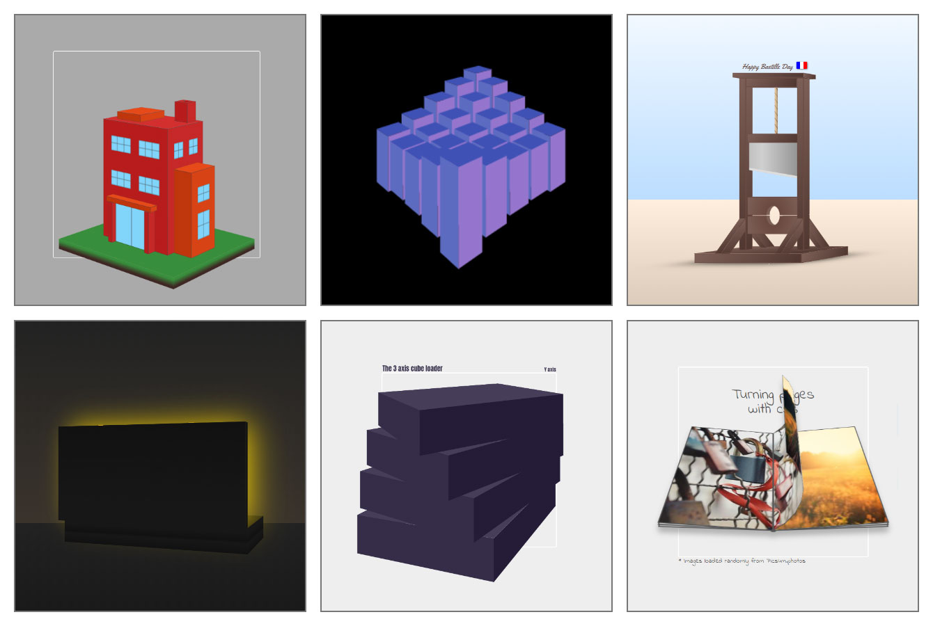
In the meanwhile, you can practice and enhance your skills by trying to create some complex structures and perspective-based animations like this, this, this, or even this.

I hope you enjoyed reading this article and learned something new in the process! Feel free to leave a comment to let me know what you think or drop me a line on Twitter if you have any questions about perspective or any other topic in this article.


The post How CSS Perspective Works appeared first on CSS-Tricks.

You can support CSS-Tricks by being an MVP Supporter.