A Deep Dive Into object-fit And background-size In CSS

We’re not always able to load different-sized images for an HTML element. If we use a width and height that isn’t proportional to the image’s aspect ratio, the image might either be compressed or stretched. That isn’t good, and it can be solved either with object-fit for an img element or by using background-size.

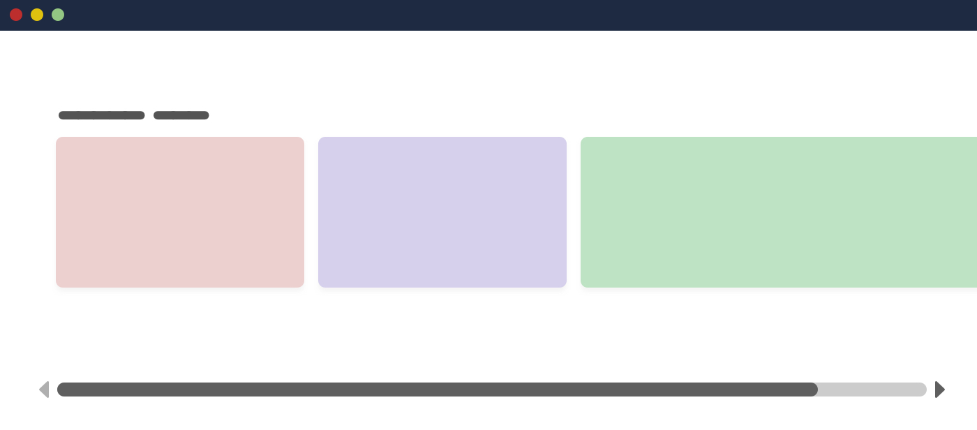
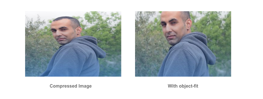
First, let’s define the problem. Consider the following figure:

Why is this happening?

An image will have an aspect ratio, and the browser will fill the containing box with that image. If the image’s aspect ratio is different than the width and height specified for it, then the result will be either a squeezed or stretched image.

We see this in the following figure:

The Solution

We don’t always need to add a different-sized image when the aspect ratio of the image doesn’t align with the containing element’s width and height. Before diving into CSS solutions, I want to show you how we used to do this in photo-editing apps:

Now that we understand how that works, let’s get into how this works in the browser. (Spoiler alert: It’s easier!)

CSS object-fit

The object-fit property defines how the content of a replaced element such as img or video should be resized to fit its container. The default value for object-fit is fill, which can result in an image being squeezed or stretched.

Let’s go over the possible values.

Possible Values for object-fit

object-fit: contain

In this case, the image will be resized to fit the aspect ratio of its container. If the image’s aspect ratio doesn’t match the container’s, it will be letterboxed.

object-fit: cover

Here, the image will also be resized to fit the aspect ratio of its container, and if the image’s aspect ratio doesn’t match the container’s, then it will be clipped to fit.

object-fit: fill

With this, the image will be resized to fit the aspect ratio of its container, and if the image’s aspect ratio doesn’t match the container’s, it will be either squeezed or stretched. We don’t want that.

object-fit: none

In this case, the image won’t be resized at all, neither stretched nor squeezed. It works like the cover value, but it doesn’t respect its container’s aspect ratio.

Aside from object-fit, we also have the object-position property, which is responsible for positioning an image within its container.

Possible Values For object-position

The object-position property works similar to CSS’ background-position property:

The top and bottom keywords also work when the aspect ratio of the containing box is vertically larger:

CSS background-size

With background-size, the first difference is that we’re dealing with the background, not an HTML (img) element.

Possible Values for background-size

The possible values for background-size are auto, contain, and cover.

background-size: auto

With auto, the image will stay at its default size:

background-size: cover

Here, the image will be resized to fit in the container. If the aspect ratios are not the same, then the image will be masked to fit.

background-size: contain

In this case, the image will be resized to fit in the container. If the aspect ratios are off, then the image will be letterboxed as shown in the next example:

As for background-position, it’s similar to how object-position works. The only difference is that the default position of object-position is different than that of background-position.

When Not to Use object-fit or background-size

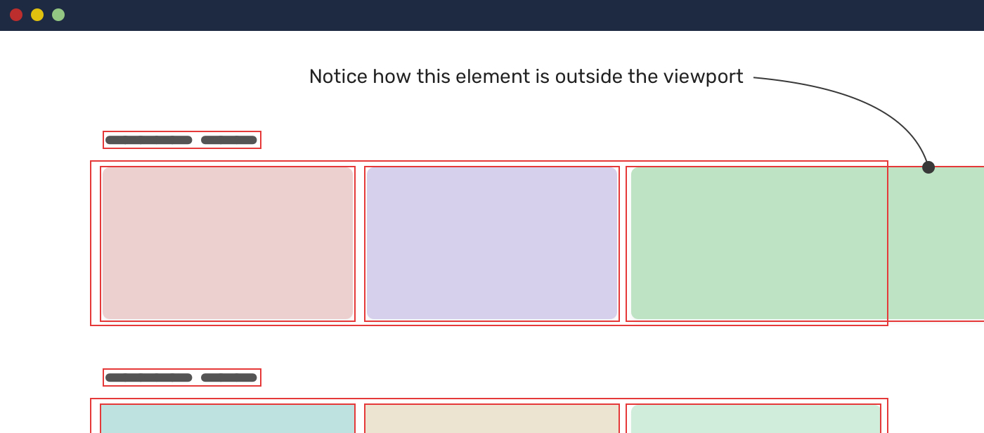
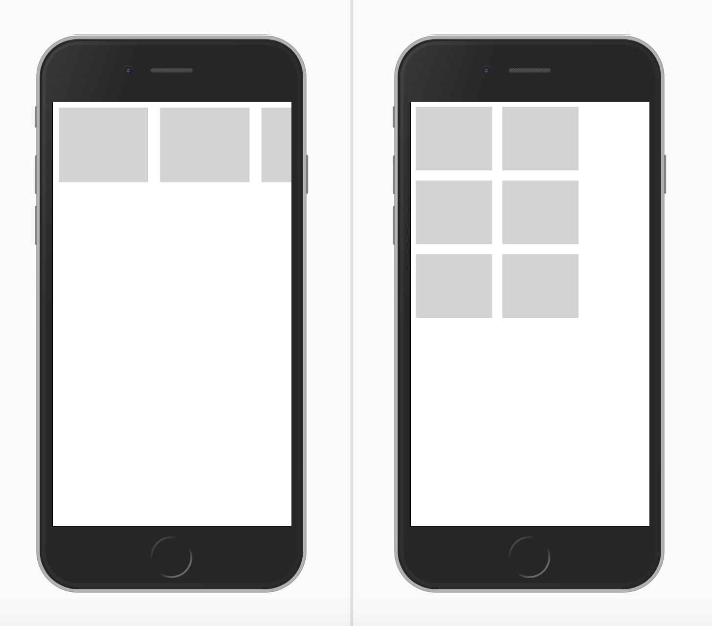
If the element or the image is given a fixed height and has either background-size: cover or object-fit: cover applied to it, there will be a point where the image will be too wide, thus losing important detail that might affect how the user perceives the image.

Consider the following example in which the image is given a fixed height:

.card__thumb {
    height: 220px;
}

If the card’s container is too wide, it will result in what we see on the right (an image that is too wide). That is because we are not specifying an aspect ratio.

There is only one of two fixes for this. The first is to use the padding hack to create an intrinsic ratio.

.card__thumb {
    position: relative;
    padding-bottom: 75%;
    height: 0;
}

.card__thumb img {
    position: absolute;
    left: 0;
    top: 0;
    width: 100%;
    height: 100%;
    object-fit: cover;
}

The second fix is to use the new aspect-ratio CSS property. Using it, we can do the following:

.card__thumb img {
    aspect-ratio: 4 / 3;
}

Note: I’ve already written about the aspect-ratio property in detail in case you want to learn about it: “Let’s Learn About Aspect Ratio In CSS”.

Use Cases And Examples

User Avatars

A perfect use case for object-fit: cover is user avatars. The aspect ratio allowed for an avatar is often square. Placing an image in a square container could distort the image.

.c-avatar {
    object-fit: cover;
}

Logos List

Listing the clients of a business is important. We will often use logos for this purpose. Because the logos will have different sizes, we need a way to resize them without distorting them.

Thankfully, object-fit: contain is a good solution for that.

.logo__img {
    width: 150px;
    height: 80px;
    object-fit: contain;
}

Article Thumbnail

This is a very common use case. The container for an article thumbnail might not always have an image with the same aspect ratio. This issue should be fixed by the content management system (CMS) in the first place, but it isn’t always.

.article__thumb {
    object-fit: cover;
}

Hero Background

In this use case, the decision of whether to use an img element or a CSS background will depend on the following:

  • Is the image important? If CSS is disabled for some reason, would we want the user to see the image?
  • Or is the image’s purpose merely decorative?

Based on our answer, we can decide which feature to use. If the image is important:

<section class="hero">
    <img class="hero__thumb" src="thumb.jpg" alt="" />
</section>
.hero {
    position: relative;
}

.hero__thumb {
    position: absolute;
    left: 0;
    top: 0;
    width: 100%;
    height: 100%;
    object-fit: cover;    
}

If the image is decorative, we can go with background-image:

.hero {
    position: relative;
    background-image: linear-gradient(to top, #a34242, rgba(0,0,0,0), url("thumb.jpg");
    background-repeat: no-repeat;
    background-size: cover;
}

The CSS is shorter in this case. Make sure that any text placed over the image is readable and accessible.

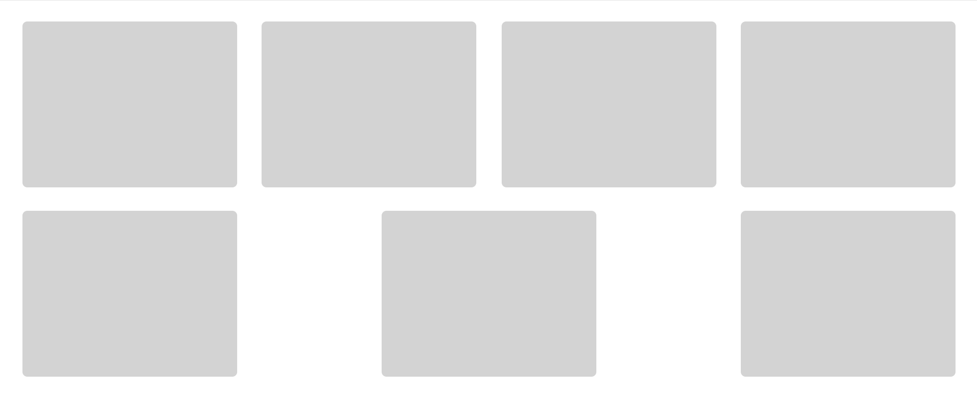
Adding a Background to an Image With object-fit: contain

Did you know that you can add a background color to img? We would benefit from that when also using object-fit: contain.

In the example below, we have a grid of images. When the aspect ratios of the image and the container are different, the background color will appear.

img {
    object-fit: contain;
    background-color: #def4fd;
}

Video Element

Have you ever needed a video as a background? If so, then you probably wanted it to take up the full width and height of its parent.

.hero {
    position: relative;
    background-color: #def4fd;
}

.hero__video {
    position: aboslute;
    left: 0;
    top: 0;
    width: 100%;
    height: 100%;
}

To make it fully cover the width and height of its parent, we need to override the default object-fit value:

.hero__video {
    /* other styles */
    object-fit: cover;
}

Conclusion

As we’ve seen, both object-fit and background-size are very useful for handling different image aspect ratios. We won’t always have control over setting the perfect dimensions for each image, and that’s where these two CSS features shine.

A friendly reminder on the accessibility implications of choosing between an img element and a CSS background: If the image is purely decorative, then go for a CSS background. Otherwise, an img is more suitable.

I hope you’ve found this article useful. Thank you for reading.

Using HSL Colors In CSS

From my experience, most of the colors I see people using in CSS are hex and RGB. Recently, I’ve started seeing more usage of HSL colors, however, I still think that the full potential of HSL is overlooked. With the help of this article, I’d like to show you how HSL can truly help us work better with colors in CSS.

Introduction

Usually, we use hexadecimal color codes (hex colors) which are fine, but they have a couple of issues:

  • They are limiting;
  • They’re hard to understand from reading them.

By “limited”, I mean that it’s not easy to alter the color without opening a color wheel and picking a color yourself. Adding on that, it’s not easy to guess what color is from looking at the hex code.

Consider the following figure:

I picked a hex color for a sky blue, and a darker one. Notice that the hex colors are not related to each other. It’s hard to tell that they are both blue but with different shades.

In a real-life scenario, you might need to create a lighter or darker shade of a color to quickly test or validate something. With hex colors, this isn’t possible until you open the color picker.

Thankfully, HSL colors can help us in solving this specific problem, and it opens a lot of possibilities for us.

What Is HSL?

HSL stands for hue, saturation, and lightness. It’s based on the RGB color wheel. Each color has an angle and a percentage value for the saturation and lightness values.

Let’s take an example of the sky blue color that we discussed previously. First, we pick the color like we usually do from a color picker, and we make sure to get the HSL value for it.

Note: I’m using Sketch app, but you use whatever design tool you want.

Consider the following figure:

Notice that the HSL values in there. The first one is the angle, which represents the angle of the color we have. In this case, it’s sky blue. Once we have the angle, we can start tweaking the saturation and brightness as per our needs.

Saturation

Saturation controls how saturated the color should be. 0% is completely unsaturated, while 100% is fully saturated.

Lightness

As for lightness, it controls how light or dark the color is. 0% is is black, and 100% is white.

Consider the following figure:

With that, we have three values that are representing color, angle, saturation, and brightness. Here is how we can use the color in CSS:

.element {
    background-color: hsl(196, 73%, 62%);
}

By modifying the color angle, we can get colors that are similar in saturation and lightness to the base one. This is very useful when working on new brand colors as it can create a consistent set of secondary brand colors.

Consider the following figure:

Do you feel that the three colors are related to each other in terms of how the color is saturated, and how it’s dark or light it is? That has been achieved by only changing the color angle. This is what great about HSL colors. It’s more human-friendly to read and edit than any other color type.

Use Cases For HSL Colors

Changing Colors On Hover

When a color in a specific component needs to appear darker on hover, HSL colors can be perfect for this. It can be helpful for components like buttons and cards.

:root {
  --primary-h: 221;
  --primary-s: 72%;
  --primary-l: 62%;
}

.button {
  background-color: hsl(var(--primary-h), var(--primary-s), var(--primary-l));
}

.button:hover {
  --primary-l: 54%;
}

Notice how I combined CSS variables with HSL colors. On hover, I only need to alter the lightness value. Remember, the higher the value, the lighter. For a darker shade, we need to reduce the value.

A Combination Of Tinted Colors

HSL can be handy when we have a design that uses the same color but with different shades. Consider the following design:

The main header navigation has the primary color, while the secondary navigation has a lighter shade. With HSL, we can get the lighter shade easily by altering the lightness value.

This can be extremely useful while having a UI with multiple themes. I created two themes and switching from one to another only requires me to edit the hue degree.

First theme:

Second theme:

Color Palettes

By altering the lightness, we can create a set of shades for a color that can be used throughout the UI where possible.

This is useful for design systems where designers provide developers with the shades for each color of the brand.

Here is an interactive demo that shows that. The input slider only changes the hue value, and the rest of the shades change based on that.

Notice how the white on the right is too much. We can replace this with a custom white that is derived from a very light shade of the color we have. In my opinion, it’s much better.

Variations Of A Button

Another useful use case for HSL colors is when we have primary and secondary options that are from the same color but with different shades. In this example, the secondary button has a very light tint of the main color. HSL colors are perfect for that.

:root {
  --primary-h: 221;
  --primary-s: 72%;
  --primary-l: 62%;
}

.button {
  background-color: hsl(var(--primary-h), var(--primary-s), var(--primary-l));
}

.button--secondary {
    --primary-l: 90%;
    color: #222;
}

.button--ghost {
    --primary-l: 90%;
    background-color: transparent;
    border: 3px solid hsl(var(--primary-h), var(--primary-s), var(--primary-l)); 
}

Tweaking the primary button variations where fast and can be extended more for broader usage. Changing the hue value will change all the buttons’ themes.

Dynamic Washed-Out Effects

In some cases, we might need a gradient to have a very light shade of the other color stop. With HSL, we can use the same color but with a different lightness value for the second one.

.section {
  background: linear-gradient(to left, hsl(var(--primary-h), var(--primary-s), var(--primary-l)), hsl(var(--primary-h), var(--primary-s), 95%));
}

.section-2 {
  --primary-h: 167;
}

The gradient starts from the right with a solid color and then fades out to the lighter shade. This can be used for a decorative hero section, for example.

That’s all with the use cases. I hope that you learned something new and useful.

Conclusion

HSL colors are very powerful when we use them the right way. They can save us time and effort and even help us to explore options for how to apply color to design.

Overflow Issues In CSS

If you’re a front-end developer, you may have come across horizontal scrollbar issues, especially on mobile. Because there are many causes of scrollbar problems, there is no straightforward solution. Some issues can be fixed quickly, and some need a little debugging skill.

What Is an Overflow Issue?

Before discussing overflow issues, we should ascertain what one is. An overflow issue occurs when a horizontal scrollbar unintentionally appears on a web page, allowing the user to scroll horizontally. It can be caused by different factors.

It could occur because of unexpectedly wide content or a fixed-width element that is wider than the viewport. We will explore all of the causes in this article.

How to Spot Overflow

An important part of solving this issue is noticing it in the first place. If we know when and where it happens, we can home in on that part of a web page. There are different ways to detect overflow, from manually scrolling to the left or right or by using JavaScript.

Let’s explore the ways to detect overflow.

Scrolling to the Left or Right

The first way to discover an overflow issue is by scrolling the page horizontally. If you’re able to scroll, this is a warning that something is wrong with the page.

Using JavaScript to Find Elements Wider Than the Body

We can add a snippet to the browser console to show any elements wider than the body. This is handy for pages with a lot of elements.

var docWidth = document.documentElement.offsetWidth;

[].forEach.call(
  document.querySelectorAll('*'),
  function(el) {
    if (el.offsetWidth > docWidth) {
      console.log(el);
    }
  }
);

CSS Outline to the Rescue

Applying CSS’ outline to all elements on the page gives us a hint about elements that go beyond the page’s body.

* {
    outline: solid 1px red;
}

Even better, Addy Osmani has a script that adds an outline to each element on the page with a random color.

[].forEach.call($$(""),function(a){a.style.outline="1px solid #"+(~~(Math.random()(1<<24))).toString(16)})

Overflow Label in Firefox

Firefox has a helpful feature that tells you which elements are causing overflow. Hopefully, other browsers will add this!

Deleting Page Elements

Another common way is to open the browser’s DevTools and start deleting elements one by one. Once the issue disappears, then the section you’ve just deleted is probably the cause. I found this method useful in cases where you’ve identified the issue but don’t know why it’s happening.

Once you’ve found where the overflow is happening, then it will be easier to make a reduced test case for further debugging.

Common Overflow Issues

Fixed-Width Elements

One of the most common causes of overflow is fixed-width elements. Generally speaking, don’t fix the width of any element that should work at multiple viewport sizes.

.element {
    /* Don’t do this */
    width: 400px;
}

Using Flexbox Without Wrapping

As useful as Flexbox is, not allowing items to wrap to a new line when no space is available is risky.

.parent {
    display: flex;
}

Here, flex items might cause horizontal overflow in case the space isn’t enough to fit them all in one line:

Make sure to use flex-wrap: wrap when the flex parent is supposed to work at different viewport sizes.

.parent {
    display: flex;
    /* Do this */
    flex-wrap: wrap;
}

CSS Grid

When you’re using CSS grid, designing responsively is important. Take the following grid:

.wrapper {
    display: grid;
    grid-template-columns: 1fr 300px 1fr;
    grid-gap: 1rem;
}

The example above will work great unless the viewport is narrower than 300 pixels. If it is, then overflow will occur.

To avoid such an issue, use grid only when enough space is available. We can use a CSS media query like so:

.wrapper {
    display: grid;
    grid-template-columns: 1fr;
    grid-gap: 1rem;
}

@media (min-width: 400px) {
    .wrapper {
        grid-template-columns: 1fr 300px 1fr;
    }
}

Long Words

Another common reason for overflow is a long word that doesn’t fit in the viewport. This happens more on mobile because of the viewport’s width.

To fix this, we need to use the overflow-wrap property.

.article-content p {
  overflow-wrap: break-word;
}

I’ve written a detailed article on handling both short and long content with CSS.

This fix is particularly useful with user-generated content. A perfect example of this is a comments thread. A user might paste a long URL in their comment, and this should be handled with the overflow-wrap property.

Minimum Content Size in CSS Flexbox

Another interesting cause of overflow is the minimum content size in Flexbox. What does this mean?

According to the specification:

“By default, flex items won’t shrink below their minimum content size (the length of the longest word or fixed-size element). To change this, set the min-width or min-height property.”

This means that a flex item with a long word won’t shrink below its minimum content size.

To fix this, we can either use an overflow value other than visible, or we can set min-width: 0 on the flex item.

.card__name {
    min-width: 0;
    overflow-wrap: break-word;
}

Minimum Content Size in CSS Grid

As with Flexbox, we have the same concept of minimum content size with CSS Grid. However, the solution is a bit different. CSS-Tricks refers to it as “grid blowout”.

Let’s explore the issue. Suppose we have a wrapper with an aside and a main section laid out with CSS grid.

.wrapper {
    display: grid;
    grid-template-columns: 248px 1fr;
    grid-gap: 40px;
}

Also, we have a scrolling section in the main section, for which I’ve used flexbox.

.section {
    display: flex;
    gap: 1rem;
    overflow-x: auto;
}

Notice that I didn’t add flex-wrap, because I want the flex items to be on the same line. This didn’t work, however, and it’s causing horizontal overflow.

To fix this, we need to use minmax() instead of 1fr. This way, the main element’s minimum content size won’t be auto.

.wrapper {
  display: grid;
  grid-template-columns: 248px minmax(0, 1fr);
  grid-gap: 40px;
}

Negative Margins

An element positioned off screen can cause overflow. Usually, that is because the element has a negative margin.

In the following example, we have an element with a negative margin, and the document’s language is English (i.e. left to right).

.element {
    position: absolute;
    right: -100px;
}

Interestingly, when the element is positioned on the opposite side, there is no overflow. Why is that?

I faced this issue lately and wrote about it. It turns out that this behavior is intentional. According to the CSS specification:

“UAs must clip the scrollable overflow area of scroll containers on the block-start and inline-start sides of the box (thereby behaving as if they had no scrollable overflow on that side).”

For an English document, the inline-start side is the left side, so any element positioned off-screen on the left will be clipped, and thus there will be no overflow.

If positioning an element off screen is really necessary, make sure to apply overflow: hidden to the parent to avoid any overflow.

Images Without max-width

If you don’t take care of large images ahead of time, you will see overflow. Make sure to set max-width: 100% on all images.

img {
    max-width: 100%;
}

Viewport Units

Using 100vw does have a downside, which is that it can cause overflow when the scrollbar is visible. On macOS, 100vw is fine and won’t cause horizontal scroll.

On Windows, scrollbars are always visible by default, so overflow will occur.

The reason for this is that with the value 100vw, there is no awareness of the width of the browser’s vertical scrollbar. As a result, the width will be equal to 100vw plus the scrollbar’s width. Unfortunately, there is no CSS fix to that.

However, we can use JavaScript to measure the viewport’s width excluding the scrollbar.

function handleFullWidthSizing() {
  const scrollbarWidth = window.innerWidth - document.body.clientWidth

  document.querySelector('myElement').style.width = calc(100vw - ${scrollbarWidth}px)
}

Injected Ads

Ads injected on page load can cause overflow if they’re wider than their parent. Add overflow-x: hidden to the parent element to prevent this.

Double-check every ad on the website to ensure that it’s not causing overflow.

Is Applying overflow-x: hidden to body a Good Idea?

Opting for overflow-x: hidden is like putting on a bandage without addressing the problem. If you have overflow, then it’s better to solve the root issue.

Moreover, applying overflow-x: hidden to the body element is not a good idea because position: sticky won’t work if a parent has overflow-x: hidden.

How to Avoid Overflow in CSS

Below are things to check to reduce overflow issues in CSS. I hope you find it useful!

Test With Real Content

Nothing beats testing with real content on a website. In doing so, you ensure that the layout can handle different varieties of content.

Account for User-Generated Content

For a component like a comments thread, account for cases in which the user will paste a long URL or type a long word, as explained above.

Use CSS Grid and Flexbox Carefully

As useful as CSS grid and flexbox are, they can easily cause overflow if used incorrectly. As we discussed, not using flex-wrap: wrap can cause overflow, as can grid-template-columns: 1fr 350px when the screen is narrower than 350 pixels.

Further Reading on SmashingMag:

Common CSS Issues For Front-End Projects

Common CSS Issues For Front-End Projects

Common CSS Issues For Front-End Projects

Ahmad Shadeed

When implementing a user interface in a browser, it’s good to minimize those differences and issues wherever you can, so that the UI is predictable. Keeping track of all of those differences is hard, so I’ve put together a list of common issues, with their solutions, as a handy reference guide for when you’re working on a new project.

Let’s begin.

1. Reset The Backgrounds Of button And input Elements

When adding a button, reset its background, or else it will look different across browsers. In the example below, the same button is shown in Chrome and in Safari. The latter adds a default gray background.

(Large preview)

Resetting the background will solve this issue:

button {
  appearance: none;
  background: transparent;
  /* Other styles */
}

See the Pen Button and Inputs by Ahmad Shadeed (@shadeed) on CodePen.

2. Overflow: scroll vs. auto

To limit the height of an element and allow the user to scroll within it, add overflow: scroll-y. This will look good in Chrome on macOS. However, on Chrome Windows, the scroll bar is always there (even if the content is short). This is because scroll-y will show a scroll bar regardless of the content, whereas overflow: auto will show a scroll bar only when needed.

Left: Chrome on macOS. Right: Chrome on Windows. (Large preview)
.element {
    height: 300px;
    overflow-y: auto;
}

See the Pen overflow-y by Ahmad Shadeed (@shadeed) on CodePen.

3. Add flex-wrap

Make an element behave as a flex container simply by adding display: flex. However, when the screen size shrinks, the browser will display a horizontal scroll bar in case flex-wrap is not added.

<div class="wrapper">
  <div class="item"></div>
  <div class="item"></div>
  <div class="item"></div>
  <div class="item"></div>
  <div class="item"></div>
  <div class="item"></div>
</div>
.wrapper {
  display: flex;
}

.item {
  flex: 0 0 120px;
  height: 100px;
}

The example above will work great on big screens. On mobile, the browser will show a horizontal scroll bar.

Left: A horizontal scroll bar is shown, and the items aren’t wrapped. Right: The items are wrapped onto two rows. (Large preview)

The solution is quite easy. The wrapper should know that when space is not available, it should wrap the items.

.wrapper {
    display: flex;
    flex-wrap: wrap;
}

See the Pen flex-wrap by Ahmad Shadeed (@shadeed) on CodePen.

4. Don’t Use justify-content: space-between When The Number Of Flex Items Is Dynamic

When justify-content: space-between is applied to a flex container, it will distribute the elements and leave an equal amount of space between them. Our example has eight card items, and they look good. What if, for some reason, the number of items was seven? The second row of elements would look different than the first one.

The wrapper with eight items. (Large preview)
The wrapper with seven items. (Large preview)

See the Pen justify-content by Ahmad Shadeed (@shadeed) on CodePen.

In this case, using CSS grid would be more suitable.

When an article is being viewed on a mobile screen, a long word or inline link might cause a horizontal scroll bar to appear. Using CSS’ word-break will prevent that from happening.

Large preview
.article-content p {
    word-break: break-all;
}   
(Large preview)

Check out CSS-Tricks for the details.

6. Transparent Gradients

When adding gradient with a transparent start and end point, it will look black-ish in Safari. That's because Safari doesn’t recognize the keyword transparent. By substituting it with rgba(0, 0, 0, 0), it will work as expected. Note the below screenshot:

Top: Chrome 70. Bottom: Safari 12. (Large preview)
.section-hero {
  background: linear-gradient(transparent, #d7e0ef), #527ee0;
  /*Other styles*/
}

This should instead be:

.section-hero {
  background: linear-gradient(rgba(0, 0, 0,0), #d7e0ef), #527ee0;
  /*Other styles*/
}

7. The Misconception About The Difference Between auto-fit And auto-fill In CSS Grid

In CSS grid, the repeat function can create a responsive column layout without requiring the use of media queries. To achieve that, use either auto-fill or auto-fit.

.wrapper {
    grid-template-columns: repeat(auto-fill, minmax(100px, 1fr));
}
(Large preview)

In short, auto-fill will arrange the columns without expanding their widths, whereas auto-fit will collapse them to zero width but only if you have empty columns. Sara Soueidan has written an excellent article on the topic.

8. Fixing Elements To The Top Of The Screen When The Viewport Is Not Tall Enough

If you fix an element to the top of the screen, what happens if the viewport is not tall enough? Simple: It will take up screen space, and, as a result, the vertical area available for the user to browse the website will be small and uncomfortable, which will detract from the experience.

@media (min-height: 500px) {
    .site-header {
        position: sticky;
        top: 0;
        /*other styles*/
    }
}

In the snippet above, we’re telling the browser to fix the header to the top only if the viewport’s height is equal to or greater than 500 pixels.

Also important: When you use position: sticky, it won’t work unless you specify the top property.

Large preview

See the Pen Vertical media queries: Fixed Header by Ahmad Shadeed (@shadeed) on CodePen.

9. Setting max-width For Images

When adding an image, define max-width: 100%, so that the image resizes when the screen is small. Otherwise, the browser will show a horizontal scroll bar.

img {
    max-width: 100%;
}

10. Using CSS Grid To Define main And aside Elements

CSS grid can be used to define the main and aside sections of a layout, which is a perfect use for grid. As a result, the aside section’s height will be equal to that of the main element, even if it’s empty.

To fix this, align the aside element to the start of its parent, so that its height doesn’t expand.

.wrapper {
  display: grid;
  grid-template-columns: repeat(12, minmax(0, 1fr));
  grid-gap: 20px;
}

// align-self will tell the aside element to align itself with the start of its parent.
aside {
  grid-column: 1 / 4;
  grid-row: 1;
  align-self: start;
}

main {
  grid-column: 4 / 13;
}
(Large preview)

See the Pen main and aside by Ahmad Shadeed (@shadeed) on CodePen.

11. Adding fill To An SVG

Sometimes, while working with SVGs, fill won’t work as expected if the fill attribute has been added inline in the SVG. To solve this, either to remove the fill attribute from the SVG itself or override fill: color.

Take this example:

.some-icon {
    fill: #137cbf;
}

This won’t work if the SVG has an inline fill. It should be this instead:

.some-icon path {
    fill: #137cbf;
}

12. Working With Pseudo-Elements

I love to use pseudo-elements whenever I can. They provide us with a way to create fake elements, mostly for decorative purposes, without adding them to the HTML.

When working with them, the author might forget to do one of the following:

  • add the content: "" property,
  • set the width and height without defining the display property for it.

In the example below, we have a title with a badge as a pseudo-element. The content: "" property should be added. Also, the element should have display: inline-block set in order for the width and height to work as expected.

Large preview

13. The Weird Space When Using display: inline-block

Setting two or more elements to display: inline-block or display: inline will create a tiny space between each one. The space is added because the browser is interpreting the elements as words, and so it’s adding a character space between each one.

In the example below, each item has a space of 8px on the right side, but the tiny space caused by using display: inline-block is making it 12px, which is not the desired result.

li:not(:last-child) {
  margin-right: 8px;
}
(Large preview)

A simple fix for this is to set font-size: 0 on the parent element.

ul {
    font-size: 0;
}

li {
    font-size: 16px; /*The font size should be reassigned here because it will inherit `font-size: 0` from its parent.*/
}
(Large preview)

See the Pen Inline Block Spacing by Ahmad Shadeed (@shadeed) on CodePen.

14. Add for="ID" When Assigning A Label Element To An Input

When working with form elements, make sure that all label elements have an ID assigned to them. This will make them more accessible, and when they’re clicked, the associated input will get focus.

<label for="emailAddress">Email address:</label>
<input type="email" id="emailAddress">
Large preview

15. Fonts Not Working With Interactive HTML Elements

When assigning fonts to the whole document, they won’t be applied to elements such as input, button, select and textarea. They don’t inherit by default because the browser applies the default system font to them.

To fix this, assign the font property manually:

input, button, select, textarea {
  font-family: your-awesome-font-name;
}

16. Horizontal Scroll Bar

Some elements will cause a horizontal scroll bar to appear, due to the width of those elements.

The easiest way to find the cause of this issue is to use CSS outline. Addy Osmani has shared a very handy script that can be added to the browser console to outline every element on the page.

[].forEach.call($$("*"), function(a) {
  a.style.outline =
    "1px solid #" + (~~(Math.random() * (1 << 24))).toString(16);
});
(Large preview)

17. Compressed Or Stretched Images

When you resize an image in CSS, it could be compressed or stretched if the aspect ratio is not consistent with the width and height of the image.

The solution is simple: Use CSS’ object-fit. Its functionality is similar to that of background-size: cover for background images.

img {
    object-fit: cover;
}
(Large preview)

Using object-fit won’t be the perfect solution in all cases. Some images need to appear without cropping or resizing, and some platforms force the user to upload or crop an image at a defined size. For example, Dribbble accepts thumbnails uploads at 800 by 600 pixels.

18. Add The Correct type For input.

Use the correct type for an input field. This will enhance the user experience in mobile browsers and make it more accessible to users.

Here is some HTML:

<form action="">
  <p>
    <label for="name">Full name</label>
    <input type="text" id="name">
  </p>
  <p>
    <label for="email">Email</label>
    <input type="email" id="email">
  </p>
  <p>
    <label for="phone">Phone</label>
    <input type="tel" id="phone">
  </p>
</form>

This is how each input will look once it’s focused:

(Large preview)

19. Phone Numbers In RTL Layouts

When adding a phone number like + 972-123555777 in a right-to-left layout, the plus symbol will be positioned at the end of the number. To fix that, reassign the direction of the phone number.

p {
    direction: ltr;
}
(Large preview)

Conclusion

All of the issues mentioned here are among the most common ones I’ve faced in my front-end development work. My goal is to keep a list to check regularly while working on a web project.

Do you have an issue that you always face in CSS? Let us know in the comments!

Smashing Editorial (dm, ra, al, yk, il)