The View Transitions API And Delightful UI Animations (Part 2)

Last time we met, I introduced you to the View Transitions API. We started with a simple default crossfade transition and applied it to different use cases involving elements on a page transitioning between two states. One of those examples took the basic idea of adding products to a shopping cart on an e-commerce site and creating a visual transition that indicates an item added to the cart.

The View Transitions API is still considered an experimental feature that’s currently supported only in Chrome at the time I’m writing this, but I’m providing that demo below as well as a video if your browser is unable to support the API.

Those diagrams illustrate (1) the origin page, (2) the destination page, (3) the type of transition, and (4) the transition elements. The following is a closer look at the transition elements, i.e., the elements that receive the transition and are tracked by the API.

So, what we’re working with are two transition elements: a header and a card component. We will configure those together one at a time.

Header Transition Elements

The default crossfade transition between the pages has already been set, so let’s start by registering the header as a transition element by assigning it a view-transition-name. First, let’s take a peek at the HTML:

<div class="header__wrapper">
  <!-- Link back arrow -->
  <a class="header__link header__link--dynamic" href="/">
    <svg ...><!-- ... --></svg>
  </a>
  <!-- Page title -->
  <h1 class="header__title">
    <a href="/" class="header__link-logo">
      <span class="header__logo--deco">Vinyl</span>Emporium </a>
  </h1>
  <!-- ... -->
</div>

When the user navigates between the homepage and an item details page, the arrow in the header appears and disappears — depending on which direction we’re moving — while the title moves slightly to the right. We can use display: none to handle the visibility.

/* Hide back arrow on the homepage */
.home .header__link--dynamic {
    display: none;
}

We’re actually registering two transition elements within the header: the arrow (.header__link--dynamic) and the title (.header__title). We use the view-transition-name property on both of them to define the names we want to call those elements in the transition:

@supports (view-transition-name: none) {
  .header__link--dynamic {
    view-transition-name: header-link;
  }
  .header__title {
    view-transition-name: header-title;
  }
}

Note how we’re wrapping all of this in a CSS @supports query so it is scoped to browsers that actually support the View Transitions API. So far, so good!

To do that, let’s start by defining our transition elements and assign transition names to the elements we’re transitioning between the product image (.product__image--deco) and the product disc behind the image (.product__media::before).

@supports (view-transition-name: none) {
  .product__image--deco {
    view-transition-name: product-lp;
  }
 .product__media::before {
    view-transition-name: flap;
  }
  ::view-transition-group(product-lp) {
    animation-duration: 0.25s;
    animation-timing-function: ease-in;
  }
  ::view-transition-old(product-lp),
  ::view-transition-new(product-lp) {
    /* Removed the crossfade animation */
    mix-blend-mode: normal;
    animation: none;
  }
}

Notice how we had to remove the crossfade animation from the product image’s old (::view-transition-old(product-lp)) and new (::view-transition-new(product-lp)) states. So, for now, at least, the album disc changes instantly the moment it’s positioned back behind the album image.

But doing this messed up the transition between our global header navigation and product details pages. Navigating from the item details page back to the homepage results in the album disc remaining visible until the view transition finishes rather than running when we need it to.

Let’s configure the router to match that structure. Each route gets a loader function to handle page data.

import { createBrowserRouter, RouterProvider } from "react-router-dom";
import Category, { loader as categoryLoader } from "./pages/Category";
import Details, { loader as detailsLoader } from "./pages/Details";
import Layout from "./components/Layout";

/* Other imports */

const router = createBrowserRouter([
  {
    /* Shared layout for all routes */
    element: <Layout />,
    children: [
      {
        /* Homepage is going to load a default (first) category */
        path: "/",
        element: <Category />,
        loader: categoryLoader,
      },
      {
      /* Other categories */
        path: "/:category",
        element: <Category />,
        loader: categoryLoader,
      },
      {
        /* Item details page */
        path: "/:category/product/:slug",
        element: <Details />,
        loader: detailsLoader,
      },
    ],
  },
]);

const root = ReactDOM.createRoot(document.getElementById("root"));
root.render(
  <React.StrictMode>
    <RouterProvider router={router} />
  </React.StrictMode>
);

With this, we have established the routing structure for the app:

  • Homepage (/);
  • Category page (/:category);
  • Product details page (/:category/product/:slug).

And depending on which route we are on, the app renders a Layout component. That’s all we need as far as setting up the routes that we’ll use to transition between views. Now, we can start working on our first transition: between two category pages.

Transition Between Category Pages

We’ll start by implementing the transition between category pages. The transition performs a crossfade animation between views. The only part of the UI that does not participate in the transition is the bottom border of the category filter menu, which provides a visual indication for the active category filter and moves between the formerly active category filter and the currently active category filter that we will eventually register as a transition element.

Since we’re using react-router, we get its web-based routing solution, react-router-dom, baked right in, giving us access to the DOM bindings — or router components we need to keep the UI in sync with the current route as well as a component for navigational links. That’s also where we gain access to the View Transitions API implementation.

Specifically, we will use the component for navigation links (Link) with the unstable_viewTransition prop that tells the react-router to run the View Transitions API when switching page contents.

import { Link, useLocation } from "react-router-dom";
/* Other imports */

const NavLink = ({ slug, title, id }) => {
  const { pathname } = useLocation();
  /* Check if the current nav link is active */
  const isMatch = slug === "/" ? pathname === "/" : pathname.includes(slug);
  return (
    <li key={id}>
      <Link
        className={isMatch ? "nav__link nav__link--current" : "nav__link"}
        to={slug}
        unstable_viewTransition
      >
        {title}
      </Link>
    </li>
  );
};

const Nav = () => {
  return 
    <nav className={"nav"}>
      <ul className="nav__list">
        {categories.items.map((item) => (
          <NavLink {...item} />
        ))}
      </ul>
    </nav>
  );
};

That is literally all we need to register and run the default crossfading view transition! That’s again because react-router-dom is giving us access to the View Transitions API and does the heavy lifting to abstract the process of setting transitions on elements and views.

Creating The Transition Elements

We only have one UI element that gets its own transition and a name for it, and that’s the visual indicator for the actively selected product category filter in the app’s navigation. While the app transitions between category views, it runs another transition on the active indicator that moves its position from the origin category to the destination category.

I know that I had earlier described that visual indicator as a bottom border, but we’re actually going to establish it as a standard HTML horizontal rule (<hr>) element and conditionally render it depending on the current route. So, basically, the <hr> element is fully removed from the DOM when a view transition is triggered, and we re-render it in the DOM under whatever NavLink component represents the current route.

We want this transition only to run if the navigation is visible, so we’ll use the react-intersection-observer helper to check if the element is visible and, if it is, assign it a viewTransitionName in an inline style.

import { useInView } from "react-intersection-observer";
/* Other imports */

const NavLink = ({ slug, title, id }) => {
  const { pathname } = useLocation();
  const isMatch = slug === "/" ? pathname === "/" : pathname.includes(slug);
  return (
    <li key={id}>
      <Link
        ref={ref}
        className={isMatch ? "nav__link nav__link--current" : "nav__link"}
        to={slug}
        unstable_viewTransition
      >
        {title}
      </Link>
      {isMatch && (
        <hr
          style={{
            viewTransitionName: inView ? "marker" : "",
          }}
          className="nav__marker"
        />
      )}
    </li>
  );
};

First, let’s take a look at our Card component used in the category views. Once again, react-router-dom makes our job relatively easy, thanks to the unstable_useViewTransitionState hook. The hook accepts a URL string and returns true if there is an active page transition to the target URL, as well as if the transition is using the View Transitions API.

That’s how we’ll make sure that our active image remains a transition element when navigating between a category view and a product view.

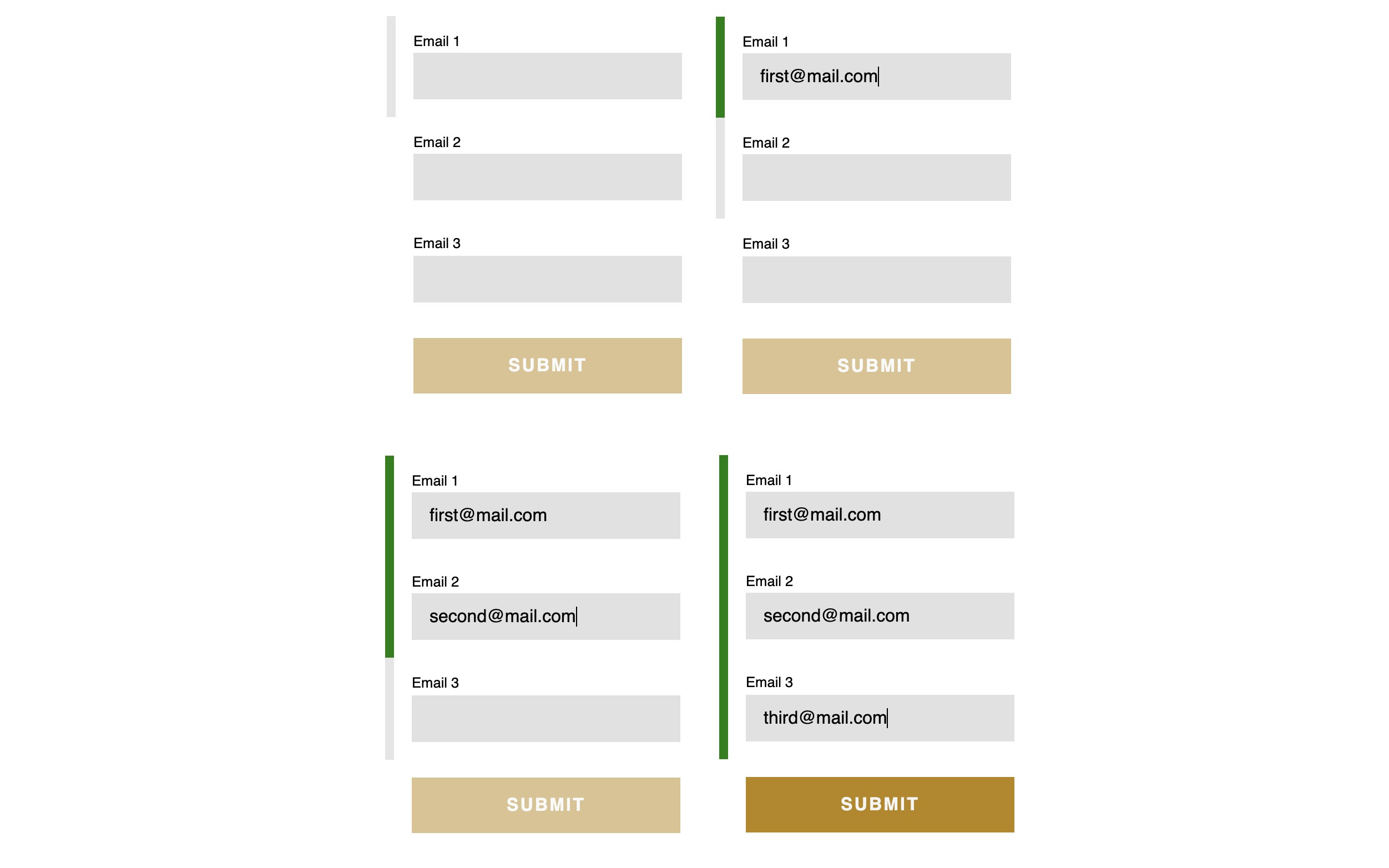
import { Link, unstable_useViewTransitionState } from "react-router-dom";
/* Other imports */

const Card = ({ author, category, slug, id, title }) => {
  /* We'll use the same URL value for the Link and the hook */
  const url = /${category}/product/${slug};

  /* Check if the transition is running for the item details pageURL */
  const isTransitioning = unstable_useViewTransitionState(url);

  return (
    <li className="card">
      <Link unstable_viewTransition to={url} className="card__link">
        <figure className="card__figure">
          <img
            className="card__image"
            style=}}
              /* Apply the viewTransitionName if the card has been clicked on */
              viewTransitionName: isTransitioning ? "item-image" : "",
            }}
            src={/assets/$&#123;category&#125;/${id}-min.jpg}
            alt=""
          />
         {/* ... */}
        </figure>
        <div className="card__deco" />
      </Link>
    </li>
  );
};

export default Card;

We know which image in the product view is the transition element, so we can apply the viewTransitionName directly to it rather than having to guess:

import {
  Link,
  useLoaderData,
  unstable_useViewTransitionState,
} from "react-router-dom";
/* Other imports */

const Details = () => {
  const data = useLoaderData();
  const { id, category, title, author } = data;
  return (
    <>
      <section className="item">
        {/* ... */}
        <article className="item__layout">
          <div>
              <img
                style={{viewTransitionName: "item-image"}}
                className="item__image"
                src={/assets/${category}/${id}-min.jpg}
                alt=""
              />
          </div>
          {/* ... */}
        </article>
      </section>
    </>
  );
};

export default Details;

We’re on a good track but have two issues that we need to tackle before moving on to the final transitions.

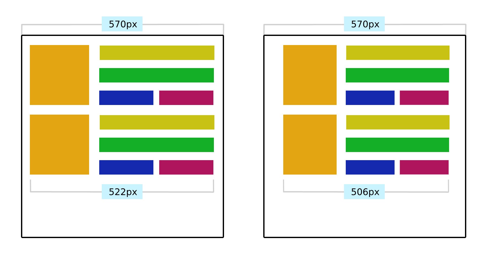
One is that the Card component’s image (.card__image) contains some CSS that applies a fixed one-to-one aspect ratio and centering for maintaining consistent dimensions no matter what image file is used. Once the user clicks on the Card — the .card-image in a category view — it becomes an .item-image in the product view and should transition into its original state, devoid of those extra styles.


/* Card component image */
.card__image {
  object-fit: cover;
  object-position: 50% 50%;
  aspect-ratio: 1;
  /* ... */
}

/* Product view image */
.item__image {
 /* No aspect-ratio applied */
 /* ... */
}

Jake has recommended using React’s flushSync function to make this work. The function forces synchronous and immediate DOM updates inside a given callback. It’s meant to be used sparingly, but it’s okay to use it for running the View Transition API as the target component re-renders.

// Assigns view-transition-name to the image before transition runs
const [isImageTransition, setIsImageTransition] = React.useState(false);

// Applies fixed-positioning and full-width image styles as transition runs
const [isFullImage, setIsFullImage] = React.useState(false);

/* ... */

// State update function, which triggers the DOM update we want to animate
const toggleImageState = () => setIsFullImage((state) => !state);

// Click handler function - toggles both states.
const handleZoom = async () => {
  // Run API only if available.
  if (document.startViewTransition) {
    // Set image as a transition element.
    setIsImageTransition(true);
    const transition = document.startViewTransition(() => {
      // Apply DOM updates and force immediate re-render while.
      // View Transitions API is running.
      flushSync(toggleImageState);
    });
    await transition.finished;
    // Cleanup
    setIsImageTransition(false);
  } else {
    // Fallback 
    toggleImageState();
  }
};

/* ... */

With this in place, all we really have to do now is toggle class names and view transition names depending on the state we defined in the previous code.

import React from "react";
import { flushSync } from "react-dom";

/* Other imports */

const Details = () => {
  /* React state, click handlers, util functions... */

  return (
    <>
      <section className="item">
        {/* ... */}
        <article className="item__layout">
          <div>
            <button onClick={handleZoom} className="item__toggle">
              <img
                style={{
                  viewTransitionName:
                    isTransitioning || isImageTransition ? "item-image" : "",
                }}
                className={
                  isFullImage
                    ? "item__image item__image--active"
                    : "item__image"
                }
                src={/assets/${category}/${id}-min.jpg}
                alt=""
              />
            </button>
          </div>
          {/* ... */}
        </article>
      </section>
      <aside
        className={
          isFullImage ? "item__overlay item__overlay--active" : "item__overlay"
        }
      />
    </>
  );
};

We are applying viewTransitionName directly on the image’s style attribute. We could have used boolean variables to toggle a CSS class and set a view-transition-name in CSS instead. The only reason I went with inline styles is to show both approaches in these examples. You can use whichever approach fits your project!

Let’s round this out by refining styles for the overlay that sits behind the image when it is expanded:

.item__overlay--active {
  z-index: 2;
  display: block;
  background: rgba(0, 0, 0, 0.5);
  position: fixed;
  top: 0;
  left: 0;
  width: 100vw;
  height: 100vh;
}

.item__image--active {
  cursor: zoom-out;
  position: absolute;
  z-index: 9;
  top: 50%;
  left: 50%;
  transform: translate3d(-50%, -50%, 0);
  max-width: calc(100vw - 4rem);
  max-height: calc(100vh - 4rem);
}

Demo

The following demonstrates only the code that is directly relevant to the View Transitions API so that it is easier to inspect and use. If you want access to the full code, feel free to get it in this GitHub repo.

Conclusion

We did a lot of work with the View Transitions API in the second half of this brief two-part article series. Together, we implemented full-view transitions in two different contexts, one in a more traditional multi-page application (i.e., website) and another in a single-page application using React.

We started with transitions in a MPA because the process requires fewer dependencies than working with a framework in a SPA. We were able to set the default crossfade transition between two pages — a category page and a product page — and, in the process, we learned how to set view transition names on elements after the transition runs to prevent naming conflicts.

From there, we applied the same concept in a SPA, that is, an application that contains one page but many views. We took a React app for a “Museum of Digital Wonders” and applied transitions between full views, such as navigating between a category view and a product view. We got to see how react-router — and, by extension, react-router-dom — is used to define transitions bound to specific routes. We used it not only to set a crossfade transition between category views and between category and product views but also to set a view transition name on UI elements that also transition in the process.

The View Transitions API is powerful, and I hope you see that after reading this series and following along with the examples we covered together. What used to take a hefty amount of JavaScript is now a somewhat trivial task, and the result is a smoother user experience that irons out the process of moving from one page or view to another.

That said, the View Transitions API’s power and simplicity need the same level of care and consideration for accessibility as any other transition or animation on the web. That includes things like being mindful of user motion preferences and resisting the temptation to put transitions on everything. There’s a fine balance that comes with making accessible interfaces, and motion is certainly included.

References

The View Transitions API And Delightful UI Animations (Part 1)

Animations are an essential part of a website. They can draw attention, guide users on their journey, provide satisfying and meaningful feedback to interaction, add character and flair to make the website stand out, and so much more!

On top of that, CSS has provided us with transitions and keyframe-based animations since at least 2009. Not only that, the Web Animations API and JavaScript-based animation libraries, such as the popular GSAP, are widely used for building very complex and elaborate animations.

With all these avenues for making things move on the web, you might wonder where the View Transitions API fits in in all this. Consider the following example of a simple task list with three columns.

We’re merely crossfading between the two screen states, and that includes all elements within it (i.e., other images, cards, grid, and so on). The API is unaware that the image that is being moved from the container (old state) to the overlay (new state) is the same element.

We need to instruct the browser to pay special attention to the image element when switching between states. That way, we can create a special transition animation that is applied only to that element. The CSS view-transition-name property applies the name of the view transition we want to apply to the transitioning elements and instructs the browser to keep track of the transitioning element’s size and position while applying the transition.

We get to name the transition anything we want. Let’s go with active-image, which is going to be declared on a .gallery__image--active class that is a modifier of the class applied to images (.gallery-image) when the transition is in an active state:

.gallery__image--active {
  view-transition-name: active-image;
}

Note that view-transition-name has to be a unique identifier and applied to only a single rendered element during the animation. This is why we are applying the property to the active image element (.gallery__image--active). We can remove the class when the image overlay is closed, return the image to its original position, and be ready to apply the view transition to another image without worrying whether the view transition has already been applied to another element on the page.

So, we have an active class, .gallery__image--active, for images that receive the view transition. We need a method for applying that class to an image when the user clicks on that respective image. We can also wait for the animation to finish by storing the transition in a variable and calling await on the finished attribute to toggle off the class and clean up our work.

// Start the transition and save its instance in a variable
const transition = document.startViewTransition(() =&gtl /* ... */);

// Wait for the transition to finish.
await transition.finished;

/* Cleanup after transition has completed */

Let’s apply this to our example:

function toggleImageView(index) {
  const image = document.getElementById(js-gallery-image-${index});

  // Apply a CSS class that contains the view-transition-name before the animation starts.
  image.classList.add("gallery__image--active");

  const imageParentElement = image.parentElement;

  if (!document.startViewTransition) {
    // Fallback if View Transitions API is not supported.
    moveImageToModal(image);
  } else {
    // Start transition with the View Transitions API.
    document.startViewTransition(() => moveImageToModal(image));
  }

  // This click handler function is now async.
  overlayWrapper.onclick = async function () {
    // Fallback if View Transitions API is not supported.
    if (!document.startViewTransition) {
      moveImageToGrid(imageParentElement);
      return;
    }

    // Start transition with the View Transitions API.
    const transition = document.startViewTransition(() => moveImageToGrid(imageParentElement));

    // Wait for the animation to complete.
    await transition.finished;

    // Remove the class that contains the page-transition-tag after the animation ends.
    image.classList.remove("gallery__image--active");
  };
}

Alternatively, we could have used JavaScript to toggle the CSS view-transition-name property on the element in the inline HMTL. However, I would recommend keeping everything in CSS as you might want to use media queries and feature queries to create fallbacks and manage it all in one place.

// Applies view-transition-name to the image
image.style.viewTransitionName = "active-image";

// Removes view-transition-name from the image
image.style.viewTransitionName = "none";

And that’s pretty much it! Let’s take a look at our example (in Chrome) with the transition element applied.

Customizing Animation Duration And Easing In CSS

What we just looked at is what I would call the default experience for the View Transitions API. We can do so much more than a transition that crossfades between two states. Specifically, just as you might expect from something that resembles a CSS animation, we can configure a view transition’s duration and timing function.

In fact, the View Transitions API makes use of CSS animation properties, and we can use them to fully customize the transition’s behavior. The difference is what we declare them on. Remember, a view transition is not part of the DOM, so what is available for us to select in CSS if it isn’t there?

When we run the startViewTransition function, the API pauses rendering, captures the new state of the page, and constructs a pseudo-element tree:

::view-transition
└─ ::view-transition-group(root)
   └─ ::view-transition-image-pair(root)
      ├─ ::view-transition-old(root)
      └─ ::view-transition-new(root)

Each one is helpful for customizing different parts of the transition:

  • ::view-transition: This is the root element, which you can consider the transition’s body element. The difference is that this pseudo-element is contained in an overlay that sits on top of everything else on the top.
    • ::view-transition-group: This mirrors the size and position between the old and new states.
      • ::view-transition-image-pair: This is the only child of ::view-transition-group, providing a container that isolates the blending work between the snapshots of the old and new transition states, which are direct children.
        • ::view-transition-old(...): A snapshot of the “old” transition state.
        • ::view-transition-new(...): A live representation of the new transition state.

Yes, there are quite a few moving parts! But the purpose of it is to give us tons of flexibility as far as selecting specific pieces of the transition.

So, remember when we applied view-transition-name: active-image to the .gallery__image--active class? Behind the scenes, the following pseudo-element tree is generated, and we can use the pseudo-elements to target either the active-image transition element or other elements on the page with the root value.

::view-transition
├─ ::view-transition-group(root)
│  └─ ::view-transition-image-pair(root)
│     ├─ ::view-transition-old(root)
│     └─ ::view-transition-new(root)
└─ ::view-transition-group(active-image)
   └─ ::view-transition-image-pair(active-image)
      ├─ ::view-transition-old(active-image)
      └─ ::view-transition-new(active-image)

In our example, we want to modify both the cross-fade (root) and transition element (active-image ) animations. We can use the universal selector (*) with the pseudo-element to change animation properties for all available transition elements and target pseudo-elements for specific animations using the page-transition-tag value.

/* Apply these styles only if API is supported */
@supports (view-transition-name: none) {
  /* Cross-fade animation */
  ::view-transition-image-pair(root) {
    animation-duration: 400ms;
    animation-timing-function: ease-in-out;
  }

  /* Image size and position animation */
  ::view-transition-group(active-image) {
    animation-timing-function: cubic-bezier(0.215, 0.61, 0.355, 1);
  }
}

Accessible Animations

Of course, any time we talk about movement on the web, we also ought to be mindful of users with motion sensitivities and ensure that we account for an experience that reduces motion.

That’s what the CSS prefers-reduced-motion query is designed for! With it, we can sniff out users who have enabled accessibility settings at the OS level that reduce motion and then reduce motion on our end of the work. The following example is a heavy-handed solution that nukes all animation in those instances, but it’s worth calling out that reduced motion does not always mean no motion. So, while this code will work, it may not be the best choice for your project, and your mileage may vary.

@media (prefers-reduced-motion) {
  ::view-transition-group(*),
  ::view-transition-old(*),
  ::view-transition-new(*) {
    animation: none !important;
  }
}

Final Demo

Here is the completed demo with fallbacks and prefers-reduced-motion snippet implemented. Feel free to play around with easings and timings and further customize the animations.

This is a perfect example of how the View Transitions API tracks an element’s position and dimensions during animation and transitions between the old and new snapshots right out of the box!

See the Pen Add to cart animation v2 - completed [forked] by Adrian Bece.

Conclusion

It amazes me every time how the View Transitions API turns expensive-looking animations into somewhat trivial tasks with only a few lines of code. When done correctly, animations can breathe life into any project and offer a more delightful and memorable user experience.

That all being said, we still need to be careful how we use and implement animations. For starters, we’re still talking about a feature that is supported only in Chrome at the time of this writing. But with Safari’s positive stance on it and an open ticket to implement it in Firefox, there’s plenty of hope that we’ll get broader support — we just don’t know when.

Also, the View Transitions API may be “easy,” but it does not save us from ourselves. Think of things like slow or repetitive animations, needlessly complex animations, serving animations to those who prefer reduced motion, among other poor practices. Adhering to animation best practices has never been more important. The goal is to ensure that we’re using view transitions in ways that add delight and are inclusive rather than slapping them everywhere for the sake of showing off.

In another article to follow this one, we’ll use View Transitions API to create full-page transitions in our single-page and multi-page applications — you know, the sort of transitions we see when navigating between two views in a native mobile app. Now, we have those readily available for the web, too!

Until then, go build something awesome… and use it to experiment with the View Transitions API!

References

WaterBear: Building A Free Platform For Impactful Documentaries (Part 2)

In my previous article, I talked about Waterbear, a significant project I worked on as a newly-appointed lead developer, and the lessons I learned leading a team for the first time. In this second article, I’ll go over some key technical highlights from the project. Before we start, let’s quickly remind ourselves what WaterBear is all about and what makes it so interesting.

WaterBear is a free platform bringing together inspiration and action with award-winning high-production environmental documentaries covering various topics, from animals and climate change to people and communities. The WaterBear team produces their own original films and documentaries and hosts curated films and content from various high-profile partners, including award-winning filmmakers, large brands, and significant non-governmental organizations (NGOs), like Greenpeace, WWF, The Jane Goodall Institute, Ellen MacArthur Foundation, Nikon, and many others.

For context, I am currently working at a software development company called Q Agency based in Zagreb, Croatia. We collaborated with WaterBear and its partner companies to build a revamped and redesigned version of WaterBear’s web and mobile app from the ground up using modern front-end technologies.

In the first article, I briefly discussed the technical stack that includes a React-based front-end framework, Next.js for the web app, Sanity CMS, Firebase Auth, and Firestore database. Definitely read up on the strategy and reasoning behind this stack in the first article if you missed it.

Now, let’s dive into the technical features and best practices that my team adopted in the process of building the WaterBear web app. I plan on sharing specifically what I learned from performance and accessibility practices as a first-time lead developer of a team, as well as what I wish I had known before we started.

Image Optimization

Images are pieces of content in many contexts, and they are a very important and prominent part of the WaterBear app’s experience, from video posters and category banners to partner logos and campaign image assets.

I think that if you are reading this article, you likely know the tightrope walk between striking, immersive imagery and performant user experiences we do as front-enders. Some of you may have even grimaced at the heavy use of images in that last screenshot. My team measured the impact, noting that on the first load, this video category page serves up as many as 14 images. Digging a little deeper, we saw those images account for approximately 85% of the total page size.

That’s not insignificant and demands attention. WaterBear’s product is visual in nature, so it’s understandable that images are going to play a large role in its web app experience. Even so, 85% of the experience feels heavy-handed.

So, my team knew early on that we would be leveraging as many image optimization techniques as we could that would help improve how quickly the page loads. If you want to know everything there is to optimize images, I wholeheartedly recommend Addy Osami’s Image Optimization for a treasure trove of insightful advice, tips, and best practices that helped us improve WaterBear’s performance.

Here is how we tackled the challenge.

Using CDN For Caching And WebP For Lighter File Sizes

As I mentioned a little earlier, our stack includes Sanity’s CMS. It offers a robust content delivery network (CDN) out of the box, which serves two purposes: (1) optimizing image assets and (2) caching them. Members of the WaterBear team are able to upload unoptimized high-quality image assets to Sanity, which ports them to the CDN, and from there, we instruct the CDN to run appropriate optimizations on those images — things like compressing the files to their smallest size without impacting the visual experience, then caching them so that a user doesn’t have to download the image all over again on subsequent views.

Requesting the optimized version of the images in Sanity boils down to adding query variables to image links like this:

https://cdn.sanity.io/.../image.jpg?w=1280&q=70&auto=format

Let’s break down the query variables:

  • w sets the width of the image. In the example above, we have set the width to 1280px in the query.
  • q sets the compression quality of the image. We landed on 70% to balance the need for visual quality with the need for optimized file sizes.
  • format sets the image format, which is set to auto, allowing Sanity to determine the best type of image format to use based on the user’s browser capabilities.

Notice how all of that comes from a URL that is mapped to the CDN to fetch a JPG file. It’s pretty magical how a completely unoptimized image file can be transformed into a fully optimized version that serves as a completely different file with the use of a few parameters.

In many cases, the format will be returned as a WebP file. We made sure to use WebP because it yields significant savings in terms of file size. Remember that unoptimized 1.2 MB image from earlier? It’s a mere 146 KB after the optimizations.

And all 14 image requests are smaller than that one unoptimized image!

The fact that images still account for 85% of the page weight is a testament to just how heavy of a page we are talking about.

Another thing we have to consider when talking about modern image formats is browser support. Although WebP is widely supported and has been a staple for some time now, my team decided to provide an optimized fallback JPG just in case. And again, Sanity automatically detects the user’s browser capabilities. This way, we serve the WebP version only if Sanity knows the browser supports it and only provide the optimized fallback file if WebP support isn’t there. It’s great that we don’t have to make that decision ourselves!

Have you heard of AVIF? It’s another modern image format that promises potential savings even greater than WebP. If I’m being honest, I would have preferred to use it in this project, but Sanity unfortunately does not support it, at least at the time of this article. There’s a long-running ticket to add support, and I’m holding hope we get it.

Would we have gone a different route had we known about the lack of AVIF support earlier? Cloudinary supports it, for example. I don’t think so. Sanity’s tightly coupled CDN integration is too great of a developer benefit, and as I said, I’m hopeful Sanity will give us that support in the future. But that is certainly the sort of consideration I wish I would have had early on, and now I have that in my back pocket for future projects.

Tackling The Largest Contentful Paint (LCP)

LCP is the biggest element on the page that a user sees on the initial load. You want to optimize it because it’s the first impression a user has with the page. It ought to load as soon as possible while everything under it can wait a moment.

For us, images are most definitely part of the LCP. By giving more consideration to the banner images we load at the top of the page, we can serve that component a little faster for a better experience. There are a couple of modern image attributes that can help here: loading and fetchpriority.

We used an eager loading strategy paired with a high fetchpriority on the images. This provides the browser with a couple of hints that this image is super important and that we want it early in the loading process.

<!-- Above-the-fold Large Contentful Paint image -->
<img
  loading="eager"
  fetchpriority="high"
  alt="..."
  src="..."
  width="1280"
  height="720"
  class="..."
/>

We also made use of preloading in the document <head>, indicating to the browser that we want to preload images during page load, again, with high priority, using Next.js image preload options.

<head>
  <link
    rel="preload"
    as="image"
    href="..."
    fetchpriority="high"
  />
</head>

Images that are “below the fold” can be de-prioritized and downloaded only when the user actually needs it. Lazy loading is a common technique that instructs the browser to load particular images once they enter the viewport. It’s only fairly recently that it’s become a feature baked directly into HTML with the loading attribute:

<!-- Below-the-fold, low-priority image -->
<img
  decoding="async"
  loading="lazy"
  src="..."
  alt="..."
  width="250"
  height="350"
/>

This cocktail of strategies made a noticeable difference in how quickly the page loads. On those image-heavy video category pages alone, it helped us reduce the image download size and number of image requests by almost 80% on the first load! Even though the page will grow in size as the user scrolls, that weight is only added if it passes through the browser viewport.

In Progress: Implementing srcset

My team is incredibly happy with how much performance savings we’ve made so far. But there’s no need to stop there! Every millisecond counts when it comes to page load, and we are still planning additional work to optimize images even further.

The task we’re currently planning will implement the srcset attribute on images. This is not a “new” technique by any means, but it is certainly a component of modern performance practices. It’s also a key component in responsive design, as it instructs browsers to use certain versions of an image at different viewport widths.

We’ve held off on this work only because, for us, the other strategies represented the lowest-hanging fruit with the most impact. Looking at an image element that uses srcset in the HTML shows it’s not the easiest thing to read. Using it requires a certain level of art direction because the dimensions of an image at one screen size may be completely different than those at another screen size. In other words, there are additional considerations that come with this strategy.

Here’s how we’re planning to approach it. We want to avoid loading high-resolution images on small screens like phones and tablets. With the srcset attribute, we can specify separate image sources depending on the device’s screen width. With the sizes attribute, we can instruct the browser which image to load depending on the media query.

In the end, our image markup should look something like this:

<img
  width="1280"
  height="720"
  srcset="
    https://cdn.sanity.io/.../image.jpg?w=568&...   568w,
    https://cdn.sanity.io/.../image.jpg?w=768&...   768w,
    https://cdn.sanity.io/.../image.jpg?w=1280&... 1280w
  "
  sizes="(min-width: 1024px) 1280px, 100vw"
  src="https://cdn.sanity.io/.../image.jpg?w=1280&..."
/>

In this example, we specify a set of three images:

  1. Small: 568px,
  2. Medium: 768px,
  3. Large: 1280px.

Inside the sizes attribute, we’re telling the browser to use the largest version of the image if the screen width is above 1024px wide. Otherwise, it should default to selecting an appropriate image out of the three available versions based on the full device viewport width (100vw) — and will do so without downloading the other versions. Providing different image files to the right devices ought to help enhance our performance a bit more than it already is.

Improving CMS Performance With TanStack Query

The majority of content on WaterBear comes from Sanity, the CMS behind the web app. This includes video categories, video archives, video pages, the partners’ page, and campaign landing pages, among others. Users will constantly navigate between these pages, frequently returning to the same category or landing page.

This provided my team with an opportunity to introduce query caching and avoid repeating the same request to the CMS and, as a result, optimize our page performance even more. We used TanStack Query (formerly known as react-query) for both fetching data and query caching.

const { isLoading, error, data } = useQuery( /* Options */ )

TanStack Query caches each request according to the query key we assign to it. The query key in TanStack Query is an array, where the first element is a query name and the second element is an object containing all values the query depends on, e.g., pagination, filters, query variables, and so on.

Let’s say we are fetching a list of videos depending on the video category page URL slug. We can filter those results by video duration. The query key might look something like this basic example:

const { isLoading, error, data } = useQuery(
  {
    queryKey: [
      'video-category-list',
      { slug: categorySlug, filterBy: activeFilter }
    ],
  queryFn: () => /* ... */
  }
)

These query keys might look confusing at first, but they’re similar to the dependency arrays for React’s useEffect hook. Instead of running a function when something in the dependency array changes, it runs a query with new parameters and returns a new state. TanStack Query comes with its dedicated DevTools package. It displays all sorts of useful information about the query that helps debug and optimize them without hassle.

Let’s see the query caching in action. In the following video, notice how data loads instantly on repeated page views and repeated filter changes. Compare that to the first load, where there is a slight delay and a loading state before data is shown.

We’re probably not even covering all of our bases! It’s so tough to tell without ample user testing. It’s a conflicting situation where you want to do everything you can while realistically completing the project with the resources you have and proceed with intention.

We made sure to include a label on interactive elements like buttons, especially ones where the icon is the only content. For that case, we added visually hidden text while allowing it to be read by assistive devices. We also made sure to hide the SVG icon from the assistive devices as SVG doesn’t add any additional context for assistive devices.

<!-- Icon button markup with descriptive text for assistive devices -->
<button type="button" class="...">
  <svg aria-hidden="true" xmlns="..." width="22" height="22" fill="none">...</svg
  ><span class="visually-hidden">Open filters</span>
</button>
.visually-hidden {
  position: absolute;
  width: 1px;
  height: 1px;
  overflow: hidden;
  white-space: nowrap;
  clip: rect(0 0 0 0);
  -webkit-clip-path: inset(50%);
  clip-path: inset(50%);
}

Supporting keyboard navigation was one of our accessibility priorities, and we had no trouble with it. We made sure to use proper HTML markup and avoid potential pitfalls like adding a click event to meaningless div elements, which is unfortunately so easy to do in React.

We did, however, hit an obstacle with modals as users were able to move focus outside the modal component and continue interacting with the main page while the modal was in its open state, which isn’t possible with the default pointer and touch interaction. For that, we implemented focus traps using the focus-trap-react library to keep the focus on modals while they’re opened, then restore focus back to an active element once the modal is closed.

Dynamic Sitemaps

Sitemaps tell search engines which pages to crawl. This is faster than just letting the crawler discover internal links on its own while crawling the pages.

The importance of sitemaps in the case of WaterBear is that the team regularly publishes new content — content we want to be indexed for crawlers as soon as possible by adding those new links to the top of the sitemap. We don’t want to rebuild and redeploy the project every time new content has been added to Sanity, so dynamic server-side sitemaps were our logical choice.

We used the next-sitemap plugin for Next.js, which has allowed us to easily configure the sitemap generation process for both static and dynamic pages. We used the plugin alongside custom Sanity queries that fetch the latest content from the CMS and quickly generate a fresh sitemap for each request. That way, we made sure that the latest videos get indexed as soon as possible.

Let’s say the WaterBear team publishes a page for a video named My Name is Salt. That gets added to a freshly generated XML sitemap:

Now, it’s indexed for search engines to scoop up and use in search results:

Until Next Time…

In this article, I shared some insights about WaterBear’s tech stack and some performance optimization techniques we applied while building it.

Images are used very prominently on many page types on WaterBear, so we used CDN with caching, loading strategies, preloading, and the WebP format to optimize image loading performance. We relied on Sanity for the majority of content management, and we expected repeating page views and queries on a single session, prompting us to implement query caching with TanStack Query.

We made sure to improve basic accessibility on the fly by styling focus states, enabling full keyboard navigation, assigning labels to icon buttons, providing alt text for images, and using focus traps on modal elements.

Finally, we covered how my team handled dynamic server-side rendered sitemaps using the next-sitemap plugin for Next.js.

Again, this was my first big project as lead developer of a team. There’s so much that comes with the territory. Not only are there internal processes and communication hurdles to establish a collaborative team environment, but there’s the technical side of things, too, that requires balancing priorities and making tough decisions. I hope my learning journey gives you something valuable to consider in your own work. I know that my team isn’t the only one with these sorts of challenges, and sharing the lessons I learned from this particular experience probably resonates with some of you reading this.

Please be sure to check out the full work we did on WaterBear. It’s available on the web, Android, and iOS. And, if you end up watching a documentary while you’re at it, let me know if it inspired you to take action on a cause!

References

Many thanks to WaterBear and Q Agency for helping out with this two-part article series and making it possible. I really would not have done this without their support. I would also like to commend everyone who worked on the project for their outstanding work! You have taught me so much so far, and I am grateful for it.

WaterBear: Building A Free Platform For Impactful Documentaries (Part 1)

A few months ago, I worked on what is probably the most remarkable and exciting project of my career so far. It’s a wonderful free platform that brings together inspiration and action called WaterBear, and I’m thrilled to tell you all about it in this two-part article series.

I want to introduce you to the WaterBear project and cover the goals, technical stack, and team dynamics that went into it. As this is also my first time taking on the role of lead developer on a project, I’ll also share some important engineering management challenges I encountered and insights from this experience where I felt like I was learning on the fly. In the following article, I’ll focus on specific technical challenges that came up in the process, including front-end performance, accessibility, and SEO.

Before we dive into the nitty-gritty, you might be wondering what makes WaterBear stand out among the plethora of competing services. Let’s find out!

About WaterBear

WaterBear is a free platform bringing together inspiration and action with award-winning high-production environmental documentaries covering various topics, from animals and climate change to people and communities. The WaterBear team produces their own original films and documentaries and hosts curated films and content from various high-profile partners, including award-winning filmmakers, large brands, and significant non-governmental organizations (NGOs), like Greenpeace, WWF, The Jane Goodall Institute, Ellen MacArthur Foundation, Nikon, and many others.

This is where the value proposition of other similar services would usually end — users binge-watching videos into perpetuity. WaterBear, however, takes a different, more mindful approach. Think back to an impactful movie or a documentary that moved you so much that it left you feeling like you needed to do something about the topic or issue you just learned about. But maybe you didn’t know where to begin or if it was even possible for you to make any difference.

WaterBear actively invites and encourages users to participate in some meaningful way. We want people to be engaged in the issue by signing petitions, donating to a cause, spreading the word, volunteering, or simply changing their habits in a positive way. Essentially, WaterBear aims to turn passive viewers into active and mindful participants by offering impactful content with options to be informed on an issue and inspired to do something about it.

WaterBear and its work have been regularly featured in various publications, and the platform is highly praised and endorsed. And, hey, if you spot a familiar-looking tardigrade while walking around London or somewhere else, make sure to snap a picture and share it with me!

Defining Project Objectives

For context, I am currently working at a software development company called Q Agency based in Zagreb, Croatia. We collaborated with WaterBear and its partner companies to build a revamped and redesigned version of the web and mobile app from the ground up using modern technologies.

The WaterBear app was originally launched in December 2020, and the team learned a lot about the user experience by gathering feedback. This data was then used to create a fresh new design and outline some new features.

While I am unable to share specific data from that research effort, I can tell you that it led us to the following main goals:

  • Create a responsive web app and mobile app using a modern tech stack based on the design provided by the WaterBear team.
  • Develop tools that will allow the WaterBear team to easily create and customize landing pages for promotional campaigns and videos.
  • Identify potential performance bottlenecks and address them early on.
  • Build dynamic, server-side generated sitemaps for improved SEO.
  • Listen to user feedback to constantly iterate and implement new features.

The Technical Stack

Before my team started working with WaterBear, the majority of the tech stack and infrastructure was set in stone, so we only had to decide on the front-end and mobile technologies we would use to build it. We agreed to use the React-powered Next.js framework for the web app and Flutter for mobile apps (i.e., Android and iOS). The work was split between the two teams: the web app team and the mobile team.

Next.js was our go-to choice because it allowed us to easily create dynamic server-side rendered sitemaps and use advanced optimizations for images and JavaScript bundle that provide options for improved performance. We’ll cover these topics in more detail in the next article. For now, let’s highlight the remaining integral parts of the project:

  • Sanity CMS
    An open-source headless content management system (CMS) that can be easily integrated with Next.js and other front-end frameworks.
  • Firebase Authentication
    A back-end service can authenticate users through social media accounts, as well as a standard email and password.
  • Cloud Firestore
    A flexible and scalable NoSQL cloud database for mobile and web. This was a logical choice for our database, as Firebase Authentication was required right from the start.
  • Video.js
    A versatile open-source video player with customizable UI and plugin support.

Strategy And Communication

As the work began, we came across our first hurdle. As you can see from the previous diagram, both web and mobile apps had to interact with the same services (including the CMS, database, authentication, and so on), so we also had to ensure consistent behavior between them.

For example, we needed to ensure that our CMS queries yielded the same results to the extent that videos appeared in the same order on both the web and mobile apps and that duration filters and sorting worked consistently.

We had to do the same with our Cloud Firestore instance to keep the database structure intact while being mindful to write the correct value types and read the correct fields so they are mapped to the structure. Each developer worked on their local instance using Firebase Local Emulator Suite to speed up development, so we had to ensure everything was in order when we were ready to switch to staging and production databases.

It was important to establish a collaborative atmosphere between the two development teams from the start, even more so considering we were all working in a remote environment. We made sure to keep in touch either through quick video calls or Slack messages to share knowledge and queries that we’d be using.

As for the database, we kept a detailed diagram of our database structure and value types in order to eliminate all doubt and ensure both apps interact with the database identically. This served as our single source of truth and was made readily available to the teams for reference at all stages of development.

These strategies proved surprisingly more useful than we expected, as they allowed us to quickly and safely switch from the emulator to the staging and production database without any hiccups. As a bonus, it resulted in fewer bugs that originated from the interplay between the web and mobile applications.

My takeaway from this experience: It’s vital to keep the communication channels open to collaborate, discuss challenges, and share knowledge about the integrations and features both of our teams had to implement. It’s also worthwhile investing some extra time and care into maintaining crucial project documentation and diagrams. Having information readily available in a convenient format can save time and clear any doubts during development. Not only that, this documentation can even end up being a great onboarding guide for new team members in the future.

What I Learned As A First-Time Lead Developer

As I’ve mentioned before, this was my first gig as a lead developer. Developers are usually thrust into this sort of role at some point in their careers. Other than that, there is usually little or no preparation or training for it — we have to learn quickly and adapt on the fly based on our own experiences as developers.

The day-to-day development work on my team gets a bit managerial as a result. As a lead developer, I am responsible for the work the team does, supporting and mentoring individual team members, and advocating for the team’s priorities. I was also more directly involved with planning and communicating with clients and stakeholders. For me, it was a lot of added responsibility that could feel overwhelming at various times.

I decided to approach the role thoughtfully by setting rules and guiding principles for myself, as opposed to putting the new responsibilities aside and focusing primarily on development work. What are those rules and principles? Let’s discuss them one at a time.

Leading By Example And Mentoring On The Fly

First, I wanted to ensure that my team was producing consistent code quality across the board, with a priority on performance, accessibility, SEO, and usability. I like to refer to these as The Four Pillars of quality development.

In my own experience, it is easier to follow existing, well-established, and documented footsteps. That’s where The Four Pillars served a significant role on our team, as they were emphasized during our team check-ins, demos, and reviews. Moreover, I set these expectations through my own pull requests (PR) by asking the team to review my work along those principles.

At the very start of the project, I asked my team to scaffold the project and complete basic integration tasks that could be completed by following existing documentation. Meanwhile, that allowed me to chart the path forward by working on a set of feature tasks that established the foundation of The Four Pillars, then asking my team to review PRs to set expectations for the quality I was pursuing for the project. This way, they had a good amount of hands-on experience abiding by the principles, and I was able to lead that by example. My team should expect the same level of quality from me that I expect of them.

The other benefit of this approach is that it allowed me to mentor the team on the fly. I could share resources and documentation supporting my work in the PRs, and the team could grow their own knowledge and understanding by requesting changes to my work. In other words, I managed to seamlessly introduce the team to new concepts.

My takeaway from this experience: Use every opportunity to share your knowledge with the team, even if it’s on the fly! And support the team’s learning journey by setting good examples that are aligned with well-defined expectations.

Acting As The Tiebreaker

As part of my own introduction to the role of lead developer, I picked up Alex MacCaw’s book The Manager’s Handbook, and it helped me overcome another interesting situation that came up during the project: acting as a tiebreaker when making decisions.

Early in the project, we had a meeting with the mobile team about our shared database architecture. Some team members proposed a somewhat radical approach to how to structure a very crucial part of our database. It didn’t sit well with me and other team members as it wasn’t documented or mentioned anywhere else and wasn’t the standard practice within the company. We would also have to commit to this approach, and it would have cost us a lot if we hit a roadblock and had to roll back our work. The only thing we had to go on was a basic small-scale proof of concept — far from what we needed to do the work — but the team members who came up with the idea were adamant about the proposal.

It was my call to make, and it was this specific advice from The Manager’s Handbook that came in handy at just the right time:

“Don’t let people pressure you into decisions you don’t believe in. They’ll hold you responsible for them later, and they’ll be right. Decisions are your responsibility.”

I decided to step back a bit and outline the possible risks and rewards of the proposed approach. It sounds so simple, but it allowed me to gain a better grasp on the debate and formulate my own conclusion that it wasn’t worth journeying into the unknown.

I made my final decision and explained my reasoning to the team at our next internal meeting. I made sure to give props to the team members who came up with the innovative idea because it’s important to maintain an inclusive atmosphere where everyone feels heard and free to explore new ideas.

Rejecting or postponing an idea shouldn’t be viewed as a negative outcome but as a part of the bigger picture of building a high-quality product, which was, of course, our primary goal.

Learn To Say “No” And Offer A Compromise

What I didn’t mention in that last story is that I offered the team members who came up with the innovative database structure a compromise by suggesting they present that idea to their team lead and explore its potential in a dedicated test project.

The same principle applies when communicating with clients and stakeholders. It’s common for clients to come up with ideas and suggestions in the middle of the project timeline, which comes with the territory of projects using an Agile methodology. However, you still want to avoid overcommitting and pushing the team to its limits, and especially prevent yourself from carrying the burden of all the extra work yourself.

I’ve learned that a lead developer acts as an advocate for the team. That means knowing when to say “no” to requests, particularly those that could make your team’s work noticeably difficult or stressful.

Saying “no” might seem cold or come across as a negative reaction because it effectively puts a lid on the discussion. However, you can always acknowledge the suggestion and offer a compromise that both parties can agree on.

Here are some real examples of how I was able to say “no” to an idea while offering a compromise:

  • Decreasing the scope
    “We might not be able to do X, Y, and Z and finish them in time to meet our deadlines. That said, we only need X at this stage, and perhaps we can postpone Y and Z in the next phase.”
  • Postponing
    “We can’t spare the time for X at this stage, but it’s a great suggestion, and we should make note of it even though we need to postpone it.”
  • Switching priorities
    “If X is a high priority and should be done this sprint, can we postpone a lower priority task so that we’re able to dedicate enough time in this sprint to finish it in time?”

Rebecca Knight shares some great principles and practical examples that have resonated with me when it comes to saying “no”:

Do
  • Evaluate whether you have the desire and the bandwidth to help with the request and ask if priorities can be shifted or trade-offs made.
  • Show a willingness to pitch in by inquiring if there are small ways you can be helpful to the project.
  • Practice saying no out loud. Eventually, it will become easier.

Don’t
  • Use a harsh or hesitant tone, and don’t be overly polite either. Instead, strive for a steady and clear no.
  • Hold back the real reason you’re saying no. To limit frustration, give reasons with good weight up front.
  • Distort your message or act tentatively because you’re trying to keep your colleague happy. Be honest and make sure your no is understood.
Be Considerate And Communicate Clearly

This goes hand-in-hand with all the previous points I’ve made, and you might think it goes without saying. However, I want to highlight the importance of embedding empathy and considerate behavior in a team.

Building and maintaining mutual trust within a team is crucial. Whenever we had internal meetings to discuss the tasks for a current sprint, I made sure to go over each feature, clear any doubts and blockers, and confirm whether anyone had any concerns about their assigned tasks. Someone might have little to no experience with the service they’re integrating, and they might feel unsure whether they’re able to complete the task. Or they could have a scheduled doctor appointment during the sprint that threatens to delay their work and requires your assistance.

Team members should feel free to speak up and share their concerns, problems, and opinions without judgment and repercussions. This allows you to plan, adapt, and solve problems early on and ease any stress and frustration a team member might feel if their progress gets stalled.

Coming Up Next

In this article, I discussed the details of WaterBear, a large project that provides a free platform for documentaries that aim to inform viewers about issues and inspire them to take action. I took on the project as a first-time lead developer at Q Agency and shared the challenges I faced throughout the project. In particular, I focused on what I learned about developing and fostering a productive and collaborative team environment and the specific approaches I took to set expectations, lead by example, and communicate with empathy and inclusiveness.

We discussed the strategy around defining objectives and the technical stack used to build the project. I will go over that in much greater detail in the concluding article of this two-part series.

Please check out WaterBear on the web, Android, and iOS, and share with us your favorite documentaries! I’d also love for you to check out this excellent post-launch interview with WaterBear CEO Sam Sutaria. He offers a bunch of additional insights on our work from the client’s perspective.

References

Many thanks to WaterBear and Q Agency for helping out with this article and making it possible. I really would not have done this without their support. I would also like to commend everyone who worked on the project for their outstanding work! You have taught me so much so far, and I am grateful for it.

Recreating YouTube’s Ambient Mode Glow Effect

I noticed a charming effect on YouTube’s video player while using its dark theme some time ago. The background around the video would change as the video played, creating a lush glow around the video player, making an otherwise bland background a lot more interesting.

This effect is called Ambient Mode. The feature was released sometime in 2022, and YouTube describes it like this:

“Ambient mode uses a lighting effect to make watching videos in the Dark theme more immersive by casting gentle colors from the video into your screen’s background.”
— YouTube

It is an incredibly subtle effect, especially when the video’s colors are dark and have less contrast against the dark theme’s background.

Curiosity hit me, and I set out to replicate the effect on my own. After digging around YouTube’s convoluted DOM tree and source code in DevTools, I hit an obstacle: all the magic was hidden behind the HTML <canvas> element and bundles of mangled and minified JavaScript code.

Despite having very little to go on, I decided to reverse-engineer the code and share my process for creating an ambient glow around the videos. I prefer to keep things simple and accessible, so this article won’t involve complicated color sampling algorithms, although we will utilize them via different methods.

Before we start writing code, I think it’s a good idea to revisit the HTML Canvas element and see why and how it is used for this little effect.

HTML Canvas

The HTML <canvas> element is a container element on which we can draw graphics with JavaScript using its own Canvas API and WebGL API. Out of the box, a <canvas> is empty — a blank canvas, if you will — and the aforementioned Canvas and WebGL APIs are used to fill the <canvas> with content.

HTML <canvas> is not limited to presentation; we can also make interactive graphics with them that respond to standard mouse and keyboard events.

But SVG can also do most of that stuff, right? That’s true, but <canvas> is more performant than SVG because it doesn’t require any additional DOM nodes for drawing paths and shapes the way SVG does. Also, <canvas> is easy to update, which makes it ideal for more complex and performance-heavy use cases, like YouTube’s Ambient Mode.

As you might expect with many HTML elements, <canvas> accepts attributes. For example, we can give our drawing space a width and height:

<canvas width="10" height="6" id="js-canvas"></canvas>

Notice that <canvas> is not a self-closing tag, like an <iframe> or <img>. We can add content between the opening and closing tags, which is rendered only when the browser cannot render the canvas. This can also be useful for making the element more accessible, which we’ll touch on later.

Returning to the width and height attributes, they define the <canvas>’s coordinate system. Interestingly, we can apply a responsive width using relative units in CSS, but the <canvas> still respects the set coordinate system. We are working with pixel graphics here, so stretching a smaller canvas in a wider container results in a blurry and pixelated image.

The downside of <canvas> is its accessibility. All of the content updates happen in JavaScript in the background as the DOM is not updated, so we need to put effort into making it accessible ourselves. One approach (of many) is to create a Fallback DOM by placing standard HTML elements inside the <canvas>, then manually updating them to reflect the current content that is displayed on the canvas.

Numerous canvas frameworks — including ZIM, Konva, and Fabric, to name a few — are designed for complex use cases that can simplify the process with a plethora of abstractions and utilities. ZIM’s framework has accessibility features built into its interactive components, which makes developing accessible <canvas>-based experiences a bit easier.

For this example, we’ll use the Canvas API. We will also use the element for decorative purposes (i.e., it doesn’t introduce any new content), so we won’t have to worry about making it accessible, but rather safely hide the <canvas> from assistive devices.

That said, we will still need to disable — or minimize — the effect for those who have enabled reduced motion settings at the system or browser level.

requestAnimationFrame

The <canvas> element can handle the rendering part of the problem, but we need to somehow keep the <canvas> in sync with the playing <video>and make sure that the <canvas> updates with each video frame. We’ll also need to stop the sync if the video is paused or has ended.

We could use setInterval in JavaScript and rig it to run at 60fps to match the video’s playback rate, but that approach comes with some problems and caveats. Luckily, there is a better way of handling a function that must be called on so often.

That is where the requestAnimationFrame method comes in. It instructs the browser to run a function before the next repaint. That function runs asynchronously and returns a number that represents the request ID. We can then use the ID with the cancelAnimationFrame function to instruct the browser to stop running the previously scheduled function.

let requestId;

const loopStart = () => {
  /* ... */

  /* Initialize the infinite loop and keep track of the requestId */
  requestId = window.requestAnimationFrame(loopStart);
};

const loopCancel = () => {
  window.cancelAnimationFrame(requestId);
  requestId = undefined;
};

Now that we have all our bases covered by learning how to keep our update loop and rendering performant, we can start working on the Ambient Mode effect!

The Approach

Let’s briefly outline the steps we’ll take to create this effect.

First, we must render the displayed video frame on a canvas and keep everything in sync. We’ll render the frame onto a smaller canvas (resulting in a pixelated image). When an image is downscaled, the important and most-dominant parts of an image are preserved at the cost of losing small details. By reducing the image to a low resolution, we’re reducing it to the most dominant colors and details, effectively doing something similar to color sampling, albeit not as accurately.

Next, we’ll blur the canvas, which blends the pixelated colors. We will place the canvas behind the video using CSS absolute positioning.

And finally, we’ll apply additional CSS to make the glow effect a bit more subtle and as close to YouTube’s effect as possible.

HTML Markup

First, let’s start by setting up the markup. We’ll need to wrap the <video> and <canvas> elements in a parent container because that allows us to contain the absolute positioning we will be using to position the <canvas> behind the <video>. But more on that in a moment.

Next, we will set a fixed width and height on the <canvas>, although the element will remain responsive. By setting the width and height attributes, we define the coordinate space in CSS pixels. The video’s frame is 1920×720, so we will draw an image that is 10×6 pixels image on the canvas. As we’ve seen in the previous examples, we’ll get a pixelated image with dominant colors somewhat preserved.

<section class="wrapper">
  <video controls muted class="video" id="js-video" src="video.mp4"></video>
  <canvas width="10" height="6" aria-hidden="true" class="canvas" id="js-canvas"></canvas>
</section>
Syncing <canvas> And <video>

First, let’s start by setting up our variables. We need the <canvas>’s rendering context to draw on it, so saving it as a variable is useful, and we can do that by using JavaScript’s getCanvasContext function. We’ll also use a variable called step to keep track of the request ID of the requestAnimationFrame method.

const video = document.getElementById("js-video");
const canvas = document.getElementById("js-canvas");
const ctx = canvas.getContext("2d");

let step; // Keep track of requestAnimationFrame id

Next, we’ll create the drawing and update loop functions. We can actually draw the current video frame on the <canvas> by passing the <video> element to the drawImage function, which takes four values corresponding to the video’s starting and ending points in the <canvas> coordinate system, which, if you remember, is mapped to the width and height attributes in the markup. It’s that simple!

const draw = () => {
  ctx.drawImage(video, 0, 0, canvas.width, canvas.height);
};

Now, all we need to do is create the loop that calls the drawImage function while the video is playing, as well as a function that cancels the loop.

const drawLoop = () => {
  draw();
  step = window.requestAnimationFrame(drawLoop);
};

const drawPause = () => {
  window.cancelAnimationFrame(step);
  step = undefined;
};

And finally, we need to create two main functions that set up and clear event listeners on page load and unload, respectively. These are all of the video events we need to cover:

  • loadeddata: This fires when the first frame of the video loads. In this case, we only need to draw the current frame onto the canvas.
  • seeked: This fires when the video finishes seeking and is ready to play (i.e., the frame has been updated). In this case, we only need to draw the current frame onto the canvas.
  • play: This fires when the video starts playing. We need to start the loop for this event.
  • pause: This fires when the video is paused. We need to stop the loop for this event.
  • ended: This fires when the video stops playing when it reaches its end. We need to stop the loop for this event.
const init = () => {
  video.addEventListener("loadeddata", draw, false);
  video.addEventListener("seeked", draw, false);
  video.addEventListener("play", drawLoop, false);
  video.addEventListener("pause", drawPause, false);
  video.addEventListener("ended", drawPause, false);
};

const cleanup = () => {
  video.removeEventListener("loadeddata", draw);
  video.removeEventListener("seeked", draw);
  video.removeEventListener("play", drawLoop);
  video.removeEventListener("pause", drawPause);
  video.removeEventListener("ended", drawPause);
};

window.addEventListener("load", init);
window.addEventListener("unload", cleanup);

Let’s check out what we’ve achieved so far with the variables, functions, and event listeners we have configured.

Creating A Reusable Class

Let’s make this code reusable by converting it to an ES6 class so that we can create a new instance for any <video> and <canvas> pairing.

class VideoWithBackground {
  video;
  canvas;
  step;
  ctx;

  constructor(videoId, canvasId) {
    this.video = document.getElementById(videoId);
    this.canvas = document.getElementById(canvasId);

    window.addEventListener("load", this.init, false);
    window.addEventListener("unload", this.cleanup, false);
  }

  draw = () => {
    this.ctx.drawImage(this.video, 0, 0, this.canvas.width, this.canvas.height);
  };

  drawLoop = () => {
    this.draw();
    this.step = window.requestAnimationFrame(this.drawLoop);
  };

  drawPause = () => {
    window.cancelAnimationFrame(this.step);
    this.step = undefined;
  };

  init = () => {
    this.ctx = this.canvas.getContext("2d");
    this.ctx.filter = "blur(1px)";

    this.video.addEventListener("loadeddata", this.draw, false);
    this.video.addEventListener("seeked", this.draw, false);
    this.video.addEventListener("play", this.drawLoop, false);
    this.video.addEventListener("pause", this.drawPause, false);
    this.video.addEventListener("ended", this.drawPause, false);
  };

  cleanup = () => {
    this.video.removeEventListener("loadeddata", this.draw);
    this.video.removeEventListener("seeked", this.draw);
    this.video.removeEventListener("play", this.drawLoop);
    this.video.removeEventListener("pause", this.drawPause);
    this.video.removeEventListener("ended", this.drawPause);
  };
    }

Now, we can create a new instance by passing the id values for the <video> and <canvas> elements into a VideoWithBackground() class:

const el = new VideoWithBackground("js-video", "js-canvas");
Respecting User Preferences

Earlier, we briefly discussed that we would need to disable or minimize the effect’s motion for users who prefer reduced motion. We have to consider that for decorative flourishes like this.

The easy way out? We can detect the user’s motion preferences with the prefers-reduced-motion media query and completely hide the decorative canvas if reduced motion is the preference.

@media (prefers-reduced-motion: reduce) {
  .canvas {
    display: none !important;
  }
}

Another way we respect reduced motion preferences is to use JavaScript’s matchMedia function to detect the user’s preference and prevent the necessary event listeners from registering.

constructor(videoId, canvasId) {
  const mediaQuery = window.matchMedia("(prefers-reduced-motion: reduce)");

  if (!mediaQuery.matches) {
    this.video = document.getElementById(videoId);
    this.canvas = document.getElementById(canvasId);

    window.addEventListener("load", this.init, false);
    window.addEventListener("unload", this.cleanup, false);
  }
}
Final Demo

We’ve created a reusable ES6 class that we can use to create new instances. Feel free to check out and play around with the completed demo.

See the Pen Youtube video glow effect - dominant color [forked] by Adrian Bece.

Creating A React Component

Let’s migrate this code to the React library, as there are key differences in the implementation that are worth knowing if you plan on using this effect in a React project.

Creating A Custom Hook

Let’s start by creating a custom React hook. Instead of using the getElementById function for selecting DOM elements, we can access them with a ref on the useRef hook and assign it to the <canvas> and <video> elements.

We’ll also reach for the useEffect hook to initialize and clear the event listeners to ensure they only run once all of the necessary elements have mounted.

Our custom hook must return the ref values we need to attach to the <canvas> and <video> elements, respectively.

import { useRef, useEffect } from "react";

export const useVideoBackground = () => {
  const mediaQuery = window.matchMedia("(prefers-reduced-motion: reduce)");
  const canvasRef = useRef();
  const videoRef = useRef();

  const init = () => {
    const video = videoRef.current;
    const canvas = canvasRef.current;
    let step;

    if (mediaQuery.matches) {
      return;
    }

    const ctx = canvas.getContext("2d");

    ctx.filter = "blur(1px)";

    const draw = () => {
      ctx.drawImage(video, 0, 0, canvas.width, canvas.height);
    };

    const drawLoop = () => {
      draw();
      step = window.requestAnimationFrame(drawLoop);
    };

    const drawPause = () => {
      window.cancelAnimationFrame(step);
      step = undefined;
    };

    // Initialize
    video.addEventListener("loadeddata", draw, false);
    video.addEventListener("seeked", draw, false);
    video.addEventListener("play", drawLoop, false);
    video.addEventListener("pause", drawPause, false);
    video.addEventListener("ended", drawPause, false);

    // Run cleanup on unmount event
    return () => {
      video.removeEventListener("loadeddata", draw);
      video.removeEventListener("seeked", draw);
      video.removeEventListener("play", drawLoop);
      video.removeEventListener("pause", drawPause);
      video.removeEventListener("ended", drawPause);
    };
  };

  useEffect(init, []);

  return {
    canvasRef,
    videoRef,
  };
};

Defining The Component

We’ll use similar markup for the actual component, then call our custom hook and attach the ref values to their respective elements. We’ll make the component configurable so we can pass any <video> element attribute as a prop, like src, for example.

import React from "react";
import { useVideoBackground } from "../hooks/useVideoBackground";

import "./VideoWithBackground.css";

export const VideoWithBackground = (props) => {
  const { videoRef, canvasRef } = useVideoBackground();

  return (
    <section className="wrapper">
      <video ref={ videoRef } controls className="video" { ...props } />
      <canvas width="10" height="6" aria-hidden="true" className="canvas" ref={ canvasRef } />
    </section>
  );
};

All that’s left to do is to call the component and pass the video URL to it as a prop.

import { VideoWithBackground } from "../components/VideoWithBackground";

function App() {
  return (
    <VideoWithBackground src="http://commondatastorage.googleapis.com/gtv-videos-bucket/sample/BigBuckBunny.mp4" />
  );
}

export default App;
Conclusion

We combined the HTML <canvas> element and the corresponding Canvas API with JavaScript’s requestAnimationFrame method to create the same charming — but performance-intensive — visual effect that makes YouTube’s Ambient Mode feature. We found a way to draw the current <video> frame on the <canvas>, keep the two elements in sync, and position them so that the blurred <canvas> sits properly behind the <video>.

We covered a few other considerations in the process. For example, we established the <canvas> as a decorative image that can be removed or hidden when a user’s system is set to a reduced motion preference. Further, we considered the maintainability of our work by establishing it as a reusable ES6 class that can be used to add more instances on a page. Lastly, we converted the effect into a component that can be used in a React project.

Feel free to play around with the finished demo. I encourage you to continue building on top of it and share your results with me in the comments, or, similarly, you can reach out to me on Twitter. I’d love to hear your thoughts and see what you can make out of it!

References

Easy SVG Customization And Animation: A Practical Guide

Scalable Vector Graphics (SVG) have been a staple in Web Development for quite some time, and for a good reason. They can be scaled up or down without loss of quality due to their vector properties. They can be compressed and optimized due to the XML format. They can also be easily edited, styled, animated, and changed programmatically.

At the end of the day, SVG is a markup language. And just as we can use CSS and JavaScript to enhance our HTML, we can use them the same on SVGs. We could add character and flourishes to our graphic elements, add interactions, and shape truly delightful and memorable user experiences. This optional but crucial detail is often overlooked when building projects, so SVGs end up somewhat underutilized beyond their basic graphical use cases.

How can we even utilize SVGs beyond just using them statically in our projects?

Take the “The State of CSS 2021” landing page, for example. This SVG Logo has been beautifully designed and animated by Christopher Kirk-Nielsen. Although this logo would have looked alright just as a static image, it wouldn’t have had as much of an impact and drawn attention without this intricate animation.

Let’s go even further — SVG, HTML, CSS, and JavaScript can be combined and used to create delightful, interactive, and stunning projects. Check out Sarah Drasner’s incredible work. She has also written a book and has a video course on the topic.

Let’s add it to our HTML and create a simple button component.

<button type="button">
  <svg width="24" height="24" viewBox="0 0 80 80" fill="none" xmlns="http://www.w3.org/2000/svg" aria-hidden="true"><path d="..." fill="#C2CCDE" /></svg>
  Add to favorites
</button>

Our button already has some background and text color styles applied to it so let’s see what happens when we add our SVG star icon to it.

Our SVG icon has a fill property applied to it, more specifically, a fill="#C2CCDE" in SVG’s path element. This icon could have come from the SVG library or even exported from a design file, so it makes sense for a color to be exported alongside other graphical properties.

SVG elements can be targeted by CSS like any HTML element, so developers usually reach for the CSS and override the fill color.

.button svg * {
  fill: var(--color-text);
}

However, this is not an ideal solution as this is a greedy selector, and overriding the fill attribute on all elements can have unintended consequences, depending on the SVG markup. Also, fill is not the only property that affects the element’s color.

Let’s showcase this downside by creating a new button and adding a Google logo icon. SVG markup is a bit more complex than our star icon, as it has multiple path elements. SVG elements don’t have to be all visible, there are cases when we want to use them in different ways (as a clipping region, for example), but we won’t go into that. Just keep in mind that greedy selectors that target SVG elements and override their fill properties can produce unexpected results.

 <svg aria-hidden="true" xmlns="http://www.w3.org/2000/svg" height="24" viewBox="0 0 24 24" width="24">
  <path d="..." fill="#4285F4" />
  <path d="..." fill="#34A853" />
  <path d="..." fill="#FBBC05" />
  <path d="..." fill="#EA4335" />
  <path d="..." fill="none" />
 </svg>

We can look at the issue from a different perspective. Instead of looking for a silver bullet CSS solution, we can simply edit our SVG. We already know that the fill property affects the SVG element’s color so let’s see what we can do to make our icons more customizable.

Let’s use a very underutilized CSS value: currentColor. I’ve talked about this awesome value in one of my previous articles.

Often referred to as “the first CSS variable,” currentColor is a value equal to the element’s color property. It can be used to assign a value equal to the value of the color property to any CSS property which accepts a color value. It forces a CSS property to inherit the value of the color property.

If you are looking for more, CSS-Tricks keeps a comprehensive list of various SVG optimization tools with plenty of information and articles on the topic.

Using SVGs With Popular JavaScript-Based Frameworks

Many popular JavaScript frameworks like React have fully integrated SVG in their toolchains to make the developer experience easier. In React, this could be as simple as importing the SVG as a component, and the toolkit would do all the heavy lifting optimizing it.

import React from 'react';
import {ReactComponent as ReactLogo} from './logo.svg';

const App = () => {
  return (
    <div className="App">
      <ReactLogo />
    </div>
  );
}
export default App;

However, as Jason Miller and many other developers have noted, including the SVG markup in JSX bloats the JavaScript bundle and makes the SVG less performant as a result. Instead of just having the browser parse and render an SVG, with JSX, we have expensive extra steps added to the browser. Remember, JavaScript is the most expensive Web resource, and by injecting SVG markup into JSX, we’ve made SVG as expensive as well.

One solution would be to create SVG symbol objects and include them with SVG use. That way, we’ll be defining the SVG icon library in HTML, and we can instantiate it and customize it in React as much as we need to.

<!-- Definition -->
<svg viewBox="0 0 128 128" xmlns="http://www.w3.org/2000/svg">
  <symbol id="myIcon" width="24" height="24" viewBox="0 0 24 24">
      <!-- ... -->
  </symbol>
  <!-- ... -->
</svg>

<!-- Usage -->
<svg viewBox="0 0 24 24" xmlns="http://www.w3.org/2000/svg">
  <use href="#myIcon" />
</svg>
Breathing Life Into SVGs

Animating SVGs can be easy and fun. It takes just a few minutes to create some simple and effective animations and interactions. If you are unsure which animation would be ideal for a graphic or should you animate it at all, it’s best to consult with the designer. You can even look for some similar examples and use cases on Dribble or other similar websites.

It’s also important to keep in mind that animations should be tasteful, add to the overall user experience, and serve some purpose (draw the user’s attention, for example).

We’ll cover various use cases that you might encounter on your projects. Let’s start with a really sweet example.

Animating A Cookie Banner

Some years ago, I was working on a project where a designer made an adorable cookie graphic for an unobtrusive cookie consent popup to make the element more prominent. This cookie graphic was whimsical and a bit different from the general design of the website.

I’ve created the element and added the graphic, but when looking at the page as a whole, it felt kind of lifeless, and it didn’t stand out as much as we thought it will. The user needed to accept cookies as the majority of website functionality depended on cookies. We wanted to create an unobtrusive banner that doesn’t block user navigation from the outset, so I decided to animate it to make it more prominent and add a bit of flourish and character.

I’ve decided to create three animations that’ll be applied to the cookie SVG:

  • Quick and snappy rolling fade-in entry animation;
  • Repeated wiggle animation with a good amount of delay in between;
  • Repeating and subtle eye sparkle animation.

Here’s the final result of the element that we’ll be creating. We’ll cover each animation step by step.

Let’s store it in a CSS variable so that we can reuse it for the repeatable wiggle movement animation.

--transition-bounce: cubic-bezier(0.2, 0.7, 0.4, 1.65);

Let’s put everything together, set a duration value and fill-mode, and add the animation to our svg element.

/* Our SVG element */
.cookie-notice__graphic {
  opacity: 0; /* Should not be visible at the start */
  animation: enter 0.8s var(--transition-bounce) forwards;
}

Let’s check out what we’ve created. It already looks really nice. Notice how the bouncing easing function made a lot of difference to the overall look and feel of the whole element.

@keyframes wiggle {
  /* Stands still */
  0% {
    transform: translate3d(0, 0, 0) rotateZ(17deg);
  }
  /* Starts moving */
  45% {
    transform: translate3d(0, 0, 0) rotateZ(17deg);
  }

  /* Pulls back */
  50% {
    transform: translate3d(-10%, 0, 0) rotateZ(8deg);
  }

  /* Moves forward */
  55% {
    transform: translate3d(6%, 0, 0) rotateZ(24deg);
  }

  /* Returns to starting position */
  60% {
    transform: translate3d(0, 0, 0) rotateZ(17deg);
  }

  /* Stands still */
  100% {
    transform: translate3d(0, 0, 0) rotateZ(17deg);
  }
}
/* Our SVG element */
.cookie-notice__graphic {
  opacity: 0;
  animation: enter 0.8s var(--transition-bounce) forwards,
    wiggle 6s 3s var(--transition-bounce) infinite;
}

SVG elements can have a CSS class attribute, so we’ll use that to target them. Let’s add the class attribute to the two path elements that we identified.

<!-- ... -->
<path fill="#351f17" d="..." />
<path class="cookie__eye" fill="#fff" d="..." />
<path fill="#351f17" d="..." />
<path class="cookie__eye" fill="#fff" d="..." />
<!-- ... -->

We want to make cookie’s eyes sparkle. I got this idea from a music video for a song by Devin Townsend. You can see the animation play at the 5-minute mark. It just goes to show how you can find ideas pretty much anywhere.

Let’s just change the scale and opacity. Notice how so far, we’ve relied only on those two attributes for all three animations, which are quite different from each other.

@keyframes sparkle {
  from {
    opacity: 0.95;
    transform: scale(0.95);
  }
  to {
    opacity: 1;
    transform: scale(1);
  }
}

We want this animation to repeat without delay. It should be subtle enough to blend in nicely with the graphic and the overall element and not obtrusive for the user. As for the easing function, we’ll do something different. We’ll use staircase functions to achieve that quick and snappy transition between the two animation states (our from and to values).

We need to be careful here. Transform origin is going to be set relative to the parent SVG element’s viewbox and not the element itself. So if we set transform-origin: center center, the transformation will use the center coordinates of the parent SVG and not the path element. We can easily fix that by setting a transform-box property to fill-box.

The nearest SVG viewport is used as the reference box. If a viewBox attribute is specified for the SVG viewport creating element, the reference box is positioned at the origin of the coordinate system established by the viewBox attribute, and the dimension of the reference box is set to the width and height values of the viewBox attribute.
.cookie__eye {
  animation: sparkle 0.15s 1s steps(2, jump-none) infinite alternate;
  transform-box: fill-box;
  transform-origin: center center;
}

Last but not least, let’s respect the user’s accessibility preferences and turn off all animations if they have it set.

@media (prefers-reduced-motion: reduce) {
  *,
  ::before,
  ::after {
    animation-delay: -1ms !important;
    animation-duration: 1ms !important;
    animation-iteration-count: 1 !important;
    background-attachment: initial !important;
    scroll-behavior: auto !important;
    transition-duration: 0s !important;
    transition-delay: 0s !important;
  }
}

Here is the final result. Feel free to play around with the demo and experiment with keyframe values and easing values to change the look and feel of the animation.

Let’s take a closer look at the SVG we’ll be working with. It consists of a few dozen circle elements.

<!-- ... -->
<circle cx="103.5" cy="34.5" r="11.3"></circle>
<circle cx="172.5" cy="34.5" r="15.7"></circle>
<circle cx="310.5" cy="34.5" r="24.6"></circle>
<circle cx="517.5" cy="34.5" r="34.5"></circle>
<circle cx="586.5" cy="34.5" r="34.5"></circle>
<circle cx="655.5" cy="34.5" r="33.4"></circle>
<!-- ... -->

Let’s start by adding a bit of opacity to our background and making it more chaotic. When we apply CSS transforms to elements inside SVG, they are transformed relative to the SVG’s main viewbox. That is why we’re getting a slightly chaotic displacement when applying a scale transform. We’ll use that to our advantage and not change the reference box.

To make things a little bit easier for us, we’ll use SASS. If you are unfamiliar with SASS and SCSS, you can view compiled CSS in CodePen below.

svg circle {
  opacity: 0.85;

  &:nth-child(2n) {
    transform: scale3d(0.75, 0.75, 0.75);
    opacity: 0.3;
}

With that in mind, let’s add some keyframes. We’ll use two sets of keyframes that we’ll apply randomly to our circle elements. Once again, we’ll leverage the scale transform displacement and change the opacity value.

@keyframes a {
  0% {
    opacity: 0.8;
    transform: scale3d(1, 1, 1);
  }
  100% {
    opacity: 0.3;
    transform: scale3d(0.75, 0.75, 0.75);
  }
}

@keyframes b {
  0% {
    transform: scale3d(0.75, 0.75 0.75);
    opacity: 0.3;
  }
  100% {
    opacity: 0.8;
    transform: scale3d(1, 1, 1);
  }
}

Now, let’s use quite a few :nth-child selectors. Every odd child will use the a keyframes, while every even circle will use a b keyframes. We’ll use :nth-child selectors to play around with animation duration and animation delay values.

svg circle {
  opacity: 0.85;
  animation: a 10s cubic-bezier(0.45,0.05,0.55,0.95) alternate infinite;

  &:nth-child(2n) {
    transform: scale3d(0.75, 0.75, 0.75);
    opacity: 0.3;

    animation-name: b;
    animation-duration: 6s;
    animation-delay: 0.5s;
  }

  &:nth-child(3n) {
    animation-duration: 4s;
    animation-delay: 0.25s;
  }

  /* ... */
}

And, once again, just by playing around with opacity values and CSS transforms on our SVG and playing around with child selectors and animation parameters, we’ve managed to create a more interesting background for our hero container.

Here is a markup for our circle SVG.

<svg xmlns="http://www.w3.org/2000/svg" viewBox="0 0 100 100"><circle cx="50" cy="50" r="50" fill-opacity=".03"/></svg>

Be careful not to inline too much data with base64, so stylesheets can be downloaded and parsed quickly. When we convert it to base64, we get this handy CSS background-image snippet:

background-image: url(data:image/svg+xml;base64,PHN2ZyB4bWxucz0iaHR0cDovL3d3dy53My5vcmcvMjAwMC9zdmciIHZpZXdCb3g9IjAgMCAxMDAgMTAwIj48Y2lyY2xlIGN4PSI1MCIgY3k9IjUwIiByPSI1MCIgZmlsbC1vcGFjaXR5PSIuMDMiLz48L3N2Zz4=);

We can simply apply a simple animation where we offset the background-position by the background-size value and get this neat background animation.

.wrapper {
  animation: move-background 3.5s linear;
  background-image: url(data:image/svg+xml;base64,...);
  background-size: 96px;
  background-color: #16a757;
  /* ... */
}

@keyframes move-background {
  from {
    background-position: 0 0;
  }

  to {
    background-position: 96px 0;
  }
}

Our example looks more interesting with this subtle moving animation going on in the background. Remember to respect users’ accessibility preferences and turn off the animations if they have a preference set.

Before diving into the animation, we need to cover two SVG properties that we’ll be using: stroke-dasharray and stroke-dashoffset. They’re integral for pulling off this animation.

Stroke can be converted to dashes with a certain length using a stroke-dasharray property.

And we can offset the positions of those strokes by a certain amount using the stroke-dashoffset property.

So, what’s this have to do with our drawing and erasing animation? Imagine what would happen if we could have a dash that covers the whole stroke length and offset it by the same value. In that case, the starting point of the stroke would be way past the ending point of the stroke, and we wouldn’t see it.

svg path {
  stroke-linecap: round;
  stroke-linejoin: round;
  stroke-dasharray: 800;  /* Dash covering the whole stroke */
  stroke-dashoffset: 800; /* Offset it to make it invisible */
}

If we animate the offset value from that value back to 0, the stroke would slowly become visible, as it was drawing itself.

svg path {
  /* ... */
  animation: draw 6s linear infinite;
}

@keyframes draw{
  to {
    stroke-dashoffset: 0; /* Reduce offset to make it visible */
  }
}

If we continue to animate the offset value from 0 to a negative value, we’d get the erasing effect.

svg path {
  /* ... */
  animation: drawAndErase 6s linear infinite;
}

@keyframes drawAndErase {
  to {
    stroke-dashoffset: -800;
  }
}

You’re probably wondering where the magical 800 pixel value came from. This value depends on the SVG and the length of the dash needed to cover the whole stroke length. It can be easily guessed, but Chris Coyier has a handy function that can do it for you. However, depending on the stroke properties and SVG shape, this function might not always return an ideal value, but it can guide you closer to it.

Check out the complete demo and feel free to play around with values to see how the stroke properties affect the animation. If you are looking for more examples, CodyHouse has covered a fun-looking button animation using the same trick.

Let’s start by adding the mouse-tracking eye animation. We’ll skip manually implementing this feature in JavaScript and use a handy library called watching-you.

Using the browser’s inspect element tool, we’ll find the target elements inside the SVG and add the eye-left and eye-right CSS classes to these elements, respectively.

<ellipse class="cls-5 eye eye-left" cx="245.15133" cy="134.57033" rx="5.31264" ry="8.61816" transform="translate(-33.47349 110.5587) rotate(-23.83807)" />
<ellipse class="cls-4 eye eye-right" cx="284.42686" cy="116.68559" rx="5.31264" ry="8.61816" transform="translate(-22.89477 124.9063) rotate(-23.83807)" />

We’ll configure the library and make it target the classes that we’ve added.

const optionsLeft = { power: 4, rotatable: false };
const watcherLeft = new WatchingYou(".eye-left", optionsLeft);
watcherLeft.start();

const optionsRight = { power: 3, rotatable: false };
const watcherRight = new WatchingYou(".eye-right", optionsRight);
watcherRight.start();

We also need to remember to apply the transform-box property, so our eyes move around the center.

.eye {
  transform-box: fill-box;
  transform-origin: center center;
}

Let’s check out what we’ve got. With just a few lines of code and a tiny JavaScript library to do the heavy lifting, we’ve made the SVG element respond to the mouse position. Now that’s amazing, isn’t it?

Bowtie and hat animation will be created in a very similar way. Let’s start with a hat and find it using the browser’s inspect element tool. The hat graphic consists of two path elements, so let’s group them.

<g class="hat">
  <path class="cls-6" d="..." />
  <path class="cls-9" d="..." />
</g>

We’ll apply the same transform-box property and add a hat--active class that will run the animation when applied.

.hat {
  transform-box: fill-box;
  transform-origin: center bottom;
  cursor: pointer;
}

.hat--active {
  animation: hatJump 1s cubic-bezier(0, 0.7, 0.5, 1.25);
}

@keyframes hatJump {
  0% {
    transform: rotateZ(0) translateY(0);
  }

  50% {
    transform: rotateZ(-10deg) translateY(-50%);
  }

  100% {
    transform: rotateZ(0) translateY(0);
  }
}

Finally, let’s set up a click event listener that applies an active class to the element and then removes it after the animation has finished running.

const hat = document.querySelector(".hat");

hat.addEventListener("click", function () {
  if (hat.classList.contains("hat--active")) {
    return;
  }
  // Add the active class.
  hat.classList.add("hat--active");

  // Remove the active class after 1.2s.
  setTimeout(function () {
    hat.classList.remove("hat--active");
  }, 1200);
});

We use the same trick with the bowtie element, only applying a different animation and class. Feel free to check out the CodePen demo for more details.

Let’s move on to the coffee machine. Notice we don’t have any SVG element acting as a coffee on our SVG, so we’ll need to add it ourselves. You should feel comfortable editing SVG markup and we don’t even have to break a sweat here. Let’s make it easy for ourselves and find and copy the coffee machine’s pipe rectangle, which is similar to the coffee stream shape we want to have. We just have to change the color to brown and slightly adjust the dimensions.

<!-- Pipe -->
<rect class="cls-12" x="137.81171" y="243.99883" width="6.21967" height="12.29272" transform="translate(281.84309 500.29037) rotate(-180)" />

<!-- Copied and adjusted Pipe rect to act as a coffee -->
<rect class="coffee" x="139" y="243.99883" width="4" height="12.29272" transform="translate(281.84309 500.29037) rotate(-180)" fill="brown" />

Like in the previous examples, let’s add active classes and their respective animation keyframes. We’ll compose the two animations and play around with duration and delay.

.lever, .coffee {
  transform-box: fill-box;
  transform-origin: center bottom;
}

.lever {   
  cursor: pointer; 
}

.lever--active {
  animation: leverPush 2.5s linear;
}

@keyframes leverPush {
  0% {
    transform: translateY(0);
  }
  8% {
    transform: translateY(50%);
  }
  90% {
    transform: translateY(50%);
  }
  100% {
    transform: translateY(0);
  }
}

.coffee--active {
  animation: coffeeStream 2.4s 0.1s ease-out forwards;
}

@keyframes coffeeStream {
  0% {
    transform: translateY(0);
  }
  5% {
    transform: translateY(50%);
  }
  95% {
    transform: translateY(50%);
  }
  100% {
    transform: translateY(150%);
  }
}

Let’s apply the active classes on click and remove them after the animation has finished running. And that’s it!

const lever = document.querySelector(".lever");
const coffee = document.querySelector(".coffee");

lever.addEventListener("click", function () {
  if (lever.classList.contains("lever--active")) {
    return;
  }

  lever.classList.add("lever--active");
  coffee.classList.add("coffee--active");

  setTimeout(function () {
    lever.classList.remove("lever--active");
    coffee.classList.remove("coffee--active")
  }, 2500);
});

Check out the complete example below, and, as always, feel free to play around with the animations and experiment with other elements, like the speech bubble or making the coffee machine’s lights blink while coffee is pouring out. Have fun!

See the Pen Smashing cat interaction [forked] by Adrian Bece.

Conclusion

I hope that this article encourages you to play around and make some wonderful SVG animations and interactions and integrate this workflow into your day-to-day projects. We’ve used only a handful of tricks and CSS properties to create a whole variety of nice effects on the fly. With some extra time, knowledge, and effort, you can create some truly amazing and interactive graphics.

Feel free to reach out on Twitter and share your work. Happy to hear your thoughts and see what you come up with!

References

Accessible Front-End Patterns For Responsive Tables (Part 2)

In Part 1, we explored general patterns of creating responsive and accessible tables depending on the design, use case, and data complexity. In this article, we’ll cover a few more complex and more specific examples, check out how we can improve performance on larger tables, and cover some JavaScript libraries that can further enhance tables with various functionalities like pagination, filtering, search, and others.

A quick note on accessibility before we start: The following examples lean more toward the design aspect of responsiveness compared to the previous article. I’ve used the same approach to accessibility as I did in the examples from the previous article. Still, as these are more complex and specific examples, further testing and adjustments might be required for these use cases, and I strongly encourage them.

That being said, let’s dive into the examples.

Working With Complex Enterprise Tables

Enterprise data tables display a large amount of complex data across lots of columns, and they rely on searching and filtering to quickly find the data we’re looking for. We’re not going to cover those actions in this article because they do not affect responsiveness and only serve to reduce the number of displayed rows.

The responsive patterns that we covered in the previous article won’t completely solve the UX issue here. The stacking and accordion pattern, for this case, might be too clunky for mobile use, and the scrolling pattern would make the table unusable and difficult to scan.

Lalatendu Satpathy suggests in his article about designing enterprise tables to use the stacking context but display only the critical data that the user will most likely want to search for.

Once users have found a row they were looking for, either by scanning, searching, or filtering, they can open up the details view by tapping the row.

Notice how we’re utilizing the limited screen space to the fullest extent for each operation — we’re showing as many data rows as possible, which contain only primary information, and then we are using an off-canvas element, a full-page element to display all data for a single row.

We’re using the recommended markup for the table element and ARIA labels that we’ve covered in the previous article, so let’s focus on the off-canvas element. First, let’s create a hidden off-canvas element and add empty elements where we’ll append row data for the row that has been clicked on.

<aside id="offcanvas" class="offcanvas" aria-hidden="true">
  <header class="offcanvas-header">
    <button tabindex="-1" onclick="closeOffcanvas()" aria-label="Return to table"><!-- ... --></button>
</header>
  <div><strong id="slot-1"></strong></div>
  <h1 id="slot-2"></h1>
  <dl>
    <dt>Available stock</dt>
    <dd id="slot-3"></dd>
   <!-- ... -->
  </dl>
</aside>

We’re using CSS to make sure that this element only displays on smaller viewports. On larger viewports, even though the off-canvas element could be activated, it won’t be displayed. Alternatively, we could have also used JavaScript’s match media element to prevent the function from running.

@media screen and (max-width: 1260px) {
  .offcanvas {
    display: block;
  }
}

Let’s move onto the row click handle function, which populates off-canvas element slots and applies an active class. We are populating the off-canvas slots by iterating over columns and using an index to target the id-s. Additionally, we are removing the aria-hidden attribute and moving the focus onto the element. We can also use focus trapping to prevent the user from leaving the off-canvas element while it’s opened.

function openAndPopulateAside() {
  if(offcanvas.classList.contains("offcanvas-active")) {
    return;
  }

  const row = window.event.target.closest("tr");
  const columns = Array.from(row.children);

  columns.forEach(function (child, i) {
    const id = `slot-${i + 1}`;
    document.getElementById(id).innerHTML = child.innerHTML;
  });

  offcanvas.classList.add("offcanvas-active");
  offcanvas.removeAttribute("aria-hidden",);
  offcanvas.querySelector("button").tabIndex = undefined;
  offcanvas.focus();
}

We also need to have a way to close the off-canvas element and undo the changes we applied when we activated the modal.

function closeOffcanvas() {
  offcanvas.setAttribute("aria-hidden", "true");
  offcanvas.classList.remove("offcanvas-active");
  offcanvas.querySelector("button").tabIndex = -1;
  document.getElementById("table-wrapper").focus();
}

In these examples, we’re relying on additional elements outside of tables (like our off-canvas element) to help us make full use of the available screen space to fully display table data. Check out the following CodePen example and see how these elements work together to improve table UX on smaller screens.

Comparing this to the previous example, the only primary column is the title & platform column. We cannot pick any other column to include for comparison since they are equally important and depend on user preference. Using a stacked column approach is also not an option, as we want users to compare the review scores to different games and between the review sites. This table is also too complex for a scrollable table, as both the primary column and table headers are equally important. It would take too much screen space if we used the fixed-column approach.

Let’s tackle this problem with the approach described in Joe Winter’s article. First, let’s focus on vertical scanning.

Let’s give users an option to choose the additional column they’ll use for comparison — their preferred review game review site. We’ll use a select element in this case, but tabs and other similar controls work well. We can store their preference in local storage if we want to keep track of user preferences and store it for future use.

<form>
  <label for="filter">Review site</label> 
  <select onchange="filterChange()" id="filter">
    <option value="1">GameSpot</option>
    <option value="2">IGN</option>
    <option value="3">Dexerto</option>
    <option value="4">GameInformer</option>
    <option value="5">VG247</option>
  </select>
</form>
const allBodyRows = document.querySelectorAll("tbody > tr");
const mainHeadCols = document.querySelectorAll("thead > tr:last-child > th");

function filterChange() {
  const value = parseInt(select.value);

  mainHeadCols.forEach(function (col, i) {
    const colIndex = i + 1;

    // Skip the first (primary column).
    if (i == 0) {
      return;
    }

    if (colIndex === 1 || colIndex === value + 1) {
      col.classList.remove("hidden");
    } else {
      col.classList.add("hidden");
    }
  });

  allBodyRows.forEach(function (row) {
    const cols = row.querySelectorAll("td");

    cols.forEach(function (col, i) {
      const colIndex = i + 1;

      if (colIndex === value) {
        col.classList.remove("hidden");
      } else {
        col.classList.add("hidden");
      }
    });
  });
}

Next, we’ll implement the same off-canvas element as we did in the previous example to cover the horizontal scanning, where we display all column data for a selected row.

We’ll use a very similar function and go through the same motions of opening, populating, and closing the off-canvas element.

function openAndPopulateAside() {
  const row = this.window.event.target.closest("tr");
  const columns = Array.from(row.children);

  columns.forEach(function (child, i) {
    const id = `slot-${i + 1}`;
    document.getElementById(id).innerHTML = child.innerHTML;
  });

  offcanvas.classList.add("offcanvas-active");
  offcanvas.removeAttribute("aria-hidden");
  offcanvas.querySelector("button").tabIndex = undefined;
  offcanvas.focus();
}

function closeOffcanvas() {
  offcanvas.setAttribute("aria-hidden", "true");
  offcanvas.classList.remove("offcanvas-active");
  offcanvas.querySelector("button").tabIndex = -1;
  document.getElementById("table-wrapper").focus();
}

We’ve improved upon the previous example by giving users an option to select an additional primary column alongside the “Title & Platform” so users can select which column will be used for comparison between the rows.

But what about more complex calendars used for planning and schedule? They can contain a variable amount of information within the cells, and scaling them down for mobile is not always viable.

We could either use the stacking pattern or scrolling pattern, but they’re not ideal for this calendar project. User needs to see their schedule for today and at least for the next day and have a general overview (a summary) for a wider timespan.

We can divide the large calendar app into two elements on the smaller screens:

  • List element: the schedule for today and the next day;
  • Table element: general, high-level, 5-day overview.

There are too many differences between the large screen and small screen views, so there is no smart way of using CSS to transform between the two. We need to duplicate the element and make sure to hide the inactive element with CSS. This will also hide it from screen readers and make the element not accessible with the keyboard.

<figure class="table-wrapper">
  <figcaption id="caption">
    <h1>Consultation schedule</h1>
  </figcaption>

  <table aria-labelledby="caption" class="table-full">
    <!-- ... -->
  <table>

  <ol class="list">
    <!-- ... -->
  </ol>

  <table aria-labelledby="caption" class="table-map">
    <!-- ... -->
  </table>
</figure>
@media screen and (min-width: 960px) {
  .table-map, .list {
    display: none;
  }
}

@media screen and (max-width: 959px) {
  .table-full {
    display: none;
  }
}

These two views can be easily generated with JavaScript or JavaScript frameworks like React and Svelte, but also with static HTML generators.

However, pagination is not an ideal fit for all tables and data types. Sometimes we just want to display the whole table and allow users to scroll the entire data table without restrictions or interruptions. What can we do if we need to display the whole table regardless of the number of rows and columns?

Virtualization

We can use virtualization. We keep the entire table data in memory but dynamically render table rows and columns that are currently visible to the user. We update the state while the user is scrolling and interacting with the table, all the while maintaining the illusion that every row and column is present by changing inner dimensions to compensate for missing elements.

This can be seen in the example below, where we render out only a handful of rows in DOM out of a total of 100,000 rows! Notice the inlined height style attribute on the second tr element.

The same approach can be used for large lists and various other HTML elements. There are some specialized virtualization libraries like Clusterize.js if you’re looking to implement just that in your project, but many popular JavaScript table libraries like Tabulator and component libraries support this out of the box.

If you want to read more about the effectiveness of table virtualization, Robert Cooper of Basedash published a case study on how table virtualization introduced significant improvements to their React project.

The root cause of the problem was that we were trying to render the entire table at once, even if most of the data for the table was off the screen/viewport. Also, the React code for rendering a single table cell was quite inefficient, so when we needed to render thousands of table cells on initial load, all those inefficiencies compounded. (…)

Overall, after implementing both virtualization and improvements to our table cell, we were able to speed up table load times by 4-5x in most cases and over 10x in extreme cases. All while increasing the default page size from 50 rows to 100.

Depending on the approach you choose, either by implementing virtualization yourself or by using an existing library, make sure to test if the solution is accessible for your use-case — both for keyboard navigation and for assistive devices.

CSS approach

Interestingly enough, there is a non-JS way to optimize table render performance. We can try to apply CSS contain: strict to the table element to signal that the massive table won’t affect the style or layout of any other elements on the page.

This is exactly how Johan Isaksson improved the performance (on his machine) of Google Search Console, which wasn’t using virtualization at the time, after experiencing issues browsing a table with 500 rows (which resulted in over 16,000 DOM elements being rendered).

However, this is not a universal and perfect solution, and depending on your use case, it might cause visual bugs, especially if you are dealing with a dynamic table that can be filtered, search, and reordered.

As the “strictest” of the containment values, this value should be used with careful consideration. This is due to the dimension requirements it imposes on the contained element. With these requirements, this containment value does offer the most potential performance benefits of containment.

If you are working with dynamic tables, which is often the case with enterprise data, you’d want to either use pagination or virtualization, depending on the design and use case, to create fully optimized complex data tables that perform optimally.

JavaScript Libraries For Enhancing Tables

Additional table features like searching, filtering, ordering, and others can improve table UX even on smaller screens by allowing users to easily scan the table and quickly find the information that they’re looking for. There are so many JavaScript-based solutions out there, both specialized and as part of a larger UI components library, and I’d like to highlight some of them here.

Tabulator is a zero-dependency vanilla JavaScript library for enhancing tables with a plethora of aforementioned functionalities and more. It also features separate NPM packages for React, Angular, and Vue. If you are working on a project that heavily features tables and requires lots of features and interactions, Tabulator can do a lot of heavy lifting for you.

As for the framework-specific libraries, I’ve only used react-table, which worked wonderfully on the projects I’ve worked on. It’s fully implemented with React hooks, so it’s fully customizable and doesn’t enforce any markup, design, or HTML structure.

As for table virtualization specifically, Clusterize.js is a solid vanilla JS solution that works well and has been recently updated in the last year at the time of writing. As for the framework-specific library, there is react-virtualized, but it hasn’t been updated for a while so make sure to test if it fits your use case before committing to using it on your project.

Keep in mind that you should always consult Bundlephobia to see package size and dependencies, and make sure to check out the package repository to see if the package is currently being maintained and if the issues raised are being actively addressed.

Conclusion

Creating responsive and accessible tables requires a careful and thoughtful approach, so the table remains usable even on smaller screen sizes. In this article, we’ve covered some highly specific use cases and approaches like an enterprise data table and a calendar. Large & complex data tables may introduce performance issues due to the DOM tree growing too large, so we need to use either pagination or table virtualization to avoid the potential issues. In conclusion, make sure that, regardless of the design and use case, your tables are responsive, usable, accessible, and performant on various types of devices and screen sizes.

References

Accessible Front-End Patterns For Responsive Tables (Part 1)

Tables allow us to organize data into grid-like format of rows and columns. Scanning the table in one direction allows users to search and compare the data while scanning in the other direction lets users get all details for a single item by matching the data to their respective table header elements.

Tables often rely on having enough screen space to communicate these data relations effectively. This makes designing and developing more complex responsive tables somewhat of a challenge. There is no universal, silver-bullet solution for making the tables responsive as we often see with other elements like accordions, dropdowns, modals, and so on. It all depends on the main purpose of the table and how it’s being used.

If we fail to consider these factors and use the wrong approach, we can potentially make usability worse for some users.

In this article, we’re going to be strictly focused on various ways we can make tables on the web responsive, depending on the data type and table use-case, so we’re not going to cover table search, filtering, and other similar functionalities.

If you are interested in improving user experience (UX) for tables and other UI elements beyond just responsiveness, make sure to check out Smashing Magazine’s incredibly useful Smart Interface Design Patterns workshop, which covers best practices and guidelines for various UI components, tables included.

Short Primer On Accessible Tables

Before diving into specific responsive table patterns, let’s quickly go over some best practices regarding design and accessibility. We’ll cover some general points in this section and other, more specific ones in later examples.

Design And Visual Features

First, we need to ensure that users can easily scan the table and intuitively match the data to their respective table header elements. From the design perspective, we can ensure the following:

  • Use proper vertical and horizontal alignment (“A List Apart” covers this in their article).
  • Design a table with clear divisions and optimal spacing between rows and cells.
  • Table header elements should stand out and be styled differently from data cells.
  • Consider using alternate background color for rows or columns (“zebra stripes”) for easier scanning.

ARIA Roles

We want to include proper ARIA attributes to our table element and its descendants. Applying some CSS styles like display: block or display: flex (to create responsive stacked columns) may cause issues in some browsers. In those cases, screen readers interpret the table element differently, and we lose the useful table semantics. By adding ARIA labels, we can fix the issue and retain the table semantics.

Including these roles in HTML manually could become tedious and prone to error. If you are comfortable about using JavaScript for adding additional markup, and you aren’t using a framework that generates static HTML files, you can use this handy little JavaScript function made by Adrian Roselli to automatically add ARIA roles to table elements:

function AddTableARIA() {
  try {
    var allTables = document.querySelectorAll("table");
    for (var i = 0; i < allTables.length; i++) {
      allTables[i].setAttribute("role", "table");
    }
    var allRowGroups = document.querySelectorAll("thead, tbody, tfoot");
    for (var i = 0; i < allRowGroups.length; i++) {
      allRowGroups[i].setAttribute("role", "rowgroup");
    }
    var allRows = document.querySelectorAll("tr");
    for (var i = 0; i < allRows.length; i++) {
      allRows[i].setAttribute("role", "row");
    }
    var allCells = document.querySelectorAll("td");
    for (var i = 0; i < allCells.length; i++) {
      allCells[i].setAttribute("role", "cell");
    }
    var allHeaders = document.querySelectorAll("th");
    for (var i = 0; i < allHeaders.length; i++) {
      allHeaders[i].setAttribute("role", "columnheader");
    }
    // This accounts for scoped row headers
    var allRowHeaders = document.querySelectorAll("th[scope=row]");
    for (var i = 0; i < allRowHeaders.length; i++) {
      allRowHeaders[i].setAttribute("role", "rowheader");
    }
    // Caption role not needed as it is not a real role, and
    // browsers do not dump their own role with the display block.
  } catch (e) {
    console.log("AddTableARIA(): " + e);
  }
}

However, keep in mind the following potential drawbacks of using JavaScript here:

  • Users might choose to browse the website with JavaScript turned off.
  • The JavaScript file may not be downloaded or may be downloaded much later if the user is browsing the website on an unreliable or slow network.
  • If this is bundled alongside other JavaScript code in the same file, an error in other parts of the file might prevent this function from running in some cases.

Adding An a11y-Friendy Title

Adding a title next to the table helps both sighted users and users with assistive devices get a complete understanding of the content.

Ideally, we would include a caption element inside the table element as a first child. Notice how we can nest any HTML heading element as a child to maintain the title hierarchy.

<table>
  <caption>
    <h2>Top 10 best-selling albums of all time</h2>
  </caption>

   <!-- Table markup -->
</table>

If we are using a wrapper element to make the table scrollable or adding some other functionality that makes the caption element not ideal, we can include the table inside a figure element and use a figcaption to add a title. Make sure to include a proper ARIA label on either the table element or a wrapper element and link it to a figcaption element:

<figure>
  <figcaption id="caption">Top 10 best-selling albums of all time</figcaption>
  <table aria-labelledby="caption"><!-- Table markup --></table>
</figure>
<figure>
  <figcaption id="caption">
    <h2>Top 10 best-selling albums of all time</h2>
  </figcaption>
  <div class="table-wrapper" role="group" aria-labelledby="caption" tabindex="0">
    <table><!-- Table markup --></table>
  </div>
</figure>

There are other accessibility aspects to consider when designing and developing tables, like keyboard navigation, print styles, high contrast mode, and others. We’ll cover some of those in the following sections. For a more comprehensive guide on creating accessible table elements, make sure to check out Heydon Pickering’s guide and Adrian Roselli’s article which is being kept up to date with the latest features and best practices.

Bare-bones Responsive Approach

Sometimes we don’t have to make any major changes to our table to make it responsive. We just need to ensure the table width responds to the viewport width. That can be easily achieved with width: 100%, but we should also consider setting a dynamic max-width value, so our table doesn’t grow too wide on larger containers and becomes difficult to scan, like in the following example:

table {
  width: fit-content;
}

With the fit-content value, we ensure that the table doesn’t grow beyond the minimum width required to optimally display the table contents and that it remains responsive.

The table responds to viewport size, and it looks good on small screens, but on wider screens, it becomes difficult to scan due to the unnecessary space between the columns.

We can also ensure that the table max-width value always adapts to its content. We don’t have to rely on assigning a magic number for each table or wrap the table in a container that constrains the width to a fixed value.

This works well for simple tables that don’t require too much screen space to be effectively parsed and aren’t affected by word-break. We can even use fluid typography and fluid spacing to make sure these simple tables remain readable on smaller screens.

/* Values generated with Utopia https://utopia.fyi/type/calculator/ */

tbody {
  font-size: clamp(1.13rem, calc(0.35rem + 2.19vw), 1.75rem);
}

tbody td {
  padding-top: clamp(1.13rem, calc(0.35rem + 2.19vw), 1.75rem);
  padding-bottom:  clamp(2rem, calc(0.62rem + 3.9vw), 3.11rem);
}

This is important to know because on some devices, like smartphones and tablets, scrollbars aren’t visible right away, and users might get the impression that the table is not scrollable.

Lea Verou and Roman Komarov have suggested using “scrolling shadows” to subtly indicate the scrolling direction using gradient background and background-attachment property. Using this property, we can set background gradient behavior when scrolling. We also use linear gradients as edge covers for shadows, so we gradually hide the shadow when the user has reached an edge and cannot scroll in that direction anymore.

.table-wrapper {
  overflow: auto;
  background: 
    linear-gradient(90deg, var(--color-background) 20%, rgba(255, 255, 255, 0)),
    linear-gradient(90deg, rgba(255, 255, 255, 0), var(--color-background) 80%) 
                    100% 0,
    radial-gradient(farthest-side at 0 0%, var(--color-shadow), rgba(0, 0, 0, 0)),
    radial-gradient(farthest-side at 100% 0%, var(--color-shadow), rgba(0, 0, 0, 0))
                    100% 0;
  background-repeat: no-repeat;
  background-size: 20% 200%, 20% 200%, 8% 400%, 8% 400%;
  background-attachment: local, local, scroll, scroll;
}

Keep in mind that background-attachment property is not supported on iOS Safari and a few other browsers, so make sure to either provide a fallback or remove the background on unsupported browsers. We can also provide helpful text next to the table to make sure users understand that the table can be scrolled.

Forcing Table Cropping

We can also dynamically set the table column width to enforce table cropping mid-content, so the user gets a clear hint that the table is scrollable. I’ve created a simple function for this example. The last column will always get cropped to 85% of its size, and we’ll reduce the number of visible columns by one if we cannot show at least 5% of the column’s width.

function cropTable(visibleCols) {
  const table = document.querySelector("figure");
  const { width: tableWidth } = table.getBoundingClientRect();
  const cols = table.querySelectorAll("th, td");
  const newWidth = tableWidth / visibleCols;

  // Resize columns to fit a table.
  cols.forEach(function(col) {
    // Always make sure that col is cropped by at least 15%.
    col.style.minWidth = newWidth + (newWidth * 0.15) + "px";
  });

  // Return if we are about to fall below min column count.
  if (visibleCols <= MIN_COLS) {
    return;
  }

  // Measure a sample table column to check if resizing was successful.
  const { width: colWidth } = cols[0].getBoundingClientRect();

  // Check if we should crop to 1 column less (calculate new column width).
  if (colWidth * visibleCols > tableWidth + newWidth * 0.95) {
    cropTable(visibleCols - 1);
  }
}

This function might need to be adjusted to a more complex use case. Check the example below and see how the table column width responds to window resizing:

Stacking Approach (Rows To Blocks)

The stacking approach has been a very popular pattern for years. It involves converting each table row into a block of vertically stacked columns. This is a very useful approach for tables where data is not comparable or when we don’t need to highlight the hierarchy and order between items.

For example, cart items in a webshop or a simple contacts table with details — these items are independent, and users primarily scan them individually and search for a specific item.

As mentioned before, converting the table rows to blocks usually involves applying display: block on small screens. However, as Adrian Roselli has noted, applying a display property overrides native table semantics and makes the element less accessible on screen readers. This discovery was jarring to me, as I’ve spent years crafting responsive tables using this pattern without realizing I was making them less accessible in the process.

It’s not all bad news, as Adrian Roselli notes the following change for Chrome version 80:

Big progress. Chrome 80 no longer drops semantics for HTML tables when the display properties flex, grid, inline-block, or contents are used. The new Edge (ChromiEdge) follows suit. Firefox still dumps table semantics for only display: contents. Safari dumps table semantics for everything.

— Adrian Roselli

For this example, we’ll use display: flex instead of using display: block for our stacking pattern. This is not an ideal solution as other browsers might still drop table semantics, so make sure to test the accessibility on various browsers and devices.

/* Small screen width styles */
table, tbody, tbody tr, tbody td, caption {
  display: flex;
  flex-direction: column;
  width: 100%;
  word-break: break-all;
}

See the Pen Table - stacked [forked] by Adrian Bece.

Accordion

The stacking pattern might look nice initially and seems to be an elegant solution from a design perspective. However, depending on the table and data complexity, this pattern might significantly increase page height, and the user might have to scroll longer to reach the content below the table.

One improvement I found interesting was to show the primary data column (usually the first column) and hide the less important data (other columns) under an accordion. This makes sense for our example, as users would first look for a name by contact and then scan for their details in the row.

<tr>
  <td onclick="toggle()">
    <button aria-label="Expand contact details">
      <!-- Icon -->
    </button>
    <!-- Main content-->
  </td>
  <td><!-- Secondary content--></td>
  <td><!-- Secondary content--></td>
  <td><!-- Secondary content--></td>
</tr>

We’ll assume that the first table column contains primary data, and we’ll hide other columns unless a row-active class is applied:

/* Small screen width styles */

thead tr > *:not(:first-child) {
  display: none;
}

tbody,
tbody tr,
tbody td {
  display: flex;
  flex-direction: column;
  word-break: break-all;
}

tbody td:first-child {
  flex-direction: row;
  align-items: center;
}

tbody tr:not(.row-active) > *:not(:first-child) {
  max-width: 0;
  max-height: 0;
  overflow: hidden;
  padding: 0;
}

Now we have everything in place for showing and hiding table row details. We also need to keep in mind the screen reader support and toggle the aria-hidden property to hide secondary info from screen readers. We don’t need to toggle the ARIA property if we’re toggling the element visibility with the display property:

function toggle() {
  const row = this.window.event.target.closest("tr");
  row.classList.toggle("row-active");

  const isActive = row.classList.contains("row-active");

  if (isActive) {
    const activeColumns = row.querySelectorAll("td:not(:first-child)");
    activeColumns.forEach(function (col) {
      col.setAttribute("aria-hidden", "false");
    });
  } else {
    const activeColumns = row.querySelectorAll(`td[aria-hidden="false"]`);
    activeColumns.forEach(function (col) {
      col.setAttribute("aria-hidden", "true");
    });
}

We’ll assign this function to the onclick attribute on our main table column elements to make the whole column clickable. We also need to assign proper ARIA labels when initializing and resizing the window. We don’t want incorrect ARIA labels applied when we resize the screen between two modes.

function handleResize() {
  const isMobileMode = window.matchMedia("screen and (max-width: 880px)");
  const inactiveColumns = document.querySelectorAll(
    "tbody > tr > td:not(:first-child)"
  );

  inactiveColumns.forEach(function (col) {
    col.setAttribute("aria-hidden", isMobileMode.matches.toString());
  });
}

//On window resize
window.addEventListener("resize", handleResize);

// On document load
handleResize();

See the Pen Table - accordion [forked] by Adrian Bece.

This approach significantly reduces table height on smaller screens compared to the previous example. The content below the table would now easily be reachable by quickly scrolling past the table.

Toggleable Columns Approach

Going back to our scrollable table example, in some cases, we can give users an option to customize the table view by allowing them to show and hide individual columns, temporarily reducing table complexity in the process. This is useful for users that want to scan or compare data only by specific columns.

We’ll use a checkbox form and have them run a JavaScript function. We’ll only have to pass an index of the column that we want to toggle. We’ll have to hide both the columns in data rows in a table body and a table header element:

function toggleRow(index) {
  // Hide a data column for all rows in the table body.
  allBodyRows.forEach(function (row) {
    const cell = row.querySelector(`td:nth-child(${index + 1})`);
    cell.classList.toggle("hidden");
  });

  // Hide a table header element.
  allHeadCols[index].classList.toggle("hidden");
}

This is a neat solution if you want to avoid the stacking pattern and allow users to easily compare the data but give them options to reduce the table complexity by toggling individual columns. In this case, we’re using a display property to toggle the visibility, so we don’t have to handle toggling ARIA labels.

See the Pen Responsive table - column toggle [forked] by Adrian Bece.

Conclusion

Table complexity and design depend on the use case and the data they display. They generally rely on having enough screen space to display columns in a way user can easily scan them. There is no universal solution for making tables responsive and usable on smaller screens for all these possible use cases, so we have to rely on various patterns.

In this article, we’ve covered a handful of these patterns. We’ve focused primarily on simple design changes with a scrolling table pattern and a stacking pattern and began checking out more complex patterns that involve adding some JavaScript functionality.

In the next article, we’ll explore more specific and complex responsive table patterns and check out some responsive table libraries that add even more useful features (like filtering and pagination) to tables out of the box.

References

Delightful UI Animations With Shared Element Transitions API (Part 2)

In the first part of this article, we covered Shared Element Transitions API (SET API) and how we can use it to effortlessly create complex transitions for various UI elements, which would usually require a lot of JavaScript code or an animation library to achieve.

But what about smooth and delightful transition animations between individual pages? This is probably one of the most often requested features in the past few years because even with all the frameworks like React and Svelte and animation libraries like GSAP and Framer Motion, transitions between pages are still really difficult to do.

In this article, we’re going to showcase same-document page transitions commonly found in Single Page Applications and talk about the future of the Shared Element Transitions API for cross-document (Multi Page Application) transitions. I’ll also showcase some awesome React, Astro, and Svelte implementation examples from the dev community.

Note: Shared Element Transitions API is currently supported only in Chrome version 104+ and Canary with the document-transition flag enabled. Examples will be accompanied by a video, so you can easily follow along with the article if you don’t have the required browser installed.

In case you haven’t checked out my previous article on the topic, here is a quick rundown of this exciting new API so you can follow along with the article.

Shared Element Transitions API

With Shared Element Transitions API, the browser does a lot of heavy lifting when it comes to animations allowing us to create complex UI animations in a more streamlined way. The main part of the API is a JavaScript function that takes screenshots of the UI state before and after the DOM update and apples a crossfade animation:

const moveTransition = document.createDocumentTransition();
await moveTransition.start(() => {
  /* Take screenshot of an outgoing state */
  /* Update the DOM - move item from one container to another */
  targetContainer.append(activeItem);
  /* Take screenshot of an incoming state and crossfade the states */
});

Just by calling the start function, we get a neat and simple crossfade animation between the outgoing and incoming states.

As you can see, we can still navigate between the pages; DOM is updated with the new content, and the URL in the browser changes. We are intercepting the browser’s default navigation behavior and handling the page loading and DOM updates all by ourselves while we remain on the same page.

By just passing the DOM update function as a callback to the SET API start function, we get a neat crossfade transition between pages right out of the box!

With just a few lines of CSS and JavaScript, we’ve created this beautiful transition animation. All we had to do was to identify the shared element (item image) on a clicked link using a page-transition-tag and signal the browser to keep track of its dimension and position.

We get a crossfade animation on a shared element on backward navigation for free because the selector we used document.querySelector(a[href="${url.pathname}"] .card__image) runs on the current page, so when we navigate back to items list page the tag doesn’t get applied and browser cannot match the shared element.

If we want to have the same animation on the shared element when navigating back to the item list page, we have to apply the tag to the correct image element in the grid after we fetch the contents of a target page.

Customizing Page-Transition Animation With CSS

Let’s use CSS animation properties to fine-tune the crossfade and item image animation. We want the crossfade animation to be quick and more subtle, and the more elaborate image animation to be more noticeable and have a nice custom easing function:

/* Speed up crossfade animations */
::page-transition-outgoing-image(*),
::page-transition-incoming-image(*) {
    animation-timing-function: ease-in-out;
    animation-duration: 0.25s;
}

/* Fine-tune shared element position and dimension animation */
::page-transition-container(product-image) {
    animation-timing-function: cubic-bezier(0.22, 1, 0.36, 1);
    animation-duration: 0.5s;
}

We also need to keep in mind that some users might prefer browsing the site without the complex animations with a lot of movement, so we want to either turn them off or provide more appropriate animation:

@media (prefers-reduced-motion) {
  ::page-transition-container(*),
  ::page-transition-outgoing-image(*),
  ::page-transition-incoming-image(*) {
    /* Or add appropriate animation alternatives */
    animation: none !important; 
  }
}

Crossfade animations now run faster, and the sizing and position animation runs a bit slower and with a different timing function.

In this example, I’ve only showcased code snippets relevant to creating page transition and SET API. If you are curious about the complete source code or want to check the demo in detail, feel free to check out the project repository and inspect the demo page.

Upcoming Cross-document Transitions

Proper Shared Element Transitions API support for MPAs is still a work in progress, but we can get a general idea of how it’s supposed to work from a rough draft by WICG.

In same-document transitions, we would use pageTransition.start(/* … */) function to let the browser keep track of the DOM updates. As for the cross-document transitions, we need to run the transition request function on the outgoing page before it’s unloaded and run the transition on the incoming page once it’s ready.

The following code snippets are copied from the WICG draft:

// In the outgoing page
document.addEventListener("pagehide", (event) => {
  if (!event.isSameOriginDocumentSwap) return;
  if (looksRight(event.nextPageURL)) {
    // This signals that the outgoing elements should be captured.
    event.pleaseLetTheNextPageDoATransitionPlease();
  }
});
// In the incoming page
document.addEventListener("beforepageshow", (event) => {
  if (
    event.previousPageWantsToDoATransition &&
    looksRight(event.previousPageURL)
  ) {
    const transitionReadyPromise = event.yeahLetsDoAPageTransition();
  }
});

Shared Element Transitions API for cross-document transitions would also need to be heavily restricted for security reasons.

Framework Implementation Examples

During the past few weeks, I saw some jaw-dropping examples of using Shared Element Transitions API for page navigation, added with progressive enhancement to various frameworks like React and Svelte.

Adding page transitions with SET API in frameworks can be tricky. In this example, we’ve had control over the DOM update functions, but this is not usually the case with front-end frameworks. Hopefully, as this API gets proper browser support and traction in the dev community, frameworks and router libraries will follow suit and provide better ways to integrate Shared Element Transitions API in navigation.

So, I would like to highlight some awesome examples of framework implementations from the community, especially those that provide reusable functions and hooks.

React / Preact

Jake Archibald created a great video playlist example using Preact, TypeScript, and a custom page transition hook. This example uses a custom router implementation to apply class names to the html element to customize the animation and toggle different types of animation depending on the navigation direction.

Astro

Maxi Ferreira implemented page transitions similarly as in our example with Navigation API but with Astro and explained the process in great detail on top of building a stunning movie database app.

He also worked with Ben Myers on this awesome guitar shop example with cool animations on both the guitar image and item background, which expands into a full description background container. This is also a good example of how to create elaborate but seamless and tasteful animations that add to the user experience.

Svelte

Moving onto Svelte, Geoff Rich built this neat fruit nutritional data app and explained the whole process in great detail in his article. SvelteKit has a built-in navigating store, and Geoff created a handy util function for intercepting page transitions and applying the Shared Element Transitions API depending on its browser support.

Conclusion

Shared Element Transitions API allows us not only to implement complex UI animations on a component level but also on a page level. Same-document transitions in Single Page Applications can be implemented today with progressive enhancement, and we can achieve impressive app-like page transitions with just a few lines of JavaScript and CSS. And all that without a JavaScript animation library! More popular and more complex cross-document transitions for Multi Page Applications are still a work in progress, and I can see it being a massive game-changer once it’s released and gains wider browser support.

Judging from the impressive examples we’ve seen online, some of which are featured in this article, we can safely say that the community is more than excited about this API. If you’ve built something awesome using Shared Element Transitions API, feel free to reach out on Twitter or LinkedIn and share your work.

Many thanks to Nikola Vranesic for reviewing the article for technical accuracy.

References

Delightful UI Animations With Shared Element Transitions API (Part 1)

Animations are an essential part of web design and development. They can draw attention, guide users on their journey, provide satisfying and meaningful feedback to interaction, add character and flair to make the website stand out, and so much more!

Before we begin, let’s take a quick look at the following video and imagine how much CSS and JavaScript would take to create an animation like this. Notice that the cart counter is also animated, and the animation runs right after the previous one completes.

Although this animation looks alright, it’s just a minor improvement. Currently, the API doesn’t really know that the image (shared element) that is being moved from the container to the overlay is the same element in their respective states. We need to instruct the browser to pay special attention to the image element when switching between states, so let’s do that!

Creating A Shared Element Animation

With page-transition-tag CSS property, we can easily tell the browser to watch for the element in both outgoing and incoming images, keep track of element’s size and position that are changing between them, and apply the appropriate animation.

We also need to apply the contain: paint or contain: layout to the shared element. This wasn’t required for the crossfade animations, as it’s only required for elements that will receive the page-transition-tag. If you want to learn more about CSS containment, Rachel Andrew wrote a very detailed article explaining it.

.gallery__image--active {
  page-transition-tag: active-image;
}

.gallery__image {
  contain: paint;
}

Another important caveat is that page-transition-tag has to be unique, and we can apply it to only one element during the duration of the animation. This is why we apply it to the active image element right before the image is moved to the overlay and remove it when the image overlay is closed and the image is returned to its original position:

async function toggleImageView(index) {
   const image = document.getElementById(js-gallery-image-${index});

  // Apply a CSS class that contains the page-transition-tag before animation starts.
  image.classList.add("gallery__image--active");

  const imageParentElement = image.parentElement;

  const moveTransition = document.createDocumentTransition();
  await moveTransition.start(() => moveImageToModal(image));

  overlayWrapper.onclick = async function () {
    const moveTransition = document.createDocumentTransition();
    await moveTransition.start(() => moveImageToGrid(imageParentElement));

    // Remove the class which contains the page-transition-tag after the animation ends.
    image.classList.remove("gallery__image--active");
  };
}

Alternatively, we could have used JavaScript to toggle the page-transition-tag property inline on the element. However, it’s better to use the CSS class toggle to make use of media queries to apply the tag conditionally:

// Applies page-transition-tag to the image.
image.style.pageTransitionTag = "active-image";

// Removes page-transition-tag from the image.
image.style.pageTransitionTag = "none";

And that’s pretty much it! Let’s take a look at our example with the shared element applied:

Customizing Animation Duration And Easing Function

We’ve created this complex transition with just a few lines of CSS and JavaScript, which turned out great. However, we expect to have more control over the animation properties like duration, easing function, delay, and so on to create even more elaborate animations or compose them for even greater effect.

Shared Element Transitions API makes use of CSS animation properties and we can use them to fully customize our state animation. But which CSS selectors to use for these outgoing and incoming states that the API is generating for us?

Shared Element Transition API introduces new pseudo-elements that are added to DOM when its animations are run. Jake Archibald explains the pseudo-element tree in his Chrome developers article. By default (in case of crossfade animation), we get the following tree of pseudo-elements:

::page-transition
└─ ::page-transition-container(root)
   └─ ::page-transition-image-wrapper(root)
      ├─ ::page-transition-outgoing-image(root)
      └─ ::page-transition-incoming-image(root)

These pseudo-elements may seem a bit confusing at first, so I’m including WICG’s concise explanation for these pseudo-elements and their general purpose:

  • ::page-transition sits in a top-layer, over everything else on the page.
  • ::page-transition-outgoing-image(root) is a screenshot of the old state, and ::page-transition-incoming-image(root) is a live representation of the new state. Both render as CSS replaced content.
  • ::page-transition-container animates size and position between the two states.
  • ::page-transition-image-wrapper provides blending isolation, so the two images can correctly cross-fade.
  • ::page-transition-outgoing-image and ::page-transition-incoming-image are the visual states to cross-fade.

For example, when we apply the page-transition-tag: active-image, its pseudo-elements are added to the tree:

::page-transition
├─ ::page-transition-container(root)
│  └─ ::page-transition-image-wrapper(root)
│     ├─ ::page-transition-outgoing-image(root)
│     └─ ::page-transition-incoming-image(root)
└─ ::page-transition-container(active-image)
   └─ ::page-transition-image-wrapper(active-image)
      ├─ ::page-transition-outgoing-image(active-image)
      └─ ::page-transition-incoming-image(active-image)

In our example, we want to modify both the crossfade (root) animation and the shared element animation. We can use the universal selector * with the pseudo-element to change animation properties for all available transition elements and target pseudo-elements for specific animation using the page-transition-tag value.

In this example, we are applying 400ms duration for all animated elements with an ease-in-out easing function, and then override the active-image transition easing function and setting a custom cubic-bezier value:

::page-transition-container(*) {
  animation-duration: 400ms;
  animation-timing-function: ease-in-out;
}

::page-transition-container(active-image) {
  animation-timing-function: cubic-bezier(0.215, 0.61, 0.355, 1);
}

Accessible Animations

It’s important to be aware of accessibility requirements when working with animations. Some people prefer browsing the web with reduced motion, so we must either remove an animation or provide a more suitable alternative. This can be easily done with a widely supported prefers-reduced-motion media query.

The following code snippet turns off animations for all elements using the Shared Element Transitions API. This is a shotgun solution, and we need to ensure that DOM updates smoothly and remains usable even with the animations turned off:

@media (prefers-reduced-motion) {
    /* Turn off all animations */
    ::page-transition-container(*),
    ::page-transition-outgoing-image(*),
    ::page-transition-incoming-image(*) {
        animation: none !important;
    }

    /* Or, better yet, create accessible alternatives for these animations  */
}

@keyframes fadeOut {
    from {
        filter: blur(0px) brightness(1) opacity(1);
    }
    to {
        filter: blur(6px) brightness(8) opacity(0);
    }
}

@keyframes fadeIn {
    from {
        filter: blur(6px) brightness(8) opacity(0);
    }
    to {
        filter: blur(0px) brightness(1) opacity(1);
    }
}

Now, all we have to do is assign the exit animation to the outgoing image pseudo-element and the entry animation to the incoming image pseudo-element. We can set a page-transition-tag directly to the HTML image element as it’s the only element that will perform this animation:

/* We are applying contain property on all browsers (regardless of property support) to avoid differences in rendering and introducing bugs */
.gallery img {
    contain: paint;
}

@supports (page-transition-tag: supports-tag) {
    .gallery img {
        page-transition-tag: gallery-image;
    }

    ::page-transition-outgoing-image(gallery-image) {
        animation: fadeOut 0.4s ease-in both;
    }

    ::page-transition-incoming-image(gallery-image) {
        animation: fadeIn 0.4s ease-out 0.15s both;
    }
}

Even the seemingly simple crossfade animations can look cool, don’t you think? I think this particular animation fits really nicely with the dark theme we have in the example.

/* We are applying contain property on all browsers (regardless of property support) to avoid differences in rendering and introducing bugs */
.product__dot {
  contain: paint;
}

.shopping-bag__counter span {
  contain: paint;
}

@supports (page-transition-tag: supports-tag) {
  ::page-transition-container(cart-dot) {
    animation-duration: 0.7s;
    animation-timing-function: ease-in;
  }

  ::page-transition-outgoing-image(cart-counter) {
    animation: toDown 0.3s cubic-bezier(0.4, 0, 1, 1) both;
  }

  ::page-transition-incoming-image(cart-counter) {
    animation: fromUp 0.3s cubic-bezier(0, 0, 0.2, 1) 0.3s both;
  }
}

@keyframes toDown {
  from {
    transform: translateY(0);
    opacity: 1;
  }
  to {
    transform: translateY(4px);
    opacity: 0;
  }
}

@keyframes fromUp {
  from {
    transform: translateY(-3px);
    opacity: 0;
  }
  to {
    transform: translateY(0);
    opacity: 1;
  }
}

And that is it! It amazes me every time how elaborate these animations can turn out with so few lines of additional code, all thanks to Shared Element Transitions API. Notice that the header element with the cart icon is fixed, so it sticks to the top, and our standard animation setup works like a charm, regardless!

See the Pen Add to cart animation - completed (2) [forked] by Adrian Bece.

Conclusion

When done correctly, animations can breathe life into any project and offer a more delightful and memorable experience to users. With the upcoming Shared Element Transitions API, creating complex UI state transition animations has never been easier, but we still need to be careful how we use and implement animations.

This simplicity can give way to bad practices, such as not using animations correctly, creating slow or repetitive animations, creating needlessly complex animations, and so on. It’s important to learn best practices for animations and on the web so we can effectively utilize this API to create truly amazing and accessible experiences or even consult with the designer if we are unsure on how to proceed.

In the next article, we’ll explore the API’s potential when it comes to transition between different pages in Single Page Apps (SPA) and the upcoming Cross-document same-origin transitions, which are yet to be implemented.

I am excited to see what the dev community will build using this awesome new feature. Feel free to reach out on Twitter or LinkedIn if you have any questions or if you built something amazing using this API.

Go ahead and build something awesome!

Many thanks to Jake Archibald for reviewing this article for technical accuracy.

References

Modern Fluid Typography Using CSS Clamp

The concept of fluid typography in web development has been present for years, and developers had to rely on various workarounds to make it work in the browser. With the new CSS clamp function, creating fluid typography has never been more straightforward.

Usually, when we implement responsive typography, values change on specific breakpoints. They are explicitly defined. So designers often provide typographic values (font sizes, line heights, letter spacings, etc.) for two, three, or even more screen sizes, and developers usually implement these requirements by adding media queries to target specific breakpoints.

Although typography elements might look as good as on the designs, that might not be the case for some elements on viewport widths close to the breakpoints. As we already know, there are lots of different devices and screen sizes available to users beyond the ones addressed in the design. Adding more breakpoints in-between and style overrides might fix the issue, but we risk increasing complexity in code, creating more edge cases, and making the code less clear and maintainable.

Fluid typography scales smoothly between the minimum and maximum value depending on the viewport width. It usually starts with a minimum value and it maintains the constant value until a specific screen width point at which it starts increasing. Once it reaches a maximum value at another screen width, it maintains that maximum value from there on. We’ll see in this article that fluid typography can also flow in the reverse order — start with a maximum value and end with a minimum value.

This approach reduces or eliminates the fine-tuning for specific breakpoints and other edge cases. Although it’s mostly used in typography, this fluid sizing approach also works for margin, padding, gap, etc.

Notice how in the following example, title text scales smoothly and how it looks good on any viewport width. Also, notice how the content still retains the responsive typography, and the value changes only on a breakpoint.

Titles scales smoothly with the viewport width and we don’t have the sizing inconsistencies around the breakpoints like in the previous example.

Although fluid typography addresses the aforementioned issues, it’s not ideal for all scenarios, and fluid typography shouldn’t be treated as a replacement for responsive typography. Each has its own set of best practices and proper use-cases and we’ll cover those later on in this article.

In this article, we are going to take a deep dive into fluid typography and check out various approaches that developers have used in the past. We’ll also cover CSS clamp function and how it simplified fluid typography implementation, and we’ll learn how to fine-tune clamp function parameters to control the starting and ending points for fluid behavior. We’ll also cover accessibility concerns, most of which can be addressed today, and one important accessibility issue which we can’t fix as of yet.

First Attempts At Fluid Typography

As developers, we often use JavaScript to supplement the missing CSS features until they are developed and supported in major browsers. In the early days of the responsive web design, JavaScript libraries like FlowType.JS have been used to achieve fluid typography.

The first real CSS implementation of fluid typography came with the introduction of CSS calc and viewport units (vw and vh).

/* Fixed minimum value below the minimum breakpoint */
.fluid {
  font-size: 32px;
}

/* Fluid value from 568px to 768px viewport width */
@media screen and (min-width: 568px) {
  .fluid {
    font-size: calc(32px + 16 * ((100vw - 568px) / (768 - 568));
  }
}

/* Fixed maximum value above the maximum breakpoint */
@media screen and (min-width: 768px) {
  .fluid {
    font-size: 48px;
  }
}

This snippet looks a bit complex and there are a lot of numbers involved in the calculation. So, let’s break this down into segments and have a high-level overview of what is going on. Let’s focus on selectors and media queries to see the cases they cover.

.fluid { /* Min value */ }

@media screen and (min-width: [breakpoint-min]) {
.fluid { /* Preferred value between the minimum and maximum bound */ }

@media screen and (min-width: [breakpoint-max]) { /* Max value */ }

In the mobile-first approach, the first selector fixes the value to a minimum bound. The first media query handles fluid behavior between the two breakpoints. The final breakpoint fixes the value to a maximum bound. Now that we know what each selector and media query does, let’s see how minimum and maximum bound is applied and how the fluid value is being calculated.

.fluid {
 font-size: [value-min];
}

@media (min-width: [breakpoint-min]) {
  .fluid {
    font-size: calc([value-min] + ([value-max] - [value-min]) * ((100vw - [breakpoint-min]) / ([breakpoint-max] - [breakpoint-min])));
  }
}

@media (min-width: [breakpoint-max]) {
  .fluid {
    font-size: [value-max]
  }
}

This is a lot of boilerplate code to achieve a very simple task of fixing a value between the minimum and maximum bounds and adding a fluid behavior between two breakpoints.

Despite the amount of the required boilerplate, this approach became so popular for handling fluid sizing in general, that it became clear that a more streamlined approach was needed. This is where the CSS clamp function comes in.

CSS clamp Function

CSS clamp function takes three values — a minimum bound, preferred value, and a maximum bound, and it clamps the current value between those bounds. The preferred value is used to determine the value between the bound. Preferred value usually includes viewport units, percentages, or other relative units to achieve the fluid effect. This is so robust and flexible function that alongside the fixed values, it can accept even math functions and expressions, and values from the attr function.

clamp([value-min], [value-preferred], [value-max]);

This function can be applied to any attribute which accepts a valid value type like length, frequency, time, angle, percentage, number, and others, so it can be used beyond typography and sizing.

Browser support for clamp function sits above 90% at the time of writing of this article, so it’s already well supported. For unsupported desktop browsers like Internet Explorer, it is enough to supply a fallback value as the unsupported browsers will ignore the entire font-size expression if they cannot parse the clamp function.

font-size: [value-fallback]; /* Fallback value */
font-size: clamp([value-min], [value-preferred], [value-max]);
Fluid Typography With CSS clamp

Let’s use the CSS clamp function and populate it with the following values:

  • Minimum value — equal to minimum font size.
  • Maximum value — equal to maximum font size.
  • Preferred value — determines how fluid typography scales — starting and ending points of fluid behavior and change speed. This value will depend on the viewport size, so we’ll use the viewport width unit vw.

Let’s take a look at the following example and set the font size to have a value between 32px and 48px. The following font-size has a set minimum of 32px and a maximum of 48px. The current value is determined by the viewport width unit or, more precisely, 4% of current viewport width if that value sits between the minimum and maximum bound.

font-size: clamp(32px, 4vw, 48px);

Let’s take a quick look at which value will be applied for this example depending on the viewport width, so we can get a good grasp of how the CSS clamp function works.

Viewport width (px) Preferred value (px) Applied value (px)
500 20 32 (clamped to a minimum bound)
900 36 36 (preferred value between the bounds)
1400 56 48 (clamped to a maximum bound)

We can notice two issues with this clamp function value:

  • Pixel values for min and max are not accessible.
    Minimum and maximum bounds are expressed with pixel values, so they won’t scale if a user changes their preferred font size.
  • Viewport value for preferred value is not accessible.
    Same as the previous case. This value depends on the viewport width exclusively and it doesn’t take user preferences into account.
  • The preferred value is unclear.
    We are using 4vw which might look like a magic number at first. We need to know when the fluid behavior starts and ends so we can sync various fluid font size changes.

We can easily address the first issue by converting px values to rem values for minimum and maximum bounds by dividing the px values by 16 (default browser font size). By doing that, minimum and maximum values will adapt to user browser preferences.

font-size: clamp(2rem, 4vw, 3rem);

We need to take a different approach with the preferred value, as this value needs to respond to the viewport size. However, we can easily mix in the relative rem value by turning it into a math expression.

font-size: clamp(2rem, 4vw + 1rem, 3rem);

Please note that this is not a foolproof solution for all accessibility issues, so it’s still important to test if the fluid typography can be zoomed in enough and if it responds well enough to user accessibility preferences. We’ll cover these issues later on.

However, we still do not know how we got the preferred value from the example (4vw + 1rem) to achieve the required fluid behavior, so let’s take a look at how we can fine-tune the preferred value and fully understand the math behind it.

Fluid Sizing Function

The preferred value affects how fluid typography function behaves. More precisely, we can change at which viewport width points the minimum value starts to change and at which viewport width point it reaches the maximum value.

For example, we might want the fluid behavior to start at 1200px and end at 800px of the viewport width. Please note that different minimum and maximum bounds require different preferred values (viewport value and relative size) to keep the various fluid typographies in sync.

For example, we usually do not want one fluid behavior to occur between 1200px and 800px of the viewport width and another to occur between 1000px and 750px of the viewport width. This can lead to sizing inconsistencies like in the following example.

To avoid this issue, we need to figure out how the preferred value is calculated and assign the proper viewport and relative values to the clamp function preferred value.

Let’s figure out a function that is used to calculate it.

font-size: clamp([min]rem, [v]vw + [r]rem, [max]rem);

$$y=\frac{v}{100}*x + r$$

  • x — current viewport width value (px).
  • y — resulting fluid font size for a current viewport width value x (px).
  • v — viewport width value that affects fluid value change rate (vw).
  • r — relative size equal to browser font size. Default value is 16px.

With this function, we can easily calculate starting and ending points of the fluid behavior. For our example, minimum value of 2rem (32px) is constant until 400px viewport width.

$$32=\frac{4}{100}*x + 16$$

$$16=\frac{1}{25}*x$$

$$x=400$$

We can apply the same function for the maximum value and see that it reaches a maximum value of 3rem (48px) on an 800px viewport width.

The purpose of this example was just to demonstrate how the preferred value affects the fluid typography behavior. Let’s use the same function for a slightly more realistic scenario and solve a more practical real-world example. We’ll create accessible fluid typography based on required font sizes and specific points where we want the fluid behavior to occur.

Calculating preferred value parameters based on specific starting and ending points

Let’s take a look at a practical example that comes up often in real-world scenarios. The designers have provided us the font sizes and breakpoints we, as developers, need to implement the fluid typography with the following parameters:

  • Minimum font size is 36px (y1)
  • Maximum font size is 52px (y2)
  • Minimum value should end at 600px viewport width (x1)
  • Maximum value should start at 1400px viewport width (x2)

Let’s take these values and add them to the fluid sizing function we’ve discussed previously.

$$y=\frac{v}{100} \cdot x + r$$

We end up with two equations with two parameters that we need to calculate — viewport width value v and relative size r .

$$(1)\;\;\; y_1=\frac{v}{100} \cdot x_1 + r$$

$$(2) \;\;\; y_2 =\frac{v}{100} \cdot x_2 + r$$

We can take the first equation and turn it into the following expression that we can use.

$$(1) \;\;\; r=y_1 - \frac{v}{100} \cdot x_1$$

We can replace r in the second equation with this expression and get the function to calculate v.

$$v=\frac{100 \cdot (y_2-y_1)}{x_2 - x_1}$$

$$v=\frac{100 \cdot (52-36)}{1400 - 600}$$

$$v=2$$

We get the viewport width value 2vw. In a similar way, we can isolate r and calculate it using the available parameters.

$$r=\frac{x_1y_2 - x_2y_1}{x_1 - x_2}$$

$$r=\frac{600 \cdot 52 - 1400 \cdot 36}{600 - 1400}$$

$$r=24$$

Note: This value is in pixels and relative value needs to be expressed in rem so we divide the pixel value with 16 and end up with 1.5rem.

We also need to convert the minimum bound of 36px and maximum bound of 52px to rem and add all values to the CSS clamp function.

font-size: clamp(2.25rem, 2vw + 1.5rem, 3.25rem);

We can plot this function to confirm that the calculated values are correct.

To summarize, we can use the following two functions to calculate preferred value parameters v (expressed in vw ) and r (expressed in rem) from font sizes and viewport width points.

$$v=\frac{100 \cdot (y_2-y_1)}{x_2 - x_1}$$

$$r=\frac{x_1y_2 - x_2y_1}{x_1 - x_2}$$

Now that we fully understand how the clamp function works and how the preferred value is being calculated, we can easily create consistent and accessible fluid typography in our projects and avoid the aforementioned pitfalls.

Using negative viewport value for fluid sizing

We can also make the size scale up as the viewport size decreases by using a negative value for the viewport value. The negative viewport value will reverse the default fluid behavior. We also need to adjust the relative size so the fluid behavior starts and ends at certain points by solving the two aforementioned equations from the previous example.

font-size: clamp(3rem, -4vw + 6rem, 4.5rem);

I haven’t used this reversed configuration in my projects, but you might find it interesting if you ever encounter this requirement in your project or the design.

Fluid behavior starts with the maximum value until it reaches a certain point when it starts decreasing until it reaches the minimum value.

Fluid typography visualization tool

While I was working on a project, I had to create multiple different fluid typography configurations. I was testing the configurations in the browser and I had an idea to create a tool that would help developers visualize and fine-tune fluid typography behavior. I was inspired by one of the demos from Josh W. Comeau’s “CSS for JS developers” course and I’ve created Modern Fluid Typography Tool.

Developers can use this tool to create and fine-tune fluid typography code snippets and visualize fluid behavior to keep multiple instances in sync. The tool can also generate a link to the config, so developers can include the link in code comments or documentation so others can easily check the fluid sizing behavior.

This project is free and open-source, so feel free to report any bugs and contribute. I’m happy to hear your thoughts and feature requests!

Accessibility Concerns

It’s important to reiterate that using rem values doesn’t automagically make fluid typography accessible for all users, it only allows the font sizes to respond to user font preferences. Using CSS clamp function in combination with the viewport units to achieve fluid sizing introduces another set of drawbacks that we need to consider.

Adrian Roselli has tested and documented these issues extensively in his blog post.

“When you use vw units or limit how large text can get with clamp(), there is a chance a user may be unable to scale the text to 200% of its original size. If that happens, it is WCAG failure under 1.4.4 Resize text (AA) so be certain to test the results with zoom.”

— Adrian Roselli

I wanted to tackle this issue from the get-go by using JavaScript to detect when zoom event occurs and apply a class that will override the fluid sizing with a regular rem value.

/* Apply fluid typography for default zoom level (not zoomed) */
.title {
  font-size: clamp(2rem, 4vw + 1rem, 3rem);
}

/* Revert to responsive typography if zoom is active */
body.zoom-active .title {
  font-size: 2rem;
}

@media screen and (min-width: 768px) {
  body.zoom-active .title {
    font-size: 3rem;
  }
}

You might be surprised as I was to find out that we cannot reliably detect the zoom event using JavaScript like we can detect any other regular viewport event like resize.

There is the Visual Viewport API specification with a solid 92% browser support at the time of writing this article, but the scale (zoom level) value simply doesn’t work — it returns the same value regardless of the zoom (scale) value. Not to mention that there is no documentation, working examples, or use-cases available. This is a bit odd, considering that this API has such solid browser support. Some workarounds do exist, but they are not completely reliable either and cannot detect if the page has been zoomed in when it’s first loaded, only after the event has occurred.

If the Visual Viewport API worked as intended, we could easily toggle a CSS class on zoom event.

/* This code won't work because visualViewport.scale is buggy
 * and always returns the same value. This might be fixed in the future.
 */

function checkZoomLevel() {
  if (window.visualViewport.scale === 1) {
    document.body.classList.remove("zoom-active");
  } else {
    document.body.classList.add("zoom-active");
  }
}

window.addEventListener("resize", checkZoomLevel);

It’s unfortunate that by applying fluid sizing we are risking making the content inaccessible for some users that use zoom functionality while browsing. Until we can create a reliable and more accessible fallback for fluid typography, make sure to use fluid sizing sparingly and test if the zoom levels are according to the Web Content Accessibility Guidelines (WCAG).

Recommended Use-cases

Fluid typography works best for large and prominent text elements with a larger difference between the minimum and maximum size. Large titles will look more jarring and out of place on smaller viewports if not scaled accordingly.

Fluid sizing is also recommended for the cases where we need to maintain consistent sizing.

Fluid sizing can be used to maintain both the typography scaling and consistent grid gap.

Elise Hein reached a similar conclusion in her article on fluid typography best practices.

“I tried and failed to find many specific areas where viewport-relative typography does outperform breakpoint-based sizing in terms of readability. Here are two: setting display text and maintaining consistent measure.”

— Elise Hein

Fluid typography is not as effective or useful if the difference between the minimum and maximum is just a few pixels, as it’s the usual case with the body text. Body text with a small difference between the minimum and maximum font sizes won’t look out of place on any viewport width, as it’s the case with larger font sizes. For those cases, it’s recommended to use regular responsive typography with breakpoints.

Conclusion

Fluid typography shouldn’t serve as a replacement for responsive typography, but as an enhancement for specific use-cases instead. We should use fluid typography to smoothly scale text that has a larger difference between the minimum and maximum size and to maintain a consistent sizing.

When using multiple fluid typography elements with CSS clamp function, we must make sure that the fluid scaling is in sync. We can do that by calculating viewport width and relative value and using them as preferred values in the CSS clamp function. We must also keep in mind to use relative units like rem unit so that fluid typography adapts to user font size preferences.

We have also seen how fluid typography can limit user zoom capabilities which can cause accessibility issues. It’s important to test the fluid typography with zoom and revert it to regular responsive typography if the testing reveals that content is not zoomable enough.

We should be able to address this issue by overriding the fluid typography values when a zoom action occurs. However, it’s currently not possible to do that as Visual Viewport API is not working properly and doesn’t respond to user zoom events.

References

Refactoring CSS: Optimizing Size And Performance (Part 3)

In previous articles from this series, we’ve covered auditing CSS codebase health and the incremental CSS refactoring strategy, testing, and maintenance. Regardless of how much the CSS codebase has been improved during the refactoring process and how much more maintainable and extendable it is, the final stylesheet needs to be optimized for the best possible performance and least possible file size.

Deploying the refactored codebase shouldn’t result in worse website performance and worse user experience. After all, users won’t wait around forever for the website to load. Also, the management will be dissatisfied with the decreased traffic and revenue caused by the unoptimized codebase, despite the code quality improvements.

In this article, we’re going to cover CSS optimization strategies that can optimize CSS file size, loading times, and render performance. That way, the refactored CSS codebase is not only more maintainable and extensible but also performant and checks all boxes that are important both to the end-user and management.

Part Of: CSS Refactoring

Optimizing Stylesheet File Size

Optimizing file size boils down to removing unnecessary characters and formatting and optimizing the CSS code to use different syntax or shorthand properties to reduce the overall number of characters in a file.

Optimization And Minification

CSS optimization and minification have been around for years and became a staple in frontend optimization. Tools like cssnano and clean-css are among my favorite tools when it comes to CSS optimization and minification. They offer a wide variety of customization options to further control how code is being optimized and which browsers are supported.

These tools work in a similar way. First, the unoptimized code is parsed and transpiled following the rules set in the config. The result is the code that uses fewer characters but still retains the formatting (line breaks and whitespaces).

/* Before - original and unoptimized code */
.container {
  padding: 24px 16px 24px 16px;
  background: #222222;
}

/* After - optimized code with formatting */
.container {
  padding: 24px 16px;
  background: #222;
}

And finally, the transpiled optimized code is minified by removing all unnecessary text formatting. Depending on the codebase and supported browsers set in the config, code with deprecated vendor prefixes can also get removed.

/* Before - optimized code with formatting */
.container {
  padding: 24px 16px;
  background: #222;
}

/* After - optimized and minified code */
.container{padding:24px 16px;background:#222}

Even in this basic example, we’ve managed to reduce the overall file size from 76 bytes to 55 bytes, resulting in a 23% reduction. Depending on the codebase and the optimization tools and config, CSS optimization and minification can be even more effective.

CSS optimization and minification can be considered as an easy win due to the significant payoff with just a few tweaks to the CSS workflow. That is why minification should be treated as the bare minimum performance optimization and a requirement for all stylesheets on the project.

Optimizing Media Queries

When we write media queries in CSS, especially when using multiple files (PostCSS or Sass), we usually don’t nest the code under a single media query for an entire project. For improved maintainability, modularity, and code structure, we usually write the same media query expressions for multiple CSS components.

Let’s consider the following example of an unoptimized CSS codebase.

.page {
  display: grid;
  grid-gap: 16px;
}

@media (min-width: 768px) {
  .page {
    grid-template-columns: 268px auto;
    grid-gap: 24px;
  }
}

/* ... */

.products-grid {
  display: grid;
  grid-template-columns: repeat(2, 1fr);
  grid-gap: 16px;
}

@media (min-width: 768px) {
  .products-grid {
    grid-template-columns: repeat(3, 1fr);
    grid-gap: 20px;
  }
}

As you can see, we have a repeated @media (min-width: 768px) per component for better readability and maintenance. Let’s run the optimization and minification on this code example and see what we get.

.page{display:grid;grid-gap:16px}@media (min-width: 768px){.page{grid-template-columns:268px auto;grid-gap:24px}}.products-grid{display:grid;grid-template-columns:repeat(2,1fr);grid-gap:16px}@media (min-width: 768px){.products-grid{grid-template-columns:repeat(3,1fr);grid-gap:20px}}

This might be a bit difficult to read, but all we have to notice is the repeated @media (min-width: 768px) media query. We’ve already concluded that we want to reduce the number of characters in a stylesheet and we can nest multiple selectors under a single media query, so why didn’t the minifier removed the duplicated expression? There is a simple reason for that.

Rule order matters in CSS, so to merge the duplicated media queries, code blocks need to be moved. This will result in rule orders being changed which can cause unwanted side-effects in styles.

However, combining media queries could potentially make the file size even smaller, depending on the codebase and structure. Tools and packages like postcss-sort-media-queries allow us to remove duplicated media queries and further reduce the file size.

Of course, there is the important caveat of having a well-structured CSS codebase structure that doesn’t depend on the rule order. This optimization should be taken into account when planning the CSS refactor and establishing ground rules.

I would recommend first checking if the optimization benefit outweighs the potential risks. This can be easily done by running a CSS audit and checking media query stats. If it does, I would recommend adding it later on and running automated regression testing to catch any unexpected side-effects and bugs that can happen as a result.

Removing Unused CSS

During the refactoring process, there is always a possibility that you’ll end up with some unused legacy styles that haven’t been completely removed or you’ll have some newly added styles that are not being used. These styles also add to the overall character count and the file size. Eliminating these unused styles using automated tools, however, can be somewhat risky because the tools cannot accurately predict which styles are actually used.

Tools like purgecss go through all the files in the project and use all the classes mentioned in files as selectors, just to err on the side of caution and not accidentally delete selectors for dynamic, JavaScript-injected elements, among other potential cases. However, purgecss offers flexible config options as workarounds for these potential issues and risks.

However, this improvement should be done only when the potential benefits outweigh the risks. Additionally, this optimization technique will require considerable time to set up, configure and test, and might cause unintended issues down the line, so proceed with caution and make sure that the setup is bulletproof.

Eliminating Render-Blocking CSS

By default, CSS is a render-blocking resource, meaning that the website won’t be displayed to the user until all linked stylesheets and their dependencies (fonts, for example) have been downloaded and parsed by the browser.

If the stylesheet file has a large file size or multiple dependencies which are located on third-party servers or CDNs, website rendering can be delayed significantly depending on the network speed and reliability.

Largest Contentful Paint (LCP) has become an important metric in the last few months. LCP is not only important for performance but also SEO — websites with better LCP scores will have better search results ranking. Removing render-blocking resources like CSS is one way of improving the LCP score.

However, if we would defer the stylesheet loading and processing, this would result in Flash Of Unstyled Content (FOUC) — content would be displayed to the user right away and styles would be loaded and applied a few moments later. This switch could look jarring and it may even confuse some users.

Critical CSS

With Critical CSS, we can ensure that the website loads with the minimum amount of styles which are guaranteed to be used on the page when it’s initially rendered. This way, we can make the FOUC much less noticeable or even eliminate it for most cases. For example, if the homepage features a header component with navigation and a hero component located above-the-fold, this means that the critical CSS will contain all the necessary global and component styles for these components, while styles for other components on the page will be deferred.

This CSS is inlined in HTML under a style tag, so the styles are loaded and parsed alongside the HTML file. Although this will result in a slightly larger HTML file size (which should also be minified), all other non-critical CSS will be deferred and won’t be loaded right away and the website will render faster. All in all, the benefits outweigh the increase in the HTML file size.

<head>
  <style type="text/css"><!-- Minified Critical CSS markup --></style>
</head>

There are many automated tools and NPM packages out there, depending on your setup, that can extract critical CSS and generate deferred stylesheets.

Deferring Stylesheets

How exactly do we make the CSS to be non-blocking? We know that it shouldn’t be referenced in the HTML head element when the page HTML is first downloaded. Demian Renzulli has outlined this method in his article.

There is no native HTML approach (as of yet) to optimize or defer the loading of render-blocking resources, so we need to use JavaScript to insert the non-critical stylesheet into the HTML markup after the initial render. We also need to make sure that these styles get loaded in the non-optimal (render-blocking) way if a user is visiting the page with JavaScript not enabled in the browser.

<!-- Deferred stylesheet -->
<link rel="preload" as="style" href="path/to/stylesheet.css" onload="this.onload=null;this.rel='stylesheet'">

<!-- Fallback -->
<noscript>
  <link rel="stylesheet" href="path/to/stylesheet.css">
</noscript>

With link rel="preload" as="style" makes sure that the stylesheet file is requested asynchronously, while onload JavaScript handler makes sure that the file is loaded and processed by the browser after the HTML document has finished loading. Some cleanup is needed, so we need to set the onload to null to avoid this function running multiple times and causing unnecessary re-renders.

This is exactly how Smashing Magazine handles its stylesheets. Each template (homepage, article categories, article pages, etc.) has a template-specific critical CSS inlined inside HTML style tag in the head element, and a deferred main.css stylesheet which contains all non-critical styles.

However, instead of toggling the rel parameter, here we can see the media query being switched from the automatically deferred low-priority print media to the high-priority all attribute when the page has finished loading. This is an alternative, equally viable approach to defer loading of non-critical stylesheets.

<link href="/css/main.css" media="print" onload="this.media='all'" rel="stylesheet">

Splitting And Conditionally Loading Stylesheets With Media Queries

For the cases when the final stylesheet file has a large file size even after the aforementioned optimizations have been applied, you could split the stylesheets into multiple files based on media queries and use media property on stylesheets referenced in the link HTML element to load them conditionally.

<link href="print.css" rel="stylesheet" media="print">
<link href="mobile.css" rel="stylesheet" media="all">
<link href="tablet.css" rel="stylesheet" media="screen and (min-width: 768px)">
<link href="desktop.css" rel="stylesheet" media="screen and (min-width: 1366px)">

That way, if a mobile-first approach is used, styles for larger screen sizes won’t be downloaded or parsed on mobile devices that could be running on slower or unreliable networks.

Just to reiterate, this method should be used if the result of the previously mentioned optimization methods results in a stylesheet with suboptimal file size. For regular cases, this optimization method won’t be as effective or impactful, depending on the individual stylesheet size.

Deferring Font Files And Stylesheets

Deferring font stylesheets (Google Font files, for example) could also be beneficial for initial render performance. We’ve concluded that stylesheets are render-blocking, but so are the font files that are referenced in the stylesheet. Font files also add quite a bit of overhead to the initial render performance.

Loading font stylesheets and font files is a complex topic and diving into it would take a whole new article just to explain all viable approaches. Luckily, Zach Leatherman has outlined many viable strategies in this awesome comprehensive guide and summarized the pros and cons of each approach. If you use Google Fonts, Harry Roberts has outlined a strategy for the fastest loading of Google Fonts.

If you decide on deferring font stylesheets, you’ll end up with Flash of Unstyled Text (FOUT). The page will initially be rendered with the fallback font until the deferred font files and stylesheets have been downloaded and parsed, at which point the new styles will be applied. This change can be very noticeable and can cause layout shifts and confuse users, depending on the individual case.

Barry Pollard has outlined some strategies that can help us deal with FOUT and talked about the upcoming size-adjust CSS feature which will provide an easier, more native way of dealing with FOUT.

Server-Side Optimizations

HTTP Compression

In addition to minification and file-size optimization, static assets like HTML, CSS files, JavaScript files, etc. HTTP compression algorithms like Gzip and Brotli can be used to additionally reduce the downloaded file size.

HTTP compression needs to be configured on the server which depends on the tech stack and config. However, performance benefits may vary and may not have as much impact as standard stylesheet minification and optimization, as the browsers will still decompress the compressed files and have to parse them.

Caching Stylesheets

Caching static files is a useful optimization strategy. Browsers will still have to download the static files from the server on the first load, but once they get cached they’ll be loaded from it directly on subsequent requests, speeding up the loading process.

Caching can be controlled via Cache-Control HTTP header at the server level (for example, using the .htaccess file on an Apache server).

With max-age we can indicate how long the file should stay cached (in seconds) in the browser and with public, we are indicating that the file can be cached by the browser and any other caches.

 Cache-Control: public, max-age=604800

A more aggressive and effective cache strategy for static assets can be achieved with immutable config. This tells the browser that this particular file will never change and that any new updates will result in this file getting deleted and a new file with a different file name will take its place. This is known as cache-busting.

Cache-Control: public, max-age=604800, immutable

Without a proper cache-busting strategy, there is a risk of losing control over files that get cached on the user’s browser. Meaning that if the file were to change, the browser won’t be able to know that it should download the updated file and not use the outdated cached file. And from that point on, there is virtually nothing we can do to fix that and the user will be stuck with the outdated file until it expires.

For stylesheets, that could mean that if we were to update HTML files with new content and components that require new styling, these styles won’t display because the outdated stylesheet is cached without a cache-busting strategy and the browser won’t know that it has to download the new file.

Before using a caching strategy for stylesheets or any other static files, effective cache-busting mechanisms should be implemented to prevent outdated static files from getting stuck in the user’s cache. You can use one of the following versioning mechanisms for cache-busting:

  • Appending a query string to the file name.
    For example styles.css?v=1.0.1. However, some CDNs can completely ignore or strip the query string from the file name and resulting in the file getting stuck in the user’s cache and never updating.
  • Changing the file name or appending a hash.
    For example styles.a1bc2.css or styles.v1.0.1.css. This is more reliable and effective than appending a query string to the file name.

CDN Or Self-hosting?

Content Delivery Network (CDN) is a group of geographically distributed servers that are commonly used for the reliable and fast delivery of static assets like images, videos, HTML files, CSS files, JavaScript files, etc.

Although CDNs might seem like a great alternative to self-hosting static assets, Harry Roberts has done in-depth research on the topic and concluded that self-hosting assets are more beneficial for performance.

“There really is very little reason to leave your static assets on anyone else’s infrastructure. The perceived benefits are often a myth, and even if they weren’t, the trade-offs simply aren’t worth it. Loading assets from multiple origins is demonstrably slower.”

That being said, I would recommend self-hosting the stylesheets (font stylesheets included, if possible) by default and moving to CDN only if there are viable reasons or other benefits to doing so.

Auditing CSS File Size and Performance

WebPageTest and other similar performance auditing tools can be used to get a detailed overview of the website loading process, file sizes, render-blocking resources, etc. These tools can give you an insight into how your website loads on a wide range of devices — from a desktop PC running on a high-speed network to low-end smartphones running on slow and unreliable networks.

Let’s do a performance audit on a website mentioned in the first article from this series — the one with the 2MB of minified CSS.

First, we’ll take a look at the content breakdown to determine which resources take up the most bandwidth. From the following charts, we can see that the images take up most requests, meaning that they need to be lazy-loaded. From the second chart, we can see that stylesheets and JavaScript files are the largest in terms of file size. This is a good indication that these files need to either be minified and optimized, refactored, or split into multiple files and loaded asynchronously.

We can draw even more conclusions from the Web Vitals charts. By taking a look a the Largest Contentful Paint (LCP) chart, we can get a detailed overview of render-blocking resources and how much they affect the initial render.

We could already conclude that the website stylesheet will have the most impact on the LCP and loading stats. However, we can see font stylesheets, JavaScript files, and images referenced inside the stylesheets that are also render-blocking. Knowing that we can apply the aforementioned optimization methods to reduce the LCP time by eliminating render-blocking resources.

Conclusion

The refactoring process isn’t complete when the code health and quality have been improved and when codebase weaknesses and issues have been fixed. Refactored codebase should result in the same or improved performance compared to the legacy codebase.

End users shouldn’t experience performance issues or long loading times from the refactored codebase. Luckily, there are many methods out there to make sure that the codebases are both robust and performant — from the simple minification and optimization methods to the more complex methods like eliminating render-blocking resources and code-splitting.

We can use various performance auditing tools like WebPageTest to get a detailed overview of loading times, performance, render-blocking resources, and other factors so we can address these issues early and effectively.

Part Of: CSS Refactoring

References

Refactoring CSS: Introduction (Part 1)

CSS is a simple stylesheet language for defining a website or document’s presentation. However, this simplicity leaves the door open for many potential issues and technical debt — bloated code, specificity hell, duplicated code blocks with very little to no difference, leftover unused selectors, unnecessary hacks, and workarounds, to name a few.

That kind of technical debt, if not paid on time, can accumulate and lead to severe issues down the line. Most commonly, it can lead to unexpected side-effects when adding new UI components and making the codebase difficult to maintain. You’ve probably worked on a project with a poor CSS codebase before and thought how you’d written the code differently, given the opportunity to refactor or rewrite everything from scratch.

Refactoring large parts of CSS code is not an easy task by any measure. At times, it may seem that it’s just a case of “deleting the poor quality code, writing better CSS, and deploying the shiny improved code”. However, there are many other factors to consider, like the difficulty of refactoring a live codebase, expected duration and team utilization, establishing refactoring goals, tracking refactor effectiveness and progress, etc. There is also the matter of convincing the management or project stakeholders to invest the time and resources into the refactoring process.

In this three-part series, we are going to go through the CSS refactor process from the beginning to the end, starting with knowledge on how to approach it and some general pros and cons of refactoring, then moving onto the refactoring strategies themselves and ending with some general best practices on CSS file size and performance.

Side-Effects Of Poor-Quality CSS

For all its flexibility and simplicity, CSS itself has some fundamental issues that allow developers to write poor-quality code in the first place. These issues originate from its specificity and inheritance mechanisms, operating in global scope, source order dependency, etc.

On a team-level level, most of the CSS codebase issues usually originate from the varying skill levels and CSS knowledge, different preferences and code styles, lack of understanding of the project structure and existing code and components, absence of project-level or team-level standards and guidelines, and so on.

As a result, poor-quality CSS can cause issues that go beyond the simple visual bugs and can produce various severe side-effects that can affect the project as a whole. Some such examples include:

  • Decreasing code quality as more features are added due to the varying CSS skill levels within a development team and lacking internal rules, conventions, and best practices.
  • Adding new features or extending existing selectors causes bugs and unexpected side-effects in other parts of the code (also known as a regression).
  • Multiple different CSS selectors with duplicated code blocks or chunks of CSS code can be separated into a new selector and extended by variation.
  • Leftover, unused chunks of code from deleted features. The development team has lost track of which CSS code is used and which can be safely removed.
  • Inconsistency in the file structure, CSS class naming, overall quality of CSS, etc.
  • “Specificity hell” where new features are added by overriding instead of existing the CSS codebase.
  • Undoing CSS where higher-specificity selectors “reset” the lower-specificity selector style. Developers are writing more code to have less styling. This results in redundancy and a lot of waste in code.

In worst-case scenarios, all aforementioned issues combined can result in a large CSS file size, even with the CSS minification applied. This CSS is usually render-blocking, so the browser won’t even render the website content until it has finished downloading and parsing the CSS file, resulting in a poor UX and performance on slower or unreliable networks.

These issues not only affect the end-user but also the development team and project stakeholders by making the maintenance and feature development difficult, time-consuming and costly. This is one of the more useful arguments to bring up when arguing for CSS refactor or rewrite.

The team at Netlify noted that the reason behind their large-scale CSS refactoring project was the decreasing code quality and maintainability as the project grew in complexity with more and more UI components added. They’ve also noticed that the lack of internal CSS standards and documentation led to the decreasing code quality as more and more people were working on the CSS codebase.

“(…) what started with organized PostCSS gradually grew to become a complex and entangled global CSS architecture with a lot of specificities and overrides. As you might expect, there’s a point where the added tech debt it introduces makes it difficult to keep shipping fast without adding any regressions. Besides, as the number of frontend developers contributing to the codebase also grows, this kind of CSS architecture becomes even more difficult to work with.”
Refactor Or Rewrite?

Refactoring allows developers to gradually and strategically improve to the existing codebase, without changing its presentation or core functionality. These improvements are usually small in scope and limited, and don’t introduce breaking, wide-ranging architectural changes or add new behavior, features, or functionality to the existing codebase.

For example, the current codebase features two variations of a card component — the first one was implemented early in project development by an experienced developer and the second one was added sometime after the project was launched by a less experienced developer on a short deadline, so it features duplicated code and wide-ranging selectors with high-specificity.

A third card variation needs to be added, which shares some styles from the other two card variations. So in order to avoid bugs, duplicated code and complex CSS classes, and HTML markup down the line, the team decides to refactor the card component CSS before implementing a new variation.

Rewriting allows developers to make substantial changes to the codebase and assumes that most if not all code from the current codebase will be changed or replaced. Rewrite allows developers to build the new codebase from scratch, tackle core issues from the current codebase that were impossible or expensive to fix, improve the tech stack and architecture and establish new internal rules and best practices for the new codebase.

For example, the client is in process of rebranding and the website needs to be updated with a new design and revamped content. Since this is a site-wide change out of the box, developers decide to start from scratch, rewrite the project, and take this opportunity to address the core issues current CSS codebase has but cannot be solved with code refactor, update the CSS tech stack, use the newest tools and features, establish new internal rules and best practices for styling, etc.

Let’s summarize the pros and cons of each approach.

Refactor Rewrite
Pros
  • Incremental and flexible process
  • Working with a single codebase
  • The team is not locked by the refactor tasks
  • Easier to convince the stakeholder and project leaders to do a refactor
  • Can address core issues; outdated tech stack, naming conventions, architectural decisions, internal rules, and so on.
  • Independent from the current codebase (existing features and weaknesses...)
  • Long-term plans for the codebase extensibility and maintainability
Cons
  • Depends on the current codebase and core architecture
  • Cannot address core issues
  • Architectural decisions, existing internal rules and best practices, wide-ranging issues, etc.
  • May be complicated to execute, depending on the project setup and codebase health
  • Expensive and time-consuming
  • Needs to be fully implemented before launch
  • Maintaining the current codebase while developing new codebase
  • Harder to convince the stakeholders and project leaders to do a complete rewrite

When To Refactor CSS?

Refactoring is a recommended approach for incrementally improving the CSS codebase while maintaining the current look and feel (design). Team members can work on addressing these codebase issues when there aren’t any higher priority tasks. By incrementally improving the current codebase user experience will not be affected directly in most cases, however, a cleaner and more maintainable codebase will result in easier feature implementation and fewer unexpected bugs and side-effects.

Project stakeholders will probably agree to invest limited time and resources into refactoring, but they’ll expect these tasks to be done quickly and will expect the team to be available for the primary tasks.

Refactoring CSS should be done at regular intervals when no wide-ranging design or content changes aren’t planned for the near future. Teams should proactively seek the previously mentioned weak points in the current CSS codebase and work on addressing them whenever there aren’t higher priority tasks available.

Lead frontend developer or the developer with the most experience with CSS should raise issues and create refactor tasks to enforce CSS code quality standards in the codebase.

When To Rewrite The CSS?

Rewriting the complete CSS codebase should be done when the CSS codebase has core issues that cannot be addressed with refactoring or when refactoring is a more expensive option. Speaking from personal experience, when I’ve started working for clients that moved from another company and the aforementioned CSS issues and it was obvious that it’ll be a difficult job to refactor, I’d start by recommending a full rewrite and see what the client thinks. In most cases, those clients were dissatisfied with the state of the codebase and were happy to proceed with the rewrite.

Another reason for full CSS rewrite is when a substantial change is planned for the website — rebranding, redesign, or any other significant change that affects most of the website. It’s safe to assume that the project stakeholders are aware that this is a significant investment and it will take some time for the rewrite to be complete.

Auditing CSS Codebase Health

When the development team has agreed on the fact that CSS code needs to be refactored to either streamline the feature development workflow or eliminate unexpected CSS side-effects and bugs, the team needs to bring this suggestion up to the project stakeholders or a project manager.

It’s a good idea to provide some hard data alongside the subjective thoughts on the codebase and the general code review. This will also give the team a measurable goal that they can be aware of while working on the refactor — target file size, selector specificity, CSS code complexity, number of media queries…

When doing a CSS audit or preparing for a CSS refactor, I rely on several of many useful tools to get a general overview and useful stats about the CSS codebase.

My personal go-to tool is CSS Stats, s a free tool that provides a useful overview of the CSS codebase quality with lots of useful metrics that can help developers catch some hard-to-spot issues.

Back in 2016, trivago has done a large-scale refactor for their CSS codebase and used the metrics from CSS Stats to set some concrete, measurable goals like reducing specificity and reducing the number of color variations. In just three weeks, they’ve managed to improve the overall health of the CSS codebase, reduce the CSS file size, improve render performance on mobile, etc.

“A tool like CSS Stats can easily help you figure out consistency issues within your codebase. Indicating what can happen when everybody has different opinions on how a grey tone should look like, you will end up with 50 shades of grey. Moreover, Specificity Graph gives you a good overall indication of your CSS base’s health.”

As for CLI tools, Wallace is a handy tool that provides somewhat basic, but useful CSS stats and overview which can be used to identify issues related to file size, number of rules and selectors, selector types and complexity, etc.

Wallace also offers a free analyzer tool on the Project Wallace Website which uses a seemingly more advanced version of Wallace in the backend to provide some useful data visualizations and few more metrics that are not available in the Wallace CLI.

Project Wallace also offers a complete paid solution for CSS codebase analytics. It features even more useful features and metrics that can help developers catch some hard-to-spot issues and keep track of CSS stats changes on a per-commit basis. Although the paid plan includes more features, the free plan, and the basic CSS analyzer tool are more than enough for auditing the CSS codebase quality and getting a general overview to make plans for refactoring.

Writing High-Quality CSS

We’ve seen how the simplicity and flexibility of the CSS codebase can cause a lot of issues with code quality, performance, and visual bugs. There is no silver-bullet automatic tool that will make sure that we write CSS in the best possible way and avoid all possible architectural pitfalls along the way.

The best tools that will ensure that we write high-quality CSS code are discipline, attention to detail, and general CSS knowledge and skillset. Developer needs to be constantly aware of the bigger picture and understand what role their CSS plays in that bigger picture.

For example, by overspecifying selectors, a single developer can severely limit the usability, leading to other developers having to duplicate the code in order to use it for other, similar components with different markup. These issues often occur when developers lack understanding and not leveraging the underlying mechanisms behind CSS (cascade, inheritance, browser performance, and selector specificity). These early decisions can lead to major repercussions in the future, so the CSS codebase's health and maintainability rest on the developer’s knowledge, skills, and understanding of the CSS fundamentals.

Automated tools are not aware of the bigger picture or how the selector is used, so they cannot make these crucial architectural decisions, besides enforcing some basic, predictable, and rigid rules.

Speaking from personal experience, I’ve found the following helped me to significantly improve how I worked with CSS:

  • Learning the architectural patterns.
    CSS Guidelines provide a great knowledge base and best practices for writing high-quality CSS based on general programming patterns and architectural principles.
  • Practice and improve.
    Work on personal projects or tackle a challenge from Frontend Mentor to improve your skills. Start with simple projects (a single component or a section) and focus on writing the best CSS you can, try out various approaches, apply various architectural patterns, gradually improve the code, and learn how to write high-quality CSS efficiently.
  • Learning from mistakes.
    Trust me, you’ll write some really poor-quality CSS when you are starting out. It will take you a few tries to get it right. Take a moment and think about what went wrong, analyze the weak spots, think about what you could have done differently and how, and try to avoid the same mistakes in the future.

It’s also important to establish rules and internal CSS standards within a team or even for the whole company. Clearly defined company-wide standards, code style, and principles can yield many benefits such as:

  • Unified and consistent code style and quality
  • Easier to understand, robust codebase
  • Streamlined project onboarding
  • Standardized code reviews that can be done by any team member, not just the lead frontend developer or the more experienced developers

Kirby Yardley has worked on refactoring the Sundance Institute design system and CSS and has pointed out the importance of establishing internal rules and best practices.

“Without proper rules and strategy, CSS is a language that lends itself to misuse. Often developers will write styles specific to one component without thinking critically about how that code could be reused across other elements (…) After lots of research and deliberation about how we wanted to approach architecting our CSS, we decided to use a methodology called ITCSS.“

Going back to the previous example from the team at trivago, establishing internal rules and guidelines proved to be an important step for their refactoring process.

“We introduced a pattern library, started utilizing atomic design in our workflow, created new coding guidelines, and adapted several methodologies like BEM and ITCSS in order to support us in maintaining and developing our CSS/UI on a large scale.”

Not all rules and standards need to be manually checked and enforced. CSS linting tools like Stylelint provide some useful rules that will help you check for errors and enforce internal standards and common CSS best practices like disallowing empty CSS code blocks and comments, disallowing duplicate selectors, limiting units, setting selector maximum specificity and nesting depth, establishing selector name pattern, etc.

Conclusion

Before deciding to propose a granular codebase refactor or a full CSS rewrite, we need to understand the issues with the current codebase so we can avoid them in the future and have measurable data for the process. CSS codebase may contain lots of complex high-specificity selectors which cause unexpected side-effects and bugs when adding new features, maybe the codebase is suffering from lots of repeated code chunks that can be moved into a separate utility class, or maybe the mix of various media queries are causing some unexpected conflicts.

Useful tools like CSS Stats and Wallace can provide a general high-level overview of the CSS codebase and give a detailed insight into codebase state and health. These tools also provide measurable stats that can be used for setting the goals for the refactoring process and keep track of the refactoring progress.

After determining refactoring goals and scope, it’s important to set internal guidelines and best practices for CSS codebase — naming convention, architectural principles, file, and folder structure, etc. This ensures code consistency, establishes a core foundation within the project which can be documented and which can be used for onboarding and CSS code review. Using linting tools like Stylelint can help to enforce some common CSS best practices to partially automate the code review process.

In the next article from this three-part series, we’re going to dive into a bulletproof CSS refactoring strategy which ensures a seamless transition between the current codebase and refactored codebase.

References

Meet <code>:has</code>, A Native CSS Parent Selector (And More)

Parent selector has been on developers’ wishlist for more than 10 years and it has become one of the most requested CSS features alongside container queries ever since. The main reason this feature wasn’t implemented all this time seems to be due to performance concerns. The same was being said about the container queries and those are currently being added to beta versions of browsers, so those performance seems to be no longer an issue.

Browser render engines have improved quite a bit since then. The rendering process has been optimized to the point that browsers can effectively determine what needs to be rendered or updated and what doesn’t, opening the way for a new and exciting set of features.

Brian Kardell has recently announced that his team at Igalia is currently prototyping a :has selector that will serve as a parent selector, but it could have a much wider range of use-cases beyond it. The developer community refers to it as a “parent selector” and some developers have pointed out that the name isn’t very accurate. A more fitting name would be a relational selector or relational pseudo-class as per specification, so I’ll be referring to :has as such from now on in the article.

The team at Igalia has worked on some notable web engine features like CSS grid and container queries, so there is a chance for :has selector to see the light of day, but there is still a long way to go.

What makes relational selector one of the most requested features in the past few years and how are the developers working around the missing selector? In this article, we’re going to answer those questions and check out the early spec of :has selector and see how it should improve the styling workflow once it’s released.

Potential Use-Cases

The relational selector would be useful for conditionally applying styles to UI components based on the content or state of its children or its succeeding elements in a DOM tree. Upcoming relational selector prototype could extend the range and use-cases for existing selectors, improve the quality and robustness of CSS and reduce the need for using JavaScript to apply styles and CSS classes for those use-cases.

Let’s take a look at a few specific examples to help us illustrate the variety of potential use-cases.

Content-Based Variations

Some UI elements can have multiple variations based on various aspects — content, location on the page, child state, etc. In those cases, we usually create multiple CSS classes to cover all the possible variations and apply them manually or with JavaScript, depending on the approach and tech stack.

Even when using CSS naming methodology like BEM, developers need to keep track of the various CSS classes and make sure to apply them correctly to the parent element and, optionally, to affected child elements. Depending on the number of variations, component styles can get out of hand quickly and become difficult to manage and maintain leading to bugs, so developers would need to document all variations and use-cases by using tools like Storybook.

With a relational CSS selector, developers would be able to write content checks directly in CSS and styles would be applied automatically. This would reduce the amount of variation CSS classes, decrease the possibility of bugs caused by human error, and selectors would be self-documented with the condition checks.

Validation-Based Styles

CSS supports input pseudo-classes like :valid and :invalid to target elements that successfully validate and elements that unsuccessfully validate, respectfully. Combined with HTML input attributes like pattern and required, it enables native form validation without the need to rely on JavaScript.

However, targeting elements with :valid and :invalid is limited to targeting the element itself or its adjacent element. Depending on the design and HTML structure, input container elements or preceding elements like label elements also need some style to be applied.

The relational selector would extend the use-case for the input state pseudo-classes like :valid and :invalid by allowing the parent element or preceding elements to be styled based on the input validity.

This doesn’t apply only to those pseudo-classes. When working with an external API that returns error messages that are appended in the input container, there won’t be a need to also apply the appropriate CSS class to the container. By writing a relational selector with a condition that checks if the child message container is empty, appropriate styles can be applied to the container.

Children Element State

Sometimes a parent element or preceding element styles depend on the state of a target element. This case is different from the validation state because the state isn’t closely related to the validity of the input.

Just like in the previous example, :checked pseudo-class for checkbox and radio input elements is limited to targeting the element itself or its adjacent element. This is not limited to pseudo-classes like :checked, :disabled, :hover, :visited, etc. but to anything else that CSS selectors can target like the availability of specific element, attribute, CSS class, id, etc.

Relation selectors would extend the range and use-cases of CSS selectors beyond the affected element or its adjacent element.

Selecting Previous Siblings

CSS selectors are limited by the selection direction — child descendant or following element can be selected, but not the parent or preceding element.

A relational selector could also be used as a previous sibling selector.

Advanced :empty Selector

When working with dynamically loaded elements and using skeleton loaders, it’s common to toggle a loading CSS class on the parent element with JavaScript once the data is fetched and components are populated with data.

Relational selector could eliminate the need for JavaScript CSS class toggle function by extending the range and functionality of :empty pseudo-class. With relational selector, necessary conditions to display an element can be defined in CSS by targeting required data HTML elements and checking if it’s populated with data. This approach should work with deeply nested and complex elements.

CSS :has Pseudo-Class Specification

Keep in mind that :has is not supported in any browsers so the code snippets related to the upcoming pseudo-class won’t work. Relational pseudo-class is defined in selectors level 4 specification which has been updated since its initial release in 2011, so the specification is already well-defined and ready for prototyping and development.

That being said, let’s dive into the :has pseudo-class specification. The idea behind the pseudo-class is to apply styles to a selector if the condition (defined as a regular CSS selector) has been met.

/* Select figure elements that have a figcaption as a child element */
figure:has(figcaption) { /* ... */ }

/ Select button elements that have an element with .icon class as a child */
button:has(.icon) { /* ... */ }

/ Select article elements that have a h2 element followed by a paragraph element */
article:has(h2 + p) { /* ... */ }

Similar to the other pseudo-classes like :not, relational pseudo selector consists of the following parts.

<target_element>:has(<selector>) { /* ... */ }
  • <target_element>
    Selector for an element that will be targeted if condition passed as an argument to :has pseudo-class has been met. Condition selector is scoped to this element.
  • <selector>
    A condition defined with a CSS selector that needs to be met for styles to be applied to the selector.

Like with most pseudo-classes, selectors can be chained to target child elements of a target element or adjacent element.

/* Select image element that is a child of a figure element if figure element has a figcaption as a child */
figure:has(figcaption) img { /* ... */ }

/* Select a button element that is a child of a form element if a child checkbox input element is checked */
form:has(input[type="checkbox"]:checked) button { /* ... */ }

From these few examples, it is obvious how versatile, powerful and useful the :has pseudo-class is. It can even be combined with other pseudo-classes like :not to create complex relational selectors.

/* Select card elements that do not have empty elements */
.card:not(:has(*:empty)) { /* ... */ }

/* Select form element that where at least one checkbox input is not checked */
form:has(input[type="checkbox"]:not(:checked)) { /* ... */ }

The relational selector is not limited to the target element’s children content and state, but can also target adjacent elements in the DOM tree, effectively making it a “previous sibling selector”.

/* Select paragraph elements which is followed by an image element */
p:has(+img) { /* ... */ }

/* Select image elements which is followed by figcaption element that doesn't have a "hidden" class applied */
img:has(~figcaption:not(.hidden)) { /* ... */ }

/* Select label elements which are followed by an input element that is not in focus */
label:has(~input:not(:focus)) { /* ... */ }

In a nutshell, relational selector anchors the CSS selection to an element with :has pseudo-class and prevents selection to move to the elements that are passed as an argument to the pseudo-class.

.card .title .icon -> .icon element is selected
.card:has(.title .icon) -> .card element is selected

.image + .caption -> .caption element is selected
.image:has(+.caption) -> .image element is selected

Current Approach And Workarounds

Developers currently have to use various workarounds to compensate for the missing relational selector. Regardless of the workarounds and as discussed in this article, it’s evident how impactful and game-changing the relational selector would be once released.

In this article, we’ll cover two most-used approaches when dealing with the use-cases where relational selector would be ideal:

  • CSS variation classes.
  • JavaScript solution and jQuery implementation of :has pseudo-class.

CSS Variation Classes For Static Elements

With CSS variation classes (modifier classes in BEM), developers can manually assign an appropriate CSS class to elements based on the element’s content. This approach works for static elements whose contents or state won’t change after the initial render.

Let’s take a look at the following card component example which has several variations depending on the content. Some cards don’t have an image, others don’t have a description and one card has a caption on the image.

See the Pen Card variations by Adrian Bece.

For these cards to have the correct layout, developers need to apply the correct modifier CSS classes manually. Based on the design, elements can have multiple variations resulting in a large number of modifier classes which sometimes leads to creative HTML workarounds to group all those classes in the markup. Developers need to keep track of the CSS classes, maintain documentation and make sure to apply appropriate classes.

.card { /* ... */}
.card--news { /* ... */ }
.card--text { /* ... */ }
.card--featured { /* ... */ }

.card__title { /* ... */ }
.card__title--news { /* ... */ }
.card__title--text { /* ... */ }

/* ... */

JavaScript Workaround

For more complex cases, when the applied parent element style depends on child state or element content that changes dynamically, developers use JavaScript to apply necessary styles to the parent element depending on the changes in the content or state. This is usually handled by writing a custom solution on a case-by-case basis.

See the Pen Filter button state by Adrian Bece.

Relational Selector In jQuery

Implementation of relational :has selector has existed in popular JavaScript library jQuery since 2007 and it follows the CSS specification. Of course, the main limitation of this implementation is that the jQuery line needs to be manually attached invoked inside an event listener, whereas native CSS implementation would be a part of the browser render process and automatically respond to the page state and content changes.

The downside of the JavaScript and jQuery approach is, of course, reliance on JavaScript and jQuery library dependency which can increase the overall page size and JavaScript parsing time. Also, users that are browsing the Web with JavaScript turned off will experience visual bugs if fallback is not implemented.

// This runs only on initial render
$("button:has(+.filters input:checked)").addClass("button--active");

// This runs each time input is clicked
$("input").click(function() {
  $("button").removeClass("highlight");
  $("button:has(+.filters input:checked)").addClass("highlight");
})

See the Pen Email inputs — valid / invalid by Adrian Bece.

Conclusion

Similar to the container queries, :has pseudo-class will be a major game-changer when implemented in browsers. The relational selector will allow developers to write powerful and versatile selectors that are not currently possible with CSS.

Today, developers are dealing with the missing parent selector functionality by writing multiple modifier CSS classes that needed to be applied manually or with JavaScript, if the selector depends on a child element state. The relational selector should reduce the amount of modifier CSS classes by allowing developers to write self-documented robust selectors, and should reduce the need for JavaScript to apply dynamic styles.

Can you think of more examples where parent selector or previous sibling selector would be useful? Are you using a different workaround to deal with the missing relational selector? Share your thoughts with us in the comments.

References

CSS Container Queries: Use-Cases And Migration Strategies

When we write media queries for a UI element, we always describe how that element is styled depending on the screen dimensions. This approach works well when the responsiveness of the target element media query should only depend on viewport size. Let’s take a look at the following responsive page layout example.

However, responsive Web Design (RWD) is not limited to a page layout — the individual UI components usually have media queries that can change their style depending on the viewport dimensions.

You might have already noticed a problem with the previous statement — individual UI component layout often does not depend exclusively on the viewport dimensions. Whereas page layout is an element closely tied to viewport dimensions and is one of the topmost elements in HTML, UI components can be used in different contexts and containers. If you think about it, the viewport is just a container, and UI components can be nested within other containers with styles that affect the component’s dimensions and layout.

Even though the same product card component is used in both the top and bottom sections, component styles not only depend on the viewport dimensions but also depend on the context and the container CSS properties (like the grid in the example) where it’s placed.

Of course, we can structure our CSS so we support the style variations for different contexts and containers to address the layout issue manually. In the worst-case scenario, this variation would be added with style override which would lead to code duplication and specificity issues.

.product-card {
    /* Default card style */
}

.product-card--narrow {
   /* Style variation for narrow viewport and containers */
}

@media screen and (min-width: 569px) {
 .product-card--wide {
     /* Style variation for wider viewport and containers */
  }
}

However, this is more of a workaround for the limitations of media queries rather than a proper solution. When writing media queries for UI elements we are trying to find a “magic” viewport value for a breakpoint when the target element has minimum dimensions where the layout doesn’t break. In short, we are linking a “magical” viewport dimension value to element dimensions value. This value is usually different from than viewport dimension and is prone to bugs when inner container dimensions or layout changes.

The following example showcases this exact issue — even though a responsive product card element has been implemented and it looks good in a standard use-case, it looks broken if it’s moved to a different container with CSS properties that affect element dimensions. Each additional use-case requires additional CSS code to be added which can lead to duplicated code, code bloat, and code that is difficult to maintain.

In case you are using a browser that doesn’t support container queries, an image showcasing the intended working example will be provided alongside the CodePen demo.

Working With Container Queries

Container queries are not as straightforward as regular media queries. We’ll have to add an extra line of CSS code to our UI element to make container queries work, but there’s a reason for that and we’ll cover that next.

Containment Property

CSS contain property has been added to the majority of modern browsers and has a decent 75% browser support at the time of writing this article. The contain property is mainly used for performance optimization by hinting to the browser which parts (subtrees) of the page can be treated as independent and won’t affect the changes to other elements in a tree. That way, if a change occurs in a single element, the browser will re-render only that part (subtree) instead of the whole page. With contain property values, we can specify which types of containment we want to use — layout, size, or paint.

There are many great articles about the contain property that outline available options and use-cases in much more detail, so I’m going to focus only on properties related to container queries.

What does the CSS contentment property that’s used for optimization have to do with container queries? For container queries to work, the browser needs to know if a change occurs in the element’s children layout that it should re-render only that component. The browser will know to apply the code in the container query to the matching component when the component is rendered or the component’s dimension changes.

We’ll use the layout​ and style​ values for the contain​ property, but we’ll also need an additional value that signals the browser about the axis in which the change will occur.

  • inline-size
    Containment on the inline axis. It’s expected for this value to have significantly more use-cases, so it’s being implemented first.
  • block-size
    Containment on block axis. It’s still in development and is not currently available.

One minor downside of the contain property is that our layout element needs to be a child of a contain element, meaning that we are adding an additional nesting level.

<section>
  <article class="card">
      <div class="card__wrapper">
          <!-- Card content -->       
      </div>
  </article>
</section>
.card {
   contain: layout inline-size style;
}

.card__wrapper {
  display: grid;
  grid-gap: 1.5em;
  grid-template-rows: auto auto;
  /* ... */
}

Notice how we are not adding this value to a more distant parent-like section and keeping the container as close to the affected element as possible.

“Performance is the art of avoiding work and making any work you do as efficient as possible. In many cases, it’s about working with the browser, not against it.”

— “Rendering Performance,” Paul Lewis

That is why we should correctly signal the browser about the change. Wrapping a distant parent element with a contain property can be counter-productive and negatively affect page performance. In worst-case scenarios of misusing the contain property, the layout may even break and the browser won’t render it correctly.

Container Query

After the contain property has been added to the card element wrapper, we can write a container query. We’ve added a contain property to an element with card class, so now we can include any of its child elements in a container query.

Just like with regular media queries, we need to define a query using min-width or max-width properties and nest all selectors inside the block. However, we’ll be using the @container keyword instead of @media to define a container query.

@container (min-width: 568px) {
  .card__wrapper {
    align-items: center;
    grid-gap: 1.5em;
    grid-template-rows: auto;
    grid-template-columns: 150px auto;
  }

  .card__image {
    min-width: auto;
    height: auto;
  }
}

Both card__wrapper and card__image element are children of card element which has the contain property defined. When we replace the regular media queries with container queries, remove the additional CSS classes for narrow containers, and run the CodePen example in a browser that supports container queries, we get the following result.

In this example, we’re not resizing the viewport, but the <section> container element itself that has resize CSS property applied. The component automatically switches between layouts depending on the container dimensions. (Large preview)

See the Pen Product Cards: Container Queries by Adrian Bece.

Please note that container queries currently don’t show up in Chrome developer tools, which makes debugging container queries a bit difficult. It’s expected that the proper debugging support will be added to the browser in the future.

You can see how container queries allow us to create more robust and reusable UI components that can adapt to virtually any container and layout. However, proper browser support for container queries is still far away in the feature. Let’s try and see if we can implement container queries using progressive enhancement.

Progressive Enhancement & Polyfills

Let’s see if we can add a fallback to CSS class variation and media queries. We can use CSS feature queries with the @supports rule to detect available browser features. However, we cannot check for other queries, so we need to add a check for a contain: layout inline-size style value. We’ll have to assume that browsers that do support inline-size property also support container queries.

/* Check if the inline-size value is supported */
@supports (contain: inline-size) {
  .card {
    contain: layout inline-size style;
  }
}

/* If the inline-size value is not supported, use media query fallback */
@supports not (contain: inline-size) {
    @media (min-width: 568px) {
       /* ... */
  }
}

/* Browser ignores @container if it’s not supported */
@container (min-width: 568px) {
  /* Container query styles */
}

However, this approach might lead to duplicated styles as the same styles are being applied both by container query and the media query. If you decide to implement container queries with progressive enhancement, you’d want to use a CSS pre-processor like SASS or a post-processor like PostCSS to avoid duplicating blocks of code and use CSS mixins or another approach instead.

See the Pen Product Cards: Container Queries with progressive enhancement by Adrian Bece.

Since this container query spec is still in an experimental phase, it’s important to keep in mind that the spec or implementation is prone to change in future releases.

Alternatively, you can use polyfills to provide a reliable fallback. There are two JavaScript polyfills I’d like to highlight, which currently seem to be actively maintained and provide necessary container query features:

Migrating From Media Queries To Container Queries

If you decide to implement container queries on an existing project that uses media queries, you’ll need to refactor HTML and CSS code. I’ve found this to be the fastest and most straightforward way of adding container queries while providing a reliable fallback to media queries. Let’s take a look at the previous card example.

<section>
      <div class="card__wrapper card__wrapper--wide">
          <!-- Wide card content -->       
      </div>
</section>

/* ... */

<aside>
      <div class="card__wrapper">
          <!-- Narrow card content -->        
      </div>
</aside>
.card__wrapper {
  display: grid;
  grid-gap: 1.5em;
  grid-template-rows: auto auto;
  /* ... */
}

.card__image {
  /* ... */
}

@media screen and (min-width: 568px) {
  .card__wrapper--wide {
    align-items: center;
    grid-gap: 1.5em;
    grid-template-rows: auto;
    grid-template-columns: 150px auto;
  }

  .card__image {
    /* ... */
  }
}

First, wrap the root HTML element that has a media query applied to it with an element that has the contain property.

<section>
  <article class="card">
      <div class="card__wrapper">
          <!-- Card content -->        
      </div>
  </article>
</section>
@supports (contain: inline-size) {
  .card {
    contain: layout inline-size style;
  }
}

Next, wrap a media query in a feature query and add a container query.

@supports not (contain: inline-size) {
    @media (min-width: 568px) {
    .card__wrapper--wide {
       /* ... */
    }

    .card__image {
       /* ... */
    }
  }
}


@container (min-width: 568px) {
  .card__wrapper {
     /* Same code as .card__wrapper--wide in media query */
  }

  .card__image {
    /* Same code as .card__image in media query */
  }
}

Although this method results in some code bloat and duplicated code, by using SASS or PostCSS you can avoid duplicating development code, so the CSS source code remains maintainable.

Once container queries receive proper browser support, you might want to consider removing @supports not (contain: inline-size) code blocks and continue supporting container queries exclusively.

Stephanie Eckles has recently published a great article on container queries covering various migration strategies. I recommend checking it out for more information on the topic.

Use-Case Scenarios

As we’ve seen from the previous examples, container queries are best used for highly reusable components with a layout that depends on the available container space and that can be used in various contexts and added to different containers on the page.

Other examples include (examples require a browser that supports container queries):

Conclusion

Once the spec has been implemented and widely supported in browsers, container queries might become a game-changing feature. It will allow developers to write queries on component level, moving the queries closer to the related components, instead of using the distant and barely-related viewport media queries. This will result in more robust, reusable, and maintainable components that will be able to adapt to various use-cases, layouts, and containers.

As it stands, container queries are still in an early, experimental phase and the implementation is prone to change. If you want to start using container queries in your projects today, you’ll need to add them using progressive enhancement with feature detection or use a JavaScript polyfill. Both cases will result in some overhead in the code, so if you decide to use container queries in this early phase, make sure to plan for refactoring the code once the feature becomes widely supported.

References

Understanding Easing Functions For CSS Animations And Transitions

Have you ever noticed how smooth and delightful animations look on a well-made, professional project? I am reminded of the In Pieces website where animations are used not just for decoration, but they also convey the message about the endangered species in an impactful way. Not only is the animation design and style beautiful, but they also flow nicely and harmoniously. It is precisely that flow in combination with the design and presentation which makes the animation look stunning and natural. That is the power of easing functions, which are also called timing functions.

Animation duration determines the amount of time for the animation to go from the first keyframe to the last. The following graph shows the connection between the animation keyframes and duration.

There are many ways in which animation can progress between two keyframes. For example, animation can have a constant speed or it can move quickly at the start and slow down near the end, or move slowly at the start and then speed up until it reaches the end, etc. This rate, or speed is defined with the easing functions (timing functions). If we take a look at the previous graph, the easing function is represented by the shape of the line connecting the two points. We’ve used the linear function (straight line) for the previous example, but we can also use a curve to connect the keyframes.

As you can see, there are lots of possible options and variations for animation easing functions and we’ll take a look at them next.

Types Of Easing Functions

There are three main types of easing functions that can be used in CSS:

  • Linear functions (linear),
  • Cubic Bézier functions (includes ease, ease-in, ease-out and ease-in-out),
  • Staircase functions (steps).

Linear Functions

We’ve covered linear functions in one of the previous examples, so let’s do a quick recap. With the linear timing function, the animation is going through the keyframes at a constant speed. As you might already know, the linear timing function can be easily set in CSS by using the linear keyword.

This is because the first (P0) and last points (P3) are fixed to the start (initial animation state) and the end (final animation state) of the curve, as the animation needs to end on a specified keyframe and within the specified duration. With the two remaining points (P1 and P2), we can fine-tune the curve and easing of the function, resulting with non-linear animation speed.

cubic-bezier(x1, y1, x2, y2)

X coordinates (x1 and x2) represent time ratio and are limited to values between 0 and 1 (the animation cannot begin sooner or last longer than specified), while Y coordinates (y1 and y2) represent the animation output and their values, which are usually set somewhere between 0 and 1 but are not limited to that range. We can use the y1 and y2 values that are outside the 0 and 1 range to create bouncing effects.

If the animation consists of several keyframes, defined in CSS @keyframes property, the easing function will be applied to each curve between the two points. If we are applying ease-out function to an animation with 3 keyframes, the animation will accelerate at the start of the first keyframe, and decelerate near the second keyframe and the same motion will be repeated for the next pair of keyframes (second keyframe and the last keyframe).

The following example showcases how various jump terms affect the animation behavior. Various jump terms are applied to the 5-step animation with the same duration.

Chrome, Safari and Firefox also offer a dedicated Animations tab in developer tools that offers a more detailed overview, including animation properties, duration, timeline, keyframes, delay, etc.

Useful Tools And Websites

There are plenty of useful online resources and easing presets that can give much more variety to easing functions.

More popular online resources include Easing Functions Cheat Sheet by Andrey Sitnik and Ivan Solovev and CSS Easing Animation Tool by Matthew Lein. These tools offer a wide range of presets that you can use as a foundation for your easing function and then fine-tune the curve to fit your animation timeline.

Animations & Accessibility

When working with easing functions and animations in general, it’s important to address accessibility requirements. Some people prefer browsing the web with reduced motion, so we should provide a proper fallback. This can be easily done with widely-supported prefers-reduced-motion media query. This media query allows us to either remove the animation or assign a different animation based on user preference.

.animated-element {
  animation: /* Regular animation */;
}

@media (prefers-reduced-motion) {
  .animated-element {
    /* Accessible animation with reduced motion */
  }
}

I’ve modified an analog clock example by Alvaro Montoro to include alternative animation for users with prefers-reduced-motion flag set.

See the Pen CSS Analog Clock with prefers reduced motion by Adrian Bece.

On a default animation, the seconds hand of the clock is constantly moving which may cause difficulties for some users. We can easily make the animation much more accessible by changing the animation timing function to steps. In the following example, users with prefers-reduced-motion flag set will be displayed an animation where seconds arm ticks every five seconds.

@media (prefers-reduced-motion) {
  .arm.second {
    animation-timing-function: steps(12);
  }
}

Conclusion

Easing functions, or timing functions, change the animation’s look and feel by affecting the animation rate (speed). Easing functions enable us to create animations that resemble natural motion which can result in improved, more delightful UX and having a better impression on the users. We’ve seen how we can use pre-defined values like linear, ease-out, ease, etc. to quickly add a timing function and how to create custom easing functions with cubic-bezier function for more impressive and impactful animations. We’ve also covered staircase functions that can be used to create “ticking” animation and are rarely used. When creating animations, it’s important to keep accessibility in mind and provide an alternative, less distracting animations with less motion to users with prefers-reduced-motion flag set.

There are plenty of browser and online tools that can simplify and streamline creating custom easing functions, so creating animations with a beautiful flow is easier than ever. If you haven’t done so already, I would recommend experimenting with various easing functions and creating your own easing function library.

References

Let’s Create an Image Pop-Out Effect With SVG Clip Path

Few weeks ago, I stumbled upon this cool pop-out effect by Mikael Ainalem. It showcases the clip-path: path() in CSS, which just got proper support in most modern browsers. I wanted to dig into it myself to get a better feel for how it works. But in the process, I found some issues with clip-path: path(); and wound up finding an alternative approach that I wanted to walk through with you in this article.

If you haven’t used clip-path or you are unfamiliar with it, it basically allows us to specify a display region for an element based on a clipping path and hide portions of the element that fall outside the clip path.

A rectangle with a pastel pattern, plus an unfilled star shape with a black border, equals a star shape with the pastel background pattern.
You can kind of think of it as though the star is a cookie cutter, the element is the cookie dough, and the result is a star-shaped cookie.

Possible values for clip-path include circle , ellipse and polygon which limit the use-case to just those specific shapes. This is where the new path value comes in — it allows us to use a more flexible SVG path to create various clipping paths that go beyond basic shapes.

Let’s take what we know about clip-path and start working on the hover effect. The basic idea of the is to make the foreground image of a person appear to pop-out from the colorful background and scale up in size when the element is hovered. An important detail is how the foreground image animation (scale up and move up) appears to be independent from the background image animation (scale up only).

This effect looks cool, but there are some issues with the path value. For starters, while we mentioned that support is generally good, it’s not great and hovers around 82% coverage at the time of writing. So, keep in mind that mobile support is currently limited to Chrome and Safari.

Besides support, the bigger and more bizarre issue with path is that it currently only works with pixel values, meaning that it is not responsive. For example, let’s say we zoom into the page. Right off the bat, the path shape starts to cut things off.

This severely limits the number of use cases for clip-path: path(), as it can only be used on fixed-sized elements. Responsive web design has been a widely-accepted standard for many years now, so it’s weird to see a new CSS property that doesn’t follow the principle and exclusively uses pixel units.

What we’re going to do is re-create this effect using standard, widely-supported CSS techniques so that it not only works, but is truly responsive as well.

The tricky part

We want anything that overflows the clip-path to be visible only on the top part of the image. We cannot use a standard CSS overflow property since it affects both the top and bottom.

Photo of a young woman against a pastel floral pattern cropped to the shape of a circle.
Using overflow-y: hidden, the bottom part looks good, but the image is cut-off at the top where the overflow should be visible.

So, what are our options besides overflow and clip-path? Well, let’s just use <clipPath> in the SVG itself. <clipPath> is an SVG property, which is different than the newly-released and non-responsive clip-path: path.

SVG <clipPath> element

SVG <clipPath> and <path> elements adapt to the coordinate system of the SVG element, so they are responsive out of the box. As the SVG element is being scaled, its coordinate system is also being scaled, and it maintains its proportions based on the various properties that cover a wide range of possible use cases. As an added benefit, using clip-path in CSS on SVG has 95% browser support, which is a 13% increase compared to clip-path: path.

Let’s start by setting up our SVG element. I’ve used Inkscape to create the basic SVG markup and clipping paths, just to make it easy for myself. Once I did that, I updated the markup by adding my own class attributes.

<svg xmlns="http://www.w3.org/2000/svg" viewBox="0 -10 100 120" class="image">
  <defs>
    <clipPath id="maskImage" clipPathUnits="userSpaceOnUse">
      <path d="..." />
    </clipPath>
    <clipPath id="maskBackground" clipPathUnits="userSpaceOnUse">
      <path d="..." />
    </clipPath>
  </defs>
  <g clip-path="url(#maskImage)" transform="translate(0 -7)">
    <!-- Background image -->
    <image clip-path="url(#maskBackground)" width="120" height="120" x="70" y="38" href="..." transform="translate(-90 -31)" />
    <!-- Foreground image -->
    <image width="120" height="144" x="-15" y="0" fill="none" class="image__foreground" href="..." />
  </g>
</svg>
A bright green circle with a bright red shape coming out from the top of it, as if another shape is behind the green circle.
SVG <clipPath> elements created in Inkscape. The green element represents a clipping path that will be applied to the background image. The red is a clipping path that will be applied to both the background and foreground image.

This markup can be easily reused for other background and foreground images. We just need to replace the URL in the href attribute inside image elements.

Now we can work on the hover animation in CSS. We can get by with transforms and transitions, making sure the foreground is nicely centered, then scaling and moving things when the hover takes place.

.image {
  transform: scale(0.9, 0.9);
  transition: transform 0.2s ease-in;
}

.image__foreground {
  transform-origin: 50% 50%;
  transform: translateY(4px) scale(1, 1);
  transition: transform 0.2s ease-in;
}

.image:hover {
  transform: scale(1, 1);
}

.image:hover .image__foreground {
  transform: translateY(-7px) scale(1.05, 1.05);
}

Here is the result of the above HTML and CSS code. Try resizing the screen and changing the dimensions of the SVG element to see how the effect scales with the screen size.

This looks great! However, we’re not done. We still need to address some issues that we get now that we’ve changed the markup from an HTML image element to an SVG element.

SEO and accessibility

Inline SVG elements won’t get indexed by search crawlers. If the SVG elements are an important part of the content, your page SEO might take a hit because those images probably won’t get picked up.

We’ll need additional markup that uses a regular <img> element that’s hidden with CSS. Images declared this way are automatically picked up by crawlers and we can provide links to those images in an image sitemap to make sure that the crawlers manage to find them. We’re using loading="lazy" which allows the browser to decide if loading the image should be deferred.

We’ll wrap both elements in a <figure> element so that we markup reflects the relationship between those two images and groups them together:

<figure>
  <!-- SVG element -->
  <svg xmlns="http://www.w3.org/2000/svg" viewBox="0 -10 100 120" class="image">
     <!-- ... -->
  </svg>
  <!-- Fallback image -->
  <img src="..." alt="..." loading="lazy" class="fallback-image" />
</figure>

We also need to address some accessibility concerns for this effect. More specifically, we need to make improvements for users who prefer browsing the web without animations and users who browse the web using screen readers.

Making SVG elements accessible takes a lot of additional markup. Additionally, if we want to remove transitions, we would have to override quite a few CSS properties which can cause issues if our selector specificities aren’t consistent. Luckily, our newly added regular image has great accessibility features baked right in and can easily serve as a replacement for users who browse the web without animations.

<figure>
  <!-- Animated SVG element -->
  <svg xmlns="http://www.w3.org/2000/svg" viewBox="0 -10 100 120" class="image" aria-hidden="true">
    <!-- ... -->
  </svg>

  <!-- Fallback SEO & a11y image -->
  <img src="..." alt="..." loading="lazy" class="fallback-image" />
</figure>

We need to hide the SVG element from assistive devices, by adding aria-hidden="true", and we need to update our CSS to include the prefers-reduced-motion media query. We are inclusively hiding the fallback image for users without the reduced motion preference meanwhile keeping it available for assistive devices like screen readers.

@media (prefers-reduced-motion: no-preference) {
.fallback-image {
  clip: rect(0 0 0 0); 
  clip-path: inset(50%);
  height: 1px;
  overflow: hidden;
  position: absolute;
  white-space: nowrap; 
  width: 1px;
  } 
}

@media (prefers-reduced-motion) {
  .image {
    display: none;
  }
}

Here is the result after the improvements:

Please note that these improvements won’t change how the effect looks and behaves for users who don’t have the prefers-reduced-motion preference set or who aren’t using screen readers.

That’s a wrap

Developers were excited about path option for clip-path CSS attribute and new styling possibilities, but many were displeased to find out that these values only support pixel values. Not only does that mean the feature is not responsive, but it severely limits the number of use cases where we’d want to use it.

We converted an interesting image pop-out hover effect that uses clip-path: path into an SVG element that utilizes the responsiveness of the <clipPath> SVG element to achieve the same thing. But in doing so, we introduced some SEO and accessibility issues, that we managed to work around with a bit of extra markup and a fallback image.

Thank you for taking the time to read this article! Let me know if this approach gave you an idea on how to implement your own effects and if you have any suggestions on how to approach this effect in a different way.


The post Let’s Create an Image Pop-Out Effect With SVG Clip Path appeared first on CSS-Tricks.

You can support CSS-Tricks by being an MVP Supporter.

A Bare-Bones Approach to Versatile and Reusable Skeleton Loaders

UI components like spinners and skeleton loaders make waiting for a page load less frustrating and might even affect how loading times are perceived when used correctly. They won’t completely prevent users from abandoning the website, but they might encourage them to wait a bit longer. Animated spinners are used in most cases since they are easy to implement and they generally do a good enough job. Skeleton loaders have a limited use-case and might be complex to implement and maintain, but they offer an improved loading experience for those specific use-cases.

I’ve noticed that developers are either unsure when to use skeleton loaders to enhance the UX or do not know how to approach the implementation. More common examples of skeleton loaders around the web are not all that reusable or scalable. They are usually tailor-made for a single component and cannot be applied to anything else. That is one of the reasons developers use regular spinners instead and avoid the potential overhead in the code. Surely, there must be a way to implement skeleton loaders in a more simple, reusable, and scalable way.

Spinner elements and skeleton loaders

A spinner (or progress bar) element is the simplest and probably most commonly used element to indicate a loading state. A spinner might look better than a blank page, but it won’t hold user’s attention for long. Spinners tell the user that something will load eventually. Users have to passively wait for content to load, meaning that they are unable to interact with other elements on the page or consume any other content on the page. Spinners take up the entire screen space and no content is available to the user.

The spinner element is displayed and covers the entire screen until all content has finished loading.

However, skeleton loaders (or skeleton screens) tell the user that the content is about to load and they might provide a better loading UX than a simple spinner. Empty boxes (with a solid color or gradient background) are used as a placeholder for the content that is being loaded. In most cases, content is gradually being loaded which allows users to maintain a sense of progress and perception that a page load is faster than it is. Users are actively waiting, meaning that they can interact with the page or consume at least some part of the content while the rest is loading.

Empty boxes (with a solid color or gradient background) are used as a placeholder while content is being gradually loaded. Text content is loaded and displayed first, and images are loaded and displayed after that.

It’s important to note that loading components should not be used to address performance issues. If a website is experiencing performance issues due to the problem that can be addressed (un-optimized assets or code, back-end performance issues, etc.), they should be fixed first. Loading elements won’t prevent users from abandoning websites with poor performance and high loading times. Loading elements should be used as a last resort when waiting is unavoidable and when loading delay is not caused by unaddressed performance issues.

Using skeleton loaders properly

Skeleton loaders shouldn’t be treated as a replacement for full-screen loading elements but instead when specific conditions for content and layout have been met. Let’s take this step-by-step and see how to use loading UI components effectively and how to know when to go with skeleton loaders instead of regular spinners.

Is loading delay avoidable?

The best way to approach loading in terms of UX is to avoid it altogether. We need to make sure that loading delay is unavoidable and is not the result of the aforementioned performance issues that can be fixed. The main priority should always be performance improvements and reducing the time needed to fetch and display the content.

Is loading initiated by the user and is the feedback required?

In some cases, user actions might initiate additional content to load. Some examples include lazy-loading content (e.g. images) in the user’s viewport while scrolling, loading content on a button click, etc. We need to include a loading element for cases where a user needs to get some kind of feedback for their actions that have initiated the loading process.

As seen in the following mockup, without a loading element to provide feedback, a user doesn’t know that their actions have initiated any loading process that is happening in the background.

We are asynchronously loading the content in a modal when the button is clicked. In the first example, no loading element is displayed and users might think that their click hasn’t been registered. In the second example, users get the feedback that their click has been registered and that the content is being loaded.

Is the layout consistent and predictable?

If we’ve decided to go with a loader element, we now need to choose what type of loader element best fits our use-case. Skeleton loaders are most effective in cases when we can predict the type and layout of the content that is being loaded in. If the skeleton loader layout doesn’t accurately represent the loaded content’s layout to some degree, the sudden change may cause layout shift and leave the user confused and disoriented. Use skeleton loaders for elements with predictable content for consistent layouts.

The grid layout on the left (taken from discogs.com) represents an ideal use-case for skeleton loaders, while the comments example on the right (taken from CSS-Tricks) is an ideal use-case for spinners.

Is there content on the page that is immediately available to the user?

Skeleton loaders are most effective when there are sections or page elements already present on the page while the skeleton loader is active and additional content is actively loading. Gradually loading in content means that static content is available on page load and asynchronously-loaded content is displayed as it becomes available (for example, the first text is loaded and images after that). This approach ensures that the user maintains a sense of progression and is expecting the content to finish loading at any moment. Having the entire screen covered in skeleton loaders without any content present and without gradual content loading is not significantly better than having the screen covered by a full-page spinner or progress bar.

The mockup on the left shows a skeleton loader covering all elements until everything has loaded. The mockup on the right shows a skeleton loader covering only content that is being asynchronously loaded. The page is usable since they have a part of the website’s content displayed and the user maintains a sense of progression.

Creating robust skeleton loaders

Now that we know when to use skeleton loaders and how to use them properly, we can finally do some coding! But first, let me tell you how we are going to approach this.

Most skeleton loading examples from around the web are, in my opinion, over-engineered and high-maintenance. You might have seen one of those examples where skeleton screens are created as a separate UI component with separate CSS styles or created with elaborate use of CSS gradients to simulate the final layout. Creating and maintaining a separate skeleton loader or skeleton styles for each UI component can become serious overhead in development with such a highly-specific approach. This is especially true when we look at scalability, as any change to the existing layout also involves updating the skeleton layout or styles.

Let’s try and find a bare-bones approach to implementing skeleton loading that should work for most use-cases and will be easy to implement, reuse and maintain!

Card grid component

We’ll use regular HTML, CSS, and JavaScript for implementation, but the overall approach can be adapted to work with most tech stacks and frameworks.

We are going to create a simple grid of six card elements (three in each row) as an example, and simulate asynchronous content loading with a button click.

We’ll use the following markup for each card. Notice that we are setting width and height on our images and using a 1px transparent image as a placeholder. This will ensure that the image skeleton loader is visible until the image has been loaded.

<div class="card">
  <img width="200" height="200" class="card-image" src="..." />
  <h3 class="card-title"></h3>
  <p class="card-description"></p>
  <button class="card-button">Card button</button>
</div>

Here is our card grid example with some layout and presentation styles applied to it. Content nodes are added or removed from the DOM depending on the loading state using JavaScript to simulate asynchronous loading.

Skeleton loader styles

Developers usually implement skeleton loaders by creating replacement skeleton components (with dedicated skeleton CSS classes) or by recreating entire layouts with CSS gradients. Those approaches are inflexible and not reusable at all since individual skeleton loaders are tailor-made for each layout. Considering that layout styles (spacings, grid, inline, block and flex elements, etc.) are already present from the main component (card) styles, skeleton loaders just need to replace the content, not the entire component!

With that in mind, let’s create skeleton loader styles that become active only when a parent class is set and use CSS properties that only affect the presentation and content. Notice that these styles are independent from the layout and content of the element they’re being applied to, which should make them highly reusable.

.loading .loading-item {
  background: #949494 !important; /* Customizable skeleton loader color */
  color: rgba(0, 0, 0, 0) !important;
  border-color: rgba(0, 0, 0, 0) !important;
  user-select: none;
  cursor: wait;
}

.loading .loading-item * {
  visibility: hidden !important;
}

.loading .loading-item:empty::after,
.loading .loading-item *:empty::after {
  content: "\00a0";
}

Base parent class .loading is used to activate the skeleton loading styles. The .loading-item class is used to override element’s presentational styles to display a skeleton element. This also ensures that the layout and dimensions of the element are preserved and inherited by the skeleton. Additionally, .loading-item makes sure that all child elements are hidden and have at least an empty space character (\00a0) inside it so that element is displayed and its layout is rendered.

Let’s add skeleton loader CSS classes to our markup. Notice how no additional HTML elements have been added, we are only applying additional CSS classes.

<div class="card loading">
  <img width="200" height="200" class="card-image loading-item" src="..." />
  <h3 class="card-title loading-item"></h3>
  <p class="card-description loading-item"></p>
  <button class="card-button loading-item">Card button</button>
</div>

Once the content has loaded, we only need to remove loading CSS class from the parent component to hide the skeleton loader styles.

These few lines should work for most, if not all, use cases depending on your custom CSS since these skeleton loaders inherit the layout from the main (content) styles and create a solid box that replaces the content by filling out the empty space left in the layout. We’re also applying these classes to non-empty elements (button with text) and replacing it with a skeleton. A button might have the text content ready from the start, but it might be missing additional data that is required for it to function correctly, so we should also hide it while that data is loaded in.

This approach can also adapt to most changes in the layout and markup. For example, if we were to remove the description part of the card or decide to move the title above the image, we wouldn’t need to make any changes to the skeleton styles, since skeleton responds to all changes in the markup.

Additional skeleton loading override styles can be applied to a specific element simply by using the .loading .target-element selector.

.loading .button,
.loading .link {
  pointer-events: none;
}

Multi-line content and layout shifts

As you can see, the previous example works great with cards and the grid layout we’re using, but notice that the page content slightly jumps the moment it is loaded. This is called a layout shift. Our .card-description component has a fixed height with three lines of text, but the skeleton placeholder spans only one line of text. When the extra content is loaded, the container dimensions change and the overall layout is shifted as a result. Layout shift is not bad in this particular case, but might confuse and disorient the user in more severe cases.

This can be easily fixed directly in the placeholder element. Placeholder content is going to get replaced by the content that is being loaded anyway, so we can add anything we need inside it. So, let’s add a few <br /> elements to simulate multiple lines of text.

<div class="card loading">
  <img width="200" height="200" class="card-image loading-item" src="..." />
  <h3 class="card-title loading-item"></h3>
  <p class="card-description loading-item"><br/><br/><br/></p>
  <button class="card-button loading-item">Card button</button>
</div>

We’re using basic HTML to shape the skeleton and change the number of lines inside it. Other examples on the web might achieve this using CSS padding or some other way, but this introduces overhead in the code. After all, content can span any number of lines and we would want to cover all those cases.

As an added benefit of using <br /> elements, they inherit the CSS properties that affect the content dimensions (e.g. the line height, font size, etc.). Similarly, &nbsp characters can be used to add additional spacing to the inline placeholder elements.

With a few lines of CSS, we’ve managed to create versatile and extensible skeleton loader styles that can be applied to a wide range of UI components. We’ve also managed to come up with a simple way of vertically extending the skeleton boxes to simulate content that spans multiple lines of text.

To further showcase how versatile this skeleton loader CSS snippet is, I’ve created a simple example where I’ve added the snippet to a page using Bootstrap CSS framework without any additional changes or overrides. Please note that in this example no text content will be displayed or simulated, but it will work as in previous examples. This is just to showcase how styles can be easily integrated with other CSS systems.

Here is an additional example to showcase how these styles can be applied to various elements, including input, label and a elements.

Accessibility requirements

We should also take accessibility (a11y) requirements into account and make sure that the content is accessible to all users. Skeleton loaders without a11y features might disorientate and confuse users that have visual disabilities or browse the web using screen readers.

Contrast

You might have noticed that the skeleton loaders in our example have a high contrast and they look more prominent compared to the common low-contrast skeleton loaders in the wild. Some users might experience difficulties perceiving and using low-contrast UI components. That is why Web Content Accessibility Guidelines (WCAG) specify a 3:1 minimum contrast for non-text UI components.

The upcoming “Media queries level 5” draft contains a prefers-contrast media query that will enable us to detect user contrast preferences. This will give us more flexibility by allowing us to assign a high-contrast background color to skeleton loaders for users that request a high-contrast version, and have a subtle low-contrast background color for others. I would suggest implementing high-contrast skeleton loaders by default until the prefers-contrast media query becomes more widely supported.

/* NOTE: as of the time of writing this article, this feature is not supported in browsers, so this code won't work */

.loading .loading-item {
/* Default skeleton loader styles */
}

@media (prefers-contrast: high) {
  .loading .loading-item {
    /* High-contrast skeleton loader styles */
  }
}

Animations

Depending on the design and the implementation of animated skeleton loaders, users suffering from visual disorders might feel overwhelmed by the animations and find the site unusable. It’s always a good idea to prevent animations from firing for users that prefer reduced motion. This media query is widely-supported in modern browsers and can be used without any caveats.

.loading .loading-item {
  animation-name: skeleton;
  background: /* animated gradient background */;
}

@media (prefers-reduced-motion) {
  .loading .loading-item {
    animation: none !important;
    background: /* solid color */;
  }
}

Screen readers

To better support screen readers, we need to update our HTML with ARIA (Accessible Rich Internet Applications) markup. This markup won’t affect our content or presentation, but it will allow users using screen readers to better understand and navigate around our website content, including our skeleton loaders.

Adrian Roselli has very detailed research on the topic of accessible skeleton loaders for cases when skeleton loaders are implemented as separate UI components. For our example, I’ll use the aria-hidden attribute in combination with visually hidden text to give screen readers a hint that content is in the process of loading. Screen readers will ignore the content with aria-hidden="true", but they’ll use the visually-hidden element to indicate the loading state to the user.

Let’s update our cards with the ARIA markup and loading indicator element.

<div class="card loading">
  <span aria-hidden="false" class="visually-hidden loading-text">Loading... Please wait.</span>
  <img width="200" height="200" class="card-image loading-item" aria-hidden="true" src="..." />
  <h3 class="card-title loading-item" aria-hidden="true"></h3>
  <p class="card-description loading-item" aria-hidden="true"><br/><br/><br/></p>
  <button class="card-button loading-item" aria-hidden="true">Card button</button>
</div>

We also could have applied aria-hidden to the grid container element and add a single visually hidden element before the container markup, but I wanted to keep the markup examples focused on a single card element rather than on the full grid, so I went with this version.

When the content has finished loading and is displayed in the DOM, we need to toggle aria-hidden to false for content containers and toggle aria-hidden to true on a visually hidden loading text indicator.

Here’s the finished example

That’s a wrap

Implementing skeleton loaders requires a slightly different approach than implementing regular loading elements, like spinners. I’ve seen numerous examples around the web that implement skeleton loaders in a way that severely limits their reusability. These over-engineered solutions usually involve creating separate skeleton loader UI components with dedicated (narrow-scope) skeleton CSS markup or recreating the layout with CSS gradients and magic numbers. We’ve seen that only the content needs to be replaced with the skeleton loaders, and not the entire component.

We’ve managed to create simple, versatile, and reusable skeleton loaders that inherit the layout from the default styles and replace the content inside the empty containers with solid boxes. With just two CSS classes, these skeleton loaders can easily be added to virtually any HTML element and extended, if needed. We’ve also made sure that this solution is accessible and doesn’t bloat the markup with additional HTML elements or duplicated UI components.

Thank you for taking the time to read this article. Let me know your thoughts on this approach and let me know how did you approach creating skeleton loaders in your projects.


The post A Bare-Bones Approach to Versatile and Reusable Skeleton Loaders appeared first on CSS-Tricks.

You can support CSS-Tricks by being an MVP Supporter.