Client-Side Routing In Next.js

Hyperlinks have been one of the jewels of the Web since its inception . According to MDN, hyperlinks are what makes the Web, a web. While used for purposes such as linking between documents, its primary use is to reference different web pages identifiable by a unique web address or a URL.

Routing is an important aspect of each web application as much as hyperlinks are to the Web. It is a mechanism through which requests are routed to the code that handles them. In relation to routing, Next.js pages are referenced and identifiable by a unique URL path. If the Web consists of navigational web pages interconnected by hyperlinks, then each Next.js app consists of route-able pages (route handlers or routes) interconnected by a router.

Next.js has built-in support for routing that can be unwieldy to unpack, especially when considering rendering and data fetching. As a prerequisite to understanding client-side routing in Next.js, it is necessary to have an overview of concepts like routing, rendering, and data fetching in Next.js.

This article will be beneficial to React developers who are familiar with Next.js and want to learn how it handles routing. You need to have a working knowledge of React and Next.js to get the most out of the article, which is solely about client-side routing and related concepts in Next.js.

Routing And Rendering

Routing and Rendering are complementary to each other and will play a huge part through the course of this article. I like how Gaurav explains them:

Routing is the process through which the user is navigated to different pages on a website.

Rendering is the process of putting those pages on the UI. Every time you request a route to a particular page, you are also rendering that page, but not every render is an outcome of a route.

Take five minutes to think about that.

What you need to understand about rendering in Next.js is that each page is pre-rendered in advance alongside the minimal JavaScript code necessary for it to become fully interactive through a process known as hydration. How Next.js does this is highly dependent on the form of pre-rendering: Static Generation or Server-side rendering, which are both highly coupled to the data fetching technique used, and separated by when the HTML for a page is generated.

Depending on your data fetching requirements, you might find yourself using built-in data fetching functions like getStaticProps, getStaticPaths, or, getServerSideProps, client-side data fetching tools like SWR, react-query, or traditional data fetching approaches like fetch-on-render, fetch-then-render, render-as-you-fetch (with Suspense).

Pre-rendering (before rendering — to the UI) is complementary to Routing, and highly coupled with data fetching — a whole topic of its own in Next.js. So while these concepts are either complementary or closely related, this article will be solely focused on mere navigation between pages (routing), with references to related concepts where necessary.

With that out of the way, let’s begin with the fundamental gist: Next.js has a file-system-based router built on the concept of pages.

Pages

Pages in Next.js are React Components that are automatically available as routes. They are exported as default exports from the pages directory with supported file extensions like .js, .jsx, .ts, or .tsx.

A typical Next.js app will have a folder structure with top-level directories like pages, public, and styles.

next-app
├── node_modules
├── pages
│   ├── index.js // path: base-url (/)
│   ├── books.jsx // path: /books
│   └── book.ts // path: /book
├── public
├── styles
├── .gitignore
├── package.json
└── README.md

Each page is a React component:

// pages/books.js — `base-url/book`
export default function Book() {
  return Books
}

Note: Keep in mind that pages can also be referred to as “route handlers”.

Custom Pages

These are special pages that reside in the pages directory but do not participate in routing. They are prefixed with the underscore symbol, as in, _app.js, and _document.js.

  • _app.js
    This is a custom component that resides in the pages folder. Next.js uses this component to initialize pages.
  • _document.js
    Like _app.js, _document.js is a custom component that Next.js uses to augment your applications <html> and <body> tags. This is necessary because Next.js pages skip the definition of the surrounding document’s markup.
next-app
├── node_modules
├── pages
│   ├── _app.js // ⚠️ Custom page (unavailable as a route)
│   ├── _document.jsx // ⚠️ Custom page (unavailable as a route)
│   └── index.ts // path: base-url (/)
├── public
├── styles
├── .gitignore
├── package.json
└── README.md

Linking Between Pages

Next.js exposes a Link component from the next/link API that can be used to perform client-side route transitions between pages.

// Import the <Link/> component
import Link from "next/link";

// This could be a page component
export default function TopNav() {
  return (
    <nav>
      <Link href="/">Home</Link>
      <Link href="/">Publications</Link>
      <Link href="/">About</Link>
    </nav>
  )
}

// This could be a non-page component
export default function Publications() {
  return (
    <section>
      <TopNav/>
      {/* ... */}
    </section>
  )
}

The Link component can be used inside any component, page or not. When used in its most basic form as in the example above, the Link component translates to a hyperlink with an href attribute. (More on Link in the next/link section below.)

Routing

Next.js file-based routing system can be used to define the most common route patterns. To accommodate for these patterns, each route is separated based on its definition.

Index Routes

By default, in your Next.js app, the initial/default route is pages/index.js which automatically serves as the starting point of your application as /. With a base URL of localhost:3000, this index route can be accessed at the base URL level of the application in the browser.

Index routes automatically act as the default route for each directory and can eliminate naming redundancies. The directory structure below exposes two route paths: / and /home.

next-app
└── pages
    ├── index.js // path: base-url (/)
    └── home.js // path: /home

The elimination is more apparent with nested routes.

Nested Routes

A route like pages/book is one level deep. To go deeper is to create nested routes, which requires a nested folder structure. With a base-url of https://www.smashingmagazine.com, you can access the route https://www.smashingmagazine.com/printed-books/printed-books by creating a folder structure similar to the one below:

next-app
└── pages
    ├── index.js // top index route
    └── printed-books // nested route
        └── printed-books.js // path: /printed-books/printed-books

Or eliminate path redundancy with index routes and access the route for printed books at https://www.smashingmagazine.com/printed-books.

next-app
└── pages
    ├── index.js // top index route
    └── printed-books // nested route
        └── index.js // path: /printed-books

Dynamic routes also play an important role in eliminating redundancies.

Dynamic Routes

From the previous example we use the index route to access all printed books. To access individual books requires either creating different routes for each book like:

// ⚠️ Don't do this.
next-app
└── pages
    ├── index.js // top index route
    └── printed-books // nested route
        ├── index.js // path: /printed-books
        ├── typesript-in-50-lessons.js // path: /printed-books/typesript-in-50-lessons
        ├── checklist-cards.js // path: /printed-books/checklist-cards
        ├── ethical-design-handbook.js // path: /printed-books/ethical-design-handbook
        ├── inclusive-components.js // path: /printed-books/inclusive-components
        └── click.js // path: /printed-books/click

which is highly redundant, unscalable, and can be remedied with dynamic routes like:

// ✅ Do this instead.
next-app
└── pages
    ├── index.js // top index route
    └── printed-books
        ├── index.js // path: /printed-books
        └── [book-id].js // path: /printed-books/:book-id

The bracket syntax — [book-id] — is the dynamic segment, and is not limited to files alone. It can also be used with folders like the example below, making the author available at the route /printed-books/:book-id/author.

next-app
└── pages
    ├── index.js // top index route
    └── printed-books
        ├── index.js // path: /printed-books
        └── [book-id]
            └── author.js // path: /printed-books/:book-id/author

The dynamic segment(s) of a route is exposed as a query parameter that can be accessed in any of the connecting component involved in the route with query object of the useRouter() hook — (More on this in the next/router API section).

// printed-books/:book-id
import { useRouter } from 'next/router';

export default function Book() {
  const { query } = useRouter();

  return (
    <div>
      <h1>
        book-id <em>{query['book-id']}</em>
      </h1>
    </div>
  );
}
// /printed-books/:book-id/author
import { useRouter } from 'next/router';

export default function Author() {
  const { query } = useRouter();

  return (
    <div>
      <h1>
        Fetch author with book-id <em>{query['book-id']}</em>
      </h1>
    </div>
  );
}

Extending Dynamic Route Segments With Catch All Routes

You’ve seen the dynamic route segment bracket syntax as in the previous example with [book-id].js. The beauty of this syntax is that it takes things even further with Catch-All Routes. You can infer what this does from the name: it catches all routes.

When we looked at the dynamic example, we learned how it helps eliminate file creation redundancy for a single route to access multiple books with their ID. But there’s something else we could have done.

Specifically, we had the path /printed-books/:book-id, with a directory structure:

next-app
└── pages
    ├── index.js
    └── printed-books
        ├── index.js
        └── [book-id].js

If we updated the path to have more segments like categories, we might end up with something like: /printed-books/design/:book-id, /printed-books/engineering/:book-id, or better still /printed-books/:category/:book-id.

Let’s add the release year: /printed-books/:category/:release-year/:book-id. Can you see a pattern? The directory structure becomes:

next-app
└── pages
    ├── index.js
    └── printed-books
        └── [category]
            └── [release-year]
                └── [book-id].js

We substituted the use of named files for dynamic routes, but somehow still ended up with another form of redundancy. Well, there’s a fix: Catch All Routes that eliminates the need for deeply nested routes:

next-app
└── pages
    ├── index.js
    └── printed-books
        └── [...slug].js

It uses the same bracket syntax except that it is prefixed with three dots. Think of the dots like the JavaScript spread syntax. You might be wondering: If I use the catch-all routes, how do I access the category ([category]), and release year ([release-year]). Two ways:

  1. In the case of the printed-books example, the end goal is the book, and each book info will have its metadata attached with it, or
  2. The “slug” segments are returned as an array of query parameter(s).
import { useRouter } from 'next/router';

export default function Book() {
  const { query } = useRouter();
  // There's a brief moment where slug is undefined
  // so we use the Optional Chaining (?.) and Nullish coalescing operator (??)
  // to check if slug is undefined, then fall back to an empty array
  const [category, releaseYear, bookId] = query?.slug ?? [];

  return (
    <table>
      <tbody>
        <tr>
          <th>Book Id</th>
          <td>{bookId}</td>
        </tr>
        <tr>
          <th>Category</th>
          <td>{category}</td>
        </tr>
        <tr>
          <th>Release Year</th>
          <td>{releaseYear}</td>
        </tr>
      </tbody>
    </table>
  );
}

Here’s more example for the route /printed-books/[…slug]:

Path Query parameter
/printed-books/click.js { “slug”: [“click”] }
/printed-books/2020/click.js { “slug”: [“2020”, “click”] }
/printed-books/design/2020/click.js { “slug”: [“design”, “2020”, “click”] }

As it is with the catch-all route, the route /printed-books will throw a 404 error unless you provide a fallback index route.

next-app
└── pages
    ├── index.js
    └── printed-books
        ├── index.js // path: /printed-books
        └── [...slug].js

This is because the catch-all route is “strict”. It either matches a slug, or it throws an error. If you’d like to avoid creating index routes alongside catch-all routes, you can use the optional catch-all routes instead.

Extending Dynamic Route Segments With Optional Catch-All Routes

The syntax is the same as catch-all-routes, but with double square brackets instead.

next-app
└── pages
    ├── index.js
    └── printed-books
        └── [[...slug]].js

In this case, the catch-all route (slug) is optional and if not available, fallbacks to the path /printed-books, rendered with [[…slug]].js route handler, without any query params.

Use catch-all alongside index routes, or optional catch-all routes alone. Avoid using catch-all and optional catch-all routes alongside.

Routes Precedence

The capability to be able to define the most common routing patterns can be a “black swan”. The possibility of routes clashing is a looming threat, most especially when you start getting dynamic routes worked up.

When it makes sense to do so, Next.js lets you know about route clashes in the form of errors. When it doesn’t, it applies precedence to routes according to their specificity.

For example, it is an error to have more than one dynamic route on the same level.

// ❌ This is an error
// Failed to reload dynamic routes: Error: You cannot use different slug names for the // same dynamic path ('book-id' !== 'id').
next-app
└── pages
    ├── index.js
    └── printed-books
        ├── [book-id].js
        └── [id].js

If you look closely at the routes defined below, you’d notice the potential for clashes.

// Directory structure flattened for simplicity
next-app
└── pages
    ├── index.js // index route (also a predefined route)
    └── printed-books
        ├── index.js
        ├── tags.js // predefined route
        ├── [book-id].js // handles dynamic route
        └── [...slug].js // handles catch all route

For example, try answering this: what route handles the path /printed-books/inclusive-components?

  • /printed-books/[book-id].js, or
  • /printed-books/[…slug].js.

The answer lies in the “specificity” of the route handlers. Predefined routes come first, followed by dynamic routes, then catch-all routes. You can think of the route request/handling model as a pseudo-code with the following steps:

  1. Is there is a predefined route handler that can handle the route?
    • true — handle the route request.
    • false — go to 2.
  2. Is there a dynamic route handler that can handle the route?
    • true — handle the route request.
    • false — go to 3.
  3. Is there a catch-all route handler that can handle the route?
    • true — handle the route request.
    • false — throw a 404 page not found.

Therefore, /printed-books/[book-id].js wins.

Here are more examples:

Route Route handler Type of route
/printed-books /printed-books Index route
/printed-books/tags /printed-books/tags.js Predefined route
/printed-books/inclusive-components /printed-books/[book-id].js Dynamic route
/printed-books/design/inclusive-components /printed-books/[...slug].js Catch-all route

The next/link API

The next/link API exposes the Link component as a declarative way to perform client-side route transitions.

import Link from 'next/link'

function TopNav() {
  return (
    <nav>
      <Link href="/">Smashing Magazine</Link>
      <Link href="/articles">Articles</Link>
      <Link href="/guides">Guides</Link>
      <Link href="/printed-books">Books</Link>
    </nav>
  )
}

The Link component will resolve to a regular HTML hyperlink. That is, <Link href="/">Smashing Magazine</Link> will resolve to <a href="/">Smashing Magazine</a>.

The href prop is the only required prop to the Link component. See the docs for a complete list of props available on the Link component.

There are other mechanisms of the Link component to be aware of.

Routes With Dynamic Segments

Prior to Next.js 9.5.3, Linking to dynamic routes meant that you had to provide both the href and as prop to Link as in:

import Link from 'next/link';

const printedBooks = [
  { name: 'Ethical Design', id: 'ethical-design' },
  { name: 'Design Systems', id: 'design-systems' },
];

export default function PrintedBooks() {
  return printedBooks.map((printedBook) => (
    <Link
      href="/printed-books/[printed-book-id]"
      as={`/printed-books/${printedBook.id}`}
    >
      {printedBook.name}
    </Link>
  ));
}

Although this allowed Next.js to interpolate the href for the dynamic parameters, it was tedious, error-prone, and somewhat imperative, and has now been fixed for the majority of use-cases with the release of Next.js 10.

This fix is also backward compatible. If you have been using both as and href, nothing breaks. To adopt the new syntax, discard the href prop and its value, and rename the as prop to href as in the example below:

import Link from 'next/link';

const printedBooks = [
  { name: 'Ethical Design', id: 'ethical-design' },
  { name: 'Design Systems', id: 'design-systems' },
];

export default function PrintedBooks() {
  return printedBooks.map((printedBook) => (
    <Link href={/printed-books/${printedBook.id}}>{printedBook.name}</Link>
  ));
}

See Automatic resolving of href.

Use-cases For The passHref Prop

Take a close look at the snippet below:

import Link from 'next/link';

const printedBooks = [
  { name: 'Ethical Design', id: 'ethical-design' },
  { name: 'Design Systems', id: 'design-systems' },
];

// Say this has some sort of base styling attached
function CustomLink({ href, name }) {
  return <a href={href}>{name}</a>;
}

export default function PrintedBooks() {
  return printedBooks.map((printedBook) => (
    <Link href={/printed-books/${printedBook.id}} passHref>
      <CustomLink name={printedBook.name} />
    </Link>
  ));
}

The passHref props force the Link component to pass the href prop down to the CustomLink child component. This is compulsory if the Link component wraps over a component that returns a hyperlink <a> tag. Your use-case might be because you are using a library like styled-components, or if you need to pass multiple children to the Link component, as it only expects a single child.

See the docs to learn more.

URL Objects

The href prop of the Link component can also be a URL object with properties like query which is automatically formatted into a URL string.

With the printedBooks object, the example below will link to:

  1. /printed-books/ethical-design?name=Ethical+Design and
  2. /printed-books/design-systems?name=Design+Systems.
import Link from 'next/link';

const printedBooks = [
  { name: 'Ethical Design', id: 'ethical-design' },
  { name: 'Design Systems', id: 'design-systems' },
];

export default function PrintedBooks() {
  return printedBooks.map((printedBook) => (
    <Link
      href={{
        pathname: `/printed-books/${printedBook.id}`,
        query: { name: `${printedBook.name}` },
      }}
    >
      {printedBook.name}
    </Link>
  ));
}

If you include a dynamic segment in the pathname, then you must also include it as a property in the query object to make sure the query is interpolated in the pathname:

import Link from 'next/link';

const printedBooks = [
  { name: 'Ethical Design', id: 'ethical-design' },
  { name: 'Design Systems', id: 'design-systems' },
];

// In this case the dynamic segment `[book-id]` in pathname
// maps directly to the query param `book-id`
export default function PrintedBooks() {
  return printedBooks.map((printedBook) => (
    <Link
      href={{
        pathname: `/printed-books/[book-id]`,
        query: { 'book-id': `${printedBook.id}` },
      }}
    >
      {printedBook.name}
    </Link>
  ));
}

The example above have paths:

  1. /printed-books/ethical-design, and
  2. /printed-books/design-systems.

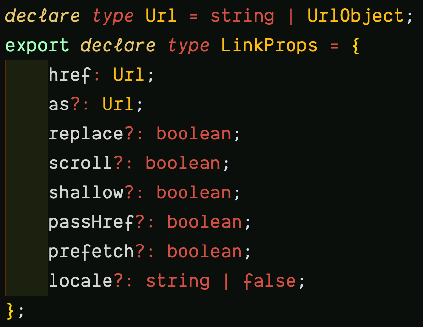
If you inspect the href attribute in VSCode, you’d find the type LinkProps, with the href property a Url type, which is either a string or UrlObject as mentioned previously.

Inspecting the UrlObject further leads to the interface with the properties:

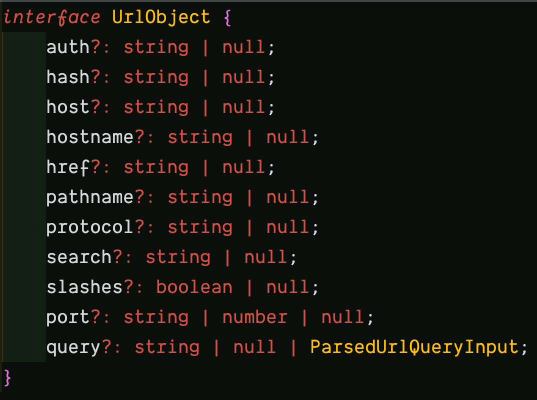
You can learn more about these properties in the Node.js URL module documentation.

One use case of the hash is to link to specific sections in a page.

import Link from 'next/link';

const printedBooks = [{ name: 'Ethical Design', id: 'ethical-design' }];

export default function PrintedBooks() {
  return printedBooks.map((printedBook) => (
    <Link
      href={{
        pathname: /printed-books/${printedBook.id},
        hash: 'faq',
      }}
    >
      {printedBook.name}
    </Link>
  ));
}

The hyperlink will resolve to /printed-books/ethical-design#faq.

Learn more in the docs.

The next/router API

If the next/link is declarative, then the next/router is imperative. It exposes a useRouter hook that allows access to the router object inside any function component. You can use this hook to manually perform routing, most especially in certain scenarios where the next/link is not enough, or where you need to “hook” into the routing.

import { useRouter } from 'next/router';

export default function Home() {
  const router = useRouter();

  function handleClick(e) {
    e.preventDefault();
    router.push(href);
  }

  return (
    <button type="button" onClick={handleClick}>Click me</button>
  )
}

useRouter is a React hook and cannot be used with classes. Need the router object in class components? Use withRouter.

import { withRouter } from 'next/router';

function Home({router}) {
  function handleClick(e) {
    e.preventDefault();
    router.push(href);
  }

  return (
    <button type="button" onClick={handleClick}>Click me</button>
  )
}

export default withRouter(Home);

The router Object

Both the useRouter hook and withRouter higher-order component, return a router object with properties like pathname, query, asPath, and basePath that gives you information about the URL state of the current page, locale, locales, and defaultLocale that gives information about the active, supported, or current default locale.

The router object also has methods like push for navigating to a new URL by adding a new URL entry into the history stack, replace, similar to push but replaces the current URL instead of adding a new URL entry into the history stack.

Learn more about the router object.

Custom Route Configuration With next.config.js

This is a regular Node.js module that can be used to configure certain Next.js behavior.

module.exports = {
  // configuration options
}

Remember to restart your server anytime you update next.config.js. Learn more.

Base Path

It was mentioned that the initial/default route in Next.js is pages/index.js with path /. This is configurable and you can make your default route a sub-path of the domain.

module.exports = {
  // old default path: /
  // new default path: /dashboard
  basePath: '/dashboard',
};

These changes will automatically take effect in your application with all / paths routed to /dashboard.

This feature can only be used with Next.js 9.5 and above. Learn more.

Trailing Slash

By default, a trailing slash will not be available at the end of each URL. However, you can switch that with:

module.exports = {
  trailingSlash: true
};
# trailingSlash: false
/printed-books/ethical-design#faq
# trailingSlash: true
/printed-books/ethical-design/#faq

Both the base path and trailing slash features can only be used with Next.js 9.5 and above.

Conclusion

Routing is one of the most important parts of your Next.js application, and it reflects in the file-system-based router built on the concept of pages. Pages can be used to define the most common route patterns. The concepts of routing and rendering are closely related. Take the lessons of this article with you as you build your own Next.js app or work on a Next.js codebase. And check the resources below to learn more.

Related Resources

CommonMark: A Formal Specification For Markdown

CommonMark is a rationalized version of Markdown syntax with a spec whose goal is to remove the ambiguities and inconsistency surrounding the original Markdown specification. It offers a standardized specification that defines the common syntax of the language along with a suite of comprehensive tests to validate Markdown implementations against this specification.

GitHub uses Markdown as the markup language for its user content.

“CommonMark is an ambitious project to formally specify the Markdown syntax used by many websites on the internet in a way that reflects its real-world usage [...] It allows people to continue using Markdown the same way they always have while offering developers a comprehensive specification and reference implementations to interoperate and display Markdown in a consistent way between platforms.”

— “A Formal Spec For GitHub Flavored Markdown,” The GitHub Blog

In 2012, GitHub proceeded to create its own flavor of Markdown — GitHub Flavored Markdown (GFM) — to combat the lack of Markdown standardization, and extend the syntax to its needs. GFM was built on top of Sundown, a parser specifically built by GitHub to solve some of the shortcomings of the existing Markdown parsers at the time. Five years after, in 2017, it announced the deprecation of Sundown in favor of CommonMark parsing and rendering library, cmark in A formal spec for GitHub Flavored Markdown.

In the Common Questions section of Markdown and Visual Studio Code, it is documented that Markdown in VSCode targets the CommonMark Markdown specification using the markdown-it library, which in itself follows the CommonMark specification.

CommonMark has been widely adopted and implemented (see the List of CommonMark Implementations) for use in different languages like C (e.g cmark), C# (e.g CommonMark.NET), JavaScript (e.g markdown-it) etc. This is good news as developers and authors are gradually moving to a new frontier of been able to use Markdown with a consistent syntax, and a standardized specification.

A Short Note On Markdown Parsers

Markdown parsers are at the heart of converting Markdown text into HTML, directly or indirectly.

Parsers like cmark and commonmark.js do not convert Markdown to HTML directly, instead, they convert it to an Abstract Syntax Tree (AST), and then render the AST as HTML, making the process more granular and subject to manipulation. In between parsing — to AST — and rendering — to HTML — for example, the Markdown text could be extended.

CommonMark’s Markdown Syntax Support

Projects or platforms that already implement the CommonMark specification as the baseline of their specific flavor are often superset of the strict subset of the CommonMark Markdown specification. For the most part of it, CommonMark has mitigated a lot of ambiguities by building a spec that is built to be built on. GFM is a prime example, while it supports every CommonMark syntax, it also extends it to suits its usage.

CommonMark's syntax support can be limited at first, for example, it has no support for this table syntax, but it is important to know that this is by design as this comment in this thread of conversation reveals: that the supported syntax is strict and said to be the core syntax of the language itself — the same specified by its creator, John Gruber in Markdown: Syntax.

At the time of writing, here are a number of supported syntax:

  1. Paragraphs and Line Breaks,
  2. Headers,
  3. Emphasis and Strong Emphasis,
  4. Horizontal Rules,
  5. Lists,
  6. Links,
  7. Images,
  8. Blockquotes,
  9. Code,
  10. Code Blocks.

To follow along with the examples, it is advised that you use the commonmark.js dingus editor to try out the syntax and get the rendered Preview, generated HTML, and AST.

Paragraphs And Line Breaks

In Markdown, paragraphs are continuous lines of text separated by at least a blank line.

The following rules define a paragraph:

  1. Markdown paragraphs are rendered in HTML as the Paragraph element, <p>.
  2. Different paragraphs are separated with one or more blank lines between them.
  3. For a line break, a paragraph should be post-fixed with two blank spaces (or its tab equivalent), or a backslash (\).
Syntax Rendered HTML
This is a line of text <p>This is a line of text</p>
This is a line of text
And another line of text
And another but the
same paragraph
<p>This is a line of text
And another line of text
And another but the
same paragraph</p>
This is a paragraph

And another paragraph

And another
<p>This is a paragraph</p>
<p>And another paragraph</p>
<p>And another</p>
Two spaces after a line of text
Or a post-fixed backslash\
Both means a line break
<p>Two spaces after a line of text<br /><br>Or a post-fixed backslash<br /><br>Both means a line break</p>

Headings

Headings in Markdown represents one of the HTML Heading elements. There are two ways to define headings:

  1. ATX heading.
  2. Setext heading.

The following rules define ATX headings:

  1. Heading level 1 (h1), through to heading level 6, (h6) are supported.
  2. Atx-style headings are prefixed with the hash (#) symbol.
  3. There needs to be at least a blank space separating the text and the hash (#) symbol.
  4. The count of hashes is equivalent to the cardinal number of the heading. One hash is h1, two hashes, h2, 6 hashes, h6.
  5. It is also possible to append an arbitrary number of hash symbol(s) to headings, although this doesn't cause any effect (i.e. # Heading 1 #)
Syntax Rendered HTML
# Heading 1 <h1>Heading 1</h1>
## Heading 2 <h2>Heading 2</h2>
### Heading 3 <h3>Heading 3</h3>
#### Heading 4 <h4>Heading 4</h4>
##### Heading 5 <h5>Heading 5</h5>
###### Heading 6 <h6>Heading 6</h6>
## Heading 2 ## <h2>Heading 2</h2>

The following rules define Setext headings:

  1. Only Heading level 1 (h1), and heading level 2, (h2) are supported.
  2. Setext-style definition is done with the equals (=) and dash symbols respectively.
  3. With Setext, at least one equal or dash symbol is required.
Syntax Rendered HTML
Heading 1
=
<h1>Heading 1</h1>
Heading 2
-
<h2>Heading 2</h2>

Emphasis And Strong Emphasis

Emphasis in Markdown can either be italics or bold (strong emphasis).

The following rules define emphasis:

  1. Ordinary and strong emphasis are rendered in HTML as the Emphasis, <em>, and Strong, <strong> element, respectively.
  2. A text bounded by a single asterisk (*) or underscore (_ ) will be an emphasis.
  3. A text bounded by double asterisks or underscore will be a strong emphasis.
  4. The bounding symbols (asterisks or underscore) must match.
  5. There must be no space between the symbols and the enclosed text.
Syntax Rendered HTML
Italic <em>Italic</em>
Bold <strong>Italic</strong>

Horizontal Rule

A Horizontal rule, <hr/> is created with three or more asterisks (*), hyphens (-), or underscores (_), on a new line. The symbols are separated by any number of spaces, or not at all.

Syntax Rendered HTML
** <hr />
<hr />
--- <hr />
- - - <hr />
___ <hr />
_ _ _ <hr />

Lists

Lists in Markdown are either a bullet (unordered) list or an ordered list.

The following rules define a list:

  1. Bullet lists are rendered in HTML as the Unordered list element, <ul>.
  2. Ordered lists are rendered in HTML as the Ordered list element, <ol>.
  3. Bullet lists use asterisks, pluses, and hyphens as markers.
  4. Ordered lists use numbers followed by periods or closing parenthesis.
  5. The markers must be consistent (you must only use the marker you begin with for the rest of the list items definition).
Syntax Rendered HTML
one
two
* three
<ul>
<li>one</li>
<li>two</li>
<li>three</li>
</ul>
+ one
+ two
+ three
<ul>
<li>one</li>
<li>two</li>
<li>three</li>
</ul>
- one
- two
- three
<ul>
<li>one</li>
<li>two</li>
<li>three</li>
</ul>
- one
- two
+ three
<ul>
<li>one</li>
<li>two</li>
</ul>
<ul>
<li>three</li>
</ul>
1. one
2. two
3. three
<ol>
<li>one</li>
<li>two</li>
<li>three</li>
</ol>
1. three
2. four
3. five
<ol start="3">
<li>three</li>
<li>four</li>
<li>five</li>
</ol>
1. one
100. two
3. three
<ol>
<li>one</li>
<li>two</li>
<li>three</li>
</ol>

Links

Links are supported with the inline and reference format.

The following rules define a link:

  1. Links are rendered as the HTML Anchor element, <a>.
  2. The inline format has the syntax: [value](URL "optional-title") with no space between the brackets.
  3. The reference format has the syntax: [value][id] for the reference, and [id]: href "optional-title" for the hyperlink label, separated with at least a line.
  4. The id is the Definition Identifier and may consist of letters, numbers, spaces, and punctuation.
  5. Definition Identifiers are not case sensitive.
  6. There is also support for Automatic Links, where the URL is bounded by the less than (<) and greater than (>) symbol, and displayed literally.
<!--Markdown-->
Google
<!--Rendered HTML-->
<a href="https://google.com" title="Google">Google</a>

<!--Markdown-->
Google
<!--Rendered HTML-->
<a href="https://google.com">Google</a>

<!--Markdown-->
Article
<!--Rendered HTML-->
<a href="/2020/09/comparing-styling-methods-next-js">Comparing Styling Methods In Next.js</a>

<!--Markdown-->
[Google][id]
<!--At least a line must be in-between-->
<!--Rendered HTML-->
[id]: https://google.com "Google"
Rendered HTML: <a href="https://google.com" title="Google">Google</a>

<!--Markdown-->
<https://google.com>
<!--Rendered HTML-->
<a href="https://google.com">google.com</a>

<!--Markdown-->
<mark@google.com>
<!--Rendered HTML-->
<a href="mailto:mark@google.com">mark@google.com</a>
  • Interactive tutorial to learn about links.
  • Dingus permalink%0A%0A---%0A%0A%5BGoogle%5D(https%3A%2F%2Fgoogle.com)%0A%0A---%0A%0A%5BComparing%20Styling%20Methods%20In%20Next.js%5D(%2F2020%2F09%2Fcomparing-styling-methods-next-js)%0A%0A---%0A%0A%5BGoogle%5D%5Bid%5D%0A%0A%5Bid%5D%3A%20https%3A%2F%2Fgoogle.com%20%22Google%22%0A%0A---%0A%0A%3Chttps%3A%2F%2Fgoogle.com%3E) to check out the full example with the Preview and AST.
  • Learn more about Links.

Images

Images in Markdown follows the inline and reference formats for Links.

The following rules define images:

  1. Images are rendered as the HTML image element, <img>.
  2. The inline format has the syntax: ![alt text](image-url "optional-title").
  3. The reference format has the syntax: ![alt text][id] for the reference, and [id]: image-url "optional-title" for the image label. Both should be separated by at least a blank line.
  4. The image title is optional, and the image-url can be relative.
<!--Markdown-->
![alt text](image-url "optional-title")
<!--Rendered HTML-->
<img src="image-url" alt="alt text" title="optional-title" />

<!--Markdown-->
![alt text][id]
<!--At least a line must be in-between-->
<!--Markdown-->
[id]: image-url "optional-title"
<!--Rendered HTML-->
<img src="image-url" alt="alt text" title="optional-title" />
  • Interactive tutorial to learn about images.
  • Dingus permalink%0A%0A---%0A%0A!%5Balt%20text%5D%5Bid%5D%0A%0A%5Bid%5D%3A%20image-url%20%22optional-title%22) to check out the full example with the Preview and AST.
  • Learn more about Images.

Blockquotes

The HTML Block Quotation element, <blockquote>, can be created by prefixing a new line with the greater than symbol (>).

<!--Markdown-->
> This is a blockquote element
> You can start every new line
> with the greater than symbol.
> That gives you greater control
> over what will be rendered.

<!--Rendered HTML-->
<blockquote>
<p>This is a blockquote element
You can start every new line
with the greater than symbol.
That gives you greater control
over what will be rendered.</p>
</blockquote>

Blockquotes can be nested:

<!--Markdown-->
> Blockquote with a paragraph
>> And another paragraph
>>> And another

<!--Rendered HTML-->
<blockquote>
<p>Blockquote with a paragraph</p>
<blockquote>
<p>And another paragraph</p>
<blockquote>
<p>And another</p>
</blockquote>
</blockquote>
</blockquote>

They can also contain other Markdown elements, like headers, code, list items, and so on.

<!--Markdown-->
> Blockquote with a paragraph
> # Heading 1
> Heading 2
> -
> 1. One
> 2. Two

<!--Rendered HTML-->
<blockquote>
<p>Blockquote with a paragraph</p>
<h1>Heading 1</h1>
<h2>Heading 2</h2>
<ol>
<li>One</li>
<li>Two</li>
</ol>
</blockquote>

Code

The HTML Inline Code element, <code>, is also supported. To create one, delimit the text with back-ticks (`), or double back-ticks if there needs to be a literal back-tick in the enclosing text.

<!--Markdown-->
inline code snippet
<!--Rendered HTML-->
<code>inline code snippet</code>

<!--Markdown-->
&lt;button type='button'&gt;Click Me&lt;/button&gt;
<!--Rendered HTML-->
<code><button type='button'>Click Me</button></code>

<!--Markdown-->
There's an inline back-tick (`).
<!--Rendered HTML-->
<code>There's an inline back-tick (`).</code>

Code Blocks

The HTML Preformatted Text element, <pre>, is also supported. This can be done with at least three and an equal number of bounding back-ticks (`), or tildes (~) — normally referred to as a code-fence, or a new line starting indentation of at least 4 spaces.

<!--Markdown-->
const dedupe = (array) =&gt; [...new Set(array)];
<!--Rendered HTML-->
<pre><code>const dedupe = (array) => [...new Set(array)];</code></pre>

<!--Markdown-->
    const dedupe = (array) => [...new Set(array)];
<!--Rendered HTML-->
<pre><code>const dedupe = (array) => [...new Set(array)];</code></pre>
  • Interactive tutorial to learn about code.
  • Dingus permalink%20%3D%3E%20%5B...new%20Set(array)%5D%3B%0A%60%60%60%0A%0A---%0A%0A%20%20%20%20const%20dedupe%20%3D%20(array)%20%3D%3E%20%5B...new%20Set(array)%5D%3B) to check out the full example with the Preview and AST.
  • Learn more about Fenced and Indented code blocks.

Using Inline HTML

According to John Grubers original spec note on inline HTML, any markup that is not covered by Markdown’s syntax, you simply use HTML itself, with The only restrictions are that block-level HTML elements — e.g. <div>, <table>, <pre>, <p>, etc. — must be separated from surrounding content by blank lines, and the start and end tags of the block should not be indented with tabs or spaces.

However, unless you are probably one of the people behind CommonMark itself, or thereabout, you most likely will be writing Markdown with a flavor that is already extended to handle a large number of syntax not currently supported by CommonMark.

Going Forward

CommonMark is a constant work in progress with its spec last updated on April 6, 2019. There are a number of popular applications supporting it in the pool of Markdown tools. With the awareness of CommonMark’s effort towards standardization, I think it is sufficient to conclude that in Markdown’s simplicity, is a lot of work going on behind the scenes and that it is a good thing for the CommonMark effort that the formal specification of GitHub Flavored Markdown is based on the specification.

The move towards the CommonMark standardization effort does not prevent the creation of flavors to extend its supported syntax, and as CommonMark gears up for release 1.0 with issues that must be resolved, there are some interesting resources about the continuous effort that you can use for your perusal.

Resources

Getting Started With Next.js

Lately, Next.js has termed itself The React Framework for Production, and with such bold claim comes a bevy of features that it offers to help you take your React websites from zero to production. These features would matter less if Next.js isn’t relatively easy to learn, and while the numerous features might mean more things and nuances to learn, its attempt at simplicity, power, and perhaps success at it is definitely something to have in your arsenal.

As you settle in to learn about Next.js, there are some things you might already be familiar with and you might even be surprised at how it gives you a lot to work with that it might seem almost overwhelming at face value. Next.js is lit for static sites and it has been well-engineered for that purpose. But it also takes it further with its Incremental Static Regeneration that combines well with existing features to make development a soothing experience. But wait, you might ask. Why Next.js?

This tutorial will be beneficial to developers who are looking to get started with Next.js or have already begun but need to fill some knowledge gaps. You do not need to be a pro in React, however, having a working experience with React will come in handy.

But Why Next.js?

  1. Relatively easy to learn.
    That’s it. If you’ve written any React at all, you’d find yourself at home with Next.js. It offers you advanced tools and a robust API support, but it doesn’t force you to use them.
  2. Built-in CSS support.
    Writing CSS in component-driven frameworks comes with a sacrosanct need for the “cascade”. It’s why you have CSS-in-JS tools, but Next.js comes out of the box with its own offering — styled-jsx, and also supports a bevy of styling methodologies.
  3. Automatic TypeScript support.
    If you like to code in TypeScript, with Next.js, you literally have automatic support for TypeScript configuration and compilation.
  4. Multiple data fetching technique.
    It supports SSG and/or SSR. You can choose to use one or the other, or both.
  5. File-system routing.
    To navigate between one page to another is supported through the file-system of your app. You do not need any special library to handle routing.

There are many more other features, e.g. using experimental ES features like optional-chaining, not importing react everywhere you use JSX, support for APIs like next/head that helps manage the head of your HTML document, and so on. Suffice to say the deeper you go, the more you enjoy, appreciate, and discover many other features.

Requirements For Creating A Next.js App

Creating a Next.js app requires Node.js, and npm (or npx) installed.

To check if you have Node.js installed, run the command in your terminal:

# It should respond with a version number
node -v

Ideally, npm (and npx) comes with your Node.js installation. To confirm that you have them installed, run the commands in your terminal:

# Run this. It should respond with a version number
npm -v

# Then run this. It should also respond with a version number
npx -v

In case any of the commands above fails to respond with a version number, you might want to look into installing Node.js and npm.

If you prefer the yarn package manager instead, you can run install it with the command:

# Installs yarn globally
npm i -g yarn

Then confirm the installation with:

# It should also respond with a version number
yarn -v

Creating A Next.js App

Getting the requirements above out of the way, creating a Next.js can be done in two ways, the first being the simplest:

  1. With create-next-app, or
  2. Manually

Creating A Next.js App With create-next-app

Using create-next-app is simple and straightforward, plus you can also get going with a starter like Next.js with Redux, Next.js with Tailwind CSS, or Next.js with Sanity CMS etc. You can view the full list of starters in the Next.js examples repo.

# Create a new Next.js app with npx
npx create-next-app <app-name>

# Create a new Next.js app with npm
npm create-next-app <app-name>

# With yarn
yarn create next-app <app-name>

If you’re wondering what the difference between npm and npx is, there’s an in-depth article on the npm blog, Introducing npx: an npm package runner.

Creating A Next.js Project Manually

This requires three packages: next, react, and react-dom.

# With npm
npm install next react react-dom

# With yarn
yarn add next react react-dom

Then add the following scripts to package.json.

"scripts": {
  "dev": "next dev",
  "start": "next start",
  "build": "next build"
}

Folder Structure

One salient thing you might notice after creating a Next.js app is the lean folder structure. You get the bare minimum to run a Next.js app. No more, no less. What you end up with as your app grows is up to you more than it is to the framework.

The only Next.js specific folders are the pages, public, and styles folder.

# other files and folders, .gitignore, package.json...
- pages
  - api
    - hello.js
  - _app.js
  - index.js
- public
  - favicon.ico
  - vercel.svg
- styles
  - globals.css
  - Home.module.css

Pages

In a Next.js app, pages is one of the Next-specific folders you get. Here are some things you need to know about pages:

  • Pages are React components
    Each file in it is a page and each page is a React component.

// Location: /pages/homepage.js
// <HomePage/> is just a basic React component
export default HomePage() {
  return <h1>Welcome to Next.js</h1>
}
  • Custom pages
    These are special pages prefixed with the underscore, like _app.js.

    • _app.js: This is a custom component that resides in the pages folder. Next.js uses this component to initialize pages.
    • _document.js: Like _app.js, _document.js is a custom component that Next.js uses to augment your applications <html> and <body> tags. This is necessary because Next.js pages skip the definition of the surrounding document’s markup.
  • File-based routing system based on pages
    Next.js has a file-based routing system where each page automatically becomes a route based on its file name. For example, a page at pages/profile will be located at /profile, and pages/index.js at /.

# Other folders
- pages
  - index.js # located at /
  - profile.js # located at /profile
  - dashboard
    - index.js # located at /dashboard
    - payments.js # located at /dashboard/payments

Routing

Next.js has a file-based routing system based on pages. Every page created automatically becomes a route. For example, pages/books.js will become route /book.js.

- pages
  - index.js # url: /
  - books.js # url: /books
  - profile.js # url: /profile

Routing has led to libraries like React Router and can be daunting and quite complex because of the sheer number of ways you might see fit to route section of your pages in your Next.js app. Speaking about routing in Next.js is fairly straightforward, for the most part of it, the file-based routing system can be used to define the most common routing patterns.

Index Routes

The pages folder automatically has a page index.js which is automatically routed to the starting point of your application as /. But you can have different index.jss across your pages, but one in each folder. You don’t have to do this but it helps to define the starting point of your routes, and avoid some redundancy in naming. Take this folder structure for example:

- pages
  - index.js
  - users
    - index.js
    - [user].js

There are two index routes at / and /users. It is possible to name the index route in the users folder users.js and have it routed to /users/users if that’s readable and convenient for you. Otherwise, you can use the index route to mitigate the redundancy.

Nested Routes

How do you structure your folder to have a route like /dashboard/user/:id.

You need nested folders:

- pages
  - index.js
  - dashboard
    - index.js
    - user
      - [id].js # dynamic id for each user

You can nest and go deeper as much as you like.

Dynamic Route Segments

The segments of a URL are not always indeterminate. Sometimes you just can’t tell what will be there at development. This is where dynamic route segments come in. In the last example, :id is the dynamic segment in the URL /dashboard/user/:id. The id determines the user that will be on the page currently. If you can think about it, most likely you can create it with the file-system.

The dynamic part can appear anywhere in the nested routes:

- pages
  - dashboard
    - user
      - [id].js
          - profile

will give the route /dashboard/user/:id/profile which leads to a profile page of a user with a particular id.

Imagine trying to access a route /news/:category/:category-type/:league/:team where category, category-type, league, and team are dynamic segments. Each segment will be a file, and files can’t be nested. This is where you’d need a catch-all routes where you spread the dynamic parts like:

- pages
  - news
    - [...id].js

Then you can access the route like /news/sport/football/epl/liverpool.

You might be wondering how to get the dynamic segments in your components. The useRouter hook, exported from next/router is reserved for that purpose and others. It exposes the router object.

import { useRouter } from 'next/router';

export default function Post() {
  // useRouter returns the router object
  const router = useRouter();

  console.log({ router });
  return <div> News </div>;
}

The dynamic segments are in the query property of the router object, accessed with router.query. If there are no queries, the query property returns an empty object.

Linking Between Pages

Navigating between pages in your apps can be done with the Link component exported by next/link. Say you have the pages:

- pages
  - index.js
  - profile.js
  - settings.js
  - users
    - index.js
    - [user].js

You can Link them like:

import Link from "next/link";

export default function Users({users) {
  return (
    <div>
      <Link href="/">Home</Link>
      <Link href="/profile">Profile</Link>
      <Link href="/settings">
        <a> Settings </a>
      </Link>
      <Link href="/users">
        <a> Settings </a>
      </Link>
      <Link href="/users/bob">
        <a> Settings </a>
      </Link>
    </div>
  )
}

The Link component has a number of acceptable props, href — the URL of the hyperlink — been the only required one. It’s equivalent to the href attribute of the HTML anchor (<a>) element.

Other props include:

Prop Default value Description
as Same as href Indicates what to show in the browser URL bar.
passHref false Forces the Link component to pass the href prop to its child./td>
prefetch true Allows Next.js to proactively fetch pages currently in the viewport even before they’re visited for faster page transitions.
replace false Replaces the current navigation history instead of pushing a new URL onto the history stack.
scroll true After navigation, the new page should be scrolled to the top.
shallow false Update the path of the current page without re-running getStaticProps, getServerSideProps, or getInitialProps, allows the page to have stale data if turned on.

Styling

Next.js comes with three styling methods out of the box, global CSS, CSS Modules, and styled-jsx.

There’s an extensive article about Styling in Next.js that has been covered in Comparing Styling Methods in Next.js

Linting And Formatting

Linting and formatting I suspect is a highly opinionated topic, but empirical metrics show that most people who need it in their JavaScript codebase seem to enjoy the company of ESLint and Prettier. Where the latter ideally formats, the former lints your codebase. I’ve become quite accustomed to Wes Bos’s ESLint and Prettier Setup because it extends eslint-config-airbnb, interpolate prettier formatting through ESLint, includes sensible-defaults that mostly works (for me), and can be overridden if the need arises.

Including it in your Next.js project is fairly straightforward. You can install it globally if you want but we’d be doing so locally.

  • Run the command below in your terminal.
# This will install all peer dependencies required for the package to work
npx install-peerdeps --dev eslint-config-wesbos
  • Create a .eslintrc file at the root of your Next.js app, alongside the pages, styles and public folder, with the content:
{
  "extends": [
    "wesbos"
  ]
}

At this point, you can either lint and format your code manually or you can let your editor take control.

  • To lint and format manually requires adding two npm scripts lint, and lint:fix.
"scripts": {
  "dev": "next dev",
  "build": "next build",
  "start": "next start"
  "lint": "eslint .", # Lints and show you errors and warnings alone
  "lint:fix": "eslint . --fix" # Lints and fixes
},
  • If you’re using VSCode and you’d prefer your editor to automatically lint and format you need to first install the ESLint VSCode plugin then add the following commands to your VSCode settings:
# Other setting
"editor.formatOnSave": true,
"[javascript]": {
  "editor.formatOnSave": false
},
"[javascriptreact]": {
  "editor.formatOnSave": false
},
"eslint.alwaysShowStatus": true,
"editor.codeActionsOnSave": {
  "source.fixAll": true
},
"prettier.disableLanguages": ["javascript", "javascriptreact"],

Note: You can learn more on how to make it work with VSCode over here.

As you work along you most likely will need to override some config, for example, I had to turn off the react/jsx-props-no-spreading rule which errors out when JSX props are been spread as in the case of pageProps in the Next.js custom page component, _app.js.

function MyApp({ Component, pageProps }) {
  return <Component {...pageProps} />;
}

Turning the rule off goes thus:

{
  "extends": [
    "wesbos"
  ],
  "rules": {
    "react/jsx-props-no-spreading": 0
  }
}

Static Assets

At some or several points in your Next.js app lifespan, you’re going to need an asset or another. It could be icons, self-hosted fonts, or images, and so on. To Next.js this is otherwise known as Static File Serving and there is a single source of truth, the public folder. The Next.js docs warns: Don't name the public directory anything else. The name cannot be changed and is the only directory used to serve static assets.

Accessing static files is straightforward. Take the folder structure below for example,

- pages
  profile.js
- public
  - favicon.ico #url /favicon.ico
  - assets
    - fonts
      - font-x.woff2
      - font-x.woff # url: /assets/fonts/font-x.woff2
    - images
      - profile-img.png # url: /assets/images/profile-img.png
- styles
  - globals.css

You can access the the profile-img.png image from the <Profile/> component:

// <Profile/> is a React component
export default function Profile() {
  return {
      <div className="profile-img__wrap">
        <img src="/assets/images/profile-img.png" alt="a big goofy grin" />
      </div>
  }
}

or the fonts in the fonts folder in CSS:

/* styles/globals.css */
@font-face {
  font-family: 'font-x';
  src: url(/assets/fonts/font-x.woff2) format('woff2'),
       url(/assets/fonts/font-x.woff) format('woff');
}

Data Fetching

Data fetching in Next.js is a huge topic that requires some level of undertaken. Here, we’ll discuss the crux. Before we dive in, there’s a precursory need to have an idea of how Next.js renders its pages.

Pre-rendering is a huge part of how Next.js works as well as what makes it fast. By default, Next.js pre-renders every page by generating each page HTML in advance alongside the minimal JavaScript they need to run, through a process known as Hydration.

It is possible albeit impractical for you to turn off JavaScript and still have some parts of your Next.js app render. If you ever do this, consider doing it for mechanical purposes alone to show that Next.js truly Hydrates rendered pages.

That being said, there are two forms of pre-rendering:

  1. Static Generation (SG),
  2. Server-side Rendering (SSR).

The difference between the two lies in when data is been fetched. For SG, data is fetched at build time and reused on every request (which makes it faster because it can be cached), while in SSR, data is fetched on every request.

What they both have in common is that they can be mixed with Client-side Rendering wit fetch, Axios, SWR, React Query etc.

The two forms of pre-rendering isn’t an absolute one-or-the-other case; you can choose to use Static Generation or Server-side Rendering, or you can use a hybrid of both. That is, while some parts of your Next.js app uses Static Generation, another can use SSR.

In both cases, Next.js offers special functions to fetch your data. You can use one of the Traditional Approach to Data Fetching in React or you can use the special functions. It’s advisable to use the special functions, not because they’re supposedly special, nor because they’re aptly named (as you’ll see) but because they give you a centralized and familiar data fetching technique that you can’t go wrong with.

The three special functions are:

  1. getStaticProps — used in SG when your page content depends on external data.
  2. getStaticPaths — used in SG when your page paths depends on external data.
  3. getServerSideProps — used in Server-side Rendering.

getStaticProps

getStaticProps is a sibling to getStaticPaths and is used in Static Generation. It’s an async function where you can fetch external data, and return it as a prop to the default component in a page. The data is returned as a props object and implicitly maps to the prop of the default export component on the page.

In the example below, we need to map over the accounts and display them, our page content is dependent on external data as we fetched and resolved in getStaticProps.

// accounts get passed as a prop to <AccountsPage/> from getStaticProps()
// Much more like <AccountsPage {...{accounts}} />
export default function AccountsPage({accounts}) {
  return (
    <div>
      <h1>Bank Accounts</h1>
      {accounts.map((account) => (
        <div key={account.id}>
          <p>{account.Description}</p>
        </div>
      ))}
    </div>
  )
}

export async function getStaticProps() {
  // This is a real endpoint
  const res = await fetch('https://sampleapis.com/fakebank/api/Accounts');
  const accounts = await res.json();

  return {
    props: {
      accounts: accounts.slice(0, 10),
    },
  };
}

As you can see, getStaticProps works with Static Generation, and returns a props object, hence the name.

getStaticPaths

Similar to getStaticProps, getStaticPaths is used in Static Generation but is different in that it is your page paths that is dynamic not your page content. This is often used with getStaticProps because it doesn’t return any data to your component itself, instead it returns the paths that should be pre-rendered at build time. With the knowledge of the paths, you can then go ahead to fetch their corresponding page content.

Think about Next.js pre-rendering your page in the aspect of a dynamic page with regards to Static Generation. For it to do this successfully at build time, it has to know what the page paths are. But it can’t because they’re dynamic and indeterminate, this is where getStaticPaths comes in.

Imagine you have a Next.js app with pages States and state that shows a list of countries in the United States and a single state respectively. You might have a folder structure that looks like:

- pages
  - index.js
  - states
    - index.js # url: /states
    - [id].js # url /states/[id].js
 

You create the [id].js to show a single state based on their id. So, it the page content (data returned from getStaticProps) will be dependent on the page paths (data returned from getStaticPaths).

Let’s create the <States/> components first.

// The states will be passed as a prop from getStaticProps
export default function States({states}) {
  // We'll render the states here
}

export async function getStaticProps() {
  // This is a real endpoint.
  const res = await fetch(https://sampleapis.com/the-states/api/the-states);
  const states = await res.json();

  // We return states as a prop to <States/>
  return {
    props: {
      states
    }
  };
}

Now let’s create the dynamic page for a single state. It’s the reason we have that [id].js so that we can match the path /states/1, or /states/2 where 1 and 2 are the id in [id].js.

// We start by expecting a state prop from getStaticProps
export default function State({ state }) {
    // We'll render the states here
}

// getStaticProps has a params prop that will expose the name given to the
// dynamic path, in this case, id that can be used to fetch each state by id.
export async function getStaticProps({ params }) {
  const res = await fetch(
    https://sampleapis.com/the-states/api/the-states?id=${params.id}
  );
  const state = await res.json();

  return {
    props: {
      state: state[0]
    }
  };
}

If you try to run the code as it is, you’d get the message: Error: getStaticPaths is required for dynamic SSG pages and is missing for /states/[id].

// The state component
// getStaticProps function
// getStaticPaths
export async function getStaticPaths() {
  // Fetch the list of states
  const res = await fetch("https://sampleapis.com/the-states/api/the-states");
  const states = await res.json();

  // Create a path from their ids: /states/1, /states/2 ...
  const paths = states.map((state) => /states/${state.id});

  // Return paths, fallback is necessary, false means unrecognize paths will
  // render a 404 page
  return { paths, fallback: false };
}

With the paths returned from getStaticPaths, getStaticProps will be made aware and its params props will be populated with necessary values, like the id in this case.

Extras

Absolute Imports

There’s support for absolute import starting from Next.js 9.4 which means you no longer have to import components relatively like:

import FormField from "../../../../../../components/general/forms/formfield"

instead you can do so absolutely like:

import FormField from "components/general/forms/formfield";

To get this to work, you will need a jsconfig.json or tsconfig.json file for JavaScript and TypeScript respectively, with the following content:

{
  "compilerOptions": {
      "baseUrl": "."
  }
}

This assumes that the components folder exists at the root of your app, alongside pages, styles, and public.

Experimental ES Features

It is possible to use some experimental features like Nullish coalescing operator (??) and Optional chaining (?.) in your Next.js app.

export default function User({user) {
  return <h1>{person?.name?.first ?? 'No name'}</h1>
}

Conclusion

According to the Next.js team, many of the goals they set out to accomplish were the ones listed in The 7 principles of Rich Web Applications, and as you work your way in and deep into the ecosystem, you’d realize you’re in safe hands like many other users who have chosen to use Next.js to power their websites/web applications. Give it a try, if you haven’t, and if you have, keep going.

Resources

Comparing Styling Methods In Next.js

As you might be aware, there are many differing perspectives on CSS-in-JS, and we all have an opinion of the topic in one way or the other that might be quite different from the opinions of framework authors.

Next.js is one of the recommended tool-chains when creating a new React app. Tools like Next have a simple goal of abstracting away commonly redundant tasks when writing a React app. This helps developers focus more on writing code than reinventing the wheel. While this is usually a good thing, it can also be a little tedious to get started with. For one, there’s a hurdle to cross by learning about the abstractions, and while there are a bevy of that in Next (Routing, Data Fetching…), one often overlooked is Styling.

To serve a wider audience, Next.js supports a myriad of ways to style your components. Whether you belong to the Utility first or CSS-in-JS party isn’t much of Next’s concern, its concern is how you inject your choice into its API.

The goal of this article is to help you understand how to set up styling in your Next app. We’ll be using different methods to handle the comparison. We’ll implement the different types of styling in a book application I have set up. The styling methods we’ll be looking at include:

  1. Global CSS,
  2. SASS/SCSS,
  3. Component-Level SASS/SCSS,
  4. Component-Level CSS (CSS Modules),
  5. Styled-Components,
  6. Styled JSX,
  7. Emotion.

Prerequisite

Before we begin our styling tour, there are some Next nuances you need to acquaint yourself with.

  1. _app.js
    This is a custom component that resides in the pages folder. Next.js uses this component to initialize pages.
  2. _document.js
    Like _app.js, _document.js is a custom component that Next.js uses to augment your applications <html> and <body> tags. This is necessary because Next.js pages skip the definition of the surrounding document’s markup.
  3. _.babelrc
    When present, Next.js uses this file as the single source of truth for some internal configuration and gives you permission to extend it.

Keep in mind that if you have your server running before adding the _app.js file, then you need to restart it.

Creating A Next App With create-next-app

Creating a Next app with create-next-app is as simple as following the steps below:

  • Install create-next-app globally.
yarn global add create-next-app // Installs create-next-app globally
  • Create a new Next app named styling-in-next.
create-next-app styling-in-next // Creates a new Next app named styling-in-next
  • Change directory into the new site.
cd styling-in-next // Switch directory into the new Next app
  • Run the site.
yarn dev -p 3000 // Instruct Next to run on port 3000

Refer to the documentation for more information on creating and running a Next app.

The app should now be running on http://localhost:3000.

Demo Repository

As we go along we’ll be building a contrived Bookshelf by applying different styling methods to each books. The end result will look like:

The image above shows 6 books; each book will have its own components, then we’ll apply a specific style type to each specific book, i.e. Book 1 will make use of a global style while Book 2 will make use of another. This way we’ll see how each of these styles work and how they can be used. This will help you in making a better decision on what option to choose.

To make things simple, I’ve scaffolded a GitHub repository for you to follow along. You can grab it here.

Some changes have also been made to the default starter generated by create-next-app. Folders like emotion, global, modules, styled-components etc. have been added to the styles folder — with their corresponding style files — as well as a components directory with multiple components.

The index.js file has been modified to import and render the needed components, and each of the components has a similar structure as shown in the image below.

If you cloned and ran the demo repository, here’s what your page should look like:

With all that out of the way, let’s get styling.

Global Style

One of the common things you’d normally do when you start a new web project is to reset or normalize your CSS so there’s a uniform starting position among browsers. This is a perfect example of using Global CSS without worrying about scoping.

/ styles/global/globals.css /
html {
  box-sizing: border-box;
  font-size: 16px;
  font-family: -apple-system, BlinkMacSystemFont, Segoe UI, Roboto, Oxygen,
    Ubuntu, Cantarell, Fira Sans, Droid Sans, Helvetica Neue, sans-serif;
}
,
:before,
*:after {
  box-sizing: inherit;
}
body,
h1,
h2,
h3,
h4,
h5,
h6,
p,
ol,
ul {
  margin: 0;
  padding: 0;
  font-weight: normal;
}
h1,
h2,
h3,
h4,
h5,
h6 {
  font-weight: bold;
}

ol,
ul {
  list-style: none;
}

img {
  max-width: 100%;
  height: auto;
}

a {
  color: inherit;
  text-decoration: none;
}
  • Import the CSS reset styles/global/globals.css in pages/_app.js.
// pages/_app.js
import "../styles/global/globals.css";

function MyApp({Component, pageProps}) {
  return <Component {...pageProps} />;
}

export default MyApp;

Global styles can only be imported in the pages/_app.js. This is directly logical because these styles will apply to all pages and components in your application — regardless of where you import them — so it is better to have a single source of [import] truth to keep things straightforward, and/or if something goes wrong.

At this point, we do not have a lot of visual changes to our Bookshelf since we have only made normalization changes. One thing you might notice is the font and spacing changes.

SASS/SCSS

Next.js also allows styling with SASS with the .sass or .scss extension. Installing Sass is a requirement. Just like global styles, they can only be imported in pages/_app.js.

  • Install the Sass package.
yarn add sass
  • Update styles/scss/bookshelf.scss.
// styles/scss/bookshelf.scss
.the-bookshelf {
  width: 100vw;
  height: 100vh;
  background-color: #e3e3e3;
  display: flex;
  justify-content: center;
  align-items: center;

  .bookshelf-wrap {
    > .bookshelf {
      box-shadow: inset 0 -20px #7b5019;
      padding-bottom: 20px;
      display: flex;
      align-items: flex-end;
    }

    [class*="book"] {
      font-size: 32px;
      letter-spacing: -0.045em;
      display: flex;
      transition: 0.2s;

      &:hover {
        transform: none;
      }
    }

    .book-info {
      text-transform: uppercase;
      writing-mode: sideways-rl;
      display: flex;
      justify-content: space-around;
      flex: 1;
      align-items: center;
      font-weight: bold;
      padding: 16px 0;

      .title {
        font-weight: inherit;
        font-size: 20px;
      }

      .author {
        font-weight: inherit;
        font-size: 15px;
      }
    }
  }
}
  • Also update styles/sass/bookone.sass and styles/sass/booktwo.sass like so:
// styles/sass/bookone.sass
  .book-one
    color: #f00
    width: 78px
    height: 350px
    transform: rotate(-4deg)
    margin-left: 16px
    margin-right: 23px
    background-color: black
// styles/sass/booktwo.sass
.book-two
  color: #781e0b
  width: 38px
  height: 448px
  margin-right: 23px
  background-color: #ffab44

SASS (.sass) is based on indentation. To make formatting easier, you can install this VSCode Extension for SASS files support (formatting, syntax highlighting…)

  • Import the three style files — styles/scss/bookshelf.scss , styles/sass/bookone.sass, and styles/sass/booktwo.sass — in pages/_app.js.
// pages/_app.js
import "../styles/globals.css";
import "../styles/scss/bookshelf.scss";
import "../styles/sass/bookone.sass";
import "../styles/sass/booktwo.sass";

function MyApp({Component, pageProps}) {
  return ;
}

export default MyApp;

Our Bookshelf is beginning to take shape. With the styles applied, the first and second book should be styled and displayed as intended.

CSS Modules

CSS Modules is a component-level CSS, that comes built-in with Next and can be activated by naming the style files with the .module.css extension. It is also possible to use CSS Modules with SASS/SCSS with the .module.sass or .module.scss extension.

Let’s style the components/BookThree.js component with it.

  • Update styles/modules/BookThree.module.css.

/* styles/modules/BookThree.module.css */
.book-three {
  color: #df66c3;
  width: 106px;
  height: 448px;
  margin-right: 23px;
  background-color: #153086;
  transform: rotate(-4deg);
}
  • Import styles/modules/BookThree.module.css in components/BookThree.js, and apply the .book-three class.
// components/BookThree.js
import BookThreeStyles from "../styles/modules/BookThree.module.css";

export default function BookThree() {
  return (
    <div className={BookThreeStyles["book-three"]}>
      <div className="book-info">
        <p className="title">the revolt of the public</p>
        <p className="author">Martin Gurri</p>
      </div>
    </div>
  );
}

Accessing class names in CSS Modules is similar to Property Accessors in JavaScript — with the dot or bracket notation. Here we import BookThreeStyles and then use the bracket notation to apply the style we have in styles/modules/BookThree.module.css file.

If the selector (in this case, class name) was properly accessed, the third book should be styled now.

Emotion

Emotion is a CSS-in-JS library and like any other CSS-in-JS, allows you to write CSS styles with JavaScript.

Let’s style the components/BookFour.js component with it.

  • Install the packages: @emotion/core, @emotion/styled, emotion, emotion-server.
yarn add @emotion/core @emotion/styled emotion emotion-server
  • Update styles/emotion/StyledBookFour.js.
// styles/emotion/StyledBookFour.js
import styled from "@emotion/styled";

export const StyledBookFour = styled.div`
  color: white;
  width: 38px;
  height: 400px;
  margin-left: 20px;
  margin-right: 10px;
  background-color: #2faad2;
  transform: rotate(4deg);
`;

After importing styled from @emotion/styled, we export the StyledBookFour styled component — not to be confused with the other CSS-in-JS Styled Component — enhanced with the styled emotion method as in styled.div. Then we can use <StyledBookFour/> as in the next step below.

Learn more about emotion’s styled function.

  • Using <StyledBookFour/> is similar to how you’d use any other React component. Import styles/emotion/StyledBookFour.js in components/BookFour.js, and apply the StyledBookFour component.
// components/BookFour.js
import {StyledBookFour} from "../styles/emotion/StyledBookFour";

export default function BookFour() {
  return (
    <StyledBookFour className="book-four">
      <div className="book-info">
        <p className="title">the man died</p>
        <p className="author">wole soyinka</p>
      </div>
    </StyledBookFour>
  );
}

With a sufficient dose of emotion, the fourth book should be thus styled.

Styled JSX

Like Global CSS and CSS-Modules, Styled-JSX works with Next.js without any extra setup required. If it helps, Styled-JSX is also Vercel’s offering of a component-based CSS, the same creators of Next.js.

Let’s style the components/BookFive.js component with it.

To keep things simple, we use the internal mode of styled-jsx here. By passing the jsx prop to the <style/> component, we are able to write as much CSS as we want like we did with .book-five, with the additional benefit of the style being localized to the <BookFive/> component.

// components/BookFive.js
export default function BookFive() {
  return (
    <div className="book-five">
      <div className="book-info">
        <p className="title">there was a country</p>
        <p className="author">Chinua Achebe</p>
      </div>
      <style jsx>{`
        .book-five {
          color: #fff;
          width: 106px;
          height: 448px;
          margin-right: 23px;
          background-color: #000;
          transform: rotate(4deg);
        }
      `}</style>
    </div>
  );
}

And just like that, the fifth book takes its styling.

Styled Components

Styled-Component, just like Emotion, is also a CSS-in-JS library that allows you to write CSS styles with JavaScript. Getting it setup is a little bit involved.

  • First, install babel-plugin-styled-components and styled-components.
yarn add babel-plugin-styled-components styled-components
  • Create a .babelrc file at the root of your app, and a pages/_document.js file, as shown in the before (left) and after(right) image below.

  • Update the .babelrc file to include the next/babel preset and include the styled-components plugin, with server-side-rendering (ssr) enabled.
// .babelrc
{
  "presets": ["next/babel"],
  "plugins": [
    [
      "styled-components",
      {
        "ssr": true
      }
    ]
  ]
}
  • Update pages/_document.js by injecting the server-side rendered styles into the <head>.

Keep in mind, the snippet below (pages/_document.js) is a required logic for styled-components to work with Next.js. You almost have to do nothing but copy the logic as pointed out in the styled-components documentation.

// pages/_document.js
import Document from "next/document";
import {ServerStyleSheet} from "styled-components";

export default class MyDocument extends Document {
  static async getInitialProps(ctx) {
    const sheet = new ServerStyleSheet();
    const originalRenderPage = ctx.renderPage;

    try {
      ctx.renderPage = () =>
        originalRenderPage({
          enhanceApp: (App) => (props) =>
            sheet.collectStyles(<App {...props} />),
        });

      const initialProps = await Document.getInitialProps(ctx);
      return {
        ...initialProps,
        styles: (
          <>
            {initialProps.styles}
            {sheet.getStyleElement()}
          </>
        ),
      };
    } finally {
      sheet.seal();
    }
  }
}

After the updates to .babelrc, and pages/_document.js, we can now begin to use styled-components.

  • Update styles/styled-components/StyledBookSix.js.

styled is an internal utility method that transforms the styling from JavaScript into actual CSS. <StyledBookSix/> is, and, can be used as any other React component.

// styles/StyledBookSix.js
import styled from "styled-components";

const StyledBookSix = styled.div`
  color: #fff;
  width: 106px;
  height: 448px;
  margin-right: 23px;
  background-color: rebeccapurple;
`;

export default StyledBookSix;

Learn more about How To Use Styled-Components in React.

  • Import styles/styled-components/StyledBookSix.js in components/BookSix.js, using the imported styled-components <StyledBookSix/>.
// components/BookSix.js
import StyledBookSix from "../styles/styled-components/StyledBookSix";

export default function BookSix() {
  return (
    <StyledBookSix className="book-six">
      <div className="book-info">
        <p className="title">purple hibiscus</p>
        <p className="author">chimamanda ngozi adichie</p>
      </div>
    </StyledBookSix>
  );
}

With the first to sixth step completed, the sixth should be styled, and the Bookshelf done:

That’s it.

If all went well, then you should have the complete Bookshelf with the books waiting to be read.

Conclusion

In my own usage with Next.js, Global styles and styled-components have often been sufficient. But there’s no doubt that all these methods have their pros and cons. And as you settle on what method to use, just keep in mind: in the end, it’s all CSS. At this point, I believe you can be able to figure out which pattern best serves you in your next project.

Resources

I find that for learning about setting up styling methods with Next.js, there’s no better place than its official documentation.

But there are also specific repositories for various styling methods. You can go through the various repository to learn more, or check for update, as things may change incognito.

  1. Tailwind CSS
  2. CSS Modules
  3. Less
  4. Stylus
  5. Tailwind CSS with Emotion
  6. Styletron
  7. Glamor
  8. CXS
  9. Aphrodite
  10. Fela
  11. Styled-JSX

How To Use Styled-Components In React

How To Use Styled-Components In React

How To Use Styled-Components In React

Adebiyi Adedotun

Styled components are a CSS-in-JS tool that bridges the gap between components and styling, offering numerous features to get you up and running in styling components in a functional and reusable way. In this article, you’ll learn the basics of styled components and how to properly apply them to your React applications. You should have worked on React previously before going through this tutorial. If you’re looking for various options in styling React components, you can check out our previous post on the subject.

At the core of CSS is the capability to target any HTML element — globally — no matter its position in the DOM tree. This can be a hindrance when used with components, because components demand, to a reasonable extent, colocation (i.e. keeping assets such as states and styling) closer to where they’re used (known as localization).

In React’s own words, styled components are “visual primitives for components”, and their goal is to give us a flexible way to style components. The result is a tight coupling between components and their styles.

Note: Styled components are available both for React and React Native, and while you should definitely check out the React Native guide, our focus here will be on styled components for React.

Why Styled Components?

Apart from helping you to scope styles, styled components include the following features:

  • Automatic vendor prefixing
    You can use standard CSS properties, and styled components will add vendor prefixes should they be needed.
  • Unique class names
    Styled components are independent of each other, and you do not have to worry about their names because the library handles that for you.
  • Elimination of dead styles
    Styled components remove unused styles, even if they’re declared in your code.
  • and many more.

Installation

Installing styled components is easy. You can do it through a CDN or with a package manager such as Yarn…

yarn add styled-components

… or npm:

npm i styled-components

Our demo uses create-react-app.

Starting Out

Perhaps the first thing you’ll notice about styled components is their syntax, which can be daunting if you don’t understand the magic behind styled components. To put it briefly, styled components use JavaScript’s template literals to bridge the gap between components and styles. So, when you create a styled component, what you’re actually creating is a React component with styles. It looks like this:

import styled from "styled-components";

// Styled component named StyledButton
const StyledButton = styled.button`
  background-color: black;
  font-size: 32px;
  color: white;
`;

function Component() {
  // Use it like any other component.
  return <StyledButton> Login </StyledButton>;
}

Here, StyledButton is the styled component, and it will be rendered as an HTML button with the contained styles. styled is an internal utility method that transforms the styling from JavaScript into actual CSS.

In raw HTML and CSS, we would have this:

button {
  background-color: black;
  font-size: 32px;
  color: white;
}

<button> Login </button>

If styled components are React components, can we use props? Yes, we can.

Adapting Based on Props

Styled components are functional, so we can easily style elements dynamically. Let’s assume we have two types of buttons on our page, one with a black background, and the other blue. We do not have to create two styled components for them; we can adapt their styling based on their props.

import styled from "styled-components";

const StyledButton = styled.button`
  min-width: 200px;
  border: none;
  font-size: 18px;
  padding: 7px 10px;
  /* The resulting background color will be based on the bg props. */
  background-color: ${props => props.bg === "black" ? "black" : "blue";
`;

function Profile() {
  return (
    <div>
      <StyledButton bg="black">Button A</StyledButton>
      <StyledButton bg="blue">Button B</StyledButton>
    </div>
  )
}

Because StyledButton is a React component that accepts props, we can assign a different background color based on the existence or value of the bg prop.

You’ll notice, though, that we haven’t given our button a type. Let’s do that:

function Profile() {
  return (
    <>
      <StyledButton bg="black" type="button">
        Button A
      </StyledButton>
      <StyledButton bg="blue" type="submit" onClick={() => alert("clicked")}>
        Button B
      </StyledButton>
    </>
  );
}

Styled components can differentiate between the types of props they receive. They know that type is an HTML attribute, so they actually render <button type="button">Button A</button>, while using the bg prop in their own processing. Notice how we attached an event handler, too?

Speaking of attributes, an extended syntax lets us manage props using the attrs constructor. Check this out:

const StyledContainer = styled.section.attrs((props) => ({
  width: props.width || "100%",
  hasPadding: props.hasPadding || false,
}))`
  --container-padding: 20px;
  width: ${(props) => props.width}; // Falls back to 100%
  padding: ${(props) =>
    (props.hasPadding && "var(--container-padding)") || "none"};
`;

Notice how we don’t need a ternary when setting the width? That’s because we’ve already set a default for it with width: props.width || "100%",. Also, we used CSS custom properties because we can!

Note: If styled components are React components, and we can pass props, then can we also use states? The library’s GitHub account has an issue addressing this very matter.

Extending Styles

Let’s say you’re working on a landing page, and you’ve set your container to a certain max-width to keep things centered. You have a StyledContainer for that:

const StyledContainer = styled.section`
  max-width: 1024px;
  padding: 0 20px;
  margin: 0 auto;
`;

Then, you discover that you need a smaller container, with padding of 10 pixels on both sides, instead of 20 pixels. Your first thought might be to create another styled component, and you’d be right, but it wouldn’t take any time before you realize that you are duplicating styles.

const StyledContainer = styled.section`
  max-width: 1024px;
  padding: 0 20px;
  margin: 0 auto;
`;

const StyledSmallContainer = styled.section`
  max-width: 1024px;
  padding: 0 10px;
  margin: 0 auto;
`;

Before you go ahead and create StyledSmallContainer, like in the snippet above, let’s learn the way to reuse and inherit styles. It’s more or less like how the spread operator works:

const StyledContainer = styled.section`
  max-width: 1024px;
  padding: 0 20px;
  margin: 0 auto;
`;

// Inherit StyledContainer in StyledSmallConatiner
const StyledSmallContainer = styled(StyledContainer)`
  padding: 0 10px;
`;

function Home() {
  return (
    <StyledContainer>
      <h1>The secret is to be happy</h1>
    </StyledContainer>
  );
}

function Contact() {
  return (
    <StyledSmallContainer>
      <h1>The road goes on and on</h1>
    </StyledSmallContainer>
  );
}

In your StyledSmallContainer, you’ll get all of the styles from StyledContainer, but the padding will be overridden. Keep in mind that, ordinarily, you’ll get a section element rendered for StyledSmallContainer, because that’s what StyledContainer renders. But that doesn’t mean it’s carved in stone or unchangeable.

The “as” Polymorphic Prop

With the as polymorphic prop, you can swap the end element that gets rendered. One use case is when you inherit styles (as in the last example). If, for example, you’d prefer a div to a section for StyledSmallContainer, you can pass the as prop to your styled component with the value of your preferred element, like so:

function Home() {
  return (
    <StyledContainer>
      <h1>It’s business, not personal</h1>
    </StyledContainer>
  );
}

function Contact() {
  return (
    <StyledSmallContainer as="div">
      <h1>Never dribble when you can pass</h1>
    </StyledSmallContainer>
  );
}

Now, StyledSmallContainer will be rendered as a div. You could even have a custom component as your value:

function Home() {
  return (
    <StyledContainer>
      <h1>It’s business, not personal</h1>
    </StyledContainer>
  );
}

function Contact() {
  return (
    <StyledSmallContainer as={StyledContainer}>
      <h1>Never dribble when you can pass</h1>
    </StyledSmallContainer>
  );
}

Don’t take it for granted.

SCSS-Like Syntax

The CSS preprocessor Stylis enables styled components to support SCSS-like syntax, such as nesting:

const StyledProfileCard = styled.div`
  border: 1px solid black;

  > .username {
    font-size: 20px;
    color: black;
    transition: 0.2s;

    &:hover {
      color: red;
    }

    + .dob {
      color: grey;
    }
  }
`;

function ProfileCard() {
  return (
    <StyledProfileCard>
      <h1 className="username">John Doe</h1>
      <p className="dob">
        Date: <span>12th October, 2013</span>
      </p>
      <p className="gender">Male</p>
    </StyledProfileCard>
  );
}

Animation

Styled components have a keyframes helper that assists with constructing (reusable) animation keyframes. The advantage here is that the keyframes will be detached from the styled components and can be exported and reused wherever needed.

import styled, {keyframes} from "styled-components";

const slideIn = keyframes`
  from {
    opacity: 0;
  }

  to {
    opacity: 1;
  }
`;

const Toast = styled.div`
  animation: ${slideIn} 0.5s cubic-bezier(0.4, 0, 0.2, 1) both;
  border-radius: 5px;
  padding: 20px;
  position: fixed;
`;

Global Styling

While the original goal of CSS-in-JS and, by extension, styled components is scoping of styles, we can also leverage styled components’ global styling. Because we’re mostly working with scoped styles, you might think that’s an invariable factory setting, but you’d be wrong. Think about it: What really is scoping? It’s technically possible for us — in the name of global styling — to do something similar to this:

ReactDOM.render(
  <StyledApp>
    <App />
  </StyledApp>,
  document.getElementById("root")
);

But we already have a helper function — createGlobalStyle — whose sole reason for existence is global styling. So, why deny it its responsibility?

One thing we can use createGlobalStyle for is to normalize the CSS:

import {createGlobalStyle} from "styled-components";

const GlobalStyle = createGlobalStyle`
    /* Your css reset here */
`;

// Use your GlobalStyle
function App() {
  return (
    <div>
      <GlobalStyle />
      <Routes />
    </div>
  );
}

Note: Styles created with createGlobalStyle do not accept any children. Learn more in the documentation.

At this point, you might be wondering why we should bother using createGlobalStlye at all. Here are a few reasons:

  • We can’t target anything outside of the root render without it (for example, html, body, etc.).
  • createGlobalStyle injects styles but does not render any actual elements. If you look at the last example closely, you’ll notice we didn’t specify any HTML element to render. This is cool because we might not actually need the element. After all, we’re concerned with global styles. We are targeting selectors at large, not specific elements.
  • createGlobalStyle is not scoped and can be rendered anywhere in our app and will be applicable as long as it’s in the DOM. Think about the concept, not the structure.
import {createGlobalStyle} from "styled-components";

const GlobalStyle = createGlobalStyle`
  /* Your css reset here */

  .app-title {
    font-size: 40px;
  }
`;

const StyledNav = styled.nav`
    /* Your styles here */
`;

function Nav({children}) {
  return (
    <StyledNav>
      <GlobalStyle />
      {children}
    </StyledNav>
  );
}

function App() {
  return (
    <div>
      <Nav>
        <h1 className="app-title">STYLED COMPONENTS</h1>
      </Nav>
      <Main />
      <Footer />
    </div>
  );
}

If you think about the structure, then app-title should not be styled as set in GlobalStyle. But it doesn’t work that way. Wherever you choose to render your GlobalStyle, it will be injected when your component is rendered.

Be careful: createGlobalStyles will only be rendered if and when it’s in the DOM.

CSS Helper

Already we’ve seen how to adapt styles based on props. What if we wanted to go a little further? The CSS helper function helps to achieve this. Let’s assume we have two text-input fields with states: empty and active, each with a different color. We can do this:

const StyledTextField = styled.input`
  color: ${(props) => (props.isEmpty ? "none" : "black")};
`;

All’s well. Subsequently, if we need to add another state of filled, we’d have to modify our styles:

const StyledTextField = styled.input`
  color: ${(props) =>
    props.isEmpty ? "none" : props.active ? "purple" : "blue"};
`;

Now the ternary operation is growing in complexity. What if we add another state to our text-input fields later on? Or what if we want to give each state additional styles, other than color? Can you imagine cramping the styles into the ternary operation? The css helper comes in handy.

const StyledTextField = styled.input`
  width: 100%;
  height: 40px;

  ${(props) =>
    (props.empty &&
      css`
        color: none;
        backgroundcolor: white;
      `) ||
    (props.active &&
      css`
        color: black;
        backgroundcolor: whitesmoke;
      `)}
`;

What we’ve done is sort of expanded our ternary syntax to accommodate more styles, and with a more understandable and organized syntax. If the previous statement seems wrong, it’s because the code is trying to do too much. So, let’s step back and refine:

const StyledTextField = styled.input`
width: 100%;
height: 40px;

// 1. Empty state
${(props) =>
  props.empty &&
  css`
    color: none;
    backgroundcolor: white;
  `}

// 2. Active state
${(props) =>
  props.active &&
  css`
    color: black;
    backgroundcolor: whitesmoke;
  `}

// 3. Filled state
${(props) =>
  props.filled &&
  css`
    color: black;
    backgroundcolor: white;
    border: 1px solid green;
  `}
`;

Our refinement splits the styling into three different manageable and easy-to-understand chunks. It’s a win.

StyleSheetManager

Like the CSS helper, StyleSheetManager is a helper method for modifying how styles are processed. It takes certain props — like disableVendorPrefixes (you can check out the full list) — that help you opt out of vendor prefixes from its subtree.

import styled, {StyleSheetManager} from "styled-components";

const StyledCard = styled.div`
  width: 200px;
  backgroundcolor: white;
`;

const StyledNav = styled.div`
  width: calc(100% - var(--side-nav-width));
`;

function Profile() {
  return (
    <div>
      <StyledNav />
      <StyleSheetManager disableVendorPrefixes>
        <StyledCard> This is a card </StyledCard>
      </StyleSheetManager>
    </div>
  );
}

disableVendorPrefixes is passed as a prop to <StyleSheetManager>. So, the styled components wrapped by <StyleSheetManager> would be disabled, but not the ones in <StyledNav>.

Easier Debugging

When introducing styled components to one of my colleagues, one of their complaints was that it’s hard to locate a rendered element in the DOM — or in React Developer Tools, for that matter. This is one of the drawbacks of styled components: In trying to provide unique class names, it assigns unique hashes to elements, which happen to be cryptic, but it makes the displayName readable for easier debugging.

import React from "react";
import styled from "styled-components";
import "./App.css";

const LoginButton = styled.button`
  background-color: white;
  color: black;
  border: 1px solid red;
`;

function App() {
  return (
    <div className="App">
      <LoginButton>Login</LoginButton>
    </div>
  );
}

By default, styled components render LoginButton as <button class="LoginButton-xxxx xxxx">Login</button> in the DOM, and as LoginButton in React Developer Tools, which makes debugging easier. We can toggle the displayName boolean if we don’t want this behavior. This requires a Babel configuration.

Note: In the documentation, the package babel-plugin-styled-components is specified, as well as a .babelrc configuration file. The issue with this is that, because we’re using create-react-app, we can’t configure a lot of things unless we eject. This is where Babel macros come in.

We’ll need to install babel-plugin-macros with npm or Yarn, and then create a babel-plugin-macros.config.js at the root of our application, with the content:

module.exports = {
  styledComponents: {
    displayName: true,
    fileName: false,
  },
};

With the fileName value inverted, the displayName will be prefixed with the file name for even more unique precision.

We also now need to import from the macro:

// Before
import styled from "styled-components";

// After
import styled from "styled-components/macro";

Conclusion

Now that you can programmatically compose your CSS, do not abuse the freedom. For what it’s worth, do your very best to maintain sanity in your styled components. Don’t try to compose heavy conditionals, nor suppose that every thing should be a styled component. Also, do not over-abstract by creating nascent styled components for use cases that you are only guessing are somewhere around the corner.

Further Resources

  1. Documentation, Styled Components
  2. Building a Reusable Component System with React.js and styled-components”, Lukas Gisder-Dubé
  3. Usage with Next.js
  4. Usage with Gatsby
Smashing Editorial (ks, ra, yk, al, il)

Using GraphQL Playground with Gatsby

I’m assuming most of you have already heard about Gatsby, and at least loosely know that it’s basically a static site generator for React sites. It generally runs like this:

  1. Data Sources → Pull data from anywhere.
  2. Build → Generate your website with React and GraphQL.
  3. Deploy → Send the site to any static site host.

What this typically means is that you can get your data from any recognizable data source — CMS, markdown, file systems and databases, to name a few — manage the data through GraphQL to build your website, and finally deploy your website to any static web host (such as Netlify or Zeit).

Screenshot of the Gatsby homepage. It shows the three different steps of the Gatsby build process showing how data sources get built and then deployed.
The Gatsby homepage illustration of the Gatsby workflow.

In this article, we are concerned with the build process, which is powered by GraphQL. This is the part where your data is managed. Unlike traditional REST APIs where you often need to send anonymous data to test your endpoints, GraphQL consolidates your APIs into a self-documenting IDE. Using this IDE, you can perform GraphQL operations such as queries, mutations, and subscriptions, as well as view your GraphQL schema, and documentation.

GraphQL has an IDE built right into it, but what if we want something a little more powerful? That’s where GraphQL Playground comes in and we’re going to walk through the steps to switch from the default over to GraphQL Playground so that it works with Gatsby.

GraphiQL and GraphQL Playground

GraphiQL is GraphQL’s default IDE for exploring GraphQL operations, but you could switch to something else, like GraphQL Playground. Both have their advantages. For example, GraphQL Playground is essentially a wrapper over GraphiQL but includes additional features such as:

  • Interactive, multi-column schema documentation
  • Automatic schema reloading
  • Support for GraphQL Subscriptions
  • Query history
  • Configuration of HTTP headers
  • Tabs
  • Extensibility (themes, etc.)

Choosing either GraphQL Playground or GraphiQL most likely depends on whether you need to use those additional features. There’s no strict rule that will make you write better GraphQL operations, or build a better website or app.

This post isn't meant to sway you toward one versus the other. We're looking at GraphQL Playground in this post specifically because it’s not the default IDE and there may be use cases where you need the additional features it provides and needs to set things up to work with Gatsby. So, let’s dig in and set up a new Gatsby project from scratch. We’ll integrate GraphQL Playground and configure it for the project.

Setting up a Gatsby Project

To set up a new Gatsby project, we first need to install the gatsby-cli. This will give us Gatsby-specific commands we can use in the Terminal.

npm install -g gatsby-cli

Now, let’s set up a new site. I’ve decided to call this example "gatsby-playground" but you can name it whatever you’d like.

gatsby new gatsby-playground

Let’s navigate to the directory where it was installed.

cd gatsby-playground

And, finally, flip on our development server.

gatsby develop

Head over to http://localhost:8000 in the browser for the opening page of the project. Your Gatsby GraphQL operations are going to be located at http://localhost:8000/___graphql.

Screenshot of the starter page for a new Gatsby project. It says Welcome to your new Gatsby website. Now go build something great.
The GraphiQL interface. There are four panels from left to right showing the explorer, query variables and documentation.
The GraphiQL interface.

At this point, I think it’s worth calling out that there is a desktop app for GraphQL Playground. You could just access your Gatsby GraphQL operations with the URL Endpoint localhost:8000/___graphql without going any further with this article. But, we want to get our hands dirty and have some fun under the hood!

Screenshot of the GraphQL Playground interface. It has two panels showing the Gatsby GraphQL operations.
GraphQL Playground running Gatsby GraphQL Operations.

Gatsby’s Environmental Variables

Still around? Cool. Moving on.

Since we’re not going to be relying on the desktop app, we’ll need to do a little bit of Environmental Variable setup.

Environmental Variables are variables used specifically to customize the behavior of a website in different environments. These environments could be when the website is in active development, or perhaps when it is live in production and available for the world to see. We can have as many environments as we want, and define different Environmental Variables for each of the environments.

Learn more about Environmental Variables in Gatsby.

Gatsby supports two environments: development and production. To set a development environmental variable, we need to have a .env.development file at the root of the project. Same sort of deal for production, but it’s .env.production.

To swap out both environments, we’ll need to set an environment variable in a cross-platform compatible way. Let’s create a .env.development file at the root of the project. Here, we set a key/value pair for our variables. The key will be GATSBY_GRAPHQL_IDE, and the value will be playground, like so:

GATSBY_GRAPHQL_IDE=playground

Accessing Environment Variables in JavaScript

In Gatsby, our Environmental Variables are only available at build time, or when Node.JS is running (what we’ll call run time). Since the variables are loaded client-side at build time, we need to use them dynamically at run time. It is important that we restart our server or rebuild our website every time we modify any of these variables.

To load our environmental variables into our project, we need to install a package:

yarn add env-cmd --dev // npm install --save-dev env-cmd

With that, we will change the develop script in package.json as the final step, to this instead:

"develop": "env-cmd --file .env.development --fallback gatsby develop"

The develop script instructs the env-cmd package to load environmental variables from a custom environmental variable file (.env.development in this case), and if it can’t find it, fallback to .env (if you have one, so if you see the need to, create a .env file at the root of your project with the same content as .env.development).

And that’s it! But, hey, remember to restart the server since we change the variable.

yarn start // npm run develop

If you refresh the http://localhost:8000/___graphql in the browser, you should now see GraphQL playground. Cool? Cool!

GraphQL Playground with Gatsby.

And that’s how we get GraphQL Playground to work with Gatsby!

So that’s how we get from GraphQL’s default GraphiQL IDE to GraphQL Playground. Like we covered earlier, the decision of whether or not to make the switch at all comes down to whether the additional features offered in GraphQL Playground are required for your project. Again, we’re basically working with a GraphiQL wrapper that piles on more features.

Resources

Here are some additional articles around the web to get you started with Gatsby and more familiar with GraphiQL, GraphQL Playground, and Environment Variables.

The post Using GraphQL Playground with Gatsby appeared first on CSS-Tricks.

Deploying a Client-Side Rendered create-react-app to Microsoft Azure

Deploying a React app to Microsoft Azure is simple. Except that... it isn’t. The devil is in the details. If you're looking to deploy a create-react-app — or a similar style front-end JavaScript framework that requires pushState-based routing — to Microsoft Azure, I believe this article will serve you well. We’re going to try to avoid the headaches of client and server side routing reconciliation.

First, a quick story.

Back in 2016, when Donovan Brown, a Senior DevOps Program Manager at Microsoft, had given a "but it works on my machine speech" at Microsoft Connect that year, I was still in my preliminary stages as a web developer. His talk was about micro-services and containers.

[...] Gone are the days when your manager comes running into your office and she is frantic and she has found a bug. And no matter how hard I try, I can't reproduce it and it works perfectly on my machine. She says: fine Donovan, then we are going to ship your machine because that is the only place where it works. But I like my machine, so I'm not going to let her ship it...

I had a similar sort of challenge, but it had to do with routing. I was working on a website with a React front end and ASP.NET Core back end, hosted as two separate projects that were deployed to Microsoft Azure. This meant we could deploy both apps separately and enjoy the benefits that comes with separation of concern. We also know who to git blame if and when something goes wrong. But it had downsides as well, as front-end vs. back-end routing reconciliation was one of those downsides.

One day I pushed some new code to our staging servers. I received a message shortly after telling me the website was failing on page refresh. It was throwing a 404 error. At first, I didn’t think it was my responsibility to fix the error. It had to be some server configuration issue. Turns out I was both right and wrong.

I was right to know it was a server configuration issue (though at the time, I didn’t know it had to do with routing). I was wrong to deny it my responsibility. It was only after I went on a web searching rampage that I found a use case for deploying a create-react-app to Azure under the Deployment tab on the official documentation page.

Building React for production

When building a React app for production (assuming we’re are using create-react-app), it’s worth noting the folders that get generated. Running npm run build will generate a build folder where an optimized static version of the application lives. To get the application on a live server, all we need do is feed the server the content of the build folder. If we were working on localhost, there is no live server involved, so it is not always equivalent to having the application on a live server.

Generally, the build folder will have this structure:

→ build
  → static
    → css
      → css files
    → js
      → js files
    → media
      → media files
  → index.html
  → other files...

Client-side routing with React Router

React Router uses the HTML5 pushState history API internally. What pushState does is quite interesting. For example, navigating (or using Link in react router) from the page https://css-tricks.com to the page https://css-tricks.com/archives/ will cause the URL bar to display https://css-tricks.com/archives/ but won't cause the browser to load the page /archives or even check that it exists. Couple this with the component-based model of React, it becomes a thing to change routes while displaying different pages based on those routes — without the all-seeing eye of the server trying to serve a page in its own directory. What happens, then, when we introduce servers by pushing the code to a live server? The docs tell it better:

If you use routers that use the HTML5 pushState history API under the hood (for example, React Router with browserHistory), many static file servers will fail. For example, if you used React Router with a route for /todos/42, the development server will respond to localhost:3000/todos/42 properly, but an Express serving a production build as above will not. This is because when there is a fresh page load for a /todos/42, the server looks for the file build/todos/42 and does not find it. The server needs to be configured to respond to a request to /todos/42 by serving index.html.

Different servers require different configuration. Express, for example, requires this:

app.get('*', (req, res) => {
  res.sendFile(path.resolve(__dirname, 'client', 'build', 'index.html'));
});

...as documented in the create-react-app docs. Keep in mind though, this assumes that we’re hosting create-react-app at the server root, which is making use of a wildcard route (*) that catches all route and respond to all route request by serving the index.html file in the build folder which sits at the root of the server application. Also, this is tightly coupled with the back-end. If that’s the case, we would most likely have this kind of folder structure (assuming the back-end is in NodeJS):

→ Server
  → Client (this is where your react code goes)
    → build (this is the build folder, after you npm run build)
    → src
    → node_modules
    → package.json
    → other front-end files and folders
  → Other back-end files and folders

Since my front-end (create-react-app) and back-end (ASP.NET) were two different projects, serving static files by navigating the directory was sort of an impossibility.

In fact, since we are deploying a static app, we do not need the back-end. As Burke Holland put it: "Static" means that we aren’t deploying any server code; just the front-end files.

I keep mentioning ASP.NET here because during the course of my research, I figured configuring Azure required a configuration file in a wwwroot folder and ASP.NET's folder structure typically has a wwwroot folder. Remember the application’s back-end was in ASP.NET? But that’s just about it. The wwwroot folder seemed to be hidden somewhere on Azure. And I can’t show you without deploying a create-react-app. So let’s go do that.

Getting started with App Services on Microsoft Azure

To get started, if you do not already have a Azure account, get a free trial then head over to the Azure portal.

  1. Navigate to All servicesWebApp Services
    Navigating on the Azure portal from All services, to Web, to App services

  2. We want to add a new app, give it a name, subscription (should be free if you’re on a free trial, or if you already have one), resource group (create one or use existing), then click on the Create button down at the bottom of the panel.
    Creating a new App service on the Azure portal.
  3. We should get a notification that the resource has been created. But it won’t immediately show up, so hit "Refresh" — I have other resources, but the AzureReactDemo2 is what I’m using here. You’ll click on the name of your newly created app, which is AzureReactDemo2 in my case.
    Displaying all App Services on the Azure portal.
  4. The blade shows you information about your app, the navigation to the left has everything you need to manage your application (overview, activity log, deployment center...).

For example, the Deployment Center is where the app deployment is managed, Slots is where things like staging, production, test are managed. Configuration is where things like environmental variables, node versions and — an important one — Kudu are managed.

The overview screen shows a general view of the application Status, URL... Click on the URL to see the live site.

Showing the various parts of an App Service on the Azure CLI.

The app is up and running!

Showing the default live page of an App Service.

What we’ve done is create a new App Service, but we have none of our code on Azure yet. As said earlier, all we need to do is to feed Azure the content of the build folder generated by building React for production, but we don’t have one yet. So let’s go local and get some React app.

Going local

We need to create a new React app, and install react-router as a dependency.

npx create-react-app azure-react-demo
cd azure-react-demo

We also want to install react-router (react-router-dom, actually)

npm i react-router-dom

All things being equal, starting the app with npm start, we should get the default page.

Showing the default page generated by React.

Because this will be about testing routes, I needed to make some pages. I’ve modified my local version and uploaded it to GitHub. I’m banking on the fact that you can find your way around react and react-router. Download a demo.

My folder looks like this:

Showing the folders and files in the modified create-react-app app.

The changed files have the following code:

// App.js
import React, { Component } from "react";
import "./App.css";
import Home from "./pages/Home";
import Page1 from "./pages/Page1";
import Page2 from "./pages/Page2";
import { BrowserRouter as Router, Switch, Route } from "react-router-dom";

class App extends Component {
  render() {
    return (
      <Router>
        <Switch>
          <Route exact path="/" component={Home} />
          <Route path="/page1" component={Page1} />
          <Route path="/page2" component={Page2} />
        </Switch>
      </Router>
    );
  }
}

export default App;
// Page1.js
import React from "react";
import { Link } from "react-router-dom";

const Page1 = () => {
  return (
    <div className="page page1">
      <div className="flagTop" />
      <div className="flagCenter">
        <h1 className="country">Argentina (PAGE 1)</h1>
        <div className="otherLinks">
          <Link to="/page2">Nigeria</Link>
          <Link to="/">Home</Link>
        </div>
      </div>
      <div className="flagBottom" />
    </div>
  );
};

export default Page1;
// Page2.js
import React from "react";
import { Link } from "react-router-dom";

const Page2 = () => {
  return (
    <div className="page page2">
      <div className="flagTop" />
      <div className="flagCenter">
        <h1 className="country">Nigeria (PAGE 2)</h1>
        <div className="otherLinks">
          <Link to="/page1">Argentina</Link>
          <Link to="/">Home</Link>
        </div>
      </div>
      <div className="flagBottom" />
    </div>
  );
};

export default Page2;
/* App.css */
html {
  box-sizing: border-box;
}

body {
  margin: 0;
}

.page {
  display: grid;
  grid-template-rows: repeat(3, 1fr);
  height: 100vh;
}

.page1 .flagTop,
.page1 .flagBottom {
  background-color: blue;
}

.page2 .flagTop,
.page2 .flagBottom {
  background-color: green;
}

.flagCenter {
  display: flex;
  align-items: center;
  flex-direction: column;
  justify-content: center;
  text-align: center;
}

.page a {
  border: 2px solid currentColor;
  font-weight: bold;
  margin: 0 30px;
  padding: 5px;
  text-decoration: none;
  text-transform: uppercase;
}

.flags {
  display: flex;
  width: 100%;
}

.flags > .page {
  flex: 1;
}

Running the app works locally, so the routes deliver when links are clicked and even when the page is refreshed.

Deploy the app to Azure

Now, let’s get it up on Azure! There are a few steps to make this happen.

Step 1: Head to the Deployment Center

On Azure, we need to go to the Deployment Center. There are quite a few options each with its pros and cons. We’ll be using Local Git (which means your local git app straight directly to Azure) for source control, Kudu for Build Provider.

Remember to click continue or finish when you select an option, or else, the portal will just keep staring at you.

Showing Deployment Center on the Azure portal and choosing a source control as the first step in deploying a new App Service.
Showing the Build Provider section in the Deployment Center on Azure portal.

After the third step, Azure generates a local git repo for you. And it gives you a remote link to point your react app to.

One thing to note at this point. When you push, Azure will ask for your GitHub credentials. It is under the deployment tab. There are two: App and User. App credential will be specific to an app. User will be general to all the apps you as a user has Read/Write access to. You can do without User Credentials and use App credentials, but I find that after a while, Azure stops asking for credentials and just tells me authentication failed automatically. I set a custom User Credentials. Either way, you should get past that.

Showing the Deployment Credentials for the App Service on Azure portal.

In the React app, after modification, we need to build for production. This is important because what we want to upload is the content of the build folder.

We need to tell Kudu what node engine we’ll be using, or else, the build will most likely fail,
due to the reported fact that react-scripts requires a node version higher than the default set on Azure. There are other ways to do that, but the simplest is to add a nodes engine in package.json. I’m using version 10.0 here. Unfortunately, we can’t just add what we like, since Azure has Node versions it supports and the rest are unsupported. Check that with the CLI with the command: az webapp list-runtimes

Add the preferred node version to the package.json file, as in:

"engines": {
  "node": "10.0"
}
Displaying a list of Azure runtimes in the Azure CLI.

Step 2: Build the App

To build the React app, let’s run npm build in the Terminal.

Step 3: Initialize the Git repo

Navigate into the build folder and initialize a Git repo in there. The URL to clone the repo is in the overview page. Depending on what credentials you’re using (App or User), it will be slightly different.

Showing the overview of the App Service on Azure and the Git clone URL.
git init
git add .
git commit -m "Initial Commit"
git remote add azure <git clone url>
git push azure master

Now, visit the live app by using the URL on the overview page. As you can see, the app fails on /page2 refresh. Looking at the network tab, a 404 is thrown because the page tried to be fetched from the server — with client-side routing, as we have already set up, the page shouldn’t even be server fetched at all.

Showing the failed page request and the network tab to verify.

Configuring Azure to reconcile client and server side routing

In the public folder, let’s add a web.config XML file with the following content:

<?xml version="1.0"?>
<configuration>
<system.webServer>
<rewrite>
<rules>
<rule name="React Routes" stopProcessing="true">
<match url=".*" />
<conditions logicalGrouping="MatchAll">
<add input="{REQUEST_FILENAME}" matchType="IsFile" negate="true" />
<add input="{REQUEST_FILENAME}" matchType="IsDirectory" negate="true" />
<add input="{REQUEST_URI}" pattern="^/(api)" negate="true" />
</conditions>
<action type="Rewrite" url="/" />
</rule>
</rules>
</rewrite>
</system.webServer>
</configuration>

I’ve intentionally decided to not format the code snippet because XML is strict about that. If you miss the formatting, the file has no effect. You can download an XML formatter for your text editor. For VSCode, that would be the XML Tools plugin.

Showing an XML formatter and an XML formatted file in VSCode.

The app can be built again at this point, although we’ll lose the Git info in the build folder since the new build overrides the old build. That means it would have to be added again, then pushed.

Now the app works as shown below! Whew.

We don’t want to have to npm run build every time — that’s where continuous deployment comes in. Check out the link below for appropriate references.

Conclusion

There is a lot to Azure, as it can do a lot for you. That’s nice because there are times when you need it to do something that seems super specific — as we’ve seen here with client and server side routing reconciliation — and it already has your back.

That said, I’ll leave you with a couple of related resources you can turn to as you look to deploying a React app to Azure.

The post Deploying a Client-Side Rendered create-react-app to Microsoft Azure appeared first on CSS-Tricks.