Scaling Success: Key Insights And Practical Takeaways

Building successful web products at scale is a multifaceted challenge that demands a combination of technical expertise, strategic decision-making, and a growth-oriented mindset. In Success at Scale, I dive into case studies from some of the web’s most renowned products, uncovering the strategies and philosophies that propelled them to the forefront of their industries.

Here you will find some of the insights I’ve gleaned from these success stories, part of an ongoing effort to build a roadmap for teams striving to achieve scalable success in the ever-evolving digital landscape.

Cultivating A Mindset For Scaling Success

The foundation of scaling success lies in fostering the right mindset within your team. The case studies in Success at Scale highlight several critical mindsets that permeate the culture of successful organizations.

User-Centricity

Successful teams prioritize the user experience above all else.

They invest in understanding their users’ needs, behaviors, and pain points and relentlessly strive to deliver value. Instagram’s performance optimization journey exemplifies this mindset, focusing on improving perceived speed and reducing user frustration, leading to significant gains in engagement and retention.

By placing the user at the center of every decision, Instagram was able to identify and prioritize the most impactful optimizations, such as preloading critical resources and leveraging adaptive loading strategies. This user-centric approach allowed them to deliver a seamless and delightful experience to their vast user base, even as their platform grew in complexity.

Data-Driven Decision Making

Scaling success relies on data, not assumptions.

Teams must embrace a data-driven approach, leveraging metrics and analytics to guide their decisions and measure impact. Shopify’s UI performance improvements showcase the power of data-driven optimization, using detailed profiling and user data to prioritize efforts and drive meaningful results.

By analyzing user interactions, identifying performance bottlenecks, and continuously monitoring key metrics, Shopify was able to make informed decisions that directly improved the user experience. This data-driven mindset allowed them to allocate resources effectively, focusing on the areas that yielded the greatest impact on performance and user satisfaction.

Continuous Improvement

Scaling is an ongoing process, not a one-time achievement.

Successful teams foster a culture of continuous improvement, constantly seeking opportunities to optimize and refine their products. Smashing Magazine’s case study on enhancing Core Web Vitals demonstrates the impact of iterative enhancements, leading to significant performance gains and improved user satisfaction.

By regularly assessing their performance metrics, identifying areas for improvement, and implementing incremental optimizations, Smashing Magazine was able to continuously elevate the user experience. This mindset of continuous improvement ensures that the product remains fast, reliable, and responsive to user needs, even as it scales in complexity and user base.

Collaboration And Inclusivity

Silos hinder scalability.

High-performing teams promote collaboration and inclusivity, ensuring that diverse perspectives are valued and leveraged. The Understood’s accessibility journey highlights the power of cross-functional collaboration, with designers, developers, and accessibility experts working together to create inclusive experiences for all users.

By fostering open communication, knowledge sharing, and a shared commitment to accessibility, The Understood was able to embed inclusive design practices throughout its development process. This collaborative and inclusive approach not only resulted in a more accessible product but also cultivated a culture of empathy and user-centricity that permeated all aspects of their work.

Making Strategic Decisions for Scalability

Beyond cultivating the right mindset, scaling success requires making strategic decisions that lay the foundation for sustainable growth.

Technology Choices

Selecting the right technologies and frameworks can significantly impact scalability. Factors like performance, maintainability, and developer experience should be carefully considered. Notion’s migration to Next.js exemplifies the importance of choosing a technology stack that aligns with long-term scalability goals.

By adopting Next.js, Notion was able to leverage its performance optimizations, such as server-side rendering and efficient code splitting, to deliver fast and responsive pages. Additionally, the developer-friendly ecosystem of Next.js and its strong community support enabled Notion’s team to focus on building features and optimizing the user experience rather than grappling with low-level infrastructure concerns. This strategic technology choice laid the foundation for Notion’s scalable and maintainable architecture.

Ship Only The Code A User Needs, When They Need It

This best practice is so important when we want to ensure that pages load fast without over-eagerly delivering JavaScript a user may not need at that time. For example, Instagram made a concerted effort to improve the web performance of instagram.com, resulting in a nearly 50% cumulative improvement in feed page load time. A key area of focus has been shipping less JavaScript code to users, particularly on the critical rendering path.

The Instagram team found that the uncompressed size of JavaScript is more important for performance than the compressed size, as larger uncompressed bundles take more time to parse and execute on the client, especially on mobile devices. Two optimizations they implemented to reduce JS parse/execute time were inline requires (only executing code when it’s first used vs. eagerly on initial load) and serving ES2017+ code to modern browsers to avoid transpilation overhead. Inline requires improved Time-to-Interactive metrics by 12%, and the ES2017+ bundle was 5.7% smaller and 3% faster than the transpiled version.

While good progress has been made, the Instagram team acknowledges there are still many opportunities for further optimization. Potential areas to explore could include the following:

  • Improved code-splitting, moving more logic off the critical path,
  • Optimizing scrolling performance,
  • Adapting to varying network conditions,
  • Modularizing their Redux state management.

Continued efforts will be needed to keep instagram.com performing well as new features are added and the product grows in complexity.

Accessibility Integration

Accessibility should be an integral part of the product development process, not an afterthought.

Wix’s comprehensive approach to accessibility, encompassing keyboard navigation, screen reader support, and infrastructure for future development, showcases the importance of building inclusivity into the product’s core.

By considering accessibility requirements from the initial design stages and involving accessibility experts throughout the development process, Wix was able to create a platform that empowered its users to build accessible websites. This holistic approach to accessibility not only benefited end-users but also positioned Wix as a leader in inclusive web design, attracting a wider user base and fostering a culture of empathy and inclusivity within the organization.

Developer Experience Investment

Investing in a positive developer experience is essential for attracting and retaining talent, fostering productivity, and accelerating development.

Apideck’s case study in the book highlights the impact of a great developer experience on community building and product velocity.

By providing well-documented APIs, intuitive SDKs, and comprehensive developer resources, Apideck was able to cultivate a thriving developer community. This investment in developer experience not only made it easier for developers to integrate with Apideck’s platform but also fostered a sense of collaboration and knowledge sharing within the community. As a result, ApiDeck was able to accelerate product development, leverage community contributions, and continuously improve its offering based on developer feedback.

Leveraging Performance Optimization Techniques

Achieving optimal performance is a critical aspect of scaling success. The case studies in Success at Scale showcase various performance optimization techniques that have proven effective.

Progressive Enhancement and Graceful Degradation

Building resilient web experiences that perform well across a range of devices and network conditions requires a progressive enhancement approach. Pinafore’s case study in Success at Scale highlights the benefits of ensuring core functionality remains accessible even in low-bandwidth or JavaScript-constrained environments.

By leveraging server-side rendering and delivering a usable experience even when JavaScript fails to load, Pinafore demonstrates the importance of progressive enhancement. This approach not only improves performance and resilience but also ensures that the application remains accessible to a wider range of users, including those with older devices or limited connectivity. By gracefully degrading functionality in constrained environments, Pinafore provides a reliable and inclusive experience for all users.

Adaptive Loading Strategies

The book’s case study on Tinder highlights the power of sophisticated adaptive loading strategies. By dynamically adjusting the content and resources delivered based on the user’s device capabilities and network conditions, Tinder ensures a seamless experience across a wide range of devices and connectivity scenarios. Tinder’s adaptive loading approach involves techniques like dynamic code splitting, conditional resource loading, and real-time network quality detection. This allows the application to optimize the delivery of critical resources, prioritize essential content, and minimize the impact of poor network conditions on the user experience.

By adapting to the user’s context, Tinder delivers a fast and responsive experience, even in challenging environments.

Efficient Resource Management

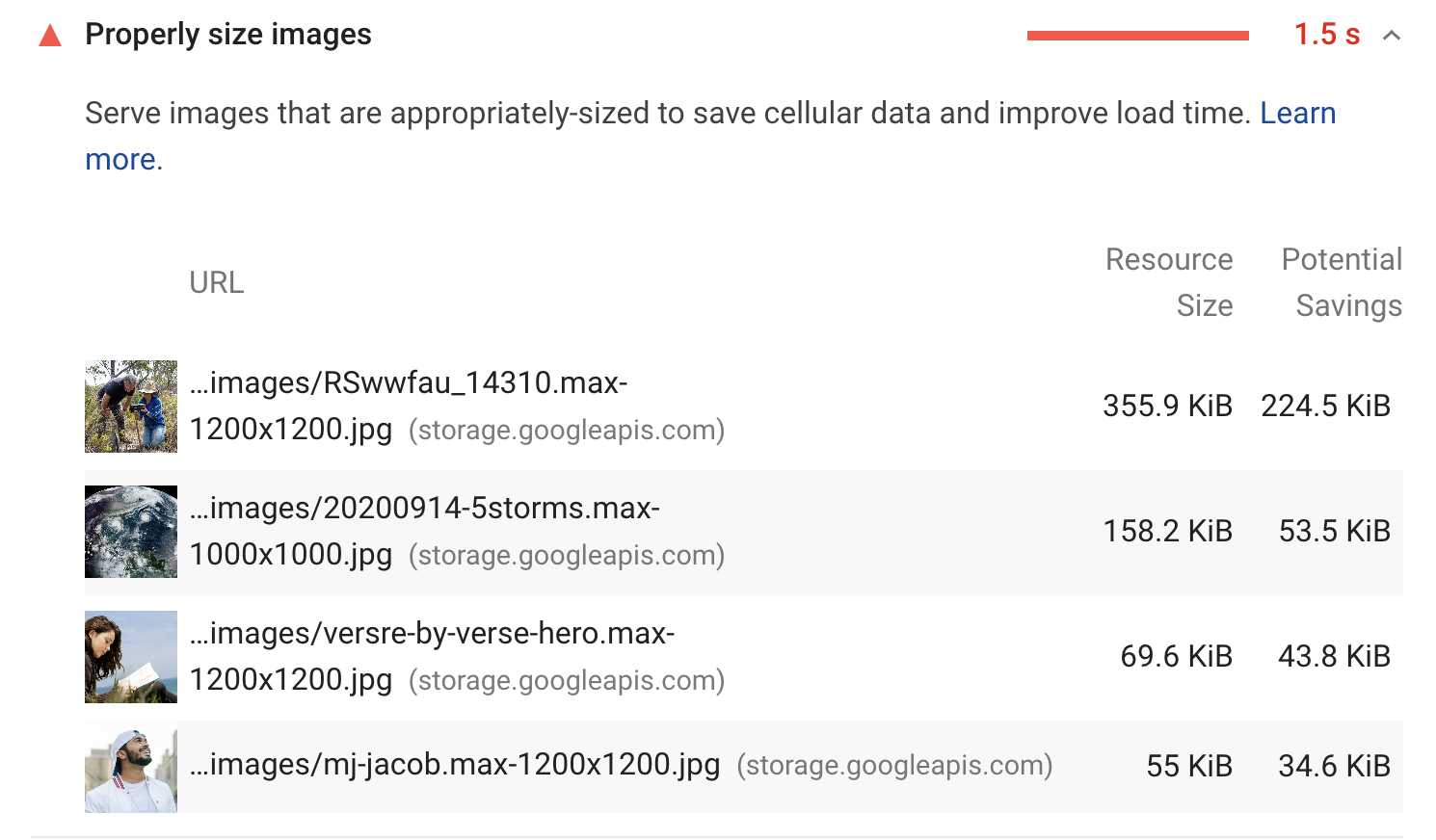
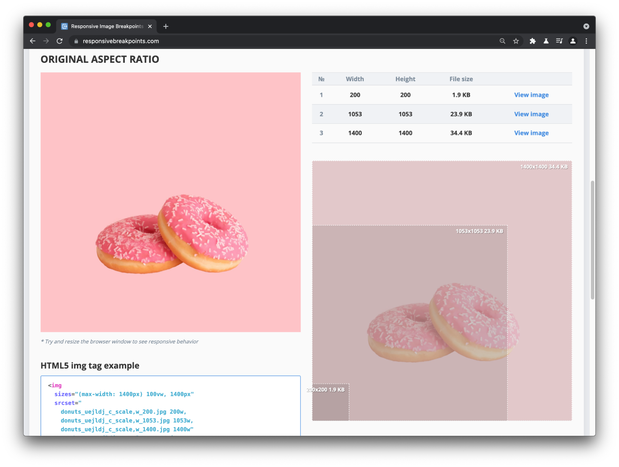
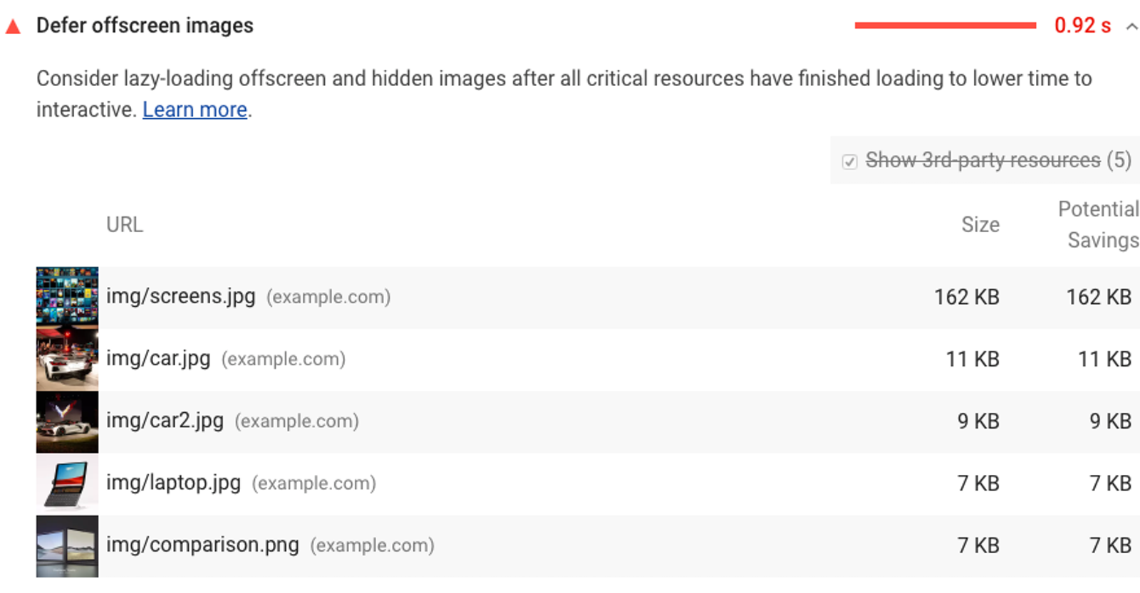
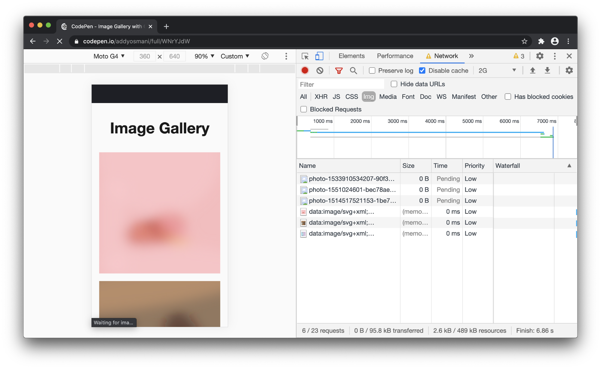
Effective management of resources, such as images and third-party scripts, can significantly impact performance. eBay’s journey showcases the importance of optimizing image delivery, leveraging techniques like lazy loading and responsive images to reduce page weight and improve load times.

By implementing lazy loading, eBay ensures that images are only loaded when they are likely to be viewed by the user, reducing initial page load time and conserving bandwidth. Additionally, by serving appropriately sized images based on the user’s device and screen size, eBay minimizes the transfer of unnecessary data and improves the overall loading performance. These resource management optimizations, combined with other techniques like caching and CDN utilization, enable eBay to deliver a fast and efficient experience to its global user base.

Continuous Performance Monitoring

Regularly monitoring and analyzing performance metrics is crucial for identifying bottlenecks and opportunities for optimization. The case study on Yahoo! Japan News demonstrates the impact of continuous performance monitoring, using tools like Lighthouse and real user monitoring to identify and address performance issues proactively.

By establishing a performance monitoring infrastructure, Yahoo! Japan News gains visibility into the real-world performance experienced by their users. This data-driven approach allows them to identify performance regression, pinpoint specific areas for improvement, and measure the impact of their optimizations. Continuous monitoring also enables Yahoo! Japan News to set performance baselines, track progress over time, and ensure that performance remains a top priority as the application evolves.

Embracing Accessibility and Inclusive Design

Creating inclusive web experiences that cater to diverse user needs is not only an ethical imperative but also a critical factor in scaling success. The case studies in Success at Scale emphasize the importance of accessibility and inclusive design.

Comprehensive Accessibility Testing

Ensuring accessibility requires a combination of automated testing tools and manual evaluation. LinkedIn’s approach to automated accessibility testing demonstrates the value of integrating accessibility checks into the development workflow, catching potential issues early, and reducing the reliance on manual testing alone.

By leveraging tools like Deque’s axe and integrating accessibility tests into their continuous integration pipeline, LinkedIn can identify and address accessibility issues before they reach production. This proactive approach to accessibility testing not only improves the overall accessibility of the platform but also reduces the cost and effort associated with retroactive fixes. However, LinkedIn also recognizes the importance of manual testing and user feedback in uncovering complex accessibility issues that automated tools may miss. By combining automated checks with manual evaluation, LinkedIn ensures a comprehensive approach to accessibility testing.

Inclusive Design Practices

Designing with accessibility in mind from the outset leads to more inclusive and usable products. Success With Scale\’s case study on Intercom about creating an accessible messenger highlights the importance of considering diverse user needs, such as keyboard navigation and screen reader compatibility, throughout the design process.

By embracing inclusive design principles, Intercom ensures that their messenger is usable by a wide range of users, including those with visual, motor, or cognitive impairments. This involves considering factors such as color contrast, font legibility, focus management, and clear labeling of interactive elements. By designing with empathy and understanding the diverse needs of their users, Intercom creates a messenger experience that is intuitive, accessible, and inclusive. This approach not only benefits users with disabilities but also leads to a more user-friendly and resilient product overall.

User Research And Feedback

Engaging with users with disabilities and incorporating their feedback is essential for creating truly inclusive experiences. The Understood’s journey emphasizes the value of user research and collaboration with accessibility experts to identify and address accessibility barriers effectively.

By conducting usability studies with users who have diverse abilities and working closely with accessibility consultants, The Understood gains invaluable insights into the real-world challenges faced by their users. This user-centered approach allows them to identify pain points, gather feedback on proposed solutions, and iteratively improve the accessibility of their platform.

By involving users with disabilities throughout the design and development process, The Understood ensures that their products not only meet accessibility standards but also provide a meaningful and inclusive experience for all users.

Accessibility As A Shared Responsibility

Promoting accessibility as a shared responsibility across the organization fosters a culture of inclusivity. Shopify’s case study underscores the importance of educating and empowering teams to prioritize accessibility, recognizing it as a fundamental aspect of the user experience rather than a mere technical checkbox.

By providing accessibility training, guidelines, and resources to designers, developers, and content creators, Shopify ensures that accessibility is considered at every stage of the product development lifecycle. This shared responsibility approach helps to build accessibility into the core of Shopify’s products and fosters a culture of inclusivity and empathy. By making accessibility everyone’s responsibility, Shopify not only improves the usability of their platform but also sets an example for the wider industry on the importance of inclusive design.

Fostering A Culture of Collaboration And Knowledge Sharing

Scaling success requires a culture that promotes collaboration, knowledge sharing, and continuous learning. The case studies in Success at Scale highlight the impact of effective collaboration and knowledge management practices.

Cross-Functional Collaboration

Breaking down silos and fostering cross-functional collaboration accelerates problem-solving and innovation. Airbnb’s design system journey showcases the power of collaboration between design and engineering teams, leading to a cohesive and scalable design language across web and mobile platforms.

By establishing a shared language and a set of reusable components, Airbnb’s design system enables designers and developers to work together more efficiently. Regular collaboration sessions, such as design critiques and code reviews, help to align both teams and ensure that the design system evolves in a way that meets the needs of all stakeholders. This cross-functional approach not only improves the consistency and quality of the user experience but also accelerates the development process by reducing duplication of effort and promoting code reuse.

Knowledge Sharing And Documentation

Capturing and sharing knowledge across the organization is crucial for maintaining consistency and enabling the efficient onboarding of new team members. Stripe’s investment in internal frameworks and documentation exemplifies the value of creating a shared understanding and facilitating knowledge transfer.

By maintaining comprehensive documentation, code examples, and best practices, Stripe ensures that developers can quickly grasp the intricacies of their internal tools and frameworks. This documentation-driven culture not only reduces the learning curve for new hires but also promotes consistency and adherence to established patterns and practices. Regular knowledge-sharing sessions, such as tech talks and lunch-and-learns, further reinforce this culture of learning and collaboration, enabling team members to learn from each other’s experiences and stay up-to-date with the latest developments.

Communities Of Practice

Establishing communities of practice around specific domains, such as accessibility or performance, promotes knowledge sharing and continuous improvement. Shopify’s accessibility guild demonstrates the impact of creating a dedicated space for experts and advocates to collaborate, share best practices, and drive accessibility initiatives forward.

By bringing together individuals passionate about accessibility from across the organization, Shopify’s accessibility guild fosters a sense of community and collective ownership. Regular meetings, workshops, and hackathons provide opportunities for members to share their knowledge, discuss challenges, and collaborate on solutions. This community-driven approach not only accelerates the adoption of accessibility best practices but also helps to build a culture of inclusivity and empathy throughout the organization.

Leveraging Open Source And External Expertise

Collaborating with the wider developer community and leveraging open-source solutions can accelerate development and provide valuable insights. Pinafore’s journey highlights the benefits of engaging with accessibility experts and incorporating their feedback to create a more inclusive and accessible web experience.

By actively seeking input from the accessibility community and leveraging open-source accessibility tools and libraries, Pinafore was able to identify and address accessibility issues more effectively. This collaborative approach not only improved the accessibility of the application but also contributed back to the wider community by sharing their learnings and experiences. By embracing open-source collaboration and learning from external experts, teams can accelerate their own accessibility efforts and contribute to the collective knowledge of the industry.

The Path To Sustainable Success

Achieving scalable success in the web development landscape requires a multifaceted approach that encompasses the right mindset, strategic decision-making, and continuous learning. The Success at Scale book provides a comprehensive exploration of these elements, offering deep insights and practical guidance for teams at all stages of their scaling journey.

By cultivating a user-centric, data-driven, and inclusive mindset, teams can prioritize the needs of their users and make informed decisions that drive meaningful results. Adopting a culture of continuous improvement and collaboration ensures that teams are always striving to optimize and refine their products, leveraging the collective knowledge and expertise of their members.

Making strategic technology choices, such as selecting performance-oriented frameworks and investing in developer experience, lays the foundation for scalable and maintainable architectures. Implementing performance optimization techniques, such as adaptive loading, efficient resource management, and continuous monitoring, helps teams deliver fast and responsive experiences to their users.

Embracing accessibility and inclusive design practices not only ensures that products are usable by a wide range of users but also fosters a culture of empathy and user-centricity. By incorporating accessibility testing, inclusive design principles, and user feedback into the development process, teams can create products that are both technically sound and meaningfully inclusive.

Fostering a culture of collaboration, knowledge sharing, and continuous learning is essential for scaling success. By breaking down silos, promoting cross-functional collaboration, and investing in documentation and communities of practice, teams can accelerate problem-solving, drive innovation, and build a shared understanding of their products and practices.

The case studies featured in Success at Scale serve as powerful examples of how these principles and strategies can be applied in real-world contexts. By learning from the successes and challenges of industry leaders, teams can gain valuable insights and inspiration for their own scaling journeys.

As you embark on your path to scaling success, remember that it is an ongoing process of iteration, learning, and adaptation. Embrace the mindsets and strategies outlined in this article, dive deeper into the learnings from the Success at Scale book, and continually refine your approach based on the unique needs of your users and the evolving landscape of web development.

Conclusion

Scaling successful web products requires a holistic approach that combines technical excellence, strategic decision-making, and a growth-oriented mindset. By learning from the experiences of industry leaders, as showcased in the Success at Scale book, teams can gain valuable insights and practical guidance on their journey towards sustainable success.

Cultivating a user-centric, data-driven, and inclusive mindset lays the foundation for scalability. By prioritizing the needs of users, making informed decisions based on data, and fostering a culture of continuous improvement and collaboration, teams can create products that deliver meaningful value and drive long-term growth.

Making strategic decisions around technology choices, performance optimization, accessibility integration, and developer experience investment sets the stage for scalable and maintainable architectures. By leveraging proven optimization techniques, embracing inclusive design practices, and investing in the tools and processes that empower developers, teams can build products that are fast and resilient.

Through ongoing collaboration, knowledge sharing, and a commitment to learning, teams can navigate the complexities of scaling success and create products that make a lasting impact in the digital landscape.

We’re Trying Out Something New

In an effort to conserve resources here at Smashing, we’re trying something new with Success at Scale. The printed book is 304 pages, and we make an expanded PDF version available to everyone who purchases a print book. This accomplishes a few good things:

  • We will use less paper and materials because we are making a smaller printed book;
  • We’ll use fewer resources in general to print, ship, and store the books, leading to a smaller carbon footprint; and
  • Keeping the book at more manageable size means we can continue to offer free shipping on all Smashing orders!

Smashing Books have always been printed with materials from FSC Certified forests. We are committed to finding new ways to conserve resources while still bringing you the best possible reading experience.

Community Matters ❤️

Producing a book takes quite a bit of time, and we couldn’t pull it off without the support of our wonderful community. A huge shout-out to Smashing Members for the kind, ongoing support. The eBook is and always will be free for Smashing Members. Plus, Members get a friendly discount when purchasing their printed copy. Just sayin’! ;-)

More Smashing Books & Goodies

Promoting best practices and providing you with practical tips to master your daily coding and design challenges has always been (and will be) at the core of everything we do at Smashing.

In the past few years, we were very lucky to have worked together with some talented, caring people from the web community to publish their wealth of experience as printed books that stand the test of time. Heather and Steven are two of these people. Have you checked out their books already?

Understanding Privacy

Everything you need to know to put your users first and make a better web.

Get Print + eBook

Touch Design for Mobile Interfaces

Learn how touchscreen devices really work — and how people really use them.

Get Print + eBook

Interface Design Checklists

100 practical cards for common interface design challenges.

Get Print + eBook

The Humble `<img>` Element And Core Web Vitals

The humble <img> element has gained some superpowers over the years. Given how central it is to image optimization on the web, let’s catch up on what it can do and how it can help improve user experience and the Core Web Vitals. I’ll be covering image optimization in more depth in Smashing Magazine’s new book on Image Optimization.

Some tips to get us started:

  • For a fast Largest Contentful Paint:
    • Request your key hero image early.
    • Use srcset + efficient modern image formats.
    • Avoid wasting pixels (compress, don’t serve overly high DPR images).
    • Lazy-load offscreen images (reduce network contention for key resources).
  • For a low Cumulative Layout Shift:
    • Set dimensions (width, height) on your images.
    • Use CSS aspect-ratio or aspect ratio boxes to reserve space otherwise.
  • For low impact to First Input Delay:
    • Avoid images causing network contention with other critical resources like CSS and JS. While not render-blocking, they can indirectly impact render performance.

Note: Modern image components that build on <img>, like Next.js <Image> (for React) and Nuxt image (for Vue) try to bake in as many of these concepts as possible by default. We’ll cover this later. You can of course also do this manually just using the <img> element directly. If using 11ty for your static sites, try the 11ty high-performance blog template.

How Do Images Impact User Experience And The Core Web Vitals?

You may have heard of Core Web Vitals (CWV). It’s an initiative by Google to share unified guidance for quality signals that can be key to delivering a great user experience on the web. CWV is part of a set of page experience signals Google Search will be evaluating for ranking. Images can impact the CWV in a number of ways.

In many modern web experiences, images tend to be the largest visible element when a page completes loading. These include Hero images, images from carousels, stories and banners. Largest Contentful Paint (LCP) is a Core Web Vitals metric that measures when the largest contentful element (images, text) in a user’s viewport, such as one of these images, becomes visible.

This allows a browser to determine when the main content of the page has finished rendering. When an image is the largest contentful element, how slowly that image loads can impact LCP. In addition to applying image compression (e.g using Squoosh, Sharp, ImageOptim or an image CDN), and using a modern image format, you can tweak the <img> element to serve the most appropriate responsive version of an image or lazy-load it.

Layout shifts can be distracting to users. Imagine you’ve started reading an article when all of a sudden elements shift around the page, throwing you off and requiring you to find your place again. Cumulative Layout Shift (CLS, a Core Web Vitals metric) measures the instability of content. The most common causes of CLS include images without dimensions (see below) which can push down content when they load and snap into place; ignoring them means the browser may not be able to reserve sufficient space in advance of them loading.

Generated using Layout Shift GIF Generator. You may also be interested in the CLS Debugger. (Large preview)

It’s possible for images to block a user’s bandwidth and CPU on page load. They can get in the way of how critical resources are loaded, in particular on slow connections and lower-end mobile devices leading to bandwidth saturation. First Input Delay (FID) is a Core Web Vitals metric that captures a user’s first impression of a site’s interactivity and responsiveness. By reducing main-thread CPU usage, FID can also be reduced.

Lighthouse

In this guide, we will be using Lighthouse to identify opportunities to improve the Core Web Vitals. Lighthouse is an open-source, automated tool for improving the quality of web pages. You can find it in the Chrome DevTools suite of debugging tools and run it against any web page, public or requiring authentication. You can also find Lighthouse in PageSpeed Insights, CI and WebPageTest.

Keep in mind that Lighthouse is a lab tool. While great for looking at opportunities to improve your user experience, always try to consult real-world data for a complete picture of what actual users are seeing.

The Basics

To place an image on a web page, we use the <img> element. This is an empty element — it has no closing tag — requiring a minimum of one attribute to be helpful: src, the source. If an image is called donut.jpg and it exists in the same path as your HTML document, it can be embedded as follows:

<img src="donut.jpg">

To ensure our image is accessible, we add the alt attribute. The value of this attribute should be a textual description of the image, and is used as an alternative to the image when it can’t be displayed or seen; for example, a user accessing your page via a screen reader. The above code with an alt specified looks as follows:

<img src="donut.jpg"
     alt="A delicious pink donut.">

Next, we add width and height attributes to specify the width and height of the image, otherwise known as the image’s dimensions. The dimensions of an image can usually be found by looking at this information via your operating system’s file explorer (Cmd + I on macOS).

<img src="donut.jpg"
     alt="A delicious pink donut."
     width="400"
     height="400">

When width and height are specified on an image, the browser knows how much space to reserve for the image until it is downloaded. Forgetting to include the image’s dimensions can cause layout shifts, as the browser is unsure how much space the image will need.

Modern browsers now set the default aspect ratio of images based on an image’s width and height attributes, so it’s valuable to set them to prevent such layout shifts.

Identify The Largest Contentful Paint Element

Lighthouse has a “Largest Contentful Paint element” audit that identifies what element was the largest contentful paint. Hovering over the element will highlight it in the main browser window.

If this element is an image, this information is a useful hint you may want to optimize the loading of this image. You might also find this helpful LCP Bookmarklet by Annie Sullivan useful for quickly identifying the LCP element with a red rectangle in just one click.

Note: The Largest Contentful Paint element candidate can change through the page load. For this reason, it’s valuable to not just look at what synthetic tooling like Lighthouse may say, but also consult what real users see.

Hovering over an image in the Chrome DevTools Elements panel will display the dimensions of the image as well as the image’s intrinsic size.

Identify Layout Shifts From Images Without Dimensions

To limit Cumulative Layout Shift being caused by images without dimensions, include width and height size attributes on your images and video elements. This approach ensures that the browser can allocate the correct amount of space in the document while the image is loading. Lighthouse will highlight images without a width and height:

See Setting Height And Width On Images Is Important Again for a good write-up on the importance of thinking about image dimensions and aspect ratio.

Responsive Images

What about switching image resolution? A standard <img> only allows us to supply a single source file to the browser. But with the srcset and sizes attributes, we can provide many additional source images (and hints) so the browser can pick the most appropriate one. This allows us to supply images that are smaller or larger.

<img src="donut-800w.jpg"
     alt="A delicious pink donut."
     width="400"
     height="400"
     srcset="donut-400w.jpg 400w,
             donut-800w.jpg 800w"
     sizes="(max-width: 640px) 400px,
            800px">

The srcset attribute defines the set of images the browser can select from, as well as the size of each image. Each image string is separated by a comma and includes:

  • a source filename (donut-400w.jpg);
  • a space;
  • and the image’s intrinsic width specified in pixels (400w), or a pixel density descriptor (1x, 1.5x, 2x, and so on).

The sizes attribute specifies a set of conditions, such as screen widths, and what image size is best to select when those conditions are met. Above, (max-width:640px) is a media condition asking “if the viewport width is 640 pixels or less,” and 400px is the width of the slot, the image is going to fill when the media condition is true. This typically corresponds to the page’s responsive breakpoints.

Device Pixel Ratio (DPR) / Pixel Density Capping

Device Pixel Ratio (DPR) represents how a CSS pixel is translated to physical pixels on a hardware screen. High resolution and retina screens use more physical pixels to represent CSS pixels for imagery that is sharper and has more detailed visuals.

The human eye may not be capable of distinguishing the difference between images that are a 2x-3x DPR vs. an even higher resolution. Serving overly high DPR images is a common problem for sites leveraging <img srcset> and a suite of image sizes.

It may be possible to use DPR-capping to serve your users an image at a 2x or 3x fidelity to prevent large image payloads. Twitter capped their image fidelity at 2x, resulting in 33% faster timeline image loading times. They found that 2x was a sweet spot of both good performance wins with no degradation in quality metrics.

Note: This approach to DPR-capping is currently not possible if using “w” descriptors.

Identify Images That Can Be Better Sized

Lighthouse includes a number of image optimization audits for helping you understand if your images could be better compressed, delivered in a more optimal modern image format, or resized.

Even those images which are responsive (that is, sized relative to the viewport) should have a width and height set. In modern browsers, these attributes establish an aspect ratio that helps prevent layout shifts, even if the absolute sizes are overridden by CSS.

When not using an image CDN or framework, I like to use responsivebreakpoints.com to determine the optimal image breakpoints and generate <img> srcset code for my responsive images.

Serving Modern Image Formats

Art direction allows us to serve different images depending on a user’s display. While responsive images load different sizes of the same image, art direction can load very different images based on the display.

The browser can choose which image format to display using the <picture> element. The <picture> element supports multiple <source> elements and a single <img> element, which can reference sources for different formats including AVIF, WebP, and eventually JPEG XL.

<picture>
    <source srcset="puppy.jxl" type="image/jxl">
    <source srcset="puppy.avif" type="image/avif">
    <source srcset="puppy.webp" type="image/webp">
    <source srcset="puppy.jpg" type="image/jpeg">
    <img src="puppy.jpg" alt="Cute puppy">
</picture>

In this example, the browser will begin to parse the sources and will stop when it has found the first supported match. If no match is found, the browser loads the source specified in <img> as the fallback. This approach works well for serving any modern image format not supported in all browsers. Be careful with ordering <source> elements as order matters. Don’t place modern sources after legacy formats, but instead put them before. Browsers that understand it will use them and those that don’t will move onto more widely supported frameworks.

Understanding the myriad of image format options out there today can be a confusing process, but you may find Cloudinary’s comparison of modern image formats helpful:

You may also find Malte Ubl’s AVIF and WebP quality settings picker useful for selecting quality settings to match the quality of a JPEG at a particular given quality setting.

Identify Images That Could Be Served In A More Modern Format

Lighthouse (below) highlights potential savings from serving images in a next-generation format.

Note: We have an open issue to better highlight the potential savings for AVIF in Lighthouse.

You might also find value in using image auditing tools such as Cloudinary’s image analysis tool for a deeper look at image compression opportunities for all the images on a page. As a bonus, you can download compressed versions of suggested image formats such as WebP:

I also enjoy using Squoosh for its support of bleeding-edge formats, such as JPEG XL as it offers a low-friction way to experiment with modern formats outside of a CLI or CDN.

There are multiple ways to approach sizing issues as both srcset and sizes are both usable on <picture> and <img>. when in doubt, use <img> with srcset/sizes for single images that have a simple layout. Use <picture> for serving multiple formats, complex layout and art direction.

Chrome DevTools allows you to disable modern image formats (demo), like WebP, AVIF or JPEG XL, to test differing fallbacks for them in the Rendering panel:

CanIUse has the latest browser support details for WebP, AVIF and JPEG XL.

Content Negotiation

An alternative to manually handling image format selection using <picture> is to rely on the accept header. This is sent by the client, allowing the server to deliver an image format that is the best fit for the user. CDNs such as Akamai, Cloudinary and Cloudflare support it.

Image Lazy Loading

What about offscreen images that are not visible until a user scrolls down the page? In the example below, all the images on the page are “eagerly loaded” (the default in browsers today), causing the user to download 1.1 MB of images. This can cause users’ data plans to take a hit in addition to affecting performance.

Using the loading attribute on <img>, we can control the behavior of image loading. loading="lazy" lazy-loads images, deferring their loading until they reach a calculated distance from the viewport. loading="eager" loads images right away, regardless of their visibility in the viewport. eager is the default so doesn’t need to be explicitly added (that is, just use <img> for eager loading).

Below is an example of lazy-loading an <img> with a single source:

<img src="donut.jpg"
     alt="A delicious pink donut."
     loading="lazy"
     width="400"
     height="400">

With native <img> lazy-loading, the earlier example now downloads only about 90 KB of images! Just adding loading="lazy" to our offscreen images has a huge impact. You ideally want to lazy-load all images present outside of the initial viewport and avoid it for everything that is within the initial viewport.

Lazy loading also works with images that include srcset:

<img src="donut-800w.jpg"
     alt="A delicious donut"
     width="400"
     height="400"
     srcset="donut-400w.jpg 400w,
             donut-800w.jpg 800w"
     sizes="(max-width: 640px) 400px,
            800px"
     loading="lazy">

In addition to working on srcset, the loading attribute also works on <img> inside <picture>:

<!-- Lazy-load images in <picture>. 
<img> is the one driving image loading so <picture> and srcset fall off of that -->
<picture>
  <source media="(min-width: 40em)" srcset="big.jpg 1x, big-hd.jpg 2x">
  <source srcset="small.jpg 1x, small-hd.jpg 2x">
  <img src="fallback.jpg" loading="lazy">
</picture>

The Lighthouse Opportunities section lists any offscreen or hidden images on a page that can be lazy-loaded as well as the potential savings from doing so.

See CanIUse.com for latest browser support for native image lazy-loading.

Request Your Image Early

Help the browser discover your LCP image early so that it can fetch and render it with minimal delay. Where possible, attempt to solve this by better minimizing the request chains to your LCP image so that the browser doesn’t need to first fetch, parse and execute JavaScript or wait for a component to render/hydrate to discover the image.

<link rel=preload> can be used with <img> to allow browsers to discover critical resources you want to load as soon as possible, prior to them being found in HTML.

<link rel="preload" as="image" href="donut.jpg">

If you are optimizing LCP, preload can help boost how soon late-discovered hero images (e.g such as those loaded by JavaScript or background hero images in CSS) are fetched. Preload can make a meaningful difference if you need critical images (like Hero images) to be prioritized over the load of other images on a page.

Note: Use preload sparingly and always measure its impact in production. If the preload for your image is earlier in the document than it is, this can help browsers discover it (and order relative to other resources). When used incorrectly, preloading can cause your image to delay First Contentful Paint (e.g CSS, Fonts) — the opposite of what you want. Also note that for such reprioritization efforts to be effective, it also depends on servers prioritizing requests correctly.

Preload can be used to fetch sources for an <img> of a particular format:

<link rel="preload" as="image" href="donut.webp" type="image/webp">

Note: This approach only preloads the latest format where supported, however cannot be used to preload multiple supported formats as this would preload both of them.

Preload can also be used to fetch responsive images so the correct source is discovered sooner:

<link rel="preload" as="image" 
     href="donut.jpg" 
     imagesrcset="
        poster_400px.jpg 400w, 
        poster_800px.jpg 800w, 
        poster_1600px.jpg 1600w" 
    imagesizes="50vw">

Take care not to overuse preload (when each resource is considered important, none of them really are). Reserve it for critical resources which the browser’s preload scanner may not be able to quickly find organically.

Lighthouse suggests opportunities to apply this optimization in Lighthouse 6.5 and above.

See CanIUse.com for latest browser support for link rel=preload.

Image Decoding

Browsers need to decode the images they download in order to turn them into pixels on your screen. However, how browsers handle deferring images can vary. At the time of writing, Chrome and Safari present images and text together – synchronously – if possible. This looks correct visually, but images have to be decoded, which can mean text isn’t shown until this work is done. The decoding attribute on <img> allows you to signal a preference between synchronous and asynchronous image decoding.

<img src="donut-800w.jpg"
     alt="A delicious donut"
     width="400"
     height="400"
     srcset="donut-400w.jpg 400w,
             donut-800w.jpg 800w"
     sizes="(max-width: 640px) 400px,
            800px"
     loading="lazy"
     decoding="async">

decoding="async" suggests it’s OK for image decoding to be deferred, meaning the browser can rasterize and display content without images while scheduling an asynchronous decode that is off the critical path. As soon as image decoding is complete, the browser can update the presentation to include images. decoding=sync hints that the decode for an image should not be deferred, and decoding="auto" lets the browser do what it determines is best.

Note: See CanIUse.com for the latest browser support for the decoding attribute.

Placeholders

What if you would like to show the user a placeholder while the image loads? The background-image CSS property allows us to set background images on an element, including the <img> tag or any parent container elements. We can combine background-image with background-size: cover to set the size of an element’s background image and scale the image as large as possible without stretching the image.

Placeholders are often inline, Base64-encoded data URLs which are low-quality image placeholders (LQIP) or SVG image placeholders (SQIP). This allows users to get a very quick preview of the image, even on slow network connections, before the sharper final image loads in to replace it.

<img src="donut-800w.jpg"
     alt="A delicious donut"
     width="400"
     height="400"
     srcset="donut-400w.jpg 400w,
             donut-800w.jpg 800w"
     sizes="(max-width: 640px) 400px,
            800px"
     loading="lazy"
     decoding="async"
     style="background-size: cover; 
            background-image:
              url(data:image/svg+xml;base64,[svg text]);">

Note: Given that Base64 data URLs can be quite long, [svg text] is denoted in the example above to improve readability.

With an inline SVG placeholder, here is how the example from earlier now looks when loaded on a very slow connection. Notice how users are shown a preview right away prior to any full-size images being downloaded:

There are a variety of modern solutions for image placeholders (e.g CSS background-color, LQIP, SQIP, Blur Hash, Potrace). Which approach makes the most sense for your user experience may depend on how much you’re attempting to offer a preview of the final content, display progress (e.g progressive loading) or just avoid a visual flash when the image finally loads in. I’m personally excited for JPEG XL’s support for full progressive rendering.

Ultimately including an inline data URL for your low-quality placeholder image that is served in the initial HTML within the <img>’s styles avoids the need for an additional network request. I’d consider a placeholder size of being <= 1-2KB as being optimal. LCP will take into account the placeholder image’s intrinsic size so ideally aim for the “preview” to match the intrinsic size of the real image being loaded.

Note: There is an open issue to discuss factoring in progressive loading specifically into the Largest Contentful Paint metric.

Lazy-render Offscreen Content

Next, let’s discuss the CSS content-visibility property, which allows the browser to skip rendering, layout and paint for elements until they are needed. This can help optimize page load performance if a large quantity of your page’s content is offscreen, including content which uses <img> elements. content-visibility:auto can reduce how much CPU work the browser has to do less work upfront, including offscreen image decoding.

section {
  content-visibility: auto;
}

The content-visibility property can take a number of values, however, auto is the one that offers performance benefits. Sections of the page with content-visibility: auto get containment for layout, paint and style containment. Should the element be off-screen, it would also get size containment.

Browsers don’t paint the image content for content-visibility affected images, so this approach may introduce some savings.

section {
  content-visibility: auto;
  contain-intrinsic-size: 700px; 
}

You can pair content-visibility with contain-intrinsic-size which provides the natural size of the element if it is impacted by size containment. The 700px value in this example approximates the width and height of each chunked section.

See CanIUse.com for latest browser support for CSS content-visibility.

Next.js Image Component

Next.js now includes an Image component with several of the above best practices baked in. The image component handles image optimization, generating responsive images (automating <img srcset>) and lazy-loading in addition to many other capabilities. This is just one of the optimizations that has come out of the Chrome and Next.js teams collaborating with sites adopting it seeing up to a 60% better LCP and 100% better CLS.

In the below Next.js example, the standard <img> element is first used to load 3 donut images downloaded from Unsplash.

import Head from 'next/head';
export default function Index() {
    return (
        <div>
            <Head>
                <title>Create Next App</title>
            </Head>

            <main>
                <div>
                    <img src="/donut1.jpeg" alt="Donut" height={700} width={700} />
                    <img src="/donut2.jpeg" alt="Donut" height={700} width={700} />
                    <img src="/donut3.jpeg" alt="Donut" height={700} width={700} />
                </div>
            </main>
        </div>
    );
}

When this page is loaded with the DevTools network panel open, we see that our images are very large in size (325KB + 4.5MB + 3.6MB = 8.4MB in total), they all load regardless of whether the user can see them and are likely not as optimized as they could be.

Loading images at these sizes is unnecessary, in particular if our user is on a mobile device. Let’s now use the Next.js image component instead. We import it in from 'next/image' and replace all our <img> references with <Image>.

import Head from 'next/head';
import Image from 'next/image';

export default function Index() {
    return (
        <div>
            <Head>
                <title>Next.js Image Component</title>
            </Head>
            <main>
                <div>
                    <Image src="/donut1.jpeg" alt="Donut" height={700} width={700} />
                    <Image src="/donut2.jpeg" alt="Donut" height={700} width={700} />
                    <Image src="/donut3.jpeg" alt="Donut" height={700} width={700} />
                </div>
            </main>
        </div>
    );
}

We can reload our page and take a second look at the DevTools network panel. Now only 1 image is being loaded by default (the only one visible in the viewport), it’s significantly smaller than the original (~33KB vs 325KB) and uses a more modern format (WebP).

Note: Next.js will optimize images dynamically upon request and store them in a local cache. The optimized image then gets served for subsequent requests until an expiration is reached.

Next.js can also generate several versions of the image to serve media to smaller screens at the right size. When loading the page under mobile emulation (a Pixel phone), an even smaller 16KB image gets served for our first image.

When a user scrolls down the page, the additional images are lazy-loaded in. Note how no additional configuration or tweaking was needed here — the component just did the right thing by default.

The performance optimizations offered by the Next.js image component can help improve Largest Contentful Paint. To learn more about the component, including the different layout modes it supports, check out the Next.js documentation. A component with similar capabilities is available for Nuxt.js.

What Are Examples Of Businesses Improving LCP Via Image Optimizations?

Vodafone found that a 31% improvement in LCP increased sales by 8%. Their optimizations to improve LCP included resizing their hero image, optimizing SVGs and using media queries to limit loading offscreen images.

Agrofy found that 70% improvement in LCP correlated to a 76% reduction in load abandonment. Their optimizations to LCP included a 2.5s saving from switching their first large image from being behind JavaScript (client-side hydration) to being directly in the main HTML document.

French Fashion house Chloè used Link Preload to preload their 1x and 2x Hero images, which were previously bottlenecked by a render-blocking script. This improved their Largest Contentful Paint by 500ms based on Chrome UX Report data over 28 days.

Optimizations to Cumulative Layout Shift helped YAHOO! Japan increased its News page views per session by 15%. They determined shifts were caused after their hero images were loaded and snapped in for the first view. They used Aspect Ratio Boxes to reserve space before their image was loaded.

Lab Data Is Only Part Of The Puzzle. You Also Need Field Data.

Before we go, I’d love to share a quick reminder about the importance of looking at the image experience your real users might have. Lab tools like Lighthouse measure performance in a synthetic (emulated mobile) environment limited to page load, while field or real-world data (e.g. RUM, Chrome UX Report) are based on real users throughout the lifetime of the page.

It’s important to check how realistic your lab results are by comparing them against typical users in the field. For example, if your lab CLS is much lower than the 75th percentile CLS in the field, you may not be measuring layout shifts as real users are experiencing them.

CLS is measured during the full lifespan of a page, so user behavior (interactions, scrolls, clicks) can have an impact on the elements that are shifting. For images, lab CLS may not see an improvement from fixing missing image dimensions if the images happen to be far down a page requiring a scroll. This is just one place where it’s worthwhile consulting real-user data.

For LCP it is very possible that the candidate element can change depending on factors such as load times (the LCP candidate could initially be a paragraph of text and then a large hero image), personalization or even different screen resolutions. Lighthouse’s LCP audit is a good place to start, but do take a look at what real users see to get the full picture.

Whenever possible, try to configure your lab tests to reflect real-user access and behavior patterns. Philip Walton has an excellent guide on debugging Web Vitals in the field worth checking for more details.

Editorial Note: Addy's Book on Image Optimization

We’re happy and honored to have teamed up with Addy to publish a dedicated book on image optimization, and the book is now finally here. With modern approaches to image compression and image delivery, current and emerging image formats, how browsers load, decode and render images, CDNs, lazy-loading, adaptive media loading and how to optimize for Core Web Vitals. Everything in one, single, 528-pages book. Download a free PDF sample (12MB).

Get the book right away — and thank you for your kind support, everyone! ❤️


Now that we’ve covered the foundations of the modern <img> tag, check out the pre-release of the Image Optimization book to get a deeper understanding of how images can impact performance and UX.

Throughout the book, we will cover advanced image optimization techniques that expand heavily on the above guidance, as well as how to best use elements like <img> and <picture> to make your images on the web shine.

You may also be interested in reading Malte Ubl’s guide to image optimization, Jake Archibald’s guide to the AVIF format and Katie Hempenius’ excellent guidance on web.dev.

With thanks to Yoav Weiss, Rick Viscomi and Vitaly for their reviews.