Material Design Text Fields Are Badly Designed

I’ve been designing forms for over 20 years now, and I’ve tested many of them for large organizations like Boots, Just Eat and Gov.uk. One topic that comes up a lot with forms is: where to put the label. In the early days, we talked about left-aligned labels versus top-aligned labels.

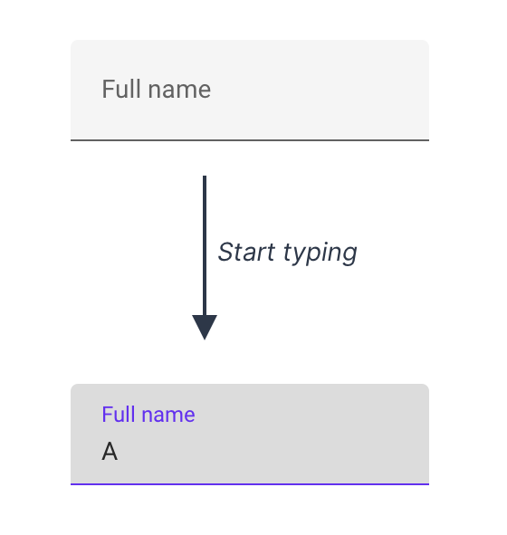
These days the focus is more about placeholders that replace labels and float labels. The latter start off inside the input. When the user starts typing, the label ‘floats’ up to make space for the answer:

Some people assume float labels are best because Google’s Material Design uses them. But in this case, Google is wrong.

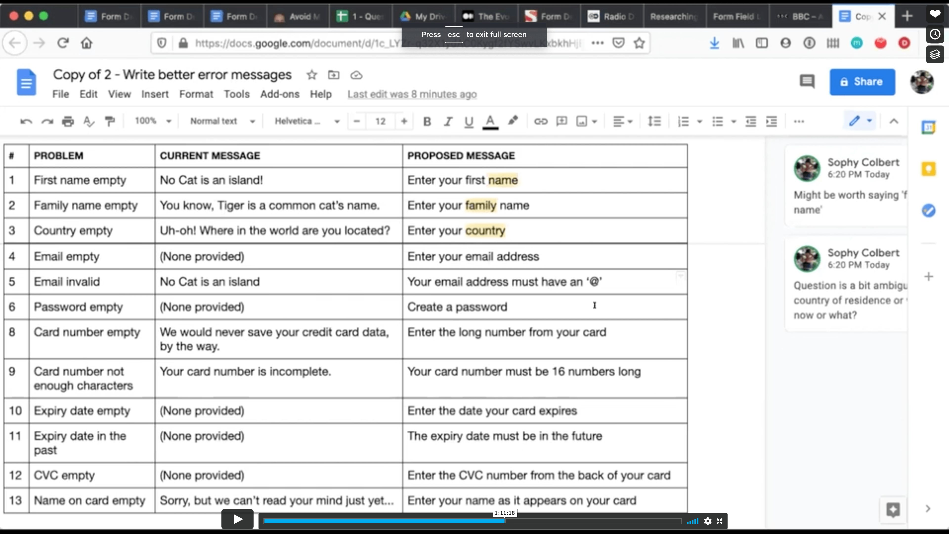
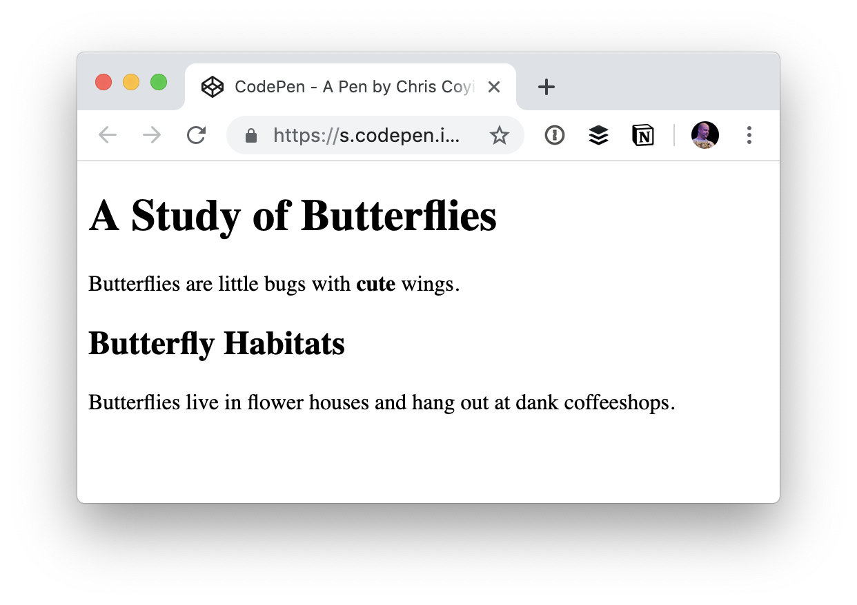
Instead, I recommend using conventional text fields which have:

  • The label outside the input (to tell the user what to type),
  • A distinct border all the way around (to make it obvious where the answer goes).

In this article, I’ll explain why I always recommend conventional text fields and why Google is wrong about using float labels for Material Design.

Float Labels Are Better Than A Common Alternative But They’re Still Problematic

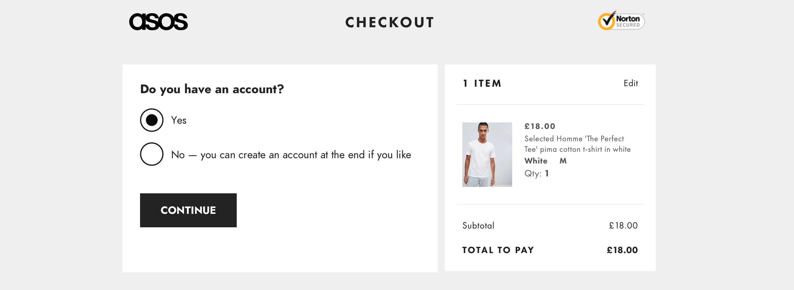
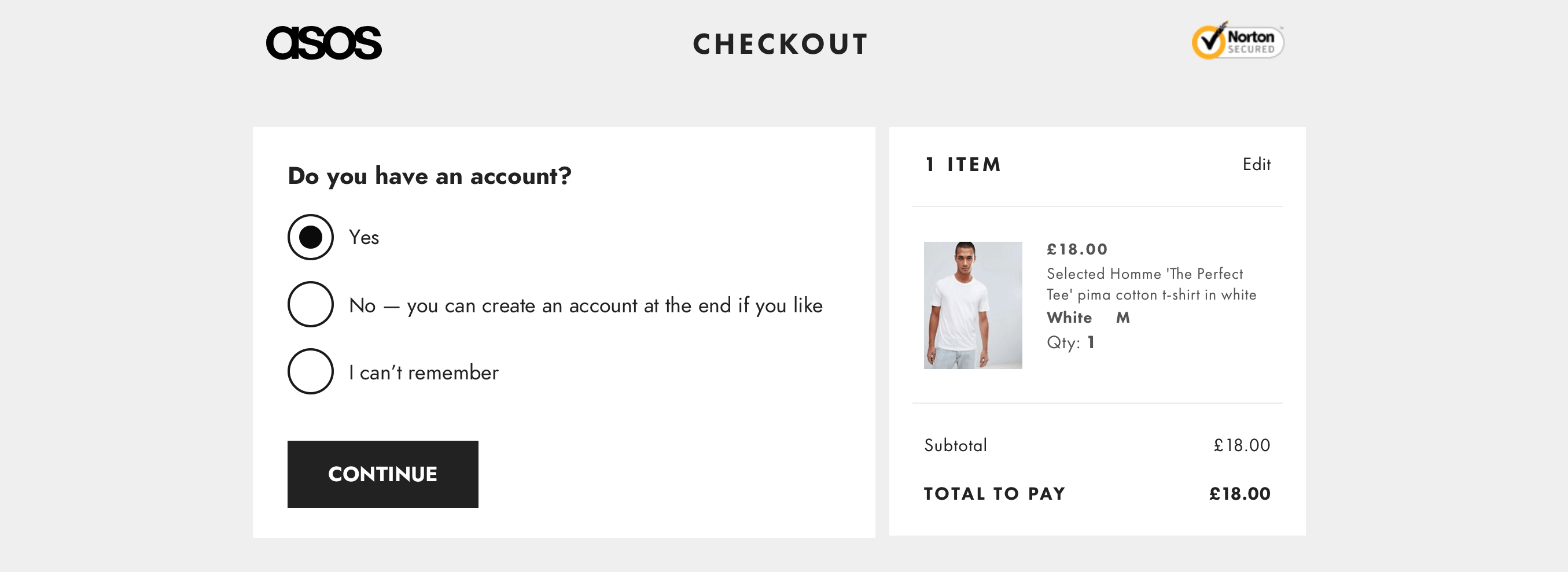
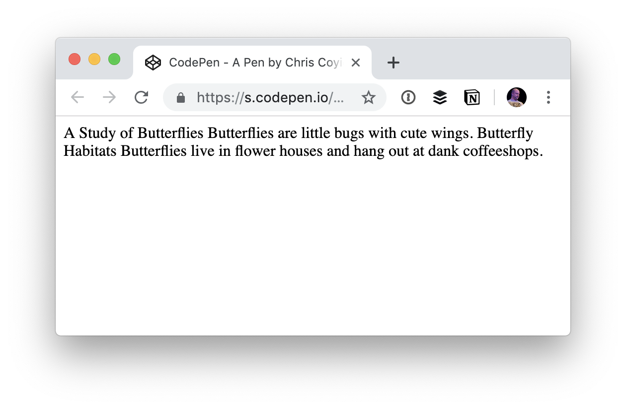
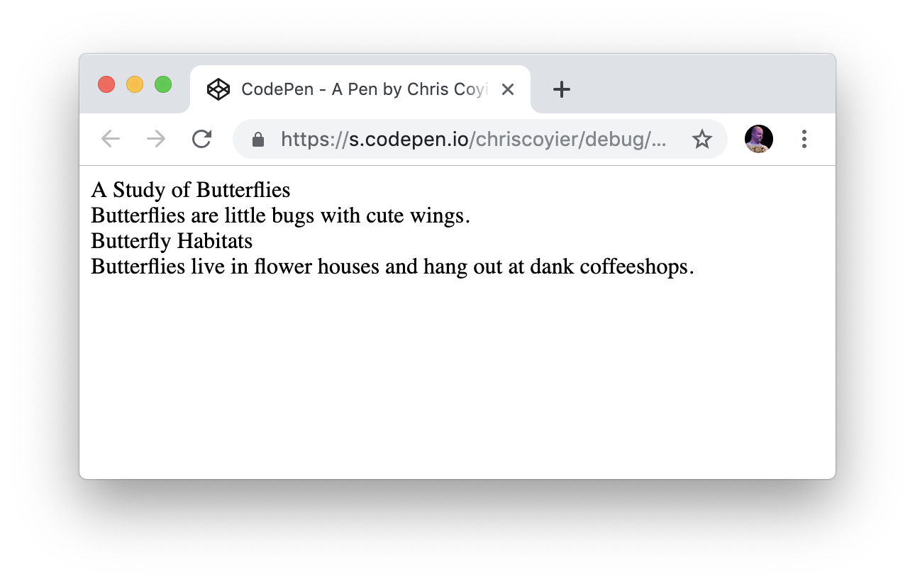
Float labels were designed to address some problems with a commonly used alternative: placeholder labels. That’s where the label is placed inside the input but disappears when the user starts typing:

Having seen lots of people interacting with forms through my work first hand I know that placeholder labels are problematic.

This is because, for example, they:

Float labels don’t solve 2 of these problems: poor contrast and the chance of the label being mistaken for an actual answer. And while they attempt to address the problem of the label disappearing, in doing so, float labels introduce lots of other problems, too.

For example, the size of the label has to be tiny in order to fit inside the box, which can make it hard to read. And long labels cannot be used as they’ll get cropped by the input:

Conventional Text Fields Are Better Than Both Placeholder Labels And Float Labels

Conventional text fields don’t have the above problems because it’s clear where the answer goes and they have a legible, readily available label. The labels can be of any length and hint text, should it be needed, is easy to accommodate as well.

I’ve watched hundreds of people interact with forms and seen many of them struggle. But not once was that down to the use of a conventional text field. They take up a bit more vertical space. But saving space at the cost of clarity, ease of use and accessibility is a bad tradeoff to make.

Google’s Test Didn’t Include Conventional Text Fields

Google’s article, The Evolution of Material Design’s Text Fields shows that only 2 variants were tested, both of which used float labels.

Crucially the test didn’t include conventional text fields which means they haven’t actually compared the usability of their float label design against conventional text fields. And having read Google’s responses to the comments on their article, it seems that usability was not their top priority.

Google Inadvertently Prioritized Aesthetics Over Usability

I looked into why Material Design uses float labels and discovered comments from Michael Gilbert, a designer who worked on them.

The comments indicate that they tried to balance aesthetics and usability.

Matt Ericsson commented:

This seems to imply that there was more of an emphasis on form over function [...] or even a desire to simply differentiate Material components from tried and true (boring) input boxes. [...] was there research conducted on the original inputs that validated that they met a goal that was not being met by box inputs? Is there something that stood out as valuable going with a simple underline?

Google’s response:

The design decisions behind the original text field predate my time on the team, but I think the goal was likely similar [to this research]: Balance usability with style. I believe at the time we were leaning towards minimalism, emphasizing color and animation to highlight usability.

Denis Lesak commented:

[...] this is one of those moments where I wonder why all of this research was necessary as I have long thought that the old design was flawed for all the reasons you mentioned.

Google’s response:

[...] the goal of the research here wasn’t to simply determine that one version was better than another [...]. This study was instead focused on identifying the characteristics of the design that led to the most usable, most beautiful experiences.

Even though Google aimed for balance, in the end they inadvertently sacrificed usability for ‘minimalism’ and ‘a beautiful experience’.

But aesthetics and usability are not in competition with each other. Something can look good without causing problems for users. In fact, these qualities go hand in hand.

Conclusion

Float labels are certainly less problematic than placeholder labels. But conventional text fields are better than float labels because they look like form fields and the label is easy to read and available at all times.

Aesthetics are important, but putting the label inside the box does not make it look beautiful. What it does do, however, is make it demonstrably harder to use.

Smashing Editor's note

At the moment of writing, here at Smashing Magazine we are actually using the floating label pattern that Adam heavily criticizes in this article. From our usability tests we can confirm that floating labels aren't a particularly great idea, and we are looking into adjusting the design — by moving to conventional text fields — soon.

Acknowledgments

Thanks to Caroline Jarrett and Amy Hupe for helping me write this. And thanks to Maximilian Franzke, Olivier Van Biervliet, Dan Vidrasan, Fabien Marry for their feedback on an earlier draft of this article.

Things To Expect From A Smashing Workshop: Form Design Masterclass

It took me around six months on and off to write the content for the workshop. After a lot of deliberation, I decided to structure it like I do in my book, Form Design Patterns.

It was a 4-day workshop split into two 45-minute segments, with 15-minute breaks followed by a 30-minute Q&A with optional homework between days. Each day we set out to solve one big problem. This provided a way to approach the problem like we do in real life: by analyzing and discussing the options before arriving at a good solution.

Overall, it was a fun experience. I learned a lot and had a great time teaching and chatting with everyone. I’m already looking forward to the next one which is tentatively planned for late 2021.

Some Of The Highlights Of Each Day

Here’s a quick rundown of each day including some of the highlights.

Day 1: Nailing The Basics Of Form Design

On the first day, we designed a simple registration form from scratch. This provided a perfect way to nail the basics of form design. It covered things like label positioning, form styling and input types. At the end of day 1, we had ourselves a registration form that covered the basics and made the form as simple as possible for users.

My highlight of this session was the question protocol exercise. Instead of focusing on how to artificially save space on forms (by using things like float labels, tooltips, left-aligned labels and placeholder text), we used a spreadsheet to help know why every question is being asked and the best way to elicit the answer.

For our registration form, this meant a thorough analysis of asking for someone’s name, email address and password. And by the end of the exercise we had halved the number of form fields and had clear justification for the ones that remained.

Day 2: Form Validation And Writing Good Error Messages

On the second day, we took our well-designed registration form and looked at how to help users recover from errors in two ways:

  1. We decided when to validate forms and how to display error messages;
  2. We learnt how to write clear, concise, consistent and specific error messages that help users get back on track quickly.

My highlight of this session was the exercise to redesign the error messages on Smashing Magazine’s very own membership sign up form.

Sophy Colbert, a content designer who attended the workshop, volunteered to share her new error messages explaining her rationale for each one.

Both the messages and the rationale were superb, and I think the group got a lot out of it as they could get an insight into Sophy’s content designer mindset.

Day 3: Redesigning A Real World Checkout Form

On day 3, we redesigned the ASOS checkout flow from scratch. This included guest checkout (first time experience) and checking out as someone with an account (repeat-use experience). We covered a lot of ground such as whether to use tabs, accordions or radio buttons. And we also looked at single page checkouts versus multi-page checkouts.

My highlight of this session was that the process of redesigning several interactions, exposed new content design and service design challenges. For example, we converted the tabs that ask the user to specify whether they have an account or not:

And we redesigned them into a form with radio buttons:

And this exposed the problem that in real life, choices are rarely binary. So I asked the group what the missing option was and they rightly said: ‘What if the user can’t remember?’

So even though we originally looked at this primarily as an interaction design problem, it became an issue of content and service design.

All of these problems nicely encapsulated one of the form UX rules: ‘Make friends with other departments’. As designers, we have to work effectively with stakeholders across the organisation to make sure we avoid as much complexity as possible. And this again is where the question protocol really shines.

Day 4: Using Shorthand Syntax And Designing Long And Complex Forms

Day 4 was split into two parts which I’ll discuss in reverse order.

In the second part, we looked at various patterns that help users fill out long and complex forms — the kind of forms that take days, weeks or even months to complete. I was really looking forward to running this because the design challenges around this are interesting and not well trodden.

In the first part, we redesigned Smashing Magazine’s registration form using shorthand syntax.

My highlight of this session was that Vitaly, Mr. Smashing Magazine himself, came along to be our business stakeholder. The group asked him questions to work out why the form was designed the way it was and asking why certain questions were asked.

Here are a few examples:

  • Sophy O asked why the country field is being asked for. Vitaly said that it depends on what the user is doing. If the user is buying a book, we need to know where it’s going. And the taxes on the book are based on the destination country. This resulted in either removing the field and asking for this information when someone buys the book — or just being clearer in hint text about why we’re asking for this information.
  • Milos Lazarevic questioned the need for the ‘Do you like cats?’ checkbox. And Dana Cottreau and Jaclyn Ziegler enjoyed the playfulness of the checkbox. But I would weigh up the joy it brings some people against the risk of alienating people who are, for example, less digitally savvy or are simply in a rush to access the content.
  • Emma Stotz questioned the use of live validation given all the usability issues that pop up around that. And Vitaly was keen to explore instantly validating the fields on submit instead.

My Overall Impression

For me, the workshop went very well overall and I was chuffed with the way things went and the feedback I received from the attendees. Everyone was so friendly, and tolerant of a couple of technical difficulties I had on the first day (thanks again, everyone!). Running the workshop remotely over Zoom has its problems (we won’t talk about how I accidentally left the meeting in a panic by accident on day 1), but actually I found the remote aspect useful on the whole.

For example, all being connected to Zoom, meant it was seamless for attendees to ask questions while sharing their screen to bring the problems to life.

I also really enjoyed meeting people across the world, something that would have been difficult with in-person workshops I think. Also, during the break, I got to quickly dash to put my kids to bed, so I imagine that also worked well for the attendees, too.

But there’s one thing I wish I knew earlier. I was worried, that with such a large group of people (81 to be exact), letting people talk freely would end up in a chaos. As a result, on day 1, I read out and answered group's questions from the shared Google Doc during the Q&A. This meant that other people’s voices weren’t heard and there was more of a barrier between me and the group.

This is something I rectified for day 2 and it really made a difference. It was nice to hear people’s voices and thoughts in their own words and it created more of an open dialogue where other people started to answer other people’s questions which I loved.

I remember Alex Price jumping in once to talk about his experience in dealing with a complicated form that needed to be completed by different people.

What I’ll Change For Next Time

While my overall impression of the workshop was very positive, there were some things I’d look to improve for next time.

1. Show The Basics, Not Learn The Basics

Day 1 covered a lot of the basics before going into greater detail on the following days, but it bothered me a bit to teach some of these things as I thought many attendees knew a lot of this stuff already. So next time I'd like to acknowledge that some people have come with a lot of knowledge and set the scene as ‘this is how I teach the basics’ as opposed to ‘this is how to learn the basics’ — thanks to Caroline Jarrett for this tip.

Also, I’ll probably ask the group if there’s any form design approach that they’ve struggled to convince teammates about as that’s certainly something I’ve struggled with before.

2. Split People Up In Bigger Groups

One of the exercises involved people splitting up into groups of 2 using the Zoom breakout rooms, but because people came to this workshop from all over the world, some of the people listening were not able to take part in the exercises.

For example, some people really needed to take a lunch break because their time zone was ahead of mine. This meant one or two people who did want to participate found themselves in a group on their own. Next time, I’d put people into groups of say 4 and make sure the exercises still work.

3. Add More Group Exercises

Despite the issue I just mentioned, the group exercises worked well. People enjoyed them, and it sparked some really interesting ideas from the participants. Some people messaged me after saying that they wished there were more group exercises, so I’ll aim to do just that.

A Poster Of All The Rules

As we moved through the workshop, we ticked off over 40 rules and principles of form design which brought a nice additional structure to the sessions.

A few of the attendees asked me if I had a poster of all the rules and I didn’t — so now I’ve made one.

Form Design Masterclass Poster (Plain Text Version)

For your convience, here’s a simple text version of the poster — feel free to adjust it and customize it to your needs.

Day 1: Nailing The Basics Of Form Design

  1. Make forms work well for everyone
  2. Every form control needs a label
  3. Only add hint text if it adds value
  4. Don’t use placeholder text
  5. Put hint text between the label and the input
  6. Put labels above the input
  7. Don’t use tooltips for hint text
  8. Know why you’re asking every question*
  9. Give text boxes a distinct border
  10. Position labels to be associated with the input
  11. Give inputs a clear focus state
  12. Use the right input type for the job
  13. Align the button to the left edge of the inputs
  14. Label the button with exactly what it does
  15. Make sure your form is actually necessary
  16. Avoid putting two forms on one page
  17. Use multiple inputs as a last resort
  18. Don’t use input masks

Day 2: Validating Forms And Writing Good Error Messages

  1. Don’t disable the submit button
  2. Don’t trigger errors when the user is answering
  3. Only validate when the user submits
  4. Put errors above the input
  5. Forgive trivial mistakes
  6. Track your errors
  7. Give users clear, concise and specific errors

Day 3: Redesigning A Real Checkout Flow

  1. Postpone questions you could ask later
  2. Use form controls inside forms
  3. Start without a progress bar*
  4. Begin prototyping with one thing per page
  5. Ask questions in a sensible order
  6. Use select boxes as a last resort
  7. Use sensible defaults
  8. Provide help in context of the question
  9. Avoid optional fields wherever possible
  10. Don’t hide the submit button
  11. Make the field width match the expected value
  12. Let users check their answers
  13. Put the back link at the top left of the form
  14. Make friends with other departments

Day 4: Using Shorthand And Designing Long And Complex Forms

  1. Break down huge forms into small tasks
  2. Tell users what they need before they start
  3. Help users check their eligibility

* This principle is from the GOV.UK Service Manual
** This principle is from the NHS Service Manual.

Thanks again to everyone who came for all their contributions. I’m looking forward to the next one.

Thanks to Caroline Jarrett for not only reviewing every detail of my workshop but for also editing this article.


Editor’s Note: You can also check a detailed overview of How We Run Smashing Online Workshops, and if you are interested in attending one, we have plenty of online workshops on front-end & UX coming up soon. We’d love to see you there!

Why, How, and When to Use Semantic HTML and ARIA

Semantic HTML and Accessible Rich Internet Applications (ARIA) help create interfaces that work for everyone in the most performant, robust, and simple way possible. They add essential meaning to your content, which lets web browsers, search engines, screen readers, RSS readers, and ultimately users understand it.

And yet, many people still don’t use them. I wanted to know why, so I set up a Twitter poll. The most common reason people gave was a lack of awareness and understanding of the benefits of using semantic HTML and ARIA.

Let’s look over the benefits of using HTML and ARIA, why starting with semantic HTML is the way to go, and why ARIA ought to come in as a last resort.

Starting with raw text

The <body> element of an HTML document contains the main content a user sees on a page. If content is put inside the body without any additional elements, the browser has no way of differentiating between different types of content, like paragraphs and headings.

<body>
A Study of Butterflies

Butterflies are little bugs with cute wings.

Butterfly Habitats

Butterflies live in flower houses and hang out at dank coffeeshops.
</body>

If the browser can’t differentiate between pieces of content, then it can’t present that content to the user in a meaningful way. That means:

  • We can’t style the headings differently from paragraphs.
  • It’s harder for search engines to interpret the content, meaning it’s likely to rank poorly and be difficult for users to find.
  • Screen readers and other assistive technology can’t communicate it properly to the user.

Not to mention, it’s more than a bit awkward visually:

A screenshot of the HTML rendered on the front end, which displays as a single line of text.

Adding some structure with HTML

To provide some structure we could wrap the lines of text here in divs like this:

<div>A Study of Butterflies.</div>
<div>Butterflies are little bugs with cute wings.</div>
<div>Butterfly Habitats</div>
<div>Butterflies live in flower houses and hang out at dank coffeeshops.</div>

This is slightly better because each piece of content is displayed in the browser on its own line instead of one long unbroken line of text.

A screenshot of the HTML rendered on the front-end showing the content on four lines, one for each div.

But there’s still a distinct lack of meaning.

Which are headings and which are paragraphs? It’s hard to tell, and impossible for assistive technology to determine. That’s because the headings and paragraphs are wrapped in divs which are meaningless on their own. In this example, browsers, CSS, search engines and screen readers are still none the wiser.

Communicating meaning with styles

We could add styling to the divs because they can be targetted with CSS. This lets us improve the visual appearance to provide meaning, context, and hierarchy.

See the Pen
Non-Semantic HTML Demo
by Geoff Graham (@geoffgraham)
on CodePen.

Here the CSS targets the first and third divs to apply heading styles. This isn't maintainable because another paragraph added afterward, for example, would get styled as a heading.

We could give each div a unique attribute such as an ID or class name, to give us more styling control, like this:

<div class="heading1">A Study of Butterflies</div>
<div class="paragraph">Butterflies are little bugs with cute wings.</div>
<div class="heading2">Butterfly Habitats</div>
<div class="paragraph">Butterflies live in flower houses and hang out at dank coffeeshops.</div>

I explain why you should use classes instead of IDs for styling in my online book, MaintainableCSS.

Now we can target the different elements with CSS like this:

.heading1 { /* styles here */ }
.paragraph { /* styles here */ }
.heading2 { /* styles here */ }

While this approach is a little better, it only communicates meaning for sighted users. It doesn't provide meaning to search engines, RSS readers and screen readers. In other words, it’s not semantic and not very accessible as a result.

Introducing semantic HTML

HTML provides many elements that are designed to give meaning to content, including elements for headings and paragraphs. So, instead of relying on divs with classes named by the developer, we can use predefined HTML elements instead.

<h1>A Study of Butterflies</h1>
<p>Butterflies are little bugs with cute wings.</p>
<h2>Butterfly Habitats</h2>
<p>Butterflies live in flower houses and hang out at dank coffeeshops.</p>

Much better! With semantic HTML like this, the content will inherit default styles from the browser (aka User Agent). We can even use other semantic HTML elements, like <b> which tells the browser to “bring to attention" by making text bold.

A screenshot of the HTML rendered on the front end showing the content with a clearer hierarchy of a Heading 1, paragraph, Heading 2 and paragraph, thanks to semantic HTML.

Crucially, using semantic HTML also means:

  • We can use CSS to add our own styling.
  • Search engines can index the content so that it ranks well enough that users can find it.
  • RSS readers can parse and style the elements appropriately.
  • Screen readers and other assistive technologies can communicate elements properly to the user.

While it’s not massively important in these short examples, the code is also more concise which makes a big difference when considering an entire site.

Semantic HTML is standards-based and stable. This means any HTML processor in the future will be able to understand it and present it correctly to users. It will also help subsequent code authors if they need to make changes.

Additional benefits of semantic HTML

In addition to the benefits we’ve covered so far, some browsers add useful enhancements to semantic HTML for free.

For example, using the HTML telephone input (<input type="tel">) will give users a telephone-specific keypad on some mobile browsers.

Identifying a form input as a telephone field will produce a telephone-specific keypad in iOS. Careful though, because it’s just for telephone numbers and not meant for any number, like credit cards.

Other browsers give users the option to switch to a simplified view of the page, like Safari’s Reader Mode. Without semantic HTML, Reader Mode would produce something much like the one-line string of text we started with. But, by using semantic HTML, we get a clean reading experience without any additional styling on our end:

The About page on my personal website viewed with Safari’s Reader Mode, comparing unsemantic HTML (left) with semantic HTML (right).

You can read more about this in Mandy Michael’s article on building websites for Safari Reader Mode and other reading apps.

When ARIA makes things better

Like semantic HTML, ARIA is a W3 standard that helps make interfaces more accessible to people who use screen readers and other assistive technologies to consume content.

Error messages are a good example. If a user leaves a required form field blank, the HTML for the error might look like this:

<label for="first-name">First name</label>
<span>Enter your first name</span> 
<input type="text" name="first-name" id="first-name">

A sighted user will be able to see the error above the field. But when a screen reader focuses on the input, the error won’t be announced because the error message isn’t linked to the input.

ARIA can be used to associate the error with the input like this:

<label for="first-name">First name</label>
<span id="first-name-error">Enter your first name</span>
<input type="text" name="first-name" id="first-name" aria-describedby="first-name-error">

Now the error message is announced when the input is in focus.

Using ARIA and JavaScript together

ARIA is most useful when JavaScript is involved. JavaScript is usually required to create more complex and dynamic interactions like hiding, showing and changing elements without a page refresh. Think toggle menus, accordions, tabs, auto-completes, sortable tables, loading content and saving, sending or getting data. Enhancing interfaces like this often breaks the experience for screen reader users.

Take a button that, when selected, reveals other content. In the original state, a sighted user will initially see a button and no content and, when the button is clicked, the content appears.

A visually-impaired user with a screen reader, however, usually relies on spoken cues as they navigate through an interface. But when a screen reader focuses on the button, there’s nothing to tell it if the content is currently in view and needs to be read.

The aria-expanded attribute can be added to the button, and JavaScript can toggle its value between true (content is showing) and false (content is hidden). This helps to meet Inclusive Design Principle #1, provide a comparable experience to screen reader users.

<button aria-expanded="false">Toggle content</button>
<div hidden>Some content</div>

Try to avoid using ARIA to fix unsemantic HTML

ARIA attributes can be used to make unsemantic HTML more accessible to screen reader users. For example, a developer who is struggling to style a native checkbox across multiple browsers might decide to use a div and some JavaScript to emulate one.

We can add a role of checkbox to make the div identity itself as a checkbox to screen reader users:

<div role="checkbox"></div>

We must also use the aria-checked attribute to indicate whether or not the checkbox is checked like this:

<div role="checkbox" aria-checked="false"></div>

But, this still isn’t enough to make it behave like a checkbox because divs aren’t focusable by keyboards like <input type="checkbox"> is. We could make them focusable by adding tabindex="0":

<div role="checkbox" aria-checked="false" tabindex="0"></div>

But even then, a real checkbox, when submitted as part of a form, will send its value. Because this isn’t an actual a checkbox, it won’t submit its value without using JavaScript.

And if that weren’t enough already, users can check or un-check a real checkbox by pressing the Space key. And, the form the checkbox belongs to can be submitted by pressing Enter when the checkbox is in focus. But the div-version checkbox won’t do this without even more JavaScript.

Not only is this more work and more code, but the approach only actually works for people who use technology that understands these particular ARIA attributes. That’s a lot of effort, a lot of code and a lot of problems that we can avoid entirely if we just use semantic HTML:

<input type="checkbox">

There’s no denying that ARIA is useful in certain situations, but starting with semantic, accessible HTML where possible is infinitely simpler and more reliable. That’s why the first rule of ARIA is not to use it.

Conclusion

Inclusive design is about providing the best possible experience to the broadest range of users. Semantic HTML helps technologies and therefore users understand content on the web. Enhancements offered by some browsers and devices mean that users get an even better experience baked in.

And when semantic HTML alone is not enough on its own, ARIA can provide more context for users of assistive technologies, but use it with caution. It's not a hard and fast cure for unsemantic markup and can become complicated, as we saw in that last example.

In short, do the hard work to make things inclusive. It’s a win for you and a win for the web.

The post Why, How, and When to Use Semantic HTML and ARIA appeared first on CSS-Tricks.