Are you running a few custom domains? Do you have an eCommerce store with a few landing pages and are considering expanding even more? If so, you might have thought about domain mapping to optimize...
Kubernetes is everywhere now, but it’s primarily been the domain of people working on the Ops side of infrastructure. What about devs, though? You benefit from knowing what Kubernetes is and how to use it, too – otherwise, we’re still putting teams in silos.
In this blog, we’re going to build off part one by learning about managed Kubernetes services: what they are, when they’re useful, and how you can try deploying to one yourself, starting with Google’s Kubernetes Engine (GKE).
Python is one of the most popular languages among data scientists, researchers, and academics. It systematically tops the ladder on TIOBE, Stack Overflow, and GitHub, being the rockstar among other coding languages. It has a rich library of tools that can be applied to solve various problems in the field of automation. Indeed, Python compares favorably in its ability to automate virtually any process.
Python also has a lot of built-in libraries. Since many services provide their data via APIs, you will have the ability to write scripts to solve tasks without deep programming knowledge.
Today, I'm going to try to simplify our architecture or at least management of Kerberos artifacts as they relate to CockroachDB by introducing a load balancer. Given the presence of LB, we can obfuscate the CockroachDB cluster architecture from Kerberos and ease the management of Kerberos keytabs as well as service principal names.
Articles Covering CockroachDB and Kerberos
I find the topic of Kerberos very interesting and my colleagues commonly refer to me for help with this complex topic. I am by no means an expert at Kerberos, I am however familiar enough with it to be dangerous. That said, I've written multiple articles on the topic which you may find below:
There are principles and there are practices. A principle is a universal truth that is applicable everywhere. A practice is a specific implementation of a principle and can vary based on the situation.
Understanding the difference between the two is an important step in becoming wise. When you understand the principle behind the practice, you understand why we do the things we do. You understand the rules and also when to break the rules. Understanding the principle behind the practice helps you to be more flexible and apply good judgment in your day-to-day decisions.
Virtual conferences have changed the game in terms of how a presenter is able to deliver content to an audience. At a live event it’s likely you just have your laptop, but at home, you may have multiple monitors so that you can move around windows and make off-screen changes when delivering live coding demos. However, as some events go back to in-person, you may be in a similar boat as me wondering how to bring an equivalent experience to a live venue.
With a bit of creativity using native web functionality and modern CSS, like CSS scroll snap, we’ll be building a no-JavaScript slide deck that allows live editing of CSS demos. The final deck will be responsive and shareable, thanks to living inside of a CodePen.
To make this slide deck, we’ll learn about:
CSS scroll snap, counters, and grid layout
The contenteditable attribute
Using custom properties and HSL for theming
Gradient text
Styling the <style> element
Slide templates
When making a slide deck of a bunch of different slides, it’s likely that you’ll need different types of slides. So we’ll create these three essential templates:
Text: open for any text you need to include
Title: emphasizing a headline to break up sections of content
Demo: split layout with a code block and the preview
Text presentation slide
Title presentation slide
Demo presentation slide
HTML templates
Let’s start creating our HTML. We’ll use an ordered list with the ID of slides and go ahead and populate a text and title slide.
Each slide is one of the list elements with the class of slide, as well as a modifier class to indicate the template type. For these text-based slides, we’ve nested a <div> with the class of content and then added a bit of boilerplate text.
We’re using target="_blank" on the link due to CodePen using iframes for the preview, so it’s necessary to “escape” the iframe and load the link.
Base styles
Next, we’ll begin to add some styles. If you are using CodePen, these styles assume you’re not loading one of the resets. Our reset wipes out margin and ensures the <body> element takes up the total available height, which is all we really need here. And, we’ll make a basic font stack update.
Next, we’ll define that all our major layout elements will use a CSS grid, remove list styling from #slides, and make each slide take up the size of the viewport. Finally, we’ll use the place-content shorthand to center the slide--text and slide--title slide content.
Then, we’ll add some lightweight text styles. Since this is intended to be a presentation with one big point being made at a time, as opposed to an article-like format, we’ll bump the base font-size to 2rem. Be sure to adjust this value as you test out your final slides in full screen. You may decide it feels too small for your content versus your presentation viewport size.
At this point, we have some large text centered within a container the size of the viewport. Let’s add a touch of color by creating a simple theme system.
We’ll be using the hsl color space for the theme while setting a custom property of --theme-hue and --theme-saturation. The hue value of 230 corresponds to a blue. For ease of use, we’ll then combine those into the --theme-hs value to drop into instances of hsl.
Our demo slide breaks the mold so far and requires two main elements:
a .style container around an inline <style> element with actual written styles that you intend to both be visible on screen and apply to the demo
a .demo container to hold the demo preview with whatever markup is appropriate for that
If you’re using CodePen to create this deck, you’ll want to update the “Behavior” setting to turn off “Format on Save.” This is because we don’t want extra tabs/spaces prior to the styles block. Exactly why will become clear in a moment.
Note that extra contenteditable="true" attribute on the <style> block . This is a native HTML feature that allows you to mark any element as editable. It is not a replacement for form inputs and textareas and typically requires JavaScript for more full-featured functionality. But for our purposes, it’s the magic that enables “live” coding. Ultimately, we’ll be able to make changes to the content in here and the style changes will apply immediately. Pretty fancy, hold tight.
However, if you view this so far, you won’t see the style block displayed. You will see the outcome of the .modern-container demo styles are being applied, though.
Another relevant note here is that HTML5 included validating a <style> block anywhere; not just in the <head>.
What we’re going to do next will feel strange, but we can actually use display properties on <style> to make it visible. We’ve placed it within another container to use a little extra positioning for it and make it a resizable area. Then, we’ve set the <style> element itself to display: block and applied properties to give it a code editor look and feel.
Then, we need to create the .slide--demo rule and use CSS grid to display the styles and demo, side-by-side. As a reminder, we’ve already set up the base .slide class to use grid, so now we’ll create a rule for grid-template-columns just for this template.
If you’re unfamiliar with the grid function fit-content(), it allows an element to use its intrinsic width up until the maximum value defined in the function. So, this rule says the style block can grow to a maximum of 85ch wide. When your <style> content is narrow, the column will only be as wide as it needs to be. This is really nice visually as it won’t create extra horizontal space while still ultimately capping the allowed width.
To round out this template, we’ll add some padding for the .demo. You may have also noticed that extra class within the demo of .box. This is a convention I like to use for demos to provide a visual of element boundaries when the size and position of something are important.
Interacting with the displayed styles will actually update the preview! Additionally, since we created the .style container as a resizable area, you can grab the resize handle in the lower right to grow and shrink the preview area as needed.
The one caveat for our live-editing ability is that browsers treat it differently.
Firefox: This provides the best result as it allows both changing the loaded styles and full functionality of adding new properties and even new rules.
Chromium and Safari: These allow changing values in loaded styles, but not adding new properties or new rules.
As a presenter, you’ll likely want to use Firefox. As for viewers utilizing the presentation link, they’ll still be able to get the intention of your slides and shouldn’t have issues with the display (unless their browser doesn’t support your demoed code). But outside of Firefox, they may be unable to manipulate the demos as fully as you may show in your presentation.
You may want to “Fork” your finished presentation pen and actually remove the editable behavior on <style> blocks and instead display final versions of your demos styles, as applicable.
Reminder: styles you include in demos can potentially affect slide layout and other demos! You may want to scope demo styles under a slide-specific class to prevent unintended style changes across your deck.
Code highlighting
While we won’t be able to achieve full syntax highlighting without JavaScript, we can create a method to highlight certain parts of the code block for emphasis.
To do this, we’ll pair up linear-gradient with the -webkit properties that enable using an element’s background as the text effect. Then, using custom properties, we can define how many “lines” of the style block to highlight.
First, we’ll place the required -webkit properties directly on the <style> element. This will cause the visible text to disappear, but we’ll make it visible in a moment by adding a background. Although these are -webkit prefixed, they are supported cross-browser.
The highlighting effect will work by creating a linear-gradient with two colors where the lighter color shows through as the text color for the lines to highlight. As a default, we’ll bookend the highlight with a darker color such that it appears that the first property is highlighted.
Here’s a preview of the initial effect:
To create this effect, we need to work out how to calculate the height of the highlight color. In our <style> element’s rules, we’ve already set the line-height to 1.65, which corresponds to a total computed line height of 1.65em. So, you may think that we multiply that by the number of lines and call it a day.
However, due to the visible style block being rendered using white-space: pre to preserve line breaks, there’s technically a sneaky invisible line before the first line of text. This is created from formatting the <style> tag on an actual line prior to the first line of CSS code. This is also why I noted that preventing auto-formatting in CodePen is important — otherwise, you would also have extra left padding.
With these caveats in mind, we’ll set up three custom properties to help compute the values we need and add them to the beginning of our .style ruleset. The final --lines height value first takes into account that invisible line and the selector.
Now we can apply the values to create the linear-gradient. To create the sharp transitions we need for this effect, we ensure the gradient stops from one color to the next match.
To help visualize what’s happening, I’ve commented out the -webkit lines to reveal the gradient being created.
Within our --lines calculation, we also included a --num-lines property. This will let you adjust the number of lines to highlight per demo via an inline style. This example adjusts the highlight to three lines:
Let’s look at the outcome of the previous adjustment:
Now, if you add or remove lines during your presentation, the highlighting will not adjust. But it’s still nice as a tool to help direct your viewers’ attention.
There are two utility classes we’ll add for highlighting the rule only or removing highlighting altogether. To use, apply directly to the <style> element for the demo.
Alright, we have some nice-looking initial slides. But it’s not quite feeling like a slide deck yet. We’ll resolve that in two parts:
Reflow the slides horizontally
Use CSS scroll snap to enforce scrolling one slide at a time
Our initial styles already defined the #slides ordered list as a grid container. To accomplish a horizontal layout, we need to add one extra property since the .slides have already included dimensions to fill the viewport.
For CSS scroll snap to work, we need to define which axis allows overflow, so for horizontal scrolling, that’s x:
#slides {
  overflow-x: auto;
}
The final property we need for scroll snapping for the #slides container is to define scroll-snap-type. This is a shorthand where we select the x axis, and the mandatory behavior, which means initiating scrolling should always trigger snapping to the next element.
#slides {
  scroll-snap-type: x mandatory;
}
If you try it at this point, you won’t experience the scroll snapping behavior yet because we have two properties to add to the child .slide elements. Use of scroll-snap-align tells the browser where to “snap” to, and setting scroll-snap-stopto always prevents scrolling past one of the child elements.
The scroll snapping behavior should work either by scrolling across your slide or using left and right arrow keys.
There are more properties that can be set for CSS scroll snap, you can review the MDN docs to learn what all is available. CSS scroll snap also has a bit different behavior cross-browser, and across input types, like touch versus mouse, or touchpad versus mouse wheel, or via scrollbar arrows. For our presentation, if you find that scrolling isn’t very smooth or “snapping” then try using arrow keys instead.
Currently, there isn’t a way to customize the CSS scroll snap sliding animation easing or speed. Perhaps that is important to you for your presentation, and you don’t need the other features we’ve developed for modifying the code samples. In that case, you may want to choose a “real” presentation application.
An optional feature is adding visible slide numbers. Using a CSS counter, we can get the current slide number and display it however we’d like as the value of a pseudo-element. And using data attributes, we can even append the current topic.
The first step is giving our counter a name, which is done via the counter-reset property. This is placed on the element that contains items to be counted, so we’ll add it to #slides.
#slides {
  counter-reset: slides;
}
Then, on the elements to be counted (.slide), we add the counter-increment property and callback to the name of the counter we defined.
.slide {
  counter-increment: slides;
}
To access the current count, we’ll set up a pseudo element. Within the content property, the counter() function is available. This function accepts the name of our counter and returns the current number.
.slide::before {
  content: counter(slides);
}
The number is now appearing but not where we want it. Because our slide content is variable, we’ll use classic absolute positioning to place the slide number in the bottom-left corner. And we’ll add some visual styles to make it enclosed in a nice little circle.
We can enhance our slide numbers by grabbing the value of a data attribute to also append a short topic title. This means first adding an attribute to each <li> element where we want this to happen. We’ll add data-topic to the <li> for the title and code demo slides. The value can be whatever you want, but shorter strings will display best.
<li class="slide slide--title" data-topic="CSS">
We’ll use the attribute as a selector to change the pseudo element. We can get the value by using the attr() function, which we’ll concatenate with the slide number and add a colon for a separator. Since the element was previously a circle, there are a few other properties to update.
With that added, here’s the code demo slide showing the added topic of “CSS”:
Small viewport styles
Our slides are already somewhat responsive, but eventually, there will be problems with horizontal scrolling on smaller viewports. My suggestion is to remove the CSS scroll snap and let the slides flow vertically.
To accomplish this will just be a handful of updates, including adding a border to help separate slide content.
First, we’ll move the CSS scroll snap related properties for #slides into a media query to only apply above 120ch.
@media screen and (min-width: 120ch) {
  #slides {
    grid-auto-flow: column;
    overflow-x: auto;
    scroll-snap-type: x mandatory;
  }
}
Next, we’ll move the CSS scroll snap and dimension properties for .slide into this media query as well.
Your content also might be at risk of overflow on smaller viewports, so we’ll do a couple of adjustments for .content to try to prevent that We’ll add a default width that will be used on small viewports, and move our previous max-width constraint into the media query. Also shown is a quick method updating our <h1> to use fluid type.
Additionally, I found it helps to reposition the slide counter. For that, we’ll adjust the initial styles to place it in the top-left, then move it back to the bottom in our media query.
The embed will likely be showing the stacked small viewport version, so be sure to open the full version in CodePen, or jump to the live view. As a reminder, the editing ability works best in Firefox.
If you’re interested in seeing a fully finished deck in action, I used this technique to present my modern CSS toolkit.
The general trend of contemporary Java application frameworks is towards the separation of data storage from data processing, aiming to be more maintainable, scalable, and migratable. One typical example is the currently hot microservices. The new framework requires that business logic, rather than performed in the database as the conventional framework designs, should be implemented within the Java program.
On most occasions, the business logic in an application involves structured data processing. Databases (based on SQL) give a lot of support for the processing, enabling to implement business logic in a relatively simple way. Such support, however, has always been absent in Java, making it complicated and inefficient to implement the business logic with the language. As a result, development efficiency becomes sharply lower while the advantages of the framework are clear.
Growing your list is essential if you want to have a successful business or a blog. One of the best ways to grow your email list is with popups. Love them or hate them, popups are a proven way to increase your conversions. But, if you want your popups to be effective, you have to […]
Add the decoding key of the database password into the system variables. It is present in the DB.txt file.
Sometimes we may need to restart the windows to pick up the updated system variables.
Run the project source code.
To call the web services, import provided postman JSON scripts into the postman client application.
About Project Configurations
Web-Service Declaration
Each Web-services of the application will be declared in the controller layer.
Example
Java
@RequestMapping("/api/v1/user")
@RestController
@Validated
public class UserController {

    private static final Logger logger = LoggerFactory.getLogger(UserController.class);

    @Autowired
    private GeneralServices generalServices;

    @Autowired
    private UserService userService;

    /**
     * Web service to create new user
     *
     * @param httpServletRequest
     * @param user
     * @return
     */
    @PostMapping(consumes = MediaType.APPLICATION_JSON_VALUE, produces = MediaType.APPLICATION_JSON_VALUE)
    public ResponseEntity<Object> createUser(HttpServletRequest httpServletRequest,
                                             @Valid @RequestBody UserCreateModel user) {
        logger.debug("<--- Service to save new user request : received --->");
        ApiSuccessResponse apiResponse = userService.createUser(user, generalServices.getApiRequestedUserId(httpServletRequest));
        logger.debug("<--- Service to save new user response : given --->");
        return ResponseEntity.status(HttpStatus.CREATED).body(apiResponse);

    }

}
@RequestMapping("/api/v1/user") annotation is used to mention the category of web service.
@RestController annotation will configure the class to receive the rest-full web service call.
@PostMapping() annotation will decide the HTTP request type.
consumes & consumes tags will decide the content type of the HTTP request and response.
From this "controller layer," API requests will be taken to the service layer. All business logic will be handled here, then it will talk with the database using JPA.
QR codes are a useful technology that simplify and enrich the customer journey. The technology is currently used almost everywhere: e-menus in restaurants, virtual business cards, customer feedback collection after food delivery, boarding passes at the airport. However, as with everything else, a business owner should consider several things when using this technology if they want to create a positive customer experience.
In this article, I’ve assembled a checklist of items to keep in mind as you try to leverage QR codes for your business, broken down by the steps of the customer journey. So, in this mini-journey, our customer:
Sees the QR code for the first time,
Examines the code,
Scans it,
Follows the link from the code.
Let’s take a closer look at what to consider in each stage.
Note: This list can and will be updated as it continues to grow, so if you have any ideas on what could be included, please do let me know. Let’s make this content even more valuable for everyone!
1. First Contact With The QR Code
Usage
A basic point: When appropriate, QR codes are worth using. The pandemic and the emergence of built-in code-scanning on our smartphones have set the stage: The public is ready for this technology. It’s a good time to use QR codes and to relieve your customers from having to memorize a long URL or type it in manually.
Gruzovichkof (a shipping company), for instance, states on its cars that its app is available in the App Store and Google Play, but it does not provide customers with any link to it:
Technopark (a retailer) performs this task more intelligently, allowing you to download the app by scanning the QR code placed on the surface of its delivery cars:
Code Visibility
Try to position the QR code in such a way that it is clearly visible from various points of the path that your customers are following. For example, if the QR code is not at eye level, then you run the risk of customers not noticing it at all.
IKEA is good at this, although initially I thought of mentioning it as a bad example. By placing QR codes under the feedback collection terminal, which seems illogical, it simplifies the process of providing feedback for visitors on wheelchairs:
Free Space
If possible, place the QR code in a way that it doesn’t “stick” to the other design elements on the surface. And minimize the visual noise around it, so that the client’s attention doesn’t dissipate and the code is easier to notice.
2. Examining The Code
Call To Action
Don’t show a QR code without an explanation. Let customers know explicitly what they are being asked. To increase the likelihood that customers will scan your QR code, place an explicit call to action (CTA) next to it:
Explanation Of Value
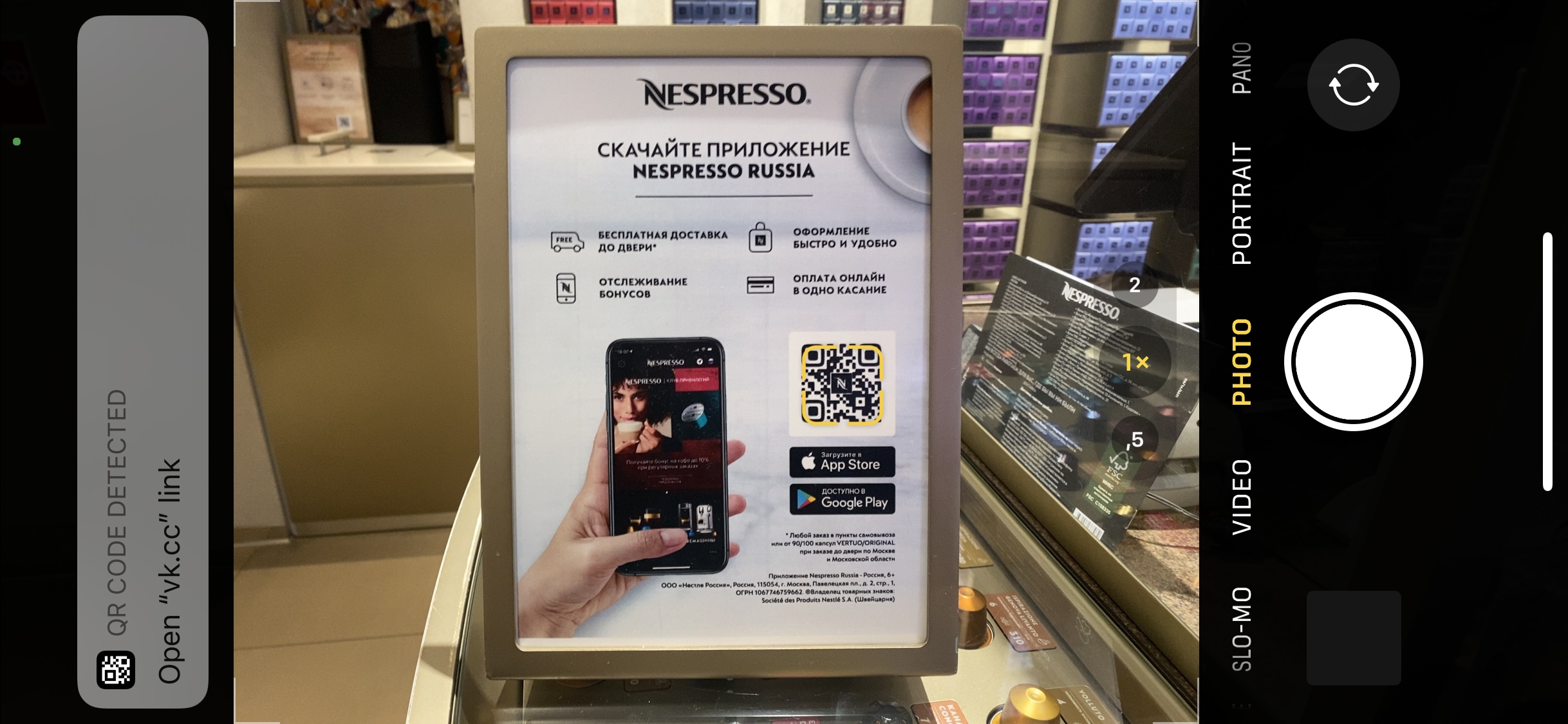
In addition to the CTA, explain to customers why scanning the QR code would be valuable to them. By managing their expectations, you further increase the likelihood that they will take action.
For example, the call to download the app in Nespresso’s boutique is accompanied by an infographic with key benefits:
Contact Details
Some businesses also place contact details next to their QR codes. It’s important not to overwhelm, but in some cases these details would be appropriate, such as for a hotline:
Company Logo
Most QR code generators allow you to brand the code by placing your company logo at its centre. This will make your code look more professional and increase the chance of drawing your customers’ attention.
Brand Colors
QR code generators also allow you to select a color for your code. This is a great opportunity to use your brand’s colors and make the code more visually appealing.
3. Scanning A QR Code
Size
Make sure that any QR code you place in offline media is not too small. Also account for the distance from which the code will be scanned. If it’s too small, customers will have trouble scanning it, and the code will be useless.
Non-Contact Surface
Minimize direct physical contact with your QR code. Otherwise, the surface will erode over time, and the code will become more difficult to scan. For example, for a storefront, stick the code inside the window, rather than outside.
In one of Street Beat’s stores (a sports apparel retailer), QR codes are placed on the checkout counter. The idea is quite good, but because it’s a contact surface, the sticker will come off gradually, and then it will look untidy and eventually have to be replaced.
Comfort Of Scanning
Place your QR code in a location where it’s comfortable to scan, without rushing. For example, a highway billboard will not only be inconvenient for customers, but will also increase the risk of accidents.
Mobile Network Availability
Many QR codes are links to websites. If yours is, make sure it’s somewhere where a mobile network or Wi-Fi is readily available. Otherwise, the value of the code will be close to zero.
Proper Surface
You’ll see some QR codes placed on transparent surfaces, which makes them difficult to scan or not scannable at all.
In Nespresso’s boutique, this issue is apparent: The code is almost unscannable. Store personnel found a solution: Every time a customer tries to scan the code, they hold up a sheet of paper as a background (which is still not the best customer experience at the end of the day):
X5 Retail Group (a food retailer) uses billboards along the streets to show its QR codes for downloading its app. Due to the format of the billboards, the codes are not as easy to read as they would be on a solid surface.
Environmental Factors
If you place a QR code outside, consider environmental factors such as lighting and weather. If the poster will be poorly highlighted at night, the code will be much harder to scan. If you’re using vehicles (such as delivery cars or cabs), ensure that they are cleaned regularly, especially in bad weather — the usefulness of a code covered with dirt is close to zero.
Explaining The Scanning Process
Despite the prevalence of QR codes, not everyone is aware of what to do with them. That’s why it’s a good practice to clearly explain this next to the code. For example, you could write, “Point your smartphone camera at the QR code to scan it”, along with an icon of a camera.
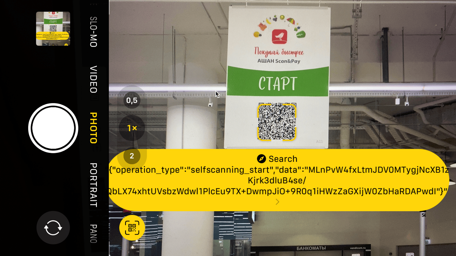
Scanning With Native Camera App
Set customers’ expectations correctly about how to scan the QR code, and if possible, do not implement a solution that requires people to install a specialized camera app.
When Auchan launched its innovative “Scan & Pay” system, corresponding QR codes were placed all over the store. Hundreds of visitors tried to scan the codes with a standard camera and encountered an error. They were not taken to the landing page but came across a system code. (The QR codes had to be scanned with the camera in Auchan’s app.)
Scanning From Different Devices
A QR code may be easily scannable on some devices and not scannable at all on others. Check the scannability of your code on different smartphone models before sending it for printing.
Color Contrast
Standard QR codes are black and white. If you use your brand’s color, make sure that it contrasts with the background enough to be scanned without any issue.
Dark On Light
Always use a color contrast of dark on light — that is, a dark QR code on a light background. Not all devices can scan the opposite correctly.
Resolution
Before submitting the code for printing, make sure the code is at a resolution high enough not to blur or pixelate. Otherwise, your effort and money will be wasted.
Website Code: Desktop
QR codes can also be used in a digital environment. For example, if I’m visiting a website on a desktop computer, the usefulness of an HTML button to download an app is questionable. However, a QR code can be scanned from the page with a smartphone, resulting in a smoother download process:
Website Code: Mobile
Unlike on a desktop website, where a transition to a mobile environment can be justified, think twice about whether to put a QR code on your mobile website. If a user encounters a code on their smartphone screen, they will not be able to read it with their camera. In this case, using a button makes more sense.
A while ago, I noticed that both the desktop and mobile versions of Auchan’s e-commerce website contained QR codes. While the former was justified, the usefulness of the latter was questionable:
An exception is when users can share a code with others. A particular and quite widespread case nowadays is the verification of a person’s COVID-19 vaccination status using the QR code from the mobile version of a public-service website.
4. Opening A Link From A QR Code
Active Link
This is a basic point, but I decided to include it nonetheless. Mistakes sometimes happen at the execution level of a business. Before sending a QR code for printing, check that the link in the code does not contain any errors and is active. Also, check regularly that all existing QR codes are active and working.
Content Relevance
Don’t forget to regularly check the relevance of content both on the page that is accessible via the link and in the area surrounding the QR code, especially if you’re using the code for a limited-time offer, an event invitation, or the like. Otherwise, it could result in unmet expectations and a negative customer experience.
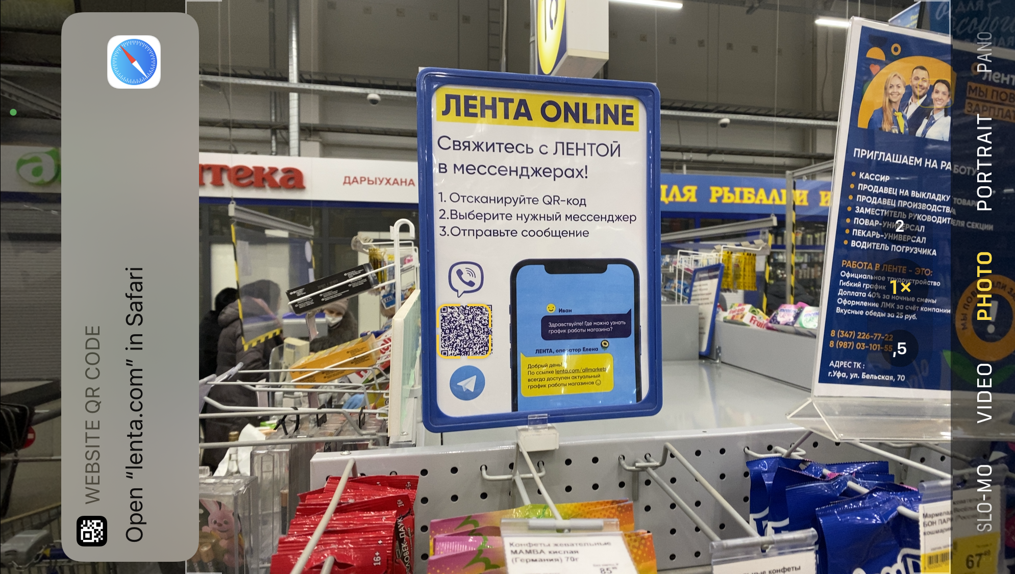
Landing Page vs. Several Codes
If you want your customer to take several actions, don’t create a QR code for each action. A better solution would be to present one QR code, and then outline the CTAs on the page that is accessible via the link in the QR code. This way, the presentation of the code will look neater, and the customer won’t be distracted when scanning it.
Below is an example of a case when this point was not thought through (by Persona Sport, a gym and wellness club). Links to Google My Business, Yandex.Maps, and 2GIS could have been placed on the landing page that is accessible via the QR code:
A while ago, Coffeemania (a restaurant) used one QR code for patrons to submit reviews, and another one for patrons to send tips to servers (whereas these actions could have been combined in a single code):
Lenta (a retailer) does this more efficiently, allowing customers to choose the medium by which to communicate with support at the level of the web page, rather than from printed media:
Managing Expectations
The content accessed via the link should match the CTA next to the QR code. If an invitation to subscribe to a social media account is the CTA, and the customer is prompted to take several unrelated actions upon scanning the code, then their attention might get diverted, and they might not take any action at all.
The drawback of the last example is that the QR code, which allows the customer to choose the medium by which to communicate with customer support, leads not to a dedicated landing page, but simply to the main e-commerce page, blurring the customer’s focus:
Mobile Optimization
It’s important to understand that scanning a QR code is just one part of the journey that a customer takes. That’s why thinking through all of the steps is important. Specifically, if the customer scans a QR code with their phone and ends up on a page that isn’t optimized for mobile devices, it won’t do them (or you) any good.
App Downloads
You can use deep linking to reduce your number of QR codes and to simplify the customer journey. This strategy allows you, among other things, to identify the type of device that the customer is using when scanning your QR code. It is useful when you’re providing a link to download an app. iPhone users who have scanned the QR code will go to the App Store, while Android users, having scanned the same code, will go to Google Play. The customer’s focus is not distracted by multiple QR codes, and there is no need to choose, while the value is the same.
Coffeemania’s loyalty program offers several QR codes, depending on the way the client wants to register. This could be overwhelming:
Uniqlo, on the other hand, doesn’t ask what kind of smartphone I have. The relevant app store will open automatically when I follow the link from the QR code:
Personalization
You can personalize the customer’s experience by leveraging UTM parameters in the link from the QR code. For example, to allow customers to evaluate a restaurant server’s work, you can add the server’s ID as a link parameter and personalize the feedback page with their name.
Analytics
Besides personalization, UTM parameters can also be used for analytics. For example, when placing QR codes on different banners around the city, you can add corresponding parameters with the ID of each banner to see which banners get more traffic and which ones should be relocated in the future.
To Be Continued
QR codes can simplify the customer journey and make it more convenient. As with everything else, however, the effectiveness of this touch point depends on the details, and poorly implemented details can turn your bright prospects into a bad customer experience.
If you use QR codes in your business, be aware of the pitfalls along the way, and leverage all of the technology available, and don’t rely on having to learn from your own mistakes. I hope this article was valuable, and if you have something to add, drop me a message — we’ll continue to refine the best practices.
If you have a special place in your heart for contemporary architecture with a futuristic feel, MAD Architects will knock you off your feet. This design firm based in Beijing is taking the world by...
Do you want to create a fitness tracker in WordPress?
Many health and fitness-related businesses and online communities offer fitness tracking tools for their users. This helps to keep users engaged and grow your business.
In this article, we’ll show you how to easily create a fitness tracker in WordPress to boost user engagement on your website.
What is a Fitness Tracker?
A fitness tracker is an online tool that helps users track different aspects of their health and fitness performance.
It could be a weight loss tracker, a BMI calculator, a meal planner, or other type of health tracker. These online tools can be created using no-code WordPress plugins that calculate different values on the fly.
Why You Should Add a Fitness Tracker to Your WordPress Site
If you run a WordPress website for a health and fitness business or an online community, then adding a fitness tracker to your website is an easy way to build user engagement.
You can provide your users with actual tools to track their fitness performance, which is more likely to keep them on your site longer.
Improved user engagement leads to higher conversion rates and better customer retention for your business.
Building an Online Fitness Community
One of the easiest ways to monetize a health and fitness website is by using MemberPress. It is the best WordPress membership plugin and allows you to easily sell online courses and subscriptions.
You can create different types of fitness plans, hide members-only content behind a paywall, create online courses, and more.
Users can then use your built-in fitness tracker to measure their performance and progress over time. This helps them spend more time on your website which improves subscription renewals, upsells, and customer retention.
To create an online fitness tracker in WordPress, you’ll need Formidable Forms.
It is the best WordPress calculator plugin on the market that allows you to create advanced forms and calculators for your website. The drag and drop form builder makes it easy to create your fitness tracking forms without having to write any code or hire a developer.
Note: There is a limited free version of the plugin called Formidable Lite. However, you’ll need the premium version to unlock more features.
Upon activation, you need to visit the Formidable » Global Settings page to enter your plugin license key. You can find this information under your account on the Formidable Forms website.
After that, you need to visit the Formidable » Forms page.
Here, simply click on the Add New button to create your fitness tracking form.
Next, you will be asked to choose a template for your form.
There are a bunch of templates that you can use, but for this tutorial we’ll be starting with a blank form.
Next, provide a name and description for your form and click on the Create button.
This will launch the Formidable Forms drag and drop builder. In the left column, you’ll see a list of the form fields that you can add.
To your right, you’ll see the form preview. Since our form is blank, there are no fields in the preview column.
Let’s change that and add the form fields for our weight loss fitness tracker.
For this tracker, we’ll be adding the following form fields.
User ID – This will be automatically filled by Formidable Forms for logged in users so that users can see their own performance.
Date – Users will be able to enter the date they measured their weight.
Number – We’ll rename this field to ‘Weight’ and ask users to enter their weight in lbs or kg.
After adding the fields, you can just click on a field to change its properties.
For instance, we edited the number field to change its label to ‘Weight’ and provided instructions in the description option.
Once you are finished editing the form, click on the Update button to save your form.
Adding Fitness Tracker in a WordPress Post or Page
Next, you would want to add the fitness tracker form to your WordPress website.
If you are using MemberPress, then you can simply edit the Account page. You can also create a new page and restrict it to members-only. This way users will be required to login to enter their fitness data.
On the page edit screen, simply add the Formidable Forms block to your page and choose your Fitness Tracker from the drop down menu.
Formidable Form will now display a preview of your form in the page editor. You can go ahead and save your changes.
You can now go ahead login with a dummy new user account and fill out a few test entries.
Display Fitness Form Tracker Data in WordPress
Formidable Forms makes it super easy to display the data collected by your forms on your WordPress website.
You can choose exactly which fields you want to show and display the data in graphs and charts.
Simply edit the post or page where you want to display the form data. Obviously, if you are using MemberPress then you want to restrict that page so that only logged in users can view their own fitness data.
Next, you will need to add a shortcode to your page in the following format.
Stampa Solutions is a renowned company that follows a data-driven approach to web-design, development, site maintenance and search engine operation. Our expert team curtails UX, designers, developers, and eCommerce specialists that ensure to establish your digital presence and help you discover your market potential.


 Growing your list is essential if you want to have a successful business or a blog. One of the best ways to grow your email list is with popups. Love them or hate them, popups are a proven way to increase your conversions. But, if you want your popups to be effective, you have to […]


