Working as a designer on a design system for a large product has taught me how precious the time you spend on a single task/component is. Things advance fast, and I try to keep up making it work for both designers and developers. It is no easy task.
I’ve noticed that a good chunk of team members’ productivity goes into endless conversations such as:
“Should this be a separate component?”
“Should it be a variant?”
“What should the configuration options look like?”
...and so on.
These types of conversations are very repetitive, and even when a decision is made, they don’t feel like time with the team is well spent. There are so many questions to be answered.
What do you optimize for? Is it for consistency, scalability, creativity or maintainability? You can optimize for so many things — and choosing only one often sacrifices another.
It’s difficult to define a set of rules that would put an end to these meetings in the future. What topped this problem up was one interface element that stood out due to its huge reusability and variations: list item.
If the Title-Subtitle list item is a component, then:
- Is the image (chevron) indicating a new component or a variant of one?
- What if it’s not a navigation chevron at the end but an (info) icon instead?
- What if it has a leading image in front?
- What if it has a switch?
Aaand at the same time, they share states (selected, pressed, disabled, and so on). Try to get the team iOS, Android and designers in a call to make a decision on it. 🤯
Thankfully, I’ve been surrounded by people that are open to collaboration across teams. After teaming up with developers, I started recognizing developer terms and patterns in the designer tool.
At the same time, Figma has been peeking over developers' shoulders for layout building tools (like auto-layout, variants with properties, constraints, and so on), so now it allows designers to approach component building closer to how things look in code.
Observing developers in how they build and think about the components gives you a perspective on its structure. Soaking those patterns allowed me to build the components with almost the same rules in Figma (looking at you, min and max-width/height setting).
Introducing “Composition” For Design Systems: Composable Content And Containers
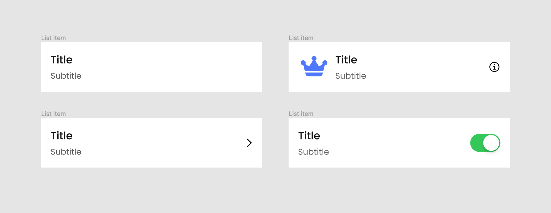
Let’s take a look at this list item component:

The way we had them in our project was just a collection of all the possible list items, i.e. with a large icon, small icon, subtitle, toggle, trailing text, and so on. They were all separately defined with their backgrounds and named numerically (starting from list item 1 to 8).
So, we had no semantics in place defining our list items in a more meaningful way, as well as no optimized way of maintaining updates to the defined background styling and layout. What started happening was that new inconsistent states started appearing in some files:
- A choice-list item would have a tinted background in one design file (indicating selection), but just a checkmark on the right side in another;
- The paddings would be different across design files.
Reasonably, the backgrounds of list items should stay consistent throughout all screens and be flexible to fit different content inside. So, how do we enforce that through a design system across all teams?
There are a couple of ways, so let’s get a bit technical here. One approach is Variation.
Variation
First, define all list items that exist in the interface and identify their variants:
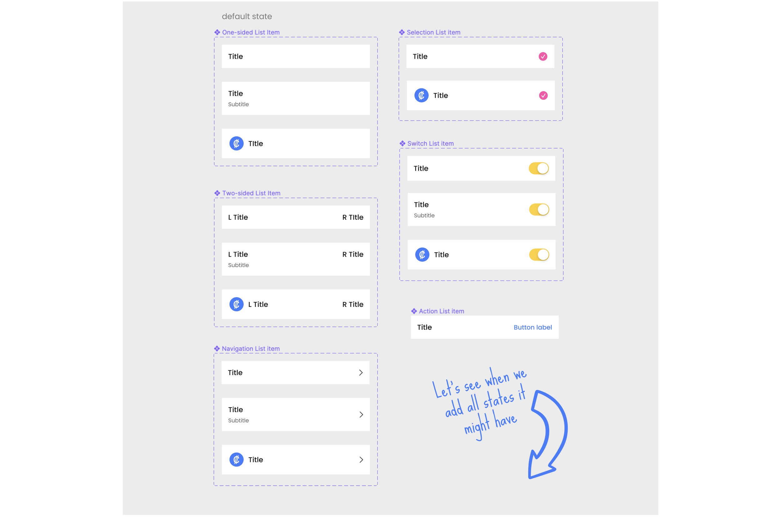
Then, add all the defined list items states (secondary, accent, and so on) as variants per each list item. This will double each original component/variant per state and you’ll be able to account for all possible states that a list item might have.

This is how we first thought to approach the problem, but you can clearly see the issues with it: bloating the number of variants that need to be maintained where you have an unnecessary repetition of background and other elements.
Now, imagine this. Let’s try changing the following:
- Secondary background (grey) to have a different color/corner radius;
- Or font style of the Title;
- Or spacing between Title and Subtitle;
- Or image size.
You would have to go to every variant (32 in total in our case) and update each one manually in order to align these changes. 😨 This becomes a quite inefficient way to maintain these components, lightly speaking.
Let’s then move on to a better approach: Composition.
Composition
We’ll start with composing a container 🔴. Here we define the background styling and padding (can also include corner radius, shadows, and so on), and nest the instance of a Generic content placeholder 🔷 that will allow us to swap it with any other component.

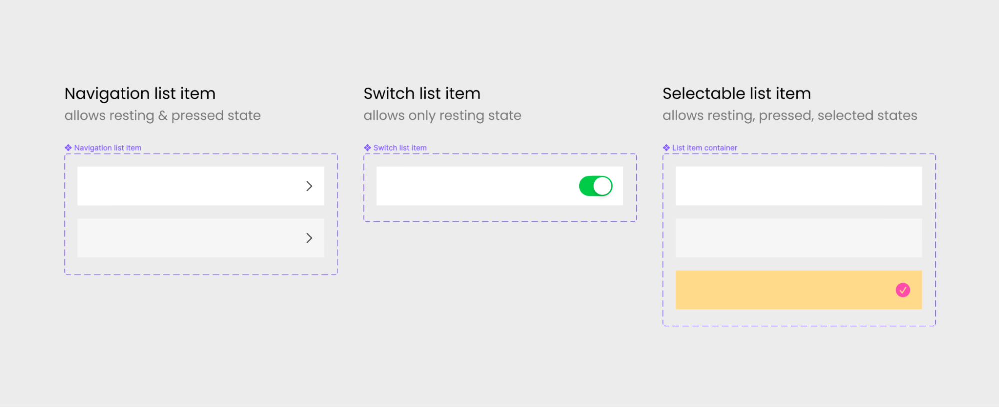
Our list items will have a few Enhancing elements 🔶 in them, such as s checkmark, navigation chevron, switch or button. Since they might apply to any defined background and to all generic content, we would need to compose another container for those elements.
- The container defines the element and its location with paddings;
- Same placeholder instance is nested inside again for content.

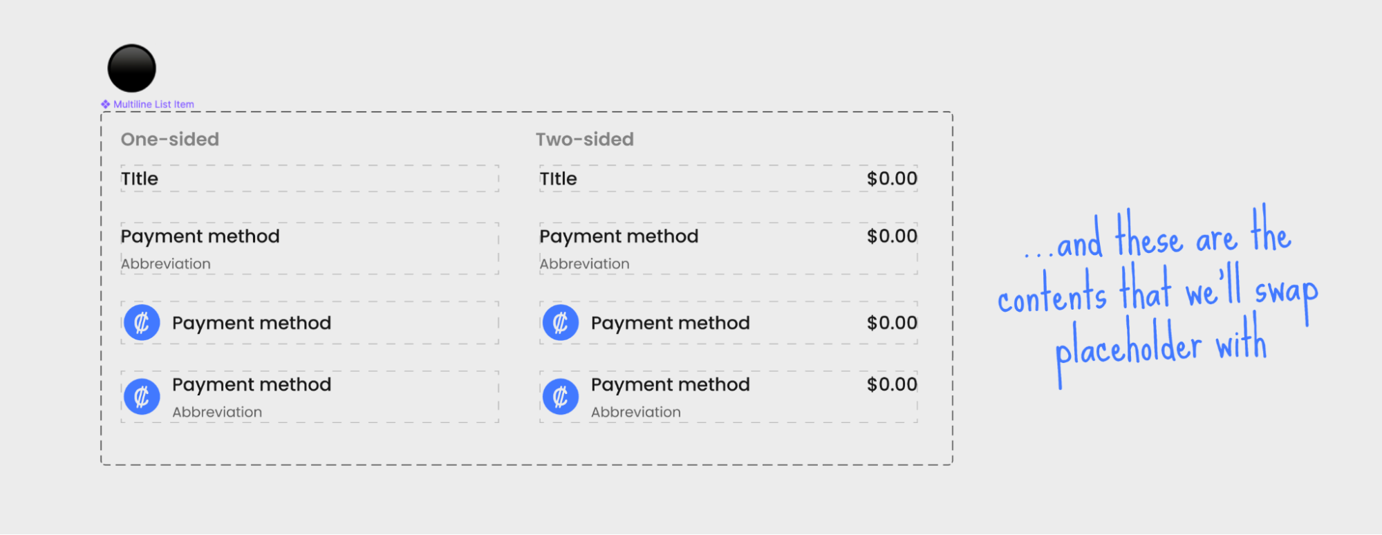
Next, let’s define the list items content ⚫️ (e.g. Multiline list item) that your interface has without background (only text and images):
Now, in order for us to assemble the needed list item, we need to think from the ground up (Z-axis first):
- Take the container 🔴 and select a needed state;
- Swap the placeholder 🔷 inside with the list item content ⚫️ you defined >> ☑️
- Or if you have an enhancing element in a list item (like a switch, button, and so on):
- Swap the placeholder 🔷 with the element container 🔶,
- Then swap inside the placeholder 🔷 with a list item content ⚫️ >> ☑️.
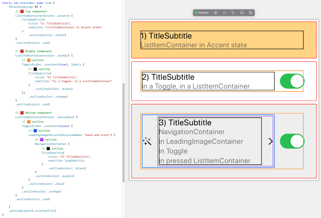
Some of these combinations are silly, but they do showcase the power of the approach. Notice how the switch (toggle) component is actually native/system for iOS and how it plugs into our composition with our custom components completely seamlessly, both in code and visually.
This is because modern front-end frameworks such as SwiftU for iOS and Jetpack Compose for Android (no kidding it literally has “Compose” in its name 😉) rely on the same composition approach that we are describing — and what Figma now allows, too.
Why Even Build Composable Components?
Well, there are at least five good reasons why we’d want to build composable components:
1. Consistency
By putting all the background patterns in one place to be reused, we ensure that those background states are represented consistently across the features and teams, as a single source of truth. When these states are not really defined, you get visually different designs for these states across the screens — the more designers on the team, the more inconsistencies there will be.
2. Error-Proof Design
We completely eliminate an opportunity for a designer to misuse the states, mistaken the paddings, introduce something that already exists, etc. Unless you detach the instance...

3. Absolute Flexibility
Do you need to nest some other component inside your list item? Voilà! We don’t need to limit a list item to host specific content only. You can put any content inside. Let’s see how we can put the contents that we used for list items into a card container absolutely seamlessly.

Now scale this to a whole design system. You can see why I consider the variation approach unmaintainable.
5. Brings The Teams Together
Building components in design the same as in code removes the friction in documentation and specs, as well as allows sharing the same process and language between designers and developers.
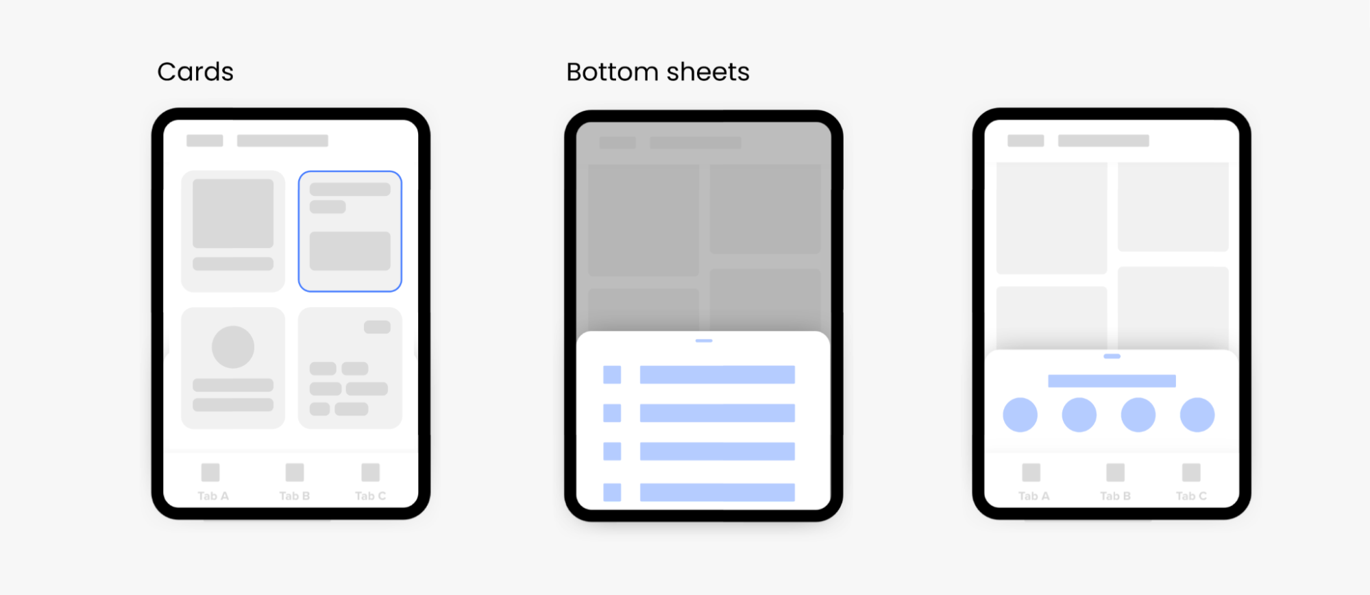
And guess what, this can be applied to many other components that share a similar composable structure. The most obvious components that we put as candidates for this upgrade are:
- cards: reusing backgrounds like active, highlighted, disabled,
- custom bottom sheets: reusing container and putting any content inside.
When To Use It And When Not?
You can probably already see that this structure optimizes consistent reuse and maintainability the most, but don’t go overboard with it. Here is a general rule of when you can go with composition:
You use composition when you can (reasonably) slice a component (on X/Y/Z axis) into 2 parts “Generic content” and “Enhancing elements” where:
- “Generic content” is the slice (area) of a component that hosts any UI content.
- “Enhancing elements” include the constant UI elements (like switch, chevron, background) and interaction behaviour (animations) of a component.
This rule leaves a lot of room for interpretation because slices can be seen differently by different people, but that’s fine because it demonstrates the flexibility and power of this approach where you have multiple ways to achieve your goal.


Managing The Power
If you decide to embrace the composable structure in your design system, I would recommend splitting your components into layers of hierarchy in Figma:
- Container-backgrounds
These compose on the Z-axis and only define:
- styling: background color, corner radius, shadow, and so on.
- general layout: paddings, the position of the content.
- Enhancing-elements containers
Containers that might include additional elements like chevron, switch, button, icon, etc.
- Content
Components that are actual generic content implementations. They are the final node of the composition tree.

You can see how you now have the power to compose anything. And just like lego pieces, your components are capable of infinite combinations that might actually be silly in practice, like in the example below.

So, you might decide that you want to limit the usage combinations of your composable components. As in the example of combining checkmark and switch, we clearly don’t want to nest both of these elements in one list item, so what we can do instead is to couple enhancing-container with applicable container-backgrounds as a new component.
In the Navigation list item, you couple container-background (with 2 variants, default and pressed) with enhancing-container (chevron). That way, you define all of the possible variations of this component. Also, even though you can still put any content inside, you cannot use another state (like highlighted) or add other elements like toggles to it.
Final Notes
So far, my team and I have adopted composable components for cards and list items for both mobile platforms, iOS and Android — and we love it.
Developers and designers quickly grew very fond of this approach. Although the component building is becoming more complex, everyone sees that it makes our design system more elaborate and elegant.
Generally, if you leave it to live only in a design system without syncing it in code, it will already be beneficial enough. You do need to put effort into building it, but then it pays off well with less maintenance — just as much as it does for design systems.
This article was written in collaboration with my iOS developer husband. Thank you, Petar Kanev.


 At some point, you might need to translate and display your website in multiple languages. Whether you’re handling a WordPress blog or a media website, a hotel or a corporate website or even if you’re managing a WooCommerce shop. In this article, we’ll first describe who you should translate your website for and why then […]


