A Simple Scenario explaining the Usage and Performance, when using EhCache (2nd Level Cache of along with Hibernate in a Spring environment. The performance results are taken using mySQL as the Database.
Though this Example is from Spring 2.5.x and Hibernate 3.x and EhCache 1.4, MySQL 5.0 => The Concepts Demonstrated will Continue to Hold Good for any Version of any Make of Second Level Cache Product with Hibernate (Optionally, Spring) such as Infinispan, Redis, Hazelcast, ...
[Download Sample Code] Please be informed that the size is about 10MB; as i have provided all the dependencies.
In this example, I need to retrieve close to 5,000 records in a single fetch and then cache this information. As usual, setup Spring contexts in your Spring configuration file. I have just one class, which is a Hibernate DAO, HibernateDoctorDAO.java. The dependency injection hierarchy is dataSource > sessionFactory > hibernateTemplate. hibernateTemplate is then injected into the HibernateDoctorDAO.java at runtime by the Spring Framework.
The results clearly shows the difference in performance with EhCache enabled, even in this simple example:
PERFORMANCE COMPARISON (In Seconds) ============================== QUERY FETCH TIME (INITIAL): 0.599 QUERY FETCH TIME (HIBERNATE CACHE): 0.212 QUERY FETCH TIME (2ND LEVEL CACHE): 0.091
Version Reference > Spring-2.5, Hibernate-3.0, EhCache-1.4, mySQL-5.0
Instructions: Unzip the file and start by creating the database. Any mySQL database that is compatible with the MySQL Connector 5.0.8 is fine for this example. You will have to create the database data_explosion (USERNAME: root, PASSWORD: architect.2012) and the table DOCTOR_TABLE. You can use the provided doctor.sql as reference. Then run the java standalone com.sumsoft.spring.orm.hibernate.dataload.JDBCDataLoader to create and load a large number of arbitary records into the DOCTOR_TABLE. You can ignore or remove every invocation that is to PATIENT_TABLE, as this is only additional for this example. Then use spring_hibernate_cache.bat to run the application. Though not tested on UNIX, you may write a script similar to the batch file to run this application.
Imagine a header of a website that is nice and thick, with plenty of padding on top and bottom of the content. As you scroll down, it shrinks up on itself, reducing some of that padding, making more screen real estate for other content.
Normally you would have to use some JavaScript to add a shrinking effect like that, but there’s a way to do this using only CSS since the introduction of position: sticky.
Let me just get this out there: I’m generally not a fan of sticky headers. I think they take up too much of the screen’s real estate. Whether or not you should use sticky headers on your own site, however, is a different question. It really depends on your content and whether an ever-present navigation adds value to it. If you do use it, take extra care to avoid inadvertently covering or obscuring content or functionality with the sticky areas — that amounts to data loss.
Either way, here’s how to do it without JavaScript, starting with the markup. Nothing complicated here — a <header> with one descendant <div> which, intern, contains the logo and navigation.
As far as styling, we’ll declare a height for the parent <header> (120px) and set it up as a flexible container that aligns its descendant in the center. Then, we’ll make it sticky.
The inner container contains all the header elements, such as the logo and the navigation. The inner container is in a way the actual header, while the only function of the parent <header> element is to make the header taller so there’s something to shrink from.
We’ll give that inner container, .header-inner, a height of 70px and make it sticky as well.
That top: 0? It’s there to make sure that the container mounts itself at the very top when it becomes sticky.
Now for the trick! For the inner container to actually stick to the “ceiling” of the page we need to give the parent <header> a negativetop value equal to the height difference between the two containers, making it stick “above” the viewport. That’s 70px minus 120px, leaving with with — drumroll, please — -50px. Let’s add that.
.header-outer {
  display: flex;
  align-items: center;
  position: sticky;
  top: -50px; /* Equal to the height difference between header-outer and header-inner */
  height: 120px;
}
Let’s bring it all together now. The <header> slides out of frame, while the inner container places itself neatly at the top of the viewport.
We can extend this to other elements! How about a persistent alert?
While it’s pretty awesome we can do this in CSS, it does have limitations. For example, the inner and outer containers use fixed heights. This makes them vulnerable to change, like if the navigation elements wrap because the number of menu items exceeds the amount of space.
Another limitation? The logo can’t shrink. This is perhaps the biggest drawback, since logos are often the biggest culprit of eating up space. Perhaps one day we’ll be able to apply styles based on the stickiness of an element…
If you are lazy loading, do you really need to do the content-visibilty thing also? They seem very related.
Serving AVIF is usually good, but it seems less cut-and-dry than WebP was. You need to make sure your AVIF version is both better and smaller, which feels like a manual process right now.
The decoding thing seems weird. I’ll totally use it if it’s a free perf win, but if it’s always a good idea, shouldn’t the browser just always do it?
I’m not super convinced blurry placeholders are in the same category of necessary as the rest of this stuff. Feels like a trend.
Traditional telephone services are expensive. With so many businesses looking for ways to save money on their phone bills, VoIP solutions are rising in popularity.
Whether you’re a startup seeking your first phone number or an established business interested in switching providers, you’re likely torn between two options—VoIP phone systems and landlines.
What’s the difference between a VoIP and a landline? Which is the best option for you and your business? Find out the answer to these questions and more in this detailed guide.
What is VoIP? What is a Landline?
VoIP stands for voice over internet protocol. It’s a modern communication solution that makes it possible to manage calls on the internet.
Landlines use traditional phone networks and copper wiring to connect calls between people. Sometimes landlines are referred to as POTS or “plain old telephone system.”
Historically, landlines were the primary method of phone communication for commercial and residential calls alike. But today, more companies are switching to VoIP to save money and scale their business communications.
5 Tools to Improve Your Phone Service
If you’re looking for an alternative solution to a traditional landline, VoIPs are a viable alternative. Check out some of my favorite business phone service tools below:
Tool #1 — Nextiva
Nextiva is one of the best business phone systems on the market today. Using VoIP technology, this provider offers business voice, video conferencing, and team communication solutions—all within a single plan.
Nextiva offers the same benefits as a traditional phone, but with so many additional advantages to improve the way your business operates.
The same system that can be used to field incoming calls from leads can be used to share files and send instant messages internally within your organization. The software even integrates with third-party business apps, like Salesforce, Zendesk, and Hubspot.
Over 100,000 organizations rely on Nextiva. It’s used by reputable names like Amazon, Cisco, the United Way, YMCA, Taco Bell, and more. They have solutions for small businesses and enterprise companies alike.
With Nextiva, you’ll have the opportunity to access features like internet faxing, call recording, voice analytics, and business SMS. Calls can be managed from computers and smartphones, allowing you to communicate from anywhere with internet access. You won’t have these capabilities with a traditional landline.
Tool #2 — RingCentral
Over 400,000 organizations of all shapes and sizes trust RingCentral as a business phone solution. This VoIP provider is an all-in-one tool for integrated phone, messaging, and video conferencing.
RingCentral’s VoIP phone service offers carrier-grade reliability. You’ll also benefit from tons of built-in security advantages.
One of the reasons why I recommend RingCentral so highly is because of its simplicity. You can get started in minutes and start deploying new users or even entire departments with a few clicks.
Those of you who currently have an existing business can keep your current number when you switch to RingCentral. The software also allows you to change devices between your desktop and mobile app with one click during a live call, which truly makes it possible to communicate from anywhere.
Other noteworthy features and highlights include unlimited business SMS, document sharing, call log reports, internet fax, call recording, and real-time analytics. RingCentral even has tools for call centers, like multi-site admin management, call whispering, and other advanced features.
Tool #3 — Phone.com
Phone.com is another popular VoIP phone service for businesses. The company initially launched over ten years ago. But today, they serve 40,000+ companies across a wide range of industries.
They provide phone services to retail companies, legal companies, educational institutions, professional service organizations, healthcare companies, financial institutions, and more. The software is trusted by popular companies like Aflac, Zoho, and Insightly. Phone.com is an ideal solution for anyone seeking a simple and reliable way to communicate from anywhere.
Another reason to consider Phone.com over a traditional landline is the fact that you’ll get enterprise-grade features at an affordable price. Select features like custom greetings, hold music, and automated attendants.
Even if you’re a single user or sole proprietor, you can use Phone.com to add professionalism to your business. The setup is as easy as it gets. Just choose a number, and you can start making calls from your computer, smartphone, or IP desk phone immediately after you sign up.
Tool #4 — 8×8
8×8 is one of the most reputable, reliable, and popular VoIP business phone systems on the market today. It’s trusted by more than one million business users across the globe. Big brands like McDonald’s and Farmers Insurance rely on 8×8 for phone communication.
I like 8×8 because they have plans for everyone. From small businesses seeking a simple VoIP phone system to contact centers with agents working from home, 8×8 has a solution. You can even use 8×8 as an all-in-one communications suite for phone, video conferencing, and team chat.
Some noteworthy features offered by 8×8 include intelligent call routing, SMS and MMS, supervisor analytics, call monitoring, call quality reports, and so much more.
8×8 lets you establish a local presence from anywhere, with numbers in 120+ countries. This is a great option for businesses that operate internationally.
With an open API, 8×8 is developer-friendly as well, so you can customize your software and integrate it with any other business application.
Tool #5 — Ooma
Ooma offers an extensive list of VoIP solutions for commercial and residential users alike. In addition to using an Ooma VoIP for your office, you can also eliminate your home landline with an Ooma subscription.
For small businesses, this provider should be a top consideration on your list. You’ll get a free phone number without being locked into a long-term contract. Ooma has everything a small business owner needs from a VoIP phone system.
The entire setup and onboarding take less than 15 minutes, so it’s effortless to sign up and deploy.
Every Ooma Office business plan comes with 35+ business features. Some of my favorites include a virtual receptionist, SMS messaging, overhead paging, virtual fax, hold music, transfer music, ring groups, call forwarding, and more.
Ooma even offers advanced features like call recording and video conferencing. According to the Ooma website, businesses that switch to an Ooma plan save an average of 50% on their phone bill.
Between the savings and features, it’s no surprise that these plans are so popular for business users.
The Basics of VoIP vs. Landline: Differences Explained
To help you better understand VoIP and landlines, I’ve identified these phone systems’ core components and explained the differences below. This will help you determine whether a VoIP phone system or a traditional landline is better for your business.
Flexibility and Mobility
Landlines don’t offer a ton of flexibility. In terms of your physical location during a call, you’ll be limited to the length of the phone cord or the range of the wireless receiver. For most people, it means they’re tied to a desk or a room to make and receive calls.
VoIP is much more flexible. You can make calls and answer calls from anywhere with an internet connection. This gives you and your staff the ability to manage work calls from home, on the road, in the office, or wherever you are. So there’s no need to worry about wires or being stuck at your desk to answer the phone.
Hardware and Equipment Requirements
With a landline, you need to have a physical telephone for the service to operate correctly. I’m referring to any average desk phone that you’ve seen or used countless times in your life. You’ll also need to have a telephone jack and a wired connection to your phone service provider.
In most cases, VoIP phone systems don’t require any additional hardware. As long as you have an internet connection that can support VoIP calling, you can use these services with your existing devices. Your computers and smartphones can essentially double as work phones. You can just download the VoIP app or use the web-based service to communicate.
VoIPs are much easier to scale than landlines due to the limited hardware requirements. So you can start deploying a remote call center with agents working from home without purchasing hardware and setting up a landline at each location.
Internet Reliability
Remember, the “I” in VoIP stands for “internet.” VoIP phones do require a stable internet connection to work effectively. If your connection is unstable, it could potentially cause some call quality issues, muffled sounds, lag, or even dropped calls. This is something you’ll want to avoid, especially for business use.
Fortunately, modern VoIP systems are ultra-reliable. Many even come with an uptime guarantee from your provider. The vast majority of the time, you won’t notice the difference at all between the call quality of a VoIP phone and a landline.
However, if there’s an internet outage or you live in a remote area with a spotty internet connection, a hardwire connection might be better suited for your needs.
Technology, Maintenance, and Cost
The existing copper wire infrastructure used by landline systems has been around for a while, and they’ll likely stay around for a while too. Lots of phone companies aren’t really committed to upgrading these legacy systems anytime in the near future.
VoIP providers are rapidly evolving. They are constantly coming out with new updates, features and improving the technology behind the curtain.
As a result, VoIP phone systems are much easier to maintain. If there’s an issue, it’s usually resolved relatively quickly without needing someone to physically provide on-site maintenance.
But if there’s a problem with your landline, it could be a major headache. Someone has to come out to your location, figure out the problem, and potentially replace some hardware. We all have at least one horror story with our phone company.
It’s also worth noting that VoIP systems are significantly cheaper than landlines. Even for business use, plans typically start around $20 per line. Traditional landlines can’t compete with those prices.
Business Features
Landlines can’t do much beyond calling. Sure, some business phone systems support call waiting, three-way calling, hold music, overhead paging, and other basic features. But beyond that, the capabilities are extremely limited.
VoIP phone systems are much more advanced. In addition to all of the features that come with a traditional landline for calling, you can also get tools for video conferencing, team messaging, SMS and MMS, and so much more. Some advanced tools even come with call recording, call analytics, and tools for supervisors like call monitoring, whispering, and barging.
When compared side-by-side, a VoIP provider’s list of capabilities and features will be significantly longer than a landline service.
3 Tricks for VoIP and Landline Phone Services
As you’re comparing and evaluating different solutions for your phone service, take these quick tips and hacks into consideration.
Trick #1: Test Your Internet Connection
If you’re concerned about call quality but are leaning towards a VoIP phone over a landline, run a quick VoIP speed test or VoIP quality test. There are dozens of simple online tools that you can use to quickly learn whether your existing internet connection can support a VoIP call.
For businesses, you’ll even be able to tell how many simultaneous calls the connection can support. If you learn that the connection is not up to par with recommended requirements from a VoIP provider, you can upgrade your internet plan or switch providers.
Trick #2: Try a VoIP for Free
In general, people can be hesitant to try new things. If you’ve been using a traditional landline for your entire life and you’re not sure if a VoIP is right for your business, you can always try one out for free.
Most of the best VoIP phone service providers offer a free trial. Others even offer money-back guarantees.
These providers don’t typically lock you into long-term contracts either. So you can usually cancel at any time, penalty-free. Just review the terms of your contract when you sign up to verify the length and cancellation policy.
Trick #3: Get a Fixed VoIP for Emergency Calls
Generally speaking, VoIPs fall into one of two categories—fixed and non-fixed. A fixed VoIP is attached to a physical address, whereas a non-fixed VoIP is not.
If you want the ability to dial 911, make sure you find a fixed VoIP service provider that supports emergency dialing. Lots of non-fixed VoIPs do not have this feature. Emergency dialing is especially useful for traditional office settings.
Sometimes non-fixed VoIPs are used by scammers, so fixed VoIPs are generally better for business use. It makes you appear more reputable if your number is tied to a physical address.
Out of all the tools available at our fingertips these days, DevTools is probably one of the most advanced ones. Over the years, it has become a tool for debugging, profiling, auditing and even prototyping — all living within the same interface, and always just a keyboard shortcut away. Still, DevTools has plenty of obscure gems and undiscovered treasures, living on the remote fringes of hidden tabs and experimental settings. Let’s fix that.
In this article, let’s dive into some of the useful and obscure features in DevTools. We’ll look into all modern browsers (Chrome, Firefox, Edge, Safari) and look into the useful tools that they provide to us, web developers. We’ll focus on the ones that we use frequently on SmashingMag, and some of the little techniques and strategies that help us fix pesky bugs and write better code.
Creating Browser Profiles
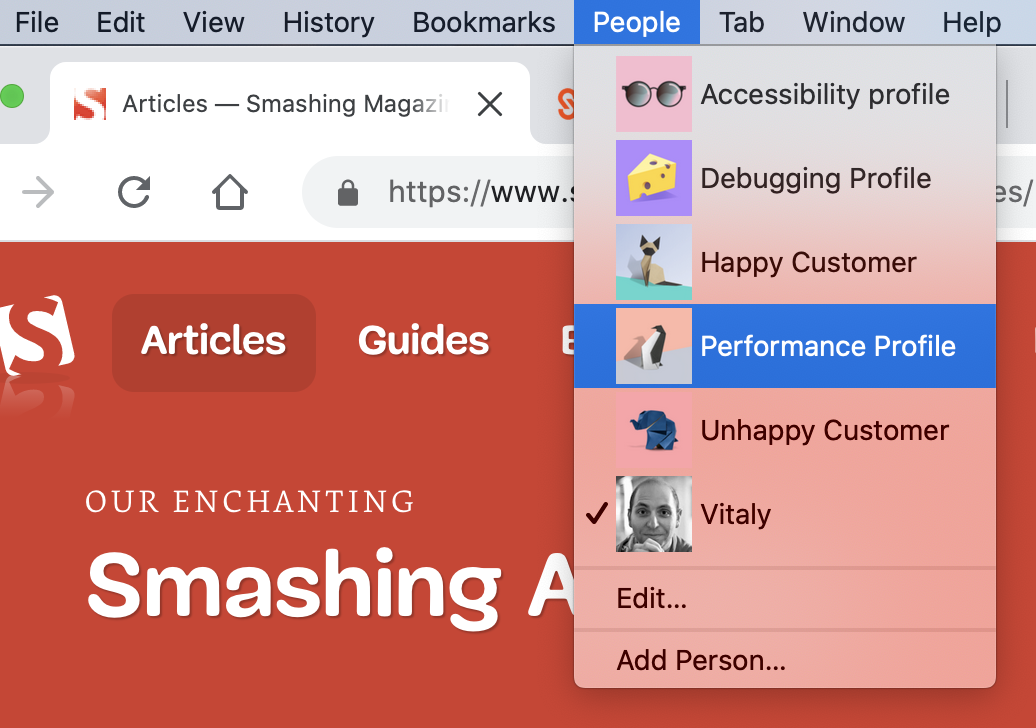
When it comes to profiling a website for performance, or tracking a particular accessibility issue, we’ve been creating separate browser profiles for each task for a while now. We usually work with at least 5 user profiles, each with its own extensions, bookmarks, bookmarklets and features turned on or off. Let’s take a closer look at them.
Accessibility profile A clean browser profile that includes various tools for checking accessibility, e.g. Accessibility Insights, aXe and a11y.css, along with a few other accessibility linters and color vision simulator.
Debugging profile A profile with a few experimental settings for profiling turned on, as well as an option to automatically open DevTools for every new window, along with a custom diagnostics CSS for quick auditing and profiling.
Happy customer Based on the data we have from our analytics, that’s a profile that is close enough to the one that many of our readers (wonderful people like you) will have. It will contain a few popular extensions, common web development extensions, ad-blockers, tab management, Google Docs offline, LastPass, VPN, Browserstack, Grammarly etc. No throttling in use.
Unhappy customer A profile for a reader on a slow, throttled connection (slow 3G), low memory, poor CPU, with 10 most popular browser extensions on. We usually use this profile to test our heaviest pages to experience the worst possible customer experiences.
Depending on the task at hand, we can jump to one of the dedicated profiles. The actual convenience comes from the simple arrangement that each of the profiles has specific extensions, bookmarklets and browser settings all set and ready to go. So if needed, we can get right to performance debugging or accessibility auditing without any hassle for searching the right extensions.
It probably goes without saying that we do our best to keep each profile clean and uncluttered — that goes for browser extensions as well as browser bookmarks, cookies and cache.
Global Keyboard Shortcuts
Admittedly, with the sheer amount of features available in DevTools, it’s not very surprising that some of them are quite difficult to find between tabs, panels, gear icons and dots. However, there is no need to memorize the place where they are placed. Instead, it’s worth remembering just a couple of useful global keyboard shortcuts — they will help you jump to specific features faster.
Opening the Command Menu (Chrome, Edge) Being probably one of the most well-known ones, this command actually has two features. Cmd/Ctrl + Shift + P opens a quick autocomplete search for panels, drawers and all the features within DevTools. Cmd/Ctrl + P opens a drawer with all available files used on the current page. If you need to quickly access any DevTools feature, the Command Menu is a quick way to get there — for general drawers, hidden menus or specific features.
Opening DevTools Settings (all modern browsers) Usually there are plenty of obscure tools and features hidden in the “Settings” panel — from emulated devices to network throttling profiles and experiments. In Chrome, you can click on the gear icon in the right upper corner or use Shift + ?. In Firefox, you can jump to Settings with F1.
Toggle Inspect Element Mode (all modern browsers) Instead of clicking on an Inspect icon and then focusing on the element you’d like to debug, you can toggle Inspect Element Mode with Cmd/Ctrl + Shift + C.
Toggle the HTML mode (all modern browsers)
While inspecting an element, you might want to change its attributes, e.g. classes or states. Instead of right-clicking on the element and adding values one-by-one, you can toggle the HTML mode on the currently selected element with Fn + F2 (or just F2 on Windows).
Toggle Device mode (all modern browsers)
To jump into the device toolbar mode, e.g. to preview how the mock-up looks like on narrow screens, or trigger a media query debugger, you can use Cmd/Ctrl + Shift + M in Chrome, and Cmd/Ctrl + Opt/Alt + M in Firefox.
There are also plenty of other useful keyboard shortcuts, e.g. for pausing and resuming script execution, and go to matching bracket (for lengthy media queries and JS functions) in the source editor.
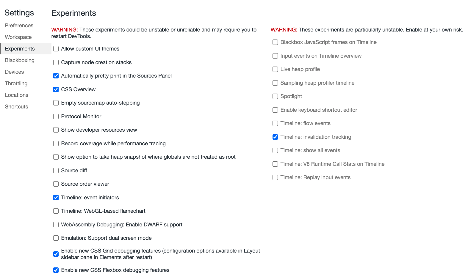
DevTools comes along with a set of experimental settings which aren’t quite recommended for a wide audience, but can indeed be very useful for debugging. A word of caution though: sometimes these settings might freeze Chrome or make it quite sluggish (which is why they are experimental in the first place).
However, with separate profiles in place, you could safely turn on some of these settings for each profile, and then turn them off if necessary. So while we use our regular profiles without experiments turned on for casual browsing, in debugging mode we always pick a dedicated profile first, to squish those bugs just a little bit faster.
With DevTools open in Chrome, jump to “Settings” (Shift + ? with DevTools open) and find “Experiments” in the sidebar. Obviously, there are plenty of experimental settings available in every DevTools, but the ones mentioned below are just the ones we find quite helpful at our work.
Across the featured listed there, it’s worth turning on “Automatically pretty print in the Source Panel”, which would prettify compressed styles and scripts by default when viewing source. You can also enable CSS Grid debugger and Flexbox debugging for dealing with layout issues. There is also a source diff and a source order viewer that can come in handy.
And for performance audits, you could mark “Timeline: event initiators” and “Timeline: invalidation tracking” that will show in the Performance panel, highlighting scripts that caused expensive operations such as Long Tasks and Style Recalculations. Additionally, in Edge, you can enable composited layers in 3D view.
For a given profile, you can access more hidden features by heading to chrome://flags/ in the browser profile of your choice. for example, that’s where you can turn on latest and experimental JavaScript features, experimental Web Platform features or enable resource loading hints to provide a preview over slow network connections.
In Firefox, jump to Settings with F1. At the bottom of the dock, you can prompt the browser to show browser styles, turn on/off autocomplete CSS, change editor preferences, toggle paint flashing, adjust screenshot behavior and enable source maps (not turned on by default). In Safari, you can find Experimental Settings under "Develop → Experimental Settings".
Switching Between Dock States (Chrome, Edge, Firefox)
Admittedly, the pane view in DevTools isn’t a particularly big revelation. In the “Styles” tab of the dock, styles appear from top to bottom, ordered by their CSS specificity. However, one little thing we’ve been overlooking a lot for years is a little toggle button :hov placed just above the styles.
It allows you to force an element state (:active, :focus, :focus-within, :hover, :visited and :focus-visible, and most recently :target) on a particular interactive element — e.g. to enforce :focus and :active states on buttons for accessibility checks.
In Firefox, you can change a pseudo-class for a DOM element as you are inspecting it — the feature is available with a right-click on a DOM node.
One thing that always gets in the way though is the position of the dock, which sometimes works better on the right hand side, and sometimes at the bottom — depending on where your bug has invaded your DOM tree.
To quickly switch between dock states, you can use Cmd/Ctrl + Shift + D. One catch to keep in mind is that the shortcut will undock DevTools into a separate window only if DevTools has been in its default position (docked to the right). Otherwise the shortcut will just switch between the default position and the one you’ve changed it to.
Triple Panes View (Firefox)
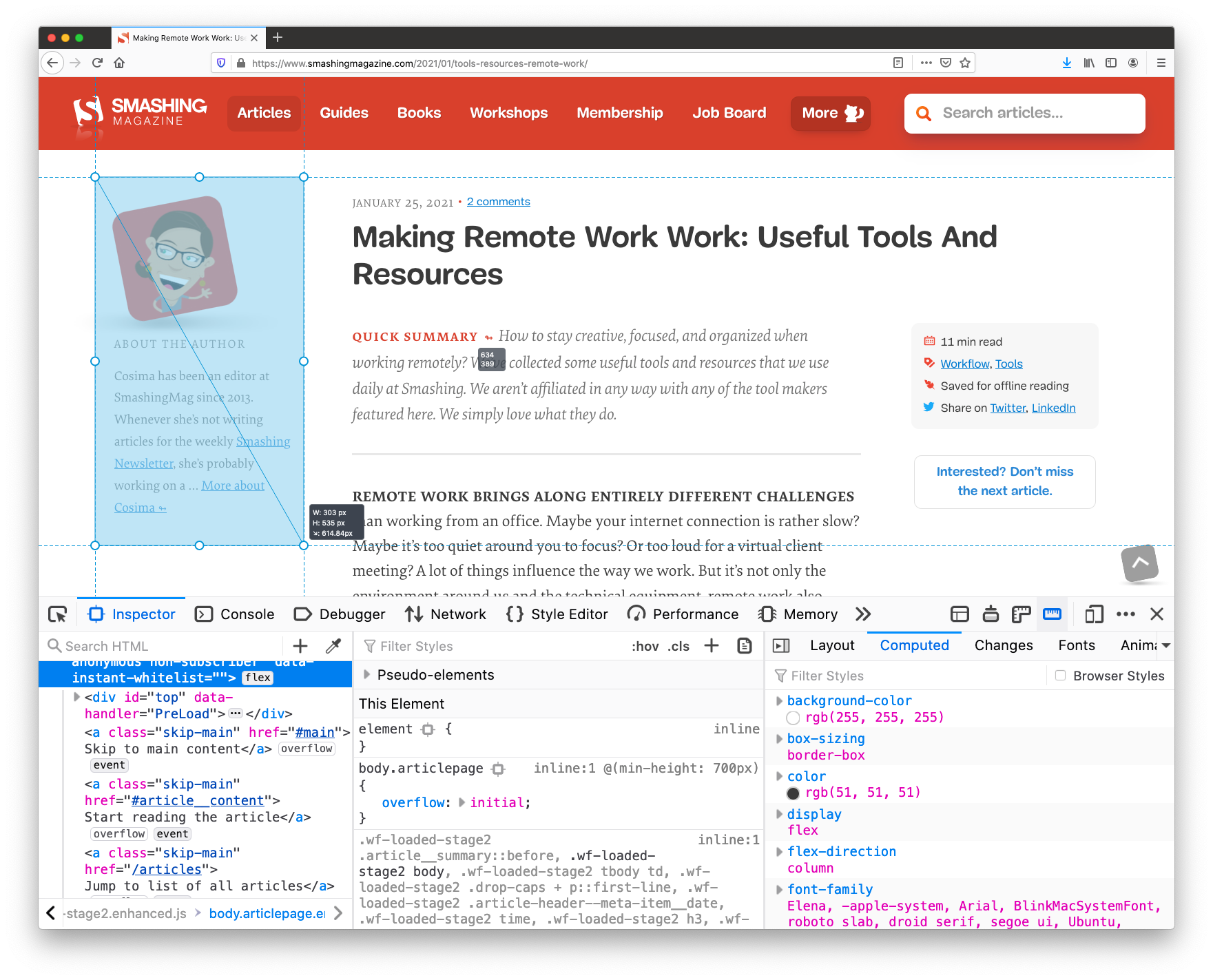
While we might be used to a double-pane view, Firefox provides a helpful triple-panes-view by default — it looks slightly differently across different sections. In the Inspector view, alongside HTML and styles you can place layout debugger, show computer styles or track CSS changes — it’s very useful to have quick access to all this information without having to switch between tabs.
Whenever you are editing styles in Firefox, DevTools highlights media queries used across the page, with quick jumps to CSS sections where a breakpoint behavior is defined. All of it is displayed right next to the source code, so no need to search for a specific breakpoint. (Not to mention styles pretty-formatted by default — that’s handy!).
A similar view is also available in Chrome and Edge as well, but it’s available only in the "Elements" panel (sidebar icon in the right upper corner), and so far it shows only computed styles (which is why it’s called "Computed Styles Sidebar").
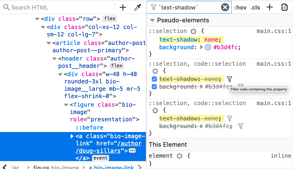
Filtering Styles By Property (Firefox)
In general, Firefox DevTools are heavily underrated. Another remarkable feature that Firefox provides is an option to filter all styles by a particular property (indicated with a filter icon). For example, if you notice that some styles are overwritten by other ones scattered somewhere across the stylesheet, you can hide all the definitions that don’t affect that particular property with a quick filter and see where exactly overrides are happening.
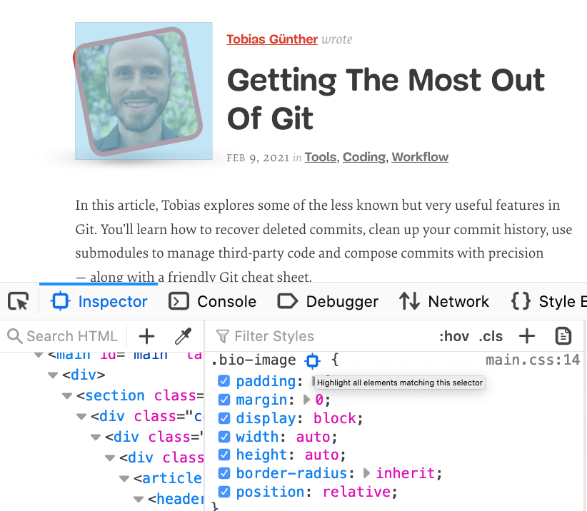
Also, on a given page, you can highlight all instances that match a particular selector. For example, if you notice a bug with a rendering of profile images on dark and light sections of the page, you can highlight all instances of a particular class without manually searching for them or adding extra styles to highlight them. It’s enough to locate the selector in Styles panel and choose a target icon to “highlight all elements matching this selector”.
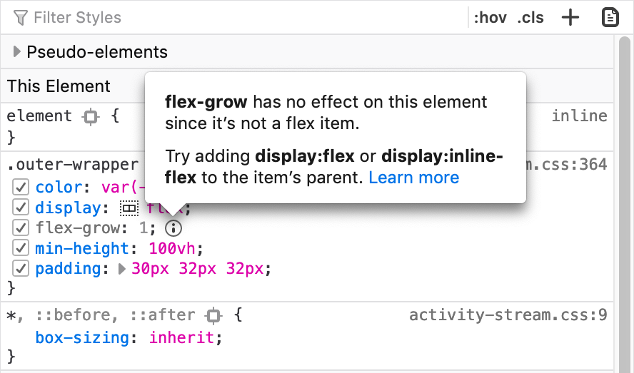
In the “Styles” panel, Firefox also explains which CSS properties aren’t affecting the selected element and why, along with recommendations of what might help to fix the issue or avoid unexpected behavior (the feature is called Inactive CSS).
Another handy feature is that Firefox assigns scroll and overflow badges to elements that are causing the container to overflow or scroll (overflow debugging) — very helpful when you are trying to figure out why a horizontal scrollbar appears all of a sudden, or an element doesn’t behave as expected.
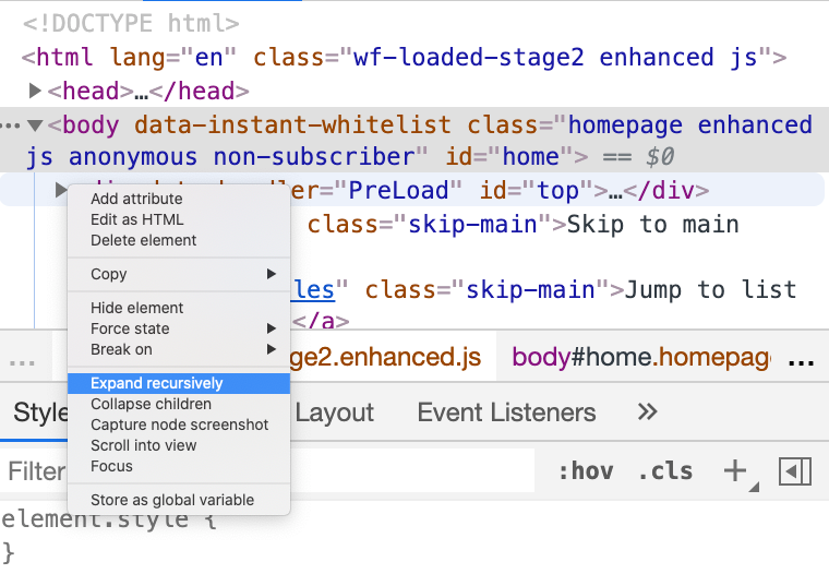
When inspecting an element with a deeply nested DOM, sometimes it might take a while to traverse down the tree, from one nested node to another. By right-clicking on the arrow on a node, you can choose “Expand recursively” and the currently-selected node (and all of its children) will expand with one single click. Alternatively, you can hold Option (or Ctrl + Alt on Windows) while clicking the arrow icon next to the element’s name.
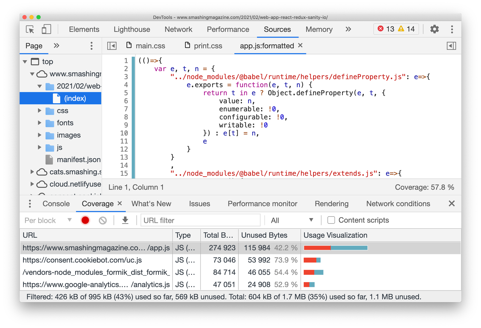
Gather And Export Code Coverage (Chrome, Edge)
On a given page, much of the CSS and JavaScript might not be used at all, although it will be shipped to the browser. The “Code coverage” panel (Command menu → “Show coverage”) allows you to explore which styles and code aren’t used on a given page. We use code coverage to collect critical CSS for each of the templates used on the site, and doing so manually can be quite tiring.
With “Code coverage” in place, going through a couple of scenarios that include a lot of tapping, tabbing and window resizing, we also export coverage data that DevTools collects as JSON (via the export/download icon). On top of that, you could use Puppeteer that also provides an API to collect coverage (but we aren’t there yet).
Media Queries Debugging (Chrome, Edge)
With dozens of media queries in flight for a given page, it can easily become difficult to keep track of the styles being overwritten by other styles scoped within a media query. To find the specific section in your CSS file that might be causing unexpected behavior, we could turn our attention to the media query debugger. By default, it’s hidden away behind the "Settings" cog in the device toolbar, but it’s actually quite helpful when it’s available by default.
Toggle the device toolbar (responsive mode) with Cmd/Ctrl + Shift + M and choose the three dots in the right upper corner. Then choose “Show media queries”. Now you should be able to see horizontal bars representing the scope of each media query.
They might appear a bit confusing at first, but the way these bars are aligned represents screen width, and is replicated on the left and on the right side of the viewport. The bars closer to the center of the screen are overwritten by the ones further away from the center. The blue bar on the top indicates max-width media queries, the green one min-width and max-width media queries, and orange one stands for only min-width media queries.
For all of the bars, you can track which media queries they contain when hovering over them. You can jump to a specific media query range and inspect layout issues in detail with Styles panel open. By clicking on any position on a bar, you can trigger specific breakpoints, and if you right click on a bar, you can reveal its position in the source code. In fact, you can quickly jump back and forth between media queries, rather than resizing the screen manually and checking the screen width over and and over again.
As a quick side note, you can also specify your custom emulated devices instead of the pre-defined ones — in fact, there are plenty of device presets available already. Plus, you can use the "Sensors" pane to control specific device sensors if needed. Additionally, in Firefox you can enable and disable touch simulation, and define a specific User Agent, e.g. to check how the page behaves with a search engine crawler requesting the page.
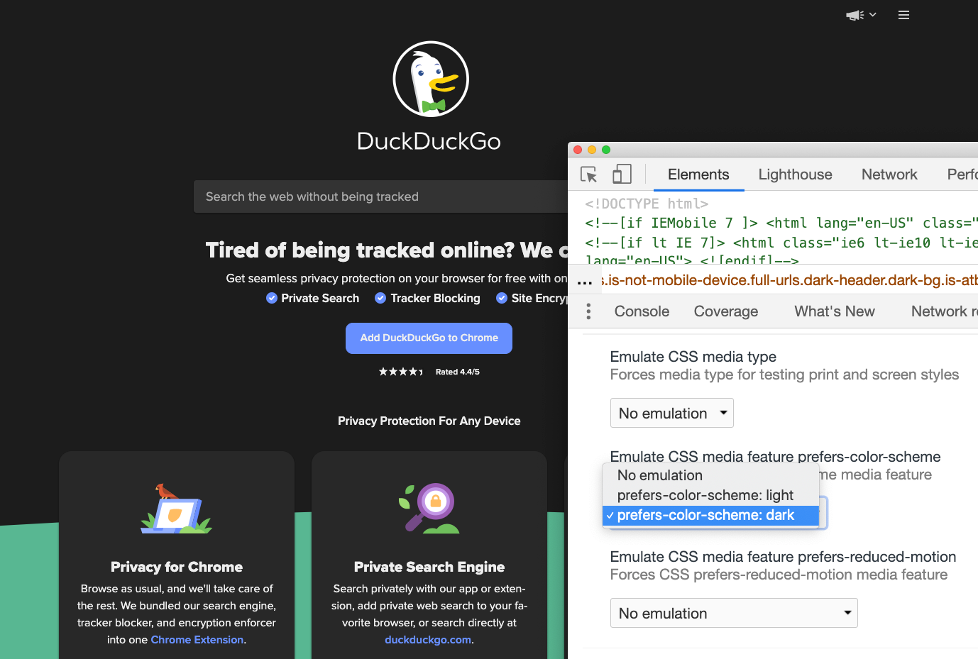
Emulate Preference Media Queries (Chrome, Edge, Firefox)
Additionally to screen size-related media queries, we can also emulate accessibility-specific media queries, e.g. prefers-color-scheme, prefers-reduced-motion and vision deficiencies. To toggle the emulation, head to the Command Control panel (Cmd/Ctrl + Shift + P) and type “Show rendering”. Now, in the settings you can choose a preferred emulation.
(That’s also where you can choose to highlight areas that need to be repainted ("Paint Flashing"), areas that have shifted ("Layout Shift Regions") and debug scrolling performance issues.)
Talking about emulation: remember how in the past you might have struggled with finding a layout bug for you print stylesheet? In the same panel, you can preview how your print styles work here as well — no need to print a PDF of a random page over and over again to figure out what caused a major rendering issue any more.
Also, in the same panel in Chrome you can add all sorts of rendering debugging features — e.g. paint flashing, layer borders, scrolling performance issues, disabling AVIF and WebP.
As a side note, there is a DevTools toolbar option for “Force Dark Appearance” and a "Force Print Media styles" in Safari, and you can simulate vision deficiencies in the “Accessibility” tab in Firefox. (We’ll talk a bit more about Accessibility later.) In Firefox, the print view is also available above the "Styles" pane in the "Inspect" mode.
Automatically Open DevTools In Each New Tab (Chrome)
With performance audits, we might want to be exploring multiple page at once, and observe how they behave with separate DevTools, without having to wondering which DevTools is responsible for which window. To save a bit of time during debugging, you could create a shortcut with a Terminal command that would open a browser with DevTools automatically opening by default in each new tab.
To achieve that, we need to pass the flag --auto-open-devtools-for-tabs when running a Chrome, Edge-based browser. We run a simple Alfred script to open the Canary browser with the flag when needed (hat tip to Addy) — very useful when you really need it:
You can find a very comprehensive overview of all Chrome, Edge command line switches in Peter Beverloo’s guide on Chrome Command Line Switches.
Full Page Screenshots (Chrome, Edge, Firefox)
When selecting an HTML node in the “Elements” pane, you could right-click on the node and prompt the DevTools to create a screenshot of that node, and in the “Responsive mode” you can capture a screenshot of the visible portion of the page or a full size screenshot (three dots in the right upper corner).
To create a full size screenshot a little bit faster, you can also prompt a “Full page screenshot” in the Command Menu (Cmd/Ctrl + Shift + P → “Full page screenshot”). Usually it’s a little bit faster. Just keep in mind that portions of the page that are lazy-loaded or rendered progressively (e.g. with content-visibility) might not show up properly in the screenshot, so you might need to scroll all the way down the page first.
In Firefox, you can generate a screenshot of the visible portion of the page by going to the "Device Toolbar" mode first, then spotting the camera icon in the right upper corner and activating it. Or for a full page screenshot, you’d need to toggle "Take a screenshot of the entire page" in "Settings" first, and then you’ll find the camera icon in the DevTools toolbar.
Rulers For Components (Chrome, Edge, Firefox)
Perhaps you’d like to quickly check the width and height of an image, or an advertising spot. But rather than taking a screenshot, or inspecting element and copy/pasting width and height values, you can use a rules to measure the size of a component. Rules are provided all across modern browsers, but Firefox DevTools also allows you to measure a portion of the page. You can find the measurement tool on the right hand side of DevTools, right next to the “Responsive mode” icon.
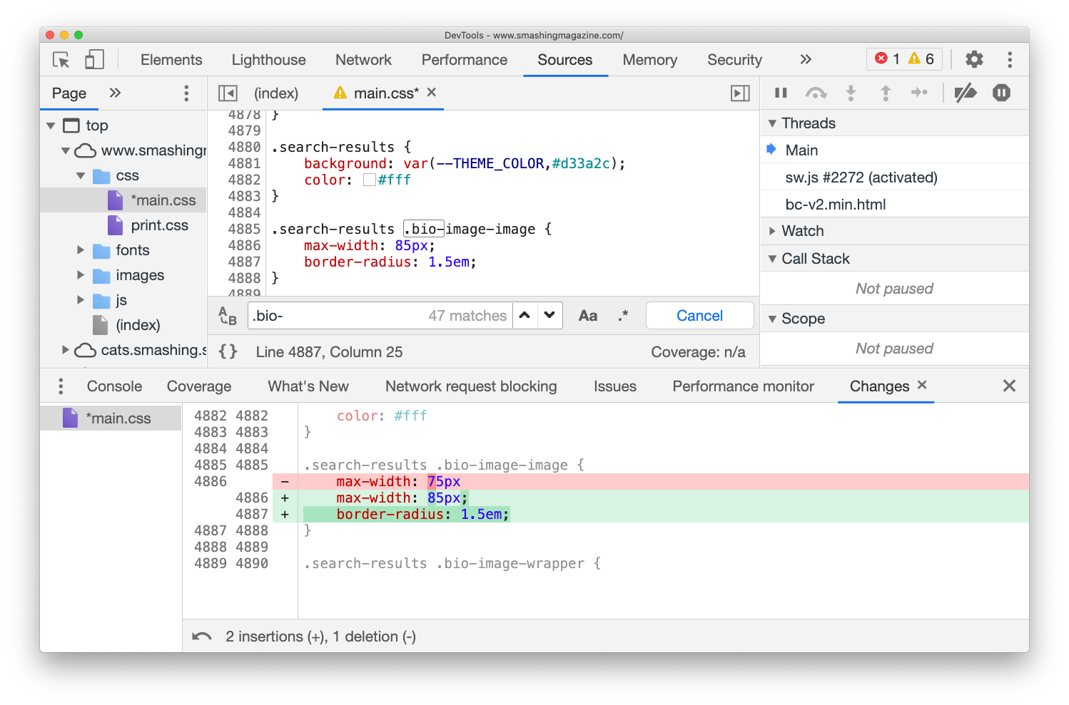
Tracking Changes (Chrome, Edge, Firefox)
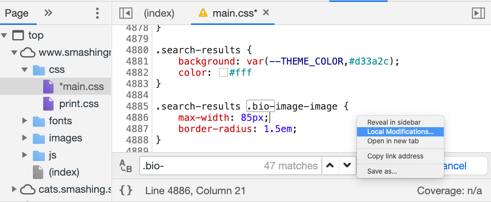
As you are debugging a particular problem, you might have commented out some lines of code, and probably added some new code that seems to be fixing the problem for good. Your changes now have to be replicated in the actual source files. To do that, there is no need to manually collect all the changes you’ve made all across your files.
In Chrome, toggle “Local Modifications” command when editing the source file. You should see a tracker of changes appearing in the panel below. If it’s collapsed, pull it out by dragging it vertically. The pane highlights changed properties and what exactly has changed, so you can copy-paste modifications right away.
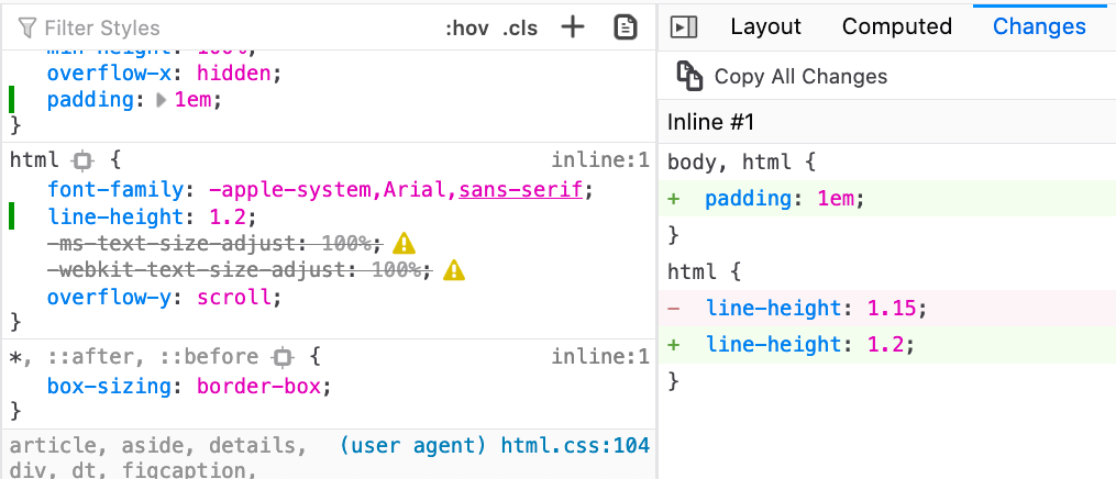
One thing to keep in mind is that it’s probably a good idea to track changes while running your local server — without automatic removal of line breaks and spaces as they would show up as changes as well. This problem doesn’t exist in Firefox, where you can also find a “Changes” pane which does the same thing, along with a friendly button “Copy All Changes”.
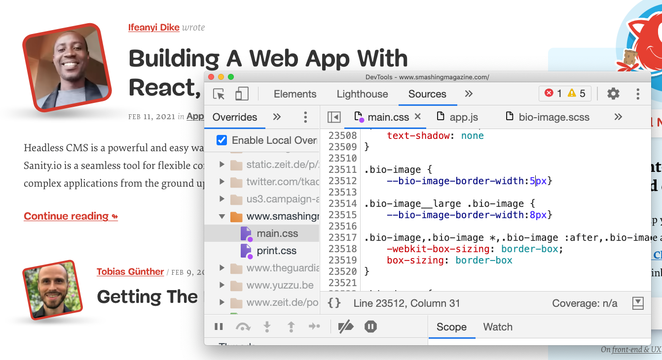
Local Overrides (Chrome, Edge)
You might have been in this situation before: you just want to experiment with a few changes, but might be quite afraid to accidentally hit “Refresh” in the browser to lose all the changes made on the page. Perhaps you can’t really run the site locally, or perhaps you just don’t want to run your entire build for some minor local modifications. In such cases, Chrome’s “Local Overrides” can be a godsend.
First, create a folder on your machine where all your local modifications will be stored (local-overrides on Desktop seems like a reasonable name and place for this kind of task). Then head to the “Sources” tab, and choose “Overrides” in the top-left corner of DevTools (it might be hidden behind a double-chevron). Now click on “Select folder for overrides” and choose your freshly created folder — that’s the folder that Chrome will be using to store your local modifications. You’ll need to click “Allow” to grant Chrome permissions to save files to your hard drive.
Now, you can choose any file in the “Sources” panel, right-click anywhere in the code and choose “Save for overrides” with the right-click. That’s a clue for Chrome to create a new file, and store all contents of the file, along with your modifications, to your hard drive. (You might want to click the {} button first to make the code slightly more readable). (Thanks toTrysfor the hint!)
Once you’ve defined your local overrides, Chrome will intercept network requests and use your code instead of the actual response. It will also watch out for modifications made to the file and inject changes into the page automatically, very much as if you had a local development installed with the watch mode on. Any files that are overwritten by local overrides will have a little purple dot next to them in the “Elements” panel.
The best part: now you can open the file in your text editor and make changes from there, while seeing these changes appearing in DevTools as well — and if you need to switch to DevTools to add breakpoints, you can do it from DevTools, make changes to the code, and these changes will be visible in your text editor as well. Almost magic!
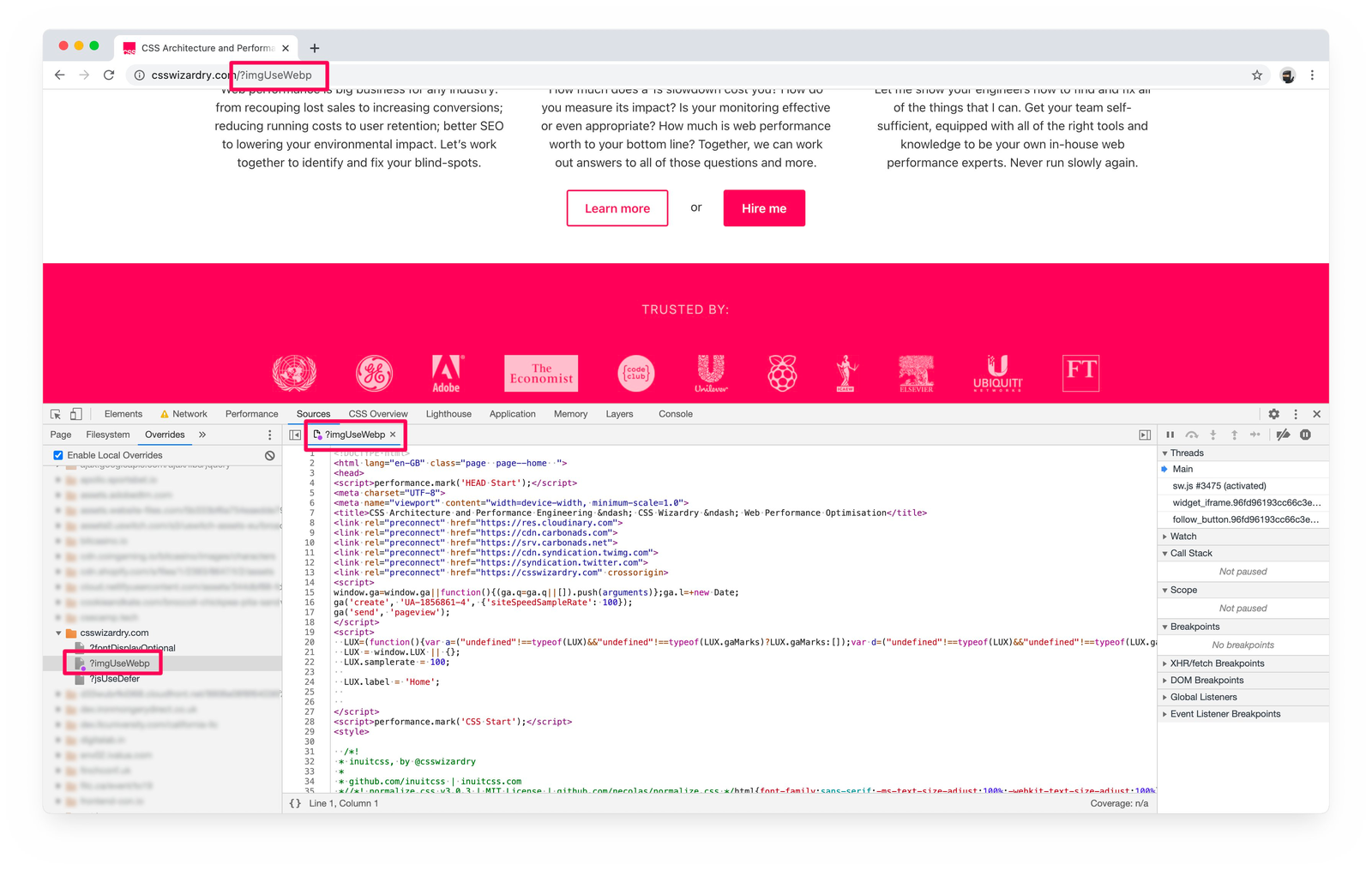
Pro-tip from Harry Roberts: Local Overrides don’t allow you to keep or track versions or variants, but you can attach a query string to the URL and load separate variants of the same page. Extremely useful when editing HTML pages.
Ah, and if you need to disable local overrides again, just check off “Enable Local Overrides” in the same pane — otherwise the styles will overwrite existing styles over and over again, which is something you might not want.
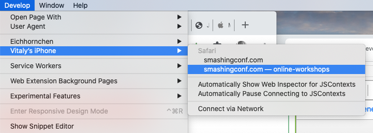
To debug Mobile Safari with Safari Inspector, enable "Web Inspector" in "Settings → Safari → Advanced → Web Inspector" and open the debugger with "Develop" → (Your phone’s name). You should have Safari’s DevTools opening up for you.
For Android devices, open the Developer Options on Android and select "Enable USB Debugging". On your development machine, you can then discover your mobile device by going to chrome://inspect#devices and choosing your "Remote Target". You can find plenty of details and instructions on "Get Started With Remote Debugging Android Devices". That’s also where you can find a dedicated DevTools for Node.js debugging.
Pause Script Execution (Chrome, Edge, Firefox)
When testing critical CSS or debugging JavaScript, you might want to hold on to the state of the DOM before a particular script gets executed or a particular style gets applied. That’s what DOM change breakpoints in DevTools are for.
By right-clicking on the three ominous dots next to the element’s name, you could pick “Break on” subtree modifications (node insertions and removals in the DOM tree rooted at the given node), attribute modifications (e.g. when an attribute is added or removed, or an attribute value changes — e.g. with classes) or node removal.
However, you can also use a conditional line-of-code breakpoint when you know the exact region of code that you need to investigate, but you want to pause only when some other condition is true. Plus, not to forget logpoints to output a value in a code snippet without writing console.log over and over again.
Code Snippets (Chrome, Edge)
If you have a couple of code snippets that you use often to track what might have caused the buggy behavior, you can store and access these snippets in the “Snippets” pane. In a way, these JavaScript snippets are similar to bookmarklets, but unlike the latter, you can manage them from the convenience of a dedicated area in DevTools.
Because they are scripts, we can add breakpoints when these scripts are running, or select portion of your code inside “Snippets” and run that particular portion of the code instead of executing the entire snippet.
The “Snippets” pane is located among “Sources”, next to “Local Overrides”. Once you’ve added a snippet, you can run it either by right-clicking and selecting “Run”, or with Cmd/Ctrl + Enter. Of course, each snippet is available from the Command Panel as well.
In general, if you find yourself running a routine task over and over again, there is a good chance that you might want to place it in “Code Snippets” and automate this task with a script. DevTools Snippets includes some useful scripts for cache busting, showing headers and saving objects as .json files from the console, but you could use it to modify the DOM or display any useful information, such as performance marks (which is what we do). Plus, you could also plug in a performance diagnostics CSS to indicate lazy-loaded images, unsized images or synchronous scripts.
Run Custom Automated Tests (Safari)
One of the often forgotten features in Safari DevTools is the option to define and run a series of automated checks. Think of it as a custom-built testing suite, with a series of small tests, which can be fully defined based on the type of audit a developer would like to run. By default, the test suite is focused around accessibility, but you can adjust it as you see fit, e.g. in order to check if there are any sync scripts in the DOM, or if all of the images have a defined width and height attribute, or even if all images are lazy-loaded. (thanks, Nikita!)
Source Maps (Chrome, Edge, Firefox)
When debugging production code, it’s extremely handy to be able to track down the changes to a specific component or module that you use in your code base. To map minified code to source code, we can use source maps. If you generate a source map as a part of your build, you can use source maps while debugging your code in DevTools.
In Chrome, you need to enable source maps for JavaScript and CSS in “Settings”, and then add a folder to “Workspace”. DevTools with then try to infer all mappings automatically and load your source files in addition to your minified ones. You can then read and debug compiled code in its original source. Even better than that: you can still walk through your breakpoints, and all errors, logs and breakpoints will map to the actual code. To build out your source map, Webpack’s Devtool might help.
For Firefox, once the source map is generated, a transformed file has to include a comment that points to the source map. Just make sure that your bundler does the job for you. Once it’s in place, in the source list pane, the original source (.scss or .ts files) will appear, and you can debug it right there.
Clear Service Worker’s Cache And Storage (Chrome, Edge)
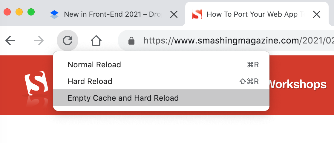
When we hit "Hard Refresh" in the browser, the browser will not use anything from the cache when reloading the page. Instead, it will re-fetch all assets from the server, without relying on caching.
If you right-click the “Refresh” button with DevTools open, you’ll find another option: “Empty Cache and Hard Reload”. The difference is that if the page prompts any dynamic fetches via JavaScript, they might still use the cache. The latter option clears them, too, while the former doesn’t.
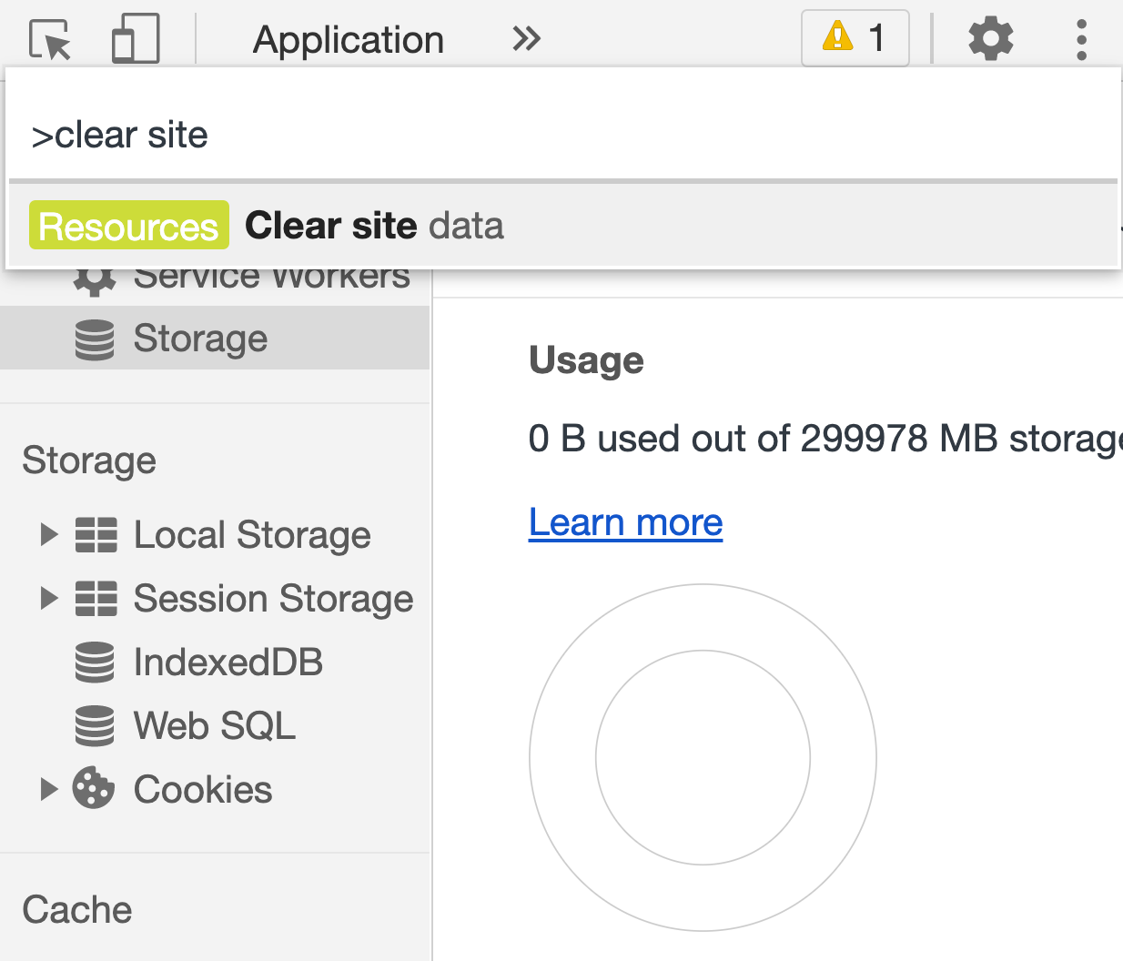
Both of these options, however, don’t clear cookie or service worker’s cache — which you might want to do in some scenarios. Jump to the Command menu (Cmd + Shift + P) and type/autocomplete “Clear site data”. When this option is activated, the browser will clean all of the data (as the name assumes), including the service worker’s cache as well as the unregistering of the service worker. (Alternatively, you can click “Clear Site Data” in the Application panel.)
And if you want to delete only cache or only cookies quickly, you can right-click on any request in the "Network" panel, and choose "Clean browser cache" from there.
In Firefox, you’ll need to head to the "Privacy & Security" panel and find the "Cookies and Site Data" section there.
Filters In The Network Panel (Chrome, Edge, Firefox)
There seems to be not much to explore in the "Network" panel as it basically just shows the list of browser requests (along with server responses) in chronological order. However, there are plenty of obscure little helpers as well.
First of all, with an overview of requests in front of us, we can choose which columns we’d like to see. Right-click on the header of one of the columns and select the ones that you find useful for the task at hand. We always choose the “Priority” column to see in which priorities assets are being requested, and if we need to adjust that order to deliver critical assets faster (based on JavaScript Resource Loading Priorities in Chrome, Edge).
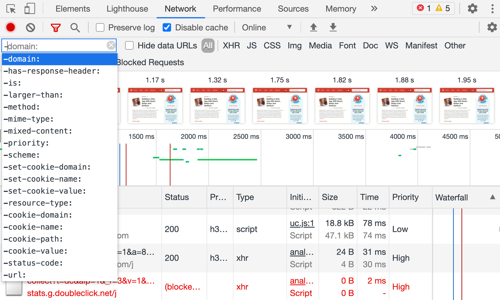
We can also filter requests to find specific ones that might be causing trouble (thanks for the tip, Harry). At the top of the “Network” panel you’ll find an input field, which accepts not only keywords but also commands for filtering. Here are a few examples of the useful ones:
is:from-cache shows all resources that were delivered from the cache,
is:service-worker-initiated, shows only requests prompted by a service worker,
is:running shows all incomplete or unresponsive requests,
larger-than:250k shows all resources that are larger than 250 Kb,
-larger-than:250k shows all resources that aren’t larger than 250 Kb (same size and smaller),
mixed-content:shows all assets that are loaded over HTTP instead of HTTPS,
-has-response-header:Cache-Control highlights assets that don’t have any caching headers,
Obviously we can also search for bad practices like document.write and @import in HTML and CSS, plus we can use regular expressions as well.
All filters can be combined as well, separated by an empty space. You can check a comprehensive list of all filters as well, or just type - in the filters input and get an autocomplete preview of all features (huge thanks to Harry for the tip!).
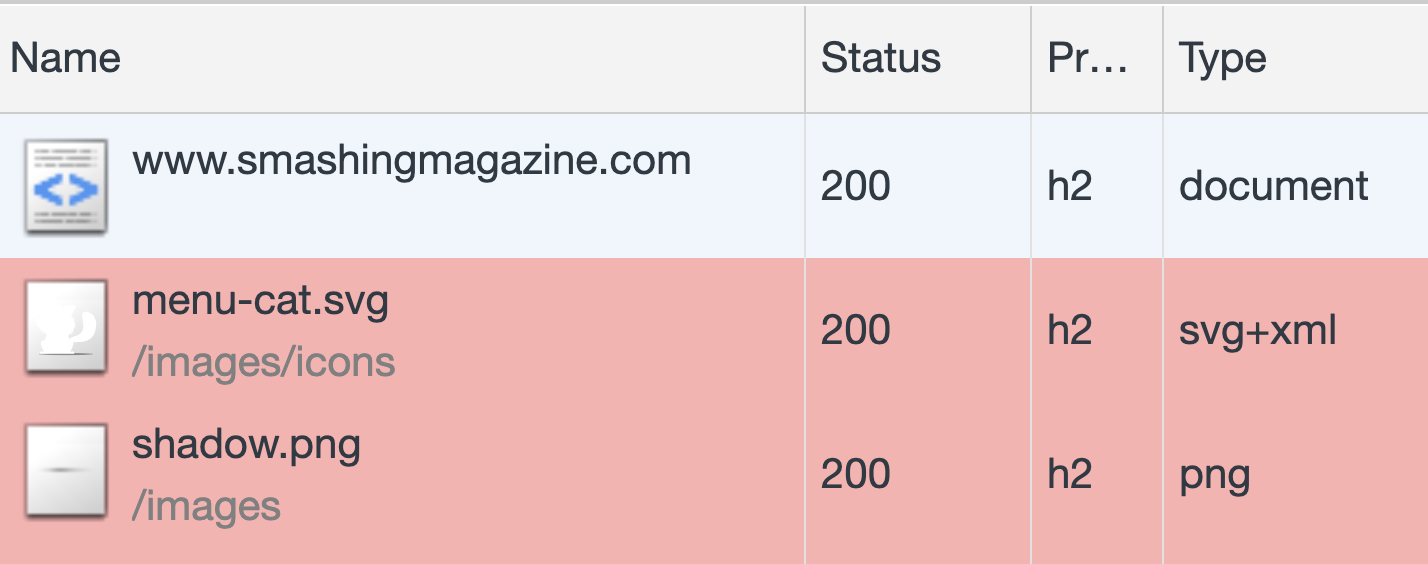
Check Initiators In The Network Panel (Chrome, Edge)
If you want to quickly check which assets a particular resource has requested, or by which resource an asset was requested, there is a simple way to discover it in DevTools as well. This is especially useful in cases where you might have a couple of third-party scripts that might be calling fourth-party-scripts.
When you are inspecting a request in the “Network” panel, hold Shift while hovering over an element. The pink background color will indicate resources that this element has prompted to download, and the green background color will indicate the initiator that actually prompted the request.
Choose a User Agent (Chrome, Edge, Firefox)
Sometimes you might want to check how the page will render with a different user agent, e.g. to make sure that a Googlebot gets a properly rendered version of the page. By heading to "Network conditions", you can define the behavior for caching, network throttling and a user agent.
By default, the latter is "automatic" but there are 10 predefined groups, ranging from GoogleBot Desktop and Mobile to Android and UC Browser. You can also define your own user agent if you need to. However, these settings will not remain preserved as you navigate from one tab to another.
In Firefox, you’ll need to head to Firefox’s about:config page and define a general.useragent.override string.
Change Scrolling Behavior In The Performance Panel (Chrome, Edge)
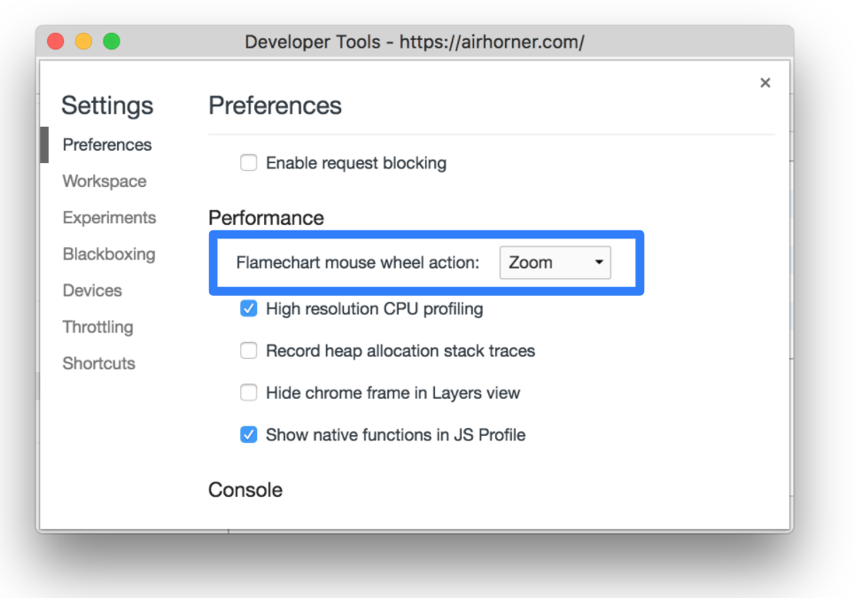
At first glance, the Performance panel might appear quite daunting with its flame charts, plenty of data displayed at once, and quite non-conventional scrolling behavior. By default, regular vertical scrolling acts as zooming into a selected portion of the timeline, but we can change it.
In “Settings”, you can switch “Flamechart mouse wheel action” from “Zoom” to “Scroll” — and voilà, your preferred scrolling will be preserved! But what if you wanted to use both zooming and scrolling though? The key hint there is to hold “Shift” while scrolling to toggle the preferred behavior.
Making Sense Of The Performance Panel (Chrome, Edge)
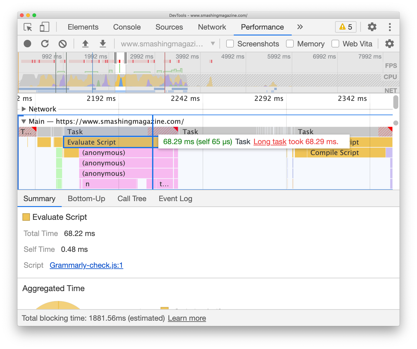
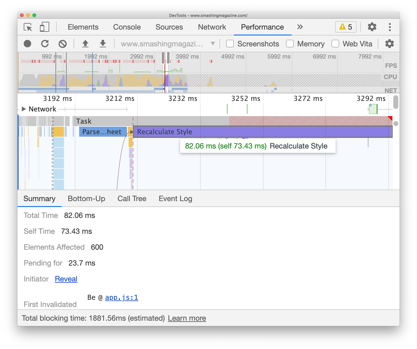
Remember “Timeline: event initiators” and “Timeline: invalidation tracking” we mentioned in the Experimental settings? These experimental features come in handy in the Performance panel when you are looking for a cause of expensive operations — so-called Long tasks (tasks that take over 50ms to complete). The goal then is to break down Long tasks into shorter tasks, and usually it makes sense to focus on the longest Long tasks first.
Jump to the Performance panel and start profiling with Cmd/Ctrl + Shift + E. After a bit of time needed for refresh and collecting data, those expensive long tasks will show up in the timeline, highlighted with a red rectangle in the right upper corner. Their length indicates how expensive the operation actually is. Tasks have a friendly budget of 50ms to finish, which is why the first 50ms-portion of the task is displayed in solid grey. Whenever you are beyond that budget, the rest of the task is highlighted with red/grey stripes.
The flame chart is a visualization of what each task consists of. All parts of a task are displayed under the actual tasks, with a yellow background representing scripting. If you click on “Evaluate script” under each of the tasks, you can pull up the “Summary” drawer at the bottom and see which script caused the cost. If you click on the purple bar labeled “Recalculate style”, DevTools will show what exactly has triggered styles invalidation.
Probably the most underrated feature in DevTools is indeed the “Summary” drawer which would then also show up which elements were affected by style recalculation (so you can jump to them right away) and what has initiated this task in the first place.
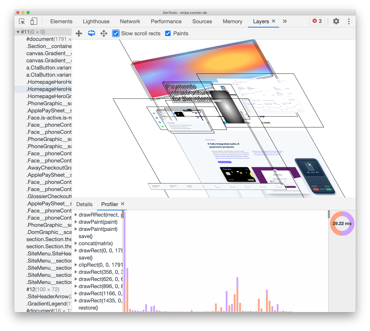
Debugging Janky Animations With Layers (Chrome, Edge, Safari)
You just need a couple of animations, perhaps with a little bit of parallax, a sliding navigation or mischievous z-index manipulation, to run into dropping frames and janky animations. The FPS meter from the performance panel (Chrome) will reveal if you are running frames smoothly, but if it isn’t the case, you can explore rendering issues in the “Layers” tab.
Some of the issues can be easily detected by tracking which of the elements are missing a will-change property, and which ones are using a disproportionate amount of memory. That’s how we spotted a large component that was hidden away off the screen with relative positioning of -1000px off the screen, causing a couple of MB of memory usage. Also, when debugging a canvas issue, keep in mind that Safari has a Canvas Memory Usage debugger.
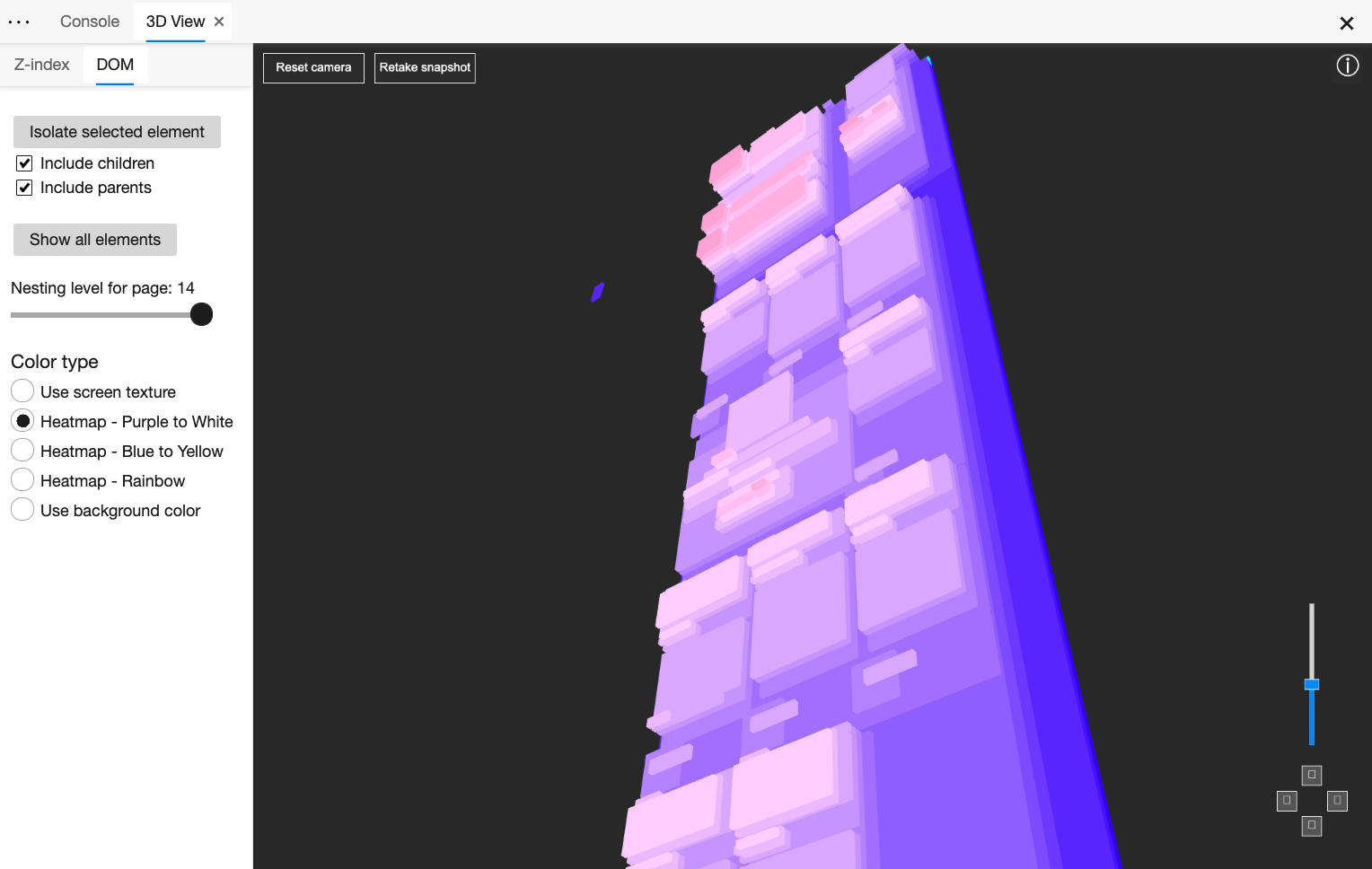
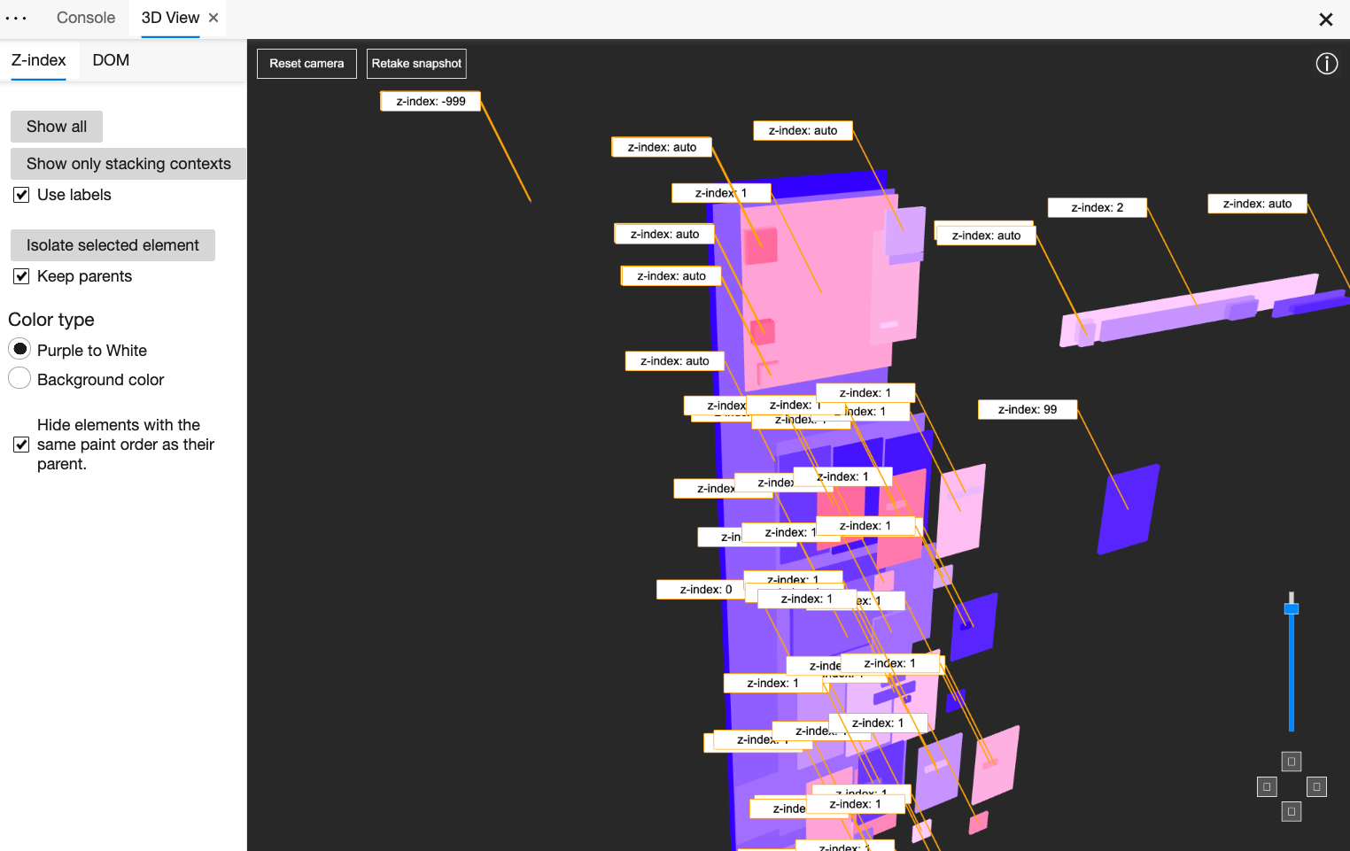
3D View Z-Index Debugger (Edge)
Another helpful tool to track rendering issues and z-index issues is Edge’s 3D View of the DOM (“Settings” → “More tools” → 3D View). The tool provides an interactive visualization of the DOM and z-index layers. You can even choose to view the DOM colored with the actual background colors of the DOM elements or show only stacking contexts.
It really has never been simpler to see how z-index values are distributed across the page, and why overlays or panels don’t appear as expected when triggered.
Wouldn’t it be great to have one-in-all accessibility tool that would provide details and guidance about everything from tab order to ARIA-attributes and screen reader announcements? To get close to that, we’ve set up a dedicated accessibility profile with useful extensions and bookmarklets mentioned at the beginning of the article. However, DevTools provides some useful features out of the box as well.
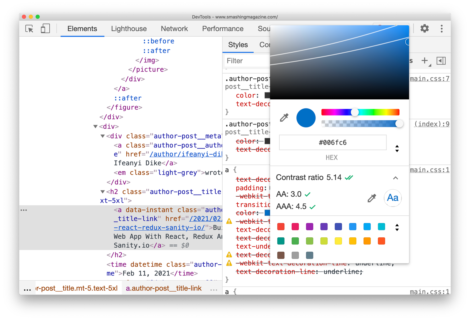
In Chrome and Edge, the “Accessibility” panel shows the accessibility tree, used ARIA attributes and computed properties. When using a color picker, you can check and conveniently adjust the colors to accommodate for a AA/AAA-compliant contrast ratio (along with the ability to switch between HEX, RGB, HSL with Shift + Click on swatch — thanks Ana!).
As already mentioned, the “Rendering” panel also allows you to emulate vision deficiencies. Lighthouse audits also include a section with recommendations around the accessibility of the page. Plus, when you inspect an element, accessibility information is appearing in the overview as well.
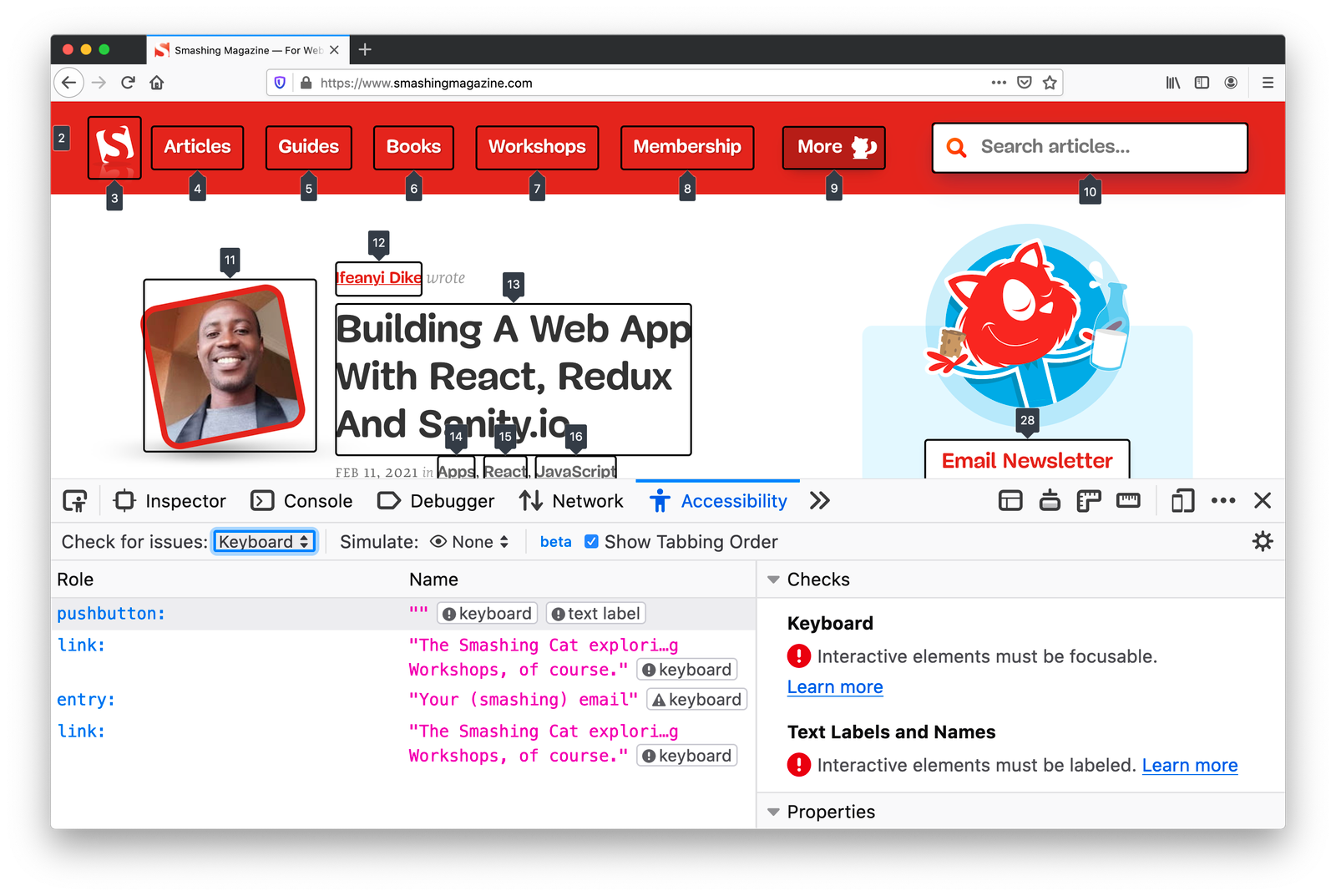
Firefox has advanced accessibility tooling as well. Additionally to the accessibility tree and contrast checker, Firefox DevTools highlights roles and landmarks, along with accessibility recommendations and checks. For example, you can check for contrast issues on the entire page, check if all links are focusable and include focus styling, and review text labels. Plus, you can toggle tabbing order as well.
Obviously, there are literally hundreds, and perhaps even thousands, of other useful features available in DevTools. Many of them are quite well-known and don’t need much introduction, but are still worth mentioning.
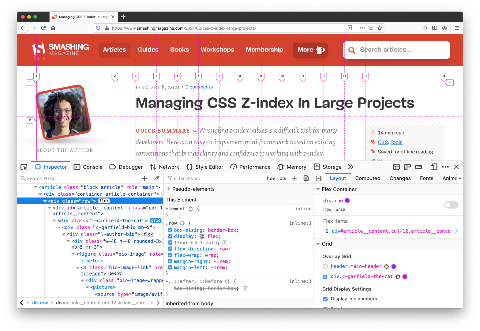
CSS Grid / Flexbox Inspectors (Firefox, Chrome, Edge) If you have any layout issue related to Grid and Flexbox, you’ll probably find a cause of the problem via DevTools. Grid and Flexbox inspectors are very useful as they show grid overlay and the boundaries of containers, as well as hints on everything from flex-basis to grid-gap.
Live Expressions If you’ve been running into habit of typing the same JavaScript expression in the console, you could look into automating it with Live Expressions. The feature, available in Chrome, Edge and Firefox, allows you to type an expression once and then pin it to the top of your console, and the value of the live expression will update automatically.
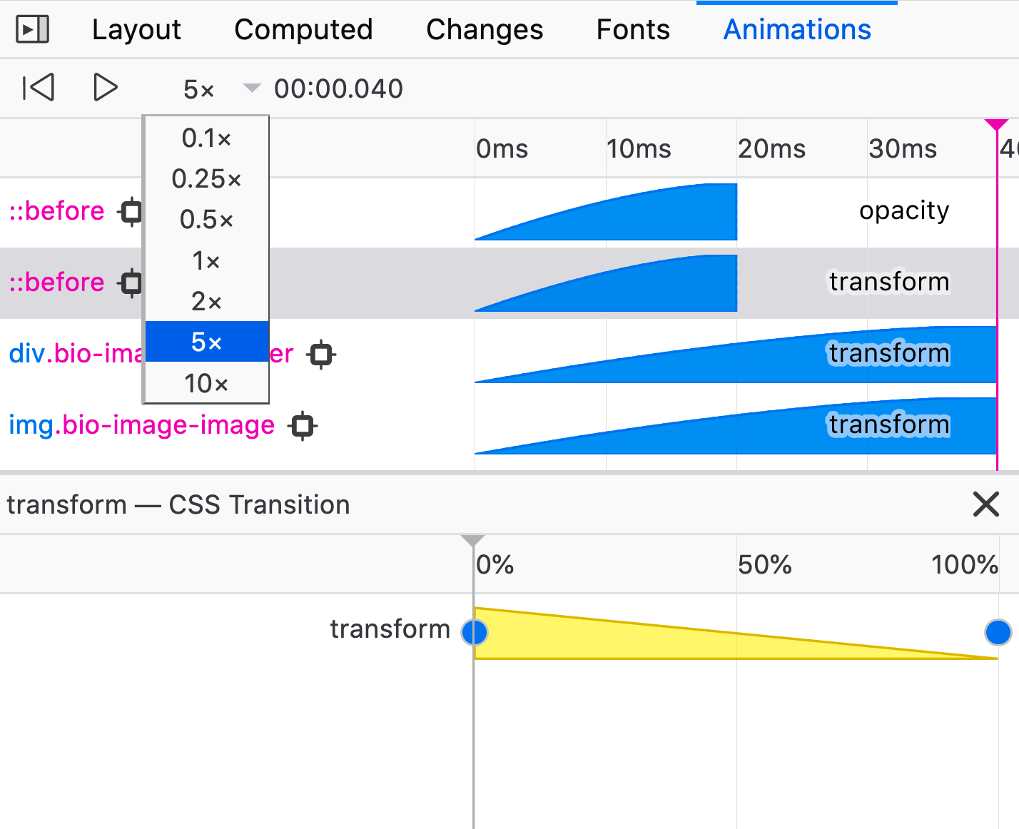
Animations Panel Firefox has a very handy panel to track issues with animations, including slowing it down and visualizing how an element is changing over time.
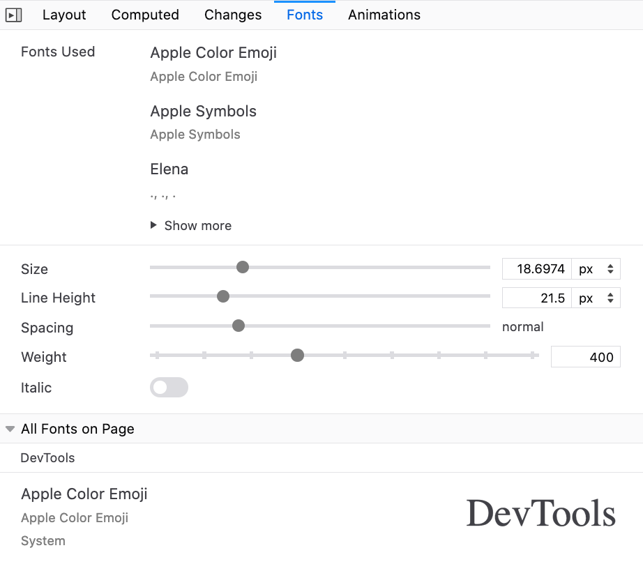
Fonts Panel Firefox also has a handy “Fonts” panel that’s worth exploring for any kind of font-related issue. We used it quite a lot when trying to match the fallback font against the web font, for example, as you can refine typographic properties with a slider and see impact in action. It also provides text previews when hovering over a font-family in styles.
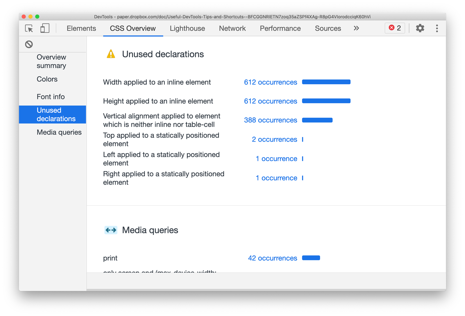
CSS Overview If you activate the “CSS Overview” in Chrome’s experimental settings, DevTools will add a tab with a comprehensive report of CSS declarations used on a page. It will also list all colors and fonts used, as well as media queries and unused declarations which you can jump to right away.
And That’s A Wrap!
When we set out to prepare this overview, it was supposed to be quite short, featuring just some of the useful features that DevTools provides. It turned out that there are plenty of features that we didn’t know of before we started writing this article — and we were able to stumble upon them with the kind help of wonderful Smashing readers who contributes their experiences on Twitter. Thank you so much for your kind contributions!
Also, a huge thank-you to all contributors of all DevTools across all browsers — we applaud you for your efforts, and your time and effort to make our development experiences better. It matters.
If we missed something valuable, please reply in the comments. And if you found something useful, we hope you’ll be able to apply these little helpers to your workflow right away, and perhaps send a link to this post to a friend or two — perhaps they’ll find it useful. Ah, and don’t forget: you could also debug DevTools with DevTools — just hit Cmd/Ctrl + Shift + I twice in a row. ;-)
I love this piece from Remy Sharp where he argues that the web didn’t get more complicated over the last 20 years, despite what we might think:
Web development did not change. Web development grew. There are more options now, not different options.
Browsers have become more capable and still work with web pages built over 20 years ago.
[…] The web really didn’t change. It really didn’t become complex. The web development process is not one single path. There is simply more choice and more options.
Remy argues that the web is only really as complex as we make it and, when we choose an enormous framework for a small problem, it’s us that’s choosing the complexity. We really don’t have to build a website with the latest and greatest tools if we’re familiar with the old stuff and there’s no shame in using float over flexbox, if that works for you.
There’s a lot of ego in web design, and there’s a lot of folks out there bashing others for using the “incorrect” tools. But here’s the secret when it comes to making website: there are no perfect tools, and there’s no perfect way to build a website. That sucks, but it’s also exciting because we get to figure it all out; nothing is set in stone.
For example: I use Sass all the time for side projects and I know for a fact that a lotta folks would scoff at that. There’s emotion and Tachyons! There’s plain CSS! There’s PostCSS! But hey: I like Sass for a few things. I like the power it gives me and I like that I’m familiar with it. That doesn’t stop me from reaching for emotion in my day job or experimenting with something new when it comes along.
But old tech isn’t bad just because it’s old. And new tech isn’t good just because it’s new. You can see that sentiment playing out in the comment thread of Chris’ “Front-End Dissatisfaction (and Backing Off)” post.
High five to Netlify for the ❥ sponsorship. Netlify is a great place to host your static (or not-so-static!) website because of the great speed, DX, pricing, and feature set. I’ve thought of Netlify a bunch of times just in the past week or so, because either they release something cool, or someone else is writing about it.
Nishant Choudhary wrote “CircleCI Vs. GitLab: Choosing The Right CI/CD Tool” which was a nice little dive into those, but it also made me think about how Netlify is CI/CD. They run your build process (and if it succeeds, deploys). It’s not just that you can tap into that and have your build process do more —they encourage it by offering build plugins. Use pre-existing ones, or write your own.
Building a Jamstack site (your only option on Netlify!) requires a certain mindset, as Brian Rinaldi puts it in “Thinking in Jamstack.”
One of the reasons Next.js is so cool is that it prebuild your content pages, but can also leave some of it to be server-side rendered as well, if it needs to be. How does that work on Netlify? A build plugin, of course.
In 2020, smartphone sales were 1.57 billion units worldwide, an increase from 1.52 billion units in 2019. Such impressive figures continue when we look at the world’s tablet shipments and deliveries. In the third quarter of 2020, Apple alone shipped 13.9 million units of tablets. These figures, as surprising as they are, make us think about the impact on mobile websites and website owners. The demand for smartphones and other mobile devices have been responsible for connecting 4.66 billion people with the internet. This number has gone up by 7.3 per cent since last year. Out of this, mobile internet traffic has been more than half of all the internet traffic all around the world. As a website owner whose website is not mobile-friendly, this is a matter of great concern and something to help shape our website in the correct direction.
It is now time that website owners understand that mobile users are top priority and should be taken seriously. If you are still backing on the desktop website with a bunch of media queries and letting luck shape your revenue, I will help you decode the importance of responsive design and how to make a high converting mobile web pages.
Responsiveness and Conversion Rates
A lot of the people take the responsiveness and conversion rates as a cause and solution pair in the website world. But converting a mobile web page is a much more complex process than just making your website responsive or mobile-friendly. Sure, responsiveness is an important aspect of conversion and is the first step in the website development but it alone cannot increase your CTR. In 2015, Google started giving more preference to responsive and mobile-friendly websites. Improving for a better experience for their users, Google does not want people to keep searching for that one perfect website which is rendered proportionately on the device. This move gave the website owners a wake-up call to focus on the user experience and mobile-friendliness as much as possible.
So how can we improve our conversion rates once we have the responsive website built? To be fair, responsiveness is more concerned towards scaling your website up and down. If my images are scaled in the proper ratio on a 5.5-inch device, I have got a responsive website. But the user is never concerned about responsiveness. Instead of praising the scalable elements, the user is more concerned about how fast those elements rendered on to the device? My user is more concerned about their own preferences and benefits.
Nearly 8 out of 10 users bounce back when the content is not properly visible on the mobile device. Such anomalies on the mobile website bring down conversion rates and affect the business. In the subsequent sections, we will focus on things that are responsive in nature (no doubt!) but is not enough that can make the user click that CTA of yours or purchase a product from your website. Soon we will realise that responsiveness has much more than what meets the eye. Let’s see how we can put ourselves up to the user’s expectations.
The first thing to ask in developing a website for mobile is the content you are about to show on the device. A device’s screen is small, which means you have to show less but relevant content on the small space provided to you. The content should be able to communicate to the user without using too many words. A user is not going to read everything just to find if he gets anything pleasing for himself. That is your job to show him what he needs to see. The content analysis can be boiled down to three major categories: the headline, the font size and the content.
What’s a perfect headline?
A web page starts with a headline which is probably the first thing a user sees. This is your chance, the moment that decides whether the user will increase the session duration or will bounce back. The following two website ranks on the first page of Google for “real estate solutions”:
The above landing page is from RESGroup while the below screenshot is from Getrealestatesolution.
Apart from a weird header which is taking 25% of your valuable screen space, the headline is concise and easy to read. The RESGroup have focussed on a long heading (if that what it is) and forces users to scroll the entire page to find something meaningful for them. A good point to note is that although building up trust on the user is important by embellishing the web page with your achievements, a user needs to find something which they can use. They rarely care about what you have to offer but more about how they can be benefitted. Remember, a user makes up his mind about the website in just 50 milliseconds.
Scrolling from up to bottom and reading about your achievements will result in an increased bounce rate. Getrealestatesolution is building up trust and showing their achievement both cleverly into a single line: “We make realtors and brokers more successful”. This more or less would translate to “We are capable enough to make you successful” and “You will be successful if you join us”.
Font-Size: Should my user zoom in?
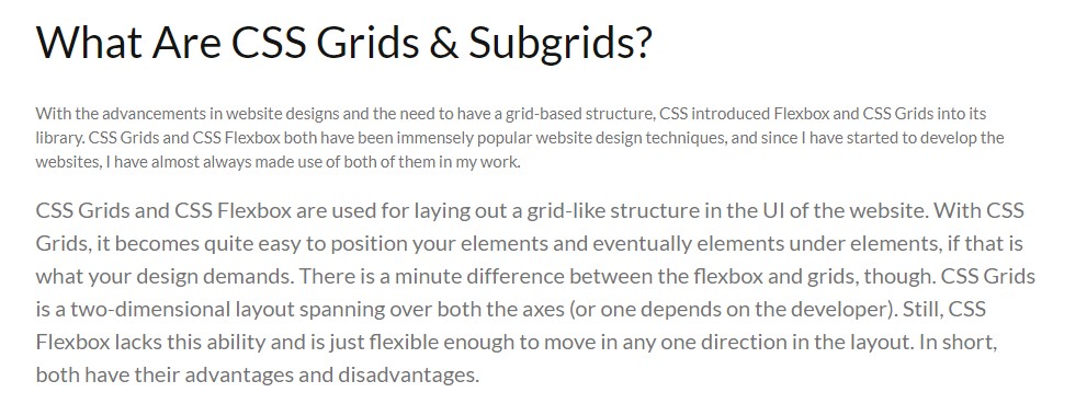
Font-size is an extremely important part of a landing page (or any other page) to determine the conversion rate of your website. A font-size of 16 px or 1 em is considered perfect for good readability of the content. Although one might argue that they can still read properly on 14 px, there are a large percentage of visually impaired people to be taken into account. The main target audience of the majority of businesses lies in the range of 15-49 years which is 28% visually impaired, as per WHO data. The following screenshot shows a blog on CSS Subgrids with 12 px font and the original font below it.
Although text can be enlarged by zooming into the mobile device, it moves the content out of the screen and makes the screen scrollable which is not liked by the users.
The relevance of Keywords- Which words to choose?
The final thing to remember while presenting content to the user is to use specific keywords which are relevant to the user. Mobile screens are very small with 5.5 inches being the most popular among the users as per a 2019 study. With a little time and smaller space in our hands, we want to gain a user’s trust as soon as possible so that he sticks on the website and does not bounce back.
The specific keywords process first starts by eliminating all the redundancy and loose words. Words such as “very”, “extremely”, “best” etc are considered fillers in the content. “We are very professional and provide the best services” could be transformed to “We are professional in providing real-estate services”. The second sentence is more effective and uses 1 less word than the first.
After elimination comes the relevant keywords to pitch to help you convert through the web page. These keywords will work as something your user can trust upon. At least, the user should be well convinced that you are the best and believe me, writing “best” does no charm in conversions. So, instead of being verbose and explicitly pitching your projects, choose minimal but effective words that show your confidence, experience and professionalism. In my analysis, I found two interior design services websites that portray this point quite clearly.
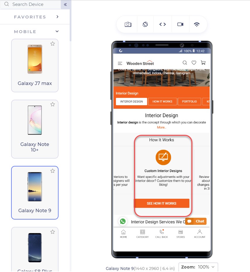
This is the landing page of Woodenstreet
In addition to proving our point of small font-size, the only effective sentence in this segment is “Customize them to your liking!” which makes me feel the fact that I will have control over customizations but not a strong one. The words are loose to build trust over to the service company.
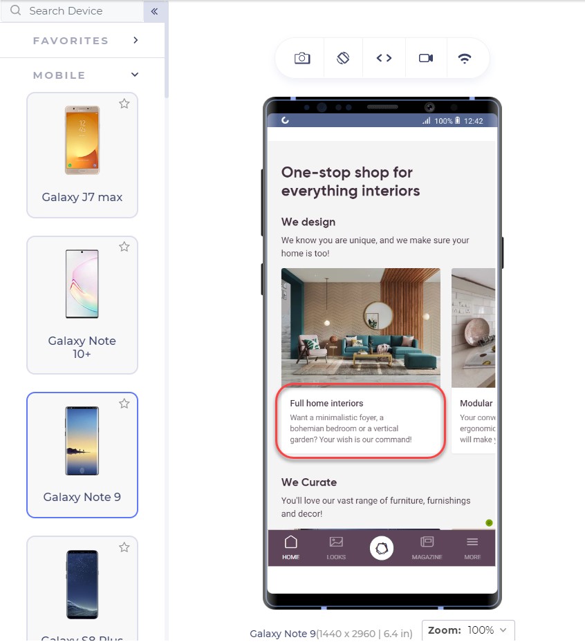
Another competitor of this website is Livespace. The same section on their website looks like this:
The segment focuses on keywords and experience by the lines of sophisticated keywords that will lure the user. I too want someone who knows a bohemian bedroom!! (Just Kidding!)
Also, notice the transformation of the same sentence in these two websites. Where Woodenstreet says, “Customize them to your liking!”, Livespace says, “Your wish is our command!”.
Which one do you think has more weight to convert your page?
For the enhancements of the content, you do not need to remove the white spaces and fill every gap on the web page. White spaces are good! They let the elements breath in the congested space and every element can get proper attention from the user. For larger content, you can also use bullets that can deliver more information in lesser sentences.
To ensure yourselves of the appearance of your website on mobile devices, you can use tools which can help you emulate the experience. A developer-friendly browser such as LT browser is also a great choice since it provides a complete solution with loads of features (including a debugger) and performance reports to analyze. LT browser can show you your website on any mobile device of your choice in a couple of clicks.
Test Responsiveness on LT Browser
Emulators and simulators have been long used to test the website on different devices. But today, for a specific tester’s need, we can take advantage of a mobile-specific testing browser that provides a complete environment for the tester. A developer-oriented browser such as LT browser can provide additional features highlights of which are given below:
A large list of in-built tools: A list of 40+ in-built screens can render the website in a couple of clicks.
Comparison Grid: A comparison grid shows two mobile devices side by side for the testers to compare. The tester can also use scroll-sync to mirror his actions on both the devices simultaneously.
Screenshot capture and Session recording: The tester can take screenshots of the device screen and mark a bug and send the video/image to the team.
Third-Party Integrations: The third-party integrations allow the developer to share the bugs or issues with their teammates with a single click.
Network Throttling: A very important feature to check user experience is how the website performs under various network bandwidth. This can be achieved with network throttling in LT browser.
Local Testing: Local testing allows the developer to test their website even before publishing it on a domain service. With the local tunnel, they can view the website on any device from the local system.
Performance Report: To analyse the final performance, developers and testers can view the performance report and share it or save it for future use.
The thumb zone and its importance in conversion
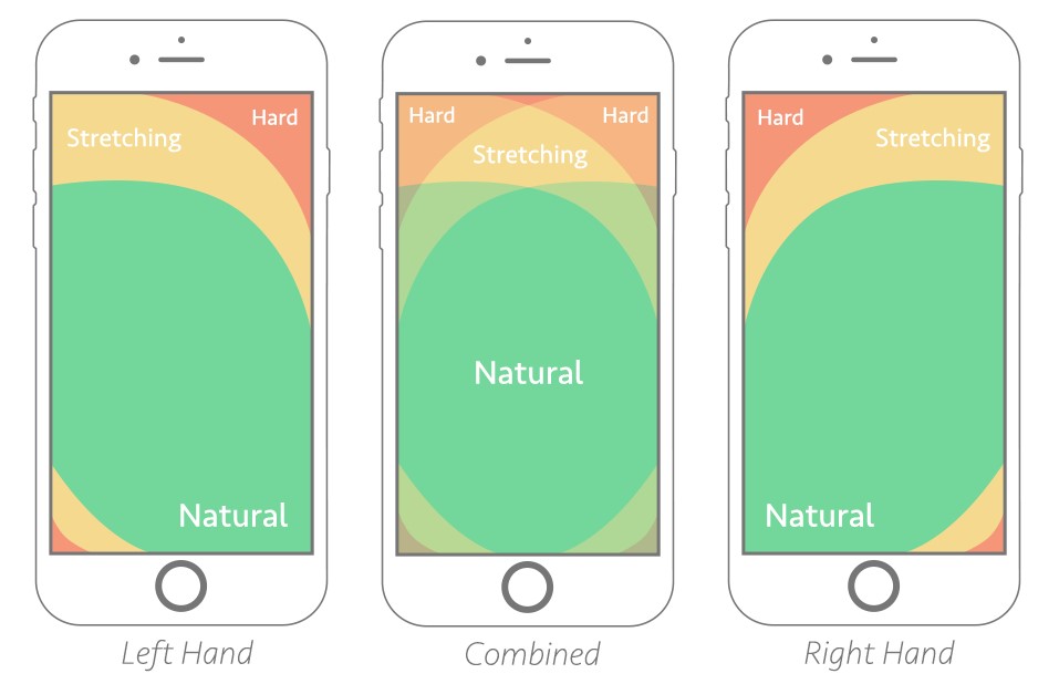
The thumb zone has been a conclusive argument for some time now and a strong foundation to many pieces of research in mobile designs and mobile web implementation. The thumb zone is the area on the mobile screen determining how hard or easy it is for our thumb to reach a certain point. A research study by Hoober concluded that 49% of people operate their mobile phones with one hand and only a 15% with two hands. Among those who do, 67% are operating through their right thumb with two major positions:
Note: The second image is placed slightly above as compared to the first image.
The color that you see in the above image: is our thumb zone. A thumb zone in general for a person using their phone with one-hand can be magnified as follows:
The green zone is the easiest to achieve: hence the most important for our conversion goals. The yellow zone is a bit hard to reach but manageable: something we can put less important things in such as headings and other content, things which are not clickable. Finally, the red zone is the toughest to reach and is the worst place to put our CTA.
Another worst position to put our CTA is at the bottom of the page or deep down below. No user would want to scroll down 4 5 times and search your CTA on the webpage. A lot of them probably don’t even know about CTA buttons and if it exists on that website or not.
The best way is to put CTA in the thumb zone and on above-fold in the first web page view. Amazon has put similar thought into their CTA and the following is their landing page:
The Sign In button is exactly where our green zone lies with the width being enough that we do not touch anything accidentally.
From the above page, we observe two interesting things: first the Sign In is also available at the top right (the hardest) position too and our green zone has another CTA “Create Account”.
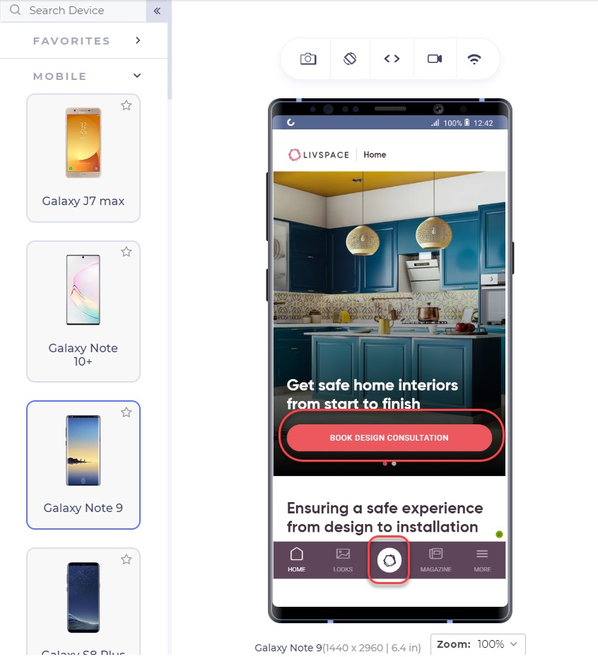
Having two sign-in options reminds the user about signing in two times. You would see the button anyway even if you do not click that. LiveSpace uses the same approach on its website in a little different way:
The bottom button is fixed and is a constant reminder to “book design consultation”. The second approach is interesting. There are two possibilities of an unknown user: either he signs in (given that he has already registered) or he creates a new account.
Deciding among the two is important for an owner to come to a final conclusion of primary CTA and secondary CTA. Having two CTAs is generally not considered a good approach as it confuses the user but even if you do, one of them should stand out in comparison to another, as in Amazon.
What CTA to use?
As a website owner, you might have a lot of services to provide: a consultation booking form, you want to showcase your cheap pricing too! And you want them to call you by a single click from the home page itself!! A CTA can increase your revenue with high conversions but a CTA cannot be the developer’s wish. It has to be what the audience wants. To increase your mobile conversions through CTAs, you need to analyse what your visitors are more interested in.
Google Analytics is a great way to start here. Google Analytics provides the keywords your visitor is most interested in. Mailchimp has a lot of good features which can be used as CTAs for example, “Start Campaign”. But their website on mobile uses the CTA linked to pricing:
CTAs are something to ponder upon and it is also a good idea to include a good input from the marketing and sales team which can suggest to you the user’s inclination quite well.
With keywords in hand, the next step is to think about the CTA text that can bring out more conversions through a responsive mobile web design. In the above screenshot, Mailchimp could have used, “See pricing” but they went with “Pick a plan” even though the page links to the pricing page.
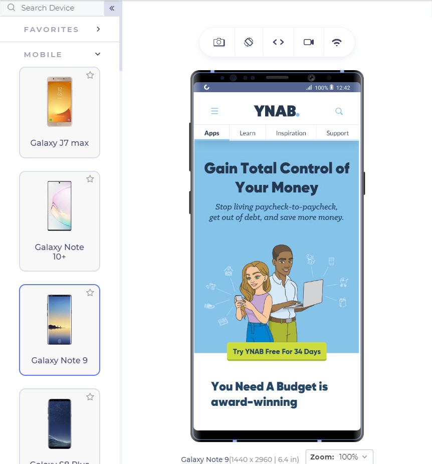
Similarly, Youneedabudget provides the user with “Try YNAB Free For 34 Days” instead of Sign Up or Try YNAB Free.
Research these words and find out why your user visits your website. Show them exactly what they are looking for through the CTAs and the conversion rates would see an increase.
The CTA should also look like a “CTA” and work like one. If the CTA gets blended into the background and looks like a ghost button, it loses its purpose. CTAs should be a contrast in colour speaking out loud and demanding attention from the user; that is what they are there for.
Mailchimp does that perfectly with a little darker shade of yellow in the background and CTA with blue; a complete contrast.
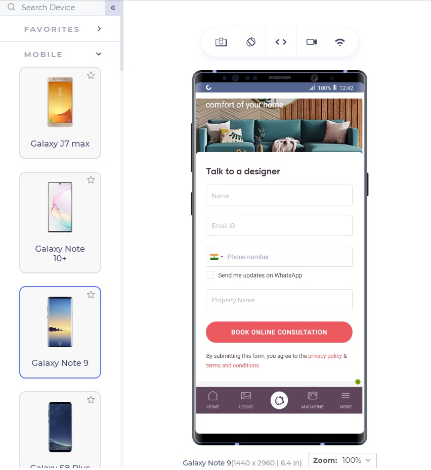
For business providers looking for direct leads, forms work as fine as a button since they cannot provide all the information in concise segments and users have a lot of other doubts. For example, interior designing. Interior designing has different requirements for different users and personal contact is necessary. A responsive form works as a great CTA here:
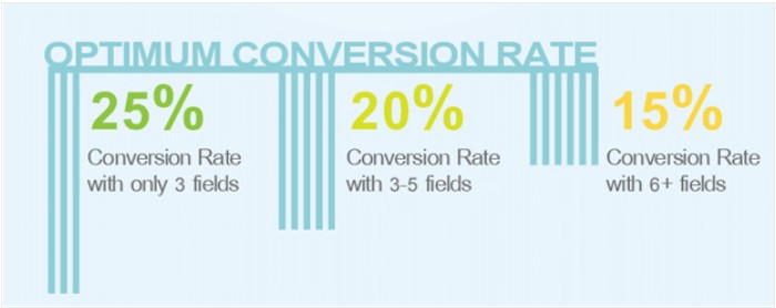
The number of fields is important to understand the conversion rates. A user is not interested in filling too many fields and will bounce back too easily. Quicksprout shows how the number of fields leads to a lower conversion rate on the mobile:
More than 5 fields in a form is intimidating for the user and the user is unlikely to complete the form. If you cannot manage to lower down the fields below 6 or 7, use the autocomplete feature of the browser in your HTML code so that the user can quickly fill out the form in one tap. Autocomplete is available in major browsers today and is helpful for the user.
If your CTA is a call button, it should be a one-click button instead of plain text. Do not expect your user to take the burden of copying the number and moving onto his dial pad, paste it and then call you.
Remember the 2-second rule!
Google aims at 0.5 second load time when it comes to loading any Google’s product. But don’t worry, we still have not touched such a high-performance statistic practically although we have come a long way in the last decade. Google states that 2 second is the user’s “acceptability” for the website load time. So how is it affecting our conversion rates?
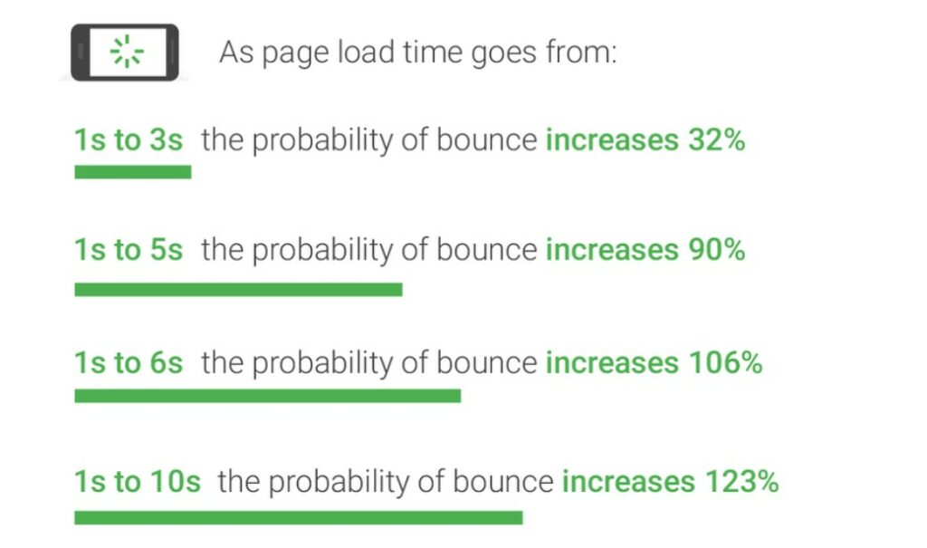
As it turns out, the bounce rate depends heavily on the website loading time:
Gone are the days of 2G connection when people could wait a hundred seconds for the website to load. With the increase in elements on the website leading to a lower load time, the conversion rate drops by a whopping 95%!!
What can we do to increase loading speed?
The question drops to the mind as to what we can do as web developers to decrease the web page load time when the network plays a vital role which we have no idea about. As a developer, we can follow a series of checks on our responsive mobile design to ensure higher conversion rate and simultaneously lower bounce rates:
Content Display Improvement
A good way to start is to code the web page to display something (if not all) to the user as early as possible. For example, AJAX queries are a great way to show a partial content to the user on the first view.
Server Improvement
Use a good server!! Servers play an important role as they are responsible for not only communicating with requests but also sending the first byte to the user. Google recommends a time of 1.3 seconds for the mobile server to communicate with the first byte. The lower the better.
The figure shows recommended average response time of the mobile server in various categories:
Request Count Optimization
Lowering the number of requests to the server also decreases the overall page load time. The lesser number of requests would generally mean lesser elements to fetch. While Google recommends less than 50, today’s average lies somewhere between 120-170.
Weight of Elements
An extremely important factor in determining the loading speed of the website is the weight of elements present in the mobile web page. The study found out that websites use too many elements in order to lure the users which slows down the loading speed even on the 4G connection (which is the most popular). 70% of the pages took 5 seconds for any visual element to first appear on the web page. This has made the average loading time to 15 seconds as compared to the recommended 2 seconds.
The main culprit; images. Providing an extremely high-quality image will just decrease the conversion rates especially the ones which are nowhere related to the product such as background or achievement thumbnails. Applying very high-quality images without compression can load up the page to as high as 4MB which is more than the average.
The analysis is done in the study also found an image worth 16 MB of size on a web page which is a simple blunder, an invitation to decrease the conversion rates. What can we do? Compress these images and use proper image formats.
By simply compressing the images on the web page, the developers can save up to 250 KB of size on as high as 25% of the website analysed. Image format can help you in decreasing the load time too. Out of all the mobile-friendly websites, 46% use JPEG and 28% use PNG. The reason behind the success of JPEG is that it is a lossy compression losing bits in the process. JPEG is a great format to use when too much focus is not on the extreme detail of the image like nature images, landscapes or background color shades etc. PNG on the other hand is lossless and saves the bits in the process. PNG images are great when sharpness, details and observations are required in the image.
The following image is a JPEG image:
This image is of a natural scene and hence does not demand very small details for the user. Your user will not zoom into the Taj dome to check out the colour shade. This image makes about 127 KB in size.
The same image in PNG consumes 714 KB of the web page which is extremely unnecessary.
To determine your website’s performance, you can use a trusted tool PageSpeedInsights by Google.
To increase the speed of the landing page, developers can also make use of CDN or Cache that web service providers such as Amazon offer. These are very fast and help store data according to the geographic locations.
A/B Testing and you are done!
When Google launched ads on Gmail, they were not sure which blue colour to use. In their experiment, they decided to provide different shades of blue to different users and see their response. With 1% of users getting one shade and another 1% getting another, Google ended up testing among 40 shades of blue to 40 different groups. The final blue selected in this experiment earned them an additional $200 million in revenue.
This is termed as A/B testing. A/B testing is a process of comparing two different versions of a web page by giving them to different groups and recording their response. A/B testing has been used extensively today to finalize the colour, location or size of the CTA button. An experiment between green and red CTA buttons showed that the red CTA button performed 21% better on 2000 page visits. The 21% increase in the conversion rates points towards how important A/B testing is today.
This does not mean every red CTA button will outperform green ones. Performing A/B testing will provide conclusive results by which you can increase the conversions and they are different for different websites.
Not only CTAs, as a developer you can also test the headlines, buttons and other important content to decrease the bounce rate which eventually does result in increased conversions. You can use Heatmap tools for A/B testing.
Conclusion
If you ever believed that responsiveness is everything there is to increase the CTR, you are not alone. The researches and studies have brought out a lot more about the behavioural aspect of a user than we knew before. From colour to the font-size, conversion rates on a mobile device is like a house on wooden pillars. All of them together increases the CTR to its capabilities and give your revenue a boost up.
Apart from the points discussed in this post, as a developer, you can also perform certain enhancements on the website for better conversions. User experience always matters on a mobile website. Whether it is conversions, word of mouth or any other target, you will always be rewarded for a better user experience. Enhancements such as not losing the sessions when the back button is pressed, providing cart support on multiple devices or shutting up the navigation bar in a hamburger menu. These enhancements are always noticed by the user and the easier it is for him, the better are the chances of conversions. So the next time you are busy developing your website, make a checklist and boost up that conversion rate from mobile web pages.
Do you want to install and set up All in One SEO for WordPress?
All in One SEO (AIOSEO) for WordPress is the best WordPress SEO plugin that allows you to easily optimize your WordPress website for search engines and social media platforms.
In this article, we will show you how to properly install and set up All in One SEO for WordPress to improve your SEO rankings.
It is easy to use, and you don’t need to be an SEO expert or have any special skills.
At the same time, it is incredibly powerful and allows you to make your WordPress website rank higher in search engines and get more free traffic from social media platforms like Facebook and Twitter.
By default, WordPress provides an SEO-friendly environment, but there are still many things that you can do to improve your website’s SEO rankings.
These include adding meta tags, generating XML sitemaps, adding schema markup, optimizing social sharing, and more.
All in One SEO for WordPress helps you do all these things with an easy-to-use interface that blends into your WordPress dashboard.
It also shows a TruSEO score for your posts and pages, which helps you create more search engine-friendly content. Plus, you can do a complete sitewide SEO audit with the click of a button.
That being said, let’s take a look at how to easily install and set up All in One SEO for WordPress. We will walk you through the complete setup, step by step.
Note: To demonstrate all the features of this power SEO plugin, we are using the Pro version. However, you can also download the free version of AIOSEO from WordPress.org.
Upon activation, the plugin will automatically launch the setup wizard.
You need to click on the ‘Let’s Get Started’ button to continue.
On the next screen, you will be asked to choose your website category or type.
For instance, you can pick if your website is primarily a blog, a news website, an online store, a small business, or something else.
For the sake of this tutorial, we will set it up as a blog.
Below that, you can fill in the homepage SEO title and description. The SEO meta title and description are used by search engines, so it is important to use your main keywords.
You will notice the smart tags options here. These tags allow you to dynamically generate text for your SEO meta title and description. You can also just manually enter the title and description that you want to use.
Note: You can always change these settings later, so don’t worry about missing something.
Now, you can click on the ‘Save and Continue’ button to move on to the next step.
On the next page, you will be asked whether you want to set it up as a person or an organization. For instance, if you run a personal blog, then you may want to choose a person.
Otherwise, you would select an organization and enter your organization name and business phone number. If you don’t have a business phone number yet, then you can leave it blank and add it later.
Below that, you need to provide a business logo and a default social sharing image.
A default social sharing image will be used when someone shares a link from your website and if that page doesn’t have a specific featured image set for it.
If you scroll down a little, then you will see the social profile section. This is where you will add social profile URLs associated with your website.
The business logo and social profiles are important elements that Google and other search engines use for their Knowledge Panels.
Once you have completed all the fields that you can, just click on the ‘Save and Continue’ button to move on to the next step.
Next, you will be asked to turn on SEO features. The essential SEO features like XML Sitemaps and Optimized Search Appearance are already turned on. You can choose other features you want to enable.
If you are unsure, then you can leave the default options and move on to the next step.
Next, you will see the Search Appearance screen. The plugin will show you a snippet preview of how your site will look in the search results. You can click on it to change the homepage title and meta description.
By default, the plugin will use the smart tags to display your site title, separator, and site tagline. You can customize these by clicking on the ‘Google Snippet Preview’.
Your goal should be to use your main keywords in the site’s title and description. You can also change these later from the plugin settings.
Below that, you will see advanced options. You can configure them to your own needs.
The first option is to choose whether your site is live or under construction. If you don’t want search engines to list your website right now, then you can choose ‘Under Construction’.
The next option is to include all post types (such as posts, pages, and products) in search results. If you are unsure, then keep it turned on for all post types.
Next, you need to choose if you have a multi-author or a single-author blog. If you have a single-author WordPress blog, then you need to select this option to avoid duplicate content.
The redirect attachment pages option is turned on by default. Attachment pages are low text pages, and it is highly recommended to redirect them because it will improve your overall SEO score.
Click on the ‘Save and Continue’ button to move on to the next step.
Finally, if you are using the PRO features of the plugin, then you will be asked to enter your license key. You can find this information in your account on the All in One SEO for WordPress website.
After entering your license key, you will see the Congratulations page, letting you know that you have reached the final page of the All in One SEO setup wizard.
You can click on the ‘Finish Setup’ button to save your settings and exit the wizard.
Congratulations, you have successfully installed and set up the All in One SEO for WordPress plugin on your website. You are now ready to take full advantage of this incredibly powerful SEO tool to grow your business.
In the next few steps, we will walk you through important SEO features and how to use them to grow your website.
Optimizing Your Website Posts and Pages for SEO Using AIOSEO
Optimizing your blog posts for SEO is a regular task and a very important part of creating content on your website.
All in One SEO for WordPress shows a TruSEO score for each of your blog posts and pages. This includes practical tips on improving that score and optimizing your posts for better performance in search results.
Simply edit any post or page on your website and scroll down to the ‘AIOSEO Settings’ section below the content editor.
From here, you will see a snippet preview of how that particular post or page will appear in search results. Below that, you can enter the SEO meta title and description.
AIOSEO can automatically generate the SEO title and description for you. You can also manually enter it for each article, which will allow you to get creative and write catchy descriptions for your articles.
Just make sure that your title and description fields are using the main focus keyphrase for your post or page.
A focus keyphrase is the main keyword or phrase that you want to target. This is the phrase that your users are most likely to type into search engines to look for the information that you have in your article.
Adding the focus keyphrase does not automatically improve your SEO. However, All in One SEO helps you optimize your content for the focus keyphrase using the content analysis feature. More on this later.
Next, you need to switch to the ‘Social’ tab under the AIOSEO settings. This is where you can control how this post or page will appear on social media platforms with a preview of Facebook and Twitter.
From here, you can choose a different variation of title and description. You can also pick which image you want to use when a link is shared.
We will talk about the ‘Schema’ tab later in this article.
Using Content Analyzer for TruSEO Score in WordPress
One of the coolest features of All in One SEO is the content analysis and the TruSEO score. You can see them at the bottom of the ‘AIOSEO Settings’ section and also by clicking on the AIOSEO button in the top right corner of the screen.
The content analysis feature looks for a detailed set of indicators to give your content an SEO score. This allows you to have a handy SEO checklist that you can go through when creating content for your website.
You can expand different sections to view the checks and recommendations. AIOSEO will give you details about each recommendation that needs your attention and tell you how to fix it.
Using Headline Analyzer to Optimize Title SEO in WordPress
Your post titles also play an important role in SEO. You can use All in One SEO’s Headline Analyzer to create headlines that get more clicks on search engine results pages.
Simply click the ‘H’ button at the top of the content editor to get started.
Your title will be given a score, and you should aim for a score of at least 70.
Below that, you will see different sections with tips on how to improve your headline. There are sections for word balance, sentiment, headline type, character count, and word count.
You can expand these sections to see actionable tips and recommendations on how to improve your post’s SEO title.
If you just want to brainstorm some great post headlines, then you can also access Headline Analyzer from All in One SEO » SEO Analysis.
Once there, you need to click on the ‘Headline Analyzer’ tab at the top of the page.
Now, simply type a headline and then click the ‘Analyze’ button.
Your headline idea will be given a score, and you will see actionable tips to improve it.
Optimizing WooCommerce SEO Using All in One SEO for WordPress
All in One SEO for WordPress is ready for eCommerce stores and helps you optimize your WooCommerce SEO right out of the box.
Let’s start with the product pages first.
Simply edit any product in WooCommerce and scroll down to the AIOSEO Settings box below the product editor.
In the ‘General’ tab, you can change the product’s SEO title and description. You can use a product short description smart tag, or you can write a custom description. Just make sure your main product keyword is used in both the title and description fields.
Next, switch to the ‘Social’ tab. From here, you can control how your product will look on social media platforms. You can set a different product image here to get more clicks and engagement from social media.
After that, you can switch to the ‘Schema’ tab.
Schema markup allows search engines to better understand and display your content in search results. For instance, this is how search engines may show a product in search results:
AIOSEO will automatically select the correct schema type.
It will also use the data from your WooCommerce product listing, like product pricing, availability of stock, and more.
Additionally, you can click the ‘Edit Schema’ icon to add other information.
You can add the brand, identifier type, material, color, pattern, and more if you need to.
The plugin also automatically generates WooCommerce XML sitemaps, including product and product category sitemaps. This brings us to the next step.
Using XML Sitemaps in All in One SEO
An XML sitemap is a file that lists all your website content in an XML format so search engines like Google can easily discover and index your content.
Sitemaps are extremely important for SEO, and AIOSEO automatically sets them up for you.
You can find your XML sitemap by adding sitemap.xml at the end of your domain name like this:
https://example.com/sitemap.xml
You can customize your sitemap using All in One SEO.
Simply go to the All in One SEO » Sitemaps page to review sitemap settings.
You can scroll down below to the Sitemap Settings section.
From here, you can manage sitemap indexes and include or exclude post types and taxonomies (categories and tags). You can also enable XML sitemaps for date-based archives and author archives.
The plugin also allows you to manually add pages to your XML sitemaps.
For instance, you might do this if you have a standalone contact form, a landing page, or Shopify store pages.
Create a Video XML Sitemap
All in One SEO allows you to create additional sitemaps like a video sitemap or a news sitemap.
If you embed videos into your content, then adding a video sitemap displays the video thumbnail with a play button in search results.
You can enable the video XML sitemap by switching to the ‘Video Sitemap’ tab.
The first time you visit this page, you will need to click the ‘Activate Video Sitemap’ button to turn on video sitemaps on your site.
Once video sitemaps are activated, you will see the ‘Video Sitemap’ settings tab.
Notice that the ‘Enable Sitemap’ toggle has been switched on.
Note: You will need at least a PRO plan of the plugin to access the video sitemaps feature.
Create a News Sitemap in WordPress
If you run a news website, then you will need to generate a news XML sitemap to appear on Google Search’s News results page.
All in One SEO makes it super easy to generate a news sitemap for your website. Simply switch to the ‘News Sitemap’ tab. The first time you visit this tab, you will need to click the ‘Activate News Sitemap’ button to enable news sitemaps on your site.
Now, you will see the ‘Video Sitemap’ settings tab.
Notice that the ‘Enable Sitemap’ toggle has been switched on.
Below that, you will see the news sitemap settings.
You can set your publication name and select a post type that you want to use for the news sitemap.
Note: You will need at least a PRO plan of the plugin to access the video sitemaps feature.
Generate an RSS Sitemap
An RSS Sitemap is different than an XML sitemap. Unlike XML Sitemaps, an RSS sitemap only contains your most recent content. It helps Google and other search engines to show your newer content in the search results.
All in One SEO allows you to easily add an RSS sitemap to your website. Simply switch to the ‘RSS Sitemap’ tab and then make sure the ‘Enable Sitemap’ setting is toggled on.
Using Schema Markup in All in One SEO for WordPress
Schema markup is a special vocabulary that you can use in your post or page’s HTML code to tell search engines more about your content.
For instance, you can tell search engines that the content they are viewing is a recipe or a product page. This allows search engines to use the microdata to display rich snippets in search results.
Schema markup also helps search engines display results in knowledge graph information panels. This enhanced placement in search results helps you get more clicks and visitors to your website.
All in One SEO for WordPress comes with built-in support for schema markup for all your content.
Setting Sitewide Schema Markup in WordPress
First, you need to visit the All in One SEO » Search Appearance page and switch to the ‘Content Types’ tab.
From here, you can open the ‘Schema Markup’ tab for each content type.
For instance, you can choose ‘Article’ for your posts and then choose what type of articles they are, such as articles, blog posts, or news articles.
Similarly, for your WooCommerce products, you can switch to the ‘Schema Markup’ tab and set the default markup type to ‘Product’.
Changing Schema Markup for Individual Posts and Pages
Now, what if you have mixed content that you publish as blog posts? For instance, you may occasionally publish a recipe instead of an article as a blog post.
All in One SEO allows you to control schema markup for all individual posts, pages, and products. Simply edit the item that you want to change and scroll down to the AIOSEO Settings below the post editor.
From here, you need to switch to the ‘Schema’ tab and click the ‘Generate Schema’ button.
This will open up the Schema Catalog.
Here, you can choose the schema type that you want to use.
Depending on which schema type you choose, you will see different options to provide additional microdata to be used in the schema markup.
For instance, if you change it to ‘Recipe’ schema, then you will be asked to enter information such as the recipe name, description, image, dish type, cuisine, the time required, and more.
Schema markup is an extremely powerful tool that helps you enhance the appearance of your content in the search results and get more free traffic to your website.
Connecting Google Search Console and Other Webmaster Tools
Google Search Console is a free tool offered by Google to help website owners track their websites’ presence in Google search results.
All in One SEO for WordPress allows you to easily connect your WordPress site to Google Search Console.
First, you need to add your website to Google Search Console using the URL prefix method. During the process, you will be asked to verify your ownership of the website. You should choose the HTML tag option.
Copy the HTML tag and switch back to your WordPress admin area.
Now, simply go to the All in One SEO » General Settings page and switch to the ‘Webmaster Tools’ tab. From here, you can click on ‘Google Search Console’ and then enter the verification code you copied earlier.
Similarly, the plugin also allows you to add verification codes for other services like Bing Webmaster Tools, Yandex, Baidu, and Pinterest site verification.
In fact, if any third-party service asks you to add some code to your site’s header, then you can use this page to add those codes in the ‘Miscellaneous Verification’ box.
Don’t forget to click on the ‘Save Changes’ button to store your settings.
Viewing Google Search Console Statistics From All in One SEO
While the Google Search Console offers a lot of useful statistics about your website on the Google Search Console website, many beginners find it difficult to find the information they need.
Luckily, All in One SEO’s Search Statistics feature makes it easy to do this from inside your WordPress website’s dashboard.
When you navigate to the All in One SEO » Search Statistics page for the first time, you will need to click the ‘Connect to Google Search Console’ button.
You will be asked to connect or choose your Google account and then give the All in One SEO plugin access to your Google Search Console account.
Once you are redirected back to your website, All in One SEO will fetch your Google Search Console data for you. It will be presented in easy-to-understand reports featuring graphs.
Using Link Assistant to Add Internal Links to Posts and Pages
Internal links are links between posts on your own website. They help search engines discover your content and rank them higher in search results.
All in One SEO’s Link Assistant feature makes it easy to add links to your old and new content without having to open up the post. Simply head over to All in One SEO » Link Assistant in your WordPress dashboard.
The first time you visit this page, you will need to click the ‘Activate Link Assistant’ to enable the feature on your website.
After that, the tool will need to scan every post and page on your website to collect the links you have and see which posts are linked to and which aren’t.
After a few moments, the scan will finish, and you will see an overview of the links used on your website.
You will see the total counts for internal, external, and affiliate links. The report will also show you the number of orphaned posts that have not yet been linked to from another post or page.
The ‘Links Report’ tab provides detailed information on all your links.
You will see a list of all your posts and pages with columns for internal, external, and affiliate links, as well as suggestions where you can add links.
You can click on the right arrow button next to any post or page to see more details.
For example, you can go to the ‘Link Suggestions’ tab to quickly view link suggestions and add links without directly editing a post or page.
A lot of WordPress users run small business websites that serve a particular town or region. These include businesses like restaurants, real estate agents, plumbing, maintenance service providers, small stores, salons, and more.
Local business SEO allows you to optimize your website to appear more prominently in local search results.
For instance, if someone is looking for an ‘Italian restaurant’, then your location would pop up in the results.
This drives targeted customers and direct sales to your business.
First, you may want to create a Google My Business account. This allows you to add your business listing, prove that you own the business, and manage your business information using Google’s My Business dashboard.
All in One SEO for WordPress allows you to easily add local business SEO schema markup to your website. This helps you get even more enhanced placement in the search results and keep the information up to date for your business.
Simply navigate to All in One SEO » Local SEO. The first time you visit this page, you will need to click the ‘Activate Local SEO’ button to enable local SEO on your site.
After that, you can set up your location settings. The first setting asks whether your business has multiple locations.
After that, you need to decide how you will add location information to your website. Most users prefer to use Gutenberg blocks, but you can also use a shortcode, widgets, or PHP code.
Now you can scroll down to the Business Info section
Here, you can fill in your business’s information like name, logo, location, area served, and more.
Once you have entered all of your business information, you can add your opening hours.
In the ‘Opening Hours’ tab, you will find settings for whether to display your business hours and how to add them to your website, such as using a Gutenberg block.
After that, you can scroll down the page and enter your business hours.
There are options for businesses that are open 24/7, or you can add your opening hours for each day of the week.
The last tab allows you to add a map of your location to your website. This can help customers navigate to your office or physical store.
Don’t forget to click on the ‘Save Changes’ button to store your settings.
Performing a Website SEO Audit in WordPress
Now, as you work on your website, you will want to know how your website’s SEO is doing. All in One SEO for WordPress provides a built-in tool to perform a detailed website SEO audit.
Simply go to the All in One SEO » SEO Analysis page to perform a complete site-wide SEO analysis.
On top of the page, it will give you an overall score for your site’s SEO health. Any score above 70 is acceptable, but there is always room for improvement.
Below the score, you will see the breakdown of your site’s SEO audit report with different labels.
If there are any critical issues, then they need your immediate attention.
Simply click on the ‘Important Issues’ tab, and you’ll see a list of issues that you need to fix. You can click on the arrow next to each item to expand, and it will show you how to fix it.
As you fix an issue, you can click on the ‘Refresh Results’ button to regenerate the SEO Analysis score.
Performing SEO Competitor Analysis in WordPress
Want to compare your SEO analysis with your competitors? AIOSEO comes with a built-in competitor analysis tool that you can use inside WordPress.
Simply go to the All in One SEO » SEO Analysis page and switch to the ‘Analyze Competitor Site’ tab. From here, you need to enter the URL of your competitor’s website to generate an analysis report.
AIOSEO will generate an SEO analysis report of your competitor.
Below the score, you will get a detailed report on different SEO checks, top keywords, critical issues, performance, and a security analysis.
You can compare this report with your own report and see if there is something that they are doing that you can use and improve upon.
All in One SEO for WordPress is an incredibly powerful SEO tool. Apart from the features we have covered above, it comes equipped with many features for advanced users.
Moving From Yoast SEO to All in One SEO
All in One SEO allows you to easily import SEO data from third-party plugins so that you can switch and use a more powerful and much better SEO tool.
Simply go to the All in One SEO » Tools page and switch to the ‘Import/Export’ tab.
You can then import data by choosing a plugin from the dropdown list and clicking on the ‘Import’ button.
Edit Robots.txt and .htaccess Files
Sometimes, when following a WordPress tutorial or guide, you may need to edit your robots.txt or .htaccess file. All in One SEO allows you to easily do that.
You can do this by visiting the All in One SEO » Tools page. From here, you will find the option to edit the robots.txt and .htaccess files.
Manipulate Your WordPress RSS Feeds
RSS Feeds are used by content aggregators to display your site’s articles or summaries.
All in One SEO allows you to easily manipulate your WordPress RSS feeds to your own advantage by adding your own custom content before or after blog posts.
You can do that by visiting the All in One SEO » General Settings page and switching to the ‘RSS Content’ tab.
Control Who Can Access SEO Options in WordPress
Many businesses have staff members responsible for creating content, marketing, or managing SEO. All in One SEO makes it easy for you to choose who has access to SEO settings.
Simply go to the ‘Access Control’ tab and toggle the different settings on and off.
Now that you have installed and set up All in One SEO for WordPress, the next step is to track how your website is doing and what you can do to grow it.
The easiest way to track your website traffic is by using MonsterInsights. It allows you to see how many visitors are coming to your site, which pages they are viewing, and what they do on your site.
It is the best conversion optimization software in the world and helps you convert website visitors into customers. It comes with beautiful lightbox popups, slide-in menus, countdown timers, notification bars, and more.