New Report Estimates WordPress’ Market Share of US Higher Education Institution Websites at 40.8%

A new report from eQAfy, a company that collects and analyzes data about higher education websites, has benchmarked which content management systems US institutions are using. The report is a snapshot of data from December 2020, sourced from the National Center for Education Statistics IPEDS database. After scanning a list of 4,000 active institutions, EQAfy’s headless browser was able to detect the CMS for 3,359 homepages (83.8%).

A market leading group of 12 content management systems made up 90% of the homepages eQAfy detected, including four open source solutions and eight proprietary solutions. WordPress captures 40.8% of the market, followed by Drupal at 19.1%, as measured across all institution types (public, private for profit, and private non-profit), levels (2-year and 4-year), and sizes.

WordPress’ estimated market share for public institutions came in at 27%, and is much higher in the private for-profit institutions category at 55%.

Looking at 2-year public higher education institutions by student population, WordPress falls to #3 at just 18.3%. Drupal leads the pack in that category with 29.2%, and proprietary CMS’s take up the rest of the market. WordPress does much better in the category of 4-year private for-profit higher education institutions, capturing a staggering 75% of the market.

When examining CMS suppliers for institutions by size, WordPress is the overall market leader but does far better in the smallest institutional size categories, with waning dominance in the large to very large categories.

The report has more interesting data comparisons across different categories if you want to dig deeper. It’s important to note that eQAfy only collected the main websites for these institutions, which may not be representative of the CMS that powers the schools’ ancillary websites. They are often created using a combination of platforms. This report covers only which CMS the schools preferred to use for the face of their institutions.

FSE and WordPress Themes: What Does the MVP Look Like?

Josepha Haden Chomphosy, the Executive Director of WordPress, posted a follow-up to her outline of the upcoming year. Questions mounted about what a minimum viable product (MVP) looked like for Full Site Editing (FSE), which is expected to be ready in the Gutenberg plugin in April. The core team is also shooting for a June launch of FSE in WordPress when it ships WordPress 5.8.

These seem like lofty goals, but members of the WordPress development and business community were left asking, “What is an MVP for FSE?” This is not a new question. Whether it is the swift pace of development, a communication breakdown, or so much of the project being hidden behind layer upon layer of GitHub issues, it can be hard to follow. There is no big webpage that spells out each step in minute detail of where the project is going. Information can sometimes feel scattered. This can give pause to third-party developers and business owners who need to know what to expect to update their products.

Joost de Valk, the CPO of Yoast, voiced his frustration with the process in the comments. We later discussed this in more detail.

“I think FSE will change what a theme is, and, if it gets executed properly, will make it far easier to build a theme, as themes will be much smaller,” he said. “That brings the burden onto the community to come up with reliable methods of styling though, and conventions on class names or similar, to make styling work everywhere. I currently don’t understand what is even considered as MVP for Full Site Editing, nor do I see any discussions about how it’ll work with themes not purpose built for it, and that worries me.”

He shares some of the same concerns as others in the community who feel like there is no process in place for an MVP.

“And there is no such thing,” he said. “Vision without execution is just hallucination.”

Chomphosy said that she was aware of the interconnectedness. “I also see that the information we have published isn’t in a tidy and followable post that would help people make good decisions on behalf of 39% of the web,” she said.

She pointed to a ticket that lists six (now seven) milestones. Each of those milestones, when taken together, represent where FSE needs to be for an MVP.

“Together they outline an architecture that allows the expression of a full theme using blocks and an editor capable of customizing that theme,” she wrote. “The MVP should make it possible to build a version of the Twenty Twenty-One theme, using only blocks, without any coding knowledge.

The following is a breakdown of the milestones that need to reach completion before we see the first version of FSE land in WordPress:

Milestone 1: Infrastructure and UI

Perhaps the most crucial part of FSE is a workable site editor. Merging the WordPress templating system into a cohesive UI is the foundation of the project. The underlying infrastructure handles how templates and template parts work. At this point, this foundation is in a reliable spot. It is all the features that build upon it that need more work. This milestone also includes getting the site-editing interface in place and handling multi-entity saving.

The final leg of the milestone allows users to edit templates from within the post editor, effectively switching between content and design editing. The FSE Outreach Program recently tested this feature to garner feedback after Gutenberg 9.6.

Milestone 2: Browsing

This milestone covers all of the work for navigating the UI of the site editor. There are many moving parts, such as switching between pages, templates, template parts, global styles, and more. Users must know which element they are working on.

This is the only milestone marked as completed. However, there is an open ticket for exploring the idea of a “browsing” mode alongside the edit and select modes.

Milestone 3: Styling

For the most part, this milestone centers on the upcoming Global Styles system. The system creates a hierarchy of how styles are applied to blocks from theme defaults to global user modifications, down to per-block style options.

While much of the work is complete for an MVP, there are dozens of feature tickets in the backlog. This is also an area where the block system is years behind third-party page builders. Expect to see long-term feature additions based on post-launch feedback.

Milestone 4: Theme Blocks

Theme authors should keep a close eye on this ticket. The only way that block-based themes become a reality for most theme developers is if all template tags have a corresponding block in the site editor. Or, at least if the most-used template tags do. Some of these functions are no longer applicable in the block editor. Theme developers should make sure they have the blocks they need to recreate anything they are building today.

Admittedly, I am sad to see that blocks for Bookmarks/Links are unlikely to be moving forward. While the feature is deprecated, I am still nostalgic about the good ol’ blogroll days. Maybe this would be best left a plugin. A revival of the Link Manager plugin could be in order.

Milestone 5: Query Block

The Query block and its corresponding Loop block are, in some ways, the most essential pieces of Full Site Editing. They handle what posts are loaded and how they are displayed. The feature is one of the more complex puzzles to solve. The Gutenberg development team has continued iterating on it for months, and it is now at a good baseline. However, it has miles to go before it can seriously handle all the things that theme authors need to do with it.

Right now, the Query block only handles a handful of options for customizing the query. The team needs to determine what controls should be available in the sidebar for end-users and integrate the blocks with patterns for different types of post-list displays.

Milestone 6: Navigation Block

Aside from the Query block, Navigation is the only other block that requires its own milestone. Navigation menu issues have plagued the WordPress project for well over a decade. It is one of the hardest things to get right. While nav menus in WordPress today are generally easy to work with, their design is not customizable by the end-user. The output is wholly at the theme author’s discretion. Catering to the array of possible menu designs theme authors might want and making it customizable for the end-user is likely one of the toughest problems for the Gutenberg project.

There are at least a couple of dozen sub-tickets that need contributors. Even then, it could be several versions later before the Navigation block is ready for the more complex patterns used in some themes today.

Milestone 7: Gradual Adoption

After the first six milestones representing the MVP are completed, WordPress needs a way to allow end-users and theme authors to gradually adopt FSE. Primarily, this would be a mix of block-based templates and traditional PHP-based templates. Developers should be allowed to update their themes without changing them wholesale, potentially leaving segments of their user base behind.

Block-based widgets and navigation screens also fall under this milestone. Both features were punted to future releases after failing to land in 2020. However, these will be stepping stones for users who are not quite ready to switch to FSE or are unable to because of their theme.

Some Performance Blog Posts I’ve Bookmarked and Read Lately

  • Back/forward cache — I always assumed browsers just do fancy stuff with the back/forward buttons and us developers had very little control. Philip Walton tells us it’s critical that we understand “what makes pages eligible (and ineligible) for bfcache to maximize their cache-hit rates.” For example, if you use the unload event, the page is instantly disqualified from the cache.
  • Big picture performance analysis using Lighthouse Parade — Lighthouse only tests one page of your site. Lighthouse Parade tests all the URLs of a site, and aggregates the results.
  • Beyond fast with new performance features — Jake Archibald gets into the CSS content-visibility property (and a few other things) and how it can lead to incredible performance boosts (you use it to tell the browser that it’s straight-up OK not to render things). Right this minute, content-visiblity makes me nervous as it has issues with scrollbar jankiness and accessiblity problems. I found it a smidge confusing at first glance, and Tim Kadlec has reservations.
  • Image Decode & Visual Timings — Image performance isn’t only about the size of the image. Different formats take different amounts of time to decode and render. GIF never wins.
  • How to increase CSS-in-JS performance by 175x — The trick, readers, is shipping CSS. You can still use CSS-in-JS as you author, and have the build process create the CSS. They call that “Zero-Runtime” like Linaria.
  • Testing Performance — Kelly Sutton: “The best approach that I have found to preventing performance regressions is to employ qualitative assessments of the code.” Performance is such an unwieldy beast, that only in production will you truly know what happens.
  • Front-End Performance Checklist 2021 — If you’re going to get serious about performance this year, you’d do well to dig into Vitaly’s guide.
  • We rendered a million web pages to find out what makes the web slow — HTTP/2 is a huge indicator of good performance.

The post Some Performance Blog Posts I’ve Bookmarked and Read Lately appeared first on CSS-Tricks.

You can support CSS-Tricks by being an MVP Supporter.

How To Make A Reg File

I want to make a reg file to automatically change the key KMD_EnableBrightnessInterface2 from 1 to 0 in the following string. This way I can use it on another computer.

HKEY_LOCAL_MACHINE \ SYSTEM \ ControlSet001 \ Control\Class \ {4d36e968-e325-11ce-bfc1-08002be10318} \ 0000 \KMD_EnableBrightnessInterface2

The folder 0000 contains many key values.
I can right click the folder 0000 and export it but I don't want to export the whole folder.
When I right click the key: KMD_EnableBrightnessInterface2 it does not give me the option to export it. I only have the option to Modify/Modify Binary Data/Delete/Rename
That's the only key I need to export

Your advice would be appreciated.

Kind regards
Chris

Registry_.JPG

WordPress 5.7 Beta 1 Is Ready for Testing

WordPress 5.7 Beta 1 was released this week on schedule and is ready for wider testing. This release will introduce 68 new features and enhancements, dozens of bug fixes, and versions 9.3 – 9.9 of the Gutenberg plugin.

A few of the highlights expected in 5.7 include the following:

  • Lazy-load iframes: When WordPress 5.4 added lazy loading for images, contributors discussed extending this to iframes as well. Now that the loading attribute on iframe tags has been added to the HTML standard, it will be supported in core in 5.7.
  • Streamlined migration from HTTP to HTTPS: WordPress can now detect if a user’s hosting environment supports HTTPS and enables a one-click update process, handling mixed content rewrites where possible.
  • Standardize colors used in WP-Admin CSS to a single palette: WordPress is implementing a CSS custom properties system that will make it easier to add custom color schemes.
  • Ongoing cleanup after update to jQuery 3.5.1
  • New Robots API: This new API allows developers to centrally manage the content of the robots meta tag injected into the page, and includes a setting to toggle whether search engines are allowed to display large media from the site. By default, a max-image-preview:large robots directive which will be injected into the robots meta tag based on the new setting.

These features need testing, along with the host of updates rolling over from the Gutenberg plugin. The editor is getting the most visible enhancements in 5.7, with features like dragging blocks and block patterns from the inserter into the canvas, major improvements to the buttons block, new social icons, and much more.

The official release is expected in just under five weeks on March 9, 2021. Testing is a critical part of the process for making WordPress better with each update. The easiest way to get in on that is to install the WordPress Beta Tester plugin (set to the Bleeding edge channel and the Beta/RC Only stream), or download and install the zip of the beta version.

Going From Solid to Knockout Text on Scroll

Here’s a fun CSS trick to show your friends: a large title that switches from a solid color to knockout text as the background image behind it scrolls into place. And we can do it using plain ol’ HTML and CSS!

This effect is created by rendering two containers with fixed <h1> elements. The first container has a white background with knockout text. The second container has a background image with white text. Then, using some fancy clipping tricks, we hide the first container’s text when the user scrolls beyond its boundaries and vice-versa. This creates the illusion that the text background is changing.

Before we begin, please note that this won’t work on older versions of Internet Explorer. Also, fixed background images can be cumbersome on mobile WebKit browsers. Be sure to think about fallback behavior for these circumstances.

Setting up the HTML

Let’s start by creating our general HTML structure. Inside an outer wrapper, we create two identical containers, each with an <h1> element that is wrapped in a .title_wrapper.

<header>

  <!-- First container -->
  <div class="container container_solid">
    <div class="title_wrapper">
      <h1>The Great Outdoors</h1>
    </div>
  </div>

  <!-- Second container -->
  <div class="container container_image">
    <div class="title_wrapper">
      <h1>The Great Outdoors</h1>
    </div>
  </div>

</header>

Notice that each container has both a global .container class and its own identifier class — .container_solid and .container_image, respectively. That way, we can create common base styles and also target each container separately with CSS.

Initial styles

Now, let’s add some CSS to our containers. We want each container to be the full height of the screen. The first container needs a solid white background, which we can do on its .container_solid class. We also want to add a fixed background image to the second container, which we can do on its .container_image class.

.container {
  height: 100vh;
}

/* First container */
.container_solid {
  background: white;
}

/* Second container */
.container_image {
  /* Grab a free image from unsplash */
  background-image: url(/path/to/img.jpg);
  background-size: 100vw auto;
  background-position: center;
  background-attachment: fixed;
}

Next, we can style the <h1> elements a bit. The text inside .container_image can simply be white. However, to get knockout text for the <h1> element inside container_image, we need to apply a background image, then reach for the text-fill-color and background-clip CSS properties to apply the background to the text itself rather than the boundaries of the <h1> element. Notice that the <h1> background has the same sizing as that of our .container_image element. That’s important to make sure things line up.

.container_solid .title_wrapper h1 {
  /* The text background */
  background: url(https://images.unsplash.com/photo-1575058752200-a9d6c0f41945?ixlib=rb-1.2.1&q=85&fm=jpg&crop=entropy&cs=srgb&ixid=eyJhcHBfaWQiOjE0NTg5fQ);
  background-size: 100vw auto;
  background-position: center;
  
  /* Clip the text, if possible */
  /* Including -webkit` prefix for bester browser support */
  /* https://caniuse.com/text-stroke */
  -webkit-text-fill-color: transparent;
  text-fill-color: transparent;
  -webkit-background-clip: text;
  background-clip: text;
  
  /* Fallback text color */
  color: black;
}

.container_image .title_wrapper h1 {
  color: white;
}

Now, we want the text fixed to the center of the layout. We’ll add fixed positioning to our global .title_wrapper class and tack it to the vertical center of the window. Then we use text-align to horizontally center our <h1> elements.

.header-text {
  display: block;
  position: fixed; 
  margin: auto;
  width: 100%;
  /* Center the text wrapper vertically */
  top: 50%;
  -webkit-transform: translateY(-50%);
      -ms-transform: translateY(-50%);
          transform: translateY(-50%);
}

.header-text h1 {
  text-align: center;
}

At this point, the <h1> in each container should be positioned directly on top of one another and stay fixed to the center of the window as the user scrolls. Here’s the full, organized, code with some shadow added to better see the text positioning.

Clipping the text and containers

This is where things start to get really interesting. We only want a container’s <h1> to be visible when its current scroll position is within the boundaries of its parent container. Normally this can be solved using overflow: hidden; on the parent container. However, with both of our <h1> elements using fixed positioning, they are now positioned relative to the browser window, rather than the parent element. In this case using overflow: hidden; will have no effect.

For the parent containers to hide fixed overflow content, we can use the CSS clip property with absolute positioning. This tells our browser hide any content outside of an element’s boundaries. Let’s replace the styles for our .container class to make sure they don’t display any overflowing elements, even if those elements use fixed positioning.

.container {
  /* Hide fixed overflow contents */
  clip: rect(0, auto, auto, 0);

  /* Does not work if overflow = visible */
  overflow: hidden;

  /* Only works with absolute positioning */
  position: absolute;

  /* Make sure containers are full-width and height */
  height: 100vh;
  left: 0;
  width: 100%;
}

Now that our containers use absolute positioning, they are removed from the normal flow of content. And, because of that, we need to manually position them relative to their respective parent element.

.container_solid {
  /* ... */

  /* Position this container at the top of its parent element */
  top: 0;
}

.container_image {
  /* ... */

/* Position the second container below the first container */
  top: 100vh;
}

At this point, the effect should be taking shape. You can see that scrolling creates an illusion where the knockout text appears to change backgrounds. Really, it is just our clipping mask revealing a different <h1> element depending on which parent container overlaps the center of the screen.

Let’s make Safari happy

If you are using Safari, you may have noticed that its render engine is not refreshing the view properly when scrolling. Add the following code to the .container class to force it to refresh correctly.

.container {
  /* ... */

  /* Safari hack */
  -webkit-mask-image: -webkit-linear-gradient(top, #ffffff 0%,#ffffff 100%);
}

Here’s the complete code up to this point.

Time to clean house

Let’s make sure our HTML is following accessibility best practices. Users not using assistive tech can’t tell that there are two identical <h1> elements in our document, but those using a screen reader sure will because both headings are announced. Let’s add aria-hidden to our second container to let screen readers know it is purely decorative.

<!-- Second container -->
<div class="container container_image" aria-hidden="true">
  <div class="title_wrapper">
    <h1>The Great Outdoors</h1>
  </div>
</div>

Now, the world is our oyster when it comes to styling. We are free to modify the fonts and font sizes to make the text just how we want. We could even take this further by adding a parallax effect or replacing the background image with a video. But, hey, at that point, just be sure to put a little additional work into the accessibility so those who prefer less motion get the right experience.

That wasn’t so hard, was it?


The post Going From Solid to Knockout Text on Scroll appeared first on CSS-Tricks.

You can support CSS-Tricks by being an MVP Supporter.

#301: What are Projects?

Chris & Stephen take a look at CodePen Projects (docs), which, for the time, is an entirely different thing than Pens. Rather than just the 3 editors: HTML, CSS, and JavaScript—you have a file system to work with, with arbitrary files and folders like you’re used to with a desktop code editor like VS Code or Atom. You’ve still got the ability to run processors, but you can do more, like literally deploy a production version of the site.

Sponsor: Jetpack

Jetpack is a WordPress plugin for your self-hosted WordPress site that brings you all sorts of useful thing. For one thing, more security. It blocks malicious activity, scans your site for problems, and backs up everything. That backup thing is very great. I just needed it yesterday! But my favorite feature is the Site Search. It replaces the default WordPress site search (which isn’t very useful) with an entirely new search experience. Not just the UI of search, but it improves the search results dramatically. I use Jetpack on all my WordPress sites.

The post #301: What are Projects? appeared first on CodePen Blog.

How to Learn Regular Expressions

Regular Expressions, or RegEx, are used for searching patterns in text. For instance, a RegEx like iP(hone|ad|od)s? will find mentions of any iOS device in a document. Knowledge of Regular Expressions is essential for programmers but they can be a great skill to have for non-developers as well - people who use Microsoft Word or spend hours inside Google Spreadsheets.

RegEx in Microsoft Word

Why Learn Regular Expressions?

Regular Expressions are extremely powerful, and no less intimidating, but even basic understanding of RegEx will save you time and make your everyday computing tasks easier.

For instance, you can quickly find & replace text that matches complex patterns in Word or Vim. You can easily extract phone numbers and emails in spreadsheet cells using regex formulas. If you are creating a form in Google Drive, RegEx can help you define validation rules for user input. You can use RegEx in Gmail and Google Analytics too.

How do you learn Regular Expressions? Or, if you are already familiar, how do you take your RegEx skills to the next level? You will obviously learn by doing but there are some excellent tools and learning resources on the Internet that will take make your journey to knowing Regular Expressions more pleasant.

The Best RegEx Tools & Resources

Lea Verou’s presentation will give you a good overview of what Regular Expressions are and what you can do with them. Jeffrey Friedl’s book - Mastering Regular Expressions - is still the best printed reference for RegEx newbies and masters. You can explore RegexOne, an interactive Codecademy-like online tutorial for learning RegEx or go here for learning the basics of pattern matching.

Highlighting all the non-English characters Highlighting all the non-English characters

RegExr is like a visual playground for Regular Expressions. You enter the text in one block and the RegEx in the other. As you edit the RegEx, the matching strings are highlighted in the input text. You can also hover over any character literal in the RegEx to know what it does. RegEx101 is a similar tool that also describes your RegEx in English as you write.

Regulex and RegExper are both open-source web apps that make it easy for you to understand and read Regular Expressions. You enter a RegEx and the tools will create a Railroad Diagram - for a string to match, it should be able to successfully move from left of the diagram all the way to the left along one of the available paths.

RegEx Visualizer

Windows users can download Expresso, a free program that will help beginners write both simple and complex regular expressions through a visual builder. Instead of coding the RegEx manually, you can select the components in a wizard. Reggy for Mac and RegEx Coach for Windows can also help you test regular expressions outside the browser.

Also see: How to Learn Coding

Once you understand the basics, head over to RegEx Golf or play this RegEx Crossword to test your skills. Like with everything else, you’ll only learn Regular Expressions by practicing and mere reading won’t be sufficient.

Rotating Loading Animation of 3D Shapes with Three.js

All things we see around are 3D shapes. Some of them are nice looking, some of them you’d like to touch and squeeze. But because it’s still quarantine time, and I don’t have many things around, I decided to create some virtual things to twist around. 🙂 Here’s what I ended up with:

How to do that?

To render everything I used Three.js, just like Mario Carillo in his amazing demo, go check it out! Three.js is the best and most popular library to do things with WebGL at the moment. And if you are just starting your 3D path, it is definitely the easiest way to get something working.

If you just rotate the shape, its nothing special, its just rotating.

Interesting things start to happen when you rotate different parts of the shape with different speeds. Let’s say I want the bottom part of the object to rotate first, and than the rest, let’s see whats going to happen.

To do something like that, you would need to use a Vertex shader. I used a little bit of math and rotated parts of the object depending on the Y or Z coordinate. The simplified code looks like this:

vec3 newposition = rotate(oldPosition, angle*Y_COORDINATE);

So with a coordinate change, the rotation would change as well. The rotate function itself includes a lot of Sine-Cosine’s and matrices. All the math you need to rotate a point around some axis. To give it a more natural feel, I also change the easing function, so it looks like elastic rubber.

Visuals, MatCap

To create a nice look for objects, we could have used lights and shadows and complicated materials. But because there’s not so much in the scene, we got away with the most simple kind of material: MatCaps. So instead of making complicated calculations, you just use a simple image to reference the lighting and color. Here is how it looks like:

And here is how the torus shape looks like with this texture applied to it:

Amazing, isn’t it? And so simple.

So combining Matcaps and a rotation method, we can create a lot of cool shape animations that look great, and have this rubber feeling.

Go and create your shape with this technique and make sure to share it with us! Hope this simple technique will inspire you to create your own animation! Have a good day!

The post Rotating Loading Animation of 3D Shapes with Three.js appeared first on Codrops.

Designing Better Tooltips For Mobile User Interfaces

Ideally, mobile designs would be seamless with no need for technical documentation, online help, or tooltips. In reality, even the best designs can benefit from supplemental information. A tooltip provides this supplemental information when users tap an icon, image, hyperlink, or other elements in a mobile user interface (UI). For example:

By identifying the “Solid Fill” and “Radial Fill” functions, the tooltips shown above make it easy for users to find the drawing function they need. These tooltips appear in the proper context and are not obtrusive. A first-time user can easily understand the meaning of each icon while an experienced user is unlikely to find these tooltips distracting. In short, the designer has balanced the needs of new and seasoned users. The result of this successful balance is a set of tooltips that users will perceive as a natural extension of the design experience.

Too often, however, tooltips are an afterthought as shown in the following example of a mobile contrast checker:

While the explanation about the contrast checker is clear, the text is too long and covers important information on the screen. The result is a clunky tooltip that confuses as much as it elucidates. Avoiding troublesome tooltips requires thought and planning.

How To Design Effective Tooltips

The key to designing tooltips that fit seamlessly into the overall design is to plan for them early in the design process. Specifically, designing useful tooltips requires:

  • Proper timing
    Paying attention to tooltips and related design techniques during the sketching and early prototyping stages.
  • Proper implementation
    Carefully considering tooltip context, placement, and clarity.

Timing

Timing refers to when during the design process to consider tooltips. By referring to the widely use design sprint, developed by Jake Knapp, we can identify the right stages in the design process to make decisions about design elements like tooltips.

Knapp’s sprint process consists of mapping out the problem, sketching solutions, choosing one solution, building a prototype, and then testing that prototype. In short, generate an idea, build it, and test it. The following image shows Knapp’s five-day design sprint process. I’ve added text to the sketching and prototype days to show when designers and developers should start thinking about tooltips.

Sketching is the logical place to begin when considering tooltips because potential points of confusion emerge as the layout and preliminary content take shape. Because initial sketches often do not include complete or detailed content, it is not necessary to identify every possible tooltip or even to include all designated tooltips at this stage. Rather, the point is to identify parts of the UI where a well-designed tooltip would help users complete the task at hand or more easily understand content.

For example, a tooltip on a field label makes it easier to fill out the form while also reducing data-entry errors. If it’s not yet clear whether a tooltip is necessary, simply include a callout with a question as shown in the figure below.

The callout shown above serves as a reminder for the team to discuss before building the prototype. In the “CVV” example above, the team might decide that one persona represents users who are unfamiliar with financial terms and abbreviations. For this group, a CVV tooltip would likely be useful and could easily be incorporated into the prototype as shown below.

Considering the need for tooltips and other supplemental information early in the design process increases the chance of developing a useful and usable prototype.

Implementation

The increasing complexity of mobile apps and limited space on mobile devices pose a significant challenge to designing effective tooltips.

Designers can meet this challenge by focusing on:

  • Context
    Check, check, and re-check the context for every tooltip. What might appear obvious to you as the designer could easily confuse a first-time user. The principle of attending to context applies to all aspects of UX and UI design. It’s especially important for tooltips because their necessary brevity will leave users confused if the context is not clear.
  • Placement
    Tooltips should be prominent and easy to find but should not obstruct important information on the screen.
  • Clarity and brevity
    Edit each tooltip for clarity and brevity. As many editors tell their writers: “Cut, cut, and cut some more.” It’s okay to write longer tooltip text in early iterations as long as you remember to keep editing and condensing for clarity.

The tooltip in the following example fulfills these criteria by providing essential information without disrupting the flow in the mobile form.

Because space is limited on mobile devices, clarity, brevity, and placement are essential. The tooltip on the Mint registration screen shown above is well designed. It is clear, concise, and appears directly below the zip code field when users tap the information icon.

The Square mobile app shown below provides another example of good tooltip design by helping bi-lingual users select their preferred language.

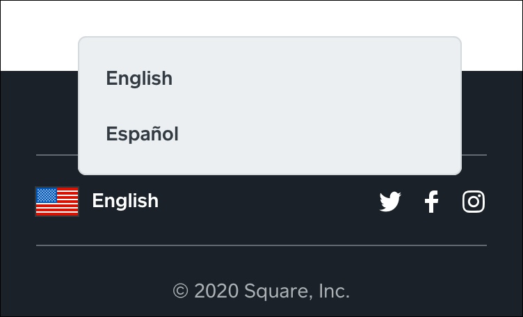
The “English/Español” tooltip shown above is clear, brief, and properly placed. When users tap the flag icon or “English” text, a tooltip appears with the option to select “English” or “Español.”

Well-placed tooltips enhance visual design by providing short, specific explanations when users need them. In the example above, users who are seeking information in other languages know immediately that they can choose between English or Spanish for this website. The language tooltip helps native Spanish speakers who might read English well but feel more comfortable using the Square app in their native language.

Utility is essential but not sufficient. Effective tooltips should be discreet to the point that users barely register their presence. Users only miss tooltips when they aren’t there. This approach to tooltips is an example of the long-standing view that great design is invisible. From this perspective, users never notice the design. Instead, they feel engaged and easily complete the task at hand.

The tooltip shown below on the Google Maps app is easy to find yet subtly integrated into the existing design:

  • The icon for muting/unmuting appears in a vertical row of icons.
  • The placement of these icons on the right makes them easy to see without obscuring important information on the map.
  • The mute/unmute icon follows the same style and color scheme as the search icon immediately above.

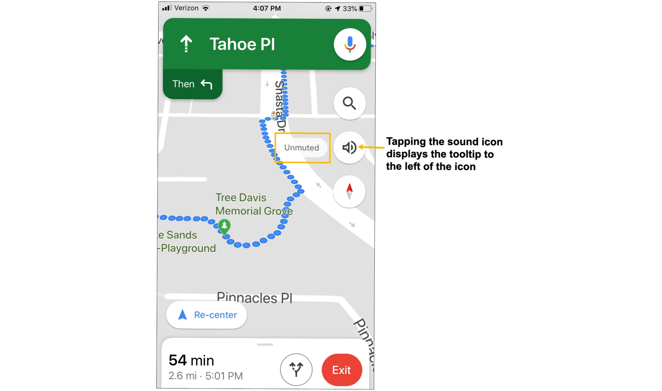
This Google map tooltips works because:

  • The context is clear. The option to toggle on sound (before pulling out of the driveway) is useful because it’s easier and safer to listen to directions while driving than to look at the phone.
  • The placement of the mute/unmute icon in a group of existing icons makes it easy to see without obscuring important information on the map.
  • The one-word tooltip is brief, and its meaning is clear.

In contrast, the tooltip shown in the MyZone fitness mobile app below is poorly designed.

While the context is clear, there are problems with the MyZone app tooltip:

  • The placement is clunky because it obscures important information.
  • The tooltip text is lengthy, and the explanation of “Max HR” is confusing.

To accommodate this lengthy text and the distracting green bar at the top, the tooltip is unnecessarily large. The result is a tooltip that is not discrete; it does not feel like a natural extension of the design.

Poor placement and confusing explanations are not the only problems users experience with mobile tooltips. A surprisingly common issue is the redundant tooltip. The tooltip example below is part of an illustration of cascading style sheets (CSS) smooth animation. The animation works and the illustration itself is clear; the problem is that the tooltip simply repeats the button text.

In the article about CSS animation, the illustration shown above is only for demo purposes. Nonetheless, the image would be more useful with a clear and useful tooltip. As used here, the tooltip is not useful.

While redundant tooltips are useless, tooltips that appear in the wrong part of the UI are especially problematic because they distract users from the task at hand.

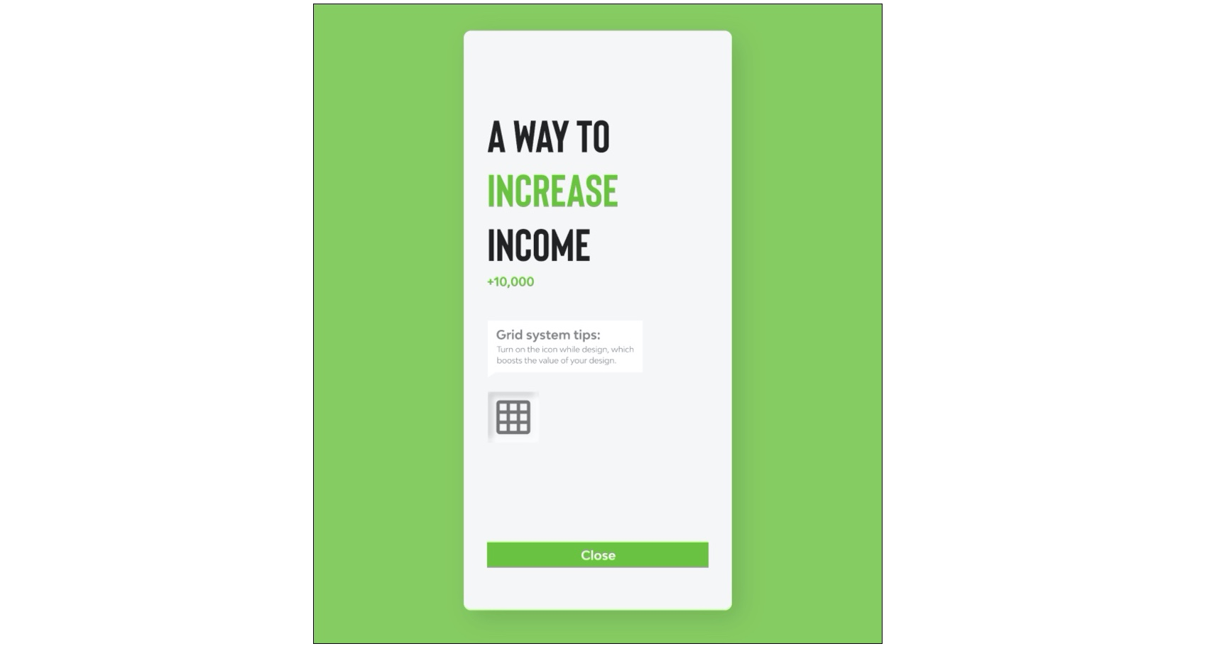
The screen shown above includes a title in large font with a statement about increasing income. Yet, the tooltip refers to a grid system tip icon that supposedly “boosts the value of your design.” At best, there is a tenuous connection between the tooltip and the main theme on this screen, increasing income. The icon and tooltip might be important, but they are in the wrong place in this app.

More broadly, context is a bedrock UX principle and applies to all design elements. For example, an image of a $150,000 sports car on a site or app targeting budget car shoppers would look and feel incongruous because the image would not match the user’s expectations. In short, the image would likely confuse the targeted user group.

Context is particularly important for tooltips because the purpose of a tooltip is to clarify and provide additional information. A misplaced tooltip does the opposite; it causes confusion.

Where To Use Tooltips

Context is also a critical consideration when deciding where to use tooltips. Because tooltips work best when they amplify a well-designed UI, they are particularly effective for:

  • Contextual Help,
  • Brief instructions,
  • New features.

Contextual Help

Contextual help appears when users are in a specific part of the UI. The following example is from Airbnb. Tapping the icon or “3 reviews” text displays a tooltip with an explanation of reviews and a link that takes users to reviews about the individual shown on screen (the author, in this example).

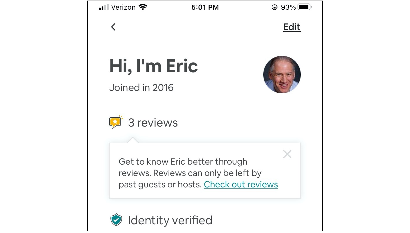
The tooltip shown above is informative because it explains what reviews mean in the Airbnb app and, specifically, in the context of a single profile. In short, contextually specific tooltips appear at the precise moment users need additional information.

Brief Instructions

Instructional tooltips should also appear when users need more information. The difference is that certain aspects of a mobile app might require an explanation at each step to ensure that users can complete the task at hand. For example:

Each tooltip in this part of the IRS app is paired with a specific task such as entering a social security number, date of birth, or street address. Because each tooltip is context-specific, users can easily learn what they need to do during each step and why the IRS needs this information.

New Features

As Sofia Quintero explains in Tooltips: your secret weapon for improving feature discovery, tooltips are an effective way to draw the user’s attention to new features, “To promote and publicize its new GIFs, Twitter displayed a full-screen message to users before gently directing them on how to incorporate GIFs into their tweets using a traditional tooltip.”

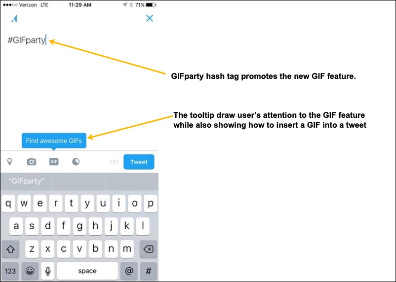
The GIF feature was introduced a few years ago, but it holds up as a useful presentation of a new feature. It’s clear and clean, standing out without dominating the UI. New users will see it while experienced users can proceed without distraction because the tooltip is well-integrated into the UI and does not cover up other screen elements.

Conclusion

Tooltips amplify a mobile UI by providing supplemental information precisely when users need it. Leverage the power of tooltips by considering them when sketching designs and building early prototypes. During implementation, ensure that tooltips will help users by focusing on:

  • Context
    Effective tooltips appear precisely when users need them.
  • Placement
    Tooltips should be prominent and easy to find but should not obstruct important information on the screen.
  • Clarity and brevity
    Review every tooltip in your app to ensure that it makes sense. Edit for brevity.

For tooltips to reinforce a well-designed UI, use them in parts of the UI where they work best such as:

  • Contextual Help,
  • Brief instructions,
  • New features.

Tooltips are a powerful design pattern with a light footprint that enhances mobile designs when used judiciously.

Additional Resources

How to Change the Category Order in WordPress

Do you want to change the category order in WordPress?

By default, when you list categories in WordPress they are displayed in alphabetical order. Some users may want to change that to their own custom category order.

In this article, we’ll show you how to easily change the category order in WordPress.

Changing category order in WordPress

Why Change Category Order in WordPress

By default, when you list categories by using the Categories widget or the block, WordPress will list them in alphabetical order.

Many website owners use categories to organize their blog content. You may want to change the default category order and customize it to your own liking.

For instance, some websites may not want their ‘Announcement’ category to be the first on the list.

If you run a WooCommerce store, then you may want to adjust product category order to display your top-selling product categories on the top.

However, the default category widget or the block does not have any options to change that order.

Luckily, there are WordPress plugins that you can use to change the category order and manually adjust how they are displayed on your website.

That being said, let’s take a look at how to easily change category order in WordPress.

Changing Category Order in WordPress

First thing you need to do is install and activate the Category Order plugin. For more details, see our step by step guide on how to install a WordPress plugin.

Upon activation, simply head over to Posts » Taxonomy Order page to rearrange your WordPress category order.

Taxonomy order page

The plugin will simply list all your categories on that page, and you can manually drag and drop to rearrange category order.

Simply click on a category and move it up or down.

If you are using child categories, then moving the parent category will also move the child categories.

Move categories up and down to rearrange

Don’t forget to click on the ‘Update’ button when you are finished rearranging the category order.

You can now add the ‘Categories’ widget to your WordPress sidebar by visiting Appearance » Widgets page.

Categories widget

After that, you can visit your WordPress blog to see the categories listed in the order you choose.

Reordered categories list

Change Product Category Order in WooCommerce

The plugin also works for WooCommerce product categories. This allows you to choose custom product category order and list your most popular product categories at the top.

Simply visit Products » Taxonomy Order page to rearrange product categories.

Reorder product categories in WooCommerce

The plugin will list all your WooCommerce product categories. You can simply drag and drop to rearrange them in any order.

Don’t forget to click on the ‘Update’ button when you are finished.

You can now add the ‘Product Categories’ widget to your online store’s sidebar by visiting Appearance » Widgets page.

Product categories widget

After that, you can visit your online store website to see your product categories listed in your custom product category order.

Product categories reordered

We hope this article helped you learn how to change category order in WordPress. You may also want to see our ultimate list of must have WordPress plugins for all websites, and our comparison of the best email marketing services to grow your traffic and sales.

If you liked this article, then please subscribe to our YouTube Channel for WordPress video tutorials. You can also find us on Twitter and Facebook.

The post How to Change the Category Order in WordPress appeared first on WPBeginner.

Lazy Loading with a responsive script

I have a script that calls image files through a database. It all works well but the image list is too long and loading is slow.I need to implement lazy loading after the third image. How do I implement this?

 <?php
         $query = mysqli_query($con, "SELECT * FROM image_uploads WHERE filename <> 'no-image.jpg' AND location = 'Masks of Venice' ORDER BY title ASC");
         ?>
      <ul>
      <li>
      <?php
         while ($row = mysqli_fetch_array($query)) {
                                $id                     = $row["id"];
                                $_SESSION['id']         = $id;
                                $file_source            = $row["file_source"];
                                $_SESSION['file_source']= $file_source;
                                $title                  = $row["title"];
                                $_SESSION['title']      = $title;
                                $location               = $row["location"];
                                $_SESSION['location']   = $location;
                                $author              = $row["author"];
                                $_SESSION['author']     = $author;


            echo "<img loading='lazy' src='{$row['file_source']}' alt'...' width='100%' />\n";?></a>

What is ‘Load Average?’

Load average is an age-old metric, which is in existence since the 1970s to indicate whether the system is under heavy/average/low load. It is useful to indicate whether the system’s load is on an increasing trend or a decreasing trend. In this article, let’s learn more about 'Load Average.'

How to Understand 'Load Average?'

In most cases, 'Load Average' is reported as an average of 1 minute, 5 minutes, and 15 minutes. Please refer to the below screenshot:

How to enhance your grocery business with an Instacart clone app?

If you own a grocery business and have plans to take it to the next level, building an Instacart clone app will be the ideal choice. Facilitate your users to purchase groceries online and get it delivered to their doorsteps. To get started, formulate an innovative business plan and approach a professional app development team. Put your ideas together while discussing with them to learn about its feasibility in real world scenarios. Once you set on the Instacart clone script development process, ensure that you get regular updates from your team. However, with so many service providers in the market, entrepreneurs have a tough time in finding the ideal one. Before hiring a development team look for their portfolio and client testimonials to get an idea about their work. Do not make compromises on the quality of your app for hiring your team.