Compression of Tree Folder directory

Hello, I am not a programmer nor I know about programming, so far. I have the following directory tree:

work/documents/Client_01/year 2018/January/PO_0001/
work/documents/Client_01/year 2018/February/PO_0002/
work/documents/Client_01/year 2018/December/PO_0092/
work/documents/Client_02/year 2019/January/PO_0001/
work/documents/Client_02/year 2019/February/PO_0002/
work/documents/Client_01/year 2019/November/PO_0012/
work/documents/Client_01/year 2019/November/PO_0032/
work/documents/Client_99/year 2020/January/PO_0001/
work/documents/Client_99/year 2020/February/PO_0002/
work/documents/Client_99/year 2020/March/PO_0005/
work/documents/Client_99/year 2020/April/PO_0031/

Im interested in the named as months. I want to compress all the content inside the folders that are named January, February, March, etc from of all my client's folders in Windows 10 with Winrar or 7zip. Can you help me?

Navigation Screen Sidelined for WordPress 5.6, Full-Site Editing Edges Closer to Public Beta

The new block-based navigation screen is once again delayed after it was originally slated for WordPress 5.5 and then put on deck for 5.6. Contributors have confirmed that it will not be landing in WordPress core until 2021 at the earliest.

“The Navigation screen is still in experimental state in the Gutenberg plugin, so it hasn’t had any significant real-world use and testing yet,” Editor Tech Lead Isabel Brison said. She made the call to remove it from the 5.6 lineup after the feature missed the deadline for bringing it out of the experimental state. It still requires a substantial amount of development work and accessibility feedback before moving forward.

Contributors will focus instead on making sure the Widgets screen gets out the door for 5.6 and plan to pick up again on Navigation towards the end of November.

WordPress 5.6 lead Josepha Haden gave an update this week on the progress of all the anticipated features, including the planned public beta for full-site editing (FSE).

“I don’t expect FSE to be feature complete by the time WP5.6 is released,” Haden said. “What I expect is that FSE will be functional for simple, routine user flows, which we can start testing and iterating on. That feedback will also help us more confidently design and build our complex user flows.”

Frank Klein, an engineer at Human Made, asked in the comments of another update why full-site editing is being tied to 5.6 progress in the first place, since it will still only be available in the plugin at the time of release.

“The main value is that it provides a good checkpoint along the path of FSE’s development,” Kjell Reigstad said. “Full-site editing is very much in progress. It is still experimental, but the general approach is coming into view, and becoming clearer with every plugin release.”

Reigstad posted an update on what developers can expect regarding block-based theming and the upcoming release, since the topic is closely tied to full-site editing. He emphasized that the infrastructure is already in place and that, despite it still being experimental, future block-based themes should work in a similar way to how they are working now.

“The focus is now shifting towards polishing the user experience: using the site editor to create templates, using the query block, iterating on the post and site blocks, and implementing the Global Styles UI,” Reigstad said.

“The main takeaway is that when 5.6 is released, the full-site editing feature set will look similar to where it is today, with added polish to the UI, and additional features in the Query block.”

Theme authors are entering a new time of uncertainty and transition, but Reigstad reassured the community that themes as we know them today are not on track to be phased out in the immediate future.

“There is currently no plan to deprecate the way themes are built today,” Reigstad said. “Your existing themes will continue to work as they always have for the foreseeable future.” He also encouraged contributors to get involved in an initiative to help theme authors transition to block-based themes. (This project is not targeted for the 5.6 release.)

Developers can follow important FSE project milestones on GitHub, and subscribe to the weekly Gutenberg + Themes updates to track progress on block-based theming. A block-based version of the Twenty Twenty-One theme is in the works and should pick up steam after 5.6 beta 1, expected on October 20.

What is a gRPC API and How Does it Work?

gRPC has become an important technology for implementing distributed software systems that need to run fast on a massive scale. In short, gRPC is an API framework that allows a program in one location on the internet to pass data to a distinct function in another program at another location on the internet for processing.

EditorPlus 1.9 Adds Animation Builder for the Block Editor

Munir Kamal shows no signs of slowing down. He continues to push forward with new features for his EditorPlus plugin, which allows end-users to customize the look of the blocks in their posts and pages. He calls it the “no-code style editor for WordPress.”

The latest addition to his plugin? Animation styles for every core block.

My first thought was that this would bloat the plugin with large amounts of unnecessary CSS and JavaScript for what is essentially a few bells and whistles. However, Kamal pulled it off with minimal custom CSS.

Inspired by features from various website builders, he wanted to bring more and more of those things to the core block editor. The animations feature is just another ticked box on a seemingly never-ending checklist of features. And, so far, it’s all still free.

Since we last covered EditorPlus in June, Kamal has added the ability to insert icons via any rich-text area (e.g., paragraphs, lists, etc.). He has also added shape divider, typography, style copying, and responsive editing options for the core WordPress blocks.

How Do Animations Work?

In the version 1.9 release of EditorPlus, Kamal added “entrance” animations. These types of animations happen when a visitor sees the block for the first time on the screen. For example, users could set the Image block to fade into visibility as a reader views the block.

Currently, the plugin adds seven animations:

  • Fade
  • Slide
  • Bounce
  • Zoom
  • Flip
  • Fold
  • Roll
Using the EditorPlus plugin's animation feature in the block editor.
Adding a Slide animation for the Cover block text.

Each animation has its own subset of options to control how it behaves on the page. The bounce animation, for example, allows users to select the bounce direction. Other options include duration, delay, speed curve, delay, and repeat. There are enough choices to spend an inordinate amount of time tinkering with the output.

One of the best features of this new feature is that Kamal has included an Animation Player under the block options. By clicking the play button, users can view the animation in action without previewing the post.

Watch a quick video of the Animations feature:

After testing and using each animation, everything seemed to work well. The one downside — and this is not limited to animations — is that applying styles on the block level sometimes does not make sense. In many cases, it would help users to have options to style or animate the items within the block, such as the images in the Gallery block. When I broached the subject with Kamal, he was open to the idea of finding a solution to this in the future.

What Is Next for EditorPlus?

At a certain point, too many block options can almost feel like overkill and become unwieldy. EditorPlus does allow users to disable specific features from its settings screen, which can help get rid of some unwanted options. Kamal said he would like to continue making it more modular so that users can use only the features they need.

“What I plan is to have micro-level feature control for this extension so that a user can switch off individual styling panels like, Typography, Background, etc.,” he said. “Even further, I plan to bring these controls based on the user role as well. So an admin can disable these features for the editor, author, etc.”

That may be a bit down the road though. For now, he wants to focus on adding new features that he already has planned.

“I do plan to add more animation features,” said Kamal. “I got too many ideas, such as scroll-controlled animation, hover animation, text animation, Lottie animation, background animation, animated shape dividers, and more. But, having said that, I will be careful adding only those features that don’t affect page performance much.”

Outside of extra styles and animations for existing blocks, he plans to jump on the block-building train in future releases. EditorPlus users could see accordion, toggle, slider, star rating, and other blocks in an upcoming release.

Hello My Friends I am new here

So i need to make a program to my final year of college which will count on the grades and it is obligatory, im doing a program to search for recipes in a access database trough its ingredients, what i mean by this is selecting some ingredients and in a datagrid view present all the possible recipes with those ingredients , i think is a great idea however im having many problmes trying to do it , cant get a a way to save ingredients into the recipes and so on , its being very difficult for me and to make things worse i asked my teacher to help and she said that the applicatuion was too unstable and told me to start over again , the deadline is day 30 of this month and im in danger of loosing my 3 year course because of it , can anyone help?

Do Graph Databases Scale?

Graph Databases are a great solution for many modern use cases: Fraud Detection, Knowledge Graphs, Asset Management, Recommendation Engines, IoT, Permission Management … you name it. 

All such projects benefit from a database technology capable of analyzing highly connected data points and their relations fast – Graph databases are designed for these tasks.

7 Reasons to Use Illustrations on Your Website – And Examples of How to Do It

If you are encountering problems finding photos for your website, there’s a simple solution you might consider. Use illustrations. The examples in this post will show you various ways to go about doing so

Sound reasonable? If you believe that to be true, when you start building your next website you’re going to have to ask yourself this:  

What kind of visual style do you want to use? 

You don’t have to reject photographs out of hand. That’s not the point. Other options are readily available should you want or need to take advantage of them.

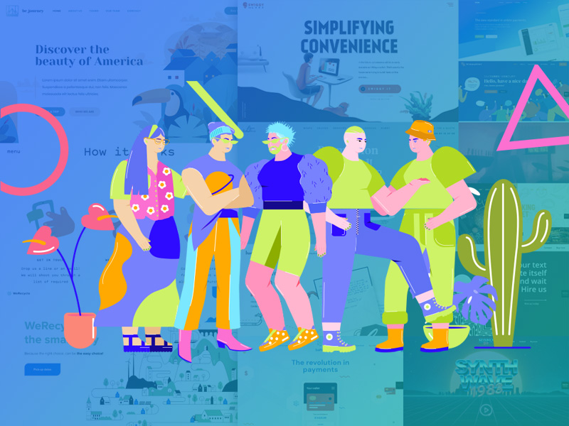
You might choose to take a more abstract, creative, and illustrative approach. That’s one of the approaches we’ve taken when creating our huge selection of pre-built websites for BeTheme; a selection you’ll find to be both informative and inspirational.

Today, we’re going to present a selection of them along with a number of great websites that have creatively used illustrations as we explore seven good reasons to use illustrations to spice up your websites.

  1. When a photograph is unable to fully capture a complicated subject

You may have already discovered that for some brandsit can be terribly difficult if not impossible to find a photo that fully conveys a message as to what that brand is all about or what it does.Taking a photo of you at your keyboard doesn’t necessarily convey the fact that you are a great copywriter (or even a decent typist).

The BeCopywriter 2 pre-built site shows why an illustrative style can be a much better way to tell your story: 

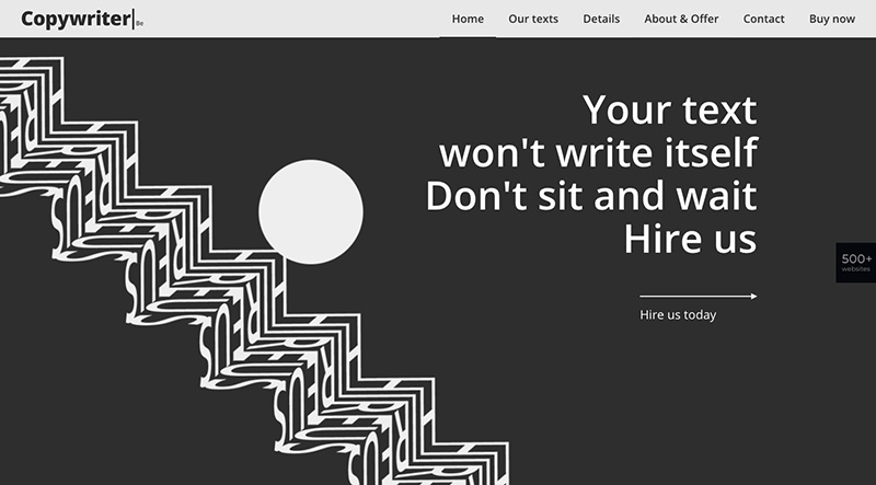
The design is definitely worth a second look while the text conveys a simple, yet powerful, message.

How about looking for a photo that accurately describes what a recycling services company does? Not an easy task.

Check out WeRecycle

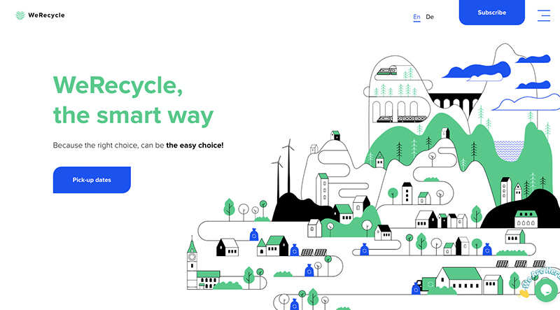
Clean air, clean water, clean neighborhoods thanks to everyone’s use of blue recycle bags or bins. This image gives a website visitor important insight as to what the company does. 

  1. When a brand has a unique look that requires a similarly unique website design approach

When discussing brands, you’re essentially talking about styles and personalities. One of the challenges owners of a given brand often have lies in finding out how to differentiate it from a competing brand that features a similar style.

A brand with a far-out style can be easier to work with, especially for a web designer who enjoys taking on far out design approach. One such a design approach is one that cleverly blends photographs with images, which is how BeTheme’s BeFoodTruck pre-built site handles it: 

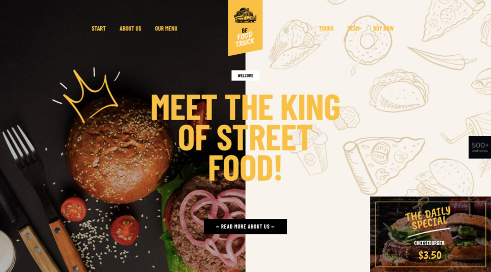
As you might expect, the illustrations used are a unique choice for this type of industry, yet a food industry websitewould have a difficult time engaging customers without real photos of food.

Handwrytten uses a similar balance between real photos and attention-getting illustrations:

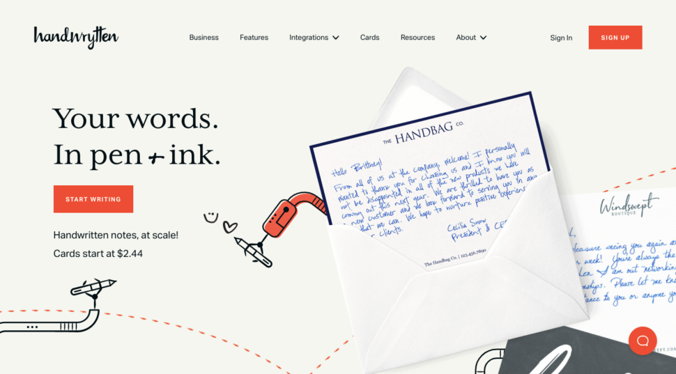
Here, the use of animated illustrations gives the homepage an added twist. It is a good example of a unique concept with a website to match.

  1. When a company wants to stand out by breaking with tradition; in this case, photo-strewn sites

Businesses in a given industry can be expected to have websites that are similar in style to other businesses in that industry. A business selling in-person experiences such as travel and hospitality businesses, rely heavily on photos to get their messages across.

This is to be expected. If you want your website to stand out among the lookalikes in a given industry, the use of illustrations is a good way to do it.

BeJourney 2 is a case in point: 

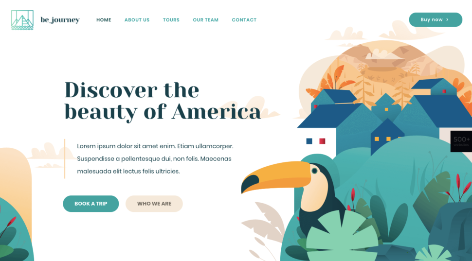
This site isn’tcompletely devoid of photos. There are just enough to tell a story that helps to get the message across.

The Bateau Mon Paris boat rental company’s site takes a comparable approach:

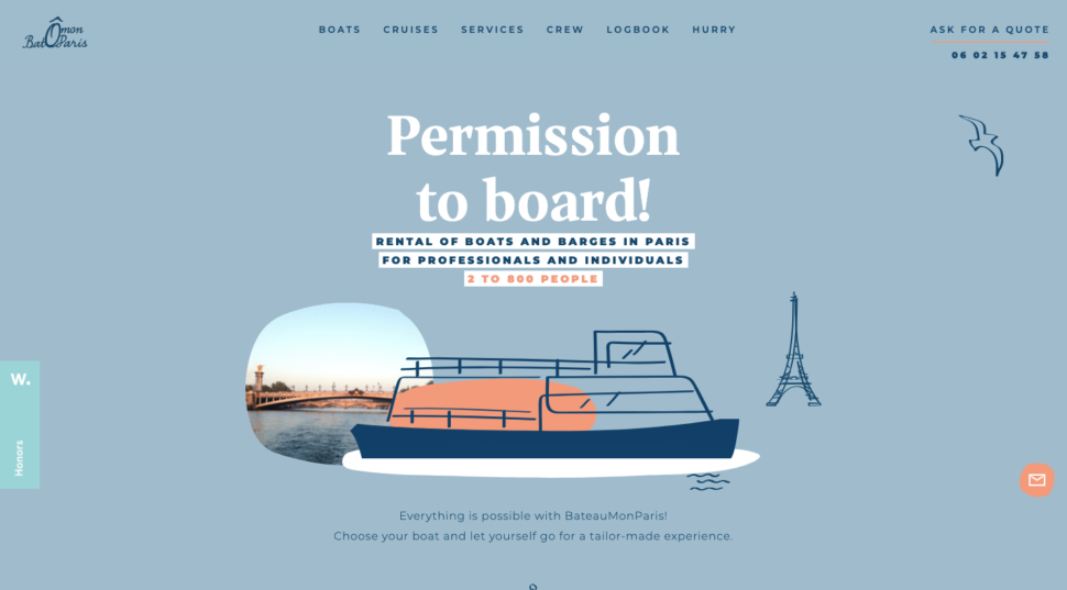
You can plainly see why this website’s main use of illustrations with its peekaboo photo caneasily engage its visitors.

  1. When a new company wants to leverage the style of a brand that consumers already trust

This approach can be somewhat challenging but can also be very effective. If you have a brand-new company your objective would be to create a website style that reminds visitors of a popular established brand.

This approach can help to erase any doubts a visitor may have as to whether your product or service is really up to the task. Stripe’s website style became a standard that many other software companies entering the same space have sought to emulate:

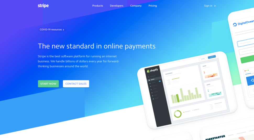
It’s not hard to see why this illustrative style, with its ingenious use of gradients has been copied for years.

Our BePay 2 site also emulates the trust-building Stripe style; with a unique spin.

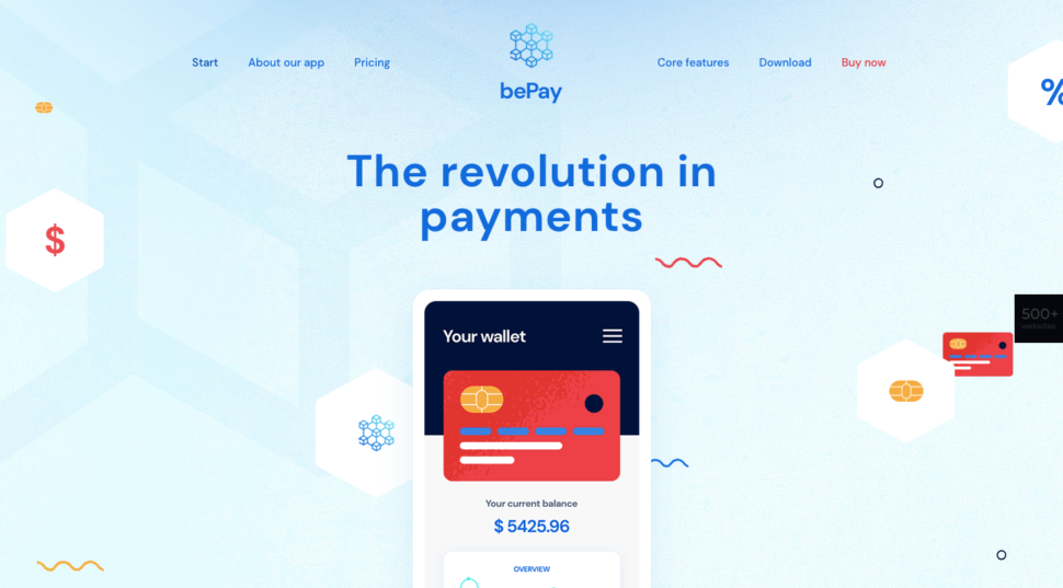
The blue color is symbolic of trust and stability, and the site design makes a good use of illustrations and mobile application images.

  1. When a creator has an interesting story and work worth sharing

Showing photos of themselves or their teams is a practice some web developers and design agencies use to give their sites a personal touch.  While it can be nice to see who you might be working with, it’s even nicer to see what they are capable of doing for you.

Illustrations tend to be much better at showing what a business can do for its clientsand do so in a more exciting way that a photo can do.

The BeBand 5 pre-built siteuses illustrations and animations to give its site a 1980slook: 

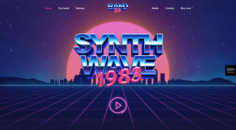
Photos can’t always convey the style of music the band plays. Illustrations on the other hand, can make it relatively easy to do.

Artist Polly Kole took this unique approach to building their illustrative website:

Besides exhibiting a dramatic look, the site is also interactive. It gives the viewer a sense of actually being there and able to examine works of art up close and personal.

  1. When a company is selling a smart app or tool

What a smart app does can’t always be captured in a photo. The experience inside the smart app, tool, or resource is what counts.

This experience typically involves a solution to a problem which can in turn require managing a good amount of data. This is where illustrations tend to shine.

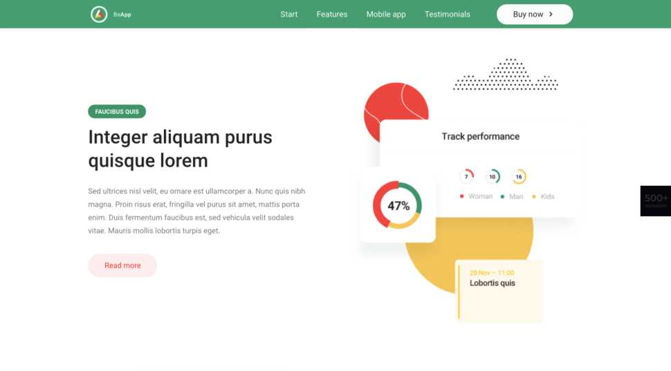
BeApp 6 cleverly uses data visualizations to get its point across:

Swiggy Labs builds products that solve big problems for consumers. Its site uses illustrations rather than a series of screenshots to show how these problems are solved: 

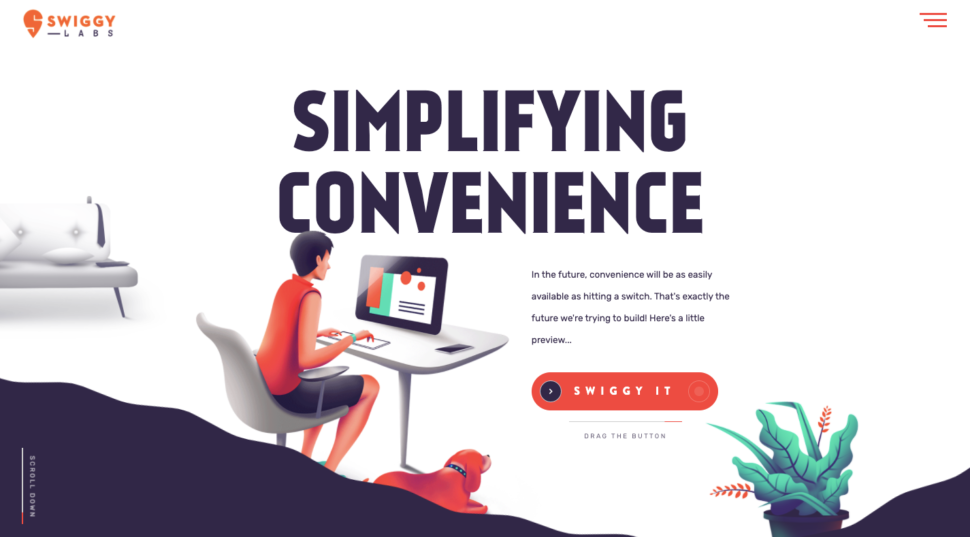
Drag the “Swiggy It” toggle to the right and you’re sure to agree that this is much more than photos or screenshots.

  1. When a brand’s target audience is children or, in many cases, their parents

Employing an illustrative style is a no-brainer since that children love cartoons and games (parents do too for that matter).

Add the fact that illustrations can be used to simplify an otherwise complex subject, like learning a language, and it’s not hard to see why their use can be so effective.

BeLanguage 3 is a language learning website:

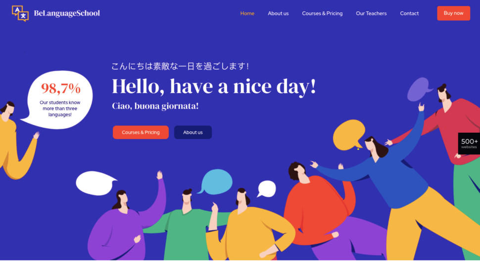
You don’t need to understand Italian or Japanese to understand what this site is all about.

See Make Play is another site that effectively uses illustrations to strengthen its sales pitch is

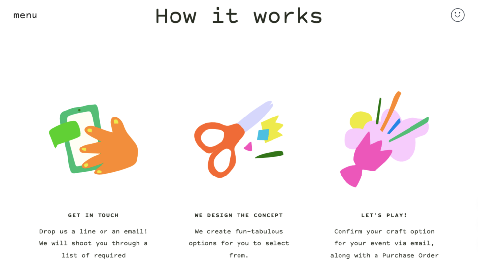
The illustrations on this section of the home page are static images, but animated graphics elsewhere on the page combine to give the site a youthful quality and a lighthearted touch.

Will you use illustrations to style your website?

If you’re finding it’s a real challenge to use photos to tell your brand’s story and are open to considering a little less conventional design style, illustrations might be the right fit.

As you can see in the websites from BeTheme and the other examples given, illustrated websites are relatively common. Still, when you come across one, it tends to have a unique look that can draw you in. 

If you want to make your website really cause a stir and even bring smiles to people’s faces, try experimenting with an illustrated website style.

Admit it. You love cartoons as much as the next person.

Read More at 7 Reasons to Use Illustrations on Your Website – And Examples of How to Do It

Balancing on a pivot with Flexbox

Let me show you a way I recently discovered to center a bunch of elements around what I call the pivot. I promise you that funky HTML is out of the question and you won’t need to know any bleeding-edge CSS to get the job done.

I’m big on word games, so I recently re-imagined the main menu of my website as a nod to crossword puzzles, with my name as the vertical word, and the main sections of my website across the horizontals.

Here’s how the design looks with the names of some colors instead:

And here’s a sample of the HTML that drives this puzzle:

<div class="puzzle">
  <div class="word">
    <span class="letter">i</span>
    <span class="letter">n</span>
    <span class="letter">d</span>
    <span class="letter">i</span>
    <span class="letter pivot">g</span>
    <span class="letter">o</span>
  </div>
  <!-- MORE WORDS -->
</div>

In this example, the letter g is the pivot. See how it’s not at the halfway mark? That’s the beauty of this challenge.

We could apply an offset to each word using hard-coded CSS or inline custom properties and walk away. It certainly gets an award for being the most obvious way to solve the problem, but there’s a downside — in addition to the .pivot class, we’d have to specify an offset for every word. The voice in my head tells me that’s adding unnecessary redundancy, is less flexible, and requires extra baggage we don’t need every time we add or change a word.

Let’s take a step back instead and see how the puzzle looks without any balancing:

Imagine for a moment that we use display: none to hide all of the letters before the pivot; now all we can see are the pivots and everything after them:

With no further changes, our pivots would already be aligned. But we’ve lost the start of our words, and when we reintroduce the hidden parts, each word gets pushed out to the right and everything is out of whack again.

If we were to hide the trailing letters instead, we’d still be left with misaligned pivots:

All of this back-and-forth seems a bit pointless, but it reveals a symmetry to my problem. If we were to use a right-to-left (RTL) reading scheme, we’d have the opposite problem — we’d be able to solve the right side but the left would be all wrong.

Wouldn’t it be great if there was a way to have both sides line up at the same time?

As a matter of fact, there is.

Given we already have half a solution, let’s borrow a concept from algorithmics called divide and conquer. The general idea is that we can break a problem down into parts, and that by finding a solution for the parts, we’ll find a solution for the whole.

In that case, let’s break our problem down into the positioning of two parts. First is the “head” or everything before the pivot.

Next is the “tail” which is the pivot plus everything after it.

The flex display type will help us here; if you’re not familiar with it, flex is a framework for positioning elements in one-dimension. The trick here is to take advantage of the left and right ends of our container to enforce alignment. To make it work, we’ll swap the head and tail parts by using a smaller order  property value on the tail than the head. The order property is used by flex to determine the sequence of elements in a flexible layout. Smaller numbers are placed earlier in the flow.

To distinguish the head and tail elements without any extra HTML, we can apply styles to the head part to all of the letters, after which we’ll make use of the cascading nature of CSS to override the pivot and everything after it using the subsequent-sibling selector .pivot ~ .letter.

Here’s how things look now:

Okay, so now the head is sitting flush up against the end of the tail. Hang on, don’t go kicking up a stink about it! We can fix this by applying margin: auto to the right of the last element in the tail. That just so happens to also be the last letter in the word which is not sitting somewhere in the middle. The addition of an auto margin serves to push the head away from the tail and all the way over to the right-hand side of our container.

Now we have something that looks like this:

The only thing left is stitch our pieces back together in the right order. This is easy enough to do if we apply position: relative to all of our letters and then chuck a left: 50% on the tail and a right: 50% on our head items.

Here’s a generalized version of the code we just used. As you can see, it’s just 15 lines of simple CSS:

.container {
  display: flex;
}
.item:last-child {
  margin-right: auto;
}
.item {
  order: 2;
  position: relative;
  right: 50%;
}
.pivot, .pivot ~ .item {
  order: 1;
  left: 50%;
}

It’s also feasible to use this approach for vertical layouts by setting the flex-direction to a column value. It should also be said that the same can be achieved by sticking the head and tail elements in their own wrappers — but that would require more markup and verbose CSS while being a lot less flexible. What if, for example, our back-end is already generating an unwrapped list of elements with dynamically generated classes?

Quite serendipitously, this solution also plays well with screen readers. Although we’re ordering the two sections backwards, we’re then shifting them back into place via relative positioning, so the final ordering of elements matches our markup, albeit nicely centered.

Screen readers preserve the element ordering as per the original markup.

Here’s the final example on CodePen:

Conclusion

Developers are better at balancing than acrobats. Don’t believe me? Think about it: many of the common challenges we face require finding a sweet spot between competing requirements ranging from performance and readability, to style and function, and even scalability and simplicity. A balancing act, no doubt.

But the point at which we find balance isn’t always midway between one thing and another. Balance is often found at some inexplicable point in between; or, as we’ve just seen, around an arbitrary HTML element.

So there you have it! Go and tell your friends that you’re the greatest acrobat around.


The post Balancing on a pivot with Flexbox appeared first on CSS-Tricks.

You can support CSS-Tricks by being an MVP Supporter.

Collective #626


Why Tailwind CSS

Shawn Wang shares why he changed his mind on Tailwind CSS, and why he now considers it the “Goldilocks Styling Solution”.

Read it


Clamp

Trys Mudford dives into one of CSS’s exciting new features for fluid scaling, clamp() for Utopia.

Read it


The post Collective #626 appeared first on Codrops.

Maximize Your Google Cloud Investment With Redis Enterprise

Google Cloud is used by many of the world’s top organizations, and provides an array of top-shelf solutions from developer tools to databases. Among these resources is Redis Enterprise Cloud, a robust in-memory data platform built by the same group that developed open source Redis.

Join Google Customer Engineer Matt Cowger and Redis Labs Senior Solution Architect Jake Angerman as they discuss how technology teams employ Redis Enterprise Cloud on Google Cloud to maximize the value of the cloud.

Scaling for Extreme Growth? The Data Layer is Ground Zero! [On-demand Webinar]

To make good decisions you need good data.  Currently 2.5 quintillion bytes of data are created each day, and the amount of data will continue to increase exponentially as the digital economy matures. But it’s not enough to have data — it needs to be data that you can get and process in real-time that is most valuable for today’s digital apps and services. IDC's “Data Age 2025” whitepaper, predicts that nearly 30% of the global datasphere will be real-time by 2025.

The challenge, irrespective of how big or small your company might be, is scale. Scaling for extreme growth — moving from tens-to-hundreds of terabytes to petabytes is both an art and science. 

6 contrarian things our Dev Lead does when updating execs

We are not purists at LinearB. Certainly not when it comes to "methodologies" like Agile or Scrum. We're not bothered with how things are "supposed" to be done. All of those rules are just dogma to us and we don't care.

We believe in lean engineering and we buy-in to a lot of ideas from the Agile Manifesto. But some Agile principles are outdated. Like "The most efficient and effective method of conveying information to and within a development team is face-to-face conversation." Not for us. We embrace asynchronous as the default form of communication within our dev team.

How to Operate Less and Innovate More Using Observability and AI

From software engineers to CEOs, everyone wants more time to think strategically instead of tactically executing tasks. While checking those tasks off your to-do list is important, and usually essential, are they the best use of your time? Humans prefer to do rather than to think, but those million-dollar ideas come from thinking. How can we fit more time into our day to make that happen? Unfortunately, we can’t. Time is finite, and we only have 24 hours in a day. But, what we can do is take some of those tasks off our plate. And I’m not talking about through a hiring spree, but rather investing in technology that can do the work for us. 

 This is especially true for DevOps practitioners and SRE teams who face enormous amounts of data and customer-facing issues. Today’s business leaders are pushing for their teams to spend more time innovating and less time fixing issues, yet some leaders haven’t invested in the technology to empower their teams to do so. By bringing AI-driven observability to DevOps, these issues can be addressed proactively through automation. As a result, teams can save hundreds of hours of work per year, empowering them to innovate more, operate less, and unlock their true potential. Let’s look at a few ways DevOps pros and SRE teams can leverage observability and AI to operate less and innovate more.

Payments Architecture – Fraud Detection Example

Cloud technology is changing the way payment services are architectured. In this series we will be presenting insight from our customers on adopting open source and cloud technology to modernize their payment service.So far we've presented research-based architectural blueprints of omnichannel customer experience, integrating with SaaS applications, and cloud-native development solutions.  

In the previous article in this series we walked through the anti-money laundering physical architecture.