The Top Three Skills Every Successful Project Manager Needs to Focus On

Project management is a complex field in software development. Sometimes you, as a project manager, feel like they are responsible for everything. Since your performance directly affects the success rate of the entire project. Project managers not only manage tasks but, most importantly, thoroughly guide the team toward the project goals. Being a great project manager requires interdisciplinary approaches and the ability to master both hard and soft skills. Let’s have a closer look at three essential competencies for the project manager to be successful. 

Technical Skills

Even though you don’t need extensive technical knowledge, having at least some competencies is a must. It will allow you to effectively interact with your team and contribute ideas to technical and business-related discussions, ask the right questions, and provide adequate answers. Most importantly, technical skills help project managers to evaluate the feasibility of the desired feature to a specific product and design a strategy for its future implementation.

Diving Into The Stock Market With Marketstack

The global stock market is something that I think most of us are familiar with, but very few people know how to capitalize on. After all, it’s not as easy as simply sinking money into a stock and hoping it rises. 

With the global stock market, there are trends and data that you have to follow in order to really be efficient. That’s where Marketstack comes into play. 

What is Marketstack?

Marketstack is a real-time, intraday and historical market data API. It uses a free and easy-to-use REST API interface that delivers worldwide stock market data in JSON format.

marketstack

By using Marketstack, you can follow trends and get real-time updates on the worldwide stock market. Let’s dive into this a little deeper.

Marketstack features

Marketstack makes it easy for anyone with any skill set to get started. In fact, with 30,000+ happy users, including some big name brands like Uber and Amazon, it’s no wonder Marketstack has the reputation of being so good. 

In addition to being so user-friendly, Marketstack comes with a few helpful features. Here’s what you can expect:

Real-time data

With the global market, every minute counts. Obtain real-time stock data for any ticker down to the minute, request intraday quotes or search 30+ years of accurate historical market data.

125,000+ stock tickers

Easily integrate the API and make use of 125,000+ worldwide stock tickers, collected from 72 global exchanges, including Nasdaq, NYSE, and more.

marketstack

Simple, quick, and reliable

Marketstack is a simple yet powerful API that is both scalable and reliable. With an uptime of nearly 100%, it only takes about 5 minutes to get started. 

Lightweight JSON API

Mafrketstack’s stock market data API has been built with simplicity in mind: Requests are made using a simple HTTP GET structure and API response data is delivered in lightweight JSON format.

marketstack

Bank-level security

All data sent to and from the Marketstack API is encrypted with industry standard 256-bit HTTPS encryption. Rest assured that anything you share through this API is safe and for your eyes only. 

Extensive documentation

A straightforward API documentation will help you get up and running within minutes using interactive demo requests and code examples in a variety of programming languages. If you’d like to explore API documentation, click here.

Marketstack pricing

Marketstack offers many subscription plans that cover a wide variety of needs. Best of all, they offer a free subscription to get started, and it comes with its fair share of options:

  • Up to 1,000 requests per month
  • Connect with 72 stock exchanges around the globe
  • Look back at the stock market history for up to 1 whole year
  • Gather end-of-data stock data every single day

Of course, if the free plan doesn’t suit your needs, there are still lots of good, paid subscriptions out there for you to take advantage of:

marketstack

Conclusions

Marketstack is one of the most comprehensive yet powerful tools on the market. It is by far the most powerful tool for keeping track of the worldwide stock market that anyone can get their hands on.

With Marketstack, you can rest assured that the information gathered is 100% accurate and up-to-date. Stock market data provided by the marketstack API is licensed and sourced from multiple high-authority market data providers around the world. Stock market data from United States exchanges is licensed and sourced from Tiingo, Inc. out of New York City, USA.

The Marketstack API service is built on top of apilayer cloud infrastructure and therefore comes with a significant level of scalability and performance. The API currently handles several million API requests per hour with ease.

All-in-all, if you’re looking for a high-volume stock market API, there’s no better choice you can make than signing up for Marketstack. 

Read More at Diving Into The Stock Market With Marketstack

Guide to Successful Thank You Email Newsletters, Examples and Best Practices

This post is originally published on Designmodo: Guide to Successful Thank You Email Newsletters, Examples and Best Practices

Guide to Successful Thank You Email Newsletter Examples and Best Practices

A little appreciation goes a long way. Showing customers how much they mean to you is an excellent way to build strong, healthy relationships. In the email marketing world, there is a unique tool for this: the Thank You email …

For more information please contact Designmodo

How to Install WordPress in a Subdirectory (Step by Step)

Do you want to install WordPress in a subdirectory? Installing WordPress in a subdirectory allows you to run multiple WordPress instances under the same domain or even a subdomain name. In this article, we will show you how to install WordPress in a subdirectory without affecting the parent domain name.

Installing WordPress in a subdirectory

Subdomain vs Subdirectory? Which One is Better for SEO?

Normally, you would want to start a WordPress website on its own domain name (for example, wpbeginner.com). However, sometimes you may want to create additional websites on the same domain name.

This can be done by either installing WordPress in a subdomain (http://newebsite.example.com) or as a subdirectory (http://example.com/newwebsite/).

One question that we get asked is which one is better for SEO?

Search engines treat subdomains differently from root domain names and assign them rankings as a separate website.

For instance, search Engines consider WPBeginner and our WPBeginner Videos website as two separate websites.

On the other hand, sub-directories directly benefit from the domain authority of the root domain thus ranking higher in most cases.

One way to create separate WordPress sites in both subdomain or subdirectory is by installing WordPress multisite network.

However, if you want to keep two websites managed separately, then you can install different instances of WordPress. You can also use WordPress site management tools to set up a single dashboard for managing your multiple WordPress installations.

Requirements for Installing WordPress in Subdirectory

There are no special requirements to install WordPress in a subdirectory. If you already have a WordPress website in the root domain name, then you are good to go.

All top WordPress hosting companies make it very easy to install multiple WordPress websites using the same hosting account.

For instance, if you are using Bluehost, you can add a new WordPress website from your hosting dashboard.

Adding new websites in Bluehost

However, please keep in mind that most shared hosting accounts have limited server resources. A sudden traffic spike on one of your websites will affect the performance and speed of all other websites on the same account.

If you are just starting out, then you can do that on shared hosting. Keeping in mind that you’ll need to upgrade to a managed WordPress hosting as your business grows.

That being said, let’s take a look at how to easily install WordPress in a subdirectory.

Step 1. Create a Subdirectory under The Root Domain Name

First, you need to create a subdirectory or a folder under the main website. This is where you will install WordPress files.

Connect to your WordPress hosting account using a FTP client or File Manager in cPanel.

Once connected, go to the root folder of your website. Usually it is the /public_html/ folder. If you already have WordPress installed in the root folder, then you will see your WordPress files and folders there.

Next, you need to right click and select ‘Create new directory’ from the menu.

Create subdirectory

You need to be careful when choosing the name for your subdirectory. This will be part of your new WordPress site’s URL and what your users will type in their browsers to reach this website.

For example, if you name this directory travel-guides then your WordPress website’s address will be:

http://example.com/travel-guides/

New subdirectory created

Step 2. Upload WordPress Files

Your newly created subdirectory is empty at the moment. Let’s change that by uploading WordPress files.

First you need to visit WordPress.org website and click on the download button.

Download WordPress
Your browser will now download the zip file containing the latest WordPress software to your computer.

After downloading the file, you need to select and extract it. Mac users can double click the file to extract it and Windows users need to right-click and then select ‘Extract All’.

After extracting the zip file, you will see ‘wordpress’ folder containing all the WordPress files.

Now let’s upload these files to your new subdirectory.

Connect to your website using an FTP client and go to the subdirectory you created in the first step.

In the local files panel of your FTP client, go to the ‘wordpress’ folder you just extracted.

Select all files inside the folder and then upload them to your new subdirectory.

Upload WordPress files to the subdirectory

Step 3. Create New Database

WordPress stores all your content in a database. You need to create a new database to use with your new WordPress site installed in a subdirectory.

First, you need to login to the cPanel dashboard of your WordPress hosting account. Click on ‘MySQL Databases’ under the databases section.

Creating a MySQL database

Note: Your hosting dashboard may look different than the screenshot above. You simply need to locate the ‘Databases’ section.

On the next screen, enter a name for your new database and then click on the ‘Create Database’ button to continue.

Create a new database

Your cPanel dashboard will now create the new MySQL database. Click on the Go Back button to return to the Databases page.

Next, you need to add a username and password for the database.

Simply scroll down to the ‘MySQL Users’ section and provide a new username and password. Click on ‘Create User’ button to continue.

Create database user and password

Next, you need to give this newly created user privileges to work on the database you created earlier.

Scroll down to ‘Add user to database’ section. Select your MySQL username and then select your newly created database.

Add user to database

Click on the Add button to continue.

Cpanel will now grant the MySQL user full privileges on your newly created database.

Step 4. Install WordPress

Now that everything is in place, you can go ahead and install WordPress. Simply visit the directory you created earlier in a web browser by typing the URL like this:

http://example.com/your-subdirectory-name/

This will bring up the WordPress installation wizard. First, you need to select the language for your WordPress website and click on the continue button.

Select language

Next, you will be asked to provide your WordPress database name, database username, password, and host. Enter the database details and click on the submit button.

Provide your database details

WordPress will now connect to your database and you will see a success message like this:

WordPress database connected

Click on ‘Run the install’ button to continue.

On the next screen, you will be asked to provide a title for your website and choose an admin username, password, and email address.

WordPress website details

After entering your website details, click on ‘Run install’ button to continue.

WordPress will now set up your website and will show you a success message:

WordPress successfully installed in the subdirectory

You can now go ahead and login to your new WordPress website installed in the subdirectory.

Step 5. Fix Permalinks

If you have a separate WordPress install in the root directory, then the .htaccess files of your subdirectory will cause conflict. This will result in 404 errors on your website.

To solve this, you need to edit the .htaccess file in your subdirectory WordPress install. Replace the code inside your .htaccess file with the following code:


# BEGIN WordPress
<IfModule mod_rewrite.c>
RewriteEngine On
RewriteBase /your-subdirectory/
RewriteRule ^index.php$ - [L]
RewriteCond %{REQUEST_FILENAME} !-f
RewriteCond %{REQUEST_FILENAME} !-d
RewriteRule . /your-subdirectory/index.php [L]
</IfModule>

# END WordPress

Don’t forget to replace /your-subdirectory/ with your own subdirectory name.

We hope this article helped you install WordPress in a subdirectory. You may also want to see our ultimate step by step WordPress SEO guide for beginners.

If you liked this article, then please subscribe to our YouTube Channel for WordPress video tutorials. You can also find us on Twitter and Facebook.

The post How to Install WordPress in a Subdirectory (Step by Step) appeared first on WPBeginner.

Need help with Javascript Topics?

Heya, have been in the lookout for some good Javascript resources.

So far have been practicing from Interviewbit, Edureka and those freely available sources on the net.

It would be great if ya'll could share few important topics that are most likely to be asked in the interviews as well as topics that are crucial to work on projects in companies.

Thanks in advance.

Everything Developers Need To Know About Figma

If you aren’t using it yet the name Figma is surely a name that you’ve heard more and more over the last few years.

Figma is a relatively new design tool that is browser-based. This means you don’t need to install it locally or buy expensive licenses to give team members access to design files. This has made design more accessible than ever and that’s why many developers now find themselves needing to learn how to work with design tools.

Since many developers don’t have a lot of experience playing around in design tools we’ll cover all the basics developers need to know about so you can confidently navigate around Figma and extract any information you might need when working with the designs sent to you by a designer.

I’ll also cover some specific Figma features that make it easier for developers such as providing CSS information about elements used within the design.

A Quick Note About Shortcuts

Most shortcuts are written for both Windows and Mac, where the Ctrl key on Windows corresponds to the Cmd key on the Mac, and Alt is used for both Alt (Windows) and Option/Alt (Mac).

For example, Ctrl/Cmd + Alt + C is Ctrl + Alt + C on Windows and Cmd + Alt/Option + C on the Mac.

Developer Handoff

To understand the hype around Figma and why you suddenly find yourself needing to learn how design tools work as a developer, it’s helpful to look back on the developer handoff process before Figma was around as it has changed significantly.

Design teams used to send an email to the development team with dozens of attachments containing static images of the design, exported assets, and even word documents with the page copy. Developers usually didn’t have access to the full design files as licenses for design software were expensive and not strictly necessary. Communication and feedback were scattered across email, project management tools, and meeting notes. Everyone was struggling with keeping track of changes to the design; every time the design was updated, it needed to be sent to everyone involved — yet again.

As design tools modernized, this process got more streamlined. Designers would often use separate tools like Zeplin or Invision to handoff the designs to developers. Developers now had better access to the designs and had more tools available to extract information about typography, colors, and measurements. Although it was easier to find the latest version of a design for everyone, designers needed to work in separate tools and keep them in sync. A big improvement but still not perfect.

Figma is a design tool that is rapidly gaining in popularity and shakes up the design handoff process once again. Figma is browser-based so everyone can use it regardless of their operating system and without installing anything. It’s also completely cloud-based so everyone is always looking at the latest version of the design and has built-in collaboration tools making collaborating and communicating easier than ever.

If you want to follow along with this article (or just play around with Figma), I’ll be using this file to explain everything in this tutorial:

The Basics

When you are added as a collaborator on a Figma design you can choose to open it in the browser or you can download the desktop app (available on Windows and macOS). The desktop app is not a native app but a cross-platform electron app like Slack and Visual Studio Code. The functionality of the browser and desktop versions is largely the same. The desktop app does have built-in support for using local fonts whereas the browser version requires installing the Figma Font Helper before you can use local fonts.

Figma’s interface is split into three major parts. In the middle, you’ll find a big canvas where all the designs are located. On the left side, there is a sidebar that contains the layers, assets, and pages of a file. The right toolbar contains all information about elements in the file.

A file can have multiple pages and every page has one canvas. Designers often use pages to separate and organize different parts of the file with separate pages for the design system, icons, or other file assets.

When opening up a new file for the first time, make sure to familiarize yourself with the different pages within the file. If the designer you are working with has made a separate page for all colors, typography, and icons it can save you time while building out the design.

Navigating Figma

Before we get to the good stuff, it’s important that you can quickly navigate around in Figma so you can work more efficiently.

When you open a file you’ll start on the largest zoom level that fits all the frames in the visible area.

  • You can zoom in or out by holding Cmd ⌘ and scrolling up/down or by pressing the + and - keys.
  • If you want to scroll horizontally on the canvas you hold the spacebar and drag with your mouse.
  • You can zoom in quickly on a single frame or element by selecting it and pressing Shift + 2.
  • Quickly return to where all elements fit in the canvas by pressing Shift + 1.

Don’t worry too much about remembering these shortcuts for now, just know that they are available and you can always view these and other available shortcuts by pressing Cmd + Shift + ?.

Once you have used a shortcut it will be colored blue so you can easily see which ones you still need to learn.

Project Styles

When you’re opening a brand new project it’s helpful to set up all the basic styles first. Figma displays all the project styles in the right sidebar. Here you can easily find all the typography, colors, grids, and other styles used in the design.

Note that the project styles will only display if no element is selected. If you want to cancel your selection and view the project styles, simply click somewhere in the canvas or use the Esc key.

You can use this information to set up your layout, variables, and fonts in CSS. Simply click on the edit icon next to the style element to view all information about that style.

If you double click an element, it will select one nesting level lower every time you double click. This is a great way to drill down into an element until you get to the desired selection.

There are many more ways to select and navigate layers, this article just covers the basics that are used 80% of the time. Figma’s documentation teaches more ways to select and navigate layers.

Once you select an element, you can click the Code tab in the right sidebar to display all the CSS information about that element.

It’s important to note that the CSS is automatically generated and is not perfect, especially for positioning elements. Don’t copy all CSS 1-to-1 to your project but instead use it as a guide and a quick way to get information about elements.

Dimensions And Measuring

Whenever you want to measure spaces between elements, correctly position elements, or even set the right margin or padding, all you need to do is select the element that you want to measure from, then hold the Alt and hover your mouse over the element you’d like to measure the distance to.

Depending on what type of file you are exporting there will be different export settings you can tweak. Images only have a scale multiplier and you can choose the file type (PNG, JPG, SVG or PDF). Figma will use the name of the layer as the file name but you can add a file name suffix. You can then export the selected element using the export button.

Quick tip: You can also quickly export an asset by right-clicking it, hovering on Copy/paste and copying the image or SVG code. This is useful if you don’t need to have custom export settings and just need a quick copy of a single element.

Export all Assets

You can export each individual asset by selecting it and clicking the export button but you can also export all assets that are exportable at once.

If you want to export all the assets from the design in one go you can go to the main menu, and click Export.. under the File menu. You can also use the keyboard shortcut Shift + Cmd + E on MacOS or Shift + Ctrl + E on Windows.

This will display a list of all the items in the file that are marked for export. You can then inspect the dimensions, file type and exclude any files before making the final export. If you hover over the thumbnail of the assets it will display the file name that the asset will have when it’s exported.

If you need to make adjustments, clicking on the thumbnail of an asset will select that element in the canvas where you can easily adjust the export settings.

If you have a lot of exportable assets in a single file, you can use a slash “/” in your layer name to mark it as a group of assets. Figma will then automatically create a folder for that group and export the assets within that group to the subfolder.

User Flow And Animations

Figma also supports a variety of animations for transition between states or pages, for opening modals or menus, for dragging and swiping actions on mobile and much more. You can preview these animations by clicking the play icon in the top right to open Presentation view.

To view the information about an animation, select the Prototype tab in the right sidebar and you’ll see the user flow displayed in blue arrows in the canvas.

Clicking on the arrow shows you all the information about that specific animation. Each animation consists of a trigger, an action, and a transition.

This simple animation opens a hamburger menu. You can see that the hamburger icon has an On Tap trigger, once it is triggered it will Navigate To the screen where the mobile menu is in an opened state. The transition type is a Smart Animate transition which means Figma automatically interpolates between these two states. It does this using an Ease Out animation function with a duration of 300ms.

This information is necessary to exactly replicate the animations in CSS but unlike all other element information, animations can not be found in the Code tab!

Communication

If anything isn’t clear and you’d like to ask someone else on the project for clarification. All you have to do is click on the chat bubble icon in the top toolbar or hit the C key to switch to the Comment tool.

You can now click anywhere in the design and start typing a comment or question about that element. Once you’ve finished writing your comment, you can use the V key to return to the normal cursor.

Note that not everyone will automatically receive a notification that you left a comment. If you want to be sure someone sees your comment you should mention them using the @ symbol just like on Slack or Twitter.

Every comment is visible to everyone who has access to the design as there are no private comments/chats. Once the issue has been resolved it can be marked as such and the comment will gray out.

Conclusion

We’ve covered a lot of ground so far in Figma and you should be able to navigate around and extract all the information you need from any Figma design file sent your way. Getting information about typography and colors, measuring margins, padding and position of elements, exporting assets and collaborating with other team members.

If you want to learn more about the tool, Figma’s documentation is a great place to start or search when you want to learn more about a specific feature.

PriceAdvantage Launches API for Fuel Pricing Services

PriceAdvantage, a company that provides fuel price analytic services, has announced a new API that will allow fuel retailers to streamline integration with the platform. The company is hoping that the API will simplify the process of importing and exporting pricing data. 

Markdown strict mode

Just a little notification that our markdown parser is now in strict mode. That means that, when posting headings, there has to be a space after the initial hash symbol. In other words:

#This won't work

# This will work

Hopefully it will stop everyone who doesn't properly indent their code having #include<iostream> stop showing up as

include<iostream>

Jetpack 8.9 Adds Donations Block, Newsletter Form, and Social Previews

Jeremey Herve, a Jetpack developer at Automattic, announced the release of Jetpack 8.9 earlier today. The update brings several major features to the plugin’s users. Jetpack now sports a new social preview option in the block editor, a newsletter signup form type, and a block for handling donations.

Version 8.9 also adds support for the AMP plugin. Herve noted that Google and Automattic have worked together over the past six months to make this integration happen. He also announced that the team would release an in-depth post on the Jetpack blog on how end-users can use the tools available.

Overall, the update seems to be a solid release. I have not run into any issues with the features I make use of thus far.

Social Network Preview for Posts

Social Previews modal from the Jetpack plugin.
Social Previews popup modal.

The latest version of the plugin adds a new Social Previews tab under the Jetpack sidebar panel in the block editor. It lists a few social icons and a preview button. Clicking the button pops up a modal window that allows users to preview what their post will look like in various places.

Currently, only Google Search, Facebook, and Twitter previews are integrated. However, the announcement post noted that LinkedIn previews are in the works.

Social Previews is not a particularly groundbreaking feature. However, it is a nice value-add for Jetpack users and almost a given in today’s climate that is led by social networking sites. The feature is similar to what some SEO plugins, such as Yoast SEO Premium, offer.

Newsletter Sign-up Form

Jetpack 8.9 introduces a Newsletter Sign-up form type via its Form block. When creating a new form, users will see the new option. It works as you might expect, adding a name and email field along with a message that the visitor is granting permission to send emails.

It might not be immediately apparent for some users is that they will need to install and activate the third-party Creative Mail plugin for newsletters to work. Jetpack’s Newsletter Sign-up merely handles the form. The newsletter aspect requires an account through the Creativ.eMail website. The free plan allows up to 5,000 emails per month, but you will need to upgrade to a paid tier after that, which will cost at least $4.95 each month.

If this sounds a bit convoluted, it’s because it is. Without reading the docs or opening the Newsletter Integration tab in the block options, some users may be wondering how this feature works.

The integration itself works fluidly. Users can install and activate the plugin directly from the block editor. However, they will need to run through the setup and signup steps to begin using email campaigns, such as a newsletter.

Donations Block

Jetpack's Donations block in the post editor.
Donations block and options.

Requiring yet another third-party service is Jetpack’s new Donations block. Users will need to be on a paid Jetpack plan to use the block, which allows them to integrate their Stripe account for collecting payments.

The Donations block is a simple affair. With a paid account in place, it is pretty much a plug-and-play system. The block options should be straightforward for the average end-user.

At this point, the Donations block and system may be too limited for some campaigns. This feature seems to more squarely target users who are looking to accept basic donations without all the features that a more mature donation plugin would provide. For anything beyond accepting a few small donations each year, I would lean toward the GiveWP plugin. Its team is hyper-focused on making a great donation experience that scales to larger campaigns.

For users who are already using Jetpack and want to start small, it wouldn’t hurt to give this block a spin. It is always possible to move up to a dedicated donation plugin down the road.

10 Digital Marketing WordPress Plugins for Success

Digital Marketing WordPress Plugins for SuccessDigital marketing has become invaluable and unavoidable for marketers. A rising number of people are looking for digital marketing tools. Since WordPress powers about half a billion websites, a considerable percentage of these people are marketers like you. The Google Trends data below would give you an idea about its demand. In this article, I will […]

The post 10 Digital Marketing WordPress Plugins for Success appeared first on WPExplorer.

API Businesses Don't Deserve to Exist Unless They Aggregate

Growing up, I studied piano. By high school, I was bored with reciting Scott Joplin and the Casio synthesizer I had access to didn’t pull my heartstrings. But then it happened....I remember the first time I played the organ in a church. After configuring the interface (known as stops on an organ), I pressed three keys which encoded my press into an electrical signal which was sent to the other end of the cathedral to some actuators that controlled airflow to these giant pipes and WOW.
 

How to use Hindi and English both in same time

am using a plugin name - pafe - https://pafe.piotnet.com/ which generates a pdf when someone fills a form. and this plugin use fpdf asset. http://www.fpdf.org/en/script/script92.php

but currently, it is not supported Hindi font. right now Hindi not work. how can I use Hindi in the current plugin? plugin author does not take this thing seriously. please help to support Hindi font

please check complete pdf asset link of the plugin - PDF assest

I have a purchase copy of plugin but for author Hindi is not necessary to add support.

Current output link - https://drive.google.com/file/d/1jOVoKn-_T1r1rjBdqiE__90VtdHhTM-M/view?usp=drivesdk

Communication to Windows COM Object

I neet to build an vb.net app to comunicate to specific Windows app COM object by sending the XML request and then collect the XML response but I have no idea how to do it. Can anyone guide me how to do it?
Here is the COM spec:

IPixPosTrans is a Windows COM interface that can be used with most single and multithreading Windows application development environments and languages. It does not have any initialization or finalization routines.

Interface: IPixPosTrans
Flags: (4416) Dual OleAutomation Dispatchable
GUID: A1AED31D-876C-4AA3-AF60-3560062660DF
IPixPosTrans = interface(IDispatch)
['{A1AED31D-876C-4AA3-AF60-3560062660DF}']
function ProcessRequest(const Request: WideString): WideString; safecall;
end;

Note: The ProcessRequest function has a "dispid = 201".
Also note: Multi-threaded and multi-process calls are possible, but they will be internally serialized.

Winsock Interface
Winsock Secure Server is the module on the EOI Station that listens for requests sent from the EOI Host, and sends the POS responses back. It uses the API to translate this information on route. The request is made in XML. The response is made in XML. The port number is 87 (but can be changed on route.

  • the request is made in XML
  • the response is made in XML
  • the port number is 87 (but can be changed on the server if necessary)
  • the certificate name is PixSecWinSrv

Diagonal Thumbnail Slideshow Animation

The other day I saw this very nice Dribbble shot by Anton Tkachev and couldn’t help but envision it as a slideshow with some large typography. So I went ahead and did a small demo which then turned into an exploration of several animations for the image tiles and the texts.

So the main idea is to animate the tilted thumbnails out of the viewport when navigating to the next or previous slide. While the thumbnails move out, the titles get animated too, in that reveal/unreveal fashion that seems to be quite trendy now. The direction of the motion depends on wether we’re navigating back or forth.

The animations are powered by GreenSock’s GSAP animation library.

I’m totally in love with IvyMode and this demo was just a perfect excuse to use Jan Maack’s typeface again!

The images used in the demos are by generative artist Manolo Ide who offers his artwork for free.

I really hope this gives you a starting point for exploring more effects!

The post Diagonal Thumbnail Slideshow Animation appeared first on Codrops.

Building React Apps With Storybook

Storybook is a UI explorer that eases the task of testing components during development. In this article, you will learn what storybook is about and how to use it to build and test React components by building a simple application. We’ll start with a basic example that shows how to work with storybook, then we’ll go ahead to create a storybook for a Table component which will hold students’ data.

Storybook is widely used in building live playgrounds and documenting component libraries, as you have the power to change props values, check loading states amongst other defined functionalities.

You should have basic knowledge of React and the use of NPM before proceeding with this article, as we’ll be building a handful of React components.

Storybook Stories

A story is an exported function that renders a given visual state of a component based on the defined test cases. These stories are saved under the extension .stories.js. Here is an example story:

import React from 'react';
import Sample from './x';

export default {
    title: 'Sample story',
    component: Sample   
}

export function Story(){
    return (
        <Sample data="sample data" />
    )
}

The good part about storybook is that it’s not different from how you typically write React components, as you can see from the example above. The difference here is that alongside the Story component, we are also exporting an object which holds the values of our story title and the component the story is meant for.

Starting Out

Let’s start with building the basic example mentioned above. This example will get us familiar with how to create stories and how the interface of the stories look like. You'll start by creating the React application and installing Storybook in it.

From your terminal, run the command below:

# Scaffold a new application.
npx create-react-app table-component

# Navigate into the newly created folder.
cd table-component

# Initialise storybook.
npx -p @storybook/cli sb init

After that, check that the installation was successful by running the following commands:

In one terminal:

yarn start

and in the other:

yarn storybook

You will be greeted by two different screens: the React application and the storybook explorer.

With storybook installed in our applications, you'll go on to remove the default stories located in src/stories folder.

Building A Hello world story

In this section, you'll write your first story, not the one for the table component yet. This story is to explain the concepts of how a story works. Interestingly, you do not need to have React running to work with a story.

Since React stories are isolated React functions, you have to define a component for the story first. In the src folder, create a components folder and a file Hello.js inside it, with the content below:

import React from 'react';

export default function Hello({name}) {
  return (
    <p>Hello {name}!, this is a simple hello world component</p>
  )
}

This is a component that accepts a name prop, it renders the value of name alongside some texts. Next, you write the story for the component in src/stories folder in a file named Hello.stories.js:

First, you import React and the Hello component:

import React from 'react';
import Hello from '../components/Hello.js';

Next, you create a default export which is an object containing the story title and component:

export default {
  title: 'Hello Story',
  component: Hello
}

Next, you create your first story:

export function HelloJoe() {
  return (
    <Hello name="Jo Doe" />
  )
}

In the code block above, the function HelloJoe(), is the name of the story, the body of the function houses the data to be rendered in the storybook. In this story, we are rendering the Hello component with the name "Jo Doe".

This is similar to how you would typically render the Hello component if you wanted to make use of it in another component. You can see that we’re passing a value for the name prop which needs to be rendered in the Hello component.

Your storybook explorer should look like this:

The Hello Joe story is listed under the story title and already rendered. Each story has to be exported to be listed in the storybook.

If you create more stories with the title as Hello Story, they will be listed under the title and clicking on each story renders differently. Let's create another story:

export function TestUser() {
    return (
        <Hello name="Test User" />
    )
}

Your storybook explorer should contain two stories:

Some components render data conditionally based on the props value passed to them. You will create a component that renders data conditionally and test the conditional rendering in storybook:

In the Hello component file, create a new component:

function IsLoading({condition}) {
    if (condition) {
        return (
            <p> Currently Loading </p>
        )
    return (
        <p> Here's your content </p>
    )
}

To test the behaviour of your new component, you will have to create a new story for it. In the previous story file, Hello.stories.jsx, create a new story:

import Hello, { IsLoading } from '../components/Hello';

export function NotLoading() {
    return (
        <IsLoading loading={false}/>
    )
}

export function Loading() {
    return (
        <IsLoading loading={true} />
    )
}

The first story render differs from the second story render as expected. Your storybook explorer should look like this:

You have learnt the basics of creating stories and using them. In the next section, you will build, style and test the main component for this article.

Building A Table Component

In this section, you will build a table component, after which you will write a story to test it.

The table component example will serve as a medium for displaying students data. The table component will have two headings; names and courses.

First, create a new file Table.js to house the component in the src/component folder. Define the table component inside the newly created file:

import React from 'react';

function Table({data}) {
    return ()
}

The Table component takes a prop value data. This prop value is an array of objects containing the data of students in a particular class to be rendered. Let's write the table body:

In the return parentheses, write the following piece of code:

<table>
    <thead>
        <tr>
            <th>Name</th>   
            <th>Registered Course</th>
        </tr>
    </thead>            
    <tbody>
    {data}
    </tbody>
</table>

The code above creates a table with two headings, Name and Registered Course. In the table body, the students' data is rendered. Since objects aren't valid children in react, you will have to create a helper component to render individual data.

Just after the Table component, define the helper component. Let's call it RenderTableData:

function RenderTableData({data}){
    return (
        <>
            {data.map(student => (
                <tr>
                    <td>{student.name}</td>
                    <td>{student.course}</td>
                </tr>
            ))}
        </>
    )
}

In the RenderTableData component above, the data prop which will be an array of objects will be mapped out and rendered individually as a table data. With the helper component written, update the Table component body from:

{data}

to

{data 
? 
    <RenderTableData data={data} />
:
    <tr>
        <td>No student data available</td>
        <td>No student data available</td>
    </tr>
}

The new block of code renders the student data with the help of the helper component if there's any data present, otherwise, return "No student data available".

Before moving on to write a story to test the component, let's style the table component. Create a stylesheet file in the components folder:

body{
    font-weight: bold;
}
table {
    border-collapse: collapse;
    width: 100%;
}
table, th, td {
    border: 1px solid rgb(0, 0, 0);
    text-align: left;
}
tr:nth-child(even){
    background-color: rgb(151, 162, 211);
    color: black;
}
th {
    background-color: rgba(158, 191, 235, 0.925);
    color: white;
}
th, td {
    padding: 15px;
}

With the styling done, let's create two stories to test the behaviour of the table component. The first story will have data passed to be rendered and the second won't.

You can also style the story differently.

In your stories folder, create a new file Table.stories.js. Begin by importing react, the table component and defining the story:

import React from 'react';
import Table from '../components/Table';

export default {
    title: 'Table component',
    component: Table
}

With the story defined, create dummy data for the first story:

const data = [
    {name: 'Abdulazeez Abdulazeez', course: 'Water Resources and Environmental Engineering'},
    {name: 'Albert Einstein', course: 'Physics'},
    {name: 'John Doe', course: 'Estate Managment'},
    {name: 'Sigismund Freud', course: 'Neurology'},
    {name: 'Leonhard Euler', course: 'Mathematics'},
    {name: 'Ben Carson', course: 'Neurosurgery'}
]

Next, you'll write the first story named ShowStudentsData:

export function ShowStudentsData() {
    return (
        <Table data={data} />
    )
}

Next, head to the storybook explorer tab to check the story. Your explorer should look like this:

You have tested the component with data and it renders perfectly. The next story will be to check the behaviour if there's no data passed.

Just after the first story, write the second story, EmptyData:

export function ExportData(){
    return (
        <Table />
    )
}

The story above is expected to render "No data available". Head to the storybook explorer to confirm that it renders the accurate message. Your storybook explorer should look like this:

In this section, you have written a table component and a story to test the behaviour. In the next section, you'll be looking at how to edit data in real time in the storybook explorer using the knobs addon.

Addons

Addons in storybook are extra features that are implemented optionally by the user. These extra features are things that might be necessary for your stories. Storybook provides some core addons but, you can install and even build addons to fit your use case such as decorator addons.

A decorator is a way to wrap a story in extra “rendering” functionality. Many addons define decorators in order to augment your stories with extra rendering or gather details about how your story is rendered.
Storybook docs

Adding Knobs Addon To Our Table Story

The knobs addon is a decorator addon and one of the most used in Storybook. It enables you to change the values (or props) of components without modifying the story function or the component itself.

In this section, you will be adding the knobs addon to our application. The knobs addon eases the stress of having to update the data in your stories manually by setting up a new panel in the storybook explorer where you can easily change the data passed. Without knobs, you’ll have to go back to manually modifying your data.

Doing this would be inefficient and it will defeat the purpose of storybook — especially in cases where those who have access to the stories do not have access to modify the data in the code.

The knobs addon doesn't come installed with storybook, so you will have to install it as an independent package:

yarn add -D @storybook/addon-knobs

Once the addon has been installed, register it under the addons array in your stories configuration located in .storybook/main.js.

module.exports = {
    stories: ['../src/**/*.stories.js'],
    addons: [
        '@storybook/preset-create-react-app',
        '@storybook/addon-actions',
        '@storybook/addon-links',
        '@storybook/addon-knobs' // Add the knobs addon.
    ],
};

With the addon registered, you can now go-ahead to implement the knobs addon in your table story. The student data is of type object, as a result, you will be using the object type from the knobs addon.

Import the decorator and the object functions after the previous imports:

import { withKnobs, object } from '@storybook/addon-knobs';

Just after the component field in the default export, add another field:

decorators: [withKnobs]

That is, your story definition object should look like this:

export default {
    title: 'Table component',
    component: Table,
    decorators: [withKnobs]
}

The next step is to modify our Table component in the ShowStudentsData story to allow the use of the object knob:

before:

<Table data={data}/>

after:

<Table data={object('data', data)}/>

The first parameter in the object function is the name to be displayed in the knobs bar. It can be anything, in this case, you'll call it data.

In your storybook explorer, the knobs bar is now visible:

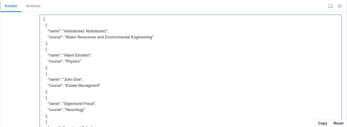
You can now add new data, edit existing ones and delete the data without changing the values in the story file directly.

Conclusion

In this article, you learned what storybook is all about and built a table component to complement the explanations. Now, you should be able to write and test components on the go using storybook.

Also, the code used in this article can be found in this GitHub repository.

External Links