How Small Businesses Can Overcome Challenges During a Pandemic

Pandemics are rare. In the past century, we have seen only two major pandemics. This means that rarely people will see two pandemics in their lifetime. But why am I telling you this? The rarity adds unpredictability and exposes how we are not ready to handle the situation.

If you are a small business, you would agree with it. Right now, keeping your small business can be a big challenge. This is entirely different from what the big giants have to go through. The pandemic helped Amazon reach double profit over the year as they netted a $5.2 billion profit compared to their last year’s profit(2019) for $2.6 billion.

Beyond Media Queries: Using Newer HTML & CSS Features for Responsive Designs

Beyond using media queries and modern CSS layouts, like flexbox and grid, to create responsive websites, there are certain overlooked things we can do well to make responsive sites. In this article, we’ll dig into a number tools (revolving around HTML and CSS) we have at the ready, from responsive images to relatively new CSS functions that work naturally whether we use media queries or not.

In fact, media queries become more of a complement when used with these features rather than the full approach. Let’s see how that works.

Truly responsive images

Remember when we could just chuck width: 100% on images and call it a day? That still works, of course, and does make images squishy, but there are a number of downsides that come with it, the most notable of which include:

  • The image might squish to the extent that it loses its focal point.
  • Smaller devices still wind up downloading the full size image.

When using images on the web, we have to make sure they’re optimized in terms of their resolution and size. The reason is to ensure that we have the right image resolution to fit the right device, so we don’t end up downloading really large and heavy images for smaller screens which could end up reducing the performance of a site. 

In simple terms, we’re making sure that larger, high-resolution images are sent to larger screens, while smaller, low-resolution variations are sent to smaller screens, improving both performance and user experience.

HTML offers the <picture> element that allows us specify the exact image resource that will be rendered based on the media query we add. As described earlier, instead of having one image (usually a large, high-resolution version) sent to all screen sizes and scaling it to the viewport width, we specify a set of images to serve in specific situations.

<picture>
  <source media="(max-width:1000px)" srcset="picture-lg.png">
  <source media="(max-width:600px)" srcset="picture-mid.png">
  <source media="(max-width:400px)" srcset="picture-sm.png">
  <img src="picture.png" alt="picture"">
</picture>

In this example, picture.png is the full-size image. From there, we define the next-largest version of the image, picture-lg.png, and the size reduces in descending order until the smallest version, picture-sm.png. Note that we’re still using media queries in this approach, but it’s the <picture> element itself that is driving the responsive behavior rather than defining breakpoints in the CSS.

The media queries are added appropriately to scale with the sizes of the picture:

  • Viewports that are 1000px and above get picture.png.
  • Viewports that are between 601px and 999px get picture-lg.png.
  • Viewports that are between 401px and 600px get picture-sm.png.
  • Any thing smaller than 400px gets picture-sm.png.

Interestingly, we can also label each image by image density —  1x, 2x, 3x and so forth — after the URL. This works if we have made the different images in proportion to each other (which we did). This allows the browser to determine which version to download based on the screen’s pixel density in addition to the viewport size. But note how many images we wind up defining:

<picture>
  <source media="(max-width:1000px)" srcset="picture-lg_1x.png 1x, picture-lg_2x.png 2x, picture-lg_3x.png 3x">
  <source media="(max-width:600px)" srcset="picture-mid_1x.png 1x, picture-mid_2x.png 2x, picture-mid_3x.png 3x">
  <source media="(max-width:400px)" srcset="picture-small_1x.png 1x, picture-small_2x.png 2x, picture-small_1x.png 3x">
  <img src="picture.png" alt="picture"">
</picture>

Let’s look specifically at the two tags nested inside the <picture> element: <source> and <img>.

The browser will look for the first <source> element where the media query matches the current viewport width, and then it will display the proper image (specified in the srcset attribute). The <img> element is required as the last child of the <picture> element, as a fallback option if none of the initial source tags matches.

We can also use image density to handle responsive images with just the <img> element using the srcset attribute:

<img
 srcset="
  flower4x.png 4x,
  flower3x.png 3x,
  flower2x.png 2x,
  flower1x.png 1x
 "
 src="flower-fallback.jpg"
>

Another thing we can do is write media queries in the CSS based on the screen resolution (usually measured in dots per inch, or dpi) of the device itself and not just the device viewport. What this means is that instead of:

@media only screen and (max-width: 600px) {
  /* Style stuff */
}

We now have:

@media only screen and (min-resolution: 192dpi) {
  /* Style stuff */
}

This approach lets us dictate what image to render based the screen resolution of the device itself, which could be helpful when dealing with high resolution images. Basically, that means we can display high quality pictures for screens that support higher resolutions and smaller versions at lower resolutions. It’s worth noting that, although mobile devices have small screens, they’re usually high resolution. That means it’s probably not the best idea rely on resolution alone when determining which image to render. It could result in serving large, high-resolution images to really small screens, which may not be the version we really want to display at such a small screen size.

body {
  background-image : picture-md.png; /* the default image */
}


@media only screen and (min-resolution: 192dpi) {
  body {
    background-image : picture-lg.png; /* higher resolution */
  }
}

What <picture> gives us is basically the ability to art direct images. And, in keeping with this idea, we can leverage CSS features, like the object-fit property which, when used with object-position, allows us to crop images for better focal points while maintaining the image’s aspect ratio.

So, to change the focal point of an image:

@media only screen and (min-resolution: 192dpi) {
  body {
    background-image : picture-lg.png;
    object-fit: cover;
    object-position: 100% 150%; /* moves focus toward the middle-right */
  }
}

Setting minimum and maximum values in CSS

The min() function specifies the absolute smallest size that an element can shrink to. This function proves really useful in terms of helping text sizes to properly scale across different screen sizes, like never letting fluid type to drop below a legible font size:

html {
  font-size: min(1rem, 22px); /* Stays between 16px and 22px */
}

min() accepts two values, and they can be relative, percentage, or fixed units. In this example, we’re telling the browser to never let an element with class .box go below 45% width or 600px, whichever is smallest based on the viewport width:

.box {
  width : min(45%, 600px)
}

If 45% computes to a value smaller than 600px, the browser uses 45% as the width. Conversely, if  45% computes to a value greater than 600px, then 600px will be used for the element’s width.

The same sort of thing goes for the max() function. It also accepts two values, but rather than specifying the smallest size for an element, we’re defining the largest it can get.

.box {
  width : max(60%, 600px)
}

If 60% computes to a value greater than 600px, the browser uses 60% as the width. On the flip side, if 60% computes to a value smaller than 600px, then 600px will be used as the element’s width.

And, hey, we can even set a minimum and maximum range instead using the minmax() function:

.box {
  width : minmax( 600px, 50% ); /* at least 600px, but never more than 50% */
}

Clamping values

Many of us have been clamoring for clamp() for some time now, and we actually have broad support across all modern browsers (sorry, Internet Explorer). clamp() is the combination of the min() and max() functions, accepting three parameters:

  1. the minimum value,
  2. the preferred value, and
  3. the maximum value

For example:

.box {
  font-size : clamp(1rem, 40px, 4rem)
}

The browser will set the font at 1rem until the computed value of 1rem is larger than 40px. And when the computed value is above 40px? Yep, the browser will stop increasing the size after it hits 4rem. You can see how clamp() can be used to make elements fluid without reaching for media queries.

Working with responsive units

Have you ever built a page with a large heading or sub-heading and admired how great it looked on a desktop screen, only to check it on a mobile device and find out that’s it’s too large? I have definitely been in this situation and in this section I’ll be explaining how to handle such problems.

In CSS, you can determine sizes or lengths of elements using various units of measurements, and the most used units of measurements includes: px, em, rem, %, vw, and vh. Although, there are several more units that aren’t used as frequently. What’s of interest to us is that px can be considered an absolute unit, while the rest are considered relative units.

Absolute units

A pixel (px) is considered an absolute unit mainly because it’s fixed and does not change based on the measurement of any other element. It can be considered as the base, or root, unit that some other relative units use. Trying to use pixels for responsive behavior can bump into issues because it’s fixed, but they’re great if you have elements that should not be resized at all.

Relative units

Relative units, like %, em, and rem, are better suited to responsive design mainly because of their ability to scale across different screen sizes.

vw: Relative to the viewport’s width
vh: Relative to the viewport’s height
rem: Relative to the root (<html>) element (default font-size is usually 16px )
em: Relative to the parent element
%: Relative to the parent element

Again, the default font size for most browsers is 16px and and that’s what rem units use to generate their computed values. So, if a user adjusts the font size on the browser, everything on the page scales properly depending on the root size. For example, when dealing a root set at 16px, the number you specify will multiply that number times the default size. For example:

.8rem = 12.8px (.8 * 16)
1rem = 16px (1 * 16)
2rem = 32px (2 * 16)

What if either you or the user changes the default size? As we said already, these are relative units and the final size values will be based off of the new base size. This proves useful within media queries, where you just change the font size and the entire page scales up or down accordingly.

For example, if you changed the font-size to 10px within the CSS, then the calculated sizes would end up being:

html {
  font-size : 10px;
}
1rem = 10px (1 * 10)
2rem = 20px (2 * 10)
.5rem = 5px (.5 * 10)

Note: This also applies to percentage %. For instance:

100% = 16px;
200% = 32px; 
50% = 8px;

And what’s the difference between rem and em units? It’s what the unit uses as its base element. rem calculates values using the font size of the root (<html>) element, whereas an element declaring em values references the font size of the parent element that contains it. If the size of specified parent element is different from the root element (e.g. the parent elements is 18px but the root element is 16px) then em and rem will resolve to different computed values. This gives us more fine-grained control of how our elements respond in different responsive contexts.

vh is an acronym for viewport height, or the viewable screen’s height. 100vh represent 100% of the viewport’s height (depending on the device). In the same vein, vw stands for viewport width, meaning the viewable screen’s width of the device, and 100vw literally represents 100% of the viewport’s width.

Moving beyond media queries

See that? We just looked at a number of really powerful and relatively new HTML and CSS features that give us additional (and possible more effective) ways to build for responsiveness. It’s not that these new-fangled techniques replace what we’ve been doing all along. They are merely more tools in our developer tool belt that give us greater control to determine how elements behave in different contexts. Whether it’s working with font sizes, resolutions, widths, focal points, or any number of things, we have more fine-grain control of the user experience than ever before.

So, next time you find yourself working on a project where you wish you had more control over the exact look and feel of the design on specific devices, check out what native HTML and CSS can do to help — it’s incredible how far things have come along.


The post Beyond Media Queries: Using Newer HTML & CSS Features for Responsive Designs appeared first on CSS-Tricks.

You can support CSS-Tricks by being an MVP Supporter.

Building A Component Library With React And Emotion

According to Clearleft, a component library is:

“A collection of components, organised in a meaningful manner, and often (but not necessarily) providing some way to browse and preview those components and their associated assets.”

— “On Building Component Libraries,” Clearleft

We’ll learn how to build a component library by making one that comprises four components:

  1. Button
    A wrapper around the default HTML button
  2. Box
    A container (HTML div) with custom properties
  3. Columns
    A container whose children are spaced evenly across the x-axis
  4. Stack
    A container whose children are spaced evenly across the y-axis

These components could then be used in whatever application we are working on. We’ll build the component library using React and Emotion.

At the end of this piece, you should be able to create a component library that fits whatever use case you have in mind. This knowledge will come handy when you’re working with a team that needs to make use of reusable components.

First, let’s get started by establishing what the Emotion library is. The documentation explains:

“Emotion is a library designed for writing CSS styles with JavaScript. It provides powerful and predictable style composition in addition to a great developer experience with features such as source maps, labels, and testing utilities.”

— “Introduction,” Emotion Docs

In essence, Emotion is a CSS-in-JavaScript library, and an interesting thing about CSS-in-JavaScript libraries is that they enable you to collocate components with styles. Being able to tie them up together in a scope ensures that some component styles don’t interfere with others, which is crucial to our component library.

Emotion exposes two APIs for React:

  • @emotion/core
  • @emotion/styled

Before we dive into how these APIs work, note that they both support the styling of components with template strings and objects.

The core API is actually like the regular style property we currently use today when building apps with React, with the addition of vendor prefixing, nested selectors, media queries, and more.

Using the object approach with the core API would typically look like this:

import { jsx } from '@emotion/core'

let Box = props => {
  return (
    <div
      css={{
        backgroundColor: 'grey'
      }}
      {...props}
    />
  )
}

This is a rather contrived example that shows how we could style a Box component with Emotion. It’s like swapping out the style property for a css property, and then we’re good to go.

Now, let’s see how we could use the template string approach with the same core API:

import { jsx, css } from '@emotion/core'

let Box = props => {
  return (
    <div
      css={css`
        background-color: grey
      `}
      {...props}
    />
  )
}

All we did was wrap the template string with the css tag function, and Emotion handles the rest.

The styled API, which is built on the core API, takes a slightly different approach to styling components. This API is called with a particular HTML element or React component, and that element is called with an object or a template string that contains the styles for that element.

Let’s see how we could use the object approach with the styled API:

import styled from '@emotion/styled'

const Box = styled.div({
        backgroundColor: 'grey'
});

Here is one way to use the styled API, which is an alternative to using the core API. The rendered outputs are the same.

Now, let’s see how we could use the template string approach using the styled API:

import styled from '@emotion/styled'

const Box = styled.div`
        background-color: grey
`

This achieves the same thing as the object approach, only with a template string this time.

We could use either the core API or the styled API when building components or an application. I prefer the styled approach for a component library for a couple of reasons:

  • It achieves a lot with few keystrokes.
  • It takes in an as prop, which helps with dynamically changing the HTML element from the call site. Let’s say we default to a paragraph element, and we need a header element because of semantics; we can pass the header element as a value to the as property.

Getting Started

To get started, let’s clone the setup scripts on GitHub, which we can do on the command line:

git clone git@github.com:smashingmagazine/component-library.git

This command copies the code in that repository to the component-library’s folder. It contains the code required to set up a component library, which includes Rollup to help bundle our library.

We currently have a components folder with an index.js file, which does nothing. We’ll be creating new folders under the components folder for each component we build in our library. Each component’s folder will expose the following files:

  • Component.js
    This is the component we’re building.
  • index.js
    This exports the component from Component.js and makes referencing components from a different location easier.
  • Component.story.js
    This essentially renders our component in its multiple states using Storybook.

It also ships with a utils folder, which defines certain properties that would be used in our components. The folder contains several files:

  • helpers.js
    This contains helper functions that we are going to be using across our application.
  • units.js
    This defines spacing and font-size units, which we will use later.
  • theme.js
    This defines our component library’s palette, shadows, typography, and shape.

Let’s look at what we’ve defined in the units.js file:

export const spacing = {
  none: 0,
  xxsmall: '4px',
  xsmall: '8px',
  small: '12px',
  medium: '20px',
  gutter: '24px',
  large: '32px',
  xlarge: '48px',
  xxlarge: '96px',
};

export const fontSizes = {
  xsmall: '0.79rem',
  small: '0.889rem',
  medium: '1rem',
  large: '1.125rem',
  xlarge: '1.266rem',
  xxlarge: '1.424rem',
};

This defines the spacing and fontSizes rules. The spacing rule was inspired by the Braid design system, which is based on multiples of four. The fontSizes are derived from the major second (1.125) type scale, which is a good scale for product websites. If you’re curious to learn more about type scale, “Exploring Responsive Type Scales” explains the value of knowing the scales appropriate for different websites.

Next, let’s through the theme.js file!

import { spacing } from './units';

const white = '#fff';
const black = '#111';

const palette = {
  common: {
    black,
    white,
  },
  primary: {
    main: '#0070F3',
    light: '#146DD6',
    contrastText: white,
  },
  error: {
    main: '#A51C30',
    light: '#A7333F',
    contrastText: white,
  },
  grey: {
    100: '#EAEAEA',
    200: '#C9C5C5',
    300: '#888',
    400: '#666',
  },
};

const shadows = {
  0: 'none',
  1: '0px 5px 10px rgba(0, 0, 0, 0.12)',
  2: '0px 8px 30px rgba(0, 0, 0, 0.24)',
};

const typography = {
  fontFamily:
    "Inter, -apple-system, BlinkMacSystemFont, 'Segoe UI', Roboto, Ubuntu, 'Helvetica Neue', sans-serif",
};

const shape = {
  borderRadius: spacing['xxsmall'],
};

export const theme = {
  palette,
  shadows,
  typography,
  shape,
};

In the theme file, we’ve defined our palette, which is essentially the colors we’re going to be using across all components in our library. We also have a shadows object, where we define our box-shadow values. There’s also the typography object, which currently just defines our fontFamily. Finally, shape is used for properties such as border-radius. This theme’s structure is inspired by Material-UI.

Next, our helpers.js file!

export const isObjectEmpty = (obj) => {
  return Object.keys(obj).length === 0;
};

Here, we only expose the isObjectEmpty function, which takes in an object and returns true if the object is empty. It returns false if it has any values. We’re going to make use of this function later.

Now that we’ve gone through all of the files in the utils folder, it’s about time to start building our components!

Buttons

Buttons are one of the most used components on the web. They’re used everywhere and can take different forms, shapes, sizes, and more.

Here are the buttons we’re going to build in Figma.

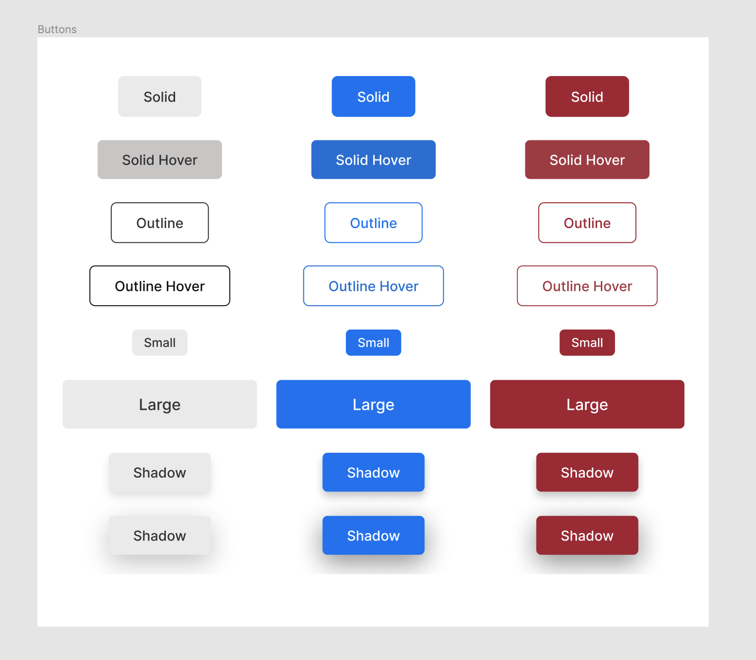
These subtle variations are going to be applied as properties to our button. We would like the buttons in our component library to accept properties such as variant, size, enableElevation (i.e. box-shadow), and color.

Starting with the button component, let’s create a Button folder, where we will define everything related to buttons, as discussed earlier.

Let's create our button component:

import styled from '@emotion/styled';
import isPropValid from '@emotion/is-prop-valid';

const StyledButton = () => {};

const IGNORED_PROPS = ['color'];

const buttonConfig = {
  shouldForwardProp: (prop) =>
    isPropValid(prop) && !IGNORED_PROPS.includes(prop),
};

export const Button = styled('button', buttonConfig)(StyledButton);

Here, we’ve started off by setting up our button component with a buttonConfig. The buttonConfig contains shouldForwardProp, which is used to control the properties that should be forwarded to the DOM, because properties such as color show up on the rendered element by default.

Next, let’s define our button sizes, which we’re going to use in the button component!

const buttonSizeProps = {
  small: {
    fontSize: fontSizes['xsmall'],
    padding: `${spacing['xsmall']} ${spacing['small']}`,
  },
  medium: {
    fontSize: fontSizes['small'],
    padding: `${spacing['small']} ${spacing['medium']}`,
  },
  large: {
    fontSize: fontSizes['medium'],
    padding: `${spacing['medium']} ${spacing['large']}`,
  },
};

buttonSizeProps is a map of our size values (small, medium, and large), and it returns fontSize and padding values based on the sizes. For a small button, we’d need a small font with small padding. The same goes for the medium and large sizes to scale them appropriately.

Next, let’s define a function that provides valid CSS properties based on the passed variant:

const getPropsByVariant = ({ variant, color, theme }) => {

  const colorInPalette = theme.palette[color];

  const variants = {
    outline: colorInPalette
      ? outlineVariantPropsByPalette
      : defaultOutlineVariantProps,
    solid: colorInPalette
      ? solidVariantPropsByPalette
      : defaultSolidVariantProps,
  };

  return variants[variant] || variants.solid;
};

Here, the getPropsByVariant function takes in variant, color, and theme properties and returns the properties of the specified variant; if no variant is specified, it defaults to solid. colorInPalette retrieves the palette assigned to the specified color if found, and undefined if not found in our theme object.

In each variant, we check whether a palette actually exists for the color specified; if we don’t, then we use colors from the common and grey objects of our theme, which we will apply in defaultOutlineVariantProps and defaultSolidVariantProps.

Next, let’s define our variant properties!

const defaultSolidVariantProps = {
  main: {
    border: `1px solid ${theme.palette.grey[100]}`,
    backgroundColor: theme.palette.grey[100],
    color: theme.palette.common.black,
  },
  hover: {
    border: `1px solid ${theme.palette.grey[200]}`,
    backgroundColor: theme.palette.grey[200],
  },
};

const defaultOutlineVariantProps = {
  main: {
    border: `1px solid ${theme.palette.common.black}`,
    backgroundColor: theme.palette.common.white,
    color: theme.palette.common.black,
  },
  hover: {
    border: `1px solid ${theme.palette.common.black}`,
    backgroundColor: theme.palette.common.white,
    color: theme.palette.common.black,
  },
};

const solidVariantPropsByPalette = colorInPalette && {
  main: {
    border: `1px solid ${colorInPalette.main}`,
    backgroundColor: colorInPalette.main,
    color: colorInPalette.contrastText,
  },
  hover: {
    border: `1px solid ${colorInPalette.light}`,
    backgroundColor: colorInPalette.light,
  },
};

const outlineVariantPropsByPalette = colorInPalette && {
  main: {
    border: `1px solid ${colorInPalette.main}`,
    backgroundColor: theme.palette.common.white,
    color: colorInPalette.main,
  },
  hover: {
    border: `1px solid ${colorInPalette.light}`,
    backgroundColor: theme.palette.common.white,
    color: colorInPalette.light,
  },
};

Here, we define the properties that are going to be applied to our button based on the selected variants. And, as discussed earlier, defaultSolidVariantProps and defaultOutlineVariantProps use colors from our common and grey objects as fallbacks for when the color specified isn’t in our palette or when no color is specified for what we put in place.

By the way, the solidVariantPropsByPalette and outlineVariantPropsByPalette objects use the color from our palette as specified by the button. They both have main and hover properties that differentiate the button’s default and hover styles, respectively.

The button design we’ve used accounts for two variants, which we can check out in our component library design.

Next, let’s create our StyledButton function, which combines all we’ve done so far.

const StyledButton = ({
  color,
  size,
  variant,
  enableElevation,
  disabled,
  theme,
}) => {
  if (isObjectEmpty(theme)) {
    theme = defaultTheme;
  }

  const fontSizeBySize = buttonSizeProps[size]?.fontSize;
  const paddingBySize = buttonSizeProps[size]?.padding;
  const propsByVariant = getPropsByVariant({ variant, theme, color });

  return {
    fontWeight: 500,
    cursor: 'pointer',
    opacity: disabled && 0.7,
    transition: 'all 0.3s linear',
    padding: buttonSizeProps.medium.padding,
    fontSize: buttonSizeProps.medium.fontSize,
    borderRadius: theme.shape.borderRadius,
    fontFamily: theme.typography.fontFamily,
    boxShadow: enableElevation && theme.shadows[1],
    ...(propsByVariant && propsByVariant.main),
    ...(paddingBySize && { padding: paddingBySize }),
    ...(fontSizeBySize && { fontSize: fontSizeBySize }),
    '&:hover': !disabled && {
      boxShadow: enableElevation && theme.shadows[2],
      ...(propsByVariant && propsByVariant.hover),
    },
  };
};

In the StyledButton function, we’re assigning defaultTheme to the theme if the theme object is empty which makes it optional for the consumers of our library to use Emotion’s ThemeProvider in order to make use of the library. We assigned fontSize and padding based on the buttonSizeProps object. We defined several default button properties, such as fontWeight and cursor, which aren’t tied to any property, and we also derived color, backgroundColor, and border values based on the result of propsByVariant.

Now that we’ve created our Button component, let’s see how we can use it:

<Button
    variant="solid"
    color="primary"
    size="small"
    enableElevation
    disabled
>
    Small Outline Elevated Button
</Button>

We can check what that looks like on CodeSandbox:

That’s how to use the Button component. We define the following properties:

  • We define a variant with a solid value. We could have specified outline instead. If the variant prop isn’t provided, we would also default to solid.
  • We define color, with a value of primary. We also support error as a color value or a color from a theme object. If the color property isn’t specified, we would fall back to our default color state.
  • We define size, with a value of small. It could be medium (the default) or large.
  • We define EnableElevation because we want some box-shadow on our button. We could have chosen not to use it.
  • Finally, we define disabled because we want our button to be disabled. The additional thing we do to a disabled button is reduce its opacity.

The button doesn’t need to take any property. It defaults to a solid medium-sized button.

Box Component

A box component is a container that can hold any component or HTML element. It accepts but is not limited to properties such as padding, margin, display, and width. It can also be used as a base component for some of the other components we’ll get into later.

Here’s what it looks like on Figma:

Before diving into the code, let’s not forget to create a new folder for this component.

Now, let’s create our Box component:


import styled from '@emotion/styled';
import isPropValid from '@emotion/is-prop-valid';
import { spacing, theme as defaultTheme } from '../../utils';

const StyledBox = ({
  paddingX,
  paddingY,
  marginX,
  marginY,
  width,
  display,
  theme,
  ...props
}) => {

  if (isObjectEmpty(theme)) {
    theme = defaultTheme;
  }

  const padding = spacing[props.padding];
  let paddingTop = spacing[props.paddingTop];
  let paddingRight = spacing[props.paddingRight];
  let paddingBottom = spacing[props.paddingBottom];
  let paddingLeft = spacing[props.paddingLeft];
  if (paddingX) {
    paddingLeft = spacing[paddingX];
    paddingRight = spacing[paddingX];
  }
  if (paddingY) {
    paddingTop = spacing[paddingY];
    paddingBottom = spacing[paddingY];
  }
  let margin = spacing[props.margin];
  let marginTop = spacing[props.marginTop];
  let marginRight = spacing[props.marginRight];
  let marginBottom = spacing[props.marginBottom];
  let marginLeft = spacing[props.marginLeft];
  if (marginX) {
    marginLeft = spacing[marginX];
    marginRight = spacing[marginX];
  }
  if (marginY) {
    marginTop = spacing[marginY];
    marginBottom = spacing[marginY];
  }
  return {
    padding,
    paddingTop,
    paddingRight,
    paddingBottom,
    paddingLeft,
    margin,
    marginTop,
    marginRight,
    marginBottom,
    marginLeft,
    width,
    display,
    fontFamily: theme.typography.fontFamily,
  };
};

const IGNORED_PROPS = ['display', 'width'];

const boxConfig = {
  shouldForwardProp: (prop) =>
    isPropValid(prop) && !IGNORED_PROPS.includes(prop),
};

export const Box = styled('div', boxConfig)(StyledBox);

The spacing rule we defined earlier is being applied to both padding and margin, as we can see in the Box component. We receive contextual values for padding and margin, and we look up their actual values from the spacing object.

We accept paddingX and paddingY props to update padding across the horizontal and vertical axis, respectively. We do the same for marginX and marginY as well.

Also, we don’t want the display and width props to get forwarded to the DOM because we only need them in CSS. So, we add them to our list of props to ignore, and pass that on to our config.

Here’s how we could use the Box component:

<Box
  padding="small"
  paddingTop="medium"
  paddingBottom="medium"
>
  Simple Box Component
</Box>

We can see what this looks like on CodeSandbox.

In this Box component, we’ve assigned small as a value to our padding property, and medium to the paddingTop and paddingBottom properties. When rendered, the Box component will have its padding-left and padding-right properties set to 12px each, and its padding-top and padding-bottom properties set to 20px. We could have replaced paddingTop and paddingBottom with paddingY and gotten the same result.

Columns Component

The Columns component is a variation of our Box component, with a display type of flex and with children spaced evenly across the x-axis.

Here is a representation of the Columns component in Figma:

Let’s build our Columns component!

import React from 'react';
import { Box } from '../Box';

export const Columns = ({ children, space, ...props }) => {
  return (
    <Box display="flex" {...props}>
      {React.Children.map(children, (child, index) => {
        if (child.type !== Box) {
          console.warn(
            'Each child in a Columns component should be a Box component'
          );
        }

        if (index > 0) {
          return React.cloneElement(child, {
            marginLeft: space,
            width: '100%',
          });
        }

        return React.cloneElement(child, { width: '100%' });
      })}
    </Box>
  );
};

We’re using React.Children to map over the Columns component’s children. And we’re adding marginLeft and width properties to each of the children, except the first child, which doesn’t need a marginLeft property because it’s the leftmost child in the column. We expect each child to be a Box element to ensure that the necessary styles are applied to it.

Here’s how we could use the Columns component:

<Columns space="small">
  <Box> Item 1</Box>
  <Box> Item 2</Box>
  <Box> Item 3</Box>
</Columns>

We can see what that looks like on CodeSandbox.

The Columns children here are spaced evenly across the x-axis by 12 pixels because that’s what the value of small resolves to, as we’ve defined earlier. Because the Columns component is literally a Box component, it can take in other Box component properties, and we can customize it as much as we want.

Stack Component

This is also a variation of our Box component that takes the full width of the parent element and whose children are spaced evenly across the y-axis.

Here is a representation of the Stack component in Figma:

Let’s build our Stack component:

import React from 'react';
import { Box } from '../Box';
import { Columns } from '../Columns';

const StackChildrenTypes = [Box, Columns];
const UnsupportedChildTypeWarning =
  'Each child in a Stack component should be one of the types: Box, Columns';

export const Stack = ({ children, space, ...props }) => {
  return (
    <Box {...props}>
      {React.Children.map(children, (child, index) => {
        if (!StackChildrenTypes.includes(child.type)) {
          console.warn(UnsupportedChildTypeWarning);
        }

        if (index > 0) {
          return React.cloneElement(child, { marginTop: space });
        }

        return child;
      })}
    </Box>
  );
};

Here, we map over each child with React.Children and apply a paddingTop property to it with the value of the space argument. As for the first child, we need it to take its original position, so we skip adding a marginTop property to it. We also accept each child to be a Box so that we can apply the necessary properties to it.

Here’s how we could use the Stack component:

<Stack space="small">
  <Box marginTop="medium"> Item 1</Box>
  <Box> Item 2</Box>
  <Box> Item 3</Box>
</Stack>

We can see what that looks like on CodeSandbox.

Here, the Box elements are spaced evenly with the small unit, and the first Box takes a separate marginTop property. This shows that you can customize components however you wish.

Conclusion

We’ve gone through the basics of using Emotion to create components in React using the APIs that it provides. This is just one of many ways to go about building a component library. There are some nuances to building it for a brand because you might not have to take theming and some other things into consideration. But if you plan to release the library to the public one day, then you’ll have to deal with requests for those missing pieces, so consider that possibility and make the library a little flexible ahead of time.

If you have any questions, feel free to drop them as comments.

The repository for this article is on GitHub, and the button designs we’ve used are on Figma.

References

12 Best Lead Generation WordPress Plugins (Powerful)

Are you looking for the best lead generation WordPress plugins?

Using the right lead generation tools can help you get more customers and sales faster so that you can grow your business.

In this article, we will share some of the best lead generation WordPress plugins to help you improve your marketing.

Best Lead Generation WordPress Plugins (Powerful)

What Is Lead Generation, and Why Does It Matter?

Lead generation means getting the interest of prospective customers. It can be done in several different ways.

On your website, lead generation might mean getting visitors to:

  • Join your email newsletter.
  • Submit a contact or inquiry form on your website.
  • Contact someone at your company through live chat.
  • Talk to a chatbot (automated chat).
  • Call your sales team, or book a call with them.

Lead generation is essential for all online businesses. Of course, it’s also important to have a strong process for converting the leads into customers. However, most businesses struggle to get enough leads in the first place.

Even if you run a nonprofit, lead generation matters. It can help you get more donations and more support.

Our goal with this list is to share the absolute best WordPress lead generation plugins that you can use to grow your business faster.

Unlike other best lead generation tool lists, we are not just sharing a list of plugins that do the same thing. Instead, we’re focusing on lead generation from a holistic point of view.

For each lead generation solution category, we share an expert pick along with one alternative option for that category. This will help us keep this list comprehensive without causing choice paralysis.

With that said, here are the best lead generation plugins for WordPress.

1. WPForms

WPForms

WPForms is the best contact form plugin on the market. Over 6 million website owners use the beginner-friendly, drag-and-drop builder to create any kind of online form for their WordPress sites.

It comes with over a hundred pre-built form templates you can use as a starting point. After that, you can customize the form to match your needs using the drag-and-drop form builder interface.

Here are just some of the lead generation forms you can create:

WPForms also integrates with your favorite email marketing services and CRM providers. This lets you automatically add leads to your email list.

Each time someone submits the form, you will automatically get an email notification. You can easily turn this off if you prefer not to receive email alerts. WPForms will store each completed form entry in your WordPress database too.

It’s also possible to send notifications to multiple recipients using WPForms. For example, you might want to send a customer inquiry notification to a specific person in the sales team and their supervisor.

Price:

WPForms pricing starts at $49.50/year. There’s also a free version of the plugin, which has limited features.

Alternative:

Formidable Forms ($39.50 per year) is a good alternative to WPForms. It has powerful tools that let you create different forms, including lead generation calculators. However, it’s not as beginner friendly as WPForms.

2. OptinMonster

OptinMonster

OptinMonster is a powerful lead generation and popup plugin that you can use on your WordPress site.

It lets you create high-converting popups and email signup forms that help you turn abandoned website visitors into subscribers and customers.

It has lots of useful features, including Exit Intent® technology. This lets you show your popup at the exact moment when someone is about to leave your site.

You can combine it with their page targeting feature to show customized popup messages for each page on your site, which is proven to increase conversions.

With OptinMonster, you even get special popups like spin the wheel popups and Yes/No optins. These can boost your conversion rate even further.

OptinMonster Spin Wheel Campaign

There are lots of different professionally designed templates included in the app. This makes it quick and easy to create your lead forms using the drag-and-drop builder.

You can also use OptinMonster to generate leads in other ways. For instance, you might use the content-locking feature to ask visitors to join your email list before they can read your full content.

You don’t necessarily need to use it to generate email leads, either. You could add a click-to-call button to your popup, use it to show special discount codes, and more.

Price:

OptinMonster starts at $9/month when billed annually. To get advanced features like Exit Intent technology and Yes/No forms, you need the Pro plan from $29/month.

Alternative:

Thrive Leads ($99 per year) is a good alternative to OptinMonster. It offers a range of different types of lead generation forms and popups. It also has a built-in template library to speed up the building process.

3. SeedProd

SeedProd website builder

SeedProd is the best WordPress website and theme builder on the market. It’s used by over a million website owners to easily create any type of website without writing any code.

It has dozens of professional templates you can customize easily with the drag and drop builder.

SeedProd also provides you with a beginner-friendly landing page builder. And you will find a ready-made sales page, opt-in page, webinar registration, coming soon page templates, and more.

All of these landing page templates can be completely customized to help you start generating leads as quickly and easily as possible.

Customize SeedProd

It includes dozens of blocks designed to help you build better landing pages, like testimonial blocks, countdown timers, CTA buttons, pricing tables, and so much more.

You will find a searchable stock photo library with over 2 million photos that you can add to your pages to improve conversions.

It also has powerful integrations with the top email marketing software and thousands of third-party apps via Zapier. This lets you easily send your leads to your lead management tool of choice.

For online store owners, you can use the WooCommerce blocks to build custom WooCommerce product pages easily, thank you pages, and more to collect leads and sell more products.

Price:

SeedProd starts from $39.50 per year (only $3.29 per month). Plus, there’s a free version you can try to see how the plugin works.

Alternative:

Instapage offers similar page builder features but is more expensive and starts at $199 per month (billed annually).

4. LiveChat

Live Chat Inc Website

LiveChat is the best live chat software for WordPress websites. It’s very easy to set up, and you can integrate it with dozens of other marketing services.

By adding live chat support to your WordPress website, you can build a better relationship with your users and convert more visitors into customers.

This plugin places a chat button in the bottom right-hand corner of your website. Visitors can click on this to chat with your team in real time.

Plus, your support team members don’t need to log in to WordPress to use LiveChat. Instead, they can use the LiveChat app on their laptop or mobile devices.

LiveChat will create a support ticket if a visitor contacts your team outside of support hours.

LiveChat is fast and easy to use for your visitors and your support team. It lets you quickly turn leads into customers by answering pre-sales questions straight away.

Price:

LiveChat starts at $20 per month when billed annually with a 14-day free trial. Our LiveChat coupon gives you an extended 30-day free trial plus a 30% discount.

Alternative:

Brevo (Previously Sendinblue) offers a simple, free live chat feature that you can use on your website. It also offers email, SMS, and a CRM tool that integrate with live chat.

5. ChatBot

ChatBot

ChatBot is one of the best AI chatbot software options on the market and lets you use automated live chat to connect with your potential customers and respond to questions 24/7.

To help you get started quickly, ChatBot has lots of pre-designed templates. For instance, you can use the lead generation bot to book calls. Meanwhile, the sales bot template allows you to sell products directly from the chat window.

ChatBot can be used in Facebook Messenger as well as on your website. That makes it a great option for companies and organizations that get a lot of inquiries through Facebook.

It’s easy to integrate it with other apps, such as LiveChat. A live agent can step into the conversation seamlessly if needed.

Price:

ChatBot pricing starts at $52 per month. There’s a 14-day free trial available.

Alternative:

Hubspot offers a suite of business CRM tools, including a chatbot builder and live chat. You can get started free, and paid plans start at $30 per month.

6. RafflePress

RafflePress

RafflePress is one of the best WordPress giveaway plugins on the market. It allows you to easily create viral giveaways and contests that you can use to grow your website traffic and email list.

You can use the drag and drop builder to quickly create giveaway campaigns in minutes without writing any code. Plus, there’s a built-in template library to help make giveaway creation even faster.

A unique refer-a-friend feature lets you do word-of-mouth marketing by letting users share your contest on their social media profiles.

This helps to build engagement and can get you a lot of new visitors to your WordPress blog.

You will find many other powerful features that help improve your campaigns, like email verification, fraud protection, social logins, giveaway landing pages, success tracking, and more.

Plus, your giveaways will run on mobile devices, so you can reach your visitors no matter where they happen to be.

For more details, see our guide on how to run a giveaway/contest in WordPress.

Price:

RafflePress has a free version of the plugin you can use to get started. Paid plans start at $39.50 per year for the starter plan.

Alternative:

Gleam is an advanced giveaway platform you can use to run contests and giveaways. However, it’s not as beginner friendly, and you will need at least the $97 per month Pro plan to unlock useful features.

7. PushEngage

PushEngage

PushEngage is the best web push notification software on the market, used by over 10,000 companies, including Harvard, Dominoes, and Business Insider.

It lets you easily send targeted push messages to visitors after they leave your website.

We use push notifications here at WPBeginner, and they are consistently a top 5 source of our traffic. They are a highly-effective way to convert website visitors into loyal followers and customers.

Visitors simply give their permission to receive push notifications by clicking a button:

An example of a push notification optin on the WPBeginner website

You can set up push notifications to automatically send out to your subscribers whenever you publish a blog post or use them to send completely custom messages.

It’s a very easy-to-use solution for beginners to advanced users. You will find powerful features like A/B testing, custom-triggered campaigns, interactive messages, custom drip campaigns, and so much more.

Plus, you can use the marketing automation features to create abandoned card sequences, scheduled messages, and more.

You will be able to see a detailed breakdown of your subscriber engagement and even the transactional revenue generated from your push campaigns.

Price:

PushEngage starts at $9 per month and gives you support for 100,000 subscribers and unlimited campaigns. There’s also a free plan available that gives you 30 campaigns per month for 200 subscribers.

Alternative:

OneSignal has a free plan for unlimited notifications on mobile. For advanced features like delayed notifications, pricing starts at $99 per month.

8. FunnelKit

FunnelKit homepage

FunnelKit, formerly known as WooFunnels, is the best sales funnel builder for WordPress.

You can use it to create lead-generation funnels, sales funnels, high-converting checkout pages, one-click upsells, and more.

It’s essentially a ClickFunnels alternative that helps you convert website visitors into leads and customers.

FunnelKit comes with a built-in library of beautiful funnel templates that you can import in one click.

FunnelKit templates

You can easily customize the templates using the WordPress block editor as well as popular page builder plugins like Elementor, Divi, and others.

FunnelKit offers in-depth analytics so that you can see how your funnels are performing in real time. Plus, it comes with A/B testing that lets you experiment with different versions of your funnels to find out which one converts best.

In addition, FunnelKit has a marketing automation solution called FunnelKit Automations. It allows you to set up automated email and SMS campaigns for lead nurturing, welcome series, abandoned cart recovery, post-purchase upsell, and more.

Price:

FunnelKit starts at $99.50 per year. To access FunnelKit Automations, you need at least the Professional plan, which costs $249.50 per year.

Alternative:

SeedProd, which we mentioned earlier in this list, can also be used to easily create lead generation pages, sales pages, custom WooCommerce checkout pages, and more.

9. WP Call Button

WP Call Button

WP Call Button allows you to easily add a ‘click to call’ button on your WordPress website or WooCommerce store. Visitors can simply click or tap the button to call you straight away.

If your customers need to call you before purchasing a service or booking an appointment, adding a click-to-call button on your website will increase your leads and sales.

It can also be used to easily set up business call forwarding.

WP Call Button makes adding your button to any post or page easy. You can include it in your WordPress sidebar, too. It’s also easy to create a sticky floating call button that stays visible all the time.

Price:

WP Call Button is free and works with all top business phones and business VoIP providers.

Alternative:

You can also create a click-to-call link using the manual method covered in our article on adding a click-to-call button in WordPress.

10. AffiliateWP

AffiliateWP

AffiliateWP is one of the best affiliate tracking and management solution for WordPress. It lets you simply create your own fully featured affiliate program on WordPress.

By creating an affiliate program, you can have your own team of affiliates promoting your products in exchange for a commission.

This can help you get more visibility online, traffic, and of course, make more sales. You can even create your very own WooCommerce affiliate program using this plugin.

It comes with everything you need to manage your program, including accurate affiliate tracking, integrated payouts, real-time reporting, affiliate coupon tracking, and so much more.

With manual affiliate approval and top-performing affiliate data, you can build lasting partnerships with your most valuable affiliates for years to come.

Price:

AffiliateWP starts at $149.50 per year and has everything you need to run a successful affiliate program.

Alternative:

Easy Affiliate is another popular WordPress plugin for creating and managing an affiliate program. The basic plan starts at $99.50 per year.

11. All in One SEO

All in One SEO

All in One SEO is the best WordPress SEO plugin used by over 3 million websites. It’s the most comprehensive SEO toolkit that makes it easy to improve your SEO rankings without learning any complicated SEO jargon.

Doing WordPress SEO is an important part of lead generation. You need to bring people to your website before they can join your email list, call you, subscribe to push notifications, or do anything else on this list.

Once you install and activate the plugin, an easy-to-use setup wizard will help you choose the best SEO settings for your business, so you can start getting more traffic.

It has a TruSEO score, which offers detailed on-page SEO analysis and gives you an actionable SEO checklist to help you easily optimize your posts and pages.

AIOSEO checklist

All in One SEO can help you improve your post SEO titles and meta descriptions, generate rich snippet schema markup and create smart XML sitemaps and RSS sitemaps.

Plus, there are built-in WooCommerce SEO settings, like individual product optimizations, product image SEO, and more, to help your online store get more visitors from the search results.

Price:

AIOSEO starts at $49.60 per year for access to advanced SEO features. You can also try out the free version to begin optimizing your site for SEO.

Alternative:

Yoast SEO is another popular SEO plugin for WordPress that will help you optimize your site. There is a free version and a premium version that starts at $99 per year.

12. MonsterInsights

The MonsterInsights Google Analytics plugin

MonsterInsights offers a powerful way to add Google Analytics to your WordPress website. It lets you quickly and easily see crucial statistics about your site and find your most important pages.

This means you can easily find out what’s working and what’s not, focusing on the areas that really matter.

For instance, you might use MonsterInsights to enable author tracking and see which writers for your site are producing the best-performing posts.

Or you could use MonsterInsights to track link clicks and button clicks. This lets you figure out which links and buttons are getting clicked and which ones aren’t, letting you pinpoint areas for improvement.

MonsterInsights is quick and easy to set up and gives you real-time stats. It can even track things like your eCommerce data, form completions, and file downloads. This gives you more insights into your lead generation efforts.

Price:

MonsterInsights starts at $99.50/year. There’s also a free version available for WordPress with limited features.

Alternative:

ExactMetrics offers similar features to MonsterInsights and starts at $99.50 per year.

Bonus: Nextiva

Nextiva

Nextiva is the best business phone service for small business owners in terms of features and ease of use.

If your business relies on phone calls for lead generation, then Nextiva can help you improve your business communication across the board.

It has a web-based admin panel that will let you manage your entire unified communications platform in one place.

You will find business phone features like call routing, voicemail to text and email, SMS messaging, unlimited domestic calling, online faxing, and so much more.

Every new account can get a free local or toll-free number. Plus, you get all standard features like caller ID, call forwarding, routing, custom greetings, and more.

You can even integrate your business phone with powerful features like live chat and CRM services.

We use Nextiva at WPBeginner for our business phone service. It works well for our remote team since they can receive business calls on their cell phones while still keeping their numbers private.

Price:

Nextiva starts at $14.95 per month per user for all your business phone needs. The Enterprise plan costs $26.95 per month per user and includes video conferencing, call recording, and more.

Alternative:

RingCentral is another popular business phone provider that’s packed with features. Paid plans start at $20 per month per user.

What Is the Best Lead Generation Plugin for WordPress?

We believe you need multiple plugins for a robust lead-generation strategy on your site.

With that said, WPForms is the best lead generation plugin for WordPress. You can use their drag-and-drop form builder to create any online form.

If you are looking for a live chat solution to improve leads and support, then LiveChat and ChatBot are both great options.

If you want to improve your overall conversion rate on your website, then nothing beats the powerful features that OptinMonster has to offer.

If you want to improve your existing website and product pages to generate more leads and make more sales, then SeedProd is a must-have plugin.

With any lead generation strategy, attracting leads is only the first part. You have to ensure a proper sales process to close the deal.

If you rely on phone calls, then we recommend using Nextiva. It comes with auto-attendant, call-routing, CRM, and powerful sales features that you can use to increase your sales.

To summarize, our top lead generation tools are:

  1. WPForms
  2. OptinMonster
  3. SeedProd
  4. LiveChat.com
  5. ChatBot.com
  6. Nextiva

We hope this article helped you learn about the best lead-generation plugins and tools for WordPress.

You might also want to see our other guides that can help you generate new leads and turn them into customers.

Best WordPress Guides for Lead Generation

If you liked this article, then please subscribe to our YouTube Channel for WordPress video tutorials. You can also find us on Twitter and Facebook.

The post 12 Best Lead Generation WordPress Plugins (Powerful) first appeared on WPBeginner.

DevOps Guide – Implementing four-eyes principle with process automation tooling

With great power comes great responsibility.

More and more organisations are moving towards a DevOps based organisational model, putting more and more responsibility into the hands of the teams delivering software. As part of that change - and the need due to the markets moving faster and faster - more and more organisations are investing into means to release more milestones into production faster. Therefore one of the main goals within these organisations is to automate, audit, secure and ensure correct repeatability of actions.

Put the Smackdown on Spammers: 12 Top-Rated WordPress Antispam Plugins

If you have a WordPress site, there’s a good chance you welcome giving your users the option to comment on a blog, register for information, send you an email, or something else. It’s great to have folks communicate with you, but this also opens the door to (gulp!) spam.

Unfortunately, spam comes with the territory, as the WordPress CMS is so popular, it naturally attracts an increased number of troublemakers looking to hack or wreak havoc on your site.

If not dealt with, it can become like swatting mosquitoes away from your WordPress site — annoying and challenging to control.

Dev Man swatting away spam.
Dev Man’s swatting powers demonstrated while on a website without spam protection.

Luckily, there are plugins out there that can come to your rescue and defend your site against spammers, ensuring that only real users you want to connect with get through.

We’ll be looking at one dozen top-rated plugins that can help you fight against spam—keeping real engagement flowing and kicking any spammer attempts to the curb.

Continue reading, or jump ahead using these links:

Each plugin has specific features, and they’re all different. Take your pick. You might want to use just one or combine them as part of a full-proof spam protection strategy.

We’ll also look at ways to combat spam from your WordPress dashboard without a plugin.

12 Top-Rated Anti-Spam Plugins

1. Akismet

The akismet plugin.

Akismet filters through the comments on your blog and marks any suspicious-looking one as spam. When they’re spotted, the comments will be sent to the spam section of the WordPress admin’s comments page.

To use Akismet, you need to get an Akismet.com API key. Keys are free for personal blogs, and there are paid subscriptions available for businesses and commercial WordPress sites. So, depending on what kind of operation you have set up, you can choose accordingly.

With over 5 million active installations, it’s the most popular combat against spam.

2. Defender

Defender banner.

Our free Defender plugin is our answer to security and can quickly put the smackdown on spammers. With his powerful firewall, you can block hackers or bots before reaching your site with his defense.

He has IP banning, IP lockouts, 404 detections, the capability of automatically identifying bad acting IPs, and much more. Therefore, you can eliminate spam and anyone up to no good before they have a chance even to reach your website.

With a solid 5-star review and popular with over 30K active users, you’ll want to have Defender in your corner to stop spammers in their tracks.

For more information, check out our article on how to get the most out of Defender security.

3. WordPress Zero Spam

zero spam plugin

Instead of relying on visitors to prove they’re genuine users with CAPTCHA, the WordPress Zero Spam plugin makes spam bots jump through hoops so your users can enjoy a better user experience. After all, let’s face it, CAPTCHA can be complicated.

It uses AI in combination with effective spam detection techniques and a database of known malicious IPs from across the globe to detect and block spammers.

It can also integrate with popular 3rd party apps, such as Contact Form 7, BuddyPress, WPForms, and more.

Plus, it’s completely free to use.

4. NoSpamNX

NoSpamNX plugin

NoSpamNX blocks comment spam by creating a field that only bots can see. Then, once bots fill it out, the comment is not published and can either be blocked or completely moved into the spam queue.

Instead of relying on CAPTCHA or calculations to defend you against automated bots, NoSpamNX automatically adds additional form fields to your comment form that are invisible to human users.

When a spambot blindly fills these fields out, the comment doesn’t get saved. Then, you can decide whether to block the spambots or mark them as spam.

5. Hivemind (formerly: Stop Spammers)

hivemind plugin

A useful plugin that blocks many forms of spam so you can use fewer plugins is Hivemind. This plugin helps block comment and registration spam, spam email, and spambots while also monitoring your login attempts.

It also features over 50 + configuration options for maximum personalization.

Stop Spammers works right away once installed without much to adjust. However, if you’d like more options, there is a Stop Spammers Premium option.

6. CleanTalk Spam Protection

CleanTalk is a universal antispam plugin. It blocks all bots from the forms on your site. That includes comment and registration spam, along with spam that comes through other forms on your site (e.g. bookings, shopping carts, widgets, etc.).

The one thing it won’t do is block manual spam; however, you’ll see a nice reduction in spam, considering most spam is created with bots. Plus, this plugin scans your site for preexisting spam.

It also includes a firewall, which helps prevent your site from DDoS and XML-RPC attacks.

7. Antispam Bee

Antispam Bee

Antispam Bee puts the sting on spam by blocking spam comments and trackbacks effectively, without CAPTCHA, and without distributing personal information to 3rd party services.

This free plugin will also schedule spam to be deleted and view stats on the blocked and deleted spam.

It’s one of the more popular options for combatting spam, with over 500K active users and a solid 5-star rating.

8. Titan Anti-Spam & Security

titan plugin

The Titan Anti-Spam & Security plugin has quite a few awesome features to prevent spam; it includes a firewall, antispam, malware scanner, site accessibility checking, and security & threats audits.

It doesn’t use CAPTCHA and includes an algorithm that ensures reliability and accuracy against spambots. It’s very well updated, and it always meets new versions of CMS.

9. Spam Destroyer

Spam Destroyer

Spam Destroyer stops automated spam from bots that are sent to your default WordPress comment form. They make it as effortless as possible to use, because once you install it, it’s ready to go. It’s intended as a drop-in solution with no settings or configuration required.

For a free, simple, and easy to use plugin, Spam Destroyer is a great option.

10. Analytics Spam Blocker

analytics plugin

The Analytics Spam Blocker works a bit differently than our previous plugins that have been mentioned, where it stops spam bots from reaching your site, so the traffic isn’t accounted for in your Google Analytics data. That means that you should only see genuine traffic reflected in your analytics.

A nice feature is you can also easily report referral spam domains with the Analytics Spam Blocker reporting tool.

11. Cerber Security

Cerber Security

The Cerber Security, Antispam & Malware Scan defends your site against spam, hacker attacks, trojans, and malware.

It has features such as limiting the login attempts when logging in by IP address or subnet, custom login URLs, Cerber anti-spam engine, etc.

All the features that this plugin provides is worth checking out. With a 5-star rating and over 100K downloads, it’s a popular choice.

12. Anti Spam

As the name suggests, the Anti Spam plugin helps fight spam by automatically detecting comment spam. It does all of this without using annoying questions, quizzes, or CAPTCHA.

All that you need to do to get it working is to install it. This plugin features a free trial, and then there is an option to upgrade to the Pro version, which has features such as protecting your contact forms, the ability to stop fake user registration, run reports, and more.

3 Quick Tricks to Stopping Spam in the WordPress Dashboard

As you can see, to stop spam in your comment section, you have a wide range of plugins at your disposal.

There’s also a way to combat spam directly from the WordPress dashboard.

So, here’s a look at three ways to combat manual spam when a plugin might not be enough or when you want some added protection.

1. Make Users Register

One thing that may help is to make users register. Many drive-by spammers will not want to go to the trouble of registering to leave a quick spam comment. After all, they’re pretty lazy.

Go to Settings > Discussion > Other comment settings and check the box to make users register.

The user must register checkbox.
You’ll check the little box and be all set.

Some bots can attempt to register at your site, and while some may be successful, others will not. So even if some use automated software for registrations, it still puts up a wall that will work at least some of the time.

And if you notice a specific IP address causing trouble, you can block it with, for example, our Defender plugin.

The other thing to consider, of course, is your non-spamming visitors. If forced to register, users may go away. You’ll need to make a judgment call if registration is right for you.

2. Close Comments on Older Posts

Another way to combat spam is to shut the comment section down after a certain amount of time. Shutting down the comments can make sense if you have a highly publicized blog when published, and traffic dies down after a certain amount of time.

Go to Settings > Discussion > Other comment settings and check the box to close older articles’ comments.

Where you'll check to close comments.
From here, you can choose how many days old a post needs to be before shutting down comments.

Not all, but lots of spammers like to leave links on pages at least somewhat related to whatever it is they’re trying to promote. You may have posts that fit that bill, but when you close comments down after a certain amount of days, then the possibility of having comments open on such a post shrinks dramatically.

If you close comments after 14 days and a spammer finds a post from two months ago via search, the comments on that post will be closed by the time they arrive.

Just keep in mind that doing this may hurt non-spamming visitors. Some may want to leave comments on older posts.

That said, most older posts tend not to get many comments. Folks see that the post has some age, and the flow of initial comments has either slowed considerably or stopped altogether.

If you like this method but worry about closing down comments to genuine visitors, you could extend the time allowed for comments.

3. Hold Comments with Links

This setting lets you hold comments with a certain amount of links in the body of the comment.

Go to Settings > Discussion > Comment Moderation and set the number of links you’d like to allow.

Where you'll click to hold comments for moderation.
Want to hold a comment if it has two or more links? No problem!

You can decide how many links should trigger a hold here. Two is the default, but you could change that to one (or anything else).

Keep in mind, changing it to zero will hold all comments. That could get very time consuming to shuffle through them all in that setting.

Like That, Your Spam is Stopped

With all 15 anti-spam plugins mentioned in this post and ways to tweak your WordPress dashboard manually, you should easily combat spam on your site. Your WordPress site will be spam-free before you know it!

Spammers will be moving on to more vulnerable locations, leaving you more time to focus on actual users on your site and less annoyed.

If you’d like some more spam-tastic information, check out our Ultimate Guide to WordPress Spam.

On that note, go out there and put the smackdown on spammers.

Put the Smackdown on Spammers: 15 Top-Rated WordPress Antispam Plugins

If you have a WordPress site, there’s a good chance you welcome giving your users the option to comment on a blog, register for information, send you an email, or something else. It’s great to have folks communicate with you, but this also opens the door to (gulp!) spam.

Unfortunately, spam comes with the territory, as the WordPress CMS is so popular, it naturally attracts an increased number of troublemakers looking to hack or wreak havoc on your site.

If not dealt with, it can become like swatting mosquitoes away from your WordPress site — annoying and challenging to control.

Dev Man swatting away spam.
Dev Man’s swatting powers demonstrated while on a website without spam protection.

Luckily, there are plugins out there that can come to your rescue and defend your site against spammers, ensuring that only real users you want to connect with get through.

We’ll be looking at 15 top-rated plugins that can help you fight against spam—keeping real engagement flowing and kicking any spammer attempts to the curb.

Each plugin has specific features, and they’re all different. Take your pick. You might want to use just one or combine them as part of a full-proof spam protection strategy.

We’ll also look at ways to combat spam from your WordPress dashboard without a plugin.

15 Top-Rated Anti-Spam Plugins

1. Akismet

The akismet plugin.

Akismet filters through the comments on your blog and marks any suspicious-looking one as spam. When they’re spotted, the comments will be sent to the spam section of the WordPress admin’s comments page.

To use Akismet, you need to get an Akismet.com API key. Keys are free for personal blogs, and there are paid subscriptions available for businesses and commercial WordPress sites. So, depending on what kind of operation you have set up, you can choose accordingly.

With over 5 million active installations, it’s the most popular combat against spam.

2. Defender

The Defender plugin.

Our free Defender plugin is our answer to security and can quickly put the smackdown on spammers. With his powerful firewall, you can block hackers or bots before reaching your site with his defense.

He has IP banning, IP lockouts, 404 detections, the capability of automatically identifying bad acting IPs, and much more. Therefore, you can eliminate spam and anyone up to no good before they have a chance even to reach your website.

With a solid 5-star review and popular with over 30K active users, you’ll want to have Defender in your corner to stop spammers in their tracks.

For more information, check out our article on how to get the most out of Defender security.

3. WordPress Zero Spam

WordPress Zero Spam

Instead of relying on visitors to prove they’re genuine users with CAPTCHA, the WordPress Zero Spam plugin makes spam bots jump through hoops so your users can enjoy a better user experience. After all, let’s face it, CAPTCHA can be complicated.

It uses AI in combination with effective spam detection techniques and a database of known malicious IPs from across the globe to detect and block spammers.

It can also integrate with popular 3rd party apps, such as Contact Form 7, BuddyPress, WPForms, and more.

Plus, it’s completely free to use.

4. NoSpamNX

NoSpamNX plugin.

NoSpamNX blocks comment spam by creating a field that only bots can see. Then, once bots fill it out, the comment is not published and can either be blocked or completely moved into the spam queue.

Instead of relying on CAPTCHA or calculations to defend you against automated bots, NoSpamNX automatically adds additional form fields to your comment form that are invisible to human users.

When a spambot blindly fills these fields out, the comment doesn’t get saved. Then, you can decide whether to block the spambots or mark them as spam.

5. Stop Spammers

Stop Spammers Plugin

A useful plugin that blocks many forms of spam so you can use fewer plugins is Stop Spammers. This plugin helps block comment and registration spam, spam email, and spambots while also monitoring your login attempts.

It also features over 50 + configuration options for maximum personalization.

Stop Spammers works right away once installed without much to adjust. However, if you’d like more options, there is a Stop Spammers Premium option.

6. FV Antispam

FV AntiSpam

FV Antispam is a powerful and straightforward plugin that moves any spambot comments directly into the trash. It works with Akismet by combatting bot spam while Akismet combats human spam.

It’s a great solution, partially because of the low CPU load. It doesn’t burden your hosting or slow down your server, unlike many other effective antispam plugins.

7. CleanTalk Spam Protection

CleanTalk is a universal antispam plugin. It blocks all bots from the forms on your site. That includes comment and registration spam, along with spam that comes through other forms on your site (e.g. bookings, shopping carts, widgets, etc.).

The one thing it won’t do is block manual spam; however, you’ll see a nice reduction in spam, considering most spam is created with bots. Plus, this plugin scans your site for preexisting spam.

It also includes a firewall, which helps prevent your site from DDoS and XML-RPC attacks.

8. Antispam Bee

Antispam Bee

Antispam Bee puts the sting on spam by blocking spam comments and trackbacks effectively, without CAPTCHA, and without distributing personal information to 3rd party services.

This free plugin will also schedule spam to be deleted and view stats on the blocked and deleted spam.

It’s one of the more popular options for combatting spam, with over 500K active users and a solid 5-star rating.

9. Titan Anti-Spam & Security

Titan Anti-Spam & Security

The Titan Anti-Spam & Security plugin has quite a few awesome features to prevent spam; it includes a firewall, antispam, malware scanner, site accessibility checking, and security & threats audits.

It doesn’t use CAPTCHA and includes an algorithm that ensures reliability and accuracy against spambots. It’s very well updated, and it always meets new versions of CMS.

10. Spam Destroyer

Spam Destroyer

Spam Destroyer stops automated spam from bots that are sent to your default WordPress comment form. They make it as effortless as possible to use, because once you install it, it’s ready to go. It’s intended as a drop-in solution with no settings or configuration required.

For a free, simple, and easy to use plugin, Spam Destroyer is a great option.

11. WPBruiser

WPBruiser

WPBruiser is a security and antispam plugin that is based on algorithms that identify spam bots without any captcha images.

It takes care of spambot signups, spam comments, and brute force attacks. What’s great is it can stop bots from leaving spam in the first place, eliminating the need to go through and deleting spam manually.

It also integrates with numerous plugins, including Jetpack, Epoch, Postmatic, and more.

12. Analytics Spam Blocker

Analytics Spam Blocker

The Analytics Spam Blocker works a bit differently than our previous plugins that have been mentioned, where it stops spam bots from reaching your site, so the traffic isn’t accounted for in your Google Analytics data. That means that you should only see genuine traffic reflected in your analytics.

A nice feature is you can also easily report referral spam domains with the Analytics Spam Blocker reporting tool.

13. Bad Behavior

Bad Behavior Plugin

The Bad Behavior plugin blocks all incoming traffic from spambots so they can’t access your site. Therefore, it acts as a gatekeeper so that spammers can’t even get to the point of leaving spam.

Bad Behavior is set up to work alongside existing spam blocking services to increase their effectiveness and efficiency. So, if you choose to activate a few spam blocking plugins, this can be an excellent addition to include.

14. Cerber Security

Cerber Security

The Cerber Security, Antispam & Malware Scan defends your site against spam, hacker attacks, trojans, and malware.

It has features such as limiting the login attempts when logging in by IP address or subnet, custom login URLs, Cerber anti-spam engine, etc.

All the features that this plugin provides is worth checking out. With a 5-star rating and over 100K downloads, it’s a popular choice.

15. Stop WP Comment Spam

Stop WP Comment Spam

As the name suggests, the Stop WP Comment Spam plugin helps fight spam by automatically detecting comment spam. It does all of this without using annoying questions, quizzes, or CAPTCHA.

All that you need to do to get it working is to install it. This plugin features a free trial, and then there is an option to upgrade to the Pro version, which has features such as protecting your contact forms, the ability to stop fake user registration, run reports, and more.

3 Quick Tricks to Stopping Spam in the WordPress Dashboard

As you can see, to stop spam in your comment section, you have a wide range of plugins at your disposal.

There’s also a way to combat spam directly from the WordPress dashboard.

So, here’s a look at three ways to combat manual spam when a plugin might not be enough or when you want some added protection.

1. Make Users Register

One thing that may help is to make users register. Many drive-by spammers will not want to go to the trouble of registering to leave a quick spam comment. After all, they’re pretty lazy.

Go to Settings > Discussion > Other comment settings and check the box to make users register.

The user must register checkbox.
You’ll check the little box and be all set.

Some bots can attempt to register at your site, and while some may be successful, others will not. So even if some use automated software for registrations, it still puts up a wall that will work at least some of the time.

And if you notice a specific IP address causing trouble, you can block it with, for example, our Defender plugin.

The other thing to consider, of course, is your non-spamming visitors. If forced to register, users may go away. You’ll need to make a judgment call if registration is right for you.

2. Close Comments on Older Posts

Another way to combat spam is to shut the comment section down after a certain amount of time. Shutting down the comments can make sense if you have a highly publicized blog when published, and traffic dies down after a certain amount of time.

Go to Settings > Discussion > Other comment settings and check the box to close older articles’ comments.

Where you'll check to close comments.
From here, you can choose how many days old a post needs to be before shutting down comments.

Not all, but lots of spammers like to leave links on pages at least somewhat related to whatever it is they’re trying to promote. You may have posts that fit that bill, but when you close comments down after a certain amount of days, then the possibility of having comments open on such a post shrinks dramatically.

If you close comments after 14 days and a spammer finds a post from two months ago via search, the comments on that post will be closed by the time they arrive.

Just keep in mind that doing this may hurt non-spamming visitors. Some may want to leave comments on older posts.

That said, most older posts tend not to get many comments. Folks see that the post has some age, and the flow of initial comments has either slowed considerably or stopped altogether.

If you like this method but worry about closing down comments to genuine visitors, you could extend the time allowed for comments.

3. Hold Comments with Links

This setting lets you hold comments with a certain amount of links in the body of the comment.

Go to Settings > Discussion > Comment Moderation and set the number of links you’d like to allow.

Where you'll click to hold comments for moderation.
Want to hold a comment if it has two or more links? No problem!

You can decide how many links should trigger a hold here. Two is the default, but you could change that to one (or anything else).

Keep in mind, changing it to zero will hold all comments. That could get very time consuming to shuffle through them all in that setting.

Like That, Your Spam is Stopped

With all 15 anti-spam plugins mentioned in this post and ways to tweak your WordPress dashboard manually, you should easily combat spam on your site. Your WordPress site will be spam-free before you know it!

Spammers will be moving on to more vulnerable locations, leaving you more time to focus on actual users on your site and less annoyed.

If you’d like some more spam-tastic information, check out our Ultimate Guide to WordPress Spam.

On that note, go out there and put the smackdown on spammers.


Sunlit 3.0 for iOS Released, Featuring New Post Editor and Improved Discovery Interface

Sunlit 3.0 was released this week and is now available in the App Store. The free photoblogging app is a companion app to the Micro.blog indie microblogging platform. Sunlit has some similarities to Instagram minus the deadweight of ads and algorithms. Users can follow each other, comment on posts, and timeline photos are displayed in chronological order.

“The idea is to get more people posting photos to their own blogs, whether that’s hosted on Micro.blog, WordPress.com, or a self-hosted WordPress,” Micro.blog creator Manton Reece said. Publishing to WordPress does not require any extra plugins, because the app uses the built-in XML-RPC support.

Sunlit uses Micro.blog’s infrastructure for the social aspect (replies and mentions). Users must be signed into a Micro.blog account (either paid or free) to view the timeline or reply to posts. In the current version, users are required to go to Micro.blog on the web to register first but Reece said his team is aiming to make this more seamless in the future so users can start using all the features in Sunlit right away.

“Some people use Micro.blog for their blog exclusively, and some people have a mix of a microblog or photoblog on Micro.blog, as well as a full blog on WordPress,” Reece said.

Sunlit also has support for following Tumblr photoblogs. In the app’s Discover tab, users can enter a Tumblr subdomain like “username.tumblr.com,” and then follow the blog even if the user is not on Sunlit.

“Micro.blog is based on blogs and IndieWeb standards so that it can integrate well with the rest of the web, not be walled off like a silo,” Reece said. “One aspect of this is that you can follow many blogs in Micro.blog even if the author of the blog hasn’t registered on Micro.blog yet, similar to how you can subscribe to blogs in a feed reader like NetNewsWire or Feedbin.”

Sunlit 3.0 has been redesigned with a new Discover interface and a faster, more flexible posting screen. Users can publish a quick photo or even a full blog post with text and photos uploaded to the users’ blog, along with the HTML layout for the post. This version also includes user search and support for mentions when replying to conversations.

Micro.blog is currently supporting the app’s development, and Reese said he has no plans to add any commercial upgrades into Sunlit.

“We support Sunlit as part of running Micro.blog,” he said. “Sunlit makes an existing Micro.blog subscription more useful, so it helps with the overall platform sustainability, even if not everyone using Sunlit is paying for a subscription. We hope that more people will sign up for a paid Micro.blog subscription, but it’s not required.”

Sunlit does not have an Android app but the teams would like to support Android in the future. The app is open source and available on GitHub under the MIT License.

“Because Sunlit for iOS is open source, this [Android support] might be something that comes from the community or it might be something we take the lead on. I personally have much more experience with iOS, so we started there.”

Stroke Text CSS: The Definitive Guide

Whenever I think of stroked text on the web I think: nope.

There is -webkit-text-stroke in CSS for it, but it places that stroke in the middle of the vector outline of the characters, absolutely ensuring that the character doesn’t look right. Just look at this in Chrome or Safari. Gross. If you’re going to do it, at least layer the correct type on top so it has its original integrity. And even then, well, it’s non-standard and you don’t get cross-browser support.

John Negoita covers text stroke in a bunch of other ways. Another way to fake it is to use text-shadow in multiple directions.

Four ways, like the figure above, doesn’t usually cut it, so he gets mathy with it. SVG is capable of doing strokes, which you’d think would be much smarter, but it has the same exact problem as CSS does with the straddled stroke — only with somewhat more control.

I’d probably avoid stroked text on the web in general, unless it’s just a one-off, in which case I’d make it into SVG in design software, fake the stroke, and use it as a background-image.

It is possible to look cool.

Direct Link to ArticlePermalink


The post Stroke Text CSS: The Definitive Guide appeared first on CSS-Tricks.

You can support CSS-Tricks by being an MVP Supporter.

Best File Sharing Apps for Startups in 2020

Every type of organization requires the ability to share and collaborate on the same information to get things done, and that is where file-sharing apps come into play.

Without the perfect file sharing apps, this sharing and collaborating often becomes a hassle with the time it requires and the risk of leaking information attached to it.

Reasons Why Startups Must Invest in Cross-Browser Testing

Hassle in a startup is not a new thing. Most startups struggle to grow. They try everything and make sure to deliver the best things on time, however, some things are underrated or are confused to be of less importance. Cross-browser testing in a startup is one such thing.

Cross-browser testing is testing your website or web application in different browsers or browser versions or devices and operating systems to make sure that the web app or website works perfectly in all of them.

Serverless Batch Process With Kumologica

A batch job is a scheduled block of code that processes messages without user interaction. Typically a batch job will split a message into individual records, performs some actions on each record, and pushes the processed the output to other downstream systems.

Batch processing is useful when working with scenarios such as

Modifying Your Virtual Assistant to Use Custom Entities – Here’s How You Do It in Teneo

Virtual assistants and chatbots are great tools for improving customer service in any company. However, to be able to become a great customer service agent there is some work to do to make it fit your business needs.

Businesses today have their own way of naming things and the same way you would need to train any co-worker on the business vocabulary, you need to train the virtual assistant. That is when customization starts.