How To Get The Most Out Of Using Hustle

Hustle is the ultimate email marketing and lead generation plugin for WordPress.  Learn how to get the most out of Hustle to grow your list and your business.

Hustle gives you everything you need to get more customers…from growing your email list and displaying targeted ads with unblockable popups, slide-ins, opt-ins, and embeds, to social sharing, seamless email marketing form integration, and conversion reports with configurable metrics.

“This is hands down the best popup plugin for WordPress there is.”

AmidaC

In this post, we’ll show you how to use Hustle to:

  1. Manage All Your Campaigns from the Dashboard
  2. Create and Customize Modules
  3. Share Your Content Easily on Social Sites
  4. Manage Third-Party App Integrations
  5. View Your Email Subscribers
  6. Configure Main Plugin Settings

1. Manage All Your Campaigns from the Dashboard

Hustle’s Dashboard includes different overview panels that let you access, create, and edit modules, perform various functions, view status and stat reports, and access plugin documentation and tutorials from one central location.

Hustle Dashboard
Hustle’s dashboard gives you access to all of the plugin’s modules and features.

The top section of the dashboard lets you quickly and easily see how many modules are active, when your last conversion took place, and view key metrics, including stats on how many times forms are displayed and submitted, and conversion rates.

Hustle Dashboard Overview section
Customize the metrics displayed in Hustle’s Overview section.

You can select three metrics from a list of options to display in this section. Later in this tutorial, we’ll show you how to configure these.

2. Create and Customize Modules

Hustle Pro gives you unlimited pop-ups, slide-ins, email opt-ins, and social sharing modules. The free version of the plugin lets you create up to three modules for each campaign type.

All modules use the same process to create, configure, and customize your marketing campaigns.

All you have to do is decide which type of campaign you want to run (e.g. pop-up, slide-in, email opt-in, or social share bar) and click the Create button.
Hustle slide-in
Next,  just follow the setup wizards. These will guide you through the form creation process and take you through all the steps you need to complete and launch your campaign.

You will be prompted to name your module and select one of the following types based on the goal of your campaign:

  • Email opt-in – Choose this type to collect email addresses and user data.
  • Informational – Choose this type if making promotional offers with a call to action.
Hustle Create Slide-in screen
Name your slide-in and choose the goal of your campaign.

Next, select a fully-responsive template for your module. You can start with one of our pre-built, professional designer-made templates to save time or design your own from scratch. Either option lets you completely customize the look and feel of your form and create pop-ups, slide-ins, and embeds that will look great and work perfectly on any device.

Choose a professionally-designed template to save time or start from scratch.

After selecting your template, you will then be stepped through all the option screens that allow you to customize and create your module. As you go through each of these screens, click the Preview button any time to see how your module is looking.

Hustle takes you step-by-step through the module creation process.

Hustle lets you style every module you create with easy-to-use settings that give you granular control over your module elements.

For example, in the Content settings screen, you can add your main text and images for the module, customize the text that will appear in the title and subtitle, add custom-featured images and background images from the media library, format your main content, enable and edit the text on your call-to-action buttons and ‘never see this again’ links, and more.

Hustle opt-in form example.
This opt-in form is using all of Hustle’s content elements.

The Emails settings screen lets you configure your opt-in form fields, re-arrange the order of your fields using drag and drop, customize the success message your visitors will see when they opt-in (or specify a URL they will be redirected to upon successful form submission), and set up automated emails your subscribers will receive after subscribing (you can also choose whether subscribers will receive this email instantly or after a specific time interval).

The Integrations section of your form lets you decide what to do with the subscriber data you collect. For example, you can save all submissions in your database and then access or export these from the plugin’s Email Lists page, or send the subscriber data to your favorite third-party email and data collection applications.

Thanks to Hustle’s integration with Zapier, you can automate sending leads to over 1,000 third party apps not natively supported in Hustle.

The Appearance tab includes tons of options to fully customize the look of your module.

We recommend starting with the Desktop settings first. You can tweak elements of your module like the featured image, change image alignment, choose a custom size, and decide how you want your image to fit within your module.

Customize your module’s desktop and mobile appearance settings.

By default, your pop-up inherits your theme’s fonts. However, if you click the Custom tab under the Typography section, you can choose from hundreds of Google fonts available.

Customize your module’s fonts to match your branding.

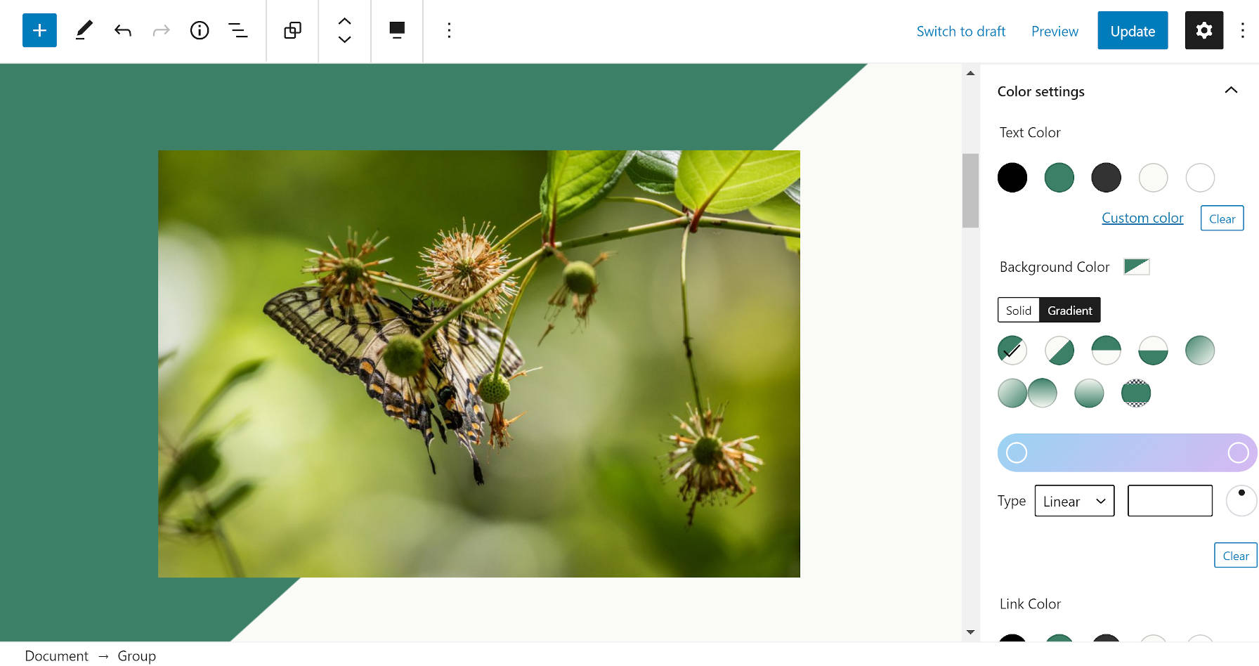
Hustle also comes with a great selection of color palettes. You can choose from one of our pre-made palettes and further customize it or create your own custom color palette and customize the color of your various form elements.

Use Hustle’s preset or custom color palettes to further customize your module’s appearance.

Additionally, Hustle gives you a range of advanced settings for enhancing elements, like border, spacing, and shadow. You can also define the overall size of your module in this section, choose whether to inherit your theme’s styling or add your own custom CSS.

Hustle Advanced Options and Custom CSS.
Use Hustle’s advanced customization options and custom CSS for even finer granular control over the appearance of your modules.

Once you’re happy with your module’s design for desktop users, the next step is to make sure that your forms will work perfectly across all devices, especially on smaller screens.

Note: If you are using one of Hustle’s pre-made templates, there’s no need to adjust your module’s custom mobile settings, as the templates are already responsive.

Also, Hustle automatically tries to keep everything responsive in your module even if a template isn’t used. If you need to edit mobile settings after previewing your module, simply enable the “Custom Mobile Settings” mode at the top of the Appearance page.

You will see that many mobile appearance settings are inherited from the settings configured for desktop users. You can customize your module further if required by adjusting these elements to display differently to mobile users.

Hustle Appearance screen - Mobile settings
Your module’s mobile appearance inherits a number of settings from its desktop settings.

In addition to controlling the appearance of your pop-ups and slide-ins, Hustle gives you extra options for displaying embedded modules on your site, such as the ability to display forms inline at a specified position in your posts & pages, making the Hustle widget available under Appearance > Widgets so you can add embeds to widgetized areas of your theme, and creating shortcodes you can use to add your embeds wherever your site accepts these.

But we’re still not done customizing your modules. Not by a long shot!

Hustle also gives you complete control over where your modules will display on your site with a staggering array of Visibility conditions.

Hustle General Visibility Conditions list
Hustle gives you precise control over your module’s visibility.

By default, your pop-up and slide-ins will appear everywhere on your site and display to every visitor. This also applies to forms embedded inline, in widgets, and when using shortcodes.

By applying one or more of Hustle’s visibility rules, you can target only the visitors you want to see your messages using specific conditions and settings to suit your needs.

For example, you can use visibility rules to show your modules only to logged-in visitors, or only to visitors from a specific country, or only to visitors using a certain browser on a certain device when they visit a specific page…or a combination of all of the above and more!

In addition to general visibility rules, if you run an eCommerce store powered, Hustle helps to improve your sales with specific conditions for WooCommerce-powered sites.

For example, if you are running a sale for a specific product, you can set WooCommerce conditions to run promotional campaigns offering specials or discounts on its product page.

WooCommerce visibility conditions for slideins
Hustle’s WooCommerce visibility conditions let you improve your sales conversions with a highly targeted eCommerce sales and promotional strategy.

Not only does Hustle give you granular control over where your modules will display on your site, but also when they will display to your visitors.

This is done in the Behavior tab, which lets you set up precise triggers for your form to display when your visibility conditions are met.

For example, you can schedule your campaigns’ start and stop times and dates, including or excluding specific days of the week, and even set up custom time zones.

Hustle Behavior Scheduling settings.
You have precise control over scheduling your module’s appearance.

You can also set triggers that let you specify how long your modules should wait or which element on the page visitors have to scroll past before displaying your campaign.

Hustle’s trigger settings let you display your campaigns in front of your visitors at the perfect moment.

Hustle’s more impressive triggers make use of sophisticated technologies like Adblock detection and Exit Intent to help maximize conversions.

With adblock detection, your site’s content is blocked with a non-dismissible pop-up when an adblocker is detected on their browser. Your visitors will have to disable their adblocker to view your content.

Exit Intent senses your visitors’ intention to leave your site and lets you display your modules before you lose them.

Take advantage of Hustle’s smart exit intent pop-ups and slide-ins to turn leaving visitors into new leads, sales, or subscribers.

In addition to the above, you also have control over your module’s animation effects, slide-in positions, closing methods and behavior, and even what happens after forms display to visitors.

Hustle lets you control everything about your module’s display behavior.

Once you’ve set up and customized your module to suit your needs, simply hit the Publish button, and Hustle goes immediately to work for you, obeying every rule and condition you have specified.

Hustle Publishing screen
As soon as you hit publish, Hustle starts hustling for you.

For more information on how to set up and use a module, see our tutorial on how to make the perfect pop-up with Hustle or check out the video below:

For a detailed walkthrough of how to configure all the settings in your module, check out Hustle’s extensive documentation section.

3. Share Your Content Easily on Social Sites

You’re not just limited to growing your business using pop-ups, slide-ins, and embeds.

With Hustle’s social sharing modules, you can also get visitors to promote your site on all the main social networks using floating on inline content sharing prompts.

It’s as simple as creating or importing a module in the Hustle > Social Sharing section.

Hustle Social Sharing
Add floating or inline social sharing prompts.

In the module’s Services screen, you can enable a counter to show how many times social icons have been clicked or how many times your content has been shared on each network.

To add social platforms to your module, just select or deselect icons and click the Add Platform button.

Add social platforms
Select or deselect the platforms to display in your social sharing module.

You can also use drag and drop to reorder how icons will display on your module.

Reorder social platforms using drag and drop.
Reorder the social platforms using drag and drop.

Go through the additional screens to finish editing and customizing your social sharing module.

In the Display Options section, you can enable a floating social bar and choose whether to display your module on visitors’ desktop and mobile screens (and adjust their positions), inline on your site’s posts and pages, or on your sidebar using a widget. You can also create a shortcode to paste into your content and display the module wherever you like.

In the Appearance screen, you can change the style of your icons, customize color schemes, and add shadows and animations.

And like all of Hustle’s other modules, you can set rules in the Visibility section to display the module only under specific conditions or have your social shares appear everywhere on your site.

Edit and customize your social sharing module.

Hit the publish button when you’re ready to put the module to work.

4. Manage 3rd Party App Integrations

Once you have created and customized your modules so they look and behave the way you want for your visitors, the next step is to make sure that they will work for your business too.

You can integrate your modules with many third-party apps in the Integrations section.

The addition of Zapier means that Hustle modules can integrate with over 1,000+ different applications.

Integrate your Hustle modules with 1,000+ third-party apps.

The integration process is very simple. First, you connect a selected app to Hustle, then you integrate the connected app into a specific module.

For a complete step-by-step walkthrough of the integration process, check out our plugin documentation section.

5. View Your Email Subscribers

You can view a list of everyone who has subscribed through any active opt-in modules on your site (including your local email list and any integrated third-party lists you’ve set up) in the Email Lists section.

Just select the type and the name of your module and click the Show Email List button to display your list of email subscribers.

View all your email subscribers without leaving your WordPress dashboard.

If you have a sizeable email list, use the filters on the submission page to save time bulk editing, finding, viewing, and sorting specific subscribers or segments of your email list.

You can filter your list by keyword or date range, sort by date submitted or id, and bulk delete subscribers.

The filters on the submission page can be very handy when filtering through a huge list.

For more details on using the Email Lists section, check out our documentation.

6. Configure Main Plugin Settings

So far, we’ve covered just about everything you need to know to get the most out of using Hustle.

There are just a few additional important things to cover in the Settings section of the plugin.

Hustle’s Settings section lets you finetune your modules’ effectiveness and performance.

In addition to configuring things like what to do with Hustle’s data and settings if you uninstall the plugin, setting viewer’s privacy options, assigning different kinds of permissions to user roles (e.g. who can edit your modules and integrations or access your email list), adding a captcha to forms, enabling support for accessibility enhancements, and customizing unsubscribe options, the sections described below also let you finetune the effectiveness of your modules’ performance:

General Settings

The General settings screen lets you customize your Hustle dashboard and subscriber notifications, and choose the number of items to show per page on your submissions or module listing pages.

Hustle - General Settings screen.
Customize your Hustle dashboard and subscriber notifications.

Color Palettes

You can create custom color palettes for your pop-ups, slide-ins, and embeds. Start with one of the default color palettes or import a color scheme from one of your existing modules and customize it further to create a new palette.

Hustle - Color Palette Settings screen.
Create custom color palettes for your modules.

Dashboard Analytics

You can display an analytics tracking widget for your Hustle modules on your WordPress dashboard.

Configure the options in this section to give the widget a custom title, define which user roles can view the widget, and select the modules you want the widget to track.

Hustle Dashboard Analytics widget.
Add an analytics tracking widget for your Hustle modules.

Top Metrics

Earlier, we mentioned that you can select three metrics from a list of options to display in the Hustle dashboard. Here is where you select these metrics.

Hustle - Top Metrics Settings screen.
Set the top metrics that will help you achieve your goals with Hustle.

Time To Get Hustling

As you can see, Hustle is not your ordinary pop-up plugin. It’s the ultimate WordPress marketing plugin for building a mailing list and converting traffic on your site.

Start with the free version of Hustle to collect email addresses and grow your mailing list or upgrade to Hustle Pro to generate more leads with unlimited pop-ups, slide-ins, embeds, social sharing modules, and marketing campaigns, plus white label plugin branding.

To learn about all the features of Hustle, refer to the plugin’s documentation and check out our roadmap for new features and improvements coming soon to Hustle.

How To Get The Most Out Of Using Beehive

Beehive Analytics is your all-in-one Google Analytics Dashboard, keeping you in the loop when it comes to your site traffic and making analytics less of a chore. Easily track your statistics straight from your WordPress dashboard and stay on top of your marketing game. Here’s everything you need to know…

Google Analytics can be daunting for inexperienced users. When all you need are a few simple statistics, having to navigate its interface whilst being faced with rows upon rows of numbers can be a bit overwhelming.

From your most-visited pages to your most-popular referral platforms, Beehive saves you this headache by making all of your most important stats available to you at a glance.

This article will talk you through how to get set up and make the most of Beehive.

Read on to find out more about:

1. Connection Options
2. Setting Up an API Project
3. Configuring Your Permissions
4. Beehive Dashboard Overview
5. Beehive Dashboard Widget
6. Checking Your Reports
7. Enabling Display Ads
8. Using Beehive with Multisite

1. Connection Options

First things first – to use Beehive, you need to have a Google Analytics account.

There are three different routes you can go down when connecting your analytics account to Beehive:

Tracking ID only – Adding just a Tracking ID allows data to be sent to a property within a Google Analytics account, but that data can only be viewed in Google Analytics and will not be available on the dashboards of the target site(s).

Connect with Google – This method utilizes a shared API to display tracking statistics on site or network dashboards but comes with limitations.

API Project (recommended) – Creating a custom API Project for a specific site or network allows data to be displayed on site and network dashboards without the limitations of a shared API.

2. Setting Up an API Project

Below we will take you through how to set up Beehive as an API Project. It is our recommended method as you won’t be sharing API credentials with anyone, plus you can personalize your authentication screen icon and project name.

Head to the Google Developer Console and select a new project.

Screenshot of the first step of the API Project where you input your project name and organization.
Choose your project name wisely as it cannot be amended later.

Select your organization and location and click Create.

You will then be met with a message informing you that you have no APIs available to use. Click on Enable APIs and Services just above this message.


Screenshot of the enable APIs and services button
This will take you to the API Library.

On the next screen, you will see tons of different API categories, however the only ones you need to enable are Google People, Google Analytics and Google Analytics Reporting.


Screenshot of the Google People API.
Type them into the search bar and click Enable on each.

As Google requires informed consent for most of its data collection APIs, in order to run Beehive, Google needs a OAuth 2.0 Client ID which requires that users grant consent to the data collection via a consent screen.

You can set this up by heading back to the Google API dashboard and clicking Credentials.


Screenshot of the drop-down where you can select OAuth client ID.
Click Create Credentials and select OAuth client ID.

On the next screen, you will need to choose the type of users that will be using Beehive. This will generally be external if you want to give access to people outside of your organization such as clients or agencies.

Screenshot of the option to select internal or external users.
If you select Internal, only members of your organization will be able to use the plugin.

The next screen may look a little daunting, but all you need to do is fill in a few pieces of simple information.

First of all, add the application name (e.g. Beehive Analytics), and add a logo if you wish. Please note that adding a logo may mean that Google has to verify the plugin, which may prevent you continuing with the setup until the verification is complete.

Screenshot of the section where you add your application name.
Select another support email address if you don’t want to use the one linked to your account.

Scroll down to Authorized domains, add in your site address, then click Save.

You will then need to head back to credentials and again click Create OAuth client ID.

Select the application type as Web Application, name the client and add the Authorized Redirect URIs.

You must add the Redirect URI twice – once ending in a forward slash, and once without.

Screenshot of the section to add your redirect URIs.
Ensure you add http/https at the front of your URI.

Click Create and a pop-up will appear containing your Client ID and Client Secret.

Screenshot of the popup which contains the keys.
Hurrah, you’ve made it!

Head back to Beehive and click on the settings page.

Click the Set Up API Project option and copy across the two pieces of data from your Google API.

Screenshot of Beehive's setup menu where you need to enter in the key from Google API.
Fill in both fields and click Authorize.

You will then be prompted to link your Google account. Follow the quick steps and your account should be successfully linked.

Last but not least, you will need to choose a profile, as you can have more than one site connected to your Google Analytics account.

Screenshot of the profile drop-down with Kirstan's blog selected.
Select the site you want to connect to from the drop-down box.

If the site you are connecting is the same site as the one you have installed the plugin on and are currently using, you can tick the Automatically detect tracking ID box.

If you are tracking the analytics for a different site, you will need to add the tracking ID manually. There is a link further down the page which takes you to Google’s instructions on where to find it.

The hard part is now over and you can now start exploring Beehive!

3. Configure Your Permissions

As standard, all administrators have access to Beehive. You can grant permissions to view the widget and analytics stats to other users either by role or by capability.

Screenshot of the tickboxes where you can delegate permissions.
The downward arrows allow you to fine-tune which aspects of the widget and analytics you want to grant access to.

You can also choose who gets access to Branda’s settings, which allows the user to change the linked accounts.

Screenshot of the user roles to which you can grant access to Beehive's settings.
Tick boxes to add permissions to extra roles or click Custom Users to include or exclude by username.

4. Beehive Dashboard Overview

For a less-experienced user, Beehive’s dashboard is a breath of fresh air compared to Google Analytics.

Your main stats are displayed on one simple and easy to understand screen, and you can quickly flick through past results by using the drop-down in the top-right corner.

Screenshot of an overview of Beehive's dashboard.
See your most important stats at a glance.

The dashboard displays a running total of page views for the current week, as well as the number of users, sessions, average time, and bounce rate.

Beehive’s dashboard features a handy comparison so that you know how your stats are holding up compared to last period.

5. Beehive Dashboard Widget

This easy-to-digest theme runs through to your main dashboard, where Beehive automatically adds a detailed summary of your Google Analytics stats.

Screenshot of the dashboard widget.
The widget is packed full of handy statistics.

You can see a quick overview such as your top page, top country, top referral, and page views. Flick across the menu to see a mini audience graph as well as your top pages and average time spent, and a roundup of your traffic activity.

It’s a simple way to keep an eye on your stats without needing to open up the plugin and getting into ‘analytics mode’.

Note: If you find yourself wondering why the WPMU DEV analytics widget in the WPMU DEV dashboard shows different data when compared to data displayed by other Analytics widgets, that’s because we use different metrics. We anonymize IPs and don’t track or store any personally identifiable information (PII).

6. Checking Your Reports

From the bottom left of Beehive’s dashboard, click ‘View Full Report’ to be taken to the good stuff.

You can switch the main graph to display the number of sessions, users, pageviews, average session time, and bounce rates.

Easily keep track of trends with Beehive’s handy graphs.

Next up are three simple donut charts which present some of your most important statistics.

First of all is the overall mediums chart. This outlines where your traffic is coming from and groups it into categories such as organic search, direct traffic, and social media.

Screenshot of the overall mediums donut chart
This chart gives a good general idea of how your visitors are finding your site.

This second splits down the referrals from social networks, including all of the large and obvious ones, right down to Stack Overflow, Reddit, and even WordPress.

Screenshot of the social networks donut chart.
The chart will display any social network that you get traffic from.

The last donut chart splits down the search engine traffic.

Screenshot of the search engines donut chart.
A nice even split…

At the bottom of the page are the top countries and pages.

An interactive map displays the top places that your visitors hail from. You can move your cursor over a country to see an exact session count.

Screenshot of the top country map showing the UK with the highest traffic
Find out exactly which parts of the world love your site.

Last but not least are your top pages, along with the average session time, number of visitors and an indication of the trend.

Screenshot of the top pages.
View any of your stats over any period to track trends.

7. Enable Display Ads

Take your analytics a step further by adding Google advertising cookies to your site so you can do things such as:

  • Create Remarketing Audiences based on specific behavior, demographic, and interest data, and share those lists with Google Ads
  • Use demographic and interest data in your Analytics reports
  • Create Segments based on demographic and interest data.

All you need to do to enable this is head to Beehive’s settings and click the toggle.

Screenshot of the display advertising toggle.
Follow the link to find out more about keeping your privacy policy in check.

8. Using Beehive with Multisite Installations

Beehive wouldn’t be a WPMU DEV plugin if it didn’t work seamlessly with multisite networks.

There are a few different ways you can go about managing your network’s analytics. You can:

  • Create a network-wide Google Analytics profile to track the entire network’s visits.
  • Set up separate accounts to track each subsite individually.
  • Connect your network URL with Google Analytics and all subsites will automatically show their stats.
Beehive Tracking Settings
Beehive lets you track statistics in your multisite network.

If you choose to allow your site admins to use Beehive, you can decide whether or not they can override your permissions. All you need to do is head to Settings>Permissions and tick the box.

Screenshot of the override permissions tickbox.
You can do this separately for the settings and stats permissions.

Make Better-Informed Decisions

Once you’ve got your analytics account successfully linked to Beehive, tracking your stats becomes one of the simplest parts of running your website.

Everything you need can be accessed quickly and easily whilst going about your other site admin duties. With your stats so readily available, it can help you keep track of traffic trends and be on the ball if there are any issues.

If you like what you see, check out Beehive’s documentation for a more in-depth step-by-step guide to getting set up and check out our roadmap (keep an eye out for our Google Tag Manager update – coming soon!) to see what we’re working on.

Exploring Seedlet, Automattic’s Block-First WordPress Theme

Decorative screenshot of the Seedlet WordPress theme.

On August 26, Automattic launched a new theme titled Seedlet that focused on integrating with the WordPress block editor. A few days later, it was also live in the WordPress.org theme directory. The theme development team wanted to produce a theme that would be in a good position to transition to full-site editing later this year as WordPress 5.6 lands.

Seedlet makes wide use of features that integrate with the block editor. It does so in what is the simplest of ways, which is a testament to how much easier theme development is becoming in the dawn of the block-based themes era. The theme makes liberal use of theme-supported features like custom font sizes, colors, and gradients. It takes its integration an extra step by registering block styles and patterns.

Seedlet almost feels like a skin around the block editor. It is a prime example of the future that we’re hurtling toward, which will mean less focus on code and more focus on design configuration. Themes will not be themes in the traditional sense. I use the term “skin” because it harkens to various systems in days gone by where designers simply added CSS to skin a site. WordPress themes will always be a bit more complex than a simple stylesheet but not much more so. We will be getting back to the basics of CSS and HTML.

That is what I see when I look through the Seedlet theme’s code. While it still has copious PHP, there is an unmistakable structure that clearly says that that theme development is changing — and here is what it looks like as we transition.

I have seen many themes that developers have built to work with the block editor. However, I have seen only a few that have taken a block-editor-first approach. It is almost subtle, and unless you have been neck-deep into theme development for years, you may miss it. Automattic’s theme team is riding the winds of change. Theme authors who want to ride along should pay attention to where this project goes in the coming months.

The one thing I do not understand is why Automattic did not choose to add the “Block Editor Styles” tag to the theme. It clearly adds such styles. This is a missed opportunity to help users find themes compatible with the block editor.

The theme will not suit everyone’s taste. It is a basic blogging theme at its core. However, its wide-open canvas makes it suitable for a variety of sites. The theme’s typography is on point, creating a comfortable reading pace for longer-form work. There is a lot to like about the theme, but I am primarily interested in what the development team has built for the block editor.

Kjell Reigstad, the primary designer on the theme, also announced the team is working on a completely block-based version called Seedlet Blocks. The current plan is to continue iterating on it and launching it as a separate, standalone theme in the future.

Experimenting With Block Patterns

While Seedlet includes only three block patterns, they immediately stood out to me. The patterns are not overly complex, but they are unique designs that make use of core blocks with a mixture of the theme’s presets, such as custom gradients and block styles.

The “Group with Split Background” pattern uses a Group block with the theme’s preset diagonal gradient to create a background for an Image block. It is not a particularly groundbreaking design. However, the beauty is in the simplicity. It shows that theme authors can create interesting designs without adding extra CSS code.

Seedlet Group with Split Background block pattern in the editor.
Group with Split Background pattern in the editor.

The theme’s “Group with Image Overlap” pattern kicks it up a notch in complexity. Starting with the same concept of a Group block with another custom gradient preset, it throws in a Columns block. In the left column, users can add two images, stacked. In the right column, users can add one image. The end result is a custom layout — primarily because of the gradient background — where the two images from the left column overlap the solid background.

Seedlet WordPress theme's Group with Image Overlap pattern on the front end.
Front-end output of the Group with Image Overlap pattern.

The technique is simple in terms of code, but it takes a good designer to create the concept. We are just now scratching the surface of what theme designers will be able to accomplish when they begin thinking about applying various techniques to the block system. Seedlet has some of that sort of outside-the-box thinking with its use of gradients. We need to see more of that from the theming community.

Admittedly, I am not a fan of the third pattern the theme adds. “Alternating Grid of Latest Posts” inserts the Latest Posts block into the editor with the theme’s custom “Alternating Grid” style. Mostly, I just do not care for the layout, but that is simply based on my personal taste.

View of the Alternating Grid of Latest Posts pattern in the block editor.
Alternating Grid of Latest Posts pattern in the editor.

On the whole, I love what the theme is doing with block patterns. This type of exploration is exactly what the WordPress community needs right now.

Setting up and Customizing the Ant Design System in a Nuxt App

I don’t typically work with UI libraries because they can be cumbersome and hard to override, which can contribute to a bloated. However, Ant Design has recently gained some some of my affection because it’s easy to use, has extensible defaults, and features a delicate design.

Nuxt and Ant Design work well together, in part because of Nuxt’s code-splitting and tree-shaking abilities, not to mention Nuxt’s new static target deployment option. I can serve an app using Ant Design with great performance scores.

Combining the two was a little tricky and there isn’t a lot in the way of documentation for how to do it, so what follows are the steps you need to set it up. Let’s get started!

Install Ant.design 

The first step is installing the ant-design-vue package, along with Less.js and less-loader, which we will need to create our Less variables:

yarn add ant-design-vue less less-loader
# or
npm i ant-design-vue less less-loader

Now lets tell Nuxt to use it globally via a plugin. We’ll create a file called antd-ui.js:

import Vue from 'vue'
import Antd from 'ant-design-vue/lib'

Vue.use(Antd)

You may notice that unlike the process outlined in the Ant Design getting started guide, we are not importing the global CSS file they mention. That’s because we’re going to manually import the base variable Less file instead so that we can override it. 

We have a few things to do in our nuxt.config.js file. First, let’s register the plugin we just made:

plugins: ["@/plugins/antd-ui"],

Next, we’re going to let webpack know we’d like to build Less:

build: {
   loaders: {
     less: {
       lessOptions: {
         javascriptEnabled: true,
       },
    },
  },
}

Finally, we need to create a global stylesheet for our variables that imports Ant Design’s defaults as well as our overrides:

css: [
  "~/assets/variables.less"
],

We can see that this file exists in a /assets folder, so let’s make it. We’ll create a file in there called variables.less, and import Ant Design’s Less variables:

@import '~ant-design-vue/dist/antd.less';

Below this line, there are myriad variables you can override. This is just a sampling. The rest of the variables are here, and you’ll need to include them by their @ and can change it to whatever you wish:

@primary-color: #1890ff; // primary color for all components
@link-color: #1890ff; // link color
@success-color: #52c41a; // success state color
@warning-color: #faad14; // warning state color
@error-color: #f5222d; // error state color
@font-size-base: 14px; // major text font size
@heading-color: rgba(0, 0, 0, 0.85); // heading text color
@text-color: rgba(0, 0, 0, 0.65); // major text color
@text-color-secondary: rgba(0, 0, 0, 0.45); // secondary text color
@disabled-color: rgba(0, 0, 0, 0.25); // disable state color
@border-radius-base: 4px; // major border radius
@border-color-base: #d9d9d9; // major border color
@box-shadow-base: 0 2px 8px rgba(0, 0, 0, 0.15); // major shadow for layers

We’re good to go! There’s no need to import what we need into every component because Nuxt will now take care of that. If you’d like to override very specific styles not included in the variables, you can find the associative classes and override them in your layouts/default.vue file as well.

Ant.design and Nuxt allow you a great framework for building apps very quickly and with ease. Enjoy!


The post Setting up and Customizing the Ant Design System in a Nuxt App appeared first on CSS-Tricks.

You can support CSS-Tricks by being an MVP Supporter.

10 Tips to Retain SEO Ranking After a Redesign

Tips to Retain SEO Ranking After a RedesignIf you run any kind of modern business, you understand how important a professional-looking website is a today. Running a website requires paying attention to a lot of things. You must fine-tune your content, implement a sleek brand, improve conversions, and master search engine optimization (SEO) to increase your organic reach. Occasional updates and even […]

The post 10 Tips to Retain SEO Ranking After a Redesign appeared first on WPExplorer.

30+ Useful Pure CSS Code Snippets

In this post, we’ve rounded up a collection of useful pure CSS code snippets for elements that are commonly used when designing and developing a website. We’ve included a few that may be less common, but might be useful for you if you are looking for a way to level up or add interest in your project.

From parallax to animations to tabs and accordions, this list should be helpful for you to refer to any time you are looking for accomplishing something in your web development utilizing only pure CSS and no JavaScript. So be sure to bookmark this page so you can refer to it next time you are looking for some guidance or inspiration.

Unlimited Web Template Downloads Starting at ONLY $16.50 per Month
Site Templates

Site Templates
2,000+ Site Templates

WordPress Themes

WordPress Themes
1,200+ WP Themes

Landing Pages

Landing Pages
600+ Landing Pages

DOWNLOAD NOW
Envato Elements


Slide Down Toggle

A clean and simple hidden panel that slides down smoothly when the button is clicked.

See the Pen Pure CSS Slide Down Toggle by Surjith (@surjithctly) on https://codepen.io‘>CodePen.dark

Animated Gradient Background

Here’s a subtle animation effect where the background gradient slowly and endlessly changes.

See the Pen Pure CSS Gradient Background Animation by Manuel Pinto (@P1N2O) on https://codepen.io‘>CodePen.dark

Parallax Star Background

A mesmerizing background with stars moving slowly through the night sky.

See the Pen Parallax Star background in CSS by Saransh Sinha (@saransh) on https://codepen.io‘>CodePen.dark

Parallax Scrolling

Some may say that parallax has come and gone, but this cool pure CSS version makes a statement that you might want to utilize in your next project.

See the Pen Pure CSS Parallax Scrolling by Keith Clark (@keithclark) on https://codepen.io‘>CodePen.dark

Form With SVG Radio Buttons

A simple form with radio buttons replaced with SVGs and a subtle animation.

See the Pen Form with SVG radio buttons by Angela Velasquez (@AngelaVelasquez) on https://codepen.io‘>CodePen.dark

Hamburger Slide Out Menu

A handy, simple slide out menu that appears when the hamburger icon is clicked.

See the Pen Pure CSS Hamburger fold-out menu by Erik Terwan (@erikterwan) on https://codepen.io‘>CodePen.dark

Custom Checkboxes

Nicely styled checkboxes that will give your forms a clean look.

See the Pen Pure CSS custom checkboxes by Glen Cheney (@Vestride) on https://codepen.io‘>CodePen.dark

Popup Modal Window

How about a clean popup modal window that doesn’t use any JavaScript? Here’s one.

See the Pen Pure css popup box by Prakash (@imprakash) on https://codepen.io‘>CodePen.dark

CSS Slider

A nice looking, smooth operating content slider with animations and navigation, all in pure CSS.

See the Pen Pure CSS Slider by Damian Drygiel (@drygiel) on https://codepen.io‘>CodePen.dark

Glitched Text Animation

Here’s a cool glitch text animation effect that could work well for large headings.

See the Pen CSS Glitched Text by Lucas Bebber (@lbebber) on https://codepen.io‘>CodePen.dark

Animated Gradient Ghost Button

Want to spruce up your buttons? Try this nice gradient animation.

See the Pen Animated Gradient Ghost Button Concept by Arsen Zbidniakov (@ARS) on https://codepen.io‘>CodePen.dark

One Page Navigation Menu

This is a very clean, single page website with left navigation, where each page slides out from the right without refreshing the browser.

See the Pen One Page Navigation CSS Menu by Alberto Hartzet (@hrtzt) on https://codepen.io‘>CodePen.dark

One Page Vertical Navigation

Similar to the previous snippet, and by the same author, this variation loads each page as a sliding panel from the bottom, along with keyboard navigation that syncs with the vertical menu.

See the Pen Pure CSS One page vertical navigation by Alberto Hartzet (@hrtzt) on https://codepen.io‘>CodePen.dark

Image Slider

Another pure CSS image slider with a nifty animated transition between slides.

See the Pen CSS image slider w/ next/prev btns & nav dots by Avi Kohn (@AMKohn) on https://codepen.io‘>CodePen.dark

Tabs

Need some easy to code/use CSS-only tabs in your next project? Here is a good example!

See the Pen Pure CSS Tabs by Wallace Erick (@wallaceerick) on CodePen.dark

Accordion

How about an accordion instead of tabs to display your content? Thought you couldn’t do it without JavaScript? Think again!

See the Pen Pure CSS Accordion by Rau (@raubaca) on https://codepen.io‘>CodePen.dark

Direction-Aware Hover

Here’s a neat trick! Hover over the box from any side and it reveals something different based on which side you slid your cursor in from.

See the Pen Direction aware hover pure CSS by Fabrice W. (@FWeinb) on https://codepen.io‘>CodePen.dark

Horizontal News Ticker

An old-school news ticker effect without any Javascript? Yes, it can be done!

See the Pen Pure CSS Ticker (Horizontal) by Lewis Carey (@lewismcarey) on https://codepen.io‘>CodePen.dark

Multiline Text Cut Off With Ellipsis

This is a little specific, but still useful in the correct context. Perhaps you need equal height blog post excerpts. Do it with this pure CSS snippet.

See the Pen Pure CSS multiline text with ellipsis by Martin Wolf (@martinwolf) on https://codepen.io‘>CodePen.dark

Toggle Buttons

Five clean looking animated toggle buttons.

See the Pen Pure CSS toggle buttons by Mauricio Allende (@mallendeo) on https://codepen.io‘>CodePen.dark

Swanky Drop Down Menu

This is a really nice vertical drop down menu with great animations.

See the Pen Swanky Pure CSS Drop Down Menu V2.0 by Jamie Coulter (@jcoulterdesign) on https://codepen.io‘>CodePen.dark

12 Loader Animations

Here are some useful spinners and loaders you can use for page load animations.

See the Pen Pure CSS Loaders kit by Viduthalai Mani (@viduthalai1947) on https://codepen.io‘>CodePen.dark

Content Filter

A very handy, pure CSS content filter with a multitude of possible use cases.

See the Pen Pure CSS content filter by Sam Gordon (@samgordon) on https://codepen.io‘>CodePen.dark

Swagtastic UI Stat Pop Out

A beautifully styled layout that could be used for statistics, a pricing table, or whatever your imagination comes up with.

See the Pen UI Statistic Pop Out CSS by Jamie Coulter (@jcoulterdesign) on https://codepen.io‘>CodePen.dark

Folder Tree

A simple folder tree without any JavaScript.

See the Pen Pure CSS Tree by Rafael González (@rgg) on https://codepen.io‘>CodePen.dark

Fancy Checkbox and Radio Buttons

Another variation on nicer than browser default checkbox and radio buttons.

See the Pen Pure CSS Fancy Checkbox/Radio by Rau (@raubaca) on https://codepen.io‘>CodePen.dark

News Cards

This would be great for a blog post listing. Hover over a card to reveal the excerpt and read more link.

See the Pen News Cards – CSS only by Aleksandar Čugurović (@choogoor) on https://codepen.io‘>CodePen.dark

Peeling Sticky

Here’s a fun animation of a label that peels off on hover. How could you use this one?

See the Pen Pure CSS Peeling Sticky by patrickkunka (@patrickkunka) on https://codepen.io‘>CodePen.dark

Horizontal Hover Accordion

A nifty horizontal accordion that reveals content on hover.

See the Pen Pure CSS Horizontal Accordion by Aysha Anggraini (@rrenula) on https://codepen.io‘>CodePen.dark

Funky Vertical Accordion

Another very nicely done vertical accordion with slick animations and zero JavaScript.

See the Pen Funky Pure CSS Accordion by Jamie Coulter (@jcoulterdesign) on CodePen.dark

Animated Toggles

Another set of toggles, this time in flat and 3D versions, with unique animations for each.

See the Pen Pure CSS Toggles by Rafael González (@rgg) on https://codepen.io‘>CodePen.dark

Button Hover Animation

Spice up your buttons and links with this neat little hover animation effect.

See the Pen Button Hover by Katherine Kato (@kathykato) on https://codepen.io‘>CodePen.dark

How will you use these handy pure CSS code snippets?

We hope you will find these pure CSS code snippets useful in your future projects, and hopefully we will save you some time next time you’re looking for any of these common elements to incorporate into your development.

Retrieving data from the db with an ID or with a search term?

I 'm building an application to store and retrieve books, but I have an issue with retrieving data from the db.
I'm using REST and testing with postman. Everything works OK. Currently I have a series of methods written in Java at the backend like so

@Override
    @POST
    @Path("/add")
    //@Produces("application/json") 
    @Produces(MediaType.APPLICATION_JSON)
    @Consumes(MediaType.APPLICATION_JSON)

    public Response addBook(Book book) {        
        dbAccess.connectToDb();
        return dbAccess.addBook(book);
    }

    @Override
    @DELETE
    @Path("/{id}/delete")
    @Produces("application/json")
    public Response deleteBook(@PathParam("id") int id) {
        dbAccess.connectToDb();
    return  dbAccess.deleteBook(id);
    }

    @Override
    @GET
    @Path("/{id}/get")
    @Produces("application/json")
    public Book getBook(@PathParam("id") int id) {
        dbAccess.connectToDb();
        return dbAccess.getBook(id);
    }

So in postman I have a request like http://localhost:8080/book-storage-REST/book/15/get to retrieve a record.
Eventually I will write a front end, maybe in angular, which allows users to do their searches and display the results back to them.
Now, in the real world, a user of course wouldn't use an ID to search for a record, but he/she will be more likely to use the author name or book title. So my question is:
do I need to rewrite the methods above and not use an id parameter or should the front end do the job of taking a search term (title or author), query the db to find the equivalent id, do the necessry filtering in case of more than 1 record and only then, call the relevant methods above wth only one ID?

How CSS Perspective Works

As someone who loves creating CSS animations, one of the more powerful tools I use is perspective. While the perspective property is not capable of 3D effects all by itself (since basic shapes can’t have depth), you can use the transform property to move and rotate objects in a 3D space (with the X, Y, and Z axes), then use perspective to control depth.

In this article, I’ll try to explain the concept of perspective, starting with the very basics, as we work up to a fully animated 3D cube.

The basics of perspective

We’ll start with a simple green square and and we’ll move it on all three axes.

While moving the object on the X and Y axes is pretty straightforward, if we’ll move it on the Z axis, it will look like the square stays exactly the same, and that’s because when the object is moving on the Z axis, the animation moves it closer to us and then further from us, but the size (and location) of the square remains the same. That’s where the CSS perspective property comes into play.

While perspective has no influence on the object when it’s moving on the X or Y axes, when the object is moving on the Z axis, perspective makes the square look bigger when it moves closer to us, and smaller when it moves further away. Yes, just like in “real” life.

The same effect occurs when we’re rotating the object:

Rotating the square on the Z axis looks like the regular rotation we all know and love, but when we rotate the square on the X or Y axes (without using perspective), it only looks like the square is getting smaller (or narrower) rather than rotating. But when we add perspective, we can see that when the square is rotating, the closer side of the square seems bigger, and the further side looks smaller, and the rotation looks as expected.

Note that when the rotation of the object on the X or Y axes is at 90° (or 270°, 450°, 630°, and so on) it will “disappear” from view. Again, this is happening because we can’t add depth to an object, and at this position the square’s width (or height) will actually be 0.

The perspective value

We need to set the perspective property with a value. This value sets the distance from the object’s plane, or in other words, the perspective’s strength. The bigger the value, the further you are from the object; the smaller the value, the more noticeable the perspective will be.

The perspective origin

The perspective-origin property determines the position from which you are “looking” at an object. If the origin is centered (which is the default) and the object is moved to the right, it will seem like you are looking at it from the left (and vice versa).

Alternatively, you can leave the object centered and move the perspective-origin. When the origin is set to the side, it’s like you are “looking” at the object from that side. The bigger the value, the further aside it will look.

The transformation

While perspective and perspective-origin are both set on an element’s parent container and determine the position of the vanishing point (i.e. the distance from the object’s plane from the position from which you are “looking” at the object), the object’s position and rotation is set using the transform property, which is declared on the object itself.

If you take a look at the code of the previous example, where I moved the square from one side to the other, you’ll see that I used the translateX() function — which makes sense since I wanted it to move along the X axis. But notice that it’s assigned to the transform property. The function is a type of transformation that is applied directly to the element we want to transform, but that behaves according to the perspective rules assigned to the parent element.

We can “chain” multiple functions to the transform property. But when using multiple transforms, there three very important things to consider:

  1. When rotating an object, its coordinate system is transformed along with the object.
  2. When translating an object, it moves relative to its own coordinate system (rather than its parent’s coordinates).
  3. The order in which these values are written can (and will) change the end result.

In order to get the effect I was looking for in the previous demo, I first needed to translate the square on the X axis. Only then I could rotate it. If this had been done the other way around (rotate first, then translate), then the result would have been completely different.

To underscore how important the order of values is to the transform property, let’s take a look at a couple of quick examples. First, a simple two-dimensional (2D) transformation of two squares that both have the same transform values, but declared in a different order:

It’s the same deal even if we’re rotating the squares on the Y axis:

It should be noted that while the order of values is important, we could simply change the values themselves to get the desired result instead of changing the order of the values. For example…

transform: translateX(100px) rotateY(90deg);

…will have the same effect as:

transform: rotateY(90deg) translate<strong>Z</strong>(100px);

That’s because in the first line we moved the object on the X axis before rotating it, but in the second line we rotated the object, changed its coordinates, then moved it on the Z axis. Same result, different values.

Let’s look at something more interesting

Sure, squares are a good way to explain the general concept of perspective, but we really start to see how perspective works when we break into three-dimensional (3D) shapes.

Let’s use everything we’ve covered so far to build a 3D cube.

The HTML

We’ll create a .container element that wraps around a .cube element that, in turn, consists of six elements that represent the sides of the cube.

<div class="container">
  <div class="cube">
    <div class="side front"></div>
    <div class="side back"></div>
    <div class="side left"></div>
    <div class="side right"></div>
    <div class="side top"></div>
    <div class="side bottom"></div>
  </div>
</div>

The general CSS

First, we’ll add some perspective to the parent .container element. Then we’ll sure the .cube element has 200px sides and respects 3D transformations. I’m adding a few presentational styles here, but the key properties are highlighted.

/* The parent container, with perspective */
.container {
  width: 400px;
  height: 400px;
  border: 2px solid white;
  border-radius: 4px;
  display: flex;
  justify-content: center;
  align-items: center;
  perspective: 800px;
  perspective-origin: top right;
}

/* The child element, with 3D tranforms preserved */
.cube {
  position: relative;
  width: 200px;
  height: 200px;
  transform-style: preserve-3d;
}

/* The sides of the cube, absolutely positioned */
.side {
  position: absolute;
  width: 100%;
  height: 100%;
  opacity: 0.9;
  border: 2px solid white;
}

/* Background colors for the cube's sides to help visualize the work */
.front { background-color: #d50000; }
.back { background-color: #aa00ff; }

.left { background-color: #304ffe; }
.right { background-color: #0091ea; }

.top { background-color: #00bfa5; }
.bottom { background-color: #64dd17; }

Transforming the sides

The front side is the easiest. We’ll move it forward by 100px:

.front {
  background-color: #d50000;
  transform: translateZ(100px);
}

We can move the back side of the cube backwards by adding translateZ(-100px). Another way to do it is by rotating the side 180deg then move it forward:

.back {
  background-color: #aa00ff;
  transform: translateZ(-100px);


  /* or */
  /* transform: rotateY(180deg) translateZ(100px); */
}

Like the back, there are a couple of ways we can transform the left and right sides:

.left {
  background-color: #304ffe;
  transform: rotateY(90deg) translateZ(100px);


  /* or */
  /* transform: translateX(100px) rotateY(90deg); */
}

.right {
  background-color: #0091ea;
  transform: rotateY(-90deg) translateZ(100px);


  /* or */
  /* transform: translateX(-100px) rotateY(90deg); */
}

The top and bottom are a little different. Instead of rotating them on the Y axis, we need to rotate them on the X axis. Again, it can be done in a  couple of different ways:

.top {
  background-color: #00Bfa5;
  transform: rotateX(90deg) translateZ(100px);


  /* or */
  /* transform: translateY(-100px) rotateX(90deg); */
}
 
.bottom {
  background-color: #64dd17;
  transform: rotateX(-90deg) translateZ(100px);


  /* or */
  /* transform: translateY(100px) rotateX(90deg); */
}

This gives us a 3D cube!

Feel free to play around with the different options for perspective and perspective-origin to see how they affect the cube.

Let’s talk about transform-style

We’re going to add some fancy animation to our cube, but let’s first talk about the transform-style property. I added it earlier in the general CSS, but didn’t really explain what it is or what it does.

The transform-style property has two values: 

  • flat (default)
  • preserve-3d

When we set the property to preserve-3d, it does two important things:

  1. It tells the sides of the cube (the child elements) to be positioned in the same 3D space as the cube. If it is not set to preserve-3d, the default value is set to flat , and the sides are flattened in the cube’s plane. preserve-3d “copies” the cube perspective to its children (the sides) and allows us to rotate just the cube, so we don’t need to animate each side separately.
  2. It displays the child elements according to their position in the 3D space, regardless of their place in the DOM.

There are three squares in this example — green, red, and blue. The green square has a translateZ value of 100px, meaning it’s in front of the other squares. The blue square has a translateZ of -100px, meaning is behind the other squares. 

But in the DOM, the order of the squares is: green, red, blue. Therefore, when transform-style is set to flat (or not set at all), the blue square will appear on top, and the green square will be in the back, because that is the order of the DOM. But if we set the transform-style to preserve-3d, it will render according to its position in the 3D space. As a result, the green square will be in front, and the blue square will be in the back.

Animation

Now, let’s animate the cube! And to make things more interesting, we’ll add the animation to all three axes. First, we’ll add the animation property to the .cube. It won’t do anything yet since we haven’t defined the animation keyframes, but it’s in place for when we do.

animation: cubeRotate 10s linear infinite;

Now the keyframes. We’re basically going to rotate the cube along each axis so that it appears to be rolling in space.

@keyframes cubeRotate {
  from { transform: rotateY(0deg) rotateX(720deg) rotateZ(0deg); }
  to { transform: rotateY(360deg) rotateX(0deg) rotateZ(360deg); }
}

The perspective property is really what gives the animation that depth, like we’re seeing the cube roll left and right, as well as forward and backward.

But before now, the value of the perspective property had been constant, and so was the perspective-origin. Let’s see how changing these values affects the appearance of the cube.

I’ve added three sliders to this example to help see how different values affect the cube’s perspective:

  • The left slider sets the value of the perspective property. Remember, this value sets the distance from the object’s plane, so the smaller the value is, the more noticeable the perspective effect will be.
  • The other two sliders refer to the perspective-origin property. The right slider sets the origin on the vertical axis, from top to bottom, and the bottom slider sets the origin on the horizontal axis, from right to left.

Note that while the animation is running, these changes may be less noticeable as the cube itself rotates, but you can easily turn off the animation by clicking the “Run animation” button.

Play around with these values and find out how they affect the appearance of the cube. There is no one “right” value, and these values vary from project to project, since they’re dependent on the animation, the size of the object, and the effect you want to achieve.

So what’s next?

Now that you’ve mastered the basics of the perspective property in CSS, you can use your imagination and creativity to create 3D objects in your own projects, adding depth and interest to your buttons, menus, inputs, and anything else you want to “bring to life.”

In the meanwhile, you can practice and enhance your skills by trying to create some complex structures and perspective-based animations like this, this, this, or even this.

I hope you enjoyed reading this article and learned something new in the process! Feel free to leave a comment to let me know what you think or drop me a line on Twitter if you have any questions about perspective or any other topic in this article.


The post How CSS Perspective Works appeared first on CSS-Tricks.

You can support CSS-Tricks by being an MVP Supporter.

How to Create an RSVP Form in WordPress (Easy)

Are you planning a big event like a birthday party, fundraiser, or even a wedding? Then you need an easy way to collect RSVPs from your guests.

If you run a WordPress website, then you can easily add an RSVP form without writing any code.

In this article, we will show you how to create an RSVP form in WordPress to improve your planning.

Creating an RSVP form in WordPress

Why Create an RSVP Form in WordPress?

Creating an RSVP form on your website can save you hours of time.

Normally, guests might reply in lots of different ways to your invitation. They could respond by email, text, phone call, or even by telling you at another event.

This can be very difficult to manage. It’s easy to forget who has replied.

That’s why it’s always a good idea to create an RSVP form in WordPress. This means everyone will reply in the same way. Even better, the RSVPs will be saved in your WordPress database.

Creating Your RSVP Form in WordPress

First, you will need to install and active the WPForms plugin for WordPress. For more details, see our step by step guide on how to install a WordPress plugin.

Tip: We recommend using the WPForms’ Pro version or higher. That way, you have access to useful form templates to speed up the process of creating your RSVP form. However, you can use the WPForms lite version to also create the RSVP form.

Upon activation, go to WPForms » Addons in your WordPress dashboard:

The WPForms addons page in your WordPress admin

Next, search for the Form Templates addon. Go ahead and click the ‘Install Addon’ button to install it.

The Form Templates addon for WPForms

Now it’s time to create your RSVP form. First, go to the WPForms » Add New page. Here, you need to type in a name for your RSVP form:

Naming your RSVP form

Below this on the page, you will see the Additional Templates section. Go ahead and type in ‘RSVP’ to see all the RSVP form templates.

We are going to use the Party Invitation RSVP Form, which is suitable for any type of party.

Choose one of the RSVP form templates

Once you have selected your template, WPForms will open it up in the drag and drop form builder:

The party invite RSVP template in the WPForms form builder

Here, you can change anything you like about the form. Simply click on the part of the form you want to change and then edit it on the left hand side.

For instance, we are going to click on the ‘Name’ field and change it to the ‘Simple’ format:

Changing the name field in WPForms

What if you want to add extra options to the ‘Will you be attending’ field? Just click on it then use the (+) button to add more choices:

Adding more options to the multiple choice field

It’s easy to use the ‘Add Fields’ tab to drag and drop more fields onto your form, too:

Adding new fields to the RSVP form

We have added a ‘Single Line Text’ field to ask about allergies and dietary requirements.

Adding a simple text field to ask about allergies and dietary requirements

Once you’re happy with your form, don’t forget to click the Save button at the top of the screen before moving on.

Make sure you save your RSVP form

Next, go to the Settings » Notifications page for your form. This lets you control where the RSVPs are sent.

Checking the notification settings for your RSVP form

Simply change the ‘Send To Email Address’ to the email address you want to use. By default, it goes to {admin_email} which is normally the email address of whoever set up the WordPress site.

Changing the Send To email address for your RSVP form

If you want RSVPs to go to more than one person, follow our instructions to create a form with multiple recipients.

You can also change other settings here, such as the subject line of the emails.

Next, you may want to change the message that guests will see after submitting the form. To do this, click on the Confirmations tab. Simply delete the existing message and type in the message you want to use instead.

Editing the confirmation message for your RSVP form

Again, don’t forget to click the Save button before exiting your form.

Adding Your RSVP Form to a Page in WordPress

It’s easy to put your RSVP form on any post or page on your website. You can even add it to your sidebar using the WPForms widget.

We are going to create a new page for our form. To do this, just go to Pages » Add New. Then, go ahead and enter any content you want for your page.

Adding a page for your RSVP form in WordPress

To add your form, simply click the + icon to add a new block. Then, search for the WPForms block.

Adding a WPForms block to your page

Once you have added that block to your page, you need to select your RSVP form in the dropdown list:

Selecting the RSVP form from the WPForms dropdown list

Finally, go ahead and publish or preview your page to see your form on your website:

The RSVP form live on the website

Checking Your Guest List in WordPress

Once people have had a chance to RSVP, you will want to construct a guest list.

Luckily, WPForms makes this process quick and easy for you. Instead of going through all the notification emails, it’s easy to download the guest list from WordPress (this feature is only available in WPForms pro version).

First, go to WPForms » All Forms in your WordPress dashboard.

The Entries page for WPForms in the WordPress admin

Then, click on the name of your form at the bottom of this page:

Click on the name of your form to view the entries

You will now see a table that summarizes the RSVPs. Just click ‘View’ next to any of these to see the full details.

To download the whole guest list, simply click the ‘Export All (CSV)’ button.

Export a CSV of your RSVP form's entries to produce a guest list

WPForms will then prompt you to confirm which fields you want to include. By default, all will be checked:

Confirm the fields you want to include in your export

Simply scroll down and click the ‘Download Export File’ button:

Downloading your export of RSVPs

It will now download to your computer as a CSV file. You can be open it in Excel or any spreadsheet program like Google Spreadsheet.

We hope this article helped you learn how to create an RSVP form in WordPress. You might also want to see our guide on how to create a professional business email address, and how to create a custom WordPress theme (without writing any code).

If you liked this article, then please subscribe to our YouTube Channel for WordPress video tutorials. You can also find us on Twitter and Facebook.

The post How to Create an RSVP Form in WordPress (Easy) appeared first on WPBeginner.

Jetpack Launches Email Marketing Tools with Creative Mail Integration, WooCommerce-Triggered Store Emails Coming Soon

Jetpack is firing up a new suite of email marketing tools in partnership with Endurance International Group’s Constant Contact brand. Last week version 8.9 of the plugin introduced a new newsletter signup form inside its Form block, based on an integration with the Creative Mail plugin that Constant Contact recently launched as a solution tailored specifically to WordPress and WooCommerce.

The release post highlighted the ability to add WordPress posts and WooCommerce products into email marketing campaigns, but today the Jetpack team elaborated on where they are taking the integration. The features Creative Mail has on deck for future releases are heavily geared towards e-commerce stores. The initial launch includes the ability for store owners to sync their contacts to their email lists in order to market to them directly. Curt Raffi, Senior VP of Product Innovation at EIG, said WooCommerce-triggered store emails are on the way.

“Soon, we’ll add automated customer lifecycle marketing journeys that are geared toward more advanced marketers and eCommerce seller,” Raffi said. The planned features include the following:

  • Create triggered, multi-step customer lifecycle marketing journeys
  • Send WooCommerce abandoned cart emails
  • Send post-purchase follow-up emails
  • Send emails about related products

Email marketing is a critical piece of the puzzle for online store owners looking to connect to customers, as they adapt to the pandemic with reduced foot traffic for brick and mortar locations. Stats from Campaign Monitor show that email send volumes increased by 31% for a random selection of their customers with mid-sized email lists during the 30-day period after March 17 versus the 30 days prior to that. Despite a sizeable increase in send volumes, average open rates for these decreased only slightly, from 31% to 30%, while click-through rates remained the same at 4%.

Even with all the perfunctory messages acknowledging “these uncertain times,” email is still an important channel for reaching customers. As social networks are becoming increasingly hostile and unfavorable environments for advertising, email stands as one of the few remaining direct lines where content won’t get instantly buried by potential customers doomscrolling their news feeds.

Automattic CEO Matt Mullenweg commented on Twitter last month about the value of having a follower’s email address vs a connection on a social network. “So many of these people with newsletters should really be blogging,” Mullenweg said.

“I do think that a follower you have an email address of and a direct relationship with is worth 1,000x a follower on a social network. Maybe it’s just about making things more website-first than email-first, especially for younger audiences that don’t use email.”

One response to his tweet caught my attention – a suggestion that Jetpack make it more convenient to manage a website-first solution for email marketing. It looks like this idea was already in the works with Creative Mail and the Constant Contact partnership.

Although Constant Contact already had an official plugin for WordPress, it only has 40,000 installs. Compare that with MailChimp, which is far and away the market leader when it comes to email marking providers. Mailchimp has many third-party plugins for WordPress, which collectively have more than a million users, including an official Mailchimp for WooCommerce plugin, with 800k+ active installs. Constant Contact stands to have a better chance penetrating the WordPress market by partnering with a highly successful plugin like Jetpack.

Email marketing is not an easy plugin niche to break into, which is evident by the slow growth of newcomers like Newsletter Glue. The plugin is marketed as a Substack alternative, with its “Send as newsletter” feature inside the WordPress editor. It connects to different emails services, provides easy-to-share past issues, and creates a search engine-friendly newsletter archive. Despite all the promotion and buzz on social networks, the plugin only has ~30 active installs after one month in the official directory.

With its deep integration with Jetpack and WooCommerce, Creative Mail has the chance to quickly become a contender among established WordPress email marketing plugins like MC4WP: Mailchimp for WordPress (1 million+ installs), MailPoet (100k), Email Subscribers (100k), and Newsletter (300k). Creative Mail has a broader scope of features that it will be supporting, but it may be able to find success on the basis of Jetpack’s ubiquity.