In this review article we’ll compare Sendinblue vs Mailchimp – two popular email marketing and marketing automation platforms. Traditionally, both Sendinblue and Mailchimp started out as email marketing tools, and gradually evolved into holistic all-in-one marketing platforms. Today, both these platforms have a wide range of features including marketing automation, behavioral targeting and customer relationship […]
In this collection of top ecommerce themes for WordPress we have selected 10 of the best we could find. Each theme in this list is part of the massive collection of assets on Envato Elements, so instead of having to buy each theme separately at a price of anywhere from $20-$100 apiece, you can get these themes and thousands more for a low subscription price starting at only $16.50 per month! This is just a small sample size of what’s available, so be sure to go check out the full selection to get a grasp of what a huge savings subscribing to Envato Elements can bring you.
All of these WordPress themes are responsive, easily customizable, and ready for you to quickly build your ecommerce business website. So let’s have a look!
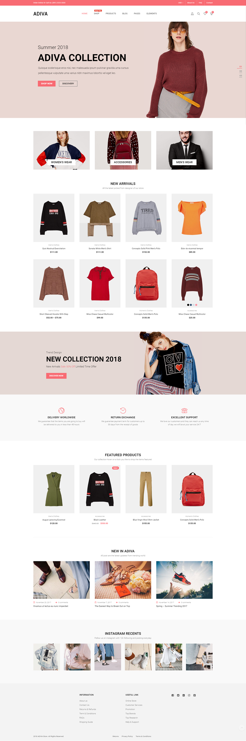
Adiva is a unique and modern looking eCommerce Theme. It is an extremely Flexible WordPress Theme with powerful Shop functionality. All these amazing features are blended together in Adiva – a powerful, stylish and attractive responsive WordPress Theme. Compatible With Visual Composer, WooCommerce, Bootstrap.
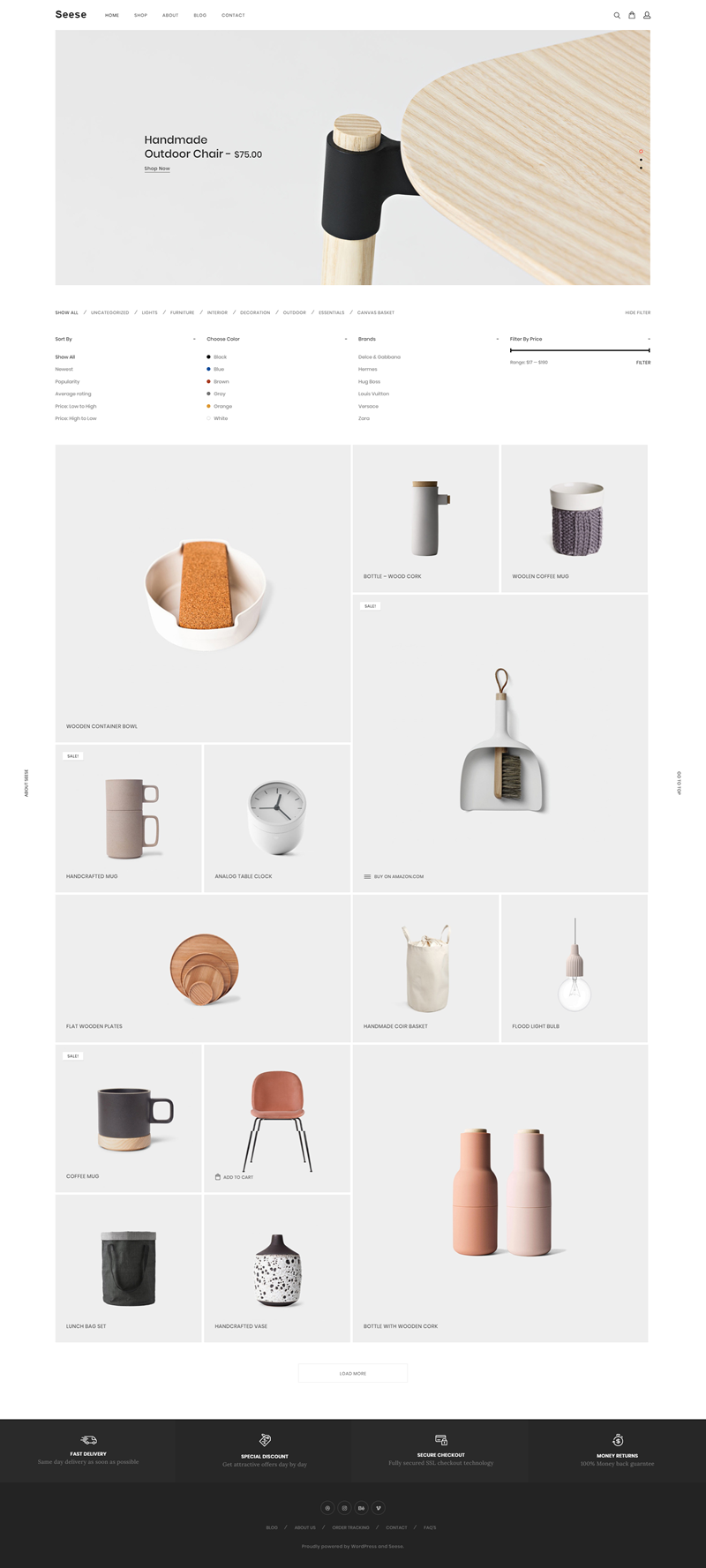
Seese offers a modern and minimal design fully focused on the products you are selling. With 5 different shop layouts (including the masonry option shown below), this ecommerce theme for WordPress is compatible with Visual Composer, WooCommerce, Bootstrap, and more.
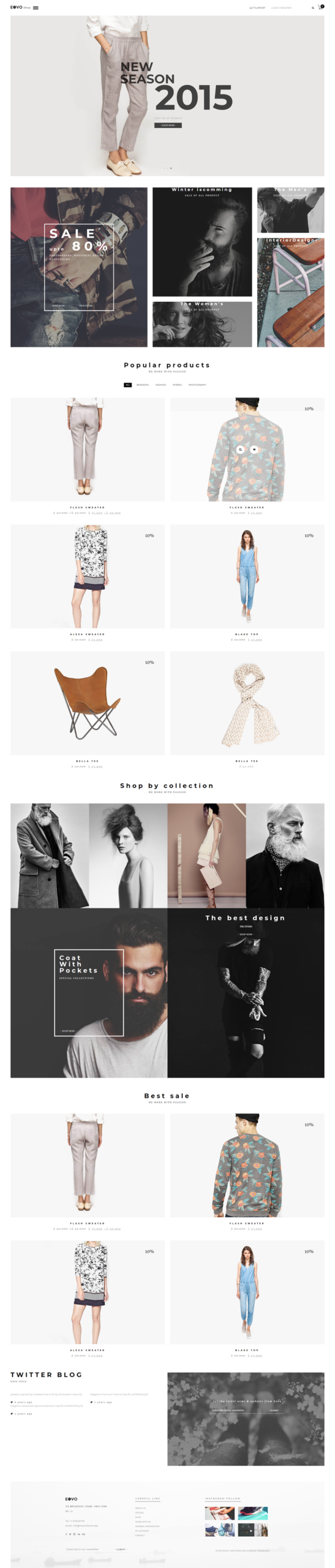
With 3 Shop page variations and 11 Home page layouts, EOVO provides a unique and modern aesthetic in an ecommerce theme for WordPress. This responsive theme is compatible with WPML, WooCommerce, Visual Composer, Bootstrap, and more.
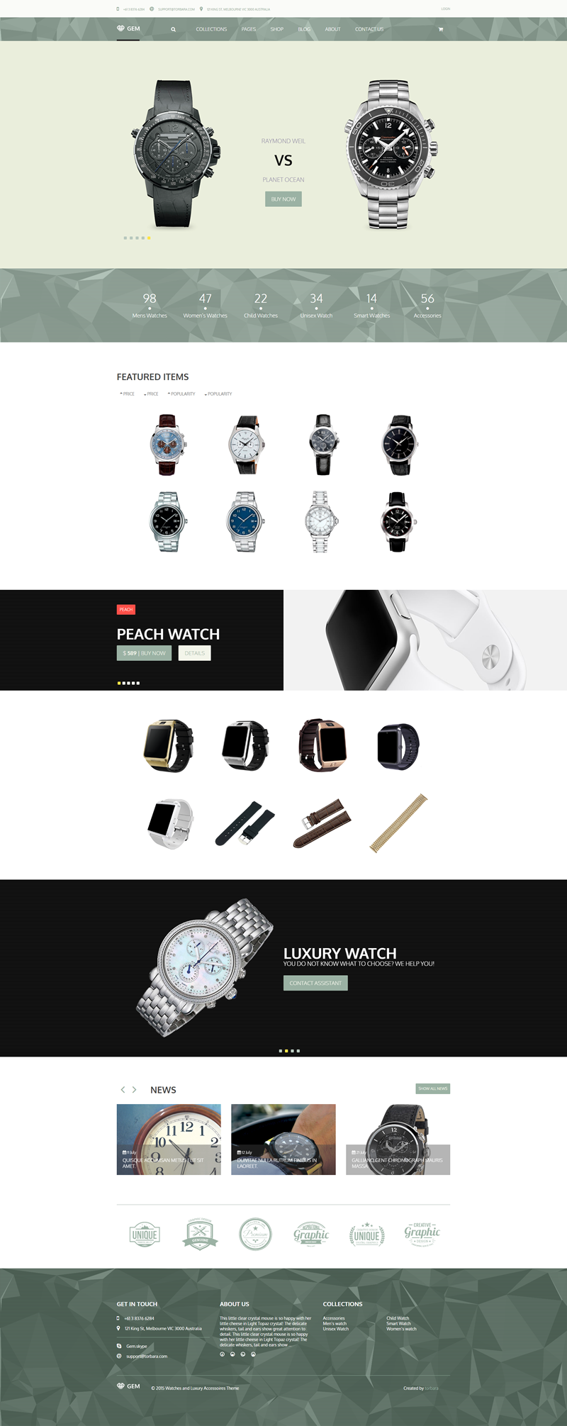
Gem is a clear, easy to customize template built on Warp 7 Framework with many features. This template is suitable for selling all things, such as: fashion, furniture, electronics, cosmetics, accessories. This clean and fresh looking responsive theme is compatible with WooCommerce and WPML.
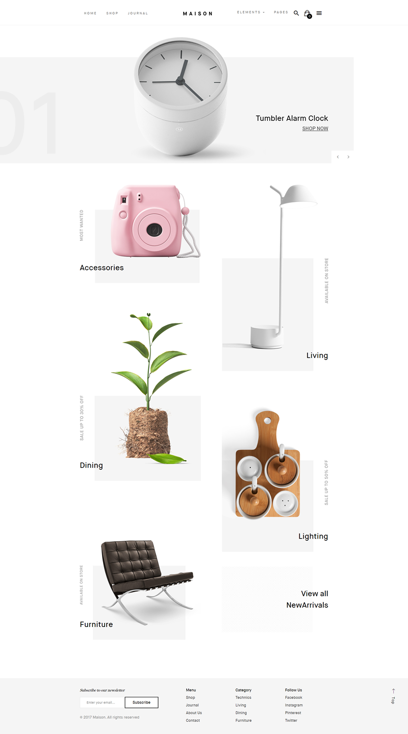
Maison is a modern and minimalist theme with a proper attention to the details. It was built for your furniture store, clothing store, digital store, watch store, men store, women store, accessories store, cosmetics shop, bookstore, hi-tech store, and more. With 5 home page layouts, this flexible and responsive theme is compatible with Bootstrap, Gutenberg, Visual Composer, WPBakery Page Builder, WPML, and WooCommerce.
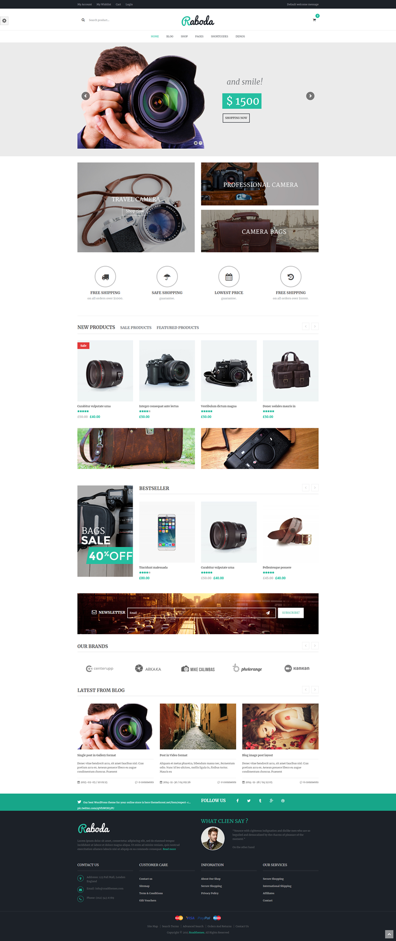
With many great features like product quick view, ajax shopping cart, wishlist, compare, zoom, and fancybox, Raboda is a robust theme. Raboda includes 7 pre-defined home page layouts, multiple blog layouts, is powered by the Redux framework, and is compatible with Visual Composer, WPML, WooCommerce, and Bootstrap.
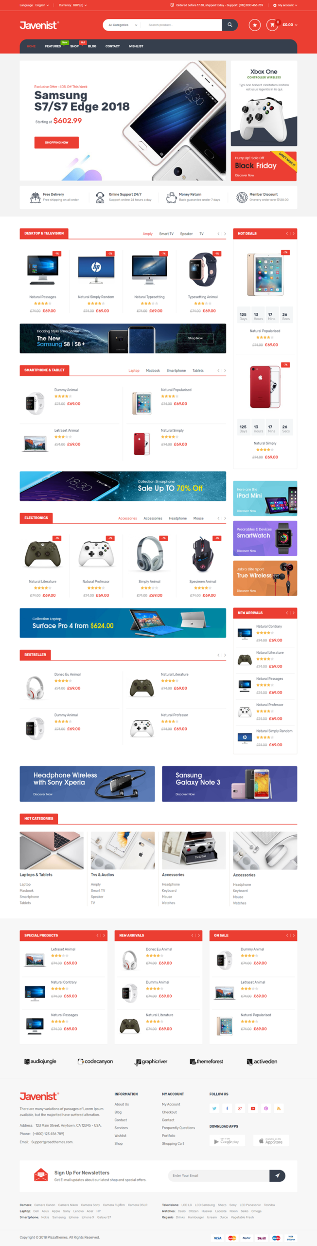
Javenist is a bright and colorful option with 7 pre-defined home page layouts, powered by the Redux framework, multiple blog layouts, mega menu options, and much more. It is compatible with Visual Composer, WooCommerce, WPML, and Bootstrap.
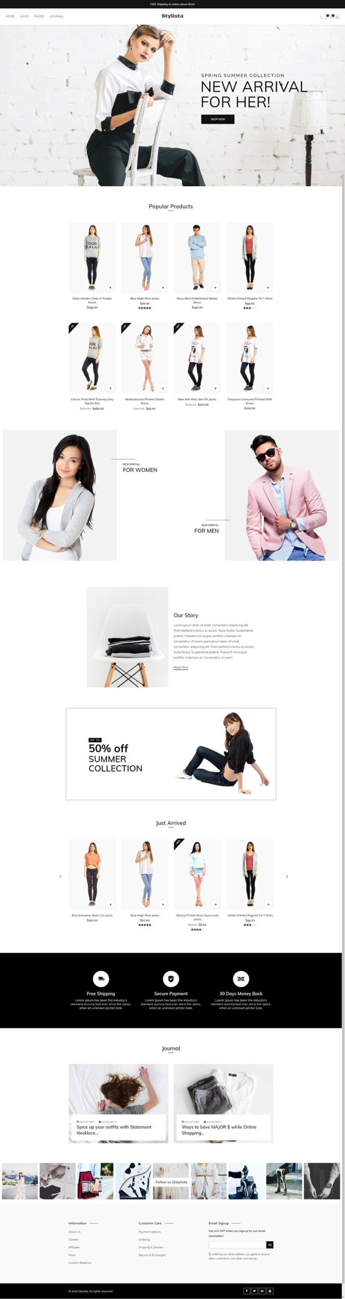
Stylista is a clean & minimal Fashion WooCommerce WordPress Theme for online fashion stores with minimal design and focused on products. Stylista is an outstanding contemporary solution if you want to build more than just a simple WooCommerce store. Stylista is customizable and easy to use, fully responsive, Retina ready, with powerful theme options, good support and much more. This theme is well suited for a lot of e-commerce websites such as a fashion store, a clothing boutique, and more! It is compatible with Bootstrap, Gutenberg, WPBakery Page Builder, WPML, and WooCommerce.
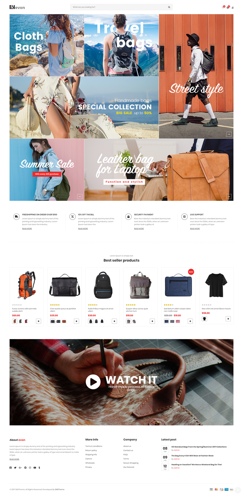
Evon is big, bold, modern, and completely focused on your products. With 16 home page layouts, you’re sure to find the look you’re going for in your ecommerce website. Evon is compatible with WPBakery Page Builder, WooCommerce, WPML, and Bootstrap.
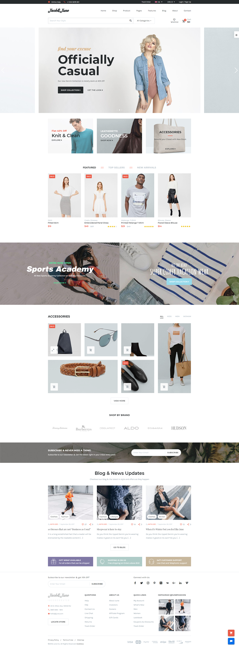
June is a Shop Builder with Drag & Drop functionality and Front-end Editing as Live as it gets! With Premade Demos, hundreds of Blocks & Elements and a Tested & Practical Design, Build, Edit & Launch your Online Shop on the go with far fewer efforts. June comes with Best in Class UI/UX and Unmatched Shop Making Experience. Loaded with the juicy features & Best Practices of a combination of 50+ topmost Big & Small eCommerce Platforms, June is the winner when your search comes to a performing, detailed, well researched, user-friendly & intuitive Shop Building Solution. It is compatible with WPBakery Page Builder, WooCommerce, and WPML.
You have all the potential in the world to be the most sought-after graphic designer in history.
Re-read that sentence again and believe it.
There are a lot of factors that go into being the best designer you can be, but one thing stands true; You could be the best designer in your field, but no one knows about you.
One reason you might not be wildly succeeding right now is that you’re not promoting yourself and your work.
Or you’re not taking advantage of all the places you could be publishing your work.
5 Platforms That Will Help You Grow
Today I want to go over my 5 go-to platforms where I publish my work when I create osmething I’m proud of.
And you should do the same!
Without further ado, let’s get into it.
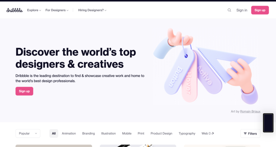
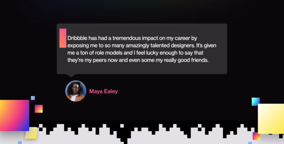
1. Dribbble
Okay, I know that you were expecting to see this as number one, but that’s for good reason!
If you’re not posting your work to Dribbble, every time you create something bomb, then you’re doing it wrong.
If by the smallest chance in the world, you don’t know what Dribbble is, then let me break it down for you.
According to Wikipedia, Dribbble is a self-promotion and social networking platform for digital designers and creatives.
It serves as a design portfolio platform, jobs and recruiting site and is one of the largest platforms for designers to share their work online.
The company is fully remote with no headquarters.
A place where designers gain inspiration, feedback, community, and jobs and is your best resource to discover and connect with designers worldwide.
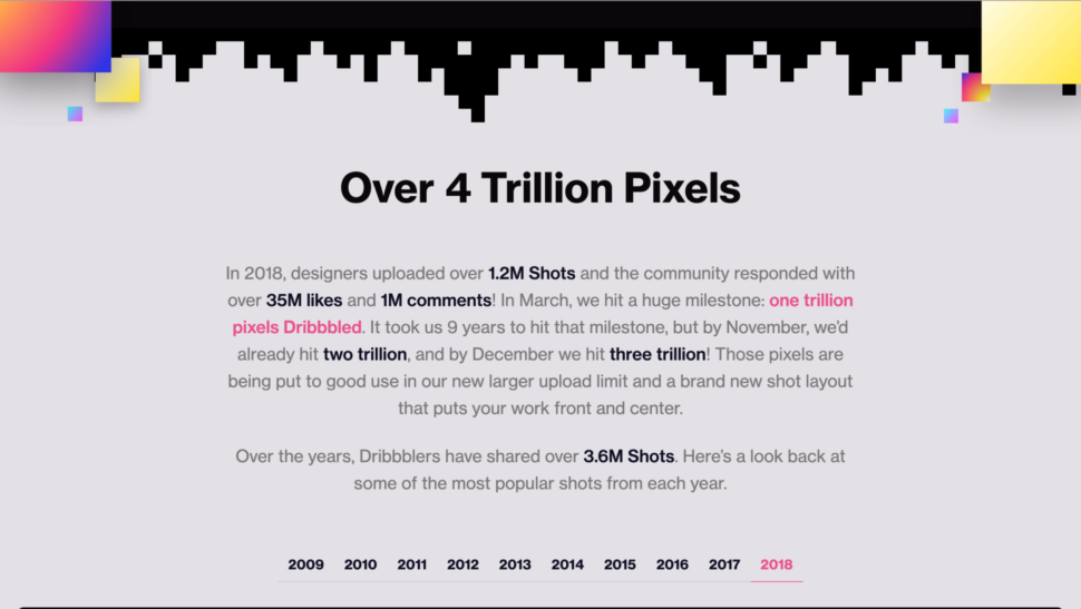
Let me just show you what 2018 held for Dribbble.
You can easily sign up and upload your work. It’s free to join and to post JPG images, but for more advanced project, you might have to upgrade to pro.
Lots of people have been connected with contractors and found jobs through this platform, so I highly recommend!
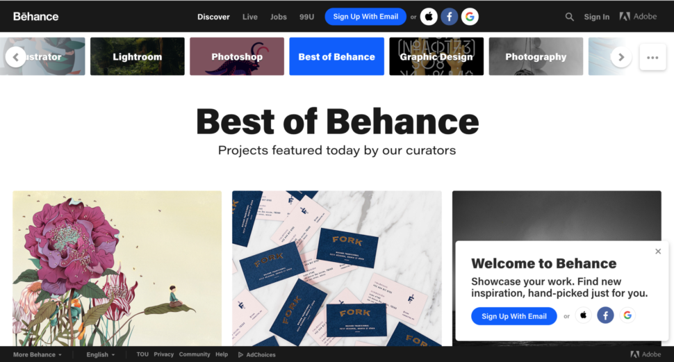
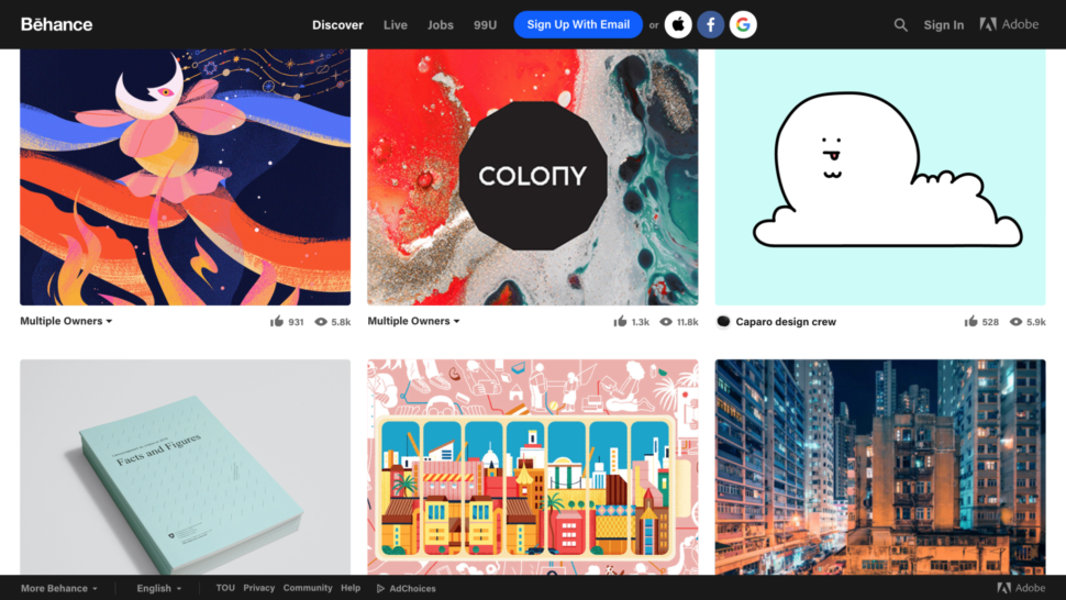
2. Behance
Are you surprised to see Behance right after Dribbble?
I suppose that none of us are.
If you have Dribbble, you need to have Behance as well.
I just feel like the two really are the perfect combo.
Behance is owned by Adobe and is a social media platform that was created for designers to showcase their work and get feedback from other designers
You might also be found by your next client, who knows!
Behance is very similar to Dribbble, in the fact that you just search for a keyword and find loads of inspirational designs and you can find likeminded designers.
Behance is also free of cost, and we all love that.
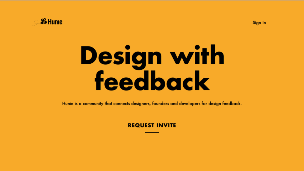
3. Hunie
If you’re always second-guessing your work, then you need to get on Hunie.
Hunie is a platform where you can submit your work strictly to get constructive criticism back from professionals.
It’s great to have an awesome community of other designers who are ready and willing to help you improve.
All you have to do is request an invite and then submit your work for advice and opinions.
You will get the opportunity to connect with others and grow, and also be able to give your opinion and help to other designers.
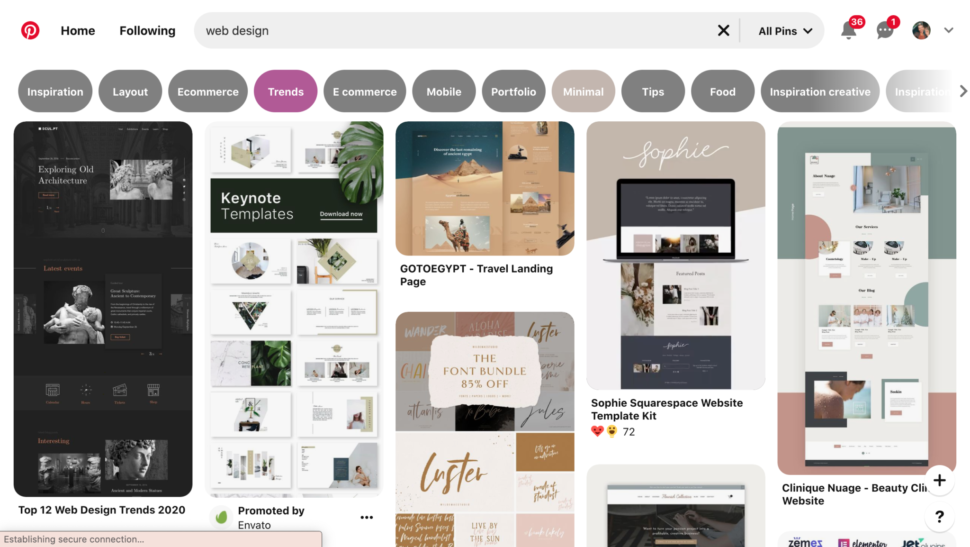
4. Pinterest
If you’re sleeping on Pinterest, then you’ve got another thing coming.
Pinterest is such a powerful tool for gaining a following and exposure.
It’s completely free, and although it’s not made specifically for designers, that doesn’t mean you can’t engage with awesome other designers on the platform.
Use the right keywords and find out what’s trending and post your work!
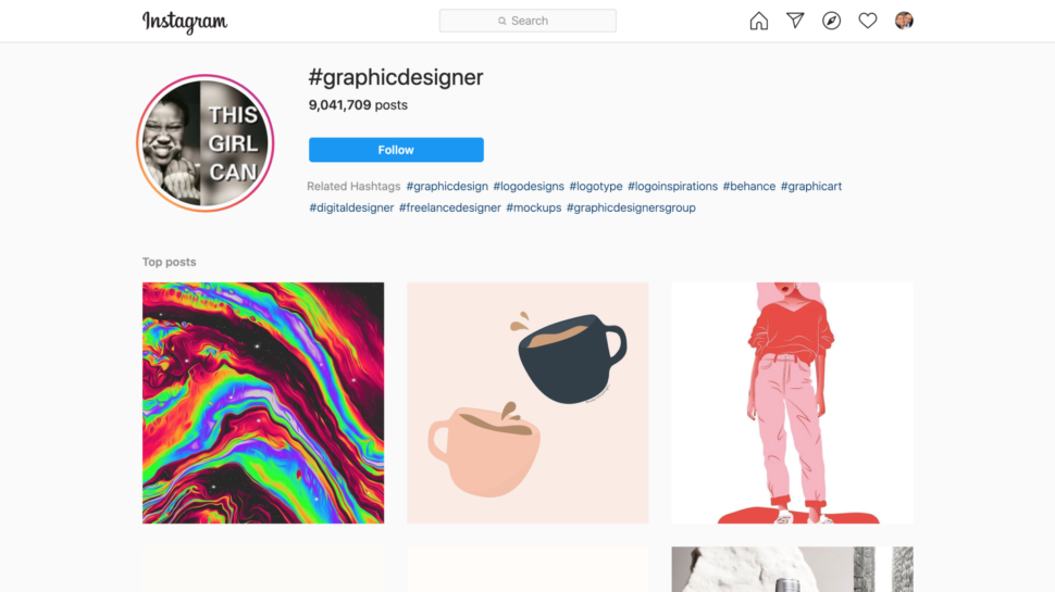
5. Instagram
I’m almost certain you have an Instagram.
You should be using Instagram to your advantage!
I wouldn’t necessarily say you should post your work on your personal profile, but I have definitely created a secondary profile.
Make a profile that’s dedicated to sharing your work.
The power of hashtags in incredible.
Whenever you upload your work, make sure you use about 5 meaningful hashtags to describe your work so you can be on the search page!
You can also promote your work very inexpensively and get thousands of impressions and likes from people who genuinely will love your work.
Wrapping up
Your work deserves to be seen, because it’s awesome.
All you need to do is put yourself out there!
Use these platforms daily to gain inspiration from others, and to grow your own following and community.
Let me know what other platforms you guys use to promote your work.
Hi everyone, how is everything now after one more month at home? We hope you’re hanging in there. We know the daily routine at this time can get a bit tedious and feels like Groundhog Day all over again but it’s far from being the worst thing it can happen to you. You can always find nice in-house activities that keep you on track and sane.
Do you want to create a popup that appears when visitors click on a link or an image on your site?
This is a proven way to grow your email list. It is more effective since it starts with an action taken by a user. Popular sites often use it to offer an optin incentive to get even more subscribers.
In this article, we’ll show how to open a WordPress popup on click of a link or an image, step by step.
What Is an ‘On Click’ Popup Form?
On-click popup forms are lightbox popups that open when a user clicks on a link, button, or image on your WordPress website.
Normally, popups appear on websites when a user arrives or when they are about to leave. On-click popup forms are triggered by user interaction.
We also use on-click popups on WPBeginner to grow our email list. For instance, a popup will appear when a user clicks the email icon in the sidebar next to all social icons.
Why Are On-Click Popup Forms So Effective?
On-click popup form is effective because it uses the powerful Zeigarnik effect. This is a psychological principle that states users who start an action themselves are more likely to finish it.
When someone clicks a link or button to trigger your popup, they’ve already shown interest. When the form popup appears, they’ll be more likely to use it.
For example, you can use an on-click popup to offer a lead magnet. This could be a free downloadable resource like an ebook or PDF file that users can get in exchange for their email address.
However, there are other ways to use on-click popups on your website. For instance, you can ask users to claim a coupon code, learn more about a product, fill-out surveys, and more.
That being said, let’s take a look at how to easily make an on-click lightbox popup for your website.
First, you’ll need to sign up for an OptinMonster account. You’ll need the Pro account (or higher) because it includes the MonsterLinks™ feature that lets you create on-click popups.
Simply visit the OptinMonster website and click the ‘Get OptinMonster Now’ button to get started.
This lets you connect your OptinMonster account to your WordPress site.
Once you’ve activated the plugin, you’ll need to connect your account. You should be taken to the Welcome page automatically in your WordPress dashboard.
Go ahead and click the ‘Connect Your Existing Account’ button.
After that, a new window will open.
You can click the ‘Connect to WordPress’ button to add your site to OptinMonster.
Once you’ve connected your OptinMonster account to your WordPress site, you can create your on-click popup.
Simply go to OptinMonster » Campaigns from your WordPress dashboard and click the ‘Create Your First Campaign’ button.
You’ll be taken straight to the OptinMonster website.
The Campaign Type should already be set to Popup. If not, just click on Popup to select it. Next, you’ll need to choose a campaign template.
You’ll be able to modify the template exactly how this looks later. We’re going to use the ‘Basic’ template for this tutorial.
Simply run your cursor over the template and click the ‘Use Template’ button.
Now, you’ll be prompted to enter a name for your campaign. This is just for you. The users will not see it.
Simply enter a name and click the ‘Start Building’ to create your popup.
OptinMonster will automatically load up the template in the drag-and-drop campaign builder.
You can edit the default text and add or remove elements from your template. Simply drag blocks from the menu on your left and drop them on the template.
You can also remove any element in the form by clicking on it and using the menu options to the left. For instance, we will remove the ‘Name’ field from the form.
First, you’ll need to click on the ‘Optin’ tab at the bottom of the screen. After that, click on the field to select it, and you’ll see the available options in the left column, including the option to remove it.
Once you have designed the popup, the next step is to design the Success view, which people see after filling out the form.
Simply switch to the ‘Success’ view at the top of the screen.
You can edit the success view just like you edited the optin view. For instance, you may want to change the text or include a link to download a lead magnet.
Connecting Your Popup to Your Email List
Once you’re happy with your popup, click on the Integrations tab at the top of the screen. You’ll need to link OptinMonster to your email marketing service so that you can add people to your email list.
From here, click the ‘+ Add New Integration’ button on the left-hand side of the screen.
Next, you can select your email provider from the dropdown list.
From here, simply follow the instructions to connect it to OptinMonster.
Setting Your Popup to Appear On Click
Now, you need to configure your popup to appear when the user clicks a link.
Go ahead and click on the Display Rules tab at the top of the screen.
The default display rule set by OptinMonster is ‘time on page.’ This means that the default pop-up will appear after the user has been looking at that page for a certain amount of time.
However, you can click the dropdown and select the ‘MonsterLink™’ (On Click)’ option instead.
After that, you should see your MonsterLink™ in the display rules.
You can click the button to copy your MonsterLink™ Code. You’ll need this in a moment.
Making Your On-Click Popup Live
Next, you can go to the ‘Published’ tab at the top of the page and change your campaign’s status from ‘Draft’ to ‘Publish.’
Once you’ve done that, click the ‘Save’ button at the top of the screen and close the campaign builder.
Next, you’ll see the ‘WordPress Output Settings’ for your campaign. You can click the ‘Status’ dropdown menu and change it from ‘Pending’ to ‘Published.’ When that’s done, click the ‘Save Changes’ button.
Adding Your MonsterLink to Your WordPress Website
Now, you need to add the special MonsterLink™ to your site. If you didn’t copy this earlier, you can get it by going back to the ‘Display Rules’ setting for your campaign.
First, you’ll need to create a new post or page, or edit the one where you want to add your link.
The MonsterLink™ is HTML code, so you need to paste it into a custom HTML block.
You can change the words ‘Subscribe Now!’ to whatever text you want to use for your link.
Once you’ve placed the link, you can preview your page or post to ensure it’s working.
Here’s our link in action. Note we’ve applied some styling to the text to create a box with larger text to help promote the lead magnet:
Tip: You’re not limited to just text links using MonsterLinks™. You can also use MonsterLink with call-to-action buttons, images, banners, or navigation menus on your website.
The Ionic Framework is an open-source UI toolkit for building fast, high-quality applications using web technologies with integrations for popular frameworks like Angular and React. Ionic enables cross-platform development using either Cordova or Capacitor, with the latter featuring support for desktop application development using Electron.
In this article, we will explore Ionic with the React integration by building an app that displays comics using the Marvel Comics API and allows users to create a collection of their favorites. We’ll also learn how to integrate native capabilities into our app with Capacitor and generate builds for a native platform.
If you have not worked with Ionic in the past, or you’re curious to find out how Ionic works with React, this tutorial is for you.
Prerequisites
Before you can start building apps with the Ionic Framework, you will need the following:
Ionic apps are created and developed primarily through the Ionic command line interface (CLI). The CLI offers a wide range of dev tools and help options as you develop your hybrid app. To proceed with this guide, you will need to make sure the CLI is installed and accessible from your terminal.
Open a new terminal window and run the following command:
npm install -g @ionic/cli
This will install the latest version of the Ionic CLI and make it accessible from anywhere on your computer. If you want to confirm that the install was successful, you can run the following command:
ionic --version
This command will output the installed Ionic version on your computer and it should be similar to this:
6.4.1
You can now bootstrap Ionic apps for the officially supported framework integrations — Angular and React — using any of the prebuilt templates available.
Starting An Ionic React Application
Creating an Ionic React application is easy using the CLI. It provides a command named start that generates files for a new project based on the JavaScript framework you select. You can also choose to start off with a prebuilt UI template instead of the default blank “Hello world” app.
This command will create a new Ionic React app using the tabs template. It also adds a Capacitor integration to your app. Capacitor is a cross-platform app runtime that makes running web apps natively on iOS, Android, and desktop easy.
Navigate your terminal to the newly created directory and run start the server.
cd marvel-client
ionic serve
Now point your browser to http://localhost:8100 to see your app running.
Note: If you have used create-react-app (CRA) before, your current project’s directory structure should feel very familiar. That’s because, in order to keep the development experience familiar, Ionic React projects are created using a setup similar to that found in a CRA app. React Router is also used to power app navigation under the hood.
Creating A React Component
You are going to create a reusable React component in this step. This component will receive data and display information about a comic. This step also aims to help demonstrate that Ionic React is still just React.
Delete the files for the ExploreContainer component from src/components and remove its imports from the .tsx files in the src/pages directory.
Your ComicCard component receives props containing details of a comic and renders the information using an IonCard component. Cards in Ionic are usually composed using other subcomponents. In this file, you are using the IonCardTitle and IonCardSubtitle components to render the comic title and series information within a IonCardHeader component.
Consuming The Marvel API
To use your newly created component you would have to fetch some data from the Marvel API. For the purpose of this guide, you are going to use the axios package to make your HTTP Requests. You can install it by running the following command:
yarn add axios
Next, add the following folder to your src directory:
# ~/Desktop/marvel-client/src
mkdir -p services
Then, cd into the services directory and create a file named api.ts:
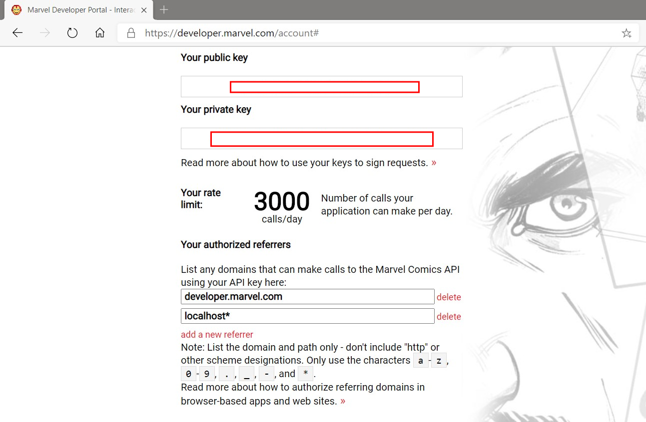
Be sure to replace the value of API_KEY with your own API key. If you don’t have one, you can request one by signing up at the Marveldeveloper website. You also need to set up your account to allow requests from your local development server by adding localhost* to your Marvel authorized referrers list (see the image below):
You now have an axios instance configured to use the Marvel API. The api.ts file has only one export, which hits the GET /comics endpoint and returns a collection of comics. You are limiting the results to only those that are available digitally. You will now proceed to use the API Service in your application.
Open the Tab1.tsx file and replace the contents with the following:
The file above is an example of a page in Ionic. Pages are components that can be accessed with a route/URL. To ensure transitions between pages work properly, it is necessary to have the IonPage component be the root component in your page.
IonHeader is a component meant to exist at the top of a page. It’s not required for all pages, but it can contain useful components like the page title, the IonBackButton component for navigating between pages, or the IonSearchBar. IonContent is the main content area for your pages. It’s responsible for providing the scrollable content that users will interact with, plus any scroll events that could be used in your app.
Inside your component, you have a function called fetchComics() — called once inside the useEffect() hook — which makes a request to get comics from the Marvel API by calling the getComics() function you wrote earlier. It saves the results to your component’s state via the useState() hook. The IonSpinner component renders a spinning icon while your app is making a request to the API. When the request is completed, you pass the results to the ComicCard component you created earlier.
In the next step, you will learn how to use Capacitor plugins in your app by enabling offline storage.
Creating a Personal Collection of Marvel Comics
Your app looks good so far, but it isn’t very useful as a mobile app. In this step you will extend your app’s functionality by allowing users to ‘star’ comics, or save them as favorites. You will also make information about the saved favorites available to view offline by using the Capacitor Storage plugin.
The Storage plugin provides a key-value store for simple data, while the Toast plugin provides a notification pop-up for displaying important information to a user.
The updateFavourites() function in this file takes a single argument, a Comic object, and adds it to the device storage if it doesn’t exist, or removes it from the device storage if it was already saved. getFavourites() returns the user’s saved comics, while checkFavourites() accepts a single argument, a Comic resource ID, and looks it up in the saved comics, returning true if it exists, or false otherwise.
Next, open the ComicCard.tsx file and make the following changes to allow your app’s users to save their favorite comics:
Your ComicCard component now has a IonButton component that, when clicked, calls the updateFavourites() function you wrote earlier. Remember that the function acts like a toggle, removing the comic if it was already saved, or else saving it. Don’t forget to add the imports for the new Ionic components, IonButton, IonCardContent and IonIcon, just added to this component.
Now for the final part of this step, where you will be rendering saved comics in their own page. Replace the contents of the Tab2.tsx file with the following:
This page is quite similar to the Tab1 page but, instead of making an API request to get comics, you are accessing locally saved data. You are also using the Ionic life cycle hook, useIonViewWillEnter(), instead of a useEffect() hook, to make a call to the function that reads saved comics and updates the component’s state. The useIonViewWillEnter() hook gets called just as the page being navigated to enters into view.
Your application now makes use of a few native plugins to improve its functionality. In the next step, you will learn how to generate a native project for Android and create a native app using Android Studio.
Note: You can delete the files related to*Tab3*and remove the import and related*IonTab*component in the*App.tsx*file.
Generating A Native Project
Ionic comes with support for cross-platform app runtimes such as Capacitor and Cordova. These frameworks help you to build and run apps developed using Ionic on a native device or emulator. For the purpose of this guide, you will be using Capacitor to generate native project files.
Before proceeding to adding a platform, you will need to generate a production build of your application. Run the following command in your project’s root directory to do so:
ionic build
Now let’s add Capacitor to your project and generate the assets required to build a native application. Capacitor provides a CLI which can be accessed in your project by using npx or from the ionic CLI as shown below:
Using npx
npx cap add android
This command adds the android platform to your project. Other possible platform values are ios and electron.
Using ionic
Since you initialized your project using the --capacitor flag earlier, Capacitor has already been initialized with your project’s information. You can proceed to adding a platform by running the following command:
ionic capacitor add android
This command will install the required dependencies for the android platform. It will also generate files required for a native Android project and copy over the assets you built earlier when running ionic build.
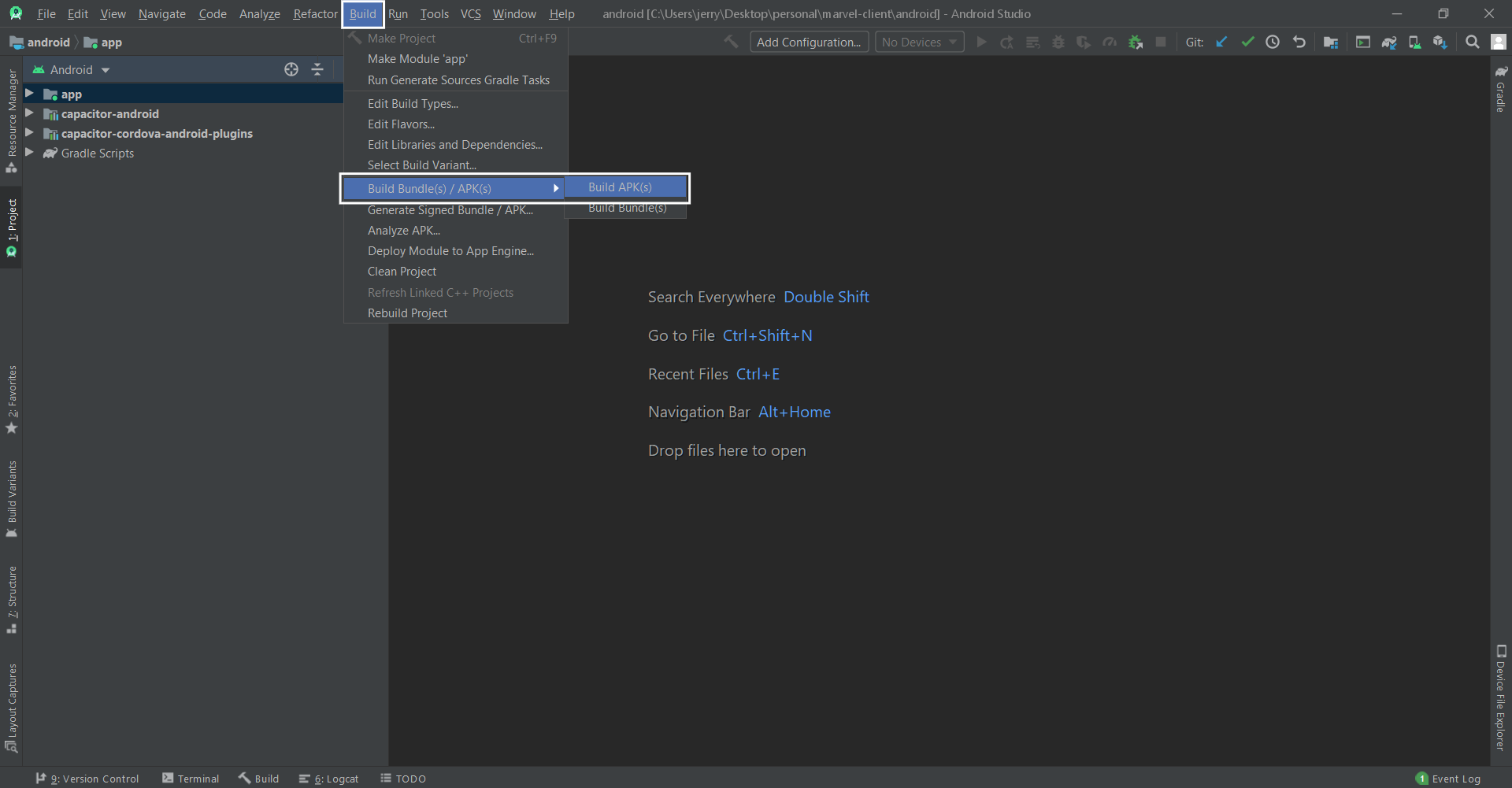
If you have installed Android Studio, you can now open your project in Android Studio by running:
In this guide, you have learned how to develop hybrid mobile applications using Ionic Framework’s React integration. You also learned how to use Capacitor for building native apps, specifically for the Android platform. Check out the API docs as there are a lot more UI components available to be used in Ionic apps that we didn’t explore. You can find the code on GitHub.
I have tried several times to make ssd bootable. Was successful. But I have never found my SSD in the boot list option. Has anyone experienced anything similar?
This article is a case study in websites built using Startup app. We have compiled an assorted collection of outstanding examples in order to show its range of possibilities and scope of use. No one can argue that the number …


 In this review article we’ll compare Sendinblue vs Mailchimp – two popular email marketing and marketing automation platforms. Traditionally, both Sendinblue and Mailchimp started out as email marketing tools, and gradually evolved into holistic all-in-one marketing platforms. Today, both these platforms have a wide range of features including marketing automation, behavioral targeting and customer relationship […]


