Scrum Development Team Anti-Patterns

Development Team Anti-Patterns

After covering the Scrum Master and the Product Owner, this article addresses Development Team anti-patterns, covering all Scrum Events as well as the Product Backlog artifact. Learn more about what to look out for if you want to support your fellow teammates.

The Role of the Development Team in Scrum

According to the Scrum Guide, the Development Team “consists of professionals who do the work of delivering a potentially releasable Increment of “Done” product at the end of each Sprint. Only members of the Development Team create the Increment. Development Teams are structured and empowered by the organization to organize and manage their own work.”

Remote Agile (Part 2): Virtual Liberating Structures

Last week, we addressed basic practices and tools of remote agile with distributed teams. Based on that article, I also ran a live virtual class, the recording of which will be made available soon on the Age-of-Product’s Youtube channel. This follow-up post now delves into virtual Liberating Structures, answering the question of how we can make use of the powerful toolbox of inclusive and collaborative practices in a remote setting.

Liberating Structures

Created by Keith McCandless and Henri Lipmanowicz, Liberating Structures cover a set of easy to learn, yet powerful ways to collaborate as a team — even as a (very) large team by Scrum standards, overcoming traditional communications approaches like presentations, managed discussions, or another disorganized brainstorming at which the loudest participants tend to prevail.

Spring Boot for Microservices: The New Age Framework for Your Apps

Microservices are those components of an app architecture that create a suite of systems. Many microservices combine as a suite to create a system that interacts through UIs (User Interfaces) with the users. Therefore, your application performance largely depends on microservices.

Springboot is an open-source framework based on the Java platform to create excellent microservices. It can help you build spring applications that can be used in the applications and are production-ready.

4 CSS Grid Properties (and One Value) for Most of Your Layout Needs

CSS Grid provides us with a powerful layout system for websites. The CSS-Tricks guide gives you a comprehensive overview of Grid’s properties with layout examples. What we’re going to do here is a reverse approach to show you the smallest possible set of grid properties you need to know to meet most of your layout needs.

These five properties will get you up and running:

  • display (for the grid value)
  • grid-template-columns
  • grid-gap
  • grid-auto-flow
  • grid-column / grid-row

Here’s how simple it is. Let’s assume you want to implement the following layout for small, medium and large screens.

Small and medium-sized screens
Large screen layout

This is the markup we’ll be working with:


<!-- Stuff before -->

<nav class="container-nav">
  <ul>
    <li></li>
    <li></li>
    <li></li>
    <li></li>
    <li></li>
    <li></li>
    <li></li>
    <li></li>
    <li></li>
  </ul>
</nav>

<div class="container-main">
  <section class="item item-type-a"></section>
  <section class="item item-type-b"></section>
  <section class="item item-type-b"></section>
  <section class="item container-inner">
    <section class="item-inner"></section>
    <section class="item-inner"></section>
    <section class="item-inner"></section>
    <section class="item-inner"></section>
    <section class="item-inner"></section>
  </section>
</div>

<!-- Stuff after -->

If we apply a few baseline styles, this is what we get, which is already sufficient for small screens:

Now we can get into the grid properties!

Use display: grid to divide the page into independent layout containers

First, we need to determine which parts of the page should be aligned with grid layouts. It is possible to define a single grid layout for the whole page. However, for websites with a very complex structure (e.g. news websites), handling a large grid quickly becomes complicated to wrangle. In this case, I recommend breaking things down into several, independent grid containers.

Like this:

Where do you draw the line between what is and isn’t a grid? Here’s a personal rule of thumb I follow:

If the layout in a particular part of the page does not fit into the grid of an adjacent or surrounding part of the page, make that part its own grid container.

I have drawn the grid lines into the page section with the class .container-main in the following image You may notice that the section with the .container-inner class from the markup does not fit exactly into the grid of rows.

Here’s another possible layout where the small sections fit into the surrounding grid if a finer line raster is chosen. A separate grid container is not absolutely necessary here.

To kick this off, let’s .container-main into a grid container. This is the basic building block for CSS Grid — turning an element into a grid container with the display property:

.container-main {
  display: grid;         
}

We’ll want to do the same with our other grid containers:

.container-inner {
  display: grid;         
}

.container-nav {
  display: grid;         
}

Use grid-template-columns to define the required columns

Next, we’re going to define the number of columns we need in each grid container and how wide those columns should be. My guideline for the number of columns:  use the smallest common multiple of the maximum number of columns required for the different screen sizes.

How does that work? The .container-main element has a total of two columns on medium-sized screens. If we take that and multiply it by the number of columns on large screens (three), we get a total of six columns.

We can do the same for our navigation, the .container-inner element. There are three columns on medium-sized screens, which we multiple by one column on large screens to get a total of three columns.

The .container-nav element provides no number of columns. In this case, the grid system should automatically adjust the number of columns to the number of menu elements. It’s common to add or remove items in a navigation, and it’d be great if it responded accordingly, which is something grid can help us with a little later on.

OK, so we defined the number of columns for each grid container. Let’s use the grid-template-columns property to set those into place. But, first a couple of minor details:

  • The grid-template-columns property is only used on the grid container. In other words, you won’t find it being used (at least correctly) on a grid item inside the container.
  • The property accepts a bunch of different values that both define the number of columns and how wide they should be. The one we’re interested in here is the fractional (fr) unit. I’d highly suggest checking out Robin’s overview because it’s unique to grid and does an amazing job doing calculations to decide how grid elements fit inside a grid container.

We need six equal-width columns in .container-main. We can write that like this:

.container-main {
  display: grid;
  grid-template-columns: 1fr 1fr 1fr 1fr 1fr 1fr;
}

Or, we can turn to the repeat() function to simplify it into something more readable:

.container-main {
  display: grid;
  grid-template-columns: repeat(6, 1fr);
}

Let’s take that knowledge and apply it to our .container-inner element as well, which we decided needs three columns.

.container-inner {
  display: grid;
  grid-template-columns: repeat(3, 1fr);
}

Use grid-gap to add spacing between grid items

By default, grid uses all the space it has in a grid container to fit in grid items. Having elements flush next to one another might be a design requirement, but not for the particular layout we’re making. We want some breathing room between things!

We have the grid-gap property for that. Again, this is a property that’s just for grid containers and what it does is create vertical and horizontal spacing between grid items. It’s actually a shorthand property that combines the vertical spacing powers of grid-row-gap and horizontal spacing powers of grid-column-gap. It’s handy that we’re able to break things out like that but, in times like this where we’re working with the same amount of spacing in each direction, the shorthand grid-gap is much nicer to write.

We want 20px of space between grid items in .container-main, 10px of space in .container-inner, and 5px of space in .container-nav. No problem! All it takes is a one-liner on each grid container.

.container-main{
  display: grid;
  grid-template-columns: repeat(6, 1fr);
  grid-gap: 20px;
}

.container-inner {
  display: grid;
  grid-template-columns: repeat(3, 1fr);
  grid-gap: 10px;
}

.container-nav {
  display: grid;
  grid-gap: 5px;
}

Use grid-column and grid-row to determine the size of the individual grid items

Now it is time to put the layout into the shape we want it!

First is the grid-column property, which allows us to extend a grid item across n columns, where n is the number of columns to span. If you’re thinking this sounds an awful lot like the rowspan attribute that lets us extend cells across multiple rows in HTML tables, you wouldn’t be wrong.

It looks like this when we use it on a grid .item in our .container-main element, and on the .inner-item elements in .container-inner:

.item {
  grid-column: span 6;
}

.item-inner {
  grid-column: span 3;
}

What we’re saying here is that each item span six rows in our main container and three rows in our inner container — which is the total number of columns in each container.

An interesting thing about CSS Grid is that we are able to name the lines of the grid. They come with implicit names out of the box but naming them is a powerful way to distinguish between the starting and ending lines for each column on the track.

We can change the number of columns and rows the items should span at different breakpoints:

@media screen and (min-width: 600px) {
  .item-type-b {
    grid-column: span 3;
  }

  .item-inner {
    grid-column: span 1;
  }
}

@media screen and (min-width: 900px) {
  .item {
    grid-column: span 2;
    grid-row: span 2;
  }

  .item-type-b{
    grid-row: span 1;
  }

  .item-inner{
    grid-column: span 3;
  }
}

Using grid-auto-flow to control the placing of the elements

CSS Grid places elements one row after the other. This is why the result in our example looks like this at the moment:

A column-by-column placement can be achieved by setting the grid-auto-flow property to column (row is the default value). Our layout will profit from column-wise placement in two cases. First, it makes our menu items finally appear in a horizontal orientation. Secondly, it brings the elements of the container class into the desired grouping.

The final result

Conclusion: More or less specification?

The grid system allows us to work under the motto, “make as many specifications as necessary, but as few as possible.” We’ve only covered a few of the specifications necessary to turn elements into a CSS grid container and the items inside it into grid items for the sake of showing just how little you need to know to build even complex layouts with CSS Grid.

CSS Grid supports additional use cases where:

  • We want to make even fewer specifications in order to instead rely more on automatic positioning.
  • We want to make even more specifications in order to determine more details of the resulting layout.

If the first case applies, then it’s worth considering the following additional grid options:

  • When creating the grid with grid-template-columns, you can have the grid system automatically determine the width of individual columns with the auto keyword or adapt it to the existing content with the settings min-content, max-content, or fit-content.
  • You can let the grid system automatically determine the number of required columns with the help of repeat, auto-fill, auto-fit, and minmax. Even media queries can become redundant and these tools help make things flexible without adding more media queries.

Here are a couple of articles on the topic that I recommend: Becoming a CSS Grid Ninja! and Auto-Sizing Columns in CSS Grid: auto-fill vs. auto-fit.

If the second case applies, CSS Grid offers even more settings options for you:

  • You can explicitly specify the width of the columns in the unit of your choice (e.g. px or %) using the grid-template-columns property. In addition, the property grid-template-rows is available to define the number and width of rows, should there be a specific number of them. 
  • You can also define specific column or row numbers for positioning as values for grid-column and grid-row (or use the properties grid-column-start, grid-column-end, grid-row-start, or grid-row-end).

And we haven’t even gotten into CSS Grid alignment! Still, the fact that we can accomplish so much without even broaching that topic shows how powerful CSS Grid is.

The post 4 CSS Grid Properties (and One Value) for Most of Your Layout Needs appeared first on CSS-Tricks.

How They Fit Together: Transform, Translate, Rotate, Scale, and Offset

Firefox 72 was first out of the gate with “independent transforms.” That is, instead of having to combine transforms together, like:

.el {
  transform: translate(10px, 10px) scale(0.95) rotate(10deg);
}

…we can do:

.el {
  rotate: 10deg;
  scale: 0.95;
  translate: 10px 10px;
}

That’s extremely useful, as having to repeat other transforms when you change a single one, lest remove them, is tedious and prone to error.

But there is some nuance to know about here, and Dan Wilson digs in.

Little things to know:

  • Independent transforms happen first. The transform property happens last and stacks on top of what has already been done, which can get confusing¹.
  • They all share the same transform-origin.
  • The offset-* properties also effectively moves/rotates elements. Those happen after independent transforms and before transform.
  1. Claus Colloseus wrote in to fix some issues in this post and clarify just how confusing this can be. For example, rotate: 45deg; transform: rotate(-45deg); will do nothing as both of them will apply and effectively cancel each other out. So shouldn’t translate: 50px 0; rotate: 45deg; transform: translate(-50px, 0) rotate(-45deg); also all cancel out? No, because of the ordering, the end result is like translate(14.6447px, -35.3553px).

Direct Link to ArticlePermalink

The post How They Fit Together: Transform, Translate, Rotate, Scale, and Offset appeared first on CSS-Tricks.

Visual Design Language: The Building Blocks Of Design

Visual Design Language: The Building Blocks Of Design

Visual Design Language: The Building Blocks Of Design

Gleb Kuznetsov
“Design is not just what it looks like and feels like. Design is how it works.”

— Steve Jobs

Like written words are to language, fonts, colors, shapes and icons are to visual design. An effective visual design language not only acts as a communication framework for all stakeholders on a product development team, but unites a brand and its customers to ensure that a company’s brand identity matches a customer’s brand perception.

We use language as a tool for communication with other people. Writers use words to communicate with their readers, while designers use visual language to communicate with their users. Fonts, colors, shapes, visual elements such as icons — those are elements of design language. Effective design language streamlines communication.

While working at Fantasy in 2016, my team was tasked with designing the interface for Huawei’s mobile OS (EMUI 5 interface). I personally was responsible for the visual design language for this OS. Surprisingly, the company didn’t have its own language at initiation; instead, they relied on a customized version of Android that was plagued by inconsistency and lacked a coherent vision. This was largely due to the existence of multiple teams and multiple functional roles with different skillsets and perspectives all grasping at straws to invent a way to communicate. UX designers, interaction designers, visual designers and graphic designers had all worked on the OS in the past, all using their own best efforts to communicate.

Without a uniform system of communication, not only was the user experience jumbled and confusing, it was extremely difficult to integrate changes into a final design. It was a true Tower of Babel.

Writers use words to communicate with their readers, while designers use visual language to communicate with their users.

What Does Design Language Provide?

By unifying the project teams under one shared language, a project can move forward with clarity, cohesion and speed.

Consistency

Digital design has few physical constraints compared to industrial disciplines. This gives designers a lot of power to experiment and propose a variety of solutions to any given challenge. However, this can easily lead to disjointed user experiences.

To achieve consistency in design, it’s vital to define reusable and cross-platform components and styling options. Consistent design makes it much easier to ship products on a multitude of platforms and devices, which is especially crucial for companies like Huawei.

Brand Recall

When they interact with a product that has a strong visual language, users tend to remember it better. Unfortunately, a majority of products available on the market have generic designs. It is too easy to confuse one product with another when they share the same visual styles.

Creating a strong visual identity is a goal that design teams should state when working on visual design. This is the personality of a digital product! The colors, typefaces, photos, illustrations, animations are all part of a brand, and they should be designed in a way that helps people remember the product. When an authentic design language is followed consistently, it creates recognizability for the brand.

Clarity

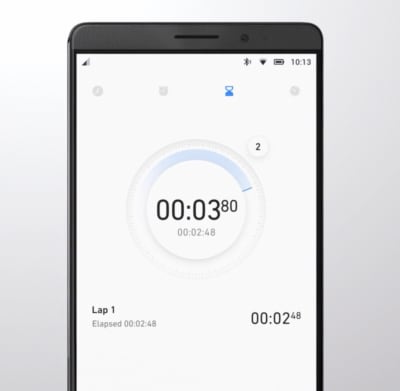
We put a strong focus on clarity — we wanted to make our GUI clean, not cluttered. By following a minimalist approach, we minimized the number of elements that users have on every screen and created a highly-focused experience.

Design concept of EMUI 5 interface
Minimalist design helps to focus user attention on important elements of your design. EMUI 5.0 Concept by Fantasy (Design concept of EMUI 5 interface) (Large preview)

A Way To Innovate

With so much competition in the phone market, companies invest significant resources to make people try their products. Companies invest in innovation and try to break new ground to attract users and peak their interest. Visual design is often the fastest and cheapest way for a product to innovate.

How Do We Create A Design Language?

For me and my teams, the process of creating a design language, we follow the same rubric we would create any complete consumer product: research-ideate-design-validate- implement. This is how we ensure that the language will work for our target audience.

Research

Often, the VDL is the most important, cornerstone product we create. And like every product you design, research should always be the first. When we started this Huawei project, it was important to understand the opportunities for our design. Jeshua Nanthakumar, a lead UX designer on this project, and his UX research team analyzed all mobile OS available on the market and identified the full range of challenges typically faced by users.

The UI Audit

As I’ve mentioned above, achieving consistency was one of the goals of creating a shared design language. It’s essential to standardize the visual design. That’s why even before starting work on a visual language, we decided to conduct a UI audit. Our goal was to understand the anatomy of the Android OS.

We broke down the whole mobile OS into atomic elements—colors, shapes, shadows, lines, transitions. By decomposing the design, our team was able to see how individual pieces work together and form a greater whole. At the end of UI audit, we had all the elements that make up the digital product (buttons, navigation bars, icons, etc.) grouped into distinct categories.

Understand How Users Perceive The Brand

When working on visual language, it’s essential to have a clear understanding of who you’re designing for and how they perceive your brand. Ideally, brand identity (the way the brand wants to be perceived by users) should match with the brand image (the way users actually perceive the brand). Designers have a direct impact on brand identity. Aesthetic styles, language & tone, iconography, and illustrations — all these are elements of brand identity.

Our goal was to create an innovative design language that feels customized for its audience. To understand how your users perceive the Huawei brand, our team invested in user research. We knew that design language should successfully meet the needs of both Eastern and Western design sensibilities, so we categorized large groups of users and created summaries based on the available information about our target groups. Every summary about our audience had the following information blocks — demographics, what they care about, and their expectations. Here is an example of the summary of the group of North American customers:

  • Huawei’s core audience lives both Urban and Suburban environments;
  • They are driven by business, social status, and personal organization;
  • Age range 30-64;
  • Average income: USD $75.000 per annum
  • They care about:
    • Being organized and ordered
    • Efficiency and productivity to enable them to enjoy their own time
  • Their expectations
    • Contributing to something bigger than themselves
    • Maximizing life and living for happiness

With the idea that design should match the audience’s lifestyle and be extremely refined, we evaluated every design decision in accordance with the needs of our target segments. This understanding will give you a reason for your visual direction.

Analyze Major Competitors

To identify strategic design opportunities, our team conducted the competitors’ analysis. We’ve identified four major competitors who had strong design languages and focussed on identifying their strengths and weaknesses. For example, when we evaluated Apple iOS, we’ve mentioned the following strengths of the language — scalable across devices, great focus on standardization, unique identity — and the following weakness — inconsistency with iconography, overuse of blur effects.

Icons of the four major Huawei competitors.
Four major competitors of Huawei at the time of our analysis. Every brand represented a large part of the market and had its own robust visual language. (Large preview)

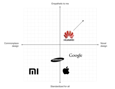
This analysis helped us to identify four major directions that brands followed when they create products:

  1. Empathetic to me (design tailored for the needs of the target audience; design that demonstrates real empathy with the human and truly reflects the audience)
  2. Novel design (design that uses innovative visual styles and interaction patterns)
  3. Commonplace design (design that utilizes conservative style elements)
  4. Standardized for all (heavy standardized design)

We put every brand on the plot with those four directions.

Quadrant diagram of Huawei visual language
Identifying opportunities for Huawei visual language (Large preview)

This process helped us to identify the opportunities for Huawei language:

  • Scalable Design Language
    The language should scale across devices and across third-party developer apps as well.
  • Unique Design DNA
    The language should be unique and distinct from the major competitors.
  • Be Bold Yet Timeless
    The language should be long-lasting.
Define Requirements For Visual Hierarchy

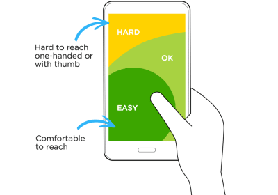
When UX researchers analyzed typical user complaints, they found that the location of key interactive elements was one of the most common problems that many mobile users mentioned. In 2016 mobile screens become larger and larger, but the location of key functional elements in Android remained the same — the top area of the screen. As a result, users had to stretch their fingers or change their grip in order to interact with the elements.

Diagram of reachable zones on mobile devices
Thumb Zone: how easy it is for our thumbs to tap areas on a phone’s screen. (Image credit: Luke W) (Large preview)

Today a bottom-area navigation is an industry-standard, but back in 2016, the situation was a bit different. We’ve reached the Huawei engineering team with this insight and asked about the technical feasibility of moving controls to the bottom area of the screen — this area is more comfortable for user interaction. The engineering team confirmed that it was possible to move the elements, and we helped define the new default location for functional elements.

Design concept of EMUI 5 interface
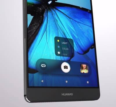
Functional controls are located at the bottom of the screen — in the easy-to-reach area. (Design concept of EMUI 5 interface by Fantasy) (Large preview)

Ideation: Defining A Design Vision

Creating A Philosophy Of Design

Imagine that you need to design a language that will be integrated into products that will be used by people all over the world. The natural language we use in interpersonal communications cannot be separated from a culture because it has a close relation to the attitude or behavior of speakers of the languages. The digital language is absolutely the same — it should look natural for customers in the Americas, Europe, Asia, Africa, and Oceania.

The success of any visual design highly relates to how people perceive it. Many factors are influencing human perception, and the significant part goes to psychology. To create a sophisticated design, you need to consider the meaning of shapes and the impact which they have on users’ minds.

Creating a philosophy of design is extremely challenging, and you cannot do it alone. That’s why I worked with Abigail Brody, a former Apple creative director who joined Huawei in September 2015 as Chief UX design and VP of Huawei Devices. At Apple, Abigail was responsible for iOS design. She was the one who described the methodology of visual language to me.

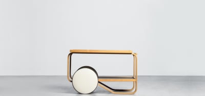
Together we spend a lot of time trying to find the direction for visual design, and we’ve decided to use the philosophy of organic design as a foundation for our design language. Organic design is centered around using nature as the biggest inspiration.

Frank Lloyd Wright chair
Organic Design was pioneered by Frank Lloyd Wright who believed in creating harmony between people and nature. (Image credit: museiitaliani) (Large preview)

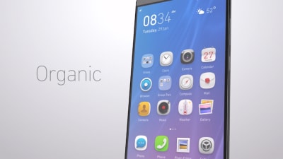
According to this philosophy, design should help to achieve harmony between people and nature. When we worked on our visual language, we focused on incorporating natural forms (smooth curves and organic forms) in our visual design. As a result, all visual elements, such as buttons, icons, and shapes, had an organic design aesthetic.

Design concept of EMUI 5 interface
Round shapes are one of the things that make organic objects different from non-organic. (Large preview)
Using Motion Design To Create A Distinct Visual Identity

There is no doubt about the importance of the role that motion plays in mobile design. For many product motion serves a purely-functional role—it provides feedback for user action and connects different states of the mobile app together. The well-crafted motion also makes things more attractive, and as we know, attractive things work better (the aesthetic-usability effect says that people are more tolerant of minor usability issues when they find an interface visually appealing).

Our team put high stakes on the motion. Our ultimate goal was to use motion to breathe life into our products — make the interface feel alive and dynamic. We wrote a motion design manifesto with solid design principles. Every animated effect and transition that we wanted to introduce in our design was measured in accordance with the functional and emotional benefits it delivers to end-users.

We know that early impressions of a product design are especially important. And for that very reason our key focus was on creating magical moments — surprise and delight users while they interact with the OS.

This video demonstrates the visual effects we used in EMUI.

Design And Testing: Build, Test, Iterate

Baking Meaning Into Every Design Element/Design Decision

Just like we have rules for using words in sentences in a natural language, we should have rules for using visual elements in visual language. Strong semantics is what makes visual communication efficient.

When a team works on a visual language, it should take two rules into account:

  • There are no random visual elements in a visual language. Every element serves a purpose.
  • There should be no isolated units in visual language. Every unit in a visual language should be a part of a greater whole.
Design concept of EMUI 5 interface
The animated effect behind the user avatar is used to convey a sense of active call. The animation is both meaningful and pleasurable. (Design concept of EMUI 5 interface) (Large preview)
Experimentation And Design Review

It’s impossible to create a great design from the first attempt. Design is an iterative process, and whenever our team created a new visual solution, they evaluated it by comparing it with previous solutions. The comparison was visual—the screens were laid side by side on a board, so everyone could see the parts that require additional polishing. Team members gather together on informal design reviews where they discuss the pros and cons of individual solutions.

Team reviewing designs on computer screen
Design review in progress at Fantasy Interactive (Large preview)
Pattern Libraries, Style Guides And Design Principles

Pattern libraries (reusable building blocks such as UI bars), style guides, and design principles (principles that allow developers to propagate design language in their own apps) are essential elements of design language. They are the foundation of the design system — a shared resource that teams use when they create interfaces. The fact that we’ve conducted a UI audit during the research phase helped us to categorize the visual design elements. We’ve established a toolbox for everyone who worked on the project. So, when a new member joins a team, all they need is the toolbox, and they are set to maintain consistency.

There are no random visual elements in a visual language. Every element serves a purpose.

Test Early, Test Often

The Huawei EMUI project was an extremely important project for the Huawei Corporation. It was essential to ensure that the language we’ve defined work for the users. And the only way to get this understanding is to test our design as soon as possible.

We’ve followed a simple but effective technique — build, measure, learn. By following this approach, the design team didn’t postpone the testing design until the release. We’ve incorporated visual language into functional prototypes and tested them both inside our group (dogfooding) and outside (with real users). The feedback collected during the testing allowed us to understand what worked/doesn’t work for users.

Product team meeting at Fantasy Interactive
Sharing the results of testing with product teams at Fantasy Interactive (Large preview)

Implementation

If you have had a chance to use the Huawei EMUI 5 interface, you are probably thinking to yourself, “Um, that doesn’t look exactly like Gleb said!” And that’s true.

Huawei OS screenshot
Production version of the Huawei EMUI 5 interface. (Image credit: androidauthority) (Large preview)

It is a sad reality that almost no design team is responsible for the implementation of this solution. Unfortunately, a lot of solutions we proposed to the engineering team weren’t implemented properly, or at all. As a result, the design language we’ve created and the design language the end-user saw in Huawei products end up as two different animals. But this is purely my opinion. In 2018, Huawei surpassed Apple in smartphone sales. The UI was a critical element to user confidence.

Based on my experience, the challenge of implementation is common for large-scale corporations. When designers who created the language aren’t invited into the process of implementing this language into the product, the final results will always be compromised. What usually happens is the engineering team follows a path of least resistance — they adjust the design solutions to the technical constraints they face when they start.

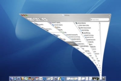
Every company needs a top-manager who cares about design and is ready to fight for it. It’s a well-known fact that when the original minimize animation in macOS that was proposed by the Apple motion design team, the engineering team said that it was impossible to implement that. At that time, Steve Jobs insisted that this animation is a must-have for MacOS. As a result, this animation became not only the most memorable transition for first-time users but also one of the things that contribute to good UX in MacOS.

A screenshot of Mac OS
The instantly memorable window animation of the Mac OS (Large preview)

A Robust Visual Design Language Is The Heart Of Good UX

Visual language can have a dramatic impact on user experience. It’s able not only to reduce friction by making UI more predictable but also to create delight. By pairing great form with excellent function, we will have an excellent user experience.

Visual language is a by-product of product design, and it requires a similar design process. It’s iterative and requires validation at every step along the way. When you build a visual language, you establish a new ecosystem for designers, and this ecosystem creates harmony between different teams involved in product development.

Smashing Editorial (cc, ra, il)

Inspirational Websites Roundup #14

Off to a new roundup of inspirational websites! Some stunning, extraordinary websites have been unleashed upon us in these past weeks and lots of creative genius was set free. Good vibes FTW!

We hope you enjoy this selection and embrace some positive design inspiration!

Rouser

wirewerks

FLOWERS

Yoichi Kobayashi

Andy Davies

BigSpring

Odunpazari Modern Museum

Fiomet

FREDDIE BRAUN

InCharge

Emanuele Milella

Madeleine Dalla

Wannabe — Toys

Cellular Agriculture Society

Mercenaire

sabato.studio

Carbonation

Polly Kole Art portfolio

Helloplayful

Queen Garnet

MSTQ

James Warner

akinokogomi

Ballsystem

USSR Design Almanac

Shape Studio

Work & Co

Yannis Yannakopoulos

CIRCUS Inc.

Inspirational Websites Roundup #14 was written by Mary Lou and published on Codrops.

How to Work with Clients During a Crisis

When a crisis such as COVID-19 comes along, it can throw so much of our daily lives into disarray. Routines are disrupted, plans are changed and everyone scrambles to adjust.

For your web design clients, this is a time of great uncertainty. Some, especially small businesses, may be in a fight for survival.

This is when a website can serve as a lifeline. Business owners can use it as a means to share important information. And, unlike the chaos of social media, visitors will be able to easily find out what they need to know. They’ll also be able to come back time and again to check for the latest updates.

All of this can mean a lot of extra work for web designers. And the emergency nature of these tasks can pile stress on top of an already-demanding job.

So, how do you deal with it? Here are some ways to both help your clients and yourself during a crisis.

The Freelance Designer Toolbox

Unlimited Downloads: 500,000+ Web Templates, Icon Sets, Themes & Design Assets
All starting at only $16.50 per month


Try to Remain Calm

It’s really hard to do your job when you feel panicked or overwhelmed. But that feeling is also understandable. Your inbox is full, your phone won’t stop ringing. Anyone would get frazzled in this type of circumstance.

Still, you have things to do. The first step in all of this is to take a deep breath and realize that you’re going to be O.K. You’ll undoubtedly feel stress, but you have the ability to get through the tough times.

It may also help to think about the fact that others are going through the exact same thing. You aren’t in this alone. Knowing that virtually everyone is being impacted can help put things in perspective.

In addition, it’s worth taking a moment to think about how you are helping. The fact that you’re making even a small difference for your clients (and their customers) is something to be proud of.

A sign that reads "And Breathe" - How to Work with Clients During a Crisis

Organize and Communicate

Clients will come to you with requests to add emergency info – and they’ll want it done quickly.

To cope, you’ll need to come up with a process for handling these tasks. Perhaps it’s first-come, first-serve. Or maybe you want clients to fill out a support ticket to help keep track of everything. Whatever your preference, it’s important to have a way to manage things in a way that makes sense for you.

Then, once you have a process that you’re comfortable with, it’s important to let your clients know. Send an email newsletter out that outlines what you’re doing. Also make mention of how the situation could affect the timeline for getting things done.

People tend to be more understanding of policies and procedures when they know about it ahead of time. Communicating your plan will allow your clients to know what to expect.

Icons on a computer screen - How to Work with Clients During a Crisis

Streamline Tasks

While every client’s needs are different, there are probably a number of similarities. If you look closely enough, you might just find some ways to use them in order to increase efficiency.

For example, if all or most of your clients are running WordPress, that’s something to take advantage of. The technical similarity means that you could use a similar process for posting information. It might be a helpful plugin or the use of a feature such as custom fields.

In addition, there might be certain design elements and code snippets that could be reused. Having even a basic template in hand means that you won’t have to reinvent the wheel for each client.

This could be a huge help in crossing items off of your ever-growing to-do list. That, in turn, makes for happy clients and a bit less stress in your life.

A person typing.

Remember the Human Element

Above all, a crisis is a time for people to work together towards a common goal. Web designers have a positive and productive role to play.

Customer service is always a big deal. It’s a defining factor in the success of your business. But it is especially appreciated during a difficult time of crisis. It’s important to keep that in mind when interacting with others.

Handling yourself with professionalism and empathy is the right thing to do. It will also help strengthen your bond with clients.

There will always be periods of time that are challenging. Look at them – not just with concern – but as an opportunity to be your very best.

15+ Ways to Prevent Burnout (Today and in the Future)

When you’re suffering from burnout, it can feel endless. You might feel like there is no cure for your exhaustion, like it is a permanent condition you must accept. But there are numerous ways to cope with burnout, heal from it, and even prevent burnout from happening again.

Smart Interface Design Patterns Checklists PDF

Smart Interface Design Patterns Checklists PDF

Smart Interface Design Patterns Checklists PDF

Rachel Andrew

Sharing the things we have learned is at the heart of everything we do at Smashing. That goes for the team as well as our authors, and Vitaly has been working on a set of checklists to accompany his workshop, Smart Interface Design Patterns. The resulting PDF is 152 pages packed with useful information to help you create better interfaces. And, we’re offering it to you free of charge.

These checklists are based on the work Vitaly has been doing for many years, exploring and examining examples of desktop and mobile interfaces. Learning what works and what doesn’t in usability tests and user interviews.

The cover of the PDF deck on “Smart Interface Design Patterns”
The cover of the PDF deck on “Smart Interface Design Patterns”, curated by Vitaly Friedman. You can get the entire deck (150 pages) by subscribing to our lovely email newsletter.

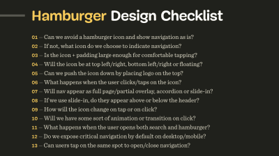
In the PDF is a collection of over 150 questions to ask yourself when designing and building almost anything — accordions, drop-downs, carousels, timelines, tables, sliders, advanced configurators, maps, seating selection, and onboarding. They can act as a jumping-off point for discussion, as designers and developers sit together to plan a component, or work through a particular design problem.

A screenshot of the Hamburger Design Checklist with 13 questions to discuss when designing and building a good navigation
An example: Hamburger Design Checklist, with questions to discuss when designing and building a good navigation.

They can help to bring to mind all the fine details that go into interface design. How large should a hamburger icon be to avoid rage clicks? Should sections in an accordion collapse automatically when moving from one to another? Can users tap on the same spot to undo actions when zooming or filtering?

These aren’t golden rules, but rather starting points to help you consider all angles when working alone, or in a team. These checklists have been created after years of work on real projects with real users. Your projects can benefit from all of that existing knowledge, rather than needing to discover these issues for yourself or wait for your visitors to tell you about the problems they are having.

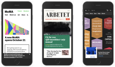
Three different design patterns without hamburger navigation on three mobile devices
The PDF deck features some examples of design patterns as well. A quick peek at some navigation design patterns without hamburger navigation. Large preview)

Subscribe To Newletter and Get The PDF

To download, we ask for one thing: your real email address. In return, you’ll get the checklist and also our Smashing bi-monthly email newsletter and occasional emails when we have a new book or event that might be of interest. We don’t spam, nor do we pass on your email address to anyone outside of Smashing.

  1. Subscribe to our lovely email newsletter.
    Please use your actual email — it’s no fun to land in spam.
  2. Verify your email.
    Please check your inbox and click on a button in the confirmation email.
  3. Download the checklist PDF.
    Voilà! We hope you’ll find the PDF useful for your work.

After subscribing, you’ll get a link to the PDF via email. If you are already subscribed, look out for the link in the upcoming newsletter issue coming this Tuesday, March 31. And please, ask your friends and colleagues to subscribe rather than simply forwarding the link on.

There is a huge amount of work that has gone into this PDF. We hope you’ll find it useful in your work. Thank you for your trust, and we hope to release more useful tools for you soon!

Smashing Editorial (vf, il)

How to Create an Online Order Form in WordPress (Step by Step)

Several of our readers have been asking how to create an online order form, so customers can easily place their orders on the website.

If you’re running a business like a restaurant or a physical store, you might not want to create a whole online shop. However, you may want to offer an easy way for customers to order food or other goods for you to deliver.

In this post, we’re going to show you how to create an online order form in WordPress. This will allow you to easily collect customer orders without adding a full-fledged eCommerce software to your website.
Creating an online order form in WordPress

Creating an Online Order Form in WordPress

Perhaps you decided to start a website for your business recently, and you’re feeling a bit overwhelmed.

Many businesses start an online store to not only collect orders but also accept payments and manage inventory. However, not all businesses need a complete eCommerce website.

If you only want customers to be able to fill an online order form, then you can create that much easily without a shopping cart solution.

A simple online order form gives you the option to either accept payments online, upon order pickup, or on delivery.

In this tutorial, we will be using WPForms to create an online order form because it allows you to do that easily with their drag & drop interface.

WPForms is the best WordPress form builder plugin on the market. Over 3 million websites use WPForms to easily create any kind of online form and add it to their website (no coding skills required).

First, you’ll need to install and activate the WPForms plugin. Need help installing the plugin? See our guide on how to install a WordPress plugin for detailed instructions.

Plugins are like apps for your WordPress website. If you are new to WordPress, then take a look at our article on what are WordPress plugins and what you can do with them.

Once you have activated the WPForms plugin, you’ll see a new WPForms tab in the admin sidebar of your WordPress dashboard.

You need to visit WPForms » Settings page to enter your license key. You can find this information under your account on the WPForms website.
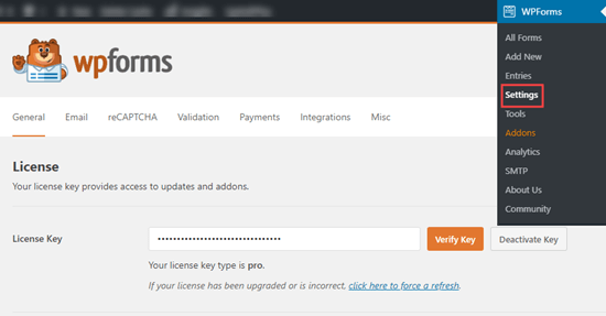
Enter your license key for WPForms

Now you are ready to create your online order form.

Simply head over to WPForms » Add New page to create your first form.
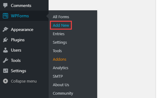
Creating a new form using WPForms

Now, you’ll see the form creation screen. Type in a name for your form and choose a template. We recommend the ‘Billing / Order Form’ template.
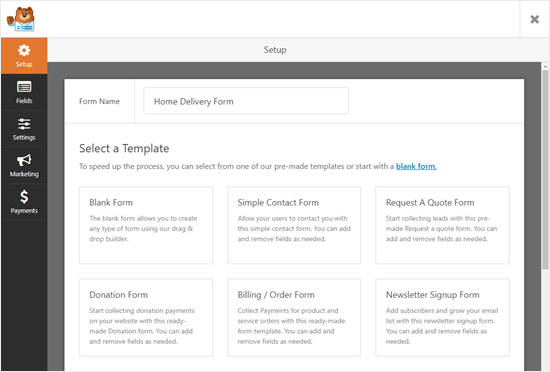
Select the 'Billing / Order Form' template to get started

Simply move your cursor over the template description and click the ‘Create a Billing / Order Form’ button.

Click on the 'Create a Billing / Order Form' button to create your form

Your form will automatically be created for you, and you’ll be taken straight into the WPForms form editor.
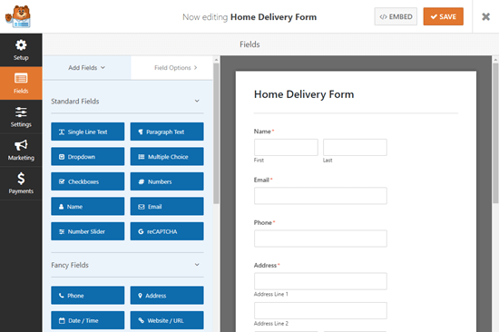
Your newly created online order form

You can now edit your online order form however you want. The different parts of the form are called “fields”. You can change, add, or remove fields on your form with a single click.

The default template already includes fields for most of the information you’re likely to need, such as name, address, and phone number. However, you’ll need to list your actual products.

Click on the ‘Available Items’ field to edit it.
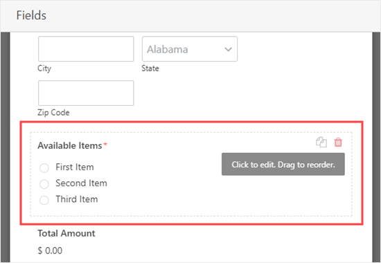
Editing the 'Available Items' field of your online order form

Type in the name and price of each of the items that customers can order from you. The price won’t automatically display on the form, so you may want to add this into the item name.
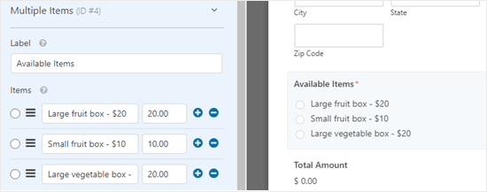
Editing the 'Available Items' field to change the names of the items

To add more options, simply click the (+) icon wherever you want to add the extra items.
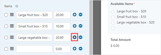
Adding more items to your online order form

Note: You can add as many items as you want. However, customers will only be able to select one option from this field.

If you have several categories of options, then you may want to copy the field to create groups.

You can copy the ‘Available Items’ field by clicking the ‘Copy’ icon that appears when you run your cursor over it, or when it’s selected.

Copy the 'Available Items' field to create a new field on your order form

Make sure you change the ‘Label’ of the fields to something appropriate to each group, too.

If you want customers to be able to select two or more options within a single field, you’ll need to use a different type of field.

Click on the ‘Add Fields’ tab then scroll down to ‘Payment Fields’ where you’ll find a ‘Checkbox Items’ field. Drag and drop this into position on your form.
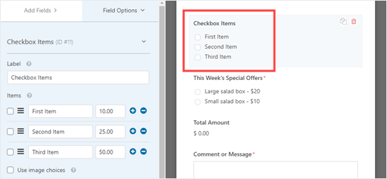
Adding a checkbox field so customers can select multiple items at once

You can now edit that field as before, entering names and prices for your items. Customers can check as many items as they want to order.

If you want to show images of your products, that’s really easy too. Simply click the ‘Use image choices’ box:
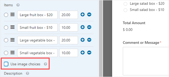
Adding images of your products to your online order form

For each item, click the ‘Upload Image’ button to add images either from your computer or from your WordPress Media Library.
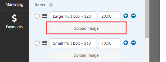
Uploading an image for a product that you offer

Your images won’t be resized or compressed by WPForms, so it’s important to upload them at the right size. They should all be the same size and no more than 250×250 pixels.

Ideally, you should also optimize your images for the web.

Finally, you may want to edit the ‘Comment or Message’ field at the bottom of the form, so that it’s not required. Not all users will want to add a message.

Simply click on the field and then uncheck the ‘Required’ box on the right to make this field optional.
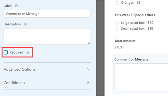
Making the 'Comment / Message' field optional rather than required

You can follow this process for any field that you want to be optional. You can tell which fields are required because they’ll have a red asterisk next to the field’s label.

Once you’re happy with the design of your form, you can move on to configuring its settings. It’s a good idea to save the form first by clicking the ‘Save’ button at the top of the screen:

The WPForms 'Save' button appears is on the top right of your screen

Configuring the Notifications Your Order Form Will Send Out

First, click the ‘Settings’ tab on the left-hand side of your screen. This will open up your form’s settings.
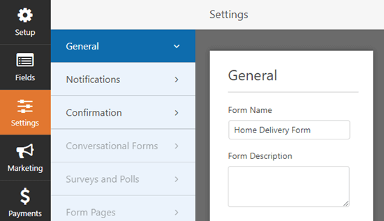
The 'Settings' tab in WPForms

Next, click the ‘Notifications’ tab to change your form’s email notifications. By default, completed order forms will be emailed to the admin address for your WordPress site.

You may want to change this or have the order forms copied to more than one address. You can simply type the email address or addresses in the ‘Send To Email Address’ box. If you’re entering more than one email address, separate them with a comma.
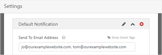
Enter the email addresses you want the form to be sent to, separated with commas

You might also want to change the subject line, so that it’s not the same for every order. This could make it easier to keep track of orders in a crowded email inbox.

Here, we’ve changed the subject line of the emails to read “Customer order from” and then the customer’s name. We used ‘Show Smart Tags’ to insert the name field in the subject line.
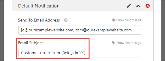
Changing the subject line on the notification email to add the customer's name

You can change any other details you want too.

We also strongly recommend setting up an email notification for your customers. This gives them a reminder of what they’ve ordered and lets them know that you’ve received their order.

To set up a new email notification, click the ‘Add New Notification’ button.
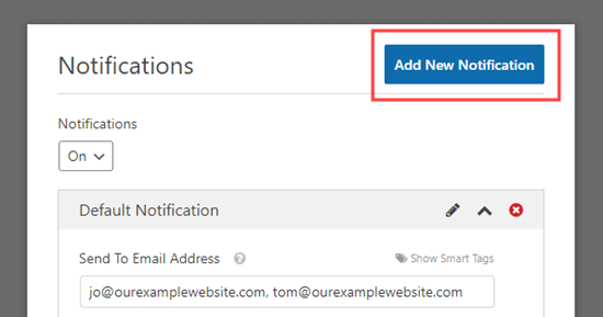
Click the 'Add New Notification' button to create a new notification

You’ll be prompted to type in a name for the new notification. You can call it whatever you want, as customers won’t see this name. We suggest something like ‘Customer Receipt’ or ‘Customer Email Confirmation’.
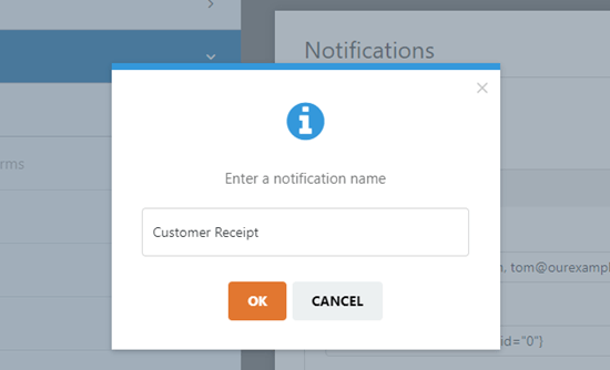
Entering a name for the notification that'll be sent to the customer

You’ll want the ‘Send To Email Address’ to be your customer’s email account. Delete {admin_email} from this box. Click the ‘Show Smart Tags’ and select the ‘Email’ field.
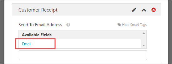
Setting up the customer receipt so that it will be emailed to the customer

You’ll also want to enter other details for the email. We suggest using a subject line such as “Your order with” and the name of your company.
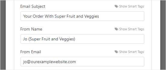
Entering the 'From' name and email address for the customer's receipt

In the ‘Message’ field, you’ll probably want to add a message to your customer. The {all_fields} tag will give all the information the customer entered on the form.
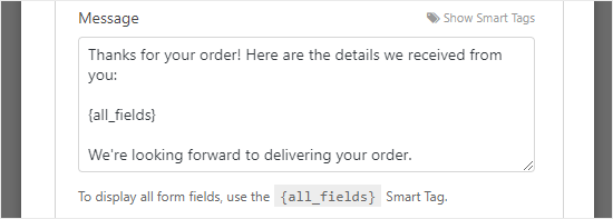
Editing the email address that your customer will receive

What if you only want to include some of the customer’s information in the email? Or what if you want to put their order details first and include their delivery details at the end of the email? You can simply use Smart Tags to add any form fields into your form.

Once you’ve finished setting up the notifications, click the ‘Save’ button at the top of the screen.

Tip: To get back to the first notification you were editing, just scroll down the screen.

Setting the Confirmation Message for Your Customers

Along with sending your customers an email receipt, you’ll want to show them an on-screen confirmation, so they know that their order has been sent.

You can do this under Settings » Confirmation tab.

The default confirmation reads “Thanks for contacting us! We will be in touch with you shortly.”
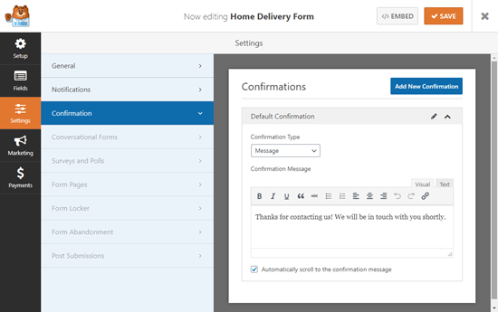
Your online order form's default confirmation message

You can change this to anything you want, and you can use the visual editor here to format your text too.
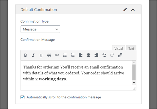
Customizing the confirmation message that your customer will see on their screen

Alternatively, you can redirect customers to a “Thank you” page on your website, or even to another website altogether.

Once you’ve set up the confirmation message, click ‘Save’ at the top of the screen.

Integrating Payment with Your Order Form (Optional)

If you want to take payment through your order form, then you’ll need to integrate it with a payment processor.

WPForms integrates very easily with two popular payment processors, PayPal and Stripe. Customers can pay either through their PayPal account or by entering their credit card details.

We’re going to use PayPal in this tutorial, but the process for Stripe is similar.

First, you’ll need to exit the form builder. You can do this by clicking the ‘X’ at the top right. You’ll be prompted to save your form if you have unsaved changes.

Next, go to WPForms » Addons page in your WordPress dashboard. Scroll down to the ‘PayPal Standard Addon’ and click the ‘Install Addon’ button beneath it.
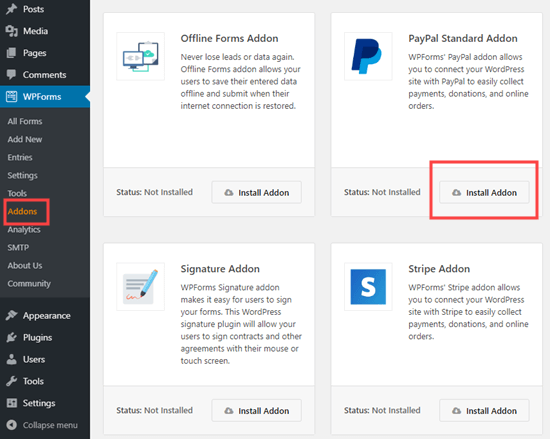
Installing the PayPal addon for WPForms

The addon will then install and activate automatically.

Go back to your form, which you can find under WPForms » All Forms. Now, click on the ‘Payments’ tab.
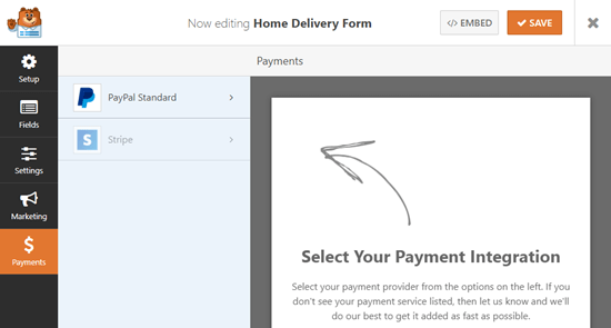
Select the payment service(s) to integrate with your form

Click on ‘PayPal Standard’ then fill in the details of the form. First, you’ll need to check the ‘Enable PayPal Standard payments’ box and enter your business’ PayPal email address.

Leave the ‘Mode’ dropdown set to ‘Production’ and leave ‘Payment Type’ set to ‘Products and Services’.
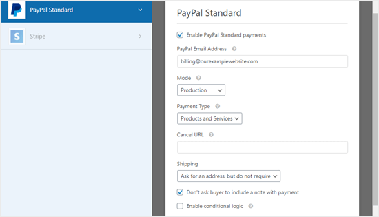
The PayPal payment settings page for your form

If you’re collecting the delivery address through the order form, then you can change ‘Shipping’ to ‘Don’t ask for an address.’

You don’t need to enter a ‘Cancel URL’, but you may want to create a page on your website for customers to be sent to if they don’t complete the checkout process.

Click the ‘Save’ button once you’ve finished.

Now, when the user submits the form, they’ll be automatically directed to PayPal to pay. You don’t need to add any extra fields to your form or do anything else.

Adding the Order Form to Your Website

The final step is to add your order form to your website.

Simply choose the page you want to add your form to, or create a new page under Pages » Add New.

Next, click on the (+) icon to add a new block (wherever you want your form) and find the ‘WPForms’ block. It’s located under the ‘Widgets’ section of blocks, or you can simply type ‘WPForms’ into the search bar to find it.
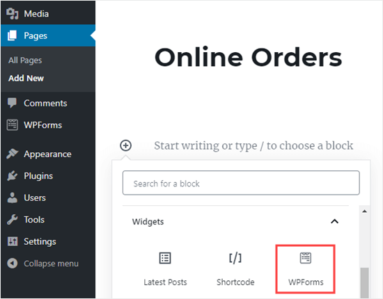
Adding your online order form to a page on your website

You’ll see a WPForms block. Click the ‘Select a Form’ dropdown and choose your form.
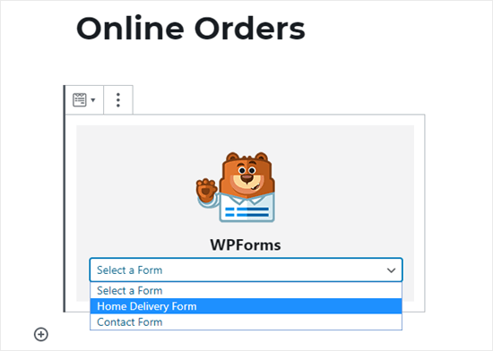
Selecting your online order form from the the WPForms dropdown list

You’ll then see a preview of the form itself in the WordPress editor.

When you’re ready, save and publish (or update) your page. You can view it live on your site to see your form in action. Before sharing it with customers, we recommend testing out the form to ensure that it works as you expected.

It’s also a good idea to check that you receive the email notification when the form is submitted. If not, check out our post on how to fix the WordPress not sending email issue.

Even if you do miss an email or accidentally delete it, WPForms saves form data in the WordPress database. You can find all your orders by going to WPForm » Entries in your WordPress dashboard.

Click on the name of your form, and you’ll then see a list of entries. You can click ‘View’ next to any of these to see the details.
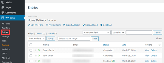
Viewing completed order forms in your WordPress dashboard

That’s it! We hope this article helped you learn how to create an online order form in WordPress. You might also like our guide on the best business phone services, and the must have WordPress plugins for small businesses.

If you liked this article, then please subscribe to our YouTube Channel for WordPress video tutorials. You can also find us on Twitter and Facebook.

The post How to Create an Online Order Form in WordPress (Step by Step) appeared first on WPBeginner.