Office 365 is an essential tool for many organizations that have thrived for years within the Microsoft ecosystem. It takes those many nostalgic tools like Word, Excel, Powerpoint, Outlook — the tools that most of today’s workforce grew up revering and using — and makes them available in the cloud. This breaks the limits of devices and allows users to use these tools on any device and have their work saved to the cloud without having to worry about using up their precious hard drive or SSD storage.
For organizations, it gives IT a much better way to enable their workforce. No more painful manual mass updates to all systems in the organization to give them the latest version of Word or Excel.
There’s a design trend I’ve seen popping up all over the place. Maybe you’ve seen it too. It’s this sort of thing where text is repeated over and over. A good example is the price comparison website, GoCompare, who used it in a major multi-channel advertising campaign.
Nike has used it as well, like in this advertisement:
I couldn’t help but wonder how I would implement this sort of design for the web. I mean, we could obviously just repeat the text in markup. We could also export the design as an image using something like Photoshop, but putting text in images is bad for both SEO and accessibility. Then there's the fact that, even if we did use actual text, it’s not like we’d want a screen reader speak it out.
Versatility Versatility Versatility Versatility
OK, stop already!
These considerations make it seem unrealistic to do something like this on the web. Then I found myself pining for the long-existing, yet badly supported, element() feature in CSS. It enables the use of any HTML element as a background image, whether it be a single button element, or an entire <div> full of content.
The element() function only reproduces the appearance of the referenced element, not the actual content and its structure. Authors should only use this for decorative purposes.
For our purposes, we’d be referencing a text element to get that repeating effect.
Let’s define an ID we can apply to the text element we want to repeat. Let’s call it #thingy. Note that when we use #thingy, we’ve got to prefix the element() value with -moz-. While element() has been supported in Firefox since 2010, it sadly hasn’t landed in any other browser since.
Here’s a somewhat loose recreation of the Nike advertisement we saw earlier. Again, Firefox is required to see the demo as intended.
See how that works conceptually? I placed an element (#versatility) on the page, hid it by giving it zero height, set it as the background-image on the body, then used the background-repeat property to duplicate it vertically down the page.
The element() background is live. That means the background-image appearance on the thing using it will change if the referenced HTML element changes. It’s the same sort of deal when working with custom properties: change the variable and it updates everywhere it’s used.
There are, of course, other use cases for this property. Check out how Preethi used it to make in-page scrolling navigation for an article. You could also use a HTML canvas element as a background if you want to get fancy. One way I’ve used it is to show screenshots of pages in a table of contents. Vincent De Oliveira, has documented some wildly creative examples. Here's an image-reflection effect, if you’re into retro web design:
Pretty neat, right? Again, I wish I could say this is a production-ready approach to get that neat design effect, but things are what they are at the moment. Actually, that’s a good reminder to make your voice heard for features you’d like to see implemented in browsers. There are open tickets in WebKit and Chromium where you can do that. Hopefully we’ll eventually get this feature in Safari-world and Chrome-world browsers.
Perhaps you know Unsplash? I'd wager it's the most popular stock photography site out there for two big reasons:
Every photo on there is pretty darn nice
Every photo is entirely free even for commercial use. You don't have to ask permission or even credit it (although that's appreciated).
Here's something you might not know though: Unsplash has an API, and it's unlimited and free. Brass tacks: it's exactly what you hope it's going to be. A really clean, well documented, well-performing, JSON API that gives you URLs to photos with metadata.
What would you use the Unsplash API for?
There are lots of examples on Unsplash’s developer area, from Medium to Squarespace to Trello, but here is another one of my favorites!
I use Notion every day. It's a great app for note-taking, planning, and all sorts of stuff. One of the features it has is giving every document you create within it a custom image header. These give the documents some great personality. Notion has a handful you can choose from or you can upload your own. Or, you can search Unsplash for them!
So to offer a search experience inside an app like Notion, you'd have a little search form and when users submit that search query, you'd hit the API with the value they entered, then loop over response.results using the response.results.urls.thumb to show the images returned. If the user picks one, you can use a higher-res URL to do something with and have access to all that photos metadata.
Hot tip! The URLs to photos are dynamic in that you can resize them, crop them, serve them in different formats, and even change the compression quality all from URL parameters. For example, changing size is like &w=200.
That is exactly what we do on CodePen
The purpose of CodePen Pen Editor is to provide an online code editor that makes it tremendously easy to code something up for the web, save it, and share it. Images are a big part of the web, so it's very possible that you might want to use a gorgeous image in a Pen. We have Asset Hosting ourselves on CodePen as a PRO feature, but we also offer Unsplash images to everyone for free!
Check out how it works:
A basic example in React
Let's make a search <form>, when submitted, it hits the Unsplash API and returns a bunch of photos.
We'll use Superagent for the Ajax just to make a smidge easier.
We'll track the current search query and returned data in state.
Here is that working!
How might you use that in your own app?
Does your app allow users to create anything? If so, could those things be enhanced by great photos? For example, cover images, background images, images for blog posts, etc. Check out existing partners for more ideas.
Could this be part of an avatar-choosing experience?
Maybe you could build a plugin that enhances some existing app by allowing quicker access to photos.
Feel free to leave comments with more ideas or how you have used the API. And if you haven't, try it out.
You may naively believe that an eye-catching subject line and killer copy is enough when it comes to email marketing; however, everything begins with email deliverability and avoiding spam/junk folders. The success of an email marketing campaign depends on the …
The validation section of my contact.php page is sending the user back to my index.php instead of staying on the contacts.php page so the user can correct the reported error. How can I fix this?
My contact.php code follows:
<?php
if(isset($_POST['submit']))
{

$name = $_POST['name'];
$visitor_email = $_POST['email'];
$message = $_POST['message'];
$type = $_POST['type'];

//Validate first
if(empty($name)||empty($visitor_email)||empty($type)||empty($message))
{
    echo "All fields are mandatory!";
  /*  exit; */
}

if(IsInjected($visitor_email))
{
    echo "Bad email value!";
 /*   exit; */
}

    $subject = $_POST['type'];
    $subject2 = "Copy of email sent to foxclone.com";
    $name = $_POST['name'];
    $email = $_POST['email'];
    $message = $_POST['message'];
    $formcontent="From: $name\r\nEmail: $email\r\nMessage: $message";
    if ($subject =="Website Problem") {
            $to="webmaster@foxclone.com" ;
          }
    else {
            $to="help@foxclone.com";
          }

$email_from = $email;
$email_subject = $type;
$email_body = $formcontent.

$headers = "From: $email \r\n";

//Send the email!
mail($to, $subject, $formcontent, $headers) or die("Error1!");
mail($email, $subject2, $formcontent, $headers) or die("Error2!");

//done. redirect to thank-you page.
header('Location: thank-you.html');

// Function to validate against any email injection attempts
function IsInjected($str)
{
  $injections = array('(\n+)',
              '(\r+)',
              '(\t+)',
              '(%0A+)',
              '(%0D+)',
              '(%08+)',
              '(%09+)'
              );
  $inject = join('|', $injections);
  $inject = "/$inject/i";
  if(preg_match($inject,$str))
    {
    return true;
  }
  else
    {
    return false;
    }
}
}
?>
<!DOCTYPE html>
<html lang="en">
<head>
    <title>Foxclone</title>

<!--    <meta content-type="text/html" charset="utf-8"> -->
    <meta name="viewport" content="width=device-width, initial-scale=1, shrink-to-fit=no">

    <!-- Links -->
    <link href="https://fonts.googleapis.com/css?family=Montserrat:500,700&display=swap&subset=latin-ext" rel="stylesheet" />
    <link href="https://fonts.googleapis.com/css?family=Open+Sans:400,400i,600&display=swap&subset=latin-ext" rel="stylesheet" />
    <link href="css/bootstrap.css" rel="stylesheet" />
    <link href="css/fontawesome-all.css" rel="stylesheet" />
    <link href="css/swiper.css" rel="stylesheet" />
    <link href="css/magnific-popup.css" rel="stylesheet" />
    <link href="css/styles.css" rel="stylesheet" />

    <!-- Favicon  -->
    <link rel="icon" href="images/favicon.png" />
    <!-- a helper script for validating the contact form-->
    <script language="JavaScript" src="js/gen_validatorv31.js" type="text/javascript"></script>
</head>
    <!-- Navbar -->
    <nav class="navbar navbar-expand-md navbar-dark navbar-custom fixed-top">
    <!-- Mobile Menu Toggle Button -->
        <button class="navbar-toggler" type="button" data-toggle="collapse" data-target="#navbarsExampleDefault" aria-controls="navbarsExampleDefault" aria-expanded="false" aria-label="Toggle navigation">
            <span class="navbar-toggler-awesome fas fa-bars"></span>
            <span class="navbar-toggler-awesome fas fa-times"></span>
        </button>
    <!-- end of mobile menu toggle button -->
       <div class="collapse navbar-collapse" id="navbarsExampleDefault">
            <ul class="navbar-nav ml-auto">
                <li class="nav-item">
                    <a class="nav-link page-scroll" href="index.php#header">HOME <span class="sr-only">(current)</span></a>
                </li>

            </ul>
        </div>
    </nav> <!-- end of navbar -->
    <!-- end of navbar -->
   <!-- Header -->
    <header id="header" class="header">
        <div class="header-content">

        </div> <!-- end of header-content -->
    </header> <!-- end of header -->
    <!-- end of header -->

<div id="contact"  class="stylized">
<br />
    <div "myform">

  <br />

         <form id="form1" method="POST" action="/">
  <h1>Need help? Have a suggestion? Why not send us an email.</h1>
         <h3>You'll receive a copy for your records</h3>
            <label>Name</label>
                <input type="text" name="name" >

            <label>Email</label>
                <input type="text" name="email" >

            <select name="type" id="category" size="1">
                <option value=''>Select A Category</option>
                <option value='Questions'>Questions</option>
                <option value="Report Problem">Report Problem</option>
                <option value='Suggestion'>Suggestion</option>
                <option value='Other'>Other</option>
                <option value="Website Problem"> Website Problem</option>
            </select>

<br /><br /> <br />

            <label>Message</label>
                <textarea  name="message" rows="7"></textarea><br />

            <button type="submit" value="Send" style="margin-top:15px; margin-left: 500px; text-align: center;">Send Email</button>

        <div class="spacer"></div>
<br /><br /><br /><br /><br /><br />
        </form>
    </div>   <!-- end of form class -->
</div>
<br /><br /><br /><br />

<!--  End of Contact  -->

 <br /><br />
<!-- footer  ================================================== -->
<div id="footer">
    <div class="copyright">
        <div class="container">
            <div class="row">
                <div class="col-lg-12">
                    <div class="p-small">Copyright  2019-2020 Andy Hardwick <br />
          Design by Larry Hale</div>

          <p>
           <a href="https://jigsaw.w3.org/css-validator/check/referer">
              <img style="border:0;width:88px;height:31px"
                   src="https://jigsaw.w3.org/css-validator/images/vcss"
                   alt="Valid CSS!" />    </a>
          </p>
                </div>
            </div>
        </div>
    </div>
</div>
          <!-- end footer__top -->

    <script src="js/jquery.min.js"></script> <!-- jQuery for Bootstrap's JavaScript plugins -->
    <script src="js/popper.min.js"></script> <!-- Popper tooltip library for Bootstrap -->
    <script src="js/bootstrap.min.js"></script> <!-- Bootstrap framework -->
    <script src="js/jquery.easing.min.js"></script> <!-- jQuery Easing for smooth scrolling between anchors -->
    <script src="js/swiper.min.js"></script> <!-- Swiper for image and text sliders -->
    <script src="js/jquery.magnific-popup.js"></script> <!-- Magnific Popup for lightboxes -->
    <script src="js/morphext.min.js"></script> <!-- Morphtext rotating text in the header -->
    <script src="js/isotope.pkgd.min.js"></script> <!-- Isotope for filter -->
    <script src="js/validator.min.js"></script> <!-- Validator.js - Bootstrap plugin that validates forms -->
    <script src="js/scripts.js"></script> <!-- Custom scripts -->
</body>
</html>
It's easy to write "unit tests" that use JUnit and some mocking library. They may produce code coverage that keep some stakeholders happy, even though the tests may not even be unit tests and the test may provide questionable value. It can also be very easy to write unit tests that are (in theory) units test but are far more complex than the underlying code and hence just add to the total software entropy.
This particular type of software entropy has the unpleasant characteristic of making it even harder for the underlying software to be restructured or to surface new requirements. It is like the test has a negative value.
The COVID-19 outbreak has been declared a pandemic by the World Health Organization, causing an unprecedented impact on people’s lives, families and communities. Every government and organization usually has a business continuity plan; however, the magnitude of the current crisis, no one saw coming. We’re discovering new ways of responding at every level — be it governments, companies, communities, families or individuals.
The way the events unfolded, we all observed how various governments and organizations responded and handled the outbreak so far. The speed at which things are evolving on a daily basis demonstrates the spirit of agility. The response is coming in different shapes and at a different speed.
Since 2014, I have been involved with several projects with a goal to convert an existing application to utilize a microservice equipped with a RESTful API. In every case, the desire was to allow a client to make RESTful API calls (as needed) to the microservice for retrieval, persistence and other data processing needs.
I fully believe I am not the only one who has ventured down this course. In fact, in a personal adventure, I did the very same thing for my mother-in-law as documented in my "New Application Journey" series.
In recent decades, programmers have been preoccupied with mastering new information, creating algorithms and unique solutions. According to the Stack Overflow Survey, Python is the fastest-growing programming language, which is actively used by software development companies in creating both simple and complex applications.
Let’s discuss what benefits it provides and why it’s a good choice for IoT development.
Software Unit Testing: What Is It? Why Is It Important?
It is hard to overestimate the importance of software quality. A single error can have a huge negative impact on your entire business. If bug issues are not addressed efficiently, it may result in everything from an endless cycle of fixes to a destroyed reputation of your company. Effective testing strategies help to minimize such risks by ensuring the quality of the released product. There are many testing practices you can choose to build a great software solution. One of the basic but effective testing techniques to make sure that your product works properly is called unit testing.
What Is Unit Testing and What Are the Unit Testing Frameworks?
Unit testing (sometimes called module testing or component testing) is a technique for testing the smallest testable component of your code (unit) to ensure that it performs as intended. The basic feature of unit testing is the isolation – a unit test only performs a specific function and excludes all external influences, such as dependencies between units, calls to other functions, etc The unit testing process can be done manually, but developers usually use unit testing tools to facilitate the process, so they can focus on more complex tasks such as defining the test cases.
Looking for valid double down codes in the year 2020? If so, Look no Further! You have come to the right place! Here you will find everything you need to know about the latest double...
Oracle Functions is a fully managed, multi-tenant, highly scalable, functions-as-a-service platform. It's built on enterprise-grade Oracle Cloud Infrastructure components and powered by the open source Fn Project serverless platform. Along with Oracle Events, Oracle Functions can deliver powerful capabilities for infrastructure and application automation. Together, they enable services to act automatically based on state changes in infrastructure resources, a common use case for enterprise IT environments.
This post walks through an example of a function that verifies whether a compute instance is tagged correctly when it's provisioned. If the instance isn't tagged properly, the function acts to stop the instance. This practice is common in infrastructure automation; it allows resources to be audited for compliance with internal governance policies as they are created, rather than after.
As the field of web design continues to grow rapidly, agencies may need to focus on factors such as Americans with Disabilities Act (ADA) compliance in order to serve their clients. Due to precedent-setting lawsuits in the past few years, taking responsibility for your client’s ADA compliance online is becoming the hallmark of a professional […]
Join 649,032 customers and get access to Divi, Extra, Bloom, Monarch and more. Power your entire team and build unlimited websites. The ultimate WordPress toolkit awaits.
In this article, Adrian Bece takes a look at each part of Houdini, its current browser support, and how they can be used today using progressive enhancement.
In this seventh instalment of Inspired Design Decisions, Andy Clarke will explore how American art director and graphic designer Otto Storch inspires his designs for the web.
Now that's great and all. You could use it for anything where you want to collect a number from a user that has an enforced minimum and maximum value.
But notice anything weird? All by itself, that range input doesn't communicate to the user what number they will actually be submitting. Now if your input is something like "How are you feeling? Left for sad, right for happy." - then fine, you probably don't need to show the user a number. But I would wager it's more common that you'll need to show the number than not show it.
The input element represents a control for setting the element's value to a string representing a number, but with the caveat that the exact value is not important, letting UAs provide a simpler interface than they do for the Number state.
But c'mon, just because we want a cool slider doesn't automatically mean we should prevent the user from knowing the submitted value. I wouldn't necessarily say browsers should alter their UI control to show that number. I am saying we should build that ourselves!
This is the perfect use case for the <output> tag, which is specifically for values calculated by form elements. Here is a super simple implementation of how you might use it:
The trick is positioning the bubble along the range input so it slides alongside the "thumb". To do that, we'll need to calculate what % the bubble needs to be scooted to the left. So let's make a function to do that to keep things a smidge cleaner:
range.addEventListener("input", () => {
  setBubble(range, bubble);
});

function setBubble(range, bubble) {
  const val = range.value;
  const min = range.min ? range.min : 0;
  const max = range.max ? range.max : 100;
  const newVal = Number(((val - min) * 100) / (max - min));
  bubble.innerHTML = val;

  // Sorta magic numbers based on size of the native UI thumb
  bubble.style.left = newVal = "%";
}
Here we're making sure we account for the range inputs min and max attributes and calculating a % position between 0-100 based on the current value in that range. Not all ranges are the default 0-100 numbers, so say a range was at value 50 in a range of 0 to 200, that would be 25% of the way. This accounts for that.
But it has one annoying flaw: the bubble is too far to the left at the start and too far to the right at the end. On range inputs, the thumb doesn't hang off the left edge so it's center is at the start, and same at the end. Like a scrollbar, the edges of the thumb stop within the track.
We can use some magic numbers there that seem to work decently well across browsers:
// Sorta magic numbers based on size of the native UI thumb
  bubble.style.left = `calc(${newVal}% + (${8 - newVal * 0.15}px))`;
Here's that final demo:
I was inspired to poke around with this because reader Max Globa wrote in with their version which I'll post here:
A cool aspect of Max's version is that the range input is CSS-styled, so the exact size of the thumb is known. There are some numbers that feel rather magic in the JavaScript math, but at least they are based on real numbers set in the CSS about the size of the thumb.
Other Versions
Dave Olsen ported the (original) idea to not have a dependency on jQuery. Here's that version:
Ana Tudor has a massive collection, many of which indicate the current value through their design.
😬 Old Version from Original Version of this Post (jQuery, plus doesn't work as well)
Just leaving this in here for historical reasons.
Let's pull in our friend jQuery and get our CSS on. This goal is below. Any range input, any time, any min/max/step - we put a bubble above it showing the current value.
Let's style the output element first. We'll absolutely position it above the input. That gives us the ability to adjust the left value as well, once we figure out with JavaScript what it should be. We'll fancy it up with gradients and border-radius, and even add a little pointer triangle with a pseudo-element.
Now what we need to do is watch all range inputs for a change in their value. Our goal is to shift the left position of the bubble in pace with the slider. That's not the simplest thing in the world, being that sliders can be of any width and any minimum or maximum value. We're going to have to do a little math. Here's all the jQuery JavaScript, commented up:
// DOM Ready
$(function() {
 var el, newPoint, newPlace, offset;

 // Select all range inputs, watch for change
 $("input[type='range']").change(function() {

   // Cache this for efficiency
   el = $(this);

   // Measure width of range input
   width = el.width();

   // Figure out placement percentage between left and right of input
   newPoint = (el.val() - el.attr("min")) / (el.attr("max") - el.attr("min"));

   // Janky value to get pointer to line up better
   offset = -1.3;

   // Prevent bubble from going beyond left or right (unsupported browsers)
   if (newPoint < 0) { newPlace = 0; }
   else if (newPoint > 1) { newPlace = width; }
   else { newPlace = width * newPoint + offset; offset -= newPoint; }

   // Move bubble
   el
     .next("output")
     .css({
       left: newPlace,
       marginLeft: offset + "%"
     })
     .text(el.val());
 })
 // Fake a change to position bubble at page load
 .trigger('change');
});
The one gross part in there is that 1.3 value. I was trying to line up the tip of the bubble's triangle with the center of the slider. It's not easy, because the slider's center is never 100% left or right. That value isn't perfect, nor perfectly implemented, but it's better than not having it.
As a bonus, browsers that don't support the range input still get the bubble action.
The above code depends on the range inputs having a specified min and max value. If they don't it kinda breaks. I think it would be weird to use a range input without specifying these things, although if you don't it seems they default to 0 and 100. To bulletproof this, you'd grab each attribute, test it, and if it didn't look right fix it. Something like:
var minValue, maxValue;
if (!el.attr("min")) { minValue = 0; } else { minValue = el.attr("min"); }
...then use the minValue variable in the math. And do similar for max. Anyway, here's the live demo:
How To Increase Mobile Conversions With Category Page Design
How To Increase Mobile Conversions With Category Page Design
Suzanne Scacca
For e-commerce designers, it’s easy to focus on designing the home page, individual product pages as well as the checkout experience because they’re obvious stepping stones along the mobile shoppers’ journey. Based on the following data, though, category pages also have a role to play — as the intermediary between search engines and e-commerce websites.
Jill Kocher Brown, the SEO Director of JumpFly, shared the following research at SMX West 2020:
SEO Jill Brown shares research on ecommerce category page vs. product page performance. (Source: Slideshare) (Large preview)
After evaluating the top 30 ecommerce websites, Brown found that product category pages outperform product pages in terms of ranking keywords and traffic.
Considering how many top of funnel customers use mobile search to find what they’re looking for online, we need to put a greater focus on designing ecommerce category pages for mobile.
Today, I’m going to provide you with some tips for designing mobile e-commerce category pages that will get you more visits from search (and, consequently, conversions on-site).
How To Design Ecommerce Category Pages For Mobile
Let’s jump right in:
1. Only Include Essential Elements on the Page
This is more or less what we should aim for when designing e-commerce category pages for mobile:
An example wireframe for an ecommerce category page on mobile. (Source: created with Wireframe.cc) (Large preview)
The elements we need to include above the fold are:
The navigation bar (it can disappear upon scrolling or stick to the top of the page),
A descriptive category page title,
The total number of products in the category,
Filter options,
Sort settings,
At least one or two matching products.
As for why these elements need to be above the fold, let me show you an example.
According to SEMrush (and Google), “kong dog toys” is a popular search term that dog toy shoppers are looking for:
SEMrush reveals that 'kong dog toys' has a monthly search volume of 33,100. (Source: SEMrush) (Large preview)
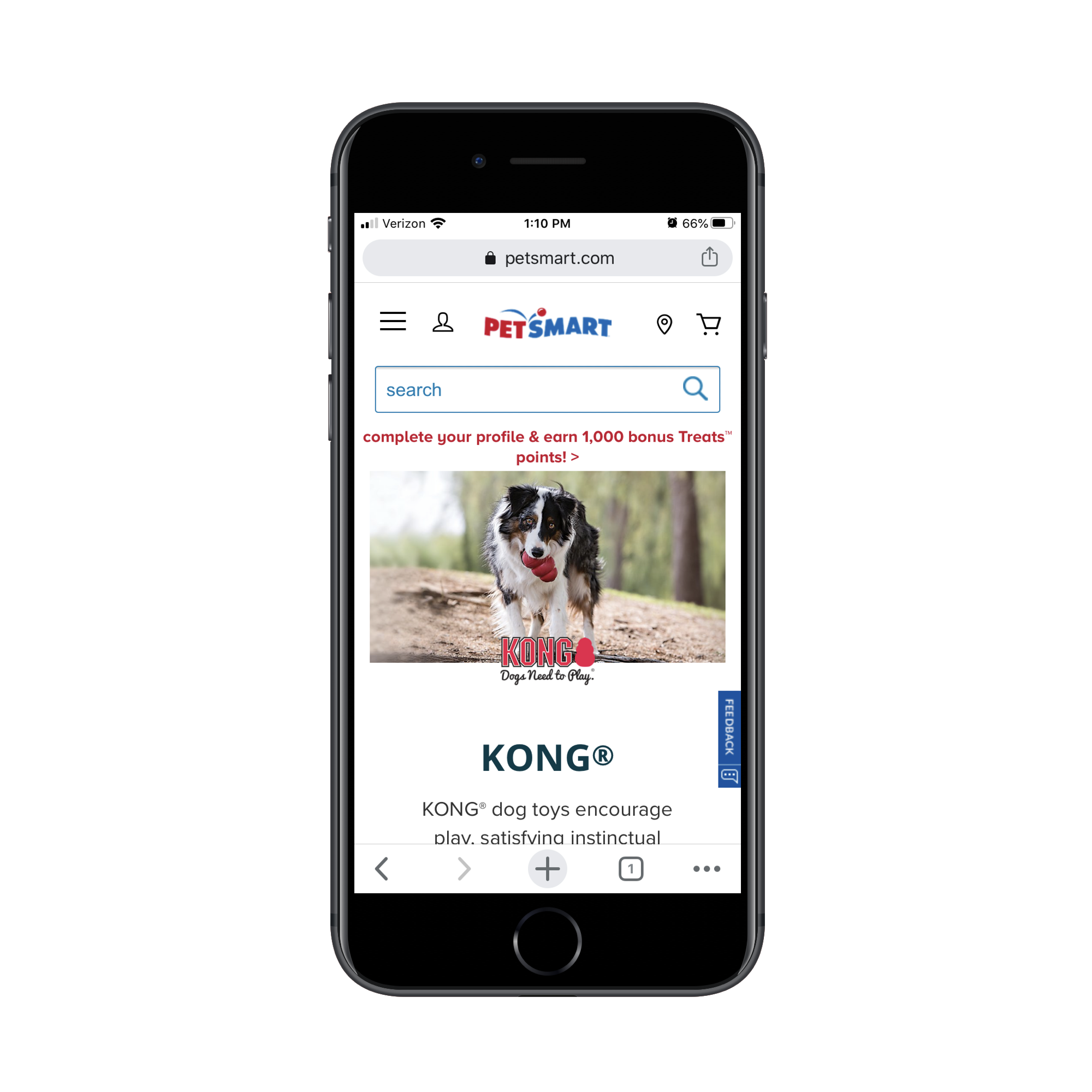
One of the top matching results for the search term is this category/brand page on the PetSmart website:
PetSmart’s product category page for Kong brand dog toys. (Source: PetSmart) (Large preview)
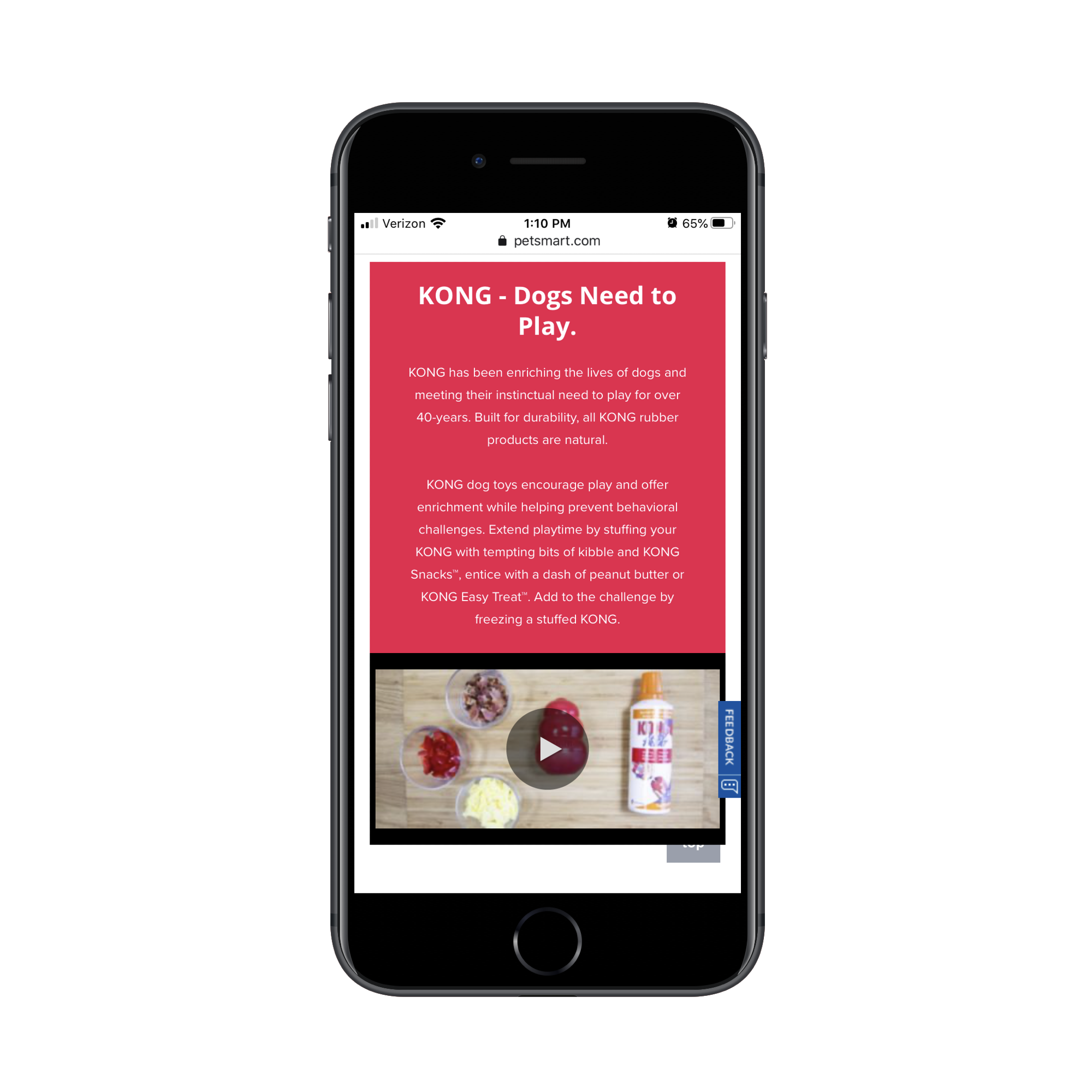
The next four swipes on the page take shoppers through informational sections, videos and subcategories like this:
PetSmart includes a bunch of information about Kong brand at the top of the category page. (Source: PetSmart) (Large preview)
Here’s the problem with this:
For visitors on the website exploring pet products, this information is great as it educates them on the very popular Kong brand. However, for visitors that went out of their way to search for “kong dog toys” in Google, they don’t need all of this information. It’s just getting in the way of the shopping experience.
While I’m not a fan of Best Buy’s inclusion of an ad above the header or a sponsored product as the first shown, the concise layout for the top of the category page is well done:
Best Buy’s category pages are concise in detail and display products right away. (Source: Best Buy) (Large preview)
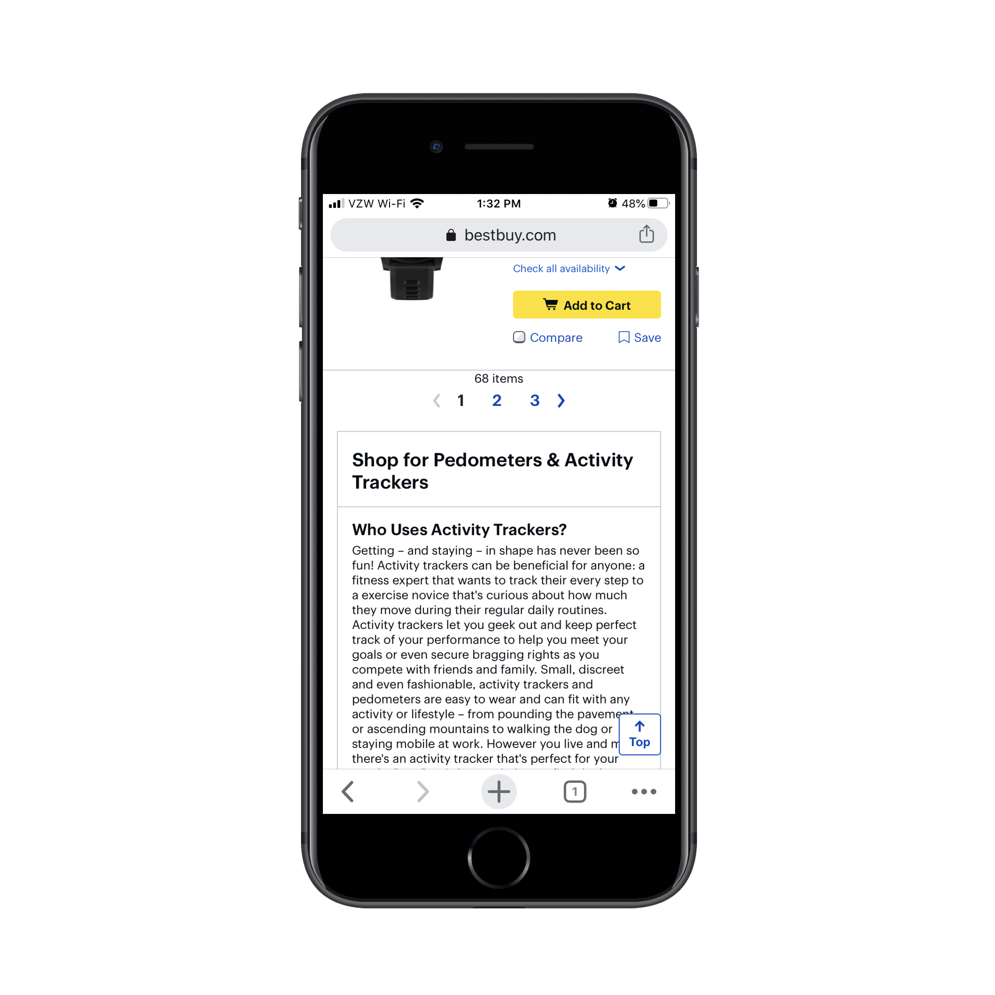
What’s more, Best Buy includes additional category information (just as PetSmart did). However, it wisely places this information below search results:
Best Buy includes category information below search results. (Source: Best Buy) (Large preview)
Why does Best Buy do this and why should you?
For one, you want shoppers who are new to a product category or brand to still have this information available to them. And considering how well-trained consumers are to look below-the-fold for more information (thanks, Amazon), this works on mobile.
In addition, this is useful for SEO. Without this category description, you’d have to leave it to your meta title and description to influence the rankability of the page. With a search-optimized informational section like this, you can improve the chances of your category page getting to the top of search.
2. Show the Most Convincing Product Details
As you can see, we don’t have a lot of room on these mobile e-commerce category pages. So, when shoppers finally get to the matching product results, you want to make it as painless as possible for them to find the ones looking for.
Here are the details that should be included with each product listing:
A crystal-clear and attractive product image,
The product name (along with a short description if the name/brand doesn’t spell out what it is),
The price,
The star rating and number of reviews.
The only one of the elements above that’s optional is the rating/reviews and that’s only the case if your site is new and you don’t want a lack of reviews to turn people off.
As for adding other elements to the product listings, be careful with this. If it doesn’t add any value (in other words, it doesn’t make it easier to choose one product from another), leave it out.
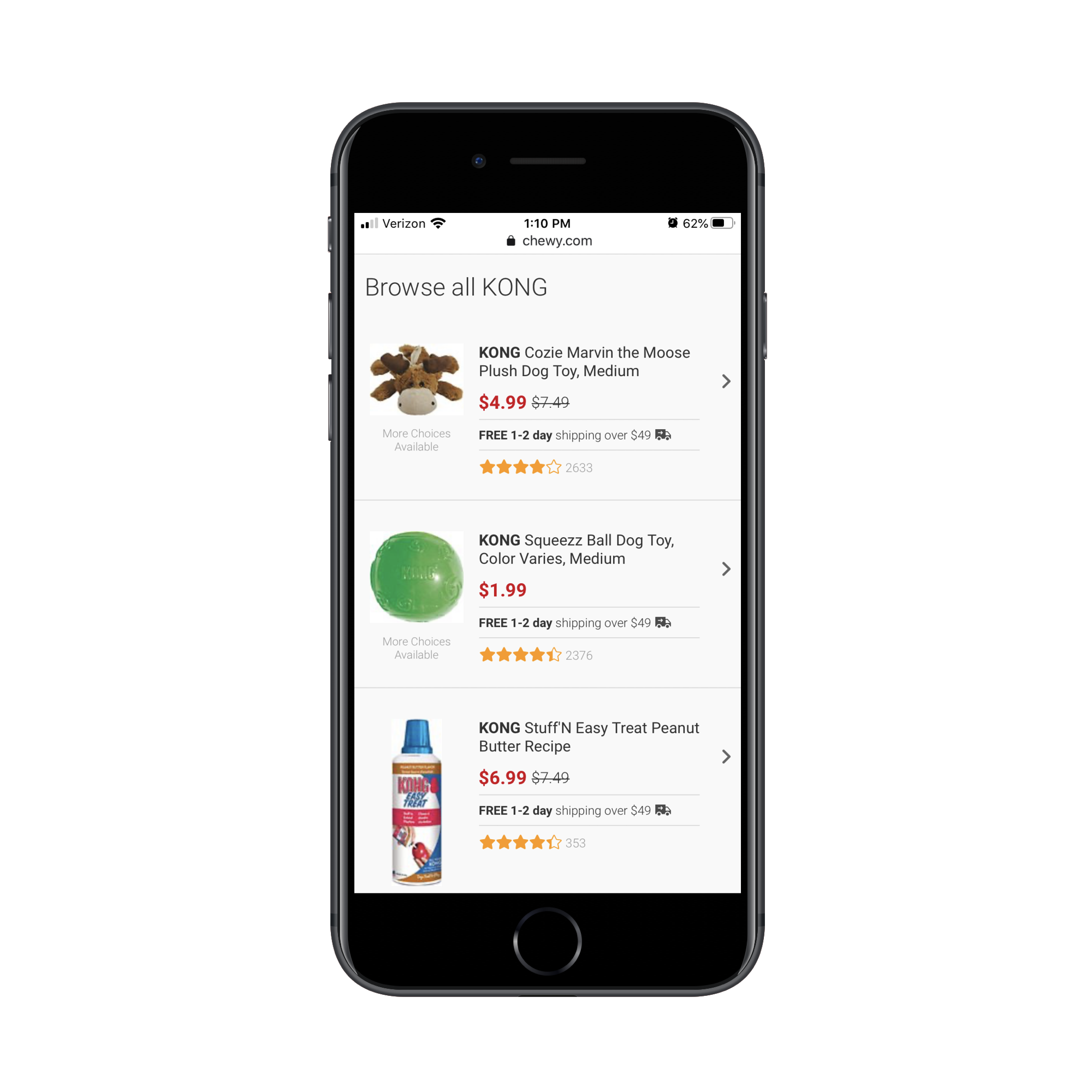
Take, for instance, this “kong dog toy” category page from Chewy:
The Chewy category page and results for 'kong dog toy'. (Source: Chewy) (Large preview)
This category page design as a whole is much more concise than how competitor PetSmart handles theirs. However, there’s quite a bit of waste here. Namely, there are two repetitive strings of text that need to go:
“More Choices Available” under the product images;
“Free 1-2 day shipping over $49 🚚” between the price and rating.
The free shipping notice could easily appear as a dismissable sticky bar at the top of the site. And “More Choices Available” doesn’t need to be here at all. By tightening up the product details, mobile shoppers can more quickly get through the search results that are available.
Here’s an example from BH Cosmetics of product listings that could stand to be trimmed back:
BH Cosmetics displays makeup brush sets on the corresponding category page. (Source: BH Cosmetics) (Large preview)
The “Add to Bag” buttons all need to go. Unless shoppers can look at a single product image and know that’s what they need, these buttons are useless on this page.
I also think the “XX% OFF” is unnecessary. There’s no reason to overcomplicate this. The scratched-out original price and new lower price in pink should be enough to call attention to the offer.
This isn’t the only way to display inventory/options on an e-commerce website, so you’ll have to evaluate each product element based on your specific case.
So you can see what I’m talking about, here’s what a search for “Santorini Greece hotels” shows on Expedia:
The search results page on Expedia for 'Santorini Greece hotels'. (Source: Expedia) (Large preview)
The search results page on Booking.com for 'Santorini Greece hotels'. (Source: Booking.com) (Large preview)
Both include the essential details needed for each listing. However, they include additional details to help users make a decision.
However, there’s a big difference in how this extra information is displayed. On Expedia, users can see that “Breakfast included” is a top feature and that there are only two rooms left at the special price. This is useful information. On Booking.com, however, there’s a mess of details in green displayed directly below the price. It’s difficult to read and I’m not sure all of the details are necessary.
If in doubt, start with the bare minimum. Then, use A/B testing to confirm whether or not other details improve click-through and conversion rates.
3. Manage Your Mobile Category Page Sizes
There are two reasons why we need to be careful about page sizes when designing e-commerce category pages:
With as many images and data that appears on these kinds of pages, it can severely hurt loading times.
The more products you display at once, the more analysis paralysis your shoppers will experience.
So, the first thing to do is create a limit on how long the page can get.
While you might be tempted to use infinite scroll or an auto-load that reveals more product images as visitors scroll down the page, it’s better for performance if you use pagination links like Walmart does:
Walmart uses pagination at the end of its product category pages. (Source: Walmart) (Large preview)
Another tip you can take from Walmart is its product view setting. By default, products appear in a grid on its category pages:
By default, Walmart displays category products in a grid layout. (Source: Walmart) (Large preview)
By clicking the button to the left of “Sort & Filter”, users can change the alignment to list view:
Users can adjust Walmart’s category page to display products in a list layout. (Source: Walmart) (Large preview)
While this is more a matter of personal taste, you can see that the list layout does actually display more products at once, so users might find this choice of layout quite useful in speeding up their shopping experience.
One last thing to think about:
You can’t assume that your default sorting method is what all customers automatically prefer. For example, Sephora’s default sort is by “Bestselling”:
By default, Sephora sorts its category pages by 'Bestselling' products. (Source: Sephora) (Large preview)
As we know, consumers have other things they’re concerned about when shopping for things online. Affordability is one of them, so sorting by “Price Low to High” might make more sense. Reviews and ratings are something else they look for, so “Top Rated” might be their preferred sorting method:
Sephora customers can change how category pages are sorted. (Source: Sephora) (Large preview)
And when it comes to filters, don’t be stingy.
Sephora, for instance, only allows customers to filter by two factors:
Sephora customers can filter category page results by Brand and Price Range. (Source: Sephora) (Large preview)
This assumes that customers are familiar with beauty brands. For those that aren’t, this can significantly impair their ability to find the products they’re looking for as it’ll take more time to consider all the options available.
Instead, what you should do is use your own product categories and tags to provide users with more comprehensive filtering options. After all, if that data helps you better organize and sell your inventory, it should do the same for your customers.
Ulta customers can filter category page results by Purpose, Type, Brand and more. (Source: Ulta) (Large preview)
This isn’t just beneficial in terms of user-friendliness either (though that’s a big part of it). By empowering shoppers to create smaller lists of products to peruse, you’re also enabling them to speed up their shopping experience as options are reduced and page loading times improve.
Wrapping Up
In sum, be mindful of how you design your mobile e-commerce category pages. Even though the research shows that these pages enjoy higher click-through rates and visits from search engines than individual product pages, bad design choices will make your website the exception to the rule.
Creating and selling online courses is a lucrative business, but success often depends on the LMS software (Learning Management System) that you use. A high quality LMS solution will enable you to design interesting and varied courses that will engage your students and keep them coming back for more.


