React Bootstrap Table With Searching and Custom Pagination

Introduction

In this article, we will learn how to use the React Bootstrap Table in React applications.  I will also explain how we can implement pagination, searching, and sorting in this Table. 

Prerequisites

  • We should have the basic knowledge of React.js and Web API.
  • Visual Studio and Visual Studio Code IDE should be installed on your system.
  • SQL Server Management Studio.
  • Basic knowledge of Bootstrap and HTML.

Implementation Steps

  • Create a Database and Table.
  • Create Asp.net Web API Project.
  • Create React App.
  • Install React-bootstrap-table2.
  • Implement Sorting.
  • Implement Searching.
  • Implement Custom Pagination.
  • Install Bootstrap.
  • Install Axios.

Create a Table in the Database

Open SQL Server Management Studio, create a database named "Employee", and in this database, create a table. Give that table a name like "Employee".

How to Build a CRUD Application Using React and Django

In this tutorial, we are going to build a CRUD application for storing books with React and Django. CRUD stands for Create, Read, Update and Delete, so basically this app would work like a library shelf where we can take a look at each book data being able to modify as we want or need.

Technologies Used

For this application, we will be using two very popular solutions for building user interfaces and APIs. The user interface of the application will be built using React – prior knowledge of React is not required for this tutorial.

Accessibility and Testing in Two Popular SPA Frameworks

I love working with JavaScript frameworks. But what I love most is building an interactive user interface with flawless accessibility. You have to be user-centric while developing apps because overlooking an end-user's perspective often leads to a half-baked idea. Considering this point of view, I found gold in Ember and Angular. These frameworks are great for building single-page applications and take accessibility to an extra mile. 

Angular is built with extensive capabilities to build bug-free applications with its supportive architecture. Ember, on the other hand, has got everything sorted for writing the tests to keep a consistent best practice in dealing with test cases among different modules of an application. For more details on different aspects of these two javascript frameworks, you can refer to our blog: Ember vs Angular: Comparing Two Popular SPA Frameworks.

Neumorphism and CSS

Neumorphism (aka neomorphism) is a relatively new design trend and a term that’s gotten a good amount of buzz lately. It’s aesthetic is marked by minimal and real-looking UI that’s sort of a new take on skeuomorphism — hence the name. It got its name in a UX Collective post from December 2019, and since then, various design and development communities have been actively discussing the trend, usually with differing opinions. Chris poked fun at it on Twitter. Adam Giebl created an online generator for it. Developers, designers, and UX specialists are weighing in on the topic of aesthetics, usability, accessibility, and practicality of this design trend.

Clearly, it’s stricken some sort of chord in the community.

Let’s dip our toes into the neumorphism pool, showcasing the various neumorphic effects that can be created using our language of choice, CSS. We’ll take a look at both the arguments for and against the style and weigh how it can be used in a web interface.

Neumorphism as a user interface

We’ve already established that the defining quality of neumorphism is a blend of minimalism and skeuomorphism. And that’s a good way to look at it. Think about the minimal aesthetic of Material Design and the hyper-realistic look of skeuomorphism. Or, think back to Apple’s design standards circa 2007-12 and compare it to the interfaces it produces today.

Nine years of Apple Calendar! The image on the left is taken from 2011 and exhibits the look and feel of a real, leather-bound journal, said to be inspired by one on Steve Jobs’ personal yacht. The right is the same app as shown today in 2020, bearing a lot less physical inspiration with a look and feel we might describe as “flat” or minimal.

If we think about Apple’s skeuomorphic designs from earlier in the century as one extreme and today’s minimal UI as another, then we might consider neumorphism as something in the middle.

Alexander Plyuto has championed and evolved neomorphic designs on his Dribbble account. (Source)

Neumorphic UI elements look like they’re connected to the background, as if the elements are extruded from the background or inset into the background. They’ve been described by some as “soft UI” because of the way soft shadows are used to create the effect.

Another way to understand neumorphic UI is to compare it to Material Design. Let’s use a regular card component to draw a distinction between the two.

Notice how the Material Design card (left) looks like it floats above the background, while the neumorphic variation(right) appears to be pushed up through the background, like a physical protrusion.

Let’s break down the differences purely from a design standpoint.

QualityMaterial DesignNeomorphism
ShadowsElements have a single or multiple dark shadows around them. Elements have two shadows: one light and one dark.
Background colorsAn element’s background color can be different than the background color of the parent element.Background colors must be the same (or very similar) as the background color of the parent element.
EdgesElements can be rounded or squared.Rounded edges are a defining quality.
BordersThere are no hard rules on borders. Using them can help prevent elements that look like they are floating off the screen.Elements can have an optional subtle border to improve contrast and make the edges a bit sharper

That should draw a pretty picture of what we’re talking about when we refer to neumorphism. Let’s move on to how it’s implemented in CSS.

Neumorphism and CSS

Creating a neumorphic interface with CSS is seemingly as easy as applying a regular box-shadow property on any element, but it’s more nuanced than that. The distinctiveness of a neumorphic UI comes from using multiple box-shadow and background-color values to achieve different types of effects and variations.

Neumorphic box shadows

Let’s do a quick refresher on the box-shadow property first so we can get a better understanding. Here’s the syntax:

box-shadow: [horizontal offset] [vertical offset] [blur radius] [optional spread radius] [color];

Following options can be adjusted:

  • Horizontal offset: A positive value offsets shadow to the right, while a negative value offsets it to the left.
  • Vertical offset: A positive value offsets shadow upwards, while a negative value offsets it downwards.
  • Blur Radius: The length of the shadow. The longer the length, the bigger and lighter the shadow becomes. There are no negative values.
  • Spread Radius: This is another length value, where larger values result in bigger, longer shadows.
  • Color: This defines the shadow’s color, just as we’d do for the CSS color property.
  • Inset: The default value (initial) results in a drop shadow. Using the inset value moves the shadow inside the frame of the element, resulting in an inner shadow.

We can apply multiple shadows using comma-separated box-shadow values. Up to four values can be concatenated, one for each side of the box.

box-shadow: 20px 20px 50px #00d2c6, 
            -30px -30px 60px #00ffff;

The following shows the box-shadow property values for a neumorphic UI element. Individual offset, blur and opacity values can be adjusted to be higher or lower, depending on the size of an element and the intensity of the effect that you’re trying to achieve. For neumorphism, it’s required to keep the shadows soft and low contrast.

As we’ve mentioned before, a core part of neumorphic elements is the use of two shadows: a light shadow and a dark shadow. That’s how we get that sort of “raised” effect and we can create variations by changing the “light source” of the shadows.

Two positive and two negative offset values need to be set. Taking this into account, we get the following four combinations, simply by changing the placement of each shadow.

Let’s use CSS variables to keep the values abstract and better understand the variations.

box-shadow: var(--h1) var(--v1) var(--blur1) var(--color-dark), 
            var(--h2) var(--v2) var(--blur2) var(--color-light);
Light SourcePositive ValuesNegative Values
Top Left--h1, --v1--h2, --v2
Top Right--h2, --v1--h1, --v2
Bottom Left--h1, --v2--h2, --v1
Bottom Right--h2, --v2--h1, --v1

We can use inset shadows to create yet more variations. Unlike drop shadows that make an element appear to be raised from beneath the background, an inset shadow gives the appearance that the element is being pressed into it.

We can change if the element is extruded from the background or inset into the background by applying the initial (not apply the option at all) or inset, respectively.

Let’s keep our light source as the top left and only toggle the inset option to see the difference.

Background colors

You might have noticed that the box-shadow values change the look of the edges of a neumorphic element. So far, we haven’t changed the background-color because it needs to be transparent or have the same (or similar) color as a background color of an underlying element, such as the element’s parent. 

We can use both solid and gradient backgrounds. Using a solid color background on the element can create a flat surface sort of look, when that solid color is the same as the color of the underlying element. 

On the other hand, using subtle gradients can change how the surface is perceived. As with the box-shadow property, there is alight and a dark value in a gradient. The gradient angle needs to be adjusted to match the light source. We have the following two variations when using gradients:

  • Convex surface variation:  The surface curves outwards where the gradient’s lighter section is aligned with the shadow’s lighter section, and the gradient’s darker section is aligned to the shadow’s darker section.
  • Concave surface variation:  The surface curves inward where the gradient’s lighter section is aligned to the shadow’s darker section, and the gradient’s darker section is aligned to the shadow’s lighter section.
.element {
  background: linear-gradient(var(--bg-angle), var(--bg-start), var(--bg-end));
  box-shadow: var(--h1) var(--v1) var(--color-dark), 
              var(--h2) var(--v2) var(--color-light);
}

Neumorphism in practice

Let’s see how Neumorphism performs when applied to a simple button. The main characteristic of a neumorphic interface is that it blends with the background and does so by having a similar or same background color as the underlying element. The main purpose of many buttons, especially a primary call-to-action, is to stand out as much as possible, usually with a prominent background color in order to separate it from other elements and other buttons on the page.

The background color constraint in neumorphism takes away that convenience. If the background color of the button matches the background color of what it’s on top of, we lose the ability to make it stand out visually with a unique color.

We can try and adjust text color, add a border below the text, add an icon or some other elements to increase the visual weight to make it stand out, etc. Whatever the case, a solid background color on a neumorphic button seems to stand out more than a gradient. Plus, it can be paired with an inset shadow on the active state to create a nice “pressed” effect.

Even though the solid color on a neumorphic button calls more attention than a gradient background, it still does not beat the way an alternate color makes a button stand out from other elements on the page.

Taking some inspiration from the real-world devices, I’ve created the following examples as an attempt to improve on the neumorphic button and toggle concept. Although the results look somewhat better, the regular button still provides a better UX, has much fewer constraints, is more flexible, is simpler to implement, and does a better job overall.

The first example was inspired by a button on my router that extrudes from the device and has a sticker with an icon on it. I added a similar “sticker” element with a solid color background as well as a slight inset to add more visual weight and make it stand out as closely as possible to the ideal button. The second example was inspired by a car control panel where the button would light up when it’s in an active (pressed) state.

Let’s take a look at some more HTML elements. One of the downsides of neumorphism that has been pointed out is that it shouldn’t be applied to elements that can have various states, like inputs, select elements, progress bars, and others. These states include:

  • User interaction: Hover, active, focus, visited
  • Validation states: Error, success, warning, disabled

UX and accessibility rules require some elements to look different in each of their respective validation states and user interaction states. Neumorphism constraints and restrictions severely limit the customization options that are required to achieve the different styles for each possible state. Variations will be very subtle and aren't possibly able to cover every single state.

Everything looks like a button! Notice how the input and button look similar and how the progress bar looks like a scrollbar or a really wide toggle.

It’s hard to see which elements are clickable! Even though this is the simplest possible example that showcases the issue, we could have added extra elements and styles to try and mitigate the issues. But as we’ve seen with the button example, some other types of elements would still perform better in terms of UX and accessibility.

It’s important to notice that Neumorphic elements also take more space (inside padding and outside margin) due to the shadow and rounded corners. A neumorphic effect wouldn’t look so good on a small-sized element simply because the visual effects consume the element.

The ideal element for neumorphism are cards, or any other static container element that doesn’t have states based on user interaction (e.g. hover, active and disabled) or validation (e.g. error, warning, and success).

In his highly critical article on neumorphism, Michal Malewicz (who helped coin “Neumorphism” as a term) suggests adding Neumorphic effects to the cards that already look good without it.

So the only way it works OK is when the card itself has the right structure, and the whole extrusion is unnecessary for hierarchy.

See?

It works well when it can be removed without any loss for the product.

Accessibility and UX

We’ve seen which elements work well with neumorphism, but there are some important rules and restrictions to keep in mind when adding the effect to elements.

First is accessibility. This is a big deal and perhaps the biggest drawback to neumorphism: color contrast.

Neumorphic UI elements rely on multiple shadows that help blend the element into the background it is on. Using subtle contrasts isn’t actually the best fit for an accessible UI. If a contrast checker is scanning your UI, it may very well call you out for not having high enough contrast between the foreground and background because shadows don’t fit into the equation and, even if they did, they’d be too subtle to make much of a difference.

Here are some valid criticisms about the accessibility of a neumorphic design:

  • Users with color blindness and poor vision would have difficulty using it due to the poor contrast caused by the soft shadows.
  • Page hierarchy is difficult to perceive when the effect is overused on a page. No particular element stands out due to the background color restrictions.
  • Users can get confused when the effect is overused on a page. Due to the extrusion effect, it’s difficult to determine which elements users can interact with and which are static.

In order to achieve a good contrast with the shadow, the background color of what a neumorphic element sits on shouldn’t get too close to the edges of RGB extremes (white and black).

Now let’s talk UX for a moment. Even though Neumorphic UI looks aesthetically pleasing, it shouldn’t be a dominant style on a page. If used too often, the UI will have an overwhelmingly plastic effect and the visual hierarchy will be all out of whack. Ae page could easily lose its intended structure when directing users to the most important content or to the main flow.

My personal take is that neumorphism is best used as an enhancement to another style. For example, it could be paired with Material Design in a way that draws distinctions between various component styles. It’s probably best to use it sparsely so that it adds a fresh alternative look to something on the screen — there’s a diminishing return on its use and it’s a good idea to watch out for it.

Here’s an  example where neumorphic qualities are used on card elements in combination with Materialize CSS:

See, it can be pretty nice when used as an accent instead of an entire framework.

That’s a wrap

So that was a deep look at neumorphism. We broke down what makes the style distinct from other popular styles, looked at a few ways to re-create the effect in CSS, and examined the implications it has on accessibility and user experience.

In practice, a full-scale neumorphic design system probably cannot be used on a website. It’s simply too restrictive in what colors can be used. Plus, the fact that it results in soft contrasts prevents it from being used on interactive elements, like buttons and toggle elements. Sure, it’s aesthetically-pleasing, modern and unique, but that shouldn’t come at the expense of usability and accessibility. It should be used sparsely, ideally in combination with another design system like Material Design.

Neumorphism is unlikely to replace the current design systems we use today (at least in my humble opinion), but it may find its place in those same design systems as a fresh new alternative to existing cards and static container styles.

References

The post Neumorphism and CSS appeared first on CSS-Tricks.

CSS2JS

To add inline styles on an element in JSX, you have to do it in this object syntax, like:

<div style={{
  fontSize: 16,
  marginBottom: "1rem"
}}>
  Content
</div>

That might look a little weird to us folks who are so used to the CSS syntax, where it is font-size (not fontSize), margin-bottom (not marginBottom), and semi-colons (not commas).

That's not JSX (or React or whatever) being weird — that's just how styles are in JavaScript. If you wanted to set the font-size from any other JavaScript, you'd have to do:

div.style.fontSize = "16px";

I say that, but other APIs do want you to use the CSS syntax, like:

window.getComputedStyle(document.body)
  .getPropertyValue("font-size");

There are also lots of CSS-in-JS libraries that either require or optionally support setting styles in this object format. I've even heard that with libraries that support both the CSS format (via template literals) and the object format (e.g. Emotion), that some people prefer the object syntax over the CSS syntax because it feels more at home in the surrounding JavaScript and is a bit less verbose when doing stuff like logic or injecting variables.

Anyway, the actual reason for the post is this little website I came across that converts the CSS format to the object format. CSS2JS:

Definitely handy if you had a big block of styles to convert.

Direct Link to ArticlePermalink

The post CSS2JS appeared first on CSS-Tricks.

Ably Masterclass Episode 2 — Building an IoT Based Attendance System

Hello again, realtime tech aficionados!

I just concluded the second episode of the masterclass series where I talked about building an RFID based access card scanner that can publish messages directly into a Slack channel. In this article, I'll summarize what happened and link to all the essential resources you may need to build this yourself or learn more about the various components involved.

Teach Your Bot to Ask for More Information — How to Do It in Teneo

Sometimes users communicate using incomplete inputs making it harder to interpret what they want. To be able to get that humanlike answer the bot needs to learn how to ask for more information to be able to understand what the user wants. Here is how you teach it to do so in Teneo Studio.

In Teneo we might expect ambiguous inputs mentioning one of our relevant products, such as coffee or flat white. We would have the same trouble understanding if someone spoke to us this way. Do they want to order? Do they want the calorie count? Something else?

How to Work From Home When Your Kids Are Home, Too

Well folks, here we are. Word came down over the weekend that all schools here in the Great Bold North (otherwise known as Minnesota) would close for a few weeks. Maybe longer. Our district has been prepping a remote learning plan, and while that’s being finalized, the kids basically get some bonus snow days. But my husband and I? No snow days for us. We’ll need to be working from home as normal – or as close to normal as we can manage.

Fortunately for us, working from home is our normal, as we’re both full-time remote employees. So we’ve had some practice dealing with the kiddos being at the house with us on days school is closed for parent-teacher conferences, curriculum development, and, y’know, actual snow. If, like us, you’re suddenly a stay-at-home parent and stay-at-home employee, here are a few ways to make this experience less stressful.

The Day After — an Officeless World?

In the consultancy company I work for, 99% of us are now working from home. All this was done in a very few days. On the evening of Friday 13 March, I was still thinking of going to my client's office, but only on Monday to facilitate the logistical aspects of a full day's meetings.

But overnight, confirmation was received that I should only go to my client's office if absolutely necessary. So the logistics will pass! It's the evening of Tuesday, March 14th when I write this article, and the episode I'm living and sharing with many of us is just beginning. However, I think there will really be a before and after these events.

10 Telework Tips for Teams Working From Home Because of Coronavirus

two people on computers

The rapid global spread of Coronavirus has compelled many teams to become "virtual" teams. Google, Microsoft, NTT, Amazon and tens of thousands of companies have advised their employees to work from home in affected parts of the world.

While some companies, especially tech companies, already offer the "telecommuting" option, it is a completely new experience for many teams. This is reflected in the surge in people searching for phrases like "telework" just in the last month.

8 Open Source Projects You Need to See!

The year 2020 has already started and with it, the huge amount of languages/frameworks/tools that we developers have to know, learn or just 'take a look at' only increases. In this short article, I try to demonstrate the 8 OpenSource projects that appear to be promising for the year. Many of these projects are already in use today (some even on a large scale), others are coming into focus just this year, either through community adoption or relevance in the current context of software development.

Frontend

React — Gatsby

Gatsby is an SSG (Static Site Generator) OpenSource based on React that aims to make development easier and more efficient. Gatsby is a framework that brings together the main features of React and several other modern tools in the same package, facilitating the creation of fast and powerful websites and web applications. 

This Week In Web Design – March 20, 2020

What a week this has been! With the Covid-19 pandemic sweeping the world and most people being quarantined in some way or another, things are rapidly changing and, for many of us, stressful. Thankfully, we have what could be a nice distraction to take your minds off those things, at least for a few minutes, with the latest version of “This Week In Web Design”. Step away from your concerns momentarily and browse through our roundup of all the articles published in the past 7 days that are web design and development related. We hope you find them useful!

Your Web Designer Toolbox

Unlimited Downloads: 500,000+ Web Templates, Icon Sets, Themes & Design Assets
Starting at only $16.50/month!


How To Create A Web Design Style Guide

What is a web design style guide? What does it entail? And how can you create one for yourself? Those are the questions we aim to answer.

Exciting New Tools for Designers, March 2020

Hopefully some of these new tools and resources will do the trick.

What Is Storytelling in Design? 10 Tips & Examples

Take a look at some examples of amazing storytelling and how you can apply those concepts to your projects.

10+ Useful Adobe Xd Plugins

A list of the best and most useful Adobe XD plugins to help streamline your work.

Managing Dates and Times Using Moment.js

Moment.js is a Swiss Army knife for working with dates in JavaScript. It allows you to parse, validate, manipulate, and display dates and times using a clean and concise API.

How to Make Repeating Border Images

How to Create a “Skip to Content” Link

The best way to implement a skip link is to hide it and then bring it into view when it is focused.

Create a Wave Motion Effect on an Image with Three.js

Learn how to make a wave motion effect on an image with Three.js.

How to Build a Simple Full-Screen Slideshow With Vanilla JavaScript

Learn how to create a responsive full-screen slideshow with plain JavaScript.

How UX writing can help create good design

So you think that it’s a fantastic design that makes users love and happily interact with your website. Think again.

20+ Deliciously Dark Website Designs

As more and more websites have shifted to dark mode in 2020, we thought we’d highlight some dark website designs that really capture the concept well.

Implementing Infinite Scroll And Image Lazy Loading In React

Learn how to use the HTML Intersection Observer API to implement infinite scrolling and image lazy loading in a React functional component.

How Do You Make Video Accessible?

You’re responsible for ensuring that every visitor on your website can fully access video.

How Web Designers Can Help in a Crisis

Let’s take a look at some ways web professionals can pitch in.

9 FontAwesome Alternatives That Are Equally As Good

A roundup of some alternative sources of well-crafted font icons.

A Complete Guide to calc() in CSS

Just about everything there is to know about this very useful function.

20 Essential React Tools for 2020

A roundup of essential React tools for 2020.

Breadcrumbs Design 101

A breadcrumb helps reduce the efforts for the visitor to reach a higher-level page.

How to get your new WordPress site indexed

Some tips that could help you get your site indexed faster.

Persuasive strategies to build sustainable user engagement

Don’t just copy persuasive design. It will backfire. Here’s how to successfully build persuasive design into your larger strategy.

How to Find a Job If You Are a UX/UI Designer

What are some of the typical problems UX/UI designers may face and how to deal with them.

How Should Designers Learn To Code? The Terminal And Text Editors (Part 1)

Take a look at getting comfortable with the command line and text editors.

12 Best Web Design Podcasts for 2020

Web design podcasts are entertaining, insightful, and easy to consume, even when you don’t have a great deal of time or focus to give. Here’s a roundup of 12 of the best.

Weekly News for Designers № 532

Here’s a roundup within our roundup!

Top 4 Reasons to Spend Money on Web Design

There are many reasons you should spend funds on providing great content that is also visually appealing for your audience. Here are the top four.

The Advantages & Challenges of Conversational User Interfaces

It has widely gained acceptance over the past few years and more and more websites are willing to have conversational user interfaces on their websites.

You’re (just) a designer

It might be the case that you are not sure what to call yourself, or that you have difficulty explaining to others just what you do.

Cover photo courtesy of ShotStash.

7 Best Wix Alternatives in 2020 (More Powerful and Reliable)

Are you looking for the best Wix alternatives?

Wix is a website builder that people use to create a website when they first start out, likely because they saw a TV commercial or heard one of the many ads.

The challenge is that their free version is quite limited in functionality, and it gets really expensive when you try to upgrade.

The good news is that many other website builders provide better functionality and features, at a lower cost. In this article, we’ll share our expert pick of the best Wix alternatives that are more powerful and reliable.

Best Wix Alternatives

Why Are People Switching Away From Wix?

Wix is a popular website builder that’s advertised to have a simple drag and drop builder which makes it easy to build websites quickly.

However, they limit users to specific features, and you will need to pay for every third-party app or plugin to add more options to your site. With the growth in your business, it becomes more expensive to use and still limited in terms of features.

It also limits you in your website template or theme selection. This means you cannot switch to a different template after your website is live on the internet.

With these limitations, Wix is upsetting a lot of users and giving them a reason to switch away to other more powerful and reliable solutions.

Luckily, there are many Wix alternatives with better features, flexibility, and prices.

Best Wix Alternatives

There are multiple website builders that you can choose for your site. We have handpicked the best Wix alternatives for your small businesses, blogs, online stores (eCommerce businesses), etc.

Here are the best Wix alternatives that you can use.

1. WordPress

WordPress

WordPress is the most popular website builder and a perfect alternative to Wix. Over 35% of websites in the world are using WordPress which makes WordPress the de-facto market leader.

There are two different versions of WordPress which often confuses beginners. WordPress.com, is a hosted solution (ranked #7 – we’ll talk about it later in this article), and WordPress.org, which is a self-hosted and free solution (ranked #1).

For more details, you should check out our complete guide on the difference between WordPress.com vs WordPress.org.

WordPress is very easy to set up and it gives you maximum control of your website. It is highly flexible and comes with thousands of themes and plugins to start a blog, create an online store, build a community forum, or more.

Unlike Wix, it is an open-source website builder with a simple admin panel for customization. You can also use the WordPress customizer with live preview to make changes to your site.

To use WordPress, you’ll need a WordPress hosting platform (where you’ll store your files) and a domain name (the URL that your users will use to browse your site, like wpbeginner.com or google.com) to set up your website.

Price: WordPress is a FREE website builder. But, you need to purchase a domain name and web hosting that costs 14.99/year and $7.99/month, respectively.

Bluehost offers WPBeginner users a 65% discount on web hosting, free domain name, and free SSL certificate. It is a popular web hosting company, and an official WordPress hosting partner.

This lets you make a WordPress website as low as $2.75 per month, which is a lot cheaper than Wix or any other website builder in the market.

→ Click here to Claim this Exclusive Bluehost offer ←

If you are looking for a Bluehost alternative, then you can check out SiteGround or another recommended provider from our best WordPress hosting list.
2. Constant Contact Website Builder

Constant Contact Website Builder

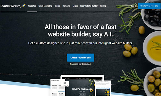
Constant Contact Website Builder is fast and A.I. based to create powerful websites without writing any code. It is an alternative to Wix and lets you set up a custom website in a few minutes.

It integrates with Unsplash to provide over 550,000 professional-quality images that you can use to engage your website users.

Constant Contact offers a CDN (content delivery network) to load your website pages super fast in any part of the world. It also improves your website SEO rankings.

Other notable features include a logo maker, website analytics, eCommerce support, engaging visual effects, customizable layouts, and more.

If we talk about features, Constant Contact is one of the most powerful and professional website builders in the market.

Price: Constant Contact has a FREE plan that lets you make a website, blog, or an online store.

Their premium plans start as low as $8 per month, and the paid version includes customer support, free domain name, free SSL certificate, and more features.

For online stores, they offer a business plan that costs $18.29 per month. It includes advanced integrations, unlimited products, no transaction fees, and priority customer support.

3. Gator by HostGator

Gator Website Builder

Gator is a leading website builder by HostGator. Since it is built by a popular hosting company, it is an ultimate website builder solution and a perfect alternative to Wix.

It comes with over 200 fully customizable templates to design a website easily. These templates are beautiful and stylish to make a powerful first impression on your website visitors.

Gator is a hosted solution, which means they take care of your website backups, updates, and software. This allows you to focus on the growth of your business.

It also offers multiple tools, social media integration, live Instagram feed, and support for eCommerce stores. Moreover, it has premium-quality stock photos that you can use on your site.

Price: Gator has premium plans starting from $3.46 per month, making it affordable for small businesses and startups. Each plan comes with a free domain name, free SSL certificate, website analytics, and premium 24/7 live support.

4. BigCommerce

BigCommerce

BigCommerce is an excellent eCommerce builder for your online store. It is a 1-stop solution to create powerful eCommerce shops and fully scalable to take your business to the next level.

It is a hosted platform, and their team of experts will take care of your website speed, security, updates, and any other technical issues.

BigCommerce has a strong affiliation with WordPress, which means you can combine the features of 2 most powerful platforms to set up an excellent eCommerce solution for your users.

When it comes to payment solutions, BigCommerce supports PayPal, Stripe, Apple Pay, Amazon Pay, Chase Pay, Visa Checkout, and more. It doesn’t charge any transaction fees, which means you get the complete profit of your sales.

It is a perfect eCommerce solution for online store owners, and far better than the Wix eCommerce builder.

Price: It offers a 15-day free trial to test all features of the BigCommerce platform. The premium plans starting from $29.95 per month. For more conversion optimization features, you can upgrade to a better plan as your business grows.

5. Divi

Divi Website Builder

Divi is an ultimate theme and a drag and drop page builder for WordPress websites. It comes with 100+ layout packs for different business niches.

It also includes 800+ pre-made designs, custom page templates, and website elements that you can use to create any website or online store easily.

With its point and click tools, you can start editing any section of your site from the frontend. Divi is easy to use, and it gives you complete control of everything, including fonts, colors, shapes, background, etc.

It offers advanced editing features like multi-select and bulk editing, find and replace styles, powerful color manager, copy and paste styles, and more.

Divi is better and faster than Wix. And, it combines with WordPress to offer a more robust and powerful solution for building any website, blog, online store, or membership site.

Price: The starting price is $89 per year with 1-year of premium support and product updates. You can also pay a 1-time fee of $249 and take benefit of all their features, lifetime premium support, lifetime software updates, and more.

Both plans include risk-free 30-day money back guarantee (no questions asked). So, you can get familiar with the platform without worrying about your money.
6. Beaver Builder

Beaver Builder

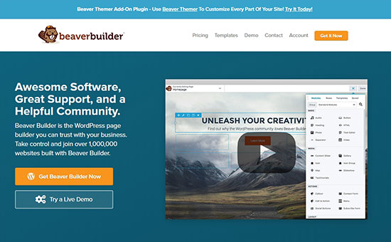
Beaver Builder is a powerful WordPress page builder plugin that combines with other WordPress features to let you launch your website quickly.

It comes with dozens of beautiful landing page and content page templates that are ready to add on your site. You can replace the demo text and images with your original content and publish the pages.

Unlike Wix, Beaver Builder lets you create fully customizable pages with a drag and drop builder for the setup. You can also use the WordPress customizer to make changes to your site.

Price: The standard plan costs $99 that includes 1-year of support and updates, premium modules, templates, and more for unlimited websites.

If you are looking for more advanced features like support for WordPress multisite network, dedicated Beaver Builder theme, etc., then you can select the Pro plan for $199.

For enterprise users who want white labeling to get full control of the software, they offer an Agency plan for $399.

Beaver Builder also comes with a Beaver Themer addon that allows you to create completely custom WordPress themes from scratch without writing any code. This is great for aspiring developers and / or agencies who want to build websites faster.
7. WordPress.com

WordPress.com

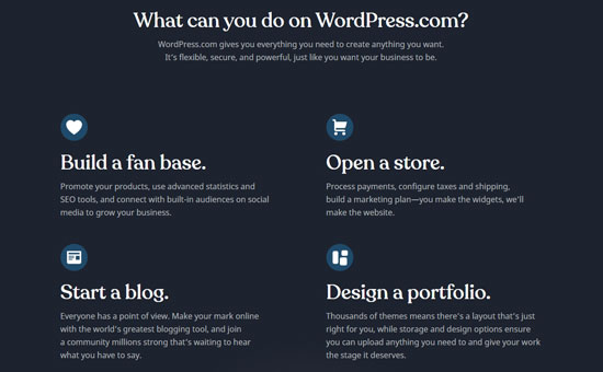
WordPress.com is a hosting solution for WordPress blogs and websites. It is built by Matt Mullenweg, the co-founder of self-hosted WordPress and founder of Automattic.

For more details, you should check out our article on how are WordPress.com and WordPress.org related.

Unlike self-hosted WordPress.org, you don’t need to worry about software updates and backups with WordPress.com. It is a fully custom website builder for beginners and bloggers.

WordPress.com doesn’t come with a drag and drop builder. But, you can use the native WordPress live customizer to make changes easily.

Price: It offers a free basic plan with limited features. The personal plan costs $4 per month, including a custom domain.

Their premium plan for freelancers costs $8 per month. For small business websites, they offer a business plan costing $25 per month.

If you want to run an online store with custom features and WooCommerce extensions, then it has an eCommerce plan for $45 per month. All their plans are billed annually.

Other Wix Alternatives

You may also find other Wix alternatives that are ideal for different types of use cases.
Shopify

Shopify

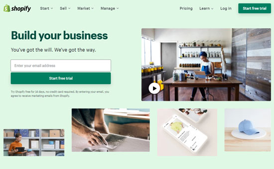
Shopify is an eCommerce software that integrates with your website builder to set up an online store. You can use Shopify as a Wix alternative.

Unlike BigCommerce, you need to pay transaction fees for every sale you make using Shopify. It also becomes expensive when you want to add more features and extensions to grow your online store.

Related: Check out our comparisons between Shopify vs WooCommerce and BigCommerce vs WooCommerce to find out the perfect Wix alternative for eCommerce stores.

Squarespace

Squarespace

Squarespace is a premium website builder and an alternative to Wix. It is easy to use for beginners to add content anywhere on the site without editing any code.

However, Squarespace has limited third-party integrations, which can be a hurdle in the growth of your business. It can be ideal at the start, but as your business grows, you need to move to a better platform like WordPress.

You can read our complete article on Squarespace vs WordPress for more details.

Weebly

Weebly

Weebly is a flexible website builder for any type of website. It is an alternative to Wix for a long time and ideal for small businesses and startups.

It restricts you to the limited features and doesn’t let you add third-party tools to set up a powerful site. If you plan to run an online store, Weebly also charges 3% transaction fees for every payment.

Related: WordPress vs Weebly – Which one is better?

Conclusion: Which is the Best Wix Alternative?

If you are looking for a perfect Wix alternative at an affordable price, then WordPress is the right choice. It is highly flexible and easy to use.

You can use Bluehost for WordPress websites to get the maximum discounts and start as low as $2.75 per month.

After that you can either use Divi or Beaver Builder, which are powerful WordPress drag and drop page builder plugins, to design beautiful website layouts without writing any code.

If you’re looking for a non-WordPress solution that’s hassle-free with better support than Wix, then look at Constant Contact Website Builder. It is perfect for small businesses that are looking for a FREE website builder. It is fast, intelligent, and A.I. powered making it a direct Wix alternative.

In case, you want to build a powerful online store to replace the Wix eCommerce solution, then you’ll need BigCommerce or Shopify. It comes with all the essential features and both offer way more powerful eCommerce solutions than Wix.

We hope this article helped you choose the best website builder for your project. You may also want to see out list of best email marketing services and best business phone services for small business.

If you liked this article, then please subscribe to our YouTube Channel for WordPress video tutorials. You can also find us on Twitter and Facebook.

The post 7 Best Wix Alternatives in 2020 (More Powerful and Reliable) appeared first on WPBeginner.

Creating Sortable Tables With React

Creating Sortable Tables With React

Creating Sortable Tables With React

Kristofer Giltvedt Selbekk

Table sorting has always been a pretty hard issue to get right. There’s a lot of interactions to keep track of, extensive DOM mutations to do and even intricate sorting algorithms, too. It’s just one of those challenges that are hard to get right. Right?

Instead of pulling in external libraries, let’s try to make stuff ourselves. In this article, we’re going to create a reusable way to sort your tabular data in React. We’ll go through each step in detail, and learn a bunch of useful techniques along the way.

We won’t go through basic React or JavaScript syntax, but you don’t have to be an expert in React to follow along.

Creating A Table With React

First, let’s create a sample table component. It’ll accept an array of products, and output a very basic table, listing out a row per product.

function ProductTable(props) {
  const { products } = props;
  return (
    <table>
      <caption>Our products</caption>
      <thead>
        <tr>
          <th>Name</th>
          <th>Price</th>
          <th>In Stock</th>
        </tr>
      </thead>
      <tbody>
        {products.map(product => (
          <tr key={product.id}>
            <td>{product.name}</td>
            <td>{product.price}</td>
            <td>{product.stock}</td>
          </tr>
        ))}
      </tbody>
    </table>
  );
}

Here, we accept an array of products and loop them out into our table. It’s static and not sortable at the moment, but that’s fine for now.

Sorting The Data

If you’d believe all the whiteboard interviewers, you’d think software development was almost all sorting algorithms. Luckily, we won’t be looking into a quick sort or bubble sort here.

Sorting data in JavaScript is pretty straightforward, thanks to the built-in array function sort(). It’ll sort arrays of numbers and strings without an extra argument:

const array = ['mozzarella', 'gouda', 'cheddar'];
array.sort();
console.log(array); // ['cheddar', 'gouda', 'mozzarella']

If you want something a bit more clever, you can pass it a sorting function. This function is given two items in the list as arguments, and will place one in front of the other based on what you decide.

Let’s start by sorting the data we get alphabetically by name.

function ProductTable(props) {
  const { products } = props;
  let sortedProducts = [...products];
  sortedProducts.sort((a, b) => {
    if (a.name < b.name) {
      return -1;
    }
    if (a.name > b.name) {
      return 1;
    }
    return 0;
  });
  return (
    <Table>
      {/* as before */}
    </Table>
  );
}

So what’s going on here? First, we create a copy of the products prop, which we can alter and change as we please. We need to do this because the Array.prototype.sort function alters the original array instead of returning a new sorted copy.

Next, we call sortedProducts.sort, and pass it a sorting function. We check if the name property of the first argument a is before the second argument b, and if so, return a negative value. This indicates that a should come before b in the list. If the first argument’s name is after the second argument’s name, we return a positive number, indicating that we should place b before a. If the two are equal (i.e. both have the same name), we return 0 to preserve the order.

Making Our Table Sortable

So now we can make sure the table is sorted by name — but how can we change the sorting order ourselves?

To change what field we sort by, we need to remember the currently sorted field. We’ll do that with the useState hook.

A hook is a special kind of function that lets us “hook” into some of React’s core functionality, like managing state and triggering side effects. This particular hook lets us maintain a piece of internal state in our component, and change it if we want to. This is what we’ll add:

const [sortedField, setSortedField] = React.useState(null);

We start by not sorting anything at all. Next, let’s alter the table headings to include a way to change what field we want to sort by.

const ProductsTable = (props) => {
  const { products } = props;
  const [sortedField, setSortedField] = React.useState(null);
  return (
    <table>
      <thead>
        <tr>
          <th>
            <button type="button" onClick={() => setSortedField('name')}>
              Name
            </button>
          </th>
          <th>
            <button type="button" onClick={() => setSortedField('price')}>
              Price
            </button>
          </th>
          <th>
            <button type="button" onClick={() => setSortedField('stock')}>
              In Stock
            </button>
          </th>
        </tr>
      </thead>
      {/* As before */}
    </table>
  );
};

Now, whenever we click a table heading, we update the field we want to sort by. Neat-o!

We’re not doing any actual sorting yet though, so let’s fix that. Remember the sorting algorithm from before? Here it is, just slightly altered to work with any of our field names.

const ProductsTable = (props) => {
  const { products } = props;
  const [sortedField, setSortedField] = React.useState(null);
  let sortedProducts = [...products];
  if (sortedField !== null) {
    sortedProducts.sort((a, b) => {
      if (a[sortedField] < b[sortedField]) {
        return -1;
      }
      if (a[sortedField] > b[sortedField]) {
        return 1;
      }
      return 0;
    });
  }
  return (
    <table>

We first make sure we’ve chosen a field to sort by, and if so, we sort the products by that field.

Ascending vs Descending

The next feature we want to see is a way to switch between ascending and descending order. We’ll switch between ascending and descending order by clicking the table heading one more time.

To implement this, we’ll need to introduce a second piece of state — the sort order. We’ll refactor our current sortedField state variable to keep both the field name and its direction. Instead of containing a string, this state variable will contain an object with a key (the field name) and a direction. We’ll rename it to sortConfig to be a bit clearer.

Here’s the new sorting function:

 sortedProducts.sort((a, b) => {
  if (a[sortConfig.key] < b[sortConfig.key]) {
    return sortConfig.direction === 'ascending' ? -1 : 1;
  }
  if (a[sortConfig.key] > b[sortConfig.key]) {
    return sortConfig.direction === 'ascending' ? 1 : -1;
  }
  return 0;
});

Now, if the direction is ‘ascending’, we’ll do as we did previously. If it’s not, we’ll do the opposite, giving us descending ordering.

Next up, we’ll create a new function — requestSort — which will accept the field name, and update the state accordingly.

const requestSort = key => {
  let direction = 'ascending';
  if (sortConfig.key === key && sortConfig.direction === 'ascending') {
    direction = 'descending';
  }
  setSortConfig({ key, direction });
}

We’ll also have to change our click handlers to use this new function!

return (
  <table>
    <thead>
      <tr>
        <th>
          <button type="button" onClick={() => requestSort('name')}>
            Name
          </button>
        </th>
        <th>
          <button type="button" onClick={() => requestSort('price')}>
            Price
          </button>
        </th>
        <th>
          <button type="button" onClick={() => requestSort('stock')}>
            In Stock
          </button>
        </th>
      </tr>
    </thead>
  {/* as before */}
  </table>
);

Now we’re starting to look pretty feature-complete, but there’s still one big thing left to do. We need to make sure that we only sort our data when we need to. Currently, we’re sorting all of our data on every render, which will lead to all sorts of performance issues down the line. Instead, let’s use the built-in useMemo hook to memoize all the slow parts!

const ProductsTable = (props) => {
  const { products } = props;
  const [sortConfig, setSortConfig] = React.useState(null);
  
  React.useMemo(() => {
    let sortedProducts = [...products];
    if (sortedField !== null) {
      sortedProducts.sort((a, b) => {
        if (a[sortConfig.key] < b[sortConfig.key]) {
          return sortConfig.direction === 'ascending' ? -1 : 1;
        }
        if (a[sortConfig.key] > b[sortConfig.key]) {
          return sortConfig.direction === 'ascending' ? 1 : -1;
        }
        return 0;
      });
    }
    return sortedProducts;
  }, [products, sortConfig]);

If you haven’t seen it before, useMemo is a way to cache — or memoize — expensive computations. So given the same input, it doesn’t have to sort the products twice if we re-render our component for some reason. Note that we want to trigger a new sort whenever our products change, or the field or direction we sort by changes.

Wrapping our code in this function will have huge performance implications for our table sorting!

Making It All Reusable

One of the best things about hooks is how easy it is to make logic reusable. You’ll probably be sorting all types of tables throughout your application, and having to reimplement the same stuff all over again sounds like a drag.

React has this feature called custom hooks. They sound fancy, but all they are are regular functions that use other hooks inside of them. Let’s refactor our code to be contained in a custom hook, so we can use it all over the place!

const useSortableData = (items, config = null) => {
  const [sortConfig, setSortConfig] = React.useState(config);
  
  const sortedItems = React.useMemo(() => {
    let sortableItems = [...items];
    if (sortConfig !== null) {
      sortableItems.sort((a, b) => {
        if (a[sortConfig.key] < b[sortConfig.key]) {
          return sortConfig.direction === 'ascending' ? -1 : 1;
        }
        if (a[sortConfig.key] > b[sortConfig.key]) {
          return sortConfig.direction === 'ascending' ? 1 : -1;
        }
        return 0;
      });
    }
    return sortableItems;
  }, [items, sortConfig]);

  const requestSort = key => {
    let direction = 'ascending';
    if (sortConfig && sortConfig.key === key && sortConfig.direction === 'ascending') {
      direction = 'descending';
    }
    setSortConfig({ key, direction });
  }

  return { items, requestSort };
}

This is pretty much copy and paste from our previous code, with a bit of renaming thrown in. useSortableData accepts the items, and an optional initial sort state. It returns an object with the sorted items, and a function to re-sort the items.

Our table code now looks like this:

const ProductsTable = (props) => {
  const { products } = props;
  const { items, requestSort } = useSortableData(products);
  return (
    <table>{/* ... */}</table>
  );
};

A Last Touch

There’s one tiny piece missing — a way to indicate how the table is sorted. In order to indicate that in our design, we need to return the internal state as well — the sortConfig. Let’s return that as well, and use it to generate styles we can apply to our table headings!

const ProductTable = (props) => {
  const { items, requestSort, sortConfig } = useSortableData(props.products);
  const getClassNamesFor = (name) => {
    if (!sortConfig) {
      return;
    }
    return sortConfig.key === name ? sortConfig.direction : undefined;
  };
  return (
    <table>
      <caption>Products</caption>
      <thead>
        <tr>
          <th>
            <button
              type="button"
              onClick={() => requestSort('name')}
              className={getClassNamesFor('name')}
            >
              Name
            </button>
          </th>
         {/* … */}
        </tr>
      </thead>
      {/* … */}
    </table>
  );
};

And with that, we’re done!

Wrapping Up

As it turns out, creating your own table sorting algorithm wasn’t an impossible feat after all. We found a way to model our state, we wrote a generic sorting function, and we wrote a way to update what our sorting preferences are. We made sure everything was performant and refactored it all into a custom hook. Finally, we provided a way to indicate the sort order to the user.

You can see a demo of the table in this CodeSandbox:

Smashing Editorial (ra, yk, il)

15 of the Best Webflow Templates and Themes for Your Next Website

If you’re about to start working on a new website project, consider suing Webflow! It’s a comprehensive website building tool that lets you create sites without having to know how to code. And to make it even easier, you can help yourself to some of the best Webflow templates and speed up the whole process considerably.