Just about everyone agrees that the cloud is the biggest transformation in IT in decades, but you’ll hear many different reasons why. OpEx vs CapEx, no need to manage physical data centers, “agility", and other buzzwords. But, the real reason why cloud has had such a profound impact is because of the empowering role it has given developers.
In the data center, developers could move only as fast as the infrastructure and security team. But with cloud, developers own all of those functions — whether the organizations that employ them realize it or not. The effect has been profound. Cloud-based companies generally out-innovate their competition in strides.
Every software development team or company will come to the point where a test automation tool is needed to downsize the effort of regression testing. The test automation tool can help the tester and the whole team to concentrate on other important testing tasks that a tool can't handle.
Selecting a tool sounds easy at first. Many people will pick the most popular tool on the market or the one that supports the programming language of the product. Sure, these are two important factors when selecting a tool, but there is much more to consider when searching and selecting the tool.
We’re all looking for low-hanging fruit to make our sites and apps more accessible. One of the easier things we can do is make sure the colors we use are easy on the eyes. High color contrast is something that benefits everyone. It not only reduces eye strain in general, but is crucial for folks who deal with reduced vision.
So let’s not only use better color combinations in our designs but find a way to make it easier for us to implement high contrasts. There’s one specific strategy we use over at Oomph that lets a Sass function do all the heavy lifting for us. I’ll walk you through how we put that together.
Want to jump right to the code because you already understand everything there is to know about color accessibility? Here you go.
What we mean by “accessible color combinations”
Color contrast is also one of those things we may think we have handled. But there’s more to high color contrasts than eyeballing a design. There are different levels of acceptable criteria that the WCAG has defined as being accessible. It’s actually humbling to crack open the WebAIM Contrast Checker and run a site’s color combinations through it.
My team adheres to WCAG’s Level AA guidelines by default. This means that:
Text that is 24px and larger, or 19px and larger if bold, should have a Color Contrast Ratio (CCR) of 3.0:1.
Text that is smaller than 24px should have a CCR of 4.5:1.
If a site needs to adhere to the enhanced guidelines for Level AAA, the requirements are a little higher:
Text that is 24px and larger, or 19px and larger if bold, should have a CCR of 4.5:1.
Text that is smaller than 24px should have a CCR of 7:1.
Ratios? Huh? Yeah, there’s some math involved here. But the good news is that we don’t need to do it ourselves or even have the same thorough understanding about how they’re calculated the way Stacie Arellano recently shared (which is a must read if you’re into the science of color accessibility).
That’s where Sass comes in. We can leverage it to run difficult mathematical computations that would otherwise fly over many of our heads. But first, I think it’s worth dealing with accessible colors at the design level.
Accessible color palettes start with the designs
That’s correct. The core of the work of creating an accessible color palette starts with the designs. Ideally, any web design ought to consult a tool to verify that any color combinations in use pass the established guidelines — and then tweak the colors that don’t. When our design team does this, they use a tool that we developed internally. It works on a list of colors, testing them over a dark and a light color, as well as providing a way to test other combinations.
ColorCube provides an overview of an entire color palette, showing how each color performs when paired with white, black, and even each other. It even displays results for WCAG Levels AA and AAA next to each result. The tool was designed to throw a lot of information at the user all at once when evaluating a list of colors.
This is the first thing our team does. I’d venture to guess that many brand colors aren’t chosen with accessibility at the forefront. I often find that those colors need to change when they get translated to a web design. Through education, conversation, and visual samples, we get the client to sign off on the new color palette. I’ll admit: that part can be harder than the actual work of implementing accessible colors combinations.
The Color Contrast Audit: A typical design delivery when working with an existing brand’s color palette. Here, we suggest to stop using the brand color Emerald with white, but use an “Alt” version that is slightly darker instead.
The problem that I wanted to solve with automation are the edge cases. You can’t fault a designer for missing some instance where two colors combine in an unintended way — it just happens. And those edge cases will come up, whether it is during the build or even a year later when new colors are added to the system.
Developing for accessibility while keeping true to the intent of a color system
The trick when changing colors to meet accessibility requirements is not changing them so much that they don’t look like the same color anymore. A brand that loves its emerald green color is going to want to maintain the intent of that color — it’s “emerald-ness.” To make it pass for accessibility when it is used as text over a white background, we might have to darken the green and increase its saturation. But we still want the color to “read” the same as the original color.
To achieve this, we use the Hue Saturation Lightness (HSL) color model. HSL gives us the ability to keep the hue as it is but adjust the saturation (i.e. increase or decrease color) and lightness (i.e. add more black or more white). The hue is what makes a green that green, or a blue that blue. It is the “soul” of the color, to get a little mystical about it.
Hue is represented as a color wheel with a value between 0° and 360° — yellow at 60°, green at 120°, cyan at 180°, etc. Saturation is a percentage ranging from 0% (no saturation) to 100% (full saturation). Lightness is also a value that goes from 0% to 100%, where no lightness is at 0%, no black and no white is at 50%, and 100% is all lightness, or very light.
A quick visual of what tweaking a color looks like in our tool:
With HSL, changing the low-contrast green to a higher contrast meant changing the saturation from 63 to 95 and the lightness from 45 to 26 on the left. That's when the color gets a green check mark in the middle when used with white. The new green still feels like it is in the same family, though, because the Hue remained at 136, which is like the color’s “soul.”
Designers can adjust colors with the tools that we just reviewed, but so far, no Sass that I have found could do it with mathematical magic. There had to be a way.
These are some similar approaches I have seen in the wild:
An idea by Josh Bader uses CSS variables and colors split into their RGB values to calculate whether white or black is the best accessible color to use in a given situation.
I didn't like these approaches. I didn’t want to fallback to white or black. I wanted colors to be maintained but adjusted to be accessible. Additionally, changing colors to their RGB or HSL components and storing them with CSS variables seemed messy and unsustainable for a large codebase.
I wanted to use a preprocessor like Sass to do this: given two colors, automagically adjust one of them so the pair receives a passing WCAG grade. The rules state a few other things to consider as well — size of the text and whether or not the font is bold. The solution had to take this into account.
In code terms, I wanted to do this:
// Transform this non-passing color pair:
.example {
  background-color: #444;
  color: #0094c2; // a 2.79 contrast ratio when AA requires 4.5
  font-size: 1.25rem;
  font-weight: normal;
}


// To this passing color pair:
.example {
  background-color: #444;
  color: #00c0fc; // a 4.61 contrast ratio
  font-size: 1.25rem;
  font-weight: normal;
}
A solution that does this would be able to catch and handle those edge cases we mentioned earlier. Maybe the designer accounted for a brand blue to be used over a light blue, but not a light gray. Maybe the red used in error messages needs to be tweaked for this one form that has a one-off background color. Maybe we want to implement a dark mode feature to the UI without having to retest all the colors again. These are the use cases I had in mind going into this.
With formulas can come automation
The W3C has provided the community with formulas that help analyze two colors used together. The formula multiplies the RGB channels of both colors by magic numbers (a visual weight based on how humans perceive these color channels) and then divides them to come up with a ratio from 0.0 (no contrast) to 21.0 (all the contrast, only possible with white and black). While imperfect, this is the formula we use right now:
If L1 is the relative luminance of a first color
And L2 is the relative luminance of a second color, then
- Color Contrast Ratio = (L1 + 0.05) / (L2 + 0.05)
Where
- L = 0.2126 * R + 0.7152 * G + 0.0722 * B
And
- if R sRGB <= 0.03928 then R = R sRGB /12.92 else R = ((R sRGB +0.055)/1.055) ^ 2.4
- if G sRGB <= 0.03928 then G = G sRGB /12.92 else G = ((G sRGB +0.055)/1.055) ^ 2.4
- if B sRGB <= 0.03928 then B = B sRGB /12.92 else B = ((B sRGB +0.055)/1.055) ^ 2.4
And
- R sRGB = R 8bit /255
- G sRGB = G 8bit /255
- B sRGB = B 8bit /255
While the formula looks complex, it’s just math right? Well, not so fast. There is a part at the end of a few lines where the value is multiplied by a decimal power — raised to the power of 2.4. Notice that? Turns out that it’s complex math which most programming languages can accomplish — think Javascript’s math.pow() function — but Sass is not powerful enough to do it.
There’s got to be another way…
Of course there is. It just took some time to find it. 🙂
My first version used a complex series of math calculations that did the work of decimal powers within the limited confines of what Sass can accomplish. Lots of Googling found folks much smarter than me supplying the functions. Unfortunately, calculating only a handful of color contrast combinations increased Sass build times exponentially. So, that means Sass can do it, but that does not mean it should. In production, build times for a large codebase could increase to several minutes. That’s not acceptable.
After more Googling, I came across a post from someone who was trying to do a similar thing. They also ran into the lack of exponent support in Sass. They wanted to explore “the possibility of using Newtonian approximation for the fractional parts of the exponent.” I totally understand the impulse (not). Instead, they decided to use a “lookup table.” It’s a genius solution. Rather than doing the math from scratch every time, a lookup table provides all the possible answers pre-calculated. The Sass function retrieves the answer from the list and it’s done.
In their words:
The only part [of the Sass that] involves exponentiation is the per-channel color space conversions done as part of the luminance calculation. [T]here are only 256 possible values for each channel. This means that we can easily create a lookup table.
Now we’re cooking. I had found a more performant direction.
Usage example
Using the function should be easy and flexible. Given a set of two colors, adjust the first color so it passes the correct contrast value for the given WCAG level when used with the second color. Optional parameters will also take the font size or boldness into account.
// @function a11y-color(
//   $color-to-adjust,
//   $color-that-will-stay-the-same,
//   $wcag-level: 'AA',
//   $font-size: 16,
//   $bold: false
// );


// Sass sample usage declaring only what is required
.example {
  background-color: #444;
  color: a11y-color(#0094c2, #444); // a 2.79 contrast ratio when AA requires 4.5 for small text that is not bold
}


// Compiled CSS results:
.example {
  background-color: #444;
  color: #00c0fc; // which is a 4.61 contrast ratio
}
I used a function instead of a mixin because I preferred the output of a single value independent from a CSS rule. With a function, the author can determine which color should change.
An example with more parameters in place looks like this:
// Sass
.example-2 {
  background-color: a11y-color(#0094c2, #f0f0f0, 'AAA', 1.25rem, true); // a 3.06 contrast ratio when AAA requires 4.5 for text 19px or larger that is also bold
  color: #f0f0f0;
  font-size: 1.25rem;
  font-weight: bold;
}


// Compiled CSS results:
.example-2 {
  background-color: #087597; // a 4.6 contrast ratio
  color: #f0f0f0;
  font-size: 1.25rem;
  font-weight: bold;
}
A deeper dive into the heart of the Sass function
To explain the approach, let’s walk through what the final function is doing, line by line. There are lots of helper functions along the way, but the comments and logic in the core function explain the approach:
// Expected:
// $fg as a color that will change
// $bg as a color that will be static and not change
// Optional:
// $level, default 'AA'. 'AAA' also accepted
// $size, default 16. PX expected, EM and REM allowed
// $bold, boolean, default false. Whether or not the font is currently bold
//
@function a11y-color($fg, $bg, $level: 'AA', $size: 16, $bold: false) {
  // Helper: make sure the font size value is acceptable
  $font-size: validate-font-size($size);
  // Helper: With the level, font size, and bold boolean, return the proper target ratio. 3.0, 4.5, or 7.0 results expected
  $ratio: get-ratio($level, $font-size, $bold);
  // Calculate the first contrast ratio of the given pair
  $original-contrast: color-contrast($fg, $bg);

  @if $original-contrast >= $ratio {
    // If we pass the ratio already, return the original color
    @return $fg;
  } @else {
    // Doesn't pass. Time to get to work
    // Should the color be lightened or darkened?
    // Helper: Single color input, 'light' or 'dark' as output
    $fg-lod: light-or-dark($fg);
    $bg-lod: light-or-dark($bg);


    // Set a "step" value to lighten or darken a color
    // Note: Higher percentage steps means faster compile time, but we might overstep the required threshold too far with something higher than 5%
    $step: 2%;

    // Run through some cases where we want to darken, or use a negative step value
    @if $fg-lod == 'light' and $bg-lod == 'light' {
      // Both are light colors, darken the fg (make the step value negative)
      $step: - $step;
    } @else if $fg-lod == 'dark' and $bg-lod == 'light' {
      // bg is light, fg is dark but does not pass, darken more
      $step: - $step;
    }
    // Keeping the rest of the logic here, but our default values do not change, so this logic is not needed
    //@else if $fg-lod == 'light' and $bg-lod == 'dark' {
    //  // bg is dark, fg is light but does not pass, lighten further
    //  $step: $step;
    //} @else if $fg-lod == 'dark' and $bg-lod == 'dark' {
    //  // Both are dark, so lighten the fg
    //  $step: $step;
    //}

    // The magic happens here
    // Loop through with a @while statement until the color combination passes our required ratio. Scale the color by our step value until the expression is false
    // This might loop 100 times or more depending on the colors
    @while color-contrast($fg, $bg) < $ratio {
      // Moving the lightness is most effective, but also moving the saturation by a little bit is nice and helps maintain the "power" of the color
      $fg: scale-color($fg, $lightness: $step, $saturation: $step/2);
    }
    @return $fg;
  }
}
The final Sass file
Here’s the entire set of functions! Open this in CodePen to edit the color variables at the top of the file and see the adjustments that the Sass makes:
All helper functions are there as well as the 256-line lookup table. Lots of comments should help folks understand what is going on.
When an edge case has been encountered, a version in SassMeister with debug output was helpful while I was developing it to see what might be happening. (I changed the main function to a mixin so I can debug the output.) Feel free to poke around at this as well.
And finally, the functions have been stripped out of CodePen and put into a GitHub repo. Drop issues into the queue if you run into problems.
Cool code! But can I use this in production?
Maybe.
I’d like to say yes, but I’ve been iterating on this thorny problem for a while now. I feel confident in this code but would love more input. Use it on a small project and kick the tires. Let me know how the build time performs. Let me know if you come across edge cases where passing color values are not being supplied. Submit issues to the GutHub repo. Suggest improvements based on other code you’ve seen in the wild.
I’d love to say that I have Automated All the A11y Things, but I also know it needs to be road-tested before it can be called Production Ready™. I’m excited to introduce it to the world. Thanks for reading and I hope to hear how you are using it real soon.
In the previous article, we explained what strong (vs. eventual) consistency is. This article is the second part of a series where we explain how a lack of strong consistency makes it harder to deliver a good end-user experience, can bring serious engineering overhead, and opens you up to exploits. This part is longer since we will explain different database anomalies, go through several example scenarios, and briefly highlight which kind of database suffers from each anomaly.
User experience is the driving factor in the success of any app, and relying on an inconsistent backend can increase the challenge to deliver a good experience. More importantly, building application logic on top of inconsistent data can lead to exploits. One paper calls these kinds of attacks "ACIDrain." they investigated 12 of the most popular self-hosted e-commerce applications and at least 22 possible critical attacks were identified. One website was a Bitcoin wallet service that had to shut down due to these attacks. When you choose a distributed database that is not 100% ACID, there will be dragons. As explained in one of our previous examples, due to misinterpretations, badly defined terminology, and aggressive marketing, it is very hard for an engineer to determine what guarantees a specific database delivers.
Which dragons? Your app might feature issues such as wrong account balances, unreceived user rewards, trade transactions that executed twice, messages that appear out of order, or application rules that are violated. For a quick introduction why distributed databases are necessary and difficult, please refer to our first article or this excellent video explanation. In short, a distributed database is a database that holds copies of your data in multiple locations for scale, latency, and availability reasons
We’ll go through four of these potential issues (there are more) and illustrate them with examples from game development. Game development is complex and those developers are faced with many problems that closely resemble serious real-life problems. A game has trading systems, messaging systems, awards that require conditions to be fulfilled, etc. Remember how angry (or happy 🤨) gamers can be if things go wrong or appear to go wrong. In games, user experience is everything, so game developers are often under huge pressure to make sure their systems are fault-tolerant.
Ready? Let’s dive into the first potential issue!
1. Stale reads
Stale reads are reads that return old data, or in other words, data that returns values which are not yet updated according to the latest writes. Many distributed databases, including traditional databases that scale up with replicas (read Part 1 to learn how these work), suffer from stale reads.
Impact on end users
First off, stale reads can affect end users. And it's not a single impact.
Frustrating experiences and unfair advantages
Imagine a scenario where two users in a game encounter a chest with gold. The first user receives the data from one database server while the second is connected to a second database server. The order of events goes as follows:
User 1 (via database server 1) sees and opens the chest, retrieves the gold.
User 2 (via database server 2) sees a full chest, opens it, and fails.
User 2 still sees a full chest and does not understand why it fails.
Although this seems like a minor problem, the result is a frustrating experience for the second player. Not only did he have a disadvantage, but he will also often see situations in the game where things appear to be there, yet they are not. Next, let’s look at an example where the player takes action on a stale read!
Stale reads leading to duplicated writes
Imagine a situation where a character in the game tries to buy a shield and a sword in a shop. If there are multiple locations that contain the data and there is no intelligent system in place to provide consistency, then one node will contain older data than another. In that case, the user might buy the items (which contacts the first node) and then check his inventory (which contacts the second node), only to see that they are not there. The user will probably be confused and might think that the transaction didn’t go through. What would most people do in that case? Well, they try to buy the item again. Once the second node has caught up, the user has already bought a duplicate, and once the replica catches up, he suddenly sees that he has no money left and two items of each. He is left with the perception that our game is broken.
Example of a user requesting the same transaction twice due to eventual consistency (t1) - A player buys a shield and sword. This buy transaction is committed to the master node. (r1) - The player loads his inventory, but the read hits replica1. Since (t1) is not yet replicated, he does not see his items. (rt1) - The first transaction is replicated, yet too late to have an effect on (r1) (t2) - The player thinks his buy attempt failed and buys the sword and shield again. (rt2) - The second transaction is replicated. (r2) - The player loads his inventory, and now sees he has two shields, two swords, and almost no gold left.
In this case, the user has spent resources which he did not want to spend. If we write an email client on top of such a database, a user might try to send an email, then refresh the browser and not be able to retrieve the email he has just sent, and therefore send it again. Delivering a good user experience and implementing secure transactions such as bank transactions on top of such a system is notoriously hard.
Impact on developers
When coding, you always have to expect that something is not there (yet) and code accordingly. When reads are eventually consistent, writing fault-proof code becomes very challenging and chances are that users will encounter problems in your application. When reads are eventually consistent, these problems will be gone by the time you are able to investigate them. Basically, you end up chasing ghosts. Developers still often choose databases or distribution approaches that are eventually consistent since it often takes time to notice the problems. Then, once the problems in their application arise, they try to be creative and build solutions (1, 2) on top of their traditional database to fix the stale reads. The fact that there are many guides like this and that databases like Cassandra have implemented some consistency features shows that these problems are real and do cause issues in production systems more frequently than you might imagine. Custom solutions on top of a system that is not built for consistency are very complex and brittle. Why would someone go through such a hassle if there are databases that deliver strong consistency out-of-the-box?
Databases that exhibit this anomaly
Traditional databases (PostgreSQL, MySQL, SQL Server, etc..) that use master-read replication typically suffer from stale reads. Many newer distributed databases also started off as eventually consistent, or in other words, without protection against stale reads. This was due to a strong belief in the developer community that this was necessary to scale. The most famous database that started off like this is Cassandra, but Cassandra recognized how their users struggled to deal with this anomaly and have since provided extra measures to avoid this. Older databases or databases which are not designed to provide strong consistency in an efficient way such as Cassandra, CouchDB, and DynamoDB are by default eventually consistent. Other approaches such as Riak are also eventually consistent, but take a different path by implementing a conflict resolution system to reduce the odds of outdated values. However, this does not guarantee that your data is safe since conflict resolution is not fault-proof.
2. Lost writes
In the realm of distributed databases, there is an important choice to make when writes happen at the same time. One option (the safe one) is to make sure that all database nodes can agree on the order of these writes. This is far from trivial since it either requires synchronized clocks, for which specific hardware is necessary, or an intelligent algorithm like Calvin that doesn't rely on clocks. The second, less safe option is to allow each node to write locally and then decide what to do with the conflicts later on. Databases that choose the second option can lose your writes.
Two database choices, avoid conflicts by ordering transactions or allow conflicts and resolve them.
Impact on end users
Consider two trade transactions in a game where we start with 11 gold pieces and buy two items. First, we buy a sword at 5 gold pieces and then buy a shield at five gold pieces, and both transactions are directed to different nodes of our distributed database. Each node reads the value, which in this case is still 11 for both nodes. Both nodes will decide to write 6 as the result (11- 5) since they are not aware of any replication. Since the second transaction could not see the value of the first write yet, the player ends up buying both the sword and shield for five gold pieces total instead of 10. Good for the user, but not so good for the system! To remedy such behavior, distributed databases have several strategies — some better than others.
Impact of lost writes on users. In this case, the user succeeds in buying two items while paying only once.
Resolution strategies include “last write wins" (LWW) or "longest version history" (LVH) wins. LWW has for a long time been the strategy of Cassandra and is still the default behavior if you do not configure it differently.
If we apply LWW conflict resolution to our previous example, the player will still be left with 6 gold, but will only have bought one item. This is a bad user experience because the application confirmed his purchase of the second item, even though the database doesn't recognize it as existing in his inventory.
An example of simple conflict resolution. Two transactions on different nodes are changing the amount of gold at the same time. The writes initially go through but when the two nodes communicate, the conflict becomes apparent. The conflict resolution strategy here is to cancel one of the transactions. The user can no longer try to take advantage of the system but occasionally writes will be lost.
Unpredictable security
As you might imagine, it is unsafe to write security rules on top of such a system. Many applications rely on complex security rules in the backend (or directly on the database where possible) to determine whether a user can or cannot access a resource. When these rules are based on stale data that's updated unreliably, how can we be sure that there is never a breach? Imagine one user of a PaaS application calls his administrator and asks: “Could you make this public group private so that we can repurpose it for internal data?” The admin applies the action and tells him it’s done. However, because the admin and user might be on different nodes, the user might start adding sensitive data to a group that is technically still public.
Impact on developers
When writes are lost, debugging user issues will be a nightmare. Imagine that a user reports that he has lost data in your application, then one day goes by before you get time to respond. How will you try to find out whether the issue was caused by your database or by faulty application logic? In a database that allows tracking data history such as FaunaDB or Datomic, you would be able to travel back in time to see how the data had been manipulated. Neither of these is vulnerable to lost writes though, and databases that do suffer from this anomaly typically don’t have the time-travel feature.
Databases that suffer from lost writes
All databases that use conflict resolution instead of conflict avoidance will lose writes. Cassandra and DynamoDB use last write wins (LWW) as default; MongoDB used to use LWW but has since moved away from it. The master-master distribution approaches in traditional databases such as MySQL offer different conflict resolution strategies. Many distributed databases that were not built for consistency suffer from lost writes. Riak’s simplest conflict resolution is driven by LWW, but they also implement more intelligent systems. But even with intelligent systems, sometimes there's just no obvious way to resolve a conflict. Riak and CouchDB place the responsibility to choose the correct write with the client or application, allowing them to manually choose which version to keep.
Since distribution is complex and most databases use imperfect algorithms, lost writes are common in many databases when nodes crash or when network partitions arise. Even MongoDB, which does not distribute writes (writes go to one node), can have write conflicts in the rare case that a node goes down immediately after a write.
3. Write skew
Write skew is something that can happen in a type of guarantee that database vendors call snapshot consistency. In snapshot consistency, the transaction reads from a snapshot that was taken at the time the transaction started. Snapshot consistency prevents many anomalies. In fact, many thought it was completely secure until papers (PDF) started to appear proving the opposite. Therefore, it’s not a surprise that developers struggle to understand why certain guarantees are just not good enough.
Before we discuss what doesn't work in snapshot consistency, let's first discuss what does. Imagine that we have a battle between a knight and a mage, whose respective life powers consist of four hearts.
When either character gets attacked, the transaction is a function that calculates how many hearts have been removed:
In a trivial situation, the knight's strike removes three hearts from the mage, and then the mage's spell removes four hearts from the knight, bringing his own life points back to four. These two transactions would behave correctly in most databases if one transaction runs after the other.
But what if we add a third transaction, an attack from the knight, which runs concurrently with the mage's spell?
Example of two transactions (Life Leech and the second Powerful Strike) that will determine the outcome of the battle. What would be the outcome in a system that provides snapshot consistency? To know that we have to learn about the ‘first committer wins’ rule.
Is the knight dead, and is the mage alive?
To deal with this confusion, snapshot consistency systems typically implement a rule called “the first committer wins.” A transaction can only conclude if another transaction did not already write to the same row, else it will roll back. In this example, since both transactions tried to write to the same row (the mage’s health), only the Life Leech spell would work and the second strike from the knight would be rolled back. The end result would then be the same as in the previous example: a dead knight and a mage with full hearts.
However, some databases such as MySQL and InnoDB do not consider “the first committer wins” as part of a snapshot isolation. In such cases, we would have a lost write: the mage is now dead, although he should have received the health from the life leech beforethe strike of the knight took effect. (We did mention badly defined terminology and loose interpretations, right?)
Snapshot consistency that includes the “first committer wins” rule does handle some things well, not surprising since it was considered a good solution for a long time. This is still the approach of PostgreSQL, Oracle, and SQL Server, but they all have different names for it. PostgreSQL calls this guarantee "repeatable read," Oracle calls it "serializable" (which is incorrect according to our definition), and SQL Server calls it "snapshot isolation." No wonder people get lost in this forest of terminology. Let’s look at examples where it is not behaving as you would expect!
Impact on end users
The next fight will be between two armies, and an army is considered dead if all of the army characters are dead:
isArmyDead(army){
  if (<all characters are dead>) { return true }
  else { return false }
}
After every attack, the following function determines if a character has died, and then runs the above function to see if the army has died:
First, the character’s hearts are diminished with the damage that was received. Then, we verify whether the army is dead by checking whether each character is out of hearts. Then, if the state of the army has changed, we update the ‘dead’ boolean of army.
Example of write skew, an anomaly that can happen in databases that provide snapshot consistency.
There are three mages that each attack one time resulting in three ‘Life Leech’ transactions. Snapshots are taken at the beginning of the transactions, since all transactions start at the same time, the snapshots are identical. Each transaction has a copy of the data where all knights still have full health.
Let’s take a look at how the first ‘Life Leech’ transaction resolves. In this transaction, mage1 attacks knight1, and the knight loses 4 life points while the attacking mage regains full health. The transaction decides that the army of knights is not dead since it can only see a snapshot where two knights still have full health and one knight is dead. The other two transactions act on another mage and knight but proceed in a similar way. Each of those transactions initially had three live knights in their copy of the data and only saw one knight dying. Therefore, each transaction decides that the army of knights is still alive.
When all transactions are finished, none of the knights are still alive, yet our boolean that indicates whether the army is dead is still set to false. Why? Because at the time the snapshots were taken, none of the knights were dead. So each transaction saw his own knight dying, but had no idea about the other knights in the army. Although this is an anomaly in our system (which is called write skew), the writes went through since they each wrote to a different character and the write to the army never changed. Cool, we now have a ghost army!
Impact on developers
Data quality
What if we want to make sure users have unique names? Our transaction to create a user will check whether a name exists; if it does not, we will write a new user with that name. However, if two users try to sign up with the same name, the snapshot won’t notice anything since the users are written to different rows and therefore do not conflict. We now have two users with the same name in our system.
There are numerous other examples of anomalies that can occur due to write skew. If you are interested, Martin Kleppman’s book “Designing Data-Intensive Applications” describes more.
Code differently to avoid the rollbacks
Now, let’s consider a different approach where an attack is not directed towards a specific character in the army. In this case, the database is responsible for selecting which knight should be attacked first.
If we execute several attacks in parallel as in our previous example, the getFirstHealthyCharacterwill always target the same knight, which would result in multiple transactions that write to the same row. This would be blocked by the “first committer wins” rule, which will roll back the two other attacks. Although it prevents an anomaly, the developer is required to understand these issues and code around them creatively. But wouldn’t it be easier if the database just did this for you out-of-the-box?
Databases that suffer from write skew
Any database that provides snapshot isolation instead of serializability can suffer from write skew. For an overview of databases and their isolation levels, please refer to this article.
4. Out of order writes
To avoid lost writes and stale reads, distributed databases aim for something called "strong consistency." We mentioned that databases can either choose to agree on a global order (the safe choice) or decide to resolve conflicts (the choice that leads to lost writes). If we decide on a global order, it would mean that although the sword and shield are bought in parallel, the end result should behave as if we bought the sword first and then bought the shield. This is also often called "linearizability" since you can linearize the database manipulations. Linearizability is the gold standard to make sure your data is safe.
Different vendors offer different isolation levels, which you can compare here. A term that comes back often is serializability which is a slightly less strict version of strong consistency (or linearizability). Serializability is already quite strong and covers most anomalies, but still leaves room for one very subtle anomaly due to writes that get reordered. In that case, the database is free to switch that order even after the transaction has been committed. Linearizability in simple terms is serializability plus a guaranteed order. When the database is missing this guaranteed order, your application is vulnerable to out of order writes.
Impact on end users
Reordering of conversations
Conversations can be ordered in a confusing way if someone sends a second message due to a mistake.
Reordering of user actions
If our player has 11 coins and simply buys items in the order of importance while not actively checking the amount of gold coins he has, then the database can reorder these buy orders. If he didn't have enough money, he could have bought the item of least importance first.
In this case, there was a database check which verified whether we have enough gold. Imagine that we did not have enough money and it would cost us money to let the account go below zero, just like a bank charges you overdraft fees when you go below zero. You might sell an item quickly in order to make sure you have enough money to buy all three items. However, the sale that was meant to increase your balance might be reordered to the end of the transaction list, which would effectively push your balance below zero. If it were a bank, you would likely incur charges you definitely did not deserve.
Unpredictable security
When an invulnerability spell swaps order with an axe attack
After configuring security settings, a user will expect that these settings will apply to all forthcoming actions, but issues can arise when users talk to each other via different channels. Remember the example we discussed where an administrator is on the phone with a user who wants to make a group private and then adds sensitive data to it. Although the time window within which this can happen becomes smaller in databases that offer serializability, this situation can still occur since the administrator's action might not be completed until after the user’s action. When users communicate through different channels and expect that the database is ordered in real-time, things go wrong.
This anomaly can also happen if a user is redirected to different nodes due to load balancing. In that case, two consecutive manipulations end up on different nodes and might be reordered. If a girl adds her parents to a facebook group with limited viewing rights, and then posts her spring break photos, the images might still end up in her parents’ feeds.
In another example, an automatic trading bot might have settings such as a maximum buy price, a spending limit, and a list of stocks to focus on. If a user changes the list of stocks that the bot should buy, and then the spending limit, he will not be happy if these transactions were reordered and the trading bot has spent the newly allocated budget on the old stocks.
Impact on developers
Exploits
Some exploits depend on the potential reversal of transactions. Imagine that a game player receives a trophy as soon as he owns 1,000 gold, and he really wants that trophy. The game calculates how much money a player has by adding together gold of multiple containers, for example his storage and what he's carrying (his inventory). If the player quickly swaps money in between his storage and inventory, he can actually cheat the system.
In the illustration below, a second player acts as a partner in crime to make sure that the money transfer between the storage and the inventory happens in different transactions, increasing the chance that these transactions get routed to different nodes. A more serious real world example of this happens with banks that use a third account to transfer money; the bank might miscalculate whether or not someone is eligible for a loan because various transactions have been sent to different nodes and not had enough time to sort themselves out.
Databases that suffer from out of order writes
Any database that does not provide linearizability can suffer from write skew. For an overview of which databases do provide linearizability, please refer to this article. Spoiler: there are not that many.
All anomalies can return when consistency is bounded
One final relaxation of strong consistency to discuss is to only guarantee it within certain bounds. Typical bounds are a datacenter region, a partition, a node, a collection, or a row. If you program on top of a database that imposes these kinds of boundaries to strong consistency, then you need to keep those in mind to avoid accidentally opening Pandora's Box again.
Below is an example of consistency, but only guaranteed within one collection. The example below contains three collections: one for the players, one for the smithies (i.e., blacksmiths repairing players' items), and another for the items. Each player and each smithy has a list of ids that point to items in the items collection.
If you want to trade the shield between two players (e.g., from Brecht to Robert), then everything is fine since you remain in one collection and therefore your transaction remains within the boundaries where consistency is guaranteed. However, what if Robert's sword is in the smithy for repairs and he wants to retrieve it? The transaction then spans two collections, the smithy's collection and the player's collection, and the guarantees are forfeited. Such limitations are often found in document databases such as MongoDB. You will then be required to change the way you program to find creative solutions around the limitations. For example, you could encode the location of the item on the item itself.
Of course, real games are complex. You might want to be able to drop items on the floor or place them in a market so that an item can be owned by a player but does not have to be in the player's inventory. When things become more complex, these workarounds will significantly increase technical depth and change the way you code to stay within the guarantees of the database.
Consistency with limitations often requires you to be aware of the limitations and change the way you code, stepping out of the boundary, and again exposing your application to the aforementioned anomalies.
Conclusion
We have seen different examples of issues that can arise when your database does not behave as you would expect. Although some cases might seem insignificant at first, they all have a significant impact on developer productivity, especially as a system scales. More importantly, they open you up to unpredictable security exploits — which can cause irreparable damage to your application's reputation.
We discussed a few degrees of consistency, but let’s put them together now that we have seen these examples:
Stale reads
Lost writes
Write skew
Out of order writes
Linearizability
safe
safe
safe
safe
Serializability
safe
safe
safe
unsafe
Snapshot consistency
safe
safe
unsafe
unsafe
Eventual consistency
unsafe
unsafe
unsafe
unsafe
Also remember that each of these correctness guarantees can come with boundaries:
Row-level boundaries
The guarantees delivered by the database are only honored when the transaction reads/writes to one row. Manipulations such as moving items from one player to another can cause issues. HBase is an example database that limits guarantees to one row.
Collection-level boundaries
The guarantees delivered by the database are only honored when the transaction reads/writes to one collection. E.g., trading items between two players stays within a "players" collection, but trading them between a player and an entity from another collection such as a market opens the door to anomalies again. Firebase is an example which limits correctness guarantees to collections.
Shard/Replica/Partition/Session boundaries
As long as a transaction only affect data on one machine or shard, the guarantees hold. This is, of course, less practical in distributed databases. Cassandra has recently started offering serializability features if you configure them, but only within a partition.
Regionboundaries
Some databases almost go all the way and provide guarantees across multiple nodes (shards/replicas), but their guarantees do not hold anymore if your database is distributed across multiple regions. Such an example is Cosmos. Cosmos is a great technology, but they have chosen an approach where consistency guarantees are limited to one region.
Finally, realize that we have only mentioned a few anomalies and consistency guarantees while in fact there are more. For the interested reader, I fondly recommend Martin Kleppman’s Designing Data-Intensive Applications.
We live in a time when we no longer have to care, as long as we choose a strongly consistent database without limitations. Thanks to new approaches such as Calvin (FaunaDB) and Spanner (Google Spanner, FoundationDB), we now have multi-region distributed databases that deliver great latencies and behave as you expect in each scenario. So why would you still risk shooting yourself in the foot and choose a database that does not deliver these guarantees?
In the next article in this series, we will go through the effects on your developer experience. Why is it so hard to convince developers that consistency matters? Spoiler: most people need to experience it before they see the necessity. Think about this though: “If bugs appear, is your app wrong, or is it the data? How can you know?” Once the limitations of your database manifest themselves as bugs or bad user experiences, you need to work around the limitations of the database, which results in inefficient glue code that does not scale. Of course, at that point, you are deeply invested and the realization came too late.
Source In the digital age, professionals across industries conduct the lion’s share of their networking activities and business transactions online. Whether you’re a freelance designer or a business owner looking to grow their empire, first impressions count. While most professionals focus on their more public-facing touchpoints (website, social media platforms, etc.) when it comes to […]
The use of containers continues to rise in popularity in enterprise environments, increasing the need for a means to manage and orchestrate them. There’s no dispute that Kubernetes (K8s) has emerged as the market leader in container orchestration for cloud-native environments.
Since Kubernetes plays a critical role in managing who and what could be done with containerized workloads, security should be well-understood and managed. It is therefore essential to use the right deployment architecture and security best practices for all deployments.
Followers of my articles should not be surprised to read that I am a serious advocate of working remotely. Two of my most popular articles on the topic are included below if you are interested in checking them out:
With all of the media attention surrounding the coronavirus and the continued rise of reported cases, organizations and learning institutions are attempting to slow the growth of the situation by allowing employees and students to work/learn remotely.
Most enterprise Java applications are driven by annotations. Java annotations encapsulate many different functionalities. Here, I’ll introduce some of the most popular annotations and explain what they are responsible for to sure up your understanding of annotations you’re already familiar with and introduce you to ones you may not know.
Inversion of Control and Dependency Injection
These two patterns are responsable for bean initialization.IOC initializes beans and defines dependencies between them, while DI allows you to use them in your class without calling a constructor. There’s much more you can do with these, but for the sake of brevity, we’ll stop here.
One of the most essential steps of any software development project is testing. If this process is skipped, the results may be disastrous – both for the project and for the company. But when should software undergo testing? It seems logical to test the project when it is completed. However, the power of the classic test procedure is limited. Overengineering, rigid design, testability issues – are just a few problems you may face if you write the code first and test the implementation later. Luckily, there is a way to tackle such challenges and it is called – Test-driven development.
As many are aware (or should be), "Agile Testing" is not a completely different testing procedure, rather a testing approach, which aligns with the principles of Agile software development.
But how? Well, the most salient aspect is that it emphasizes testing and close coordination with the end-users or at least with the story owners, throughout the project life-cycle.
Scalable Vector Graphics (SVGs) became a W3C open standard in 1999 — back when the new tech hotness was the Blackberry phone, Napster first invaded college dorms, and the Y2K bug sparked fear in us all. Fast forward to our modern digital world and you’ll notice that while the other tech trends have waned, SVGs are still around and thriving. This is partly due to SVGs having a small footprint for such high visual fidelity, in a world where bandwidth and performance matter more than ever — especially on mobile devices and situations/locations where data is at a premium. But also because SVGs are so flexible with their integrated styles, interactivity, and animation options. What we can do with SVGs today goes way beyond the basic shapes of yesteryear.
If we focus on the accessibility aspect of SVGs, we have come a long way as well. Today, we have many robust patterns and techniques to help us optimize inclusiveness. This is true regardless if you are creating icons, simple images, or more complex images. While the specific pattern you decide to use might vary depending on your particular situation and targeted WCAG conformance level — the reality is, most people stop there, focusing on code compliance and not actual end-users and their needs. If true inclusiveness lies beyond patterns — what other factors should we consider when designing and developing accessible SVGs?
Styling And Animating SVGs With CSS
Why is it so important to optimize your SVGs? Also, why even put in the effort to make them accessible? Sara Soueidan explais why and also how to style and animate with CSS. Read article →
SVG Color And Contrast
The primary focus of accessible SVGs is screen readers compliance — which is only part of the issue and part of the solution. Globally, people with low-vision and color blindness outnumber the people who are blind 14:1. We are talking a staggering 546 million in total (246 million low-vision users plus 300 million colorblind users) vs. 39 million users who are legally blind. Many people with low-vision and colorblindness do not rely on screen readers, but may instead use tools like browser resizing, customized stylesheets, or magnification software to help them see what is on the screen. To these 546 million people, screen reader output is probably not as important to them as making sure the color and contrast is great enough that they can see the SVG on the screen — but how do we go about checking for this?
Tools And Checks
The very first step you should take when designing your SVG color palette is to review the WCAG color contrast ratio guidelines. While SVGs and other icons were exempt from color contrast ratio requirements not too long ago (when targeting WCAG AA compliance), the recent update to the WCAG 2.1 guidelines have made it so all essential non-text imagery must adhere to a contrast ratio of at least 3:1 against adjacent colors. By essential, it means if your SVG was to vanish, would it fundamentally change the information or functionality of the content? If you can answer “no,” then you are likely exempt from this guideline. If you can answer “yes” or “maybe,” then you need to make sure your SVG color contrast ratios are in check.
House icon used in demo with light outline vs dark outline — which is more accessible? (Large preview)
One example of an essential non-text image is an SVG icon used as a CTA button or link — such as we see in this home button. In this SVG, we see a line drawing of a house with no visual text. When we look into the code, we see the text “Home” in a span with a class called "sr-only" (screen reader only) on it. This class, along with the related CSS, hides the span text from sighted users, but not from AT users (this is just one example of an accessible image/graphic pattern).
This is a good first step, but choosing the correct SVG pattern is one piece of the puzzle — another piece is the color contrast between the icon and its background. Going back to the example, at first glance it seems like both SVGs could be accessible. Yet, when using a color contrast tool and testing the house icon against its background, we see the first SVG fails compliance with a color contrast ratio of 2:1 between the stroke (#8f8f8f) and the background (#cccccc), while the second SVG passes with a color contrast ratio of 3:1 between the stroke (#717171) and the background (#cccccc). By using the same accessible pattern, but taking an extra step and changing the stroke color to something a bit darker, we made our SVG more inclusive to a wider range of abilities.
To check for accessible color contrast ratios, there are many tools available for use. For a quick color contrast spot check, you could use the Contrast Checker in Chrome DevTools. For checking color contrast on non-coded designs, check out the Colour Contrast Analyser tool. And for a full-color palette review, A11y Color Palette is a great way to help you see which color combinations are the most accessible. Of course, make sure you try out a few of the tools and pick whatever works best for you and your team — the best tool is the one you actually use.
Light/Dark Mode
Beyond checking for color contrast ratios, you should also consider the increasingly popular and supported media query called @prefers-color-scheme that allows a user to choose a light or dark themed version of the website or app they are visiting. While this media query does not replace checking for color contrast ratios, it can give your users more choice when it comes to the overall experience of your website or app.
As with other media queries, to see the light/dark theme changes, the website or app developer must add additional code targeting the query. Going back to the house icon example from earlier, you can see in the following code that the SVG’s stroke, fill, and background colors are controlled by the CSS. Since these style elements are externally controlled and not hard-coded in the SVG markup, we can add a few extra lines of CSS to make the SVG work in a dark theme.
Light/default mode:
House icon used in demo with a light background (Large preview)
As this example shows, setting up your designs to use CSS to control style elements means that creating a dark theme version of your SVG can be relatively simple. Conversely, if you have hard-coded styles into the SVG markup, you may need to reimagine your SVG in a way that allows CSS to have more control over the design. Or you may want to consider creating a completely new dark version of your SVG and swap out the light version when the theme preferences change. Just remember, if you do plan to show/hide different images based on the user mode, you also need to hide the nonvisible SVG from AT users!
Note: in this particular example, the default theme was already light so it made sense to also make that the default experience and build a dark theme for an alternate experience. Otherwise, if we started with a dark theme, we could have done the opposite making the dark theme the default experience and using @media (prefers-color-scheme: light) to create a light theme.
In the next example, we are looking at a more complex SVG with both light and dark mode versions via the @prefers-color-scheme media query. Our friend Karma Chameleon (in SVG form) has both a dark theme and a light/default theme. By changing your light/dark preference settings (Mac OS + Win OS dark mode settings) and navigating to a browser that supports @prefers-color-scheme media query, you can see the environment change. In the light/default mode, Karma Chameleon is sitting on a branch in a green forest surrounded by a fluttering red butterfly. In dark mode, she is sitting on a branch in space with a blue rocket zooming past. In both environments, her colors automatically change and her eyes move around.
See the Pen [Light/Dark mode + reduced motion with SVGs (Karma Chameleon)](https://codepen.io/smashingmag/pen/rNVJyoj) by Carie Fisher.
While the above examples are fun ways to show what you can do with color and contrast and the @prefers-color-scheme media query, there are some really great real-world reasons to consider adding a dark theme including:
Dark themes are helpful to people with photophobia, or light sensitivity. People with photophobia can trigger headaches and migraines when they view a website or app that is too bright.
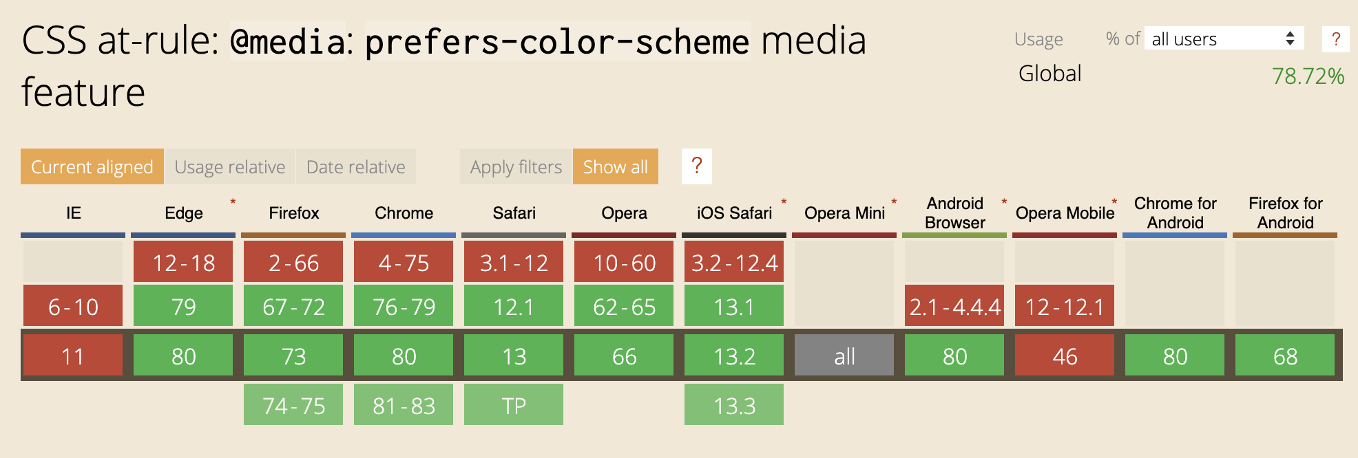
Unlike some other color or contrast based media queries like @inverted-colors (currently only supported by Safari) and @forced-colors (developed by Edge/IE engineers with Chromium support coming soon), the browser support is pretty universal for @prefers-color-scheme — so this media query is useful out of the box today and it should be sticking around for awhile. Plus with the recent changes to MS Edge using Chromium under the hood, there is even more support for this media query going forward (R.I.P. -ms-high-contrast-mode).
Graph showing which browsers utilize the CSS at-rule: @media: prefers-color-scheme media feature. (Large preview)
SVG Animation
In conjunction with color and contrast, how your SVG moves on the screen is another aspect to consider when designing and developing with inclusiveness in mind. The WCAG motion guidelines are clear: non-essential moving, blinking, or scrolling information that starts automatically, lasts more than five seconds, and is part of other page elements must allow the user to pause, stop, or hide it. But why do we need this rule?
For some users, moving, blinking, or scrolling content can be very distracting. People with ADHD and other attention deficit disorders might be so distracted by your animated SVGs they forget why they even went to your website/app in the first place. While for other people, motion can trigger physical reactions. For example, people with vestibular issues can become nauseous and dizzy when viewing movement. While others can be triggered to have a seizure when viewing content that flashes or is bright — a situation you obviously want to avoid.
Since SVG animations, like other moving content, must not auto-play for more than five seconds, you must create a way for users to pause or stop the animation. One way to do this is to create a JS toggle button to play/pause the animation.
If your SVG is large or is the main feature of your website (e.g. animations that pop in and out as you scroll down a page) a pause/play button at the top of the screen might be a realistic option to control the entire experience of the page. If your SVGs are smaller in scale or related to user input (e.g. an animation happens when a user submits a form), a pause/play button might not be realistic for each individual image, so an alternative option is to code the animation to stop at five seconds vs. playing it on an infinite loop.
Reduced Motion
In addition to using a pause/play option or creating a finite animation loop, you may also consider adding @prefers-reduced-motion media query to address the animation in your SVGs. Similar to the light/dark theme example, the @prefers-reduced-motion media query checks the user’s settings for motion restrictions and then implements a visual experience based on their preference. In the case of @prefers-reduced-motion, a user can choose to minimize the amount of animation or motion they see.
In the following example, the animated SVG “writes out” a word as the page loads — this is its default animation. In the reduced motion version, the SVG is stationary and the word loads without the animation. Depending on the complexity of your SVG animation and how you want the reduced motion experience to look, the amount of extra code involved can vary.
See the Pen [Reduced motion with SVGs](https://codepen.io/smashingmag/pen/dyodvqm) by Carie Fisher.
Keep in mind, having @prefers-reduced-motion code in place is one step in making your SVGs more accessible, but you also need to consider the way the motion is reduced. For example, let’s say you create a slowed-down version of your SVG animation using @prefers-reduced-motion. However, the slower version is on an infinite loop so the animation lasts more than five seconds, which violates one part of the WCAG rules on motion. If you instead create a reduced motion version of your animated SVG that stops the animation at five seconds, then it would pass that part of the rule. This subtle code change equals two completely different user experiences.
In the next example, Karma Chameleon is back with a @prefers-reduced-motion media query and related code. By changing your motion settings (Mac, Win, Android, and iOS settings) and using a browser that supports @prefers-reduced-motion media query, you can see the animation change. In the light mode with reduced motion, Karma Chameleon in a forest with a stationary red butterfly. In dark mode with reduced motion, she is in space with a stationary blue rocket in the background. In both environments, her colors and eyes are also stationary, as the original SVG animation is completely removed.
See the Pen [Light/Dark mode + reduced motion with SVGs (Karma Chameleon)](https://codepen.io/smashingmag/pen/rNVJyoj) by Carie Fisher.
From an accessibility standpoint, there are some great reasons to consider limiting the movement on your screen or providing alternative animations in your SVGs including:
Less is more! Keeping your SVG animations simple for people with cognitive and attention disorders can help with your overall user experience. This is especially true for SVGs critical to the content or functionality of your website or app — such as navigation, buttons, links, or any animation triggered by user input.
Don’t make people sick! Some people with seizure, vestibular, and vision disorders can trigger physical reaction by motion in your SVGs, so please be responsible with your designs and code. Note: you should double-check any animated SVGs that could be problematic in the flashing/blinking area, by using the free Photosensitive Epilepsy Analysis Tool (PEAT) to ensure you don’t trigger seizures with your content.
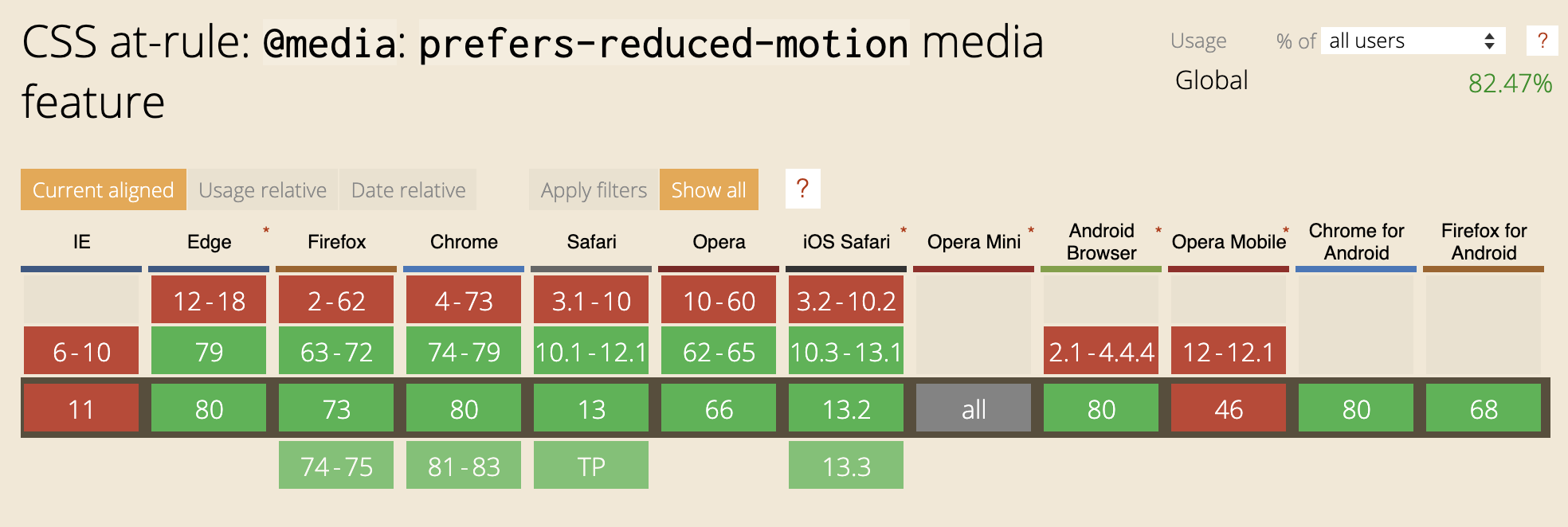
Most major browsers now support @prefers-reduced-motion media query both on desktop and mobile devices — meaning that more people can limit their exposure to unwanted movement on their screens. Unlike the media query @prefers-color-scheme which has a lot of competitors, there is currently no other motion reducing media query available.
Graph showing which browsers utilize the CSS at-rule: @media: prefers-reduced-motion media feature (Large preview)
Wrapping Up
Color, contrast, and animation is at the heart of every SVG. Studies report that these visual elements hold intrinsic meaning, contribute to brand recognition, and are tied to a company’s perceived value — making SVGs a very large area where designers and developers can have a direct and immediate impact on our users.
But it is also important that we don’t just think of SVG accessibility as something to help “other people” — because who hasn’t found themselves in a situation where they have to battle glare on a device screen? Or you have a migraine and SVGs keep floating on and off the screen making you sick instead of “delighted”. Or maybe you visit a website in a low-light setting and the text is hard to read due to the gray-on-gray color scheme?
With the use of accessibility tools, WCAG guidelines, and the continued addition and support of new CSS media queries to allow for more choice, we can impact all people in a more responsible and inclusive way.
Do you want to add custom fonts in WordPress? Custom fonts allow you to use beautiful combination of different fonts on your website to improve typography and user experience.
Apart from looking good, custom fonts can also help you improve readability, create a brand image, and increase time users spend on your website.
In this article, we will show you how to add custom fonts in WordPress using Google Fonts, TypeKit, and CSS3 @Font-Face method.
Note: Loading too many fonts can slow down your website. We recommend choosing two fonts and use them across your website. We’ll also show you how to properly load them without slowing down your website.
Before we look at how to add custom fonts in WordPress, let’s take a look at finding custom fonts that you can use.
If you don’t know how to mix and match fonts, then try Font Pair. It helps designers pair beautiful Google fonts together.
As you are picking your fonts, remember that using too many custom fonts will slow down your website. This is why you should select two fonts and use them throughout your design. This will also bring consistency to your design.
Video Tutorial
If you don’t like the video or prefer the written guide, then please continue reading.
Adding Custom Fonts in WordPress from Google Fonts
Google Fonts is the largest, free, and most commonly used font library among website developers. There are multiple ways you can add and use Google Fonts in WordPress.
Method 1: Adding Custom Fonts Using Easy Google Fonts Plugin
If you want to add and use Google Fonts on your website, then this method is by far the easiest and recommended for beginners.
Upon activation, you can go to Appearance » Customizer page. This will open the live theme customizer interface where you’ll see the new Typography section.
Clicking on Typography will you show different sections of your website where you can apply Google Fonts. Simply click on ‘Edit Font’ below the section you want to edit.
Under the font family section, you can choose any Google Font you want to use on your website. You can also choose font style, font size, padding, margin, and more.
Depending on your theme, the number of sections here could be limited and you may not be able to directly change font selection for many different areas of your website.
To fix this, the plugin also allows you to create your own controls and use them to change fonts on your website.
First, you need to visit Settings » Google Fonts page and provide a name for your font control. Use something that helps you quickly understand where you will be using this font control.
Next, click on the ‘Create font control’ button and then you will be asked to enter CSS selectors.
You can add HTML elements you want to target (for instance, h1, h2, p, blockquote) or use CSS classes.
You can use Inspect tool in your browser to find out which CSS classes are used by the particular area you want to change.
Now click on the ‘Save font control’ button to store your settings. You can create as many font controllers as you need for different sections of your website.
To use these font controllers, you need to head over to Appearance » Customizer and click on the Typography tab.
Under Typography, you will now see a ‘Theme Typography’ Option as well. Clicking on it will show your custom font controls you created earlier. You can now just click on the edit button to select the fonts and appearance for this control.
Don’t forget to click on the save or publish button to save your changes.
Method 2: Manually Add Google Fonts in WordPress
This method requires you to add code to your WordPress theme files. If you haven’t done this before, then see our guide on how to copy and paste code in WordPress.
First, visit the Google fonts library and select a font that you want to use. Next, click on the quick use button below the font.
On the font page, you’ll see the styles available for that font. Select the styles that you want to use in your project and then click on the sidebar button at the top.
Next, you will need to switch to the ‘Embed’ tab in the sidebar to copy the embed code.
There are two ways you can add this code to your WordPress site.
First, you can simply edit your theme’s header.php file and paste the code before the <body> tag.
However, if you are unfamiliar with code editing in WordPress, then you can use a plugin to add this code.
Upon activation, go to Settings » Insert Headers and Footers page and paste the embed code in the ‘Scripts in header’ box.
Don’t forget to click on the Save button to store your changes. The plugin will now start loading the Google Font embed code on all pages of your website.
You can use this font in your theme’s stylesheet like this:
Typekit by Adobe Fonts is another free and premium resource for awesome fonts that you can use in your design projects. They have a paid subscription as well as a limited free plan that you can use.
Simply signup for an Adobe Fonts account and visit the browse fonts section. From here you need to click on the </> button to select a font and create a project.
Next, you’ll see the embed code with your project ID. It will also show you how to use the font in your theme’s CSS.
You need to copy and paste this code inside the <head> section of your website.
There are two ways you can add this code to your WordPress site.
First, you can simply edit your theme’s header.php file and paste the code before the <body> tag.
However, if you are unfamiliar with code editing in WordPress, then you can use a plugin to add this code.
Adding Custom Fonts in WordPress Using CSS3 @font-face
The most direct way of adding custom fonts in WordPress is by adding the fonts using CSS3 @font-face method. This method allows you to use any font that you like on your website.
First thing you need to do is download the font that you like in a web format. If you do not have the web format for your font, then you can convert it using the FontSquirrel Webfont generator.
Once you have the webfont files, you would need to upload it on your WordPress hosting server.
The best place to upload the fonts is inside a new “fonts” folder in your theme or child theme‘s directory.
You can use FTP or File Manager of your cPanel to upload the font.
Once you have uploaded the font, you need to load the font in your theme’s stylesheet using CSS3 @font-face rule like this:
Loading fonts directly using CSS3 @font-face is not always the best solution. If you are using a font from Google Fonts or Typekit, then it is best to serve the font directly from their server for optimal performance.


