In the video below, we take a closer look at the Spring bean lifecycle — Spring aware interfaces for beans. Let's get started!
Spring Bean Lifecycle — Spring Aware Interfaces for Beans


Tips, Expertise, Articles and Advice from the Pro's for Your Website or Blog to Succeed
In the video below, we take a closer look at the Spring bean lifecycle — Spring aware interfaces for beans. Let's get started!
As defined on the home page, Quarkus is “a Kubernetes Native Java stack tailored for OpenJDK HotSpot and GraalVM.” Since I’m a big fan of OpenJ9, I’ve quickly measured memory usage of my reactive sample application where I run a microservice once with OpenJ9 and once with HotSpot.
OpenJ9 is a Java JVM that was open sourced from IBM 2-3 years ago. It’s basically the same JVM that IBM uses in hundreds of products and offerings. The nice thing is that compared to Hotspot, it not only provides a 42% faster startup time, but also a 66% smaller memory footprint. Check out the documentation.
I was recently working on a modern take of the blogroll. The idea was to offer readers a selection of latest posts from those blogs in a magazine-style layout, instead of just popping a list of our favorite blogs in the sidebar.
The easy part was grabbing a list of posts with excerpts from our favorite RSS feeds. For that, we used a WordPress plugin, Feedzy lite, which can aggregate multiple feeds into a single time-ordered list — perfect for showcasing their latest offerings. The hard part was making it all look awesome.
The plugin’s default list UI is rather bland, so I wanted to style it to look like a newspaper or magazine website with a mixture of smaller and larger “featured content” panels.
This seems like an ideal case for CSS Grid! Create a grid layout for different layouts, say, one five-column layout and one three-column layout, then use media queries to switch between them at different break points. Right? But do we actually need those media queries — and all the hassle of identifying break points — when we can use grid’s auto-fit options to automatically create a fluid responsive grid for us?
The approach sounded tempting, but when I started introducing column-spanning elements, I ran into trouble with the grid overflowing on narrow screens. Media queries appeared to be the only solution. That is, until I found a workaround!
After looking at several tutorials on CSS Grid, I found that they largely fall into two camps:
I want to make the grid do both: create a fully responsive fluid layout that includes responsively resizing multi-column elements as well.
The beauty is that once you understand the limitations of responsive grids, and why and when column spans break grid responsiveness, it is possible to define a responsive magazine/news style layout in just a dozen lines of code plus one simple media query (or even with no media queries if you are willing to limit your span options).
Here’s a visual showing the RSS plugin right out of the box and what it’ll look like after we style it up.

This magazine-style grid layout is fully responsive with the colored featured panels adjusting dynamically as the number of columns change. The page displays around 50 posts, but the layout code is agnostic as to the number of items displayed. Ramp up the plugin to show 100 items and the layout stays interesting all the way down.
All of this is achieved using only CSS and with only a single media query to deal with a single column display on the narrowest of screens (i.e. smaller than 460px).
Incredibly, this layout only took 21 lines of CSS (excluding global content styling). However, to achieve such flexibility in such a few lines of code, I had to dig deep into the more obscure parts of some of CSS Grid and learn how to work around some of its inherent limitations.
The essential elements of the code that produce this layout is incredibly short and a testament to the awesomeness of CSS Grid:
.archive {
  display: grid;
  grid-template-columns: repeat(auto-fit, minmax(210px, 1fr));
  grid-gap: 32px;
  grid-auto-flow: dense;
}

/* Extra-wide grid-posts */
.article:nth-child(31n + 1) {
  grid-column: 1 / -1;
}
.article:nth-child(16n + 2) {
  grid-column: -3 / -1;
}
.article:nth-child(16n + 10) {
  grid-column: 1 / -2;
}

/* Single column display for phones */
@media (max-width: 459px) {
  .archive {
    display: flex;
    flex-direction: column;
  }
}
The techniques in this article could be used equally well to style any dynamically generated content such as the output from a latest posts widget, archive pages or search results.
I have set up seventeen items displaying a variety of mock content — headlines, images and excerpts — which are all contained in a wrapper
<div class="archive">
  <article class="article">
    <!-- content -->
  </article>

  <!-- 16 more articles -->

</div>
The code that turns these items into a responsive grid is remarkably compact:
.archive {
  /* Define the element as a grid container */
  display: grid;
  /* Auto-fit as many items on a row as possible without going under 180px */
  grid-template-columns: repeat(auto-fit, minmax(180px, 1fr));
  /* A little spacing between articles */
  grid-gap: 1em;
}Notice how the heights of the rows automatically adjust to accommodate the tallest content in the row. If you change the width of the Pen, you will see the items grow and shrink fluidly and the number of columns change from one to five, respectively.
The CSS Grid magic at play here is the auto-fit keyword that works hand-in-hand with the minmax() function that’s applied to grid-template-columns.
We could have achieved the five-column layout alone using this:
.archive {
  display: grid;
  grid-template-columns: repeat(5, 1fr);
}
However, this would create five columns that grow and shrink with different screen widths, but always stay at five columns, resulting in them becoming ridiculously narrow on small screens. The first thought might be to create a bunch of media queries and redefine the grid with different numbers of columns. That would work fine, but with the auto-fit keyword, it is all done automatically.
For auto-fit to work the way we want, we need to use the minmax() function. This tells the browser how small the columns can be squeezed down to followed by the maximum width they can expand to. Any smaller, and it will automatically reduce the number of columns. Any larger, and the number of columns increases.
.archive {
  grid-template-columns: repeat (auto-fit, minmax(180px, 1fr));
}
In this example, the browser will fit in as many columns as it can 180px wide. If there is space left over the columns will all grow equally by sharing the remaining space between them — that’s what the 1fr value is saying: make the columns equal fractions of the available width.
Drag the window out and as the available space increases the columns all grow equally to use up any additional space. The columns will keep growing until the available space allows for an additional 180px column, at which point a whole new column appears. Decrease the screen width, and the process reverses, perfectly adjusting the grid all the way down to a single column layout. Magic!
And you get all this responsiveness out of just one line of code. How cool is that?
So far, we have a responsive grid but all items the same width. For a news or magazine layout we need some content to be featured by spanning two or more columns or even, perhaps, to span all the columns.
To create multi-column spans we can add the column-span feature to the grid items we want to take up more space. For example, if we want the third item in our list to be two columns wide we can add:
.article:nth-child(3) {
  grid-column: span 2;
}
However, once we start adding spans a number of problems can arise. First, gaps may appear in the grid because a wide item may may not fit on the row, so grid auto-fit pushes it onto the next line, leaving a gap where it would have been:

The easy fix is adding grid-auto-flow: dense to the grid element which tells the browser to fill in any gaps with other items, effectively making the narrower content flow around the wider items like this:

Note that the items are now out of order, with the fourth item coming before the third item, which is double the width. There is no way round this as far as I can tell, and it is one of the limitations you have to accept with CSS Grid.
Check out Geoff Graham’s "The Auto-Flowing Powers of Grid’s Dense Keyword” for an introduction to grid-auto-flow: dense with examples of how it behaves.
There are several ways to indicate how many columns an item should span. The easiest is to apply grid-columns: span [n] to one of the items, where n is the number of columns the element will span. The third item in our layout has grid-column: span 2, which explains why it is double the width of other items that only span a single column.
Other methods require you to explicitly define grid lines. The numbering system for grid lines is as follows:

Grid lines can be specified from left-to-right using positive values (e.g. 1, 2, 3) or negative values (e.g. -1, -2, -3) to go from right-to-left. These can be used to place items on the grid using the grid-column property like this:
.grid-item {
  grid-column: (start track) / (end track);
}
So, this gives us additional ways to specify a spanned item. This is especially flexible as either the start or end value can be replaced with the span keyword. For example, the three-column blue box in the example above could be created by adding any of the following to the eighth grid item:
grid-column: 3 / 6grid-column: -4 / -1grid-column: 3 / span 3grid-column: -4 / span 3grid-column: span 3 / -1On a non-responsive (i.e. fixed columns) grid, these all produce the same effect (like the blue box above), however, if the grid is responsive and the number of columns changes, their differences start to become apparent. Certain column spans break the layout with an auto-flowing grid, making the two techniques appear incompatible. Fortunately, there are some solutions which allow us to combine the two successfully.
First, however, we need to understand the problem.
Here are some featured areas created using the notation above:

It all looks good at full-width (five columns) but when resized to what should be two columns, the layout breaks like this:

As you can see, our grid has lost its responsiveness and, although the container has shrunk, the grid is trying to maintain all five columns. To do so, it has given up trying to keep equal-width columns, and the grid is breaking out of the right-hand side of its container, causing horizontal scrolling.
Why is this? The problem comes about because the browser is trying to honor the explicit grid lines we named. At this width, the auto-fit grid should implicitly be displaying two columns, but our grid line numbering system contradicts this by explicitly referring to the fifth grid line. This contradiction leads to the mess. To display our implicit two-column grid correctly, the only line numbers allowed are 1, 2 and 3 and -3, -2, -1, like this:

But if any of our grid items contains grid-column references that lie outside this, such as grid line number 4, 5 or 6 (or -4, -5 or -6), the browser is getting mixed messages. On the one hand, we have asked it to automatic create flexible columns (which should implicitly give us two columns at this screen width) but we have also explicitly referred to grid lines that don’t appear in a two-column grid. When there is a conflict between implicit (automatic) columns and an explicit number of columns, grid always defers to the explicit grid; hence the unwanted columns and horizontal overflow (which has also been aptly named CSS data loss). Just like using grid line numbers, spans can also create explicit columns. So, grid-column: span 3 (the eighth grid item in the demo) forces the grid to explicitly adopt at least three columns, whereas we want it, implicitly display two.
At this point it might seem like the only way forward is to use media queries to change the grid-column values at the width where our layout breaks — but not so fast! That’s what I assumed at first. But after thinking it though a bit more and playing around with various options, I found there are a limited set of workarounds that work all the way down to two columns, leaving just one media query to cover a single column layout for the narrowest screens.
The trick, I realized, is to only specify spans using grid lines that appear in the narrowest grid you intend to display. That is a two-column grid in this case. (We will use a media query to cover the single column scenario for very narrow screens.) That means we can safely use grid lines 1, 2 and 3 (or -3, -2 and -1) without breaking the grid.
I initially thought that meant limiting myself to a maximum span of two columns, using combinations of the following:
grid column: span 2grid-column: 1 /3grid-column: -3 / -1
Which remains perfectly responsive right down to two columns:

Although this works, it is rather limiting from a design perspective, and not particularly exciting. I wanted to be able to create spans that would be three, four or even five columns wide on large screens. But how? My first thought was that I would have to resort to media queries (OMG old habits die hard!) but I was trying to get away from that approach and think differently about responsive design.
Taking another look at what we can do with just 1 to 3 and -3 to -1, I gradually realized that I could mix positive and negative line numbers for the grid column’s start and end values ,such as 1/-3 and 2/-2. At first glance, this does not seem very interesting. That changes when you realize where these lines are located as you resize the grid: these spanned elements change width with the screen size. This opened up a whole new set of possibilities for responsive column spans: items that will span different numbers of columns as the screen gets wider, without needing media queries.
The first example I discovered is grid-column: 1/-1.This makes the item act like a full-width banner, spanning from the first to the last column at all column numbers. it even works down to one column wide!
By using grid-column: 1/-2, a left-aligned nearly-full-width span could be created that would always leave a one column item to the right of it. When shrunk to two columns it would shrink responsively to a single column. Surprisingly, it even works when shrunk to a single column layout. (The reason seems to be that grid will not collapse an item to zero width, so it remains one column wide, as does grid-column: 1/1.) I assumed grid-column: 2/-1 would work similarly, but aligned with the right-hand edge, and for the most part it does, except at one column display when it causes overflow.
Next I tried 1/-3 which worked fine on wider screen, showing at least three columns, and smaller screens, showing one column. I thought it would do something weird on a two-column grid as the first grid line is the same as the grid line with -3. To my surprise, it still displays fine as a single-column item.
After a lot of playing around, I came up with eleven possible grid column values using grid line numbers from the two-column grid. Surprisingly, three of these work right down to single-column layouts. Seven more work down to two columns and would only need a single media query to deal with single column display.
Here is the full list:

auto-fit grid. (Demo)As you can see, although this is a limited subset of every possible responsive span, there are actually a lot of possibilities.
2/-2 is interesting as it creates a centered span which works all the way down to one column! 3/-1 is least useful as it causes overflow even with two-columns.3/-3 was a surprise.By using a variety of grid-column values from this list, it is possible to create an interesting and fully responsive layout. Using a single media query for the narrowest single-column display, we have ten different grid-column span patterns to play with.
The single-column media query is generally straightforward as well. The one on this final demo reverts to using flexbox at smaller screens:
@media (max-width: 680px) {
  .archive {
    display: flex;
    flex-direction: column;
  }

  .article {
    margin-bottom: 2em;
  }
}
Here is the final grid which, as you can see, is fully responsive from one to five columns:

The last trick I used to get my code down to two dozen lines was the :nth-child(n) selector which I used to style multiple items in my grid. I wanted my span styling to apply to multiple items in my feed, so that the featured post boxes appeared regularly throughout the page. To start with I used a comma-separated selector list, like this:
.article:nth-child(2),
.article:nth-child(18),
.article:nth-child(34),
.article:nth-child(50)  {
  background-color: rgba(128,0,64,0.8);
  grid-column: -3 / -1;
}
But I soon found this cumbersome, especially as I had to repeat this list for each child element I wanted to style within each article — such as the title, links and so on. During prototyping, if I wanted to play around with the position of my spanned elements, I had to manually change the numbers in each of these lists, which was tedious and error-prone.
That’s when I realized that I could use a powerful feature :nth-child pseudo-selector instead of a simple integer as I had used in the list above. :nth-child(n) can also take an equation, such as :nth-child(2n+ 2), which will target every second child element.
Here is how I used the :nth-child([formula]) to create the blue full-width panels in my grid which appear at the very top of the page, and is repeated just over half way down:
.article:nth-child(31n + 1) {
  grid-column: 1 / -1;
  background: rgba(11, 111, 222, 0.5);
}
The bit in the brackets (31n + 1 ) ensures that the 1st, 32nd, 63rd, etc. child is selected. The browser runs a loop starting with n=0 (in which case 31 * 0 + 1 = 1), then n=1 (31 * 1 + 1 = 32), then n=2 (31 * 2 + 1 = 63). In the last case, the browser realizes that there is no 63rd child item so it ignores that, stops looping, and applies the CSS to the 1st and 32nd children.
I do something similar for the purple boxes which alternate down the page from right-to-left:
.article:nth-child(16n + 2) {
  grid-column: -3 / -1;
  background: rgba(128, 0, 64, 0.8);
}

.article:nth-child(16n + 10) {
  grid-column: 1 / -2;
  background: rgba(128, 0, 64, 0.8);
}
The first selector is for the right-hand purple boxes. The 16n + 2 makes sure that the styling applies to every 16th grid item, starting with the second item.
The second selector targets the right-hand boxes. It uses the same spacing (16n) but with a different offset (10). As a result, these boxes appear regularly on the right-hand side for grid items 10, 26, 42, etc.
When it comes to the visual styling for these grid items and their contents, I used another trick to reduce repetition. For styles that both boxes share (such as the background-color, for example) a single selector can be used to target both:
.article:nth-child(8n + 2) {
  background: rgba(128, 0, 64, 0.8);
  /* Other shared syling */
}
This will target items 2, 10, 18, 26, 34, 42, 50, and so forth. In other words, it selects both the left- and right-hand featured boxes.
It works because 8n is exactly half of 16n, and because the offsets used in the two separate selectors have a difference of 8 (i.e. the difference between +10 and +2 is 8)
Right now, CSS Grid can be used to create flexible responsive grids with minimal code, but this does come with some significant limitations on positioning elements without the retrograde step of using media queries.
It would be great to be able to specify spans that would not force overflow on smaller screens. At the moment, we effectively tell the browser, “Make a responsive grid, please,” which it does beautifully. But when we continue by saying, “Oh, and make this grid item span four columns,” it throws a hissy-fit on narrow screens, prioritizing the four-column span request rather than the responsive grid. It would be great to be able to tell grid to prioritize responsiveness over our span request. Something like this:
.article {
  grid-column: span 3, autofit;
}
Another issue with responsive grids is the last row. As the screen width changes the last row will frequently not be filled. I spent a long time looking for a way to make the last grid item span (and hence fill) the remaining columns, but it seems you can’t do it in Grid right now. It would be nice if we could specify the item’s start position with a keyword like auto meaning, “Please leave the left-hand edge wherever it falls.” Like this:
.article {
  grid-column: auto, -1;
}
…which would make the left-hand edge span to the end of the row.
The post Responsive Grid Magazine Layout in Just 20 Lines of CSS appeared first on CSS-Tricks.
As API architectural patterns go, GraphQL — which is most definitely not RESTful — is the new darling on the block. More and more enterprises from Github to the New York Times to PayPal are working with the technology which was invented at Facebook.
Java thread synchronization and concurrency are the most discussed topics during various design phases of a complex application. There are many aspects of threads, synchronization techniques to achieve great concurrency in an application. The evolution of CPUs over the years (multi-core processors, registers, cache memory, and the main memory (RAM) has lead to some areas that usually developers tend to overlook — like thread context, context-switching, variable visibility, JVM memory model vs CPU memory model.
In this series, we will discuss various aspects of the Java memory model, including how it impacts thread contexts, synchronization techniques in Java to achieve concurrency, race conditions, etc. In this article, we'll focus on the concepts of threads, synchronization techniques, and the memory models of both Java and our CPU.
While WordPress powers more than 35% of all websites on the internet, it’s not the only open-source content management system (CMS) in the market. There are other poplar software like Joomla and Drupal.
All three of them have a lot in common and many significant differences. Each one of them is a unique website builder with pros and cons.
In this article, we will compare WordPress vs Joomla vs Drupal to find out which one is the best choice for you.

Note: We are comparing WordPress.org, and not the WordPress.com hosting service. Please see our guide on the difference between WordPress.org and WordPress.com.
All three of the web’s most popular CMS have a lot in common in terms of technology, philosophy, and community.
While there are a lot of similarities, they are different in many aspects.
For instance, they have different policies about what to include in the core software, how to handle modules and templates, how to deal with security, etc.
These differences make a big impact on users, and how they build their websites.
Having that said, let’s take a look at how WordPress, Joomla and Drupal compare to each other, so you can choose the best website builder platform for your business.
Most people creating their websites are not web developers, designers, or programmers. They are average users who just want to build a website. Ease of use is the most important factor for majority of users.
WordPress
WordPress comes with a famous five minute install. Most WordPress hosting providers also offer one click install of WordPress. This makes it fairly easy for a new user start a WordPress blog or website in minutes, not hours.

The post-install user experience of WordPress is way better than Joomla or Drupal. The user sees a simple clean-cut user interface with the menus to create posts, pages, or start customizing appearance and themes.
Joomla
Joomla installation may not look as quick as WordPress, but it has very similar steps. Apart from that many shared hosting providers offer one-click install packages for Joomla as well.

After the installation, the user lands on a control panel that is not as straight forward as WordPress. There are just too many menus to click on and customize your site.
Joomla fans would say that’s because Joomla is a lot more powerful than WordPress, but we don’t believe that to be true.
Drupal
Drupal’s installation is similar to both Joomla and WordPress. Simply download and upload the package and run the installation script.

Drupal also offers distributions. These are pre-packaged Drupal bundles with modules and configurations to create specific types of websites.
The post-installation experience for absolute beginners is a bit complicated. Users will find it difficult to figure out how to change things on their site. Drupal makes it very obvious how to add the content, but changing appearance and adding non-content elements is not very obvious.
Winner: WordPress
All three of these popular CMS come with themes and plugins / modules as a way to extend the features and appearance of the software.
Themes control the appearance of your website and how it looks to your users. Plugins or Modules are like apps for your CMS.
Let’s see how these three major CMS software perform in this category.
WordPress
WordPress allows users to change their site’s appearance using themes. WordPress comes with a few default themes pre-installed.
At any time, you can click on the add new button from your Appearance page and install free WordPress themes from the official WordPress.org theme directory.

Apart from free themes, you will find many more premium WordPress themes developed by third-party theme shops like StudioPress, Astra Theme, Elegant Themes, and more. These are paid themes and come with premium support options.
The real power of WordPress lies in plugins. There are more than 55,000 WordPress plugins available for free in the official WordPress plugin directory. You can also buy premium plugins that come with paid support provided by plugin developers. Check out our list of must-have WordPress plugins to see how plugins make WordPress awesome.
Joomla
Just like WordPress, Joomla also comes with templates and extensions. There are great extensions to do just about anything from creating an eCommerce store to managing email.

However, the quantity of these templates and extensions is not as high as WordPress. This could make finding the perfect template and the perfect extensions a bit difficult.
By default, Joomla does not have a feature that would allow users to search and install extensions or templates from the administration area. There is an extension that allows you to add “install from web” feature for extensions. But for templates, users will still have to manually search templates and then install them by adding their URL.
Drupal
Drupal has the same issue with the availability of themes and modules. Users will have to leave their site, search for the module and theme they want to add, then locate the project’s zip file URL. Finally, they can enter the URL in the Modules or Themes page to install them.

There are modules to do just about anything and new ones are added regularly. Still, the overall quantity of modules is lacking when compared to WordPress.
Winner: WordPress.
The availability of help and support options is very important for beginner users. There will surely be some hurdles when you are trying new software. That’s ok as long as you can get help.
WordPress
WordPress has a strong community of users. You can find WordPress help on official support forums, docs, handbooks, codex, Slack channels, Stack Exchange, WPBeginner Engage facebook group, and almost every forum on the internet about web design and development.

There are sites like WPBeginner, containing hundreds of tutorials, video tutorials, and articles catering to beginner level WordPress users. There are many ways to ask for free WordPress support and get it.
Apart from the free support options, there are ways to get paid support for WordPress as well.
Online platforms like Codeable, UpWork, Fiverr, etc. are just some of the places where you can hire WordPress professionals to help you. Due to the immense popularity of WordPress, finding WordPress developers is easy and affordable for small businesses and individuals.
Joomla
Joomla, just like WordPress has a large and very helpful community. There is extensive documentation on the Joomla website which is a valuable resource for beginners. For more interactive support, users can join forums, mailing lists, user groups, etc.

Apart from community support, there are third party resources, paid training, and development agencies that can be helpful.
Unlike WordPress, finding affordable expert help is quite difficult for Joomla. Hiring a developer or expert for Joomla development, troubleshooting or assistance can cost way more than WordPress.
Drupal
Drupal has a very proactive community of fans and users. You will find all the community support options for Drupal just like WordPress and Joomla. There is extensive documentation, support forum, mailing lists, user groups, irc chatrooms. All good places to get advice and free help.

Drupal tries to connect users to developers and companies offering professional Drupal services. You may find them in Drupal Marketplace.
However Drupal developer similar to Joomla are very expensive when compared to WordPress.
Winner: WordPress
A large percentage of websites created each day, are non-English or multilingual sites. It is much more likely that many beginners would probably be looking for a CMS that can handle multiple languages or has support for different locales and languages.
WordPress
WordPress does an excellent job of offering a good platform to build a multilingual site. It does not support multiple languages out of the box, but there are some excellent plugins that allow you to easily create a WordPress multilingual site.
WordPress is available in more than 57 languages. New languages can be installed with just a click from the WordPress admin area.

Most popular themes and plugins are also available in multiple languages. Theme and plugin developers are actively seeking help to translate their packages into other languages.
All these efforts make WordPress a great platform to build a non-English or multilingual website.
Joomla
Joomla comes with out of the box capability to handle a multilingual website without installing any extension. Simply go to language manager, add a content language and start creating multilingual content on your website.

Translations are also available for the admin interface in many languages and can be easily installed from the admin area.
Drupal
Drupal comes with built-in support to handle non-English or multilingual sites. You will need to enable locale and content translation modules. After that, you can add site and admin interface languages from Drupal’s configuration section.

Winner: Tie – All three of them support multilingual sites and are available in multiple languages.
Security is a very important factor when choosing a CMS for your website. Almost every website on the internet is vulnerable to security threats.
WordPress
Being the most popular CMS in the world, WordPress based websites are often targeted by hackers. However, WordPress is built on a very secure code, and it responds to security vulnerability very quickly.
WordPress also has an auto-update mechanism which allows WordPress websites to automatically update when there is a new security patch.
WordPress sites can be further secured with automated backups, two-factor authentication, and other WordPress security best practices.
There is also a built-in mechanism to show updates for WordPress themes and plugins. This allows themes and plugin developers to rapidly respond to any security vulnerability.
Joomla
Joomla is very similar to WordPress when it comes to security. They actively respond to any security vulnerability and are very quick to patch it up. However, maintaining a website and installing updates is still up to the user.
There are extensions available to backup your Joomla site. You can also strengthen your Joomla site’s security by following the same best practices as WordPress.
Drupal
Drupal takes a very serious approach to security. They publish security vulnerabilities on their own site as they are discovered and patched. There is a perception that Drupal is more secure because you don’t hear about Drupal sites being hacked as often, but that could because it’s not as popular Joomla or WordPress.
Winner: Tie – All three follow proper security standards.
Drupal, Joomla, and WordPress are all fantastic content management systems. Drupal and Joomla come with many more built-in features than WordPress.
However, WordPress beats them with its ease of use, huge global community, plugins, and themes. We feel that most non-developer users would find it much easier to build with WordPress than Joomla or Drupal.
With over 55,000 WordPress plugins, you can add just about any feature or build any type of website that you like (without writing code).
Overall Winner: WordPress
Whether you choose WordPress, Joomla, or Drupal, you will need a domain name and website hosting to make a website.
Luckily, all three of these top CMS software have quite similar requirements which means all top web hosting companies support them.
We recommend using either Bluehost or SiteGround. They are both among the largest hosting companies in the world and specialize in hosting WordPress, Joomla, and Drupal websites.
For more recommendations, see our complete web hosting guide for beginners.
If you are starting with WordPress, then see our beginner’s guide on how to make a website with step by step instructions.
We hope this article helped you compare WordPress vs Joomla vs Drupal, to find out the best CMS for your site. You may also want to see our comparison of the best email marketing services and best live chat software for small business.
If you liked this article, then please subscribe to our YouTube Channel for WordPress video tutorials. You can also find us on Twitter and Facebook.
The post WordPress vs Joomla vs Drupal – Which One is Better? appeared first on WPBeginner.
Your color scheme is going to make or break your design.
And we want you to make it.
That’s why today we’re going to go over 5 color trends that you should be using in 2020.
2020 is the start of a new decade, and your colors are going to speak volumes, whether you go with neutrals, bolds, soft, or neon.

Whatever you choose, it needs to complement your design, so get inspired by these 7 color trends for 2020!
There aren’t many things more satisfying than looking at a beautiful monochromatic design.

[source]
There’s nothing quite like it. It’s easy on the eyes to look at and it’s so satisfying to see so many shades of the same color that work perfectly together.

And the more unique color you choose the better. People expect to see black and white, but hit them with a beautiful blue or royal purple and watch your clients be in awe of your work.

[source]
[source]

[source]
[source]

[source]
Nothing says bold and confident like neon. Some designs just call for bold and nothing else, and that’s why neon is on the rise this year.

[source]
It’s definitely a bold choice and takes lots of confidence to rock, but if you choose to go with neon, you won’t regret it.
[source]
You’ll stand out like nothing else, and people will appreciate the confidence you had to go with neon colors.

[source]
Also, neon colors aren’t easily forgotten. We highly recommend you try using different hues and shades of neon this year in your designs.
[source]
Neutrals will always be in style and will always be a great choice.
Although it is great to stand out with bright, demanding colors, it has to be the right situation.
And sometimes, the better choice is to go with something soft, to really enhance your product or whatever it is that you’re designing.

[source]
[source]
[source]

[source]
[source]
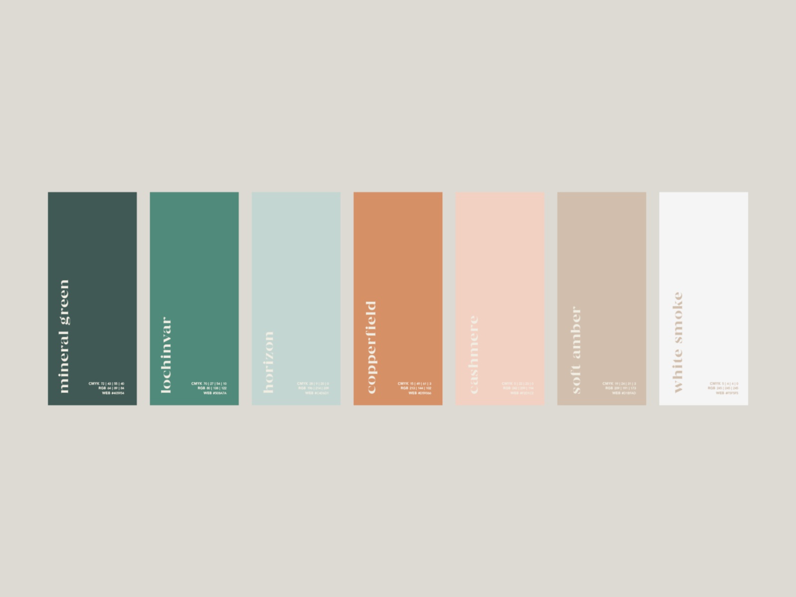
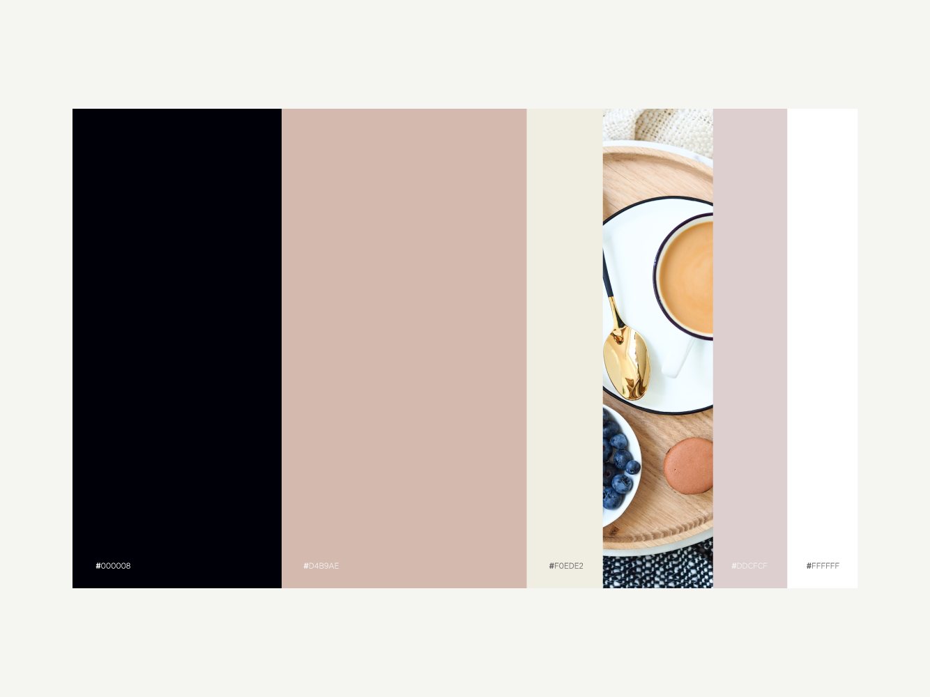
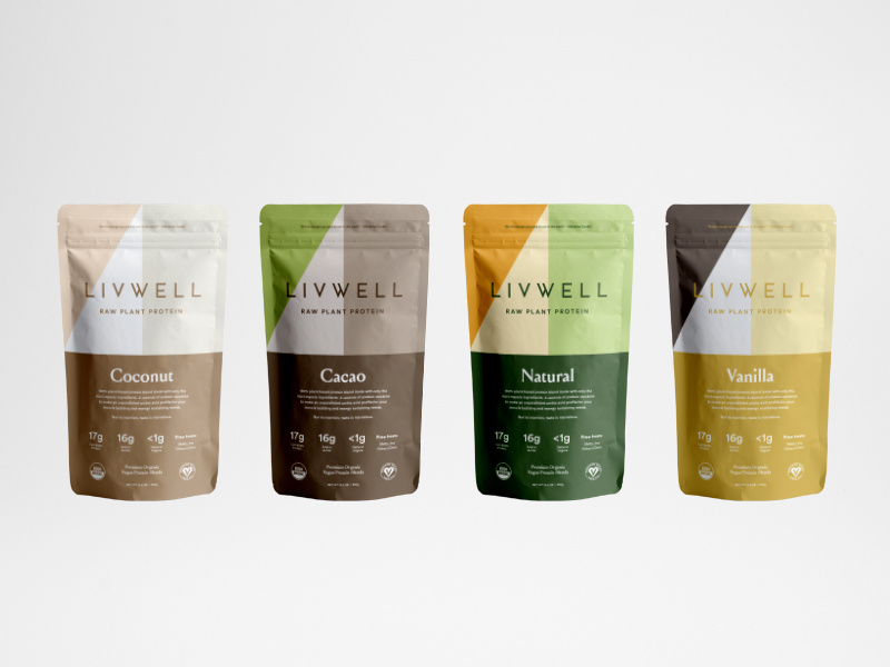
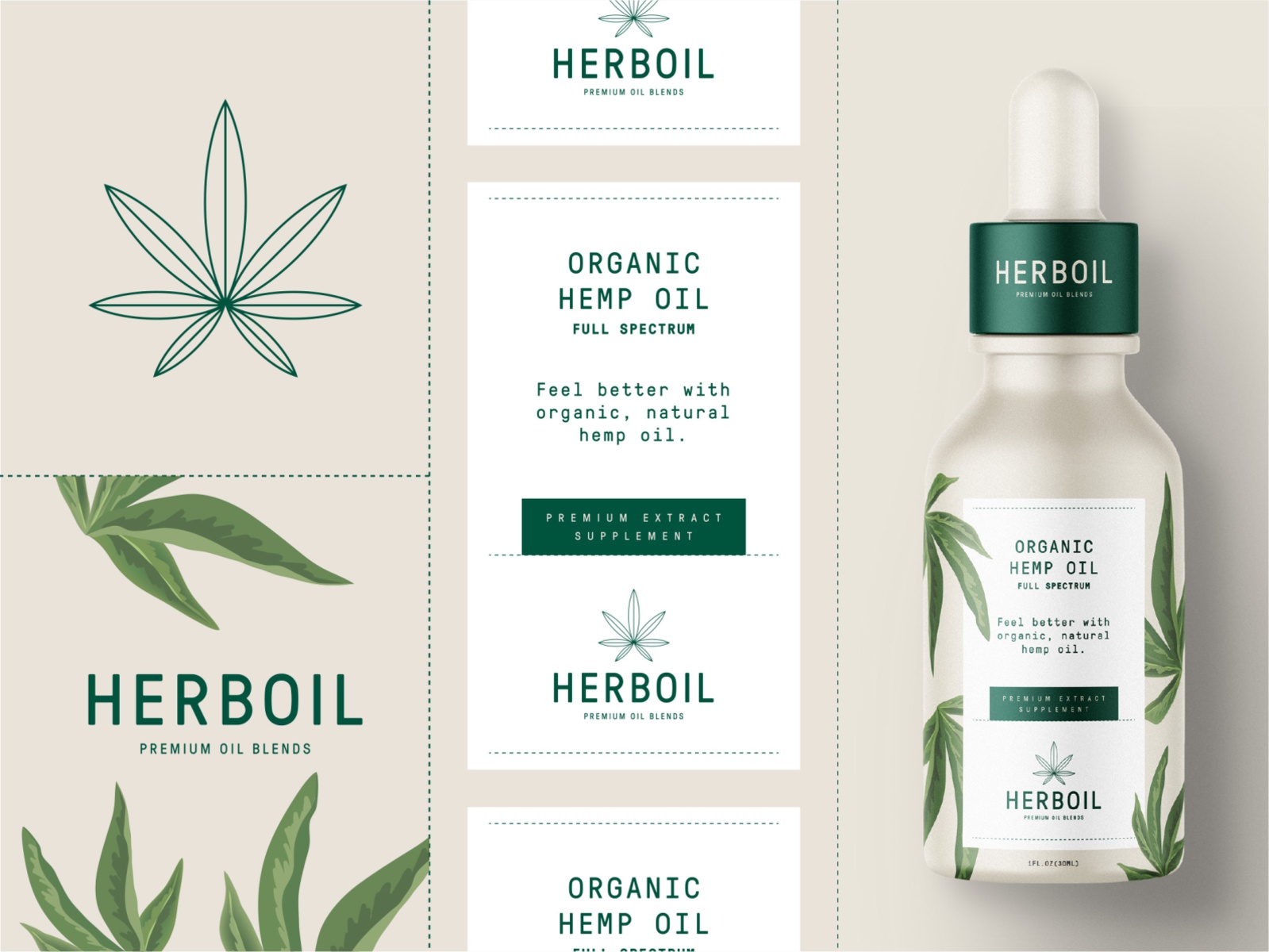
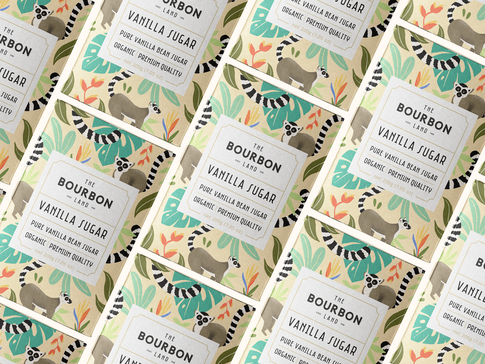
Nothing is more natural and subconsciously attractive than earthy tones.
Especially if you’re designing some sort of eco-friendly packaging or website, just by using earthy tones you inspire people to trust you.
Earthy tones are calming and relaxing to look like, giving you the feeling that you’re connecting with nature.
[source]

[source]
[source]

[source]
[source]

[source]
[source]
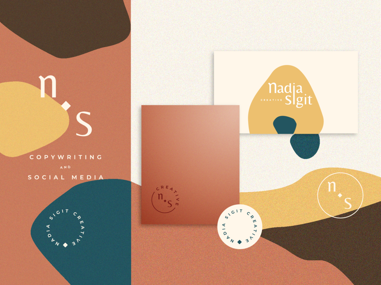
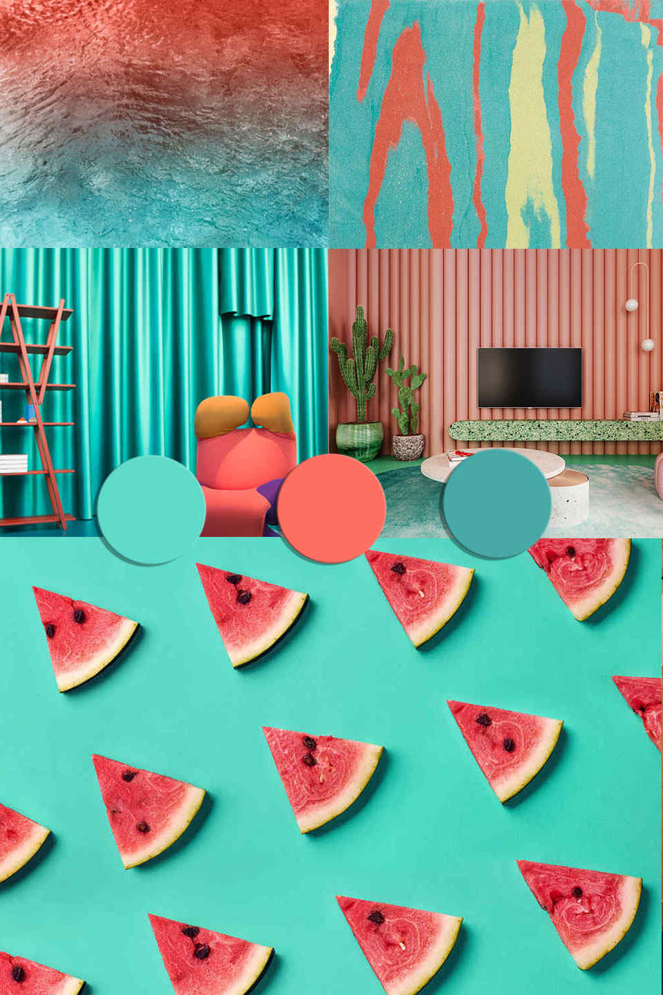
Coral and turquoise are certainly some striking colors that won’t be easily passed by.
The dynamic duo is irresistible to look at and is going to be a major hit this summer. I just know it.
The contrast between the two colors is absolutely perfect, but coral also works well with teal and other variants of blue.
Definitely experiment with the colors and see what masterpieces you’ll come up with!
[source]
[source]
[source]
We hope you enjoyed this inspirational piece on color trends for 2020.
What do you expect to see this upcoming year?
Let us know in the comments.
Until next time,
Stay creative, folks!
Read More at 5 Striking Color Trends You’ll Want to Hop on in 2020