Every day, the ProgrammableWeb team is busy, updating its three primary directories for APIs, clients (language-specific libraries or SDKs for consuming or providing APIs), and source code samples.
Hacktoberfest has started back up again for its sixth year running, sponsored by DigitalOcean and DEV. The annual event brings together open source communities from all over the world for virtual and local collaboration. Organizers are expecting approximately 150,000 participants this year.
The first 50,000 participants who make four pull requests to any GitHub-hosted repositories between October 1-31, will receive a commemorative Hacktoberfest T-shirt. Organizers have introduced a one-week review period for PRs this year in order to give maintainers the opportunity to flag any spammy PRs as invalid. The goal is to encourage participants to submit more thoughtful contributions.
More than 21,000 issues on GitHub have already been labeled for Hacktoberfest. Maintainers who want to have their projects included should identify issues best suited to new contributors and apply the “Hacktoberfest” label. Organizers also recommend creating a CONTRIBUTING.md file with contribution guidelines and adopting a code of conduct for the project.
Adding WordPress to a search for Hacktoberfest issues displays 120 issues that are related in some way to themes, plugins, apps, and other products with WordPress-specific needs. The event is a good opportunity for maintainers to get more exposure for their projects and help new contributors gain confidence through a structured contribution process.
Hacktoberfest is open to contributors at any level of experience. For those just getting started, DigitalOcean has created an Introduction to Open Source series that covers the basics of git and how to create a pull request. DEV also has a Git crash course available to get new contributors up to speed.
eToroX, the blockchain subsidiary of global investment platform eToro, today announced the launch of its institutional-grade API trading program, AlgoX Prime.
Protected Media, ad fraud detection solution provider, has announced an SDK for connected TV (CTV) and over the top (OTT). The SDK allows users to verify traffic at the source. This provides media buyers with fraud-free marketplaces to purchase and view inventory.
Private items are a PRO feature of CodePen. If you make an item (Pen, Post, Project, Collection) private, nobody can see it except you and people you share the link with.
We feel like that makes a decent amount of obvious sense. But it's slightly complicated with Collections, which contain Pens. What happens if you, say, put a private Pen in a public Collection? Well, we keep our promise. Nobody else, except you, can see that private Pen. So you when you look at the Collection, the Pen is in there. When other people look at it, it's not there.
That logic can cause a little confusion, so we've added a special message that only you can see to make sure it's clear.
Hopefully that clears things up for those situations where you have both private and public Pens in a public Collection.
One more little things to be aware of:
If you put private Pens in a private Collection, then share that private Collection, the private Pens within will be shown. The idea there is that you've already chosen to break that private barrier, so private things can be revealed. This can be useful when you, for example, need to keep a whole bunch of Pens private (say, for client work), but share the whole lot of them at once.
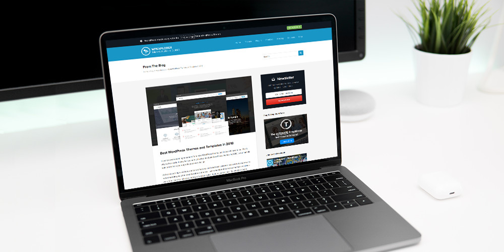
It can be overwhelming to search for a new WordPress theme, but it doesn’t have to be. That’s why we’ve made it easy for you and collected the best WordPress themes in 2019 (in our humble opinion) to help you upgrade your web design. We’ve looked high and low, compared features and read real customer […]
Human Made has created a Publication Checklist plugin built specifically for the block editor. It was developed as a headline feature of Altis, the company’s enterprise publishing platform based on WordPress, but is also available as a standalone plugin that developers can customize for their own particular use cases.
Ryan McCue, Human Made’s Director of Engineering, shared screenshots of the plugin on Twitter but noted that it may require more manual configuration when used outside of Altis. Developers familiar with React can extend the checklist to provide a more interactive experience for users completing the required publishing tasks.
“Because this is built for the block editor, you can build the UI for your checks in React, allowing users to fix issues inline, or providing richer interaction; e.g. ‘jump to block failing this check,'” McCue said.
Status of the publishing tasks is also shown in its own column in the posts list table, a useful feature for giving editorial teams a better overall picture of posts in progress. (The plugin also provides a way to disable this view.)
It’s important to note that the Publication Checklist plugin only provides a framework for the pre-publish checks, and does not include a settings interface for users to create their own checks. For this reason, the current version is more geared towards developers who are capable of registering checks using the provided function. The checks display a warning if incomplete but users are still allowed to publish. A more strict enforcement that blocks publishing can also be applied. For more information on customizing the plugin, check out the documentation on GitHub.
The WordPress Theme Review Team (TRT) restructured its administrative duties and laid out its new team organization after yesterday’s semimonthly team meeting. This is not the first time the TRT has restructured to meet the growing demands of the official theme directory over the years. The team is moving toward a flat structure that spreads its responsibilities to various project representatives.
The original team consisted of a purely merit-based system where members worked their way up the ranks, becoming moderators and eventually admins. Each level provided more access and responsibility. In 2017, the team restructured to a lead-based system in which two team leads rotated every six months. The time limit was put in place to prevent burnout. Some leads ran the team beyond the six-month limit during this time, but it was not always easy to find replacements who wanted to take on the full responsibilities of managing everything. There was also concern among some team members that the rotation schedule wasn’t strictly followed with some leads overstaying their allotted time.
In meetings and discussions over the last several months, various members drafted proposals on changing the team structure. The now-former team leads and a group of moderators created the new plan to split the team into specific projects, each with at least one representative.
The following are the new sub-teams and representatives.
Theme review representatives: Sandilya Kafle and Carolina Nymark
Theme packages representative: Ari Stathopoulos
Automation representative: Denis Žoljom
Theme handbook representative: Ana Alfieri
Communications representative: William Patton
The five projects cover the team’s current duties and spread out the workload. “That’s kind of what this is about,” said William Patton. “It’s making sure that no one single person handles all the things and that it’s shared between all.”
The new structure doesn’t mean there’s no room for other projects. If a team member has a particular itch they want to scratch, they’re open to spearhead that project. All the power is no longer consolidated into a couple of people’s hands.
“Sharing the load and spreading people’s specific skills between things they know and are investing time into makes sense at this point,” said Patton.
The team will no longer rotate leads (or representatives in this case) every six months. If someone needs to step down from their representative role or take a break, finding a new representative will be handled on a case-by-case basis. “We all have our strengths and passions. The thing that we also need to work on is finding people who are willing to participate and eventually take over when we feel tired,” said Denis Žoljom.
Žoljom has been leading the automation project for while by maintaining the Theme Review coding standards and Theme Sniffer plugin. He’s currently looking to move the WPThemeReview ruleset to the official WordPress GitHub. “This is necessary because we want to use it in Tide,” said Žoljom. Tide is an automated tool for improving code quality in plugins and themes.
“My personal goal would be to see if we can improve the review process – either by working on the GitHub review idea I had a few months ago, or by working on the automated tools that help the users,” said Žoljom.
The theme review representatives will handle the traditional role of overseeing the reviewing responsibilities of the team. Little will change in that regard since it’s the primary duty of the TRT. They will continue moderating themes and handling guideline changes. “However, they can consult with other reps to make the final decision and to make new changes,” said Sandilya Kafle.
The WordPress docs team has now handed over responsibility of the theme developer handbook to the TRT. “I think we should try to keep coherence between the two handbooks, so we avoid saying one thing in one and another in the other,” said Ana Alfieri about the differences between the developer and review handbooks. At times, such difference have been points of contention between TRT members. Having both handbooks in sync on best practices will help keep reviewers and theme authors on the same page.
Ari Stathopoulos recently took over as the representative for theme packages in the past month. The packages project aims to build standardized drop-in modules for developers to use in their themes. This specific project may also have various developers handling specific packages.
You’ve read that solid web content, more than any other factor, determines the success of your website. But what determines whether or not you’ve written a good blog post? It’s impossible to say objectively, but there are a number of generally agreed items that can contribute to the effectiveness of your blog posts. Incorporate these into […]
Mux is an API-first platform that makes it easy for any developer to build beautiful video. Powered by data and designed by video experts, your video will work perfectly on every device, every time.
Mux Video handles storage, encoding, and delivery so you can focus on building your product. Live streaming is just as easy and Mux will scale with you as you grow, whether you're serving a few dozen streams or a few million.
Following Nathan’s article on how to create mouse trails using his minimal WebGL framework OGL, we’d now like to show some demos based on his mouse flowmap example. The concept of this effect is to deform an image based on the mouse position and velocity.
In this article, we’re not going to explain how to initialise and use OGL. Nathan’s article, Crafting Stylised Mouse Trails With OGL, is covering all of this, so we’ll rather focus on the creation of this effect and assume you already have your OGL setup ready with a renderer and a plane with its texture.
Getting started
In order to deform our image we need to use one of the many extras provided by OGL:
Flowmap: import { Flowmap } from "./src/Extras.js";
Once everything is setup according to this example you should be seeing this:
In your shader you can alternate between the two textures to understand the concept behind this effect.
// R and G values are velocity in the x and y direction
// B value is the velocity length
vec3 flow = texture2D(tFlow, vUv).rgb;
// Use flow to adjust the uv lookup of a texture
vec2 uv = gl_FragCoord.xy / 600.0;
uv += flow.xy * 0.05;
vec3 tex = texture2D(tWater, uv).rgb;
gl_FragColor = vec4(tex.rgb, 1.0);
If your replace tex by flow in the last line here’s the ouput:
gl_FragColor = vec4(flow.rgb, 1.0);
Here’s a mix of the two textures to visualize the concept:
Now that you know how to create and use this effect you can play with the different parameters of the flowmap while instantiating it.
As APIs open doors to information and functionality, they move well beyond being merely technical interfaces to becoming central actors in new digital business models. However, for such business models to be effective and successful, technical teams are confronted with the unique challenge of API-enabling systems that weren't necessarily built to provide real-time access. Because of this, there are several implementations beyond the obvious that must be catered for in order to create APIs that are easy to use and can truly scale to handle the sort of volumes expected from real-time systems.
This article is an excerpt from the book Enterprise API Management written by Luis Weir. This book explores the architectural decisions, implementation patterns, and management practices for successful enterprise APIs. This article elaborates on the core concepts and capabilities required to implement API-led architectures.
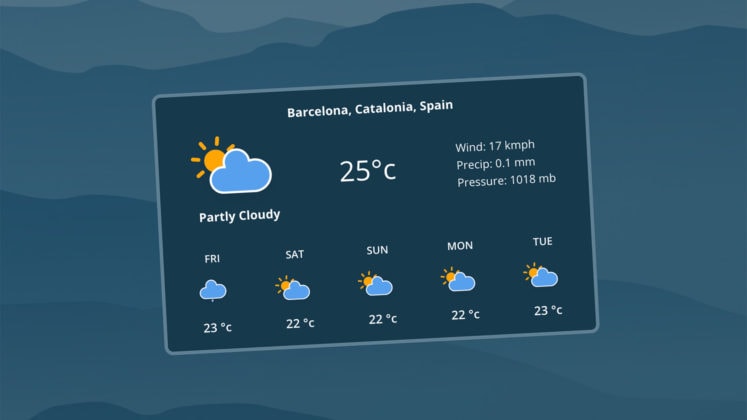
Provide an extra element that will delight, inform, or help users with live weather information right on your website. It’s easier than you think with Weatherstack API. Use the tool to retrieve instant – and accurate – weather information for …
I like when websites have a dark mode option. Dark mode makes web pages easier for me to read and helps my eyes feel more relaxed. Many websites, including YouTube and Twitter, have implemented it already, and we’re starting to see it trickle onto many other sites as well.
In this tutorial, we’re going to build a toggle that allows users to switch between light and dark modes, using a <ThemeProvider wrapper from the styled-components library. We’ll create a useDarkMode custom hook, which supports the prefers-color-scheme media query to set the mode according to the user’s OS color scheme settings.
If that sounds hard, I promise it’s not! Let’s dig in and make it happen.
Next, open a separate terminal window and install styled-components:
yarn add styled-components
Next thing to do is create two files. The first is global.js, which will contain our base styling, and the second is theme.js, which will include variables for our dark and light themes:
Go to the App.js file. We’re going to delete everything in there and add the layout for our app. Here’s what I did:
import React from 'react';
import { ThemeProvider } from 'styled-components';
import { lightTheme, darkTheme } from './theme';
import { GlobalStyles } from './global';
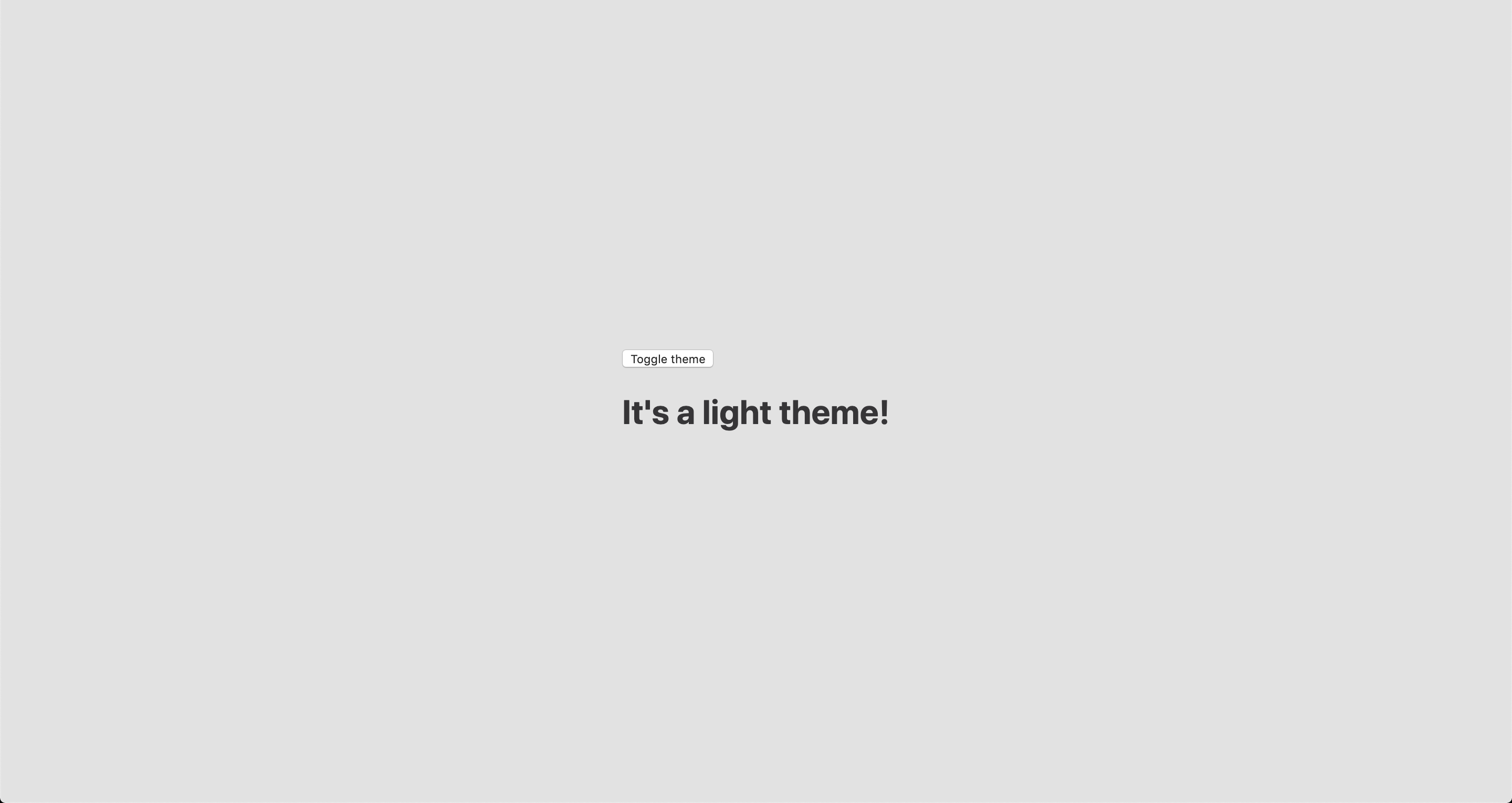
function App() {
return (
<ThemeProvider theme={lightTheme}>
<>
<GlobalStyles />
<button>Toggle theme</button>
<h1>It's a light theme!</h1>
<footer>
</footer>
</>
</ThemeProvider>
);
}
export default App;
This imports our light and dark themes. The ThemeProvider component also gets imported and is passed the light theme (lightTheme) styles inside. We also import GlobalStyles to tighten everything up in one place.
Here’s roughly what we have so far:
Now, the toggling functionality
There is no magic switching between themes yet, so let’s implement toggling functionality. We are only going to need a couple lines of code to make it work.
First, import the useState hook from react:
// App.js
import React, { useState } from 'react';
Next, use the hook to create a local state which will keep track of the current theme and add a function to switch between themes on click:
// App.js
const [theme, setTheme] = useState('light');

// The function that toggles between themes
const toggleTheme = () => {
  // if the theme is not light, then set it to dark
  if (theme === 'light') {
    setTheme('dark');
  // otherwise, it should be light
  } else {
    setTheme('light');
  }
}
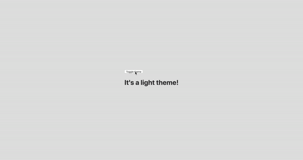
After that, all that’s left is to pass this function to our button element and conditionally change the theme. Take a look:
// App.js
import React, { useState } from 'react';
import { ThemeProvider } from 'styled-components';
import { lightTheme, darkTheme } from './theme';
import { GlobalStyles } from './global';

// The function that toggles between themes
function App() {
  const [theme, setTheme] = useState('light');
  const toggleTheme = () => {
    if (theme === 'light') {
      setTheme('dark');
    } else {
      setTheme('light');
    }
  }

  // Return the layout based on the current theme
  return (
    <ThemeProvider theme={theme === 'light' ? lightTheme : darkTheme}>
      <>
        <GlobalStyles />
        // Pass the toggle functionality to the button
        <button onClick={toggleTheme}>Toggle theme</button>
        <h1>It's a light theme!</h1>
        <footer>
        </footer>
      </>
    </ThemeProvider>
  );
}

export default App;
Earlier in our GlobalStyles, we assigned background and color properties to values from the theme object, so now, every time we switch the toggle, values change depending on the darkTheme and lightTheme objects that we are passing to ThemeProvider. The transition property allows us to make this change a little more smoothly than working with keyframe animations.
Now we need the toggle component
We’re generally done here because you now know how to create toggling functionality. However, we can always do better, so let’s improve the app by creating a custom Toggle component and make our switch functionality reusable. That’s one of the key benefits to making this in React, right?
We’ll keep everything inside one file for simplicity’s sake,, so let’s create a new one called Toggle.js and add the following:
// Toggle.js
import React from 'react'
import { func, string } from 'prop-types';
import styled from 'styled-components';
// Import a couple of SVG files we'll use in the design: https://www.flaticon.com
import { ReactComponent as MoonIcon } from 'icons/moon.svg';
import { ReactComponent as SunIcon } from 'icons/sun.svg';
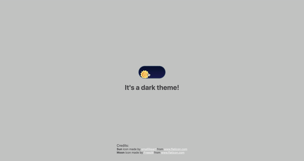
const Toggle = ({ theme, toggleTheme }) => {
const isLight = theme === 'light';
return (
<button onClick={toggleTheme} >
<SunIcon />
<MoonIcon />
</button>
);
};
Toggle.propTypes = {
theme: string.isRequired,
toggleTheme: func.isRequired,
}
export default Toggle;
We passed two props inside: the theme will provide the current theme (light or dark) and toggleTheme function will be used to switch between them. Below we created an isLight variable, which will return a boolean value depending on our current theme. We’ll pass it later to our styled component.
We’ve also imported a styled function from styled-components, so let’s use it. Feel free to add this on top your file after the imports or create a dedicated file for that (e.g. Toggle.styled.js) like I have below. Again, this is purely for presentation purposes, so you can style your component as you see fit.
Importing icons as components allows us to directly change the styles of the SVG icons. We’re checking if the lightTheme is an active one, and if so, we move the appropriate icon out of the visible area — sort of like the moon going away when it’s daytime and vice versa.
Don’t forget to replace the button with the ToggleContainer component in Toggle.js, regardless of whether you’re styling in separate file or directly in Toggle.js. Be sure to pass the isLight variable to it to specify the current theme. I called the prop lightTheme so it would clearly reflect its purpose.
The last thing to do is import our component inside App.js and pass required props to it. Also, to add a bit more interactivity, I’ve passed condition to toggle between "light" and “dark" in the heading when the theme changes:
Don’t forget to credit the flaticon.com authors for the providing the icons.
// App.js
<span>Credits:</span>
<small><b>Sun</b> icon made by <a href="https://www.flaticon.com/authors/smalllikeart">smalllikeart</a> from <a href="https://www.flaticon.com">www.flaticon.com</a></small>
<small><b>Moon</b> icon made by <a href="https://www.freepik.com/home">Freepik</a> from <a href="https://www.flaticon.com">www.flaticon.com</a></small>
Now that’s better:
The useDarkMode hook
While building an application, we should keep in mind that the app must be scalable, meaning, reusable, so we can use in it many places, or even different projects.
That is why it would be great if we move our toggle functionality to a separate place — so, why not to create a dedicated account hook for that?
Let’s create a new file called useDarkMode.js in the project src directory and move our logic into this file with some tweaks:
We’ve added a couple of things here. We want our theme to persist between sessions in the browser, so if someone has chosen a dark theme, that’s what they’ll get on the next visit to the app. That’s a huge UX improvement. For this reasons we use localStorage.
We’ve also implemented the useEffect hook to check on component mounting. If the user has previously selected a theme, we will pass it to our setTheme function. In the end, we will return our theme, which contains the chosen theme and toggleTheme function to switch between modes.
Now, let’s implement the useDarkMode hook. Go into App.js, import the newly created hook, destructure our theme and toggleTheme properties from the hook, and, put them where they belong:
// App.js
import React from 'react';
import { ThemeProvider } from 'styled-components';
import { useDarkMode } from './useDarkMode';
import { lightTheme, darkTheme } from './theme';
import { GlobalStyles } from './global';
import Toggle from './components/Toggle';

function App() {
  const [theme, toggleTheme] = useDarkMode();
  const themeMode = theme === 'light' ? lightTheme : darkTheme;

  return (
    <ThemeProvider theme={themeMode}>
      <>
        <GlobalStyles />
        <Toggle theme={theme} toggleTheme={toggleTheme} />
        <h1>It's a {theme === 'light' ? 'light theme' : 'dark theme'}!</h1>
        <footer>
          Credits:
          <small>Sun icon made by smalllikeart from www.flaticon.com</small>
          <small>Moon icon made by Freepik from www.flaticon.com</small>
        </footer>
      </>
    </ThemeProvider>
  );
}

export default App;
This almost works almost perfectly, but there is one small thing we can do to make our experience better. Switch to dark theme and reload the page. Do you see that the sun icon loads before the moon icon for a brief moment?
That happens because our useState hook initiates the light theme initially. After that, useEffect runs, checks localStorage and only then sets the theme to dark.
So far, I found two solutions. The first is to check if there is a value in localStorage in our useState:
However, I am not sure if it’s a good practice to do checks like that inside useState, so let me show you a second solution, that I’m using.
This one will be a bit more complicated. We will create another state and call it componentMounted. Then, inside the useEffect hook, where we check our localTheme, we’ll add an else statement, and if there is no theme in localStorage, we’ll add it. After that, we’ll set setComponentMounted to true. In the end, we add componentMounted to our return statement.
You might have noticed that we’ve got some pieces of code that are repeated. We always try to follow the DRY principle while writing the code, and right here we’ve got a chance to use it. We can create a separate function that will set our state and pass theme to the localStorage. I believe, that the best name for it will be setTheme, but we’ve already used it, so let’s call it setMode:
We’ve only changed code a little, but it looks so much better and is easier to read and understand!
Did the component mount?
Getting back to componentMounted property. We will use it to check if our component has mounted because this is what happens in useEffect hook.
If it hasn’t happened yet, we will render an empty div:
// App.js
if (!componentMounted) {
  return <div />
};
Here is how complete code for the App.js:
// App.js
import React from 'react';
import { ThemeProvider } from 'styled-components';
import { useDarkMode } from './useDarkMode';
import { lightTheme, darkTheme } from './theme';
import { GlobalStyles } from './global';
import Toggle from './components/Toggle';

function App() {
  const [theme, toggleTheme, componentMounted] = useDarkMode();

  const themeMode = theme === 'light' ? lightTheme : darkTheme;

  if (!componentMounted) {
    return <div />
  };

  return (
    <ThemeProvider theme={themeMode}>
      <>
        <GlobalStyles />
        <Toggle theme={theme} toggleTheme={toggleTheme} />
        <h1>It's a {theme === 'light' ? 'light theme' : 'dark theme'}!</h1>
        <footer>
          <span>Credits:</span>
          <small><b>Sun</b> icon made by <a href="https://www.flaticon.com/authors/smalllikeart">smalllikeart</a> from <a href="https://www.flaticon.com">www.flaticon.com</a></small>
          <small><b>Moon</b> icon made by <a href="https://www.freepik.com/home">Freepik</a> from <a href="https://www.flaticon.com">www.flaticon.com</a></small>
        </footer>
      </>
    </ThemeProvider>
  );
}

export default App;
Using the user’s preferred color scheme
This part is not required, but it will let you achieve even better user experience. This media feature is used to detect if the user has requested the page to use a light or dark color theme based on the settings in their OS. For example, if a user’s default color scheme on a phone or laptop is set to dark, your website will change its color scheme accordingly to it. It’s worth noting that this media query is still a work in progress and is included in the Media Queries Level 5 specification, which is in Editor’s Draft.
This browser support data is from Caniuse, which has more detail. A number indicates that browser supports the feature at that version and up.
Desktop
Chrome
Opera
Firefox
IE
Edge
Safari
76
62
67
No
76
12.1
Mobile / Tablet
iOS Safari
Opera Mobile
Opera Mini
Android
Android Chrome
Android Firefox
13
No
No
76
No
68
The implementation is pretty straightforward. Because we’re working with a media query, we need to check if the browser supports it in the useEffect hook and set appropriate theme. To do that, we’ll use window.matchMedia to check if it exists and whether dark mode is supported. We also need to remember about the localTheme because, if it’s available, we don’t want to overwrite it with the dark value unless, of course, the value is set to light.
If all checks are passed, we will set the dark theme.
As mentioned before, we need to remember about the existence of localTheme — that’s why we need to implement our previous logic where we’ve checked for it.
Give it a try! It changes the mode, persists the theme in localStorage, and also sets the default theme accordingly to the OS color scheme if it’s available.
Congratulations, my friend! Great job! If you have any questions about implementation, feel free to send me a message!
Amelia Wattenberger has written this wonderful and interactive piece about React Hooks and details how they can clean up code and remove all those troubling lifecycle events:
React introduced hooks one year ago, and they've been a game-changer for a lot of developers. There are tons of how-to introduction resources out there, but I want to talk about the fundamental mindset change when switching from React class components to function components + hooks.
Make sure you check out that lovely animation when you select the code, too. It’s a pretty smart effect to show the old way of doing things versus the new and fancy way. Also make sure to check out our very own Intro to React Hooks once you’re finished to find more examples of this pattern in use.
Which would you choose? Or should you be choosing at all?
Introduction
These days, you can’t go to a Microsoft conference where the question of “What is the difference between Microsoft Flow and Azure Logic Apps?” isn’t asked. For many people, they think the answer is binary; you need to use one or the other. While people have preferences, and perhaps even biases, it is important not to rule the other technology out, as you are likely missing out on opportunities for your organization.
When Microsoft has answered the Azure Logic Apps vs. Microsoft Flow question in the past, personas generally played a role in deriving an answer. When it comes to “Power users” or even “Citizen Developers,” Microsoft Flow is generally identified as the tool of choice, in part due to it being the targeted audience for why the tool was created.
"CloudFormation allows you to use a simple text file to model and provision, in an automated and secure manner, all the resources needed for your applications across all regions and accounts. This file serves as the single source of truth for your cloud environment."
CloudFormation is a web service that falls under the Infrastructure-as-Code (IaC) category. IaC allows users to define their infrastructure in a text file using a declarative approach to model your infrastructure. The text file is called "template" and is written in either JSON or YAML notation.


 It can be overwhelming to search for a new WordPress theme, but it doesn’t have to be. That’s why we’ve made it easy for you and collected the best WordPress themes in 2019 (in our humble opinion) to help you upgrade your web design. We’ve looked high and low, compared features and read real customer […]


 You’ve read that solid web content, more than any other factor, determines the success of your website. But what determines whether or not you’ve written a good blog post? It’s impossible to say objectively, but there are a number of generally agreed items that can contribute to the effectiveness of your blog posts. Incorporate these into […]