Gutenberg 6.5 was released today with a rough prototype that adds one-click search and installation of blocks from the block directory to the inserter. Selected blocks are automatically installed as a plugin in the background and inserted into the editor with one click.
The pull request for the experiment indicates that it’s still very much a work in progress. It extends the inserter to fetch a list of suggestBlocks similar to reusableBlocks, and the list is currently served from a mock API.
The prototype is can be turned on under the Gutenberg > Experiments menu, a relatively new Settings page that was added in Gutenberg 6.3. This menu also allows testers to enable the experimental Navigation Menu Block, Widgets Screen, and Legacy Widget Block.
Block Navigation has also been added to the experimental Navigation Block in this release. This addition is considered a first start that is expected to evolve over time.
“Regardless of how the UI evolves for this block, I think there will always be a need for representing the menu structure as a child block tree with all menu hierarchies mapped out consistently and not hidden (dropdowns, etc),” Gutenberg engineer Matias Ventura said.
“Luckily, we already have a view that handles that representation in the ‘block navigator.’ That means if the navigation menu block is represented through child blocks, we’ll get this view for free.”
In the future, Gutenberg engineers may allow for drag-and-drop reordering of items in the navigator and may explore rendering the view inline or in a modal launched from the navigation menu block.
Gutenberg 6.5 Adds New Social Links Block
Gutenberg 6.5 also adds a new social links block under the widgets panel. It allows users to place social links anywhere within the content by clicking on the icons and pasting in their social URLs. The gif below demonstrates how the block works, although the grey placeholder icons have since been removed in favor of opacity changes to indicate unconfigured blocks.
The 6.5 release post has not yet been published but the plugin update is available in the admin and a full list of enhancements and bug fixes can be found in the changelog.
Medium is a hybrid between a blogging platform and a social network. Sophie Maoura, the head of B2B partnerships in Medium calls it a social content platform. In their own words, “Medium is a place where words matter” so it’s no surprise that Medium is favored by bloggers, but it still remains behind WordPress in […]
Sophie Koonin blogged "Everything I googled in a week as a professional software engineer," which was a fascinating look into the mind of a web developer and what they need to look up during day-to-day work. We all joke that we just Google stuff (or StackOverflow stuff) we don't know off the bat and copy and paste, but this is more to the heart of it.
A few just from one day:
react-apollo release notes
jest silence warnings - don’t judge me, ok?
semantic HTML contact details - wanted to check if the <address> tag was relevant here
dominos accessibility - popcorn.gif
Because we know that all people with battery-powered devices are constantly concerned about their battery levels, and that websites are significant consumers of that battery power, we should probably think about this stuff a lot more than we do.
I'd expect the browser itself to be our main ally here, doing smart things to reduce power consumption without us developers needing to think too much about it. But we've learned over the years that it's always a shared responsibility. We regularly need to help the browser do its job the best it can (think responsive images and will-change).
Some direct tips from Benjamin Poulain and Simon Fraser's article:
Minimize the use of timers to avoid waking up the CPU. Try to coalesce timer-based work into a few, infrequent timers. Lots of uncoordinated timers which trigger frequent CPU wake-ups are much worse than gathering that work into fewer chunks.
Minimize continually animating content, like animated images and auto-playing video. Be particularly vigilant to avoid “loading” spinner GIFs or CSS animations that continually trigger painting, even if you can’t see them. IntersectionObserver can be used to run animations only when they are visible.
Use declarative animations (CSS Animations and Transitions) where possible. The browser can optimize these away when the animating content is not visible, and they are more efficient than script-driven animation.
Avoid network polling to obtain periodic updates from a server. Use WebSockets or Fetch with a persistent connection, instead of polling.
I'd like to see more developer tooling along the lines of how macOS makes it easy to see apps that are demanding significant power:
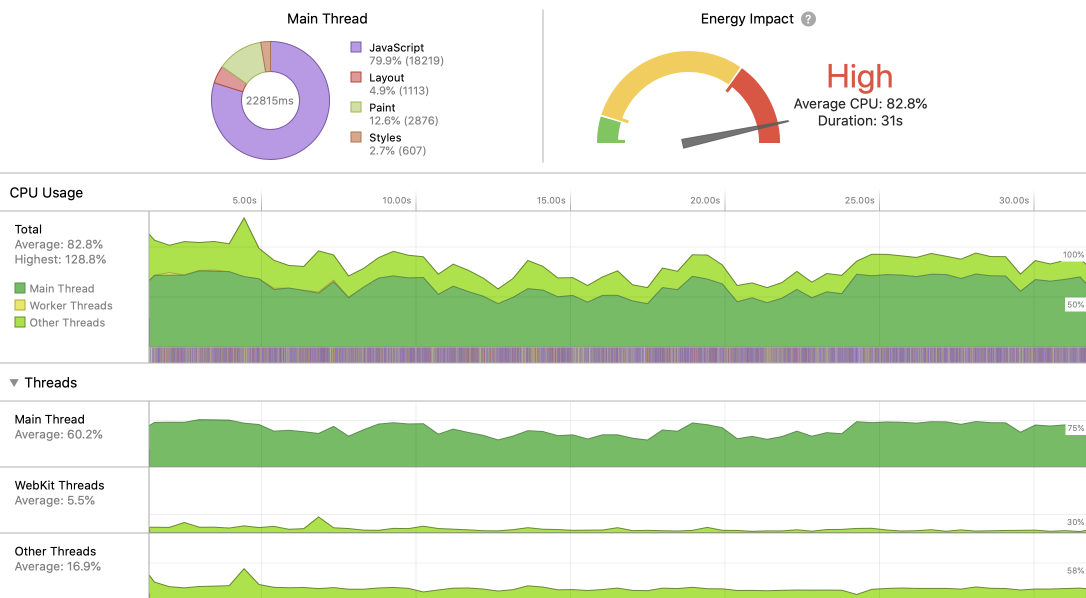
WebKit DevTools does has it:
We used to have a Battery Status API, but that's been deprecated, so not a big part of the story right now.
I was just at the Web Unleashed conferencewhere Kyle Simpson talked about this rather directly in his keynote lecture. His main idea is that we should ask users a bit more directly and solicit their preferences. Hey user, are you in a situation where you want to use as little battery power as possible? Tell us and we'll do what we can to make that happen (even on a site-by-site basis).
GitHub has announced that it is now a Common Vulnerabilities and Exposures (CVE) Numbering Authority. CVE Numbering Authorities are authorized to assign CVE IDs to vulnerabilities that affect products within their geographic area, within a specific scope, for inclusion in initial public announcements of new vulnerabilities. CVE IDs are used by researchers and IT vendors to better uncover, correct, and defend against vulnerabilities.
Facebook has made several announcements this week that will benefit developers by expanding the ways that they can reach audiences beyond the social network’s walls. The first announcement highlights the benefits of the latest Audience Network SDK, while the second includes some exciting enhancements to the Facebook Live API.
EditorsKit is becoming somewhat of a “hotfix” plugin for Gutenberg, especially with the additions to the 1.14 release this week. Developer Jeffrey Carandang added new link formats for nofollow rel attribute options, along with a fix for an annoying bug in Chrome that causes Gutenberg metaboxes to overlap. He has been closely monitoring feedback on both Gutenberg and EditorsKit, introducing features for which users have an immediate need.
Since the related PR doesn’t seem to be a priority, with no movement for two weeks, Carandang decided to add the nofollow and sponsored rel attribute options to EditorsKit, so users can start following Google’s recommendations without having to switch to HTML mode. He also managed to make it work with the version of Gutenberg included in core.
Chrome users may have noticed that the block editor has a nasty bug with metaboxes overlapping, obscuring the main content area. This problem was introduced in the recent Chrome 77 update and is present on WordPress 5.2.3 and older versions.
Chrome developers are aware of the issue and a fix will be in the next release. Version 78 is expected October 22. Since it is a bug with Chrome, the Gutenberg team has opted not to release a fix/workaround for this problem. In the meantime, they recommend updating to WordPress 5.3 if it is released before the Chrome bug is fixed. This isn’t likely, as 5.3 is scheduled for mid-November.
The Gutenberg team also recommend using a different browser or installing the Gutenberg plugin to fix the issue. Andrea Fercia noted on the ticket that the plugin is still listed among WordPress’ beta plugins and may not be advisable to use in production on some sites. Users with a technical background can implement one of several CSS solutions in the ticket, but this is a frustrating bug for users who don’t know how to apply code fixes.
Carandang added a fix for this bug to the most recent version of EditorsKit. So far his strategy of being responsive to users’ requests seems to have been successful, as his Gutenberg utility plugin now has more than 1,000 active installs. He said he is happy to add hot fixes for EditorsKit users and will remove them once the fixes have been added to Chrome and/or the block editor.
As part of the WordPress Theme Review Team’s plan to curb obtrusive admin notices, the team pushed version 1.0 of its Admin Notices package to the public. The new package provides a standard API for theme authors to display admin notices.
Ari Stathopoulos took over as the packages project lead in late August. Stathopoulos is the primary developer and creator of the highly-rated Kirki customizer framework, which currently has 300,000+ active installs as a plugin. However, the framework is also available as separate modules that theme authors can bundle within their themes.
The Admin Notices package is the third package produced by the team and the first that Stathopoulos has spearheaded.
Adding a basic admin notice in WordPress is relatively easy for most developers. However, handling features such as persistent dismissible actions is more complex. The Admin Notices package handles this out of the box.
Some options for the package include the ability to:
Set a title and message.
Select a type that adds in the appropriate UI class (info, success, warning, error).
Choose which admin screens the notice appears on.
Limit the message by user capability so that it doesn’t appear for all users.
The above screenshot shows an example of a basic admin notice output for the four available types. The dismiss action is handled by JavaScript and works without reloading the page. Once dismissed, users will no longer see the notice.
“I think the hardest thing about it was deciding how restrictive we wanted it to be,” said Stathopoulos of the challenges building this package. The package restricts theme authors to paragraph, link, bold, and italic elements in version 1.0. It doesn’t leave a lot of room for experimentation, but standardization is the goal. The more elements allowed, the more likely the tool doesn’t solve the team’s problem of keeping admin notices unobtrusive.
User Notifications Are a Complex Problem
WordPress doesn’t provide a formal API for user notifications. However, it does provide a standard set of CSS classes and a hook for attaching notices. The Codex also has some examples of best practices. The lack of a formal API has left theme and plugin authors to their own devices. Users have suffered because of wildly varying implementations and common issues such as non-dismissible advertisements.
Tim Hengeveld proposed a Notification Center API on Trac in 2018. The ticket has a healthy, ongoing discussion and some UI proposals. The proposal is still marked as “Awaiting Review,” and it’s unlikely that it’ll ship anytime sooner than WordPress 5.4 or later.
Currently, many plugins and themes also use admin notices for user onboarding, which is a separate problem in need of a solution. There’s a 4-year-old ticket that discusses WordPress new-user onboarding, but there’s not much movement to solve this problem for plugins and themes.
While the TRT’s package doesn’t tackle all issues associated with user notifications, it does help limit some of the short-term damage.
More Packages in the Works
More packages are currently being built and others are in the planning stages.
The goal of the overall project is to provide theme authors with drop-in modules they can bundle with their themes. The packages are all written in PHP 5.6+ in hopes to push theme authors toward more modern coding practices (relatively speaking, since PHP 7.4 will be released this year). It will also help streamline the review process if more theme authors adopt the packages rather than building everything in-house.
“If we build packages for the most-requested things, we’ll hopefully empower people to build quality themes easier,” explained Stathopoulos. “I think of packages as building blocks for themes.”
Stathopoulos is working on a customizer control for selecting a color with alpha transparency, which could be released as early as next week. It will provide theme users with more control over how their colors appear for themes that implement it.
“After we build the basics I want to focus on packages that would enhance a11y and privacy in themes – two areas where themes are falling short,” he said. “It would help a lot of people, and that is ultimately our goal.”
Theme authors have grown accustomed to installing JavaScript and CSS packages via NPM over the past few years. However, their use of Composer as a PHP dependency manager has lagged. In some part, this could be due to WordPress’ previous reluctance to bump its minimum version of PHP. Many packages available on Packagist, the main Composer repository, do not work with older versions of PHP. WordPress’ recent jump to PHP 5.6+ and plans to move to 7+ in the future may push more theme authors to consider PHP dependency management.
The TRT has a Packagist account and has made all of its packages installable via Composer.
No Requirement to Use Packages Yet
There are no current plans for the TRT to start requiring the use of these packages for specific features, but a few team members have proposed doing so.
“There are valid reasons to enforce the use of these packages, but it can’t happen overnight,” said Stathopoulos. “We want themes in the repository to have some standards, it can not be the wild west. Code quality has to improve. These packages are a way to make life easier for people, and ultimately save time for everyone.”
Stathopoulos is open to theme authors building custom implementations if they can improve upon what the team has built, but he prefers that authors “discuss their ideas in the package repository and submit a pull-request so that the whole community can benefit.”
Getting theme authors involved is one area where the team has struggled. Contributing to the packages could benefit the entire community. “Most people don’t even know about them since they are not listed anywhere,” said Stathopoulos. “Theme Authors currently have to look for them, and in order to look for them someone needs to tell them they exist (which doesn’t happen).” One of the next steps would be getting the packages listed in the TRT’s documentation.
Working together on common theme features could provide a bridge between theme authors and reviewers, allowing them to solve issues together.
Note: The author of this article was involved with the initial theme packages proposal and a developer on its initial package releases.
Let’s attempt to coin a term here: "Static Form Provider." You bring your HTML <form>, but don’t worry about the back-end processing that makes it work. There are a lot of these services out there!
Static Form Providers do all tasks like validating, storing, sending notifications, and integrating with other APIs. It’s lovely when you can delegate big responsibilities like this. The cost? Typically a monthly or annual subscription, except for a few providers and limited plans. The cost is usually less than fancier "form builders" that help you build the form itself and process it.
In this article, we are going to review some of the most popular static form providers:
Before moving forward, just a note that the information for these comparisons came from visiting the site for each product and learning about the included features. Once I got all the information, I sent an email to each provider to confirm the list of features. Some of them confirmed, some didn't. Special thanks to Kwes, FormKeep, Formspree, FormSubmit, formX, and Netlify Forms teams for confirming.
Form building components and validation
Name
Custom Components
Front-End Validation
Back-End Validation
Kwes
✅
✅
✅
Basin
❌
❌
❌
FieldGoal
Unable to confirm
Unable to confirm
Unable to confirm
FormCarry
❌
❌
❌
FormKeep
✅
❌
❌
Formspree
❌
❌
❌
FormSubmit
❌
❌
❌
formX
❌
❌
❌
Getform
❌
❌
❌
Netlify Forms
❌
❌
❌
Components for building a form are HTML input elements, like text inputs, textareas, checkboxes, and radio buttons. When using a static form, most providers require adding custom HTML attributes. By providing the custom URL in the form action attribute, the form gets submitted on the provider’s side where it gets stored.
If you are looking for a form builder, FormKeep has a form designer feature. That means you embed custom HTML and JavaScript files in the page, and you get a styled form. Otherwise, you have to style the form by yourself.
If you need custom components, like a date picker or card inputs, Kwes and FormKeep are the only providers with this feature. If you want to validate input fields in the browser, you might use third-party libraries or writing your code which means adding additional JavaScript code to the site. Kwes is the only provider that supports front-end validation based on the rules you set in each input component. To enable this feature, you should include additional JavaScript file, which you might do nevertheless. Other static form providers rely only on HTML5 validation.
Kwes is the only provider with back-end validation, too. The rules you set in the front end are passed to the back end side. In case when front-end validation fails, you are safe, the backend validation would work. Other providers don't have this feature; they rely only on spam protection.
Kwes advertises a 99.6% spam block success rate with no setup required.
Once your form is ready for submissions, you might find it hard to deal with spam. That’s why spam protection is essential, especially if you want to keep your sanity and serenity. All providers provide spam protection in this way or another. Some rely on Google reCAPTCHA or Akismet, some on Honeypot techniques, and some use artificial intelligence to get the job done. It is worth noting that adding an additional step to your form, like adding reCAPTCHA might affect the conversion rates on form submissions.
Email notifications
Name
Confirmations
Notifications
Email Routing Logic
Kwes
✅
✅
✅
Basin
✅
✅
✅
FieldGoal
Unable to confirm
Unable to confirm
Unable to confirm
FormCarry
✅
✅
✅
FormKeep
✅
✅
✅
Formspree
✅
✅
✅
FormSubmit
✅
✅
✅
formX
✅
✅
✅
Getform
✅
✅
✅
Netlify Forms
✅
✅
✅
Email confirmations are essential if you want to provide a fast response to your users. With a contact form, for example, you want to get an email for every new submission. That way, you're able to respond to the submission quickly and efficiently.
All providers, except FieldGoal, have confirmation, notification, and email routing logic features. You could set up an email form element which would be used to send an email automatically to the user with confirmation about the submission.
Some providers have other sorts of notifications besides email, like push notifications or Slack messages, which might be handy.
White labeling
Name
White Label
Kwes
✅
Basin
✅
FieldGoal
Unable to confirm
FormCarry
✅
FormKeep
✅
Formspree
✅
FormSubmit
✅
formX
✅
Getform
✅
Netlify Forms
✅
When communicating via email notifications with your clients, you might want to use your brand and style. It creates better awareness and that way you familiarize your clients with your product. All providers offer this feature, with the exception of FieldGoal, which I was unable to confirm (although it might be under paid plans).
Custom redirects
Name
Custom Redirects
Kwes
✅
Basin
✅
FieldGoal
Unable to confirm
FormCarry
✅
FormKeep
✅
Formspree
✅
FormSubmit
✅
formX
✅
Getform
✅
Netlify Forms
✅
Once you have captured a response from your user, you may want to let the user continue using your site. Also, you might want to communicate to the user that the submission was received. This feature is called "custom redirect," and every provider has this feature (with another exception for FieldGoal because I was unable to confirm). Note that this feature might not be available in a free plan and require a paid or upgraded account.
Upload storage
Name
Upload Storage
Kwes
200MB per file 20GB storage
Basin
100MB per submission
FieldGoal
Amazon S3
FormCarry
5MB per file 5GB storage
FormKeep
2.5G storage
Formspree
10MB per file 10GB storage
FormSubmit
Included, but unconfirmed storage amounts
formX
❌
Getform
25MB per submission 25GB storage
Netlify Forms
1GB storage
Not every static form provider provides file storage. For example, formX doesn't provide it at all. In most cases, this feature is available under paid plans. You might want to invest additional time to find out which provider offers the best service for you. Be sure to look specifically at single file size and form submission size limitations.
Data export
Name
Data Export
Kwes
✅
Basin
✅
FieldGoal
Unable to confirm
FormCarry
✅
FormKeep
✅
Formspree
✅
FormSubmit
✅
formX
✅
Getform
✅
Netlify Forms
✅
Data export is important feature if you want to use it for analysis or for import to third-party software. Most providers offers CSV and JSON exports, which are the most commonly used ones.
API access
Name
API Access
Kwes
✅
Basin
✅
FieldGoal
Unable to confirm
FormCarry
✅
FormKeep
✅
Formspree
✅
FormSubmit
✅
formX
On demand
Getform
❌
Netlify Forms
✅
If you want to control your data submissions by building custom application or script, you might benefit from having API access. Most providers have this feature, except Getform. formX offers it, but only on demand.
Webhooks/Zapier
Name
Webhooks
Zapier
Kwes
✅
✅
Basin
✅
✅
FieldGoal
Unable to confirm
✅
FormCarry
✅
✅
FormKeep
✅
✅
Formspree
✅
✅
FormSubmit
✅
❌
formX
✅
✅
Getform
✅
✅
Netlify Forms
✅
✅
When building a custom application or a script is out of budget, you might want to use webhooks to integrate data submissions with third-party software. Zapier is one of the most commonly used services for this, and only FormSubmit doesn't support it (though it does support webhooks).
Analytics
Name
Analytics
Kwes
❌
Basin
✅
FieldGoal
Unable to confirm
FormCarry
❌
FormKeep
✅
Formspree
❌
FormSubmit
❌
formX
✅
Getform
❌
Netlify Forms
❌
Analytics for static forms is a neat feature that could offer beneficial insight into how your form is performing. It may help you understand how your users interact with it, and you may spot ways to improve the form submission experience as a result. This feature is the least supported of all other features. Only Basin, FormKeep, and formX provide it.
Plan comparison
Name
Plan 1
Plan 2
Plan 3
Plan 4
Kwes
Free Tier $0/mo. Build spam-protected, and validated forms quicker than ever.
1 Website Unlimited Forms 50 Spam Blocks
Bronze Tier $9/mo. Unlimited spam blocks, more form tools, and submissions. 1 Website Unlimited Forms Unlimited Spam Blocks
Silver Tier $29/mo. Build more powerful forms with integrations and webhooks. 3 Websites Unlimited Forms Unlimited Spam Blocks 4 Users
Gold Tier $79/mo. Enjoy more team members and everything with increased limits. 10 Websites Unlimited Forms Unlimited Spam Blocks 11 Users
Basin
Standard Tier $4.17/mo. (billed annually)
Premium Tier $12.50/mo. (billed annually)
FieldGoal
Single Tier 1 form $5/mo.
Freelancer Tier 5 forms $15/mo.
Studio Tier 15 forms $39/mo.
Agency Tier 50 forms $79/mo.
FormCarry
Baby Tier Free
Basic Tier $15/mo.
Growth Tier $40/mo.
FormKeep
Starter Tier $4.99/mo.
Starter Pack $7.50 per form per month
Freelancer Tier $5.90 per form per month
Agency Tier $3.30 per form per month
Formspree
Free Tier $0/mo.
Gold Tier $10/mo.
Platform Tier $40/mo.
FormSubmit
Unlimited
formX
Free Tier $0/mo. 100 submissions max.
Starter Tier $4.99/mo.
SMBs & Freelancers $49.99/mo.
Business & Agencies $99.99/mo.
Getform
Free Tier $0/mo.
Basic Tier Perfect for small businesses $7.5/mo. $90 per year
Agency Tier $24/mo. $290 annually
Enterprise Tier $57.5/mo. $690 annually
Netlify Forms
Level 0 $0 100 submissions/mo. 10MB uploads/mo.
Level 1 $19/mo. per site 1,000 submissions/mo. 1GB uploads/mo.
Level 2 Custom pricing and limits
Static form providers have different plans, from entirely free plans and trials, to enterprise plans for every business need. Depending on a plan, you might have different features enabled. For example, FormSubmit is the only provider that offers all of its features for free, though it doesn't support every feature we've covered here. You will want to invest some time to learn about which features that are most important for you and your product or business. Then go ahead and decide on which provider is most suitable for your needs.
Wrapping up
Having a form of any kind is a must-have for a large number of sites. When you use a static site generator, you might discover that static form providers make adding forms to a site almost trivial. By following a few rules for enabling static forms, you could benefit from essential features like spam protection and email notifications.
I have been using Kwes for a while now and I can honestly tell you it is a great product that fulfills all of my needs. It has smart spam protection, an easy-to-use dashboard, and impressive validation, both on the front end and back end.
Before choosing your static form providers, be sure to put down all requirements to the paper, and then find your perfect provider.
Shortcodes are an easy way to add dynamic content into your WordPress posts, pages, and sidebars.
Many WordPress plugins and themes use shortcodes to add specialized content like contact forms, image galleries, sliders, and more.
In this article, we will show you how to easily add a shortcode in WordPress. We will also show you how to create your own custom shortcodes in WordPress.
What are Shortcodes?
Shortcodes in WordPress are code shortcuts that help you add dynamic content in WordPress posts, pages, and sidebar widgets. They are displayed inside square brackets like this:
[myshortcode]
To better understand shortcodes, lets take a look at the background of why they were added in the first place.
WordPress filters all content to make sure that no one uses posts and page content to insert malicious code in the database. This means that you can write basic HTML in your posts, but you cannot write PHP code.
But what if you wanted to run some custom code inside your posts to display related posts, banner ads, contact forms, galleries, etc?
This is where Shortcode API comes in.
Basically, it allows developers to add their code inside a function and then register that function with WordPress as a shortcode, so users can easily use it without having any coding knowledge.
When WordPress finds the shortcode it will automatically run the code associated with it.
Let’s see how to easily add shortcodes in your WordPress posts and pages.
Adding a Shortcode in WordPress Posts and Pages
First, you need to edit the post and page where you want to add the shortcode. After that, you need to click on the add block button to insert a shortcode block.
To learn more about using blocks, see our Gutenberg tutorial for more details.
You can now save your post or page and preview your changes to see the shortcode in action.
Adding a Shortcode in WordPress Sidebar Widgets
You can also use shortcodes in WordPress sidebar widgets. Simply visit the Appearance » Widgets page and add the ‘Text’ widget to a sidebar.
Now you can paste your shortcode inside the text area of the widget.
Don’t forget to click on the ‘Save’ button to store your widget settings.
After that, you can visit your WordPress website to see the live preview of the shortcode in the sidebar widget.
Adding a Shortcode in Old WordPress Classic Editor
If you are still using the old classic editor in WordPress, then here is how you can add shortcodes to your WordPress posts and pages.
Simply edit the post and page where you want to add the shortcode. You can paste the shortcode anywhere inside the content editor where you want it to be displayed. Just make sure the shortcode is in its own line.
Don’t forget to save your changes. After that you can preview your post and page to see the shortcode in action.
How to Add a Shortcode in WordPress Theme Files
Shortcodes are meant to be used inside WordPress posts, pages, and widgets. However, sometimes you may want to use a shortcode inside a WordPress theme file.
WordPress makes it easy to do that, but you will need to edit your WordPress theme files. If you haven’t done this before, then see our guide on how to copy and paste code in WordPress.
Basically, you can add a shortcode to any WordPress theme template by simply adding the following code.
<?php echo do_shortcode("[your_shortcode]"); ?>
WordPress will now look for the shortcode and display its output in your theme template.
How to Create Your Own Custom Shortcode in WordPress
Shortcodes can be really useful when you want to add dynamic content or custom code inside the WordPress post and pages. However, if you want to create a custom shortcode, then it requires some coding experience.
If you are comfortable with writing PHP code, then here is a sample code that you can use as a template.
// function that runs when shortcode is called
function wpb_demo_shortcode() {

// Things that you want to do.
$message = 'Hello world!';

// Output needs to be return
return $message;
}
// register shortcode
add_shortcode('greeting', 'wpb_demo_shortcode');
In this code, we first created a function that runs some code and returns the output. After that, we created a new shortcode called ‘greeting’ and told WordPress to run the function we created.
You can now use add this shortcode to your posts, pages, and widgets using the following code:
[greeting]
It will run the function you created and show the desired output.
Now let’s take a look at a more practical usage of a shortcode. In this example, we will display a Google AdSense banner inside a shortcode.
// The shortcode function
function wpb_demo_shortcode_2() {

// Advertisement code pasted inside a variable
$string .= '<script async src="//pagead2.googlesyndication.com/pagead/js/adsbygoogle.js"></script>
<ins class="adsbygoogle"
     style="display:block; text-align:center;"
     data-ad-format="fluid"
     data-ad-layout="in-article"
     data-ad-client="ca-pub-0123456789101112"
     data-ad-slot="9876543210"></ins>
<script>
     (adsbygoogle = window.adsbygoogle || []).push({});
</script>';

// Ad code returned
return $string;

}
// Register shortcode
add_shortcode('my_ad_code', 'wpb_demo_shortcode_2');
Don’t forget to replace the ad code with your own advertisement code.
You can now use the [my_ad_code] shortcode inside your WordPress posts, pages, and sidebar widgets. WordPress will automatically run the function associated with the shortcode and display the advertisement code.
Shortcodes vs Gutenberg Blocks
We’re often asked by users about the differences between shortcode vs the new Gutenberg blocks.
Basically if you find shortcodes useful, then you’ll love WordPress editor blocks. Blocks allow you to do the same thing but in a more user-friendly way.
Instead of requiring users to add a shortcode for displaying dynamic content, blocks allow users to add dynamic content inside posts / pages with a more intuitive user interface. A lot of popular WordPress plugins are switching to using Gutenberg blocks instead of shortcodes because they’re more beginner friendly.
My Design Process Of The Cover Design For Smashing Magazine Print Issue #1
My Design Process Of The Cover Design For Smashing Magazine Print Issue #1
Veerle Pieters
Back in 2016, Vitaly Friedman asked me to design the cover and layout for a printed version of Smashing Magazine, a magazine for web designers and developers. The design I created back then for the cover and inside template layout, however, was shelved for a while as the project was paused for about two years owing to other priorities. Later, after Smashing Magazine launched its new website, a new style was born, and the design I had come up with didn’t really match anymore. So it was dropped.
Around mid 2018, the project was reignited, and I was asked to design a new layout template for the magazine. Later, around the beginning of this year, I also redesigned the cover. Now, the pilot issue of a shiny new Smashing Magazine Print has been launched.
I’m very happy they chose my initial design of the table of contents, as I was really fond of it myself. The version I created later (see the above image to the right) was very different, since I went for something closer to the current design style.
In my first design back in 2016, I could choose the typefaces, and I had total freedom over the design style. It was totally different — very geometric and more modernistic. So I was very happy to see that some of the designs were adopted in the magazine’s final layout, like the table of contents and this page design for the introduction.
Reshape to Fit the New Design Style
The challenge now was to reshape the design to fit the current style of orange-red roundness, and cartoon cats. The answer was, of course, very simple: start from scratch.
Brainstorming and Sketching
Fortunately, the theme of the first edition had been identified, which made it easier for me to think about a suitable illustration. Smashing Print #1 would be about ethics and privacy. My first idea in terms of the overall design concept was to try out something along the direction of Noma Bar’s negative space design style. That’s easier said than done, of course, but I thought it would be awesome if I could pull it off and come up with something clever like that.
After writing down a few keywords (spying, watching, tracing), things like an eye, a keyhole and a magnifying glass came to mind as suitable subjects to use in my illustration. As for “tracing” I thought of a trail of digital data, which I saw in the shape of a perfect curvy line with ones and zeros. So I doodled a couple of basic ideas.
Inspiration Browsing
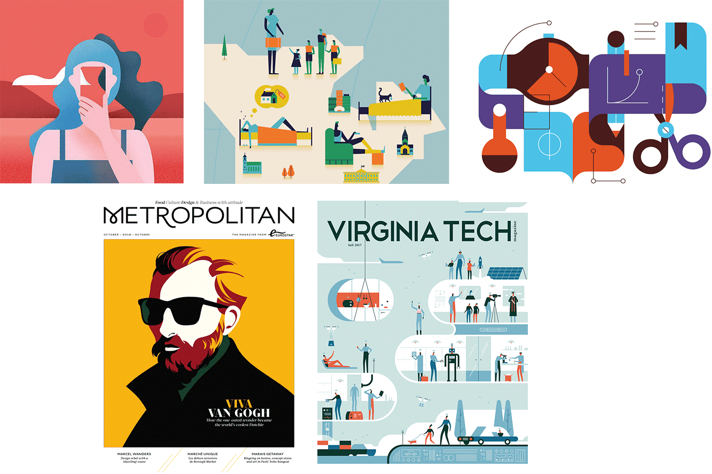
While designing this cover I did a lot of browsing around. Here are a couple of images that inspired me. The bottom-left one inspired me purely in terms of the layout. In the top-right one I really like the rounded shapes, plus its simplicity and contrasting colors. The middle-top and bottom-right ones use cute figures and a fun, vertical 2D approach. The top-left one has nice smooth shapes and colors, and I like its strong image. There were more images, for sure, but these five did it for me.
Images that inspired me for the cover design. (Large preview)
First Design
Choosing Colors
I often start a design by choosing my color palette first. The colors I picked here were chosen purely because I felt they go well together. I wasn’t sure I would use all of them, but somehow I’m used to having a color palette in circles placed above my artboard. Then I use the color picker tool to select the color fill I want to apply, or I select them all and make them global swatches.
Then I worked with the doodle of the magnifying glass as an eye in Illustrator and played around with a bit of color and composition. I thought adding some colored bars at the bottom would give the illustration an eye-catching touch. They represent digital data gathered from users, converted into analytical graphs.
I ended up with the design shown to the left. (Ignore the name of the magazine, as this was changed later on.) I wasn’t sure how much of the Smashing orange-red I should use, so I tried out a version with a lot of orange as well, even though I preferred the other one.
While I did like the result, the idea of doing something with a trail also appealed to me as a second concept. I visualized a person walking around with a smartphone leaving a literal trail of all their interactions. That trail was then picked up, and zoomed in to and saved and analyzed. At the beginning of the trail I added a magnifying glass. I would have also mixed in some graph bars, but at this point I didn’t know where or how exactly I would incorporate them into my composition, though I was already playing with the idea of using some sort of rounded shape background, combined with some subtle patterns.
Typically, I don’t sketch out my entire design. I only quickly doodle the idea and sketch out the elements I need in more detail, like the person with the phone. Once I had the concept fixed in my mind, I started out designing in Adobe Illustrator. First, I created a grid of guides to be used for the background shapes, and also for positioning the trail and figure. There were a couple of steps to get to this final design.
Final Design
Setting Up a Grid
The inspiration image at the bottom left encouraged me to go for a layout with a lot of white space at the top for the title and some white space at the bottom to add three key articles. As for the illustration itself, I envisioned using a square grid, perhaps going all the way over the spine and back.
Final cover design shown in Adobe Illustrator with grid guides and layers panel. (Large preview)
I created this square grid and placed the guides in a separate layer. Once this was set up, I started with the walking man and his smartphone, positioning him somewhere at the top-left.
Next came the curvy path. I just drew an angled line on top of the grid and used the corner widget to convert these into perfect rounded corners. I was thinking of using ones and zeros on the trail, because that’s how I visualize digital data. I turned the curvy path into a fine dotted line with a very wide gap to use as a guide to place the numbers. Once I started to place the numbers on each dot, it looked way too busy, so I decided to place one tiny dot between each number.
The next thing in the process was the creation of the background. I only had a vague idea in my head: a composition of geometrical vertical shapes with rounded corners in different colors from the palette. During this phase, I did a lot of experimenting. I moved and recolored shapes over and over. Once I had the flat colored shapes finished, I started adding in patterns on top. I tried out tiny dot grids that I randomly shaped in length and width, and applied color to. This was all a matter of intuition, to be honest, trying out something, then trying out something else, comparing both and choosing what worked best: changing color, changing the transparency mode, opacity value, and so on.
The bar graphs and icons were created in the last phase, together with the magnifying glass, and the spine and back. I just kept the idea at the back of my head, and waited till I had the man and the background shapes ready. Finally, I added in some basic icons to refer to the type of action made on the data, such as geolocation.
Back Cover
As for the back cover, I had already envisioned the background composition going all the way around, only much lighter. That’s how I came up with the idea of using a light area in the center with a couple of intersecting colored lines there.
In the final printed version, text is added in the center space, nicely framed in a rounded box with a yellow border, so the composition of the lines you see here has been removed and doesn’t match the printed version.
Spine
For the spine, I’d had the fun idea earlier of having the Smashing logo build up with each release (see image at the top of the article), but the tricky thing here is that each edition needs to have the exact same thickness or the whole concept falls apart. It wasn’t realistic since I wasn’t sure each edition would have exactly the same page count. I had to remember that the width of the spine could vary. So I came up with the idea of using some sort of pattern combinations that can vary in width, but still have the magazines connected.
The general idea was also to use a different theme pattern for each issue. The pilot issue uses fine dots in combination with a capsules pattern. In the spine I use a couple of others. The idea is to achieve a coherent composition when you place or stack them in the right order, which serves also a motivation to buy all issues. 😉
Drawing Can Be Really Simple
Here I’ll describe a quick process of a simple detail of the cover illustration: the creation of the walking man’s face. I know a lot of people are convinced that drawing in Adobe Illustrator isn’t easy and that you have to use the pen tool a lot, but that’s not true. You can create beautiful illustrations using only simple shapes like rectangles and circles, combined with the corner widget, pathfinder options and align tools.
Quick Design Process Of The Walking Man
If you keep the shapes in your illustration as simple, flat 2D, drawing in Adobe Illustrator can be easy. Take the head of the walking man. I didn’t even use the pen tool. I've only used simple shapes: rectangles and a circle, and these steps:
With the sketch in the background, I drew a rectangle for each part of the head, and a circle for his ear.
2. Align and unite
Next, I used the align options to align the shapes correctly, and the Pathfinder > Unite option, and I also moved the top-left corner point a little to the right for his nose, using the → key.
Then, with the Direct Selection tool (white arrow) I created the rounded corners for the hair and chin.
4. Arrange and apply color
All that remains is removing the strokes and applying a proper fill color for each shape. Last but not least, I made sure the shapes were in the correct stacking order by using the Object > Arrange options.
Chapter Illustrations
The chapter illustrations also have a bit of my handiwork. Below are the illustrations created by someone else, but the request came to improve them a little bit and make them full-page.
Chapter illustrations already created but needing to be improved. (Large preview)
And so I did. Below are the ones I delivered to Smashing Magazine and which were implemented in the final version.
Note: As you can see, I've incorporated the dotted pattern and modified some of the icons a little bit, but I kept the overall illustration style.
For the first chapter, there was no image, so that one was based on the style already in place.
The six chapter illustrations created from ones already in place (with the exception of chapter 1). (Large preview)
I hope you've enjoyed my design process story and the quick process tutorial. Don’t forget to check out the pilot issue of Smashing Magazine Print (view sample PDF). It’s a must-have for any web designer! Enjoy!
Having a Full Screen header is an interesting way to design your WordPress website. The full screen themes occupy the whole screen and offer great design value to the website. Today, we will go through...


 Medium is a hybrid between a blogging platform and a social network. Sophie Maoura, the head of B2B partnerships in Medium calls it a social content platform. In their own words, “Medium is a place where words matter” so it’s no surprise that Medium is favored by bloggers, but it still remains behind WordPress in […]
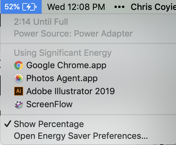


