Is WordPress, and the internet as we know it, going to be cast out to the firmament at the expense of closed, network enabled, Facebookland? Are the early gods on the way out?
Note to regular readers: Let’s bring back some opinion to this blog :) Not #wpdrama (honestly, I mean that!) but a weekly opportunity to really get into the meat of what’s going down in WP land. So, without further ado… here’s an edited version of a piece I published in The MasterWP newsletter in July.
In case you’re not familiar with SF writer Neil Stephenson, you could probably not do much worse than getting yourself a copy of his 1992 (1992!!!) novel Snow Crash and reflecting on how much of that has (and is still likely to) come to pass. The guy’s a visionary and will generally feature on most of your ‘Tech Billionaire’s Reading Lists’, which is why he’s always worth reading both for the enjoyment of his novels (Seveneves is a cracking read too, if a bit silly towards the end) and also because, well, he’s often as much of a futurist as you’ll find in the digital space.
Anyway – fanboy stuff over – his latest novel, Fall, or Dodge in Hell, is as much a romp through a futuristic landscape as a fantasy novel that deals with the question of what might happen should we be able to develop, post-death, a fully accurate scan of your connectome alongside sufficiently powerful neural computing capacity to bring you digitally back to ‘life’.
Awesome read, especially for you scifi-fantasy double nerds
And here’s where the actually-relevant-to-wp-land stuff kicks in, because Dodge (reborn Egdod) finds himself, and then others, in a haphazard, chaotic, open world of endless possibilities and infinite opportunities for shaping and reshaping. Read, for us, the internet and the chaos of a world yet to be formed that gave us html sites, Dreamweaver, GeoCities, Movable Type, open-source-CMSs-galore and finally, has settled, on yours and my favorite of them all, WordPress.
Which has turned out pretty cool yeh? I’m running a WP-based business as, I imagine, are most of you in some form or another. The medium I am posting this mindump of a post in is, itself, a WP business. Many families are fed and many lives are led as part of this dominant ecosystem. Hallelujah!
But, what if that were to change. What if we & WP were to be flung out. What if that was actually the most likely outcome. What could be The Fall?
Well, I’m very much on the record as arguing, and trying to counter the fact that it would be via the much more easy-to-use, well funded and end-consumer driven third party competition, think Squarespace, Shopify, Wix etc. But I was wrong. Again, lol.
For any number of reasons (capacity, community, cost… to name a few) alongside Gutenberg being the great leap forward (pun intended) we needed to bridge that gap. Yay! WP lives long & prospers!
Or, does it?
Because there are dark clouds not just on the horizon, but already here. Clouds that I think can be fairly neatly grouped into corporate and government threats. Threats that come with their own hosts (I can’t help myself) of support and that would seek to dominate and, even better, displace the web as we know it and, with it, WP.
For purposes commercial I don’t think we really need to look much further than what – to me at least – comes across as a hugely ironic scream into the abyss, also known as ‘A meditation on the open web’. Which, upon watching, as opposed to taking a deep breath you might as well flee screaming down the street shouting “They are coming to take us all arggggggghhhh!!! Faaaaaaaarrrrkkk!!!”.
By which I mean Facebook (and associated entities), and any number of other terrifying, network-effect-enabled, gazillion dollar funded and closed publishing platforms.
And as for Google being, as the entry point (because who, apart from most of us, still actually uses an RSS reader) the gateway and protector of the ‘open web’ what chance do we realistically have when Maps is basically becoming an advertising soaked (if not simply fake) shitshow and, in one of my favourite graphics about WordPress hosting put together by WPShout, basically lies driven by affiliates and advertisers. Thanks Google, great job.
And that’s before we even get into a far more existential threat, the state. In case you missed it Australia – also thanks home! – recently secured broad G20 support for the effective criminalisation of social media publishing, which might not seem like a problem for your lil’ old WP site until you wonder what chance we’ll have when the behemoths that want to eat us all are running scared.
Because if you want a reality check on what that’s going to look like then go no further than China which should do plenty to ritually disabuse you of the notion that the ‘open web’, or (to go back to the book) a Utopian and free chaos has any chance whatsoever of surviving when it comes down to guys and gals with guns. You don’t even need to read that far into (the excellent) We Have Been Harmonised: Life in China’s Surveillance State by Kai Strittmatter to grasp the fundamental fact that what many of us almost universally thought of as being a new dawn, a cause for optimism and a terror for tyrants is in fact the opposite, hard.
Have we already fallen? Have the gods of the early internet been cast down? Maybe, and certainly if you happen to live your life through WeChat (I’d love to see a meditation on that!)
Has WordPress (by which I mean .org, not .com) got much chance of surviving in a state beyond an underground ‘zine of the 80s, and indie record label, a farmstead (sigh) or a series of pamphlets greeted by a ‘no junk mail’ down the road?
I think we all hope it has but in order to make that happen, in addition to simply saying it should we need to do a lot more than hope… dare I say even resist?
Pantone, a color management company that is best known for the Pantone Matching System (PMS), a proprietary color space that is used by various industries to ensure accurate colors across systems, has announced a new API for third-party software integration.
This new API will allow developers to more easily integrate Pantone’s color data into applications. Iain Pike, Pantone’s Licensing Business Development Director, stated in the press release:
With the proliferation of block collection plugins over the past year, Kioken Blocks is a relatively unknown newcomer that you may have missed. Compared to competitors with thousands of users like CoBlocks (30K+), Atomic Blocks (20K+), Stackable (10K+), and Ultimate Addons for Gutenberg (100K+), Kioken is a small fish in a big pond of page builder utilities.
You might have seen Kioken Blocks in action recently without knowing it, if you checked out Matias Ventura’s demo introducing the concept of “block areas.” The plugin was first released two months ago but is already starting to differentiate itself with some innovative design features, block templates, and layouts. Its name was inspired by the Street Fighter arcade game and major releases are named for different character moves.
Kioken’s most recent release includes a new Vertical Text setting that allows users to rotate paragraphs and headings for a special effect in more complex layouts.
Inside the block editor, users can flip the vertical text rotation, adjust the alignment, add margins, dropcaps, and apply other standard text settings to the selection.
Kioken currently includes 17 blocks, all created with an emphasis on providing an aesthetic base design that will seamlessly fit into a user’s theme, with further customization options for each block. The blocks are not cookie cutter repeats of other collections but rather offer their own distinct styles and features.
For example, the Kinetic Posts block allows users to list blog posts, including custom post types, inside a grid, columns/list, or slider with multiple different layout options. Users can run custom queries, such as ordering randomly, or by name, popularity, date, and by post type with custom taxonomy queries.
Kioken Blocks creator Onur Oztaskiran said he focuses on adding features and blocks that are not commonly available already. This includes some under the hoods usability features, such as custom block appenders, lighter block highlighter on block selection on dark backgrounds, and block settings change indicators in the sidebar.
“I try to add blocks that people don’t have access to yet,” Oztaskiran said. “So I don’t spend my time on creating accordions or team blocks but rather add things that enrich your content building process in the same fashion premium page building tools do (Kinetic Wrapper block, Animator and Vertical Text extensions are some of these).”
Kioken Blocks Aims to Provide a Faster, Simpler Alternative to Complex Page Builder Plugins
Oztaskiran has a design background, having previously worked as the design lead at Udemy, Noon.com, and Qordoba, but he taught himself how to build blocks in order to push the limits of WordPress’ page building capabilities.
“Kioken Blocks started out as a personal hobby to learn Gutenberg development and test out if I can do something with GB that would replace mine and everyone else’s page building workflow with WordPress, using only Gutenberg by extending it.
“I am a designer and not so great developer. I’ve mostly built Kioken Blocks following Gutenberg resources on the web and GitHub, most of the time by learning from the Gutenberg GitHub repo.”
Oztaskiran’s personal site, monofactor.com, was built with nothing but Gutenberg and Kioken Blocks, including the fancy animations reminiscent of Themeforest products, along with the layout. The site is a good example of how the block editor and a few custom blocks can enable users to create beautiful, complex layouts without having to use a heavy, over-engineered page builder plugin.
“I took a leap of faith in Gutenberg when it was first released and started developing for it since I’m also a user and hate many things about page builder plugins,” Oztaskiran said. “I love to hate Gutenberg as well, but right now I can’t stop using it.”
Oztaskiran used page builder plugins in the past and even created extensions for some of them, but ultimately his frustrations inspired him to go all in on Gutenberg block development.
“With page builders, what took me away from them most was the MBs of resources they add to my sites, and the complexity of content editing in the editor, the long learning curve for some of them, and most importantly you need to be a ‘pro’ to create complex layouts and engaging, rich content,” Oztaskiran said.
As a result of these frustrations, he decided to focus on speed and usability in Kioken Blocks. Oztaskiran said he is satisfied to have developed a product that allows users to create animated, complex layouts in minutes, much faster than he was able to do in other platforms. Kioken’s predefined block presets allow users to insert elements like background hero sections, product intros, sliding testimonials, and other page elements, making it easy to quickly design a site. These types of elements further blur the line between predefined block templates and themes.
“What amazes me with Gutenberg is you only need a lightweight unbloated GB compatible theme and nothing else,” Oztaskira said. “You can create amazing things.”
He is currently maintaining the plugin by himself without a team but the project is very time consuming. He sells commercial block templates through the plugin’s upgrade page and the user base is growing, so is considering making some partnerships in the future. Kioken Blocks only has approximately 100+ active installs at the moment, but Oztaskiran reports that his conversion rate is about 6-7% on selling Pro licenses, which include priority support and commercial block templates and layouts.
Despite identifying himself as just “a designer and a crappy developer,” Oztaskiran’s investment in learning Gutenberg block development is starting to pay off.
“You don’t need to be a pro dev to understand the logic, and with having an average JS knowledge you can get on board to GB development in a short time,” he said.”
“I indeed had ups and downs with Gutenberg, and Kioken Blocks aims to cover for those ‘downs.’ I’ve been trying to build a tool for the editor so that some day you will only need Gutenberg and no other page building tools to create engaging and beautiful content.”
Every day, the ProgrammableWeb team is busy, updating its three primary directories for APIs, clients (language-specific libraries or SDKs for consuming or providing APIs), and source code samples.
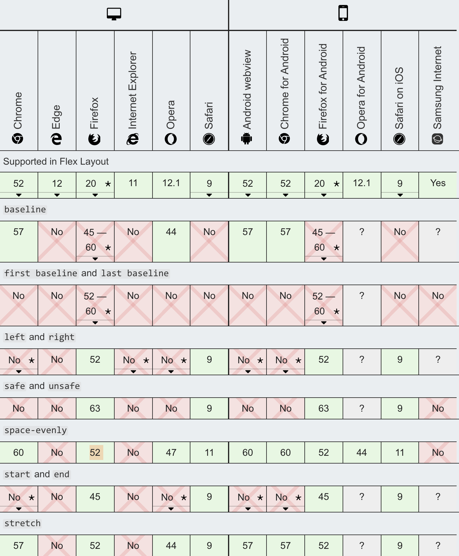
Second only to "silly GIFs," I'd guess screenshots of caniuse are the most common slide graphic at web conferences. It's become the ultimate source for looking at web compatibility data in the hearts and minds of web developers.
Can I use CSS filter in Firefox?Yes.Can I use the filter() function?No.
But of course, MDN has incredible web platform documentation that also includes compatibility data. So it's nice to see them collaborate. And not just theoretically — it's already happening.
Florian Scholz and Alexis Deveria:
Before we began our collaboration, the caniuse website only displayed results for features available in the caniuse database. Now all search results can include support tables for MDN compat data. This includes data types already found on caniuse, specifically the HTML, CSS, JavaScript, Web API, SVG & and HTTP categories. By adding MDN data, the caniuse support table count expands from roughly 500 to 10,500 tables! Developers’ caniuse queries on what’s supported where will now have significantly more results.
Massive upgrade, already live on the site. I absolutely love real collaboration like this when it actually happens. I remember back in 2012 when WebPlatform.org launched and every single major web company gave lip service that they were going to contribute and consolidate their documentation there. Sounded too good to be true. Launched before that work actually happened. Died unglamorously a few years later.
The caniuse database, I believe, is basically this 2MB JSON file on GitHub. We use that right here on CSS-Tricks. We pull it in and use the data in it to display our support tables, crediting caniuse while we do it.
Here's backdrop-filter:
This browser support data is from Caniuse, which has more detail. A number indicates that browser supports the feature at that version and up.
Desktop
Chrome
Opera
Firefox
IE
Edge
Safari
76
No
No
No
17
9*
Mobile / Tablet
iOS Safari
Opera Mobile
Opera Mini
Android
Android Chrome
Android Firefox
9.0-9.2*
No
No
76
No
No
It doesn't sound like the MDN data is going to make its way into that JSON, so I guess my big hope is that that dataset continues to be updated, or that if it is someday replaced, it is in a place that is similarly easy to access.
I totally get why they are just combining the data sources out of the gate, as MDN digs into individual features in a way that caniuse typically doesn't. For example, the individual values for justify-content are super complicated!
I imagine that kind of detail might require a deeper architectural change that wasn't right for a Version 1 integration.
Ballerina, the open-source project from WSO2, has released Ballerina 1.0, which provides cloud-native middleware as a programming language. Ballerina was designed and developed to address what WSO2 saw as major shortcomings in how middleware was evolving to take part in a cloud-native world. Its aim is to simplify how developers will build and deploy cloud-native distributed applications and services.
Kong, API and service lifecycle management platform provider, has announced a new open-source project: Kuma. Kuma is a universal control plane based on the open-source Envoy proxy. The goal of the project is to overcome the outdated limitations of first-generation service mesh technology.
Actually iam a new PHP Learner, i developed an web app using Bootstrap, PHP, Mysql. Now i want to give login access for gmail id's which are already existed in my database, so i used login with google API, but want deny login access for any other gmails which are not existed in my database.
If you're already PRO, you've probably already seen this! That's because we announced the feature via a modal on the homepage when you are logged in as a PRO user:
Hopefully the name "Private by Default" explains what it needs to: if you toggle this setting on, when you save any Pen, Project, Collection, or Post, it saves it privately automatically.
You can still make them public at any time (it's an option on any of those things), but that first save will always make them private.
If you're looking for more detailed information, it's always smart to check our documentation. Chances are that's more up to date than an announcement blog post like this.
The little UI module that allows you to control this feature is just a header, paragraph, and toggle switch that controls a value in our database. We smoosh all that together, including querying for and mutating the data (via toggle) into a single component:
<PrivateByDefault />
Wherever we put that thing, it's a fully functional bit of UI that does that job.
But the value of this really presents itself when combined with other bits of infrastructure we already have. For example, we have a <Modal /> component that displays a modal and handles all the stuff that modals need to: opening/closing, escape-key closing, click-outside closing, styling, etc.
We also have a functionality component called <FeatureNotifier /> which will render what is inside of it only once and then save the fact that you've seen the feature to our database. By default, it's a little yellow glowing circle, but it can also render whatever you give it. So by putting all those things together...
<FeatureNotifier id={PRIVATEBYDEFAULT}>
   <Modal>
       <h1>Would you prefer if all new work was private by default?</h1>
       <p>Pardon the intrusion... we're letting you know about this new feature.</p>
       <PrivateByDefault />
   </Modal>
</FeatureNotifier>
Of course, it was work to get there, but seeing this kind of thing come together quickly and easily now that the work is done is very satisfying.
We all know what a hamburger menu is, right? When the pattern started making its way into web designs, it was both mocked and applauded for its minimalism that allows main menus to be tucked off screen, particularly on mobile where every pixel of space counts.
CSS-Tricks is all about double the meat.
Love ‘em or hate ‘em, hamburger menus are here and likely will be for some time to come. The problem is how to implement them. Sure, they look simple and straightforward, but they can be anything but. For example, should they be paired with a label? Are they more effective on the left or right side of the screen? How do we tackle closing those menus, whether by click or touch? Should the icon be an SVG, font, Unicode character, or pure CSS? What about a meatless option?
I wanted to build one of those but failed to find a simple solution. Most solutions are based on libraries, like reactjs-popup or react-burger-menu. They are great, but for more complex solutions. What about the core use case of a three-line menu that simply slides a panel out from the side of the screen when it’s clicked, then slides the panel back in when it’s clicked again?
I decided to build my own simple hamburger with sidebar. No pickles, onions or ketchup. Just meat, bun, and a side of menu items.
We’re building use React for this tutorial because it seems like a good use case for it: we get a reusable component and a set of hooks we can extend to handle the click functionality.
npx create-react-app your-project-name
cd your-project-name
yarn add styled-components
Add basic styles
Open the newly created project in your favorite code editor and start adding basic styles using styled-components. In your src directory, create a file called global.js. It will contain styles for the whole app. You can write your own or just copy what I ended up doing:
This is only a part of global styles, the rest of it you can find here.
The CreateGlobalStyle function is generally used for creating global styles that are exposed to the whole app. We’ll import it so we have access to these styles as we go.
The next step is to add a theme file that holds all our variables. Create a theme.js file in the src directory and add following:
Go to your App.js file. We’re going to wipe everything out of there and create the main template for our app. Here’s what I did. You can certainly create your own.
// App.js
import React from 'react';
import { ThemeProvider } from 'styled-components';
import { GlobalStyles } from './global';
import { theme } from './theme';
function App() {
return (
<ThemeProvider theme={theme}>
<>
<GlobalStyles />
<div>
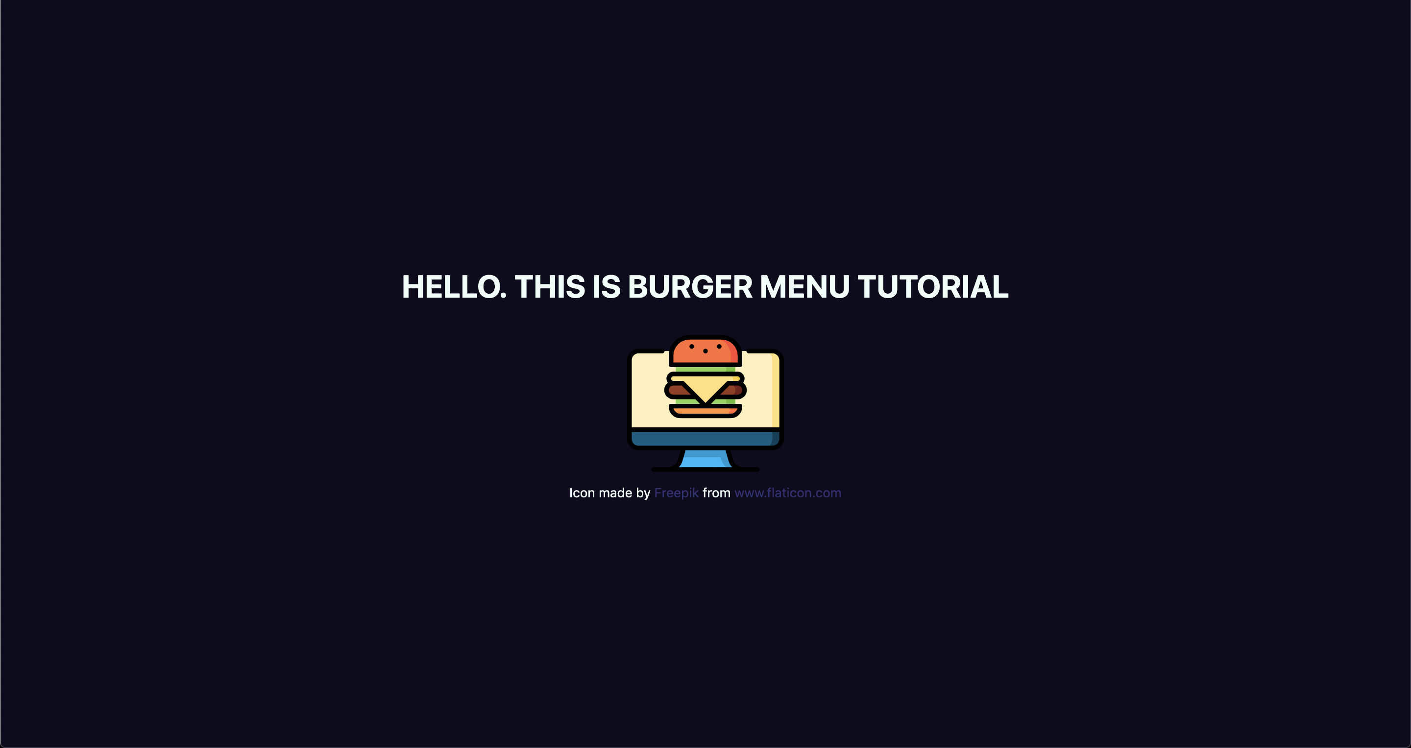
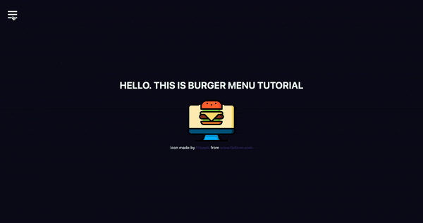
<h1>Hello. This is burger menu tutorial</h1>
<img src="https://image.flaticon.com/icons/svg/2016/2016012.svg" alt="burger icon" />
<small>Icon made by Freepik from www.flaticon.com</small>
</div>
</>
</ThemeProvider>
);
}
export default App;
Don’t forget to add the line with the small tag. That’s how we credit flaticon.comhttp://flaticon.com) authors for the provided icon.
Here’s what we’ve got up to this point:
Let me explain a little bit. We imported ThemeProvider, which is a wrapper component that uses the Context API behind the scenes to make our theme variables available to the whole component tree.
We also imported our GlobalStyles and passed them as a component to our app, which means that our application now has access to all global styles. As you can see, our GlobalStyles component is inside ThemeProvider which means we can already make some minor changes in it.
Go to global.js and change the background and color properties to use our defined variables. This helps us implement a theme rather than using fixed values that are difficult to change.
We destructure our theme from props. So, instead of writing props.theme each time, we’re using a bunch of brackets instead. I’ll repeat myself: the theme is available because we’ve wrapped our global styles with ThemeProvider.
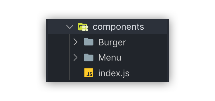
Create Burger and Menu components
Create a components folder inside the src directory and add two folders in there: Menu and Burger, plus an index.js file.
index.js will be used for one purpose: allow us to import components from one file, which is very handy, especially when you have a lot of them.
Now let’s create our components. Each folder will contain three files.
What’s up with all the files? You’ll see the benefit of a scalable structure soon enough. It worked well for me in a couple of projects, but here is good advice how to create scalable structure.
Go to the Burger folder and create Burger.js for our layout. Then add Burger.styled.js, which will contain styles, and index.js. which will exporting the file.
// index.js
export { default } from './Burger';
Feel free to style burger toggle in a way you want, or just paste these styles:
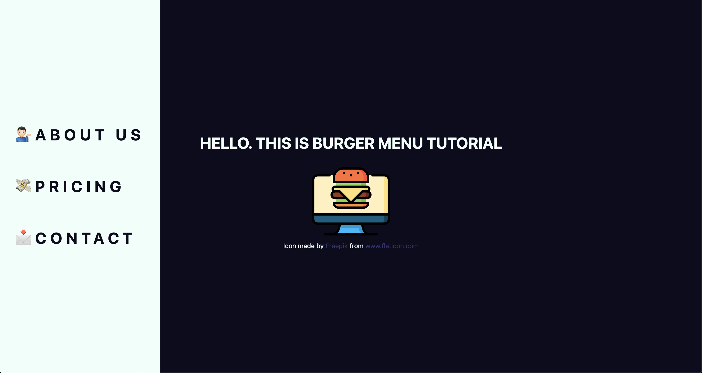
Next, let’s add the layout for the menu items that are revealed when clicking on our burger:
// Menu.js
import React from 'react';
import { StyledMenu } from './Menu.styled';
const Menu = () => {
return (
<StyledMenu>
<a href="/">
<span role="img" aria-label="about us">💁🏻‍♂️</span>
About us
</a>
<a href="/">
<span role="img" aria-label="price">💸</span>
Pricing
</a>
<a href="/">
<span role="img" aria-label="contact">📩</span>
Contact
</a>
</StyledMenu>
)
}
export default Menu;
We’ve got nice emojis here, and best practice is to make them accessible by wrapping each one in a span and adding a couple of properties: role="img" and aria-label="your label". You can read more about it here.
Time to import our new components into our App.js file:
// App.js
import React from 'react';
import { ThemeProvider } from 'styled-components';
import { GlobalStyles } from './global';
import { theme } from './theme';
import { Burger, Menu } from './components';

// ...
Let’s see, what we’ve got:
Take a look at this nice navigation bar! But we’ve got one issue here: it’s opened, and we want it initially to be closed. We only need to add one line to Menu.styled.js fix it:
// Menu.styled.js
transform: 'translateX(-100%)';
We are well on our way to calling this burger cooked! But first…
Adding open and close functionality
We want to open the sidebar when clicking the hamburger icon, so let’s get to it. Open App.js and add some state to it. We will use the useState hook for it.
// App.js
import React, { useState } from 'react';
After you import it, let’s use it inside the App component.
We set the initial state to false, because our menu should be hidden when the application is rendered.
We need both our toggle and sidebar menu to know about the state, so pass it down as a prop to each component. Now your App.js should look something like this:
// App.js
import React, { useState } from 'react';
import { ThemeProvider } from 'styled-components';
import { GlobalStyles } from './global';
import { theme } from './theme';
import { Burger, Menu } from './components';
function App() {
const [open, setOpen] = useState(false);
return (
<ThemeProvider theme={theme}>
<>
<GlobalStyles />
<div>
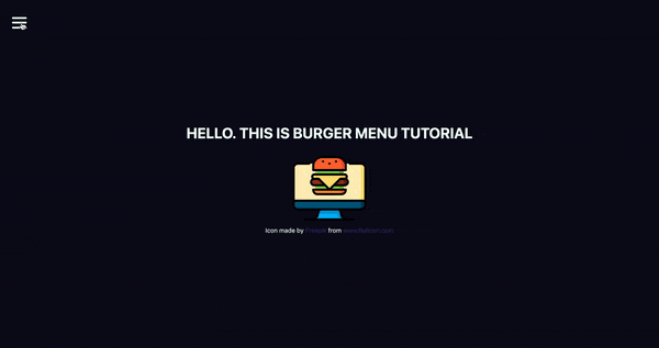
<h1>Hello. This is burger menu tutorial</h1>
<img src="https://media.giphy.com/media/xTiTnwj1LUAw0RAfiU/giphy.gif" alt="animated burger" />
</div>
<div>
<Burger open={open} setOpen={setOpen} />
<Menu open={open} setOpen={setOpen} />
</div>
</>
</ThemeProvider>
);
}
export default App;
Notice that we’re wrapping our components in a div. This will be helpful later when we add functionality that closes the menu when clicking anywhere on the screen.
Handle props in the components
Our Burger and Menu know about the state, so all we need to do is to handle it inside and add styles accordingly. Go to Burger.js and handle the props that were passed down:
We destructure the open and setOpen props and pass them to our StyledBurger to add styles for each prop, respectively. Also, we add the onClick handler to call our setOpen function and toggle open prop. At the end of the file, we add type checking, which is considered a best practice for aligning arguments with expected data.
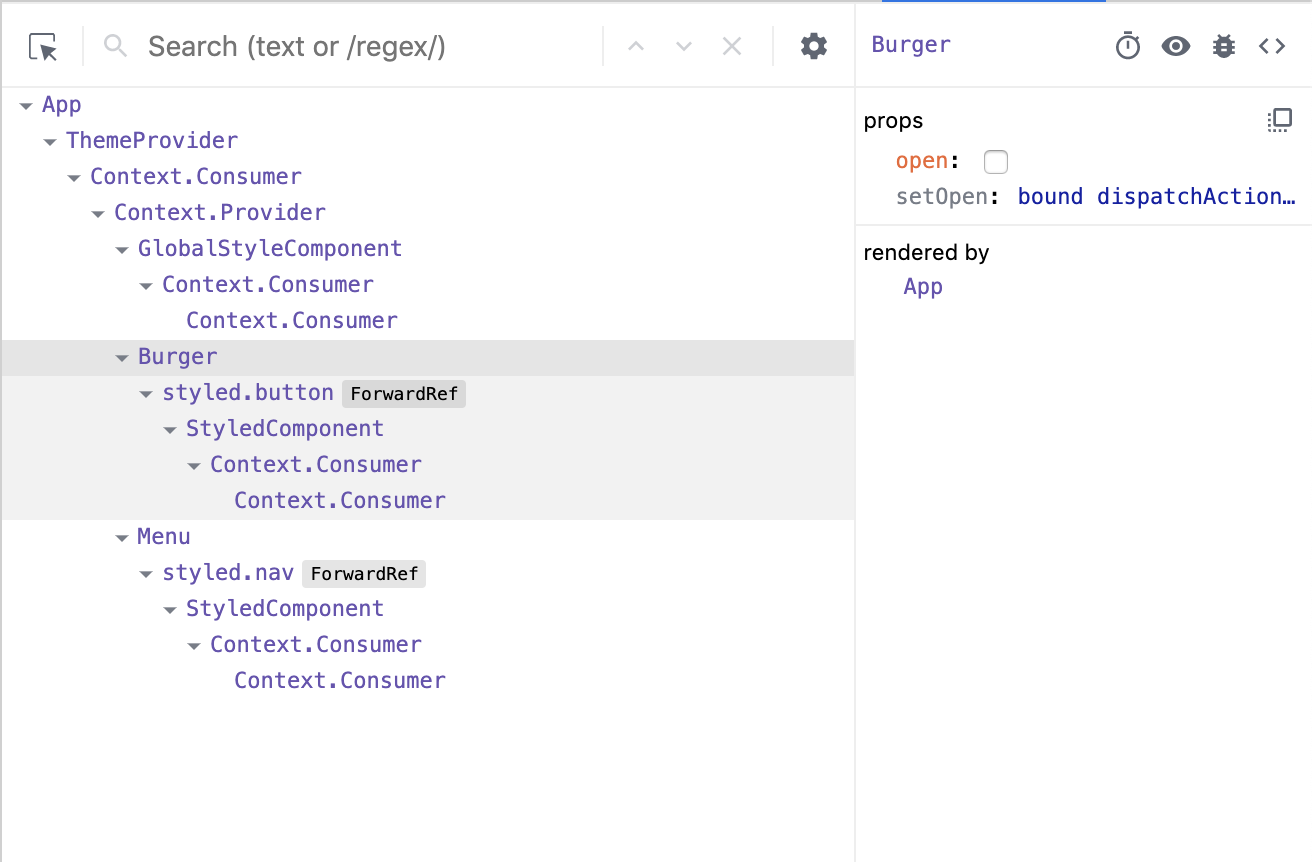
You can check whether it works or not by going to your react-dev-tools. Go to Components tab in your Chrome DevTools and click on Burger tab.
Now, when you click on your Burger component, (don’t mix it up with the tab), you should see, that your open checkbox is changing its state.
Go to Menu.js and do almost the same, although, here we pass only the open prop:
// Menu.js
import React from 'react';
import { bool } from 'prop-types';
import { StyledMenu } from './Menu.styled';
const Menu = ({ open }) => {
return (
<StyledMenu open={open}>
<a href="/">
<span role="img" aria-label="about us">💁🏻‍♂️</span>
About us
</a>
<a href="/">
<span role="img" aria-label="price">💸</span>
Pricing
</a>
<a href="/">
<span role="img" aria-label="contact">📩</span>
Contact
</a>
</StyledMenu>
)
}
Menu.propTypes = {
open: bool.isRequired,
}
export default Menu;
Next step is to pass open prop down to our styled component so we could apply the transition. Open Menu.styled.js and add the following to our transform property:
transform: ${({ open }) => open ? 'translateX(0)' : 'translateX(-100%)'};
This is checking if our styled component open prop is true, and if so, it adds translateX(0) to move our navigation back on the screen. You can already test it out locally!
Wait, wait, wait!
Did you notice something wrong when checking things out? Our Burger has the same color as the background color of our Menu, which make them blend together. Let’s change that and also animate the icon a bit to make it more interesting. We’ve got the open prop passed to it, so we can use that to apply the changes.
Open Burger.styled.js and write the following:
// Burger.styled.js
import styled from 'styled-components';
export const StyledBurger = styled.button`
  position: absolute;
  top: 5%;
  left: 2rem;
  display: flex;
  flex-direction: column;
  justify-content: space-around;
  width: 2rem;
  height: 2rem;
  background: transparent;
  border: none;
  cursor: pointer;
  padding: 0;
  z-index: 10;

  &:focus {
    outline: none;
  }

  div {
    width: 2rem;
    height: 0.25rem;
    background: ${({ theme, open }) => open ? theme.primaryDark : theme.primaryLight};
    border-radius: 10px;
    transition: all 0.3s linear;
    position: relative;
    transform-origin: 1px;

    :first-child {
      transform: ${({ open }) => open ? 'rotate(45deg)' : 'rotate(0)'};
    }

    :nth-child(2) {
      opacity: ${({ open }) => open ? '0' : '1'};
      transform: ${({ open }) => open ? 'translateX(20px)' : 'translateX(0)'};
    }

    :nth-child(3) {
      transform: ${({ open }) => open ? 'rotate(-45deg)' : 'rotate(0)'};
    }
  }
`;
This is a big chunk of CSS, but it makes the animation magic happen. We check if the open prop is true and change styles accordingly. We rotate, translate, then hide the menu icon’s lines while changing color. Beautiful, isn’t it?
Okay, folks! By now, you should know how to create a simple hamburger icon and menu, that incorporates responsiveness and smooth animation. Congratulations!
But there’s one last thing we ought to account for...
Close the menu by clicking outside of it
This part seems like a small bonus, but it’s a big UX win because it allows the user to close the menu by clicking anywhere else on the page. This helps the user avoid having to re-locate the menu icon and clicking exactly on it.
We’re going to put more React hooks to use to make this happen! Create a file in the src directory, called hooks.js and open it. For this one, we’re gonna turn to the useEffect hook, which was introduced in React 18.
// hooks.js
import { useEffect } from 'react';
Before we write the code, let’s think about the logic behind this hook. When we click somewhere on the page, we need to check whether the clicked element is our current element (in our case, that is the Menu component) or if the clicked element contains the current element (for instance, our div that wraps our menu and hamburger icon). If so, we don’t do anything, otherwise, we call a function, that we’ll name handler.
We are going to use ref to check the clicked element, and we will do so every time someone clicks on the page.
Don’t forget to return the function from useEffect. That’s so-called "clean up" and, basically, it stands for removing an event listener when the component unmounts. It is the replacement of componentWillUnmount lifecycle.
Now let’s hook up the hook
We’ve got our hook ready, so it’s time to add it to the app. Go to the App.js file, and import two hooks: the newly created useOnClickOutside and also useRef. We’ll need the latter to get a reference to the element.
// App.js
import React, { useState, useRef } from 'react';
import { useOnClickOutside } from './hooks';
To get access these in the current element, we need to get access to the DOM node. That’s where we use useRef, also, the name node perfectly reflects the point of this variable.
From there, we pass the node as a first argument. We’ll pass the function that closes our menu as a second argument.
Whatever you plan to create, you have a reliable companion in Bootstrap. It provides a solid, trustworthy foundation for a web project with a bulk of features for building and extending functionality like Bootstrap dashboards. The free Bootstrap dashboards are …
One of the best part about Facebook groups is that it allows users to report inappropriate comments.
This allows admins and moderators to easily remove offensive, rude, and hurtful comments from the group. Wouldn’t it be nice if WordPress had a solution that allowed users to report inappropriate comments?
In this article, we will show you how to crowdsource comment moderation by allowing users to report inappropriate comments in WordPress.
Why Allow Users to Report Inappropriate Comments in WordPress?
Offensive, rude, and hurtful words appearing on your website can hurt your brand image and negatively impact your business.
If your website gets a lot of comments, then you’d have to read every comment to ensure that negative comments don’t slip through the cracks.
This is extremely difficult if you don’t have the resources.
By allowing users to report inappropriate comments, you can crowdsource this task to your readers similar to how many Facebook groups do.
Let your users catch and report inappropriate comments for you to review and remove. If you allow users to report / flag comments, then you’ll be able to quickly respond to bad comments by deleting them.
This allows you to easily catch negative comments, and it give your users a sense of community along with a new way of participation on your site.
Let’s take a look at how you can easily allow users to report comments in WordPress.
Allowing Users to Report Inappropriate Comments in WordPress
Upon activation, you need to go to the Settings » Discussion page in your WordPress admin area and navigate to the ‘Allow comment flagging’ option.
Next, check the box next to ‘Allow your visitors to flag a comment as inappropriate’ option.
Once done, you need to click on the Save button to save your settings.
After the settings are saved, you will see additional options below ‘Allow comment flagging’ option.
First, you will see a ‘Flagging threshold’ option. This basically lets you set a number of reports before a comment is flagged for manual review. We recommend having this number set to 1, but you can have it as high as you like.
Second, there is an ‘Administrator notifications’ option which lets you choose whether you would like to receive an email when a comment has been sent for manual moderation.
The third option also lets you enable or disable ‘Administrator notifications.’ You can check the box next to it if you want WordPress to send administrators an email each time a comment is reported as inappropriate.
Depending on the number of comments your site gets, these notifications can become overwhelming. An easier solution is to disable email notifications and simply review your comments every day.
Once you are done configuring the settings, make sure to click the Save button.
To preview how the report a comment option looks on your blog, simply open a blog post on your website.
A link to ‘Report comment’ will start appearing below each comment on your site. Users can click on this link to report a negative comment.
When a user reports a comment, the plugin will display a quick AJAX feedback.
When a comment’s report count reaches the flagging threshold, it is pushed back to the moderation queue for a site administrator or editor to review. You have the option to delete or re-approve it.
Webflow: The Web Development Platform Of The Future
Webflow: The Web Development Platform Of The Future
Nick Babich
(This is a sponsored article.) Time-to-market plays a crucial role in modern web design. Most product teams want to minimize the time required to go from the idea to a ready-to-use product without sacrificing the quality of the design along the way.
When it comes to creating a website, teams often use a few different tools: one tool for graphics and visual design, another for prototyping, and another for coding. Webflow attempts to simplify the process of web design by enabling you to design and develop at the same time.
Typical Problems That Web Designers Face
It’s important to start with understanding what challenges web design teams face when they create websites:
A disconnection between visual design and coding.
Visual designers create mocks/prototypes in a visual tool (like Sketch) and hand them off to developers who need to code them. It creates an extra round of back-and-forth since developers have to go through an extra iteration of coding.
It’s hard to code complex interactions (especially animated transitions).
Designers can introduce beautiful effects in hi-fi prototypes, but developers will have a hard time reproducing the same layout or effect in code.
Optimizing designs for various screens.
Your designs should be responsive right from the start.
What Is Webflow?
Webflow is an in-browser design tool that gives you the power to design, build, and launch responsive websites visually. It’s basically an all-in-one design platform that you can use to go from the initial idea to ready-to-use product.
Here are a few things that make Webflow different:
The visual design and code are not separated.
What you create in the visual editor is powered by HTML, CSS, and JavaScript.
It allows you to reuse CSS classes.
Once defined, you can use a class for any elements that should have the same styling or use it as a starting point for a variation (base class).
It is a platform and as such, it offers hosting plans.
For $12 per month, it allows you to connect a custom domain and host your HTML site. And for an additional $4 per month, you can use the Webflow CMS.
Building A One-Page Website Using Webflow
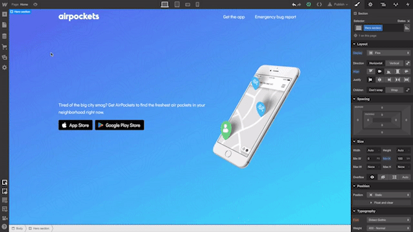
The best way to understand what the tool is capable of is to build a real product with it. For this review, I will use Webflow to create a simple landing page for a fictional smart speaker device.
Define The Structure Of The Future Page
While it’s possible to use Webflow to create a structure of your layout, it’s better to use another tool for that. Why? Because you need to experiment and try various approaches before finding the one that you think is the best. It’s better to use a sheet of paper or any prototyping tool to define the bones of your page.
It’s also crucial to have a clear understanding of what you’re trying to achieve. Find an example of what you want and sketch it on paper or in your favorite design tool.
Tip: You don’t need to create a high-fidelity design all of the time. In many cases, it’s possible to use lo-fi wireframes. The idea is to use a sketch/prototype as a reference when you work on your website.
For our website, we will need the following structure:
A hero section with a large product image, copy, and a call-to-action button.
A section with the benefits of using our product. We will use a zig-zag layout (this layout pairs images with text sections).
A section with quick voice commands which will provide a better sense of how to interact with a device.
A section with contact information. To make contact inquiries easier for visitors, we’ll provide a contact form instead of a regular email address.
Create A New Project In Webflow
When you open the Webflow dashboard for the first time, you immediately notice a funny illustration with a short but helpful line of text. It is an excellent example of an empty state that is used to guide users and create the right mood from the start. It’s hard to resist the temptation to click “New Project.”
When you click “New Project,” Webflow will offer you a few options to start with: a blank site, three common presets, and an impressive list of ready-to-use templates. Some of the templates that you find on this page are integrated with the CMS which means that you can create CMS-based content in Webflow.
Templates are great when you want to get up and running very quickly, but since our goal is to learn how to create the design ourselves, we will choose “Blank Site.”
As soon as you create a new project, we will see Webflow’s front-end design interface. Webflow provides a series of quick how-to videos. They are handy for anyone who’s using Webflow for the first time.
Once you’ve finished going through the introduction videos, you will see a blank canvas with menus on both sides of the canvas. The left panel contains elements that will help you define your layout’s structure and add functional elements. The right panel contains styling settings for the elements.
Let’s define the structure of our page first. The top left button with a plus (+) sign is used to add elements or symbols to the canvas. All we have to do to introduce an element/visual block is to drag the proper item to the canvas.
While elements should be familiar for anyone who builds websites, Symbols can still be a new concept for many people. Symbols are analogous to features of other popular design tools, like the components in Figma and XD. Symbols turn any element (including its children) into a reusable component. Anytime you change one instance of a Symbol, the other instances will update too. Symbols are great if you have something like a navigation menu that you want to reuse constantly through the site.
Webflow provides a few elements that allow us to define the structure of the layout:
Sections. Sections divide up distinct parts of your page. When we design a page, we usually tend to think in terms of sections. For instance, you can use Sections for a hero area, for a body area, and a footer area.
Grid, columns, div block, and containers are used to divide the areas within Sections.
Components. Some elements (e.g. navigation bar) are provided in ready-to-use components.
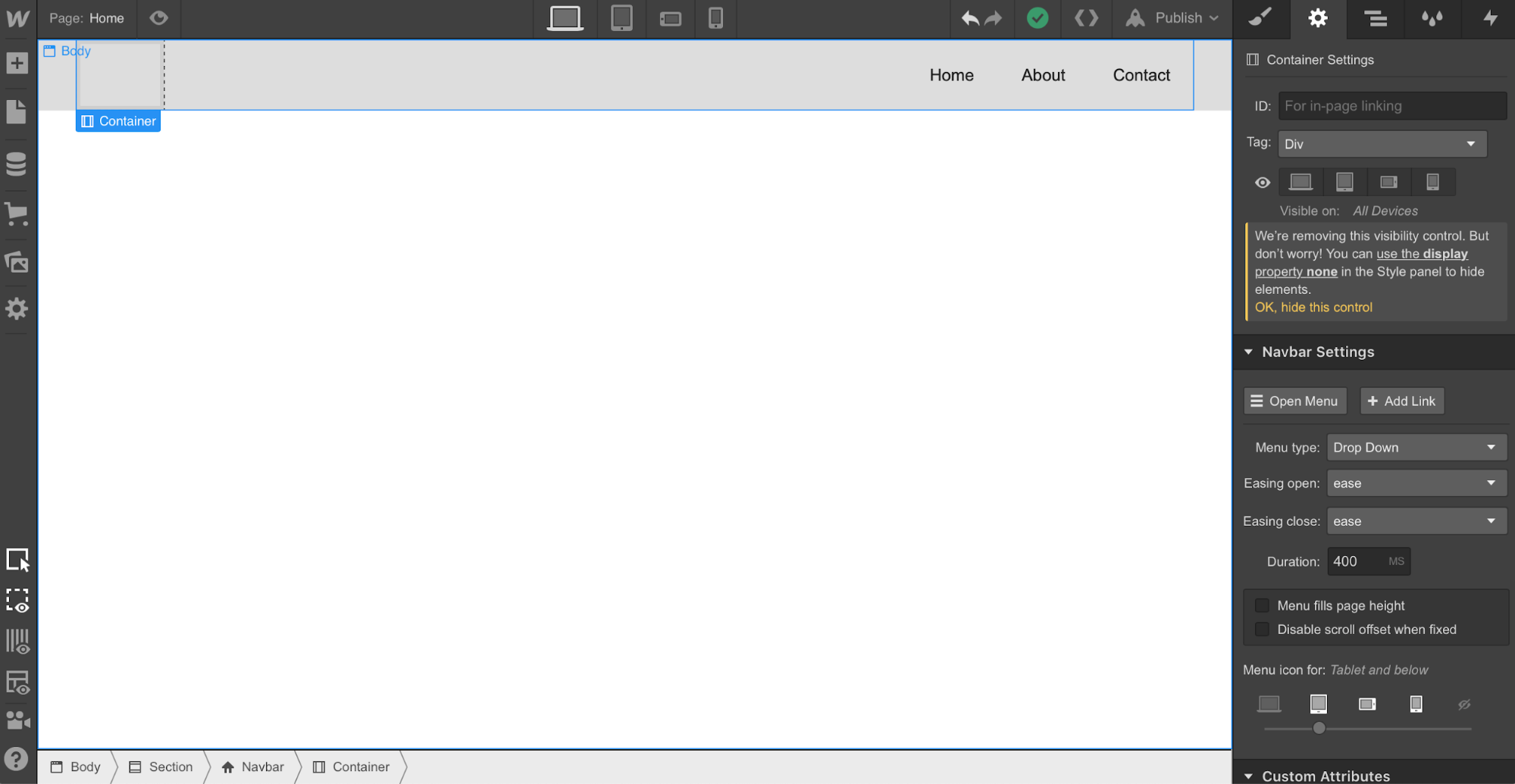
Let’s add a top menu using the premade component Navbar which contains three navigation options and placeholders for the site’s logo:
Let’s create a Symbol for our navigation menu so we can reuse it. We can do that by going to “Symbols” and clicking “Create New Symbol.” We will give it the name “Navigation.”
Notice that the section color turned to green. We also see how many times it’s used in a project (1 instance). Now when we need a menu on a newly created page, we can go to the Symbols panel and select a ready-to-use “Navigation.” If we decide to introduce a change to the Symbol (i.e., rename a menu option), all instances will have this change automatically.
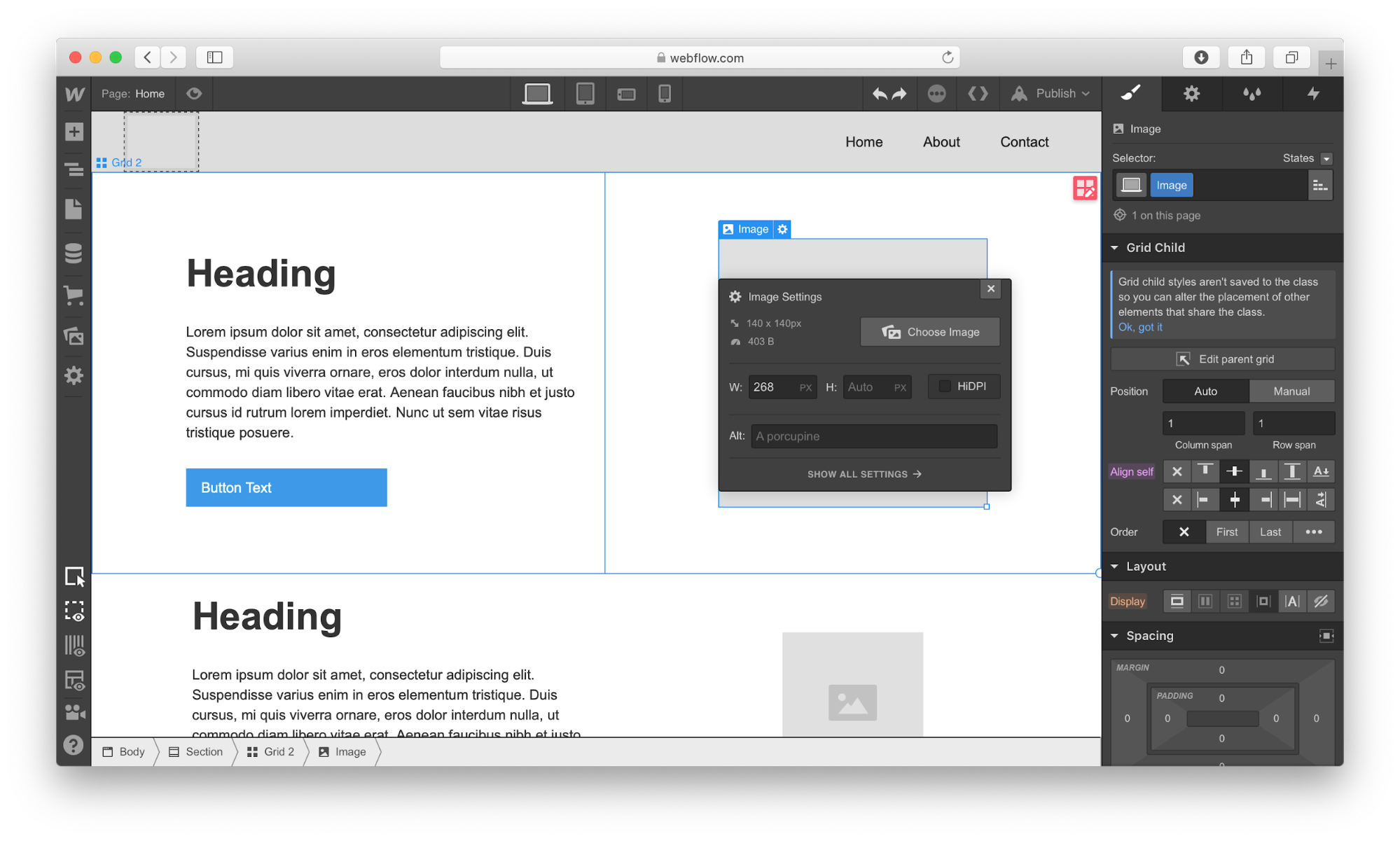
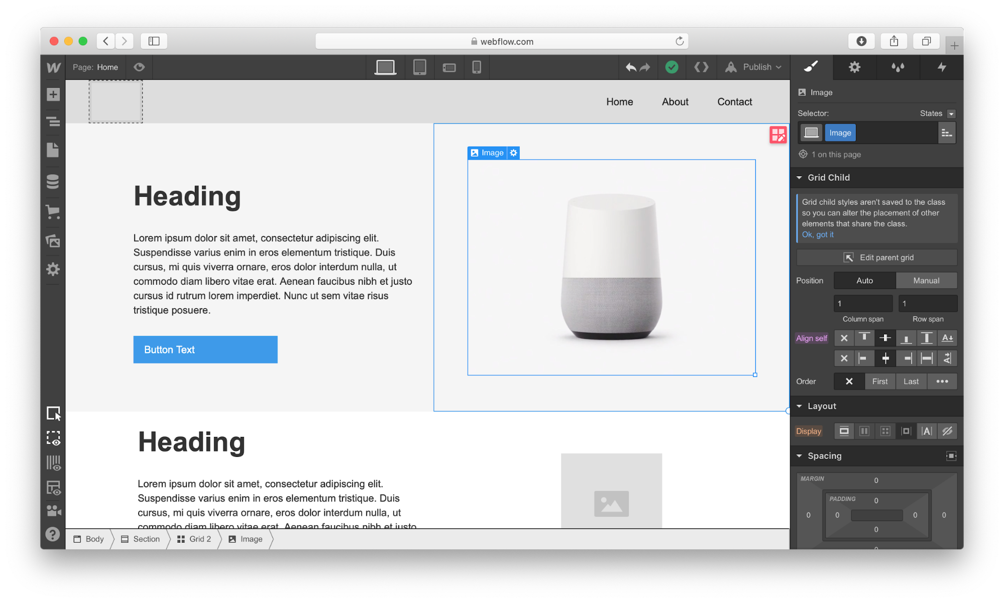
Next, we need to define the structure of our hero section. Let’s use Grid for that. Webflow has a very powerful Grid editor that simplifies the process of creating the right grid — you can customize the number of columns and rows, as well as a gap between every cell. Webflow also supports nested grid structure, i.e. one grid inside the other. We will use a nested grid for a hero section: a parent grid will define the image, while the child grid will be used for the Heading, text paragraph, and call-to-action button.
Now let’s place the elements in the cells. We need to use Heading, Paragraph, Button, and Image elements. By default, the elements will automatically fill out the available cells as you drag and drop them into the grid.
While it’s possible to customize the styling for text and images and add real content instead of dummy placeholders, we will skip this step and move to the other parts of the layout: the zig-zag layout.
For this layout, we will use a 2×3 grid (2 columns × 3 rows) in which every cell that contains text will be divided into 3 rows. We can easily create the first cell with a 3-row grid, but when it comes to using the same structure for the third cell of the master grid, we have a problem. Since Webflow automatically fills the empty cells with a new element, it will try to apply the 3-row child grid to the third element. To change this behavior, we need to use Manual. After setting the grid selection to Manual, we will be able to create the correct layout.
Once we have all the required elements in place, we can create a vertical rhythm by adjusting the position of every item that we use. First, we need to adjust the spacing of elements in grids. Change the margin and paddings and Align self for the image in order to place it in the center of the cell.
Now it’s time to replace the dummy content with real content. To start adding images, we’ll need to click on the gear icon for the Image element and select the image of our choice.
Webflow provides a visual style for every element we use in our design. Let’s take a Heading section as an example: It’s possible to play with font color, font, weight, spacing, shadows, and other visual properties of this object. Here is what we will have when adding real copy and playing with font color.
Once we have a nice and clean hero section, we can add content to our zig-zag layout.
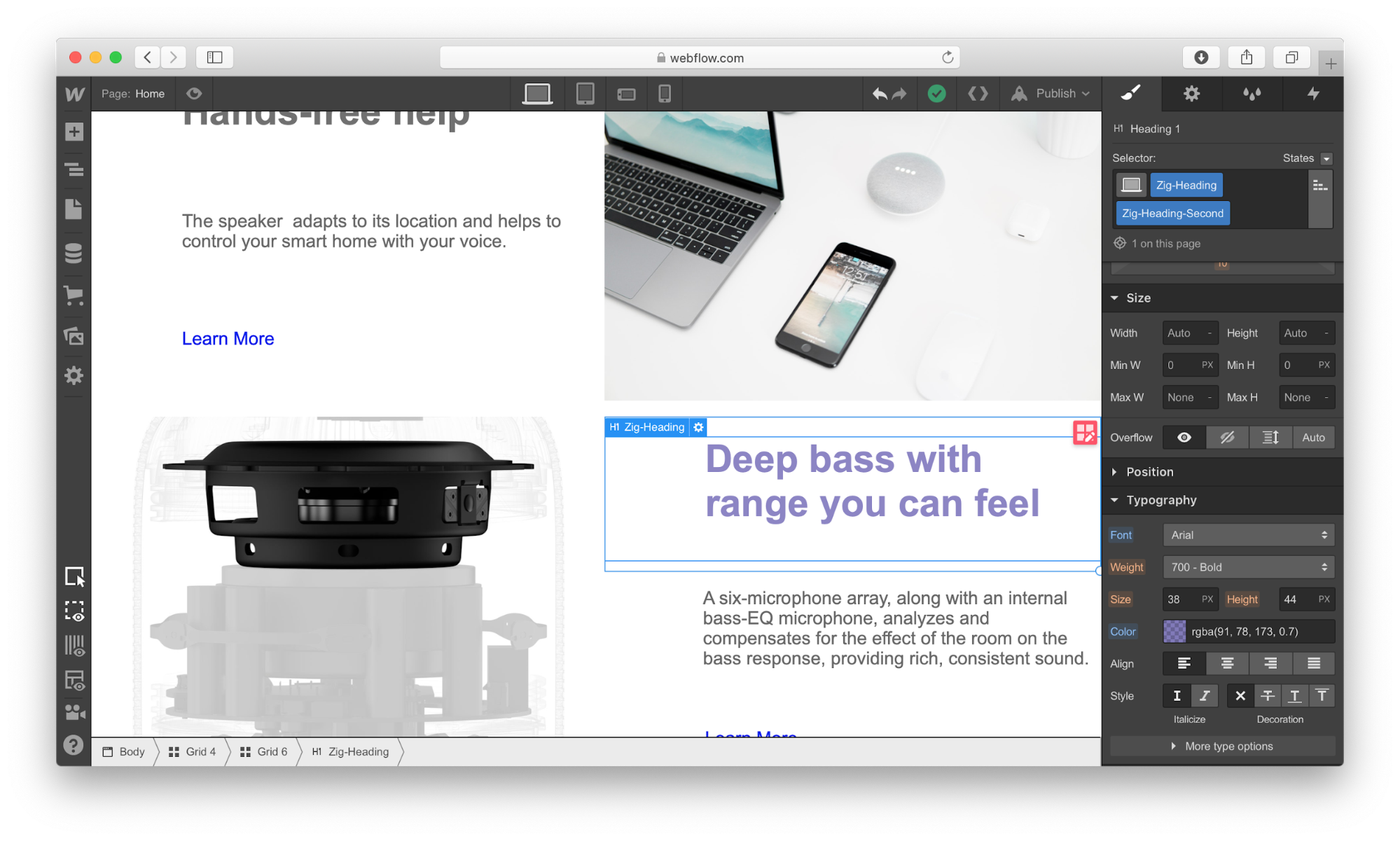
Notice that every time we style something, we give it a Selector (a class), so Webflow will know that the style should be applied specifically for this element. We can use the same class to style other elements. In our case, we need the same style for images, headings, descriptions, and links that we have in the zig-zag layout.
Applying the same “benefit” style for all images in the zig-zag section. (Large preview)
Webflow also allows creating combo classes — when one class is used as a base class, and another class is used to override the styling options of the base class. In the example below, we override the default font color of the Heading using the class “Zig-Heading-Second.” Combo classes can save you a lot of time because you won’t need to create a style from scratch.
Using a combo class for the Heading. The orange indicator is used to highlight the properties that were inherited from the base class. (Large preview)
Here is how our layout will look like after the changes:
Webflow provides a very helpful feature for aligning content named “guide overlay” which can be located in the left menu panel. When you enable the guide, you will see the elements that are breaking the grid.
After finishing with a zig-zag layout, we need to add information on voice commands in the Slider. Add a Heading section in a relevant slide and change the visual styling options of this object.
Last but not least, we need to add a contact form to our website. Let’s add a section right underneath of Slider.
There are two ways we can add a form to the page. First, Webflow has a special element for web forms called Form Block. A form created using Form Block has three elements: Name, Email Address, and a Submit button. For our form, we will need a Message field. We can easily create one by duplicating the element Email Address and renaming it. By default, the Form Block has 100% width alignment, meaning it will take the entire width of the container. We will use the Grid settings to adjust the form width.
Secondly, Webflow allows integrating custom code right in the page. It means that we can create a form in a tool like Typeform, copy the embed code it provides and place it to the component called Embed that we placed to the section. Note that embeds will only appear once the site has been published or exported — not while you’re designing the site.
Once all elements are in place, we need to optimize our design for mobile. Almost half of the users (globally) access websites on mobile. What you can do within Webflow is to resize the browser window so that you can see how your design looks like with different breakpoints.
Let’s change our view to Mobile by clicking on the Mobile - Portrait icon.
As you can see, the design looks bad on mobile. But it’s relatively easy to optimize the design using Webflow: It allows you to change the order of elements, the spacing between elements, as well as other visual settings to make the design look great on mobile.
After we’re done making changes to our design, we have two options: we can export the design and use it on our own web hosting (i.e., integrate it into your existing CMS) or we can use Webflow’s own hosting provided. If we decide to use the second option, we need to click the Publish button and select the relevant publishing options, i.e. either publish it on the webflow.io domain or on a custom domain.
If you decide to export the code, Webflow will prepare a full zip with HTML, CSS, and all the assets you’ve used to create your design. The exported code will help you build a solid foundation for your product.
Conclusion
Webflow is an excellent tool for building high-fidelity prototypes and inviting feedback from team members and stakeholders. People who will review your prototype won’t need to imagine how the finished product will behave and look — they can experience it instead!
The tool simplifies the transition from a prototype into a fully finished UI because you’re designing products with real code, as opposed to creating clickable mocks in Sketch or any other prototyping tool. You won’t waste time by using one piece of software to build prototypes and another to turning those prototypes into real products. Webflow solves this problem for you.
Of the many possibilities for tattoo designs, gun tattoos are a popular choice. These tattoos come in many shapes and sizes. Many gun tattoos portray old-fashioned style pistols, but any type of gun...
Cloud computing has taken the world by storm. It’s the most cost-efficient, secure, and reliable way to host any online project. And Amazon Web Services (AWS) sits right at the top, showering us with its amazing and powerful cloud infrastructure.
Amazon is known for its online shopping portal, but if you dig deeper, you’ll realize that they’re way bigger than you’ve imagined them to be. AWS is a powerful cloud computing platform that lets you harness their superior infrastructure for your own online projects. In fact, it’s so powerful that quite a few top companies in the world use it, including Netflix, BBC, LinkedIn, and even Facebook.
AWS is usually reserved for larger projects, but you can still take advantage of its power and scalability if you’re up to the task. In this step-by-step tutorial, I’ll show you how to install WordPress on AWS in just a few minutes.
Let’s deploy!
What is AWS?
Amazon Web Services (AWS) is a flexible and secure on-demand cloud computing platform. Think of it as renting a bunch of computers to do with them as you wish, including setting up a server to host your WordPress website.
AWS uses a pay-as-you-go pricing model, so you’ll only pay for the cloud infrastructure and resources you end up using. Depending on your use case, this can be a huge advantage or a big drain on your pockets.
Why AWS for WordPress?
There are many advantages of going with AWS for hosting your WordPress site. Here are the most important benefits:
Complete Ownership: AWS gives you total access to servers, storage, databases, and other application services. While AWS only owns the hardware for running these services, you’re in complete control of the server, including all your data.
Agility: Though the era of move fast and break things has kinda come to an end, the philosophy still endures. The cloud gives you easy and fast access to a broad range of technologies, so that you and your team can innovate faster.
Better User Experience: The AWS service is blazing fast, as its maintained by Amazon in multiple locations all across the world. This means lower latency and faster load times, and thus a better experience for your users.
Highly Scalable: With AWS, you have access to as much or as little computing infrastructure. You can scale up and down at the click of a button as per your website’s needs.
Cost Savings: The cloud allows you to own a server without any capital expense like data centers, servers, etc. And since Amazon takes care of all the infrastructure at scale, they can provide the service for you at a significant discount.
Some Considerations
This tutorial is the quickest and most economical way to get WordPress up and running on AWS. It’s perfect for websites with low traffic or no strict high availability requirements. If you’re looking to set up WordPress on AWS for a high traffic site, you can still scale up this deployment later easily.
Let’s Deploy WordPress on AWS
Step 1: Sign Up for an AWS Free Tier Account
AWS Free Tier gives you a 12 months free, hands-on experience with most of the services offered by AWS platform. It’s the best way to get started with AWS. Sign up for an account here.
Step 2: Go To Your AWS Management Console
To start off, log into your AWS account and open the AWS Management Console.
Step 3: Launch an Amazon EC2 Instance
In your AWS Management Console, find EC2 under Compute, and double-click on it to open the EC2 dashboard. Here, click Launch Instance to create and configure your EC2 instance.
Step 3: Install WordPress on your EC2 Instance
The AWS Marketplace has a lot of Amazon Machine Images (AMI) that you can use to quickly setup a good deal of common software. The AMIs are usually pre-configured with the ideal settings for running on AWS. We’ll be using one such AMI to install WordPress.
Click on AWS Marketplace on the left menu, search for WordPress, look for WordPress powered by BitNami, then hit the blue Select button.
Step 4: Confirm the Pricing for Your Instance
You’ll be presented a detailed pricing page. Don’t fret. Here, the price will be $0.00 for the software, regardless of the size of the instance that you use. Scroll to the bottom and select Continue.
For this tutorial, we will be using a free-tier eligible t2.micro instance. Click on t2.micro in the Type column, then click Next: Configure Instance Details. It may take a few seconds for it to load.
On the following screens, click Next: Add Storage and then Next: Tag Instance.
Step 5: Set the Key and Value Pair
Set a name for your instance. Enter Name in the Key box and WordPress in the Value box. Click Review and Launch to continue.
Step 6: Review the Instance One Last Time
Here, you can review your instance configurations before clicking Launch. This will start your Amazon EC2 instance running WordPress.
Step 7: Configuring Key-Pair for SSH
Key-pairs are how you can connect to your EC2 instances with a terminal program using Secure Shell (SSH). If you don’t know anything about SSH, you needn’t worry. Just keep in mind that you need to have a key-pair to log in to your terminal. We’ll not be setting a key-pair here.
Select Proceed without a key pair, and check the box to confirm that you know you need this key to access your EC2 instance.
Click Launch Instances to launch your instance. It may take a few minutes to start the instance.
Step 8: Your WordPress Instance is Running?
Click View Instances on the bottom right (you may need to scroll down). Then select the WordPress instance, make sure the Instance State says running. If Instance State says launching then AWS is still preparing your WordPress instance.
Step 9: Test Your Site
Once your instance is running, you can now test your WordPress website. Find the Public IP for your instance at the bottom of this page.
Copy the Public IP into a new tab in your web browser, and you should see the familiar Hello World WordPress home screen (the theme may vary depending on the installation type).
And there you go! You’ve successfully installed a new installation of WordPress on your AWS EC2 instance.
Step 10: Configuring Your WordPress Website
Now that you have your WordPress site up and running, it’s time to log into its admin page, so you can customize its settings. But to do that, you must find your admin password first. Here’s how you do that:
Go back to your EC2 dashboard and select your WordPress instance. Then, click the Actions button. In the drop down menu, select Instance Setting > Get System Log.
Scroll through the system log window to find the password. Hint: You can find it surrounded by hash marks. Copy the password to an external file.
Go to your WordPress website. Add /admin to the end of the URL, so it looks something like 55.192.55.555/admin. Hit enter. This will take you to your WordPress site’s login page.
To login, enter the default username (user) and the password that you just copied.
Congratulations! You can now manage, customize, and configure your WordPress site as you like. I suggest you to change your username and password right away.
The site we built here is good for a simple blog or a low-traffic business website, but if you’re looking to build a WordPress site for a business with high traffic, you need to go further. And this doesn’t come cheap. Here’s a great guide by Amazon on how to deploy a production-ready WordPress website on AWS.
Further Reading:This white paper by Amazon details how to improve both the cost efficiency and the user experience of your WordPress deployment. It also outlines how to address common problems associated with scalability and high availability requirements.
Great Freedom, Greater Responsibilities
Hosting your WordPress site on AWS can give you complete freedom over your server along with amazing performance, but setting it up is highly challenging. And maintaining it is even more so.
On a cloud host, you’re responsible for updating your server’s software packages and maintaining its security patches. You’re also in charge of making sure that the server’s resources are properly scaled as and when needed. And lastly, you need to take care that you don’t go broke when you finally see the bill. All this on top of making sure that your site is live at all times.
There’s a common joke in sysadmin communities. “Being a sysadmin is as easy as riding a bike. Except, the bike is on fire, and you’re on fire, and the road is on fire too. In fact, everything is on fire!”
That’s where a managed WordPress hosting solution like WPMU DEV Hosting comes in. It gives you the same performance as cloud hosting, but without worrying you about maintaining the server or its security. The pricing is fixed too. Everything’s taken care of for you by experts who live and breathe WordPress.
However, if you think you can take on the challenges of being a server admin, more power to you. Sysadmins rule!
Good prototyping tools give an accurate insight to designers as to how a product under design will work once the project is completed. These tools simulate application flow, measure and test expected performance. Also, they create a valid user experience. …
WordPress can be a complex beast for those not yet initiated… luckily a fellow WP dummy (who also happens to be a blog contributor) is on hand to explain WordPress to you in a way that anyone can understand… in 10 minutes max!
This is really hard for me, but I have to do it…
Full disclosure:
Hello everyone, my name is Rick Crawshaw, and I… am a WordPress dummy.
It’s kind of embarrassing, but It’s true.
I’m telling you this because, if you consider yourself a beginner…
Or if you’re new to the juggernaut that is WordPress…
You’re not alone!
And this article (and the video below) are for you.
Plus also for anyone who wants to start a website or blog with WordPress and doesn’t have the slightest clue of where to begin.
But the question begs:
Why Should You Take WordPress Advice From A Fellow Beginner?
Now although I’m definitely a “newb” when it comes to WordPress, from the day I started writing for WPMU DEV, I’ve continued to learn more and more about this popular platform.
I’ve also taken it upon myself to learn as much as I can about WP so I can succeed in my new role.
And I think that’s why I’m the perfect candidate to give you an introduction to the basics of the platform, and hopefully explain it in a way that ANYONE can understand.
After all I’ve been in your shoes and the basics are still fresh in my mind.
But Before We Go Any Further, Let’s Keep Those Pesky Lawyers At Bay…
By acknowledging the amazing Lisa Sabin-Wilson and her range of “WordPress For Dummies” publications (not an affiliate link fyi) so we don’t get in trouble for using the coined term.
In all seriousness, these books are fantastic resources for getting to know more about WordPress if you’re just starting out.
Okay, now that’s out of the way, let’s jump into our own WordPress article for dummies, brought to you by a real life WP dummy!
Starting with the obvious question:
What Is WordPress?
In simple terms, WordPress is a popular piece of software you can use to create your own website or blog.
Of course, since that time WordPress has evolved into a full-blown CMS with thousands of plugins, widgets, and themes for users to access (which we’ll get to later).
As we’ve already touched on, WordPress is also open-source, so rather than two people, as it was at the beginning – nowadays WordPress is updated and improved by a massive community of developers and contributors.
It’s also for this reason that WordPress continues to get better and remains the most popular website platform available for users in 2019.
Why Does Everyone Love On WordPress So Much?
So why are 34% of all websites online powered by WordPress? And what makes WordPress superior to the other website or CMS platforms out there?
Here are a few reasons that might help explain why:
It’s open source – As mentioned earlier, WordPress is open source and worked on and improved by a community of thousands of developers and experts from around the globe.
It’s easy to use – WP is highly accessible and prides itself on being user-friendly. As mentioned earlier, the great thing about this platform is that you don’t have to know how to write code to be able to create your own website. It can also be used by those with impaired vision.
It gives you access to all the latest and greatest developments – Because WordPress is a staple in the website and development world, you can be sure that any of the latest software or plugin initiatives are being crafted with WordPress in mind.
It’s highly flexible – No matter what type of website you’re trying to set up… whether it’s a personal blog or a high end e-commerce store – you can most likely create it in WordPress.
It’s customizable – It’s easy to add new features and functionality to your website with WP themes and plugins. Think of these as handy apps or add-ons for your website.
It can be accessed on all devices – You’re free to use WordPress on devices of all shapes and sizes, and you can access your website whether you’re on your desktop, laptop, or phone.
Hold On! Before We Go Any Further, Don’t Get “WordPress.org” and “WordPress.com” Confused Like I Did…
Before we press on, I should also mention that when I talk about “WordPress” in this article I am referring to “WordPress.org.”
Take it from me, it can be easy to get WordPress.org and WordPress.com mixed up, or to not even realise there are two different WordPress platforms.
So What Is The Difference Between The Two?
“WordPress.org” which is known as the “self-hosted” WordPress – is a free open-source software you can install on your own hosting and create a website that you 100% own.
“WordPress.com” on the other hand, is a for-profit piece of software that is powered by WordPress.org.
It’s simple to use, it’s free, however, the website is hosted by WordPress, as opposed to being your own site.
This means you can’t have your own domain name, and your URL will be something along the lines of: “http://examplewebsite.wordpress.com.”
You also have limited access to themes and plugins, so the changes you can make to your website are limited.
In general, if you’re chatting with someone about WordPress, they’ll more than likely be talking about WordPress.org.
Alrighty, now that we know some more about what WordPress (.org!) is… let’s get into some basics of setting up and actually using the software.
Before you set up your website or blog you’re going to need a domain name – the address of your website essentially.
You can purchase domains from a range of different Domain Registrars, and your domain can be separate from your hosting provider (which we’ll get into in a moment).
Your Domain Registrar may also be local, if you’d prefer your site address to be national (.co.nz) instead of international (.com).
Domain costs can vary, but in general a domain should set you back no more than $10 – $15.
Setting Up Hosting
Like domains, there are a number of different hosting provider options out there.
Here’s a quick run down of some different hosting types:
Shared Hosting – With shared hosting the service provider can serve multiple websites from a single web server. This is usually the least expensive option and can be a good choice for smaller websites and blogs.
Virtual Private Server (VPS) – A VPS means you have your own resources set aside for you on a shared server. This basically means that your website will not be affected by any other sites on your server when it comes to security and performance. This is a great option if your websites are starting to gain more traffic.
Managed WordPress Hosting – If you need the power of a VPS, but you could use more assistance from your provider – managed WordPress hosting could be the way to go. This type of hosting gives you all that a VPS does, along with the added advantage of ongoing support and guidance.
A Dedicated Server – These types of servers are ideal for larger companies that have massive amounts of traffic to pouring into their site. With a dedicated server you have access to the full resources of an entire server. If you only care about performance this option might be the way to go. Just be aware this power comes at a hefty cost.
Cloud Hosting – Cloud hosting works by spreading your website content throughout multiple servers, which helps to improve your site’s “uptime”. However, the increased uptime and security can be costly, but this is a great option for those who want to make sure their site is live for users 99.999% of the time.
Okay, once you’ve chosen the type of hosting, now you’re free to select a provider.
There’s no right or wrong answer when it comes to selecting a provider, as mentioned earlier, it could largely depend on your budget and the type of hosting you require.
Once you’ve decided on a host, you’ll just need to decide on the hosting package for you.
Most hosting providers will also include a free domain in their plan, otherwise you’ll be given the option to integrate from your Domain Registrar.
Installing WordPress
Install WordPress With “One Click”
Once you’re in a with a hosting provider and you have a domain, you’ll usually be able to install WordPress in “one click” via your host homepage as below:
Most hosting providers allow you to install WordPress in one click.
You’ll then be given some prompts which vary from company to company, but the set up should be fairly simple and straightforward.
Or Try The Famous WordPress 5 Minute Install…
Another option is also installing WordPress manually through the process famously known as the: “5 minute WordPress Install.”
Check out the video below to see the 5 minute install in action:
Once you’re all ready to go and you have WordPress installed, you can now start to familiarise yourself with the platform.
Navigating And Using WordPress (Dummies Style)
The WordPress Dashboard
Once you’ve logged in you’ll be greeted with the main administration screen, which is commonly known as the dashboard.
It’s here you can organize and put together your site. It’s where all of the magic happens basically.
At the top of your screen you’ll also see the toolbar. Here you can click on your site name and you’ll be taken directly to your website or blog.
Back to the dashboard… you’ll notice straight away it shows you the recent activity of your website.
It keeps you in the loop with insights, information, and news, courtesy of a number of different WordPress sources.
When you’re first starting out, you’ll also notice WordPress gives you prompts to help you get started creating your site:
You can choose to ignore these, or often they can be quite handy if you’re stuck on where to start.
To the left side of your dashboard you’ll see the main navigation menu which gives you access to a number of different administration functions.
Under each menu item, sub-menus will also appear for each.
Let’s briefly go over each menu item and how it functions…
First up we have posts:
Posts
Mosts website owners (especially blogs) know how important posting regular content can be.
Both from an SEO (search engine optimisation) and an audience standpoint (providing relevant and interesting content).
Through the posts menu item you can start writing and adding new posts, as well as editing posts that have already been published, or drafts that still require some work.
This includes images, audio files, video files and more.
You can also upload, manage, and edit all of your individual images and videos via this built-in media uploader.
Pages
Much like the posts, pages allows you to draft and publish static pages for your website.
You can edit and delete already published pages, you can also apply custom page templates to your pages.
Editing and publishing pages is also done using the Gutenberg editor, however, if needed you can also choose to use the classic editor by going to formatting and then selecting classic editor.
The comments menu item lets you view, edit, and delete all of the comments posted to your website.
As well as this, you can also view and manage comments that may require some moderation.
For example, based on your settings this could be comments that contain certain words that you deem inappropriate.
You can also choose to blacklist certain URLs or users that may have spammed you with comments in the past.
Appearance
The Appearance menu lets you manage your WordPress themes, allowing you to view, activate and edit them using the Theme Editor.
In a nutshell, themes are what give your website it’s overall look as well as providing it with specific functionalities.
Not happy with the way your website looks? Pick a new theme!
You can download and choose from a vast collection of free themes you’ll find on WordPress.
Or, if you can’t find what you’re looking for, you can always go off-site to find more premium themes from sites like ThemeForest.
As well as themes, the appearance menu allows you to directly customize what your site looks like, along with managing the menus of your site and how they work together.
You can also manage your widgets, which are little features that add more functionality to your pages or posts.
These could be things like a search field, a “recent posts” section, or editing what displays on the sidebar of your blog post page.
Plugins
Ah good old plugins… now these are a set of tools you’ll be using A LOT.
Plugins are pretty much extra features you can add to your website that your current theme or widgets do not have.
This could be anything from a contact form plugin, to a plugin that helps with SEO for your site.
Through WordPress you instantly have access to thousands of different plugins made by a community of other users and developers, available at WordPress.org and via the ‘Plugins’ menu.
Through this menu item you have the option of adding new plugins, as well as managing your existing plugins. As often you’ll find that new updates will be available for your plugins regularly.
Users
The users menu allows you to manage your users and subscribers, as well as edit your own profile.
If you’re the only one posting or editing your website then you’ll only need to worry about your own profile.
However, if you have a team, or maybe you have people contributing to your blog, it’s here that you can provide them with their own profile.
You can also provide users with different levels of accessibility.
For example, for someone contributing to the blog, you’ll only want to give them access to the post editor, rather than access to the design or coding of the rest of your site.
Tools
Using the tools menu item you can import data from another content management platform, or you might choose to export your current site data into a backup file if you choose.
You can also check on the health of your website, which is handy for making sure any plugins you have installed are free from viruses or hacking.
And you can also import or export personal data if you choose.
Settings
Finally we have the settings, where (as you guessed) you can manage the general options and preferences of your website.
Here’s a quick breakdown of what you can adjust and change:
General settings – Here you can adjust things like the title of your site, the address and the timezone.
Reading settings – Adjust the readability of your website, for example, what your homepage displays, how many blog pages to show, and whether or not you want search engines to see your posts.
Writing settings – Change the default post category, the post format, and your email if you want to post to WordPress via email.
Discussion settings – As touched on above, using these settings can help you manage and filter any comments you might receive or your website or posts.
Media settings – Set some defaults for the sizes of your images as well as how you’d like to organise the media files in your library.
Permalinks – This is slightly techie… but basically adjusting the permalink settings will adjust how the URLs of your posts and pages are displayed in the address bar.
Privacy – Finally, you can edit or preview your privacy policy page. As a website owner there are some national and international privacy laws you’ll have to ensure you adhere to. WordPress automatically sets you up with a page you can edit, but you also have the option of creating your own privacy policy.
And There You Have It!
A basic breakdown of what WordPress is and the basics you need to know about using the popular software… as told by a fellow WP dummy.
But even after this beginners explanation, if you’re still having trouble understanding WordPress…
Never fear!
WordPress Still Feeling Like A Mystery?
If you’re still having problems working out WordPress there are plenty of help forums, video tutorials, and documentation available in the WordPress community that can point you in the right direction.
You’ll find plenty of support and helpful information in the WordPress support forums.


