Although the new default theme will be based on Chaplin, it will not retain the same style.
“Using an existing theme as a base will help us get going on development faster,” Norén said. “Very little of the style of Chaplin will remain though, so it will still look and feel very much like its own thing.”
The screenshots he shared in the announcement look like a completely different theme. With just a few color and typography changes, along with a centered column for content, Twenty Twenty has its own distinct character.
Norén said he designed it to be a flexible, all-purpose theme suitable for businesses, organizations, and blogs, depending on the combination of blocks.
“The promise of the block editor is to give users the freedom to design and structure their sites as they see fit,” he said in the post introducing Twenty Twenty. “The responsibility of a theme is to empower users to create their inspired vision by making the end result look as good, and work as well, as the user intended.”
The theme uses Inter for the typeface, selected for its legibility and bold personality when used in headings. It also comes in a Variable Font version, which Norén said will be a first for WordPress default themes. The benefits are that it reduces the number of requests and decreases the page size.
Those who are adventurous can download Twenty Twenty right now from GitHub and play around with the theme in its current state. Once it is stable, Norén and his team plan to merge it into core and continue development on Trac. There will be weekly meetings held in the #core-themes Slack channel for those who want to contribute to the design and development. The first one is scheduled for Monday, September 9, 2019, 02:00 PM CDT.
ABB Group, a company that provides power and automation products, systems, and services, has announced the availability of a new API platform for smart home automation. The company took a major step forward in 2017 with the release of the Smarter Home Developer Program. Today’s announcement is a natural extension of lessons learned from previous endeavors.
UltraViolette is a contemporary portfolio theme with a minimalistic design style & smooth custom made animation effects. It features a beautiful collection of templates and elements designed with care, streamlined for designers & creative agencies – it’s ideal for showcasing creative output.
The most recent release of Chrome (76) added a new “loading” attribute that supports native lazy loading in the browser. An implementation for WordPress core is still under discussion. In the meantime, plugins that enable this for WordPress sites are starting to pop up, and Google has just released one of its own.
Native Lazyload was created by Google engineer Felix Arntz and the team behind the official AMP and PWA plugins for WordPress. It lazy loads images and iframes with the new loading attribute for browsers that support it. It also includes a fallback mechanism for browsers that do not yet support it, but this can be disabled with a filter. The plugin has no settings – users simply activate it and it works.
In a post introducing the new plugin, Arntz explains why current lazy loading options, which require custom JavaScript, are not always good for performance:
Lazy-loading has for a long time not been a switch you can just toggle to make it work. It was not a browser feature, so it typically required loading and running custom JavaScript logic to make it work. Unfortunately, JavaScript itself is an expensive resource, so lazy-loading as it’s been done so far might in certain cases actually have a negative impact on performance (e.g. if a page doesn’t contain any images or only contains a single image that’s immediately visible). Furthermore, if a user had disabled JavaScript in their browsers, lazy-loading wouldn’t work at all.
The plugin uses a similar implementation that is being discussed in the core ticket. Arntz described it as a “progressive enhancement,” where a user’s website performance will “magically improve without intervention,” as more browsers add support for the loading attribute.
With the release of this plugin, and Google’s input on the related trac ticket, it’s clear that the company is interested in seeing WordPress core support the new loading attribute. Chrome Engineering Manager Addy Osmanicommented on the ticket 10 days ago to lend his support for the effort and make a few recommendations.
“I’m very supportive of core getting support for native lazy-loading in a non-destructive manner,” Osmani said.
“The ideal change I would love to see in lazy-load plugins is deferring to native lazy-loading where supported and applying their fallback where it is not.” Osmani estimates that more than 17K origins are already using loading=lazy, according to Google’s telemetry.
Andy Potts, a software engineer at the BBC reported seeing major performance improvements after adopting native lazy loading. He implemented it on one of the company’s internal products, a site with approximately 3,000 active users per day:
“One of the most common actions on the site involves running a query which renders a list of up to 100 images — which I thought seemed like the ideal place to experiment with native lazy loading,” Potts said.
“Adding the loading attribute to the images decreased the load time on a fast network connection by ~50% — it went from ~1 second to < 0.5 seconds, as well as saving up to 40 requests to the server. All of those performance enhancements just from adding one attribute to a bunch of images!”
Kris Gunnars, who operates searchfacts.com, added Google’s new Native Lazyload plugin to his site and reported remarkable performance improvements, especially on mobile.
“After I installed this, my mobile PageSpeed score went from 92 to 96 and it also shaved a whopping 1.5 seconds off of my Time to Interactive score,” Gunnars said.
With WordPress powering 34.5% of the top 10 million websites, core support for native lazy loading stands to make a huge impact on the overall performance of the web. Progress on the ticket has been slow, as contributors continue discussing the best approach. In the meantime, users who are anxious to implement it on their sites can install any one of a number of plugins that are already available.
Extended Support for SQL Server 2008 and 2008 R2 ended in July 2019, and Extended Support for Windows Server 2008 and 2008 R2 will end in January 2020. Upgrading the software to the latest versions is always an option, of course, but for a variety of reasons, that may not be viable or cost-effective for some legacy applications. Another option is to pay an additional fee to continue receiving Extended Security Update support for three more years. But for most organizations, the best option will be to get continued support for free by moving the databases to the Azure cloud.
This article highlights the considerations and challenges involved when migrating mission-critical SQL Server 2008/R2 databases to the Azure cloud and offers some useful suggestions to help avoid common pitfalls.
For this particular sub I type the customer id in a text box and then click the button, then I'm trying to get the relative information pertaining to that id.
Not sure what I am doing wrong.
Comes back with an error message of
system.data.sqlclient.sqlexception
Recursive common table expression '[customers]' does not contain a top-level UNION ALL operator.
Private Sub FillByCustomerIDToolStripButton_Click(ByVal sender As Object, ByVal e As EventArgs) Handles FillByCustomerIDToolStripButton.Click

        Try

            Dim customerID As Integer = CInt(CustomerIDToolStripTxtBox.Text)

            ' LOAD THE CUSTOMERS TABLE WITH THE SELECTED CUSTOMER.
            Dim id = Me.CustomersTableAdapter.FillByCustomerID(Me.DatabaseDataSet.customers, customerID)
            If Me.DatabaseDataSet.customers.Count > 0 Then

                For Each row As DataRow In DatabaseDataSet.customers.Rows
                    Dim i = row(id)

                    CustomerIDTextBox.Text = Me.CustomersTableAdapter.FillByCustomerID(Me.DatabaseDataSet.customers, customerID)
                    NameTextBox.Text = Me.CustomersTableAdapter.GetDataBy(customerID).Rows(i)(1).ToString

                Next

                ' LOAD THE INVOICES TABLE WITH THE CUSTOMER'S INVOICES.
                Me.InvoicesTableAdapter.FillByCustomerID(Me.DatabaseDataSet.invoices, customerID)

            Else

                MessageBox.Show("No Customer was found with that ID.", "No Customer Found.", MessageBoxButtons.OK, MessageBoxIcon.Error)

            End If

        Catch ex As Exception

            MessageBox.Show(ex.Message, ex.GetType.ToString)

        End Try

    End Sub
DevOps has been a hot topic for many years, but it's still common for organizations to feel overwhelmed by the complexity of automating their entire infrastructure and to get hung up on which tools to use.
An integrated set of DevOps tools for monitoring has the power to improve visibility and productivity, achieve higher-performing systems, and establish cross-functional collaboration. The right toolset is more than the tools themselves — it’s about developing the culture, discipline, and practices that come to define your product/service and your workplace.
Chances are, while you’re reading this, there are frantic boardroom meetings happening in some parts of the world. Imagine CxO’s shivering to their bones, urging their IT security teams to "do something" about the web application security breach they’ve been hit by. That’s how web application security breaches are.
Open doors you never have before with these shortcuts
In this article, you find some useful shortcuts for VS Code, which will help you to build or frame your programs. Shortcuts in programming are important, as they make life easier for developers — not to mention, at least to me, they feel like you're playing with your keyboard.
To use the shortcuts, you have to install some pluggings and VScode extensions to accelerate your program flow and have a great experience.
Here, I am going to discuss how to generate Barcodes or QR codes in Xamarin for Android. In order to do this, we need to get some information from the user, such as what message they want to convert, the code format they want to use, and their desired bitmap size. There is no default library for this, so we need to install a plugin.
Just write a few lines of code to generate 1D and 2D code. Barcodes have different formats, but I will demonstrate only a few code formats — Code 39, Code 128, AZTEC, and QR Code. Below is our final output for the project, so you can visualize our end-result throughout the tutorial.
Still not sure why they didn't just use the eagles from the beginning
Through this article, I would like to list down the detailed steps for communicating from a device to a server in the cloud running a scalable Kafka infrastructure and back from Kafka to the device using Mosquitto broker and Kafka connect.
The Equifax security breach was among the worst ever in terms of the number of people affected and the type of information breached. Information such as names, SSNs, birth dates and addresses are considered the Holy Grail of personal data that allows hackers to gain access to anyone’s personal, financial, and health records.
While frequent incidents of security breaches have brought enough anxiety in corporate America, it’s the complexity of managing cybersecurity and addressing unanswered questions that really have enterprises nervous.
Graphic design is a top choice job for a lot of people. It allows you to put your creative juices to good use, there are opportunities for advancement, and good pay. The downside is that the cost of training can be quite expensive. There is no guarantee that you’ll get a job after the training. […]
I've recently noticed an interesting change on CodePen: on hovering the pens on the homepage, there's a rectangle with rounded corners expanding in the back.
Expanding box effect on the CodePen homepage.
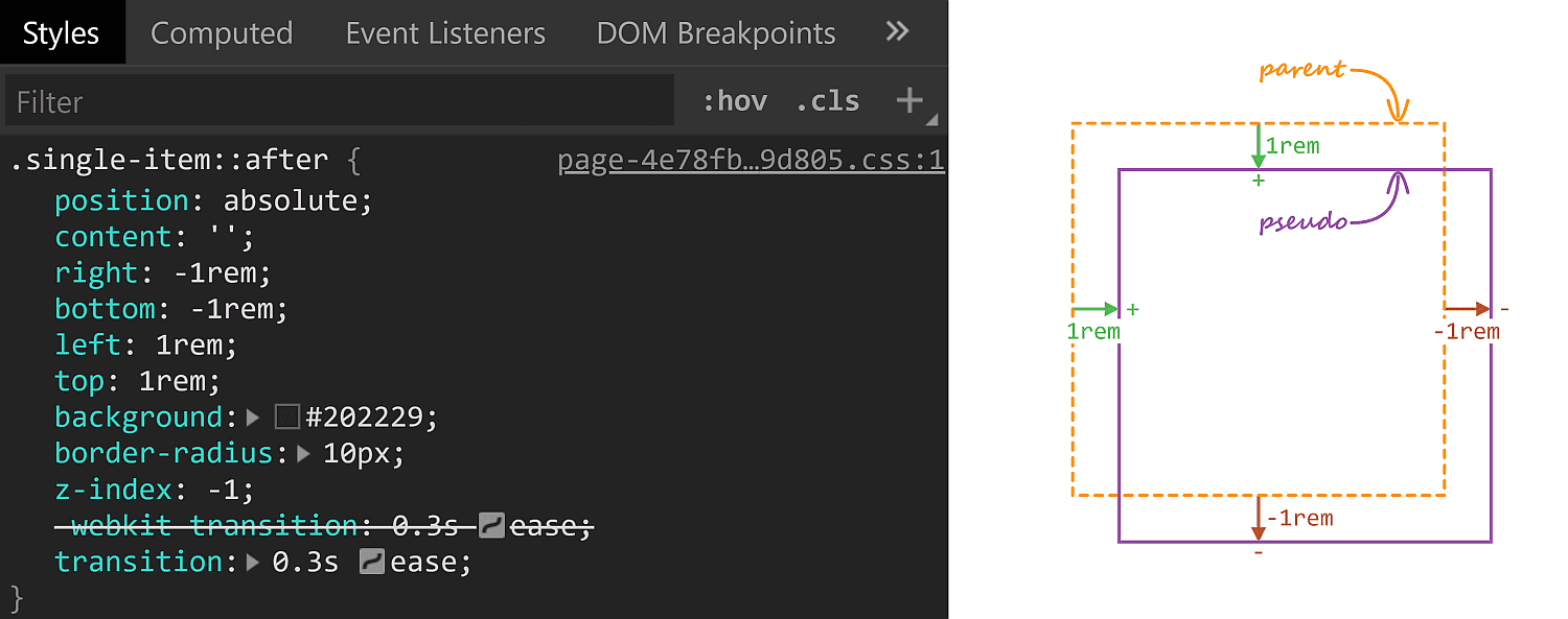
Being the curious creature that I am, I had to check how this works! Turns out, the rectangle in the back is an absolutely positioned ::after pseudo-element.
Initial ::after styles. A positive offset goes inwards from the parent's padding limit, while a negative one goes outwards.
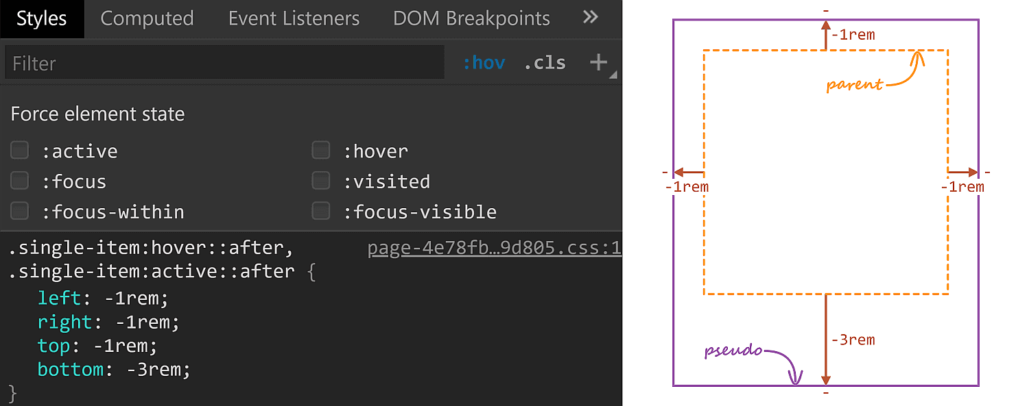
On :hover, its offsets are overridden and, combined with the transition, we get the expanding box effect.
The ::after styles on :hover.
The right property has the same value (-1rem) in both the initial and the :hover rule sets, so it's unnecessary to override it, but all the other offsets move by 2rem outwards (from 1rem to -1rem for the top and left offsets and from -1rem to -3rem for the bottom offset)
One thing to notice here is that the ::after pseudo-element has a border-radius of 10px which gets preserved as it expands. Which got me to think about what methods we have for expanding/shrinking (pseudo-) elements while preserving their border-radius. How many can you think of? Let me know if you have ideas that haven't been included below, where we take a look at a bunch of options and see which is best suited for what situation.
Changing offsets
This is the method used on CodePen and it works really well in this particular situation for a bunch of reasons. First off, it has great support. It also works when the expanding (pseudo-) element is responsive, with no fixed dimensions and, at the same time, the amount by which it expands is fixed (a rem value). It also works for expanding in more than two directions (top, bottom and left in this particular case).
There are however a couple of caveats we need to be aware of.
First, our expanding element cannot have position: static. This is not a problem in the context of the CodePen use case since the ::after pseudo-element needs to be absolutely positioned anyway in order to be placed underneath the rest of this parent's content.
Second, going overboard with offset animations (as well as, in general, animating any property that affects layout with box properties the way offsets, margins, border widths, paddings or dimensions do) can negatively impact performance. Again, this is not something of concern here, we only have a little transition on :hover, no big deal.
Changing dimensions
Instead of changing offsets, we could change dimensions instead. However, this is a method that works if we want our (pseudo-) element to expand in, at most, two directions. Otherwise, we need to change offsets as well. In order to better understand this, let's consider the CodePen situation where we want our ::after pseudo-elements to expand in three directions (top, bottom and left).
The relevant initial sizing info is the following:
Since opposing offsets (the top-bottom and left-right pairs) cancel each other (1rem - 1rem = 0), it results that the pseudo-element's dimensions are equal to those of its parent (or 100% of the parent's dimensions).
...is not enough, as this makes the height increase the downward direction by 4rem instead of increasing it by 2rem up and 2rem down. The following demo illustrates this (put :focus on or hover over the items to see how the ::after pseudo-element expands):
But, to be honest, this feels less desirable than changing offsets alone.
However, changing dimensions is a good solution in a different kind of situation, like when we want to have some bars with rounded corners that expand/shrink in a single direction.
Note that, if we didn't have rounded corners to preserve, the better solution would be to use directional scaling via the transform property.
Changing padding/border-width
Similar to changing the dimensions, we can change the padding or border-width (for a border that's transparent). Note that, just like with changing the dimensions, we need to also update offsets if expanding the box in more than two dimensions:
In the demo above, the pinkish box represents the content-box of the ::after pseudo-element and you can see it stays the same size, which is important for this approach.
In order to understand why it is important, consider this other limitation: we also need to have the box dimensions defined by two offsets plus the width and the height instead of using all four offsets. This is because the padding/ border-width would only grow inwards if we were to use four offsets rather than two plus the width and the height.
In spite of these limitations, this method can come in handy if our expanding (pseudo-) element has text content we don't want to see moving around on :hover as illustrated by the Pen below, where the first two examples change offsets/ dimensions, while the last two change paddings/ border widths:
This is another approach that works great for the CodePen situation, though I cannot really think of other use cases. Also note that, just like changing offsets or dimensions, this method affects the size of the content-box, so any text content we may have gets moved and rearranged.
Changing font size
This is probably the trickiest one of all and has lots of limitations, the most important of which being we cannot have text content on the actual (pseudo-) element that expands/shrinks — but it's another method that would work well in the CodePen case.
Also, font-size on its own doesn't really do anything to make a box expand or shrink. We need to combine it with one of the previously discussed properties.
For example, we can set the font-size on ::after to be equal to 1rem, set the offsets to the expanded case and set em margins that would correspond to the difference between the expanded and the initial state.
If you've read pieces on animation performance, then you've probably read it's better to animate transforms instead of properties that impact layout, like offsets, margins, borders, paddings, dimensions — pretty much what we've used so far!
The first issue that stands out here is that scaling an element also scales its corner rounding, as illustrated below:
We can get around this by also scaling the border-radius the other way.
Let's say we scale an element by a factor $fx along the x axis and by a factor $fy along the y axis and we want to keep its border-radius at a constant value $r.
This means we also need to divide $r by the corresponding scaling factor along each axis.
However, note that with this method, we need to use scaling factors, not amounts by which we expand our (pseudo-) element in this or that direction. Getting the scaling factors from the dimensions and expansion amounts is possible, but only if they're expressed in units that have a certain fixed relation between them. While preprocessors can mix units like in or px due to the fact that 1in is always 96px, they cannot resolve how much 1em or 1% or 1vmin or 1ch is in px as they lack context. And calc() is not a solution either, as it doesn't allow us to divide a length value by another length value to get a unitless scale factor.
This is why scaling is not a solution in the CodePen case, where the ::after boxes have dimensions that depend on the viewport and, at the same time, expand by fixed rem amounts.
But if our scale amount is given or we can easily compute it, this is an option to consider, especially since making the scaling factors custom properties we then animate with a bit of Houdini magic can greatly simplify our code.
This is a method I really like, even though it cuts out pre-Chromium Edge and Internet Explorer support.
Pretty much every usage example of clip-path out there has either a polygon() value or an SVG reference value. However, if you've seen some of my previous articles, then you probably know there are other basic shapes we can use, like inset(), which works as illustrated below:
So, in order to reproduce the CodePen effect with this method, we set the ::after offsets to the expanded state values and then cut out what we don't want to see with the help of clip-path:
Furthermore, it doesn't really break anything in non-supporting browsers, it just always stays in the expanded state.
However, while this is method that works great for a lot of situations — including the CodePen use case — it doesn't work when our expanding/shrinking elements have descendants that go outside their clipped parent's border-box, as it is the case for the last example given with the previously discussed scaling method.
We can count the number of user to user problems social problems in all our years of existence, that we know about, on one hand. But that doesn't absolve us of building community safety tools, especially as we plan on doing more with the social features of CodePen.
The basics of blocking: When you block another user, they can't see any of your work individually (while logged in as themselves) or interact with you in any way.
There is nuance to all this (for example, you may still see their work mixed in within grids around the). Rather than hash that all out in this blog post, we have docs:
Are you looking for an easy registration and login plugin for your WordPress site? For it, you can find the best user registration WordPress plugins through which you don’t have to fill any signup forms or log in separately. The login page is the gateway to your WordPress website admin panel. You can make your [...]
This week, we look into the recent API vulnerability in Cisco routers, how MuleSoft handled severe vulnerability in their API gateway, API security aspects of communication PaaS, and passes for upcoming API World conference in San Jose, CA.
Cisco has implemented its REST API as a virtual service container for IOS XE. This operating system is used on a variety of Cisco routers. It is not enabled by default but needs to be installed by administrators who need the REST API functionality.