Building a bot is a rewarding experience: creating your own artificial intelligence is amazing! However, it can be a challenge, and there are mistakes to avoid. In this piece, we’re going to walk you through the most common or damaging mistakes new bot builders make in each phase of bot building: conception, training, building, connection, user experience, and maintenance. Let’s roll!
Conception
Building a bot doesn’t start at the first line of code. It starts much earlier, during the conception.
Sometimes, when you are performing unit or integration tests whilst developing code, you need to be able to do something extreme, such as mangling a test database or two, repeatedly, each time subsequently restoring it to its original state before running the next test. Often, especially in integration tests when you are testing processes, you will need run a ‘setup’ process to establish a known database data state, then run the process, test that the final data state matches that which your business rules dictate it should be, and finally run a ‘teardown’ process to restore things to how they were at the start.
The difference with a unit test is that the developer is constantly running the test and resents it if the set up or teardown processes take any delay longer than what in my misspent youth we’d call ‘the time it takes to roll a cigarette.' Integration tests are generally done in a more dignified manner after the build, so there is less pressure on time. In this case, it is a unit test that we need, though it can be adapted as an integration test if the component under test gets to be part of a process.
2025 is the year where AR is estimated to be crucial in the business world. In this era of modern technology’s development, businesses must focus on implementing AR technology itself, as it is expected to expand up to $150 billion by 2020, according to Digi-Capital fundamental.
Augmented reality is the next big technology that delivers 3D high definition audio and video experience to its users. This technology uses markers and sensors to overlay digital environment in the real world that enable users with more intensely and vividly experiences.
Design A Lead Gen Landing Page For Mobile That Converts
Design A Lead Gen Landing Page For Mobile That Converts
Suzanne Scacca
There is a huge difference between a website (which can generate leads) and a lead capture page (which is only supposed to generate leads).
Websites tell visitors:
This is all of the stuff we can do for you. Have a look around and let us know when you’re ready to spend some money!
Lead capture pages, instead, tell visitors:
We have this one super valuable thing we want to give you for free. Share your name, email address and maybe a couple of other details and we’ll hand it straight over!
There’s also a significant difference in how the two are designed.
Unbounce has a nice side-by-side comparison that shows this difference in design between the two:
Unbounce contrasts the design of a web page with a lead capture page. (Source: Unbounce) (Large preview)
The only problem with this is that it depicts the design from a traditional desktop perspective. Just as you would consider the differences in conversion between a desktop and mobile website, you have to do the same for their landing pages.
In the following post, I’m going to give you some points to think about as you design lead capture pages for mobile audiences. I’ve also analyzed a number of landing pages on mobile so you can see how the design criteria may change based on what you’re promoting and who you’re trying to promote it to.
The Difference Between A Website And Lead Capture Page
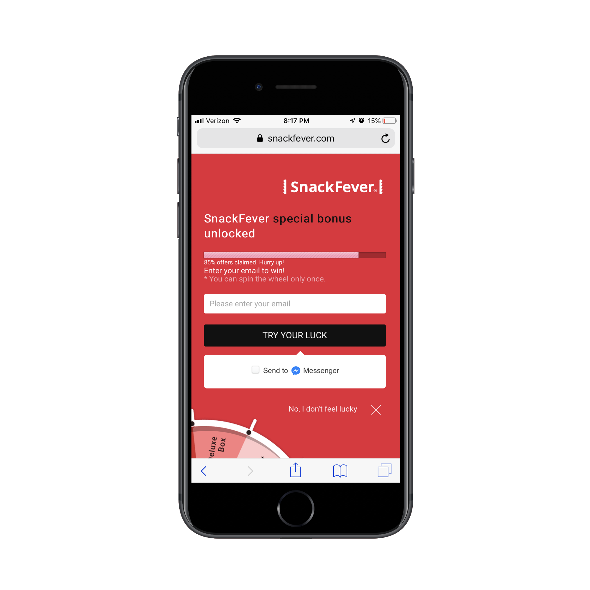
Technically, this is a lead capture pop-up. However, on mobile, SnackFever has turned this into a full page design (which is a much better choice).
This is a pretty awesome example of why you should be designing different experiences for different devices.
You can see that this is much more succinct and easy to stay engaged with as it has a singular purpose. The goal here is to capture that lead ASAP. This is not designed to give them room to walk around the site and ponder other decisions.
This is exactly why you should be building lead capture pages away from the website. It doesn’t matter what kind of lead generation you’re using to lure visitors there:
eBooks, white papers and other custom reports
Courses or webinars
Checklists
Calculator or quiz results
Discounts or coupons
Demos or consultations
Free trials
By moving potential leads over to a distraction-free landing page full of highly targeted messaging and visuals, you can improve your chances of converting them into leads. It might not be a purchase, but you’ve helped them take that first step.
Design Tips For Lead Capture Pages On Mobile
Before you do anything else, I’d urge you to take a look at your website’s Google Analytics data. Specifically, go to Audience > Mobile > Overview and look for this:
This is the average amount of time your mobile visitors spend on your website.
This data point will be helpful in determining, realistically, how long you have to capture and hold the attention of your mobile visitors.
An even better way of doing this is to go to Behavior > Site Content > All Pages. Then, set the Secondary Dimension to Mobile (including Tablet) and click on the new dimension filter so that the “Yes” values go to the top:
This lets you see how individual pages perform in terms of time on page with mobile visitors.
Look closely at any pages that have a strong and singular CTA, like a dedicated service or product page. You can use those times as an average benchmark for how long mobile visitors will stay engaged with a page that’s similarly structured (like your lead capture page).
Now that you have an idea of what your mobile visitors’ threshold is, you’ll be better prepared to design a lead capture page for mobile. The only thing is, though, it’s not that cut-and-dried.
I wish it were as easy to say:
Write a headline under 10 words.
Write a memorable description under 100 words.
Add a form.
Design an eye-catching button.
You’re done.
Instead, you’ll have to think dynamically about how your lead capture page will best convert visitors to it.
Here are the various things to consider as you design each part of your mobile landing page:
#1: Navigation
The navigation menu is a critical part of any website. It allows visitors to move around the site with ease while also gaining a better understanding of all that’s available within the walls of it.
But lead capture pages don’t exist within a website’s navigation. Visitors, instead, encounter promotional links or buttons on web pages, in emails, on social media and via paid ads in search. Upon clicking, they’re taken to a landing page that’s reminiscent of the website, but has a unique style of its own.
Now, the question is:
Should your lead capture page include the main website’s navigation atop it?
If the goal of a lead capture page is to capture leads, then it should have just one clickable call-to-action, right? Wouldn’t logic dictate that a navigation menu with links to other pages would serve as too much of a distraction? And what about the brand logo? After all, any other links will send the signal:
“Hey, it’s okay if you want to abandon this page.”
Instead of saying:
“We weren’t kidding. Look at how amazing this offer is. Scroll down and claim yours now.”
I’d say that the navigation should only be included when the website is already successfully converting visitors into paying customers/subscribers/members/readers. If the lead gen is merely there as a bonus element, then it’s not a big deal if visitors want to backtrack to the site.
The logo should be fine to keep as it’s more of a branding element than a competing link in this context though. Take, for instance, this sweepstakes giveaway on the Martha Stewart website:
In general, if you need this lead gen offer to truly be a vehicle to grow your email list, the navigation should not be there. Nor should other competing links that draw them away from conversion.
#2: Copy
All of the usual rules for typography in mobile web design apply here — that includes size, spacing, color and font face. All of the rules you’d adhere to in terms of formatting a page for mobile apply as well. For example:
Very succinct headlines;
Short and punchy paragraphs;
Bulleted or numbered lists to describe points quickly;
Header tags to break up large swaths of text;
Bolding, italics, hyperlinks and other stylized text to call attention to key areas.
What about the amount of copy on the page though? Typically, the answer for mobile is:
Write only as much copy as you need to.
That is indeed the case with mobile lead capture pages… but there’s a catch.
Some lead gens are easier to “sell”, which means you shouldn’t need much more than the following to get people to convert:
A short and descriptive headline;
A paragraph explaining why the lead gen is so valuable;
Three to five bullets breaking out the benefits;
A short form asking for the basics: name, email and maybe a phone number.
A brightly colored and personally worded call-to-action button.
There are other cases where the lead gen offer requires more convincing. Or when the brand behind it decides to use the page’s copy as a way to qualify leads. You’ll see this a lot if the lead gen is something that requires an investment of time on the part of the brand. For instance:
Product demos
Consultations or audits
Webinars (sometimes)
In these cases, it makes more sense to write a lengthy lead capture page. Even then, I go back and forth on this because I’m just not sure that’s the smartest move for mobile visitors. So, what I’m going to suggest is this:
If you’re building a lead capture page for a well-established brand that’s known for overly-long pages and whose leads are valued at over $1,000 each, a super lengthy lead capture page is fine.
If you’re building a lead capture page for a newish brand that simply wants to grow their email list fast, don’t make visitors wait to convert.
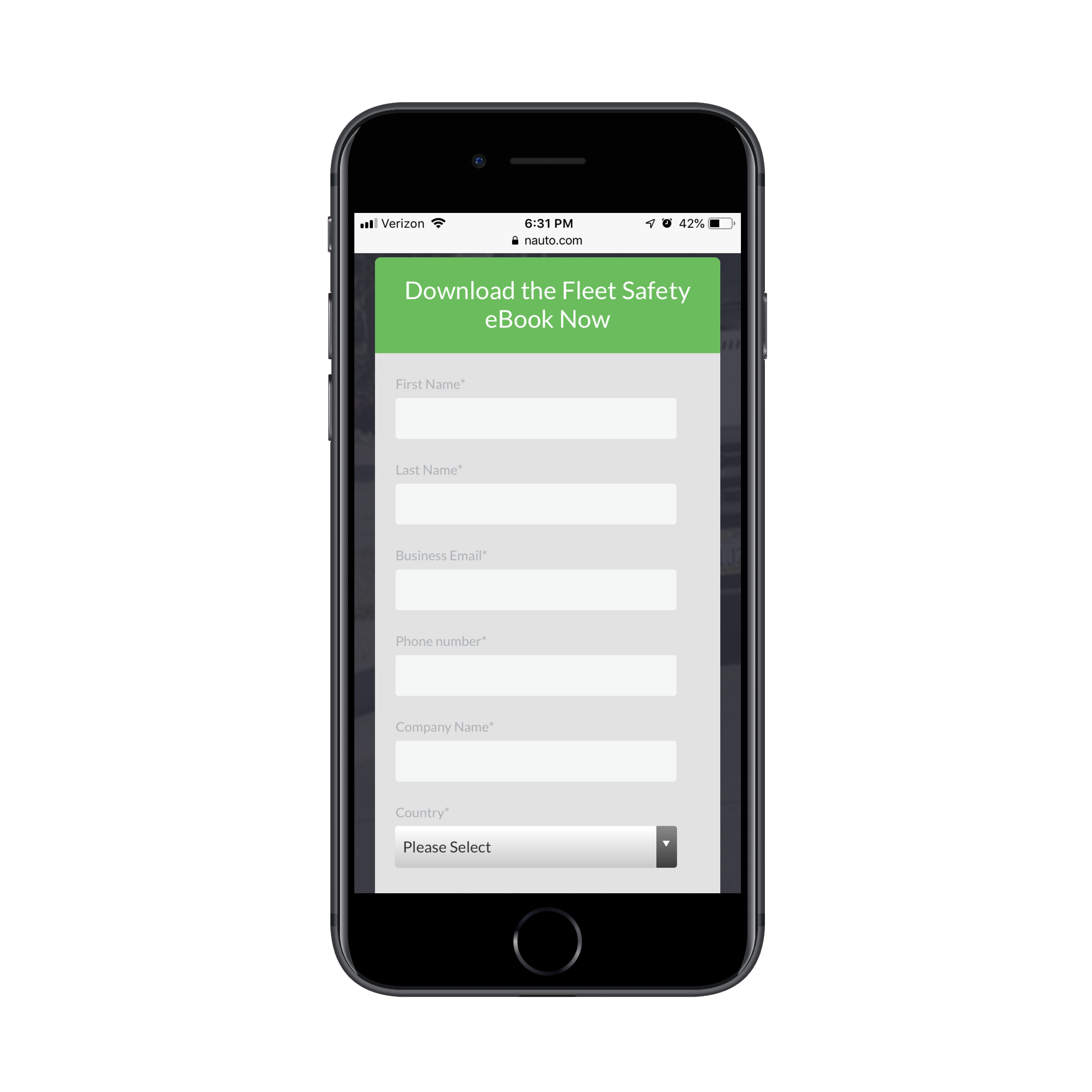
Get a look at this landing page from Nauto for a free eBook:
It could’ve been as simple as that. However, Nauto continues on with more copy after the CTA:
Nauto includes additional copy after its lead capture form. (Source: Nauto) (Large preview)
What’s interesting here is that this part of the page essentially rewrites the intro at the top of the page. My guess is that they did this to strengthen the SEO of the page with a longer word count and a reiteration of the main keywords.
Either that or they found that visitors weren’t immediately filling out the form and needed a little more encouragement. That would explain why a couple more scrolls down take you through a closer look at the content of the eBook as well as another link to download it (which just returns you to the form):
Nauto includes another CTA for the lead capture form. (Source: Nauto) (Large preview)
Clearly, you can still write a whole bunch of copy after the lead gen form, so long as there’s a good reason for it.
#3: Lead Capture Form
Nick Babich has a great piece on how to design forms for mobile. Although the guide pertains more to e-commerce checkout forms, the same basic principles apply here, too.
There are a number of other factors you should consider when designing forms to capture leads on a dedicated landing page.
Where should you place the form?
I’ve mostly answered that question in the above point about copy. But, if we want to be more specific, the lead capture form should always appear within no more than three swipes on mobile.
Realistically, the initial glance at a lead capture page should be an engaging visual element and headline. The next swipe down (if needed) should be an explainer paragraph and short list of benefits. Then, you should take them right to the form.
This is an example from GoToMeeting’s eBook lead capture page:
They’ve truncated all of those key intro elements into the top header design.
Can you write the labels differently?
No, labels should never be tampered with, especially on mobile. Keep them clear and to the point. Name. Email. Business. # of employees. Etc.
What you can and should do differently, though, is to create more engaging form titles and CTAs. Or you can encapsulate the form within brightly-colored borders.
The whole point of this page is to convert visitors on a single element. While you can’t play with the field labels, you can increase their engagement with the outlier text and design.
How many fields should you include?
The answer to this is always “only the ones that are necessary”. However, you don’t want to go too far towards the simple side if the purpose of the lead gen is to qualify leads.
If all you’re doing is growing an email list, sure, Name and Email will suffice. If your goal is to provide something of value to the people who really need it and, later, follow up and start them on the sales journey, the lead capture form needs to be longer.
Here’s another look at the GoToMeeting landing page:
You can tell right away they’re not trying to give this eBook out to any and everyone. This is for a specific kind of business and they’re likely going to filter the leads they receive from it based on job title and country, too.
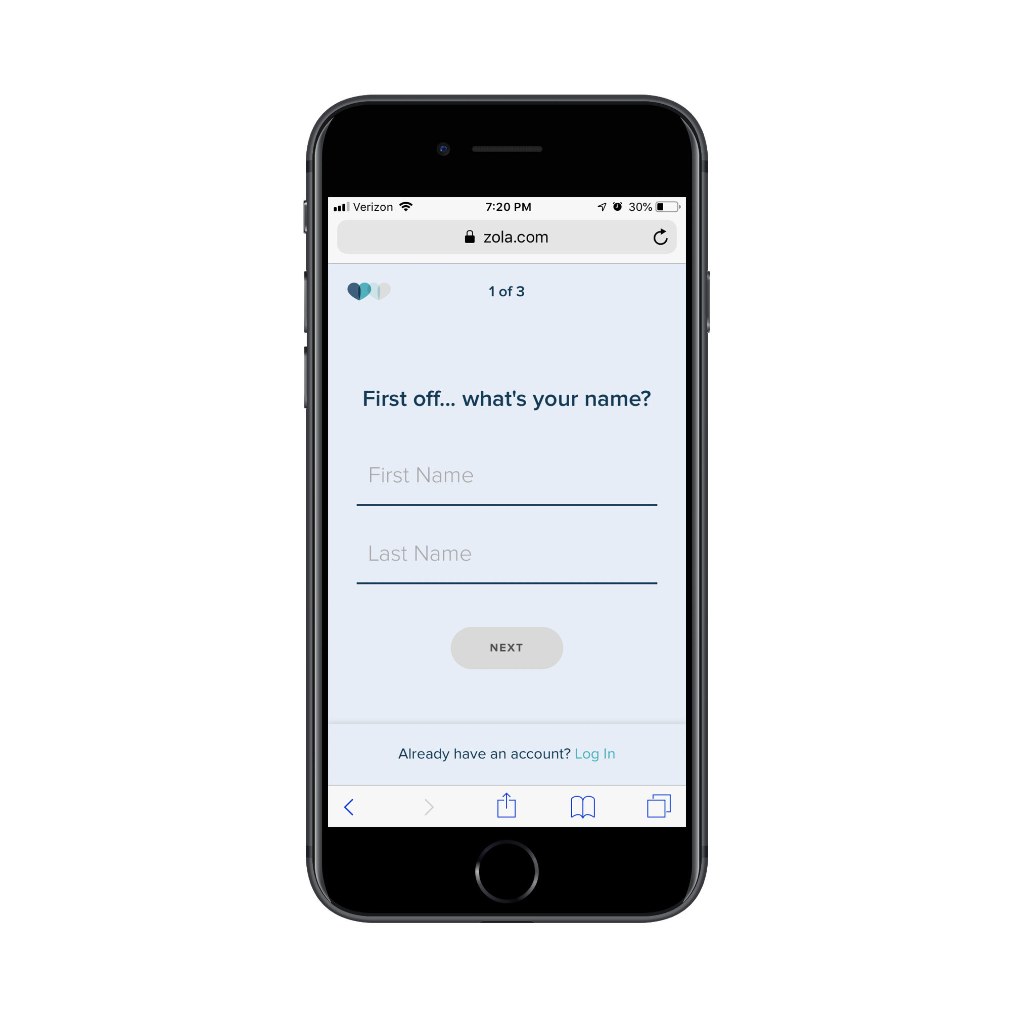
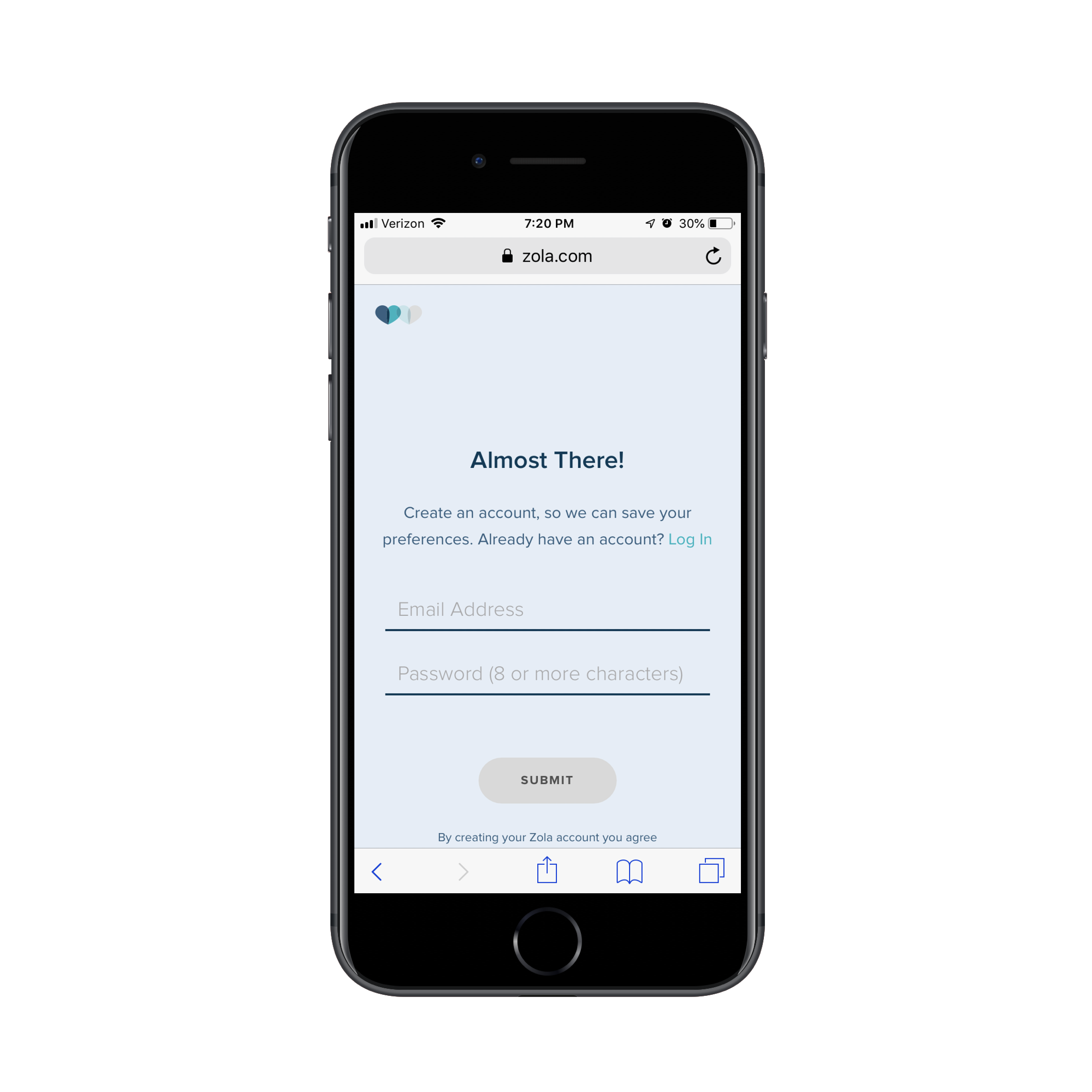
Don’t feel as though this is only something you can use for B2B websites either. Get a look at this custom wedding checklist lead capture form from Zola:
The first page of Zola’s lead capture form. (Source: Zola) (Large preview)
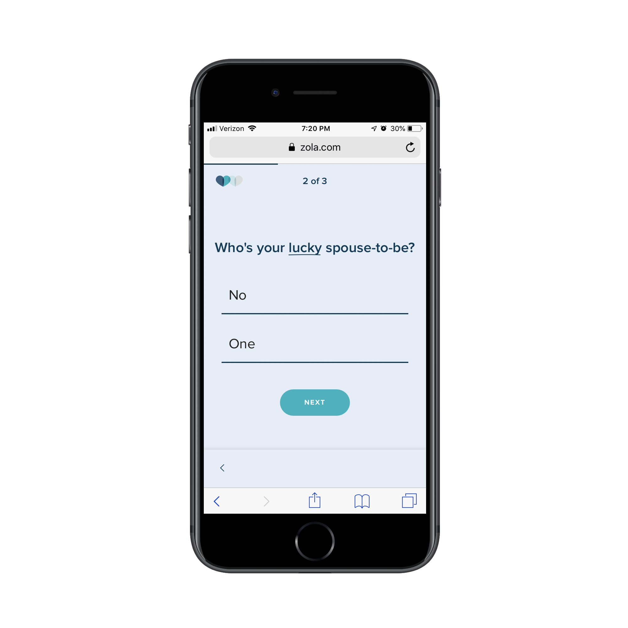
The first page of the form asks for your name. The second page of the form asks for your spouse-to-be’s name:
The second page of Zola’s lead capture form. (Source: Zola) (Large preview)
The final question then asks for your scheduled or tentative wedding day:
The third page of Zola’s lead capture form. (Source: Zola) (Large preview)
On the final page, Zola let’s you know that you can receive your custom wedding checklist if you’re willing to create an account:
Zola requires an email address and password before sending the custom checklist. (Source: Zola) (Large preview)
It’s a simple enough series of questions, but also not the kind you would find on most lead capture forms. So, don’t be afraid to break outside the norm if it improves the value of the lead gen offer for the visitor and helps your client collect better data on their leads.
#4: Trust Marks
Trust marks are often used around mobile e-commerce checkout forms. That makes a lot of sense since the goal is to make mobile visitors comfortable enough to buy something from their smartphones.
But are trust marks necessary for lead capture pages?
I think this boils down to what kind of lead gen you’re giving away and what kind of communication you intend to have with the lead after they’ve filled out the form.
Take the SnackFever example above. It’s a fun little game they’ve put on their site that exchanges a discount for an email address. There’s no reason for SnackFever to put a Norton Security or SSL trust mark next to the form. It’s very low stakes.
But when the lead gen’s value is dependent on the knowledge and skills of the company behind it, it’s very important to include trust marks on the page.
In this case, you want to demonstrate that there are satisfied customers (not leads) who are willing to vouch for the capabilities and prowess of the company. If you can leverage well-known brand logos and flattering testimonials from individuals, your landing page will more effectively capture the right kinds of leads (i.e. the ones willing to enter the sales funnel after they get their lead gen).
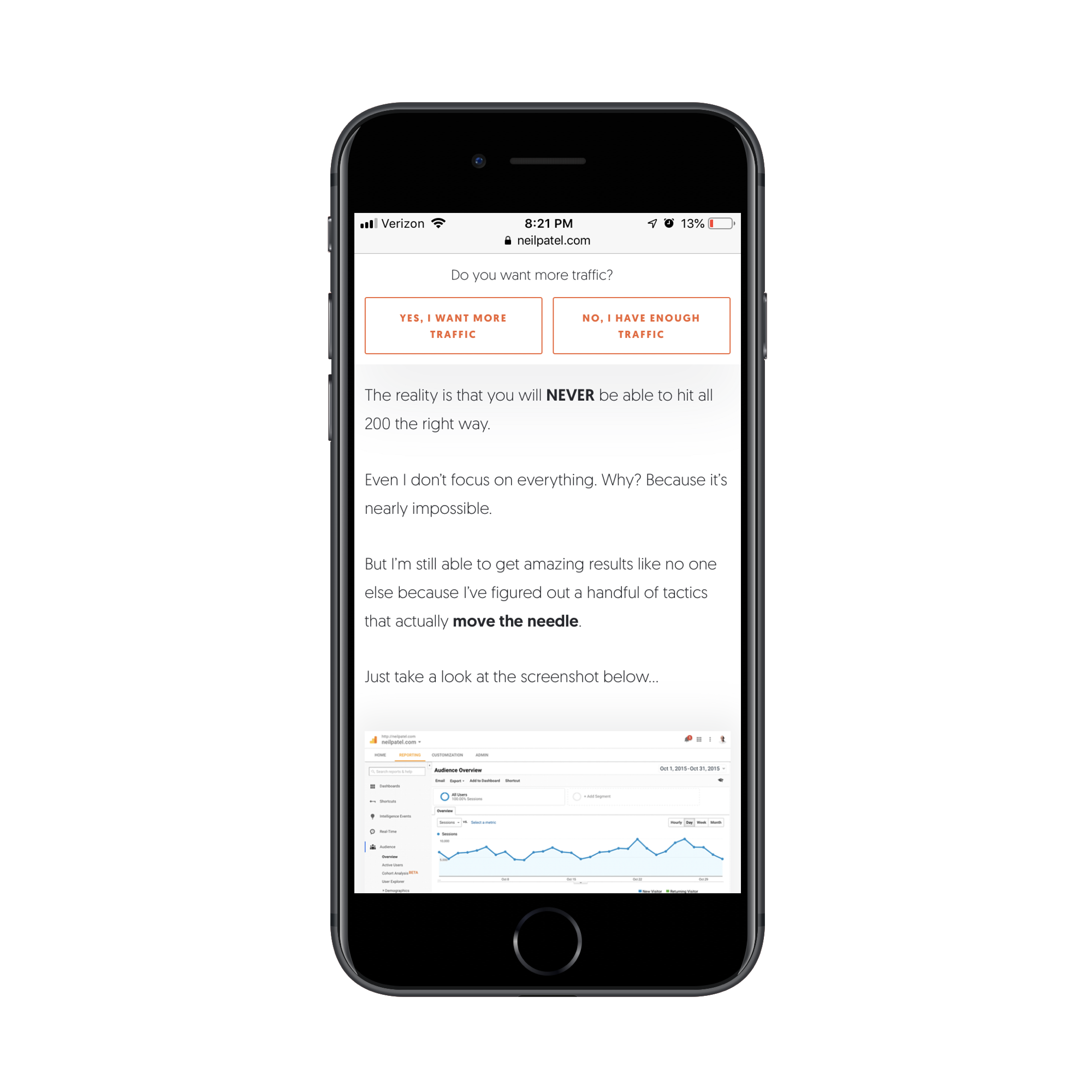
It’s no surprise that someone like Neil Patel would leverage these kinds of trust marks — he has a lot of high-profile and satisfied customers. It would be silly not to include them on his lead capture page.
This is the top of his “Yes, I Want More Traffic” lead capture page:
It goes on and on like this for about a dozen scrolls. (As I mentioned before, if you’re known for writing overly long content on your site, you can get away with this.)
Neil Patel provides valuable data to demonstrate the value of his offer. (Source: Neil Patel) (Large preview)
Eventually, he gets to a point where he lets others tell the visitor why they should pursue this offer. The first block of trust marks come in the form of short quotes and logos from well-known companies:
Neil Patel shows off his high-profile clients and quotes they’ve provided about him. (Source: Neil Patel) (Large preview)
The next section puts the spotlight on “smaller” clients that are willing to divulge what kinds of impressive results Neil has gotten for them:
Neil Patel includes data-driven testimonials from other clients. (Source: Neil Patel) (Large preview)
While I wouldn’t suggest the length or style of this page for your clients, I do think there’s a great lesson to be taken away here in terms of leveraging the words and reputations of a satisfied client base to build trust.
#5: Footer
While I have a hard time justifying the use of a navigation on a lead capture page, I actually do think a footer is a good idea. That said, I don’t think it should be the same as your website’s footer. Again, we want to avoid any design element stuffed full of links that can distract from the goal of the page.
Instead, you should use the footer to further establish trust with leads. Terms of Use, Privacy Policy, and other data management policy pages belong here.
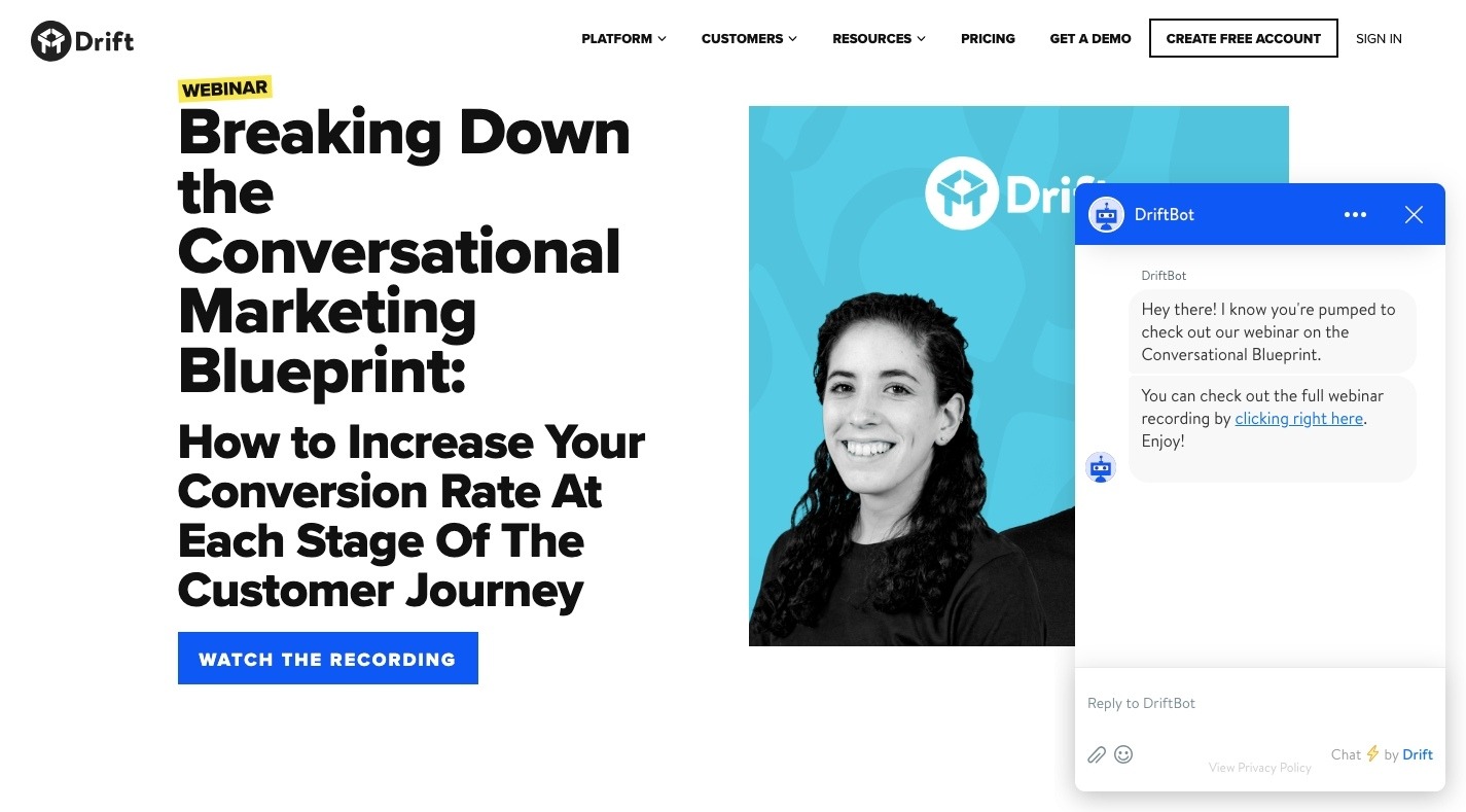
I’m including this final example from Drift because, well, it’s the most unique lead capture “page” I’ve encountered thus far — and because the footer is as simple as they come.
This page promotes Drift’s upcoming and previous webinars:
If you attempt to “Watch the Recording” of an old webinar, it’s fair to assume that Drift is going to want to capture your email address. However, Drift is in the business of developing conversational marketing tools for business. While they could’ve created a conversational landing page (sort of like what Zola did with its form above), it went a different route:
Drift’s chatbot asks visitors for their email address to get to the webinar. (Source: Drift) (Large preview)
Visitors interested in the webinar lead gen are taken to a DriftBot page. It’s very simple in design (as any chat interface should be) and includes the simplest of footers. While Drift’s link is there, the only other competition for attention is the “Privacy Policy” and it’s clear that Drift wants that to be an afterthought based on the font color choice.
One more thing I want to note about this example is that if you were to go through these same steps on the desktop website, DriftBot doesn’t ask you for an email address. It simply gives you a link:
Drift’s desktop chatbot doesn’t ask for an email address. (Source: Drift) (Large preview)
This is further proof that you should be designing different experiences based on the expected outcomes on each device. In this case, they probably have data that shows that desktop visitors watch the webinar right away while mobile visitors wait until they’re on a larger-screened device.
Wrapping Up
While adhering to basic mobile design principles is the best thing to do when designing something new for your clients, be mindful of the purpose of the new element or page too.
As you can see in many of the examples above, there’s a stark difference between the kinds of lead gen offers your clients may want to share with visitors.
The simpler exchanges (e.g. give me your email/get this checklist) don’t require much deviation from the designs of other mobile web pages. More high stakes exchanges (e.g. give me your information/get a custom quote, consult or demo) may require some non-mobile-friendly design techniques.
I would suggest you do your research, see how long you can realistically hold your visitors’ attention on mobile and design it. Then, start A/B testing your design to experiment with form construction, page length, and so on. You may be surprised at what your mobile visitors will go for if the lead gen offer is juicy enough.
Today we discuss the importance of software testing in blockchain, outline benefits of automation testing and explain how to get involved in the Quality Assurance of our open source project. This is part two of the two part blog post.
Many blockchain projects don't survive long after hitting the initial production state. For most, a lack of proper software testing is one of the main reasons for their demise. It's estimated that over half a billion dollars worth of cryptocurrency has been lost due to bad code in the last year alone. You probably heard about The DAO's code loophole, which allowed attackers to drain out 3.6 million ETH (worth $70 million at the time) from the Ethereum-based smart contract. Another notorious case was the Parity bug which resulted in over $150 million permanently frozen. Even Bitcoin itself is not immune to hacks. Late last year, a bug discovered in the code allowed malicious individuals to artificially inflate Bitcoin's supply via double input. If the bug wasn't quickly identified and addressed, it could have had catastrophic effects on the network. This is just the tip of the iceberg — there are plenty of smaller incidents caused by inexperienced or inattentive developers that don't make the headlines.
What does this tell us? In development, things can go wrong fast and the outcome can be ugly. This is why software testing is so important for any project utilizing blockchain technology, such as blockchain platforms, blockchain applications or blockchain-based services.
Serverless has become the most used deployment pattern for cloud applications. In this field, AWS Lambda is a very well known player. Every developer wants to get his hands dirty with lambda, build a quick function code, and run it.
However, there are myths that AWS manages the compute so Lambda is hands-off. It handles scalability, ha, security, performance and so on by its own. Lambda is not like an AI robot which learns on its own and optimizes its configurations to improve all the cloud-native metrics. Developers need to pay attention while designing and learn how to balance between cost and performance. In this blog, I am going to share how we can get the best use of Lambda by understanding how it works.
Hi Spring fans! In this installment of Spring Tips, Josh revisits RSocket, the reactive application protocol from, among others, Facebook, this time looking at the brand new Spring Framework 5.2 and Spring Boot 2.2 integration.
If you’ve used CSS, you might have worked with CSS filters before. Sadly, these are somewhat limited, so you’ll often need to break out Photoshop to get the effect you’re looking for. That’s where SVG filters come in!
SVG filters are simply effects that can be applied to images and even text, but you can do much more than is possible with CSS. Blurs, drop shadows, animations, and other effects that you can often only find in advanced graphics editing programs are all available to you.
Ready to learn? These resources, demos, and tutorials will teach you to use these super helpful filters.
For those looking to learn SVG filters, this page is the best place to start. Codrops introduces you to SVG filters with its helpful online tutorial. It’s not a short read, but by the end, you should have a basic understanding of SVG filters and be ready to apply them on your own site!
This tutorial gets a bit more into the meat of things, showing you primarily how to style text with filters. There’s code for lighting effects, noise, strips, outlines, and all sorts of other neat effects. This normally takes a fair bit of skill with outside programs to get it right, but you can do it just with some lines of code.
Here’s a cool example of what you can pull off with these filters. This “Stranger Things” logo is rendered in nothing but SVG, complete with the spooky flicker effect and neon lighting.
Looking for a cool image distortion effect? Three interesting hover effects are showcased here, along with a few tutorials so you can learn to create your own.
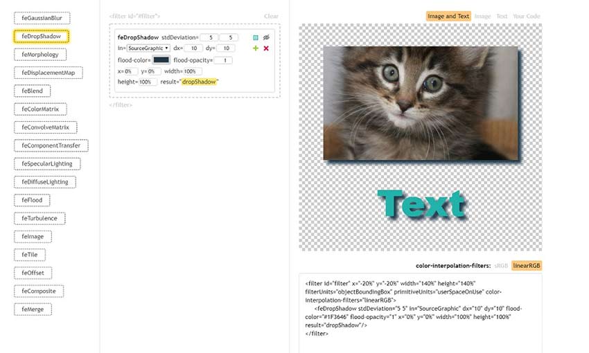
This is a tremendous resource for new programmers. Here’s a sandbox for you to test out and play with various SVG filters, applied to both images and text! And if you like the effect you made, you can even copy it and try it on your own site.
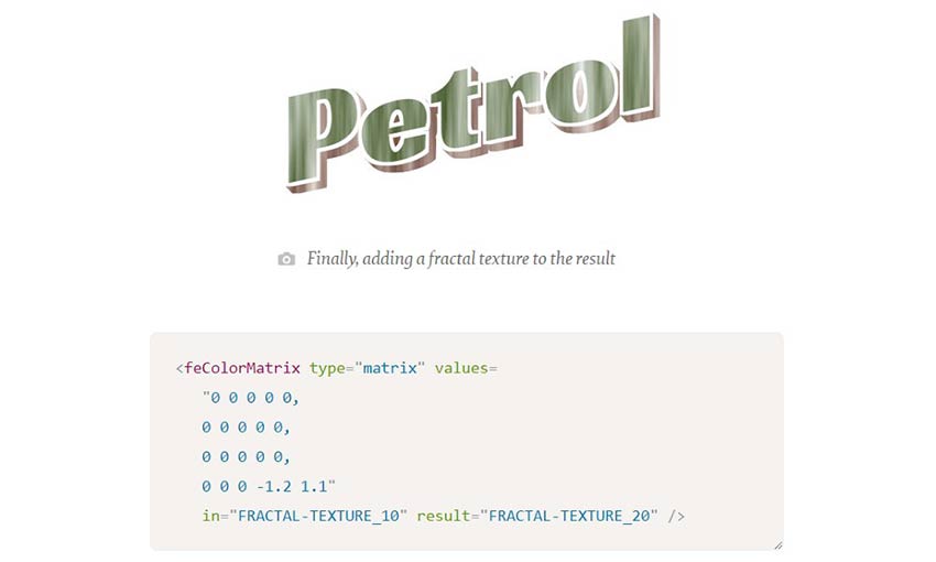
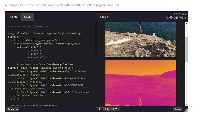
Duotone images are quite popular thanks to Spotify, but you don’t need to learn how to use gradient maps to create one. Just pop in this code and you can create your own gorgeous duotone images!
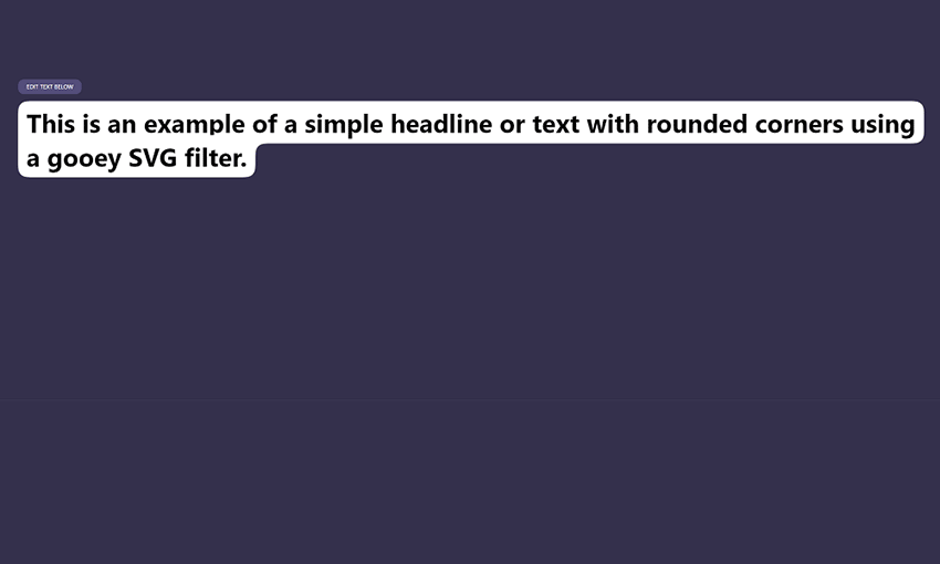
The “gooey” filter is used to create a blob-like object similar to a cell. You can also use it to make a rounded background for your text. And the best part is, it’s a dynamic filter that changes to fit the text size!
Here’s a weird, colorful ripple effect made with a combination of SVG and CSS! It might make a great background or banner for part of a webpage. Here’s the magic: it’s just a bunch of straight, rotating lines with a displacement map filter.
Sick of boring blurs and slides in image transitions? Here’s something more interesting: a dynamic dissolve transition effect that cycles between multiple images.
Another cool transition effect, this one is a slider that applies a motion blur and squishes the image as it transitions. No more simple sliders; make your site stand out with a pleasing animation.
Mastering SVG Filters
For web designers and developers, it’s important to always be learning new skills. SVG filters can save a lot of time that might have been spent in a graphics editing program. Instead, just pop in some code and you have a professional image filter effect – simple as that!
Now that you’re a master of SVG filters, it’s time to get out there and start designing a beautiful website.
This post is the ninth (and probably last) one of our series on the history and foundations of econometric and machine learning models. The first four were on econometrics techniques. Part 8 is online here.
Optimization and Algorithmic Aspects
In econometrics, (numerical) optimization became omnipresent as soon as we left the Gaussian model. We briefly mentioned it in the section on the exponential family, and the use of the Fisher score (gradient descent) to solve the first order condition
Data is the lifeblood of a company, and Oracle Data Guard and Oracle Active Data Guard have long been the answer for the real-time protection, availability, and usability of your Oracle data. In recent times, Oracle has brought new capabilities of the Oracle database to benefit the customers and deliver the best performance, scalability, reliability, and security for all their transactional and analytical workloads and application development requirements.
This article demonstrates the performance benefits in the field of the Oracle Active Data Guard database using global temporary tables.
Spring Batch is a lightweight, comprehensive batch framework that is designed for use in developing robust batch applications. In this article, you will learn:
What is Spring Batch?
How does Spring Batch make building batch programs easier?
What are important features of Spring Batch?
What are important concepts to understand in Spring Batch?
What are the best practices in using Spring Batch?
What Is Spring Batch?
Spring Batch is a lightweight, comprehensive batch framework designed for use in developing robust batch applications.
In this post, following the example project that you have here, I am going to explain how to optimize queries to a database using JPA.
You will see different types of queries explaining how to make connections between lazy and eager tables. The tables will be joined by a single field, by several and even by one, but adding a static condition.
I had the opportunity to meet with Jeff Prosise, Co-founder and Chief Learning Officer, Wintellect, during Skillsoft's Perspectives 2019 user conference. Wintellect is a Microsoft certified developer consulting and education firm. Jeff has written nine books and hundreds of articles on software development.
Prior to the conference, Skillsoft announced a partnership with Wintellect to offer expanded training for enterprise technology and developer professionals with WintellectNOW's 500 hours or on-demand training.
Your radio station site must contain multiple advanced qualities that include streamed radio stations as well as scheduling tables for it to operate successfully. You must also have the right combinations with WooCommerce so that...
In the context of developer relations, a Lunch & Learn event is a lunchtime developer education event. It's very similar to an evening meetup, but hosted during the lunch hour. While a meetup can have different formats (hands-on, lecture, panel, etc.), this particular event has a lecture-style format. Developers come to the event, get to eat a delicious lunch, learn something new, ask questions, and network.
So now the question is — why run an event during the lunch hour? I'm going to share why a Lunch & Learn can add value to your developer relations program. I want to mention this is not to run instead of evening events, but in addition to evening events.
The topic of Agile metrics inevitably comes up in many situations and conversations. I have been hiring Scrum Masters lately. One of my screening questions read, "What standard metrics would you track if any and for what purpose?" I cannot tell you how many candidates mention velocity, burndown and burnup charts. Very few can reasonably explain the meaning and use for those.
So far, I hired 2 Scrum Masters whose answer to the question didn't have any of those metrics. What these two have in common was they mentioned and could talk about Cycle Time. Mind you, that was not the only reason they got the job, but it gave them an advantage over others. Rarely do you hear Scrum practitioners bringing up Cycle Time, Lead Time, Throughput, or Work Item Age. These all firmly used to belong to the Kanban world. Somehow during the Holy Scrum-Kanban decades of feud these metrics were banished from the Scrum land and forgotten by many.