China Unicom is one of the five largest telecom operators in the world. China Unicom’s booming business in 4G and 5G networks has to serve an exploding base of hundreds of millions of smartphone users. This unprecedented growth brought enormous challenges and new requirements to the data processing infrastructure. The previous generation of its data processing system was based on IBM midrange computers, Oracle databases, and EMC storage devices. This architecture could not scale to process the amounts of data generated by the rapidly expanding number of mobile users. Even after deploying Hadoop and Greenplum database, it was still difficult to cover critical business scenarios with their varying massive data processing requirements. The complicated the architecture of its incumbent computing platform created a lot of new challenges to effectively use resources.
Fortunately, there is a new generation of distributed computation frameworks that can help China Unicom meet the enormous data challenges for a variety of business scenarios. To solve these problems, the company built a new software stack of Apache Spark, Alluxio, HDFS, Hive and Apache Kafka. We leverage Alluxio as the core component for a unified, memory-centric distributed data processing platform with consolidated resources, and improved computation efficiency.
As with so many new technologies, the era of big data has been more hype than reality, with many organizations struggling to get high quality data out of internal silos in order to derive timely and actionable insights from it. According to a recent survey from PwC, however, now is the time that will all change. Their latest pulse survey reveals that 86% of companies believe that 2019 will be the year they finally extract value from data.
This priority was emphasized by the 94% of executives who thought customer data was critical, although the size of the challenge was underlined by the fact that just 15% thought they had sufficient data in this area. When asked to explain some of the barriers they faced, the responses were those we've heard many times before, including the quality and standardization of data, the security of it, and the regulatory uncertainties surrounding the collection, storage, and use of data.
Recent data from security firm LogRhythm highlights the long way most companies still have to go before their cybersecurity is up to scratch. In their survey of 1,500 IT professionals, they found that just 15 percent were confident in their organization’s cybersecurity capabilities.
“These results are worrying as whilst firms have expressed concerns about the regular occurrence of data breaches hitting today’s headlines, it seems like there’s still a long way to go when it comes to addressing their own cybersecurity capabilities,”LogRhythm say. “Today’s hackers are smart, creative, and persistent enough for even the most well-equipped business to be compromised. Having the most up-to-date, sophisticated tools in place is key in combatting modern-day threats.”
While the study cites things like the need for automation to tackle the ever growing speed and complexity of threats, something they neglect to mention is the need for cooperation across the industry. That is exactly the rationale behind the creation of the Charter of Trust by German industrial giant Siemens. The charter, which was originally formed with nine members, has recently grown to 16, including AES, Airbus, Allianz, Atos, Cisco, Daimler, Dell Technologies, Deutsche Telekom, Enel, IBM, NXP, SGS, Total, and TÜV Süd.
When you upload an image, WordPress does a lot of work behind-the-scenes so you can serve the image to your visitors. You can piggyback on this process and add custom image sizes to save yourself from having to resize images manually.
In this post, I’ll explain how and why WordPress creates different image sizes. Then I’ll teach you how to add your own image sizes by modifying the functions.php file, regenerate thumbnails and add your new image sizes to the Gutenberg image block and/or the WordPress loop.
WordPress Image Sizes Explained
Every time you upload an image into the WordPress media library, these are the additional image size options WordPress creates by default:
Thumbnail
Medium
Medium Large
Large
If your theme specifies additional image sizes, WordPress creates those as well.
WordPress also preserves the original size you upload and names it Full as in full-size.
You can see all of these (with the exception of Medium_Large) in the Gutenberg image block Image Size drop down when inserting an image into a page or post.
Why does WordPress create so many images?
Images are like pants. You want to make sure you get the right size. Pants and images that are too small look silly and it’s painfully obvious to you and everyone else that they don’t fit right. Too small images on your site will look stretched out or pixellated.
By contrast, if they’re too large, that’s super wasteful. You wouldn’t put a pair of pants made for a man on a baby, right? It’s so much extra fabric that isn’t even necessary. That baby is going to get lost in a pant leg ;)
Images are the same. If your image is too large for the container, you’re wasting bandwidth and time downloading it to serve on your page. And for what? For nothing.
Ideally, the full-size images you upload should be big enough to fit the largest image container on your site, but no larger. Then when you use images on your site, you should use the exact size image you need.
Since scaling images to create the right size in Photoshop or other image editor takes valuable time, WordPress takes on this task and does it for you. Thanks, WordPress!
If the WordPress default image sizes aren’t perfectly sized for your theme, you can adjust the defaults in the Media > Settings section or add custom sizes so you’ll have more options to choose from.
The WordPress default image sizes, except for medium_large which is hidden by default
The default image sizes are as follows:
150px square for thumbnails
300px width for medium images
768px max width for medium_large images
1024px max width for large images.
Medium_large was added to take advantage of responsive image support, which is why it isn’t included in the settings page. Speaking of responsive images…
Responsive Images
All of these images in various sizes serve another purpose, so you shouldn’t set the defaults to zero to keep WordPress from creating them, as some tutorials suggest.
WordPress added responsive images to core in version 4.4. Instead of populating image src attributes with the URL for just one image, WordPress also added srcset (set of sources) which is a list of URLs of images of various sizes.
Guess what images it uses to create that list? Yup, WordPress uses the same images at different sizes it creates when you upload an image.
It offers this list to the browser so it can select an image that is appropriate for the visitor’s device. If the visitor is using a mobile device, they’ll receive a smaller image in the srcset. If they’re visiting your site on a desktop Retina device, then they’ll receive the full-size Retina-ready image file you uploaded. Again, this is why you should upload an image big enough to fill that need.
When you add a custom image size, WordPress will add it to the srcset as long as it has the same aspect ratio. If the custom image size crops the image into a different shape then it will be omitted from the set.
WordPress Thumbnails and Featured Image Size
We’ve now reached the part of our tutorial where we will unravel the whole thumbnail/featured image mess. Basically, the problem boils down to this; because WordPress maintains backward compatibility as it evolves, the names of things change, but the functions still refer to things by their old names.
The WordPress Thumbnails image size was introduced in version 2.9 but was quickly changed to Featured Images in version 3.0, but alas, the name stuck. So you’ll often hear featured images referred to as thumbnails in tutorials and even in the function names.
If you don’t have the featured image meta box, paste add_theme_support( ‘post-thumbnails’ ); into your functions.php file
Here are some examples:
If your theme doesn’t have featured images and you want to enable that feature, you’ll add add_theme_support( 'post-thumbnails' ); to your functions file.
To display the WordPress featured image size in a theme, you’ll use the_post_thumbnail() function.
Thumbnails and featured images share a default size of 150px by 150px. If you use the_post_thumbnail() function without an argument to specify the size, it will use the default 150px square size.
To make this less confusing for yourself so you can actually use the right size, I suggest creating a custom image size and naming it featured-large or something similar. Then, when you want to use that image in you’re the loop, you’ll use the_post_thumbnail('featured-large').
Before You Start Creating Custom Image Sizes in WordPress
As you start creating custom image sizes, avoid going overboard and creating images for every conceivable purpose. Otherwise, you’ll burn through space on your hosting and if you’re using an image optimization service that charges you per image, you’re going to go through your image allowance a whole lot faster.
If your plan allows you to optimize 100 images but every upload generates 9 additional sizes that also need to be optimized, you’ll hit your limit once you upload 10 images. Keep this in mind when adding custom sizes and choosing image optimization plans.
Smush Pro doesn’t have image optimization limits and comes with a CDN so you can keep your server storage space clear. You’ll be able to add more custom image sizes than you normally would. Think of it as the equivalent of putting flowy MC Hammer pants instead of little skinny jeans on those babies because the fabric is cheap :)
Should the image be cropped to fit the width and height you specified above
Cropping
The cropping parameter is a boolean, so you’ll use true or false. If you leave it out entirely, then it will default to false.
If you set the cropping parameter to true, then WordPress will crop your image to fit the dimensions you specify when it creates the custom image.
For example, if your custom image size is a 600px by 600px square and you set cropping to true, then if you upload a 600px by 800px rectangular image, 200px will get chopped off to make the image square.
Setting the cropping parameter to true is helpful for image sizes that have to be exact, like featured images or post archive images that have to fit a certain dimension perfectly.
For images that can have more wiggle room, such as the WordPress post image size and images on pages that tend to have variable heights and widths, then you can set cropping to false. This will resize the images, but it won’t change the shape of the image or cut off any pixels.
Take a look at our image SEO guide if you’re trying to drive traffic to your sites with your images.
Regenerating Thumbnails
One of the most important steps when either:
modifying the WordPress default image sizes
adding custom image sizes or
switching over to a new theme that has different custom sizes
is regenerating thumbnails.
In this context, thumbnails refers to all the additional images WordPress creates, including the custom image sizes that are included in your theme and the ones that you create via your functions file.
When you make a change to the way that WordPress creates additional images, then it will only affect the images you upload going forward. It doesn’t update the images that are already in your media library.
To change the images you’ve already uploaded, you’ll have to use the popular Regenerate Thumbnails plugin.
After you install it, you’ll find it in the Tools section.
Just push the button to create new image sizes
When you regenerate your thumbnails in your new sizes, you’ll have the option to delete old unused image sizes to free up server space.
How to Add Custom Image Sizes to the drop-down in the Gutenberg image block
You only need to add the code below to your functions file if you want your custom image sizes to appear in the drop-down in the Gutenberg image block. If you created a custom image size to use behind-the-scenes for your theme, you can skip this step.
Here’s the custom image size I’m adding with the code below
We’re going to be hooking onto the image_size_names_choose filter.
In the array, I’ll add the name of the custom size that I specified in the add_image_size function and the name that I want to appear in the drop-down within the parentheses.
As I learned when doing this tutorial, you’ll have to regenerate thumbnails before the image appears in the drop down.
WordPress Add Image Size Full Code Snippet
Next, we’ll combine everything we learned into one code block with a real-world example.
Let’s say you want to add custom image sizes to your blog.
Here are the image sizes you want to add:
A 1600px by 400px featured image
An 800px size that spans the width of your blog’s content section
Since our theme doesn’t currently support featured images, we’ll start with that.
You’ll then see my custom sizes. Notice that I didn’t crop the images that are going to span the width of the blog content. I will hard crop my featured images since I want them to line up just right.
The only image I want to add to the Gutenberg drop down is the blog image since I’ll be using the WordPress featured image size in my theme.
After I add this code to my functions.php file, the next step is to regenerate thumbnails.
To use my custom featured image for my posts in the loop, I’ll add the following to single.php or index.php
See how I added 'featured-large' in the_post_thumbnail() function? That will display my featured image below my blog posts titles, above my content.
Custom Image Sizes Best Practices
Here are a few more tips so you don’t run into trouble creating custom images in WordPress.
Always upload the largest file you can. If your image size is too small, WordPress won’t be able to create all the sizes it needs to serve your images properly on a variety of devices.
If you need to resize the medium_large default size, use the update_option() function. You can use this same function to update any other WordPress default image size.
If you’re outside the WordPress loop, you can use the function get_the_post_thumbnail() to use one of your custom images.
Once you understand how custom image sizes in WordPress work, you can modify them to fit your needs and save a lot of time. Getting your image sizes right also helps you improve your site performance and search engine rankings, so it is an important thing to get right.
If you really want to take your image optimization to another level, check out Smush. We’ve added an amazing CDN to Smush Pro that has automatic image resizing, which will help you avoid dealing with modifying your functions file to add custom image sizes.
Hi, Spring fans! Welcome to another wild-and-wacky week of This Week in Spring! I’m in Johannesburg, South Africa, where I both spoke at the SpringOne Tour South Africa event and at the Johannesburg Java User Group. I have had tons of fun on safari visiting (safely from a great distance and in an SUV) the utterly astonishing, beautiful, majestic wildlife here. I can’t stress that last part enough. The animals here are so, so, SO breathtaking. I got as close as I ever want to get to an elephant that was the size of a small house with eyes. Utterly massive! It towered over buses. When you go into the bush, my tour guide warned, you enter the food chain, and there, we don’t figure very high at all. The experience reminded me how insignificant I am and how utterly privileged I am to be here, with you, dear community. We’re all pretty lucky.
I also really enjoyed meeting some of the local community. My friend, Rory Preddy at Microsoft South Africa, was telling me that the local community here in South Africa is very small — tens of thousands of professional developers, if that. What the community lacks in quantity, they more than make up for in quality.
An inference engine using forward chaining applies a set of rules and facts to deduce conclusions, searching the rules until it finds one where the IF clause is known to be true. The process of matching new or existing facts against rules is called pattern matching, which forward chaining inference engines perform through various algorithms, such as Linear, Rete, Treat, Leaps, etc.
When a condition is found to be TRUE, the engine executes the THEN clause, which results in new information being added to its dataset. In other words, the engine starts with a number of facts and applies rules to derive all possible conclusions from those facts. This is where the name "forward chaining" comes from — the fact that the inference engine starts with the data and reasons its way forward to the answer, as opposed to backward chaining, which works the other way around.
Whether you are developing a website for personal use, for a customer, or your organization, it is very important that the site is bug-free. A bug in your application will not only ruin the usability of your website but will also affect your reputation as a developer. In this article, we shall discuss some basic checklist that will enable you to deploy a bug-free web application in production.
Mobile-Ready Test
Since most people nowadays use mobile devices to access websites, for expanding your target audience, your website must be fully responsive and compatible with mobile devices and browsers.
Application container technologies, also referred to as containers, combine application software packaging through different images with a form of operating system virtualization. The goal of such tech is that everything needed to easily package and run software reliably can be moved from one environment to another. As well as allowing devs to run an app and all of its dependencies in isolated processes, containers are also transferable, reusable, and automatable.
In Agile practice, the completion of work is seen as being the responsibility of the team. Although individual team members may action a particular backlog item in whole or in part, it will be the team which owns it. This principle is ingrained to the point that — in the Scrum framework — it shapes the way in which roles are defined. Hence, you will find a role in Scrum called "Development Team," but not one filled by an individual "Developer."
Each Agile team member is considered to be a peer to the others. For this to hold true, there must be a shared sense of commitment to team goals, and an ability for those people to work together. In an efficient team, the various members will "go to where the work is," rather than waiting for work to come to them. This implies that a degree of cross-skilling and cross-training ought to be in evidence, and which is sufficient to overcome the waste that would otherwise be accrued through bottlenecks and skill-silos. Efficient peers will collaborate with regard to who performs certain tasks at certain times. Any scheduling that they agree amongst themselves will thus become orthogonal to the flow of work.
Are you wondering how to set up and install a WordPress multisite network? WordPress has a built-in capability to create multiple websites using a single WordPress installation.
A WordPress multisite network is often used by blogs, schools, and businesses that need to run separate websites but want to manage them under one dashboard.
In this article, we will show you how to install and set up a WordPress multisite network properly.
Since this is a comprehensive article, we have added this table of contents for easier navigation. You can use the quick links below to jump to the section you want to learn about:
A WordPress multisite network allows you to run and manage multiple WordPress blogs or websites from a single WordPress installation.
It enables you to create new sites instantly and manage them using the same username and password. You can even allow other users to sign up and create their blogs or websites on your domain.
The WordPress multisite network comes with advanced settings that you can use to customize each website/blog on your network.
Pros of Using a WordPress Multisite Network
In many situations, a WordPress multisite network can be more useful than managing multiple standalone WordPress sites. Here are some of the advantages of using a WordPress multisite network:
As the network administrator, you can easily manage multiple sites from a single dashboard.
Each site on the network can have its admin users. The site admins will have the capability to manage only their website.
You can install plugins/themes and activate them for multiple sites with one download.
A multisite network also makes it easier for you to manage updates. You only need to update your WordPress, plugins, or themes on one “master” install.
Cons of Using a WordPress Multisite Network
Creating a WordPress multisite network is not always helpful for managing multiple sites.
Here are some of the disadvantages that you should keep in mind before setting up a multisite network.
All sites on the network share the same resources. This means that when your network is down, all other sites also go down.
It’s difficult for beginner-level users to manage traffic and server resources. If one of your websites gets unexpected traffic, it will affect all other websites on the network.
Some WordPress plugins may not work well on a multisite network.
WordPress multisite network is not adequately supported by all web hosting providers, which limits your options. We will talk more about this later in the article.
Who Needs a WordPress Multisite Network?
Just because you manage multiple WordPress websites does not mean you need to start using a multisite network.
Here are some scenarios when creating a multisite network makes sense:
A magazine website with different sections managed by separate teams
A business website with sub-sites for different locations and branches
Government or non-profit websites using WordPress multisite for different departments, locations, and regions
Your network of blogs running on multiple subdomains
Schools and colleges using multisite for different departments, and blogs, or letting students create their websites on school servers
Requirements for a WordPress Multisite Network
All websites on a WordPress multisite network share the same server resources. This means that the most important thing you will need is good WordPress hosting.
If you are planning on having just a couple of websites with low traffic, then you can probably get away with shared hosting.
However, due to the nature of a multisite network, you will typically need VPS hosting or a dedicated server as your sites grow.
We recommend Bluehost because they offer shared hosting and VPS/Dedicated servers. They are also one of the official WordPress hosting partners.
If you’re looking for an alternative, then SiteGround and WP Engine also provide excellent service for WordPress multisite networks.
Choosing a Domain Structure for your Multisite Network
On a WordPress multisite network, you can add new sites using either subdomains or sub-directories.
Example of subdomain: http://site1.example.com
Example of sub-directory: http://example.com/site1/
If you choose subdomains, then you’ll have to configure wildcard subdomains on your server. We will show you how to do that in the next step.
On the other hand, if you choose sub-directories or path-based URLs for sites on your network, you can skip the next step.
Setting Up Wildcard Subdomains
Wildcard subdomains create a placeholder subdomain under your domain name. This placeholder subdomain can then be used to map subdomains that you haven’t already defined.
This setting enables WordPress multisite to create new sites using their own subdomains.
If you decide to use subdomains for websites on your multisite network, then you will need to set up wildcard subdomains.
We will show you how to do that on Bluehost. However, the basic process is the same for all hosting providers.
First, you need to log in to your WordPress hosting account’s dashboard. Locate your site under Websites and click on the ‘Settings’ button.
This will open your site’s Settings page, where you need to switch to the ‘Advanced’ tab.
From there, scroll down to the cPanel section and click the ‘Manage’ button.
The multisite network feature comes built-in with each WordPress installation. All you need to do is install and set up WordPress like you normally would.
After that, you just need to enable the multisite feature. You can also enable the multisite feature on any existing WordPress site.
Once that’s done, you can save and upload your wp-config.php file to the server.
This code simply enables the multisite feature on your WordPress site. Once enabled, you will still need to set up the multisite network.
Setting Up Your WordPress Multisite Network
Now that you have successfully enabled the multisite network feature on your WordPress site, it is time to set up the network.
If you are setting up a multisite network on an existing WordPress website, then you will need to deactivate all plugins on your site.
Simply visit the Plugins » Installed Plugins page and select all plugins. You need to select ‘Deactivate’ from the ‘Bulk Actions’ dropdown menu and then click on the ‘Apply’ button.
You can now head over to the Tools » Network Setup page.
Here, you can configure your multisite network.
On the network setup screen, you will notice that you need Apache’s mod_rewrite module installed on your server. This module is installed and enabled on all the best WordPress hosting providers.
Next, you need to tell WordPress what domain structure you will be using for sites in your network, e.g., Subdomains or Sub-directories.
After that, you will need to provide a title for your network and ensure the email address in the ‘Network Admin Email’ field is correct.
Click on the ‘Install’ button to continue.
WordPress will now show you some code to add to your wp-config.php and .htaccess files, respectively.
You can use an FTP client or the File Manager in the cPanel to copy and paste the code.
First, edit the wp-config.php file and paste the code just below the line you added in the earlier step.
Secondly, you need to edit the .htaccess file and replace the existing WordPress rules in your .htaccess with the WordPress multisite code you copied.
Don’t forget to save your changes and reupload the edited files back to your server.
Once finished, you will need to re-login to your WordPress site to access the multisite network.
Configuring Network Settings
Now that you have set up the multisite network, it is time to configure its network settings.
Start by logging in to your WordPress website admin area.
After that, you need to switch to the ‘Network Dashboard’ settings to change network settings, add new sites, and configure other settings.
When you take your mouse over to the ‘My Sites’ menu in the admin toolbar, a flydown popup will appear. Click on Network Admin » Dashboard.
This will take you to the multisite network dashboard. You will notice that there are new menu items to manage your multisite network.
You will also see a ‘Right Now’ dashboard widget that allows you to create a new site and add new users.
To configure network settings, you just need to click on the ‘Settings’ link in the admin sidebar.
The first option on the network settings page is to set your site title and admin email address. These fields will be filled automatically with the network title and admin email you entered during setup.
Opening Your Multisite Network for Registrations
The ‘Registration Settings’ section on the network settings page is probably the most important setting in your entire network setup.
By default, both user and site registrations are disabled on the network.
You can choose to open your site for user registration, only allow existing users to create new sites, or allow both user and site registration.
If you are opening your multisite network to registration, then you can check the box next to the ‘Registration Notification’ option.
This will allow you to receive email notifications every time a new user or site is registered.
If you want to allow individual site administrators to add new users to their sites, then you can check the box next to the ‘Add New Users’ option.
The limited Email Registration option allows you to limit site or user registration to email addresses from specific domains.
This is particularly useful if you only want to allow people from your own organization to register and create users or sites.
Similarly, you can also ban certain domains from registration.
New Site Settings
The ‘New Site Settings’ section allows you to configure default options for new sites created on your multisite network.
You can modify the welcome emails and the contents of the first default post, page, and comment in these settings.
As a network administrator, you can change these settings anytime.
Upload Settings for Your Multisite Network
It is important to keep an eye on the usage of your server resources. Under the ‘Upload Settings’ section, you can limit the total amount of space a site can use for uploads.
The default value is 100 MB, which is probably good for at least 100 photo uploads. You can increase or decrease this space depending on how much disk space you have.
The default upload file types are images, audio, video, and pdf files. You can add additional file types if you want, like doc, docx, odt, and so on.
Afterward, you can choose a file size limit so that users can’t upload insanely large files to the server.
Plugin Menu Settings
Next, you can jump to the Menu Settings. It will allow you to enable the administrative menu for the plugins section on your network sites.
Enabling this will show the Plugins menu to respective site admins. They can activate or deactivate a plugin on their sites, but they cannot install new plugins.
Once you are satisfied with all the configuration settings, go ahead and click the ‘Save Changes’ button.
Adding New Sites to Your WordPress Multisite Network
To add a new site to your WordPress multisite network, simply click on ‘Sites’ under the My Sites » Network Admin menu in the admin toolbar.
This will show you a list of sites on your current multisite installation. By default, you have your primary site listed as the only site in your WordPress multisite network.
To add a new site, click the ‘Add New’ button at the top.
On the ‘Add New Site’ page, provide the site’s address. You don’t need to type the full address, just the part you want to use as the subdomain or sub-directory.
Next, you add a site title and enter the site admin’s email address.
You can add an admin email address other than the one that you are currently using to manage your multisite network.
If another user does not currently use that email address, then WordPress will create a new user and send the username and password to the email address you enter.
Once you are done, simply click on the ‘Add Site’ button.
A new site will be added to your WordPress multisite network. As the network admin, you will also receive a new site registration email.
If you create a new user, that user will receive an email with instructions to set the password and log in.
Adding Themes and Plugins to Your Multisite Network
By default, individual site administrators in a multisite network cannot install themes and plugins on their own.
As the network admin, you can install the respective plugins and themes so they are available for all sites on your network.
Installing Themes for Your Multisite Network
To add themes, go to the My Sites » Network Admin » Themes page.
On this page, you will see a list of themes that are currently installed on your WordPress multisite.
You can make a theme available to other sites by clicking on the ‘Network Enable’ option under that theme.
You can also disable a theme by clicking on the ‘Network Disable’ link under the theme. Note: The Network Disable option will only appear when the theme is enabled.
To add a new theme, you need to click on the ‘Add New’ button at the top of your screen and then install a WordPress theme as you would normally do.
Once the new theme is installed, you will be able to make it available to other sites on your network with the ‘Network Enable’ option.
If you need recommendations on which themes to make available to your network, here are our picks of the best WordPress themes that you can use:
Setting a Default Theme for Your Multisite Network
Even if you have added a couple of themes, WordPress will still activate the default WordPress theme for each new site.
If you want to make another theme the default for new sites, then you need to add the following code to your wp-config.php file:
// Setting default theme for new sites
define( 'WP_DEFAULT_THEME', 'your-theme' );
Replace your-theme with the name of your theme. You will need to use the name of the theme’s folder, which you can find by looking at the /wp-content/themes/ folder using FTP or File Manager.
Installing Plugins for Your Multisite Network
Similarly, you can visit the My Sites » Network Admin » Plugins page to install plugins and click on the ‘Network Activate’ link below each plugin to activate it on your multisite network.
Here are a few essential WordPress plugins that we recommend for every website:
Note: If you previously enabled the Plugins Menu option for site admins in the ‘Network Settings’, then the site administrators can activate or deactivate installed plugins on their own. Site admins cannot delete or install a new plugin on their own.
Adding Default Content to Multisite Sites
By default, WordPress allows you to add and edit some default content for each site on your multisite network. You can go to Settings » Network Settings page and add this content in the ‘New site settings’ section.
You can edit the content for the default post, page, and comment. We recommend replacing the default content with something more useful for your site admins.
But what if you wanted additional default content to be added to each new site?
By default, WordPress does not give you an option to create additional default content for new sites. If you want to do that, then you will need to add custom code to your WordPress multisite.
In this example, we are going to add a new default page to be created for each new site. You can add this code to your main site’s functions.php file or by using the WPCode plugin on your main site:
add_action('wpmu_new_blog', 'wpb_create_my_pages', 10, 2);

function wpb_create_my_pages($blog_id, $user_id){
  switch_to_blog($blog_id);

// create a new page
  $page_id = wp_insert_post(array(
    'post_title'     => 'About',
    'post_name'      => 'about',
    'post_content'   => 'This is an about page. You can use it to introduce yourself to your readers or you can simply delete it.',
    'post_status'    => 'publish',
    'post_author'    => $user_id, // or "1" (super-admin?)
    'post_type'      => 'page',
    'menu_order'     => 1,
    'comment_status' => 'closed',
    'ping_status'    => 'closed',
 ));

restore_current_blog();
}
You can use the same code with little modifications to create default posts for new sites. Check out the following code:
add_action('wpmu_new_blog', 'wpb_create_my_pages', 10, 2);

function wpb_create_my_pages($blog_id, $user_id){
  switch_to_blog($blog_id);

// create a new page
  $page_id = wp_insert_post(array(
    'post_title'     => 'A sample blog post',
    'post_name'      => 'sample-blog-post',
    'post_content'   => 'This is just another sample blog post. Feel free to delete it.',
    'post_status'    => 'publish',
    'post_author'    => $user_id, // or "1" (super-admin?)
    'post_type'      => 'post',
 ));

restore_current_blog();
}
Troubleshooting WordPress Multisite Issues
Most common issues with WordPress multisite network setup happen due to the incorrect configuration of wildcard subdomains and domain mapping issues. Make sure that your web host supports wildcard subdomains before setting up multisite.
The following are some other common issues and their quick fixes.
Fixing Login Issues on Multisite Installs
A common issue is that when using WordPress multisite with sub-directories, some users are unable to log in to the admin area of their sites after they add the required code in the wp-config.php file.
To fix this, locate the following line in the wp-config.php file:
define('SUBDOMAIN_INSTALL', false);
Now, simply replace it with the following line:
define('SUBDOMAIN_INSTALL', 'false');
Find Unconfirmed Users
Another issue you may encounter is not being able to find users who registered on your network but didn’t get the activation email.
You may also want to bookmark our ultimate guide to common WordPress errors and how to fix them. This will save you a lot of time fixing the most common WordPress issues quickly.
FAQs About WordPress Multisite Network
Many of our users have asked us plenty of questions about WordPress multisite network and how to use it more efficiently. The following are the most frequently asked questions that we have answered.
1. Would I be able to better manage my sites with a multisite network?
To be honest, the answer really depends on your usage scenario.
For example, if your websites are not related to each other, then you would be better off with a multiple site management tool like InifiteWP.
However, if you manage multiple sites for a restaurant chain, university, or online magazine, then WordPress multisite will be more efficient.
2. Does WordPress multisite make my websites load faster?
Once again, it depends on several factors. Better WordPress hosting with plenty of server resources will allow multisite to be faster, but then again, with these resources, individual WordPress sites will also run faster.
However, on a shared hosting account, traffic spikes will increase memory usage and slow down all websites on the multisite network at the same time. To improve multisite speed, see our guide on WordPress performance and speed optimization.
3. Can I add an online store to a WordPress Multisite Website?
Yes, you can add an online store in the WordPress multisite network. Most likely, you will be using an eCommerce plugin like WooCommerce for that, which is compatible with WordPress multisite.
4. Can I install ‘x plugin’ on my WordPress multisite?
Some WordPress plugins may not be compatible with WordPress multisite. Normally, plugin authors mention it on the plugin’s website, and you can avoid installing a plugin that may not work on a multisite setup. However, if it is not mentioned, then it is safe to assume that it is multisite compatible.
5. How do I share user logins and roles across the multisite network?
By default, a user who is registered on one site cannot register or be added to another site on the same network. That’s because they are already registered in the shared WordPress database. However, they don’t have any user role privileges on other sites.
You can use third-party plugins like WP Multisite User Sync to sync users across the network. However, you need to be careful, as you may end up giving someone admin privileges to a site.
We hope this article helped you learn how to install and set up WordPress multisite network. You may also want to see our step-by-step WordPress security guide to protect and keep your WordPress multisite secure or our expert picks of the best WordPress multisite plugins you should use.
If you liked this article, then please subscribe to our YouTube Channel for WordPress video tutorials. You can also find us on Twitter and Facebook.
Last year, Rachel Andrew wrote an article that took a new look at CSS Shapes in which she reintroduced readers to the basics of using CSS Shapes. For anyone keen to understand how to use properties like shape-outside, shape-margin, and shape-image-threshold, Rachel’s is the ideal primer.
I’ve seen many examples of using the properties, but very few go beyond Basic Shapes, including circle(), ellipse(), inset(). Even examples using polygon() shapes rarely go far beyond them. Considering the creative opportunities CSS Shapes offer, this is disappointing. But, I’m sure that with a little inspiration and imagination, we can make more distinctive and engaging designs. So, I’m going to show you how to use CSS Shapes to create the following five different types of layout:
Sadly, you won’t find many inspiring examples of websites which use CSS Shapes. That doesn’t mean that inspiration isn’t out there — you just have to look a little further afield at advertising, magazine, and poster design. However, it would be foolish for us to merely mimic work from a previous era and medium.
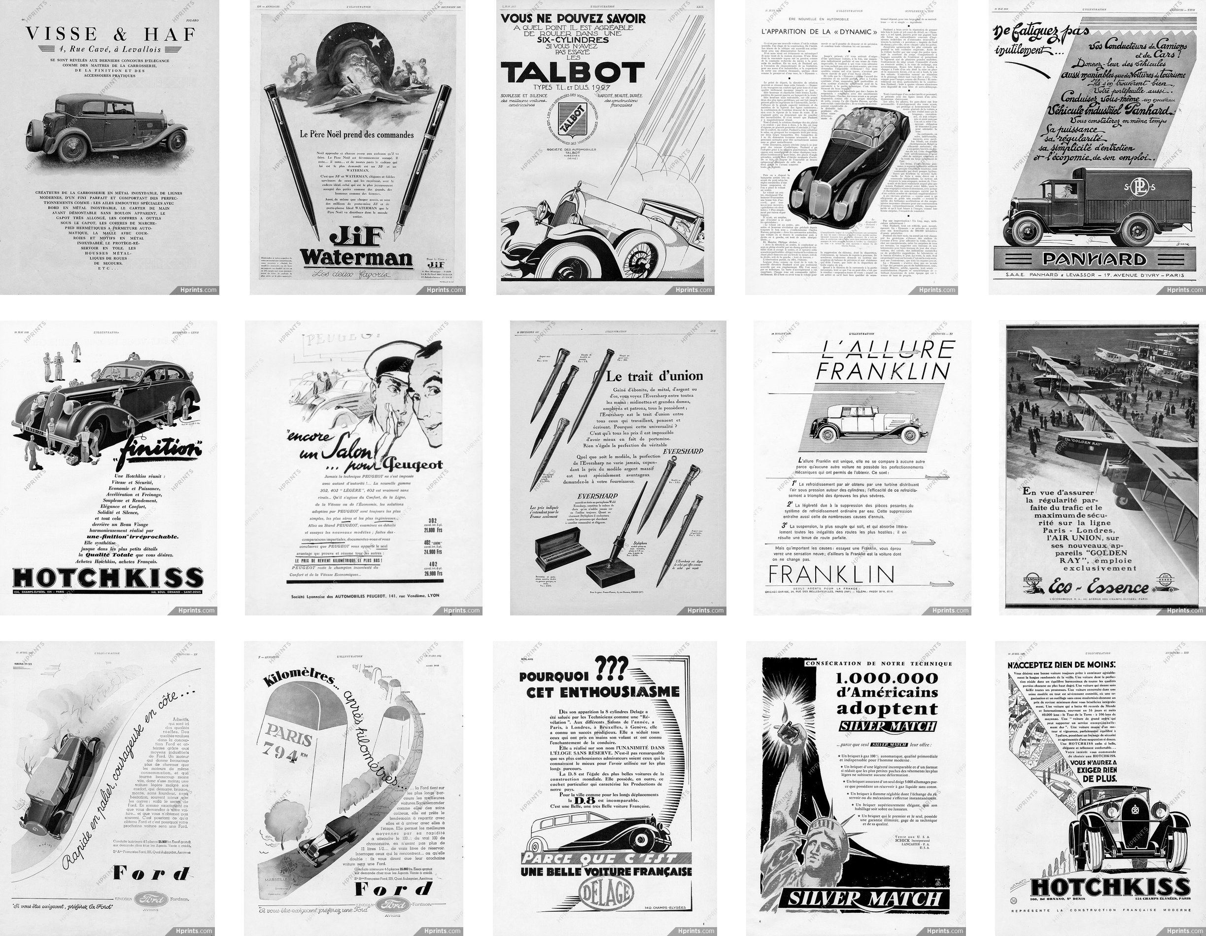
You can find inspiration in surprising places, such as these vintage advertisements.
For the past few years, I’ve filled Dropbox folders with inspiration and I really ought to move those examples to Pinterest. Fortunately, Kristopher Van Sant has been more diligent than me in compiling a Pinterest board full of inspiring ‘Shapes Of Text’ examples.
Shapes add energy to design, and this movement draws people in. They help to connect an audience with your story and make tighter connections between your visual and written content.
When you need content to flow around a shape, use the shape-outside property. You must float an element left or right for shape-outside to have any effect.
  img {
  float: <values>;
  shape-outside: <values>;
}
NB:When you flow content around shapes, be careful not to allow any lines of text to become too narrow and fit only one or two words.
It often needs surprisingly little markup to develop dynamic and original layouts. My HTML for this series of five designs consists only of a header and main elements, figures, and images, and is often no more complicated than this:
For me, one of the most incredible aspects of modern-day CSS is that I can create a shape from the alpha channel of a partially transparent image with no need to draw a polygon path. I only need to create an image, and then a browser will take care of the rest.
I think this is one of the most exciting additions to CSS and it makes developing art direction for the web more straightforward, especially if you work with a content management system and dynamically generated content.
Left: Without CSS Shapes, this design feels dull and lifeless. Right: Creating v-shapes makes this design more distinctive and engaging.
To develop shapes from images, they must have an alpha channel which is either entirely or partially transparent. I needn’t draw a polygon to enable content to flow between the triangular shapes either side of my content in this first design; instead, I need only specify the URL of an image file as the shape-outside value:
Watch out for CORS (cross-origin resource sharing) when using images to develop your shapes. You must host images on the same domain as your product or website. If you use a CDN, make sure it sends the correct headers to enable shapes. It’s also worth noting that the only way to test shapes locally is to use a web server. The file:// protocol simply won’t work.
Generated Content
As Rachel explained in her article:
“You could also use an image as the path for the shape to create a curved text effect without also including the image on the page. You still need something to float, however, and so for this, we can use Generated Content.”
As an alternative to alpha channel, I can use Generated Content — applied to two pseudo-elements — one for a polygon triangle on the left, the other for the right. My running text will now flow between the two generated shapes:
NB:Bennett Feely’s CSS clip-path maker is a fabulous tool for working out coordinate values for use with CSS Shapes.
Adjusting the width of alpha images at several breakpoints allows the shape of this running text to best suit its viewport.
2. Z-Patterns
A Z-pattern is a familiar path our eyes follow when reading content from left–right, top–bottom. By placing content along the hidden lines which form a Z, these patterns help guide a reader along this path, from where we’d like them to start reading towards a destination such as a call-to-action. Z-patterns can be either discreet — implied by focal points or elements with higher visual weight — or made obvious using CSS Shapes.
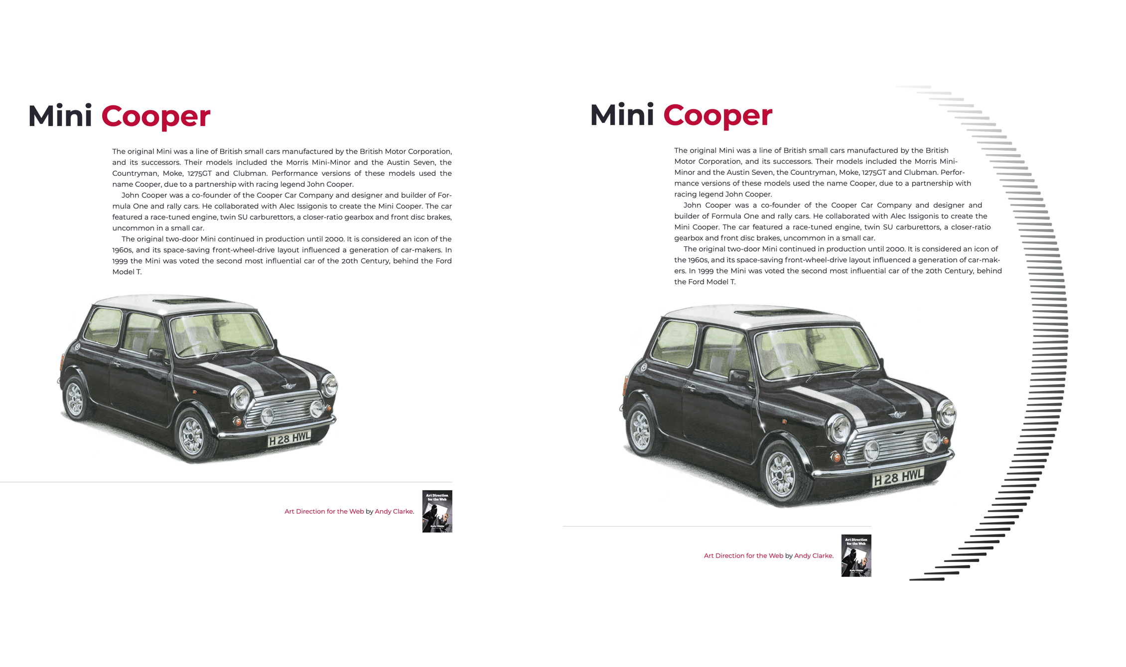
The z-pattern created by driving a narrow column of running text between two shapes suggests speed and the fun people will have when driving this iconic little car.
In this next design, a discreet z-pattern is formed as:
The large image spans the full page width, the end-point emphasised with a right aligned headline.
A block of running text is formed by two CSS Shapes.
The thick top border on a figure acting as a footer completes the Z.
There’s no need for complicated markup to implement this design and my simple HTML includes just three elements:
My page-width spanning header and figure needs no explanation, but flowing text between two triangular shapes is a little more complicated. To implement this z-pattern design, I choose to include two tiny 1×1px placeholder images onto which I apply two larger, shape-forming images using shape-outside. By attaching an aria-hidden attribute to these images, a screen reader won’t describe them.
After giving the two shape images the same dimensions,
I float one image left and the other to the right, which allows my running text to run between them:
Left: A presentable but predictable design which lacks energy. Right: CSS Shapes suggest fun and speed.
The iconic Mini Cooper was fast and fun to drive. While my design would be perfectly presentable without a z-pattern formed by CSS Shapes, this layout looks predictable and lacks energy. The z-pattern created by driving a narrow column of running text between two shapes suggests speed and the fun people will have when driving this iconic little car.
3. Curved Shapes
One of the most fascinating aspects of CSS Shapes is how I can create elegant shapes using the alpha channel from a partially transparent image. This shape can be anything I imagine. I only need to create the image, and a browser will flow content around it.
While confining content to within a shape has been proposed in the CSS Shapes Module Level 2 specification, there’s currently no way to know if and when this might be implemented in browsers. But while shape-inside isn’t available (yet!), that doesn’t mean I can’t create similar results using shape-outside.
Left: Another presentable, but predictable design. Right: A more distinctive look created by using CSS Shapes.
By confining my content within a curved image floated right, I can easily add a distinctive look to this next design. To create the shape, I again use the shape-outside property, this time with the value being the same URL as my visible image:
To put some distance between my shape and the content flowing around it, the shape-margin property draws a further shape outside the contours of the first one. I can use any CSS absolute length unit — millimeters, centimeters, inches, picas, pixels, and points — or relative units (ch, em, ex, rem, vh, and vw):
[src*="curve"] {
  shape-margin: 3rem;
}
More Margins
Adding movement to this curved design relies on more than CSS Shapes. Using viewport width units, I give my headline, image, and running text a different left margin, each one proportional to the width of the viewport. This creates a diagonal from the back of my headline to the front of the car:
Angles can help make layouts look less structured and feel more organic. The absence of clear structure encourages the eye to roam freely around a composition. This movement also causes an arrangement to feel energetic.
I see designs set around horizontal and vertical axes every day, but rarely anything based on a diagonal. Every once in a while, I spot an angled element — perhaps a banner graphic with its bottom sloping — but it’s rarely essential to a design.
It’s common to see content flowing around shapes in print design, but this was impossible to achieve on the web before CSS Shapes.
Even though CSS Grid involves setting columns and rows, there’s no reason why it can’t be used to create dynamic diagonals. This next design needs just a header and main element:
To create the diagonal detail in this design, I again flow content around a shape image which itself is floated left. Again I use the shape-outside property with the same URL value as my visible image and a shape-margin to put distance between my shape and the content flowing around it:
Given that responsiveness is one of the web’s intrinsic properties, we can rarely predict how content will flow, but we avoid designs like this one. When there’s too little space for all my running text to fit above the shape, the fact that each shape is floated means that content will flow into space below the shape.
5. Rotated Shapes
Why settle for just using CSS Grid and Shapes when adding Transforms to the mix can enable layouts which were unimaginable only a few years ago? In this final example, flowing text around the cars in this image, while at the same time rotating the entire composition needed a combination of all those properties.
Why settle for using only CSS Grid and Shapes?
As the image of these cars has no transparent alpha channel, flowing text around the shapes, it contains needs a second image which includes only alpha channel information.
Implementing this design requires two images; one visible, the other proving alpha channel information.
This time, I float the visible image right and apply the shape-outside property with a URL value which matches my alpha channel image:
You may have noticed that both my images contain elements which I rotated clockwise by ten degrees. With those images in place, I can rotate the entire layout ten degrees in the opposite direction to give the illusion that my images are upright:
  body {
  transform: rotate(-10deg);
}
I rotate this layout just enough to make the design more appealing, without sacrificing readability.
Bonus Example: Polygon Shapes Sculpt Columns
An extract from ‘Art Direction for the Web’ available from 26th March 2019.
You can create strong, structural shapes with nothing more than type. Combining polygon() shapes and pseudo-elements, you can sculpt shapes from solid blocks of running text, in the style of Alexey Brodovitch and his influential work for Harper’s Bazaar.
Left: These beautiful numerals are almost too lovely to hide. They’re also perfect for carving into those columns. Right: When I use invisible pseudo-elements with no background or borders to develop polygon shapes, the result is two unusually shaped columns.
I formed these columns from two article elements, i.e. with a gutter between them and a maximum width, which help maintain a comfortable measure:
Because there are two article elements and I also specified
two columns for my grid, there’s no need to be specific about the position of those articles. I can let a browser place them for me, and all that remains for me is to apply shape-outside to a generated pseudo-element in each column:
Now that Firefox has released a version which supports CSS Shapes, and has launched a Shape Path Editor inside its Developer Tools, there’s now only Edge without support for Shapes. This situation will soon change now that Microsoft has announced a change from their own EdgeHTML rendering engine to Chromium’s Blink, the same engine as Chrome and Opera.
Tools like CSS Shapes now give us countless opportunities to use art direction to capture readers’ attention and keep them engaged. I hope by now you’re as excited about them as I am!
Editorial’s Note: Andy’s new book, Art Direction for the Web (pre-order your copy today), explores 100 years of art direction and how we can use this knowledge and the newest web technologies to create better digital products. Read an excerpt chapter to get a taste of what the book has to offer.
As a result, your website needs to be high-quality if you want to beat your competitors. However, not only it has to provide value and look great, but also needs to perform up to par. If your site is slow to load or is incredibly messy or laggy, people will be unlikely to stick around. They will often migrate to your competitor, which could cost you a lot of money and business.
So it is important that your site runs well, doesn’t lag and loads quickly. Unfortunately, this is easier said than done as there are many variables that can lead to bad site performance. This includes errors, large amounts of traffic, unoptimized content, and more. With that in mind, this article is going to take a look at a few different tools that you can use to help increase the performance of your website.
Monitoring tools
While improving the performance of your site is great, you should also try to find out why the performance is struggling in the first place. In order to do that, you should be utilizing at least one type of monitoring tools. There is a wide range of tools that can be used such as log monitoring, analytics monitoring, and networking monitoring. Free network monitoring tools are also great and they can provide you with a ton of value without breaking the bank.
These tools will alert you when an error or a specific event occurs, and they may even let you know how to fix it. Without using these tools you may not be aware of why your site is performing poorly, which will limit your ability to fix the issue.
Use a CDN or a load balancer
As we briefly mentioned earlier, having too much traffic on your site can often be a major cause of performance issues. This is because your single server is overloaded with requests, so it takes longer to respond to them and provide people access to your site. One thing that many companies may consider doing to rectify this is using a content delivery network (CDN).
CDNs use a principle called load balancing to help your site stay perfectly functional. Load balancing involves distributing your traffic over a number of different servers, instead of overloading one with requests. This eases the load on your website and will allow you to maintain a suitable speed despite the increased traffic. While these can sometimes be fairly expensive, they are a proven and reliable way to keep your website performing appropriately.
Ensure it is optimized for mobile audiences
Just because your site runs and performs well on a desktop computer or laptop, don’t automatically assume it will run as well on a mobile device. If your site isn’t specifically optimized or designed with mobile in mind, there is a good chance the user experience will be subpar.
And with over half of the world’s internet traffic coming from mobile devices, this is more important than ever. There is a better chance someone is viewing your site on a mobile phone or tablet than a computer, so make sure it looks good. This can be done by using a reliable host, a responsive theme, redesigning pop-ups and more. Of course, don’t forget to test your site on different devices as well.
Hopefully, this article has been helpful when it comes to bettering the performance of your website.
The adoption of DevOps and Agile has been one of the biggest trends to be seen in the testing domain. A rising trend in the domain of automation testing is leading to more systems being developed in every minute. With the development of information technology, the testing domain is also changing. Gone are the days when the testing phase of software is satisfied with manual testing. With the IT industry already witnessing DevOps, there are few skills that are needed to be adopted by a tester in 2019 to remain competitive.
1. Testing in Advanced Machine Learning and Artificial Intelligence
A horde of futuristic developments is brought in the IT industry by AI. The center stage is already dominated by natural language processing, neural systems, and machine learning. The best thing about artificial intelligence is the capacity of a system in developing more systems.
Since 2009, and especially over the past few years, cryptocurrency development has become a skill in high demand. Whether you are looking to create a new currency or contribute to an existing project, creating a new user-friendly wallet is a necessary part of the process. This includes creating a front-end and a back-end to the client.
For inspiration, you should take a look at the source code of some of the top cryptocurrency wallets. If you wish to compete with what’s on the market, features like offline cold storage, paper wallet generation, or asset management would be well received.
Businesses are continuously striving to bring high availability to customers with unmatched application performance, little to zero downtime, and seamless multi-channel experience. Moving to the cloud is one way to achieve these goals. However, even moving to the cloud is not a foolproof survival strategy. They still need agility, cost-savings, and better performance for millions of connected devices. The development and cloud operations must go hand-in-hand to make the most of cloud platforms. Companies missing DevOps on cloud operations or development are not reaping the promises of using cloud platforms.
Cloud and DevOps Are Better Off Together
First, using DevOps engineering (developers and QA teams) can work with the operations team employing a cloud platform. Developers can quickly set up new environments without the help of IT operations. Meanwhile, IT operations can investigate other operations of infrastructure costs, enabling security and dynamics. Cloud is the common language here and thus, connects two different teams.
Kubernetes has built on Docker’s containerization success to further transform the way server environments are set up. Rather than relying on a single physical server or a cloud instance, web services and apps can now run across a multi-cloud environment. Cloud provider networking capabilities the flexibility offered by Kubernetes even further, allowing developers to have private and public instances/services in a proper network architecture implementation.
When we have pods and Kube services running in private subnets though, these are not instantly accessible from the internet. Kubernetes has an extra layer between your services and the internet. That layer is Ingress. For us to utilize those private cluster resources from the external world, we need to set up an ingress controller and ingress rules.


