Amazon Introduces Blog Blueprint to Deliver WordPress Posts as Audio on Alexa

Last week Amazon launched Alexa Skill Blueprints that allow anyone to publish new skills to the Alexa Skills Store without having to have any coding knowledge. The blueprints are templates that provide a starting point where users can create a new skill by filling in the blanks and then publish it to the store for US customers.

This first round of blueprints is targeted at content creators, bloggers, and organizations. It includes blueprints for personal trainers, flashcards, facts, quizzes, and a fable blueprint for storytellers. There are also new blueprints available called University and Spiritual Talks for live and recorded audio content from institutions and organizations.

Amazon has also created a blueprint specifically for WordPress blogs. It works in connection with the Amazon AI Plugin for WordPress to read blogs aloud on Alexa-enabled devices. Setup is not trivial but it is much easier for users than having to create their own blueprints from scratch.

How to Get Alexa to Read Your WordPress Blog Aloud

According to Amazon’s announcement, the new WordPress blog blueprint converts posts into speech and creates an audio RSS feed:

The Amazon AI Plugin for WordPress is a sample application that enables WordPress bloggers to easily convert their blog posts into speech by leveraging Text-to-Speech (TTS) and translation tools provided by Amazon. Bloggers can generate an audio feed (RSS feed) for text-based blog content, and simply add this to the new Blog blueprint to create and publish their own Alexa skill.

If you want to get this working for your WordPress blog, the first step is to install the official Amazon AI Plugin for WordPress. Follow the instructions on the Blog skill blueprint page. The plugin will generate an RSS feed that you will enter into your skill content section. It also needs to be configured with the AWS access key, secret key, and AWS region. There are options available for specifying a post type, enable logging, audio player settings, the ability to exclude certain tags from generating audio, translations, audio excerpts, and more.

After setting up the plugin, you can complete the blueprint by customizing the welcome messages, naming the skill, and publishing it to the Alexa Skills Store, as demonstrated in the video below. Anyone with an Alexa-enabled device can then have Alexa read your RSS feed to them.

Amazon also introduced a new blueprint for creating flash briefing skills, which include short-form content in the form of an audio feed. This format lends itself well to local weather reports, news and sports updates, and other information that can be quickly communicated via an audio update. This may be another option that WordPress news site owners may want to consider. The flash briefing skills page has instructions for creating one and there is also an unofficial WordPress plugin called WP Alexa Flash Briefing that has its own Alexa skill already set up.

If you want to go one step further and manage your WordPress blog with Alexa, the Blog Helper skill will enable you to log new drafts and moderate comments. It’s available on GitHub.

Google Proposes Fix to Incognito Mode Leak in Chrome

Google has announced a fix to a privacy problem with browsing Chrome in incognito mode. Chrome supports the FileSystem API in normal browsing mode. However, the FileSystem API is not supported in incognito mode. Accordingly, abusive sites detect whether or not a certain user is browsing in incognito mode simply by trying to use the FileSystem API. This created the privacy problem: an incognito mode leak.

Prefilling text field in IE with VBA Excel

I've been looking tutorials and examples of setting the value field of a input tag. I'm trying to enter two IP addresses into the text fields on this website, under IP Range To CIDR. But my code won't enter anything.

There's no ID tag, so I can't use the getElementById method.

Inspect.PNG

Dim url As String

Sub ConvertIPRangeToCIDR()

    Dim IE As InternetExplorer
    Set IE = New InternetExplorerMedium

     With IE
        .Visible = True
        url = "https://www.ipaddressguide.com/cidr"
        .navigate (url)

        While IE.Busy
            DoEvents
        Wend

        Dim Elements As Object
        Set Elements = IE.Document.getElementsByTagName("input")
        For Each Element In Elements
            If Element.Name = "ipFrom" Then
                Element.Value = "1.32.204.128"
            Exit For
            End If
        Next Element
        End With
End Sub

From tutorials this looks easy, but I've been trying different things and nothing is working.

How @supports Works

CSS has a neat feature that allows us to test if the browser supports a particular property or property:value combination before applying a block of styles — like how a @media query matches when, say, the width of the browser window is narrower than some specified size and then the CSS within it takes effect. In the same spirit, the CSS inside this feature will take effect when the property:value pair being tested is supported in the current browser. That feature is called @supports and it looks like this:

@supports (display: grid) {
  .main {
    display: grid;
  }
}

Why? Well, that's a bit tricky. Personally, I find don't need it all that regularly. CSS has natural fallback mechanisms such that if the browser doesn't understand a property:value combination, then it will ignore it and use something declared before it if there is anything, thanks to the cascade. Sometimes that can be used to deal with fallbacks and the end result is a bit less verbose. I'm certainly not a it's-gotta-be-the-same-in-every-browser kinda guy, but I'm also not a write-elaborate-fallbacks-to-get-close kinda guy either. I generally prefer a situation where a natural failure of a property:value doesn't do anything drastic to destroy functionality.

That said, @supports certainly has use cases! And as I found out while putting this post together, plenty of people use it for plenty of interesting situations.

A classic use case

The example I used in the intro is a classic one that you'll see used in lots of writing about this topic. Here it is a bit more fleshed out:

/* We're gonna write a fallback up here in a minute */

@supports (display: grid) {
  .photo-layout {
    display: grid;
    grid-template-columns: repeat(auto-fill, minmax(200px, 1fr));
    grid-gap: 2rem;
  }
}

Nice grid! Repeating and auto-filling columns is a sweet feature of CSS grid. But, of course, there are browsers that don't support grid, or don't support all the specific features of it that I'm using above there.

For example, iOS shipped support for CSS grid in version 10.2, but iOS has had flexbox support since version 7. That's a decent gap of people with older iOS devices that do support flexbox but not grid. I'm sure there are more example gaps like that, but you probably get the idea.

It may be acceptable to let the fallback for this be nothing, depending on the requirements. For example, vertically stacked block-level elements rather than a multi-column grid layout. That's often fine with me. But let's say it's not fine, like a photo gallery or something that absolutely needs to have some basic grid-like structure. In that case, starting with flexbox as the default and using @supports to apply grid features where they're supported may work better...

.photo-layout {
  display: flex;
  flex-wrap: wrap;
  > div {
    flex: 200px;
    margin: 1rem;
  }
}

@supports (display: grid) {
  .photo-layout {
    display: grid;
    grid-template-columns: repeat(auto-fill, minmax(200px, 1fr));
    grid-gap: 2rem;
    > div {
      margin: 0;
    }
  }
}

The "fallback" is the code outside of the @supports block (the properties above the block in the example above), and the grid code is either inside or after. The @supports block doesn't change any specificity, so we need the source order to help make sure the overrides work.

Notice I had to reset the margin on the divs inside the @supports block. That's the kind of thing I find a bit annoying. There is just enough crossover between the two scenarios that it requires being super aware of how they impact each other.

Doesn't that make you wish it could be entirely logically separated...

There is "not" logic in @supports blocks, but that doesn't mean it should always be used

Jen Simmons put this example in an article called Using Feature Queries in CSS a few years ago:

/* Considered a BAD PRACTICE, at least if you're supporting IE 11 and iOS 8 and older */
@supports not (display: grid) {
   /* Isolated code for non-support of grid */
}
@supports (display: grid) {
   /* Isolated code for support of grid */
}

Notice the not operator in the first block. That's checking for browsers that do not support grid in order to apply certain styles to those browsers. The reason this approach is considered bad practice is that the browser support for @supports itself has to be considered!. That's what makes this so dang tricky.

It's very appealing to write code in logically separated @supports blocks like that because then it's starting from scratch each time and doesn't need to be overriding previous values and dealing with those logical mind-benders. But let's go back to the same iOS situation we considered before... @supports shipped in iOS in version 9 (right between when flexbox shipped in iOS 7 and grid shipped in iOS 10.2). That means any flexbox fallback code in a @supports block using the not operator to check for (display: grid) {} support wouldn't work in either iOS 7 or 8, meaning the fallback now needs a fallback from working in browsers it otherwise would have. Phew!

The big reason to reach for @supports is to account for very different implementations of something depending on feature support where it becomes easier to reason and distinguish between those implementations if the blocks of code are separated.

We'll probably get to a point where we can use mutually-exclusive blocks like that without worry. Speaking of which...

@supports is likely to be more useful over time.

Once @supports is supported in all browsers you need to support, then it's good to start using it more aggressively and without having to factor in the complication of considering whether @supports itself is supported. Here's the support grid on that:

This browser support data is from Caniuse, which has more detail. A number indicates that browser supports the feature at that version and up.

Desktop

ChromeOperaFirefoxIEEdgeSafari
2812.122No129

Mobile / Tablet

iOS SafariOpera MobileOpera MiniAndroidAndroid ChromeAndroid Firefox
9.0-9.246all4.47164

Basically, IE 11 and any iOS device stuck on iOS 8 are the pain points. If your requirements are already past those, then you're good to use @supports more freely.

The irony is that there hasn't been a ton of CSS features shipping that have big clear @supports use cases — but there are some! Apparently, it's possible to test new fancy stuff like Houdini:

(I'm not sure entirely what you'd put in the @supports block to do that. Has anyone else done this?)

When @supports isn't doing anything useful

I've seen a good amount of @supports uses in the wild where the end result is exactly as it would be without using it. For example...

@supports (transform: rotate(5deg) {
  .avatar {
    transform: rotate(5deg);
  }
}

On some level, that makes perfect logical sense. If transforms are supported, use them. But it's unnecessary if nothing different is happening in a non-support scenario. In this case, the transform can fail without the @supports block and the result is the same.

Here's another example of that shaking out.

There are browser extensions for playing with @supports

There are two of them!

They are both centered around the idea that we can write @supports blocks in CSS and then toggle them on and off as if we're looking at a rendering of the code in a browser that does or doesn't support that feature.

Here's a video of Keith's tool applied to the scenario using grid with a flexbox fallback:

This is fun to play with and is very neat tech. But in this exact scenario, if I was able to pull off the layout identically with flexbox, then I'd probably just do that and save that little bit of technical debt.

Ire's tool, which she wrote about in the article Creating The Feature Queries Manager DevTools Extension, has a slightly different approach in that it shows the feature queries that you actually wrote in your CSS and provides toggles to flip them on and off. I don't think it works through iframes though, so I popped open Debug Mode to use it on CodePen.

More real world use cases for @supports

Here's one from Erik Vorhes. He's styling some custom checkboxes and radio buttons here, but wraps all of it in a @supports block. None of the styling gets applied unless the block passes the support check.

@supports (transform: rotate(1turn)) and (opacity: 0) {
  /* all the styling for Erik's custom checkboxes and radio buttons */
}

Here are several more I've come across:

  • Joe Wright and Tiago Nunes mentioned using it for position: sticky;. I'd love to see a demo here! As in, where you go for position: sticky;, but then have to do something different besides let it fail for a non-supporting browser.
  • Keith Grant and Matthias Ott mention using it for object-fit: contain;. Matthias has a demo where positioning trickery is used to make an image sort of fill a container, which is then made easier and better through that property when it's available.
  • Ryan Filler mentions using it for mix-blend-mode. His example sets more opacity on an element, but if mix-blend-mode is supported, it uses a bit less and that property which can have the effect of seeing through an element on its own.
  • .thing {
      opacity: 0.5;
    }
    @supports (mix-blend-mode: multiply) {
      .thing {
        mix-blend-mode: multiply;
        opacity: 0.75;
      }
    }
  • Rik Schennink mentioned the backdrop-filter property. He says, "when it's supported the opacity of the background color often needs some fine tuning."
  • Nour Saud mentioned it can be used to detect Edge through a specific vendor-prefixed property: @supports (-ms-ime-align:auto) { }.
  • Amber Weinberg mentioned using it for clip-path because adjusting the sizing or padding of an element will accommodate when clipping is unavailable.
  • Ralph Holzmann mentioned using it to test for that "notch" stuff (environment variables).
  • Stacy Kvernmo mentioned using it for the variety of properties needed for drop capping characters. Jen Simmons mentions this use case in her article as well. There is an initial-letter CSS property that's pretty fantastic for drop caps, but is used in conjunction with other properties that you may not want to apply at all if initial-letter isn't supported (or if there's a totally different fallback scenario).

Here's a bonus one from Nick Colley that's not @supports, but @media instead! The spirit is the same. It can prevent that "stuck" hover state on touch devices like this:

@media (hover: hover) {
  a:hover {
    background: yellow;
  }
}

Logic in @supports

Basic:

@supports (initial-letter: 4) {

}

Not:

@supports not (initial-letter: 4) {

}

And:

@supports (initial-letter: 4) and (transform: scale(2)) {

}

Or:

@supports (initial-letter: 4) or (-webkit-initial-letter: 4) {

}

Combos:

@supports ((display: -webkit-flex) or
          (display: -moz-flex) or
          (display: flex)) and (-webkit-appearance: caret) {

}

JavaScript Variant

JavaScript has an API for this. To test if it exists...

if (window.CSS && window.CSS.supports) {
  // Apparently old Opera had a weird implementation, so you could also do:
  // !!((window.CSS && window.CSS.supports) || window.supportsCSS || false)
}

To use it, either pass the property to it in one param and the value in another:

const supportsGrid = CSS.supports("display", "grid");

...or give it all in one string mirroring the CSS syntax:

const supportsGrid = CSS.supports("(display: grid)");

Selector testing

At the time of this writing, only Firefox supports this sort of testing (behind an experimental flag), but there is a way to test the support of selectors with @supports. MDN's demo:

@supports selector(A > B) {
}

You?

Of course, we'd love to see Pens of @supports use cases in the comments. So share 'em!

The post How @supports Works appeared first on CSS-Tricks.

instant.page

instant.page is a pretty cool project from Alexandre Dieulot. Alexandre has been at this idea for half a decade now, as InstantClick is his and is essentially the same exact idea.

The idea is that there is a significant delay between hovering over a link and clicking that link. Say it takes you 300ms of delay. That 300ms could have been spent preloading the next page. And if you do use that time preloading, that page loads that much faster.

This new project makes use of newer tech to get it done. It's hardly any code., the core of which is appending a <link rel="prefetch" href=""> to the document of the link you're about to click/touch.

The page encourages you to hotlink the script, which means possible cache-hits in case you've already visited a page using this. It's not risky in the way other third-party JavaScript can be because the integrity attribute means that if you trust the code as it is now, it can't ever change unless you change that attribute along with it. It also cleverly uses the type="module" to prevent it from loading anything in browsers that don't support prefetching anyway.

Still, you could self-host it if you wanted. I have no idea who's ponying up the for the bandwidth here, so another risk is a hung script should it stop responding one day.

You could argue that it doesn't do the prefetching as absolutely responsibly as it could. Google's similar quick link library (which we covered here) does two interesting things in which to attempt to be more responsible with prefetching: 1) wait for requestIdleCallback and 2) respects info from navigator.connection, like a user enabling data-saver mode.

Direct Link to ArticlePermalink

The post instant.page appeared first on CSS-Tricks.

Best Google Analytics Plugins for WordPress in 2021

Want to jump straight to the answer? The best Google Analytics plugin for WordPress is MonsterInsights and Google Analytics Dashboard for WP.

How is your website performing?

Heck, for those of you who have a new website, you’re probably wondering if your site is even working—let alone how much traffic you have, where your visitors are coming from, and what pages are performing well.

To answer those questions, you’ll want to turn to Google Analytics.

If you’re using WordPress, you can integrate Google Analytics with your site through plugins. They allow you to view all of these insights without having to leave your WordPress administrative dashboard.

It doesn’t matter if you’re website is new or old. It doesn’t matter if you have an ecommerce site or blog. Every website can benefit from Google Analytics plugins.

The 5 Best Google Analytics Plugin for WordPress

  1. MonsterInsights
  2. Google Analytics Dashboard for WP
  3. Actionable Ecommerce Google Analytics Plugin for WooCommerce
  4. Analytify
  5. WP Google Analytics Events

Check out my list to determine which plugin is best for your situation. I took the time to research and identify the best Google Analytics plugins for WordPress.

1. MonsterInsights

MonsterInsights

More than two million WordPress websites are using the MonsterInsights plugin.

I love this plugin because it’s so easy to install and use. You can get the plugin configured in just minutes.

It is dead simple. And it’s easier than manually adding your Google Analytics code, set up your event tracking, configure your ecommerce tracking (if applicable), and deal with the learning curve of Google Analytics.

MonsterInsights simplifies everything for you, directly from your WordPress dashboard. You can enable specific Google Analytics features with just one click. There is no coding required.

The plugin provides you with extensive reports about your website. I’ll go through each one briefly and list the benefits.

Audience Report

  • Gender
  • Age breakdown
  • Device (desktop, mobile, tablet)
  • Location
  • Categories

You could learn that the majority of your traffic is coming from men in the United States between the ages of 25 and 34. These users are browsing from mobile devices.

Behavior Report

  • Sessions
  • Pageviews
  • Average session duration
  • Bounce rate
  • Referrals
  • Search terms
  • Outbound links

If you identify specific outbound links on your website that are very popular, you can use that as a potential partnership opportunity. You’ll also be able to focus on referral channels that are driving the most traffic.

Content Report

The content report shows you the top performing landing pages. You’ll see the visits, average duration and bounce rate for each page. Based on these results, you can optimize those pages to drive conversions.

Ecommerce Report

Obviously, this report is specifically for ecommerce websites. It’s useful information that will help you increase conversions and revenue.

You can’t go wrong by installing the MonsterInsights plugin. The only catch is that it’s not free. Pricing starts at $99.50 per year. But if you have an ecommerce site, you’ll want to go with the pro version that’s $199.50 annually. MonsterInsights even has a plan for agencies and developers, which costs $499.50. That’s not bad considering you can use it on 25 sites. Buy it now.

2. Google Analytics Dashboard for WP

Google Analytics Dashboard for WP

Google Analytics Dashboard for WP by ExactMetrics is one of the most popular analytics solutions out there.

In fact, this plugin has more than one million active installations.

With the Google Analytics Dashboard for WP, you’ll be able to use the latest Google Analytics tracking code to monitor your WordPress site. This is great for those of you who don’t want to manually insert the tracking code. Once installed, you’ll be able to view all of your Google Analytics statistics from the WordPress dashboard. This makes things much easier for you.

You’ll be able to track key stats in real-time, such as:

  • Real-time visitors
  • Real-time acquisition channels
  • Real-time sources of traffic

The plugin also helps you track specific events on your site. Some of these include emails, downloads, page scrolling depth, and affiliate links. You can even create notated HTML elements that allow you to track custom events and actions.

The plugin also offers front-end viewing options. As an administrator, you can set up your reports on the front-end of any page on your site. You can also allow these front-end viewing permissions for other people who work on the website like editors, authors, and contributors.

Some of the most popular reports you can view with the Google Analytics Dashboard for WP include:

  • Page views
  • Bounce rates
  • Traffic channels and mediums
  • Browers
  • Operating systems
  • Screen resolutions
  • Social networks
  • 404 errors
  • Keywords
  • Locations

Why is this information so important? The data allows you to learn more about the browsing behavior of people on your website. You can use these insights to create a customer persona that improves conversion rates.

Overall, it’s a top option for any website. Get it here.

3. Actionable Ecommerce Google Analytics Plugin for WooCommerce

Enhanced Ecommerce Google Analytics Plugin for WooCommerce

In case the name didn’t give it away, the Actionable Ecommerce Google Analytics Plugin for WooCommerce is designed specifically for ecommerce sites.

Google Analytics recently launched a new feature for enhanced ecommerce statistics. That’s what this plugin focuses on.

It’s fast and easy to install. Once you install it, you’ll be able to track the behavior of your website visitors across your entire ecommerce site. You’ll learn about everything they do from the home page to the product views, all the way to the thank you pages.

Here some of the reporting they offer:

  • Shopping behavior report
  • Checkout behavior report
  • Product performance report
  • Sales performance report

The plugin tracks product impresses, clicks, and add-to-cart rates on every page. If you don’t want to bounce back and forth between your WordPress dashboard and Google Analytics dashboard, this plugin will let you view everything from one place. Try it today.

4. Analytify

Analytify

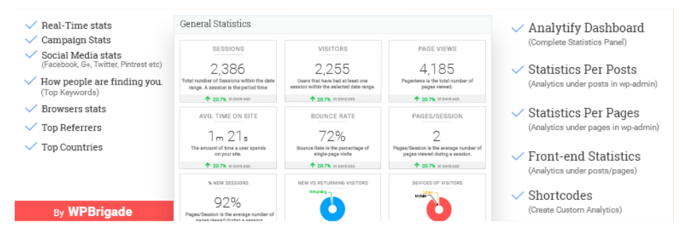
Analytify is another plugin eliminates the need for you to manually add your Google Analytics tracking code to your site. All you need to do is install the plugin and authenticate it with one click to automatically add the code.

This is especially nice for anyone who’s nervous about messing with your website’s code. Let’s be honest: It can be scary. Without any coding experience, even a simple copy and paste can be a bit intimidating.

Analytify has all of the standard Google Analytics reports and statistics. You can view all of them from your WordPress dashboard. What makes this plugin stand apart from other options are the extras. They offer premium add-ons for things like WooCommerce and Easy Digital Downloads integrations.

Depending on the type of website you have, you may want to show website visitors your statistics as well. For example, let’s say you have a business directory site. The companies that are listed on your site would want to know certain metrics. So you can enable front-end viewing reports.

The Analytify WordPress plugin is great for ecommerce businesses. They have enhanced ecommerce tracking. You’ll know how many visitors added items to their shopping cart and also gain insights for when people are leaving the cart. This information will help you reduce shopping cart abandonment by optimizing your checkout process.

You’ll also see things like:

  • Transactions
  • Revenue
  • Average order value
  • Product checkouts
  • Unique purchases
  • Product clicks
  • Product detail views

They also provide you with automated email reports — which is amazing. You can gain deeper insights for specific campaigns, posts, and pages.

The shortcodes offered by Analytify allow you to integrate your data into custom templates.

Furthermore, you can manage your UTM campaigns with Analytify as well. For those of you who aren’t familiar with this or want to learn more, refer to my guide on how to track your leads with UTM parameters. It’s nice knowing that you can monitor those campaigns directly from this WordPress plugin.

Pricing for Analytify starts at $39 for one site. Add-ons are purchased separately. Those all fall within the $19 to $49 range. Analytify also offers an all-in-one bundle for $129 per year that includes your Analytify install and every add-on. This is the most cost-effective deal if you’re planning to purchase add-ons.

5. WP Google Analytics Events

WP Google Analytics Events

Google Analytics already offers insights for event tracking. This allows you to monitor specific user interactions with content on your website.

Think: clicks, downloads, flash element or AJAX embedded element interactions, video plays, and gadgets. This helps monitor custom metrics that aren’t based on something simple (e.g. page views). Just because someone navigated to your homepage, it doesn’t tell you if they scrolled to view your pricing table.

The only problem is these events can be tough to manually set up and configure with Google Analytics.

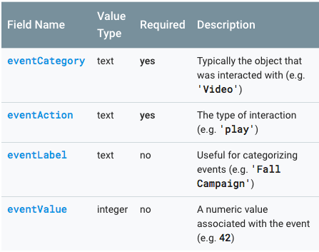
Without a plugin, you’ll have to some extra work based on the type of event that you want to track:

GA Event Type

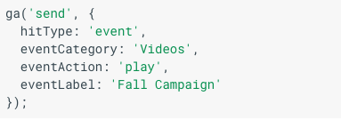
Then you’ll have to write commands. When it’s done, it will look something like this:

GA Example 1

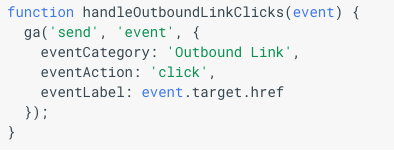
Here’s another example:

GA Example 2

Again, it’s complicated. Even the Google Analytics developer page with these instructions says, “tracking outbound links and forms can be tricky.”

The WP Google Analytics Events plugin simplifies this process. You can do all of this without having to worry about any coding.

So if you want more detailed information with how users are interacting with specific pages on your website, you’ll want to install this plugin. It’s much easier and less complex than the standard coding process for event tracking. You can download and install the WP Google Analytics Events plugin to your WordPress site for free.

Conclusion

Every website can benefit from Google Analytics.

(You’ve already installed, right? If not, do it now. Right now. Go. Install it now. Here’s our guide to help.)

But you can simplify your insights by getting all of your reports and information directly from your WordPress dashboard. All you need to do is install a plugin. So what’s the best Google Analytics plugin for WordPress?

For those of you who want a free all in one plugin, you should consider Google Analytics Dashboard for WP. If you’re a developer, have an agency, or want added reports for an annual premium, you should look into MonsterInsights.

Ecommerce websites would benefit from plugins like Analytify or the Enhanced Ecommerce Google Analytics Plugin for WooCommerce.

Maybe you don’t want all of these features, and you’d rather focus on something specific, like event tracking. If that’s the case, WP Google Analytics Events will be your best bet.

No matter what type of website you have, I know there’s a Google Analytics plugin for you on this list.

IE10-Compatible Grid Auto-Placement with Flexbox

If you work on web applications that support older browsers, and have lusted after CSS Grid from the sidelines like I have, I have some good news: I've discovered a clever CSS-only way to use grid auto-placement in IE10+!

Now, it's not actually CSS Grid, but without looking at the code itself, you wouldn't be able to tell. The HTML structure looks like CSS Grid. It has a defined set of columns with an undefined amount of rows and it has gutters that support borders and shadows on the cells without hacks. But what’s actually happening behind the scenes is a combination of flexbox and margins.

In this article, I'll walk through the approach. Here’s a demo of what we’re looking at:

See the Pen
IE10-compatible CSS-Grid-like column layout
by Brian Holt (@bholtbholt)
on CodePen.

Auto-flowing rows with flexbox wrap

Five orange rectangles in two rows with three on the first row and two on the second row.
Flexbox-created auto-placement grid

Getting the basic grid setup is very simple. If you're at all familiar with flexbox, I'm certain you've already guessed flex-wrap: wrap is the trick here. And you'd be right.

Let's get the HTML markup in place before we write any CSS. We want it to resemble the same structure as if we were using auto-placement — a .grid container and an undefined number of .grid__cells.

<div class="grid">
  <div class="grid__cell">...</div>
  ...
</div>

We set three grid breakpoints. A single-column, two-column, and three-column layout for mobile-devices, small screens, and medium screens, respectively. I'm using the breakpoints used in Bootstrap for this article, though we’d want to define them at actual points where the layout breaks if we were working with real content.

$screen-sm-min: 768px;
$screen-sm-max: 991px;
$screen-md-min: 992px;
Five orange rectangles stacked on top of one another.
Mobile-first grid collapses into a single column

A mobile-first approach means our single-column layout is already complete since each .grid__cell is already a block. We set .grid to become a flexbox container after the first breakpoint, and wrap cells.

@media (min-width: $screen-sm-min) {
  .grid {
    display: flex;
    flex-wrap: wrap;
  }
}

Our two- and three-column layouts need explicit widths and flex properties; otherwise they'll cram onto a single line. While testing IE10, I experienced unexpected behavior with the flex-basis property, and found setting an explicit width with flex-basis: auto was more consistent. This didn't seem to be a problem with IE11 though.

.grid__cell {
  min-width: 0;
  flex: 1 1 auto;
}

// Two-column grid
@media (min-width: $screen-sm-min) and (max-width: $screen-sm-max) {
  $width: 50%;

  .grid__cell {
    width: $width;
  }
}

// Three-column grid
@media (min-width: $screen-md-min) {
  $width: 33.33%;

  .grid__cell {
    width: $width;
  }
}

We don't need to wrap .grid__cell in a media query since its flex properties won't have the effect when the parent isn't a flexbox container. We also define an upper-limit to the two-column media query so it doesn't affect the three-column grid.

And that's it! We now have a responsive, fluid, wrapping flexbox grid. The easy part is done… well, as long as we only ever have items that are multiples of two and three. With flex: 1 1 auto, the last item will always take up any remaining space in the last row.

Three rows of orange rectangles. The first two rows have two columns of boxes and the third row has one single box that spans both columns.
Two-column grid on smaller screens
Two rows of orange rectangles. The first row has three columns of rectangles and the second row has two rectnagles that span the full width.
Three-column grid on large screens

Aligning cells in the last row

The elusive last row is why we're here, right? By default, each cell will stretch to the end of the row in a flexbox layout, but grid leaves a blank spot. How do we do that in flexbox? With pseudo-elements!

The trick is to add a pseudo-element to the .grid container and set it like a cell. We define the :after pseudo-element cell at each of our breakpoints with the same width as a real cell.

@media (min-width: $screen-sm-min) {
  .grid {
    ...

    &:after {
      content: '';
      display: block;
      flex: 1 1 auto;
    }
  }
}

@media (min-width: $screen-sm-min) and (max-width: $screen-sm-max) {
  $width: 50%;

  .grid:after {
    width: $width;
  }
}

@media (min-width: $screen-md-min) {
  $width: 33.33%;

  .grid:after {
    width: $width;
  }
}

This creates a fake cell that will push against our real cells and align our two-column grid when the cells are odd. Leaving its height undefined allows it to collapse to nothing when the cells are even.

Three rows of orange rectangles. First two rows have two columns, each with a rectangle. Third row has a single rectangle and an empty column.
Two-column grid with odd cells, snapping into place

Our three-column grid is a bit more complex because we need to handle multiple states, like when there is one empty cell and when there are two empty cells.

Three column grid of orange rectangles with two rows. The second row only has one rectangle and an empty column.
Three-column grid with one empty cell

Our one empty cell state is already handled because it isn't really any different from one empty cell in two columns. The :after cell has its width set and completes the row. The story changes when there are two empty cells though because flex: 1 1 auto rears its head again: the last cell now stretches across 50% of the width when pushed against the pseudo-element.

Three column grid of orange rectangles with two rows. The second row has one rectangle that spans half the grid width leaving an empty white space.
Three-column grid with two empty cells

Using CSS :nth-of-type selectors, we can target the first column in each row. Since our rows are multiples of three, we target them with 3n then count backwards by 2 to get the first element in each row.

@media (min-width: $screen-md-min) {
  .grid__cell {
    ...

    &:nth-of-type(3n-2) {
      background-color: red;
    }
  }
}
Three column grid of rectangles. The first column of rectangles is red indicating the rectangles that are selected with CSS. The other rectangles are orange.
Targeting the first cell in each three-column row

We're broadly targeting all the cells in the first column, but we need to limit the selection to only the last row. Actually, we need to limit it to when it's the last cell in the first column of the last row. Luckily, there's a handy pseudo-selector for targeting the last item of its kind. We chain :last-of-type to create the logical statement.

@media (min-width: $screen-md-min) {
  .grid__cell {
    ...
    &:nth-of-type(3n-2):last-of-type {
      background-color: red;
    }
  }
}

Now that we have the last cell in the first column of the last row selected, we use a margin to push the :after cell to the last column and fill the middle cell.

@media (min-width: $screen-md-min) {
  .grid__cell {
    ...

    &:nth-of-type(3n-2):last-of-type {
      margin-right: $width;
    }
  }
}

Here's our flexbox-defined-auto-placement-grid-imitator in full. Look at its beautifully lined up rows. I bet you can't even tell it's not CSS Grid!

Three column grid with three rows of orange rectangles. The last row has a single rectangle in the first column and the other two columns are empty.
Our complete three-column grid.

Adding gutters with margins

CSS Grid's spec has a column and row gap to provide space between each cell. Creating gutters in flexbox is much more challenging. It looks like it's coming to flexbox, but we're not there yet…and IE will never be.

In Daniel Tonon’s guide on CSS Grid in IE, he used an inner-cell div with negative margins, borders, a bit of padding, and overflow: hidden. While maybe a bit hacky, the effect works, but it breaks our desire to maintain CSS Grid-like HTML structure. The approach I prefer might feel a bit crude, but I also found it the easiest to read and understand. Further, it continues using :nth-of-type pseudo-selectors which makes the overall approach feel consistent.

We want gaps between the cells, but not around the outside. We also want our cells to sit flush with the container.

A three-by-two grid of orange rectangles. A block arrow is pointing at a gap between the rectangles.
Gaps between the cells, not on the outside.

Our mobile or single-column grid only needs a bottom margin on the cells. We add that and override the very last cell with margin-bottom: 0 so the cell fits flush against the container. Normally I'd use initial, but there's no support in IE.

$col-gap: 16px;

.grid__cell {
  ...
  margin-bottom: $col-gap;

  &:last-of-type {
    margin-bottom: 0;
  }
}
A single column of orange rectangles in five rows.
Single-column grid with gaps between each row

Our two- and three-column grids need margins on the right of the cells, no right margins in the last column, and no bottom margins on any of the last row's cells. Because of the margins, we'll also need to recalculate our widths since the cells will wrap if they don't fit.

In a two-column layout, getting the right (or second) column is fairly easy with :nth-of-type(2n) or :nth-of-type(even). I prefer an n-multiplier for consistency with our three-column grid and for calculating the last row.

Our last row is a bit more tricky. When we have odd cells our mobile-first CSS takes care of removing the bottom margins since the cell is the :last-of-type and our :after cell doesn't have margins applied.

A two-by-three grid of orange rectangles. The last rectangle is a little taller than the others.
Two-columns with even cells

When we have even cells we need to target the second last cell, but only when it is in the first column position. If we didn't qualify it, the second last cell will grow vertically with to match the height of the second last row. We can target it with :nth-of-type(2n-1):nth-last-of-type(2).

@media (min-width: $screen-sm-min) and (max-width: $screen-sm-max) {
  $width: calc(50% - #{$col-gap});

  .grid__cell {
    ...
    margin-right: $col-gap;

    // Remove margin in last column
    &:nth-of-type(2n) {
      margin-right: 0;
    }

    // For when the last row is complete
    // . .
    // * .
    &:nth-of-type(2n-1):nth-last-of-type(2) {
      margin-bottom: 0;
    }
  }
}
The same two-by-three grid as before, but with the last rectangle at an even height with the rest.
Two-columns with even cells that sit flush against the container

Our three-column gutters take the same approach. We add margin-right to all of them, remove it from the third column, and remove bottom margins from the last row. Again our last cell is handled by our mobile-first approach, but now we need to cover when there are two cells in the last row and when when there are three cells. We can qualify our selectors with nth-of-type and nth-last-of-type.

@media (min-width: $screen-md-min) {
  $width: calc(33% - #{$col-gap});

  .grid__cell {
    ...
    margin-right: $col-gap;

    // Remove margin in last column
    &:nth-of-type(3n) {
      margin-right: 0;
    }

    // For when there two items in the last row
    // . . .
    // * .
    &:nth-of-type(3n-2):nth-last-of-type(2) {
      margin-bottom: 0;
    }

    // For when the last row is complete
    // . . .
    // * * .
    &:nth-of-type(3n-1):nth-last-of-type(2),
    &:nth-of-type(3n-2):nth-last-of-type(3) {
      margin-bottom: 0;
    }
  }
}
A three-by-three grid of orange rectangles, with the last cell empty.
Three-column grid with gutters and an empty cell

We need to adjust the margin of last cell in the last row when it's alone because of the columns. We use 33% plus a gutter on each side.

@media (min-width: $screen-md-min) {
  $width: calc(33% - #{$col-gap});

  .grid__cell {
    ...
    // When there is only one item in the last rpw
    // Fill the margin so it's like the last item is
    // double the width
    // . . .
    // *->
    &:nth-of-type(3n-2):last-of-type {
      margin-right: calc(33% + #{$col-gap * 2});
    }
  }
}

Now our gutters are installed and the grid is complete! Fill them borders, shadows, or whatever your heart desires.

A three-by-two grid of orange rectangles with the last cell empty.
Complete three-column grid with gutters using flexbox.

Wrapping up

Here’s the final result one more time:

See the Pen
IE10-compatible CSS-Grid-like column layout
by Brian Holt (@bholtbholt)
on CodePen.

I believe this technique could also support IE9 with minor adjustments, like using inline-blocks instead of flexbox. We could also expand to a four-column grid by adding another breakpoint and using the same approach as the three-column grid. Feel free to use this approach and I hope it helps!

The post IE10-Compatible Grid Auto-Placement with Flexbox appeared first on CSS-Tricks.

#CodePenChallenge: Blobs

It's week three of the Shapes #CodePenChallenge!

Last week, we got straight to the point with triangles. Check out the Pens from the challenge in our #CodePenChallenge: Triangles 🔺 collection.

February's Challenge Sponsor: CodePen PRO

CodePen PRO combines a bunch of features that can help any front-end designer or developer at any experience level. You'll be able to drag-and-drop to upload assets • Cross-browser test easier with no-login Debug View and Live View • Make anything private with the flip of a toggle • Collaborate in real time with Collab Mode • So much more.

Week Three Prompt: Blobs 🍦

After a couple weeks of strict shapes, it's time to get blobby! This week we're throwing out the compass and the ruler to create soft, amorphous blob shapes.

Your Challenge

Create a Pen that features irregular, blobby shapes.

How to Participate

Create a Pen and tag it codepenchallenge and the weekly tag cpc-blob. We'll gather those Pens into a collection and share our favorites on Twitter and Instagram (Use the #CodePenChallenge tag on Twitter and Instagram as well).

Ideas

  1. Did you make a Pen for the circles or triangles challenge? Use that as your starting point to create new blobby shapes.
  2. Ever seen a lava lamp? The oil and wax inside create and endless variety of blobby shapes. Maybe you could light up the browser that way.
  3. Blobs can bring a bit of delight to UI. Could you blobbify a button or form action?

Resources

  1. Planning to transform a regular shape into a blob? Our very own Chris Coyier curated a list of blob building tools for Bizarro Devs.
  2. Going for the lava lamp vibe? Check out Alex Zaworski's Pure CSS Lava Lamp or Adam Kuhn's gooeytype A.
  3. Watch the Keyframers blobbify a form's error state in the first video from their two-part Gooey GUI livestream.

The post #CodePenChallenge: Blobs appeared first on CodePen Blog.

17 Inspiring Hand-Letterers to Follow on Instagram

Instagram is chock full of lettering artists. These people put their awesome calligraphy out there for you to enjoy. You’ll find everything from traditional and digital lettering to graffiti, neon, and body art. If you’re looking for a little inspiration, give a follow to these great artists and watch your Instagram feed flood with beautiful artwork.

Gemma O’Brien

Gemma O’Brien

All you can say when looking at these images: Wow! These designs are super cool and complicated. Letters, colors and unique designs mix together perfectly to create these fantastic pieces.

Sarah Disney

Sarah Disney

This artist creates hand-lettering for weddings and home decor, and that sophisticated aesthetic permeates the whole gallery. You’ll find their work on everything from signs and cards to plates and book covers.

Ian Bernard

Ian Bernard

This page is full of totally unique lettering designs, and there’s no one style here, either. Traditional, digital, grungy, sketchy, and elegant art awaits you. The artist also created letter brushes you can purchase for Procreate.

Heyfoxy.au

Heyfoxy.au

Have you ever wanted to keep a cute journal filled with artwork and calligraphy? Look here for all the inspiration you’ll ever need! These pretty pastels are nothing less than breathtaking.

JansArts

JansArts

This page is especially interesting because you’ll see both traditional art right on the paper and the artist’s work digitally overlaid on photography. The effect is pretty awesome!

Michael Moodie

Michael Moodie

This artist specializes in clean script font, but you’ll see other types of lettering too. Bold letters that look like something off a poster, or painted words with bleeding ink – but all pulled off with the same stylish grace.

The Inky Hand

The Inky Hand

This marker artist has a distinctively vibrant style. Mixed in you’ll find hand-lettering embroidery and digital pieces too, so there’s plenty of variety here!

Saskolinas

Saskolinas

This artist is all about the atmosphere. Their black and white lettering and drawings are amazing, and you’ll also want to take note of the carefully arranged background! It all comes together to make the perfect image.

Shelley Hitz

Shelley Hitz

Do you love watercolors and soft designs? Then you’ll definitely want to check out this artist! They make beautiful watercolor cards with calligraphy text.

Miichellabella

Miichellabella

Have you ever seen prettier hand-made cards? You’ll definitely want to take a look at these cards with their artistic calligraphy and sweet designs.

Mateusz Witczak Designs

Mateusz Witczak Designs

Do you love vintage lettering? This art looks like it could be engraved on a sign or as an established company’s logo.

Nim_br

Nim_br

Absolutely gorgeous calligraphy. You’ll see a lot of sketches, soft gradients and shiny gold lettering here.

Humletters

Humletters

You’ll love these watercolors with a unique font! There are plenty of distinctive and pretty designs here, all on cute little cards that will brighten up your day!

Lettering By Usha

Lettering By Usha

Here’s an artist who’s got their colors down. The gradients they create within letters are absolutely stunning, and there’s not a bad mix of colors in this whole gallery. The backgrounds are super fun and well-crafted too!

Jessica Hische

Jessica Hische

Not only is this artist a talented lettering artist, she’s also a best-selling children’s author. Her art is incredibly intricate and spans a wide variety of looks and genres. You’ll find anything from classic, homemade craft to modern styles within her gallery.

Creatifolio

Creatifolio

This elegant hand-lettering looks like it could be on a greeting card. Scroll down to see a rainbow of colors and beautiful typography.

Hello Tosha

Hello Tosha

These cursive designs just exude positivity. Maybe it’s the cute drawings or the splashes of bright colors. Either way, it’s impossible to be unhappy when you see this gallery.

Add Some Creativity to Your feed!

These awesome artists are sure to bring a little color and variety to your Instagram feed. If you find someone whose work speaks to you, make sure to like your favorite posts and give them a follow. Every artist could use a little love. And these fantastic hand-letterers definitely deserve it!

Collective #493


C493_leon

Leon

Leon is an open-source personal assistant who can live on your server.

Check it out


C493_meteorite

Meteorite

Like an assistant for your GitHub notifications, Meteorite helps you to focus on the most important issues and pull requests.

Check it out


C493_7

Get Ready for Priority Hints

Read about the new experimental feature known as Priority Hints now available through an Origin Trial in Chrome Beta which will allow you to tell the browser how resources should be prioritized.

Read it


C493_pong

Pong

Grégoire Divaret-Chauveau made a fun variation of Pong, where you are the ball.

Check it out


Collective #493 was written by Pedro Botelho and published on Codrops.

How A Screen Reader User Accesses The Web: A Smashing Video

How A Screen Reader User Accesses The Web: A Smashing Video

How A Screen Reader User Accesses The Web: A Smashing Video

Bruce Lawson

Two weeks ago, I had the pleasure of hosting a Smashing TV webinar with Léonie Watson on how a screen reader user accesses the web. In the talk, Léonie showed some big-name sites, such as BBC, sites nominated by Members (including my own!), Smashing Magazine itself, and the popular third-party service Typeform, because so many of us (including us at Smashing) just assume that the popular services have been checked for accessibility. Throughout, Léonie explained how the sites’ HTML was helping (or hindering) her use of the sites.

We felt that the webinar was so valuable that we would open it up so that it’s free for everybody to use. Hopefully, it will serve as a resource for the whole web development community to understand how — and why — semantic markup matters.

What We Learned

I was pleased that my personal site’s use of HTML5 landmark regions (main, nav, header, footer, etc) helped Léonie form a mental model of the structure of the page. Although I’ve always been scrupulous to avoid link text like “click here” because WCAG guidelines require “The purpose of each link can be determined from the link text alone”, it hadn’t occurred to me before that because I have hundreds of weekly “Reading List” articles, it’s impossible for a screen reader user to tell one from the other when navigating by headings. Since the webinar, I’ve made each new reading list’s heading unique by including its number in the heading (“Reading List 222”).

We also learned that being technically accessible is good, but even better is to be usably accessible. The Smashing Team learned that before Léonie can read her own article on our site, there’s loads of preamble (author bio, email sign-up form) that she can’t easily skip over. We’re correcting this at the moment. There’s also an issue with our quick summaries; Léonie gets no indication when the summary has finished and the article proper has begun. Sighted users get a dividing line, but what can we do for non-sighted users?

After the webinar, Léonie suggested using a semantic HTML element and a sprinkling of ARIA:

<section aria-label="Summary">
</section>

This is announced as “Summary region start” and “Summary region end”, and can be skipped over if desired.

Thank You!

We’d like to thank Léonie for giving the webinar, and also our magnificant Smashing Magazine members whose support allows us to commission such content, pay our contributors fairly, and reduce advertising on the site.

Shameless plug: if you enjoyed this webinar, why not consider becoming a Member yourself? There are around three webinars a month free, Smashing eBooks and discounts galore. It costs around two cups of coffee a month, and you can cancel anytime.

Smashing Editorial (ra, il)

9 Best WordPress Translation Plugins for Multilingual Websites

WordPress is used by millions of non-English websites around the world. You can use WordPress to create a website in any language that you want.

However, WordPress does not come with the built-in capability to create a multilingual websites. Luckily, there are some powerful WordPress translation plugins that allow you to easily add multilingual content to your site.

In this article, we will show you the best WordPress translation plugins that you can use to create multilingual websites. We will take a look at their features, pros and cons, to help you pick the best option for your website.
WordPress translation plugins for multilingual websites

Choosing a Translation Plugin to Create Multilingual WordPress Websites

Most beginners don’t know that you can install WordPress in your own language and use it to make websites in any language.

With the help of plugins, you can create bilingual or multilingual websites. You can even allow your users to translate content using Google Translate.

While there are many translation plugins available for WordPress, they can be characterized in two main categories.

The multilingual plugins allow you to manually add multilingual content to your website. The main benefit of these plugins is the quality of your translations will be significantly better than any machine-generated online translation tools.

The second type of WordPress translation plugins are the ones that use online translation services to translate your content. These plugins don’t require you to write content in multiple languages, but the quality of translations is not as good as it can be.

That being said, let’s look at the best WordPress multilingual plugins and automated translation plugins.

Best WordPress Multilingual Plugins

Unlike automated WordPress translation plugins, these multilingual plugins allow you to manually translate every aspect of your website including content, theme, plugins, and more.

Following are our top picks for the best WordPress multilingual plugins to easily translate your entire website.
1. TranslatePress

TranslatePress

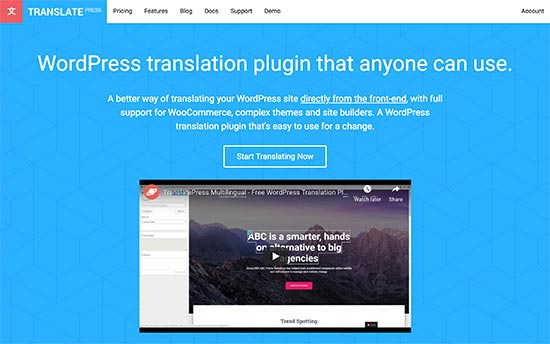
TranslatePress is a full-fledged WordPress multilingual plugin to translate every aspect of your website. The main feature of TranslatePress is that it allows you to translate directly from the front-end.

You can easily switch languages during the translation, and the live preview will change instantly. Another benefit of this approach is that you can translate content, theme, plugins, and even meta-data without changing the interface.

TranslatePress is perfect for manual translations. You can translate yourself or assign the custom translator user role to any user on your site. These users will be able to translate content without access to the admin area.

If manual translations sound like a lot of work, then you can also use Google Translate for machine translations. This approach allows you to use AI-powered translations with manual corrections.

The plugin creates SEO friendly URLs for all languages, which gives you a boost in local SEO results.

To learn more, see our guide on how to easily translate WordPress with TranslatePress.

Pricing: Starting from €79 for personal license.

2. WPML

WPML

WPML is one of the most popular WordPress multilingual plugin. It comes with a powerful translation management system that allows you to translate content, themes, plugins, and more.

WPML comes in Multilingual blog and Multilingual CMS licensing plans. You’ll need the multilingual CMS plan for eCommerce, page builder support, custom fields, managing translation teams, and some other features.

It comes with an easy to use interface to add translations and manage multilingual content across your website. WPML supports all post types, taxonomies, custom fields, and strings generated by your WordPress themes and plugins.

It also allows you to connect your website to third-party translation service providers. You can select which content needs to be translated and get it submitted directly to your website.

For detailed instructions, see our step by step guide on how to create a multilingual WordPress site with WPML.

Pricing: $29 for Multilingual Blog version and $79 for Multilingual CMS.

3. Polylang

Polylang

Polylang is another powerful plugin to easily create a multilingual or bilingual WordPress site. It comes with a simple interface to easily add translations for your posts, pages, custom post types, widgets, and more.

Polylang does not come with support to translate your WordPress theme and plugins. The default plugin doesn’t include eCommerce support, so you will need to purchase a paid addon for that.

It allows you to setup SEO friendly URLs for each language, and it works well with popular WordPress SEO plugins. For language selection, you can add the language switcher to your website using a sidebar widget.

For more details, see our tutorial on how to create a multilingual WordPress site with Polylang.

Pricing: The base plugin is free. You can get Pro version for €99 with a single site license.

4. Weglot

Weglot

Weglot is a cloud-based website translation platform. It works with WordPress, Shopify, BigCommerce, and more.

During the setup, you will need to enter Weglot API to connect your WordPress site to their platform. After that, you will choose your preferred language, site language, and the languages you want to add.

You will have to use Weglot’s website to translate all your content, manage translations, and push them to your live website.

Other notable features include SEO friendly URL support, WooCommerce support, language switcher button, third-party translation services, and more.

Weglot uses a monthly pricing structure based on the number of languages and translated words. This may make it more expensive for you than some other multilingual WordPress plugins which come with a fixed yearly license.

Pricing: Starting from €8.25 / month for 1 language and 10,000 Words. Their popular PRO plan supports unlimited languages and 200,000 words for €41 per month.

5. MultilingualPress

MultilingualPress

MultilingualPress takes a slightly different approach to create multilingual websites with WordPress. Instead of running on a normal WordPress install, it uses the built-in WordPress multisite network for each language.

This allows the plugin to efficiently manage content for each language while improving performance by loading one language at a time. It comes with an easy interface to manage your translations from a single dashboard.

It supports posts, pages, custom post types, taxonomies, and more. Due to its architecture, each language can be on its own subdomain, directory, or even a custom domain name.

Pricing: Starting from $199 / year for a single multisite license.

Best WordPress Translation Plugins

These plugins allow you to translate your website using automated translation services or by manually providing translations for some parts of your website.

6. Translate WordPress with GTranslate

Translate WordPress with Gtranslate

Translate WordPress with GTranslate is a Google Translation plugin for WordPress. It automatically connects to Google translate API and can fetch translations for any supported languages.

It allows you to add a language switcher to easily translate your web pages, or you can automatically translate content based on user’s browser language.

The plugin offers a paid version as well which allows you to choose SEO friendly URLs and let search engines index your translated content (more on this later in the article).

7. Transposh WordPress Translation

Transposh

Transposh combines automated machine translations with manual human translations. You can also allow your website visitors to contribute translations with an easy to use in-context interface.

The plugin allows you to hire professional translation services to submit translations. Transposh’s automated translation feature supports Google, Bing, Yandex, and Apertium translation services.

8. Google Website Translator

Google Website Translator

Google Website Translator plugin allows you to use Google Translate API to translate your website content. It uses the default Google translate button which you can display anywhere on your website.

You can select the languages you want to show in the language switcher, which can be displayed using the sidebar widget or an inline shortcode.

The shortcode feature allows you to offer machine translations for specific pages as needed. The translated page will be visible to users when they select the language or the plugin detects it via their browser settings.
9. Loco Translate

Loco Translate

Loco Translate is slightly different than other translation plugins in the list. It basically allows you to translate WordPress themes and plugins.

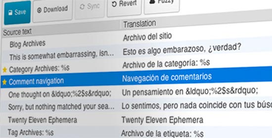
If your WordPress theme or plugin is translation-ready, then you can use Loco Translate to translate it inside the WordPress dashboard. It uses a simple user interface similar to popular translation tools with one column for original strings and the other for translation.

For more details, see our guide on how to translate a WordPress plugin.

Our Pick of the Best WordPress Multilingual Plugin

If you are looking for a multilingual WordPress plugin to manually translate content on your website, then we recommend using TranslatePress.

It is extremely beginner friendly and quite easy to use even for users with no experience of running multilingual websites. It is optimized for SEO and performance, two features that would benefit your business in the long run.

For automatic WordPress translations, we recommend using Translate WordPress with Gtranslate plugin. It is easy to use and even the free version is quite good for automtic translations.

Should I allow search engines to index automated machine translations?

Some translation plugins allow you to make automatic translations available for search engines to index.

These machine translations are not very good. They can be odd and even misleading at times. Allowing search engines to index this low-quality content is a bad idea. Google can identify such content and will consider it as spam which would damage your website’s search rankings.

However for manual site translations, yes you should definitely let Google index your translated versions, so you can rank higher in local SEO.

We hope this article helped you find the best WordPress translation plugins for your multilingual website. You may also want to see our practical tips on how to increase your website traffic.

If you liked this article, then please subscribe to our YouTube Channel for WordPress video tutorials. You can also find us on Twitter and Facebook.

The post 9 Best WordPress Translation Plugins for Multilingual Websites appeared first on WPBeginner.

10 Resources to Find Free Textures

Textures are an all-but-necessary component in web design. They can give a webpage depth, draw the eye to key elements, serve as great backgrounds and just look great when used well! If you’re looking for free textures to enhance your projects, you’ve come to the right place. Here are ten free websites where you can download high-quality textures.

Free Stock Textures

Free Stock Textures

Created by two photographers and artists, this website hosts a ton of textures all licensed under Creative Commons Zero. From nature, to concrete, to abstract – there are all sorts of images to find here. You can also sort by tags, so it’s easy to find what you’re looking for.

There’s a download limit of 5 per day for anonymous users and 50 for registered users.

Rawpixel

Rawpixel is a royalty-free stock photography resource, which has a textures section that contains tons of gorgeous, high-quality images. Their Free plan includes 100 images per month.

Unsplash

Unsplash

Unsplash is a free photography website supported by a large community of photographers. There are tons of textures and patterns, all available for personal and commercial use under CC0.

Textures.com

Textures.com

Textures.com is a versatile site that comes with basically every kind of textured graphic you can think of. Need photos? 3D scanned surfaces? Panoramas, decals or brushes? You can find them here. The robust search feature allows you to search for specific textures as well as tags like “seamless” or “scanned”.

You can download up to 15 images a day with an account. From there, you’ll need to purchase credits or a subscription. You’ll also need credits to download larger files.

Vecteezy

Vecteezy

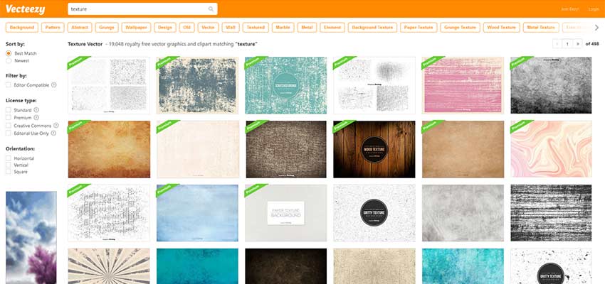
Need textured vectors? Vecteezy is the place to find them. There are tons of beautiful, clean vectors available for download. Some are free while others require credit. You can sort by license, which is really helpful if you only want to see the free images.

Wild Textures

Wild Textures

Wild Textures has textures of all kinds, but where the website shines is in its sorting system. You can sort by categories, tags and even by color! This makes it super easy to find the perfect texture. There’s also some auto-generated previews of the pictures used for different functions.

Stockvault

Stockvault

This vault of stock photos and textures contains everything from grungy patterns to the abstract. Simple or complex, you’ll find a high-definition picture that fits your needs here. Users who upload can choose from commercial or non-commercial use, or public domain – so make sure to check the license.

Freepik

Freepik

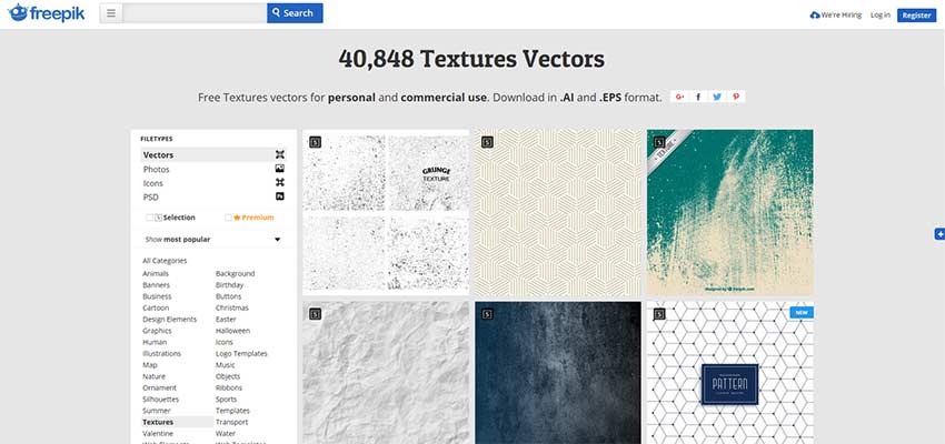
Freepik has a massive library of vector textures that come in .ai and .eps format. Without buying a plan, you’re limited to 5 anonymous and 30 registered downloads a day. There are also a few commercial stipulations.

Texturelib

Texturelib

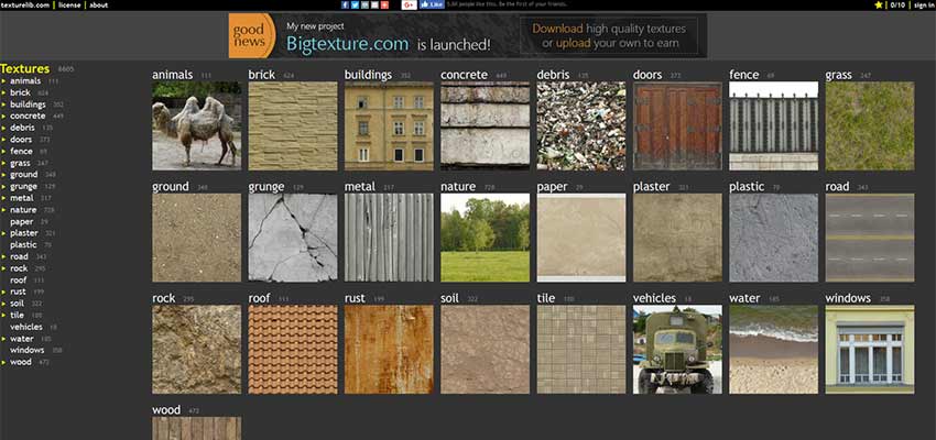
A small-but-robust library, Texturelib is free for personal or commercial use. Most of the images are inspired by nature, but there are also quite a few architecture textures – such as photos of roads, windows and doors.

TextureKing

TextureKing

TextureKing has a variety of grungy, nature-like textures, available for use in almost any commercial project. While the site features about 400 images and doesn’t appear to be updated very often, there are a few categories to pick from, and the high-quality textures can be downloaded for free without an account.

Textures in Web Design

When used correctly (and perhaps sparingly), textures are a great design choice. Use them to call attention to important elements, to craft a rough, grungy atmosphere – and to add depth and beauty to a flat design! With so many free resources, you should have all the tools you need to craft deep, gorgeous websites.

Is Your Web Design SEO Workflow Optimized?


Search engine optimization projects can be very complex, from ​SEO audits​ to content development. Having an optimized strategy on how to approach SEO for web designers not only ensures your design team has clear project direction but also increases client satisfaction. Is your SEO workflow optimized? Here are a few productivity tips to make sure your strategy is fully-optimized.


Make SEO Project Management Visual


This is a very important tip to improve productivity and optimize your SEO workflow. Unfortunately, this is where many SEO and marketing agencies fall short on projects. By having a visual representation of a project, you and your team can see the progression of projects and tasks, as well as what is still to do.

This also helps keep tasks from falling through the cracks, especially since search engine optimization projects are so complex. There are plenty of ways you can approach this. One way is manually, but that can be time consuming. The other is using process documentation software that does the work for you.


Process documentation is a roadmap for your organization—it helps you identify the current state of a process to know how you can improve it. Any task that is done more than once or completed by multiple people needs to be documented.

Develop a Task Workflow for Maximum Productivity


Simply outlining tasks, or sprints within the project backlog is great, but doesn’t necessarily enhance the overall productiveness of your SEO agency. To truly ensure workflow is optimized, you need to develop a workflow for tasks within the project workflow. It is kind of like setting small goals supported by a detailed plan to achieve on big goal down the road.
There are four elements of a task workflow that is highly productive for SEO, or any other project management process. These include, task planning, daily check-ins, review and feedback sessions, and post task analysis to ​improve strategies​.

1.Task Planning

This is the strategizing stage of a task and answers the what and how questions. For example, let’s say one SEO task, or sprint within a client project is to create six location based landing pages to capitalize on local search results. Task planning would consist of the what is needed to accomplish these pages, like location specific keywords, addresses, phone numbers, and content, as well as how to implement these pages.

It is important to keep task planning time efficient, since some tasks don’t need a lot of strategy to get started. In other words, don’t spend an hour strategizing the what and how when it comes to creating a single web page. Utilize your time efficiently.

2. Daily Check-Ins


This is a very important part of increasing project productivity. Essentially, daily check- ins are quick 15 to 20 minute meetings where project anagers, SEO managers, and team members gather to update one another on tasks and the overall pace of the project.


For instance, if you were a project manager, you would huddle your team and find out what each team member has completed from their task list, what they are currently working on, and any issues that need to be resolved. Then you can jot down notes, move the needle on the visual project board, and address issues.


Daily check-ins also give you a clear picture of the entire project in a very short amount of time. This helps ​keep team communication open​, and also allows you to update the client on progress and hiccups moving forward.

3. Review and Feedback Sessions


These sessions are imperative to ensure projects remain mission focused, based on the client business objectives defined by the project manager and SEO manager. By looking at all completed tasks, project managers can evaluate work done and examine it based on meeting client expectations.
If something seems out of place, the project manager can connect with the team and make tweaks on those completed tasks to ensure they are perfect before being closed out. These review and feedback sessions are great for client updates too. You can show clients how the project is progressing and highlight the benefits of each task for the main business aim.

4. Post Task Analysis

Each SEO project is unique, even if you deal with a specific industry niche. This makes post task analysis vital to keeping your SEO workflow optimized on future projects. For example, you and your team may identify a task or sprint that could have been paired with another task for more efficient progress. These sessions generally happen bi- weekly or monthly.
● Main questions to address during the post task analysis include:
● What did we learn from the tasks?
● What issues did we identify?
● How did we solve the problems?
● What areas could we make better?
After the meeting, the project manager and SEO manager can huddle and develop two potential new strategies that can be implemented next time around to increase productivity.


Wrapping Up . . .


Optimizing your web design SEO workflow is essential to growing your client list, as well as retaining existing clients. Using a strategic planning model like the one outlined above can make this happen. Search engine optimization is complex and depending on the size of the project, can be downright overwhelming. Is Your Web Design SEO Workflow Optimized?

Read More at Is Your Web Design SEO Workflow Optimized?