With the Super Bowl now over, surely your attention has now switched to how to view large amounts of unformatted JSON in an effective way.
Ok, maybe your attention hasn't been directed that way, but, ask yourself how many times as a web developer have you had to view a raw dump of an entire JSON document? I mean the kind that is tens of thousands of kilobytes large (or more!); most likely for debugging or tracking a setting down.
In addition to the minds inside Unravel Data, we have a team of advisors that have a phenomenal track record of entrepreneurship, leadership, and engineering. Two of them had some keen perspectives to share on what 2019 for big data. Over the course of the next two blogs, we’ll introduce you to Herb Cunitz and Tasso Argyros as they outline their take on what’s in store for Big Data in 2019.
Customer and vendor activity continued to accelerate in 2019 and all indications are that we’ll continue to see innovation advance at pace and to see how modern data applications are helping companies of all types be more competitive and drive more value to the bottom line. Over the next few weeks, we thought it would be informative to solicit some points of view on what’s next for Big Data in the coming year from people who have been in it and leading that change for the past number of years. Our First guest is Herb Cunitz, principal owner of AccelG2M.
Do you want to build an Amazon affiliate store using WordPress?
An Amazon affiliate store allows you to sell products from Amazon as an affiliate and earn money on each sale. Due to the low startup and running costs, an Amazon affiliate store is one of the easiest ways to start a new business and make money online.
In this article, we will show you how to easily build an Amazon affiliate store using WordPress. We will also share our expert tips on how to increase your Amazon affiliate earnings.
What is an Amazon Affiliate Store?
An Amazon affiliate store is an online store that promotes products that are available to buy on Amazon.
Creating an Amazon affiliate store is very different to running your own online store, where you’ll need to source products, manage orders and refunds, ship products, and keep track of inventory. This can take a lot of time, effort, and money.
When you build an affiliate store, you don’t have to worry about any of these things. You can simply add some affiliate links to your website, and Amazon will handle the rest.
When visitors arrive at your website, they’ll see all the different products they can buy on Amazon using your unique affiliate links.
If a visitor clicks on one of your affiliate links and then buys this product on the Amazon website, you’ll earn money from that sale. This is known as an affiliate commission and it’s a great way to make money online blogging with WordPress.
Amazon affiliate stores are popular because of the low startup and running costs.
Amazon also sells a huge range of products. By creating an Amazon affiliate store, you’ll get access to over 75 million different products.
With that in mind, you should have no problems finding products that your visitors will be interested in buying, no matter whether you start a food blog, a photography website, a fashion blog, or any other kind of site.
However, you can’t add Amazon affiliate links to any sites that are mainly aimed at children under 13.
With that being said, let’s see how you can build an Amazon affiliate store using WordPress. If you prefer to jump straight to a particular step then you can use the links below.
Step 1. Getting Started With WooCommerce and WordPress
There are lots of different WordPress eCommerce plugins that you can use to build an Amazon affiliate store, but we recommend using WooCommerce because it’s powerful, flexible, and free.
WooCommerce is also the most popular eCommerce plugin on the market and powers millions of online stores all around the world.
Before you start building your WordPress website, just be aware that there are two types of WordPress software. To get started, you will need to be using the WordPress.org platform (see the difference between WordPress.com vs WordPress.org).
When you promote Amazon products on your affiliate site, Amazon is responsible for processing the customer’s credit card details. However, at some point you may want to expand your business and start selling your own products. These can be physical products or even digital downloads such as ebooks.
A domain name typically costs $14.99 per year and hosting costs start from $7.99 per month.
The price of an SSL certificate can vary depending on where you buy the certificate. However, as an estimate you can expect to pay anywhere between $50-200/year for an SSL certificate.
That is a lot of expense for a new affiliate business.
Thankfully, Bluehost, an official WordPress and WooCommerce recommended hosting provider, has agreed to offer our readers a free domain name, a free SSL certificate, and over 60% off web hosting.
Basically, you can start an Amazon affiliate business for $2.75 / month.
Note: Bluehost’s starter plan is a great choice for any Amazon affiliate store. However, if you want to sell your own products and services as well, then you want to take a look at our pick of the best WooCommerce hosting providers.
After buying your Bluehost package, you’ll need to install WordPress and choose a theme. For step by step instructions, see our guide on how to start a WordPress blog.
Once you’ve installed WordPress, you can log into the WordPress dashboard by going to example.com/wp-admin/ in your browser. Just replace “example.com” with your own domain.
Here, simply type in the username and password you created, and then click on ‘Log In.’
You’re now in your WordPress dashboard, ready to start building your Amazon affiliate store.
As soon as you activate WooCommerce, it will launch a setup wizard where you can type in an address for your store, the industry where your store operates, and the type of products you plan to sell.
Since we want to create an Amazon affiliate store, you don’t need to worry about configuring your WooCommerce settings. With that in mind, you can close the setup wizard by clicking on the ‘Skip setup store details’ link.
For step by step instructions on how to configure the WooCommerce settings, see our guide to WooCommerce.
Step 2. Sign up to the Amazon Associates Program
Now you’ve installed WordPress and WooCommerce, you’ll need to sign up to the Amazon Associates program.
Amazon automatically accepts everyone who applies to their affiliate program. However, the Amazon guidelines state that you must drive at least three qualified sales in the first 180 days of your application.
This means that at least three people need to click on your affiliate links and then make a purchase on the Amazon website. If you don’t meet this target within 180 days, then Amazon will remove you from their program and you will no longer earn money from your Amazon affiliate links.
When you’re ready to become an Amazon affiliate, simply head over to the Amazon Affiliate program website and click on the ‘Sign Up’ button.
At this point, you’ll be asked to log into your Amazon account.
There’s no need to create a special Amazon affiliate account, so you can go ahead and type in the email address and password for your existing Amazon account.
If you don’t have an Amazon account, then click on ‘Create your Amazon account.’ Amazon will now guide you through the process of creating an account, step by step.
By default, Amazon will send all payments to the primary address for this account. If you’re happy to go ahead and use the default payee, then make sure that ‘The payee listed above’ is selected and then click on the ‘Next’ button.
If you want to use a different payee, then click on the ‘Someone else’ radio button.
You can then type in the name and contact phone number for this new payee, and click on the ‘Next’ button.
On the next screen, you can type in the website domain where you plan to use your Amazon affiliate links, and then click on ‘Add.’
If you plan to advertise Amazon’s products on more than one domain, then simply repeat the same process described above.
After adding all the domains where you plan to use Amazon’s affiliate links, click on ‘Next.’
On the next screen, you’ll need to confirm that your website isn’t mainly aimed at children under 13.
Assuming this is the case, click to select the ‘No’ radio button and then click on ‘Confirm.’
The next step is creating your Amazon Associates profile. To start, type the ID that you would like to use into the ‘What is your preferred Associates Store ID?’ field.
Amazon uses this ID to track and record your commissions. The ID will also be included in your Amazon affiliate links. With that in mind, it’s a good idea to type in the name of your website or company.
Amazon will then automatically create an ID based on your preferred ID.
After typing in this information, check that the ‘Your Website List’ box is showing all the domains where you plan to add your Amazon affiliate links.
Once you’ve done that, you’ll need to enter some information about your site. This includes the topics you cover on your website, and the kind of products you plan to promote on your Amazon affiliate store.
Amazon will also ask for some basic analytics information such as how many people visit your site every month.
Once you’ve entered all this information, click on the ‘Finish’ button.
That’s it. You’re now registered as an Amazon affiliate.
Step 3. How to Find the Best Products for Your Amazon Affiliate Site
Once you’ve signed up to the Amazon Associates program, you’re ready to start creating affiliate links.
You can get affiliate links for most of the physical and digital products sold on the Amazon store. However, there are some products that you can’t get affiliate links for, such as any products sold by Amazon Pharmacy.
Let’s find some products to promote on your new Amazon affiliate store.
To start, sign into your Amazon Associates account. If you scroll to the bottom of the screen, you’ll see some products that Amazon recommends you add to your website.
These recommendations are based on the products your site’s visitors have previously purchased or shown an interest in purchasing.
To add one of these products to your site, simply hover your mouse over the product’s image.
Then, click on the Get Link button when it appears.
On the next page, click on the Text Only tab.
Once you’ve done that, click on the ‘Short link’ radio button. Amazon will now show the affiliate link that you can use to add this product to your website.
Another option is to simply visit the normal Amazon store while logged into your Amazon affiliate account.
Along the top of the screen, you’ll see a new Amazon Associates SiteStripe banner.
You can now simply browse the Amazon store as normal. When you find a product that you want to add to your Amazon affiliate store, simply click on the ‘Get Link: Text’ button in the SiteStripe banner.
In the popup that appears, click on the ‘Short link’ radio button. You will now see an affiliate URL for this product.
To help you get sales, it’s important to find products that your visitors will be interested in buying. Here, a good analytics solution for WordPress can help you learn more about the people visit your site, so you can identify the products they may want to buy.
It’s also a good idea to to think about the kind of content you’re publishing, and the content you plan to publish. For example, if you’re creating a fitness blog, then your target audience might be interested in buying gym equipment or health supplements.
Meanwhile, if you’re building an animals and pet related website then you may want to promote products from Amazon’s ‘Pet Supplies’ category.
No matter what products you choose, once you have an affiliate link you’re ready to start adding products to your Amazon affiliate store.
Step 4. Adding Amazon Affiliate Products in WooCommerce
WooCommerce is the best Amazon affiliate store plugin for WordPress. It allows you to import products that are for sale on third-party websites, and then show these products as part of your own online store.
In this way, you can deliver a seamless experience to the people who visit your website.
To start importing products from Amazon, go to the Products » Add New page.
First, you need to type in a title for the product that you want to promote on your website.
Then, type a detailed description into the post editor.
Once you’ve done that, scroll to the ‘Product data’ box.
Here, open the dropdown that shows ‘Simple product’ by default and click on ‘External/Affiliate product.’
You can now either type in or paste the Amazon affiliate URL for this product.
Just because a product costs $10 now, doesn’t mean it will cost $10 forever. Amazon can change the price of its products at any point.
With that in mind, you’ll want to leave both the ‘Regular price’ and ‘Sale price’ fields blank. Your visitors can then check Amazon for the current price.
Next, scroll to the ‘Product short description’ section. Here, you can type in a short description that will appear on your affiliate store’s front page, product category pages, and in the search results.
To encourage visitors to click your link and buy the product, it’s a good idea to add an engaging product image.
To do this, click on the ‘Set product image’ link.
You can then either choose an image from the WordPress media library or upload a file from your computer.
When you’re happy with all the information you’ve entered, it’s time to click on ‘Publish.’ Now if you visit the shop page of your affiliate store, you’ll see your Amazon product live.
If you click on the ‘Buy product’ button then the affiliate link will take you to the product’s page on Amazon’s website.
You can now add more Amazon products to your affiliate store by following the same process described above.
Step 5. Customizing Your WordPress Amazon Affiliate Store
Themes control how your Amazon affiliate store looks including the colors, layout, and fonts. Your theme is the face of your online store and can encourage visitors to click on your affiliate links.
By default, WordPress comes with a basic design that has limited WooCommerce support.
The good news is that there are lots of different free and premium WooCommerce-ready themes that you can choose from. To get more sales, you’ll want to choose a theme that looks good, compliments your products, and has exactly the features you need.
Another option is to create your own custom theme using SeedProd. It’s the best page builder plugin for WooCommerce and is used by over 100 million websites.
You can use SeedProd to create a completely custom WordPress theme for your store without having to write a single line of code.
SeedProd even comes with special WooCommerce blocks that you can use to show off your Amazon affiliate products. For example, you can use the Products Grid block to show multiple affiliate products on any page in a nice layout.
As well as these special WooCommerce blocks, SeedProd also comes with ready-made templates including designs that you can use to create a landing page with WordPress.
You can also add powerful new features to your eCommerce site using plugins.
There are tons of free and premium WooCommerce plugins that you can choose from. To help you find the best plugins for your Amazon affiliate store, check out our expert pick of the best WooCommerce plugins.
Resources to Grow Your Amazon Affiliate Store
Now that you have set up your Amazon affiliate store, it’s time to focus on growing your new affiliate business.
Fortunately, there are many tools, plugins, and resources that can help you get more sales and make money from your Amazon affiliate store.
Let’s start with SEO. As a general rule, the higher your content appears in relevant search engine results, the more visitors you’ll get to your website. This means more potential clicks on your affiliate links.
For a step by step guide on how to fine-tune your Amazon affiliate store for the search engines, please see our WooCommerce SEO guide.
You may also want to install AIOSEO. AIl in One SEO is the best SEO plugin for WordPress and can help you optimize your affiliate site for the search engines.
By tracking your visitors you can understand what’s working on your Amazon affiliate store, and the areas that you can fine-tune to get more sales.
MonsterInsights is the best Google Analytics plugin for WordPress. It helps you find your best selling Amazon affiliate products as well as products that aren’t doing so well.
You can then make changes to your store based on real data. For more information, see our tutorial on how to track WooCommerce users in WordPress.
Abandoned carts are a huge problem for eCommerce stores. For an affiliate store, this means people will look at the products you’re promoting, but they won’t buy them. In this way, abandoned carts directly affect your affiliate earnings.
To help reduce your cart abandonment rates, we have a detailed guide on how to recover abandoned carts and boost your commissions.
Above all, make sure you continue to add new products to your Amazon affiliate store, post helpful reviews, and use content marketing tools to get more people to visit your website.
FAQs About Running an Amazon Affiliate Store Using WordPress
Since we first published this guide, we have got lots of questions from our readers about how to run a successful Amazon affiliate store using WordPress.
Here are the answers to some of those most frequently asked questions.
1. Can I add products from other affiliate networks?
Yes, you can add products from other affiliate networks to your website. This can be a great way to earn more money, and create a more diverse and robust affiliate business.
2. I live outside the United States, can I join Amazon Affiliate program?
Yes, you can. Currently, the Amazon Associates program is available in over 17 countries. However, every country has its own program and you’ll need to apply separately to each program that you want to join.
3. Do I need to disclose my affiliate partnership?
Yes, you do. Amazon’s program policies and the US laws require you to disclose that you’ll earn a commission when users buy a product.
It is not just limited to Amazon, all websites that use advertising or affiliate marketing to make money need to show a disclaimer. For an example, see our WPBeginner’s disclaimer page.
To meet Amazon’s requirements, you must include a legally compliant disclosure along with your affiliate links, and identify your site as an Amazon associate.
You must also include the following statement on your website:
“As an Amazon Associate I earn from qualifying purchases.”
4. Can I promote Amazon products without creating an affiliate store?
Yes, you can. For example, if you run a blog, then you can add affiliate links to your blog posts. If you do this, then you won’t need to install WooCommerce.
5. What are the Amazon affiliate commission rates?
The amount of commission you get changes depending on the product category. Commission rates can also vary depending on your location.
For a detailed look at the commission rates, you can see the Associates Program Standard Commission Income Statement for your location. For example, the Income Statement for the United States shows that you can expect to earn between 20% and 1% commission depending on the product category.
6. Can I promote Amazon services?
Yes. You’ll typically get a fixed fee every time someone signs up to an Amazon service using your affiliate link. This includes services such as the Prime Video Free Trial.
7. What is the difference between Amazon Associates and Amazon Affiliates?
While they’re very similar, the Amazon Associates program and Amazon Affiliates are two slightly different things.
You become an Amazon Affiliate by signing up to the Amazon Associates program. If you’ve been following along with this guide, then you’re now enrolled in the Amazon Associates program, which makes you an Amazon Affiliate.
8. How much does the Amazon Affiliate program cost?
It’s free to join the Amazon Associates program.
There is no minimum number of sales you need to make before you can start earning commission. However, you will need to refer at least three qualified sales within the first 180 days of becoming an Amazon affiliate.
9. How much does it cost to build an Amazon Affiliate store?
You can start with Bluehost for $2.75 per month and use the free WooCommerce plugin to limit your costs. There are also plenty of free WooCommerce-ready themes that can help you create a professional-looking Amazon affiliate website for minimum cost.
Take a peek over this gallery of 10 incredible examples of custom logo animations for unknown entities and world-famous brands alike.
1. Flowers SVG
One of the hottest animation trends on the web is SVG animation. It’s a growing topic of interest and this flower logo animation is a great example of SVG in action.
The icon & text of the logo has been created inside an <svg> tag in the HTML markup. Then sequential animations are controlled through CSS and automated on pageload. This requires a number of SVG-specific CSS properties like stroke-dashoffset which pushes outline motions in sequence to create this brilliant animated effect.
2. Carbon LDP
The Carbon LDP logo is fairly detailed and complex. But developer David McFeders took this to another level with his animated Carbon logo built on CSS/Compass.
Every piece of this code is easy to customize from the logo size to the animation speed. It’s built in pure CSS and made to loop endlessly. And even though the letters are made of a single PNG image you can always reverse-engineer that design with your own custom fonts.
3. Binary Lab
Binary Lab’s animated logo is one of the more complex animation effects in this list. It pulls numbers from a flask and fades them in & out of view above the logo.
The animation itself is controlled through CSS. But this pen also relies on the TweenMax library for adding repeating digits and custom alpha transitions. All-in-all a very creative use of CSS and JavaScript for modern web animation.
4. Pure CSS3 Stack Overflow
The Stack Overflow logo is one of my favorites because it’s simple, yet recognizable. And this snippet animates the Stack logo icon using nothing but pure CSS3.
This is by far one of the most impressive pure CSS animations I’ve seen. The final output really does look like the official logo and the animation feels smooth in every major browser. Anyone who loves pure CSS/SCSS animation will adore this snippet.
5. Monster Energy Logos
Tim Pietrusky animated this series of Monster Energy logos using SVGs and well-spaced CSS transitions. His code is free to study and replicate on your own if you want a similar fading effect on logos.
All of the animation timing is controlled directly through Sass which makes this a pure CSS animation. But you can alter variables to change the speed, fade colors, or pretty much anything else.
6. Subvisual
The team at Subvisual has a highly unique logo which was animated by Miguel Palhas. It works on two factors: the logo text and the “S” icon.
Everything is built on SVG elements which makes manipulation a bit easier. This pen also relies on the TweenLite library for JavaScript, although the vast majority of the animation is done via CSS. It’s a neat effect that can be repeated or triggered based on user action (hover, click, etc).
7. Pixel Logo Animation
Using the free pixel font Jura allows any developer to create a custom pixel-by-pixel animation effect. And that’s exactly what CodePen user Khaosmuhaha did in this pen.
It uses plain text manipulated through an HTML canvas element. The animations are powered by CSS3 animation properties, but they’re controlled through jQuery which makes the sequential pixel animation possible.
Definitely a cool effect and a fun use of the canvas element combined with a webfont.
8. Alex Aloia Logo
If you’re looking for a real complex logo animation then check out this example created by developer Alex Aloia. Using his name as the brand he created a complex series of SVG shapes which animate using a “drawing” effect.
The entire effect isn’t possible with only CSS. It requires a number of JS transformation libraries like DrawSVG and the more popular D3.js. But it’s a fun way to use open source libraries to create this one-of-a-kind animation.
9. Bayleys
The Bayleys logo is an obscure choice for animation. But it does have strong solid edges which makes re-creating the logo easy as pie.
That’s where Rafael Contreras comes in with his animation snippet using just 38 lines of code. The logo itself is built using SVG tags and the animation manipulates these tags accordingly. Many logo elements move in different directions making this effect mesmerizing to watch.
10. Nintendo Switch
The newest gaming console from the minds of Nintendo comes with a brilliant logo animation. This can be seen in all of their commercials and in this pen created by Koto Furumiya.
Koto re-built the Nintendo Switch logo using SVGs while animating the entire thing with CSS. And would you believe this animation only requires ~50 lines of CSS?
One thing I have to praise about this logo animation is the authenticity. It genuinely matches with Nintendo’s animation from the forceful push down and the rebound/bounce back up.
Wrapping Up
All of these examples are free and open source to study, clone, and manipulate for your own projects. I hope you like these demos and if you’re looking for more examples of CSS animation, take a look at this collection to see what other people have made.
Your client’s website is done. They’re thrilled with it. You and your team are satisfied with the results. And visitor reception looks good so far.
While I recognize that a lot of research, experimentation, analysis and review went into the creation of the website, is that all there is to building a winning website these days? I’d argue that the mobile-first web has added a layer of complexity that few are fully prepared for.
Which is why your work shouldn’t stop when you hit the “Publish” button.
If you’re not yet performing post-launch A/B testing for your website clients, that’s a big mistake. Although we have a massive amount of case studies and other research at our disposal that confirm how to design for conversion on desktop, the mobile experience is still relatively new. At least the mobile-first experience as we know it today.
The following guide includes tips for A/B testing for mobile websites and will get you thinking about conversion rate optimization in other ways than just “Buy This Now”.
A Brief Introduction To A/B Testing For Mobile
Once a website has gone live, Google Analytics and any conversion rate optimization (CRO) tools you hook up to the site will start feeding you data about your users. If you choose to do something with these valuable insights, you have two options:
Identify obstacles in the experience and implement changes to the site to resolve them.
Identify a single obstacle in the experience, hypothesize why it occurred and create an alternative version of the site to test the resolution.
The first option seems cut-and-dried. The data tells you there is an issue; you create a solution for it. But like I mentioned already, the chances of succeeding when shooting from the hip like that only work with tried and true desktop design techniques. Even then, it can still be risky if your audience doesn’t align with the average online user’s behavior.
The second option, on the other hand, allows designers to more safely implement changes to a mobile website. Until you have a clear picture of the mobile user’s journey through your website (which, realistically, could involve them jumping from a mobile device to desktop at some point), mobile A/B testing must be an essential part of your job as a web designer.
This is how A/B testing works:
Identify a part of the website that you believe needs a change. (This should be based on findings in your data or direct reports from users about problematic experiences.)
Hypothesize why there is friction and how you think it can be resolved.
Choose just one element to change.
Using A/B testing software, set up your test variables. You should pit the control (i.e. original version of the site) against a variation of the element.
Run the test against equal parts of mobile visitors.
Let the test run for two to four weeks.
Monitor results to make sure you’re generating sufficient data and take note of any anomalies along the way.
End the test and review the results.
If there’s a significant margin between the control and variation results, use your mobile A/B testing tool (like VWO) to implement the winner.
It’s okay if you find that the control is the winner. Take what you’ve learned and apply it to your A/B testing efforts going forward.
You’re here because you want to know how to increase conversions on the websites you build for clients. The tips below will force you to step outside typical conversion rate optimization planning and think outside the box as you test your theories.
Tip #1: Stop Thinking About Mobile vs. Desktop A/B Testing
With traditional A/B testing, you typically have verifiable proof of what works and what doesn’t. You tweak the wording on a call-to-action and more users click to buy the product. You change the color of the shirt in a photo and sales go up by 25%. You move the placement of the CTA to the bottom of the post and more readers subscribe.
In other words, you know that a change you made will directly impact the business’s bottom line.
However, when it comes to mobile, it’s not that easy.
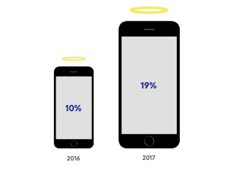
Qubit demonstrates growth in the mobile halo effect. (Source: Qubit) (Large preview)
The above image depicts the differences in the mobile halo effect from 2016 to 2017.
The mobile halo effect is a term Qubit uses to describe how the activity that takes place on mobile directly influences what happens on desktop. Qubit’s research of over 1.2 billion customer interactions with the web found:
Analyzing the cohort of users in our dataset who logged into their accounts on more than one type of device shows that mobile activity directly influences an average of 19% of computer revenue. In some sub-verticals, this influence is much higher, with Fashion seeing an average of 24%, while some retailers receive as many as 1 in 3 of their computer transactions as a result of mobile-browsing.
What’s more, this information only accounts for mobile users who logged into a website from multiple devices. Qubit suspects that people who simply discover a website through mobile also lead to this halo effect. This, in turn, drives up the value of desktop conversions because of how helpful mobile is during the discovery phase of the customer journey.
This is why you can’t just look at mobile-only results on a mobile-first A/B test.
Instead, conduct your tests in the following manner:
Run your test with mobile visitors.
Review the results from your A/B testing tool to see if you were able to remove the obstacle from the mobile experience.
Then, look at your Google Analytics results from the same time period. Even if mobile traffic continued to drop off at the same point, you may find that desktop traffic and engagement increased as a result.
In sum, don’t go into mobile A/B testing thinking that everything you do must result in a greater amount of sales, subscribers or members on mobile. Instead, focus on how to improve the experience as a whole so that it improves your overall conversion rate.
Tip #2: Start with the Header
Remember that there are four micro-moments (or motivations) that drive mobile users to a website:
With such a clear purpose driving their journey to and hopefully through your mobile site, don’t force them to wait for what they’re asking for. In terms of design, this translates to shortening their pathway — either to conversion or to completing the mobile experience before moving to desktop.
When you begin mobile-first A/B testing, look at elements that provide an answer to the micro-moments that are most relevant to your website.
Is there a way to place them in the header of the website or within the first scroll or two of the home page? Or can you at least design a one-click shortcut in the navigation to take them to it?
Here are some ideas:
1. I want to know.
Websites with lots of content would do well to test whether or not rearranging the navigation and putting emphasis on relevant and timely categories helps with conversion.
In addition to customizing the navigation regularly, BuzzFeed has chosen to leave the main navigation out in the open on mobile, with a fun selection of emojis to draw attention to the timeliest of categories.
Another way to answer the “I want to know” search is by providing a point of contact in as streamlined a fashion as possible as SensesLab has done:
The SensesLab includes a recognizable “mailto” icon in the header. (Source: SensesLab) (Large preview)
The “Mail” icon in the top-right corner takes mobile visitors to the Contact page. However, this is no ordinary contact page. While an introduction to their point of contact and email address is given, it’s the contact form below that really shines:
The SensesLab provides a super mobile-friendly contact form at the shortcut. (Source: SensesLab) (Large preview)
The entire form fits within an entire screen-grab on my iPhone above. There’s no wasting of time by providing instructions on how to fill out the form or anything like that. Users just need to click on the highlighted fields to personalize their responses.
Even better:
The SensesLab uses user-friendly contact form fields. (Source: SensesLab) (Large preview)
SensesLab has anticipated their responses and provided pre-populated answers along with custom keyboards to shorten the amount of time anyone has to spend filling this out.
2. I want to go.
I think the solution to test for with this one is obvious. In other words:
Where in the header or above the fold do you place the reservation buttons?
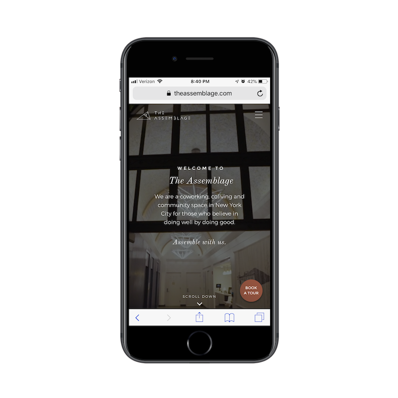
Just don’t be afraid to think outside the box with this. For example, this is The Assemblage website:
The Assemblage includes a 'Book a Tour' icon on the mobile home page. (Source: The Assemblage) (Large preview)
The Assemblage is a coworking space located in New York City. While the mobile site could’ve easily prioritized conversions up top (i.e. “Get your membership now!”), it instead provides a shortcut that makes more sense.
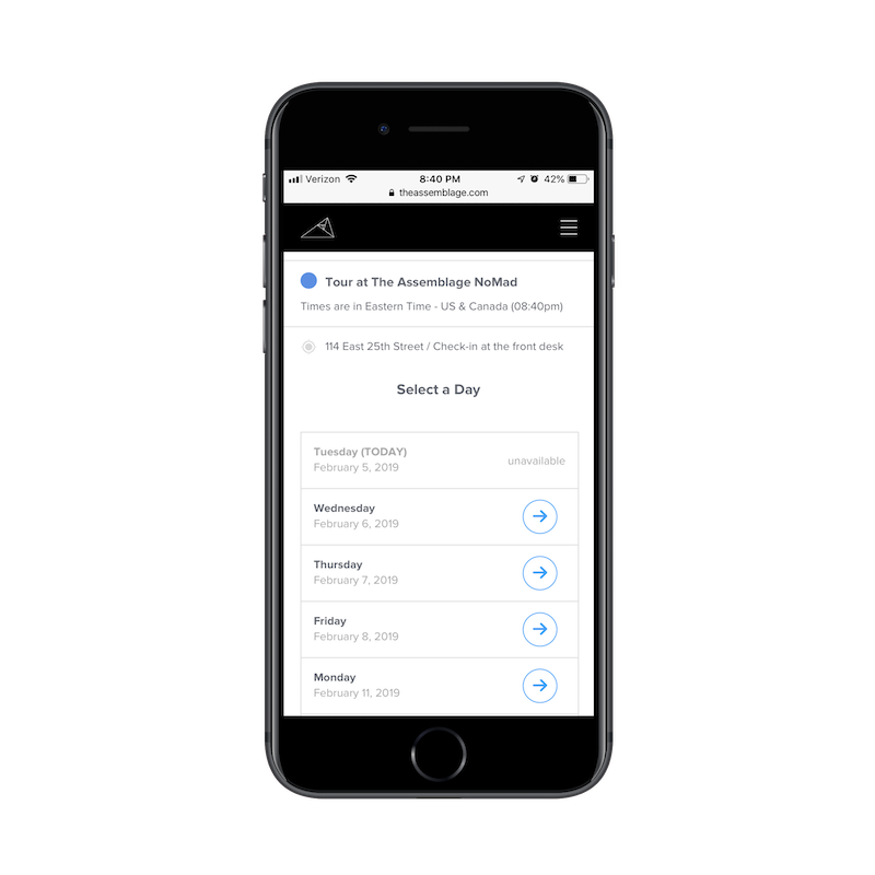
With the focus on booking a tour, mobile visitors can easily claim a date and time. Then, worry about learning all about and seeing the workspace in person later.
Completing the booking process is incredibly easy on mobile, too.
There are other ways to think outside the box when it comes to designing and testing for “I want to go”. This next example combines two micro-moments and does so in a really unique way, in my opinion.
Among the well-chosen icons its placed in the header of the site, Visit California also includes a “Map” icon. After all, what is one of the main reasons why someone would visit this site?
“I want to go to California and need suggestions!”
Now, behind this map icon is not a reservation system, enabling users to book their trip to California. With a site promoting travel to such an expansive location, users are more likely to use this site to gather information to decide where to go. The Map icon, then, is their key to drilling down deeper into those answers:
This is a unique and visually stimulating way to get research topics and answers into the hands of people who want it.
3. I want to do.
This question is an interesting one to design and A/B test for.
On the one hand, you’d assume that “I want to do” would be answered by articles that provide a how-to for the desired task. When that’s the case, the abundantly sized search bar from Kitchn is a good idea to test for:
Kitchn uses a search bar that’s comparable in size to the header bar. (Source: Kitchn) (Large preview)
It’s clear what Kitchn users want to do when they get here: search for recipes. And with a magazine of Kitchn’s size, that could be a difficult task to accomplish by using the traditional navigation. Instead, this search bar that’s nearly comparable in size to the entire header bar provides a faster solution.
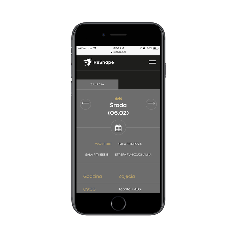
But then you have the other kind of “I want to do” situation to design for — the one where the visitor of your mobile site wants to go out in the real world and get something done. This is similar to the “I want to go” solution from The Assemblage.
ReShape’s home page looks like your typical fitness center website. (Source: ReShape) (Large preview)
Once you open the navigation on this website, users encounter a number of options to learn about the fitness center and its services.
ReShape includes a navigational shortcut for mobile customers. (Source: ReShape) (Large preview)
What’s nice about this, however, is that the website allows current customers to cut the line and schedule a class right away through the calendar icon. There’s no need to download and use a separate mobile app. It’s all right on the mobile website and it’s easy to do, too:
ReShape makes scheduling fitness classes through mobile a breeze. (Source: ReShape) (Large preview)
When the success of the website and business is contingent upon getting customers to actually do something, don’t bury it in the mobile experience.
4. I want to buy.
Lastly, there’s the “I want to buy” scenario you have to test for.
While the hypothesis for this kind of test is going to be easy enough to figure out — “I want to get more mobile customers to make a purchase” — it’s how you use your design to compel them to do so that’s going to be difficult. Because, again, you have to remember that mobile conversion isn’t simple.
One example I really like of this comes from The Bark, a magazine for dog owners.
The Bark hello bar commands attention without being pushy. (Source: The Bark) (Large preview)
What’s nice about this design is that there are two actions competing against one another:
The content of the website that allows visitors to peruse articles for free.
The unobtrusive yet boldly designed sticky bar with an attractive offer to convert.
You could place banners in-line with the content, but that may be too disruptive for your users. While I’d assume that a sticky bar that can easily be dismissed is the better way to compel mobile visitors to convert, this is why we have A/B testing. To let us know what exactly our specific audience will do when confronted with a Buy (Subscribe) CTA on mobile.
And if they don’t want to convert there, that’s fine. At least you’ve done your due diligence in testing alternative scenarios to see if you can improve your success rate.
Tip #3: Encourage Users to Save Instead
This last point is a good segue into what I’m going to talk about next:
There are just some websites that won’t convert well on mobile.
Although research on Generation Z as consumers is still relatively new, many suggest that they are going to be true multichannel shoppers. Most of their research will be done on mobile devices, but the preferred shopping experience will be from a computer or in person.
Whether or not that’s true for Gen Z, millennials or any other generation of consumer, I think it’s a smart idea to test for this hypothesis. Until your mobile conversion rates are consistently and significantly higher than desktop and in-person conversion, encouraging mobile users to “Save” their progress on your site might be the better design choice.
As you work on designing and redesigning websites this year, you might want to save yourself the trouble of committing solely to a conversion funnel. Instead, build in shortcuts to “Save” on the mobile experience like:
Sign up for an account.
Save products to your cart or wish list.
Save an article or feed for future reading.
Share your email address for future updates.
Sign up for a free demo and we’ll take care of the rest.
Then, when the site is live, test how the conversion rates are affected with or without them.
Here are some neat examples of websites that use “Save” features well on mobile.
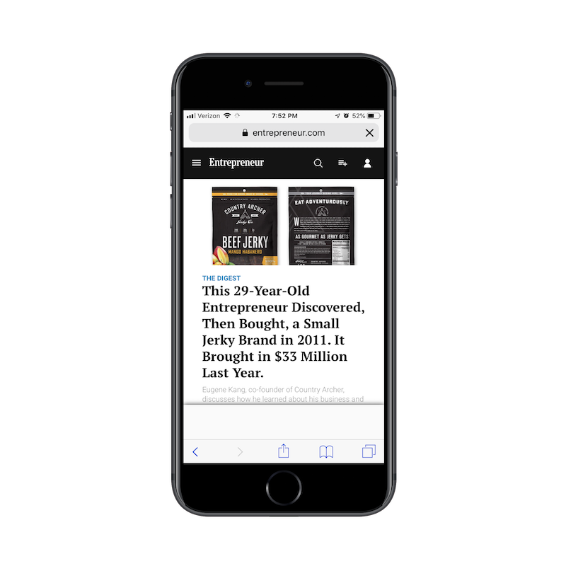
See that icon in the header between the search magnifying glass and account settings? This is where Entrepreneur enables regular readers to save content for future consumption:
As you can see, readers can save all sorts of content under this Save feature, making it easy to return to Entrepreneur articles any time, any place and from any device.
Zendesk offers a free demo and trial right away. (Source: Zendesk) (Large preview)
For those of you designing websites for service providers and SaaS companies, this is an excellent way to help your users “Save” their progress. I know it might not look that way at first glance, but let me explain:
Zendesk isn’t wasting anyone’s time with an overlong description of what it does and why people need to purchase its help desk software. Instead, it’s clearly summarized what users can expect and then provides two appealing calls-to-action. Regardless of which option the mobile user chooses, Zendesk requires them to provide contact information.
So, let’s say a mobile user fills out the form to enter the demo. They get inside it, but then realize they’re short on time or just don’t want to interact with it on mobile. Fine. Zendesk now has their information and will be in touch soon to follow up about the experience. The mobile user can then re-enter the experience from their preferred device when the inevitable follow-up email reminds them to do so.
Tip #4: A/B Test Your Page and Post Length
Another suggestion I’m going to make for mobile-first A/B testing is content length.
I actually touched on the subject of brevity in my previous article, How Web Designers Can Contribute to Mobile-First Marketing. However, I didn’t talk about how you can use A/B testing to confirm whether or not that’s the right path for your website.
There are case studies and research reports galore that discuss the subject of ideal content length for both desktop and mobile. Some are emphatic that shorter is always better, which is why I think we’ve seen such a huge push for video over written content in past years.
But then there are some who suggest that length should be determined on a case-by-case basis.
Take the Neil Patel blog, for instance. If I had to guess, I’d say that his articles are between 2,000 and 5,000 words on average — even on mobile. Considering Patel is a multi-millionaire, I don’t suspect that his lengthy posts have hurt the success of his brand in the least bit.
So, again, this is why we need A/B testing — just to confirm our suspicions and put any fears we might have about the efficacy of a site’s design or content to rest.
Unless your client comes to you as a well-known brand and they’ve already proved they can produce successful 2K-word posts like Patel, you have to test this.
Talk to your writers and marketers and ask them to create two different versions of your content for the first month or two. This includes the home page, blog posts, product pages and any other key pages in the user’s journey. Run a test to see if the length of the page on mobile affects readability as well as conversions.
You can then use these results to refine the rest of the content on your site, making sure you’re providing mobile users with the ideal reading experience wherever they go.
Wrapping Up
The goal in mobile-first A/B testing is to inspire mobile visitors to keep moving through the experience. Even if the element you’ve chosen to test doesn’t directly lead to conversion, the improvements you make should eventually trickle down to that final step, no matter which device it takes place on.
Just don’t forget to study your desktop analytics while running mobile-first A/B tests. While test results might not show you what you were hoping to see, looking at the overall picture might.
A very interesting article by Eric Bailey Every on how adjustments to the appearance and behavior of the features browsers can come at the expense of alienating users.
Lightweight and without any external dependencies, qoa enables you to receive various types of user input through a set of intuitive, interactive and verbose command-line prompts.
Every modern website needs to be mobile friendly. You can accomplish this by using responsive techniques, one of which is the CSS flexbox feature.
Flexbox lets you define layout elements as flexible boxes that can adjust based on the container. So you can decide how much room a certain element should take up, where it should move when the container is resized and how to arrange that content accordingly.
If you’ve never used the flexbox property before it can be really confusing. This list is here to help you come to terms with all the major flexbox methods. From there, you’ll be able to implement this powerful layout feature into your own projects.
Your Designer Toolbox Unlimited Downloads: 500,000+ Web Templates, Icon Sets, Themes & Design Assets
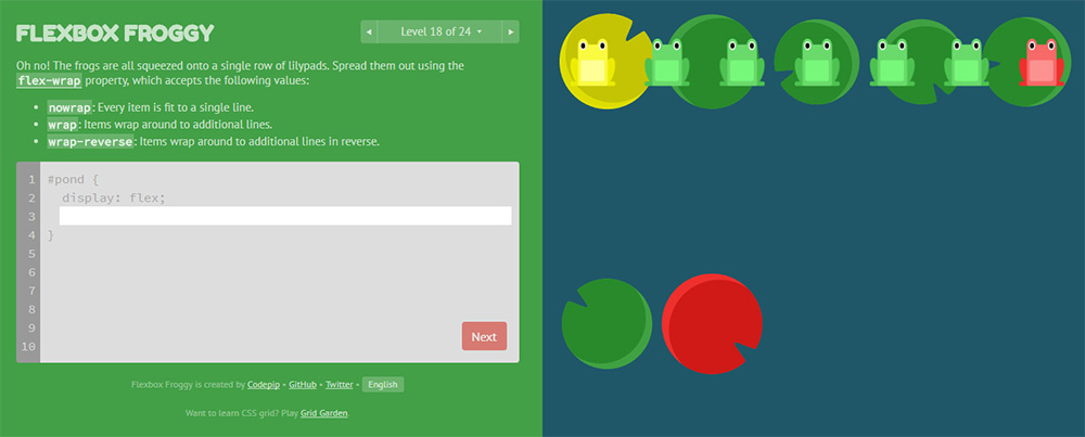
Flexbox Froggy
I’d argue that this is the best tutorial for complete beginners who want to get their hands dirty. Flexbox Froggy is a free open source coding game where you learn the ways of the flexbox…froggy.
You progress through various levels – with the first few being super easy. They introduce the absolute basics of flexbox and teach you the fundamental properties. From there, you’ll move through 30+ levels that get increasingly more difficult and will push the limits of your knowledge.
This game is great even for experienced developers who want a recap of what flexbox can do. You can skip ahead to the later lessons if you need more challenging work, so it’s perfect for all developers.
What The Flexbox
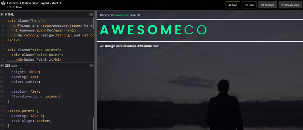
What The Flexbox?! may sound like a weird trivia game show but it’s actually a great way to learn. This is a free set of video courses built by developer Wes Bos.
He takes you through everything related to flexbox properties, including resizing containers and how to create fully-responsive interfaces from scratch. The videos require an email address to sign up, but the course is totally free.
The best part is that these videos teach practical examples you can follow along with to learn the ropes. I still think one of the best ways to learn is to build real projects and this course does just that.
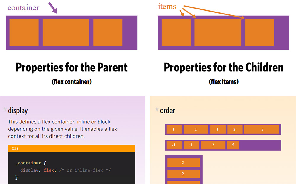
CSS-Tricks Guide
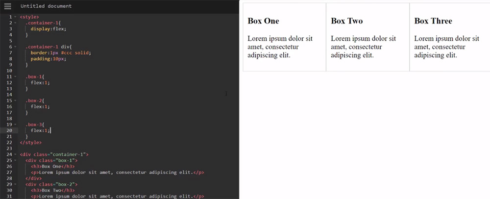
If you prefer a written tutorial, then have a look at this CSS-Tricks guide. It covers pretty much everything you’d need to know, starting from the absolute basics of flexbox.
You’ll find plenty of visuals along the way explaining flexbox terminology, layouts and content organization. It’s not the best guide in the world, but it’s probably the best for beginners who just want to read and learn.
It’s much easier to consume than most of the W3 specification documentation and acts as a nice starting point.
Flexbox Intro Tut
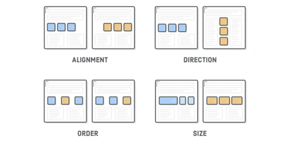
I’m also really keen on this tutorial, written for the website Interneting Is Hard. It’s a site dedicated to online web development tutorials, with the goal of helping everyone understand coding.
Each chapter has beautiful diagrams explaining the syntax and terms you run into when studying HTML and CSS. And I have to say their flexbox stuff is fantastic.
The guide is absolutely massive, with over 12 chapters organized onto a single page. The tutorial uses a table of contents, which is quickly becoming the norm for lengthy articles. The sheer length may put you off at first – but it’s really worth a read.
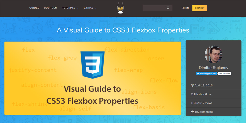
Visual Guide To CSS3 Flexbox
Graphics and visuals always explain things a little better than words. That’s why this guide by Scotch.io is one of the better introductory tutorials for studying flexbox.
Note this does use a lot of code snippets to explain the concepts, so it’s not just a visual guide. But there’s also plenty of graphics and diagrams to go around.
If you want a clear-cut technical guide to flexbox, then you’ll really like the Scotch guide. It does lean heavier towards developers, so it really helps if you’re already familiar with CSS syntax.
Flexbox CSS In 20 Minutes
I know that many people learn better through watching videos and there’s a lot you can find on YouTube. Granted, the Wes Bos video series above is also a great choice. But if you want something quick, have a peek at this video by Traversy Media.
It does a beautiful job of explaining the flexbox syntax in just 20 minutes. You’ll walk away with a much stronger understanding of why the flexible box model can so easily replace floats and why developers are so gung-ho about this new setup.
Building A Simple Layout With Flexbox
To get into a more practical video example, you might like this video tutorial recorded by developer Kevin Powell.
It’s a rather short video, totaling just about 11 minutes. But it’s also more straightforward and to-the-point when it comes to explaining the flexible box model.
If you want a video you can easily follow along with, then this is worth watching. You won’t learn everything about flexbox, but you’ll learn enough to use it for custom web layouts.
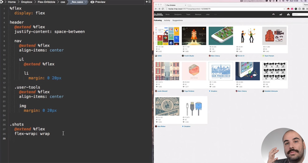
Rebuilding Dribbble Using FlexBox
This is perhaps one of my favorite video tutorials because it goes so in-depth with teaching you how to create a whole project from scratch.
YouTube channel DevTips created this Dribbble coding tutorial, which shows you how to rebuild the entire Dribbble layout using CSS flexbox. This is the exact type of tutorial I recommend for beginners who want to really dive in and learn how this works.
Memorizing CSS properties is great and will help. But with this kind of tutorial, you’re learning practical techniques on how to code layouts from scratch. And that’s the kind of experience you can bring into every future project.
Flat Responsive Flexbox Site
My last pick is lengthy tutorial which also covers flexbox quite well. In this video, you’ll find over an hour of guided instruction on building a custom website from scratch with flexbox.
You’ll learn how to code a grid and how to design the entire page to be mobile friendly.
However, this is much more detailed than other video tutorials. Therefore, I really recommend watching this video later on – once you understand the basics. It will cover a lot of the fundamentals of CSS flexbox properties but it also moves pretty quickly.
Either way, this list has plenty to keep you busy and will get you started on the right track with flexbox layouts.


