Trust Models for Secure Network Connections

The Concept of Trust in Cybersecurity

Everyone is talking about the strength of cryptography and its susceptibility to new generations of computing programs. For example, there’s a wealth of discussion about preferable algorithms that should be used for authentication and encryption. Much of this debate is framed within the context of fears and assumptions about a future in which quantum computing holds sway.

Quantum computing may make it possible to execute certain algorithms in a matter of seconds instead of days. The ramifications, should this eventuality come to pass, are huge, not just for cryptocurrencies but for the entire Internet. A quantum breakthrough raises the risk of breaking most of our existing encrypted security protocols — think online banking, VPNs, database storage, digital signatures, blockchains, and disk encryption. Although it looks like functional quantum computers are still a few years off, no one can be entirely sure quite how well they will work against cryptography until they are readily available.

CSS Transitions: Tutorial and Examples

Since the release of the CSS3 specification, transitions are allowing web designers and front-end web developers to create stunning CSS animations in pure CSS, without using JavaScript. This quick CSS reference guide explains how to use transitions properties and provides stunning, ready-to-use examples of what you can do with CSS3 transitions. What Are CSS Transitions? […]

WordPress 5.1 Beta 3, New WordPress Leadership, Newspack In The Works 🗞️ February 2019 WordPress News w/ CodeinWP

Hi, WordPress friends! 2019 started strongly, bringing a bunch of impactful news in the past four weeks. During this time, Matt Mullenweg made some major changes to the WordPress leadership team, Automattic announced the release of an open-source platform for journalists, the guys at WPML had to urgently solve a data breach allegedly caused by a former employee, while WordPress itself and the block editor went through another series of improvements and updates.

Coding on the Side as Therapy

I haven't "written code" at work in any significant way for years, and this doesn't look likely to change. It's a good thing: I believe in full-lifecycle product ownership. If I can't design it, test it, deploy it, troubleshoot it, and carry the pager for it, I shouldn't be coding it. But like anyone else in this position, I feel the loss of deep technical work keenly. What to do?

I've been in the workforce for more than 30 years now one way or another, and during that time I've performed a lot of different types of work. For the first decade, it was mainly hard physical labor. The next stint was service work (hotel housekeeping, cashier, and so on). I followed this by deep focused creative and problem-solving work: studying at college, programming, and writing. Then I changed careers into mostly management and leadership, with brief forays back into creative problem-solving.

Top 12 Web-Based Color Tools for Web Designers

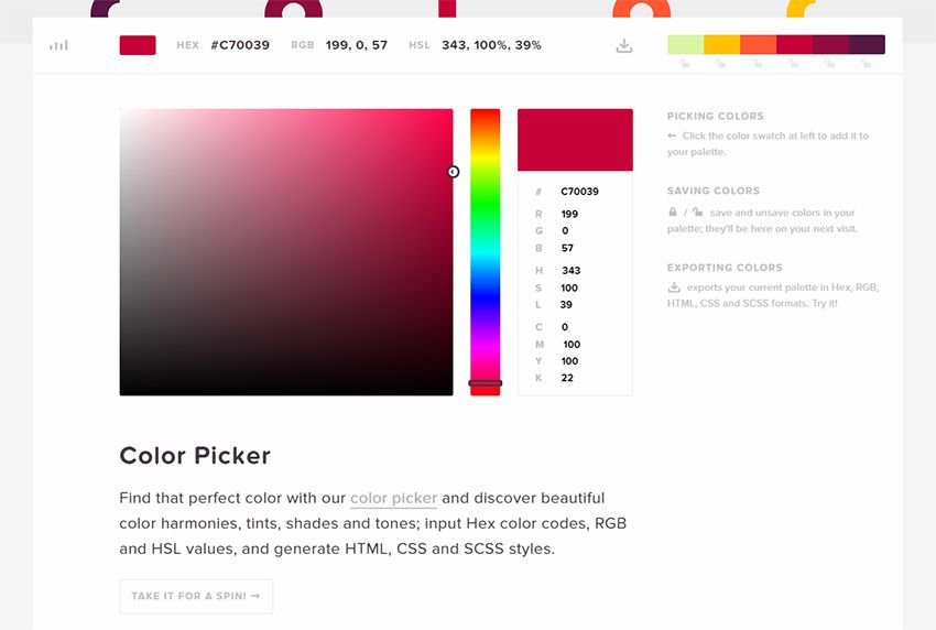
Picking the perfect color scheme shouldn’t be a miserable task. All you need are the right tools for the job and an eye for design.

I can’t help develop your eye for picking colors, but I can share a bunch of handy color tools that’ll likely improve your eye as you use them.

These tools are all 100% free, so they’re easy to bookmark and reuse time & time again. They can also work for web, mobile, print, or any other medium that needs incredible colors.

1. ColorHexa

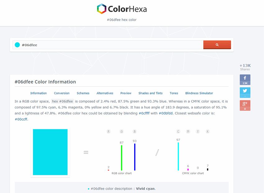
colorhexa webapp

Recently I was browsing the web and stumbled onto ColorHexa. It’s by far one of the coolest color tools I’ve ever seen.

This isn’t technically a color generator or a scheme design tool. Instead, it’s an information library on all colors with suggested gradient ideas, related shades, and dozens of color codes(ex: hex, RGB, CMYK, CIE-LAB, HSL and more).

You’ll never find a more complete list of information on color. This is super useful for all designers, including web designers, and it’s a great place to start researching colors for your projects.

2. Colors.css

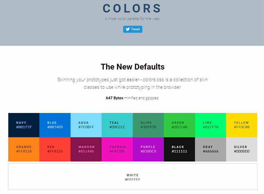
colors.css

If you do some research into color psychology you’ll learn how different colors stack together & what sort of mood they give. This plays into contrast for certain types of colors and how they work together.

Every browser comes with default colors that are often too harsh. Colors.css fixes that.

It’s a free CSS library that restyles the default color palette. This means you can use color names like “blue” and “red” with totally different values.

They even have an entire accessibility page full of ideas for matching color schemes that’ll improve readability on your site.

3. ColorPick Eyedropper Extension

colorpick chrome addon

How often do you find a site with a beautiful color scheme? I find amazing sites all the time and it’s difficult to export those colors from the stylesheet.

You can use Chrome DevTools but this requires digging around in the code to pick out the hex colors. Instead you can use the ColorPick Eyedropper extension made exclusively for Google Chrome.

You just click the toggle window in the extensions panel, then hover any color you want to study. This gives you the full hex code along with a “copy” link to copy the exact color to your clipboard.

Pretty cool right? And it’s a free plugin, so there’s nothing to lose by trying it out.

4. Coolors

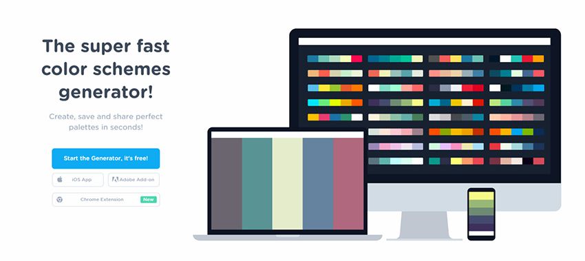
coolors webapp

The Coolors site is a large color scheme generator. You can find dozens of generators on the web, but this one’s a little different since it supports Adobe programs with its own add-on.

You can also get this as a Chrome extension or even as a custom iOS app for your phone.

Really the true value is in the browser webapp that auto-generates color schemes on the fly. You can then mix & match colors, change settings, adjust for color blindness, and randomize your own schemes based on certain criteria.

It’s a great application, but it comes with a small learning curve. Shouldn’t take you more than 15-20 minutes to figure out how it all works.

5. Palettte App

color palettte app

Palettte is color editing and remapping tool. It allows you to build color schemes that flow from one to another and fine-tune individual color swatches. You can also import, analyze, and editing existing color schemes. The creator has written more on the motivations behind this color app.

6. Material UI Colors

material ui colors

With a quick Google search you’ll find a bunch of sweet material design tools on the web. They seem never-ending and many of them rely on the color styles typically found in Android apps.

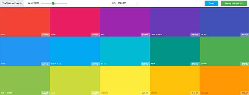
With the Material UI Colors webapp you can find perfect color schemes that match with Google’s material guidelines.

Easily change the tint of all colors with the slider in the top-left corner of the screen. Or randomize your selections to match an existing site’s color choices.

You can also switch between hex and RGB depending on whatever format you want. A great app for material design lovers.

7. Color Supply

color supply webapp

The Color Supply website is pretty unique but also very strange. It gives you a bunch of interesting color tools for matching color schemes, picking the foregrounds & backgrounds, plus different ways to compare how those colors would look on a page.

But this doesn’t have any guide or specific purpose. It acts like a color scheme generator that you have to just kind of learn as you go.

It will output different colors with hex codes near the bottom of the page to copy. Plus it’ll show you how those colors work in a gradient, in icons, and with text. Nice tool but it comes with an awkward learning curve.

8. Color Safe

color safe wcag app

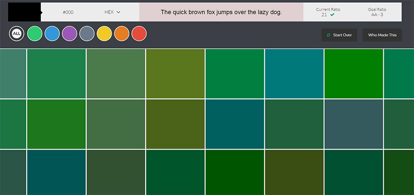
The WCAG works hard towards a more accessible web. Color is one of the easiest ways to build your accessibility without losing time testing.

Color Safe is a free webapp that can test your color choices. You pick from a small set of fonts & sizes, then pick whatever colors you want for your foreground & background.

From there you’ll get an accessibility rating along with suggestions on how to improve your color choices(if needed).

Really great tool for anyone concerned about accessibility on the web.

9. Color Hunt

color hunt webapp

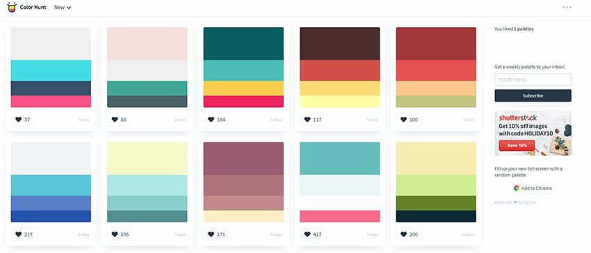
For a user-curated gallery of color schemes take a look at Color Hunt.

This free project was launched a couple of years back and continues to be a source of design inspiration. People submit their own color schemes into the site, then others vote on those color schemes.

You can sort by newest or by most popular and even vote on your favorites. Pretty cool right?

It’s an extremely simple web app so don’t expect too many features. It’s just a neat way to visually browse through many different color patterns at once.

10. Open Color

open colors webapp

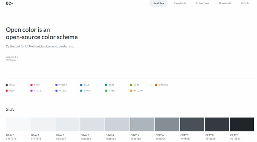
Looking for something a little more web-friendly? Then check out the Open Color library.

This is a massive open source collection of color choices built around accessibility and browser support. Each color has been optimized for easy matching regardless of your layout’s design.

Check out the GitHub repo for more info and to download a copy of the styles.

11. HTML Color Codes

html color codes generator

HTML Color Codes is another info-focused color webapp.

This lets you pull all forms of HTML/CSS code for your color choices right from the app. You can search for any color you want, or go by their recommendations. Plus this even has a tool for generating color palettes that you can download as Adobe Swatch files.

Don’t let the name fool you: this app is for more than just HTML color.

It’s a brilliant tool for digital designers of all types who want easy access to color codes and reusable palettes.

12. Adobe Color CC

adobe color cc webapp

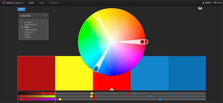
I can’t pass over the incredible Adobe Color CC webapp.

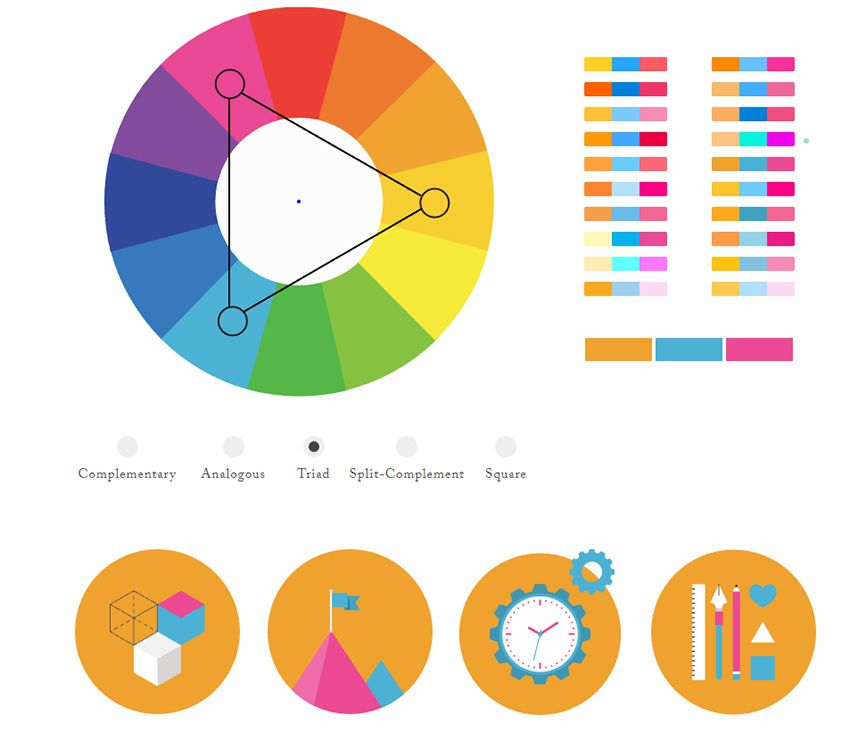
This free tool used to be called Adobe Kuler but it’s gone through a few iterations over the years. It’s still a free color picker but the interface has changed to make it easier for designers to build & save color schemes.

If you’re an Adobe user this tool is worth bookmarking. It supports up to 5 different colors in one scheme, and you can even upload images to pull dynamic color schemes automatically.

Worst design fails, and how to avoid them

design fails

Within the world of the internet, there are many great things. You can order food, shop in your underwear, and connect with people from all over the world right from your living room. Unfortunately, with these amazing things comes some pretty terrible things, too. Today, we’re going to be focusing on some of the worst design fails ever, and how you can avoid them.

Some of these fails are generic, and will have specific examples. Regardless of which category each one falls into, the point of this list is to avoid each and every one of the following fails completely. After all, that’s why they call it a fail.

Overdesign

Over designed websites are the worst thing to happen to any website. Fortunately, these websites are being weeded out slowly, but they definitely still exist, and they’re still pretty terrible.

The reasons to avoid such a terrible decision are pretty obvious. For one, too much on one page can greatly slow down your loading speeds, and it sends the reader away almost immediately. Secondly, it confuses everyone. Looking at the image above, if you manage not to get a headache and pass out, you’ll have a hard time finding what you’re looking for.

Granted, web design isn’t always easy. After all, if it were easy, we wouldn’t have a need for web designers at all. The moral of this story is to make it simple, make it clean, and for the love of God, make it easy to navigate.

Auto-playing audio and video

We’ve all been there. It’s late, you’re tired, you’re just ready to go to bed, and out of nowhere, amongst your dozens of tabs you have opened, a video starts playing. Now, you get to play the always fun and engaging game of “guess the tab” and try your best to shut down the video. It feels like you’re trying to defuse a bomb. Only in this case, you don’t know where the bomb is and you feel like crying.

If ever you find yourself wondering if an auto-playing video or audio file anywhere within your web design, stop yourself. Unless you want to slow your loading times down, and make literally everyone on the internet upset, avoid this design fail.

Websites that aren’t mobile friendly

We live in a time where everyone uses their phone for just about everything. Even if they aren’t dependant on their phones, they use them at least a few times a day. The way the web is evolving means that more and more people will be using their phones for tasks that used to be impossible using mobile web browsers. It should be a crime to not at least think about mobile users when designing a website.

Each year, the amount of mobile users goes up by a healthy amount. In fact, as of the start of 2019, over 63% of internet users are on mobile devices. Pretty soon, mobile users might make up most, if not all of your visitors. With that in mind, it’s absolutely worth spending some time to avoid this design fail, and making your website mobile friendly.

Sidebars

As helpful as sidebars used to be, and arguably still are, they’re just not good looking. Most of the time, the sidebar takes up a good portion of your main interface, and it gets quite distracting. Call it a trend if you want, but major websites like Amazon and Ebay have ditched the sidebar for a more streamlined look.

The idea is to have your visitors interact with your website. As easy as it would be to just throw up a sidebar and have all the navigation options users might need right in front of them, it takes away from the experience.

Passive-aggressive CTAs

Listen, I love conversions as much as the next guy, but being passive-aggressive about a CTA is a very quick way to turn a potential customer away completely. It might seem like a good idea, but using a CTA like, “No thanks, I don’t want to grow my traffic” actually comes off as desperate on your part, not the potential customer.

I think the overall theme of this article, aside from design fails, is to stop and think before you act. Think about how you would react in your visitors’ shoes. If you can honestly say that you wouldn’t like it, then odds are that your visitors won’t, either. A passive-aggressive CTA is a great example of this analogy, but being passive-aggressive in general works here, too. Stop, and try a different approach.

Trying to keep up with all the trends

Trends are important in any type of design. In fact, keeping up with trends should be the main objective of any designer, whether it’s web, interior, clothing, or anything else. So why, you may ask, is it such a bad thing to keep up with many trends at once? The short answer is that it takes the focus off of the content of the website.

Yes, using a color gradient is cool, and encouraged. Maybe even a few custom doodles to bring your website to life and give it a unique look. What’s not encouraged is pumping your website full of so many trends that it looks like the front cover of The Cosmopolitan. You’ll end up misdirecting your visitors. Keep it simple, and focus on the content. If the content of your website is quality, then the rest of your site will follow suit with little to no effort from you.

The conclusion

When you really take a look, design fails are everywhere, and they always will be. To be fair, there is a place for design fails on the internet. They give us opportunities to learn, and in a way, they make good design stand out more.

Of course, this is just a small list of design fails to avoid. There are many more out there that you should try your best to avoid. And, as important as it is to stay up-to-date with web design trends, perhaps the worst mistake any of us could make is using too many. Web design is all about balance. You find that balance, and you, my friend, have found the keys to success.

Read More at Worst design fails, and how to avoid them

Microsoft Access Database Forms: Should We Use Unbound Forms?

I’ve always been a big fan of Microsoft Access VBA programming; why? Because I like the way a rich application like this can be customized and designed from the floor up with little IT programming and development knowledge. Plus, I like building things.

As a recap, knowing the difference between what an unbound vs. a bound Microsoft Access form is will help divide the distinction and allow you to determine which approach will suit best.

Golang Tutorial: Learn Golang by Examples

Golang has become one of the most trending languages in the developer community. Go provides the best of both worlds by striking a balance between dynamic and statically compiled languages. The code is easy to read, the specifications are short, and it still includes a built-in web server! Throughout this Golang tutorial, not only will we be covering the reasons that make Go such a fantastic open-source language, we will also go over a majority of its concepts.

Following are the topics that we will cover throughout this Golang tutorial:

Wix vs WordPress – Which One is Better? (Pros and Cons)

Are you trying to decide between Wix vs WordPress to build your website? While WordPress is the most popular website builder in the world, it is not the only option.

After seeing TV commercials for Wix, some of our users asked us to do a detailed comparison of Wix vs WordPress to find out which is the better choice.

In this article, we will compare Wix vs WordPress and highlight the pros and cons. Our hope is that with this Wix review and comparison, you’ll be able to decide which platform is right for your needs.
Comparing Wix vs WordPress

Note: This article compares Wix vs Self Hosted WordPress.org NOT WordPress.com. See the difference between self-hosted WordPress.org vs WordPress.com sites.

We have broken down this comparison into 7 categories:

Let’s see how Wix and WordPress stack up into each of these categories.

1. Pricing and Costs

The cost of website building is an important factor when choosing your site builder platform. The total costs of developing and maintaining your site will entirely depend on your needs. Our goal is to make sure that you can do whatever you need within your budget.

Let’s compare the pricing of Wix and WordPress to find out which one gives you more bang for the buck.

Wix Pricing Comparison:

Wix offers a basic website builder for free. However, there are two major downsides to it.

First, it adds Wix branded advertisements on the top and bottom of your website. Second, you cannot use a custom domain name for your site, so your website address will be: username.wix.com/sitename

Apart from that, the basic plan does not offer necessary add-ons such as Google Analytics, Favicons, eCommerce, etc. To remove ads and get additional features from their apps market, you’ll have to upgrade to one of the premium plans they offer.

Each Wix premium plan has different storage and bandwidth limitations. You can pay monthly or choose a yearly plan.
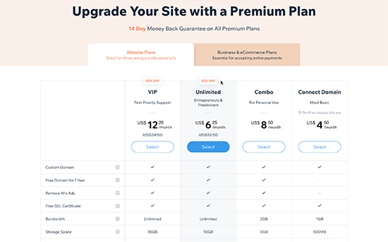
Wix Pricing Plan

The best value plans on Wix is the Unlimited plan ($12.50 / month).

If you need eCommerce and business features, then you need to select a Business & Ecommerce plan.
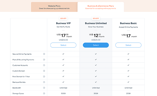
Wix eCommerce and business plans

Pricing for small business website and eCommerce plans start from $17 / month.

Regardless of which plan you choose, this cost does not include any apps that you later choose to buy from the Wix app market to use on your website.

WordPress Pricing Comparison:

The WordPress software is open source, and it is available for free for anyone to use.

We often get asked about why is WordPress free and what’s the catch?

Well, the biggest catch is that you need your own domain name and web hosting to install it.

There are several WordPress hosting providers that you can choose from. See our guide on how to choose the best WordPress hosting company.

Depending on your budget, you can start with a basic plan with a WordPress hosting provider like Bluehost that will cost you $2.75 per month and includes a free custom domain name.
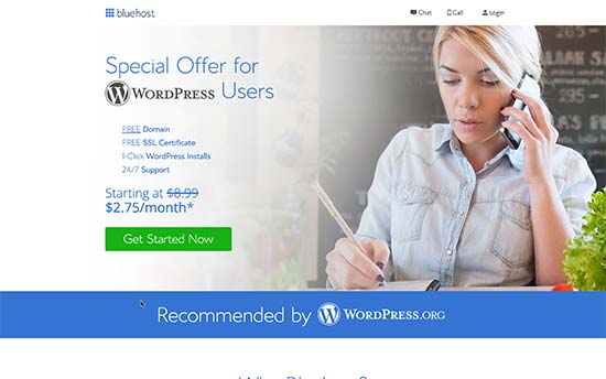
Bluehost WordPress hosting

If your budget permits, then you can use a managed WordPress hosting provider like WP Engine which costs $29 per month.

The cost of a WordPress site will increase if you decide to use premium WordPress themes or plugins (similar to apps in WordPress).

However, there are thousands of free WordPress themes and plugins available that you can use to reduce costs. You can add any feature to your WordPress site using a plugin without upgrading your hosting plan.

For more information, see our guide on how much does it cost to build a WordPress website.

WordPress comes with full support for eCommerce out of the box. You can install the WooCommerce plugin to create an online store on your website. Just like WordPress, WooCommerce itself is free and opensource.

For more information, see our article on how much it costs to build an eCommerce website.

Conclusion:

WordPress beats Wix with flexible plans available from a variety of web hosting companies. The cost depends on how much resources you use, and you are free to use your WordPress website in any way you want.

2. Ease of Use

Most beginners choose Wix or WordPress because they don’t want to hire a website designer. Both Wix and WordPress allow you to create websites without learning to code.

Let’s take a look which one of them is easier to use for beginners with no coding experience.

Wix:

Wix comes with powerful and easy to use tools to build your own website. It offers a simple drag and drop interface where you can select any element on your site and start editing it in a WYSIWYG interface.
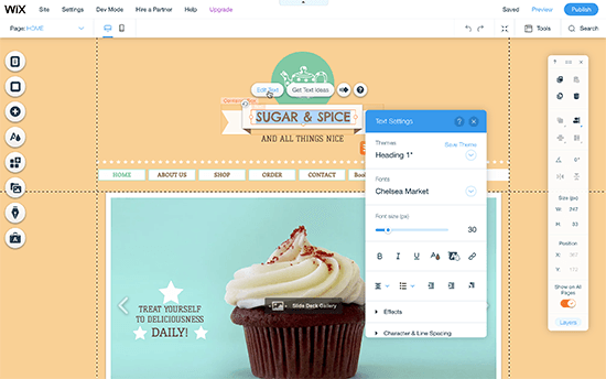
Wix Editor

You can drag and drop items anywhere on your site, rearrange things on your pages, write content, and add media in a user-friendly environment. Many beginners would find this feature a blessing as it saves them from dealing with code.

WordPress:

WordPress comes with an incredibly powerful WordPress block editor that allows you to edit your pages with a live preview.

This allows you to create visually stunning layouts by adding blocks. There are blocks for all common elements like text, headings, buttons, background images, galleries, and more.
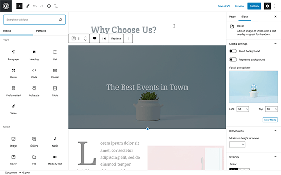
WordPress editor

WordPress also gives you access to thousands of themes (website templates) to use on your site. Each of them is also fully-customizable using the live theme customizer.
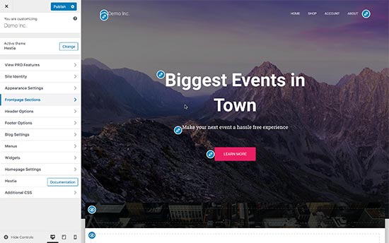
WordPress customizer

Need even more code-free ways to edit your website visually? WordPress has some of the most intuitive drag and drop page builder plugins. These drag-and-drop editor provide you even more tools to create professional-looking websites without writing code.

For example you can use a page builder like SeedProd or Divi that lets you build completely custom websites without writing any code.
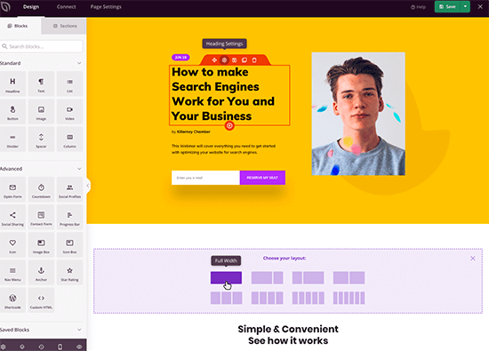
SeedProd Page Builder

All of these options give a lot more choices and tools to edit your website.

Conclusion:

There is a tie when it comes to ease of use between Wix and WordPress. Both offer easy code-free ways to write content, make pages, and manage business and eCommerce websites.

Wix does a great job with their editor interface, but it lacks advanced capabilities. WordPress offers ease of use that can be extended with a little bit of a learning curve which is great in the long run.

3. Design and Layout

Your site’s design and layout play an important role in your success. Every site owner needs a web design that’s not only good-looking but also user-friendly and makes their brand stand-out.

Wix:

Wix comes with more than 900+ pre-made templates to choose from. All Wix designs are fully responsive and written in HTML5. Using the built-in tools, you can further tweak your site design, change the layout, and rearrange items as you see fit.
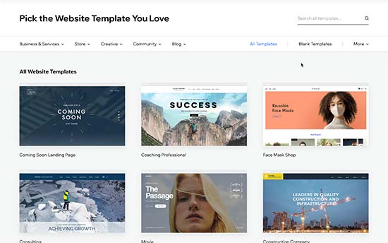
Wix website templates

There are designs available for every kind of site. Templates are divided into categories like business, eCommerce, hobbies, arts & crafts, personal, etc.

One big disadvantage is that once you have selected a template, you cannot change it. You can modify it and customize it as much as you want using only the built-in tools, but you cannot switch to another template.

WordPress:

There are thousands of free and paid themes available for WordPress. Free themes come with limited support, but they also go through a strict review process. Paid themes generally offer more features and come with premium support options.
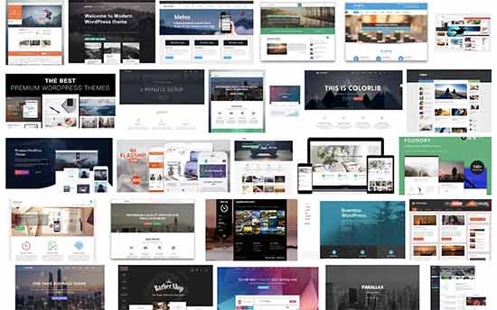
WordPress themes

WordPress themes range from small personal sites to full-fledged eCommerce sites. Most themes come with built-in customization options of their own. You can also use one of the many styling plugins to further style or customize your WordPress themes.

Users can download free themes from WordPess.org directory. For paid themes, there are several WordPress theme shops like Astra, StudioPress, Themify, CSSIgniter, and more. See our list of the best commercial WordPress theme shops.

Furthermore, you can hire a developer or learn to create a completely custom theme for your company.

There are also plugins like SeedProd, a landing page builder plugin that allows you to quickly deploy a website, a sales page, product page, or even a coming soon page regardless of which theme you are using.

More importantly, you can change your WordPress theme anytime you want and use a different theme. This allows your website design to grow and evolve with your business.

Conclusion:

WordPress has a much larger range of themes and design layouts than Wix. WordPress users can also easily switch themes or customize them as much as they want without any restrictions.

4. Plugins and Apps

Plugins and apps are like third-party extensions that you can use with your platform to add more features.

Wix calls them apps, and in the WordPress ecosystem, they are called plugins.

Let’s compare apps and plugins available on both platforms and what you can do with them.

Wix:

Wix comes with nearly 200+ apps that you can add to your site. These apps offer a wide range of features like adding contact forms, gallery, comments, social media buttons, email marketing and so on.
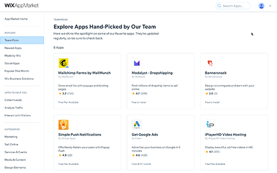
Wix App Marketplace

Many of the apps are free or have a lite version. Other apps require monthly payments and vary in prices. Even though there is a limited collection of apps, they cover the most commonly requested features by site owners.

WordPress:

At the time of writing this article, there are more than 58,000+ free plugins available in the WordPress.org plugin directory alone. Not to mention, premium plugins available on other marketplaces.
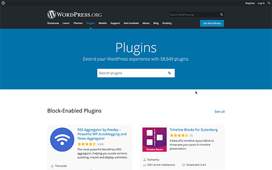
WordPress plugins

The saying goes: if you can think of a feature, there’s probably a WordPress plugin that makes it happen.

Whether you want to create a contact form, install Google Analytics, build a membership website, or sell online courses, there’s a plugin for that.

You can do just about anything you like with WordPress. There are plenty of plugins both free and paid which you can use to build the website of your dreams.

Conclusion:

WordPress easily beats Wix in this area as well. Even though Wix’s app library is growing, it is still limited in comparison to the huge choice available to WordPress users.

5. Wix vs WordPress – Which one is better for blogging?

Many users are looking for an easier platform to start blogging. Wix and WordPress both can be used to create blogs. Let’s take a look at which one does it better.

Blogging with Wix

Wix allows you to easily add a blog section to your website. It has all the basic blogging features you’ll commonly use. For example, categories and tags, photos and videos, archives, etc.
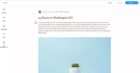
Blogging with Wix

Comments on Wix blogs are slow and not as easy to manage as WordPress. Many users end up installing third-party commenting systems like Facebook or Disqus both of them require users to create accounts.

It also lacks several features like backdating posts, creating private posts, and more.

The writing interface for blog posts is not the same as the Wix website builder. Instead, it uses a plain text editor which is very limited in terms of formatting options.

Blogging with WordPress

WordPress started out as a blogging platform and evolved into a full-blown website builder. Today it powers nearly 40% of all websites.

It has all the blogging features you’ll need like a native commenting system and all other advanced features that are missing from Wix.
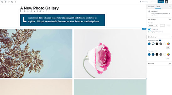
Editing blog posts in WordPress

It comes with the powerful Gutenberg block editor which allows you to create beautiful layouts for your blog posts.

Most importantly, you can extend your blog using plugins and add any feature that you can think of.

Conclusion

WordPress totally outshines Wix as a blogging platform. Wix blogs are too basic and lack several important features. If you are thinking about starting a blog, then Wix doesn’t even come close to WordPress.

6. Wix vs WordPress Ecommerce Comparison

Selling things online is another important feature that most beginners look for. Let’s see how WordPress and Wix compare in eCommerce.

Wix:

Wix offers eCommerce with their paid plans. This means users with the free plan cannot run their eCommerce store on Wix without upgrading to a paid plan.
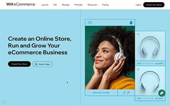
Wix eCommerce

With the Wix Stores, you can accept payments using their own native payments system or use third-party apps to connect different payment gateways including PayPal, Authorize.net, and more.

If you choose to use Wix Payments, then they charge 2.9% of the transaction amount + 0.30 USD for the US region. As you sell more products, this processing fee becomes a substantial amount.

There are a few third-party apps that you can use to help promote your store and sell things online. The overall features of the eCommerce platform are limited too.

WordPress:

WordPress makes it super easy to create your online store using WooCommerce, which is the most popular eCommerce platform in the world.
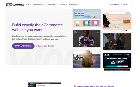
WooCommerce

There are also plenty of other eCommerce plugins available for WordPress that you can use to sell physical or digital goods, services, events, subscriptions, and more.

WordPress is also the best platform to sell digital subscriptions using MemberPress. It allows you to sell online courses, pay per view content, and membership plans for your online community.

Most eCommerce plugins for WordPress even have their own dedicated themes and add-on plugins. See our list of best WooCommerce themes for some excellent examples.

Conclusion:

If you want to build a proper online store and be ready for growth, then WordPress + WooCommerce offers much more flexibility, freedom, and choices when compared to Wix.

7. Data Portability Options in Wix vs WordPress

Data portability allows you the freedom to move your content away when you need it. Let’s take a look at how Wix and WordPress help you move your content and use it elsewhere.

Data portability options in Wix

Wix comes with very limited options to move your content to another platform. You can only export your blog posts in XML format. You’ll have to manually download your pages, images, videos, and other content.

According to Wix documentation, all your content is hosted exclusively on Wix’s servers and cannot be exported elsewhere.

This makes it a bit difficult to move your content to another platform if needed. However, you can still transfer a Wix site. See our article, on how to switch from Wix to WordPress for more details.

Data portability options in WordPress

WordPress is a proper content management system and makes it extremely easy to export your content. It comes with a one-click exporter that allows you to download your content in XML format.
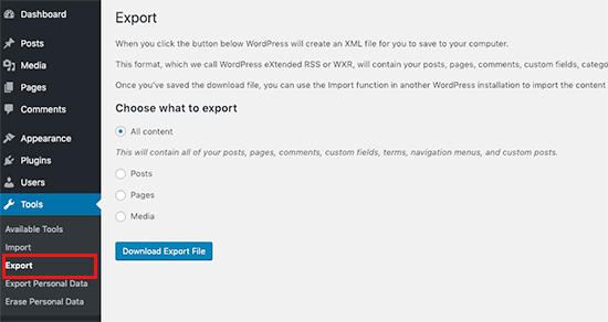
Exporting your WordPress site

Since it is a self-hosted platform, you can also create complete WordPress backups, download your media files, and even manually export your WordPress database.

You can then easily move your WordPress site to a new host if you are not satisfied with your current WordPress hosting company.

Conclusion:

WordPress is a lot better when it comes to downloading and moving your data. Wix, on the other hand, makes it quite difficult to move your content away.

Final Verdict: Wix vs WordPress – Which One is Better?

WordPress is far superior to Wix as a web publishing platform for any kind of website. While Wix offers an easy-to-use website builder, you can accomplish a lot more with WordPress over the long run.

See our guide on how to make a website using WordPress for step by step instructions.

Frequently Asked Questions – Wix vs WordPress

Do you still have a few questions? Here are some of the most commonly asked questions users asked us when deciding between Wix vs WordPress.

1. Which one is cheaper Wix vs WordPress?

Wix has free plans with their own branded domain name and advertisements. Their paid plans allow you to remove the branding and use your own domain name and they start at $4.50 per month with very limited storage and features. Your costs increase if you want to upgrade to more feature rich plans.

On the other hand, WordPress just needs hosting and domain name. For instance, you can get started with Bluehost for $2.75 per month with a free domain name and SSL certificate. Considering that it also gives you flexibility to add any feature you want to your website, WordPress becomes a lot cheaper in the long run.

2. Can I transfer my domain away from Wix?

Yes, you can transfer your domain away from Wix. However, Wix makes it a bit difficult to transfer your website files and content. For more details, see our article on how to transfer a website from Wix to WordPress.

3. What are Pros and Cons of using Wix?

For a quick comparison, here are some of the advantages and disadvantages of using Wix over WordPress.

Pros:

  • You don’t need to install software or manage updates on Wix
  • It offers a simpler and easy to use interface to edit websites
  • Wix is a hosted solution so you don’t need to worry about backups and security

Cons:

  • Wix is more expensive than WordPress in the long run
  • It is very limited in terms of functionality when compared to WordPress
  • It has fewer design choices and third-party integrations
  • The eCommerce and business features are no where close to what other platforms like Shopify and WooCommerce offer

4. Which platform offers more storage and bandwidth?

Most WordPress hosting companies offer unlimited storage and bandwidth. Compared to Wix, which limits the storage space based on the plan you choose. For instance, their basic plan gives users just 500 MB storage, 1 GB bandwidth, and no video hours.

5. Which one is better for SEO Wix vs WordPress

WordPress is better for SEO as you can use SEO plugins and tools, which you can use to do things like adding open graph meta tags, advanced XML sitemaps, On-site SEO analysis, and more.

We recommend using All in One SEO (AIOSEO) plugin to improve your WordPress ranking.

Wix offers some search engine optimization features built into their platform. This allows you to perform basic SEO for your website.

We hope this article helped you compare Wix vs WordPress and learn their pros and cons. You may also want to see our article on easy to start online business ideas and how to increase your website traffic without spending too much money.

If you liked this article, then please subscribe to our YouTube Channel for WordPress video tutorials. You can also find us on Twitter and Facebook.

The post Wix vs WordPress – Which One is Better? (Pros and Cons) appeared first on WPBeginner.

12 Inspirational Examples of Minimal Web Design

Considering that the current philosophy of UI design is “less is more,” the expected rise in popularity of minimalism has reached an all-time high amongst web designers, especially in the last couple of years. But, perhaps unknowingly, its appeal to users has also grown.

The principles of minimalism in web design are that a website (and other mediums as well) should be stripped down to their bare bones, while carefully making use of whitespace and improving readability with clearer typography. When implemented correctly, the result will allow users to focus on what’s truly important without being distracted by non-essential elements.

Your Web Designer Toolbox
Unlimited Downloads: 500,000+ Web Templates, Icon Sets, Themes & Design Assets


While this may sound easy, it can be difficult deciding what the truly important elements are and what’s little more than decoration. It can also be risky. Accidentally removing a seemingly innocuous element could be deemed critical by the user and could result in the wrong message (or worse, no message at all) being delivered to your target audience.

minimal web design Rotate

Source: Rotate°

If you think about the logistics, it makes sense that minimalism appeals to users: the less fluff on the site, the less you have to think about. When there are just a few links or blocks of text, and the point of interest is directly in front of you, you can let your mind rest for a bit – relax, and the website will spoon feed you just what you need.

This collection features fifteen websites that have been designed using the minimalistic principles mentioned above. Some of the sites have also been influenced by many of the popular web design trends we have seen over that past year or so, like flat design, yet still retain a look and feel that can only be described as minimal. Here are the beautifully designed sites:

minimal web design Ballet BC

Source: Ballet BC

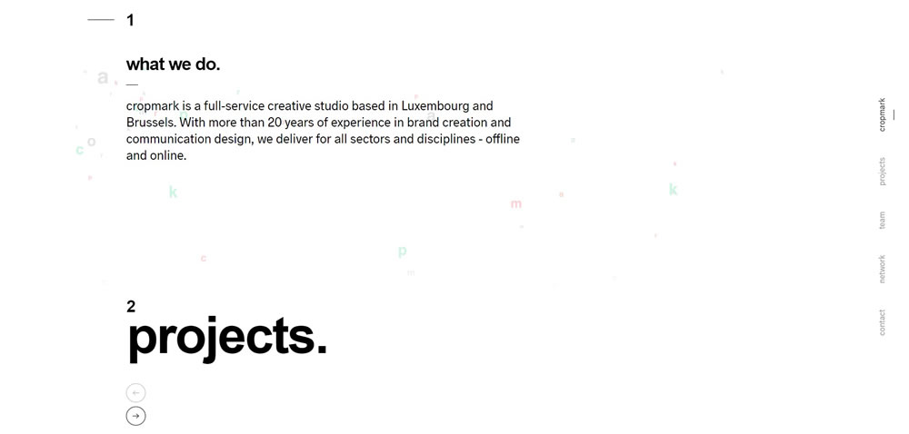
minimal web design Cropmark

Source: Cropmark

minimal web design GSArora

Source: GSArora

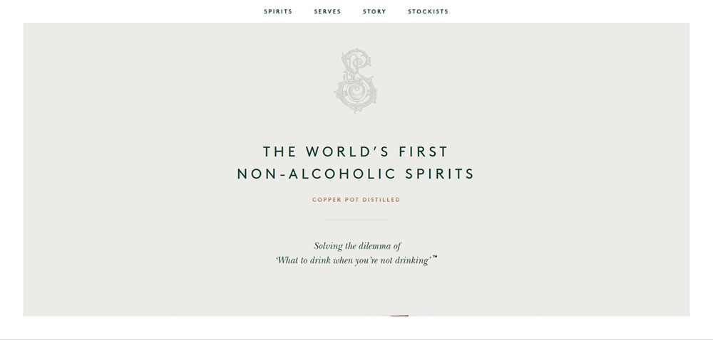
minimal web design Seedlip

Source: Seedlip

minimal web design Tim Brack

Source: Tim Brack

minimal web design Hatch Inc

Source: Hatch Inc.

minimal web design Elastique

Source: Elastique

Finshed

Minimalism isn’t the miracle solution that you can slap on every single project. There’s a time and place for everything; the time is now, but you need to carefully decide the place.

A Guide To CSS Support In Browsers

A Guide To CSS Support In Browsers

A Guide To CSS Support In Browsers

Rachel Andrew

We will never live in a world where everyone viewing our sites has an identical browser and browser version, just as we will never live in a world where everyone has the same size screen and resolution. This means that dealing with old browsers — or browsers which do not support something that we want to use — is part of the job of a web developer. That said, things are far better now than in the past, and in this article, I’m going to have a look at the different types of browser support issues we might run into. I’m going to show you some ways to deal with them, and also look at things which might be coming soon which can help.

Why Do We Have These Differences?

Even in a world where the majority of browsers are Chromium-based, those browsers are not all running the same version of Chromium as Google Chrome. This means that a Chromium-based browser such as Vivaldi, might be a few versions behind Google Chrome.

And, of course, users do not always quickly update their browsers, although that situation has improved in recent years with most browsers silently upgrading themselves.

There is also the manner in which new features get into browsers in the first place. It is not the case that new features for CSS are designed by the CSS Working Group, and a complete spec handed down to browser vendors with an instruction to implement it. Quite often it is only when an experimental implementation happens, that all the finer details of the specification can be worked out. Therefore, feature development is an iterative process and requires that browsers implement these specifications in development. While implementation happens these days most often behind a flag in the browser or available only in a Nightly or preview version, once a browser has a complete feature, it is likely to switch it on for everyone even if no other browser yet has support.

All this means that — as much as we might like it — we will never exist in a world where features are magically available on every desktop and phone simultaneously. If you are a professional web developer then your job is to deal with that fact.

Bugs vs. Lack Of Support

There are three issues that we face with regard to browser support:

  1. No Support Of A Feature
    The first issue (and easiest to deal with) is when a browser does not support the feature at all.
  2. Dealing With Browser “Bugs”
    The second is when the browser claims to support the feature, but does so in a way that is different to the way that other browsers support the feature. Such an issue is what we tend to refer to as a “browser bug” because the end result is inconsistent behavior.
  3. Partial Support Of CSS Properties
    This one is becoming more common; a situation in which a browser supports a feature — but only in one context.

It’s helpful to understand what you are dealing with when you see a difference between browsers, so let’s have a look at each of these issues in turn.

1. No Support Of A Feature

If you use a CSS property or value that a browser does not understand, the browser will ignore it. This is the same whether you use a feature that is unsupported, or make up a feature and try to use it. If the browser does not understand that line of CSS, it just skips it and gets on with the next thing it does understand.

This design principle of CSS means that you can cheerfully use new features, in the knowledge that nothing bad will happen to a browser that doesn’t have support. For some CSS, used purely as an enhancement, that is all you need to do. Use the feature, make sure that when that feature is not available the experience is still good, and that’s it. This approach is the basic idea behind progressive enhancement, using this feature of the platform which enables the safe use of new things in browsers which don’t understand them.

If you want to check whether a feature you are using is supported by browsers then you can look at the Can I Use website. Another good place to look for fine-grained support information is the page for each CSS property on MDN. The browser support data there tends to be very detailed.

New CSS Understands Old CSS

As new CSS features are developed, care is taken in terms of how they interact with existing CSS. For example, in the Grid and Flexbox specification, it is detailed in terms of how display: grid and display: flex deal with scenarios such as when a floated item becomes a grid item, or a multicol container is turned into a grid. This means that certain behaviors are ignored, helping you to simply overwrite the CSS for the nonsupporting browser. These overrides are detailed in the page for Progressive enhancement and Grid Layout on MDN.

Detecting Support With Feature Queries

The above method only works if the CSS you need to use does not need other properties to go along with it. You might need to add additional properties to your CSS for older browsers which would then also be interpreted by the browsers which support the feature too.

A good example of this can be found when using Grid Layout. While a floated item which becomes a grid item loses all float behavior, it is likely that if you are trying to create a fallback for a grid layout with float, you will have added percentage widths and possibly margins to the items.

.grid > .item {
    width: 23%;
    margin: 0 1%;
}
A four column layout
Using floats we can create a four column layout, widths and margins need to be set in %. (Large preview)

These widths and margins will then still apply when the floated item is a grid item. The width becomes a percentage of the grid track rather than the full width of the container; any margin will then be applied as well as a gap you may have specified.

.grid > .item {
    width: 23%;
    margin: 0 1%;
}

.grid {
    display: grid;
    grid-template-columns: 1fr 1fr 1fr 1fr;
    column-gap: 1%;
}
A four column layout with squished columns
The width is now a percentage of the grid track — not the container. (Large preview)

Thankfully, there is a feature built into CSS and implemented into modern browsers which helps us deal with this situation. Feature Queries allow us to directly ask the browser what they support and then act on the response. Just like a Media Query — which tests for some properties of the device or screen — Feature Queries test for support of a CSS property and value.

Test For Support

Testing for support is the simplest case, we use @supports and then test for a CSS property and value. The content inside the Feature Query will only run if the browser responds with true, i.e. it does support the feature.

Test For No Support

You can ask the browser if it does not support a feature. In this case, the code inside the Feature Query will only run if the browser indicates it has no support.

@supports not (display: grid) {
    .item {
        /* CSS from browsers which do not support grid layout */
    }
}
Test For Multiple Things

If you need more than one property to be supported, use and.

@supports (display: grid) and (shape-outside: circle()){
    .item {
        /* CSS from browsers which support grid and CSS shapes */
    }
}

If you need support of one property or another, use or.

@supports (display: grid) or (display: flex){
    .item {
        /* CSS from browsers which support grid or flexbox */
    }
}
Picking A Property And Value To Test For

You don’t need to test for every property you want to use — just something which would indicate support for the features you are planning to use. Therefore, if you want to use Grid Layout, you might test for display: grid. In the future (and once subgrid support lands in browsers), you might need to be more specific and test for subgrid functionality. In that case, you would test for grid-template-columns: subgrid to get a true response from only those browsers which had implemented subgrid support.

If we now return to our floated fallback example, we can see how feature queries will sort it out for us. What we need to do is to query the browser to find out if it supports grid layout. If it does, we can set the width on the item back to auto and the margin to 0.

.grid > .item {
    width: 23%;
    margin: 0 1%;
}

@supports(display: grid) {
    .grid {
        display: grid;
        grid-template-columns: 1fr 1fr 1fr 1fr;
        column-gap: 1%;
    }

    .grid > .item {
        width: auto;
        margin: 0;
    }
}

Note that while I have included all of the grid code inside my feature query, I don’t need to. If a browser didn’t understand the grid properties it would ignore them so they could safely be outside of the feature query. The things that must be inside a feature query in this example are the margin and width properties, as these are needed for the old browser code but would also be applied by supporting browsers.

Embrace The Cascade

A very simple way to offer fallbacks is to utilize the fact that browsers ignore CSS that they don’t understand, and the fact that where everything else has equal specificity, source order is taken into account in terms of which CSS is applied to an element.

You first write your CSS for browsers which do not support the feature. Then test for support of property you want to use, if the browser confirms it has support overwrite the fallback code with your new code.

This is pretty much the same procedure that you might use when using media queries for responsive design, following a mobile-first approach. In that approach, you start with your layout for smaller screens, then add or overwrite things for larger ones as you move up through your breakpoints.

Can I Use CSS Feature Queries? Data on support for CSS Feature Queries across the major browsers from caniuse.com.

The above way of working means that you do not need to worry about browsers which do not support Feature Queries. As you can see from Can I Use, Feature Queries have really great support. The standout browsers that do not support them being any version of Internet Explorer.
It is likely, however, that the new feature you want to use is also not supported in IE. So, at the present time you will almost always start by writing CSS for browsers without support, then you test with a Feature Query. This Feature Query should test for support.

  1. Browsers which support Feature Queries will return true if they have support and so the code inside the query will be used, overwriting the code for older browsers.
  2. If the browser supports Feature Queries but not the feature being tested, it will return false. The code inside the feature query will be ignored.
  3. If the browser does not support Feature Queries then everything inside the Feature Query block will be ignored, which means that a browser such as IE11 will use your old browser code, which is very likely exactly what you want!

2. Dealing With Browser “Bugs”

The second browser support issue is thankfully becoming less common. If you read “What We Wished For” (published at the end of last year), you can get a little tour into some of the more baffling browser bugs of the past. That said, any software is liable to have bugs, browsers are no exception. And, if we add to that the fact that due to the circular nature of specification implementation, sometimes a browser implemented something and then the spec changed so they now need to issue an update. Until that update ships, we might be in a situation where browsers do something different to each other.

Feature Queries can’t help us if the browser reports support of something supports it badly. There is no mode by which the browser can say, “Yes, but you probably won’t like it.” When an actual interoperability bug shows up, it is in these situations where you might need to be a little more creative.
If you think you are seeing a bug then the first thing to do is confirm that. Sometimes when we think we see buggy behavior, and browsers doing different things, the fault lies with us. Perhaps we have used some invalid syntax, or are trying to style malformed HTML. In those cases, the browser will try to do something; however, because you aren’t using the languages as they were designed, each browser might cope in a different way. A quick check that your HTML and CSS is valid is an excellent first step.

At that point, I’d probably do a quick search and see if my issue was already widely understood. There are some repos of known issues, e.g. Flexbugs and Gridbugs. However, even just a well-chosen few keywords can turn up Stack Overflow posts or articles that cover the subject and may hand you a workaround.

But let’s say you don’t really know what is causing the bug, which makes it pretty hard to search for a solution. So, the next step is to create a reduced test case of your issue, i.e. stripping out anything irrelevant to help you identify exactly what triggers the bug. If you think you have a CSS bug, can you remove any JavaScript, or recreate the same styling outside of a framework? I often use CodePen to pop together a reduced test case of something I am seeing; this has the added advantage of giving me the code in a way I can easily share with someone else if I need to ask about it.

Most of the time, once you have isolated the issue, it is possible to think up an alternate way of achieving your desired result. You will find that someone else has come up with a cunning workaround, or you can post somewhere to ask for suggestions.

With that said, if you think you have a browser bug and can’t find anyone else talking about the same issue, it is quite possible you have found something new that should be reported. With all of the new CSS that has landed recently, issues can sometimes show up as people start to use things in combination with other parts of CSS.

Check out this post from Lea Verou about reporting such issues, “Help The Community! Report Browser Bugs!”. The article also has great tips for creating a reduced test case.

3. Partial Support Of CSS Properties

The third type of issue has become more common due to the way that modern CSS specifications are designed. If we think about Grid Layout and Flexbox, these specs both use the properties and values in Box Alignment Level 3, to do alignment. Therefore, properties such as align-items, justify-content, and column-gap are specified to be used in both Grid and Flexbox as well as other layout methods.

At the time of writing, however, the gap properties work in Grid Layout in all grid-supporting browsers, and column-gap works in Multicol; however, only Firefox has implemented these properties for Flexbox.

If I were to use margins to create a fallback for Flexbox, then test for column-gap and remove the margins, my boxes will have no space between them in browsers which support column-gap in Grid or multicol, so my fallback spacing will be removed.

@supports(column-gap: 20px) {
    .flex {
        margin: 0; /* almost everything supports column-gap so this will always remove the margins, even if we do not have gap support in flexbox. */
    }
}

This is a current limitation of Feature Queries. We don’t have a way to test for support of a feature in another feature. In the above situation, what I want to ask the browser is, “Do you have support for column-gap in Flexbox?” This way, I can get a negative response so I can use my fallback.

There is a similar issue with the CSS fragmentation properties break-before, break-after, and break-inside. As these have better support when the page is printed, browsers will often claim support. However, if you are testing for support in multicol, you get what appear to be false positives. I’ve raised an issue over at the CSS Working Group for this issue, however, it isn’t a straightforward problem to solve. If you have thoughts, please do add them there.

Testing For Selector Support

Currently, Feature Queries can only test for CSS Properties and Values. Another thing we might like to test for is the support of newer selectors, such as those in Level 4 of the Selectors specification. There is an explainer note and also an implementation behind a flag in Firefox Nightly of a new feature for Feature Queries which will achieve this.

If you visit about:config in Firefox and enable the flag layout.css.supports-selector.enabled then you can test to see if various selectors are supported. The syntax is currently very straightforward, for example to test for the :has selector:

@supports selector(:has){
  .item {
      /* CSS for support of :has */
  }
}

This is a specification in development, however, you can see how features to help us manage the ever-present issues of browser support are being added as we speak.

Further Reading

It can seem frustrating when you want to use a feature and discover that it isn’t supported by one major browser, or if things seem to be behaving in different ways. I’ve rounded up some practical further reading that might help.

Smashing Editorial (il)

Inspirational Websites Roundup #1

InspirationalWebsites1

Over the last couple of weeks we’ve been collecting some great website designs for your inspiration. Watch out for those toned-down colors and delicate interactions. Designers certainly don’t shun experimental details, they give a unique touch. Enjoy!

IN FOCUS inc.

in-focus

Cure

Cure

Epicurrence – Breckenridge, Colorado

epicurrence

Radical Everything

radicaleverything

Atelier Richelieu

atelierrichelieu

Charlie Gray

Charlie-Gray

Archi Graphi

Archi-Graphi

UnProductive Social Year

UnProductive-Social-Year

Microsoft by the Numbers

Microsoft-by-the-Numbers

Synerg’hetic

Synerg’hetic

Pierre Choiniere Photo

pierrechoiniere

Okalpha

Okalpha

66°Nord

66°Nord

Les Animals

Les-Animals

Lasse Pedersen

Lasse-Pedersen

Next Level Fairs

Next-Level-Fairs

Bounds Agency

Bounds-Agency

KITAMURA MAKURA

KITAMURA-MAKURA

Everest

everest

Disrupt

Disrupt

Editions

Editions

HBMN

HBMN

Spire

Spire

Inspirational Websites Roundup #1 was written by Mary Lou and published on Codrops.

10 Underused Laravel Blade Directives

Laravel Blade is the template engine that’s built into the framework. It makes working with HTML a breeze. I have been working with Laravel for more than a year, but never realized some of Blade’s features. I want to share with you 10 underused blade directives that will clean up your code and save some time in the process. Let’s get going.

Check out LaravelCollections.com - an ever growing collection of great Laravel resources

Set Up Jenkins CI in 30 Minutes

Do you want to experiment with Jenkins CI in a local setup? In this post, we will set up a local Jenkins CI server, create a build job for a simple Spring Boot Maven project, and push the created Docker image to DockerHub. It will be a setup for local experimenting only, but it can be really handy if you want to try out a Jenkins plugin for example.

1. Prerequisites

In order to get started, we need the following prerequisites:

In-House vs. Managed IT Support: How to Capture The Most Benefits

The bar for IT support is already high. New-gen startups have made exceptional digital customer experience their central selling point, challenging more traditional companies to keep up the stakes.

However, delivering that support also requires significant capital investments – both financial and human. The wrinkle? Companies now spend billions in recruitment to find the right talent, only to have to replace that talent in a year or so. According to a recent LinkedIn report, the tech sector has the highest turnover rate in every industry sector – 13.2%. Yes, even higher than retail. Even at that giant Amazon, the average tenure of an IT employee is one year.