Next up in our series about the Most Clicked, Shared and Talked About APIs added to our directory in 2018 are Mapping and Location APIs. Developers looking to add mapping services, routing services, location services, or other geospatial and localization services to applications should take a look at this list.
I’ve been auditing a ton of CSS lately and thought it would be neat to jot down how I’m going about doing that. I’m sure there are a million different ways to do this depending on the size and scale of your app and how your CSS works under the hood, so please take all this with a grain of salt.
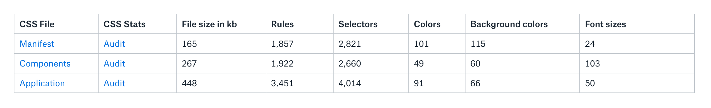
First a few disclaimers: at Gusto, the company I work for today, our engineers and designers all write in Sass and use webpack to compile those files into CSS. Our production environment minifies all that code into a single CSS file. However, our CSS is made up of three separate domains. so I downloaded them all to my desktop because I wanted to test them individually.
Here’s are those files and what they do:
manifest.css: a file that’s generated from all our Sass functions, mixins and contains all of our default HTML styles and utility classes.
components.css: a file that consists of our React components such as Button.scss, Card.scss, etc. This and manifest.css both come from our Component Library repo and are imported into our main app.
app.css: a collection of styles that override our components and manifest. Today, it exists in our main application repo.
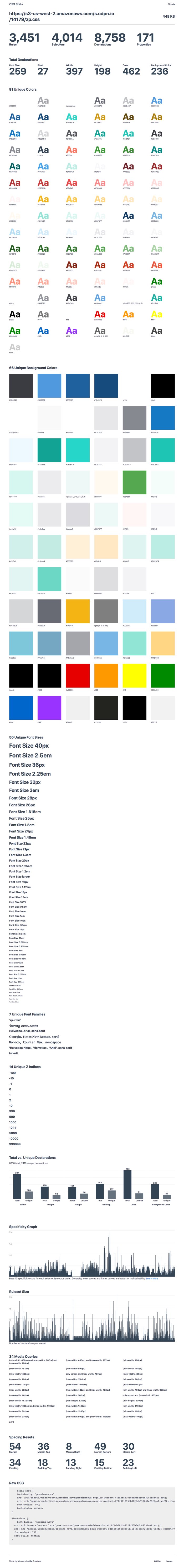
After I downloaded everything, I threw them into an S3 bucket and ran them through CSS Stats. (I couldn’t find a command line tool that I liked, so I decided stuck with this tool.) The coolest thing about CSS Stats is that it provides a ton of clarity about the health and quality of a site’s CSS, and in turn, a design system. It does this by showing the number of unique font-size and unique background-color CSS declarations there are, as well as a specificity graph for that particular CSS file.
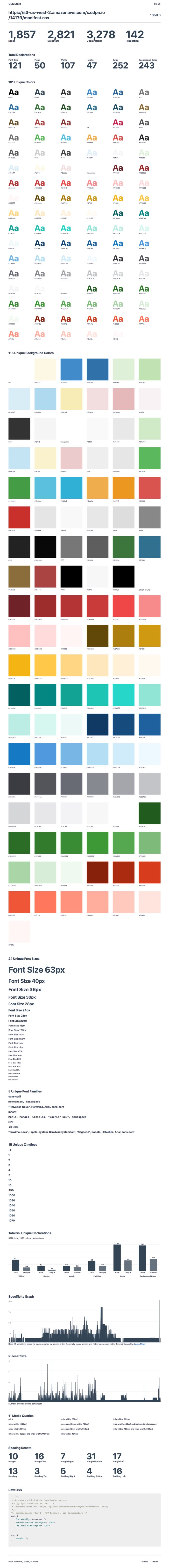
I wanted to better understand our manifest.css file first. As I mentioned, this file contains all our utility classes (such as padding-top-10px and c-salt-500) as well as our normalize and reset CSS files, so it's pretty foundational for everything else. I started digging through the results:
There are some obvious issues here, like the fact that there are 101 unique colors and 115 unique background colors. Why is this a big deal? Well, it’s a little striking to me because our team had already made a collection of Sass functions to output a very specific number of colors. In our Figma UI Kit and variables_color.scss (which gets compiled into our manifest file, we declare a total of 68 unique colors:
So, where are all these extra colors coming from? Well, I assume that they’re coming from Bootstrap. Back when we started building the application, we hastily built on top of Bootstrap’s styles without refactoring things as we went. There was a certain moment when this started to hurt as we found visual inconsistencies across our application and hundreds of lines of code being written that simply overrode Bootstrap. In a rather gallant CSS refactor, I removed Bootstrap’s CSS from our main application and archived it inside manifest.css, waiting for the day when we could return to it and refactor it all.
These extra colors are likely come from that old Bootstrap file, but it’s probably worth investigating some more. Anyway, the real issue with this for me is that my understanding of the design system is different from what’s in the front-end. That’s a big problem! If my understanding of the design system is different from how the CSS works, then there’s enormous potential for engineers and designers to pick up on the wrong patterns and for confusion to disseminate across our organization. Think about the extra bloat and lack of maintainability, not to mention other implications.
I was reading Who Are Design Systems For? by Matthew Ström and perked up when he quotes a talk by Julie Ann-Horvath where she’s noted as saying, “a design system doesn’t exist until it’s in production.” Following the logic, it's clear the design system I thought we had didn't actually exist.
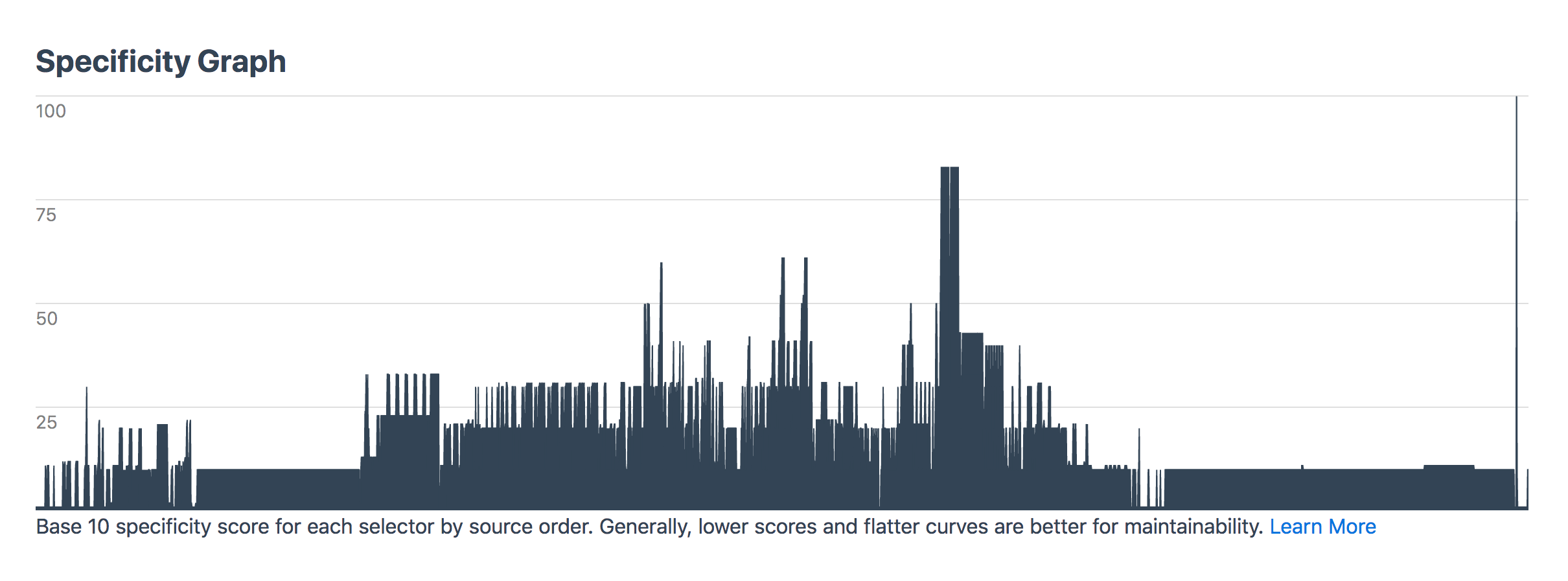
Going back to manifest.css though: the specificity graph for this file should be perfectly gradual and yet there are some clear spikes that show there’s probably a bit more CSS that needs to be refactored in there:
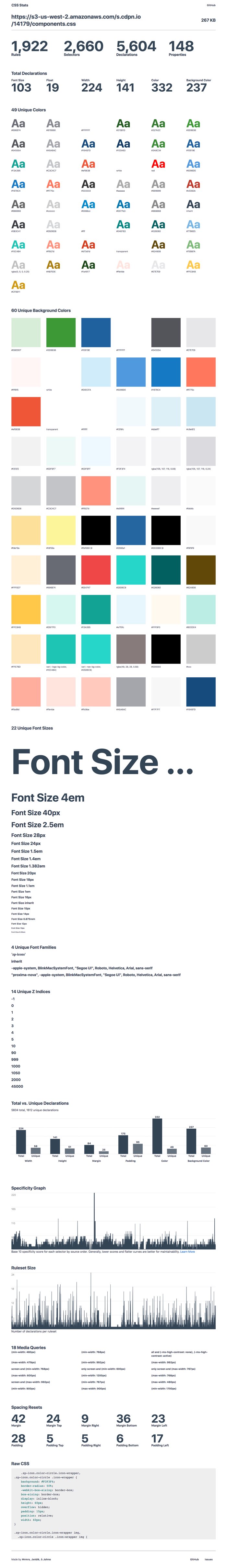
Anyway, next up is our components.css. Remember that’s the file that our styles for our components come from so I thought beforehand that it’s bound to be a little messier than our manifest file. Throwing it into CSS Stats returns the following:
CSS-Stats shows some of the same problems — like too many font sizes (what the heck is going on with that giant font size anyway?) — but there are also way too many custom colors and background-colors. I already had a hunch about what the biggest issue with this CSS file was before I started and I don’t think the problem is not shown in this data here at all.
Let me explain.
A large number of our components used to be Bootstrap files of one kind or another. Take our Accordion.jsx React component, for instance. That imports an accordion.css file which is then compiled with all the other component’s CSS into a components.css file. The problem with this is that some Accordion styles affect a lot more than just that component. CSS from this this file bleeds into other patterns and classes that aren’t tied to just one component. It’s sort of like a poison in our system and that impacts our team because it makes it difficult to reliably make changes to a single component. It also leads to a very fragile codebase.
So I guess what I’m saying here is that tools like CSS Stats are wondrous things to help us check core vital signs for CSS health, but I don’t think they’ll ever really capture the full picture.
Anyway, next up is the app.css file:
This is the “monolith” — the codebase that our design systems team is currently trying to better understand and hopefully refactor into a series of flexible and maintainable React components that others can reuse again and again.
What worries me about this codebase is the specificity of it all what happens when something changes in the manifest.css or in our components.css? Will those styles be overridden in the monolith? What will happen to the nice and tidy component styles that we import into a new project?
Subsequently, I don’t know where I stole this, but I’ve been saying it an awful lot lately — you should always be able to predict what your CSS is going to do, whether that’s a single line of code or a giant codebase of intermingled styles. That’s what design systems are all about — designing and building predictable interfaces for the future. And if our compiled CSS has all these unpredictable and unknowable parts to it, then we need to gather everyone together to fix it.
Anywho, I threw some of the data into a Dropbox Paper doc after all this to make sure we start tackling these issues and see gradual improvements over time. That looks something like this today:
How have you gone about auditing your CSS? Does your team code review CSS? Are there any tricks and tips you’d recommend? Leave a comment below!
It's rather heartwarming to know you can style a <select> in a rather cross-browser friendly way that doesn't hurt accessibility. Kudos for documenting this Scott!
Email marketing is alive and thriving more than ever. 80% of marketing professionals name email as the top driving factor of customer acquisition and customer retention. And it’s got a great ROI: For every $1 spent on email, you can expect an average of $38 in return.
At their simplest, welcome emails confirm that a new subscriber was added to your list.
If you’re only using this message for that purpose, you’re missing out on a huge opportunity to make money. Compared to other promotional emails, welcome messages generate an average of 320% more revenue.
Furthermore, customers who buy products from email campaigns spend 138% more than customers who haven’t subscribed to your list.
Stop missing out on your opportunity to make money with welcome emails. This article will tell what you need to do to drive sales directly with these campaigns.
Use a double opt-in strategy
Lots of businesses use a single opt-in strategy. With this method, a new subscriber submits their email address and automatically gets added to your list. That’s it.
But there are a few problems with this method.
If you’re not using a double opt-in, it’s possible that customers think they signed up for your emails but actually didn’t. Maybe they misspelled their email address — they’ll never know.
On the flip side, a new subscriber could also sign up by mistake, thinking that they’re submitting the email address for another reason.
In this case, you’re going to be emailing people who don’t want to receive your promotional content, and not emailing the people who do want to receive it.
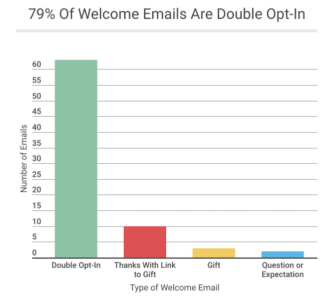
The double opt-in strategy eliminates these problems. That’s why the majority of welcome emails are double opt-in.
Without a double opt-in strategy, you’ll also end up with fake email addresses and spam accounts on your list. This will throw off your metrics. A huge list of email subscribers won’t do you any good if they aren’t qualified leads who are ready to buy.
When you force new subscribers to confirm their subscription to your email list, it increases their lead score.
Sure, it’s an extra step, and you may lose some subscribers as a result. However, the people who follow through with the double opt-in genuinely want to receive your promotional content. As a result, it’s much more likely that they’re willing to spend money.
It’s also worth noting that double opt-in messages have higher unique open rates than single opt-in campaigns.
We already talked about the fact that welcome emails have higher open rates than other types of emails. By using a double opt-in strategy, you can increase those open rates even more.
Opening the email is the first step in subscribers completing the end-goal action: making a purchase.
Send welcome emails immediately
The timing of your welcome message is crucial. As soon as someone signs up, the welcome email needs to be sent.
Some companies wait and batch out all of their welcome emails for the week at the same time, but that’s not as effective. Here’s why: Your new subscriber was just on your website and signed up to receive your email content because of some benefit that you’re offering, so your brand is fresh on their mind.
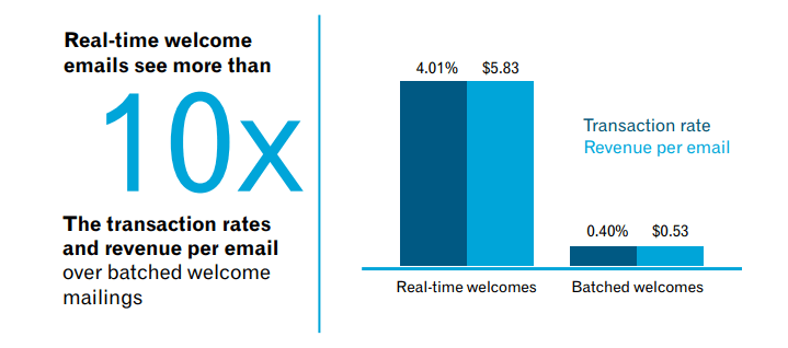
Don’t miss out on this opportunity to make a sale. This new subscriber is definitely more likely to buy something if the message is sent in real-time.
Just look at transaction rates for real-time welcomes compared to batched emails.
Furthermore, real-time welcome emails have an 88% open rate compared to just 53% of bulk welcome emails.
Though 29% of people click on the CTA of welcome emails that are sent immediately, only 12% of subscribers click on CTAs that are sent in bulk welcomes.
If you’re not sending a welcome email within seconds of the person subscribing, you’re lowering the chances of that customer making a purchase.
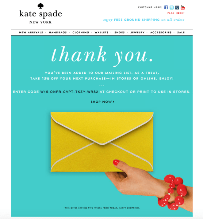
Thank your new subscribers
By thanking your customers for signing up to receive promotional content from your company, it shows that you appreciate them. Here’s an example of this strategy used by Kate Spade.
Saying thank you is just good manners. Even though they haven’t bought something yet, you can still thank them for having enough interest in your brand to subscribe to your email list.
Saying thank you can be more beneficial than you think. That’s why you need to nurture your leads with thank you pages. Take this same strategy and apply it to your welcome email.
Set a precedent for relevant content
Your welcome emails should be a good indication of what consumers can expect from you moving forward.
Tell your customers how often they’ll get emails from you, and what kind of messages they’ll be receiving. Make sure you follow through with that promise.
For example, if someone signs up for a monthly newsletter, don’t send them an email every day. That’s not what they asked for.
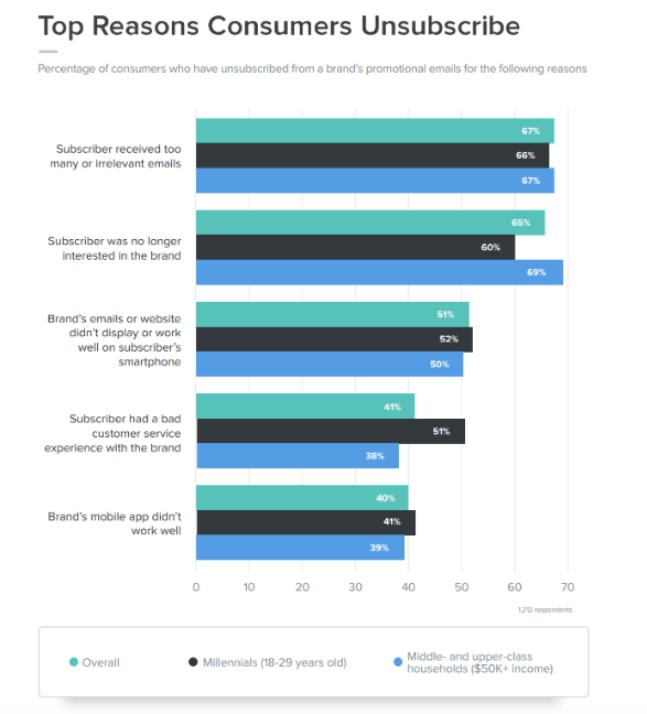
In fact, too many irrelevant emails from brands is the top reason why people unsubscribe from email lists.
The last thing you want to do is bother a new subscriber with too many messages. You just went through all of the trouble and effort to get them to sign up in the first place. All of that hard work goes out the window if they unsubscribe.
Welcome emails should be the first message of a drip campaign, which is a series of emails that entice an action. Ultimately, you want your subscribers to buy.
Drip campaigns nurture your leads by sending them timely information. As soon as someone signs up, you can have them automatically entered into a drip cycle.
After the welcome email, they’ll receive subsequent emails spaced out over the coming weeks, or however you set it up.
Here’s an example path of what a drip campaign will look like:
The great part about a drip campaign is that the customer doesn’t need to buy something right away in order for the message to be effective.
While you definitely want to create an actionable drip campaign, it’s not the end of the world if that first message doesn’t result in a conversion. You can still plant the seed for a future purchase.
After all, this new subscriber just signed up to receive your emails. Depending on the circumstances, they may not be familiar with your brand, products, and services just yet. But as these subscribers continue to receive subsequent messages throughout the drip campaign, it will increase the chances that they’ll buy something down the road.
Provide valuable information
To get the most out of your email campaigns, you need to understand why people are signing up in the first place.
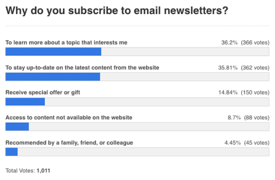
It’s a common misconception that people only join email lists to get a discount. While that’s definitely a motivating factor, there are other reasons why people sign up for promotional content from your brand. Your welcome letter needs to provide all of this to be most effective.
As you can see, receiving a special offer or a gift ranked third on this list. The majority of people say they subscribe to newsletters to learn more about topics and stay up to date on new content. It’s still worth giving a discount to new subscribers, but it doesn’t necessarily have to be your top priority.
You can also keep them engaged by giving a new subscriber an added benefit that they wouldn’t have received if they didn’t sign up for emails. Talk about new or exclusive product releases. Give them an opportunity to create an account to benefit from a more personalized customer experience.
Offer an incentive to buy
Even though it isn’t first on the list of reasons, getting a gift or something in return is still one of the top three reasons why people sign up for emails. And, offering a discount is a great way to get people to sign up for emails in the first place.
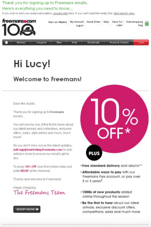
By signing up for emails, this welcome message gives the new subscriber 10% off of their purchase. In addition to providing a discount, this message thanks the new subscriber for signing up. It’s personalized with her name. It also gives a sense of inside information with phrases like, “Be the first to hear” and “Here’s all you need to know.” All of these tactics used in one message will definitely increase the chances that a customer will make a purchase.
Send personalized content
People don’t want to feel like they are just a number on your list, when in reality, that may actually be the case. If you’re sending out generic welcome emails with opening lines like “Dear Sir or Madam,” it’s not going to convey the personalized touch that you want to offer.
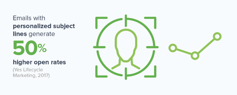
Getting your new subscribers to open your message is half of the battle. Obviously, nobody is going to buy anything if the message goes unopened. Good news: personalized subject lines have higher open rates.
However, opening the message alone won’t automatically translate to a sale. You need people to engage with your messages as well. The best way to do this is by providing interactive content. For example, adding a video to your welcome email can increase clicks by 300%.
It’s also worth noting that 64% of people are more likely to buy something online after watching a video about a product. By combining engaging content with a personalized message, your welcome emails will have a greater chance of driving sales.
Give your new subscribers a reason to invite their friends and family to sign up as well. Take a look at how Blinq does this in their welcome email:
This refer-a-friend program offers an incentive to the current subscriber as well as any new people who sign up. Both receive a $10 credit. The more people who join as a result of the referral, the more rewards the new subscriber gets. This will also increase their chances of buying.
Here’s something else to consider, if someone who gets referred by a new customer ends up signing up for emails as well, they’ll also receive the same welcome message. As a result, it will increase the chances that they’ll refer new customers too. This strategy encourages business growth without much work on your end.
Plus, consumers are four times more likely to buy something if they are referred by a friend.
Conclusion
Your company needs to prioritize its email marketing strategy. But you don’t need to wait months to encourage new subscribers to make a purchase. You should be trying to drive sales right away with your welcome emails.
Send welcome messages immediately.
Use a double opt-in strategy to increase opens and qualify your leads.
Let your welcome email serve as the first message of your drip campaigns.
Don’t forget to thank your new subscribers for signing up.
Give them what they’re looking for by providing valuable information, and tell them what to expect from you in the future.
Personalize your content and add other incentives to increase the chances that people will buy.
Use your welcome email as an opportunity to promote your customer referral program.
By applying these strategies to your welcome emails, you’ll be able to generate more sales from new subscribers.
How is your brand leveraging welcome messages to drive sales?
The way you develop for and create content with WordPress is changing. With the release of WordPress 5.0 and the new Gutenberg editor, there will be a lot of adjustments to make. They not only affect what we see on our screens, but also the underlying techniques we use to customize the back end.
What’s especially important to note is that it’s not just web professionals who will bear the burden of a changed workflow. Everyday users will also have their own learning curve to deal with. The simple act of writing a blog post, for example, will look much differently with Gutenberg than with the Classic Editor.
That’s not to paint any of these changes as either positive or negative. Regardless of how you feel about them, they are changes nonetheless.
So, what’s changing? Let’s have a look at some areas that WordPress 5.0 will have its greatest impact.
Writing with Gutenberg
The most visible change with WordPress 5.0 is the block-based Gutenberg editor. Gone are the days of a single rectangular field to type away at your next blog post. Instead, virtually everything is contained with portable blocks – including text paragraphs.
The positive side of this change is that it’s easy to rearrange content – something that could be frustrating with the Classic editor. A user can, for instance, edit one block without fear of impacting any of the surrounding content.
Still, it’s going to take some getting used to – especially for longtime users. The UI is fairly intuitive, but a different experience altogether from what a standard WordPress install has been.
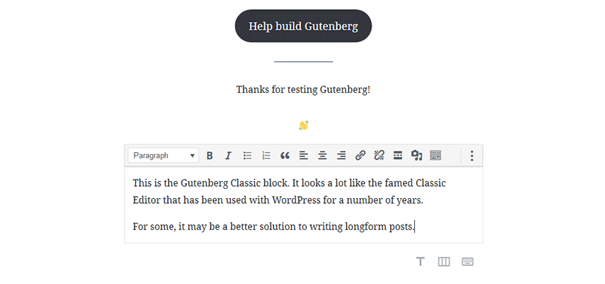
Oh, and one tip worth mentioning about those paragraph blocks: Hitting the Enter key at the end of one paragraph will automatically create another new block. So, you can continue writing in the editor without having to manually add blocks via the UI. Alternatively, you can use the “Classic” block, that allows for the more traditional style of content writing.
Customizing the Edit Screen
Among the biggest changes with WordPress 5.0 and Gutenberg are how customizations to the edit screen both look and are built.
For example, if you use a plugin such as Advanced Custom Fields to create custom field UI setups, it will still work just fine. But Gutenberg forces these fields down to the very bottom of the screen. Therefore, any elaborate custom layouts you’ve built for the back end are going to be stuck below the fold – unless you opt to remain with the Classic editor.
Beyond that, adding custom features to the editor itself is a completely different process in the post 5.0 world. Since the Classic editor’s TinyMCE-based setup is being pushed aside, you’ll need to create a custom block for Gutenberg in order to integrate with the editor. That will require some serious knowledge of React and JavaScript in general.
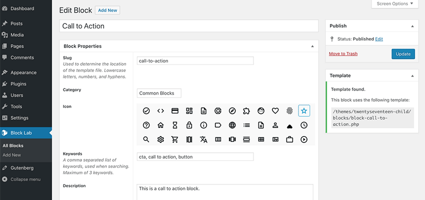
Thankfully, the aforementioned Advanced Custom Fields and the new Block Lab plugin both provide easier methods for creating custom blocks. This will enable more developers to build in custom capabilities for the new editor without diving too deeply into the weeds with JS. The process will be more familiar, yet still requires some effort to learn.
All told, customizing the edit screen will require a very different approach in order to achieve the same level of integration with the WordPress editor’s UI.
Building a Custom WordPress Theme
It seems fairly unlikely that Gutenberg will “break” any themes. Instead, existing themes just may not be setup to take full advantage of some of the fancy new features, such as cover images.
By default, some “baseline” styles for all Gutenberg blocks will be included. However, you can also add custom styles to your theme in order to better control how blocks look on the front end of your site.
It’s also possible to include (or withhold) support for specific features, such as full-width images, via some code in your theme’s functions.php file. This provides you with some measure of oversight regarding what your theme can or can’t do with Gutenberg.
Lastly, one of the main selling points of Gutenberg is an experience that is much closer to being truly WYSIWYG. To get as close as possible, adding editor styles to your theme can provide a more accurate reflection in the editor of how content will look on the front end. WordPress has a built in a handy .editor-styles-wrapper class to get you going.
Rolling with the Changes
In some ways, this may all sound a bit overwhelming. But while change isn’t easy, it’s also inevitable. Therefore, all we can do is make the best of it.
A positive aspect of all of this is that, even though WordPress 5.0 is out there, we can still opt for the Classic editor if we so choose. This empowers us to make the final decision on whether these changes are a good fit for our own particular situation.
The Classic editor will be supported at least through the end of 2021, meaning we have some time to adjust before taking the plunge into Gutenberg. So, while our workflows are indeed going to change eventually, we get to do so at our own pace.
Yes, it’s a lot to take in. But at least we have the necessary tools and knowledge to handle these changes successfully.
The end of the year is always a good time to look back at all the things – good and bad – that happened over the last 12 months. But today let’s just focus on the good. Hence, this list of the best WordPress dev tools of 2018!
As we come to the end of 2018, I spoke to some of the Smashing team, to get some thoughts on what the past year has been like for Smashing Magazine. We’re a small and fully remote team, communicating via Slack and Notion. Many of us only work part-time for Smashing, however, in many ways, I think that is one of our strengths.
We’re not just the publishers of an online magazine or conference organizers, we are people who work in the web industry. Among the team, products have been launched, books are being written, conferences have been spoken at, and websites launched that have nothing to do with Smashing Magazine itself. I love that. It stops us being insular, and I hope this helps us to constantly broaden our reach — bringing people together from all over the world to share ideas and inspiration as we all work together to build a better web.
As Editor in Chief of Smashing Magazine, I look after the content that goes out on the online magazine, and also our upcoming print magazine for members. This year, we have published almost every weekday — that represents over 290 articles! That’s a whole lot of content on subjects from privacy and accessibility to CSS and WordPress. While I read every article that goes out, I do not have the expertise to know everything about all of these subjects. I couldn’t do my job without the help of our talented editors who work with individual authors: Alma Hoffmann (Design), Chui Chui Tan (UX Design), Drew McLellan (Coding), Jim Dabell (Mobile), Marko Dugonjić (Typography), Michel Bozgounov (Graphics), and Rey Bango (Coding). Plus thanks to Iris Lješnjanin, Markus Seyfferth, Yana Kirilenko, Cosima Mielke, Andrew Lobo and Ricardo Gimenes for their hard work and efforts.
In Between Timezones
On a personal note, this year has once again involved a lot of travel, as I continue to tour around speaking about new CSS and CSS Layout. That has included talks and workshops for Smashing. In total (with speaking engagements, workshops and CSS Working Group meetings), I have traveled 272,865 kilometers while visiting 45 cities and 15 countries. That amounts to spending 146 days on the road.
Here’s a fun fact: My weekly standup post in our Smashing Slack usually starts with sharing the timezones I’m going to be in that week. Well, next year will involve more travel, and I’ll be bringing my new CSS Layout workshop to San Francisco, Toronto, and New York.
As for the magazine, I hope we can continue to publish great content from authors — those who are experienced writers but also folks writing for the first time. We are very happy to work with you to shape an article for publication. Personally, writing has helped boost my career more than anything else I have done. I love to help other people get started. So, if you have an idea, read this and then send over an outline.
Please don’t hesitate. Some of our most popular posts have been beginner guides to a technology, so don’t feel you need to have solved a big problem, or have some brand new technique in order to contribute. A nice technique, demonstrated and explained well, is worth a lot to someone who has just hit that same issue.
Anyway, enough from me! What were the highlights of the year for everyone else here at Smashing?
2018 was a quite busy and adventurous year for me, with a good number of ups and downs, challenges, surprises, and rewards. I was honored to have had the opportunity to run trainings, workshops and even offer consultancy to the European Parliament, EPAM, OTTO, Sipgate, Axel Springer and Wondrous, among others. I was happy to support dozens of local meet-ups and conferences around the world with the kind help of our Smashing Members.
Earlier this year, I explored how we can improve the level of education for front-end and design. While speaking at universities and schools, I was also teaching to get a sense of what’s required to set up a proper design school. In February, I taught at the New Digital School in Porto, Portugal, for a week, while exploring the state of front-end and responsive interface design in a class of 20 students. In June, I helped dear friends from the Projector Design School in Kyiv, Ukraine, set up Berlin Design Campus, an initiative for Ukrainian students to explore how digital agencies and designers work and live in Berlin. In October, I participated in a week-long co-working co-living campus in Mokrin, Serbia.
Specifically, I was exploring the state of design and front-end in uncommon locations, mostly second- and third-largest cities: Porto and Braga in Portugal (thanks Tiago!), Yerevan in Armenia (thanks Sona and Sargis!), Gdansk in Poland (thanks Patrycja!), Salzburg in Austria (thanks Markus!), Moscow and Saint Petersburg in Russia (thanks Julia, Daria, Alex, Andrey, Vadim and Alexey!), Split and Labin in Croatia (thanks Toni, Antonio and Domagoj!), Belgrade and Mokrin in Serbia (thanks Tatjana and Marija!), Belfast in Northern Ireland (thanks Tash and Oliver!), Manila in Philippines (thanks Sophia!), Tallinn in Estonia (thanks Artur!).
Much of the time in the second half of the year was spent with wonderful people at the European Parliament in Brussels, where Nicolas and Manuel were kind enough to invite me to work on refinements and improvements of UIs for election sites, media library, and a few smaller sites. That was quite a bit of traveling, with the absolute worst highlight of the last years being a massively delayed 47-hour trip to the Philippines due to a closed runway at the Manila airport (thanks for bearing with me through this, dear Sophia and the crew!)
Over the course of the year, I have spoken at 17 conferences, and was privileged to meet many — many! — remarkable people. It ended up with conversations I will remember for years to come. Some of these conversations changed me for the better as a person and professional, so I was happy to receive constructive criticism on MCing skills, writing, as well as code and design. I managed to wrap my head around the intricacies of CSS Grid Layout and Service Workers but also spent a lot of time learning about network protocols and the underlying layers of the Internet. I also attended 6 workshops to stay afloat of what’s happening in our industry these days and sharpened up my front-end/UX/communication skills. In September, I was honored to participate in the Mozilla Tech Speakers coaching, along with Ada Rose Edwards and Marc Thiele, mentoring and giving feedback to dozens of new speakers (here’s a review of the event by Havi Hoffman).
In terms of the Smashing Universe, we spent quite a bit of time revising our workflows and streamlining our processes for conferences, books, and the Smashing Membership. With fantastic event management skills of Mariona Ciller, Amanda Tamny Annandale and Charis Rooda, we’ve run 5 conferences this year: in London, San Francisco, Toronto, Freiburg and New York.
For the first time, we experimented with a ’no-slides’ format in Toronto (every speaker presented “live” on stage in front of a large screen shwoing how they build and design — with performance and accessibility audits to live designing/coding/sketching sessions on stage. In fact, that’s the format we are going to continue exploring in 2019.
Editor’s Note: If this format sounds interesting to you, you can watch all of the SmashingConf talks on Vimeo.
Nadieh Bremer presenting at SmashingConf Toronto (watch on Vimeo)
After many months of work, we finally published “Smashing Book 6” and “Form Design Patterns” by Adam Silver, but quite a bit of time was spent on the next upcoming books that will be published in the next years. For the Membership, we were able to secure Scott Whitehead and Bruce Lawson to help evolve the Membership program.
On a more personal level, I will vividly remember vacations to Morocco (Marrakesh, Fez and the Sahara desert trip) and Sardinia (Northern part) earlier this year. Also, on a sad note, I’ve moved out from Vilnius, Lithuania, where I’ve resided for the past 3 years.
Overall, I see 2018 as an important “transitional” year which took a lot of time, effort, and hard work. It feels like it’s been a transitional year between how things used to be and what’s coming up next. With this in mind, I couldn’t be more excited to see what 2019 will bring us! Expect a few new books coming up, Smashing Magazine Print edition, four Smashing Conferences (San Francisco, Toronto, Freiburg, New York) and many wonderful Smashing TV sessions!
Change happens everywhere and all the time — in all organizations, agencies, and businesses. If you don’t thrive change on your own, then there comes a time when change takes place on its own and things get out of control.
Looking back on the year 2018, we’ve undergone changes to even better fit the needs of our readers. We published the Smashing Book 6: New Frontiers in Web Design, a book packed into the probably the most beautiful cover that we have had designed so far. It’s a book that sheds light on all kinds of upcoming challenges that await web designers and developers in the near future.
We also published Form Design Patterns, a book that focusses on building all sorts of accessible and resilient web forms, and how to make them pretty (thanks to progressive enhancement) — a book that I personally learned a lot from. We’ve also started working on two new books that we’ll be publishing early next year: “Art Direction on the Web” by Andy Clarke, and “Inclusive Components” by Heydon Pickering. I am eagerly looking forward to holding both of them in my hands!
At the end of last year, we did something that we usually wouldn’t do because it would be too much of a risk. We launched a fully redesigned site: we migrated the entire magazine, the Job Board, and our Smashing Shop onto a new platform, and also launched our Membership initiative to reduce advertising on the site and to make Smashing more independent from ads in the long run. All of this took place at the same time. Was it worth it? A definite “Yes!” We’ve seen a noticeable uptrend in our analytics and many positive outcomes. At around mid-2018, we had already crossed the 1,000 members mark, and we look forward to breaking the next big mark in the next year (always with the long-term goal of getting fully independent within the next three years)!
That’s right; Smashing Membership continues to evolve. In the upcoming months, we’ll be introducing a new print magazine for our Members — something that is both visually appealing and also most useful to read. Rachel will be building the print magazine mostly with print.css, so I’m really looking forward to seeing how this will turn out and whether we can reuse some of it for our upcoming books!
And that’s not the only sort of change that is still ongoing at Smashing. We also tried a new live coding and design conference format at this year’s SmashingConf in Toronto; we thought that the old format had gotten a bit too much of the same, something that makes SmashingConf a bit too similar with what others already do. After all, we want to run conferences that contain content that we ourselves find most useful and interesting, and the new live format brings precisely that! It did take quite a bit of a risk though, and we’re thrilled that it turned out to be a tremendous success! So we are going to double down with this new format in the next year.
Last but not least, we also moved our smashingconf.com site to Netlify just recently, but that happened mostly in the background, so if no one really noticed the change, I guess that’s a good thing.
Yes, 2018 was a year full of transitions, but I guess you never can afford to stand still anyway? ;-)
Before the end of the first year of Smashing Membership, we reached a thousand members — thank you so much, everyone! Those extra-special people who were with us for the whole year received a little thank you in the post.
I joined Scott in October, which allowed us to increase the number of Smashing TV webinars (which are free to Members and Smashing Members, of course). We’ve had sessions on coding Machine Learning, Designing with Ethics, the State of the Web in South-East Asia, and statistical techniques for collecting user data without compromising privacy. (All are recorded and available to members, if you have FOMO!)
When we set up Membership, we promised that it would be an inclusive place where lesser-heard voices (in addition to big names) would be beamed straight to your living room/ home office/ sauna over Smashing TV. While we’ve been speaking at other non-Smashing events, we’ve watched other sessions from lesser-known talents in our industry. With only $5 to $9 a month, your Membership subscription allows us to bring you even greater content, pay all our contributors fairly, and reduce advertising on the site.
Next year, we’ll be increasing the number of webinars again. Lined up is a course on how to make Progressive Web Apps, Internationalization, Semantic HTML, Houdini, as well as a monthly show hosted by me and Vitaly with industry guests. We sincerely hope you’ll join us!
2018 was a year of firsts, new cities, new attendees, new speakers, and even a couple new formats. We had more than a few challenges in store, but if you have any experience with the Smashing Team, you’ll know that we thrive on challenges.
We started the year in London (our first time in the capital city and the first time in England in a couple of years). The sold-out conference took place in LSO’s St. Luke’s Church, and bathed in sunlight. This performance-based conference brought in a new crowd of attendees and speakers — all discussing why Performance Matters, the common pitfalls, and the tips and tricks for improving the day to day user experience. With Una Kravets and Patrick Hamman as MCs, the experience was new and empowering.
In April, the Smashing team headed back to San Francisco. The weather was wonderful as we returned to the bay, with 14 speakers, 8 workshops, and nearly 500 attendees. Held at the Palace of Fine Arts, Mina Markham walked us through the process of redesigning Slack, while Joe Leech broke down the process of “Designing Powerful User Experiences With Psychology.” We toured the area, competed with each other at the arcade, and came together to find new ways to solve new processes and challenges.
Backstage at Smashing Conf Toronto (Photo credit: Marc Thiele)
A couple of months later, SmashingConf experimented with its boldest change: no slides! All of the presenters, from Aaron Draplin to Rachel Andrew, tossed out their ‘normal’ presentation format and showed the attendees how they work. The experience was enlightening, showing how similar we all are in our work processes in some ways, while approaching things from an entirely different angle in others. In fact, we loved it so much that we’ve decided 2019 should be the year of No Slides!
The end of the summer is when Smashing goes home. Set on the foothills of the Black Forest, at the infamous Markethall, SmashingConf came back to Freiburg, Germany with 14 speakers. Chui Chui Tan spoke about Designing for Global Audiences while Josh Clark talked about Design in the Era of the Algorithm. In addition, we had a new experience adding community lightning talks to our program. No matter what changes though, there’s nothing like hosting SmashingConf Freiburg and bringing people to our home.
And finally, we ended the year in the city that never sleeps — and lived up to the name! In New York City, we had 14 speakers, 8 workshops, a packed speaker panel, a couple of retro parties, and events that kept everyone busy for four days. Smashing challenged the sold-out audience with an engaging group of speakers from John Maeda to Debbie Millman and Sara Soueidan. No matter how many times we go back, the experiences always change us in a way.
But, then again, that’s how the Smashing team always feels at the end of a season: challenged, moved, and driven. We’ve learned from over 30 speakers, met over 1500 attendees, flown to 5 cities, eaten lots of incredible food, and had countless wonderful experiences. Now, the team is ready to create, improve, and progress to see what 2019 has in store for us!
If you ask me, I think that this year went by really quickly. When I look back, I see five Smashing conferences, which took place in London, San Francisco, Toronto, Freiburg and New York, as well as many improvements which we’ve achieved in the background.
Editor’s note: Marc has taken photos of many of our conferences, you can find the albums on his Flickr account.
When I say background, I mean that maybe readers, attendees or folks who visit Smashing Magazine don’t even recognize the work we do behind the curtains. Of course, there are final products that are presented in the articles published on Smashing Magazine, the Smashing Books, or projects that have been brought to your attention via Smashing TV or while attending a Smashing conference or workshops, but there is a small team of people who work hard to continue improving workflows and experiences for our cherished customers. What you often don’t see is see the messy middle and the bumpy journey we are on — from talking about a new idea to the final product. There actually is a lot of work, a lot of failure, and many discussions and conversations involved.
From the end of April onwards, we had many meetings and conversations to see where we can improve the work that we do. Defining clear roles and tasks, checking how the many different parts of the Smashing Universe can grow closer together, and also looking for new, exciting ideas to bring to life. There are also many new faces on board of the Smashing boat — fresh energy to move forward — and I am very much looking forward to seeing the results of their passion and input. Expect the quality you know from the magazine and the events and an even better Smashing Membership, Smashing TV, and maybe the one or other new idea.
So, when I personally speak about 2018, I tend to say that this year was not too good and felt strange for a reason that I can’t really grab and describe. Perhaps it is the overall mood and spirit that comes from what you see when you turn on the news, read the newspaper in the morning or talk to your neighbor? All I know is that it is important to stay positive and have a positive look into the future. I ran three very successful beyond tellerrand shows in Munich, Dusseldorf and Berlin, and I’ve seen the success we had with all the Smashing conferences and the improvements we’ve accomplished for the overall Smashing experience.
My wish for the upcoming new year: let’s meet — even more. Let’s share ideas and what we’ve learned. Let’s not just meet on the web, but in real life. It is wonderful to teach and share and to see other people taking what they’ve learned from you and take it further to create, inspire and teach others with it. One more thing that also is important: Stay curious and ask questions. Never fear to ask a question as you “might look stupid asking.” If you have a question, then it’s stupid not to ask.
With this, I wish everyone a wonderful journey over to 2019 and I am looking forward to meeting you in 2019!
Working at Smashing Magazine has been a very rewarding experience. Each time one of the articles I have edited gets published, I think I am happier than the authors.
One article, in particular, that was very meaningful to me was written by Trine Falbe and titled “Ethical Design The Practical Getting-Started Guide.” We all talk about ethical design, but not often we are provided with a way to get started. It is a good article to reflect upon as the current year ends and the new starts.
Thank you, Smashing, for keeping me around!
A Truly Smashing Year
Reading all of this certainly makes me proud to be part of the Smashing team. At the heart of everything Smashing, is an absolute focus on you, our readers, members, and conference attendees. We hope that the things we do demonstrate that, and we are always happy to listen and to learn when we get it wrong!
I’m excited for the things we will be sharing in 2019, and along with all of the team I am always happy to hear your feedback. What can we do better? What do you want to learn? How can we help? We will be opening up a survey for some more formal feedback early in 2019, but our door (or email inbox at least) is always open!
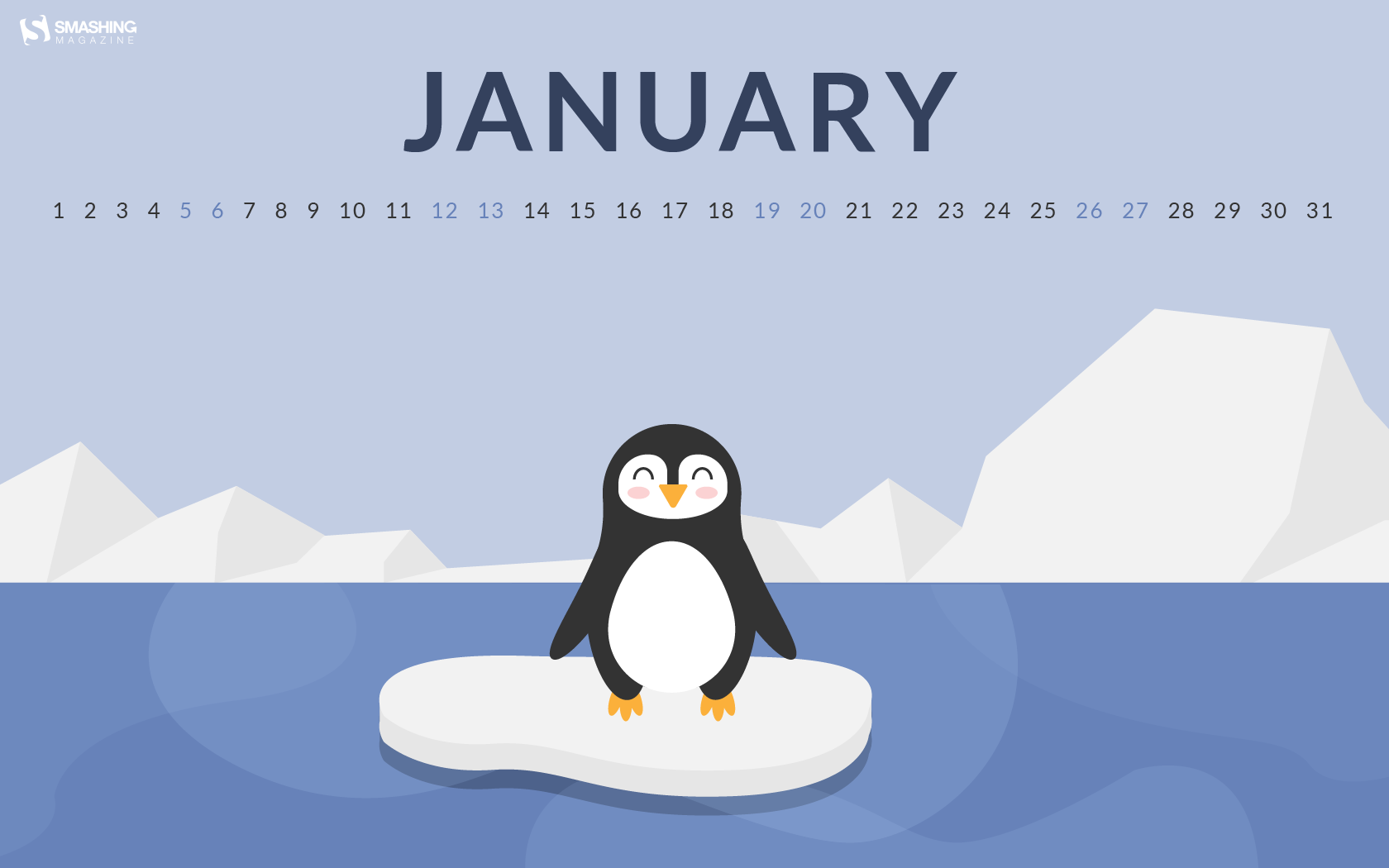
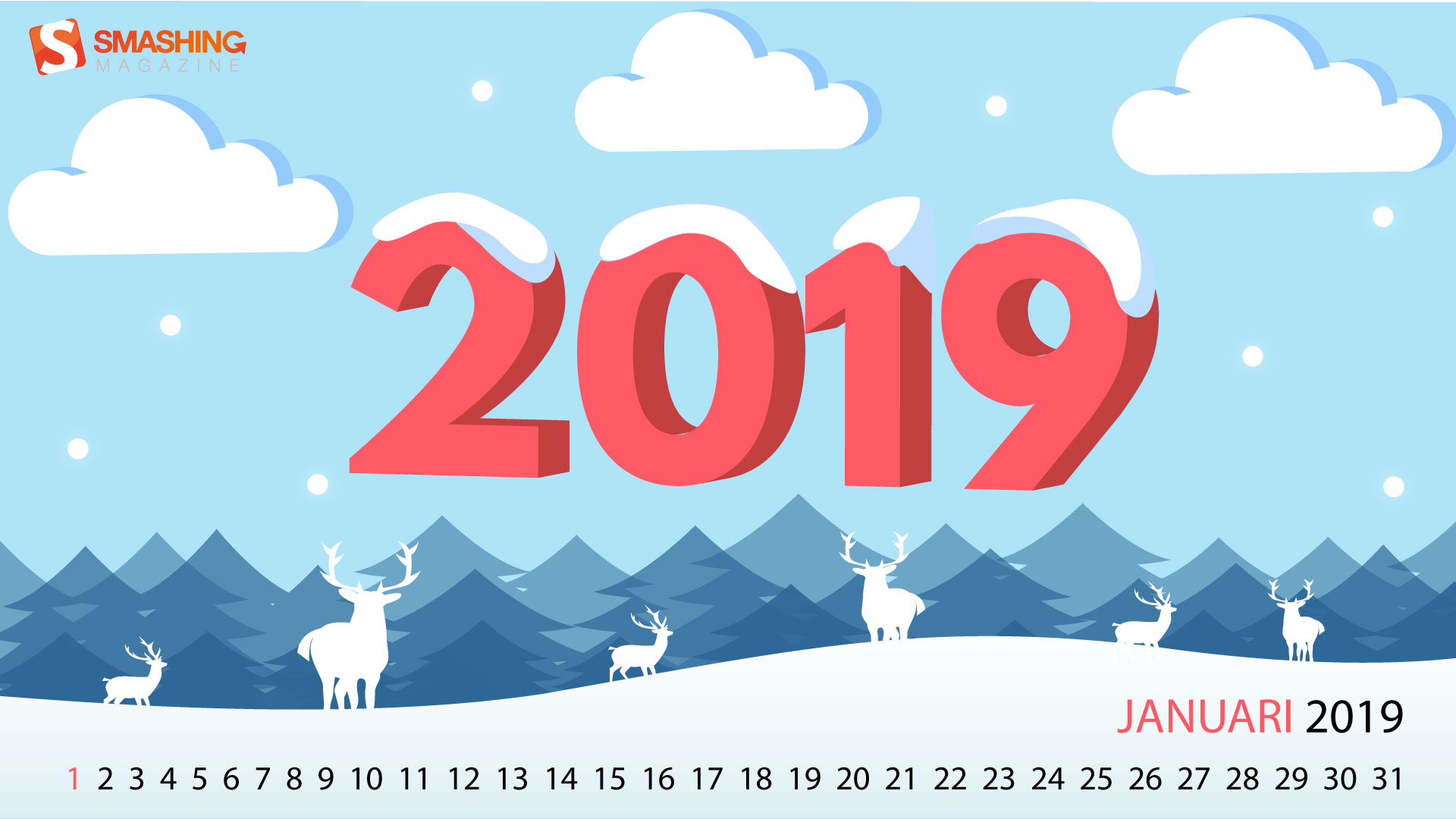
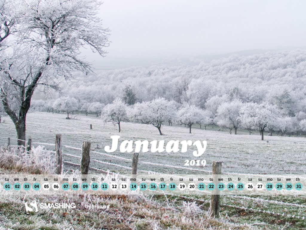
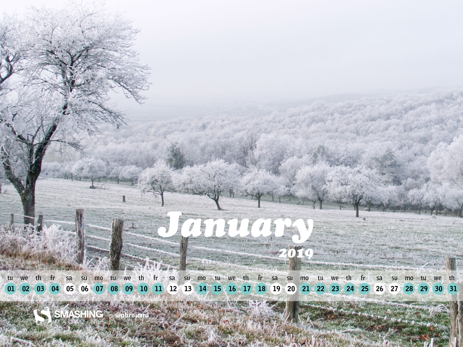
New Year, New Beginnings (January 2019 Wallpapers Edition)
New Year, New Beginnings (January 2019 Wallpapers Edition)
Cosima Mielke
Maybe you’ve already started into the new year when you read this, maybe you’re still waiting for the big countdown to begin. No matter what: Let’s welcome 2019 with a fresh wallpaper!
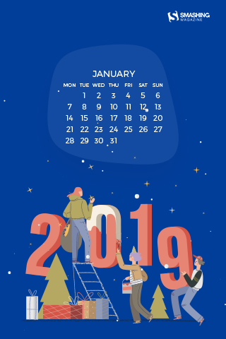
To give you a little inspiration boost, artists and designers from across the globe once again tickled their creativity and designed unique wallpapers for you to indulge in. All of them come in versions with and without a calendar for January 2019 and can be downloaded for free — just like every month since more than nine years already. At the end of this post, we also compiled some January favorites from past years that are too good not to share. Have an exciting new year!
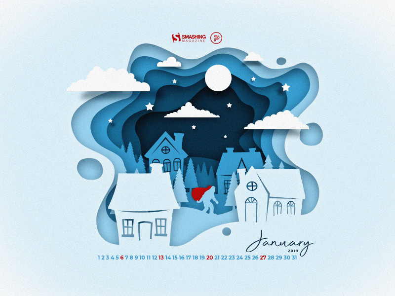
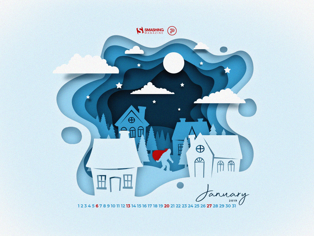
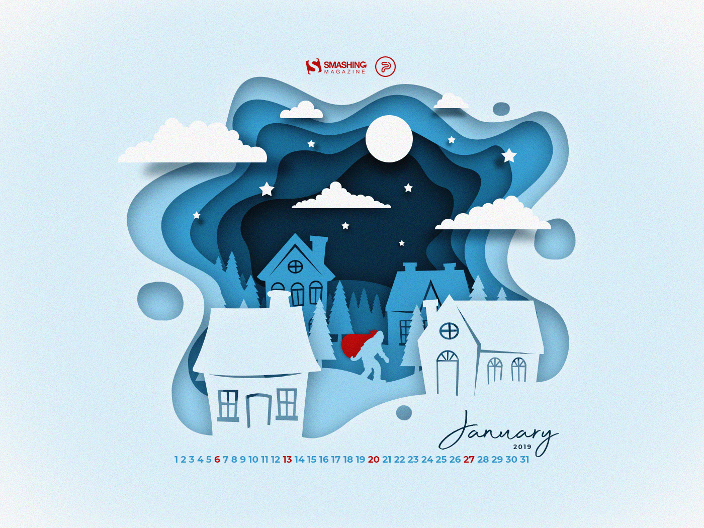
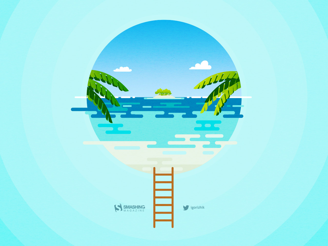
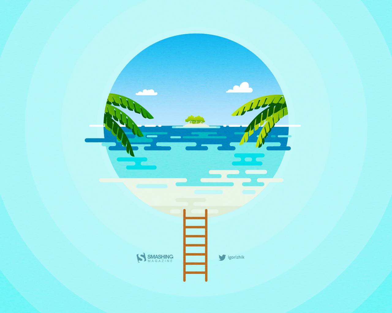
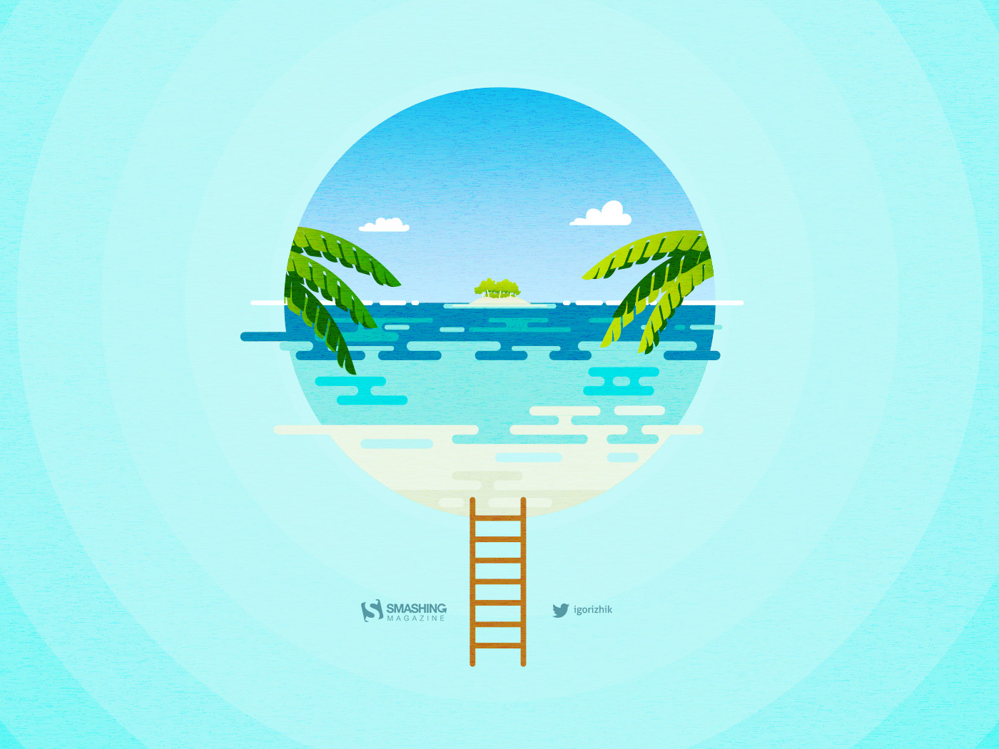
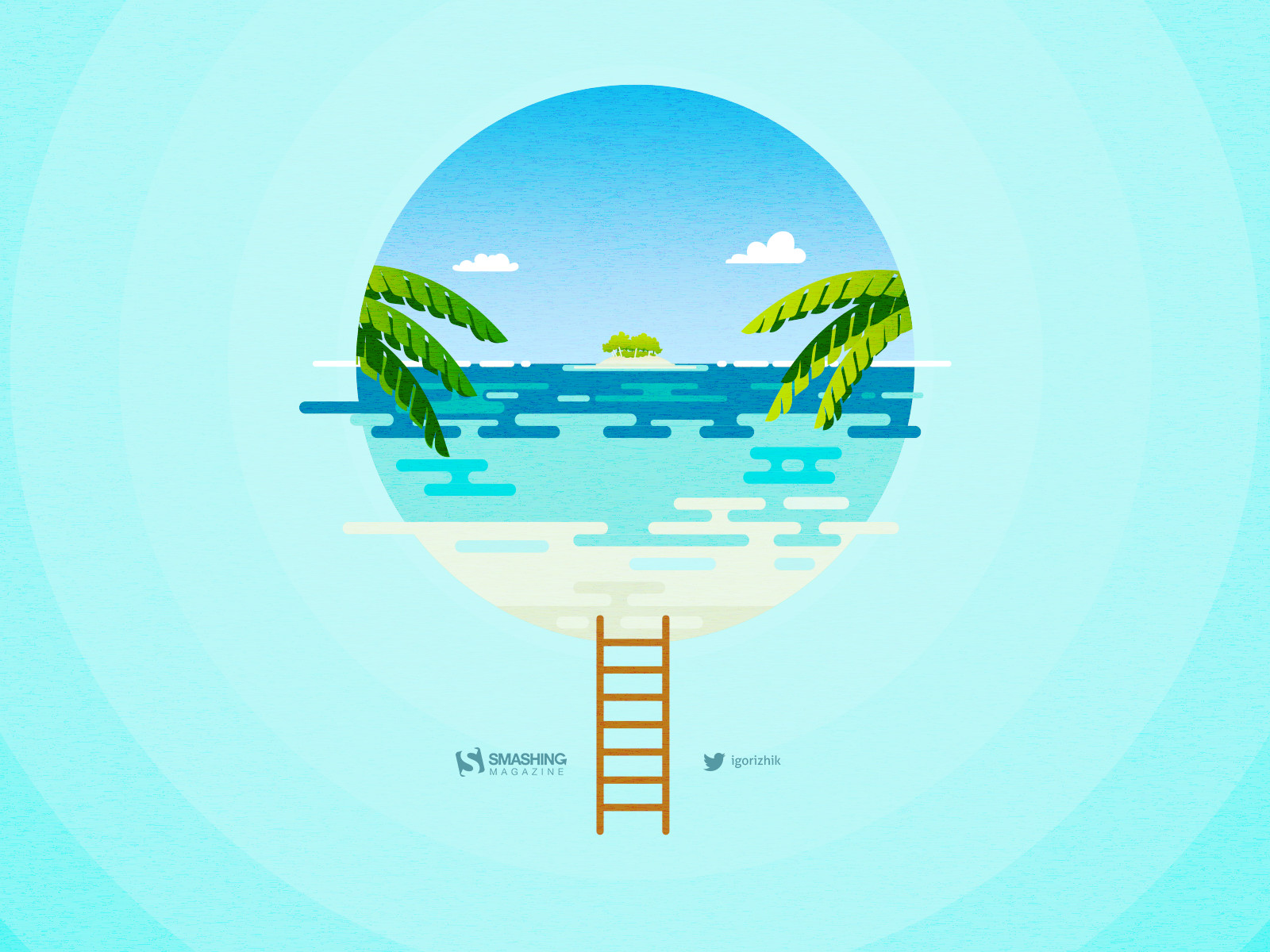
All images can be clicked on and lead to the preview of the wallpaper,
You can feature your work in our magazine by taking part in our Desktop Wallpaper Calendar series. We are regularly looking for creative designers and artists to be featured on Smashing Magazine. Are you one of them?
Let The Magic Begin
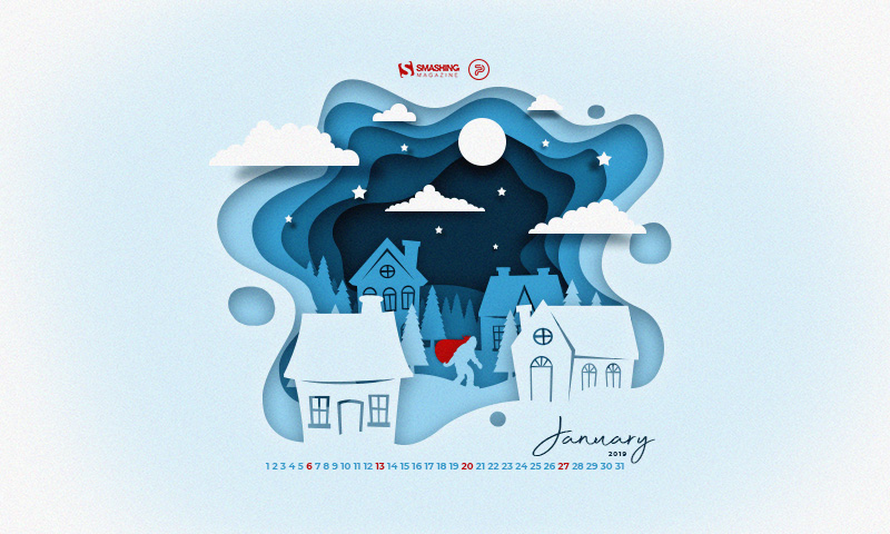
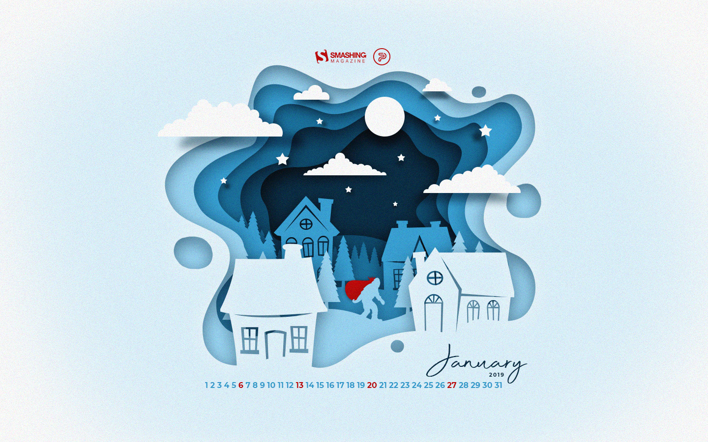
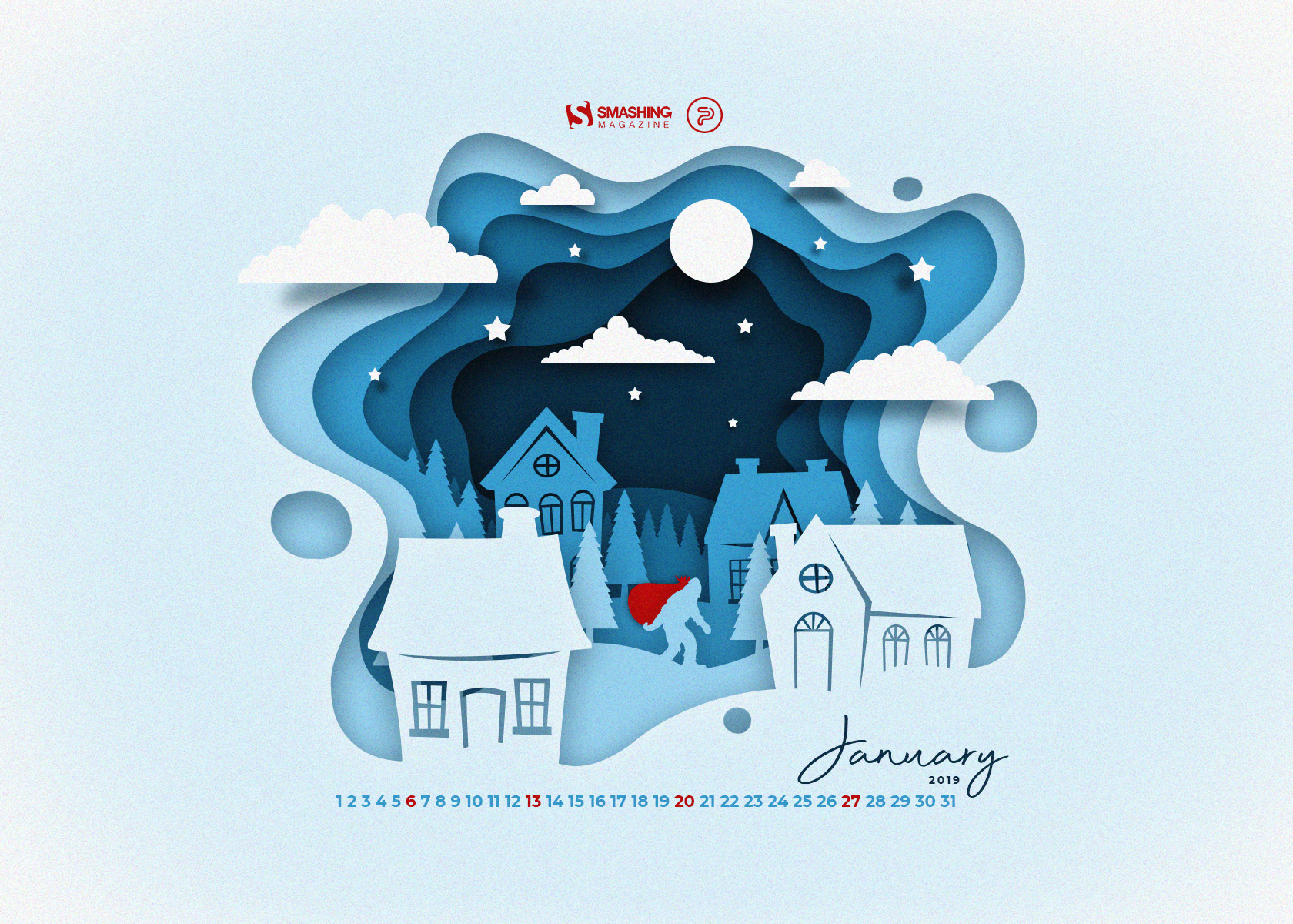
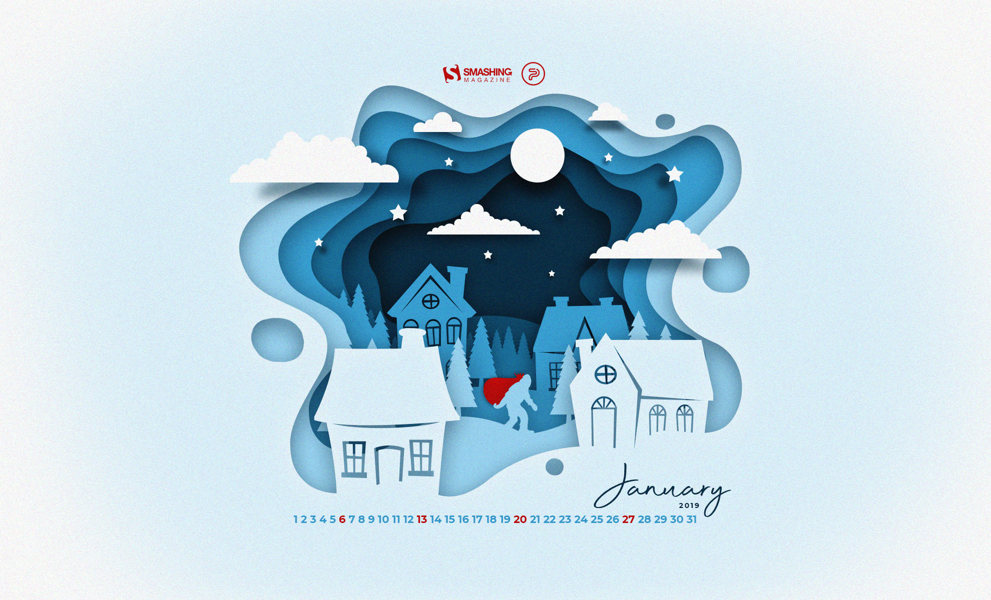
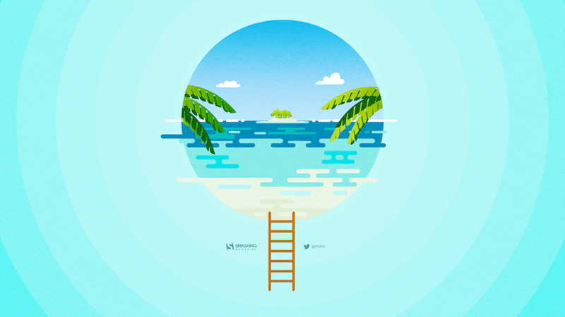
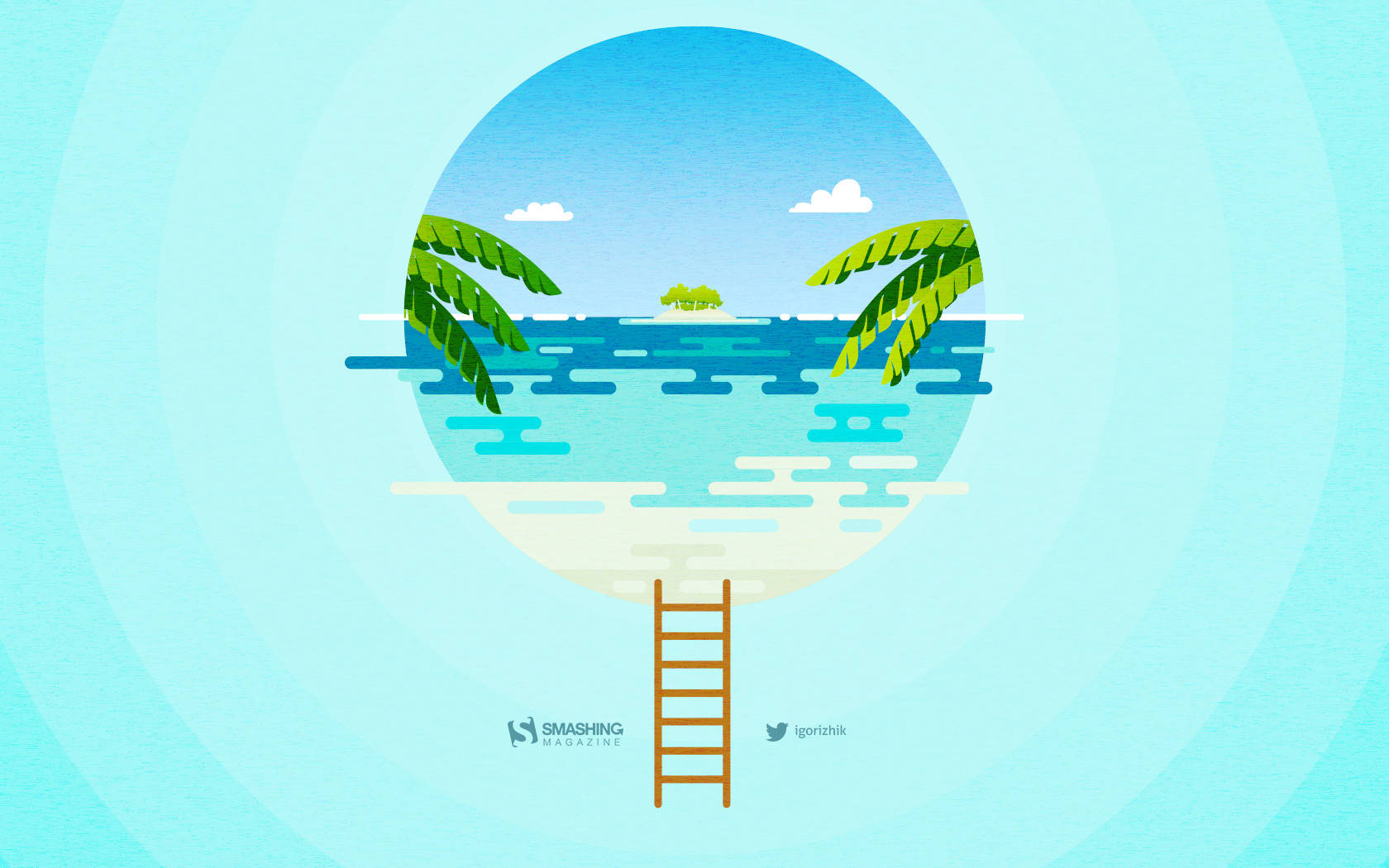
“When the noisy holidays stay behind us, and everything calms down to a peaceful setting, it is a perfect moment for the magic to step in and start making our wishes, hopes, and decisions come true. Happy January, everyone!” — Designed by PopArt Web Design from Serbia.
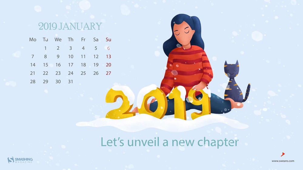
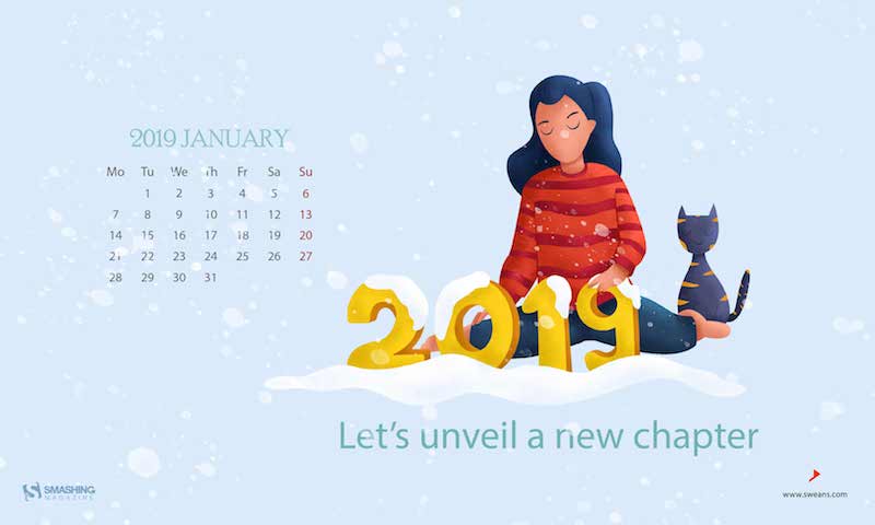
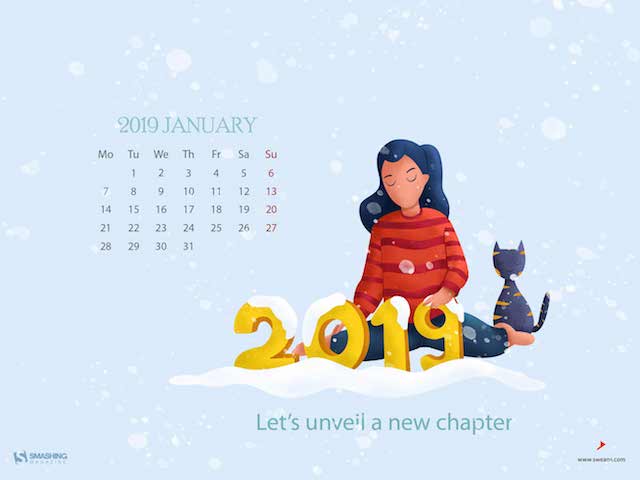
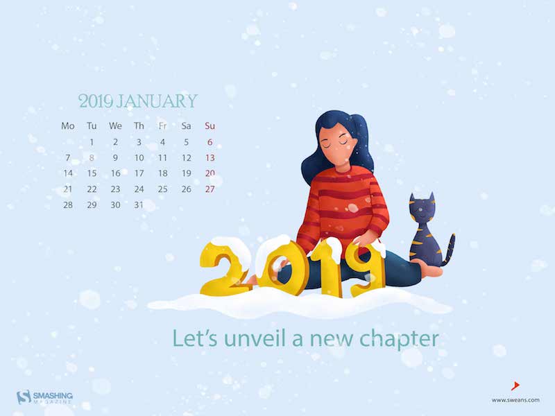
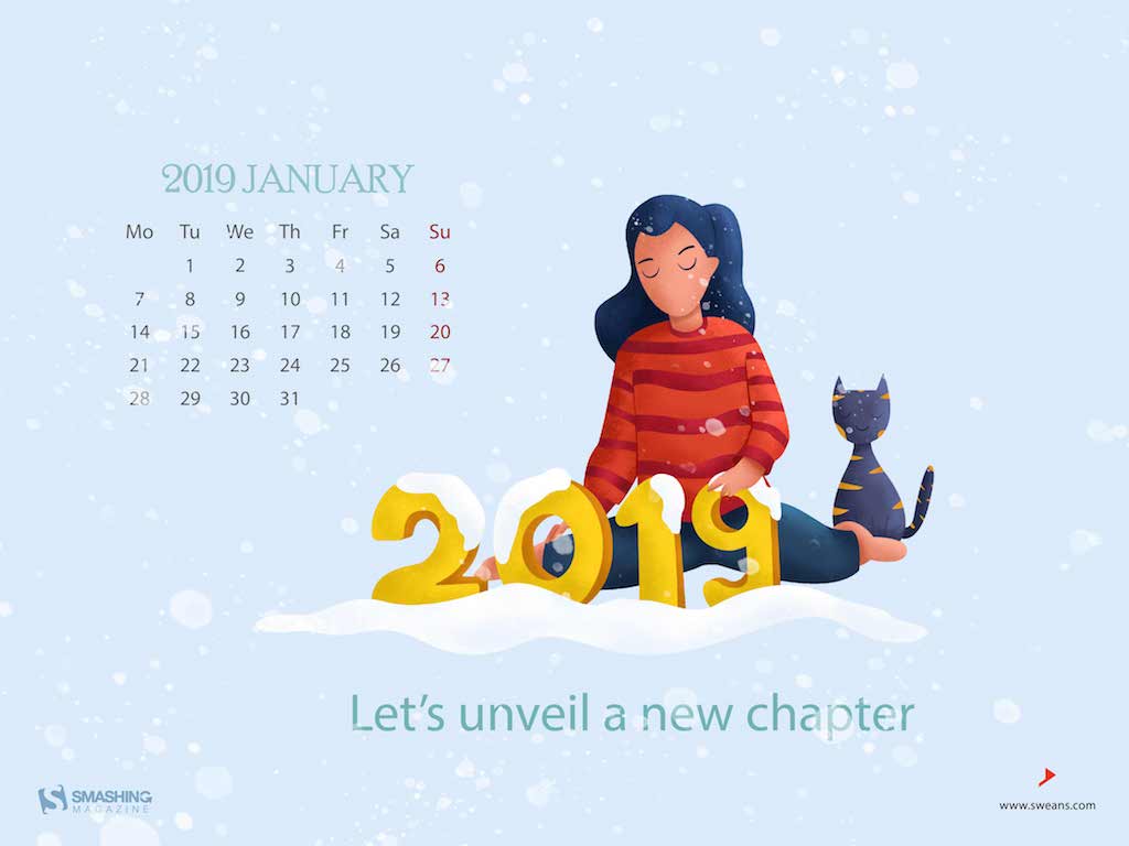
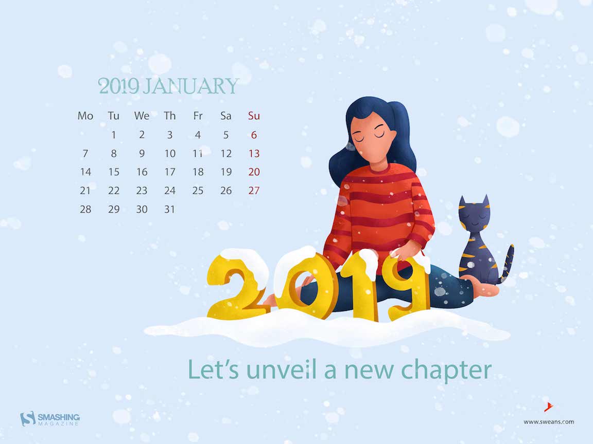
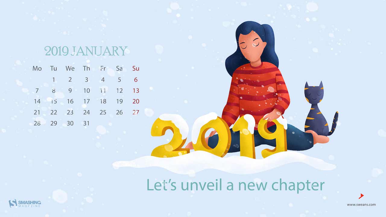
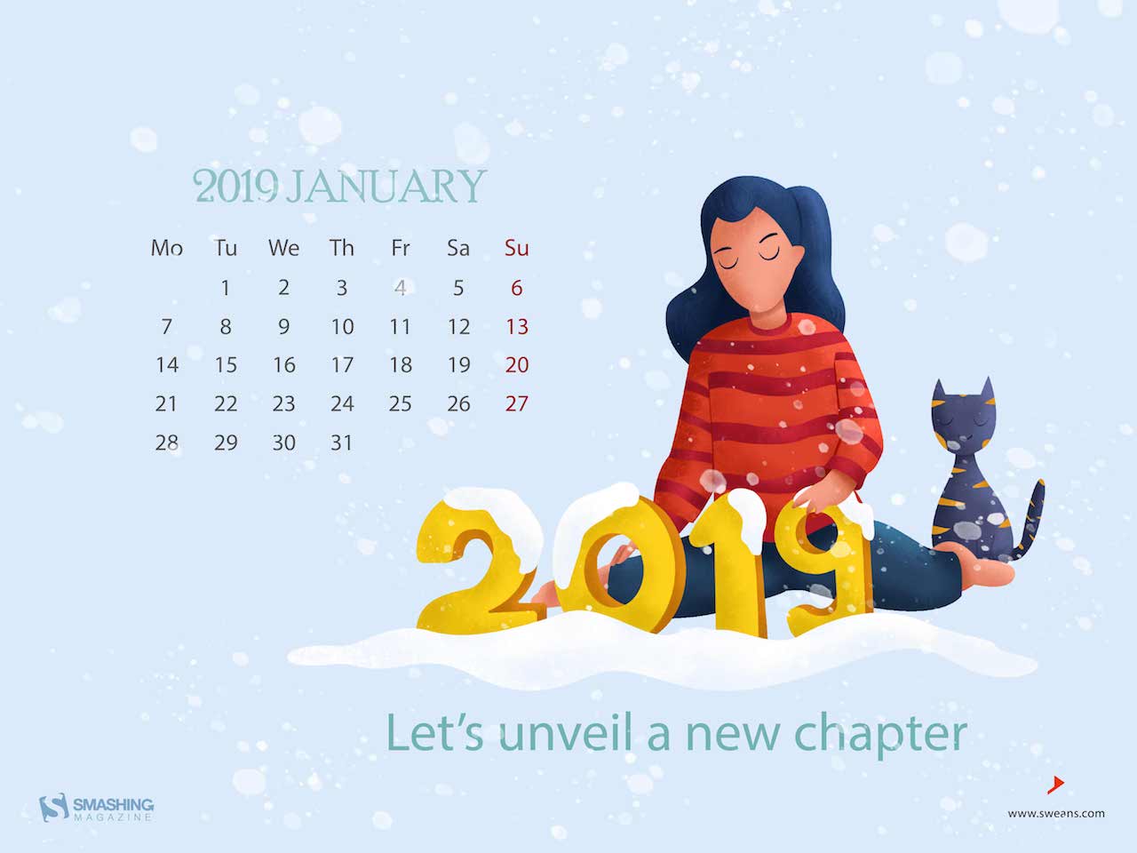
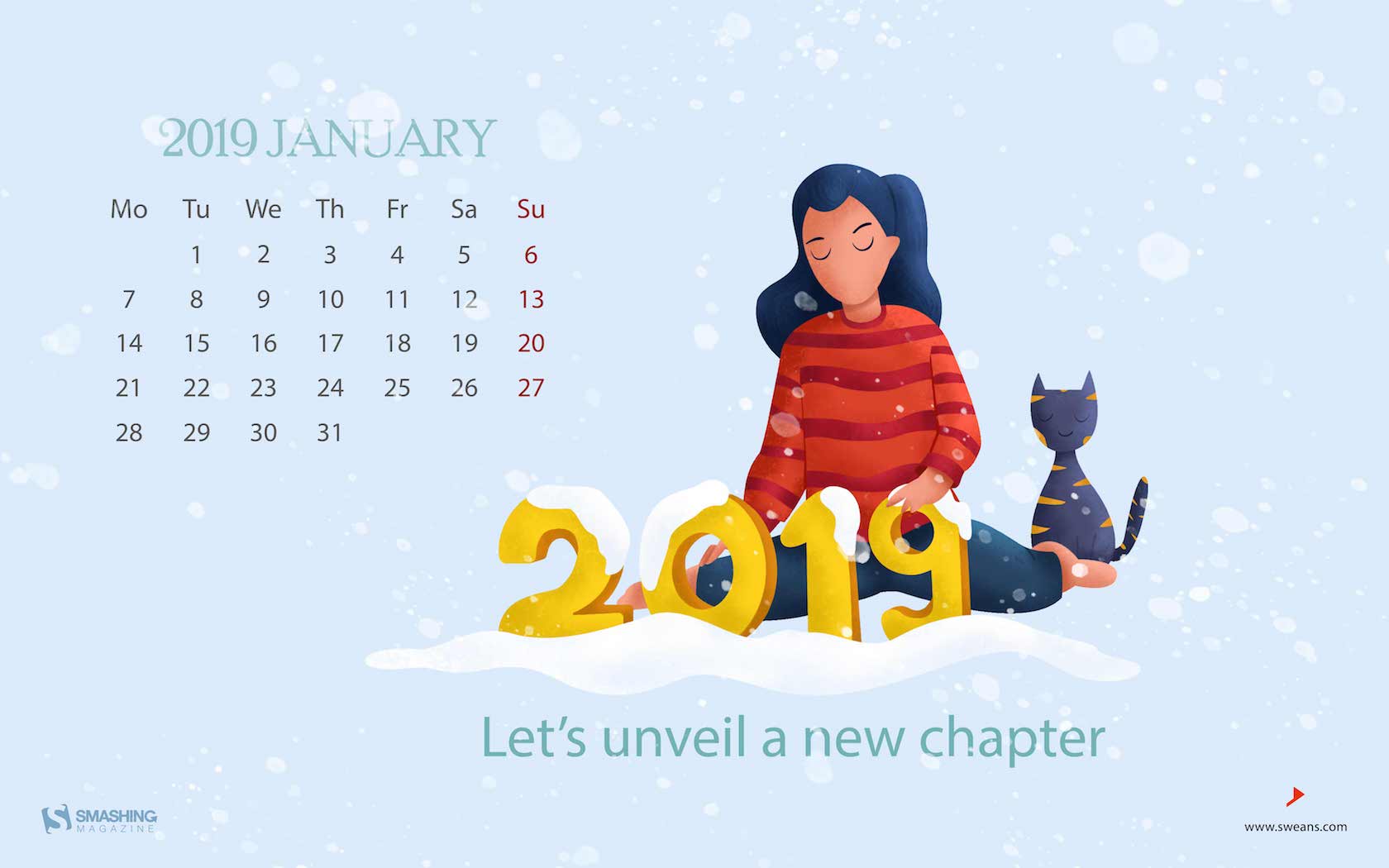
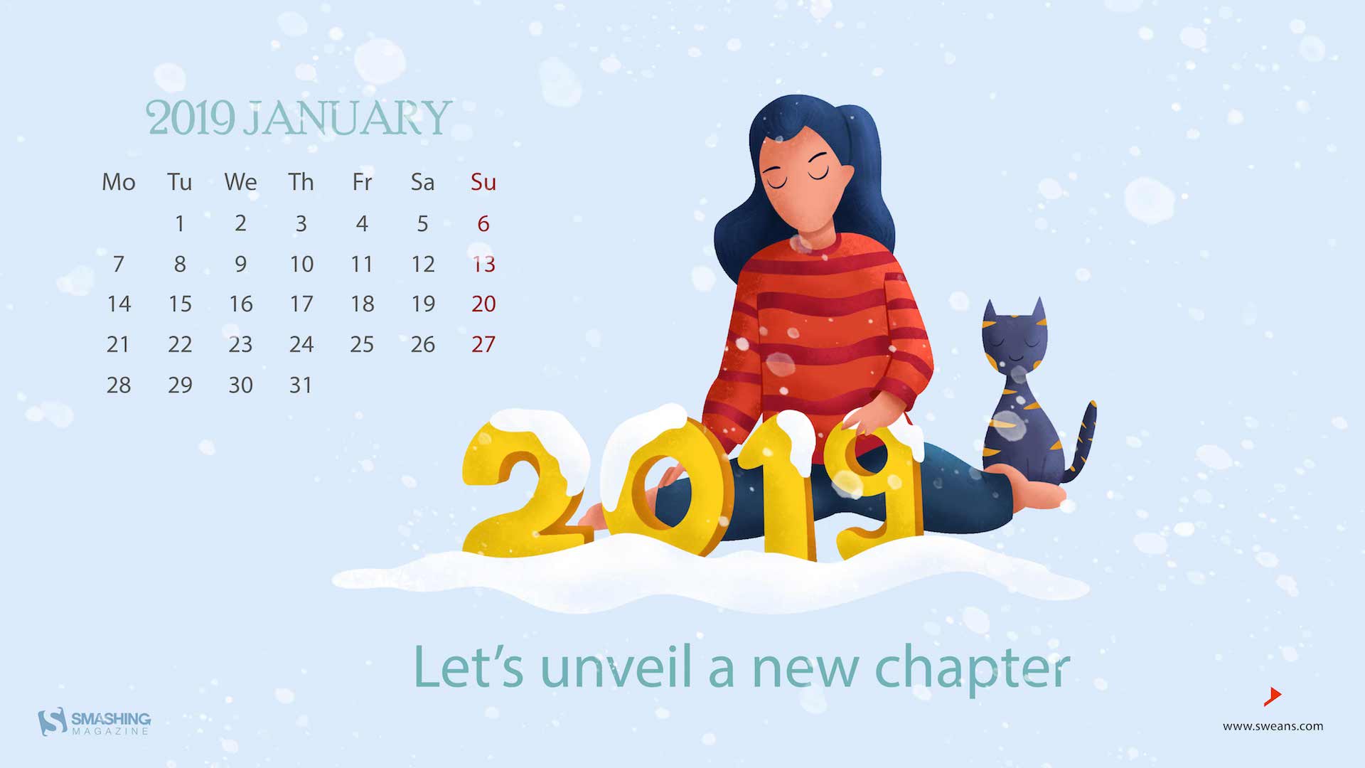
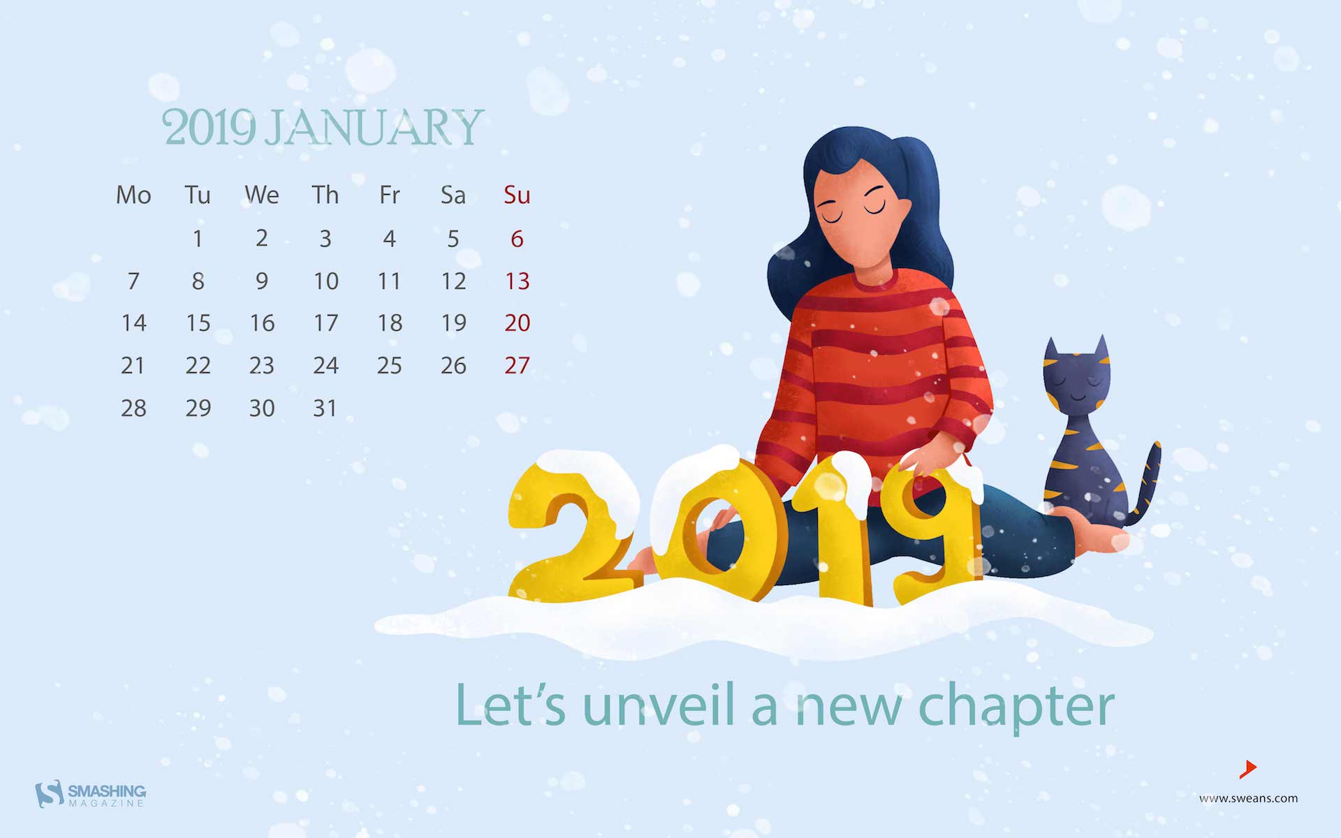
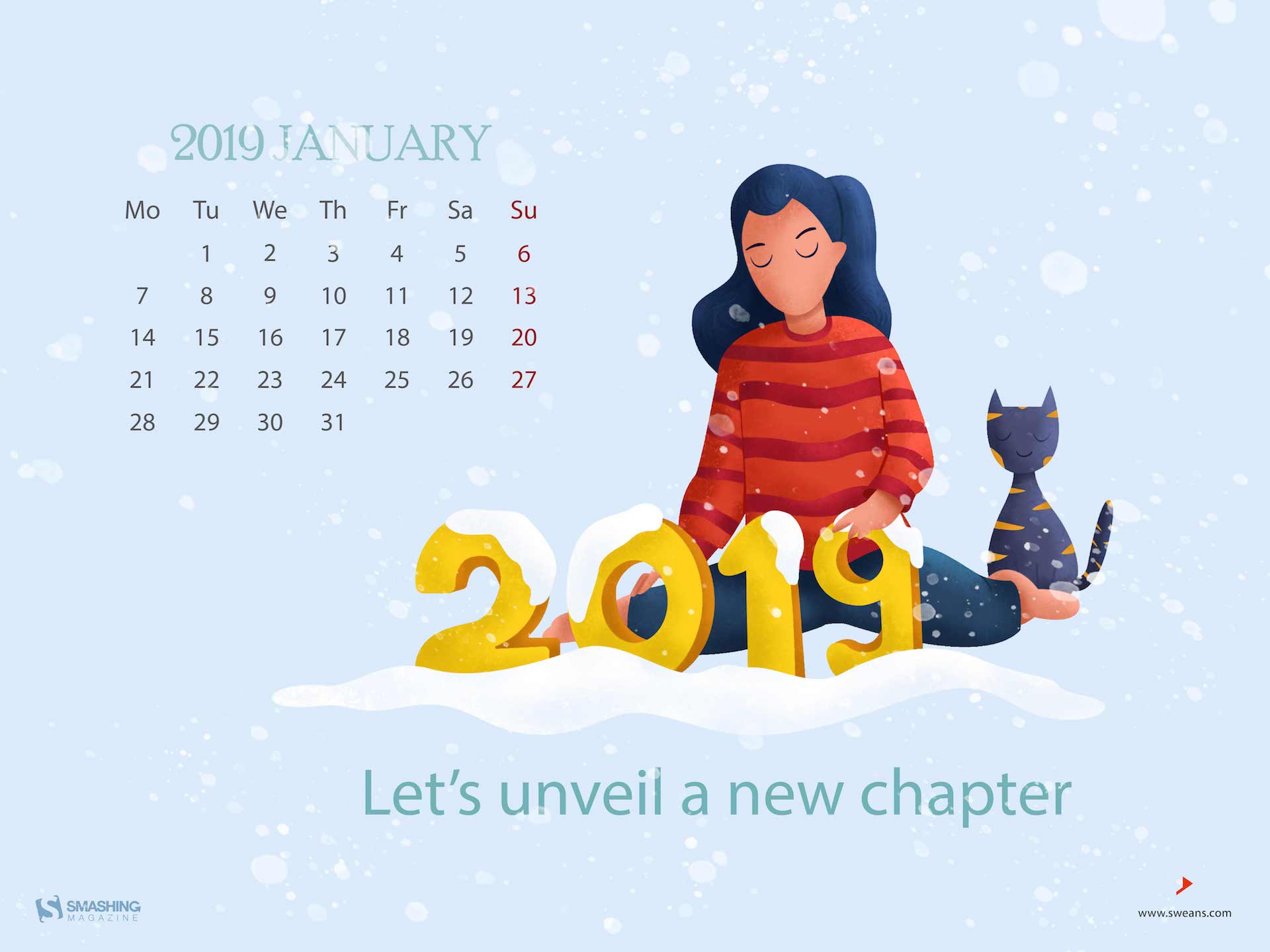
“The dawn of January the 1st of 2019 is the beginning of a new year which gives dreams, hopes and a lot more to billions of people around the world.” — Designed by Sweans Technologies Ltd. from London.
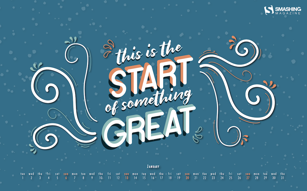
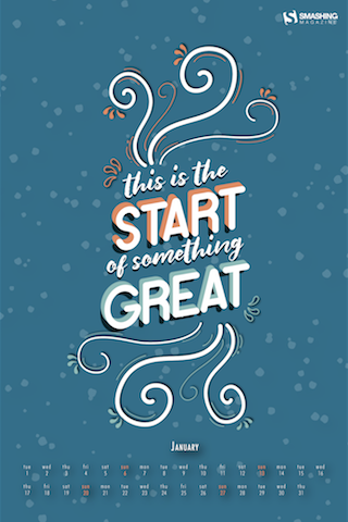
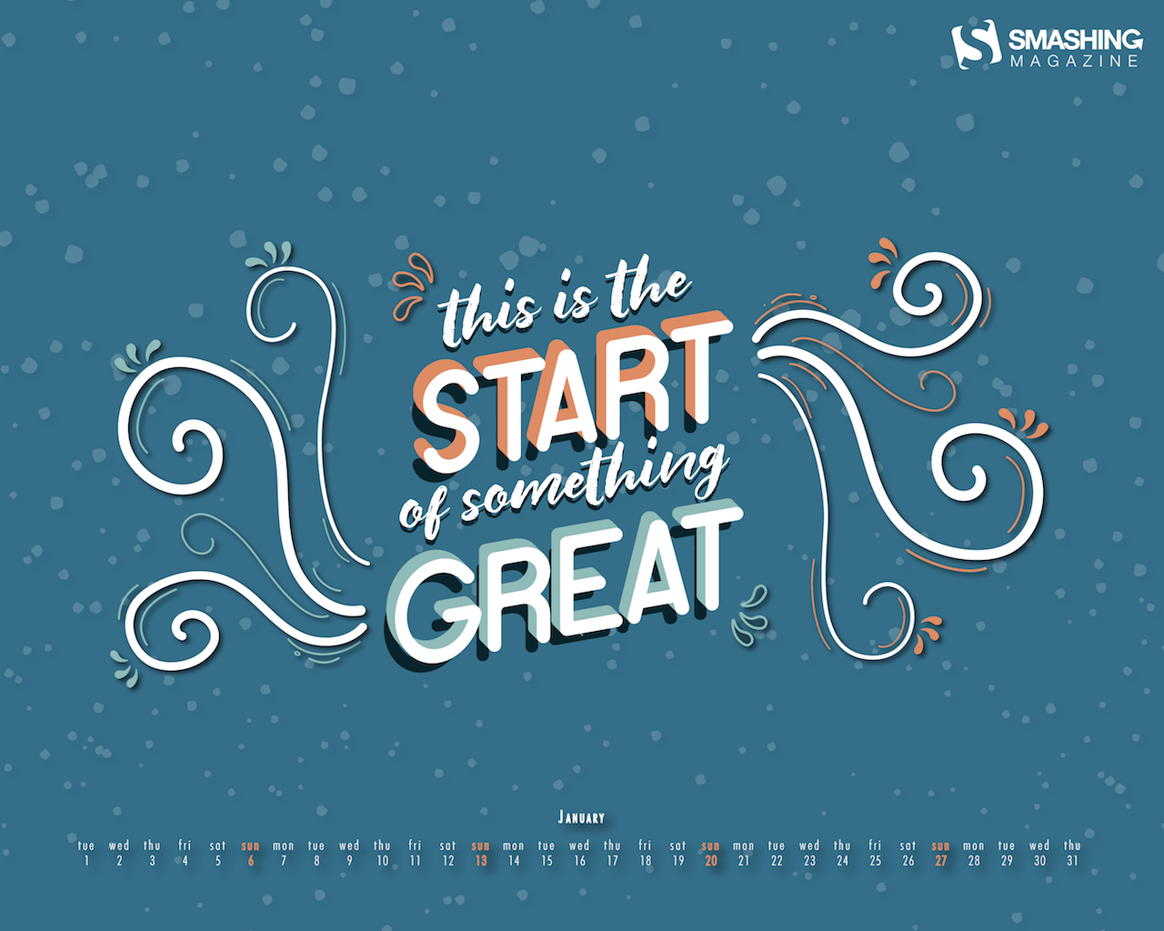
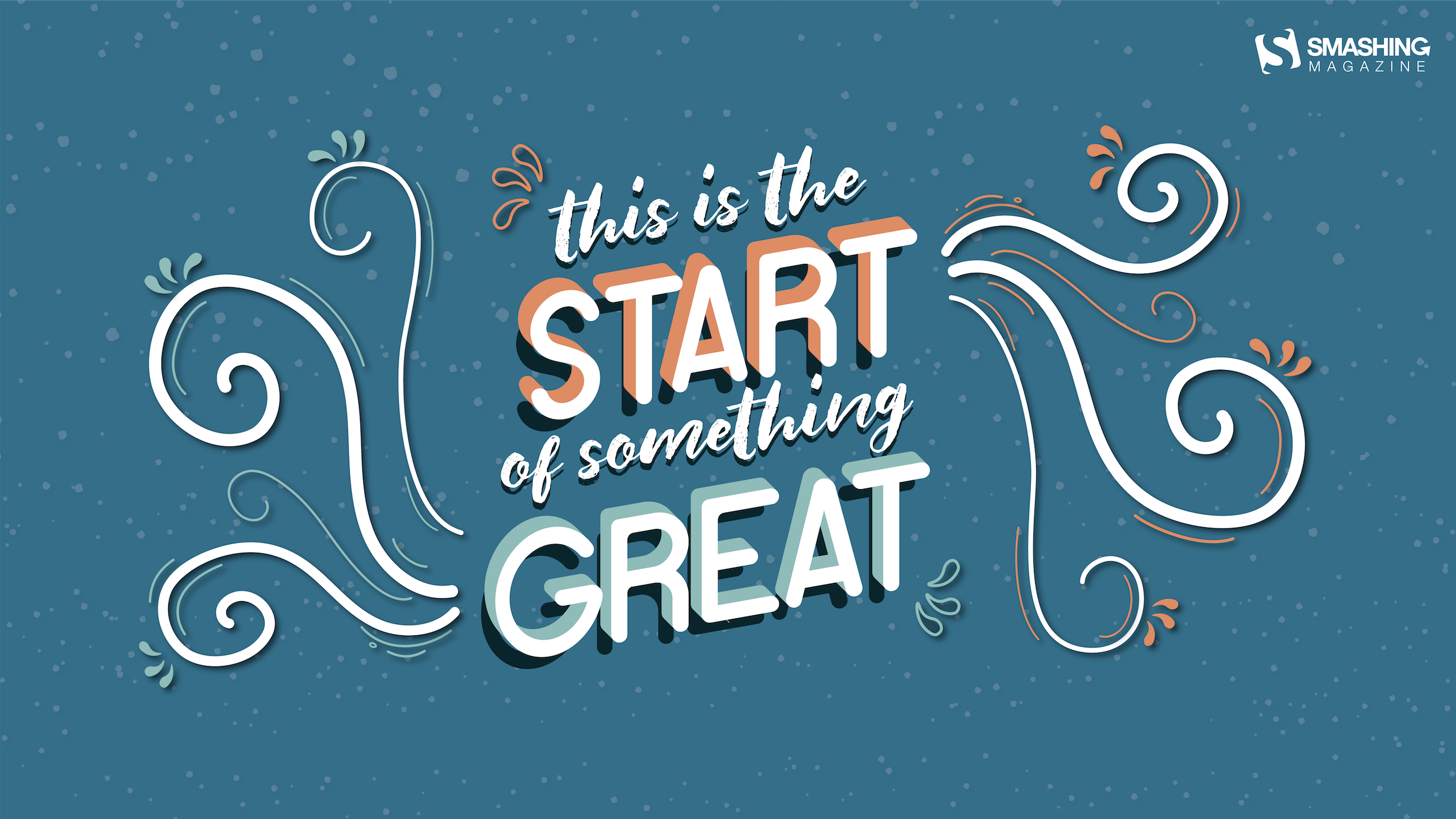
“I wanted to do a lettering-based wallpaper because I love lettering. I chose January because for a lot of people the new year is perceived as a new beginning and I wish to make them feel as positive about it as possible! The ideia is to make them feel like the new year is (just) the start of something really great.” — Designed by Carolina Sequeira from Portugal.
“Winter brings both Christmas & New Year together. A season which provides time for comfort, food, warmth, and touch of a friendly hand and for a talk beside the fire.” — Designed by Call Taxi Software from India.
“The climate is changing very fast. 2019 is a new chance to save the earth, the people and the animals who suffer from global warming.” — Designed by Melissa Bogemans from Belgium.
“January is a cold but cozy month so i tried to make my illustrations in cold and cozy colors. Blue and white as the cold colors and red darkblue as the cozy colors. I made some small details like reindeers, clouds snowflakes and trees to make it look better.” — Designed by Vince Teckmans from Belgium.
“Kingfishers are called ‘ijsvogels’ (ice-birds) in Dutch. Not because they like winter cold, but because of the intense blue and teal colors...” — Designed by Franke Margrete from the Netherlands.
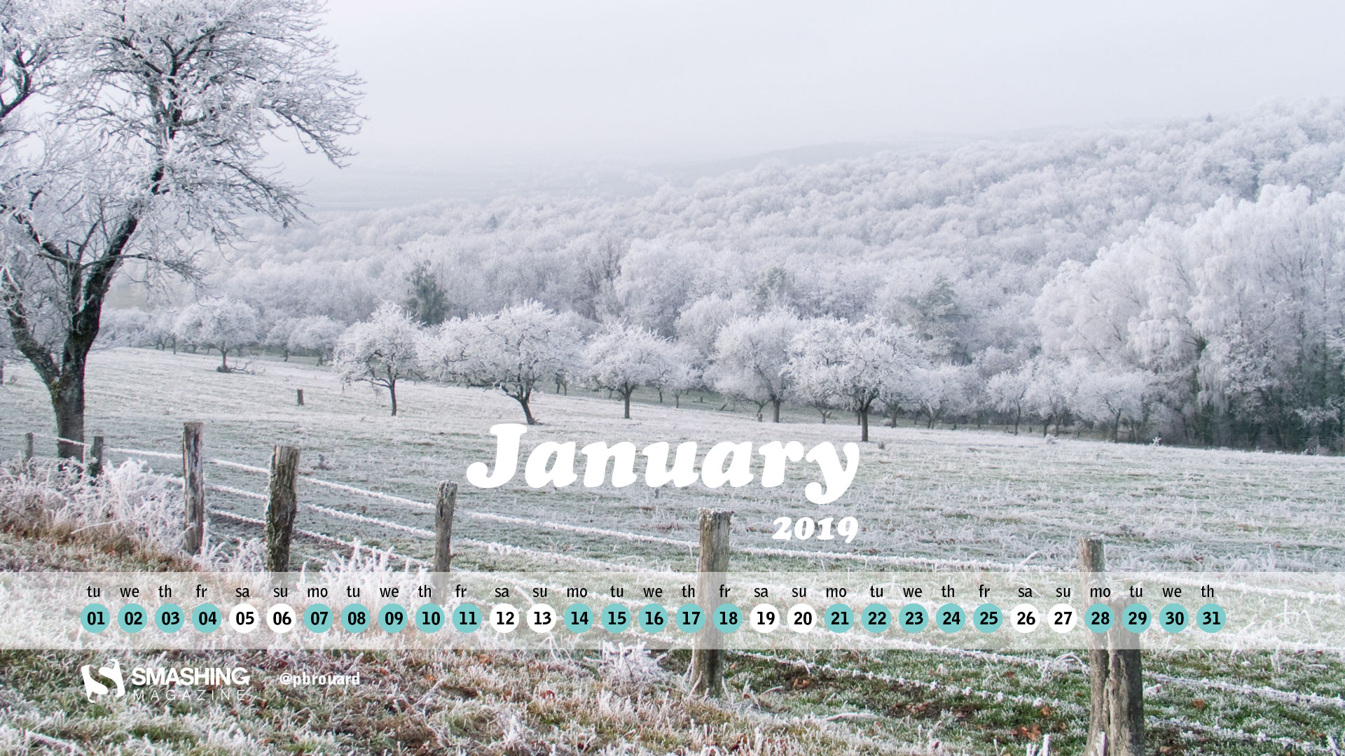
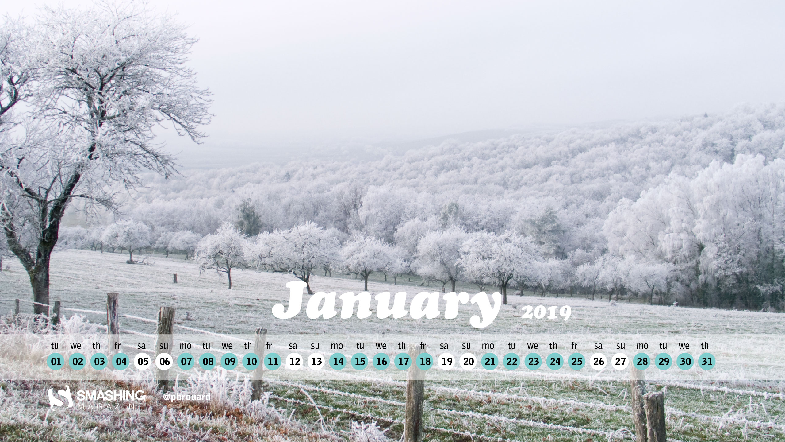
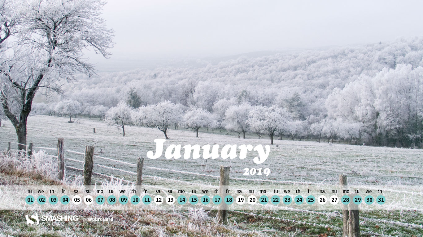
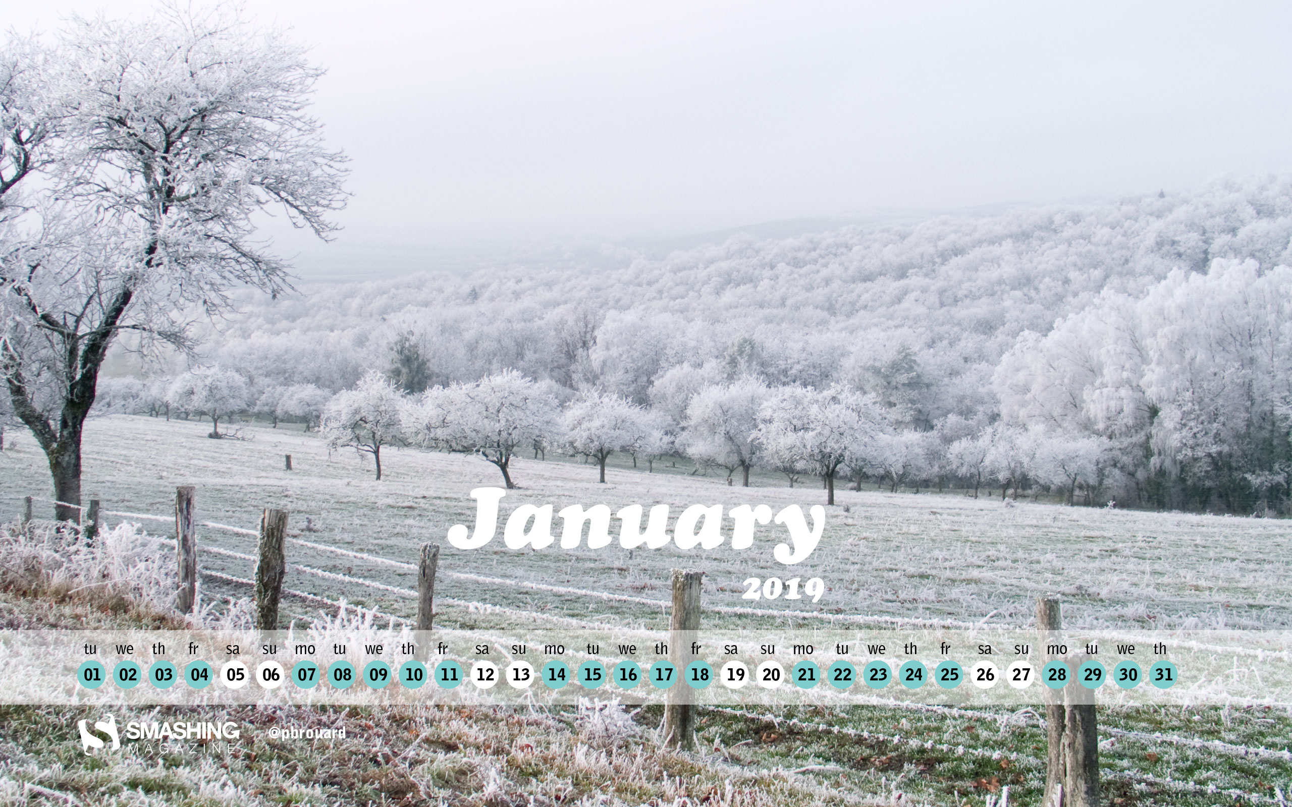
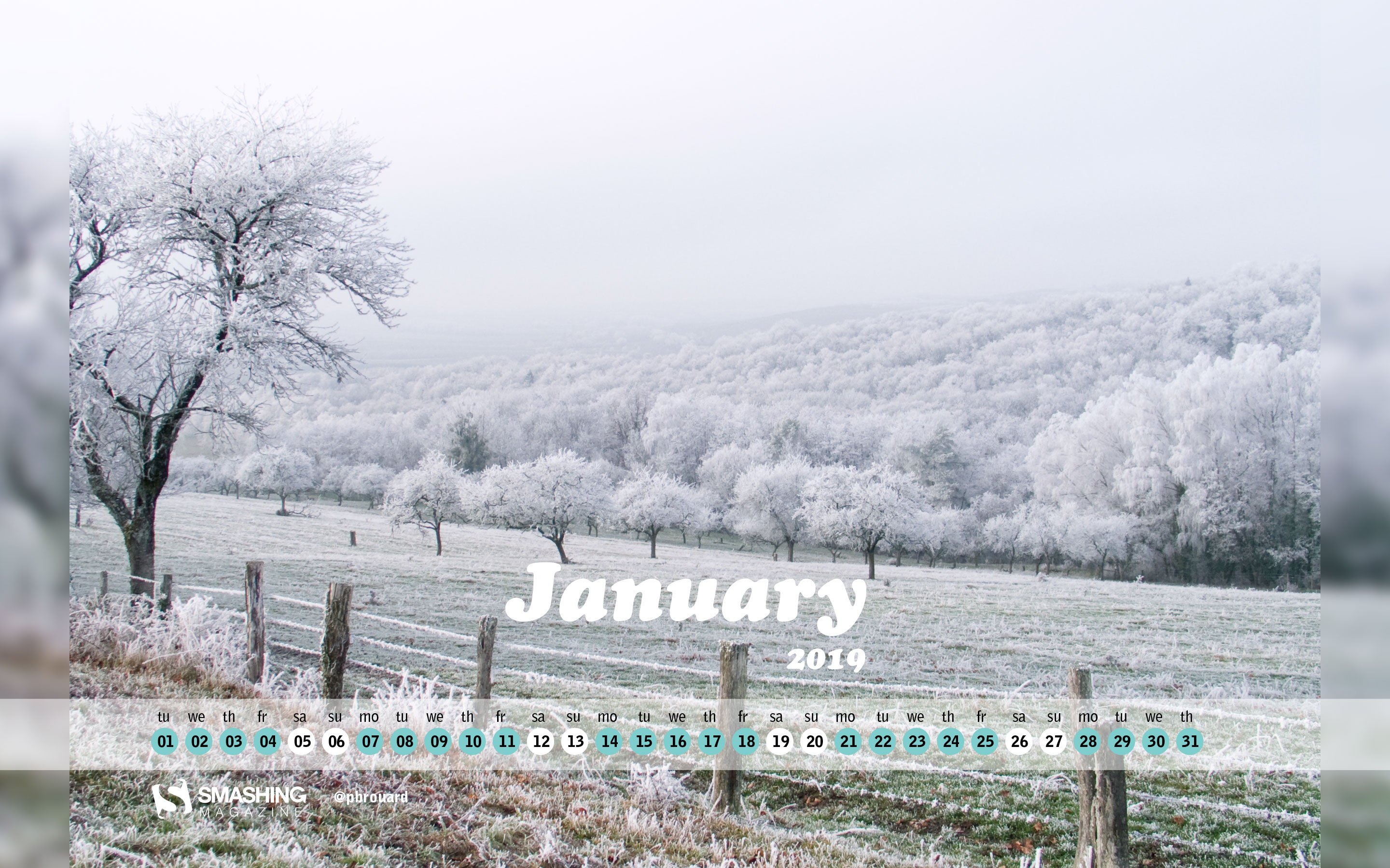
“I took this photo while walking around the city where I live. It's located in the Vosges, France. It was cold but without snow. White color is coming from freezy touchs of the fog remaining on everything. I found it amazing. White is a color for hope. Let's have a pleasant year 2019” — Designed by Philippe Brouard from France
The past New Year’s editions have brought forth some timeless wallpaper goodies that work equally well in 2019. Please note that they don’t come with a calendar. May we present…
Open The Doors Of The New Year
“January is the first month of the year and usually the coldest winter month in the Northern hemisphere. The name of the month of January comes from ‘ianua’, the Latin word for door, so this month denotes the door to the new year and a new beginning. Let’s open the doors of the new year together and hope it will be the best so far!” — Designed by PopArt Studio from Serbia.
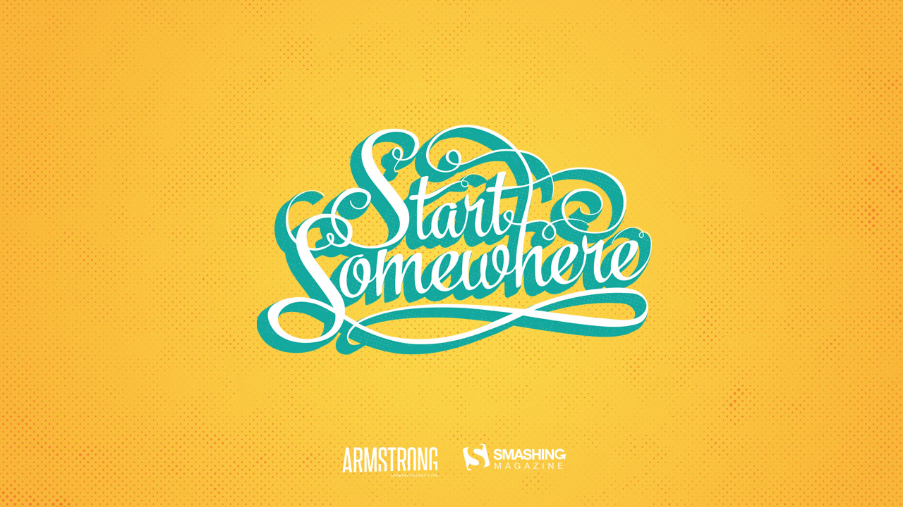
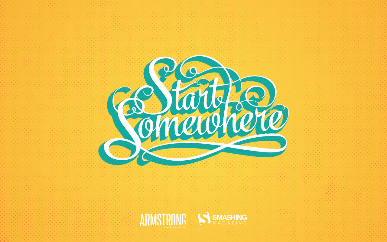
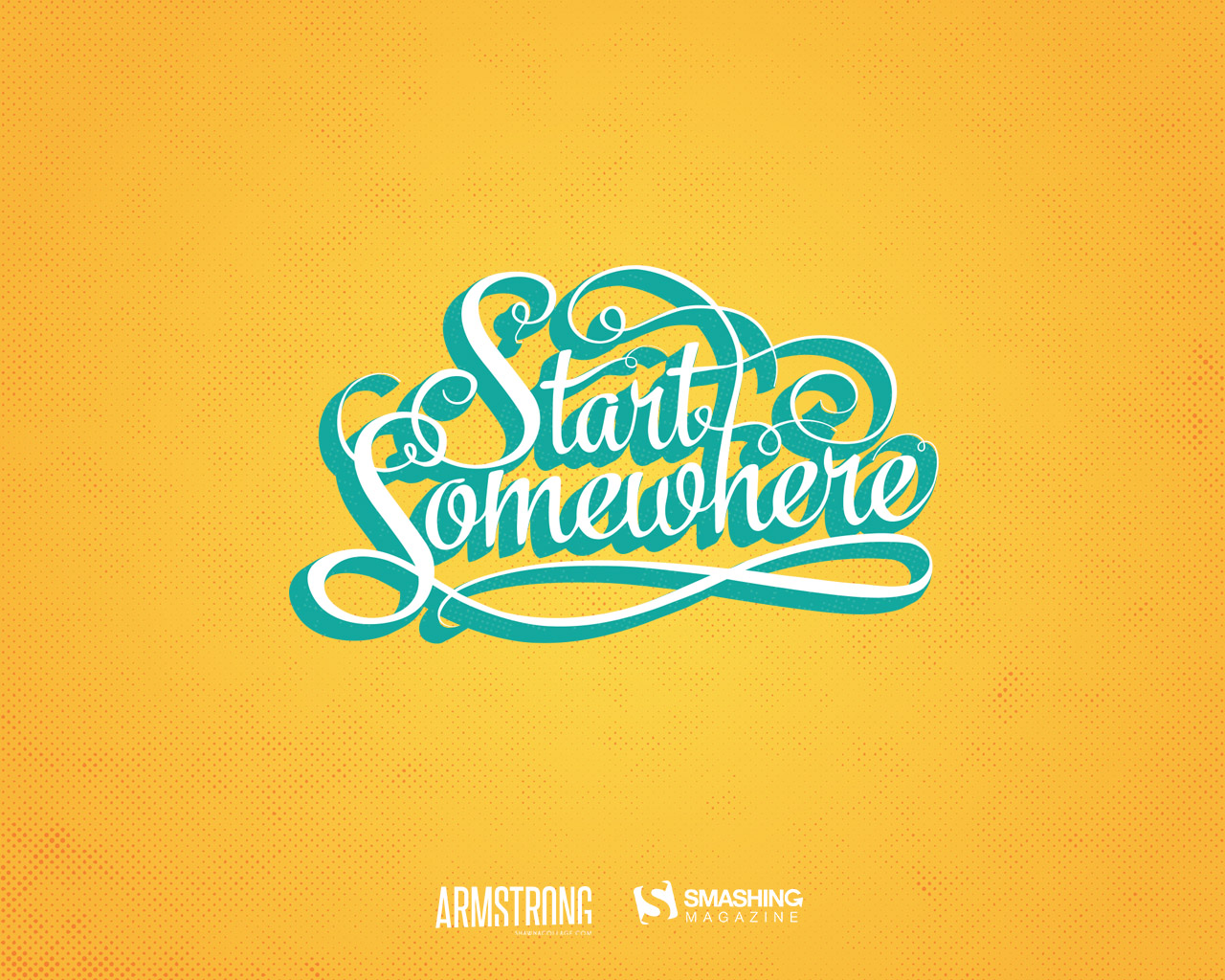
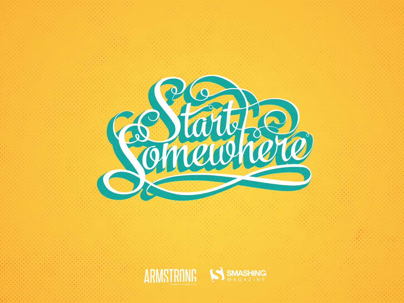
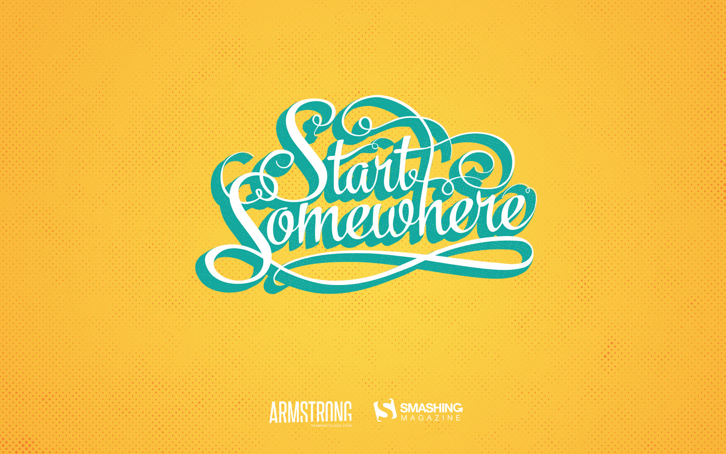
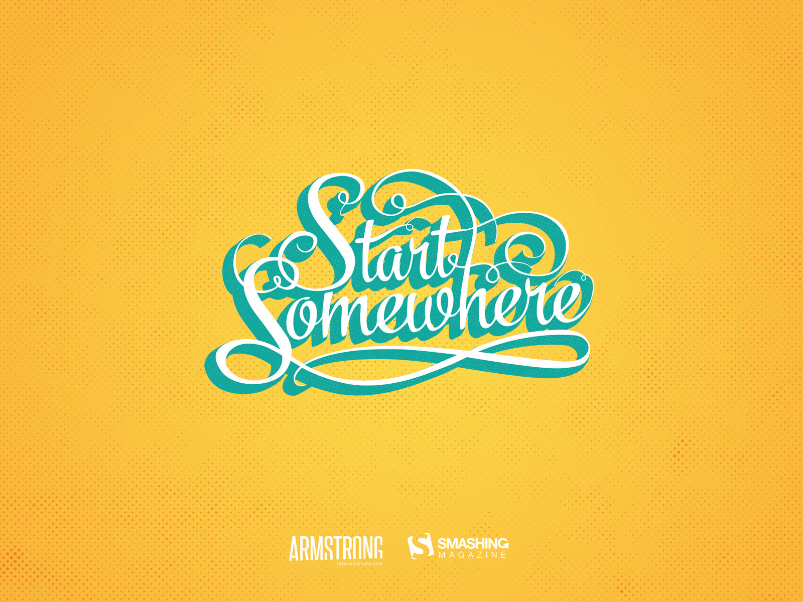
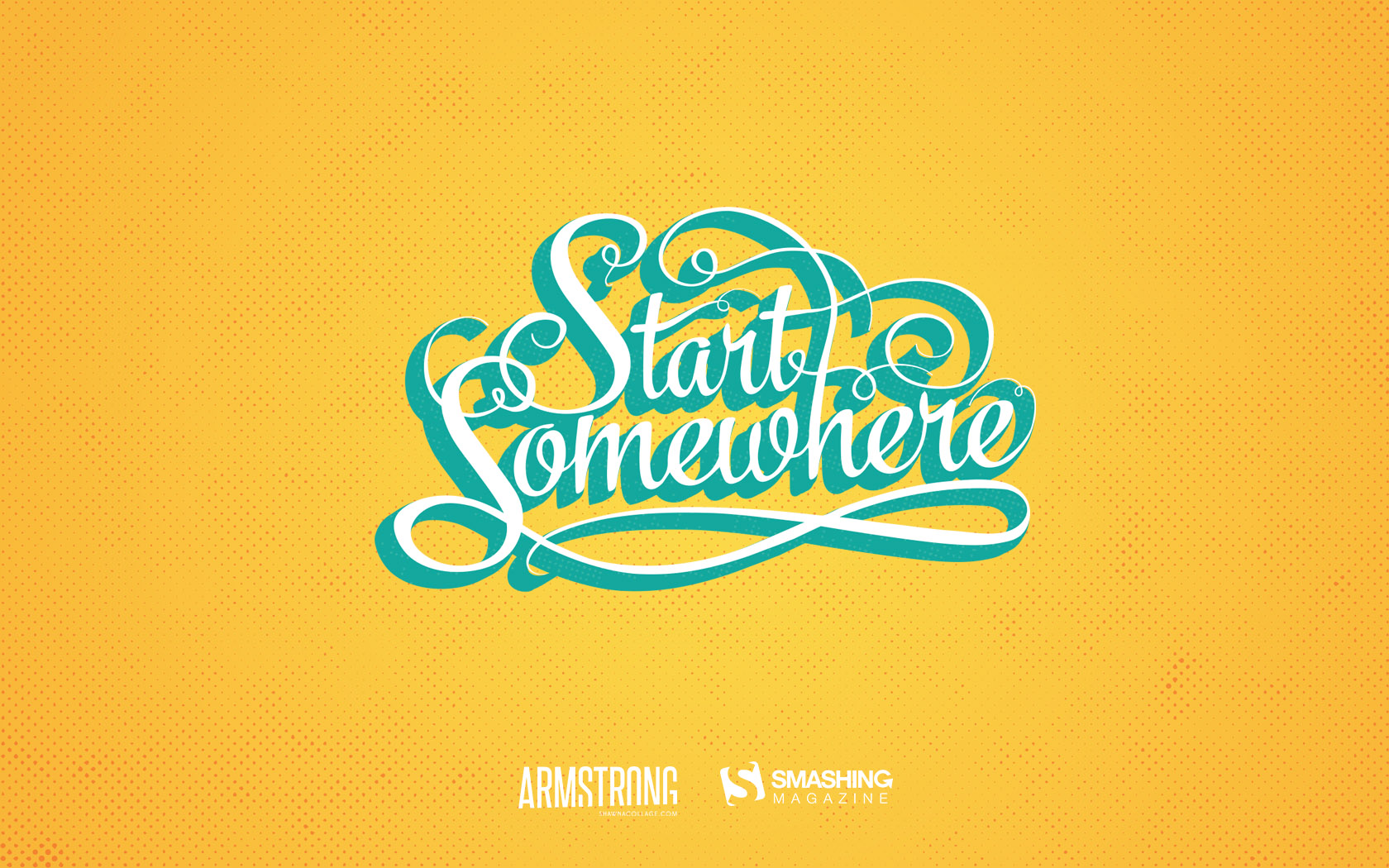
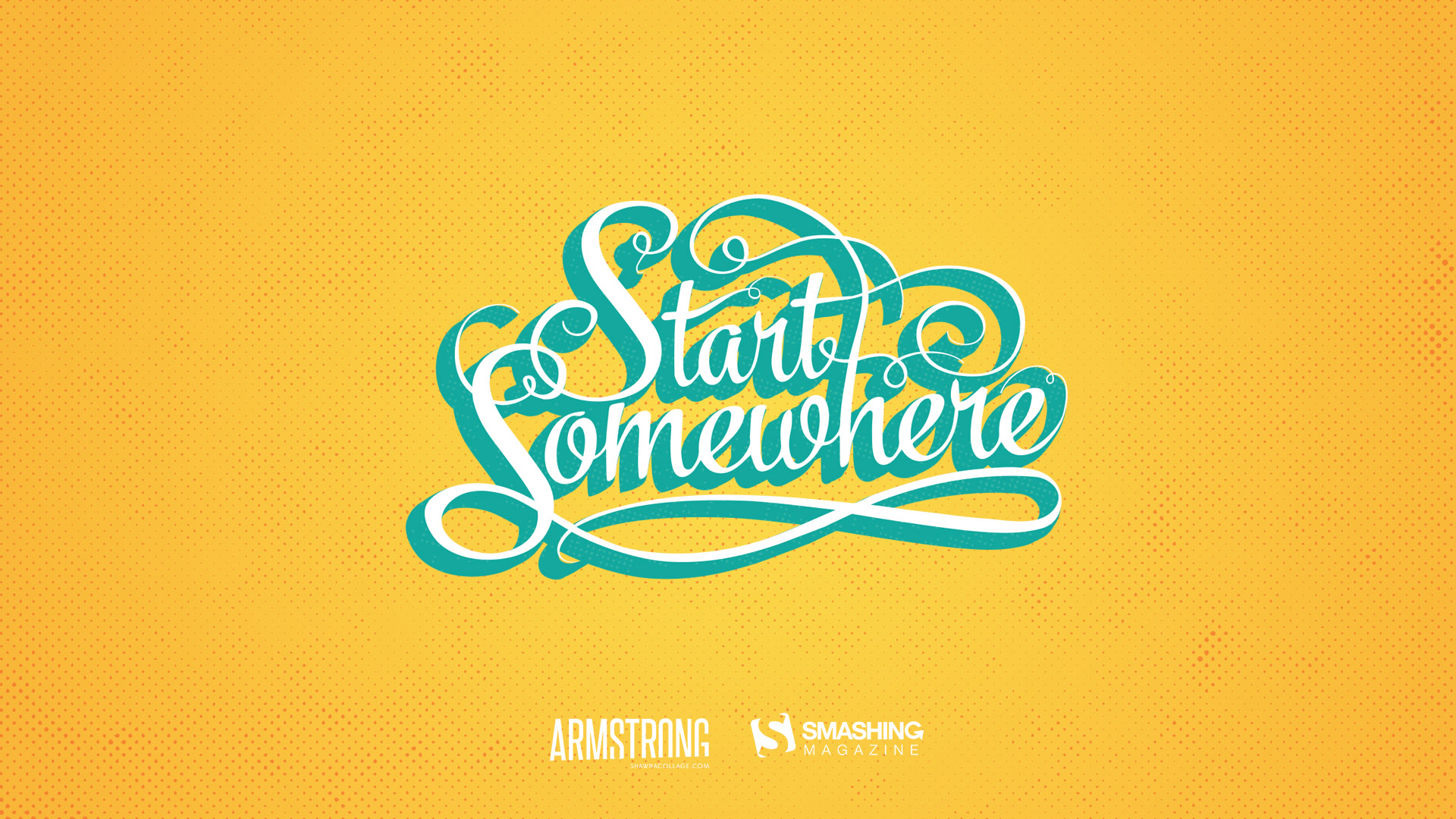
“If we wait until we’re ready, we’ll be waiting for the rest of our lives. Start today - somewhere, anywhere.” — Designed by Shawna Armstrong from the United States.
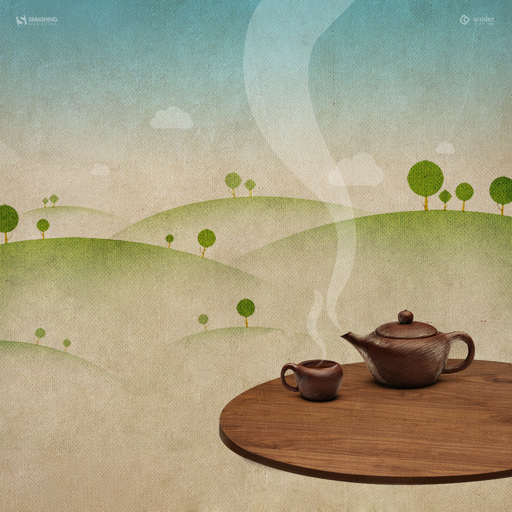
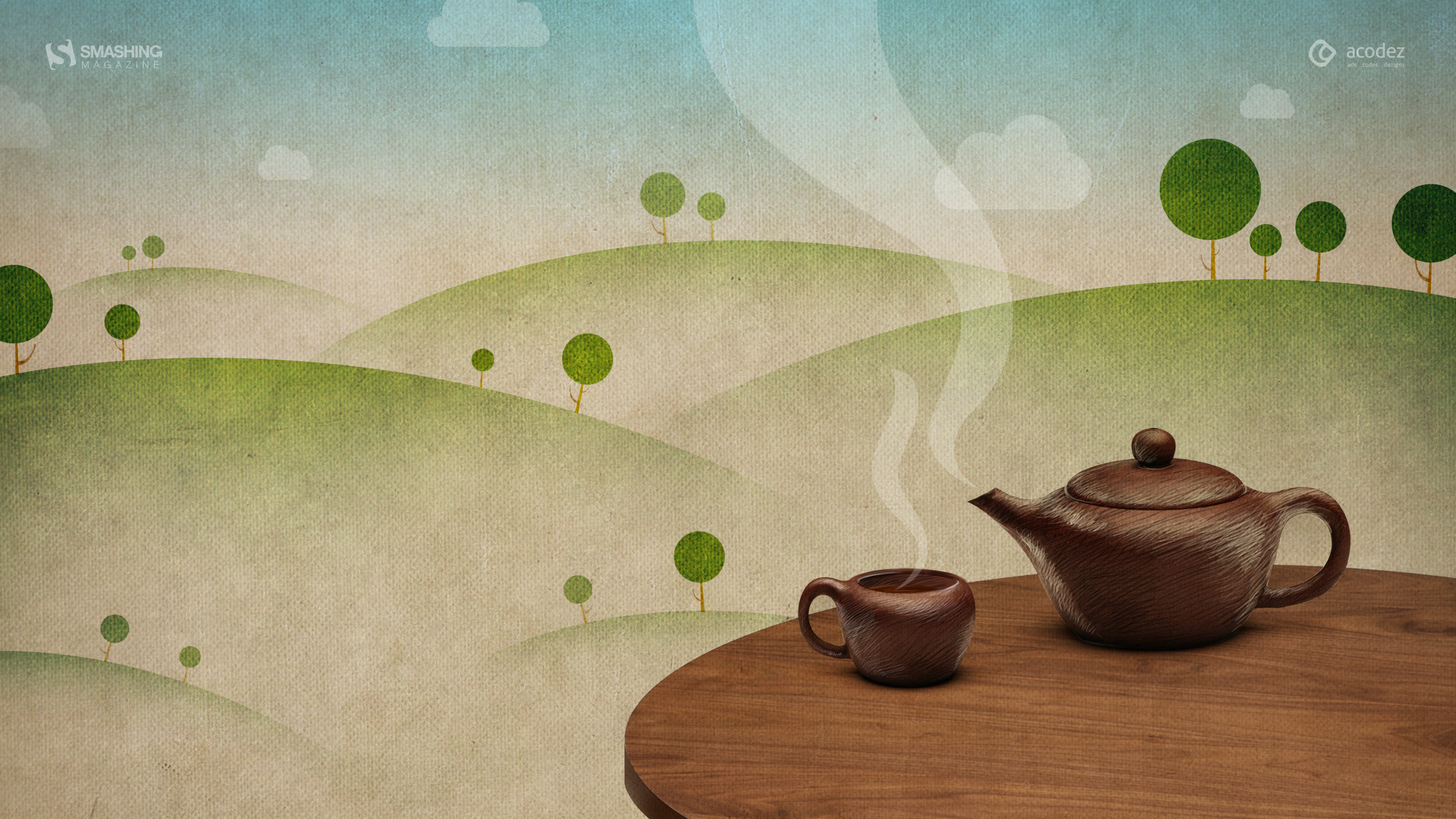
“You wake me up to a beautiful day; lift my spirit when I’m feeling blue. When I’m home you relieve me of the long day’s stress. You help me have a good time with my loved ones; give me company when I’m all alone. You’re none other than my favourite cup of hot tea.” — Designed by Acodez IT Solutions from India.
“The new year brings new opportunities for each of us to become our true selves. I think that no matter what you are — like this little monster — you should dare to be the true you without caring what others may think. Happy New Year!” — Designed by Maria Keller from Mexico.
“In Central Europe, we’ve had a very warm beginning of winter. I hope there will be lots of powder for snowboarding soon. I’d love to see the French Alps again as white as in 2015 when I took this photo.” — Designed by Annika Oeser from Germany.
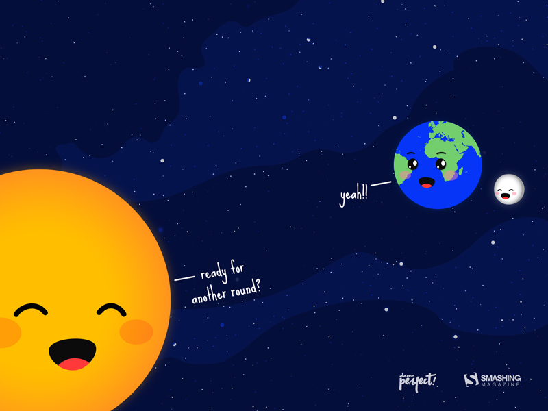
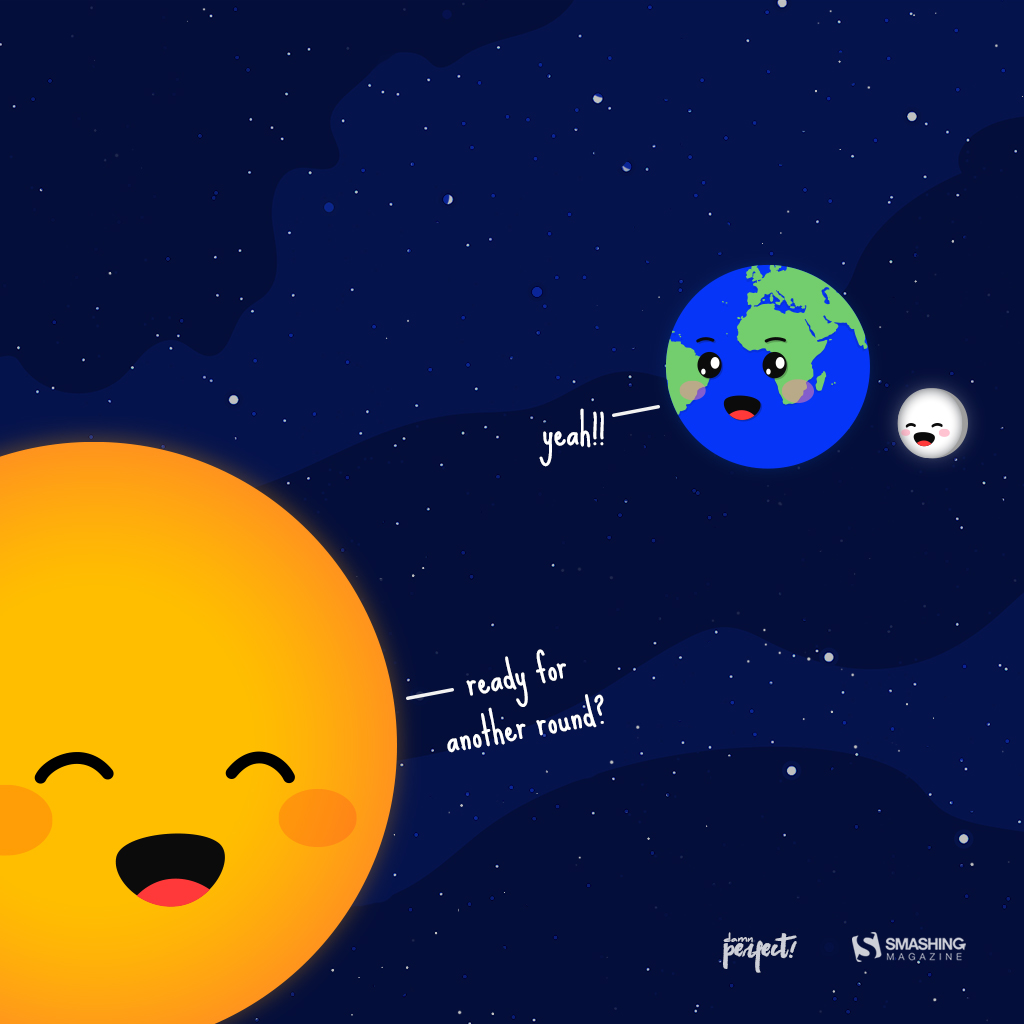
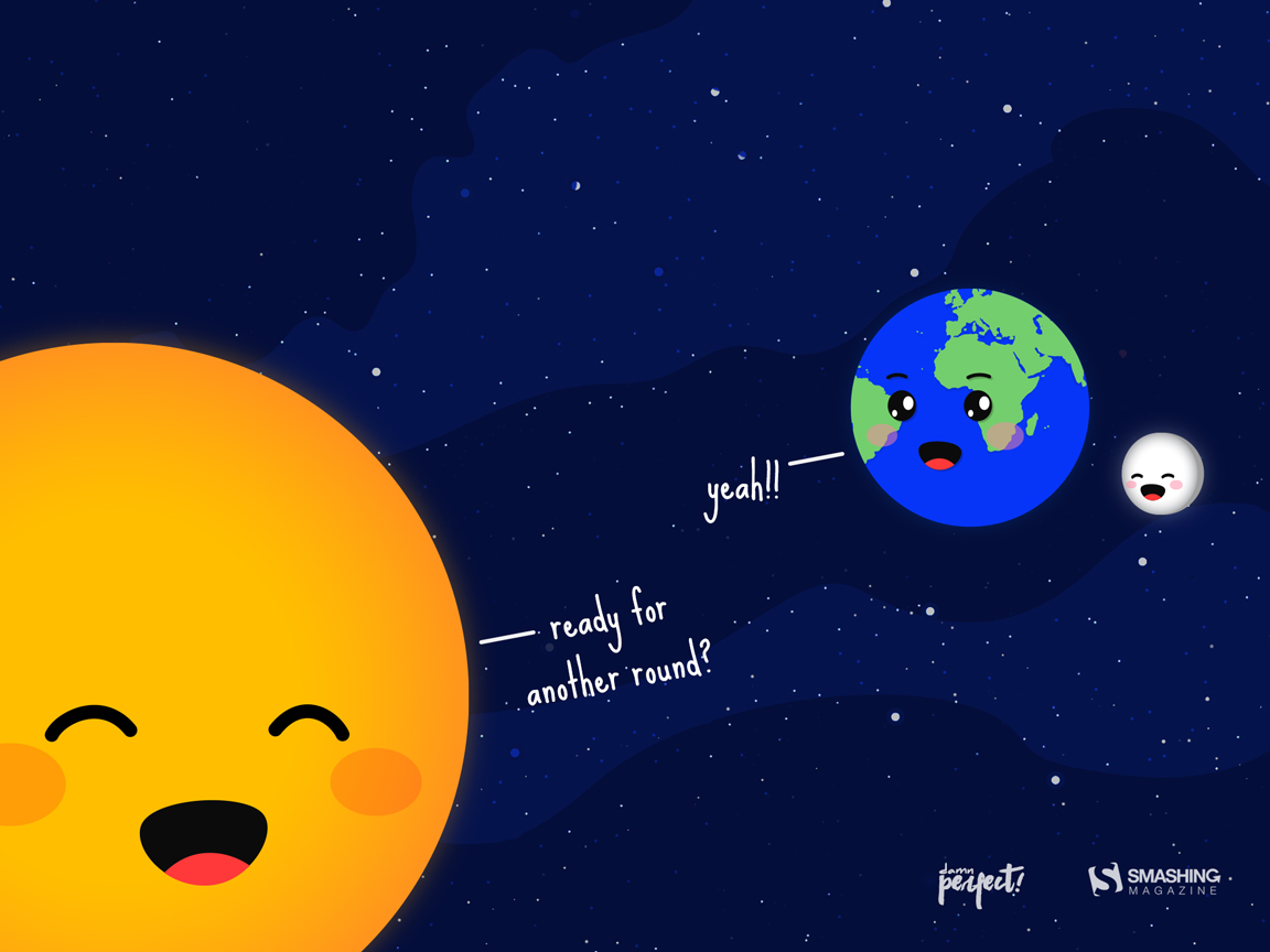
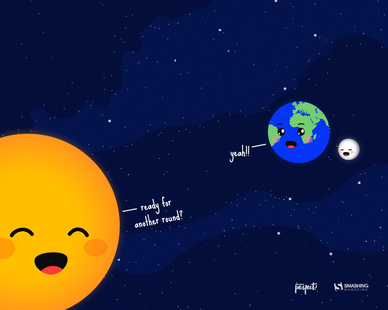
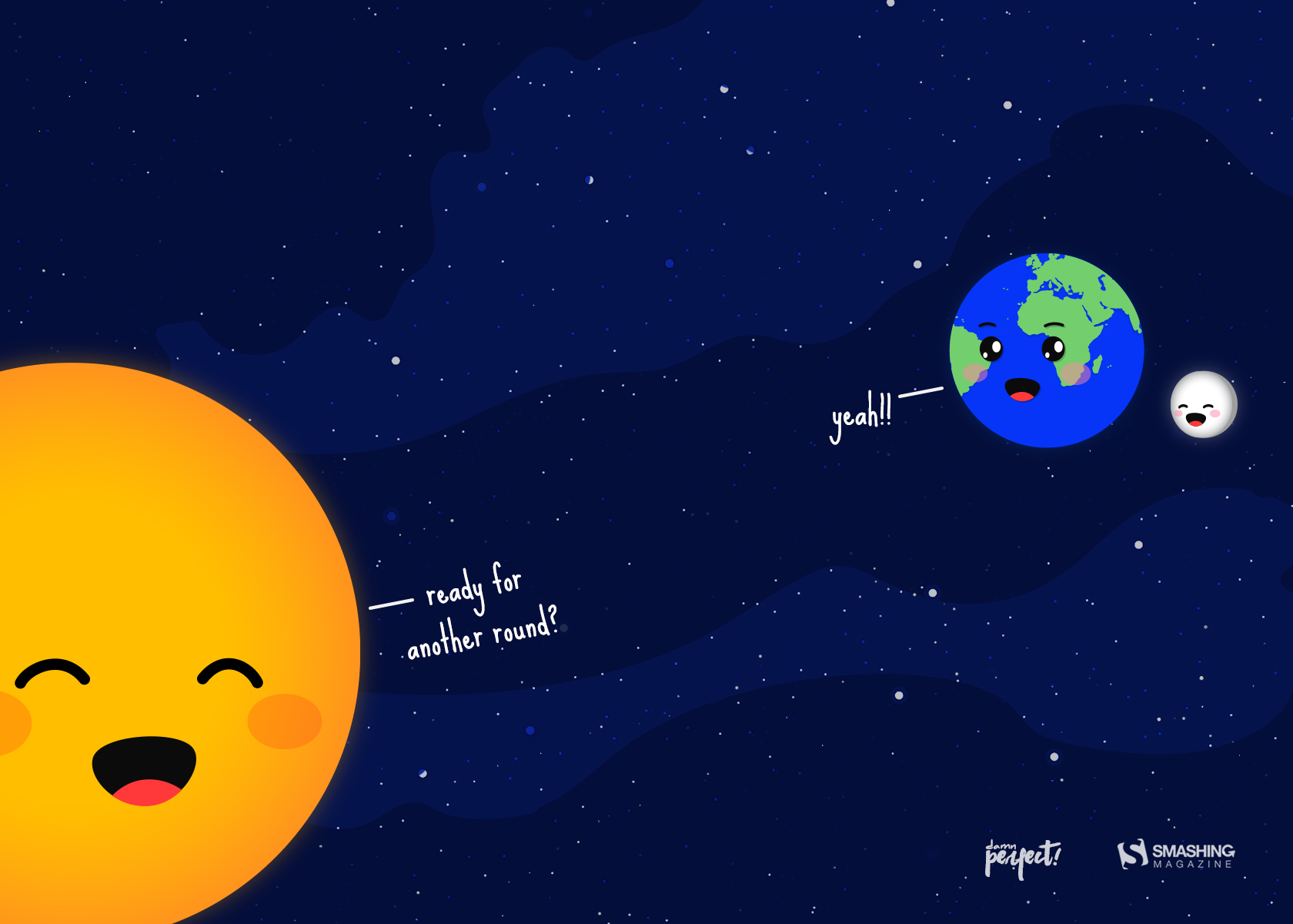
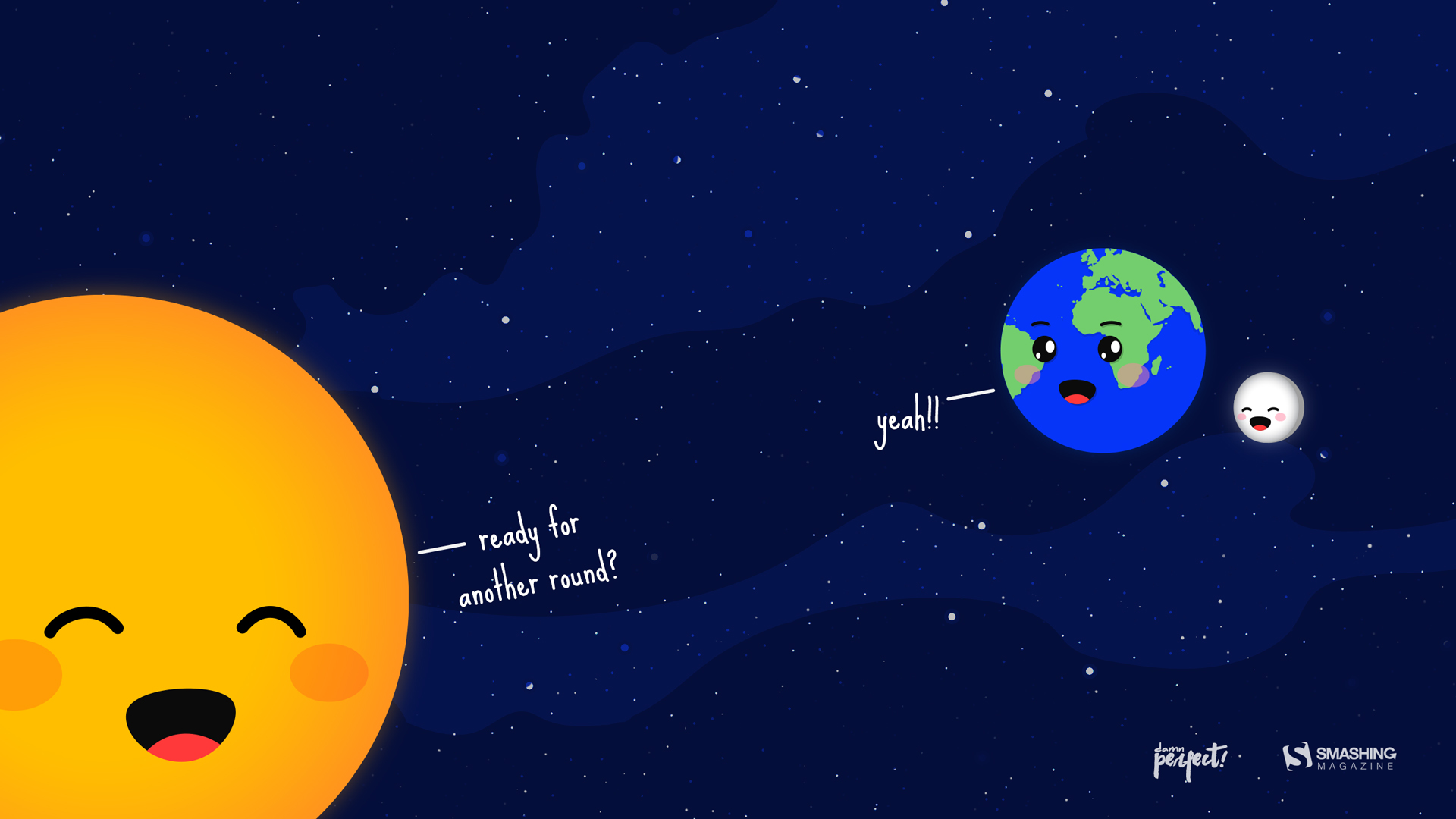
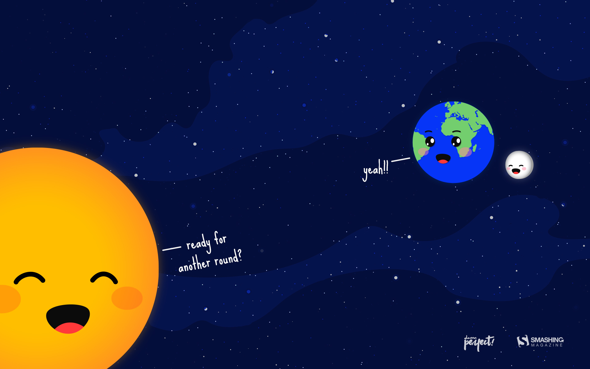
“The new year brings hope, festivity, lots and lots of resolutions, and many more goals that need to be achieved. This wallpaper is based on the idea of ‘A New Start’.” — Designed by Damn Perfect from India.
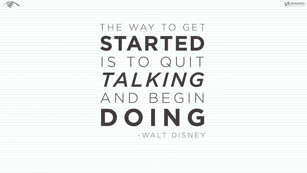
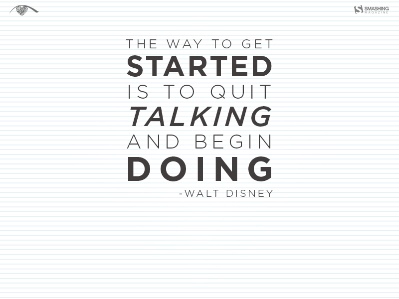
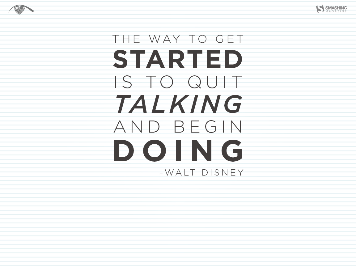
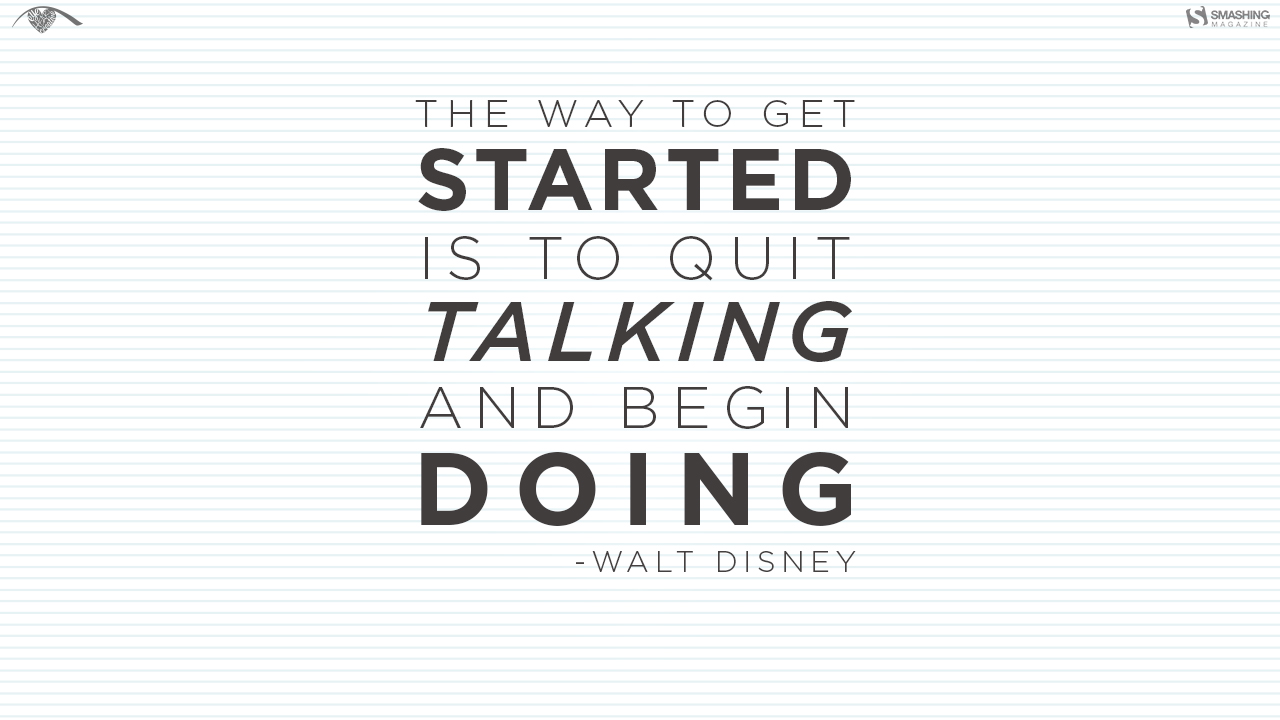
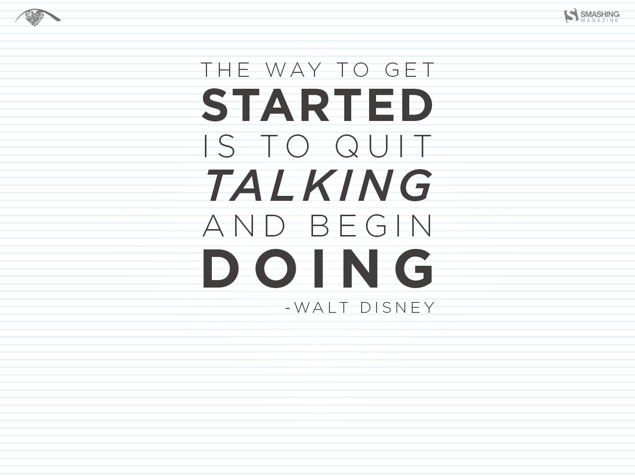
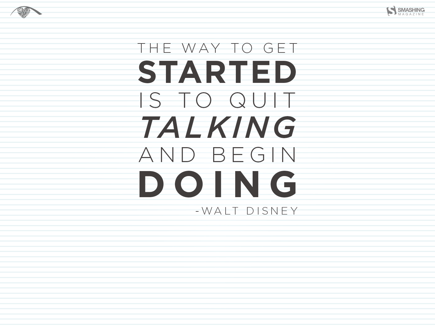
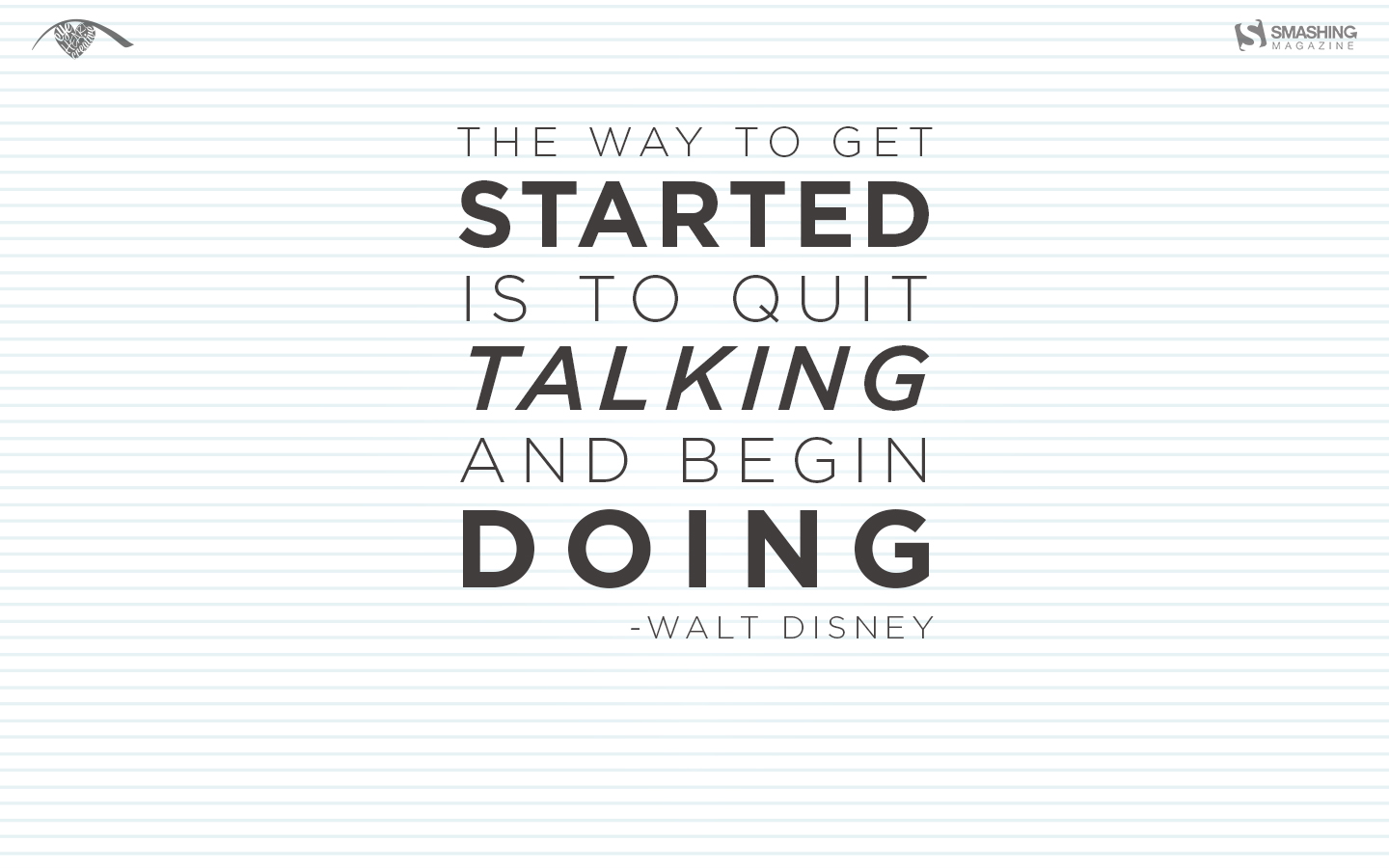
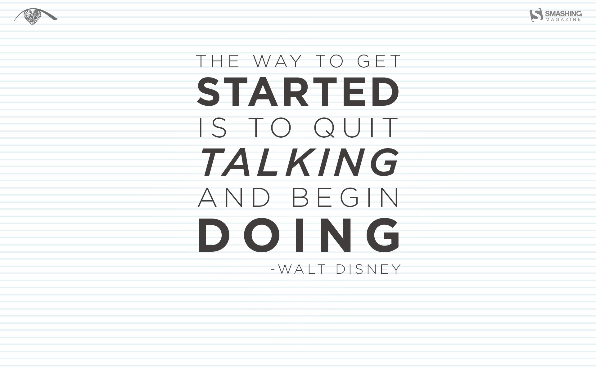
“January is all about renewing efforts and making plans, but sometimes we need little reminders that plans don’t matter if you don’t do anything about them. Initially, I was inspired by the idea of a fresh sheet of paper, which became the background for some great words from Walt Disney.” — Designed by Resa Barillas from the United States.
“In Belgium remember the Three Wise Men of the East is a tradition. It involves children going from door to door, dressed up as the three Wise Men. They sing a little song, in exchange for sweets and/or money. The design is very minimalistic and ‘flat’. I hope you like it :)” — Designed by Jeroen Bartels from Belgium.
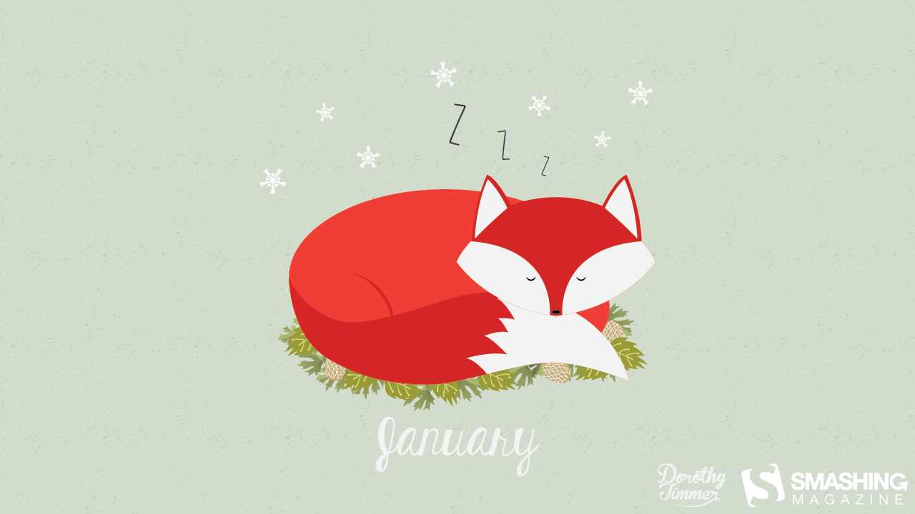
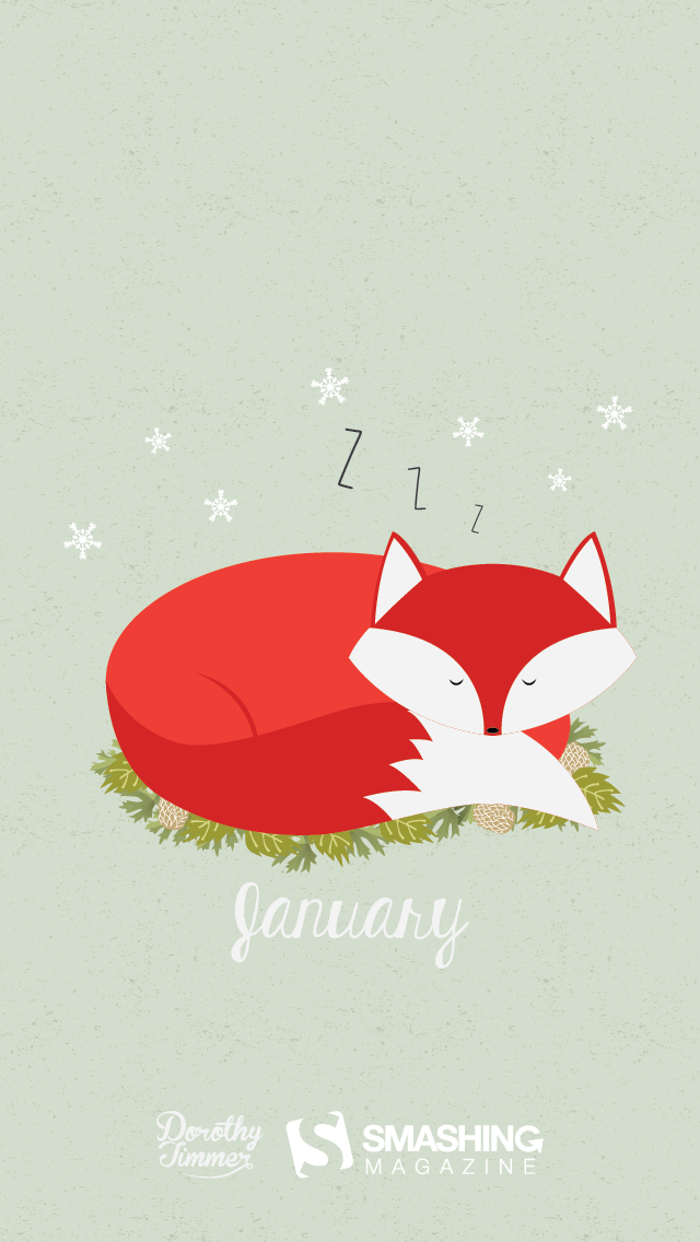
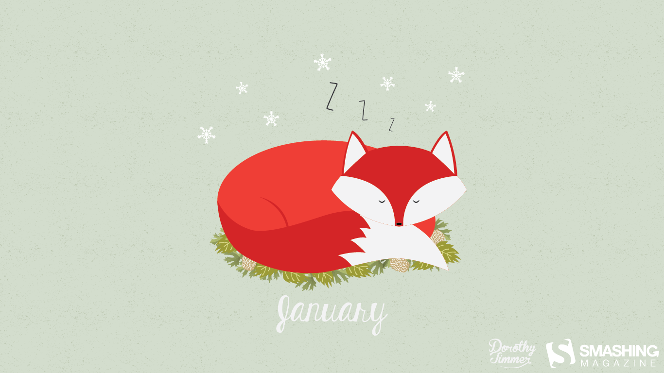
“I was browsing for themes when I found this “Festival of Sleep” that takes place on the 3rd, and I’m a big fan of sleep… Especially in these cold months after the holiday craziness, it’s nice to get cozy and take a nice nap.” — Designed by Dorothy Timmer from Central Florida, USA.
Please note that we respect and carefully consider the ideas and motivation behind each and every artist’s work. This is why we give all artists the full freedom to explore their creativity and express emotions and experience throughout their works. This is also why the themes of the wallpapers weren’t anyhow influenced by us, but rather designed from scratch by the artists themselves.
Thank you to all designers for their participation. Join in next month!
It has become a little tradition at Codrops to share a summary of all our resources in the end of the year. 2018 was really an exciting year for the web and we are stoked to be part of an ever-changing and inspiring community of creatives who don’t hesitate to push the boundaries, to make bold design statements and use new, experimental technologies. We hope you had a wonderful, creative and fulfilling 2018!
A big big thank you to all our fantastic readers, supporters, contributors and sponsors! Have a wonderful new year full of positivity, health and love! Let’s make good stuff!


