Functional filters on an E-commerce site can help drive more sales, providing visitors with a pleasant, accessible user experience. Filters enhance an experience and can reduce frustration. Customers seeking a specific item are likelier to find it while also having their interests piqued into additional purchases by other relevant filters. E-commerce product filters can be […]
According to statistics between November 2016 to January 2017, people have a rather high degree of trust (36%) towards online healthcare resources recommended by their own physicians or well-known providers of healthcare services. Given the rapid growth of IT and, in particular, the complex diagnosis of some diseases, we can affirm that such sites will […]
The trick to making your mark in the digital world — at least when it comes to building brand exposure and boosting your returns — is having a planned, well-constructed digital campaign. By not incorporating a defined and reliable marketing strategy, you’re shooting yourself in the foot. Image Source:www.l49digital.com As Smart Insights made clear in […]
When Android was first introduced in 2007, it was ranked 5th among the mobile platforms available. Since then, Android’s popularity has increased exponentially. In fact, it is now considered as the world most popular mobile platform. In fact, Android devices account for 50% of the global smartphone market. We are in the age where almost […]
Artificial intelligence (AI), Chatbots and Blockchain are some of the key technologies which will disrupt the financial services industry in the coming days. Artificial Intelligence AI is a collection of machine learning, natural language processing, and cognitive computing designed for scale. This scalability is exciting, as it can create exponential growth and deliver today’s required […]
Valentine’s Day is approaching so fast, and all beloved are impatiently waiting for a chance to show how much they love their best halves. It’s a great day to hang out at some party with your beloved or with friends and have the best V-Day. Whether you are an owner of a nightclub and are […]
$wp_new_user_notification_email_admin: Associative array with the keys to, subject, message, headers.
$user: A WP_User object of the registered user.
$blogname: A string containing the name of the blog the user registered to.
With these values at hand it’s easy to create your customized mail:
add_action( 'login_init', 'my_wp_new_user_notification_email_admin_init' );

function my_wp_new_user_notification_email_admin_init() {
    add_filter( 'wp_new_user_notification_email_admin', 'my_wp_new_user_notification_email_admin', 10, 3 );
}

function my_wp_new_user_notification_email_admin( $wp_new_user_notification_email, $user, $blogname ) {
    $wp_new_user_notification_email['subject'] = sprintf( '[%s] New user %s registered.', $blogname, $user->user_login );
    $wp_new_user_notification_email['message'] = sprintf( "%s ( %s ) has registerd to your blog %s.", $user->user_login, $user->user_email, $blogname );

    return $wp_new_user_notification_email;

}
(As always for filters: do not forget to return the altered variable.) The mail now looks like this:
From: myBlog (MyBlog@myblog.com) Subject: [myBlog] New user new_user registered.
new_user (new_user@user.com) has registerd to your blog myBlog.
Of course, you can insert more data than provided by the filter. E.g., you can tell the admin, how many registered users the blog already has:
function my_wp_new_user_notification_email_admin($wp_new_user_notification_email, $user, $blogname) {

    $user_count = count_users();

    $wp_new_user_notification_email['subject'] = sprintf('[%s] New user %s registered.',
$blogname, $user->user_login);
    $wp_new_user_notification_email['message'] =
    sprintf( "%s has registerd to your blog %s.", $user->user_login, $blogname) .
"\n\n\r" . sprintf("This is your %d. user!", $user_count['total_users']);

    return $wp_new_user_notification_email;

}
The parameter headers can be used to easily change some header information:
In this example the From information of the mail is changed and the user admin2@myblog is added as an additional recipient. As you can see, multiple headers entries are separated by "\n\r" (return and linefeed).
As said before this all could already be done by using wp_mail() and phpmailer but the new filters are way more convenient.
We’re back with a new roundup with more nice UI animations that we’ve come across recently. Everything from subtle micro-animations to more majestic content loaders.
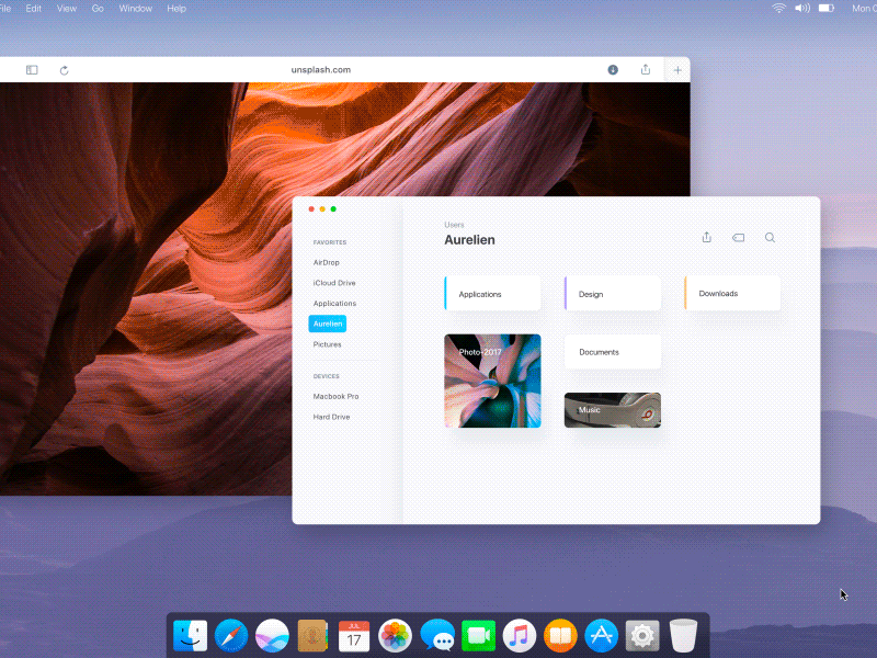
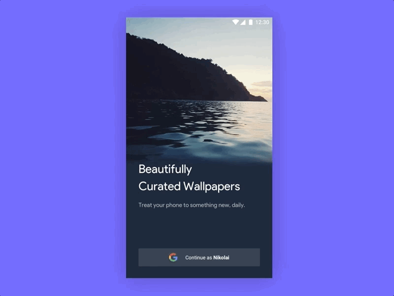
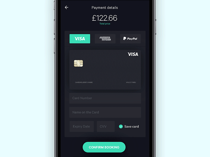
Single field formEmail input micro animationOnly Text Сontent App by Sergey JaniMicro interactions for To-Do List AppCalendar, date range picker by Hernán SartorioMoving task flow interactions by Jakub AntalíkE-Commerce App by Alex KhoroshokApple OS / MacOS — Finder UI motion by Aurélien SalomonSubmit Credit Card Flow by Azís PradanaRealWeather UI by Michal SamboraAlbum details by Ivan BjelajacMulti-dimensional controller by Leo LeungGoogle Wallpapers by Nikolai PrettnerOnboarding Flow by Sal for WeeblyPayment for flight app by Jekin Gala
Great UI/UX Animations was originally published in From up North on Medium, where people are continuing the conversation by highlighting and responding to this story.
From a personal perspective, there’s a number of things from 2017 I’d like to share, including accomplishments and challenges.
Moving to a new home in the Kansas Sandhills
Of everything that happened in 2017, there is one single highlight on the personal side of things: getting acreage outside of my city. In June, my wife and I noticed a property for sale three miles north of Hutchinson, KS, where we live. It had 11 acres comprised of woods, tall grass prairie, and plum thickets. Aside from a number of Cedar trees (an invasive species), the property was mostly pristine Kansas Sandhills that had never (to our knowledge) been farmed.
I grew up unschooled on an apple orchard my parents operated and the property included about 100 acres of trees and open prairie. I have longed to be back in the country away from the city ever since I moved away from my parents’ home. I consider my time growing up, free to be a wild child, some of the most important and formative years of my life and I want my children to have the same freedom and opportunities to explore and learn as I did. I hope for them to develop a deep love for nature through being immersed in it every day as I was.
After thinking about it for a week or two, we decided to jump on the chance of getting our own small plot of land. We put an offer on the property, which included a good house, and had it accepted less than 72 hours later. The next month was a whirlwind of getting everything in order, including selling our previous home. We had anticipated the possibility of it taking months, or even a year, to sell our house but were pleasantly surprised to have a solid offer on it in less than 10 days, which we accepted.
Moving to our new home was not free of challenges, especially as far as internet access was concerned, but after getting settled in everyone was thrilled. No place has ever felt more like home than where we are now and I’m eternally grateful to have had the opportunities and good fortune necessary to get here.
Building greenspace
Along with achieving a long-term goal of moving back into a rural setting, 2017 gave me an opportunity to move forward with another of my hopefuls: purchasing land to convert into greenspace and prevent the complete overtaking of concrete that was inevitable for the area. Shortly after completing our new home purchase, I also finalized the purchase of a vacant, 3 acre lot in our city for the sole purpose of creating a nature area.
There is still a lot of work to do on it, which I’ll be beginning later this winter and I look forward to including updates on my progress in followup year-end-review posts.
Part of preparing the property for tree planting and other green developments involves keeping it mowed. During the spring and summer I will be mowing it every other week and it takes me about 2.5 hours to finish. I’ve found it as a great opportunity to sit (on a mower) and think for 2-3 hours. It’s actually a rare opportunity, the option to sit and think for extended periods of time. At first I thought I would want to hire someone to mow it for me but I’ve found the time to myself and my thoughts to be exceptionally valuable.
Between spending long periods of time on my bike and mowing the park, I’ve found the time with just my thoughts to be some of my most productive for working through hard challenges. Originally I thought I would want to get rid of any and all “dead” time, now I cherish it.
Re-discovering my role within my own company
On at least four separate occasions I have sat down to write a blog post on how I have lost my role as the lead developer of my WordPress products. As I have continually brought on immensely talented individuals to join my team, I have successfully hired myself out of my primary job: writing code.
This was an entirely intentional transition that, all things considered, worked spectacularly. It has allowed me to step wholly away from the development of our products and focus instead of other areas of the business. What I had not anticipated, however, is the effect this move would have on my personal motivation.
I so successfully hired myself out of my job that I often found myself unsure of what I should do. I frequently found myself sitting in my office monotonously going from easy task to easy task while trying to find my purpose again.
As a solo founder, the beautiful thing about bringing highly skilled team members on board is that you are then given the flexibility to put your own focus and efforts where they are most needed or most valuable. The downside, however, is that you also tend to find that you are no longer needed by your team to complete the task you used to be solely responsible for.
My presence is no longer needed for an update to one of our products to be completed and released. I am no longer needed for customer support. I am no longer needed for our marketing efforts. It is no longer necessary for me to review every line of code that’s written. Most of the company administration tasks no longer depend entirely on me. Obviously my presence and focus on projects and around the company is still immensely valuable, but the profound effect that a lack of need has on a solo founder’s motivation and drive can be intense.
I have always been really good at taking care of things that need to be done, whether I enjoy the specific task or not. I was completely caught off guard by how much not being directly needed was able to undercut my motivation and drive to continue pushing forward.
Getting the company to a place where I am no longer needed is one of my best accomplishments as it takes care of a huge problem that many solo founder companies face: the bus factor. If I am struck by a bus tomorrow, or disabled in any way, I can rest assured that the company will continue to succeed, and that has been one of my long term goals, one which I’m thrilled to have succeeded at.
I simply did not anticipate the effect that protecting against the bus factor would have on my personal motivation.
I never did succeed in finishing my blog post on the subject of losing my role as the lead developer, but I did over time manage to rediscover my purpose with the company. That allowed me to find my source of motivation again and gave me a new drive to succeed and push us further and further forward.
The last 12 months have been an incredibly interesting journey. I never thought I’d be struggling to find my motivation when the company was thriving better than ever before.
The mind is a fascinating beast.
Team growth
When I first began building my company I had no intention of ever having more than 3-5 employees. Growth, though, has a habit of adjusting your plans in ways that may not be expected. In 2017 four new team members came on board and several moved from part time contractors to full time.
Ginger Coolidge joined to help with AffiliateWP support and documentation.
Ashley Gibson moved from a part time contractor to full time team member to work on Restrict Content Pro development.
Kyle Maurer moved from a part time contractor to a full time team member to work on Easy Digital downloads support and marketing.
Tyler Lau joined to help with billing support and social outreach.
Phil Johnston, previously a part time contractor, joined us as a full time team member to work on Easy Digital Downloads development and support.
Keri Jacoby joined to help with Easy Digital Downloads support and internal company documentation.
John Jacoby joined to help with development across all products and to help re-launch the next leg to our product table, Sugar Calendar.
We also said goodbye to several teammates. Between the ones that left and the new ones that joined, our team size remained about the same as 2016. 13-16 between full time employees and part time contractors.
The Sandhills Development team currently includes thirteen full time, salaried members and three active full to part time contractors.
Team photo from our company meetup in Keystone, Colorado
My team is the core of the company. Without them we are nothing and for them I am eternally grateful.
Team focused decisions
Throughout the year, and at the tail end of 2016, my team and I made a number of strategic decisions that all had a singular core goal: doing what is best for the team and the company.
Depending on who you ask, these decisions were supported, loved, applauded, chastised, and hated by many. I have been told quite a few times this past year that I am making excellent decisions that really convey the strength of the team I’ve built and of my leadership skills. I have also been told by numerous individuals that I am the scum of the earth, I am ruining the open source nature of WordPress, and my business will fail.
As anyone that continues to work online does, I have grown a pretty thick skin and am not terribly phased by people calling me a greedy criminal or a despicable person. Each time it happens I try to pause and do my best to understand why someone has this opinion of me. Are they right? Is there truth to what they’ve said about me? Regardless of how right or wrong anyone is, being the target of such accusations has made me very reflective and cognizant of the choices I make for my company.
Perhaps the most important lesson I’ve learned from the choices we have made, some of which I will detail below, is that it’s critically important for the health and wellness of my team to be put first on the list of priorities. This is for a very simple fact: if we are not well nor happy in life or work, we will never excel at making our customers happy. This understanding has become the pivot on which all company decisions are now based.
Is it good for us? If not, we do our best to find an option or route that is. Decisions that promote better health and wellness for the team automatically carry over to the promotion of better experiences for our customers.
Price changes
There were several adjustments to our product pricing in 2017, and one in 2016 that had its effects realized in 2017.
Easy Digital Downloads prices increased significantly in December, 2016
AffiliateWP prices increased in March, 2017
Restrict Content Pro prices increased in March, 2017
Renewal discounts removed from AffiliateWP in March, 2017
Renewal discounts removed from Restrict Content Pro in March 2017
Renewal discounts removed from Easy Digital Downloads in September, 2017
The price increase for Easy Digital Downloads was easily the most contentious of the decisions made. While most people supported the reasons for the change, there was a very vocal minority that vehemently hated us for our decision. I am a firm believer that it is not necessary for the vast majority of companies to have any justification for the prices they charge.
Whatever price chosen is perfectly acceptable, even if some argue the price is extreme. The reason for this is simple: free markets permit companies and individuals to make their own choices on the prices they charge. Beyond that, the “correctness” of the price can be gauged by how customers respond to it and how it affects the sustainability of the company. Too high and the company fails to attract enough customers; too low and the company fails to generate enough revenue. So long as both needs are met, the chosen price works.
A number of individuals made it very clear to us that they felt we’d made a terrible decision with our Easy Digital Downloads price increase and, in no uncertain terms, expressed how our mistake would be clearly realized in our financial failure. I have no wish to discredit or demean their opinions, but I will say this: increasing our Easy Digital Downloads prices is one of the single best decisions we have ever made. It has contributed almost single handedly to a complete turnaround of Easy Digital Downloads’ future. In previous years I have expressed how we felt Easy Digital Downloads was a sinking ship. Today I’m happy to say it is thriving and in a better position than ever. This turn around is something that should greatly reassure Easy Digital Downloads users, even those that were unhappy with the price change, as it is what will permit us to continue building, maintaining, and improving the platform.
The price increases for AffiliateWP and Restrict Content Pro were also very successful in allowing us to operate more freely and have given us a lot more ability to invest back into the further development of the products and company.
Closing the EDD marketplace
In September, 2017, my team and I made the decision to close down the extensions marketplace we operated for Easy Digital Downloads. This was the marketplace that allowed 3rd party vendors to sell their EDD extensions through our website. We had been working on slowly reducing the number of 3rd party plugins that we offered through the site over several years already but it was going to take a considerable amount of time before the process was completed at the pace we were going.
While working through the logistics of introducing some price and sales model changes for EDD, we encountered a number of challenges that were a direct result of our site selling 3rd party extensions. It had already been decided that the changes we wanted to make were really important to the longevity of Easy Digital Downloads as a platform and as a business, so we began looking at the feasibility of discontinuing our marketplace and removing all 3rd party extensions.
After a few weeks of analyzing, thinking, and talking, we quickly discovered that shuttering the marketplace was pretty feasible and would likely not result in too much discontent. Doing so, however, would have significantly positive affects on the future of Easy Digital Downloads.
In order to fully close the marketplace, we needed to get rid of, in one way or another, every plugin that was owned by a 3rd party developer. Getting rid of them really just meant that the plugins needed to be removed from the site so that only our own extensions remained. We decided that one of three things would happen to each of the 3rd party plugins:
It could be transferred off-site and distributed through whatever mechanism the author chose so long as it was not our site.
It could be discontinued entirely.
It could be acquired by Easy Digital Downloads and left as-is on the site.
While our site did not have nearly as many extensions for sale at the time as it once had, there were still a large number of plugins to be managed. In total, 55 plugins needed to be moved off, discontinued, or acquired.
Of the 55 plugins, we chose 37 that we wished to acquire and take over full ownership of. These were plugins built wholly or in part by 3rd party developers that had performed well or had strong potential for the future. For these plugins we determined what we felt was a fair price and then we reached out to each of the owners and made them acquitision offers. The vast majority of authors were thrilled with the prospect of selling their plugins and quickly accepted our offers.
18 of the 55 plugins were determined to be ones that we no longer wished to sell on our site, so these were either discontinued or moved to a place of the author’s choosing, their own site or a marketplace such as CodeCanyon.
Once we decided we were going to acquire the plugins and close down our marketplace, it took just about four weeks to complete the entire transition. After all was said and done, we spent $145,000 purchasing extensions. All extension purchases were paid for in cash with the exception of one, which was put onto a payment plan spanning four months. This was a move made possible by our price increase at the end of 2016. If we had not done that, we’d never have been able to afford purchasing so many plugins in such a short period of time.
A number of very interesting things happened as a result of our choice to acquire all extensions and close down our marketplace.
First, there was a palpable sense of relief and satisfaction among the team. Working closely with 3rd party developers and selling their products through your own site can have mixed experiences, sometimes good and sometimes bad. Most of the developers we worked with were great. They were responsive to bug fixes, welcoming of feature requests, and all around just good to work with. Others were less good for various reasons but regardless of how good someone is to work with, there are inherent challenges that come with working alongside outside developers. By acquiring all of the plugins, we removed all of the challenges that the 3rd party plugins posed to us, thus eliminating significant sources of stress and tension for the team. The effect that this had on everyone was very noticeable in the team’s moods and focus.
Second, by removing 3rd party plugins, we eliminated a significant monthly expense. Each month we paid out between $8,000 and $15,000 in commissions to 3rd party developers. As soon as there were no more 3rd party commissions to track, all of that revenue started going straight back into the company instead of being paid out, which then provided extra flexibility and safety nets. Through the savings of having significantly lower expenses we easily have the opportunity to hire more development resources and invest back into the improvement of the platform.
Third, we reduced our support load. Some of the extensions that were acquired had had long-term issues that were not being taken care of adequately. By taking over control of the plugins we were then able to immediately push out a large number of updates to extensions to resolve some long-standing bugs and problems. We were also able to further reduce support loads by discontinuing some of the plugins that were low sellers or simply not worth the time and effort it took to maintain them.
Overall, I would consider the decision to close our marketplace and acquire all of the extensions to be one of the single best decisions we’ve made in the last few years.
Firing
Twice in 2017 I found myself in a position where I needed to fire a team member. Bluntly, those were two of the hardest experiences in my professional career. Hiring the right people is hard, but I’ve come to find that firing people is perhaps harder.
Going through the mental exercise of firing someone is exhausting. You worry about how the person will react. Will they be angry, understanding, sad, unmoved? You worry about whether they will be okay in the coming months. Do they have funds set aside to get them through a period of unemployment? Do they have something else lined up? You worry about how the rest of the team will react to the news of one of their team members leaving. Will that make the others worry for the safety of their own positions? Will it cause rifts or resentment within the team? You worry about the company’s performance. Will firing this person harm your ability to deliver on promises to customers? You worry about what they will think of you. Will this person hate you for firing them? You worry about their family. Do they have children to support and will they be able to provide for their kids when their paycheck is cut off?
Firing someone you’ve worked with for multiple years is an absolute whirlwind of emotions. Nothing about it is easy. The objective side of the brain knows the choice you’ve made is the right one, but the emotional side struggles. It is obvious when a person is not performing, is not meeting quality requirements, is a poor fit for the team culture, and other issues, but those do not make it any easier to overwrite the human element when you care for the person and their wellbeing.
Realistically, I know I will have to fire someone again in the future, and probably more than one, but I dread the prospect of it. Having gone through the experience twice in a year has made me much more cautious about the hiring process and how we vet possible candidates. No system will ever be perfect but we will work harder to ensure those people we do hire are the right fit.
Revenue
2017 treated us well, largely in part to the strategic decisions we made throughout the year and earlier in 2016. Overall we saw a 53% increase over 2016 with a total of $2,268,000.00 in revenue.
Our 2017 revenue can be broken down as such:
Restrict Content Pro: $333,000.00
AffiliateWP: $901,000.00
Easy Digital Downloads: $946,000.00
Other: $94,700.00
Our revenue increase came from three primary factors:
Raising our prices
Automatic license renewals
Natural growth
The most interesting of these three is the automatic license renewals, so let’s take a deeper look at those stats.
Revenue from automatic license renewals
In the first quarter of 2016 we implemented automatic renewals for license purchases. This meant all license keys purchased automatically renewed with a payment on the annual anniversary of the purchase date. As this change was made in 2016, it wasn’t until January and March 2017 that we began to see the effects of it.
In my 2016 review post, I said that enabling automatic renewals was “one of the most important changes we made for the sustainability of the company”. Today I am completely confident that turned out to be true.
Let’s take a quick look at our license renewal stats for 2017.
Easy Digital Downloads
In 2017 Easy Digital Downloads saw $309,000.00 in revenue from license renewals. 2016, in contrast, only had $139,850.00 in revenue from license renewals, so we increased our renewal revenue by more than $150,000.00. And that revenue increase was not from an increased marketing effort nor natural growth, it was simply due to the difference between automatic and manual license renewals. Here’s a graph that illustrates the effect automatic renewals had very clearly:
Look at the change between March and April. The first automatic renewals began being processed at the end of March, 2017. It more than doubled the number of renewals we see every month.
Out of the $309,000.00 in renewal revenue, $208,000.00 came from automatic renewals. The rest was from manual license renewals for customers that did not have automatically renewing subscriptions.
AffiliateWP
Similar to EDD, AffiliateWP saw an increase in monthly renewal revenue as soon as automatic renewals kicked in, which happened in the second half of January, 2017.
In 2017, AffiliateWP brought in $201,000.00 in revenue from license renewals. Of that number, $181,500.00 came from automatic renewals. In contrast, 2016 had just $62,700.00 in license renewal revenue, so automatic renewals increased our renewal revenue nearly 3x by itself.
A graph showing renewal growth from Jan 2016 to December 2017:
Restrict Content Pro
Like Easy Digital Downloads and AffiliateWP, Restrict Content Pro also saw a nice boost in revenue due to automatic renewals.
In 2017, we brought in $59,750.00 from license renewals. Of that, $44,780.00 was from automatic renewals. This is a pretty significant increase from 2016 where we saw just $23,700.00 in renewals.
Here’s a visual of our renewals over 2016 and 2017:
Enabling auto renewals is easily one of the best financial decisions we have made.
SellBird
A project we’ve slowly worked on over the last two years, SellBird is beginning to take shape. We’re still a few months have having an MVP ready but it is getting closer.
I’ll have more to share on it in a couple of months but for now, here’s a screenshot from one of the dashboard views.
Follow @SellBirdHQ for updates.
Sugar Calendar
One of the earlier commercial plugins I launched, Sugar Calendar was built to be a simple, lightweight event calendar plugin for WordPress. While never a major success from a revenue stand point, the plugin has done decently well over five+ years.
Much like Restrict Content Pro, I’ve wanted to more fully develop the plugin into a full-fledged product for quite some time but had not managed to do that on my own.
Read about the effort to re-build Restrict Content Pro here.
I had originally partnered with another developer to try and move the plugin forward. That effort and partnership, unfortunately, fell through and did not produce nearly the results I had hoped for. It failed due to a number of reasons and no single person carries the blame for the failure.
In October, earlier this year, I decided it was time to restart the efforts to build out Sugar Calendar into a full-fledged product. To do this, I partnered again with another developer to aid in the efforts. This time I chose John Jacoby, whom began the process of modernizing the codebase and expanding the feature set of Sugar Calendar. At first it was decided it would be a possibly short term experiment to see how it worked. By early November, however, we’d already decided it was meant to be. JJJ joined my team as a full time member in December to continue his work on Sugar Calendar and other projects.
When the new version launches, it will see a price change and a new series of add-ons introduced. All current customers will have their license keys migrated to the new website and those customers that have purchased multi site versions will see complimentary access to new add-ons granted to their account.
There is still a lot of work to be completed before we’re ready to launch the new Sugar Calendar but we’re getting closer and closer each day. You can follow @sugarcalendar on Twitter to stay updated.
Achieving sustainable profitability
There several things I am deeply proud of with my company.
We have never missed nor skimped on payroll due to financial inflexibility
We are 100% self-funded and have never taken on loans nor any other kind of financing out of necessity
We have always been profitable
Those three facts mean a lot to me and continue to be pillars of every decision I make for the company.
I say that we’ve always been profitable, but that doesn’t mean we’ve always had comfortable profit levels. We’ve had a couple of years where our profit was only a few thousand dollars. That means very, very little when your monthly expenses surpass $100,000.
The choices that we made in 2016 and 2017 were aimed at moving us towards a number of goals, but one of the most important was targeting sustainable profitability.
What do I mean by sustainable profitability? I view it as a level of monthly and yearly profit that allows a company to:
Be financially stable and able to weather downturns in revenue
Have adequate resources to make strategic investments
Have the ability to bring on new team members to fill needed roles at any time
Be financially able to pay all employees greater than a living wage
Be financially stable enough to allow less liked or neglected revenue streams to be removed
Have adequate cash reserves to permit the company to survive in the case of catastrophe
In 2017 we achieved sustainable profitability. I do not know for certain that we’ll maintain it throughout 2018 and beyond but I am confident we are on the right path to long term sustainable profitability.
Insulating the company
Our greatest strengths are our greatest weaknesses.
I’ve spent a lot of time with nothing but my thoughts in the last two years and these periods have led me down a number of mind paths, many that went nowhere in particular, but there is one that I kept coming back to.
What do I want in the next 25 years?
As I’ve gone through the various ups and downs of the previous years, I’ve thought on numerous occasions that it might be time for me to sell my company and move on. The prospect of this really bothered me though. I knew that if I were to sell my company I could likely walk away very comfortably and I don’t doubt I’d be able to find a new owner that would continue to take good care of it, but I couldn’t get past the prospect of leaving my team.
The people that comprise my team are some of the best individuals I’ve ever met and many go beyond just teammates. they’re lifetime friends that I hope to always stay connected with.
The thought of selling my company has always ended with my team. Many of them have told me that if I go, they go, and that they’d happily follow me onto the next thing, whatever it might be.
Coming to understand the quality of the team I’ve built helped me to find the answer to my question: what do I want in the next 25 years?
I want to build a lifetime company.
I don’t want to spend 8 years building software products, sell it, and move on. As common as it is to hear of founders doing that, it’s not for me.
I first realized that I wanted to build a lifetime company after the owner of a local business I had hired to do a project told me their average employee tenure was more than 25 years. It astounded me that any company today could hold onto employees for so long. I want that! I want to know that we have so successfully taken care of our people that they never want to leave nor need to.
One of the first steps in building the lifetime company is insulating us from our biggest weakness: me.
I have worked hard in the last few years to remove dependency on me for the company’s operations. The next step was to protect against myself for decision making and succession.
If I fall off a cliff tomorrow, I want to know that my company and my team are going to be okay. Doing that meant I needed to no longer go it alone; I needed others to have clear roles in my succession.
In September, 2017, I made four of my team members full partners by giving them a combined 25% of my company.
This move helps to insulate the company from me in the case that I become unfit to run things. It also allows me to reward Sean, Chris, Andrew, and John in a small way for the important role they have all played in getting us to where we are today.
Brewery development
At the end of 2016 I declared one of my 2017 goals was to brew my first batch of commercial beer for Sandhills Brewing, a passion project my brother and I have been working on. We didn’t quite get there but we got very close.
For those that do not know, my brother and I have been working on opening a commercial brewery as a side project for the last several years. That work is getting closer and closer to having something to show for it.
A few highlights from our brewery development:
We helped another local brewery brew a small test batch using our equipment. This test batch was sold through their brewery and was well received.
We partnered with the same local brewery, Three Rings Brewing, in order to provide them with a barrel aging warehouse and our own expertise (my brother and I’s) with barrel aging beers.
We completed the majority of the build phase for our brewery.
We submitted our licensing application to the federal government and hope to receive our approval in early 2018.
Once we have had our application approved and have completed a few smaller, easier local and state license applications, we’ll be able to begin brewing commercially. At this time we expect that to happen sometime during the first quarter of 2018. If all goes well, we’ll sell our first 100% independently produced beer by summer 2018.
A nice example of the beer to be brewed by Sandhills Brewing
It’s been a great year and I really look forward to what 2018 has in store for us.
You do everything you can to build a website that will lead visitors to conversion. As you study the analytics, you’re excited to see that the user journey you’ve created is being taken by those visitors, time and time again. However, there’s something keeping them from converting. Find out what it is in this advanced contact forms guide.
The contact form is a critical part of your visitors’ journey.
Even if you’ve effectively sold them on whatever the website has to offer, a contact form could realistically ruin the experience for them if not executed well.
Broken buttons, confusing fields, too many steps, a disorganized interface… Heck, even the placement of the contact form could disrupt the user experience.
There’s a lot that can go wrong, and in this article we’ll be doing our best to educate you on how you can avoid these things.
More specifically we’re giving you our…
6 Rules For Building the Perfect Contact Form
But hold on, quick PSA first…
Before we go any further, you should know this is an advanced look into the world of WordPress contact forms.
Once you’ve done those things we reckon you’ll be ready and primed for the advanced in-form-ation (heh) that follows.
Moving on…
User logins. Membership sign-ups. Email subscriptions. Quote requests. Questionnaires. Support requests. Order and payment forms.
There are a bunch of different ways to use contact forms on a WordPress site. What doesn’t change, however, are the rules you must abide by if you want the contact form to perform well.
A Google eye-tracking study published in 2014 showed that following the most basic usability guidelines for form design will significantly improve the user experience.
Specifically, when a contact form abides by all the rules, 78% of users can complete and submit them in a single try. When a contact form violates those rules, however, only 42% are able to do it in one attempt.
Curious to know what those rules are? Then keep reading.
Rule #1: Focus on Alignment
As you’ll see in some of the other rules here, people are often concerned with the length of contact forms, which is what often leads to bad design choices.
Take the matter of alignment, for instance.
You might see a form like this one on the BrainTraffic website and think, “Hmmm… but isn’t that a little too long to fill out?”
This is just a beautifully constructed contact form on the BrainTraffic website.
One way you might think about fixing this “problem” is by shifting the labels to the left-hand side and placing the answer fields on the right.
However, UX experts will tell you that’s a major no-no as it compromises the scannability of the form.
The same thing applies if you were thinking about placing fields next to each other horizontally.
Basically, if you deviate from the label-on-top/field-below-it structure, you’ll create friction within the user experience.
Google picked those guidelines up in 2014 and put them to the test with an eye-tracking study.
It’s clear from this eye-tracking test how much work we’re putting visitors’ eyes through when we don’t pay attention to alignment.
Among their many findings, they concluded that left-aligned forms with labels placed atop each field resulted in an improved user experience.
If you’d like your contact forms to abide by this simple alignment rule, here is what you need to do:
Left-align all labels, form fields, and the main call-to-action button.
Never align related fields horizontally. You can structure the form logically, but each question or field needs to be stacked vertically.
Any field that has multiple choice questions (with under six options) should be displayed in a vertical list of bullet points or checkboxes, not in a drop-down menu.
A really nice example of mobile contact form alignment and design from WPMU DEV.
Not only is this design great for the user experience, but it will help your site bridge the gap between the desktop and mobile experience (especially important as you work towards updating your sites for Google’s mobile-first index).
Rule #2: Include All Relevant Fields
When it comes to designing contact forms, you might think that shorter is better, right?
This actually isn’t always the case. What matters most is that you provide users with all necessary and relevant fields.
Michael Aagaard, the Senior Conversion Optimizer for Unbounce, gave a presentation in 2015 that tackled this very question.
He and his team wanted to know what would happen if they shortened this contact form:
Surprisingly, the shorter form did not fare as well as the longer one.
As you can see, they removed what they believed to be unnecessary fields in order to streamline the process of filling out the form.
However, upon concluding the test, they discovered a 14% drop in conversions with the shorter form.
Afterward, they studied which fields had the highest and lowest interactions on the contact form.
Using the original, longer design, they rearranged those fields and updated the labels to clarify what type of information was needed.
They re-ran the test and saw a 19% improvement in leads with the relabeled and reorganized version of the long form:
Unbounce found that the keys to improving the longer contact form were in the labels, not the form length.
That’s not always how these tests work out though.
It was optional, but users didn’t necessarily understand that and, in turn, filled out the wrong information which eventually led to their purchase being declined.
When Expedia realized the issue, they removed the field and saw an additional $12 million in revenue the following year.
I would suggest that, when building your own contact form, start with the basic fields as QuickBooks has done here:
Only the most necessary fields are included when signing up for QuickBooks.
If you find that conversions aren’t tying out with expectations, study the analytics and see if you can determine which fields are stopping users up from completing the form.
Rule #3: Simplify Input
Regardless of whether your users engage with your contact form using a desktop or mobile device, or whether or not they need assistive technology to help them do it, the form should be equipped to simplify the input process.
Here are some techniques you should be aware of:
Tabbing
For desktop users and those with accessibility issues, make sure your contact form has a logical tabbing order enabled.
Input Masks
Rather than force users to guess how you want certain fields formatted, you can code them with input masks that automatically format them as the user types.
An example of what an input mask looks like from the Social Design House website.
This type of auto-formatting also leads to fewer clicks (especially if a field like a phone number or credit card is broken into multiple fields) and quicker form completions.
Input Types HTML input types will help users see the right keyboard options as they type on mobile, saving them from having to type everything from scratch (like the “.com” for email).
Watch how the keyboard at the bottom of this Elluminati contact form changes based on the field selected.
Google Autocomplete
Rather than code each field to automatically format per the standards it needs to meet, enable auto-fill with the Google Address Autocomplete plugin.
Not only will it help you avoid having to deal with misspellings and improperly formatted addresses, it’ll spare your visitors from having to type most of that information out.
Conditional Logic
If you’re worried about the length of your contact form–especially if it targets different user types and fulfills various purposes–you can use conditional logic to keep it short.
Once the user selects their particular “condition”, only then will the relevant parts of the form be exposed.
Upon selecting the final field, users are presented additional fields to fill in that are most relevant to their request.
Many contact form plugins come with an extension for this. For example, here’s one for Forminator.
Create forms with conditional logic using Forminator.
Breadcrumbs A breadcrumb or progress bar for a contact form isn’t necessarily about simplifying the process of filling out a form.
However, it does help encourage users to finish it as the remaining steps are clearly defined.
Once again, here’s an example of a progress bar using Forminator’s Pagination element:
Add a progress bar to forms to help users navigate more easily through the form-filling process.
Rule #4: Spell Everything Out
While I realize this rule will go against the basic principles behind minimalism, it’s one that you should pay close attention to so you can avoid unnecessarily frustrating your visitors.
Let me explain: You have a contact form that looks simple enough.
Your users fill it out based on what the labels suggest and they hit the submission button.
Then they receive that ugly red message: “You didn’t do it right! Go back, fix the form, and resubmit!”
You’ve likely encountered this as a user and you know how frustrating it can be, especially if some of the information you inputted drops out when the error is thrown.
So, rather than leave users guessing about what needs to be fixed and how, don’t let it get to that point.
Spell everything out along the way:
Provide field focus (especially on mobile) so users know exactly where they are in the process of filling out a form.
Write out any formatting requirements if you’re not using input masks to auto-format fields.
Explicitly state when a field is “Optional” (use the word, not the red asterisk).
Give users the ability to show or hide the password field as they enter it.
Show an error message as soon as the user has engaged with a field. Don’t wait until the very end to do it.
Hubspot shows the right way to handle error messages in a contact form.
In the aforementioned Google eye-tracking study, they followed up with users who took the test and found that a lack of formatting was often specified as a complaint.
Google suggests providing clear guidelines throughout the form as well as highly visible error messages. In addition, these labels shouldn’t just be in a standard red font.
They should be outlined, colored, and bolded.
Rule #5: Stay Away from Hints
Hint text in a contact form looks like this:
While Target has fixed some of the problems associated with using hint text in form fields, it still might not be enough for users with accessibility issues.
See how Target places the labels within the field? In some contact forms, those labels/hints simply disappear when a user clicks on a field.
Target handles this a little differently and instead shifts the label to the top of the field box (see “email address”).
Regardless of how this is handled, usability experts–like the Nielsen Norman Group–will tell you that this is a bad design practice because:
This is problematic for users that are multi-tasking, get distracted, or too quickly tab into the next field. When the hint disappears, users have to back out of the field in order to rediscover what is needed.
Hints that disappear also prohibit users from going back over a form to check their work or to fix an error without deleting the response completely to see what’s underneath.
The lighter grey text used for placeholder hints isn’t ideal for easy reading.
Fields with hint text can be confused for fields that have already had data filled in, leaving users to skip them, submit the form, and receive an error message.
Some screen reader tools aren’t capable of reading placeholder hint text.
According to the NNG, users find empty fields more attractive than those that contain hint text.
While it may make your forms look longer to place those labels or descriptors above the field, it’ll improve usability.
Rule #6: Look at Your Buttons
WPMU DEV already has a great guide to designing better buttons, so I’m not going to rehash that. Instead, I want to focus on the few things you can do to improve your contact form buttons.
For starters, always align the primary CTA with the form fields, even if it doesn’t seem logical.
For instance, if you have a “Next” and “Back” button, “Next” should appear on the far left as it’s the action most users are going to take.
Also, try not to use “Reset”, “Clear”, or “Cancel” buttons. Many users get to the bottom of a form and automatically click on the first button they see, thinking it’s the submission button.
If they lose all their answers by erroneously hitting the wrong button, you may find them unwilling to re-submit.
In this A/B test from Unbounce, they found that value-driven copy (even if longer) was more successful in converting users.
The CTA text may be longer, but users responded much more positively to the value-driven message.
The updated copy received over 31% more conversions than the original message.
Finally, use trust marks around your contact form buttons when it makes sense.
The CoSchedule statement about no credit card being required is a nice example of this:
Generally, a great-looking form that does a good job of using “trust mark” text that encourages users to click without hesitation.
But be careful. If you use a trust mark when it’s not needed, it could mislead users into believing they have to hand over sensitive information when that’s not actually the case, as this A/B test from Behave demonstrates:
You’d assume the TRUSTe trust mark would help increase conversions, but that’s not so in this case.
Version B received almost 13% more submissions than Version A as the security seal led users to believe they’d eventually have to submit payment or other sensitive information through the website.
Time To Apply The In(Form)ation
Contact forms are not a one-size-fits-all kind of thing.
Every website (and business behind the website) has a different goal and, thus, the contact forms within it need to work specifically to help achieve that goal.
If you want to properly execute the rules above while working towards those goals, you have two options.
A plugin like WPMU DEV’s Forminator gives you the best of both worlds (and it’s free!).
Install the plugin and choose a template to start with, then build the form to suit your specific needs with a range of powerful customization options and settings.
Whatever you decide, just remember that users aren’t necessarily afraid of lengthy contact forms, it’s more about how well you’ve created an experience within the form for them.