How to Disable WordPress Admin Bar for All Users Except Administrators

Category Image 091

Do you want to easily disable the admin bar in WordPress?

By default, you can easily disable the WordPress admin bar for any user from the dashboard. But this method can take time if you have a lot of registered users on your site.

In this article, we’ll show you how to disable the WordPress admin bar for all users except administrators.
Disabling WordPress admin bar for all users except administrators

What is WordPress Admin Bar?

By default, WordPress displays an admin bar on the top for all logged-in users. This toolbar is visible in the WordPress admin area as well as all other pages when you are logged in.
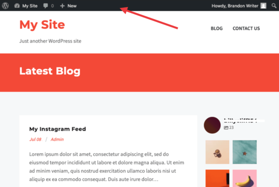
WordPress admin bar

The WordPress admin toolbar contains useful shortcuts to different WordPress sections. The shortcuts available in the admin bar change based on a users’ role and permissions in WordPress.

However, when viewing the public pages on the front-end of your website, the admin bar can be a bit distracting. It may also affect your website’s design and user experience.

Luckily, there are multiple ways to easily disable the WordPress admin bar for all users except administrators.

Method 1. Disabling The WordPress Admin Bar for Any User

WordPress allows each user to disable the admin bar by simply editing their user profile. As a site owner, you can also edit other user’s profiles and disable the admin bar for them.

If you want to disable the admin bar for any particular user in WordPress, you’ll need to edit their user profile.

Simply go to the Users » All Users page and then click on the ‘edit’ link for any user you want to disable the admin bar for.
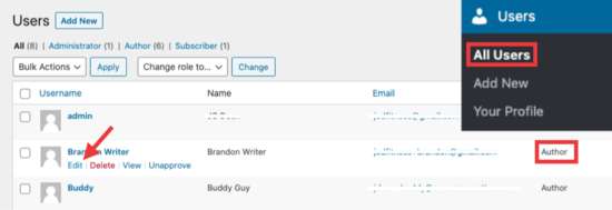
Edit user settings

This will bring you to the user profile editor page. From here, uncheck the box next to the ‘Show toolbar when viewing site’ option.

Disable admin bar

Scroll down and click the ‘Update User’ button to save your changes.

This will disable the admin bar for that particular user when they visit the website.
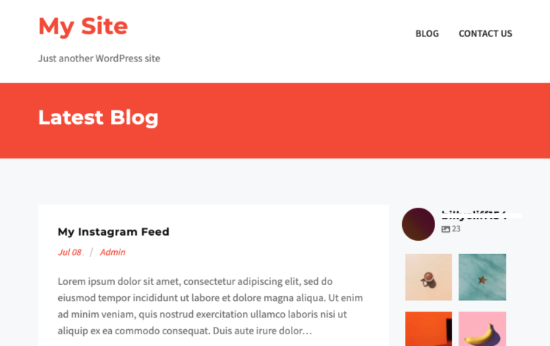
Site without admin bar

If you have a handful of users, then you can go ahead and manually disable the admin bar for all of them. However, if you run a membership site with a lot of users, then this method wouldn’t work.

Luckily, there are other ways to quickly disable the admin bar for all users except administrators.

Method 2. Disable Admin Bar for All Users Except Admins with a Plugin

This method allows you to quickly disable the WordPress admin for all users.

First, you need to install and activate the Hide Admin Bar Based on User Roles plugin. For more details, see our step by step guide on how to install a WordPress plugin.

Upon activation, go to the Settings » Hide Admin Bar Settings page. From here, check the boxes next to the user roles where you want to disable the admin bar.
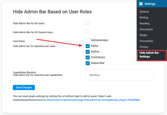
Hide Admin settings with a plugin

Don’t forget to click on the ‘Save Changes’ button to store your settings.

Method 3. Disable Admin Bar for All Users Except Administrators Using Code

This method requires you to add code to your WordPress theme files. If you have not done this before, then check out our guide on how to copy and paste code snippets in WordPress.

Simply add the following code to your theme’s functions.php file or a site-specific plugin.

add_action('after_setup_theme', 'remove_admin_bar');
function remove_admin_bar() {
if (!current_user_can('administrator') && !is_admin()) {
  show_admin_bar(false);
}
}

This code checks if the current user is not an administrator, and they are not viewing the admin dashboard. If both conditions match, then it will disable the WordPress admin bar.

Don’t forget to save your changes and check your website to make sure everything is working fine.

Method 4. Disable Admin Bar for All Users Including Admins

What if you wanted to disable the admin bar for all users including yourself and any other administrator on your site?

You can do this by modifying the code we showed earlier.

Simply add the following code to your theme’s functions.php file or a site-specific plugin.

/* Disable WordPress Admin Bar for all users */
add_filter( 'show_admin_bar', '__return_false' );

This code will disable the admin bar for all users when viewing the public pages of your website. All users will still be able to see the toolbar inside the WordPress admin dashboard.

We hope this article helped you learn how to disable the WordPress admin bar for all users except administrators. You may also want to see our ultimate WordPress security guide and our comparison of the best WordPress page builder for creating custom page layouts without any code.

If you liked this article, then please subscribe to our YouTube Channel for WordPress video tutorials. You can also find us on Twitter and Facebook.

The post How to Disable WordPress Admin Bar for All Users Except Administrators appeared first on WPBeginner.

Styling Web Components

Category Image 052

Nolan Lawson has a little emoji-picker-element that is awfully handy and incredibly easy to use. But considering you’d probably be using it within your own app, it should be style-able so it can incorporated nicely anywhere. How to allow that styling isn’t exactly obvious:

What wasn’t obvious to me, though, was how to allow users to style it. What if they wanted a different background color? What if they wanted the emoji to be bigger? What if they wanted a different font for the input field?

Nolan list four possibilities (I’ll rename them a bit in a way that helps me understand them).

  1. CSS Custom Properties: Style things like background: var(--background, white);. Custom properties penetrate the Shadow DOM, so you’re essentially adding styling hooks.
  2. Pre-built variations: You can add a class attribute to the custom elements, which are easy to access within CSS inside the Shadow DOM thanks to the pseudo selectors, like :host(.dark) { background: black; }.
  3. Shadow parts: You add attributes to things you want to be style-able, like <span part="foo">, then CSS from the outside can reach in like custom-component::part(foo) { }.
  4. User forced: Despite the nothing in/nothing out vibe of the Shadow DOM, you can always reach the element.shadowRoot and inject a <style>, so there is always a way to get styles in.

It’s probably worth a mention that the DOM you slot into place is style-able from “outside” CSS as it were.

This is such a funky problem. I like the Shadow DOM because it’s the closest thing we have on the web platform to scoped styles which are definitely a good idea. But I don’t love any of those styling solutions. They all seem to force me into thinking about what kind of styling API I want to offer and document it, while not encouraging any particular consistency across components.

To me, the DOM already is a styling API. I like the scoped protection, but there should be an easy way to reach in there and style things if I want to. Seems like there should be a very simple CSS-only way to reach inside and still use the cascade and such. Maybe the dash-separated custom-element name is enough? my-custom-elemement li { }. Or maybe it’s more explicit, like @shadow my-custom-element li { }. I just think it should be easier. Constructable Stylesheets don’t seem like a step toward make it easier, either.

Last time I was thinking about styling web components, I was just trying to figure out how to it works in the first place, not considering how to expose styling options to consumers of the component.

Does this actually come up as a problem in day-to-day work? Sure does.

I don’t see any particularly good options in that thread (yet) for the styling approach. If I was Dave, I’d be tempted to just do nothing. Offer minimal styling, and if people wanna style it, they can do it however they want from their copy of the component. Or they can “force” the styles in, meaning you have complete freedom.


The post Styling Web Components appeared first on CSS-Tricks.

You can support CSS-Tricks by being an MVP Supporter.

A Whole Website in a Single HTML File

Category Image 052

I can’t stop thinking about this site. It looks like a pretty standard fare; a website with links to different pages. Nothing to write home about except that… the whole website is contained within a single HTML file.

What about clicking the navigation links, you ask? Each link merely shows and hides certain parts of the HTML.

<section id="home">
  <!-- home content goes here -->
</section>
<section id="about">
  <!-- about page goes here -->
</section>

Each <section> is hidden with CSS:

section { display: none; }

Each link in the main navigation points to an anchor on the page:

<a href="#home">Home</a>
<a href="#about">About</a>

And once you click a link, the <section> for that particular link is displayed via:

section:target { display: block; }

See that :target pseudo selector? That’s the magic! Sure, it’s been around for years, but this is a clever way to use it for sure. Most times, it’s used to highlight the anchor on the page once an anchor link to it has been clicked. That’s a handy way to help the user know where they’ve just jumped to.

Anyway, using :target like this is super smart stuff! It ends up looking like just a regular website when you click around:

Direct Link to ArticlePermalink


The post A Whole Website in a Single HTML File appeared first on CSS-Tricks.

You can support CSS-Tricks by being an MVP Supporter.

TasteWP FTW

Category Image 035

TasteWP enables anyone to setup a test/temporary WordPress instance in seconds. So you can play around and do things like test plugins on a live site. I know this kind of thing has been done before, but I've never seen it made SO EASY. Like stupid easy. And FREE. Awesome tool.

Direct link to article | View post at DigWP.com

Blocked by robots.txt in GSC going down

Featured Imgs 11

The number of known pages in Google Search Console blocked by robots.txt in the Coverage report just recently started going down. Over the course of this month, it went down from about 400K pages to 200K pages.

No changes to robots.txt file in 6+ months nor any big structural changes, 404'd pages, etc. in that amount of time either.

What would cause this number to go down on its own?

#300: Exploring Custom Profiles

Category Image 052

You’ve got two options for customzing your profile on CodePen, and endless possibility:

  • Open to everyone: Apply Custom CSS (which can be a link to a Pen on CodePen)
  • PRO only: Apply a Pen-as-Header-Background

In this video, Chris & Stephen look at a bunch of awesome profiles on CodePen, and find that many users (especially the coolest profiles) do both. Here’s the shuffle machine we used in the video to randomize cool profiles:

The post #300: Exploring Custom Profiles appeared first on CodePen Blog.

The Holy Grail Layout with CSS Grid

Category Image 052

A reader wrote in asking specifically how to build this layout in CSS Flexbox:

My answer: That’s not really a layout for CSS Flexbox. You could pull it off if you had to, but you’d need some kind of conceit, like grouping the nav and article together in a parent element (if not more grouping). CSS Grid was born to describe this kind of layout and it will be far easier to work with, not to mention that the browser support for both is largely the same these days.

What do you mean by “Holy Grail”?

See, kids, layout on the web used to be so janky that the incredible simple diagram above was relatively difficult to pull off, particularly if you needed the “columns” there to match heights. I know, ridiculous, but that was the deal. We used super weird hacks to get it done (like huge negative margins paired with positive padding), which evolved over time to cleaner tricks (like background images that mimicked columns). Techniques that did manage to pull it off referred to it as the holy grail. (Just for extra clarity, usually, holy grail meant a three-column layout with content in the middle, but the main point was equal height columns).

CSS is much more robust now, so we can use it without resorting to hacks to do reasonable things, like accomplish this basic layout.

Here it is in CSS Grid

This grid is set up both with grid-template-columns and grid-template-rows. This way we can be really specific about where we want these major site sections to fall.

I slipped in some extra stuff

  • I had another question come my way the other day about doing 1px lines between grid areas. The trick there is as simple as the parent having a background color and using gap: 1px;, so I’ve done that in the demo above.
  • It’s likely that small screens move down to a single-column layout. I’ve done that at a media query above. Sometimes I use display: block; on the parent, turning off the grid, but here I’ve left grid on and reset the columns and rows. This way, we still get the gap, and we can shuffle things around if needed.
  • Another recent question I was asked about is the subtle “body border” effect you can see in the demo above. I did it about as simple as possible, with a smidge of padding between the body and the grid wrapper. I originally did it between the body and the HTML element, but for full-page grids, I think it’s smarter to use a wrapper div than use the body for the grid. That way, third-party things that inject stuff into the body won’t cause layout weirdness.

The post The Holy Grail Layout with CSS Grid appeared first on CSS-Tricks.

You can support CSS-Tricks by being an MVP Supporter.

Help

558fe5180e0e8fc922d31c23ef84d240

Design a program to compute the gross pay of worker named michael bryan given that michael bryan worked 80hours to php67.97 per hour

Tracking multiple sources of traffic

Featured Imgs 20

Hi,

This might be a simple question, but I have an affiliate site that I want to drive traffic to, and the traffic will be coming from various sources.

All I want to know is that I got the traffic count that is being contracted for from each source...

My first thought is to create a sub-domain for each traffic source and utilize a DB update query to increment the visitors on the index page for that sub-domain, and then Automatically redirect the visitor to the actual affiliate page.

This would accomplish 2 things -

  1. give me a count on each sub-domain to compare to the contract
  2. make the link easier without the affiliate code at the end of it.

I guess the basic question is whether there is an easier quicker way to do this other then creating a mysql table to keep track of the visitor count per sub-domain?

Suggestions are welcome.
Thanks
Douglas

128 vs. 256-bit SSL Encryption: What Are the Differences?

Category Image 032

When you are searching for an SSL certificate, you will find 128-bit encryption and 256 bit encryption certificates. What are they? The below questions may come to your mind.

  • Is 128 bit SSL encryption secure?
  • Is 256 bit SSL encryption secure?
  • What does 128 or 256 bit encryption mean?

Don’t panic; we have answers.

Daniweb security breach

Featured Imgs 23

MESSAGE TO ADMIN........
I have used "';--have i been pwned?" and it seems you have had a security breach and peoples emails & passwords have been stolen from your (daniweb) servers. I have tried changing my password but just get an oops error.
I assume you are having issues so would you kindly remove my account including ALL detals from your servers & website.
Maybe i will create an entire new account.
Thank You

dw.JPG