Jina Anne silences the night to talk about how we talk about Design Systems. Can the language we use impact the effectiveness of the solution? Fear not, if mighty dread has seized your troubled mind. Design systems of great joy we bring to you and all mankind.
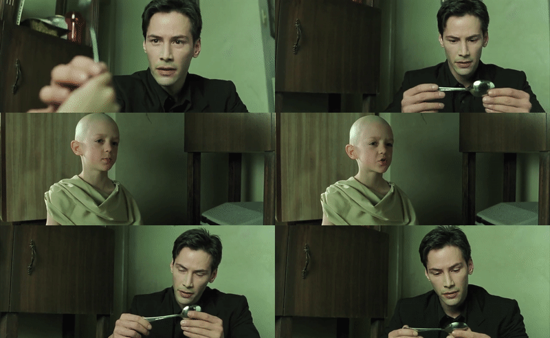
Ooh, clickbaity title. Why on earth would I, a self-proclaimed “design systems advocate”, say there is no design system? Yes, I’m being a little tongue-in-cheek. Maybe I just wanted an excuse to use the “there is no spoon” gif. But I do have an actual point, so bear with me.

Design systems as a “thing” vs design systems as a methodology
Recently I tweeted my thoughts on why I have been tending to use design systems in plural form (rather than using an article like “a” or “the” in front of it). During my time at Salesforce when our team was called “Design Systems” and my role was “Lead Designer, Design Systems”, I would get asked “Why is it plural? We only have one.”.
My thoughts:
I liked my title at Salesforce as “Lead Designer, Design Systems”.
— design systems jina (@jina) December 12, 2019
People asked, but it’s just one. Why plural?
“A design system” or “The design system” makes people think of a deliverable artifact/library.
But it’s ongoing design systems work. Process improvement & workflows.
Lately, I’ve been thinking a lot about the way we talk about design systems, including the confusion and negativity that can come along with it. Amélie Lamont gave a talk in 2018 called “The Language of Design”, and in it, she talked about the way we talk about design systems and design itself from a “jargony point of view”. She argues that design is technically problem-solving.
I definitely agree. People get caught up in “design” as the actual role or action of designing and have even taken issue with the term “design systems” for this very reason (and have suggested it be more focused on code). I don’t think it really does us a good service to just swap out one role for the other. And… is it even about the role?
For other folks, which I include myself, we see design as a larger effort that involves the end-user experience (which includes usability, accessibility, performance, etc) as well as having a huge impact on the business. This includes code.
But really, it should all be focused on people. I like Mina Markham’s definition of what makes for good art direction in design systems:
Art direction is progressive. Localized. Cross-functional. Inclusive. Systematic.
Mina Markham
You’ll notice that the emphasis of what she speaks about is on people.
So in the design systems work we do, you often think of a style guide. Or a component library. Or a Sketch UI Kit. And there are arguments on whether either of those things can be called a design system if it doesn’t include this other thing or that other thing. We even talk about whether design systems are products or are more of a service. My take? The word “design” and “system” used in combination together literally just means to systemize your design (and in my world view that is more about the overall experience). And so if for you that means a Sketch UI Library, then you do you! My point is I think there is too much focus on the deliverables in the first place.
I touched on this briefly very recently:
Something I’ve been thinking a lot about is how much time we spend on making beautiful design system websites. I love looking at them. They’re great. But as our design and engineering tools get closer and closer together, will we come to a point where we don’t need the website? Can our tools surface suggestions for better accessibility, localization, performance, and usability, because our design system is baked into the tools? Just a thought.
Quote from post in Smarter Design Systems Tools

Invisible Design Systems?
So this is something I am striving for in 2020 — in what ways can we improve our collaboration, remove any proverbial gaps between design and engineering (not just bridge them), and have more meaningful conversations around the work we do? I don’t have any wrong or right answers here, but I am looking forward to seeing this progress in our field.
Design tools are bringing in smarter, automated ways to check for color contrast and other accessibility issues that can be detected early on. Sketch just announced their Assistant feature planned for 2020, which will check for your visual design discrepancies. And some design tools are using real code to be used in your product.
Engineering tools are advancing every day as well. I was just attending Flutter Interact recently, which was an event held by Google about their Flutter UI toolkit. It previously enabled you to get apps built for native platforms like Android and iOS, from one code base, and now has also announced their support for desktop and web. The push at this year’s event was focused on making this approachable for creatives (with their integrations into tools like Adobe XD. It really does feel like design and engineering tools are coming closer and closer together. And that’s all really cool and exciting.
However, I have to tell you: a lot of the time that I’m working in design systems, I’m not even touching a design tool. Or coding. Rather, it’s a lot of people-focused work: Reviewing. Advising. Organizing. Coordinating. Triaging. Educating. Supporting. That’s a lot of invisible systems work right there. (I use “invisible” here to mean there is not a direct tangible object in some of this work, though it all does serve the end-user through the product outcomes).
Designed objects are the fruit of invisible systems.
Amélie Lamont
This definitely is not me saying “don’t build a style guide” or “don’t make a Sketch UI Kit”. Use whatever works best for your organization. But this essentially is a plea to always put the focus on the people using your products. And, think about design systems as more of a methodology. A shining example of this way of designing systems is the newly released Encore from Spotify. I had the opportunity to see this revealed at Design Systems London, and they just published a post on it recently.
What’s different about Encore is that it isn’t a single monolithic thing. It’s a framework that brings Spotify’s existing design systems under one brand—a “system of systems.”
Source: Reimagining Design Systems at Spotify
This design systems work is not about one style guide website and instead focuses on the needs across several systems that are connected. Design Tokens help this to be a reality. Needless to say, I’m a big fan.

Love for your community
Design system principle #4: Favor community over control.
— Nathan Curtis (@nathanacurtis) March 23, 2017
When you’re doing design systems work in your organization, you are actually building a community. This can involve shared language and nomenclature, an aligned purpose, and better, closer collaboration. It doesn’t have to be a “style police” situation (I actually very much dislike the term “governance”). This can be a joint effort – working together to share the ownership of design systems together.
I was a big fan of the pairing model that we had at Salesforce when I was there. The work we did in design systems informed the work our product designers did. But then the work that the product designers did, in turn, informed the work we did in design systems. It was a very cyclical model and combined Nathan Curtis’s observed models of the Centralized Team and the Federated Contributors.
From my experience, I have found that great design systems teams have hybrid skillsets. Whether that is having actual hybrid designer/engineers on the team, or just ensuring that those skillsets are represented across the team, it’s important to have the perspectives of design, engineering, product, content, accessibility, and more.
I think that part of a designer’s role – and not even a designer. Anybody who uses the design system by nature of what a design system is – it’s the conglomeration of all the disciplines. Some code, some design, some product knowledge, some writing. And what that means is I think everybody on the team has to approach it with some humility.
Dan Mall
Kim Williams spoke recently in her talk, Start with your Brand Purpose, on Design Systems Love:
Love is patient. With design systems, …it’s a marathon and not a sprint. …this is a long game and it is a labor of love. And love is kind. We support everyone through change. Internally change is so hard. How do you help engineers work in a different way, how do you help PMs think strategically and embrace a new definition of analytical, how do you make in-roads with marketing so that they’re comfortable with you talking about brand and that you’re comfortable with marketing talking about user experience? How do you really, really build those relationships up through empathy. …the onus is on us to educate, to facilitate, to help others understand, to speak the language, to be that bridge, to be that connector, to be that catalyst for our companies. It always trusts, always hopes, always perseveres. Never fails. I love this because there’s a resiliency that we need to have, a resilience when we go through this.
Kim Williams
I love, love, love that.
And so while I still think it’s fun to explore new tools and get really excited about certain processes, at the end of the day, (in my most humble opinion), the best design systems teams are not just hybrid teams — they are also teams that work and supports each other really well, thus producing amazing user-centered work.
So, my suggestion for the coming year is to perhaps move away from thinking of design systems as an actual thing (especially when it comes to the negative perception of spending time on them) and more as a way of working better, more efficiently, and more creatively so that we can build great experiences for our users. I like to repeat in my work, Design Systems are for people, because it is a call to cherish, support, and empower the people you serve (both internally and externally).
Happy holidays!

About the author
Jina is a design systems advocate and coach. At Amazon, Jina was Senior Design Systems Lead. At Salesforce, she was Lead Designer on the Lightning Design System. She led the CSS architecture and style guide for the Apple Online Store. She’s also worked at GitHub, Engine Yard, Crush + Lovely, and Memphis Brooks Museum of Art, and more. She developed projects with W3C, Mass.gov, FedEx, etc.
Jina coauthored Design Systems Handbook, Fancy Form Design, and The Art & Science of CSS. She’s published several articles. She’s spoken at conferences including Adobe MAX. Print Magazine featured Jina as a leading San Francisco creative.

