Perfect Tooltips With CSS Clipping and Masking

Category Image 091

Clipping and masking have been around for a while now in CSS and even have pretty decent browser support. I recently worked on a project that needed to use a clipping technique for tooltips showing above links in text.

Those tooltips have two designs based on their content:

One design is a tooltip that contains plain text against a solid background.
The other design allows an image to cover the entire space.

You might not think the text tooltip requires any clipping at all. A pseudo-element can be positioned at the bottom to add the little notch, right? You are indeed absolutely right! Because the background of the tooltip is a a plain color, there’s really no need for CSS trickery and whatnot.

But clipping the image in the second design is where things get interesting…

Here’s the thought process my mind followed when I started the task.

Idea 1: clip-path & polygon

The CSS clip-path property allows us to define a custom polygon with percentage values to make the path we want.
This solution is often enough if the shape of your path is simple enough. In the demo below, I’m using calc() values to make sure the clip is fully responsive, while the little triangle stays the same size no matter how stretched the parent is.

.tooltip {
  clip-path: polygon(
    0% 0%, // Top left point
    100% 0%, // Top right point
    100% calc(100% - 10px), // Bottom right point
    calc(50% + 10px) calc(100% - 10px), // Center right of the triangle
    50% 100%, // Tip of the triangle
    calc(50% - 10px) calc(100% - 10px), // Center left of the triangle
    0% calc(100% - 10px) // Bottom left point
  );
}

This solution is very clean but, in my case, not good enough as I don’t have a straight triangle notch, but rather a custom shape.

Idea 2: clip-path and SVG

Using an SVG path seemed like a good solution. First, you export your SVG clipping path, then use it in your CSS with the url(#clipPathId) value.

Check the demo below. Do you see any issue with the path?

The arrow is stretched based on the image ratio. Since the little notch is part of the whole path shape, it is as stretched as the rectangle part of the path stretches in size.

Idea 3: mask-image

Now here is the thing I discovered with the CSS mask-image property in CSS: You can combine mask layers! Think about it like a background-image in CSS. You can apply multiple gradients or images on a single element. Now, what if you combine all those layers to generate the final mask you need?

This is exactly what we are going to do here with two layers:

  1. A large rectangle that cover the whole block except for a stripe at the bottom (shown in green)
  2. An image of the arrow (shown in pink)

With that solution, the rectangle can stretch according to our tooltip’s dimensions, and the arrow will always keep its fixed size.

All the code and demos below are prefix free and the demos are using Autoprefixer. At the time I’m writing this article, Edge, Chrome & Safari require prefixes.

Just as we would with background properties, we are going to use three different mask properties to define our two layers:

  • mask-image: This property lets us draw the rectangle with a linear background and the arrow with an inline SVG.
  • mask-position: The rectangle doesn’t need a position (as it starts from the top-left), but the arrow needs to be positioned at the center-bottom.
  • mask-repeat: We need to avoid repeating both layers; otherwise, the linear gradient would cover the whole element when it repeats.
.tooltip {
  mask-image:
    linear-gradient(#fff, #fff), /* Rectangle */
    url('data:image/svg+xml;utf8,'); /* Bottom arrow mask-position: */
    0 0, /* Rectangle */
    50% 100%; /* Bottom arrow */
  mask-size:
    100% calc(100% - 18px), /* Rectangle */
    38px 18px; /* Bottom arrow */
  mask-repeat: no-repeat;
}

Tada! Change the tooltip dimensions or replace the image and the bottom arrow will keep its original ratio.

More complex shapes

Let’s get a little fancy and go deeper with this technique. I was inspired by the iMessage app on iOS and tried to reproduce the same tooltips with this masking technique.

I had to draw more layers for my mask to render every rounded corner:

  • four circles, one for each corner (shown in red)
  • one horizontal rectangle (shown in blue)
  • one vertical rectangle (shown in green)
  • one SVG for the arrow (shown in yellow)

The full code is going to be a bit longer as we have more layers to draw, but the logic stays the same. The corners are drawn using four radial gradients. To fill the rectangle, we need two rectangles (one vertical, one horizontal) as shown above. And finally, our little arrow that is using an inline SVG.

.tooltip {
  --radius: 25px;
  mask-image:
    radial-gradient(#fff (var(--radius) - 1), #fff0 var(--radius)), /* Top left corner */
    radial-gradient(#fff (var(--radius) - 1), #fff0 var(--radius)), /* Top right corner */
    radial-gradient(#fff (var(--radius) - 1), #fff0 var(--radius)), /* Bottom left corner */
    radial-gradient(#fff (var(--radius) - 1), #fff0 var(--radius)), /* Bottom right corner */
    linear-gradient(#fff, #fff), /* Horizontal gradient */
    linear-gradient(#fff, #fff), /* Vertical gradient */
    url('data:image/svg+xml;utf8,'); /* Bottom right icon */
  mask-position: 
    0 0, /* Top left corner */
    100% 0, /* Top right corner */
    0 100%, /* Bottom left corner */
    100% 100%, /* Bottom right corner */
    0 var(--radius), /* Horizontal gradient */
    var(--radius) 0, /* Vertical gradient */
    100% 100%; /* Bottom right icon */
  mask-size:
    (var(--radius) * 2) (var(--radius) * 2),  /* Top left corner */
    (var(--radius) * 2) (var(--radius) * 2),  /* Top right corner */
    (var(--radius) * 2) (var(--radius) * 2),  /* Bottom left corner */
    (var(--radius) * 2) (var(--radius) * 2),  /* Bottom right corner */
    100% calc(100% - #{var(--radius) * 2}), /* Horizontal gradient */
    calc(100% - #{var(--radius) * 2}) 100%, /* Vertical gradient */
    (39px / 2) (25px / 2); /* Bottom right icon */
  mask-repeat: no-repeat;
}

As you see, we can create a version with the arrow on the left or right by using a flipped version of the arrow and positioning it in a different corner. The trick is working fine on tooltips without images too. But like I said at the beginning of this article, you probably don’t need that much CSS if you only have a plain background to style.


If you want to learn more about clipping and masking in CSS, there are lots of other great articles right here on CSS-Tricks worth checking out.


The post Perfect Tooltips With CSS Clipping and Masking appeared first on CSS-Tricks.

You can support CSS-Tricks by being an MVP Supporter.

What Issues to Avoid When Implementing Smart Contracts

Featured Imgs 23
What Issues to Avoid When Implementing Smart Contracts

Blockchain technology has become a buzzing topic for discussion in business. The technology can serve as the basis not only for mining cryptocurrencies but also for smart contracts. It is known that smart contracts on the blockchain have all chances to replace traditional documents.

There are three main characteristics that define smart contracts like immutability, transparency, and the ability to hold value. Nevertheless, these characteristics also may turn smart contracts into a security risk. In this article, we will discuss the most common issues to avoid when implementing smart contracts.

What Issues to Avoid When Implementing Smart Contracts

Issue #1: Block gas limit vulnerabilities

The block gas limit is Ethereum’s way of ensuring blocks don’t grow too large. It simply means that blocks are limited in the amount of gas the transactions contained in them can consume. Put simply, if a transaction consumes too much gas it will never fit in a block and, therefore, will never be executed.

This can lead to a vulnerability that comes across quite frequently: If data is stored in variable-sized arrays and then accessed via loops over these arrays, the transaction may simply run out of gas and be reverted. This happens when the number of elements in the array grows large, so usually in production, rather than in testing. The fact that test data is often smaller makes this issue so dangerous since contracts with this issue usually pass unit tests and seem to work well with a small number of users. However, they fail just when a project gains momentum and the amount of data increases. It is not uncommon to end up with unretrievable funds if the loops are used to push out payments.

Issue #2: Forgetting about monetary units

Since smart contracts exist on the basis of the blockchain, accordingly, all calculations can only be carried out using cryptocurrencies. And where to get cryptocurrency for someone who is not involved in mining? After all, there are quite a few exchanges that allow you to exchange cryptocurrency for fiat money and vice versa. Although with the legalization of cryptocurrencies by different countries and the opening of new exchanges, this obstacle will be removed.

Issue #3: Hoping for smart contract adjustments

When concluding traditional contracts, situations often arise when something needs to be corrected, clarified, changed. In this case, "appendices" are written to the contract. But in blockchain technology there is no "administrator" who could make corrections to the contract, there is no center that can stop a running program. Programmers know this, but people who give them terms of reference can forget.

The attitude of users and specialists to the fork is still ambiguous. Some consider it to be a mistake that undermines confidence in the system. One thing is clear: in more "ordinary" cases, if an error is found in a smart contract, it will be impossible to rewrite it! The only option is to write a "correcting" smart contract, which, of course, presupposes the goodwill of the participants in the transaction.

Issue #4: Forgetting about laws

In the off-line world, any contract can potentially be challenged in court. The agreement, which was declared invalid, loses its force and the parties return to their original position.

However, the invalidation of a smart contract will not affect its "legal effect" and will not allow it to be canceled in any way, and system participants will still see information about the transaction.

Although today there was not a single high-profile case when the laws of any country came into conflict with the written computer algorithms. But, perhaps, this will happen as cryptocurrencies are legalized in different countries worldwide. This is something to keep in mind for entrepreneurs who plans to work with smart contracts.

Issue #5: Trusting privacy

The use of cryptocurrencies assumes the complete confidentiality of payment parties. But the details of transactions, on the contrary, are available and open. For example, you can find a parsing of a smart contract that provides an online roulette game and the calculation of winnings. Enthusiasts who checked the code concluded that the casino plays fair and does not cheat players. But such openness is not always good for business.

Issue #6: Simple Logic Bugs

The most common type of issue consists of simple mistakes in the logic of the smart contract. Such bugs may the result of a misunderstanding of the specification, a simple typo, or a larger programming mistake. They tend to have severe implications on the security and functionality of the smart contract.

What they all have in common though, is the fact that they can only be detected if the entrepreneur understands how smart contracts work while the auditor understands the code base completely and has an insight into the project’s intended functionality and the contract’s specification. It is these types of issues that are the reason smart contract audits take time, are not cheap, and require highly experienced auditors.

Final Thoughts

Things have changed over the last couple of years in smart contract programming. Countless high-profile cases resulting in lost money have made projects aware of the need to take things seriously. We do find that developers are more aware of common vulnerabilities and frequently employ tools, such as static code analysis and symbolic execution to automatically scan their code.

If you still have some questions or you are looking for a reliable tech partner to implement the smart contract into your business, drop us a line and we assist you in any inquiries!

How to Verify Your WordPress Site on Pinterest (Step by Step)

Featured Imgs 29

Are you looking for a simple way to verify your WordPress site on Pinterest?

Verifying your website on Pinterest will unlock neat features like Pinterest analytics, ads program, stats for your photos, and more.

In this article, we will show you how to easily verify your WordPress site on Pinterest.

How to Verify Your WordPress Website on Pinterest

Why You Should Verify Your WordPress Site on Pinterest?

Pinterest is one of the most popular social media platforms to share your photos, videos, and other visual content. It allows you to create an account and manage your images like Instagram or Flickr.

It also allows other users to collect website links, and other visual content by creating boards.

If you are running a photography website or any other type of blog with images and videos, then Pinterest can be an important source of traffic.

Verifying your website on Pinterest will help you learn more about your visitors using Pinterest Analytics. You will also be able to participate in their ad program and plan a strategy to grow your Pinterest traffic.

That being said, let’s take a look at how to easily verify your WordPress blog on Pinterest.

How to Verify Your WordPress Site on Pinterest

Before we start, you’ll need to upgrade your Pinterest profile to a business account. This will allow you to use all their Pro tools like analytics, ads program, and more. The Pinterest business account is free and easy to set up.

Ready, let’s get started.

Step 1. Upgrade Your Pinterest Account to Business

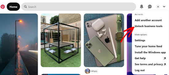
First, you need to log into your Pinterest account and click on the down arrow at the top right corner of your screen. Next, click on the ‘Unlock business tools’ option.
Click the Unlock business tools option

On the next screen, you will see a list of features the business account will offer. To use these features, click the ‘Switch to business’ button.

Select the Switch to business button

After that, enter your business account details like a profile name, website URL, country, and language. Once you have entered all these details, click the ‘Next’ button.

Build your profile

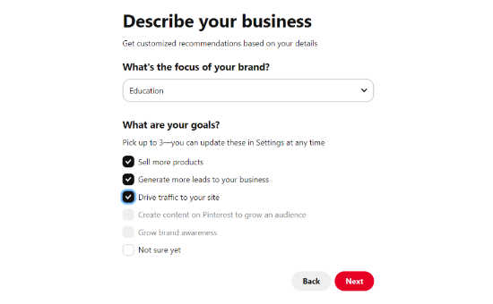
Pinterest will now ask you to describe your business. You can select an industry from the drop-down menu and pick 3 goals from the given options. After that, click the ‘Next’ button.
Describe your business

Now select an option to get customized recommendations and click the ‘Next’ button.

Get customized recommendations

On the next screen, you can select an option if you are interested in advertising on Pinterest and then click the ‘Next’ button. For the sake of this tutorial, we selected the ‘No, I am not planning to advertise’ option.

Planning to run Pinterest ads

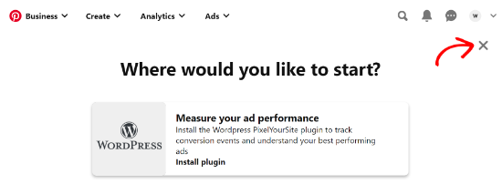
Next, Pinterest will show you different options to get started with your business account. You can click the ‘cross’ icon in the top right corner to skip this part.
Where would you like to start

Step 2. Claim Your Website on Pinterest

The next step is to claim your website on Pinterest.

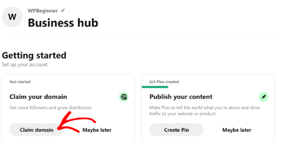
To do that, you can click on the ‘Claim domain’ button from your Pinterest Business hub page, and it will directly take you to the claim settings page.
Claim domain in Pinterest

Another way to claim your website is by clicking on the down arrow in the top right corner and selecting the ‘Settings’ option. Then head over to the ‘Claim’ section in the left menu.

To get the credit for your content on Pinterest, click the ‘Claim’ button for Websites.
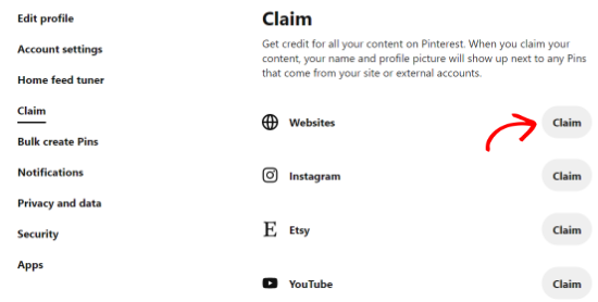
Click websites claim

Once you click the button, a popup window will appear with three options to claim your WordPress website.

Choose how you want to claim

We are choosing the ‘Add HTML tag’ option because it is the easiest.

However, if you prefer, you can choose the other option where you download the HTML file and upload it to your website’s root directory using an FTP client or your WordPress hosting file manager.

Alternatively, you can also add a verification record to your domain settings using your domain registrar.

Step 3. Add HTML Tag to Your WordPress Website

There are multiple ways to add an HTML tag to your website’s header, but we will only cover the two easiest methods.

First, you can use the All in One SEO (AIOSEO) WordPress plugin and enter the HTML tag to your website. For more details, follow our guide on how to install a WordPress plugin.

AIOSEO is the best SEO plugin for WordPress and makes it very easy to optimize your site for search engines without hiring an expert.

While we recommend the Pro version, you can also use the free version of AIOSEO to add Pinterest verification.

To add the HTML tag, go to All in One SEO » General Settings and then click the ‘Webmaster Tools’ tab from the top menu.

After that, click the ‘Pinterest Site Verification’ block.

AIOSEO Webmaster Tools

Now enter the HTML tag you copied in the previous step in the Pinterest Site Verification field and click the ‘Save Changes’ button.

Enter Pinterest Verification Code

Aside from using AIOSEO, another way of adding the HMTL tag is by installing and activating Insert Headers and Footers plugin.

Upon activation, you need to visit Settings » Insert Headers and Footers page in your WordPress admin area. In the Scrips in Header section, you need to paste the HTML tag and click on the Save button.
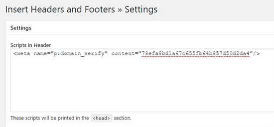
Insert HTML tag in header script section

Once the HTML tag is added in your website’s header section, you need to go back to the Pinterest screen and click on the Continue button in the popup.

It will now ask you to enter the URL of your website and then click the ‘Verify’ button.

Verify your site in Pinterest

Once you do that, you will see a message saying ‘Verification in progress.’ Normally, the process takes 24 hours, and you get an email about your website’s verification.
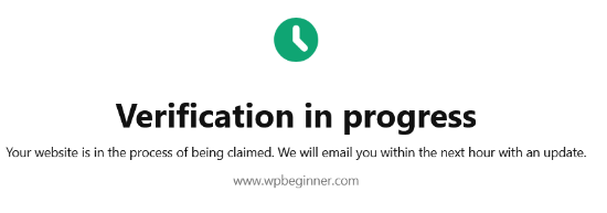
Verification in progress

That is it, you have now successfully verified your WordPress website on Pinterest.

Tip: If Pinterest fails to verify after you’ve added the verification code, then it means you need to clear your WordPress cache.

We hope this article helped you learn how to verify your WordPress site on Pinterest. You may also want to see our expert pick of the must-have WordPress plugins for your website, and our comparison of the best business phone services for small business.

If you liked this article, then please subscribe to our YouTube Channel for WordPress video tutorials. You can also find us on Twitter and Facebook.

The post How to Verify Your WordPress Site on Pinterest (Step by Step) appeared first on WPBeginner.

Inline Styles as Classes (lol)

Category Image 091

If you’re abhorred by using inline styles, just move that style to the class attribute! And then make sure you have CSS in place that, ya know, does what it says on the box.

OK lemme dig in and totally ruin the joke.

  • First off, it’s a joke, so don’t actually do this. I don’t even mind the occasional inline style for one-off stuff, but this is not that.
  • To me the weirdest part is that period (.) character. Escaping the more unusual characters with a backslash () feels normal, but what is that period about? UPDATE: It’s because of the space. It’s two classes in the HTML, not one. Derp.
  • The little period trick there doesn’t work when the following character is a number (e.g. .padding:.1rem;). UPDATE: Because classes that start with a number are invalid. Derp.
  • You can avoid the escaping and trickery if you go with an attribute selector like [class*="display: flex;"].
  • This reminds me of Mathias Bynens’ research: CSS character escape sequences. But… that doesn’t seem to work anymore? I wonder if browsers changed or if the tool broke and doesn’t output what it should anymore (e.g. does .color\3A \ #f06d06 look right?).

Here’s all that playing around:


The post Inline Styles as Classes (lol) appeared first on CSS-Tricks.

You can support CSS-Tricks by being an MVP Supporter.

Useful and Useless Code Comments

Category Image 052

Jim Nielsen:

If somebody says a comment isn’t adding any value, I would ask: to whom?

Personally, I’ve never liked the advice that writing obvious comments is bad practice—probably because I write obvious comments all the time.

Jim showed off some examples of “code comments that are at the same level of fidelity as the code itself.” Those are the hardest calls with code comments.

// this function adds two numbers
function add(a, b) {
  return a + b;
}

Easy to point at that and call it not useful. I tend not to leave this type of comment, but it’s fair play for Jim to question that. Comments can be used for a wide swath of people whom may at some point interact with that code, so why gate-keep it?

[…] comments can serve a very different purpose when they’re being read vs. when they’re being written. Those are almost two different kinds of activities.

I’d add they serve a different purpose when re-visiting old code vs actively working. Also different when you’re trying to code review versus directly contribute.

Direct Link to ArticlePermalink


The post Useful and Useless Code Comments appeared first on CSS-Tricks.

You can support CSS-Tricks by being an MVP Supporter.

#320: Andy and Una from Google’s Learn CSS Project

Category Image 052

Learn CSS is a very cool project from a whole team of people at Google (and outside). It does a great job of documenting where is right now, in a fairly comprehensive way. Learn CSS was spearheaded by Una Kravets and Andy Bell did the bulk of the writing, so they are two extra-special guests to have on the show to talk about it. Why CodePen Radio though? Because there are literally hundreds of Embedded Pens used in this course, all using a style guide base and are live editors in the site itself. Cool!

Time Jumps

  • 00:55 What is Learn CSS?
  • 03:07 Who’s idea was this?
  • 08:08 Sponsor: WooCommerce
  • 09:17 Snapshot of now and the future of CSS
  • 12:55 Quality content and course creation
  • 17:51 Using CodePen for demos
  • 19:27 Shared stylesheet for a design system
  • 24:06 Native CSS only
  • 26:58 How difficult was it to sell Google on this?

Sponsor: WooCommerce

WooCommerce supports Apple Pay at checkout now, which is a nice thing to offer. Some people have pretty strong preferences for how they pay online, and it’s best to meet them there rather than force one particular payment method.

The post #320: Andy and Una from Google’s Learn CSS Project appeared first on CodePen Blog.

How a CodePen Support Ticket Turned into a Great Conversation

Featured Imgs 23

A nice story from Heather Burns on how she helped us improve the accessibility and usability of Embedded Pens.

We had an ongoing email exchange with Chris for about a month. He and his talented team made changes that improved the accessibility of ALL embedded CodePens. AND without requiring the authors of the pens or the page to make changes!

The post How a CodePen Support Ticket Turned into a Great Conversation appeared first on CodePen Blog.

Dark Sky Extends API Lifespan Until End of 2022

Featured Imgs 23

When Apple announced in mid-2020 that it would acquire the popular weather app Dark Sky, developers knew that it was only a matter of time before they would need to find a new source for weather data. Soon after, Apple announced that the API would be taken down at the end of 2021. That deprecation date is now being pushed back until the end of 2022.