Google has announced that it is updating the Google Calendar API rate limiting and monitoring schedule in an effort to better manage usage fallout after passing imposed limits. Previously the rates were monitored daily, allowing for prolonged downtime if usage was poorly managed.
udio src=”audio/test-audio.ogg” controls autoplay>
I want to hear that
[Fixed] Database in Recovery Mode SQL Server 2014
Summary
This post discusses the instances that put a SQL Server 2014 database in recovery mode and what causes the database to get stuck in recovery. Also, it discusses the methods to restore the database.
You may find a SQL Server 2014 database in recovery mode when you restart the SQL Server service or restore a database from SQL Server Management Studio (SSMS). Also, a database goes into recovery mode if you restart a system abnormally. The database goes into recovery in such a scenario until all the active transactions are committed or rolled back. Let the recovery process complete, and the database comes back online.
Clove: A Showcase of Block Patterns by Anariel Design
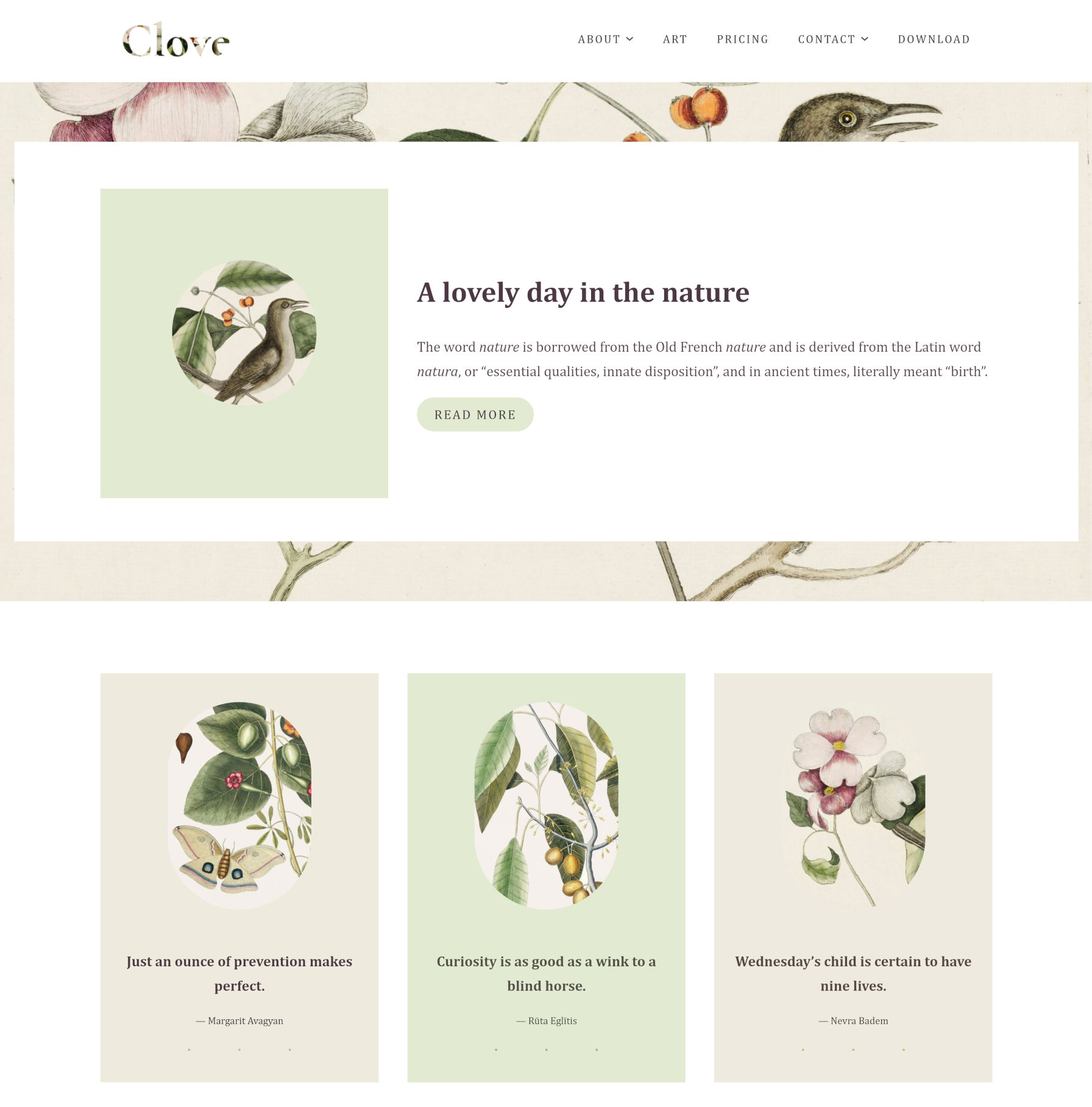
Earlier today, Ana Segota tweeted and announced via the Anariel Design blog that her company had submitted its second block-based theme to WordPress.org. Clove is a more well-rounded follow-up to her first such theme, Naledi. It is currently under review for inclusion in the official directory, but anyone can give it a test run by snagging the ZIP file from its ticket. Or, just peruse the live demo.
This should officially be the 10th block-based theme to go live in the WordPress.org theme directory (note that a couple by Automattic are not tagged). That is assuming all goes well during the review process.
It has been a long road thus far, but 10 themes with the Full Site Editing tag is a notable milestone. The Q theme by Ari Stathopoulos was the first to land in the directory back in October 2020. Now, eight months later, there is still room for other theme authors to become pioneers in the space. With almost no competition, who will design that first block theme that squeezes its way into the most popular list?
If “practice makes perfect,” Segota is now ahead of the curve by pushing her second theme to the directory. This makes her theme company only one of two with multiple block themes.
Clove is experimental, as all block themes are. It relies on the ever-shifting parts of the Gutenberg plugin, but it all comes together into a floral, nature-themed design. There are hints of inspiration from Twenty Twenty-One, but it feels more structured, less chaotic.
The design is less of a theme and more of a showcase of block patterns and styles. Even on the template level, it reuses those same elements across each of its seven templates, providing multiple entryways for users to tinker with its features.
Clove even includes pricing columns. I seem to recall writing about how theme authors could implement them via patterns just over a month ago. Maybe the Anariel Design team came to the same conclusion. Maybe they took my message and ran with it. I like to think the latter is true. Either way, the result is a beautiful, theme-specific pattern — the sort of artistry that is tough to achieve from a plugin.
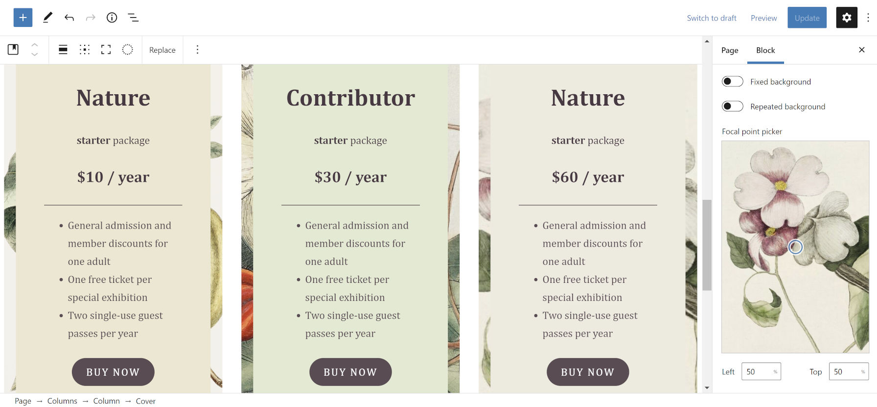
I am less of the fan of the overlapping and uneven columns in some of the designs designs, preferring some of the more-structured patterns, such as Three Quotes Images:
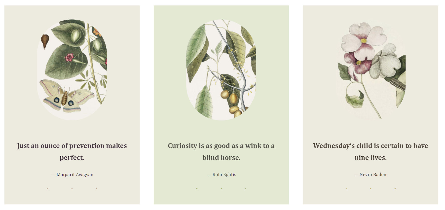
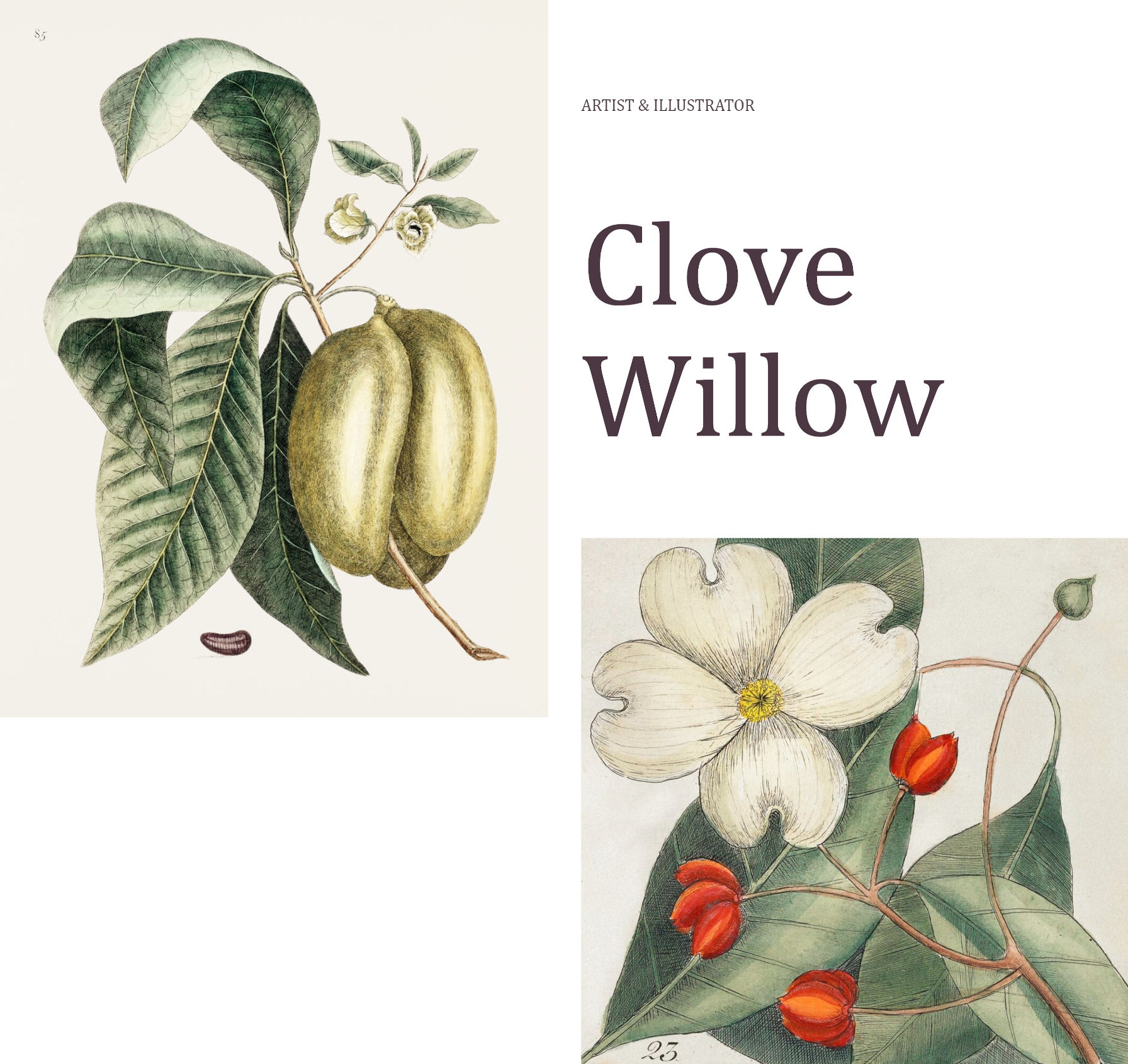
Despite my general dislike of the uneven column style, my favorite piece of the entire theme is the Illustrations page template, which leans into that design method.
The page intro section is an announcement to the world, “Hey, check out my work.”
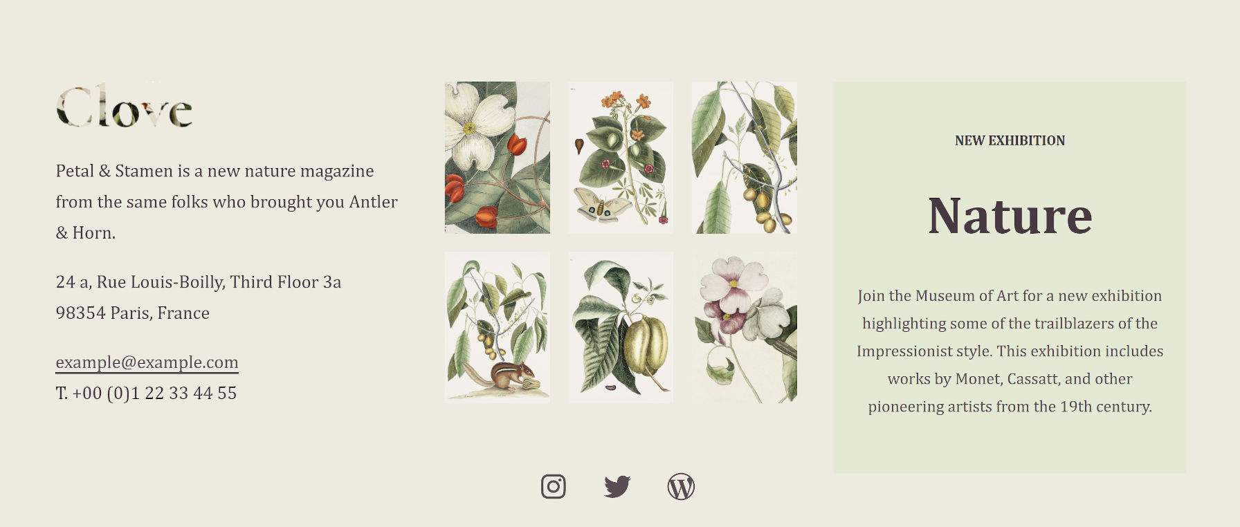
I also like the Illustrations page template’s widgets-like area in the footer. It manages to stuff several blocks in without feeling too crowded. It even showcases a box for artists to highlight their next exhibition.
The Clove theme also registers 10 block styles for users to choose from. Most of them add different types of borders or frames to various elements. Plus, there is the fun-but-kind-of-an-oddball blob “Shape” for images.
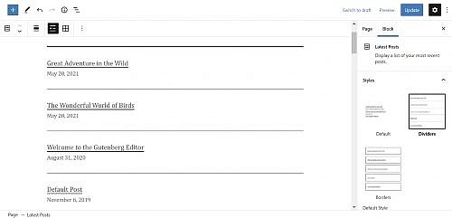
Latest Posts – Dividers 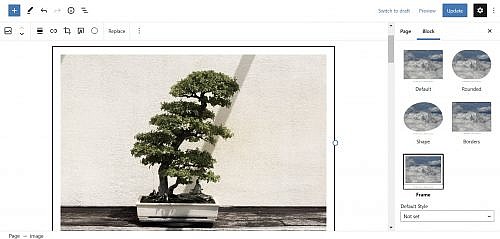
Image – Framed 
Image – Shape
Segota was one of several people to submit custom designs to the upcoming block pattern directory. There is some noticeable crossover between her current theme work and submissions, such as the Playful Gallery pattern that did not quite make the cut. Others, like her Recipe design, did. There is still an open invitation for people to contribute.
I am always like a kid in a toy store when a new block theme comes along, reaching out to grab the latest gadget. I want to see more experiments like Clove. Keep them coming, theme authors.
Side note: For people interested in the background-clipped text design used in Clove’s site logo, I opened a ticket to take us one step closer to doing it in the editor. Currently, users must create an off-site image and upload it.
GoPro Launches API Platform for HERO9 Black Camera Integration
GoPro, a provider of video cameras that are most known for their use in capturing extreme sports, has released a new API platform dedicated to supporting the company’s latest product release. The Open GoPro API Initiative is available today and can be leveraged in connection with GoPro HERO9 Black cameras.
TablesNG — Improvements to table rendering in Chromium
When I blogged “Making Tables With Sticky Header and Footers Got a Bit Easier” recently, I mentioned that the “stickiness” improvement was just one of the features that got better for <table>s in Chrome as part of the TablesNG upgrade. I ain’t the only one who’s stoked about it.
But Bramus took it the rest of the nine yards and looked at all of the table enhancements. Every one of these is great. The kind of thing that makes CSS ever-so-slightly less frustrating.
Just the writing-mode stuff is fantastic.
Direct Link to Article — Permalink
The post TablesNG — Improvements to table rendering in Chromium appeared first on CSS-Tricks. You can support CSS-Tricks by being an MVP Supporter.
Using Performant Next-Gen Images in CSS with image-set
The CSS image-set() function has been supported in Chromium-based browsers since 2012 and in Safari since version 6. Support recently landed in Firefox 88. Let’s dive in and see what we can and can’t do today with image-set().
Multiple resolutions of the same image
Here’s what the CSS spec has to say about image-set():
Delivering the most appropriate image resolution for a user’s device can be a difficult task. Ideally, images should be in the same resolution as the device they’re being viewed in, which can vary between users. However, other factors can factor into the decision of which image to send; for example, if the user is on a slow mobile connection, they may prefer to receive lower-res images rather than waiting for a large proper-res image to load.
It’s basically a CSS background equivalent to the HTML srcset attribute for img tags. By using image-set we can provide multiple resolutions of an image and trust the browser to make the best decision about which one to use. This can be used to specify a value for three different CSS properties: content, cursor, and most useful of all, background-image.
.hero {
  background-image: image-set("platypus.png" 1x, "platypus-2x.png" 2x);
}
1x is used to identify the low-res image, while 2x is used to define the high-res image. x is an alias of dppx, which stands for dots per pixel unit.
Chrome/Edge/Opera/Samsung Internet currently require a -webkit- prefix. If you’re using Autoprefixer, this will be handled automatically. Safari no longer requires the prefix but uses an older syntax that requires a url() function to specify the image path. We could also include a regular old background-image: url() to support any browsers that don’t support image-set.
.hero {
  /* Fallback */
  background-image: url("platypus.png");

  /* Chrome/Edge/Opera/Samsung, Safari will fallback to this as well */
  background-image: -webkit-image-set(url("platypus.png") 1x, url("platypus-2x.png") 2x);

  /* Standard use */
  background-image: image-set("platypus.png" 1x, "platypus-2x.png" 2x);
}
Now users on expensive fancy devices will see a super sharp image. Performance will be improved for users on slow connections or with cheaper screens as their browser will automatically request the lower-res image. If you wanted to be sure that the high-res image was used on high-res devices, even on slow connections, you could make use of the min-resolution media query instead of image-set. For more on serving sharp images to high density screens, check out Jake Archibald’s recent post over on his blog.
That’s pretty cool, but what I really want is to be able to adopt the latest image formats in CSS while still catering for older browsers…
New image formats
Safari 14 shipped support for WebP. It was the final modern browser to do so which means the image format is now supported everywhere (except Internet Explorer). WebP is useful in that it can make images that are often smaller than (but of the same quality as) JPG, PNG, or GIF.
There’s also a whole bunch of even newer image formats cropping up. AVIF images are shockingly tiny. Chrome, Opera and Samsung Internet have already shipped support for AVIF. It’s already in Firefox behind a flag. This image format isn’t supported by many design tools yet but you can convert images to AVIF using the Squoosh app built by the Chrome team at Google. WebP 2, HEIF and JPEG XL might also make it into browsers eventually. This is all rather exciting, but we want browsers that don’t support these newer formats to get some images. Fortunately image-set() has a syntax for that.
Using new image formats by specifying a type
Browser support note: The feature of image-set that I’m about to talk about currently has pretty terrible browser support. Currently it’s only supported in Firefox 89.
HTML has supported the <picture> element for years now.
<picture>
  <source srcset="./kitten.avif" type="image/avif">
  <img src="./kitten.jpg" alt="a small kitten">
</picture>
image-set provides the CSS equivalent, allowing for the use of next-gen image formats by specifying the image’s MIME type:
.div1 {
  background-image: image-set(
    "kitten.avif" type("image/avif"),
    "kitten.jpg" type("image/jpeg")
  );
}
The next-gen image goes first while the fallback image for older browsers goes second. Only one image will be downloaded. If the browser doesn’t support AVIF it will ignore it and only download the second image you specify. If AVIF is supported, the fallback image is ignored.
In the above example we used an AVIF image and provided a JPEG as a fallback, but the fallback could be any widely supported image format. Here’s an example using a PNG.
.div2 {
  background-image: image-set(
    "puppy.webp" type("image/webp"),
    "puppy.png" type("image/png")
  );
}
In Chromium and Safari, specifying the type is not supported yet. That means you can use image-set today only to specify different resolutions of widely-supported image formats but not to add backwards-compatibility when using WebP or AVIF in those browsers. It should be possible to provide both multiple resolutions and multiple image formats, if you are so inclined:
.div2 {
  background-image: image-set(
    "puppy.webp" type("image/webp") 1x,
    "puppy2x.webp" type("image/webp") 2x,
    "puppy.png" type("image/png") 1x,
    "puppy2x.png" type("image/png") 2x
  );
}Hopefully browser support will improve soon.
Using <picture> for backgrounds instead
Maybe you don’t need background-image at all. If you want to use modern image formats, you might be able to use the <picture> element, which has better browser support. If you set the image to position: absolute it’s easy to display other elements on top of it.
As an alternative approach to using position: absolute, CSS grid is another easy way to overlap HTML elements.
The post Using Performant Next-Gen Images in CSS with image-set appeared first on CSS-Tricks. You can support CSS-Tricks by being an MVP Supporter.
“Weak declaration”
PPK looks at aspect-ratio, a CSS property for layout that, for the most part, does exactly what you would think it does. It’s getting more interesting as it’s behind a flag in Firefox and Safari now, so we’ll have universal support pretty darn soon. I liked how he called it a “weak declaration” which I’m fairly sure isn’t an official term but a good way to think about it.
This will produce a 16 / 9 element:
.movie-card {
  aspect-ratio: 16 / 9;
}
This will too:
.movie-card {
  width: 50%;
  aspect-ratio: 16 / 9;
}
But this won’t:
.movie-card {
  width: 150px;
  height: 150px;
  aspect-ratio: 16 / 9;
}
Because you’ve explicitly set the height and width, that is what will be respected. The aspect-ratio is weak in that it will never override a dimension that is set in any other way.
And it’s not just height and width, it could be max-height that takes effect, so maybe the element follows the Aspect ratio sometimes, but will always respect a max-* value and break the Aspect ratio if it has to.
It’s so weak that not only can other CSS break the Aspect ratio, but content inside the element can break it as well. For example, if you’ve got a ton of text inside an element where the height is only constrained by aspect-ratio, it actually won’t be constrained; the content will expand the element.
I think this is all… good. It feels intuitive. It feels like good default behavior that prevents unwanted side effects. If you really need to force an Aspect ratio on a box with content, the padding trick still works for that. This is just a much nicer syntax that replaces the safe ways of doing the padding trick.
PPK’s article gets into aspect-ratio behavior in flexbox and grid, which definitely has some gotchas. For example, if you are doing align-content: stretch;—that’s one of those things that can break an Aspect ratio. Like he said: weak declaration.
The post “Weak declaration” appeared first on CSS-Tricks. You can support CSS-Tricks by being an MVP Supporter.
How to Find a User Interface-Friendly WordPress Theme
WordPress is responsible for powering millions of sites that we see today on the Internet, which has certainly grown exponentially since its birth in 1983. As of March 2021, there are 1.84 billion websites active...
The post How to Find a User Interface-Friendly WordPress Theme appeared first on 85ideas.com.
How to Market Your Plumbing Business Online and Increase Traffic to Your Website
Owning a plumbing business in this digital age entails the need for you to create a solid online presence. In this way, you will be able to promote your services and reach your target market....
The post How to Market Your Plumbing Business Online and Increase Traffic to Your Website appeared first on 85ideas.com.
Nine SEO Tips When Using Images
Whether you’re writing a blog post or creating new pages on your website, images are essential. Not only do they help capture audience attention and improve user experience, but photographs also offer a valuable SEO...
The post Nine SEO Tips When Using Images appeared first on 85ideas.com.
Are we in a new era of web design? What do we call it?
Una is calling it the new responsive. A nod to the era we were most certainly in, the era of responsive design. Where responsive design was fluid grids, flexible media, and media queries, the new responsive is those things too, but slotted into a wider scope: user preference queries, viewport and form factor, macro layouts, and container styles.

I like the thinking and grouping here and I kinda like the name. It eludes to an evolution and extension of responsive web design rather than a rejection and replacement.
This isn’t the first crack at identifying and naming a shift between eras. Back in 2018, Jen Simmons was doing a talked called “Everything You Know About Web Design Just Changed” where she identified that responsive design was a major shift in how we did layout on the web. And yet, it was firmly defined in an era where layout tools like flexbox and grid didn’t even exist. Now, they do exist, and with them a bevy of other new features that bring more capable graphic design to the web. She called it Intrinsic Design.
I almost like Intrinsic Design more now than I did in 2018, because now, if we attempt to lump in @container queries, the name makes more intuitive sense. We (hopefully will soon) make styling choices based on the intrinsic size of elements. We make styling choices based on the intrinsic nature of the individual users we serve. We make styling choices off the intrinsic qualities of the browser.
I wouldn’t say either of the terms have really caught on though. It’s hard to make a name stick. That little burst of ideating around CSS4 sure didn’t go anywhere.
Direct Link to Article — Permalink
The post Are we in a new era of web design? What do we call it? appeared first on CSS-Tricks. You can support CSS-Tricks by being an MVP Supporter.
Be: The Fastest and Easiest Way to Build Your Portfolio Site
The website for your design business should not only explain who you are and what you do, but show off the impressive body of work you’ve created. It’s the strongest tool in your sales and marketing arsenal.
But as a web designer, you know how long it can take to build a really great website for a client. If you’re ready to start attracting awesome leads and adding new clients to your business now, you might not want to spend that much time building your portfolio site.
The good news is that you don’t have to.
BeTheme’s new Muffin Builder is like upgrading from a Ford to a Ferrari. You’ll be shocked at how quickly you get your website to the finish line — and with superior results, no less.
Let’s take a closer look:
New Muffin Builder features that’ll knock your socks off
Time is money when you’re a web designer. So, it’s important to build a portfolio site and get it online as soon as possible.
Here are 6 features from the new Muffin Builder (and BeTheme) that will enable you to quickly and painlessly create something you’re proud of and that will undoubtedly impress prospective clients:
Feature #1: A professional-looking portfolio site already built for you
There are certain pages and features every portfolio should have: An attractive home page, convincing client testimonials, a selection of works, and so on.
But just because the structure of your site will mirror other portfolio sites, that doesn’t mean it has to look like everyone else’s.
As of today, BeTheme has over 600 pre-built sites, with dozens of portfolio site options to choose from:
While these portfolio sites might be built for different types of creatives, pay attention to the different styles. Whether you want to give your site a futuristic edge or you want to infuse the design with some femininity, you’ll find the perfect portfolio-equipped site for your business here.
What’s more, each pre-built portfolio site is compatible with Muffin Builder, so you’ll have the added benefit of being able to edit your pre-built site with this powerful website builder.
Feature #2: Intuitive customization options
Realistically, you could have a new portfolio site designed and loaded into WordPress in under a minute with BeTheme.
While each site comes with well-chosen imagery and helpful placeholder text, you’ll still need to customize the content and maybe even tweak the design in order to make it your own.
Once you’re inside the new and improved Muffin Builder, you’ll see how easy this is to do.
The first customization feature to take advantage of is the global settings editor, which you’ll find under Betheme > Theme Options in WordPress:

Quickly update colors, fonts, layouts, and styles and apply them globally to the site from this panel.
To make changes on a smaller scale, use the Muffin Editor within your Pages. The section toolbar will allow you to make adjustments to each container:
You have the same level of control over the content within each block. The settings you find here all depend on what kind of content is in the block. For example:
You have the flexibility to customize your content however you prefer: Use the text editor or take advantage of Muffin Builder’s predefined settings.
Feature #3: Importable and reusable section templates
It’s not just the base of your site that’s already built for you with BeTheme.
Let’s say you’ve imported a great-looking portfolio pre-built site like Portfolio 2:

You like the current layout of the About us page on this site, but you want to add a Google reviews section between the “My offer” and “How I work” sections.
With the Muffin Builder, you can easily import pre-built sections using the icon on the right toolbar or by clicking “Pre-built sections” when you add a new section to the page:

Chances are good that whatever you envisioned adding to the page can be found there. Like this:

As you can see, it’s all placeholder content. That said, the structure and design are taken care of, so all you need to do is fill in the content.
Feature #4: Custom layouts and headers
Pre-built sites are a great starting point. In many cases, you can use them right out of the box.
However, if you want to alter the layout across the site or on a specific page or two, Muffin Builder can help you make those adjustments:
Under the Layouts section in WordPress, set up your custom layout — which includes changing the header, too, if you prefer — and save it.
To apply it to your pages, scroll down below the Muffin Builder on each page and select the layout from the list:

This way, you’re not just empowered to swap out your content for BeTheme’s placeholder content. With Muffin Builder, you get to customize as much or as little of the pre-built site as you want.
Feature #5: Backup and restoration
It’s not uncommon to “sleep on it” and decide you liked the way the site looked or the way you wrote something previously.
Thanks to the Muffin Builder’s revision panel and backups, you can quickly and painlessly roll back your portfolio site.
First, open the revisions panel:

Then choose the revision (if there’s more than one) you want to restore:

If you’ve ever stressed about an update you made to your portfolio and wished you could instantly go back to the way it was before, this new Muffin Builder feature is going to be a lifesaver.
Coming soon: The Front-end builder
If you prefer to design from the front-end of the website, a new Muffin Builder feature will be headed your way the Summer of 2021:

There are a number of reasons why many website builder tools (including WordPress’s own Gutenberg) have a front-end editing experience:
- It saves you the trouble of having to switch between the editor and website preview to check your work.
- Some people prefer to do their editing within the full context of the website as it’s easier to make decisions when looking at the big picture.
- It’s more client-friendly than the typical backend editor, so this feature can empower your clients and other non-tech-savvy users to make tweaks to their sites.
If you’ve been looking for a live visual editor to use in WordPress, this new feature is just around the corner!
The fast and easy way to build a portfolio: BeTheme + Muffin Builder
If you’re looking for a fast and easy way to build your digital portfolio, the solution is obvious:
Start with a beautiful BeTheme pre-built site and then customize it with the intuitive Muffin Builder.
Who knows? This potent combo could end up changing the way you build websites for your clients going forward.
The post Be: The Fastest and Easiest Way to Build Your Portfolio Site appeared first on Codrops.
How to make class
How to make class named person
How to Choose Content Layout for Your WordPress Blog: Attract and Retain Visitors With a Beautiful Layout
Today, we will explain the importance of the look of your blog depending on the topic and purpose of the blog itself. When it comes to WordPress, you can often hear the term content layout....
The post How to Choose Content Layout for Your WordPress Blog: Attract and Retain Visitors With a Beautiful Layout appeared first on 85ideas.com.
W3C Announces Web Audio API Standard
The World Wide Web Consortium (W3C), an international standards organization that manages internet protocols, has announced that the Web Audio API is now an official standard. This designation signifies that W3C has vetted the technology in an industry-inclusive manner that is intended to accelerate adoption.
This Week In Web Design – June 18, 2021
Does Your Website Need a Blog?
No matter what type of business you might have, you should consider adding a blog to your website. Having a blog is an essential part of any business, and it can have some fantastic benefits...
The post Does Your Website Need a Blog? appeared first on 85ideas.com.


