A balanced tree is one of the data access techniques in a database. How does it work? How
data can be inserted in. How data can be deleted from it; how data can be updated? And
how data can be reviewed? By giving an example explain all of them. Your report must
be prepared as seen in the following template.
Here is the template of the report:
Steps Actions
1 Name of the report and date
2 Author of the report
3. Literature review
4. Your contribution
5 Explanation of each process as detail as much on figures.
6 Summary
7. Future advice
8. References
Ultimate Guide to WordPress Categories & Tags
 So you’ve started your own WordPress website and you can’t wait to publish your first blog post. There’s only one small problem: you can’t decide whether you should add categories or tags to your blog post… or maybe both? You’re not alone. Many bloggers get confused by WordPress categories and tags so in today’s post, […]
The post Ultimate Guide to WordPress Categories & Tags appeared first on WPExplorer.
Divide arraylist of 750 into 150 sub arraylist
I have an ArrayList of 750 elements I would like to divide that ArrayList into 150 subarraylists so 5 elements to each subarraylist.
I have this code but it not working
while (scanner.hasNextLine()) {
            String t = scanner.nextLine();
            String[] ar = t.split(",");

            for (int i = 0; i < ar.length; i++)
            {
                add.add(Double.parseDouble(ar[i]));
}I need some help with C error
codeblocks-ld-exe-cannot-find-lbgi-error-message
How to Search By Category in WordPress (2 Ways)
Do you want to add category specific search in WordPress?
Adding a search by category feature to WordPress lets your visitors quickly find what they’re looking for. You can add options to search specific blog categories, product categories, and more.
In this tutorial, we’ll show you how you can add a search by category feature to your WordPress site.
Why Add Search By Category to WordPress?
A search by category feature allows your visitors to search specific website categories.
If you have a lot of content, then categories can help organize your content and make it easier for your visitors to find what they’re looking for.
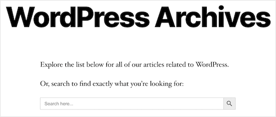
You can add a category search feature to your archive pages to help your visitors quickly find what they’re looking for.
Category search can also be added to your online store, so visitors can quickly find the exact products they want.
Overall, this offers your visitors a better onsite experience and can help your WordPress website give off positive SEO signals like increased dwell time and lower bounce rate.
The best way to add a category search feature is by using a WordPress plugin.
We’re going to share two different WordPress search plugins that can help you customize WordPress search. Simply use the quick links below to choose the type of WordPress category search you want to add.
Method 1: Using SearchWP to Add Category Select Search Form to WordPress
SearchWP is the best search plugin for WordPress. It’s very easy to use and lets you add a category selection feature, giving your users control over their search results.
First, you need to install and activate the SearchWP plugin. For more details, see our step by step guide on how to install a WordPress plugin.
Upon activation, navigate to Settings » SearchWP. This brings up the main search settings menu.
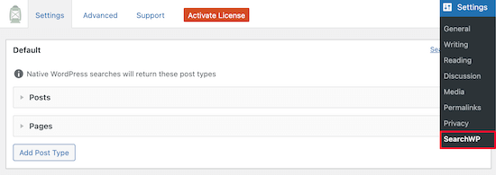
You can adjust the search engine settings by clicking on ‘Posts’, ‘Pages’, or ‘Library’ drop downs.
Changing the ‘Weight Multiplier’ sliders customizes how the search engine values content. If you want the search engine to value page content higher than the title, then adjust the slider accordingly.
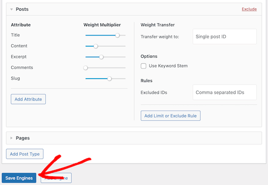
Once you’re done, make sure you click the ‘Save Engines’ button to generate your first search engine.
Next, we’re going to customize the search form to add a category selection option, so your visitors can decide which category they want to search.
To do this, you’ll need to add code to your WordPress files. If you haven’t done this before, then check out our guide on how to copy and paste code in WordPress.
You’ll need to copy and paste the following code and add it to your functions.php file, in a site-specific plugin, or by using a code snippets plugin.
function my_searchwp_get_search_form_with_categories_dropdown( $form ) {
	ob_start(); ?>
		<form role="search" method="get" class="search-form" action="<?php echo home_url( '/' ); ?>">
			<label>
				<span class="screen-reader-text">Search For</span>
				<input type="search" class="search-field" placeholder="Search..." value="<?php echo esc_attr( get_search_query() ); ?>" name="s" title="Search for:" />
			</label>
			<?php
				// for more information see http://codex.wordpress.org/Function_Reference/wp_dropdown_categories
				$swp_cat_dropdown_args = array(
						'show_option_all'  => __( 'Any Category' ),
						'name'             => 'swp_category_limiter',
					);
				wp_dropdown_categories( $swp_cat_dropdown_args );
			?>
			<input type="submit" class="search-submit" value="Search" />
		</form>
	<?php return ob_get_clean();
}

add_filter( 'get_search_form', 'my_searchwp_get_search_form_with_categories_dropdown' );
This code modifies the search form on your WordPress blog, and gives users a drop down box to select their preferred category.
After the code is added you can view any of your search forms, and you’ll see that a category search drop down has been added.
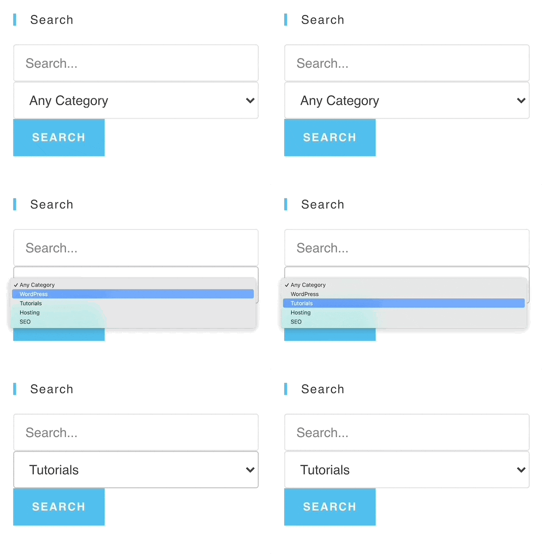
You also use SearchWP to customize your WooCommerce product search pages. For more details, see our guide on how to make a smart WooCommerce product search.
Method 2: Using Ivory Search to Add Search By Category Form to WordPress
Ivory Search is another popular WordPress search plugin. It’s very easy to use and helps you simply control search categories across WordPress.
First thing you need to do is install the plugin. For more details, see our guide on how to install a WordPress plugin.
Once the plugin is activated, you’ll have a new WordPress menu item called ‘Ivory Search’.
Go to Ivory Search » Search Forms, then click the ‘Add New Search Form Button’.

Now it’s time to start building your category search form.
First, give your search form a name. This name will not appear when you add the search feature to your website. It’s only for admin purposes.
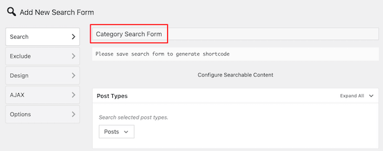
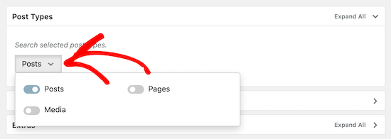
Next, click the drop down in the ‘Post Types’ meta box. This brings up a menu to select the type of content you want to allow. You can add Posts, Pages, and Media to the search.
You can simply enable the toggle for the content types you want to allow.
After that, click the ‘Posts’ option to bring up the expanded menu. Then, turn on the ‘Search posts of only selected taxonomies’ toggle.
This allows you to select the WordPress categories you can add to search.
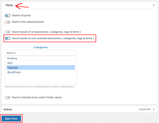
Once you’ve selected the category or categories, click the ‘Save Form’ button.
Now, under your search form title, copy the shortcode and paste it into a text file.

This shortcode gives you the flexibility to add WordPress category search to any page, post, or widgetized area of your website.
All you have to do now is open the post, page, or widget where you want to add your category search and paste your shortcode. For more details, see our guide on how to add a shortcode in WordPress.

After you click ‘Save’, the post or page will now have your active category search form.
You can add this shortcode to as many areas of your site as you’d like.

When a user searches with this form, they’ll only be able to view posts within the selected category.
In this case, visitors will only be able to view posts from the ‘Tutorials’ category.
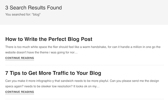
If you want to create multiple different category searches, then follow the steps above to create another search form and embed the new shortcode into your site.
We hoped this article helped you add search by category in WordPress. You may also want to see our expert pick of the best WordPress plugins for businesses, and our comparison of the best email marketing services.
If you liked this article, then please subscribe to our YouTube Channel for WordPress video tutorials. You can also find us on Twitter and Facebook.
The post How to Search By Category in WordPress (2 Ways) appeared first on WPBeginner.
A Laptop and a Dream: Your Home Office Should Meet Your Needs

I began my journey into remote work while teaching English as a Second Language (ESL) in South Korea. I was 23 years old at the time. By day, I spent my time wrangling elementary and middle-school kids. At night, I was writing tutorials, building themes and plugins, and taking any work that landed on my [figurative] desk.
My home office was my entire home, a spartan, one-bedroom/living/kitchen apartment. My workstation was a bed with several pillows piled up for back support.
My first client contract was signed, developed, and completed on that bed. I made a mere $300 for creating a per-post thumbnail system for a popular blog (yes, I way undervalued my work). This was long before WordPress launched its featured image system.
I was living the dream. Young and hungry, I took whatever odd jobs I could in preparation for eventually running my own WordPress-related business. Some nights, I would put in eight hours or more. On the weekends, I rarely actually slept in that bed. It had become my office chair. My lap was my desk.
In the back of my mind, I suppose I always thought I would get a proper office. It would have all the bells and whistles like separate monitors for different tasks instead of tabs on a single screen. I would have the best mic and speaker setup — including the kitchen sink.
After nearly a decade and a half, I realized I never needed all of that stuff. My laptop and I got along just fine. Of course, like many people, I tend to get stuck in my ways, looking for any excuse to not change.
When I see articles like “It’s been a year. Here’s what your home office should look like,” written by Kathryn Vasel for CNN Business, I tend to cringe before diving into it. There are some good takes in the article, such as getting natural light, taking breaks, and adjusting your posture.
My idea of “what your home office should look like” is that it should be what makes you feel comfortable with the tools that allow you to do the job. For some folks, that is a laptop and a standing desk. For others, it includes specialized audio and video equipment.
If you can afford it, I would at least recommend getting a good office chair. If you sit at a desk much of the day, skimp on the desk and other tools first.
On the subject of affordability, it is also good to be mindful that a home office is a luxury, a privilege that few have. Like that small-town Alabama boy with his $400 Walmart computer in Korea, sometimes people just have to get by with what they have on hand.
Now, 14 years later, I do have a home office. Like the first, it is spartan. It has the tools I need, and that is what I love about it. I do not spend all day in it. I prefer to move around from spot to spot.
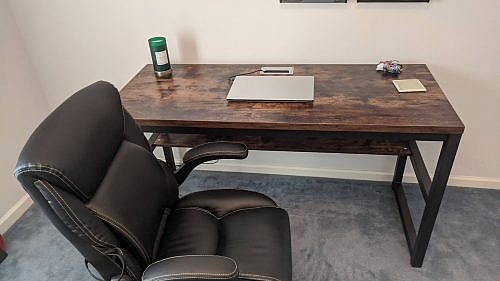
Simple desk and chair. 
Cats included.
On days like today, those with mid-70s temps (Fahrenheit for all the non-Americans) and a slight breeze in the air, I like to sit on the back patio. I enjoy the birds singing. It is a good time of the year to watch the little ones learn to forage their own food. I keep an eye on the squirrels, making sure their mischievousness is limited to sneaking a few nuts from the bird feeders.
It is also another reason I have always preferred a laptop over a desktop. Its utility allows me to lug it from the couch or desk to a spot outside amid nature.
While much of the world’s workforce is still figuring this whole remote, work-from-home thing out, many in the WordPress community have this down to a science. Or, at least, they know what works for them. I would love to hear and see (share pics in the comments — embeds are enabled) what your home offices are like.
Select every 5 numbers random
I have an array list that looks like this.
8.1,6.5,4.4,3.2,1,8.9,5,1.4,0.1,1,8.7,6.2,4.3,3.2,3
I would like that my program selects every 5 numbers randomly.
for example to select
8.1,6.5,4.4,3.2,1,8.7,6.2,4.3,3.2,3
as you can see it selected 5 numbers from the begging and 5 more from the end
and saves them
Random random_method = new Random();
// loop for generation random number
for (int i = 0; i < array.size(); i++)
// generating random index with the help of
// nextInt() method
int index = random_method.nextInt(array.size());

System.out.println("Random Element is :" + array.get(index));Can I Email…
While I’m 85% certain you’ve seen and used Can I Use…, I bet there is only a 13% chance that you’ve seen and used Can I Email…. It’s the same vibe—detailed support information for web platform features—except instead of support information for web browsers, it is email clients. Campaign Monitor has maintained a guide for a long time as well, but I admit I like the design style pioneered by Can I Use….

HTML email is often joked about in how you have to code for it in such an antiquated way (<table> tags galore!) but that’s perhaps not a fair shake. Kevin Mandeville talked about how he used CSS grid (not kidding) in an email back in 2017:
Our Apple Mail audience at Litmus is approximately 30%, so a good portion of our subscriber base is able to see the grid desktop layout.
Where CSS Grid isn’t supported (and for device/window widths of less than 850 pixels), we fell back to a one-column layout.
Just like websites, right? They don’t have to look the same everywhere, as long as the experience is acceptable everywhere.
Me, I don’t do nearly as as much HTML email work as I do for-web-browsers work, but I do some! For example, the newsletter for CSS-Tricks is an RSS feed that feeds a MailChimp template. The email we send out to announce new shows for ShopTalk is similar. Both of those are pretty simple MailChimp templates that are customized with a bit of CSS.
But the most direct CSSin’ I do with HTML email is the templates for CodePen emails. We have all sorts of them, from totally custom templates, to special templates for The Spark and Challenges and, of course, transactional emails.

Those are all entirely from-scratch email templates. I’s very nice to know what kind of CSS features I can count on using. For example, I was surprised by how well flexbox is supported in email.
It’s always worth thinking about fallbacks. There is nothing stopping you from creating an email that is completely laid out with CSS grid. Some email clients will support it, and some won’t. When it is supported, a fancy layout happens. When it is not supported, assuming you leave the source order intelligible, you just get a column of blocks (which is what most emails are anyway) and should be perfectly workable.
Progressive enhancement is almost more straightforward in email where there is rarely any functionality to be concerned with.
Direct Link to Article — Permalink
The post Can I Email… appeared first on CSS-Tricks.
You can support CSS-Tricks by being an MVP Supporter.
Sixfold Announces Launches Visibility Data Sharing Initiative
how to convert to vb.net?
import threading,time,sys
try:
import requests
except:
print("Please install requests module!")
sys.exit()
path=input("File (example: file.m3u) => ")
out=path+"_out.txt"
try:
with open(path, 'r') as file_in:
lines = file_in.read().splitlines()
except:
print("File error or not found!")
file_out=open(out, "w")
#print(str(lines))
all = len(lines)
print(all)
worked=0
print("Scanning {} lists... Worked will write in {}".format(all,out))
time.sleep(5)
def check(i):
global worked
thisline=str(i)
file_out.write(thisline+"\n")
if thisline.startswith("#") == False:
print("Checking "+thisline+"...")
if "m3u8" not in thisline:
if thisline.endswith("/") == False:
thisline=thisline+".m3u8"
else:
thisline=thisline+"/index.m3u8"
try:
req=str(requests.get(thisline, timeout=(2,5)).status_code)
if req == "200" or (req == "302"):
print("OK. "+thisline)
worked+=1
#write here
file_out.write(thisline+"\n")
except:
print("ERROR. "+thisline)
for i in lines:
threading.Thread(target=check,args=(i,)).start()
Top 10 Mistakes Ottawa Businesses Make on Graphic Design Projects
There is always that one design faux pas you and many Ottawa business owners wish you could forget. Either you were rushing to finish a marketing brochure or you overlooked proofreading or you just didn’t know what to do. These are common mistakes Ottawa companies make on graphic design projects that can easily be avoided if you understand some basic principles. Though it’s always a smart move to hire a professional, knowing what mistakes to avoid will make life a lot easier.
That said, here are the top 10 mistakes Ottawa businesses make with graphic design:
Poor Font Choice
You might see a font that you absolutely adore and want to integrate into your designs. But there is a chance that it could be a poor choice or mismatch for your brand. Remember, there are many fonts out there, but only a few are going to fit the vibe you’re looking for. Also, you want to make sure that you aren’t using too many fonts at once. Having too many fonts on a single page will create visual dissonance. The project will look messy and unprofessional, which isn’t the result you’re going for.
Keep 2-3 font types that are related to one another. One of the best tricks is using one font type but different weights and sizes. It will look cohesive but also pop. Also, avoid certain fonts. Papyrus, Comic Sans, and in some cases even Helvetica will detract from the graphic design.
Also read:
The Top 20 Fonts to Use For Branding – Logos and Graphic Designs
Overly Wordy
Humans have short attention spans. There’s no denying that fact. It’s why people can’t sit through a 20 second advertisement without wanting to skip it. And it’s also why people will lose patience with designs that have too much information. Many graphic designers and businesses tend to make the same mistake on their first few projects—they choose far too many words.
When there is too much text, people are going to say it’s too long and pass it by. Instead, try for brevity. Minimize the text down to the very vital bits then let imagery play a key role. Try to stay below 50-60 characters in a single line.
Poor Colour Combinations
Choosing the wrong colours and complementary (opposite on the colour wheel) shades spells trouble. You want to choose a palette and stick with those colours throughout the entire project. Don’t stray from the shades you choose, because it could ruin the cohesiveness of your work. Also, pay attention to how the background colours work with the font weight and colour choice. You don’t want to lose any of the information you’re trying to highlight.
Secondly, consider how the colour choice will affect the psychology of the viewer. If you choose the wrong colours for a brand, they could end up perceiving your business as cold or clinical instead of welcoming, for example. You will need to find proper balance between all colours, fonts, and images.
Poorly Written Brief
One of the biggest mistakes in graphic design happens before the project even begins. It occurs when the designer doesn’t even understand what is expected of them. Usually, this is due to a badly written creative brief or a lack of communication between the graphic designer and the business. Many businesses expect the graphic designer to comprehend what is desired from a few instructions or an idea, but the truth is that the graphic designer can’t deliver great work unless they have a total understanding of the expectations.
The good news is that it’s an easy fix. For every project, write up an in-depth briefing for everything. Detail the kind of colour scheme, the targeted audience, your branding, and so on. Also, communicate with the designer regularly.
No Responsiveness
Although this is more web design related, graphic design also carries over to the overall look and feel of a website and its media. If you are implementing special vector designs, images, animations, and so on, you are going to want to make sure all that stuff works across all platforms. If the desktop version of a website functions well but the mobile-version has sizing issues or doesn’t respond, it will impact you negatively.
Stale, Overused Content
So many businesses make the mistake of following graphic design trends. Unfortunately, recycling what’s popular could backfire. Your project might look stale or outdated, and it could reflect poorly on your business. While it’s fine to incorporate some trends, creativity is more important.
Using Stock Pictures
You might think that using a free stock photo for your website or blog or flyer is going to save you some money. In reality, it is not always the best idea. If you want to rise above your competition, try to go with original photography rather than using a stock photo that has already been used hundreds of times. You want to minimize duplicated images whenever possible. Having an image designed strictly for your business shows creativity and will even be more advantageous for branding.
Spelling and Grammatical Errors
Sometimes you get blind to your spelling and grammatical errors. That is why it’s so important to have someone review the work before printing it or launching it on social media. Even a small mistake could have a large impact on your business, especially if the information gets skewed. Others may perceive the error as negligence and wonder about the integrity of your brand. People might even discredit your products and services and head to the competition instead. You don’t want that.
The bottom line is that you need to not only be careful with the language and fonts you choose but also the way you communicate through the graphic design project.
Crazy Kerning
Kerning is when the space between letters is adjusted to make text more appealing and legible. Doing so is a delicate procedure. Go too much one way, and your letters could be so smashed together or so far apart that your project loses all meaning. This is bad for branding and bad for your image. When in doubt, have a professional graphic designer work on the kerning for you.
Improper Formats
While most designers will automatically save their work as a Tagged Image File Format (TIFF) or as a Joint Photographic Experts Group (JPEG) or something similar, deciding which one is right for the project can be a challenge. Basically, you need to know how you’re going to be using the final project before you begin.
You can ask the graphic designer for their recommendations. They will generally consider whether the image is going online or if it will be printed then go from there.
Final Thoughts
Graphic design is more than just selecting colours and images. It takes some practice and creativity to make projects into masterpieces. Now that you know some typical mistakes, you can avoid those issues and start creating amazing designs.
XML Tutorial for Beginners | What is XML? [Video]
In the video below, we take a closer look at the XML Tutorial for Beginners | What is XML? | Learn XML. Let's get started!
Moving Lines/Blocks of Code with Option ⬆️ and ⬇️
One of the default keyboard shortcuts I really like from VS Code is the ability to move lines around. I went a long time in my career as a developer never doing this, but once I learned the commands, I use them as naturally as copy and paste. Anytime you’re on a line (or have a selection), you can press Option Up (or Down) and move that line up or down, essentially swapping it with the line above (or below).
It’s very satisfying:
That’s me doing it in CodePen, as we have that feature now with the exact same keyboard command as default VS Code.

We technically supported this feature before, but it was undocumented (we need to improve the key binding documentation in general). The trick was you needed to have Sublime Text key bindings turned on (you do that in your global Editor Settings), and even then, the keyboard command was different. It turns out that Option Up/Down was already taken, but what it was doing was also undocumented, and could be easily moved. What it was doing was, in the CSS editor only, if your cursor happened to be over a number, Option Up/Down would increment that number by 0.1 in the appropriate direction. Emmet has several of those options, here there are all still working:
Sublime Text still has some additional goodies in it, that I really like, for example Command-Shift-D for duplicating lines. That pairs nicely with these new moving lines commands.
The post Moving Lines/Blocks of Code with Option ⬆️ and ⬇️ appeared first on CodePen Blog.
#314: Team Updates
Marie and Chris discuss the big round of updates that went out around Team Management. There is a new “admin” role that it took us years of having a Teams product to understand that many teams could actually use. In the end, these updates to how Teams work make them way more useful. Teams can self-manage themselves in a way they never could before, and we’re hoping that makes people much happier with the product, less likely to leave because of something silly like access controls, and reduce support.
Timejumps
Sponsor: Jetpack Backup + WooCommerce
Aside from Jetpack Backup just being really easy to use and the most trustworthy way to back up your entire WordPress site, it’s the only backup solution that works with eCommerce (WooCommerce) in the way you really need it to. Say you need to rollback to a version of your site from 4 days ago because something bad happened that hosed the site. Rolling back is a good idea, that’ll get you up and running right away, but when you revert a database back 4 days, that could wipe out all the eCommerce orders and product changes that have happened in that time: not good. Not with Jetpack Backup, it will restore to 4 days ago, but then replay all the orders and product changes, so your store is up to date with reality. Vital.
The post #314: Team Updates appeared first on CodePen Blog.
16px or Larger Text Prevents iOS Form Zoom
This was a great “Today I Learned” for me from Josh W. Comeau. If the font-size of an <input> is 16px or larger, Safari on iOS will focus into the input normally. But as soon as the font-size is 15px or less, the viewport will zoom into that input. Presumably, because it considers that type too small and wants you to see what you are doing. So it zooms in to help you. Accessibility. If you don’t want that, make the font big enough.
Here’s Josh’s exact Pen if you want to have a play yourself.
In general, I’d say I like this feature. It helps people see what they are doing and discourages super-tiny font sizes. What is a slight bummer — and I really don’t blame anyone here — is that not all typefaces are created equal in terms of readability at different sizes. For example, here’s San Francisco versus Caveat at 16px.

font-size is the same.You can view that example in Debug Mode to see for yourself and change the font size to see what does and doesn’t zoom.
The post 16px or Larger Text Prevents iOS Form Zoom appeared first on CSS-Tricks.
You can support CSS-Tricks by being an MVP Supporter.
United Nations Universal Postal Union Adds Address Verification API
The Universal Postal Union (UPU), an agency of the United Nations that coordinates postal policies among member nations, has announced the launch of a new address verification API that hopes to help improve address accuracy and reliability. The API is built upon the organization's POST*CODE database of global address data.
Let’s use (X, X, X, X) for talking about specificity
I was just chatting with Eric Meyer the other day and I remembered an Eric Meyer story from my formative years. I wrote a blog post about CSS specificity, and Eric took the time to point out the misleading nature of it (I remember scurrying to update it). What was so misleading? The way I was portraying specificity as a base-10 number system.
Say you select an element with ul.nav. I insinuated in the post that the specificity of that selector was 0011 (eleven, essentially), which is a number in a base-10 system. So I was saying tags = 0, classes = 10, IDs = 100, and a style attribute = 1000. If specificity was calculated in a base-10 number system like that, a selector like ul.nav.nav.nav.nav.nav.nav.nav.nav.nav.nav.nav (11 class names) would have a specificity of 0111, which would be the same as ul#nav.top. That’s not true. The reality is that it would be (0, 0, 11, 1) vs. (0, 1, 0, 1) with the latter easily winning.
That comma-separated syntax like I just used solves two problems:
- It doesn’t insinuate a base-10 number system (or any number system)
- It has a distinct and readable look
I like the (X, X, X, X) look. I could see limiting it to (X, X, X) since a style attribute isn’t exactly a selector and usually isn’t talked about in the same kind of conversations. The parens make it more clear to me, but I could also see a X-X-X (dash-separated) syntax that wouldn’t need them, or a (X / X / X) syntax that probably would benefit from the parens.
Selectors Level 3 uses dashes briefly. Level 2 used both dashes and commas in different places.
Anyway, apparently I get the bug to mention this every half-decade or so.
The post Let’s use (X, X, X, X) for talking about specificity appeared first on CSS-Tricks.
You can support CSS-Tricks by being an MVP Supporter.
Benefits of Minimalist Web design (with examples)
Creating websites using the minimalist approach is something that will go against everything some web designers have ever known. They have a bunch of expensive editing tools, normally used for designing the flashiest websites full...
The post Benefits of Minimalist Web design (with examples) appeared first on 85ideas.com.


