Publish Text, Image, and Gallery Snippets With the Shortnotes WordPress Plugin

Yesterday, Happy Prime owner and engineer Jeremy Felt released Shortnotes, a plugin for writing notes from the WordPress editor. The intention is for users to create short pieces of content, such as that found on Twitter, Instagram, and similar social networks. However, it does not come with a front-end posting interface, at least not in version 1.0.

The plugin works just like the post and page editor. It should be straightforward for most users.

While the Shortnotes plugin is relatively bare-bones for now, it serves as a foundation of something that could be more. Part of what makes social networks appealing is the ease of publishing quick content. Publishing notes through the plugin requires visiting the WordPress admin, clicking “Add New,” writing the content, publishing, and clicking a new link to view it on the front end. A quick-publishing interface either through a Dashboard widget or a front-end form would be a useful addition.

Notes post type from the WordPress block editor.
Note post type in the block editor.

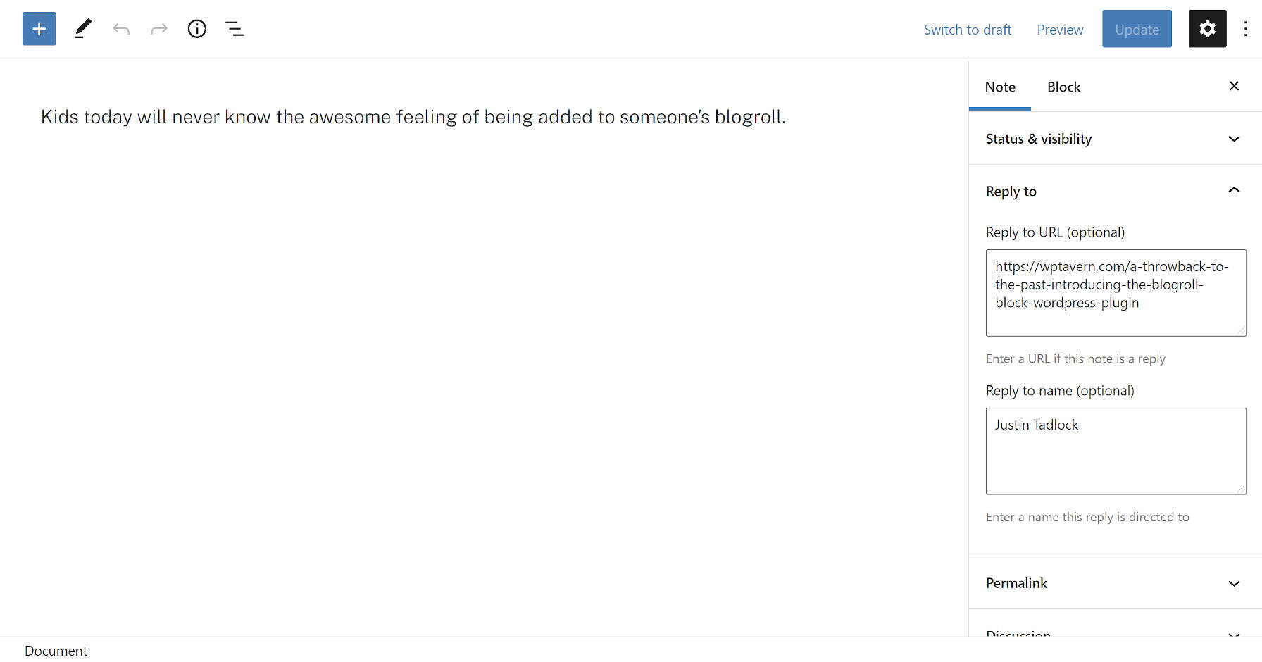
Some new concepts that not all users may be familiar with are the “Reply to URL” and “Reply to name” fields. These are semantic fields for creating a note in reply to another post or person on the web. The plugin will automatically output this reply link on the front end.

The plugin integrates with the Webmention plugin. A Webmention is a standardized protocol for mentions and conversations across the web. The goal is a decentralized social “network” of sorts where everyone owns and controls their content. It is an alternative to what IndieWeb calls the “corporate” web in which large tech companies have control.

When entering a Reply to URL, Shortnotes will automatically send that URL through the Webmentions plugin system. It will also parse URLs in the post content as webmentions if they exist.

Users may also notice that the note title field is missing. This is intentional. The plugin automatically generates titles. They are needed for the <title> tag, which tools like search engines use.

The idea is for titles to not appear as part of the theme layout. Because most themes are not coded to check for post-type support before displaying them, there is a high chance that a user’s theme will output the auto-generated title on the front end. For now, that means editing a bit of theme code for those who do not want them to appear. Felt has an example of how he modified this for his site’s custom Twenty Twenty-One child theme. In the long run, as more themes begin supporting the upcoming site editor, users will be able to make this customization directly in the WordPress admin.

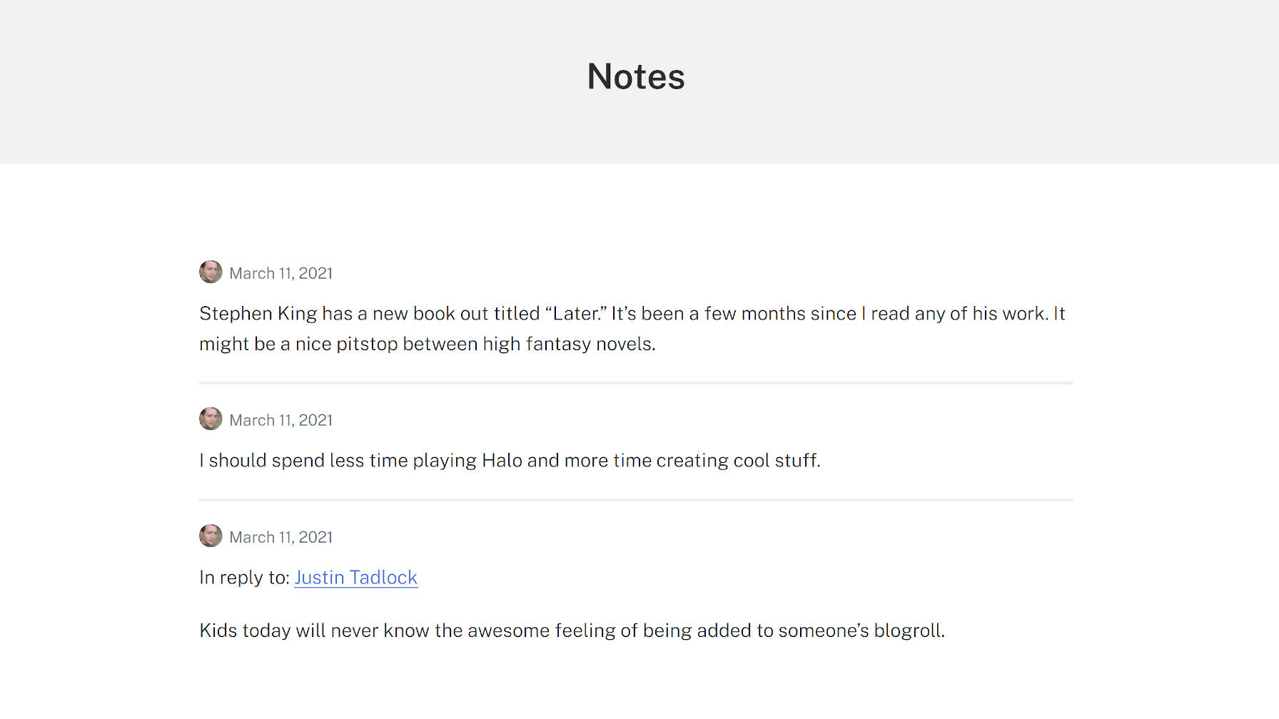
With a few tweaks like removing the title and some minor CSS adjustments, I was able to create a clean Notes archive page using the Genesis Block theme:

Archives view of notes from the Shortnotes plugin.
Modified notes archive.

One of my interests in checking this project out was diving into a real-world example of a plugin that limited which blocks could be used with the editor. The notes post type only allows the Paragraph, Image, and Gallery blocks. Again, the idea is to replicate the feel of what you can do on social networks. Overall, this feature worked as it should, limiting the notes to a subset of blocks.

However, I ran across a bug with the block editor. All block patterns, regardless of what blocks they contained, appeared in the inserter. Clicking on one containing a disallowed block would not insert it into a post. However, the editor did add a pop-up note that it had. There is a GitHub issue for this bug that has seen little movement since it was opened in June 2020.

Felt created a plugin to solve this called Unregister Broken Patterns. It removes any patterns that contain blocks that a post type does not support. At best, it is a temporary measure and needs to be addressed in WordPress.

Table of Contents with IntersectionObserver

If you have a table of contents on a long-scrolling page, thanks to, say, position: fixed; or position: sticky;, the IntersectionObserver API in JavaScript is the perfect companion to highlight items in the table of contents when corresponding content is in view.

Ben Frain has a post all about this:

Thanks to IntersectionObserver we have a small but very efficient bit of code to create our table of contents, provide quick links to jump around the document and update readers on where they are in a document as they read.

Compared to older techniques that need to bind to scroll events and perform their own math, this code is shorter, faster, and more logical. If you’re looking for the demo on Ben’s site, the article is the demo. And here’s a video on it:

I’ve mentioned this stuff before, but here’s a Bramus Van Damme version:

And here’s a version from Hakim el Hattab that is just begging for someone to port it to IntersectionObserver because the UI is so cool:

Direct Link to ArticlePermalink


The post Table of Contents with IntersectionObserver appeared first on CSS-Tricks.

You can support CSS-Tricks by being an MVP Supporter.

FileHandling Java

Hi,

I would like to ask regarding File Handling in Java. I am creating a program for my school project and we should use file handling only (.txt) not database. When I add a product (with product code, product name, price, etc), I want to save it in a file. After that there is an option for displaying the product. I would like to display the product in a columnar format. Can you advice me on how I can do it? or once the program reads the file, is there a way to separate the identifiers so I can format each identifiers before displaying in the system. Thank you experts

Collective #652


Collective item image

Conic.css

Fantastic conic gradients. Get it by clicking on a gradient and then pasting it into your CSS.

Check it out


The post Collective #652 appeared first on Codrops.

Jive (Now GoToConnect) Review

Jive’s cloud-based phone system gives users the flexibility to place and receive calls from anywhere, on any device.

Acquired by a new company, it became GoToConnect, a fusion of Jive’s phone service and GoToMeeting’s online meeting features. The result is an all-in-one communication and collaboration system for businesses of all shapes and sizes.

Unlike other VoIP phone service providers, GoToConnect gives all users almost unrestricted access to all its features regardless of plan. Whether you’re a startup or a thriving enterprise, GoToConnect can meet all your business communication needs in one place.

Jive Pros and Cons

Pros

  • Key features available in all plans
  • Easy to set up and use
  • No special hardware needed
  • Third-party app integration
  • Safe and secure communication
  • Intuitive dial plan editor
  • Time-based call routing
  • Robust call reporting and monitoring
  • Unlimited auto-attendants
  • Multiple office connection
  • 24/7 customer support
  • Reliable user guides and tutorials

Cons

  • No free trial available
  • Separate account required to store recorded calls
Compare The Best Business Phone Services
We reviewed dozens of business phone service providers and narrowed them down to the best options.
See Top Picks

How Jive Compares to Top VoIP Phone Systems

Jive is no longer just a VoIP phone system provider. After it merged with GoToMeeting’s online meeting software to create the more powerful GoToConnect, it’s now a force to be reckoned with that few rivals in the industry can match.

In fact, our top pick RingCentral doesn’t hold a candle to GoToConnect in terms of features and cost-effectiveness.

While RingCentral doesn’t offer video conferencing in its most basic plans, GoToConnect offers it and an array of other robust features to all users regardless of plan. And even if RingCentral gives users the cost-saving option of paying the annual fee upfront, GoToConnect still ends up costing less overall.

Between GoToConnect and another one of our top picks, Nextiva, the latter seems to have a slighter edge.

Unlike GoToConnect, Nextiva comes with complete communication, collaboration, and its own CRM tools right out of the box. If you’re in the healthcare industry, you might want to choose Nextiva over GoToConnect because its VoIP phone services are compliant with the Health Insurance Portability and Accountability Act (HIPAA) of 1996. This means Nextiva ensures the privacy and security of whatever data stored in the cloud.

Jive Hardware Requirements

With GoToConnect, you ditch the bulky on-premise PBX hardware for the convenience of a virtual phone system.

Since calls are transmitted over the internet, it’s compatible with almost any type of device. Hence, you can place and receive calls through your mobile device, a desktop application, or web browser anywhere you are.

Having calls delivered over the internet also means fewer expenses as you no longer have to purchase special hardware and spend money for its upkeep. As a result, it’s easier to scale your business with a cloud-based phone system.

If you prefer the familiarity of traditional office phones, GoToConnect also offers over 180 preconfigured desk and conference phones. Price ranges from $75 to $800 per device.

GoToConnect’s VoIP phones are ready to use right out of the box. In addition, they don’t have the expensive hardware components that come with old-fashioned analog phones. Instead, they’re bundled with GoToConnect’s hosted VoIP features like auto-attendants, free long-distance calling, and voicemail boxes at no additional charge.

In case you’re using an old on-premise phone system with hundreds of analog phones, GoToConnect will help make the transition easier. Analog desk phones can still work with VoIP, but you need to use an analog telephone adapter. This special device will convert electric signals into data packets that the virtual phone system can transmit.

If you’re a solopreneur or a small remote team with no need for any additional hardware, you might want to consider RingCentral or Grasshopper.

RingCentral is our overall best VoIP phone system, and you can use it with any of your existing phones.

Grasshopper also requires no additional devices. All you need to do is select a number and install the Grasshopper app to start placing and receiving calls. Every time there’s a business call, the Grasshopper icon will appear, so your work and personal calls will always be separate.

Jive Pricing

Just like other VoIP solutions, GoToConnect also prices its plans according to the number of users. The more employees you have, the less you’ll pay per head.

However, GoToConnect is the most generous VoIP service provider in the industry. In its two upper plans, all users have access to over 80 features, including unlimited call queues, caller ID, and call routing.

Pricing splits into three packages that scale based on the number of users. The Basic plan is limited and meant for much smaller operations, starting at $22/month when billed annually for 1-20 users (above which the Basic plan is no longer available).

The Standard and Premium plans feature all the bells and whistles, starting at $26/month and $39/month, respectively, for up to 20 users. For 21 or more users, the price for Standard drops to $23/month.

Entrepreneurs and small companies with five to ten employees can also consider another cheap alternative. Ooma Office can give the best bang for your buck with its most basic plan that starts at only $19.95 per user per month. If you want more features, you can also upgrade to $24.95 per user per month, which is within the same price range as GoToConnect’s cheapest plans.

Jive Setup and Ease of Use

You don’t have to be tech-savvy to install and maintain GoToConnect’s VoIP phone system.

There’s plenty of information online to provide assistance. However, a more thorough “setup wizard” would significantly improve the speed and ease of installation. But even without detailed online documentation, GoToConnect’s customer support team is always ready to extend a helping hand through different touchpoints.

Overall, the setup process is mostly plug-and-play. Therefore, busy teams with no time for tinkering can get their phone system up and running in no time. The installation is so easy that you can ship the phones to your remote team, have them plug the devices in, and start making calls right off the bat.

Configuring GoToConnect is easier if you don’t have any VoIP phone to connect. Simply access the web interface, then set up call routing with the help of a visual editor, and you’re good to go.

Aside from GoToConnect, we also recommend Ooma VoIP for being easy and quick to set up. The whole process is uncomplicated that you can launch your phone system in less than 15 minutes.

Jive Features

The Jive cloud-based phone system has everything you need to place and receive calls, whether inside or outside your company. And now that it’s bundled with an online meeting software to form GoToConnect, your team can also collaborate under a single platform.

Its all-inclusive plans give users access to tools that other providers charge additional fees for. These include the dial plan editor with a drag-and-drop interface, so it’s easier to create and customize call flows for your team.

Time-based call routing is easy to set up so that your customers will be informed when your business is available and when it’s not. Call routing also enables your customers throughout the country to dial a local number and have it routed to one of your representatives with no delay.

GoToConnect’s call monitoring tool helps you be aware of how each employee handles the calls. On the other hand, built-in analytics generates reports that are visual representations of how your employees communicate and collaborate.

Meanwhile, voicemails are also automatically sent to your email, so you can still be notified about important and urgent matters even if you’re not in the office. This way, you can retrieve the voicemail wherever you are and call clients or customers who urgently need to talk to you.

Other call management features include an auto-attendant, call park, call queues, call waiting, call transfers, do not disturb, call history, and Find Me/Follow Me.

GoToConnect also offers premium video conferencing and contact center features as add-ons.

The video conferencing feature allows you to launch meetings directly into the web application. It comes with one-click screen sharing so that you can jump from a chat or a call to a video conference without any hassle. There’s no need to switch apps or juggle different tools as everything you need is under one roof.

Businesses can also enjoy contact center services to help them serve their customers better. These call center features include advanced ring strategies, pre-call announcements, unlimited call queues, and wait time announcements.

As your business grows, GoToConnect is flexible enough to provide you with the tools you need to scale successfully. And even if it doesn’t have the built-in features you’re looking for, it’s easy to expand its functionality by integrating GoToConnect with third-party apps like Salesforce, Zendesk, Slack, Outlook, and many more.

Jive Connect Bundle

The GoToConnect Connect Bundle combines the best of the Jive VoIP phone system and GoToMeeting’s online meeting software. This way, you won’t have to juggle multiple collaboration tools at once.

For as low as $19.95 a month, your employees can make or receive calls and have access to basic video conference features at the same time.

With the Jive VoIP phone system, you can add custom hold music, create workflows using dial plan editor,  and call internationally. You can also leverage call routing to let your remote workers receive calls wherever they are and let your customers know when your business is closed or open.

As for video conference features, Connect Bundle lets you start a webinar for up to 150 attendees. This webinar also comes with meeting transcription so you can keep a permanent record of its content.

Jive Enterprise Suite

To build a productive and cohesive team, you need more than a hosted VoIP phone system.

The GoToConnect Enterprise Suite is an all-in-one solution that cares for both your customers’ satisfaction and employees’ productivity. It has all the basic features of the Connect Bundle with upgraded collaboration tools to meet your growing enterprise’s needs.

For seamless interaction with your customers, the Enterprise Suite has voice and call management features you’ll find in Connect Bundle. Its webinar solution, on the other hand, can accommodate up to 3,000 attendees. And with the addition of GoToRoom’s hardware and software bundle, you can now convert any room into a smart conferencing room.

With Enterprise Suite, you can get all these features while spending less. You can partner with GoTo, who will evaluate your needs so you can find ways to cut costs without cutting corners.

Jive Startup Suite

The Startup Suite offers more straightforward solutions to help you navigate your business’s early stages with ease.

Like the Enterprise Suite, this one also offers Jive’s flexible cloud-based phone system and GoToMeeting’s online meeting software. It also has GoToRoom to help turn your room into a professional conference room in minutes.

You can also hold a simple video conference with Startup Suite, but it’s nowhere as robust as that of the Enterprise Suite. With no GoToWebinar included in the bundle, you can only have meetings for up to 250 attendees.

Compare The Best Business Phone Services
We reviewed dozens of business phone service providers and narrowed them down to the best options.
See Top Picks

Summary

Jive has come a long way since it first penetrated the market with its cloud-based phone system. Now known as GoToConnect, it is equipped with conferencing tools, so everything you need to communicate and collaborate with the team is in one place. While it doesn’t offer a free trial or free version, the wide range of features it provides makes it a cut above the rest. Cost-effective and scalable, GoToConnect is ideal for any business, whether starting from scratch or looking to expand.

Chapter 7: Standards

It was the year 1994 that the web came out of the shadow of academia and onto the everyone’s screens. In particular, it was the second half of the second week of December 1994 that capped off the year with three eventful days.

Members of the World Wide Web Consortium huddled around a table at MIT on Wednesday, December 14th. About two dozen people made it to the meeting, representatives from major tech companies, browser makers, and web-based startups. They were there to discuss open standards for the web.

When done properly, standards set a technical lodestar. Companies with competing interests and priorities can orient themselves around a common set of agreed upon documentation about how a technology should work. Consensus on shared standards creates interoperability; competition happens through user experience instead of technical infrastructure.

The World Wide Web Consortium, or W3C as it is more commonly referred to, had been on the mind of the web’s creator, Sir Tim Berners-Lee, as early as 1992. He had spoken with a rotating roster of experts and advisors about an official standards body for web technologies. The MIT Laboratory for Computer Science soon became his most enthusiastic ally. After years of work, Berners-Lee left his job at CERN in October of 1994 to run the consortium at MIT. He had no intention of being a dictator. He had strong opinions about the direction of the web, but he still preferred to listen.

W3C, 1994

On the agenda — after the table had been cleared with some basic introductions — was a long list of administrative details that needed to be worked out. The role of the consortium, the way it conducted itself, and its responsibilities to the wider web was little more than sketched out at the beginning of the meeting. Little by little, the 25 or so members walked through the list. By the end of the meeting, the group felt confident that the future of web standards was clear.

The next day, December 15th, Jim Clark and Marc Andreessen announced the recently renamed Netscape Navigator version 1.0. It had been out for several months in beta, but that Thursday marked a wider release. In a bid for a growing market, it was initially given away for free. Several months later, after the release of version 1.1, Netscape would be forced to walk that back. In either case, the browser was a commercial and technical success, improving on the speed, usability, and features of browsers that had come before it.

On Friday, December 16th, the W3C experienced its first setback. Berners-Lee never meant for MIT to be the exclusive site of the consortium. He planned for CERN, the birthplace of the web and home to some of its greatest advocates, to be a European host for the organization. On December 16th, however, CERN approved a massive budget for its Large Hadron Collider, forcing them to shift priorities. A refocused budget left little room for hypertext Internet experiments not directly contributing to the central project of particle physics.

CERN would no longer be the European host of the W3C. All was not lost. Months later, the W3C set up at France’s National Institute for Research in Computer Science and Control, or INRIA. By 1996, a third site at Japan’s Keio University would also be established.

Far from an outlier, this would not be the last setback the W3C ever faced, or that it would overcome.


In 1999, Berners-Lee published an autobiographical account of the web’s creation in a book entitled Weaving the Web. It is a concise and even history, a brisk walk through the major milestones of the web’s first decade. Throughout the book, he often returns to the subject of the W3C.

He frames the web consortium, first and foremost, as a matter of compromise. “It was becoming clear to me that running the consortium would always be a balancing act, between taking the time to stay as open as possible and advancing at the speed demanded by the onrush of technology.” Striking a balance between shared compatibility and shorter and shorter browser release cycles would become a primary objective of the W3C.

Web standards, he concedes, thrives through tension. Standards are developed amidst disagreement and hard-won bargains. Recalling a time just before the W3C’s creation, Berners-Lee notes how the standards process reflects the structure of the web. “It struck me that these tensions would make the consortium a proving ground for the relative merits of weblike and treelike societal structures,” he wrote, “I was eager to start the experiment.” A web consortium born of compromise and defined by tension, however, was not Berners-Lee’s first plan.

In March of 1992, Berners-Lee flew to San Diego to attend a meeting of the Internet Engineering Task Force, or IETF. Created in 1986, the IETF develops standards for the Internet, ranging from networking to routing to DNS. IETF standards are unenforceable and entirely voluntarily. They are not sanctioned by any world government or subject to any regulations. No entity is obligated to use them. Instead, the IETF relies on a simple conceit: interoperability helps everyone. It has been enough to sustain the organization for decades.

Because everything is voluntary, the IETF is managed by a labyrinthine set of rules and ritualistic processes that can be difficult to understand. There is no formal membership, though anyone can join (in its own words it has “no members and no dues”). Everyone is a volunteer, no one is paid. The group meets in person three times a year at shifting locations.

The IETF operates on a principle known as rough consensus (and, often times, running code). Rather than a formal voting process, disputed proposals need to come to some agreement where most, if not at all, of the members in a technology working group agree. Working group members decide when rough consensus has been met, and its criteria shifts form year to year and group to group. In some cases, the IETF has turned to humming to take the temperature of a room. “When, for example, we have face-to-face meetings… instead of a show of hands, sometimes the chair will ask for each side to hum on a particular question, either ‘for’ or ‘against’.”

It is against the backdrop of these idiosyncratic rules that Berners-Lee first came to the IETF in March of 1992. He hoped to set up a working group for each of the primary technologies of the web: HTTP, HTML, and the URI (which would later be renamed to URL through the IETF). In March he was told he would need another meeting, this one in June, to formally propose the working groups. Somewhere close to the end of 1993, a year and a half after he began, he had persuaded the IETF to set up all three.

The process of rough consensus can be slow. The web, by contrast, had redefined what fast could look like. New generations of browsers were coming out in months, not years. And this was before Netscape and Microsoft got involved.

The development of the web had spiraled outside Berners-Lee’s sphere of influence. Inline images — a feature maybe most responsible for the web’s success — was a product of a late night brainstorming session over snacks and soda in the basement of a university lab. Berners-Lee learned about it when everyone else did, when Marc Andreessen posted it to the www-talk mailing list.

Tension. Berners-Lee knew that it would come. He had hoped, for instance, that images might be treated differently (“Tim bawled me out in the summer of ’93 for adding images to the thing,” Andreessen would later say), but the web was not his. It was not anybody’s. He had designed it that way.

With all of its rules and rituals, the IETF did not seem like the right fit for web standards. In private discussions at universities and research labs, Berners-Lee had begun to explore a new path. Something like a consortium of stakeholders in the web — a collection of companies that create browsers and websites and software — that can come together to agree upon a rough consensus for themselves. By the end of 1993, his work on the W3C had already begun.


Dave Raggett, a seasoned researcher at Hewlett-Packard, had a different view of the web. He wasn’t from academia, and he wasn’t working on a browser (not yet anyway). He understood almost instinctively the utility of the web as commercial software. Something less like a digital phonebook and more like Apple’s wildly successful Hypercard application.

Unable to convince his bosses of the web’s promise, Raggett used the ten percent of time HP allowed for its employees to pursue independent research to begin working with the web. He anchored himself to the community, an active member of the www-talk mailing list and a regular presence at IETF meetings. In the fall of 1992, he had a chance to visit with Berners-Lee at CERN.

Yuri Rubinsky

It was around this time that he met Yuri Rubinsky, an enthusiastic advocate for Standard General Markup Language, or SGML, the language that HTML was originally based on. Rubinsky believed that the limitations of HTML could be solved by a stricter adherence to the SGML standard. He had begun a campaign to bring SGML to the web. Raggett agreed — but to a point. He was not yet ready to sever ties with HTML.

Each time Mosaic shipped a new version, or a new browser was released, the gap between the original HTML specification and the real world web widened. Raggett believed that a more comprehensive record of HTML was required. He began working on an enhanced version of HTML, and a browser to demo its capabilities. Its working title was HTML+.

Ragget’s work soon began to spill over to his home life. He’d spend most nights “at a large computer that occupied a fair portion of the dining room table, sharing its slightly sticky surface with paper, crayons, Lego bricks and bits of half-eaten cookies left by the children.” After a year of around the clock work, Raggett had a version of HTML+ ready to go in November of 1993. His improvements to the language were far from superficial. He had managed to add all of the little things that had made their way into browsers: tables, images with captions and figures, and advanced forms.

Several months later, in May of 1994, developers and web enthusiasts traveled from all over the world to come to what some attendees would half-jokingly refer to as the “Woodstock of the Web,” the first official web conference organized by CERN employee and web pioneer Robert Calliau. Of the 800 people clamoring to come, the space in Geneva could hold only 350. Many were meeting for the first time. “Everyone was milling about the lobby,” web historian Marc Weber would later describe, “electrified by the same sensation of meeting face-to-face actual people who had been just names on an email or on the www-talk [sic] mailing list.”

Members of the first conference

It came at a moment when the web stood on the precipice of ubiquity. Nobody from the Mosaic team had managed to make it (they had their own competing conference set for just a few months later), but there were already rumors about Mosaic alum Marc Andresseen’s new commercial browser that would later be called Netscape Navigator. Mosaic, meanwhile, had begun to license their browser for commercial use. An early version of Yahoo! was growing exponentially as more and more publications, like GNN, Wired, The New York Times, and The Wall Street Journal, came online.

Progress at the IETF, on the other hand, had been slow. It was too meticulous, too precise. In the meantime, browsers like Mosaic had begun to add whatever they wanted — particularly to HTML. Tags supported by Mosaic couldn’t be found anywhere else, and website creators were forced to chose between cutting-edge technology and compatibility with other browsers. Many were choosing the former.

HTML+ was the biggest topic of conversation at the conference. But another highlight was when Dan Connolly — a young, “red-haired, navy-cut Texan” who worked at the supercomputer manufacturer Convex — took the stage. He gave a talk called “Interoperability: Why Everyone Wins.” Later, and largely because of that talk, Connolly would be made chair of the IETF HTML Working Group.

In a prescient moment capturing the spirit of the room, Connolly described a future when the language of HTML fractured. When each browser implemented their own set of HTML tags in an effort to edge out the competition. The solution, he concluded, was an HTML standard that was able to evolve at the pace of browser development.

Ragget’s HTML+ made a strong case for becoming that standard. It was exhaustive, describing the new HTML used in browsers like Mosaic in near-perfect detail. “I was always the minimalist, you know, you can get it done with out that,” Connolly later said, “Raggett, on the other hand, wanted to expand everything.” The two struck an agreement. Raggett would continue to work through HTML+ while Connolly focused on a more narrow upgrade.

Connolly’s version would soon become HTML 2, and after a year of back and forth and rough consensus building at the IETF, it became an official standard. It didn’t have nearly the detail of HTML+, but Connolly was able to officially document features that browsers had been supporting for years.

Ragget’s proposal, renamed to HTML 3, was stuck. In an effort to accommodate an expanding web, it continued to grow in size. “To get consensus on a draft 150 pages long and about which everyone wanted to voice an opinion was optimistic – to say the least,” Raggett would later put it, rather bluntly. But by then, Raggett was already working at the W3C, where HTML 3 would soon become a reality.


Berners-Lee also spoke at the first web conference in Geneva, closing it out with a keynote address. He didn’t specifically mention the W3C. Instead, he focused on the role of web. “The people present were the ones now creating the Web,” he would later write of his speech, “and therefore were the only ones who could be sure that what the systems produced would be appropriate to a reasonable and fair society.”

In October of 1994, he embarked on his own part in making a more equitable and accessible future for the web. The World Wide Web Consortium was officially announced. Berners-Lee was joined by a handful of employees — a list that included both Dave Raggett and Dan Connolly. Two months later, in the second half of the second week of December of 1994, the members of the W3C met for the first time.

Before the meeting, Berners-Lee had a rough sketch of how the W3C would work. Any company or organization could join given that they pay the membership fee, a tiered pricing structure tied to the size of that company. Member organizations would send representatives to W3C meetings, to provide input into the process of creating standards. By limiting W3C proceedings to paying members, Berners-Lee hoped to focus and scope the conversations to real world implementations of web technologies.

Yet despite a closed membership, the W3C operates in the open whenever possible. Meeting notes and documentation are open to anybody in the public. Any code written as part of experiments in new standards is freely downloadable.

Gathered at MIT, the W3C members had to next decide how its standards would work. They decided on a process that stops just short of rough consensus. Though they are often called standards, the W3C does not create official standards for the web. The technical specifications created at the W3C are known, in their final form, as recommendations.

They are, in effect, proposals. They outline, in great detail, how exactly a technology works. But they leave enough open that it is up to browsers to figure out exactly how the implementation works. “The goal of the W3C is to ensure interpretability of the Web, and in the long range that’s realistic,” former head of communications at the W3C Sally Khudairi once described it, “but in the short range we’re not going to play Web cops for compliance… we can’t force members to implement things.”

Initial drafts create a feedback loop between the W3C and its members. They provide guidance on web technologies, but even as specifications are in the process of being drafted, browsers begin to introduce them and developers are encouraged to experiment with them. Each time issues are found, the draft is revised, until enough consensus has been reached. At that point, a draft becomes a recommendation.

There would always be tension, and Berners-Lee knew that well. The trick was not to try to resist it, but to create a process where it becomes an asset. Such was the intended effect of recommendations.

At the end of 1995, the IETF HTML working group was replaced by a newly created W3C HTML Editorial Review Board. HTML 3.2 would be the first HTML version released entirely by the W3C, based largely on Ragget’s HTML+.


There was a year in web development, 1997, when browsers broke away from the still-new recommendations of the W3C. Microsoft and Netscape began to release a new set of features separate and apart from agreed upon standards. They even had a name for them. They called them Dynamic HTML, or DHTML. And they almost split the web in two.

DHTML was originally celebrated. Dynamic meant fluid. A natural evolution from HTML’s initial inert state. The web, in other words, came alive.

Touting it’s capabilities, a feature in Wired in 1997 referred to DHTML as the “magic wand Web wizards have long sought.” In its enthusiasm for the new technology, it makes a small note that “Microsoft and Netscape, to their credit, have worked with the standards bodies,” specifically on the introduction of Cascading Style Sheets, or CSS, but that most features were being added “without much regard for compatibility.”

The truth on the ground was that using DHTML required targeting one browser or another, Netscape or Internet Explorer. Some developers chose to simply choose a path, slapping a banner at the bottom of their site that displayed “Best Viewed In…” one browser or another. Others ignored the technology entirely, hoping to avoid its tangled complexity.

Browsers had their reasons, of course. Developers and users were asking for things not included in the official HTML specification. As one Microsoft representative put it, “In order to drive new technologies into the standards bodies, you have to continue innovating… I’m responsible to my customers and so are the Netscape folks.”

A more dynamic web was not a bad thing, but a splintered web was untenable. For some developers, it would prove to be the final straw.


Following the release of HTML 3.2, and with the rapid advancement of browsers, the HTML Editorial Review Board was divided into three parts. Each was given a separate area of responsibility to make progress on, independent of the others.

Dr. Lauren Wood (Photo: XML Summer School)

Dr. Lauren Wood became chair of the Document Object Model Working Group. A former theoretical nuclear phycist, Wood was the Director of Product Technology at SoftQuad, a comapny founded by SGML advocate Yuri Rubinsky. While there, she helped work on the HoTMetaL HTML editor. The DOM spec created a standardized way for browsers to implement Dynamic HTML. “You need a way to tie your data and your programs together,” was how Wood described it, “and the Document Object Model is that glue.” Her work on the Document Object Model, and later XML, would have a long-lasting influence on the web.

The Cascading Style Sheets Working Group was chaired by Chris Lilley. Lilley’s background was in computer graphics, as a teacher and specialist in the Computer Graphics Unit at the University of Manchester. Lilley had worked at the IETF on the HTML 2 spec, as well as a specification for Portable Network Graphics (PNG), but this would mark his first time as a working group chair.

CSS was still a relative newcomer in 1997. It had been in the works for years, but had yet to have a major release. Lilley would work alongside the creators of CSS — Håkon Lie and Bert Bos — to create the first CSS standard.

The final working group was for HTML, left under the auspices of Dan Connolly, continuing his position from the IETF. Connolly had been around the web almost as long as Berners-Lee had. He was one of the people watching back in October of 1991, when Berners-Lee demoed the web for a small group of unimpressed people at a hypertext conference in San Antonio. In fact, it was at that conference that he first met the woman that would later become his wife.

After he returned home, he experimented with the web. He messaged Berners-Lee a month later. It was only three words:“You need a DTD.”

When Berners-Lee developed the language of HTML, he borrowed its convention from a predecessor, SGML. IBM developed Generalized Markup Language (GML) in the early 1970’s to make it easier for typists to create formatted books and reports. However, it quickly got out of control, as people would take shortcuts and use whatever version of the tags that they wanted.

That’s when they developed the Document Type Definition, or as Connolly called it, a DTD. DTDs are what added the “S” (Standardized) to GML. Using SGML, you can create a standardized set of instructions for your data, its scheme and its structure, to help computers understand how to interpret it. These instructions are a document type definition.

Beginning with version 2, Connolly added a type definition to HTML. It limited the language to a smaller set of agreed-upon tags. In practice, browsers treated this more as a loose definition, continuing to implement their own DHTML features and tags. But it was a first step.

In 1997, the HTML Working Group, now inside of the W3C, began to work on the fourth iteration of HTML. It expanded the language, adding to the specification far more advanced features, complex tables and forms, better accessibility, and a more defined relationship with CSS. But it also split HTML from a single schema into three different document type definitions for browsers to adopt.

The first, Frameset, was not typically used. The second, Transitional, was there to include the mistakes of the past. It expanded a larger subset of HTML that included non-standard, presentational HTML that browsers had used for years, such as <font> and <center>. This was set as a default for browsers.

The third DTD was called Strict. Under the Strict definition, HTML was pared down to only its standard, non-presentational features. It removed all of the unique tags introduced by Netscape and Microsoft, leaving only structured elements. If you use HTML today, it likely draws on the same base of tags.

The Strict definition drew a line in the sand. It said, this is HTML. And it finally gave a way for developers to code once for every browser.


In the August 1998 issue of Computerworld — tucked between large features on the impending doom of <abbr title=”Year 2000>Y2K, the bristling potential of billing on the World Wide Web, and antitrust concerns about Microsoft — was a small announcement. Its headline read, ”Browser standards targeted.” It was about the creation of a new grassroots organization of web developers aimed at bringing web standards support to browsers. It was called the Web Standards Project.

Glenn Davis, co-creator of the project, was quoted in the announcement. “The problem is, with each generation of the browser, the browser manufacturers diverge farther from standards support.” Developers, forced to write different code for different browsers for years, had simply had enough. A few off-hand conversations in mailing lists had spiraled into a fully grown movement. At launch, 450 developers and designers had already signed up.

Davis was not new to the web, and he understood its challenges. His first experience on the web dated all the way back to 1994, just after Mosaic had first introduced inline images, when he created the gallery site Cool Site of the Day. Each day, he would feature a single homepage from an interesting or edgy or experimental site. For a still small community of web designers, it was an instant hit.

There was no criteria other than sites that Davis thought were worth featuring. “I was always looking for things that push the limits,” was how he would later define it. Davis helped to redefine the expectations of the early web, using the moniker coolas a shorthand to encompass many possibilities. Dot-com Design author and media professor **Megan Ankerson points out what “this ecosystem of cool sites gestured towards the sheer range of things the web could be: its temporal and spatial dislocations, its distinction from and extension of mainstream media, its promise as a vehicle for self-publishing, and the incredible blend of personal, mundane, and extraordinary.” For a time on the web, Davis was the arbiter of cool.

As time went on Davis transformed his site into Project Cool, a resource for creating websites. In the days of DHTML, Davis’ Project Cool tutorials provided constructive and practical techniques for making the most out of the web. And a good amount of his writing was devoted to explaining how to write code that was usable in both Netscape Navigator and Microsoft’s Internet Explorer. He eventually reached a breaking point, along with many others. At the end of 1997, Netscape and Microsoft both released their 4.0 browsers with spotty standards support. It was already clear that upcoming 5.0 releases were planning to lean even further into uneven and contradictory DHTML extensions.

Running out of patience, Davis helped set up a mailing list with George Olsen and Jeffrey Zeldman. The list started with two dozen people, but it gathered support quickly. The Web Standards Project, known as WaSP, officially launched from that list in August of 1998. It began with a few hundred members and announcement in magazines like Computer World. Within a few months, it would have tens of thousands of members.

The strategy for WaSP was to push browsers — publicly and privately — into web standards support. WaSP was not meant to be a hyperbolic name.” The W3C recommends standards. It cannot enforce them,” Zeldman once said of the organization’s strategy, “and it certainly is not about to throw public tantrums over non-compliance. So we do that job.”

A prominent designer and standards advocate, Zeldman would have an enduring influence on makers of the web. He would later run WaSP during some of its most influential years. His website and mailing list, A List Apart, would become a gathering place for designers who cared about web standards and using the latest web technologies.

WaSP would change focus several times during their decade and a half tenure. They pushed browsers to make better use of HTML and CSS. They taught developers how write standards-based code. They advocated for greater accessibility and tools that supported standards out of the box.

But their mission, published to their website on the first day of launch, would never falter. “Our goal is to support these core standards and encourage browser makers to do the same, thereby ensuring simple, affordable access to Web technologies for all.”

WaSP succeeded in their mission on a few occasions early on. Some browsers, notably Opera, had standards baked in at the beginning; their efforts were praised by WaSP. But the two browsers that collectively made up a majority of web use — Internet Explorer and Netscape Navigator — would need some work.

A four billion dollar sale to AOL in 1998 was not enough for Netscape to compete with Microsoft. After the release of Netscape 4.0, they doubled-down on bold strategy, choosing to release the entire browser’s code as open source under the Mozilla project. Everyday consumers could download it for free; coders were encouraged to contribute directly.

Members of the community soon noticed something in Mozilla. It had a new rendering engine, often referred to as Gecko. Unlike planned releases of Netscape 5, which had patchy standards support at best, Gecko supported a fairly complete version of HTML 4 and CSS.

WaSP diverted their formidable membership to the task of pushing Netscape to include Gecko in its next major release. One familiar WaSP tactic was known as roadblocking. Some of its members worked at publications like HotWired and CNet. WaSP would coordinate articles across several outlets all at once criticizing, for instance, Netscape’s neglect of standards in the face of a perfectly reasonable solution in Gecko. By doing so, they were often able to capture the attention of at least one news cycle.

WaSP also took more direct action. Members were asked to send emails to browsers, or sign petitions showing widespread support for standards. Overwhelming pressure from developers was occasionally enough to push browsers in the right direction.

In part because of WaSP, Netscape agreed to make Gecko part of version 5.0. Beta versions of Netscape 5 would indeed have standards-compliant HTML and CSS, but it was beset with issues elsewhere. It would take years for a release. By then, Microsoft’s dominion over the browser market would be near complete.

As one of the largest tech companies in the world, Microsoft was more insulated from grassroots pressure. The on-the-ground tactics of WaSP proved less successful when turned against the tech giant.

But inside the walls of Microsoft, WaSP had at least one faithful follower, developer Tantek Çelik. Çelik has tirelessly fought on the side of web standards as far back as his web career stretches. He would later become a member of the WaSP Steering Committee and a representative for a number of working groups at the W3C working directly on the development of standards.

Tantek Çelik (Photo: Tantek.com)

Çelik ran a team inside of Internet Explorer for Mac. Though it shared a name, branding, and general features with its far more ubiquitous Windows counterpart, IE for Mac ran on a separate codebase. Çelik’s team was largely left to its own devices in a colossal organization with other priorities working on a browser that not many people were using.

With the direction of the browser largely left up to him, Çelik began to reach out to web designers in San Francisco at the cutting edge of web technology. Through a stroke of luck he was connected to several members of the Web Standards Project. He’d visit with them and ask what they wanted to see in the Mac IE browser. “The answer: better standards support.”

They helped Çelik realize that his work on a smaller browser could be impactful. If he was able to support standards, as they were defined by the W3C, it could serve as a baseline for the code that the designers were writing. They had enough to worry about with buggy standards in IE for Windows and Netscape, in other words. They didn’t need to also worry about IE for Mac.

That was all that Çelik needed to hear. When Internet Explorer 5.0 for Mac launched in 2000, it had across the board support for web standards; HTML, PNG images, and most impressively, one of the most ambitious implementations of the new Cascading Style Sheets (CSS) specification.

It would take years for the Windows version to get anywhere close to the same kind of support. Even half a decade later, after Çelik left to work at the search engine Technorati, they were still playing catch-up.


Towards the end of the millennium, the W3C found themselves at a fork in the road. They looked to their still-recent past and saw it filled with contentious support for standards — Incompatible browsers with their own priorities. Then they looked the other way, to their towering future. They saw a web that was already evolving beyond the confines personal computers. One that would soon exist on TVs and in cell phones and on devices we that hadn’t been dreamed up yet in paradigms yet to be invented. Their past and their future were incompatible. And so, they reacted.

Yuri Rubinsky had an unusual talent for making connections. In his time as a standards advocate, developer, and executive at a major software company, he had managed to find time to connect some of the web’s most influential proponents. Sadly, Rubinsky died suddenly and at a young age in 1996, but his influence would not soon be forgotten. He carried with him an infectious energy and a knack for persuasion. His friend and colleague Peter Sharpe would say upon his death that in “talking to the people from all walks of life who knew Yuri, there was a common theme: Yuri had entered their lives and changed them forever.”

Rubinsky devoted his career to making technology more accessible. He believed that without equitable access, technology was not worth building. It motivated all of the work he did, including his longstanding advocacy of SGML.

SGML is a meta-language and “you use it to build your own computer languages for your own purposes.” If you hand a document over to a computer, SGML is how you can give that computer instructions on how to understand it. It provides a standardized way to describe the structure of data — the tags that it uses and the order it is expected in. The ownership of data, therefore, is not locked up and defined at some unknown level, it is given to everybody.

Rubinsky believed in that kind of universal access, a world in which machines talked to each other in perfect harmony, passing sets of data between them, structured, ordered, and formatted for its users. His company, SoftQuad, built software for SGML. He organized and spoke at conferences about it. He created SGML Open, a consortium not unlike the W3C. “SGML provides an internationally standardized, vendor-supported, multi-purpose, independent way of doing business,” was how he once described it, “If you aren’t using it today, you will be next year.” He was almost right.

He had a mission on the web as well. HTML is actually based on SGML, though it uses only a small part of it. Rubinsky was beginning to have conversations with members of the W3C, like Berners-Lee and Raggett, about bringing a more comprehensive version of SGML to the web. He was even writing a book called SGML on the Web before his death.

In the hallways of conferences and in threaded mailing lists, Rubinsky used his unique propensity for persuasion to bring people several people together on the subject, including Dan Connolly, Lauren Wood, Jon Bosak, James Clark, Tim Bray, and others. Eventually, those conversations moved into the W3C. They formed a formal working group and, in November of 1996, eXtensible Markup Language (XML) was formally announced, and then adopted as a W3C Recommendation. The announcement took place at an annual SGML conference in Boston, run by an organization where Rubinsky sat on the Board of Directors.

XML is SGML, minus a few things, renamed and repackaged as a web language. That means it goes far beyond the capabilities of HTML, giving developers a way to define their own structured data with completely unique tags (e.g., an <ingredients> tag in a recipe, or an <author> tag in an article). Over the years, XML has become the backbone of widely used technologies, like RSS and MathML, as well as server-level APIs.

XML was appealing to the maintainers of HTML, a language that was beginning to feel somewhat complete. “When we published HTML 4, the group was then basically closed,” Steve Pemberton, chair of the HTML working group at the time, described the situation. “Six months later, though, when XML was up and running, people came up with the idea that maybe there should be an XML version of HTML.” The merging of HTML and XML became known as XHTML. Within a year, it was the W3C’s main focus.

The first iterations of XHTML, drafted in 1998, were not that different from what already existed in the HTML specifications. The only real difference was that it had stricter rules for authors to follow. But that small constraint opened up new possibilities for the future, and XHTML was initially celebrated. The Web Standards Project issued a press release on the day of its release lauding its capabilities, and developers began to make use of the stricter markup rules required, in line with the work Connolly had already done with Document Type Definitions.

XHTML represented a web with deeper meaning. Data would be owned by the web’s creators. And together, computers and programmers, could create a more connected and understandable web. That meaning was labeled semantics. The Semantic Web would become the W3C’s greatest ambition, and they would chase it for close to a decade.

W3C, 2000
W3C, 2000

Subsequent versions of XHTML would introduce even stricter rules, leaning harder into the structure of XML. Released in 2002, the XHTML 2.0 specification became the language’s harbinger. It removed backwards compatibility with older versions of HTML, even as Microsoft’s Internet Explorer — the leading browser by a wide margin at this point — refused to support it. “XHTML 2 was a beautiful specification of philosophical purity that had absolutely no resemblance to the real world,” said Bruce Lawson, an HTML evangelist for Opera at the time.

Rather than uniting standards under a common banner, XHTML, and the refusal of major browsers to fully implement it, threatened the split the web apart permanently. It would take something bold to push web standards in a new direction. But that was still years away.


The post Chapter 7: Standards appeared first on CSS-Tricks.

You can support CSS-Tricks by being an MVP Supporter.

New Full Site Editing Testing Challenge: Create a Custom 404 Page

The Full Site Editing (FSE) Outreach program has launched its third testing call, continuing the effort to engage users in a structured testing flow focused on specific practical tasks. Previous rounds had testers building a custom homepage and exploring the distinction between editing modes (template vs page/post).

The challenge in round #3 is to create a fun, custom 404 page. This page is often an opportunity for brands and individuals to inject a little humor and creativity into their websites, transforming a potentially negative experience into a path back to working links. In the past, site owners not comfortable with code had to rely on plugins in order to design their 404 pages. The new FSE capabilities will open a whole new world of customization.

Testers who want to jump in on this challenge will need to set up a testing environment that uses WordPress 5.7, the TT1 Blocks Theme, and Gutenberg 10.1.1 (latest version). Nothing special is required so it’s easy to jump in and start testing right away.

Anne McCarthy, who is spearheading the FSE Outreach program, has published a detailed testing flow that provides a guided exploration of the 404 template and simple tasks like adding navigation and other blocks.

This challenge seemed like a good place to dip my toe into FSE testing and check out the progress the team has made in the past few months. Here is what I set out to do: add a funny gif, a search form, and a button to get back home.

One of the first steps is to open the Navigation Toggle and head to Templates > 404. The “Navigation Toggle” refers to the WordPress icon in the top left corner of the page, but as a new user I would expect that to take me back to the dashboard. The naming doesn’t seem clear and I had to look up what was meant by Navigation Toggle.

Following the instructions, I selected the Header template part and removed it from the 404 page, but I don’t think it’s obvious to users that it’s possible to delete the entire template part in one go. Without the instructions, I probably would have started deleting all the blocks within the header template part before trying to figure out how to remove the entire thing.

The testing flow asks users to insert a Template Part Block, select the “New Template Part” option, and add a custom title like “404 Header.” While this feature technically works, it seems like power user knowledge and I don’t see less technical site owners having any idea that this is possible or understanding its purpose without reading tutorials.

One aspect of it that could be improved is that new Template Parts don’t save until you click “Update Design.” If you move away from the block and continue other parts of the design, it appears that it hasn’t saved and you may be tempted to create it again, as I was. Clicking “Update Design” will show you all the Template Parts you have created and requires confirmation to save them. This can get confusing if you don’t make a point to stop and save periodically.

Once the design is saved, there is no confirmation but the button is no longer operable. The interface could communicate this better.

I didn’t encounter anything that was broken, though several aspects of it could be significantly improved. Everything outlined in the testing flow seems to work as it should, if users can ever find it. It is going to be a real challenge to make the interface spectacularly simple enough for ordinary users to feel comfortable knowing when and how to create their own template parts.

Adding more blocks was easy enough when I customized the 404 page content. I skipped the part of the testing script that involved creating a menu.

404 preview

Unfortunately, the preview looked nothing like the display on the frontend, but I assume that is still in progress. After trying multiple sources, I found that embeds didn’t work and some of the block styles were off.

The testing flow for this challenge focused primarily on creating content within the new Template Part. That aspect of the test seemed to work, but there are a few things that could be significantly improved. The last part of the challenge is to answer the following questions:

  • Did the experience crash at any point? No
  • Did the saving experience work properly? Yes but it was confusing without any confirmation.
  • Did the saving experience make sense when making changes to the Template Part vs the general content? It did after taking some time to explore it, but it’s not a concept that would be immediately evident to beginners.
  • What did you find particularly confusing or frustrating about the experience? Saving template parts was confusing, and the previews are much better than what you get on the frontend.
  • What did you especially enjoy or appreciate about the experience? I appreciated the ability to edit templates and template parts without jumping into code.
  • Did you find that what you created in the Site Editor matched what you saw when you viewed your 404 page? No, it was far from similar to the preview.
  • Did it work using Keyboard only? No
  • Did it work using a screen reader? Did not test

My expectation when I began testing the 404 page design editing experience was that it would be a simple and enjoyable customization process with a few bugs. It ended up frustrating in the end because I could not trust the previews at all.

Is WordPress close to having an MVP of full site editing ready for 5.8? All the bones are in place. It feels like a rough prototype with enough momentum to reach MVP status in a few months. Editing and saving template parts works but the current interface design falls squarely within the realm of power users.

If you want to join this challenge, follow the testing flow and post your feedback by March 23, 2021.

How I Built my SaaS MVP With Fauna ($150 in revenue so far)

Are you a beginner coder trying to implement to launch your MVP? I’ve just finished my MVP of ReviewBolt.com, a competitor analysis tool. And it’s built using React + Fauna + Next JS. It’s my first paid SaaS tool so earning $150 is a big accomplishment for me.

In this post you’ll see why I chose Fauna for ReviewBolt and how you can implement a similar set up. I’ll show you why I chose Fauna as my primary database. It easily stores massive amounts of data and gets it to me fast.By the end of this article, you’ll be able to decide on whether you also want to create your own serverless website with Fauna as your back end.

What is ReviewBolt?

The website allows you to search any website and get a detailed review of a company’s ad strategies, tech stack, and user experiences.

Reviewbolt currently pulls data from seven different sources to give you an analysis of any website in the world. It will estimate Facebook spend, Google spend, yearly revenue, traffic growth metrics, user reviews, and more!

Why did I build it?

I’ve dabbled in entrepreneurship and I’m always scouting for new opportunities. I thought building ReviewBolt would help me (1) determine how big a company is… and (2) determine its primary distribution channel. This is super important because if you can’t get new users then your business is pretty much dead.

Some other cool tidbits about it:

  • You get a large overview of everything that’s going on with a website.
  • What’s more, every search you make on the website creates a page that gets saved and indexed. So ReviewBolt grows a tiny bit bigger with every user search.

So far, it’s made $150, 50 users, analysed over 3,000 websites and helped 5,000+ people with their research. So a good start for a solo dev indie-hacker like myself.

It was featured on Betalist and it’s quite popular in entrepreneur circles. You can see my real-time statistics here: reviewbolt.com/stats

I’m not a coder… all self-taught

Building it so far was no easy feat! Originally I graduated as an english major from McGill University in Canada with zero tech skills. I actually took one programming class in my last year and got a 50%… the lowest passing grade possible.

But between then and now a lot has changed. For the last two years I’ve been learning web and app development. This year my goal was to make a profitable SaaS company but to also to make something that I would find useful.

I built ReviewBolt in my little home office in London during this massive Lockdown. The project works and that’s one step for me on my journey. And luckily I chose Fauna because it was quite easy to get a fast, reliable database that actually works with very low costs.

Why did I pick Fauna?

Fauna provides a great free tier and as a solo dev project, I wanted to keep my costs lean to see first if this would actually work.

Warning: I’m no Fauna expert. I actually still have a long way to go to master it. However, this was my setup to create the MVP of ReviewBolt.com that you see today. I made some really dumb mistakes like storing my data objects as strings instead of objects… But you live and learn.

I didn’t start off with Fauna…

ReviewBolt first started as just one large google sheet. Every time someone made a wesbite search, it pulled the data from the various sources and saved it as a row in a google sheet.

Simple enough right? But there was a problem…

After about 1,000 searches Google Sheets started to break down like an old car on a road trip…. It was barely able to start when I loaded the page. So I quickly looked for something more stable.

Then I found Fauna 😇

I discovered that Fauna was really fast and quite reliable. I started out using their GraphQL feature but realized the native FQL language had much better documentation.

There’s a great dashboard that gives you immediate insight for your usage.

I primarily use Fauna in the following ways:

  1. Storage of 110,000 company bios that I scraped.
  2. Storage of Google Ads data
  3. Storage of Facebook Ad data
  4. Storage of Google Trends data
  5. Storage of tech stack
  6. Storage of user reviews

The 110k companies are stored in one collection and the live data about websites is stored in another. I could have probably created created relational databases within fauna but that was way beyond me at the time 😅 and it was easier to store everything as one very large object.

For testing, Fauna actually provides the built-in web shell. This is really useful, because I can follow the tutorials and try them in real-time on the website without load visual studio.

What frameworks does the website use?

The website works using React and NextJS. To load a review of a website you just type in the site.

Every search looks like this: reviewbolt.com/r/[website.com]

The first thing that happens on the back end is that it uses a Fauna Index to see if this search has already been done. Fauna is very efficient to search your database. Even with a 110k collection of documents it still works really well because of its use of indexing. So when a page loads — say reviewbolt.com/r/fauna — it first checks to see if there’s a match. If a match is found then it loads the saved data and renders that on the page.

If there’s no match then the page brings up a spinner and in the backend it queries all these public APIs about the requested website. As soon as it’s done it loads the data for the user.

And when that new website is analyzed it saves this data into my Fauna Collection. So then the next user won’t have to load everything but rather we can use Fauna to fetch it.

My use case is to index all of ReviewBolt’s website searches and then being able to retrieve those searches easily.

What else can Fauna do?

The next step is to create a charts section. So far I built a very basic version of this just for Shopify’s top 90 stores.

But ideally I have one that works by the category using Fauna’s index binding to create multiple indexes around: Top Facebook Spenders, Top Google Spenders, Top Traffic, Top Revenue, Top CRMs by traffic. And that will really be interesting to see who’s at the top for competitor research. Because in marketing, you always want to take inspiration from the winners.

But ideally I have one that works by the category using Fauna’s index binding to create multiple indexes around: Top Facebook Spenders, Top Google Spenders, Top Traffic, Top Revenue, Top CRMs by traffic. And that will really be interesting to see who’s at the top for competitor research. Because in marketing, you always want to take inspiration from the winners.

export async function findByName(name){

  var data = await client.query(Map(
    Paginate(
      Match(Index("rbCompByName"), name)
    ),
    Lambda(
      "person",
      Get(Var("person"))
    )
  ))
  return data.data//[0].data
}

This queries Fauna to paginate the results and return the found object.

I run this function when searching for the website name. And then to create a company I use this code:

export async function createCompany(slug,linkinfo,trending,googleData,trustpilotReviews,facebookData,tech,date,trafficGrowth,growthLevels,trafficLevel,faunaData){

  var Slug = slug
  var Author = linkinfo
  var Trends = trending
  var Google = googleData
  var Reviews = trustpilotReviews
  var Facebook = facebookData
  var TechData = tech
  var myDate = date
  var myTrafficGrowth = trafficGrowth
  var myGrowthLevels = growthLevels
  var myFaunaData = faunaData


  client.query(
    Create(Collection('RBcompanies'), {
      data: {
        "Slug": Slug,
        "Author": Author,
        "Trends": Trends,
        "Google": Google,
        "Reviews": Reviews,
        "Facebook": Facebook,
        "TechData": TechData,
        "Date": myDate,
        "TrafficGrowth":myTrafficGrowth,
        "GrowthLevels":myGrowthLevels,
        "TrafficLevels":trafficLevel,
        "faunaData":JSON.parse(myFaunaData),
      }
    })
  ).then(result=>console.log(result)).catch(error => console.error('Error mate: ', error.message));

}

Which is a bit longer because I’m pulling so much information on various aspects of the website and storing it as one large object.

The Fauna FQL language is quite simple once you get your head around. Especially since for what I’m doing at least I don’t need to many commands.

I followed this tutorial on building a twitter clone and that really helped.

This will change when I introduce charts and I’m sorting a variety of indexes but luckily it’s quite easy to do this in Fauna.

What’s the next step to learn more about Fauna?

I highly recommend watching the video above and also going through the tutorial on fireship.io. It’s great for going through the basic concepts. It really helped get to the grips with the fauna query language.

Conclusion

Fauna was quite easy to implement as a basic CRUD system where I didn’t have to worry about fees. The free tier is currently 100k reads and 50k writes and for the traffic level that ReviewBolt is getting that works. So I’m quite happy with it so far and I’d recommend it for future projects.


The post How I Built my SaaS MVP With Fauna ($150 in revenue so far) appeared first on CSS-Tricks.

You can support CSS-Tricks by being an MVP Supporter.

Trying to get all input fields

Hello Fam Am a newbie am trying to get each input box seperately with js pls i need help

<!doctype html>
<html>
<head>
<title>
test
</title>
</head>
<body>
    <!-- <input type="number" value="1" id="demo"> -->
    <?php
      for ($i=0; $i <= 5 ; $i++) { 
       ?>
       Number <?php echo $i;?>: <input type="number" id="myNumber">
    <button onclick="myFunction()">Try it</button>
    <button onclick="myFunction1()">Try it</button><br>
       <?php
       # code...
      }
    ?>

    <script>
function myFunction() {
  document.getElementById("myNumber").stepUp();
}
function myFunction1() {
  document.getElementById("myNumber").stepDown();
}
</script>
</body>
</html>

CSS Auditing Tools

How large is your CSS? How repetitive is it? What about your CSS specificity score? Can you safely remove some declarations and vendor prefixes, and if so, how do you spot them quickly? Over the last few weeks, we’ve been working on refactoring and cleaning up our CSS, and as a result, we stumbled upon a couple of useful tools that helped us identify duplicates. So let’s review some of them.

CSS Stats

CSS Stats runs a thorough audit of the CSS files requested on a page. Like many similar tools, it provides a dashboard-alike view of rules, selectors, declarations and properties, along with pseudo-classes and pseudo-elements. It also breaks down all styles into groups, from layout and structure to spacing, typography, font stacks and colors.

One of the useful features that CSS Stats provides is the CSS specificity score, showing how unnecessarily specific some of the selectors are. Lower scores and flatter curves are better for maintainability.

It also includes an overview of colors used, printed by declaration order, and a score for Total vs. Unique declarations, along with the comparison charts that can help you identify which properties might be the best candidates for creating abstractions. That’s a great start to understand where the main problems in your CSS lie, and what to focus on.

Yellow Lab Tools

Yellow Lab Tools, is a free tool for auditing web performance, but it also includes some very helpful helpers for measure the complexity of your CSS — and also provides actionable insights into how to resolve these issues.

The tool highlights duplicated selectors and properties, old IE fixes, old vendor prefixes and redundant selectors, along with complex selectors and syntax errors. Obviously, you can dive deep into each of the sections and study which selectors or rules specifically are overwritten or repeated. That’s a great option to discover some of the low-hanging fruits and resolve them quickly.

We can go a bit deeper though. Once you tap into the overview of old vendor prefixes, you can not only check the offenders but also which browsers these prefixes are accommodating for. Then you can head to your Browserslist configuration to double-check if you aren’t serving too many vendor prefixes, and test your configuration on Browsersl.ist or via Terminal.

Project Wallace

Unlike other tools, Project Wallace, created by Bart Veneman, additionally keeps the history of your CSS over time. You can use webhooks to automatically analyze CSS on every push in your CI. The tool tracks the state of your CSS over time by looking into specific CSS-related metrics such as average selector per rule, maximum selectors per rule and declarations per rule, along with a general overview of CSS complexity.

Parker

Katie Fenn’s Parker is a command-line stylesheet analysis tool that runs metrics on your stylesheets and reports on their complexity. It runs on Node.js, and, unlike CSS Stats, you can run it to measure your local files, e.g. as a part of your build process.

DevTools CSS Auditing

Of course, we can also use DevTools’ CSS overview panel. (You can enable it in the “Experimental Settings”). Once you capture a page, it provides an overview of media queries, colors and font declarations, but also highlights unused declarations which you can safely remove.

Also, CSS coverage returns an overview of unused CSS on a page. You could even go a bit further and bulk find unused CSS/JS with Puppeteer.

With “Code coverage” in place, going through a couple of scenarios that include a lot of tapping, tabbing and window resizing, we also export coverage data that DevTools collects as JSON (via the export/download icon). On top of that, you could use Puppeteer that also provides an API to collect coverage.

We’ve highlighted some of the details, and a few further DevTools tips in Chrome, Firefox, and Edge in Useful DevTools Tips And Shortcuts here on Smashing Magazine.

What Tools Are You Using?

Ideally, a CSS auditing tool would provide some insights about how heavily CSS implact rendering performance, and which operations lead to expensive layout recalculations. It could also highlight what properties don’t affect the rendering at all (like Firefox DevTools does it), and perhaps even suggest how to write slightly more efficient CSS selectors.

These are just a few tools that we’ve discovered — we’d love to hear your stories and your tools that work well to identify the bottlenecks and fix CSS issues faster. Please leave a comment and share your story in the comments!

You can also subscribe to our friendly email newsletter to not miss next posts like this one. And, of course, happy CSS auditing and debugging!

The Guide To Ethical Scraping Of Dynamic Websites With Node.js And Puppeteer

Let’s start with a little section on what web scraping actually means. All of us use web scraping in our everyday lives. It merely describes the process of extracting information from a website. Hence, if you copy and paste a recipe of your favorite noodle dish from the internet to your personal notebook, you are performing web scraping.

When using this term in the software industry, we usually refer to the automation of this manual task by using a piece of software. Sticking to our previous “noodle dish” example, this process usually involves two steps:

  • Fetching the page
    We first have to download the page as a whole. This step is like opening the page in your web browser when scraping manually.
  • Parsing the data
    Now, we have to extract the recipe in the HTML of the website and convert it to a machine-readable format like JSON or XML.

In the past, I have worked for many companies as a data consultant. I was amazed to see how many data extractions, aggregation, and enrichment tasks are still done manually although they easily could be automated with just a few lines of code. That is exactly what web scraping is all about for me: extracting and normalizing valuable pieces of information from a website to fuel another value-driving business process.

During this time, I saw companies use web scraping for all sorts of use cases. Investment firms were primarily focused on gathering alternative data, like product reviews, price information, or social media posts to underpin their financial investments.

Here’s one example. A client approached me to scrape product review data for an extensive list of products from several e-commerce websites, including the rating, location of the reviewer, and the review text for each submitted review. The result data enabled the client to identify trends about the product’s popularity in different markets. This is an excellent example of how a seemingly “useless” single piece of information can become valuable when compared to a larger quantity.

Other companies accelerate their sales process by using web scraping for lead generation. This process usually involves extracting contact information like the phone number, email address, and contact name for a given list of websites. Automating this task gives sales teams more time for approaching the prospects. Hence, the efficiency of the sales process increases.

Stick To The Rules

In general, web scraping publicly available data is legal, as confirmed by the jurisdiction of the Linkedin vs. HiQ case. However, I have set myself an ethical set of rules that I like to stick to when starting a new web scraping project. This includes:

  • Checking the robots.txt file.
    It usually contains clear information about which parts of the site the page owner is fine to be accessed by robots & scrapers and highlights the sections that should not be accessed.
  • Reading the terms and conditions.
    Compared to the robots.txt, this piece of information is not available less often, but usually states how they treat data scrapers.
  • Scraping with moderate speed.
    Scraping creates server load on the infrastructure of the target site. Depending on what you scrape and at which level of concurrency your scraper is operating, the traffic can cause problems for the target site’s server infrastructure. Of course, the server capacity plays a big role in this equation. Hence, the speed of my scraper is always a balance between the amount of data that I aim to scrape and the popularity of the target site. Finding this balance can be achieved by answering a single question: “Is the planned speed going to significantly change the site’s organic traffic?”. In cases where I am unsure about the amount of natural traffic of a site, I use tools like ahrefs to get a rough idea.

Selecting The Right Technology

In fact, scraping with a headless browser is one of the least performant technologies you can use, as it heavily impacts your infrastructure. One core from your machine’s processor can approximately handle one Chrome instance.

Let’s do a quick example calculation to see what this means for a real-world web scraping project.

Scenario

  • You want to scrape 20,000 URLs.
  • The average response time from the target site is 6 seconds.
  • Your server has 2 CPU cores.

The project will take 16 hours to complete.

Hence, I always try to avoid using a browser when conducting a scraping feasibility test for a dynamic website.

Here is a small checklist that I always go through:

  • Can I force the required page state through GET-parameters in the URL? If yes, we can simply run an HTTP-request with the appended parameters.
  • Are the dynamic information part of the page source and available through a JavaScript object somewhere in the DOM? If yes, we can again use a normal HTTP-request and parse the data from the stringified object.
  • Are the data fetched through an XHR-request? If so, can I directly access the endpoint with an HTTP-client? If yes, we can send an HTTP-request to the endpoint directly. A lot of times, the response is even formatted in JSON, which makes our life much easier.

If all questions are answered with a definite “No”, we officially run out of feasible options for using an HTTP-client. Of course, there might be more site-specific tweaks that we could try, but usually, the required time to figure them out is too high, compared to the slower performance of a headless browser. The beauty of scraping with a browser is that you can scrape anything that is subject to the following basic rule:

If you can access it with a browser, you can scrape it.

Let’s take the following site as an example for our scraper: https://quotes.toscrape.com/search.aspx. It features quotes from a list of given authors for a list of topics. All data is fetched via XHR.

Whoever took a close look at the site’s functioning and went through the checklist above probably realized that the quotes could actually be scraped using an HTTP client, as they can be retrieved by making a POST-request on the quotes endpoint directly. But since this tutorial is supposed to cover how to scrape a website using Puppeteer, we will pretend this was impossible.

Installing Prerequisites

Since we are going to build everything using Node.js, let’s first create and open a new folder, and create a new Node project inside, running the following command:

mkdir js-webscraper
cd js-webscraper
npm init

Please make sure you have already installed npm. The installer will ask us a few questions about meta-information about this project, which we can all skip, hitting Enter.

Installing Puppeteer

We have been talking about scraping with a browser before. Puppeteer is a Node.js API that allows us to talk to a headless Chrome instance programmatically.

Let’s install it using npm:

npm install puppeteer

Building Our Scraper

Now, let’s start to build our scraper by creating a new file, called scraper.js.

First, we import the previously installed library, Puppeteer:

const puppeteer = require('puppeteer');

As a next step, we tell Puppeteer to open up a new browser instance inside an asynchronous and self-executing function:

(async function scrape() {
  const browser = await puppeteer.launch({ headless: false });
  // scraping logic comes here…
})();

Note: By default, the headless mode is switched off, as this increases performance. However, when building a new scraper, I like to turn off the headless mode. This allows us to follow the process the browser is going through and see all rendered content. This will help us debug our script later on.

Inside our opened browser instance, we now open a new page and direct towards our target URL:

const page = await browser.newPage();
await page.goto('https://quotes.toscrape.com/search.aspx');

As part of the asynchronous function, we will use the await statement to wait for the following command to be executed before proceeding with the next line of code.

Now that we have successfully opened a browser window and navigated to the page, we have to create the website’s state, so the desired pieces of information become visible for scraping.

The available topics are generated dynamically for a selected author. Hence, we will first select ‘Albert Einstein’ and wait for the generated list of topics. Once the list has been fully generated, we select ‘learning’ as a topic and select it as a second form parameter. We then click on submit and extract the retrieved quotes from the container that is holding the results.

As we will now convert this into JavaScript logic, let’s first make a list of all element selectors that we have talked about in the previous paragraph:

Author select field #author
Tag select field #tag
Submit button input[type="submit"]
Quote container .quote

Before we start interacting with the page, we will ensure that all elements that we will access are visible, by adding the following lines to our script:

await page.waitForSelector('#author');
await page.waitForSelector('#tag');

Next, we will select values for our two select fields:

await page.select('select#author', 'Albert Einstein');
await page.select('select#tag', 'learning');

We are now ready to conduct our search by hitting the “Search” button on the page and wait for the quotes to appear:

await page.click('.btn');
await page.waitForSelector('.quote');

Since we are now going to access the HTML DOM-structure of the page, we are calling the provided page.evaluate() function, selecting the container that is holding the quotes (it is only one in this case). We then build an object and define null as the fallback-value for each object parameter:

let quotes = await page.evaluate(() => {
        let quotesElement = document.body.querySelectorAll('.quote');
  let quotes = Object.values(quotesElement).map(x => {
              return {
                  author: x.querySelector('.author').textContent ?? null,
    quote: x.querySelector('.content').textContent ?? null,
    tag: x.querySelector('.tag').textContent ?? null,
  };
});
 return quotes;
});

We can make all results visible in our console by logging them:

console.log(quotes);

Finally, let’s close our browser and add a catch statement:

await browser.close();

The complete scraper looks like the following:

const puppeteer = require('puppeteer');

(async function scrape() {
    const browser = await puppeteer.launch({ headless: false });

    const page = await browser.newPage();
    await page.goto('https://quotes.toscrape.com/search.aspx');

    await page.waitForSelector('#author');
    await page.select('#author', 'Albert Einstein');

    await page.waitForSelector('#tag');
    await page.select('#tag', 'learning');

    await page.click('.btn');
    await page.waitForSelector('.quote');

    // extracting information from code
    let quotes = await page.evaluate(() => {

        let quotesElement = document.body.querySelectorAll('.quote');
        let quotes = Object.values(quotesElement).map(x => {
            return {
                author: x.querySelector('.author').textContent ?? null,
                quote: x.querySelector('.content').textContent ?? null,
                tag: x.querySelector('.tag').textContent ?? null,

            }
        });

        return quotes;

    });

    // logging results
    console.log(quotes);
    await browser.close();

})();

Let’s try to run our scraper with:

node scraper.js

And there we go! The scraper returns our quote object just as expected:

Advanced Optimizations

Our basic scraper is now working. Let’s add some improvements to prepare it for some more serious scraping tasks.

Setting A User-Agent

By default, Puppeteer uses a user-agent that contains the string HeadlessChrome. Quite a few websites look out for this sort of signature and block incoming requests with a signature like that one. To avoid that from being a potential reason for the scraper to fail, I always set a custom user-agent by adding the following line to our code:

await page.setUserAgent('Mozilla/5.0 (Macintosh; Intel Mac OS X 10_14_6) AppleWebKit/537.36 (KHTML, like Gecko) Chrome/88.0.4298.0 Safari/537.36');

This could be improved even further by choosing a random user-agent with each request from an array of the top 5 most common user-agents. A list of the most common user-agents can be found in a piece on Most Common User-Agents.

Implementing A Proxy

Puppeteer makes connecting to a proxy very easy, as the proxy address can be passed to Puppeteer on launch, like this:

const browser = await puppeteer.launch({
  headless: false,
  args: [ '--proxy-server=<PROXY-ADDRESS>' ]
});

sslproxies provides a large list of free proxies that you can use. Alternatively, rotating proxy services can be used. As proxies are usually shared between many customers (or free users in this case), the connection becomes much more unreliable than it already is under normal circumstances. This is the perfect moment to talk about error handling and retry-management.

Error And Retry-Management

A lot of factors can cause your scraper to fail. Hence, it is important to handle errors and decide what should happen in case of a failure. Since we have connected our scraper to a proxy and expect the connection to be unstable (especially because we are using free proxies), we want to retry four times before giving up.

Also, there is no point in retrying a request with the same IP address again if it has previously failed. Hence, we are going to build a small proxy rotating system.

First of all, we create two new variables:

let retry = 0;
let maxRetries = 5;

Each time we are running our function scrape(), we will increase our retry variable by 1. We then wrap our complete scraping logic with a try and catch statement so we can handle errors. The retry-management happens inside our catch function:

The previous browser instance will be closed, and if our retry variable is smaller than our maxRetries variable, the scrape function is called recursively.

Our scraper will now look like this:

const browser = await puppeteer.launch({
  headless: false,
  args: ['--proxy-server=' + proxy]
});
try {
  const page = await browser.newPage();
  … // our scraping logic
} catch(e) {
  console.log(e);
  await browser.close();
  if (retry < maxRetries) {
    scrape();
  }
};

Now, let us add the previously mentioned proxy rotator.

Let’s first create an array containing a list of proxies:

let proxyList = [
  '202.131.234.142:39330',
  '45.235.216.112:8080',
  '129.146.249.135:80',
  '148.251.20.79'
];

Now, pick a random value from the array:

var proxy = proxyList[Math.floor(Math.random() * proxyList.length)];

We can now run the dynamically generated proxy together with our Puppeteer instance:

const browser = await puppeteer.launch({
  headless: false,
  args: ['--proxy-server=' + proxy]
});

Of course, this proxy rotator could be further optimized to flag dead proxies, and so on, but this would definitely go beyond the scope of this tutorial.

This is the code of our scraper (including all improvements):

const puppeteer = require('puppeteer');

// starting Puppeteer

let retry = 0;
let maxRetries = 5;

(async function scrape() {
    retry++;

    let proxyList = [
        '202.131.234.142:39330',
        '45.235.216.112:8080',
        '129.146.249.135:80',
        '148.251.20.79'
    ];

    var proxy = proxyList[Math.floor(Math.random() * proxyList.length)];

    console.log('proxy: ' + proxy);

    const browser = await puppeteer.launch({
        headless: false,
        args: ['--proxy-server=' + proxy]
    });

    try {
        const page = await browser.newPage();
        await page.setUserAgent('Mozilla/5.0 (Macintosh; Intel Mac OS X 10_14_6) AppleWebKit/537.36 (KHTML, like Gecko) Chrome/88.0.4298.0 Safari/537.36');

        await page.goto('https://quotes.toscrape.com/search.aspx');

        await page.waitForSelector('select#author');
        await page.select('select#author', 'Albert Einstein');

        await page.waitForSelector('#tag');
        await page.select('select#tag', 'learning');

        await page.click('.btn');
        await page.waitForSelector('.quote');

        // extracting information from code
        let quotes = await page.evaluate(() => {

            let quotesElement = document.body.querySelectorAll('.quote');
            let quotes = Object.values(quotesElement).map(x => {
                return {
                    author: x.querySelector('.author').textContent ?? null,
                    quote: x.querySelector('.content').textContent ?? null,
                    tag: x.querySelector('.tag').textContent ?? null,

                }
            });

            return quotes;

        });

        console.log(quotes);

        await browser.close();
    } catch (e) {

        await browser.close();

        if (retry < maxRetries) {
            scrape();
        }
    }
})();

Voilà! Running our scraper inside our terminal will return the quotes.

Playwright As An Alternative To Puppeteer

Puppeteer was developed by Google. At the beginning of 2020, Microsoft released an alternative called Playwright. Microsoft headhunted a lot of engineers from the Puppeteer-Team. Hence, Playwright was developed by a lot of engineers that already got their hands working on Puppeteer. Besides being the new kid on the blog, Playwright’s biggest differentiating point is the cross-browser support, as it supports Chromium, Firefox, and WebKit (Safari).

Performance tests (like this one conducted by Checkly) show that Puppeteer generally provides about 30% better performance, compared to Playwright, which matches my own experience — at least at the time of writing.

Other differences, like the fact that you can run multiple devices with one browser instance, are not really valuable for the context of web scraping.

Resources And Additional Links

Ultimate Guide to Geotargeting in WordPress – Step by Step

Do you want to use Geotargeting in WordPress to enhance the customer experience?

Geotargeting allows website owners to show personalized content to users based on their geographic location. It helps improve user experience and conversion rates for businesses.

In this ultimate guide, we’ll show you how to use Geotargeting in WordPress to boost sales and customer satisfaction.

Using geotargeting in WordPress and WooCommerce

Why Use GeoTargeting in WordPress?

Geotargeting or Geo-Location targeting is a marketing technique that allows businesses to offer custom user experiences based on a customer’s geographic location.

You can use geotargeting to make your content, products, and website more relevant to the customer. Research shows that it helps build user interest, boosts engagement, results in higher conversions, and generate more sales.

A Google study found that 61% of smartphone owners prefer to buy from sites that customize information for their location.

For instance, a real estate website can use geotargeting to show specific real estate listings in a user’s region. Similarly, an online store can offer customers free shipping by detecting their geolocation first.

Having that said, now let’s take a look at some of the easiest ways to use geotargeting effectively in WordPress. Here is a quick overview of what we’ll cover in this guide.

Tracking User Geographic Locations in WordPress

Before you learn how to target users in different geographic locations, you need to gather the data about where your users are coming from.

The easiest way to track user’s geographic locations is by using MonsterInsights. It is the best Google Analytics plugin for WordPress and allows you to easily track website visitors.

MonsterInsights

First thing you need to do is install and activate the MonsterInsights plugin. For more details, see our step by step guide on how to install a WordPress plugin.

Upon activation, the plugin will automatically guide you to connect your WordPress website to your Google Analytics account. If you need help, then see our step-by-step guide on how to install Google Analytics in WordPress.

After that, you can view your website traffic reports by visiting the Insights » Reports page.

View countries report in MonsterInsights

It will show you a section of the top 10 countries, and you can view more data by clicking on the ‘View Countries Report’ button. This will take you to the Google Analytics website where you will see a full list of countries.

Google Analytics Geolocation report

You can click on each country to see how users from that country used your website, how many pages they viewed, how much time they spent, did they convert, and more.

You can then adjust your strategies to target regions that are not performing so well and find more ways to increase revenues from locations that are doing well.

Using Geotargeting in WordPress and WooCommerce with OptinMonster

The most common use of geotargeting is to show personalized content to your users based on their location.

This is where OptinMonster comes in.

It is the best conversion optimization software in the world because it helps you convert abandoning website visitors into customers and subscribers.

It also comes equipped with incredibly powerful display rules including geotargeting to show targeted messages on your website.

First, you’ll need to sign up for an OptinMonster account.

Note: You’ll need at least their Growth plan to access Goetargeting features.

OptinMonster

After signing up, switch to your WordPress website to install and activate the OptinMonster plugin. For more details, see our step by step guide on how to install a WordPress plugin.

This plugin acts as a connector between your WordPress website and your OptinMonster account.

Upon activation, you need to visit OptinMonster » Settings page and click on the ‘Connect existing account’ button.

Connect OptinMonster account to WordPress

This will bring up a popup where you can log in and connect your WordPress site to your OptinMonster account.

Now that your WordPress site is connected, you are ready to create your first geotargeted campaign. Go to the OptinMonster » Campaigns page and click on the ‘Add New’ button.

Create campaign

First, you’ll need to choose your campaign type. OptinMonster supports lightbox popups, floating bars, inline optins, fullscreen, slide-in, and gamified campaigns.

For the sake of this tutorial, we’ll choose a lightbox popup campaign. Below that, you can select a campaign template by clicking on it.

Select campaign type and template

Next, you need to enter a name for your campaign. You can enter any name here, and then click on the ‘Start building’ button.

Enter campaign name

This will launch OptinMonster’s campaign builder interface with a live preview of your campaign in the right panel.

Editing OptinMonster campaign

You can simply point and click on any item in the preview to edit, move, or delete it. You can also add new elements from the left column.

Let’s add some personalized geotargeted messaging to this campaign. To do that, we will be using an OptinMonster feature called Smart Tag.

Simply click on a text area or add a new text block and then in the text toolbar click on the Smart Tag button.

Detect and show user's location in OptinMonster using Smart Tag

It will show you a list of smart dynamic texts that you can add to your content.

We’ll add {{city}} smart tag to our campaign. This tag will automatically detect user’s city and display it in the campaign content.

Once you are finished editing your campaign, you can switch to the ‘Display Rules’ tab. This is where you can configure when to show your campaign.

Display rules to set up geotargeting campaigns

Next, you need to create a new Ruleset and use Physical location as the condition to check.

After that, you will be asked to select the criteria you want to match. For instance, we want to show this campaign if the visitors’ location is in Florida.

Display criteria for geotargeting

Click on the Validate button to make sure that your condition is setup correctly. After that, click on the Next Step button to continue.

Next, you’ll be asked which campaign view you want to show and if you want to use special effects.

Campaign display settings

Click on the Next Step button to continue and save your ruleset.

Now that everything is set up, you can switch to the Publish tab to make your campaign go to live. Simply switch to the ‘Publish Status’ from Draft to Publish by clicking on it.

Publish your geotargeting campaign in WordPress

Don’t forget to click on the Save changes button to save your campaign settings and then click on the close button to exit the builder.

After that, you’ll be redirected back to your WordPress site, where you can configure where and when you want to display the campaign.

Publishing your campaign in WordPress

Simply set the status from pending to published and click on the ‘Save Changes’ button to launch your campaign.

You can now visit your WordPress website in incognito mode to view your campaign. You’ll need to be in the location that you are targeting to view the campaign.

Geotargeted popup in WordPress showing a custom message

Note: If you are not located in that region, then you can check out a VPN service that has servers located in that region. This will allow you to mimic the location you want to target with your geotargeting campaigns.

Other Geotargeting Campaign Ideas for WordPress using OptinMonster

A header bar announcing free shipping with a countdown timer to trigger the FOMO effect.

A floating banner with countdown timer triggered by geo-location targeting

A slide-in message targeting local users to request a callback from your sales team.

A geo targeted slidein message

Here is an example of an inline campaign to help users discover content relevant to their location.

Inline campaign showing users locally relevant information

Using Geolocation Data in WordPress Forms

Forms help you generate leads, engage with customers and website visitors, and grow your business. Using geolocation data, you can learn more about your customers and offer them more local content.

For this, you’ll need WPForms. It is the best WordPress form builder plugin on the market and allows you to create any kind of form you need.

It also comes with a Geolocation addon that helps you collect users’ geolocation information with form submissions.

First, you need to install and activate the WPForms plugin. For more details, see our step by step guide on how to install a WordPress plugin.

Upon activation, you need to visit the WPForms » Settings page to enter your license key. You can find this information under your account on the WPForms website.

Enter WPForms license key

Next, you need to visit WPForms » Addons page. From here, you need to click on the ‘Install Addon’ button next to the GeoLocation Addon.

Geolocation addon

WPForms will now fetch, install, and activate the addon for you.

You can now go ahead and create your first form by visiting WPForms » Add New page. You’ll start by entering a name for your form and choose a template.

Creating a new form

A template is a starting point that you can use to quickly make forms. You can start with a blank form too, if you want.

Clicking on a template will launch the form builder interface. On the right, you’ll see pre-loaded form fields based on the template you choose. You can add new fields from the column on your left side.

Form builder

You can also just click on any field to edit it, drag and drop to move it, or delete any form field.

Once you are finished, don’t forget to click on the Save button to publish your form.

Your form is now ready. In order to collect Geolocation data, you need to add the form to your website.

WPForms makes it super easy to add your forms anywhere on your website. Simply edit the post or page where you want to add the form and click on the (+) add new block button.

Locate the WPForms block and add it to your post.

WPForms block

From block settings, simply select the form you created earlier. WPForms will load a live preview of your form in the content editor. You can now save your post or page and view your form in action.

Viewing Geolocation Data for Your Form Entries

After you have added the form to your website, wait for it to collect a few form entries or go ahead and add a few test entries on your own.

After that, you can go to WPForms » Entries page and click on your form name to view entries. On the Entries page, click on the View link next to any entry to view the details.

Viewing form entries in WPForms

On the entry details page, you will see a box with user’s Geographic location marked on the map.

Geolocation pointed on a map

Using Geolocation Data for Your WordPress Forms

Geolocation data can be used to grow your business. You can figure out which regions are showing more interest in your products, services, or website.

You can match this data with your Google Analytics reports to see which regions are not performing well. If your business serves a global audience, then you may consider offering forms in local languages.

Using GeoTargeting in WooCommerce

WooCommerce is the biggest eCommerce platform in the world that runs on top of WordPress. It comes with built-in geolocation feature that allows you to detect user’s location and use it to display taxes and shipping information.

For this section, we assume that you have already set up your online store. If you haven’t, then follow our guide on how to create an online store for step by step instructions.

After that, you need to visit WooCommerce » Settings page and scroll down to the ‘General Options’ section.

Geolocation settings in WooCommerce

From here you can select the countries or regions where you sell or ship to. You can also modify the ‘Default customer location’ option.

By default, WooCommerce assumes customer’s location to ‘no location’. You can change that to use your store address or use Geolocate to find the customer’s country.

Note: Geolocate feature will only lookup user’s country using their IP address and WooCommerce uses a third-party integration to fetch this information.

You can also use Geolocate with page cache support. The downside of choosing this is that your product URLs will show a v=XXXX string.

Don’t forget to click on the ‘Save Changes’ button to store your settings.

Next, you need to switch to the Integrations tab and you’ll see an option where you’ll be asked to provide a MaxMind API key.

MaxMind API key

This third-party service will lookup for GeoLocation information for your WooCommerce store.

Now, you need to sign up for a MaxMind free account. Once you have completed the sign up, go ahead and login to your account dashboard.

From here you need to click on Services » Manage License Keys menu. On the next page, click on the Generate New License Key button.

Generate license key

After that, simply copy the generated API key and paste it into your WooCommerce settings.

Don’t forget to click on the ‘Save Changes’ button to store your settings.

WooCommerce will now start using Geolocate data to calculate taxes and shipping costs. However, you’ll still need to configure shipping zones, shipping costs, and taxes.

We hope this article helped you learn how to use GeoTargeting in WordPress boost sales and improve user experience. You may also want to see our proven tips to increase website traffic, and our comparison of the best business phone services for small businesses.

If you liked this article, then please subscribe to our YouTube Channel for WordPress video tutorials. You can also find us on Twitter and Facebook.

The post Ultimate Guide to Geotargeting in WordPress – Step by Step appeared first on WPBeginner.

Can accelerationism be changed in the future?

The Declaration of Accelerationist Politics" and subsequent works rejected the left-wing blind worship of so-called "folk politics": flat democratic organizations, space restrictions, slowing down of romanticism, and folk localism. Left-wing politics should better deal with global capitalism and its complex government and economic cycles. Here, accelerationists call for cognitive mapping to facilitate reality speculation and political manipulation. Regarding this understanding of speculation and production manipulation, the realization of a new understanding of the future in left-wing politics is observable. The future must be regained, and must be designed, not to follow unions, social movements or the latest occupation protests that lack vision and defensiveness. Armen Avanessian pointed out that when we look back at this open future, this kind of existence can be seen as accidental and can be manipulated and politically navigated. Regarding this fruitful understanding of political navigation and strategic manipulation, accelerationism also implies a positive acceleration of technological progress

Automation of Opening and Running Python Scripts in Idle

I run Python 3.x on a Windows 10 laptop and I have a daily routine that involves opening three Python scripts in succession, and running them all concurrently, each one in its own, separate instance of Idle. I have been wondering whether I could automate the entire process.

I imagine this might need to involve some sort of Windows batch file initially to open each Idle instance and, within each instance, to open and run a Python script. I don't even know whether such a sequence of actions, stepping between Windows batch file programming and Idle application programming, is possible; still less how to do it. In detail, I would like to carry out the following:

  1. Click on Idle.bat file to open Idle shell window1;
  2. In Idle shell window1, click on File/Open to open Python script1;
  3. In script1 window, click on Run/F5;
  4. Wait for file to execute, with its output displayed in the Idle edit window;
  5. Move and resize the windows (currently done using the mouse);
  6. Repeat 1 -5 for script2;
  7. Repeat 1 - 5 for script3;

If anyone can tell me whether this is possible and, if so, how to do it, I would be grateful.

Many thanks
Peter