Amy Hupe prepares a four bird roast of tasty treats so we can learn how the needs of many different types of users can be served through careful implementation of components within a design system.
Design systems help us to make our products consistent, and to make sure we’re creating them in the most efficient way possible. They also help us to ensure our products are designed and built to a high quality; that they’re not only consistent in appearance, and efficiently-built, but that they are good. And good design means accessible design.
1 in 5 people in the UK have a long term illness, impairment or disability – and many more have a temporary disability. Designing accessible services is incredibly important from an ethical, reputational and commercial standpoint. For EU government websites and apps, accessibility is also a legal requirement.
With that in mind, I’ll explain the four main ways I think we can use design systems to promote accessible design within an organisation, and what design systems can’t do.
1. Bake it in
Design systems typically provide guidance and examples to aid the design process, showing what best practice looks like. Many design systems also encompass code that teams can use to take these elements into production. This gives us an opportunity to build good design into the foundations of our products, not just in terms of how they look, but also how they work. For everyone.
Let me give an example.
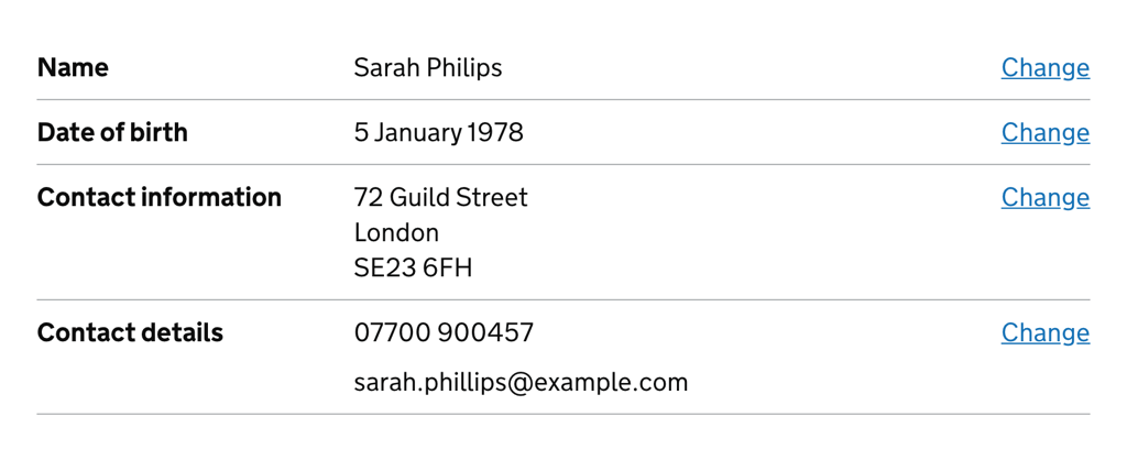
The GOV.UK Design System contains a component called the Summary list. It’s used in a few different contexts on GOV.UK, to summarise information. It’s often used at the end of a long or complex form, to let users check their answers before they send them, like this:

Users can review the information and, if they’ve entered something incorrectly, they can go back and edit their answer by clicking the “Change” link on the right-hand side. This works well if you can see the change link, because you can see which information it corresponds to.
In the top row, for example, I can see that the link is giving me the option to change the name I’ve entered because I can see the name label, and the name I put in is next to it.
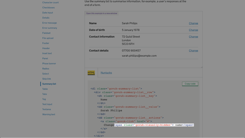
However, if you’re using a screen reader, this link – and all the others – will just say “change”, and it becomes harder to tell what you’re selecting. So to help with this, the GOV.UK Design System team added some visually-hidden text to the code in the example, to make the link more descriptive.

Sighted users won’t see this text, but when a screen reader reads out the link, it’ll say “change name”. This makes the component more accessible, and helps it to satisfy a Web Content Accessibility Guidelines (WCAG 2.1) success criterion for links which says we must “provide link text that identifies the purpose of the link without needing additional context”.
By building our components with inclusion in mind, we can make it easier to make products accessible, before anyone’s even had to think about it. And that’s a great starting point. But that doesn’t mean we don’t have to think about it – we definitely do. And a design system can help with that too.
2. Explain it
Having worked as the GOV.UK Design System’s content designer for the best part of 3 years, I’m somewhat biased about this, but I think that the most valuable aspect of a design system is its documentation.
(Here’s a shameless plug for my patterns Day talk on design system documentation earlier this year, if you want to know more about that.)
When it comes to accessibility, written documentation lets us guide good practice in a way that code and examples alone can’t.
By carefully documenting implementation rules for each component, we have an opportunity to distribute accessible design principles throughout a design system. This means design system users encounter them not just once, but repeatedly and frequently, in various contexts, which helps to build awareness over time.
For instance, WCAG 2.1 warns against using colour as “the only visual means of conveying information, calling an action, prompting a response or distinguishing a visual element”. This is a general principle to follow, but design system documentation lets us explain how this relates to specific components.
Take the GOV.UK Design System’s warning buttons. These are used for actions with serious, often destructive consequences that can’t easily be undone – like permanently deleting an account.

The example doesn’t tell you this, but the guidance explains that you shouldn’t rely on the red colour of warning buttons to communicate that the button performs a serious action, since not all users will be able to see the colour or understand what it signifies.
Instead, it says, “make sure the context and button text makes clear what will happen if the user selects it”. In this way, the colour is used as an enhancement for people who can interpret it, but it’s not necessary in order to understand it.
Making the code in our examples and component packages as accessible as possible by default is really important, but written documentation like this lets us be much more explicit about how to design accessible services.
3. Lead by example
In our design systems’ documentation, we’re telling people what good design looks like, so it’s really important that we practice what we preach.
Design systems are usually for members of staff, rather than members of the public. But if we want to build an inclusive workplace, we need to hold them to the same standards and ensure they’re accessible to everyone who might need to use them – today and in the future.
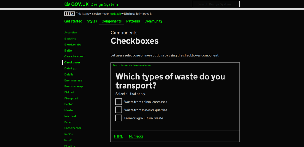
One of the ways we did this in my team, was by making sure the GOV.UK Design System supports users who need to customise the colours they use to browse the web. There are a range of different user needs for changing colours on the web. People who are sensitive to light, for instance, might find a white background too bright. And some users with dyslexia find certain colours easier to read than others.
My colleague, Nick Colley, wrote about the work we did to ensure GOV.UK Design System’s components will work when users change colours on GOV.UK. To ensure we weren’t introducing barriers to our colleagues, we also made it possible to customise colours in the GOV.UK Design System website itself.

Building this flexibility into our design system helps to support our colleagues who need it, but it also shows others that we’re committed to inclusion and removing barriers.
4. Teach it
The examples I’ve drawn on here have mostly focused on design system documentation and tooling, but design systems are much bigger than that. In the fortuitously-timed “There is No Design System”, Jina reminds us that tooling is just one of the ways we systematise design:
…it’s a lot of people-focused work: Reviewing. Advising. Organizing. Coordinating. Triaging. Educating. Supporting.”
To make a design system successful, we can’t just build a set of components and hope they work. We have to actively help people find it, use it and contribute to it. That means we have to go out and talk about it. We have to support people in learning to use it and help new teams adopt it. These engagement activities and collaborative processes that sit around it can help to promote awareness of the why, not just the what.
At GDS, we ran workshops on accessibility in the design system, getting people to browse various web pages using visual impairment simulation glasses to understand how visually impaired users might experience our content. By working closely with our systems’ users and contributors like this, we have an opportunity to bring them along on the journey of making something accessible.
We can help them to test out their code and content and understand how they’ll work on different platforms, and how they might need to be adjusted to make sure they’re accessible. We can teach them what accessibility means in practice.
These kinds of activities are invaluable in helping to promote accessible design thinking. And these kinds of lessons – when taught well – are disseminated as colleagues share knowledge with their teams, departments and the wider industry.
What design systems can’t do
Our industry’s excitement about design systems shows no signs of abating, and I’m excited about the opportunities it affords us to make accessible design the default, not an edge case. But I want to finish on a word about their limitations.
While a design system can help to promote awareness of the need to be accessible, and how to design products and services that are, a design system can’t make an organisation fundamentally care about accessibility.
Even with the help of a thoughtfully created design system, it’s still possible to make really inaccessible products if you’re not actively working to remove barriers. I feel lucky to have worked somewhere that prioritises accessibility. Thanks to the work of some really brilliant people, it’s just part of the fabric at GDS. (For more on that work and those brilliant people, I can’t think of a better place to start than my colleague Ollie Byford’s talk on inclusive forms.)
I’m far from being an accessibility expert, but I can write about this because I’ve worked in an organisation where it’s always a central consideration. This shouldn’t be something to feel lucky about. It should be the default, but sadly we’re not there yet. Not even close.
Earlier this year, Domino’s pizza was successfully sued by a blind customer after he was unable to order food on their website or mobile app, despite using screen-reading software. And in a recent study carried out by disability equality charity, Scope, 50% of respondents said that they had given up on buying a product because the website, app or in-store machine had accessibility issues.
Legally, reputationally and most importantly, morally, we all have a duty to do better. To make sure our products and services are accessible to everyone. We can use design systems to help us on that journey, but they’re just one part of our toolkit.
In the end, it’s about committing to the cause – doing the work to make things accessible. Because accessible design is good design.
About the author
Amy is a content specialist and design systems advocate who’s spent the last 3 years working as a Senior Content Designer at the Government Digital Service.
In that time, she’s led the content strategy for the GOV.UK Design System, including a straightforward and inclusive approach to documentation.
In January, Amy will continue her work in this space, in her new role as Product Manager for Babylon Health’s design system, DNA.

