

Over 50 thousand developers visit DavidWalshBlog every month from around the world to learn JavaScript tricks and fix problems in their code. Unfortunately, some of them have a slow experience on the site.
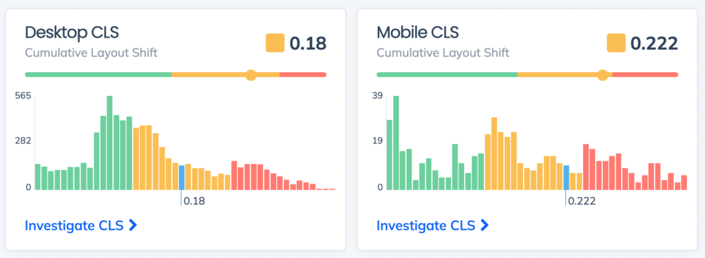
David tracks the performance of his Core Web Vitals and overall performance with Request Metrics. Recently, we noticed that his CLS performance score was trending pretty slow for both desktop and mobile users.
Wait, what is CLS?
Cumulative Layout Shift (CLS) is one of the Core Web Vital performance metrics. It doesn’t measure load time directly, instead it measures how much a page shifts while it is being loaded. You’ve definitely seen this and been annoyed by it. These shifts make a site feel slow to a user.
CLS and the rest of the Core Web Vitals are super important. Not only because they measure user experience, but also because they influence the pagerank of a site in search. And search traffic is life for bloggers, media sites, e-commerce stores, and pretty much everyone with a website.
If we can fix the site’s CLS problem, we’ll give readers a faster experience, and boost the search ranking so David can help even more people. Sounds like a great incentive, let’s figure it out.
Crashing with Google Lighthouse
To find a performance problem, many developers will use a tool like Google Lighthouse. I ran a Lighthouse report on David’s site, and here’s what I got.
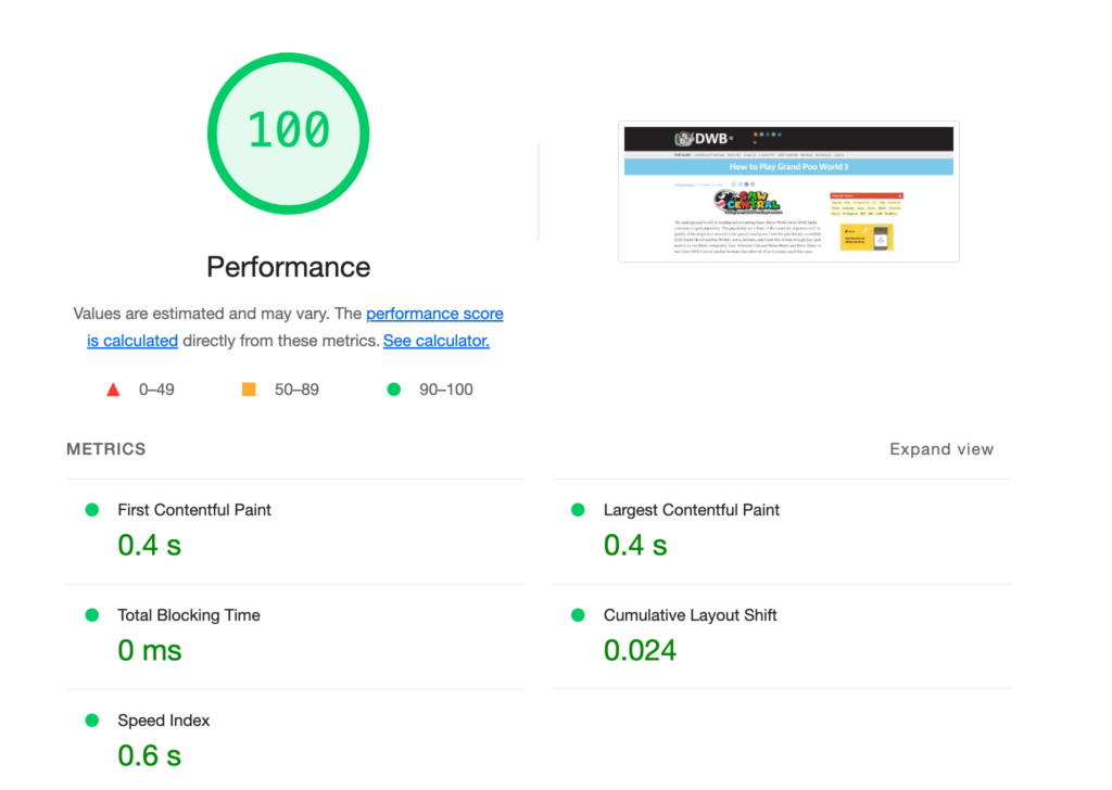
A perfect score! Let’s pack it up and go home.
The trouble is that Google Lighthouse is a lie. Real users won’t have this performance. That score only represents a single test, from my lightning-fast computer, in the USA, on a fast broadband connection.
David’s real users come from all over the world, on varying devices and networks, and at all times of the day. Their performance experience is far from perfect. That’s why we need to get real user monitoring for the performance, otherwise we might never know that there is a problem.
Where are the CLS problems?
David has been writing for a long time and has hundreds of posts on his site. Request Metrics tracks the CLS score per page so we can zero-in on the problems.
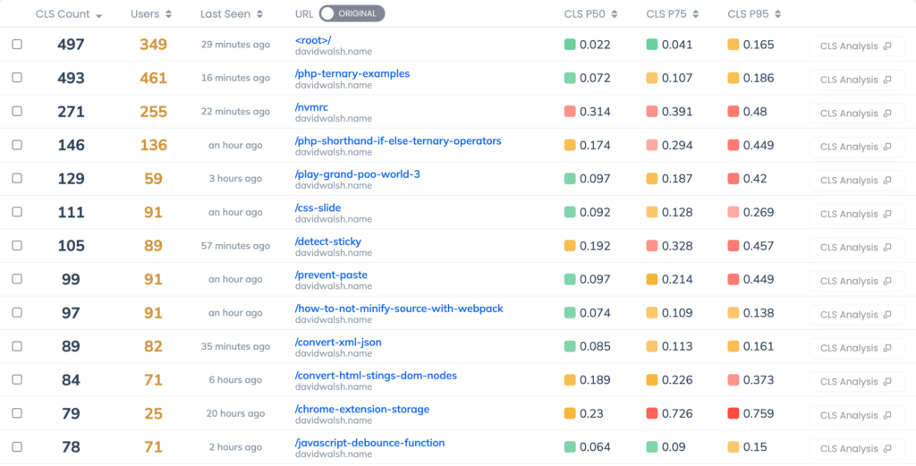
The largest traffic page is the root page, and that has a good CLS. But many of his posts, like Play Grand Poo World and Pornhub Interview have troubling CLS scores. We can also track the elements responsible for CLS, and for most of the posts its main > article > p. That means the first paragraph of the article is the thing shifting. Why would it do that?
What is common about these posts with the worst CLS scores? Images. Images are a very common cause of CLS problems because a browser doesn’t always know how big an image is until it’s downloaded. The browser assumes it’s 0x0 until it has the image, then shifts everything around it to make room.
Posts with lots of images would shift many times as each image was downloaded and the article shifted to make room for the new content.
Using images correctly for CLS
To avoid layout shifts when using images, we need to give the browser hints about how big the images will be. The browser will use these hints to reserve space in the layout for the image when it’s finished downloading.
<img src="/path/to/image" width="300" height="100" />
Notice that the width and height are specified as their own attributes — not part of a style tag. These attributes set both a base size of the image as well as the aspect ratio to use. You can still use CSS to make the image bigger or smaller from here.
Also notice that there is no px unit specified.
Image Sizes in WordPress
DavidWalsh.name is hosted on WordPress, where there are some built-in tools to do this. We can utilize wp_image_src_get_dimensions to get the dimensions of images he’s using and add them to the markup.
Proving it works
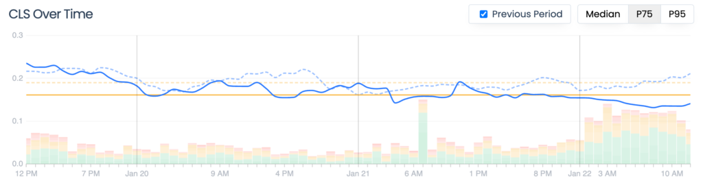
David made the image changes a few days ago, and we’re already seeing an improvement. CLS has dropped 20% to 0.123. We’re real close to the “Good” range of CLS now.
There’s still some issues to sort out around fonts, but that will be a story for another time and another post.
If you’re looking to improve the real performance of your site, or worried about losing your SEO juice from Core Web Vital problems, have a look at Request Metrics. It’s got the tools to track your performance and actionable tips to actually fix the problems.
Plus it’s free, so it’s got that going for it.
The post Fixing Cumulative Layout Shift Problems on DavidWalshBlog appeared first on David Walsh Blog.
