Upgrade Your Publishing Flow with the Post Descriptions WordPress Plugin

Featured Imgs 08

Tom de Visser, a developer from Amsterdam, released the Post Descriptions plugin last week. It was his first submission to the WordPress.org plugin repository. It allows users to write short descriptions on a per-post basis, which are then displayed on the post-management screen.

For an initial outing, it already seems to be a hit with its small user base. It has already racked up several five-star reviews and over 100 active installs. Granted, one of those reviews is from his employer, Mediaversa. While that might not seem like much from the outside looking in, anyone who has created plugins knows that it is a successful launch for an individual developer’s first plugin submission.

The plugin’s goal is simple: leave small notes, reminders, to-dos, or longer descriptions for posts. It could be an ideal solution for a small team, but lone bloggers might need it too.

Post Descriptions works with both the regular WordPress post editor or the classic editor by adding a meta box to the side of the editing screen. Currently, it only allows descriptions for posts or pages. Maybe the developer will add a post-type-support flag or filter hook for custom post types in the future.
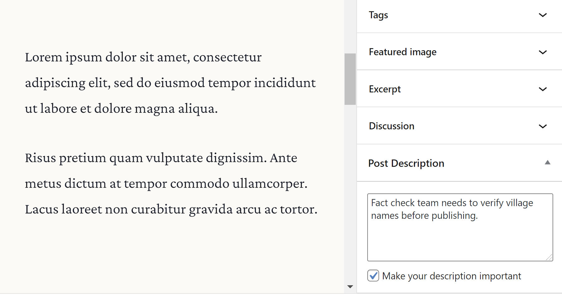
Meta box on the post-editing screen for adding a post description.
Posts Descriptions plugin meta box.

Aside from the description input box, users can tick the “Make your description important” checkbox to highlight a particular note. This option gives the text’s display a red color and turns it bold when viewed.

Descriptions are viewable via the post or page management screens. By default, they appear as a “state,” similar to how pending or draft states next to the title. The plugin also displays them under a “Description” column. Users can turn off the state display via the plugin’s settings screen and toggle the extra column via WordPress’s built-in Screen Options tab.

Post states via the Post Descriptions plugin on the post management screen.
Descriptions as post “states.”

One of my favorite features of this plugin is the flexibility of selecting where the notes appear on the post-management screen. Those who prefer one or two words can choose to display them as states. Those who prefer lengthier descriptions can show them in a separate column. Or, do both.

Description column on the post management screen for displaying notes.
Column for displaying post descriptions.

Users can also add descriptions via the Quick Edit link on the post-management screen.

From a user-experience standpoint, it hits some of those sweet spots of usability and simplicity. Under the hood, the code is solid. The developer does not seem to be overthinking things and making the plugin more complicated than necessary.

For small teams, I envision building a labeling system around this plugin that could address workflow issues. Adding short notes like Editor Review, SEO Review, and similar would alert the right team members to sign off on a post.

While the flexibility of displaying notes as either states or descriptions is welcome, it does not account for a third type of user. My ideal workflow would be to have separate inputs for both states and descriptions. I could create a shorter state that gets my team’s attention. Then, if more information is needed, I could add a longer description.

Post management screen displaying short notes as post states and longer ones under a description column.
Idea: Separate state and description text.

The downside in such a system is that it puts yet another input field in front of the end-user. Sometimes the route with the least effort is best. And, for a quick post note plugin, it is tough to beat the plugin’s current solution.

2nd Annual Atarim Web Agency Summit Kicks Off March 23

Featured Imgs 23

Atarim is launching its 2nd annual Web Agency Summit in a couple of weeks. The free event will run from March 23 – 26. The goal of the event is to help agencies and freelancers in the WordPress space grow sustainable businesses.

Atarim is the company formerly known as WP Feedback. In February, the business rebranded because its primary product had grown beyond a mere feedback plugin into an across-the-board agency solution.

“While I’m a big fan of WordCamps and a big believer in the value that events can bring to personal growth, we found that most events in our space focus on the technical Aspect of building a website,” said Vito Peleg, Atarim’s founder. “We take a more business-oriented approach. From finding the first clients through building solid recurring revenue and all the way to lessons from some of the biggest agencies in the world at full scale.”

The event has 36 sessions, which are broken down into four categories that focus on:

  • Build: Best practices for performance, SEO, accessibility, and the future of building websites.
  • Expand: Building recurring revenue and maintaining profits.
  • Scale: Project management, completing services, payment, and getting projects unstuck.
  • Thrive: Hiring, community building, profitability at scale, and exit strategies.

Peleg hopes that attendees can glean some knowledge in the sessions while saving years of trial and error.

“All are delivered through our own summit platform, so attendees don’t need to jump around between Zoom calls, YouTube Lives, and Slack channels,” he said. “We brought it all into our own interactive platform.”

Atarim has made several sessions publicly available from 2020’s event. For those on the fence, it should provide insight into the types of talks they can expect.

This year, each session will be running live — last year’s sessions were pre-recorded. This will allow attendees to be involved in real-time. There will also be a designated Q&A time for each session.

The event is free to attend through the last week of March for anyone. However, the sessions will eventually fall behind a paywall, which helps cover costs.

“We offer an All Access Pass for those that want to watch the replays for $97, which is the investment for those that get it before the event,” said Peleg. “This also includes 30+ sessions from last year’s event for a total of 50+ hours of expert advice, specifically designed to help web freelancers and agencies build a solid business.”

Success and Lessons Learned From 2020

Last year’s event kick-started as a response to the changing nature of conferences in the Covid-era. Peleg described the initiative as a way of “licking our own wounds” after his company had planned to attend, sponsor, and have its own retreat at WordCamp Asia in Thailand, which was canceled in 2020.

“This drove me into action, wanting to lift some spirits in the community,” he said. “I didn’t know that we would end up with the biggest event in the WordPress space and have such incredible partners that came along for the ride.”

Last year’s event had 5,725 attendees from 126 countries. In total, they watched 53,945 hours of videos. They also won 1,000s of prizes at sponsor booths that included iPads, board games, and more.

“This was way more than what we expected, and the summit platform even broke on the first day when we were getting more than 240,000 requests to the server in an hour,” said Peleg. “Luckily, there isn’t a better community for something like this to happen. Very quickly, some of the sponsors joined forces with some of the speakers and our team and got us back on the air for a full week of action. While they were working to get this sorted, I was mostly pacing back and forth in my office like a headless chicken, but this year we’ve come prepared, with load balancers, auto-scaling processes, and a much leaner platform to sustain the scale.”

There are no plans to switch to a physical Web Agency Summit in the coming years. For now, the virtual model is working.

“I’m very much looking forward to the return of WordCamps as physical events when [Covid-19] blows over, but I believe that virtual events are here to stay, so for the foreseeable future, once a year, we’ll bring back our summit as a celebration of the business side of the WordPress industry.”

Publish Text, Image, and Gallery Snippets With the Shortnotes WordPress Plugin

Category Image 091

Yesterday, Happy Prime owner and engineer Jeremy Felt released Shortnotes, a plugin for writing notes from the WordPress editor. The intention is for users to create short pieces of content, such as that found on Twitter, Instagram, and similar social networks. However, it does not come with a front-end posting interface, at least not in version 1.0.

The plugin works just like the post and page editor. It should be straightforward for most users.

While the Shortnotes plugin is relatively bare-bones for now, it serves as a foundation of something that could be more. Part of what makes social networks appealing is the ease of publishing quick content. Publishing notes through the plugin requires visiting the WordPress admin, clicking “Add New,” writing the content, publishing, and clicking a new link to view it on the front end. A quick-publishing interface either through a Dashboard widget or a front-end form would be a useful addition.

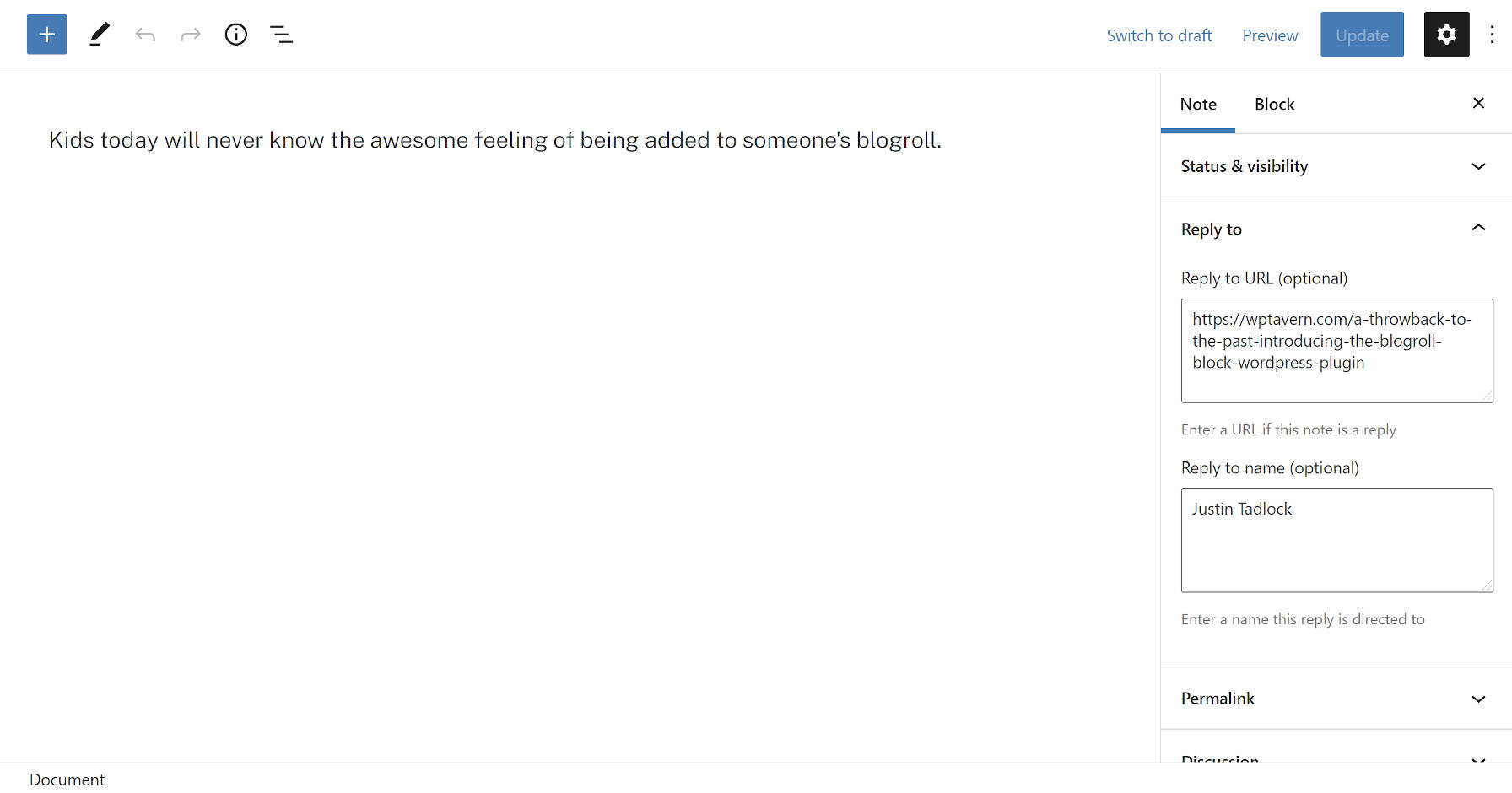
Notes post type from the WordPress block editor.
Note post type in the block editor.

Some new concepts that not all users may be familiar with are the “Reply to URL” and “Reply to name” fields. These are semantic fields for creating a note in reply to another post or person on the web. The plugin will automatically output this reply link on the front end.

The plugin integrates with the Webmention plugin. A Webmention is a standardized protocol for mentions and conversations across the web. The goal is a decentralized social “network” of sorts where everyone owns and controls their content. It is an alternative to what IndieWeb calls the “corporate” web in which large tech companies have control.

When entering a Reply to URL, Shortnotes will automatically send that URL through the Webmentions plugin system. It will also parse URLs in the post content as webmentions if they exist.

Users may also notice that the note title field is missing. This is intentional. The plugin automatically generates titles. They are needed for the <title> tag, which tools like search engines use.

The idea is for titles to not appear as part of the theme layout. Because most themes are not coded to check for post-type support before displaying them, there is a high chance that a user’s theme will output the auto-generated title on the front end. For now, that means editing a bit of theme code for those who do not want them to appear. Felt has an example of how he modified this for his site’s custom Twenty Twenty-One child theme. In the long run, as more themes begin supporting the upcoming site editor, users will be able to make this customization directly in the WordPress admin.

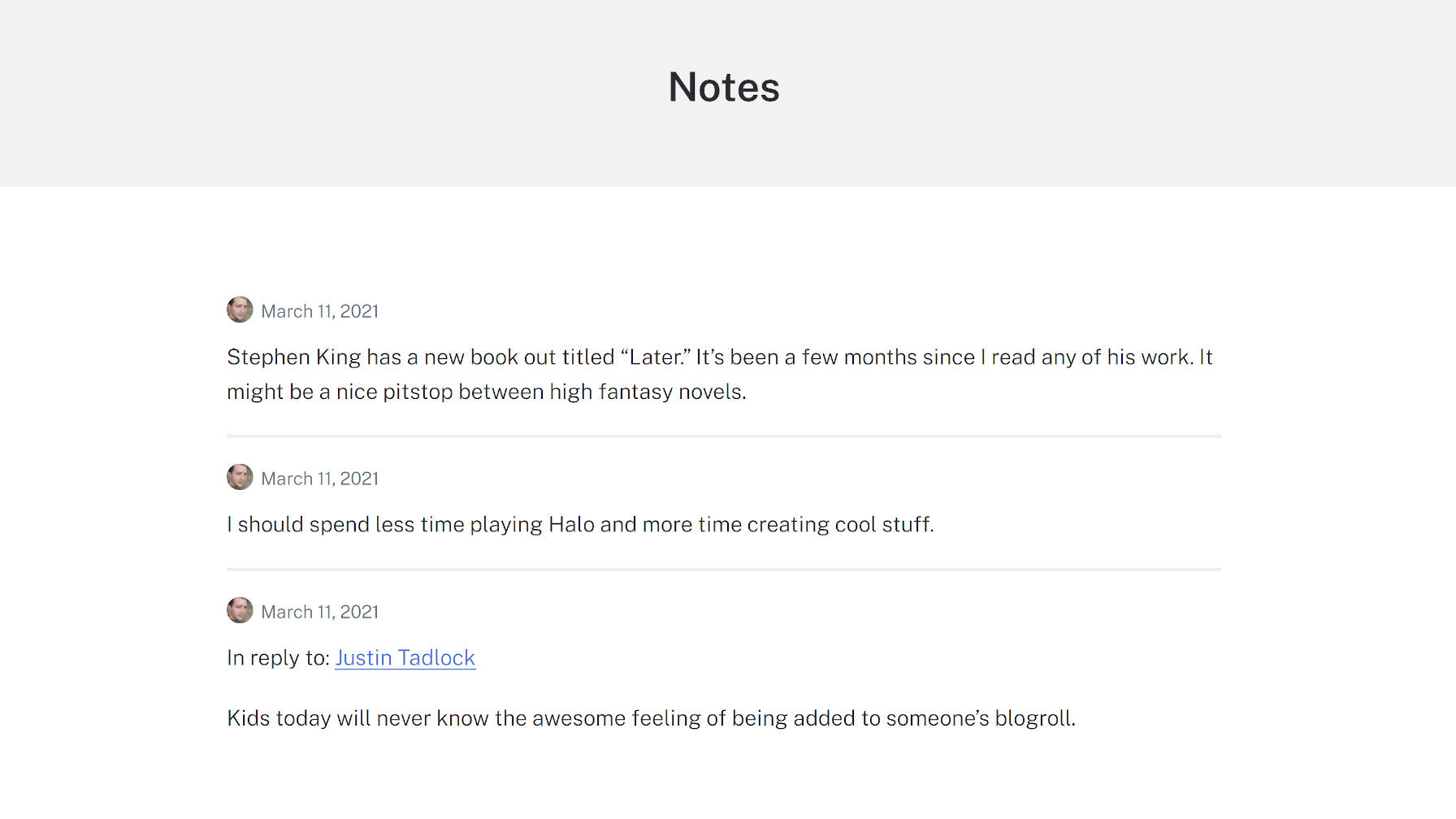
With a few tweaks like removing the title and some minor CSS adjustments, I was able to create a clean Notes archive page using the Genesis Block theme:

Archives view of notes from the Shortnotes plugin.
Modified notes archive.

One of my interests in checking this project out was diving into a real-world example of a plugin that limited which blocks could be used with the editor. The notes post type only allows the Paragraph, Image, and Gallery blocks. Again, the idea is to replicate the feel of what you can do on social networks. Overall, this feature worked as it should, limiting the notes to a subset of blocks.

However, I ran across a bug with the block editor. All block patterns, regardless of what blocks they contained, appeared in the inserter. Clicking on one containing a disallowed block would not insert it into a post. However, the editor did add a pop-up note that it had. There is a GitHub issue for this bug that has seen little movement since it was opened in June 2020.

Felt created a plugin to solve this called Unregister Broken Patterns. It removes any patterns that contain blocks that a post type does not support. At best, it is a temporary measure and needs to be addressed in WordPress.

WordPress 5.7 Introduces Drag-and-Drop for Blocks and Patterns, Streamlined Admin Color Palette, and One-Click Migration from HTTP to HTTPS

Category Image 091

WordPress 5.7 “Esperanza” was released today, named for Esperanza Spalding, an American jazz bassist who became an accomplished singer, songwriter, and composer in her early 20’s.

Versions 9.3 – 9.9 of the Gutenberg plugin are rolled into this update, bringing hundreds of enhancements and bug fixes that make working in the block editor more efficient and enjoyable.

One of the highlights is the new drag-and-drop capabilities in the block inserter. Users can now drag blocks and block patterns directly into the post content area, making page building even faster.

Many of the user-facing editor enhancements in this release give the user more control when using existing blocks:

  • Full height alignment: Blocks such as the Cover block now can have an option to expand to fill the entire viewport.
  • Buttons block: The Buttons block now supports vertical alignments, and you can set the width of a button to a preset percentage.
  • Social Icons block: You can now change the size of the icons in the Social Icons block.
  • Font size in more places: You can now change the font size in the List and Code blocks

This release also improves the UI for block variations to include the icon and description for the variation in the block inspector and a new dropdown to allow for switching between variations. Reusable blocks have been updated to be saved at the same time the post is saved. Quite a few more improvements have been added in version 10.1 of the Gutenberg plugin, which is not yet included core. If you use Reusable blocks frequently, you may want to install the plugin to take advantage of the expanded UI.

In addition to all the editor improvements, WordPress 5.7 introduces a streamlined color palette for the admin. It standardizes the palette to seven core colors and a range of 56 shades. One of the benefits is that all the shades meet the requirements for WCAG 2.0 AA recommended contrast ratio against white or black.

New Admin Color Scheme

Theme and plugin developers who want to better match the admin color scheme can easily reference the new standardized shades to make their products more at home in the WordPress admin. WordPress’ existing core classes have also been updated with the new color palette so plugin authors can use them to work within the new standardized palette.

One of the most exciting technical enhancements in 5.7 is a new one-click migration from HTTP to HTTPS. WordPress can now detect if the user’s hosting environment has support for HTTPS and update with the click of a button, handling mixed content rewrites where possible. This feature is available on the Site Health recommendations screen.

WordPress 5.7 continues the ongoing cleanup after the update to jQuery 3.5.1, which will eventually result in the removal of jQuery Migrate plugin. It fixes numerous jQuery deprecations in external libraries, cleaning up many JQMIGRATE warnings.

Developers may also be interested in the new filter-based Robots API included in 5.7. It enables the central management of the content of the robots meta tag injected into the page, and includes a setting to toggle whether search engines are allowed to display large media from the site. By default, a max-image-preview:large robots directive which will be injected into the robots meta tag based on the new setting.

Version 5.7 also includes native support for lazy loading iframes, a follow-up to WordPress’ support for lazy loading for images that came in 5.5. This should improve loading for pages that include embeds and other types of iframes.

Check out the WordPress 5.7 field guide for technical details on everything new in this release. This update is the result of work from 481 volunteer contributors who collaborated on 250 tickets on Trac and more than 950 pull requests on GitHub.

MemberPress Creators Have Earned over $1 billion dollars (Milestone Update)

Category Image 091

It’s always mind blowing for me to see the impact WordPress makes on the global economy.

MemberPress, the leading WordPress membership and course platform, announced today that they have passed the milestone of $1 billion dollars in creator earnings.

This is a conservative estimate and likely MemberPress creators have earned way more than that.

MemberPress Billion Dollar Creator Earning Milestone

With the digital acceleration from last year, they are estimating that MemberPress site creators are projected to earn over $600 million dollars in 2021 alone.

For those who don’t know, I invested in MemberPress in 2018 as part of our WPBeginner Growth Fund.

It’s been an exciting journey to work alongside with Blair Williams, founder & CEO of MemberPress.

The impact our users (website creators) are making through their online courses and membership sites is truly humbling to watch.

Note: Want to add premium content on your site? See our step by step guide on how to create a membership site, and how to sell online courses in WordPress.

Product Update from MemberPress

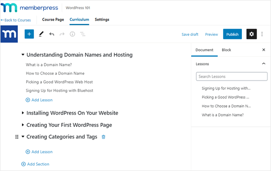
Last year, MemberPress launched an easy to use online course builder that works on top of the WordPress block editor. This makes it easy for non-techy website owners to create courses, add lessons, manage access control, and more.

Creating the sections and lessons for your course

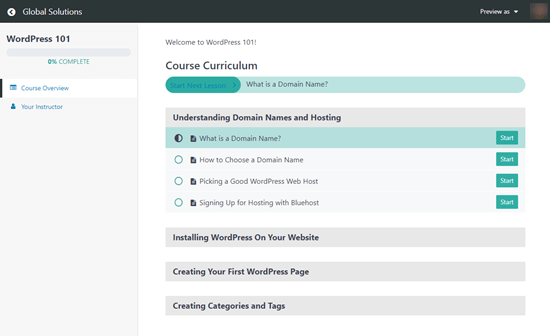
The team also added a Classroom mode to offer a distraction-free learning experience that’s focused on content consumption and course completion rate. This immersive learning mode works with all WordPress themes.

The MemberPress course curriculum that users see, showing their progression through the course

Aside from the huge update on Courses, MemberPress also made it seamless to add premium content protection for various top page builder plugins such as Divi, Elementor, Beaver Builder, WP Bakery, etc.

They also made significant improvements to add drip content in WordPress, ability to gift memberships, added PDF invoices, integrations with PushEngage, and more.

I also got a sneak peek of some big features they’re working on, and it’s going to be an exciting 2021.

What Can You Use MemberPress for?

MemberPress is the best WordPress membership plugin and online course platform for many reasons.

Here’s what you can do with MemberPress:

Basically if you want to restrict access to any type of premium content in WordPress, then you should use MemberPress.

Final Thoughts on WordPress & Creator Economy

The WordPress economy and indirectly the creator economy is huge. In the State of Word for 2020, Matt Mullenweg, co-founder of WordPress shared that WooCommerce facilitated over $20 billion in sales in 2020.

Other third-party online course platforms like Teachable reported that course creators earned over $456.7 million in 2020. Thinkific is also estimating their course creators to earn around $550 million in 2021.

MemberPress is estimating that creators using MemberPress will surpass estimated $600 million in sales in 2021, and this is a conservative estimate.

The creator economy has been on the rise since I started WPBeginner in 2009, but it’s never been stronger than right now.

If you have the knowledge and passion for teaching others, then you can start a very successful online business today.

The combination of YouTube, membership platforms, and social networks for building community provide a unique opportunity for anyone who has a desire to succeed.

As a content creator myself, it’s extremely rewarding for me to see others succeed in their online journey.

I want to congratulate Blair and the MemberPress team in their role for building a robust platform that supports thousands of creators find success online.

Here’s to an amazing 2021!

P.S. If you have a WordPress product that’s empowering website owners to succeed online and want to work with us, then I would love to chat with you. Click here to learn more about WPBeginner Growth Fund.

The post MemberPress Creators Have Earned over $1 billion dollars (Milestone Update) appeared first on WPBeginner.

Build a Full WordPress Site via Block Patterns With the Hansen Theme

Category Image 091
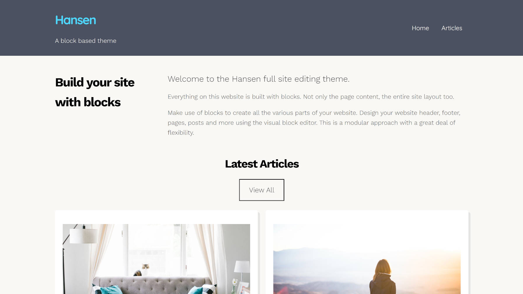
Front page output of the Hansen WordPress theme.

Earlier today, the WordPress theme directory welcomed its fourth block-based theme. Built by UXL Themes, Hansen is one of the more stylish projects capable of working with the site editor in the Gutenberg plugin. The theme author also stepped it up a notch and included several block patterns.

I have written about how patterns will be a game-changer. I have talked about the need for a UI overhaul to better expose them to users. And I have proposed that theme authors use the pattern system instead of templates, allowing users to build out full sections of their sites at the click of a button.

UXL Themes has done just that. Most patterns that we have seen thus far have been built primarily for post or page content. The Hansen theme takes that idea a step further and creates patterns for different site sections.

Want to try a different look for the header? Just remove the old one and swap in another header pattern.

Header patterns included with the Hansen WordPress theme: dark and light.
Inserting the dark header pattern.

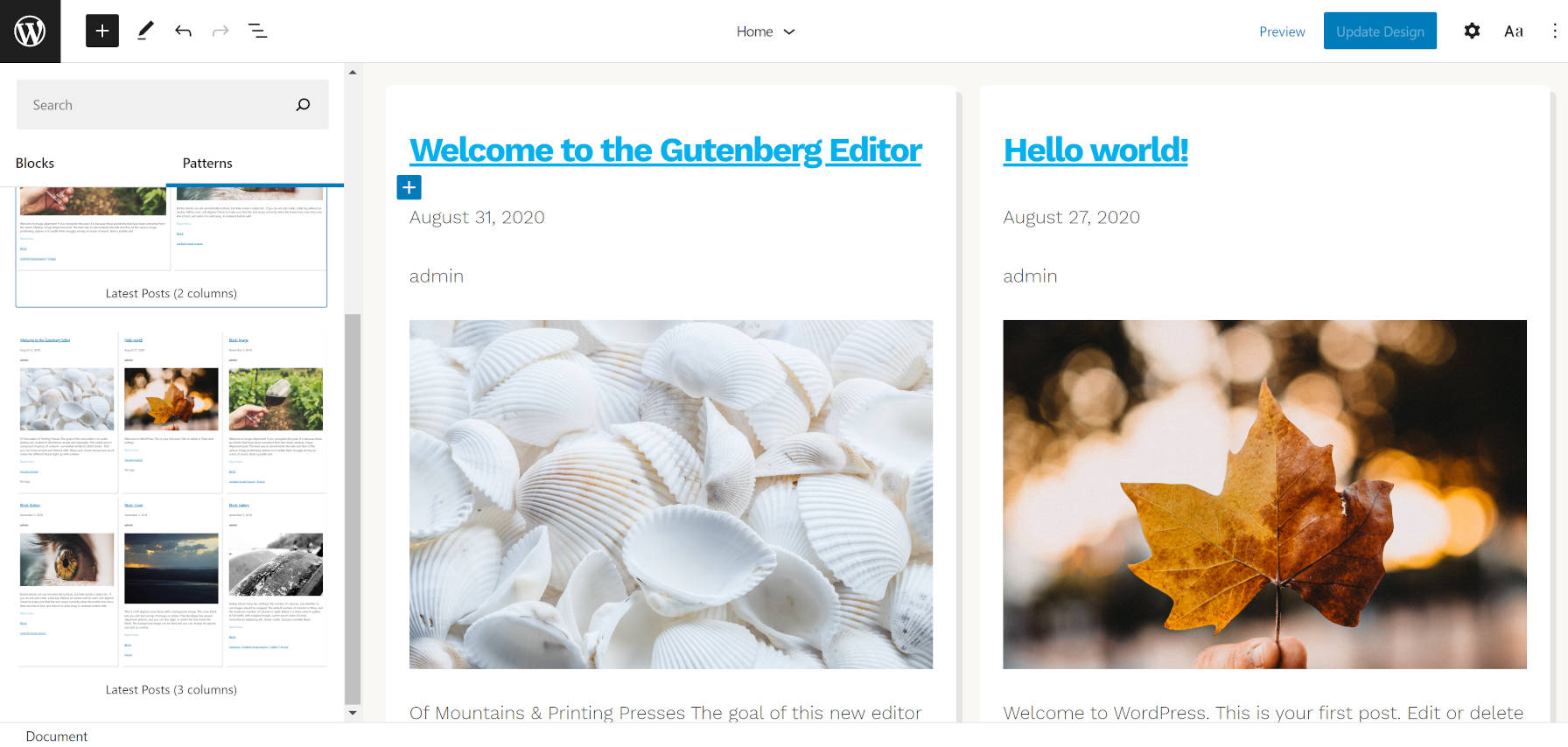
How about changing the look of your blog posts page? The theme comes with two and three-column patterns for outputting the latest posts.

Blog posts patterns included in the Hansen WordPress theme.
Inserting a two-column blog posts pattern.

It also packages a Content and Sidebar pattern that is more suitable for single posts and pages.

I am still undecided on whether the patterns or template parts system is the ideal solution for this. Right now, patterns have a cleaner UI overall and can be categorized. Template parts might be easier to switch, but there is no way to group them (e.g., header templates, footer templates, etc.). Regardless of what becomes the de facto standard in the long term, we need more theme authors like UXL Themes experimenting with these concepts, seeing what works, and gathering user feedback.

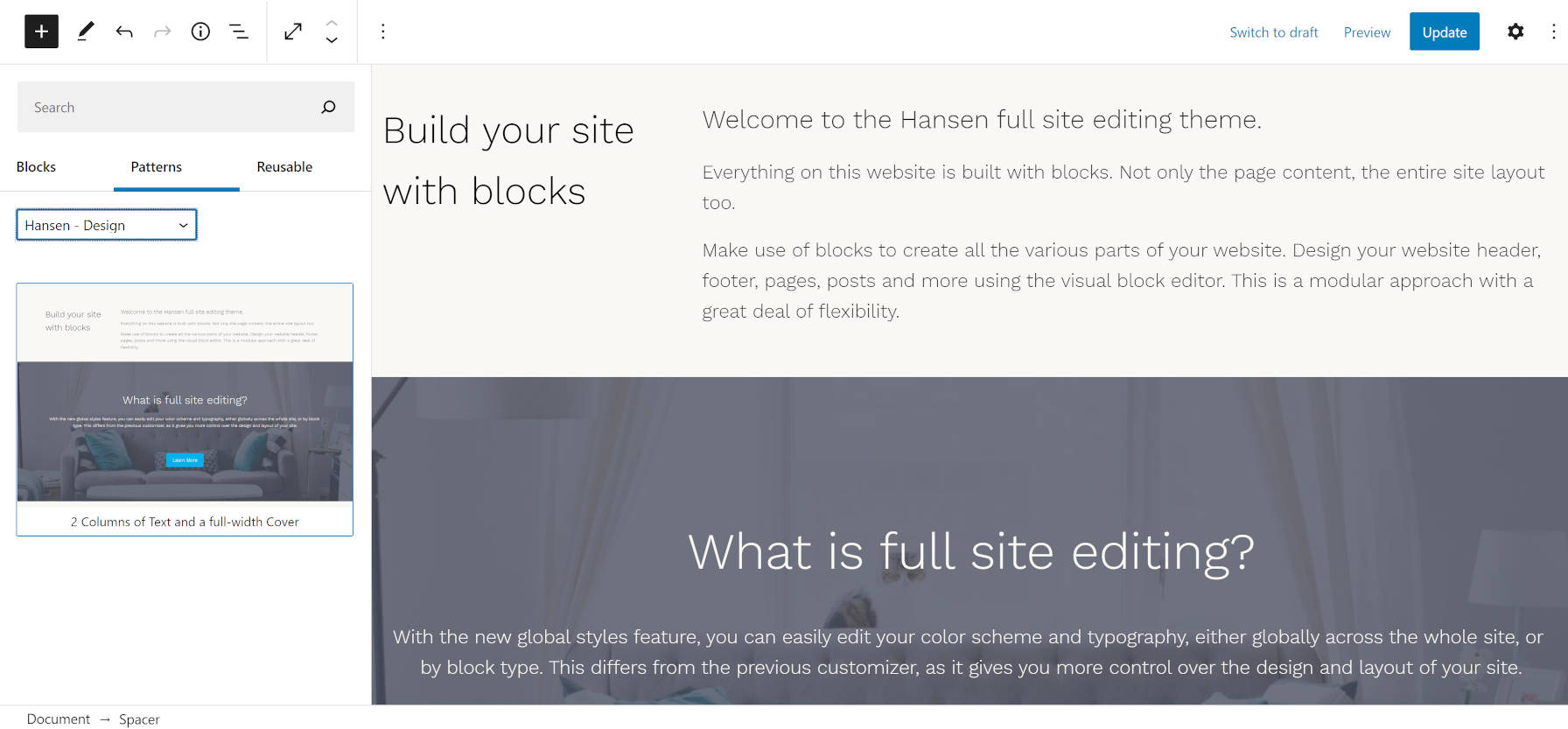
The theme does not add much in the way of content patterns. However, it does include one named “2 Columns of Text and a Full-Width Cover.” While it is a bit of a mouthful, the name does fully describe what it does. This is also the pattern in use for the homepage in the theme’s demo. However, the demo has a slight modification, adding a custom latest posts section.

A custom block pattern with two columns and a cover/hero section.
Hansen content-related pattern.

Hansen is more than just its patterns. The theme generally looks pretty good too. It has a bit more pizazz than we have seen from some other block-based experiments. Like the recently-released Phoenix theme, developers are becoming more comfortable moving beyond the bare-bones block-based designs from previous months.

These themes are obviously not on par with what one could build on more mature systems. However, Gutenberg’s FSE system is inching forward. The theme authors who are experimenting now are paving the way for the next generation of themes, which I am excited to see.

The Hansen theme also includes several block styles. Most are geared toward blocks that users would typically use in the site editor. I have not seen such an approach in previous block-based themes.

Two of the styles are for mobile navigation. The Mobile Friendly style displays a horizontal nav menu on desktop while switching to a hamburger-flydown on mobile devices. The Mobile Style alternative retains the mobile layout on all screen sizes.

There is a Box Shadow style for the Query Loop block, which adds a shadow to each post. In the future, I hope to see WordPress provide box-shadow options for this instead of themes relying on block styles. Nevertheless, it is a welcome addition for the moment.

Selecting the Box Shadow style in the block editor for the Query Loop block.
Box Shadow style for the Query Loop block.

The No Bottom Margin style allows users to remove bottom margin from Columns. I assume the theme author used this to address the common issue of nested blocks and their bottom margins adding on top of each other. I do not like this as a style because it gives the user the responsibility of fixing a design issue that should be taken care of under the hood. Generally, the problem stems from tackling spacing in design using a bottom margin instead of a top margin. It can be corrected in either case, but going with a top-margin approach is easier.

Outside of that one stylistic issue, the other downside to the theme is that it is not well-suited to long-form content out of the box. The content area stretches too wide for the default font size, making for uncomfortable reading. The theme includes a Narrow Width style for the Group block that corrects this. However, it would ideally be the reverse, with the content defaulting to a narrower width. Whenever a user wants to write a long-form blog post, they would need to wrap it in a Group block and apply the Narrow Width style. The more common use case should be the default.

Overall, I love the experimentation. Hansen is one of the best themes for playing around with the site editor in Gutenberg right now.

WordPress 5.7 Lets Administrators Send Password Reset Links

Category Image 006

It’s that time in the release cycle when all the dev notes are rolling out ahead of the next major update. These notes include technical summaries of all the goodies coming in the next release. If you haven’t been paying close attention, there are always a few happy surprises in there that pop up as conclusions to tickets that contributors have been working on for years.

The new password reset feature coming in WordPress 5.7 allows administrators to manually send a password reset link to users, resolving a five-year old ticket. Instead of having to instruct a user about where to go to click on the lost password link and follow the steps, this new feature lets administrators push a button in the admin to send the link. If you have ever had to support clients or a community of users who may not be very technically inclined, this new password reset feature will save lots of time in helping users regain access to their accounts.

The “Send password reset” link is available in several places. Administrators can find the link on the Users screen, as well as in the bulk actions dropdown menu.

It is also available on the individual user screen with a button and a note clarifying that this action will not change the user’s password or force the user to change it.

The password reset email notification includes the site name, username, a password reset link, and the IP address where the request originated:

This password reset request originated from the IP address [IPADDRESS].

There is an open discussion on the original ticket regarding whether this email notification should include the administrator’s IP address.

“The IP address (while fraught with privacy concerns) is the only thing validating that this email came from the website and is not a phishing email,” contributor Gabriel Mariani said. “Unless there is a better way to validate the authenticity of the email I’d say it would be worthwhile to keep it.”

Others see the IP address as useful only if a user is attempting to verify that it is their own IP address or collecting the information to prevent a phishing attack. Giving out the administrator’s IP address doesn’t seem pertinent to either of those concerns.

“I could use my phone to send a reset, and I would have no idea what my IP was,” Mika Epstein said. “And that can easily be faked. Omitting the IP actually reduces the data being sent out that could be used by bad-actors.

“I think it’s more likely we’d have a savvy bad actor than end users who would need to ask for a password reset but also know what a valid IP is and how to ask about it.”

This part of the email text may be iterated on in subsequent patches or future releases of WordPress. Check out the dev note for more discussion on this feature, along with information about further customizing the notification email.

Native Lazy Loading Support for iframes Coming To WordPress 5.7

Featured Imgs 23

Felix Arntz, a WordPress core committer and developer programs engineer at Google, announced upcoming support for lazy loading iframes. The feature is included in the latest WordPress 5.7 beta and will officially ship next month to the larger community.

WordPress has supported lazy loading for images since version 5.5. However, support for iframes was not included in the initial feature set. Browser support for iframes was widespread at the time. However, it had not yet been formalized as part of the HTML Living Standard. Soon thereafter, it was added to the HTML spec, and discussion began anew for adding support into WordPress.

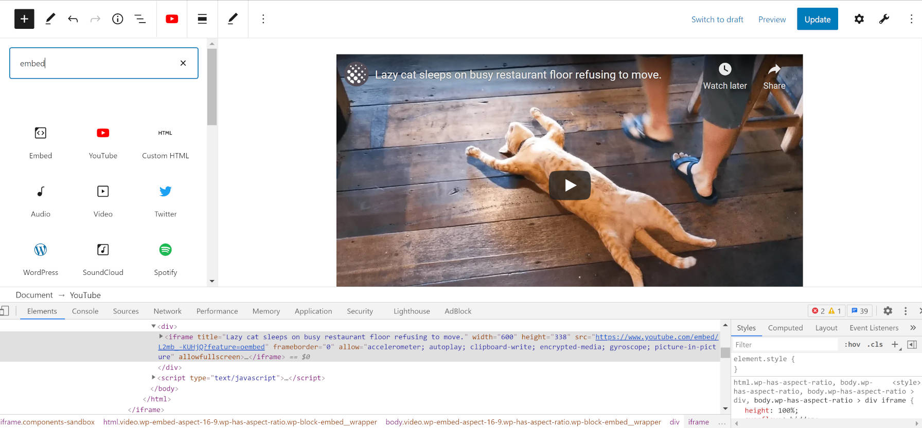
Unlike images, many users are likely unaware that they are using iframes. The primary use case for iframes is with embed blocks or the auto-embed system for users who are on the classic editor. For example, whenever a user adds a YouTube video to their blog post, the underlying code outputs an iframe.

Viewing the source code for an embedded YouTube video in the block editor.
Source code of YouTube embed shows iframe.

These iframes add weight to the page size and hamper loading time.

The opposite of lazy loading is eager loading. This is the default on the web, which loads all resources in bulk. This also often leads to slow-loading webpages when they contain many images or iframes. Lazy loading only loads the image and iframe sources when they appear in a site visitor’s viewport. This speeds up the initial load time of pages.

WordPress will only add the loading="lazy" attribute if an explicit width and height are set for the iframe. This is to avoid the page-shifting effect that happens when the iframe comes into view. Arntz wrote about this effect extensively when he announced support for image lazy loading. The same issue applies to iframes.

“A common user experience problem in modern websites is so-called layout shifting, often caused by slow-loading media resources like images,” he wrote. “By default, only after an image is loaded, the browser can layout the page correctly, which results in the content e.g. below the image to shift. This issue can be easily resolved by providing width and height attributes on img tags, as the browser will use them to determine the Aspect ratio of the image so that it can infer the page layout ahead of actually loading the image.”

There are cases where WordPress will not add the loading attribute, even for oEmbed providers that it supports. The iframe content is not supplied by WordPress. The third-party providers create the HTML and send it back to the individual WordPress site. It is up to those third parties to follow best practices for adding width and height attributes.

“Since WordPress cannot guess the dimensions of the embedded resource, the loading="lazy" attribute will only be added if the oEmbed iframe tag comes with both dimension attributes present,” wrote Arntz.

Currently, the filter applies to the post content, excerpt, and text widgets. Perhaps WordPress will extend this to comment text one day.

Potential Problems With Ads

MaAnna Stephenson, the owner of BlogAid, brought up a concern for users who display ads on their site. There may be scenarios where lazy loading is banned in advertising terms or has a technical conflict.

“Has this been tested with folks who run ads on their site using an ad agency like Mediavine and AdThrive?” she asked. “They cannot have iframes lazy loaded, as the ads use iframes and they have their own lazy load mechanism for delivery.”

The problem is that there is no ideal way to exclude every advertising service and to distinguish them from other types of iframes. From a technical standpoint, it needs to be an all-or-nothing feature.

Handling ads falls squarely into plugin territory. Arntz covered such use cases in the post. Developers can disable lazy loading for iframes wholesale or target specific iframes with basic PHP. It would only take a few lines of code to build a plugin for specific ad services.

Jeff Starr also has a plugin for disabling lazy loading altogether named Disable Lazy Load. That could serve as a stopgap solution until something more specific to users’ needs comes along.

GoDaddy Launches the Hub, a New Site, Project, and Client Management Experience for Web Professionals

Featured Imgs 08
Decorative image representing The Hub by GoDaddy Pro that displays the home screen.

On Monday, GoDaddy officially launched the Hub by GoDaddy Pro, a dashboard that brings together all of its products, pro-specific tools, and solutions. The experience is geared toward website developers and designers, creating a central location to manage their client work.

GoDaddy Pro is not a new service by GoDaddy. The hosting company launched its initial beta in 2015. However, GoDaddy Pro is now offering a fresh experience powered by the Hub. According to Adam Warner, the Global Field Marketing Sr. Manager at GoDaddy, the Hub is being built in collaboration with real-world web designers and developers from their Customer Advisory Board.

The Hub is at hub.godaddy.com. Existing GoDaddy Pro users can opt-in to the new Hub experience. However, they may continue using the legacy experience at pro.godaddy.com. They can also jump between both as needed. Eventually, the Hub will completely replace the legacy experience.

The Hub home screen from GoDaddy Pro.
The Hub home screen.

“You can manage all your client projects, sites, and GoDaddy products from within the Hub,” said Warner. “Your clients’ WordPress sites don’t have to be hosted at GoDaddy. The Hub works with all web hosts. You can run one-click WordPress updates, security checks, backups, and other bulk site maintenance work within the Hub. We’ve seen users save an average of three hours per month, per site.”

The Hub allows web developers to access their clients’ GoDaddy products without needing to pass around credentials. Developers can also send a pre-loaded shopping cart or purchase products on their clients’ behalf.

“This makes it easier, and faster, to get a new project up and running,” said Warner. “You don’t have to worry about your client buying the wrong hosting plan or domain. Project management is integrated into the Hub, so you can keep track of client communications and ensure you’re delivering projects on time.”

Part of this journey began when GoDaddy acquired ManageWP and brought its team over in 2016. The acquisition was anything but popular at the time.

“We built the first version of our GoDaddy Pro site management tools on top of ManageWP Orion,” said Warner. “We added new GoDaddy-specific features, like allowing clients to grant delegated access to manage their GoDaddy products. We also included some premium addons for free on GoDaddy-hosted websites. Just like with ManageWP, sites managed in the Hub can be hosted anywhere, not just at GoDaddy.”

The Hub has an interface that feels more Average Joe than tech savant. I half expected to see call-to-action buttons littering the screen, funneling users to every conceivable GoDaddy product, but none were found. Expectations from the GoDaddy of 10 years ago still linger and die hard. However, the company continues to move beyond its old reputation with its free tools and more recent willingness to give back to the open-source community, including its contribution to Five for the Future.

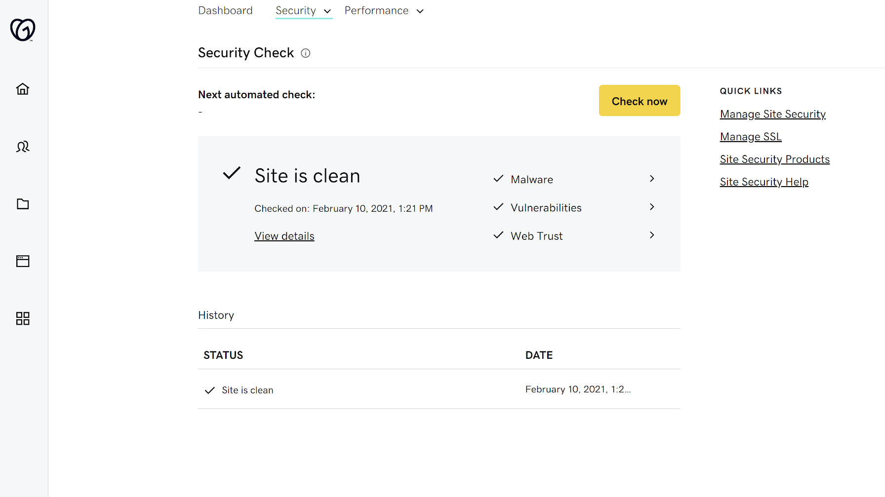
Site security check with the Hub by GoDaddy Pro.
Running a site security check.

“My goal in joining GoDaddy in 2018 was, and still is, to continue my participation in the WordPress and wider web designer and developer (WD&D) communities in order to listen and return feedback internally on how we can best support freelancers in starting, growing, and streamlining their businesses,” said Warner. “GoDaddy Pro (the legacy tool) already existed when I joined GoDaddy, and my mission was to spread the word and offer suggested enhancements based on real-world conversations with freelancers and their specific needs.”

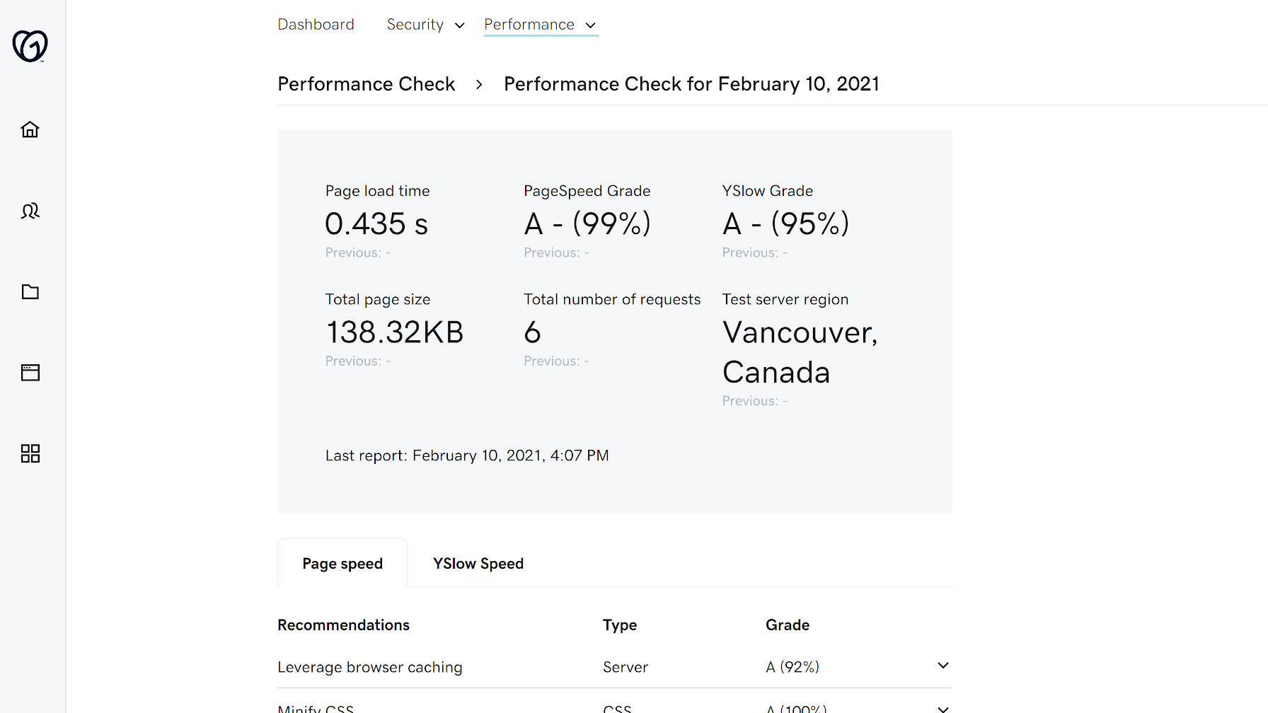
Creating clients, projects, and sites from within the interface is simple. Performance and security checks went well for the one site I have connected. The tests seemed to be spot on in comparison to other tools I have used.

Performance check output by the Hub from GoDaddy Pro.
Site performance check.

GoDaddy Pro membership is free. However, the Hub will have premium site maintenance tools in the future. Automated security checks, performance checks, backups, and uptime monitoring are currently free. There is no timetable on when they will be behind a paywall. Some of the premium features will have a downgraded free option when the switch is flipped.

“While some adjacent programs (e.g. GoDaddy Reseller program, Pro subscription) may have associated costs or fees, GoDaddy Pro’s integrated project management, site management, and client management tools are free,” said Warner.

The commitment to offering the management tools for free is undoubtedly a good thing. Thus far, I like what I am seeing with the new Hub experience.

WordPress 5.7 Will Make It Easier to Migrate From HTTP to HTTPS

Featured Imgs 23

The next major release of WordPress will make it much easier for users to migrate their sites from HTTP to HTTPS. It introduces new capabilities to detect if the user’s hosting environment has support for HTTPS and provides a one-click update process, handling mixed content rewrites where possible.

“A major pain point in WordPress has been the migration of a WordPress site from HTTP to HTTPS: While changing the Site Address and WordPress Address to use HTTPS is trivial, updating references to the old URLs in existing content is not,” WordPress Core Committer Felix Arntz said in the ticket proposing the feature. “It cannot be accomplished within core UI and requires use of more advanced tools, such as WP-CLI or plugins like Better Search Replace, which is a no-go for most users.”

In WordPress 5.6, there is no clear guidance in the Site Health screen about how to migrate to HTTPS, even though it shows as an issue. The user would need to learn more about how to update it manually, starting with changing the site URLs.

In WordPress 5.7, if HTTPS is supported, the Site Health Status screen will notify users and guide them with a new button that updates the site with a single click. It also migrates the site content on the fly to use HTTPS for URLs. Arntz recorded a video demo of the update:

This change also comes with new environment variables and filters that allow hosting providers to change the URLs linked in the HTTPS status check in Site Health, so they can more effectively manage it for their customers’ hosting options. This is similar to how hosts can modify URLs for updating the PHP version, which has had a positive impact on getting sites running on supported versions of PHP.

It’s important to note that the streamlined HTTP to HTTPS migration in 5.7 does not handle updating content in the database. Also, if a site’s URLs are controlled by constants, the update is not possible to complete automatically. In these instances, the HTTPS status check on the Site Health screen will inform the user why the site would need to be manually updated.

More technical details are available in the ticket and commit message, and a dev note should be forthcoming.