Part of your job as a designer is to make sure you present your final design to your clients in a way that they expect (and that makes your hard work shine!). Clearly, they will want to see how your design looks and feels on their actual product — that’s where product mockups can be incredibly helpful.
This week we’re taking a look at food, drink, and packaging design mockups. We’ve tracked down some beautiful examples on Envato Elements so, if you’re currently designing a label or package design for a client, some of these might be the perfect way to present your design when it’s done. Enjoy!
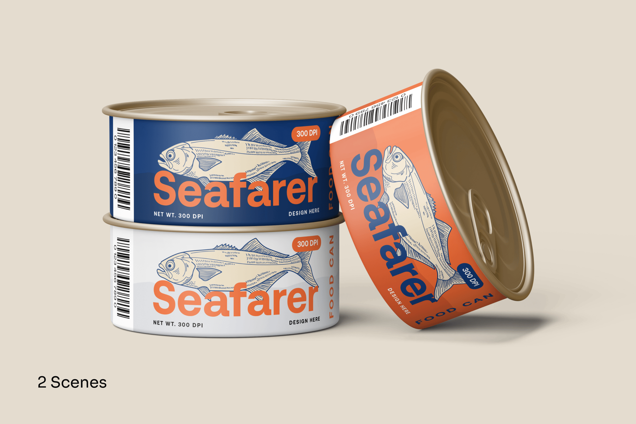
This is a realistic mockup designed for showcasing food products, especially in the seafood realm. With two preciously crafted scenes for displaying different perspectives, this mockup also enables full customization, from labels to color schemes. The mockup further impresses with its realistic metallic texture, providing a professional and market-ready appearance.
An easily customizable Photoshop mockup template for showcasing food products. The template features smart objects and fully customizable layered PSD files. This Mockup, which boasts realistic, 3D rendering and an editable background color, enables you to showcase your product in real-world scenarios with precise detail.
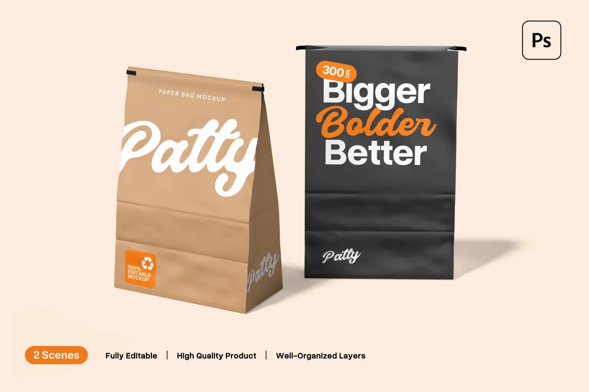
This paper bag mockup provides two distinct scenes featuring mockups of paper bags crafted from sustainable materials, complete with customizable rubber straps. From adjusting the background to utilizing a natural Kraft paper texture, you can transform these mockups to impeccably represent your brand’s essence.
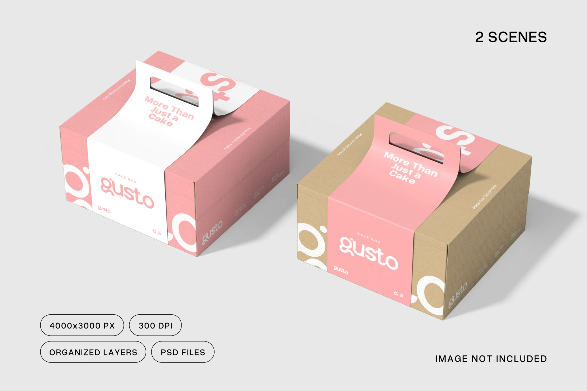
A customizable, versatile cake box mockup designed to help you display your brand’s unique design flair. Made of paper and featuring a practical handle, it’s designed for businesses, such as bakeries and dessert shops, that prioritize aesthetics, and eco-friendliness. This mockup is fully customizable, allowing you to modify every aspect.
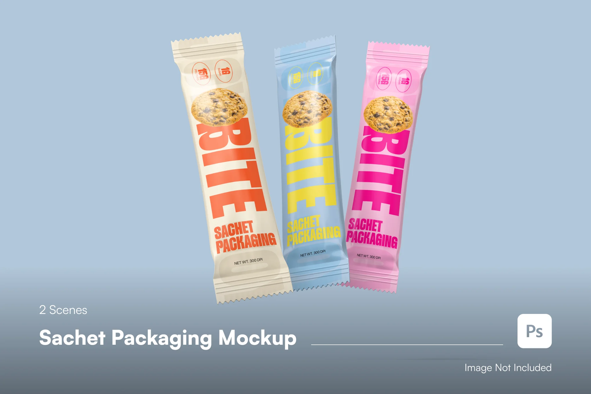
This sachet packaging mockup is an engaging and versatile template that features two different scenes for diverse presentations. The first scene displays three bright sachets in a row, great for highlighting your packaging design, while the second scene showcases sachets upright, ideal for portfolios or ads.
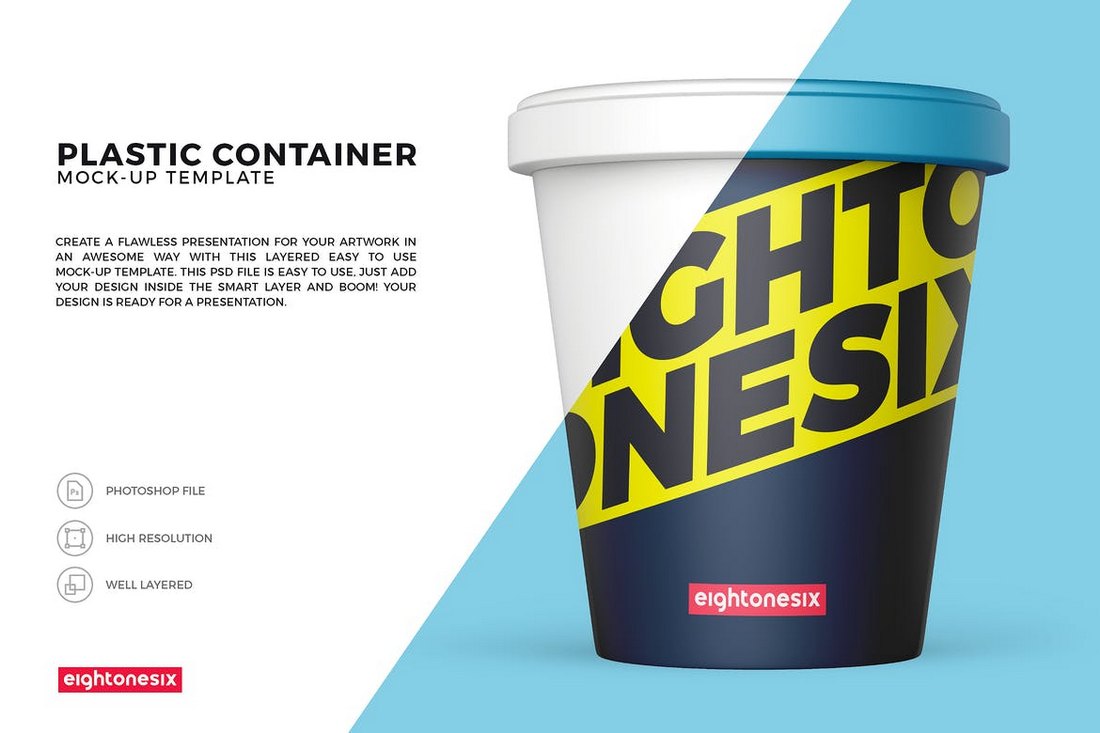
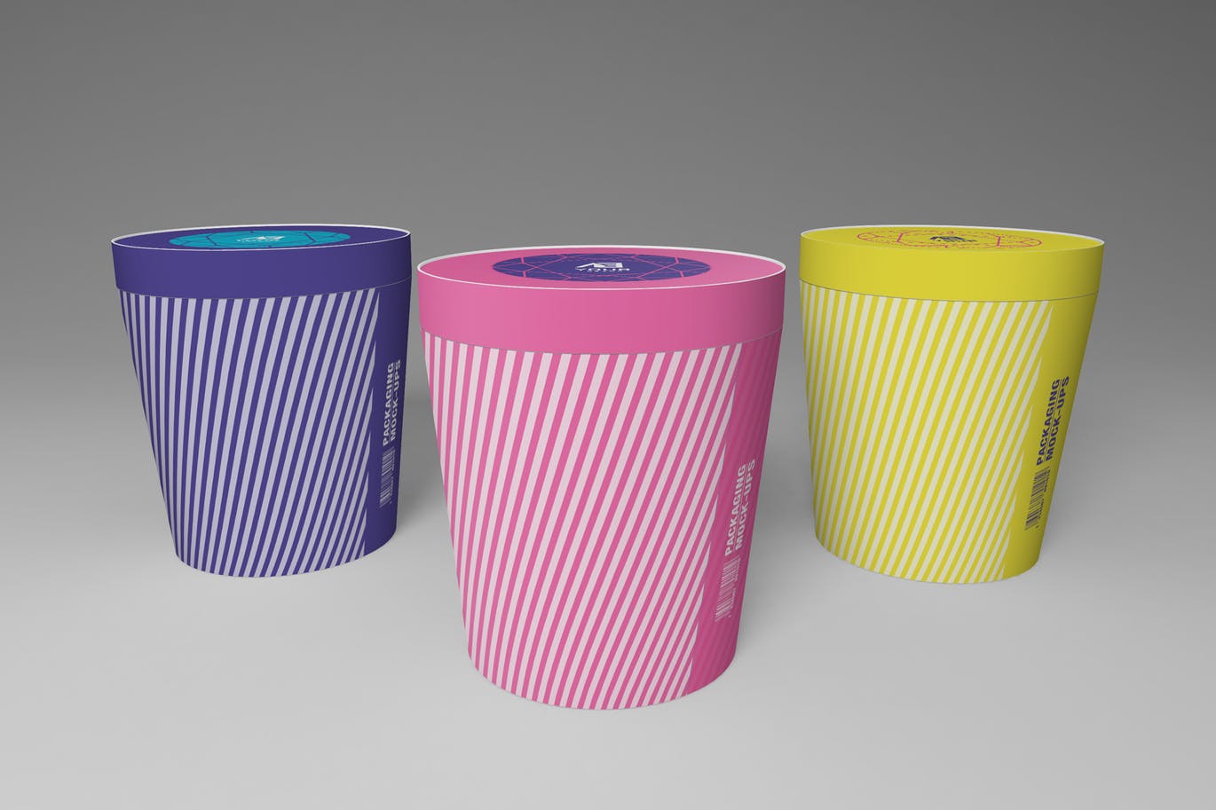
This is a neat ice cream tub mockup template that showcases your design in a fun, versatile format. Ideal for previewing ice cream packaging or other products, the mockup features easy customization via smart objects and well-organized layers. You can swiftly personalize the background and cap colors, add your designs, and more with a few clicks.
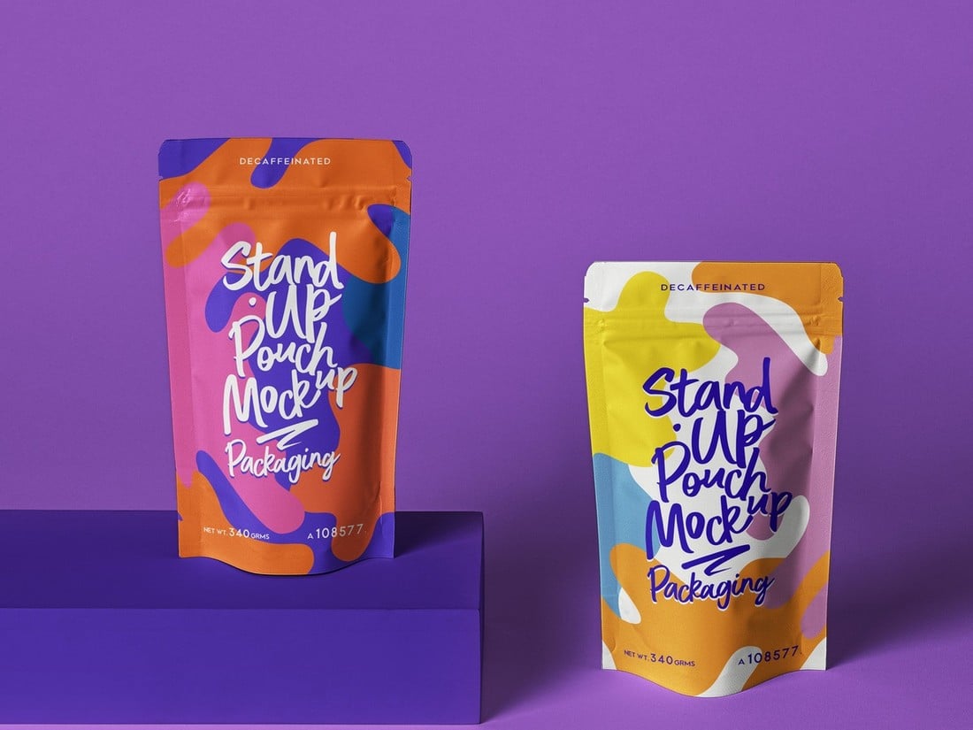
This pouch mockup template is a high-quality, realistic mockup perfect for displaying your unique product or custom designs. It features easy-to-edit, organized layers with smart object support. With a file size of 3840 x 2560 px at 300dpi and an RGB color space, it offers detailed, vibrant previews of your packaging designs.
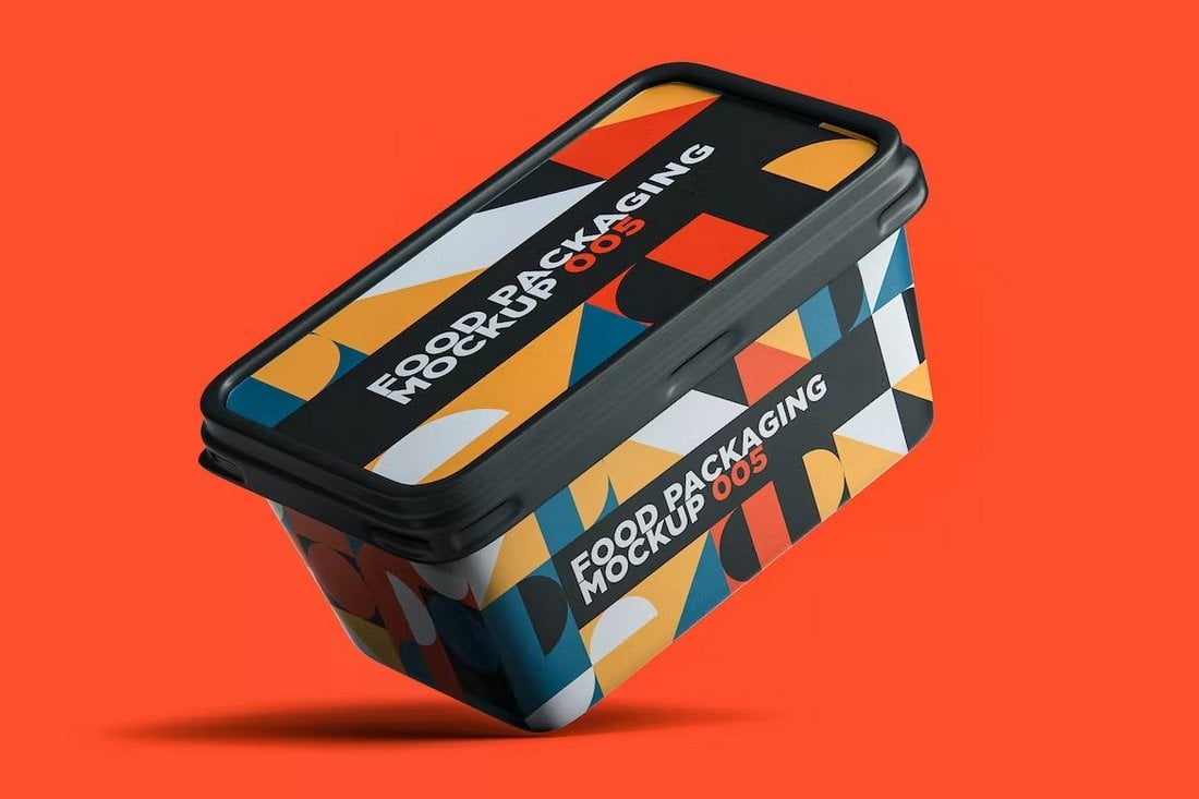
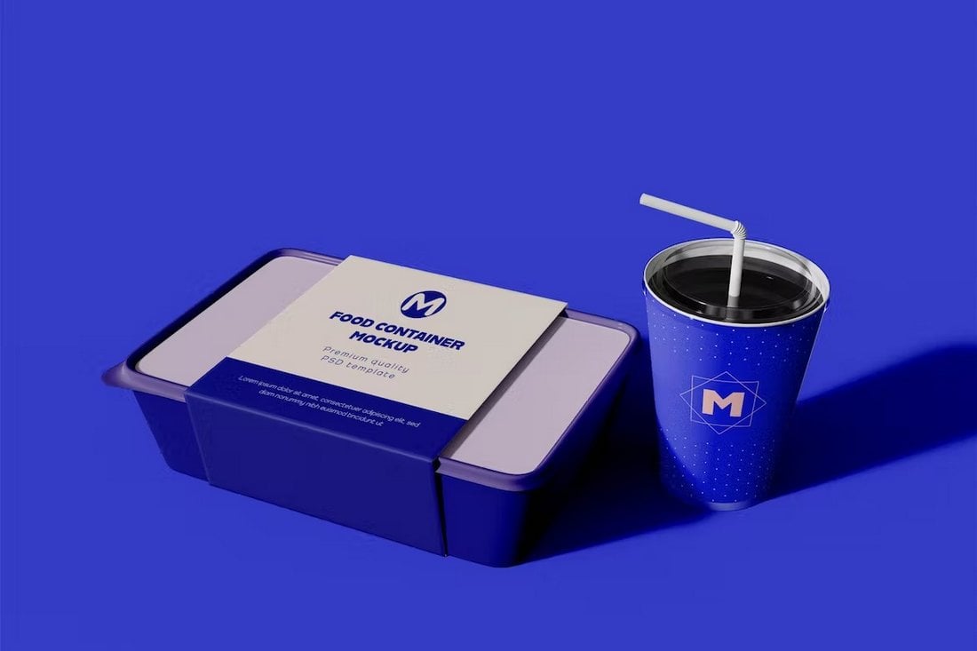
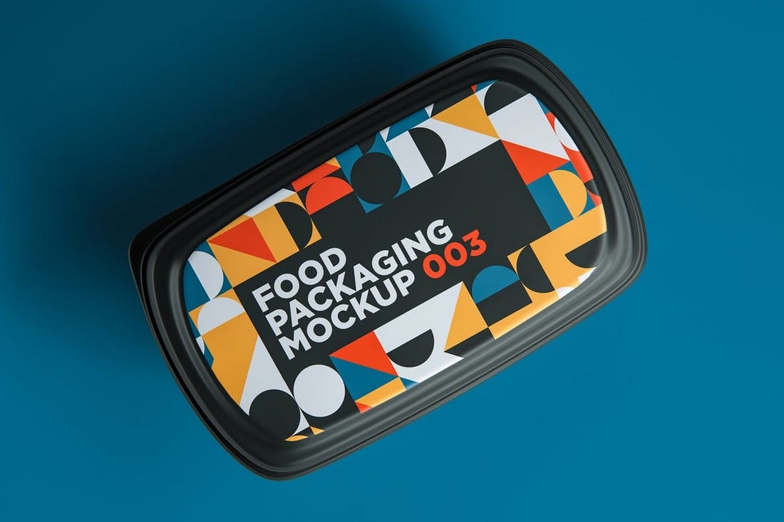
A high-quality food container mockup template ideal for presenting your designs in a professional and realistic 3D display. It comes in a Photoshop-friendly PSD format and utilizes smart object features, enabling you to easily and rapidly replace the default design with your own.
A great set of food mockup templates for presenting your packaging designs in a realistic and professional manner. The mockup is vailable in PSD Photoshop format and provides high resolution, organized layers and folders, and even allows a changeable background color.
A high-quality wine bottle mockup template, ideal for professionally presenting your designs in a 3D format. Its user-friendly smart-object feature in PSD Photoshop format allows you to swiftly substitute current designs with your own.
A unique, high-resolution template offering a variety of features for showcasing food packaging designs. It’s fully customizable with editable colors and smart objects, perfect for food and drink packaging designs. Its layered PSD file and organized, named layers contribute to an easy editing experience.
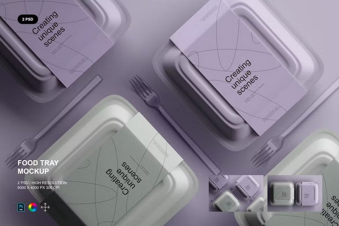
This mockup pack blends a versatile food tray container and a natural kraft paper carton label, offering a realistic look with high-resolution detailing. It’s easily customizable with editable PSD layers and also features smart object functionality. Perfect for restaurants, caterers, or food enthusiasts.
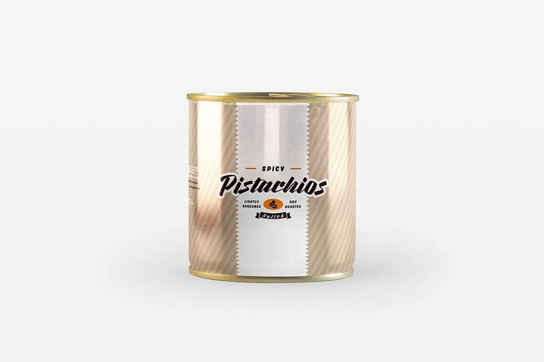
A visually engaging canned food mockup template that simplifies the design process. Useful for presenting ideas before actual development, the tin can mockup renders your designs at high-resolution (3000×2000 px), facilitated by a smart object feature.
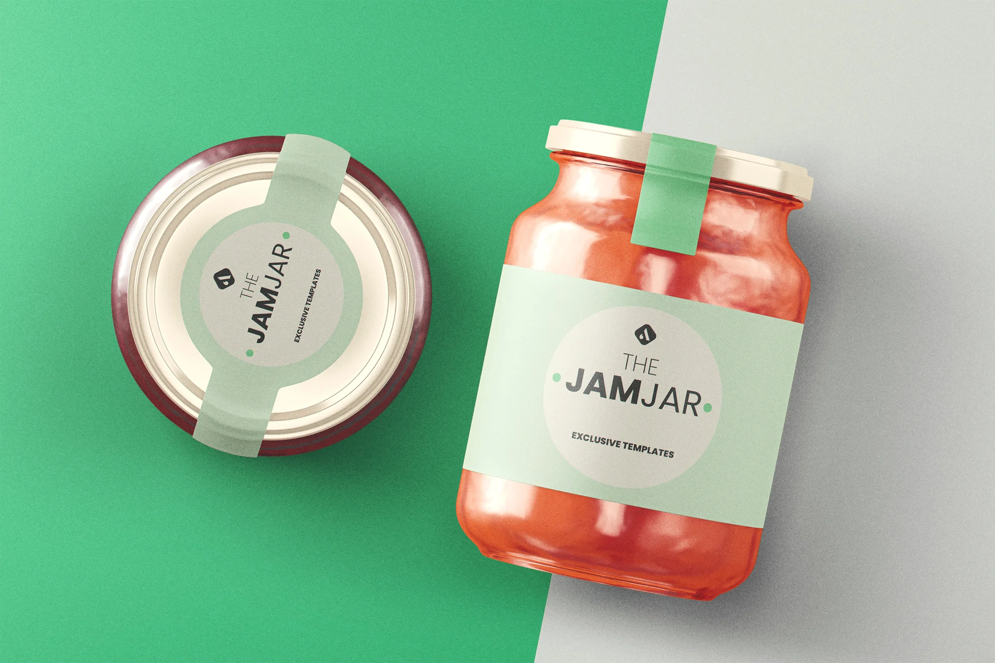
This is a versatile, high-resolution template, perfect for presenting your jam, jar, packaging, or food-related projects. This easily editable and organized mockup with Smart Objects allows you to customize and display your design on a realistic-looking jar.
An easy-to-use mockup template offered in high resolution for presenting fast food container designs. With its organized layers and smart object feature, this creative asset lets you seamlessly paste your design and get a detailed preview.
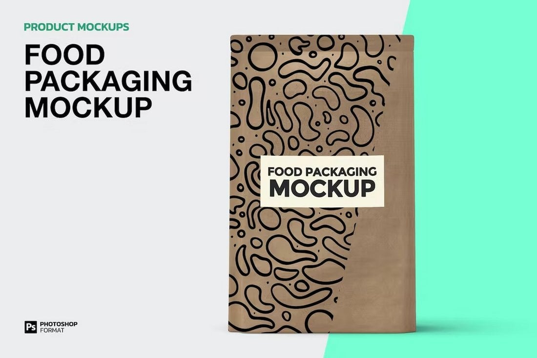
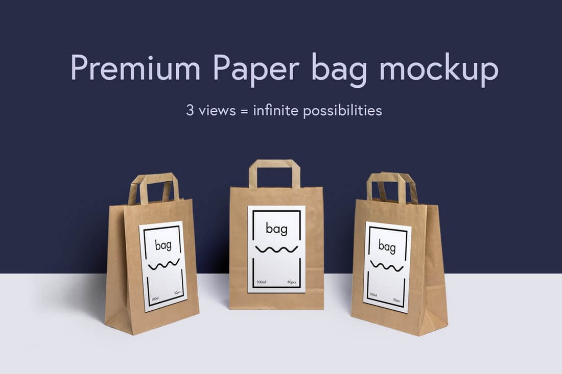
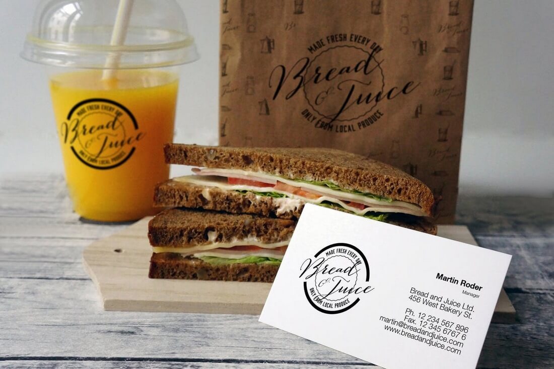
Paper bags are one of the most common methods used for food packaging. With this mockup, you can showcase your own paper bag packaging designs for various types of food products.
This food packaging mockup features a clean and realistic design. It includes 3 different mockup templates showing different views of the product. Each template is easily customizable via smart objects.
A modern and minimal food tray packaging mockup. This template is perfect for showcasing designs for healthy and organic food items. There are 2 mockups in the template with isolated objects.
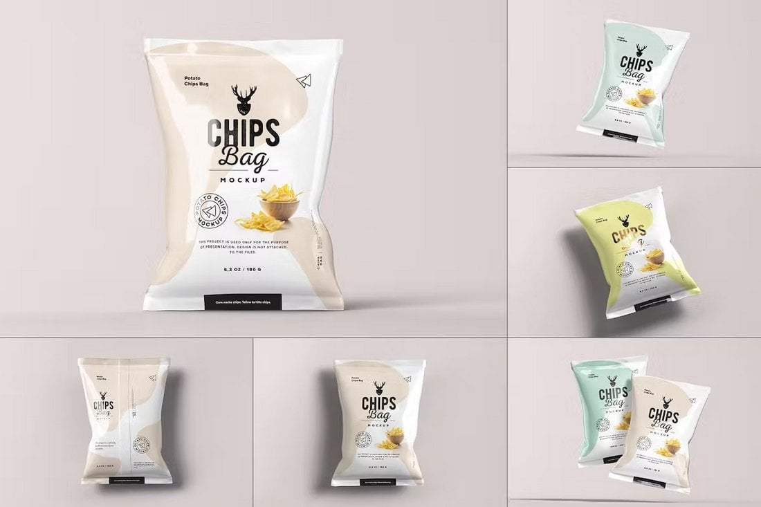
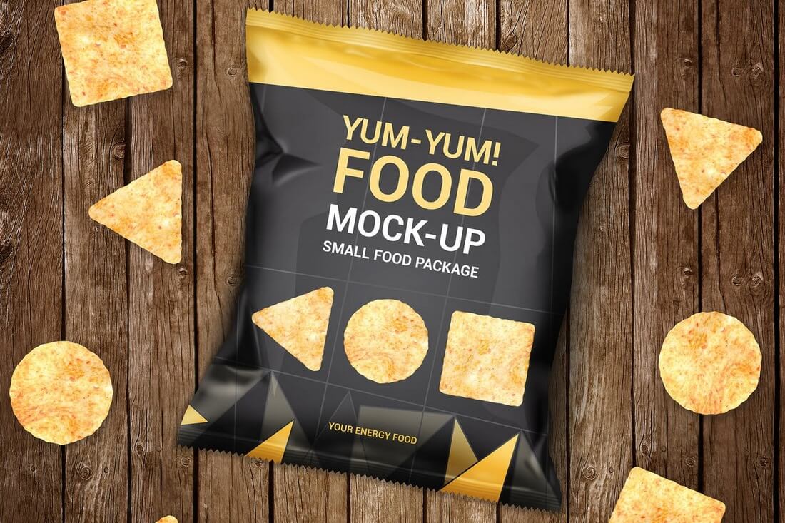
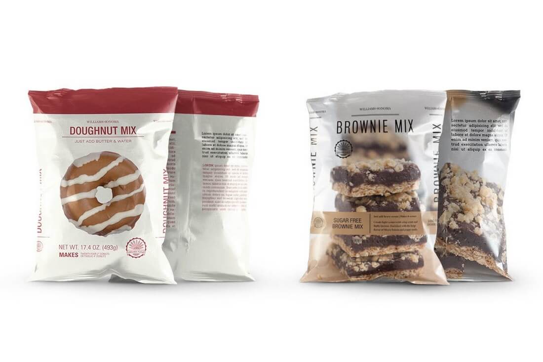
You can show off your packaging designs for chips bags with this creative mockup template. It includes 6 different mockups with realistic designs for promoting all kinds of chips and snack bags.
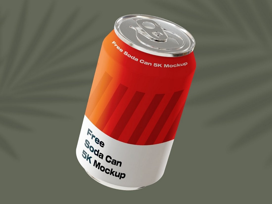
This is a free bundle of drink can mockups with easily editable designs. There are 6 different templates in this pack and they are available in 5K resolution. You can even use them on a billboard.
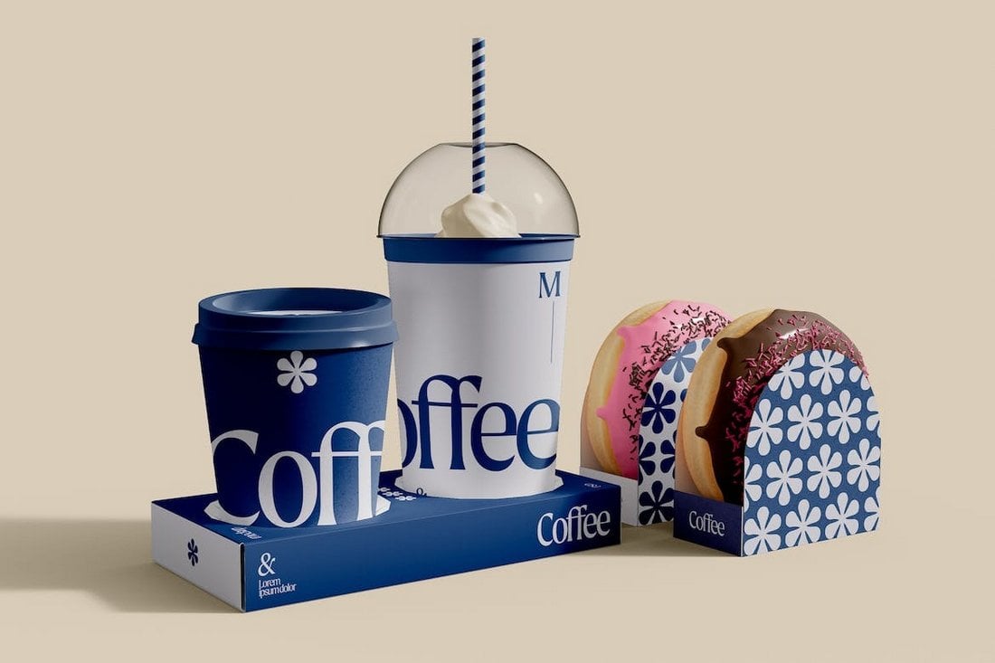
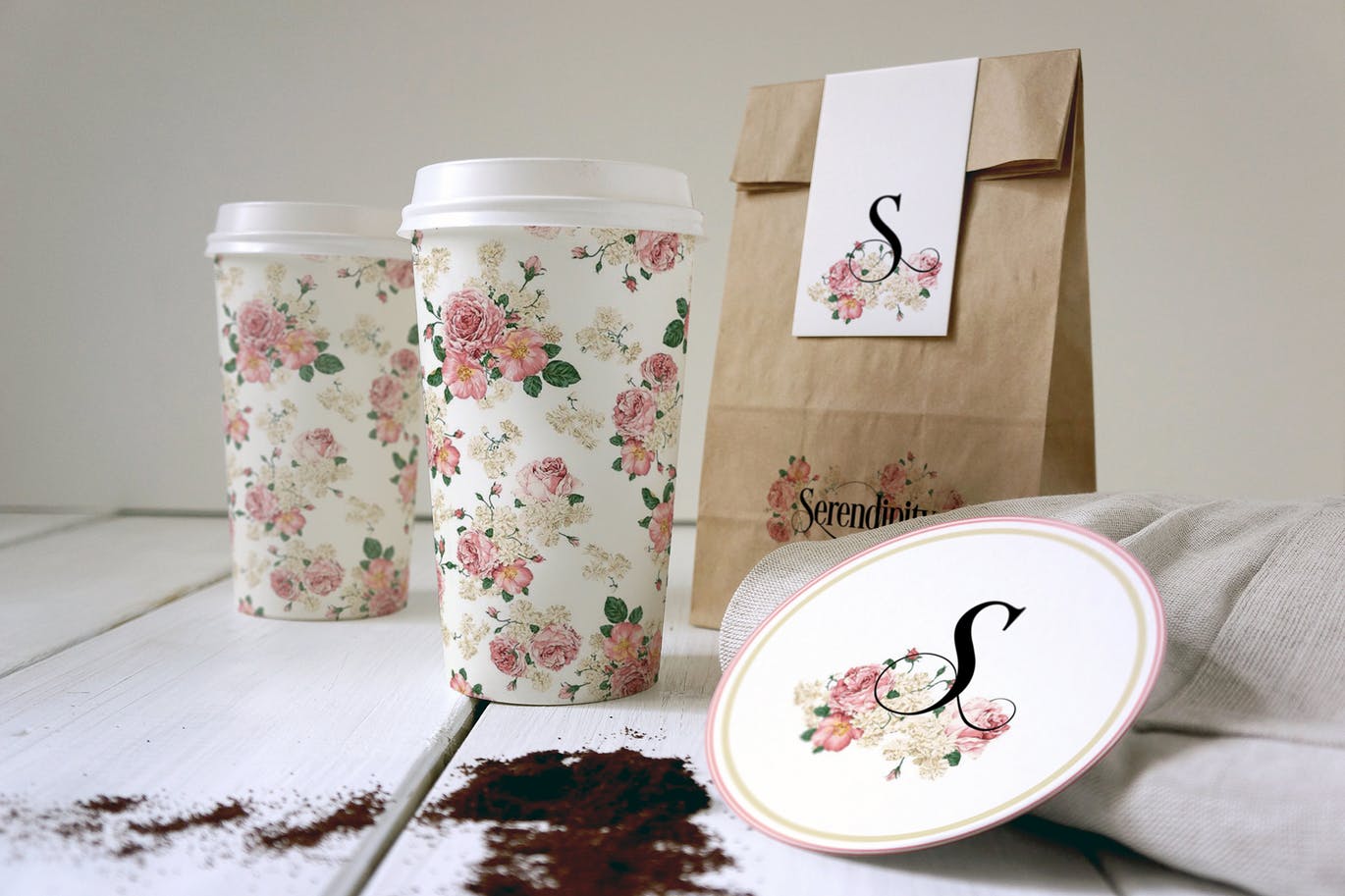
This mockup template is perfect for coffee shops and restaurants to showcase their branding in a takeaway packaging design. The template has coffee cups and donuts packaging design with easily editable smart objects.
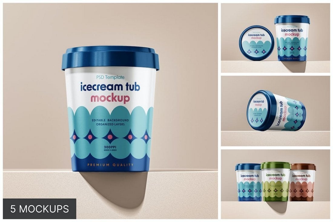
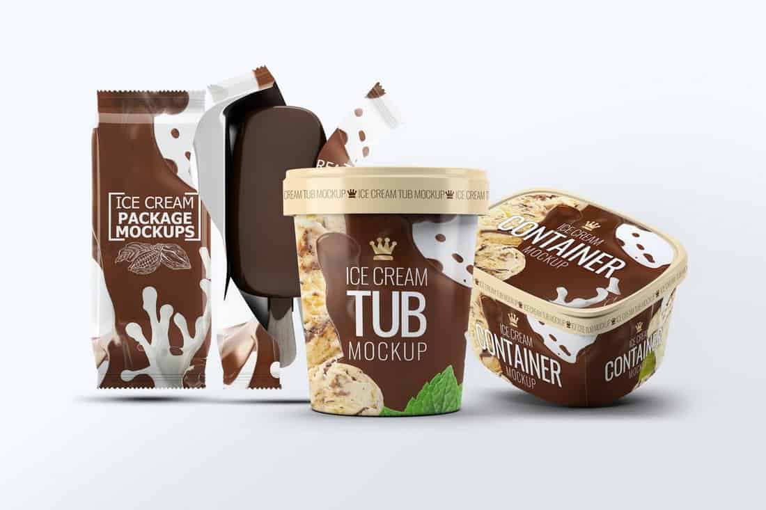
With this mockup kit, you get 5 different mockups to present ice cream packaging designs. The ice cream tub mockups come in various arrangements and views. You can use them for various print and design presentations.
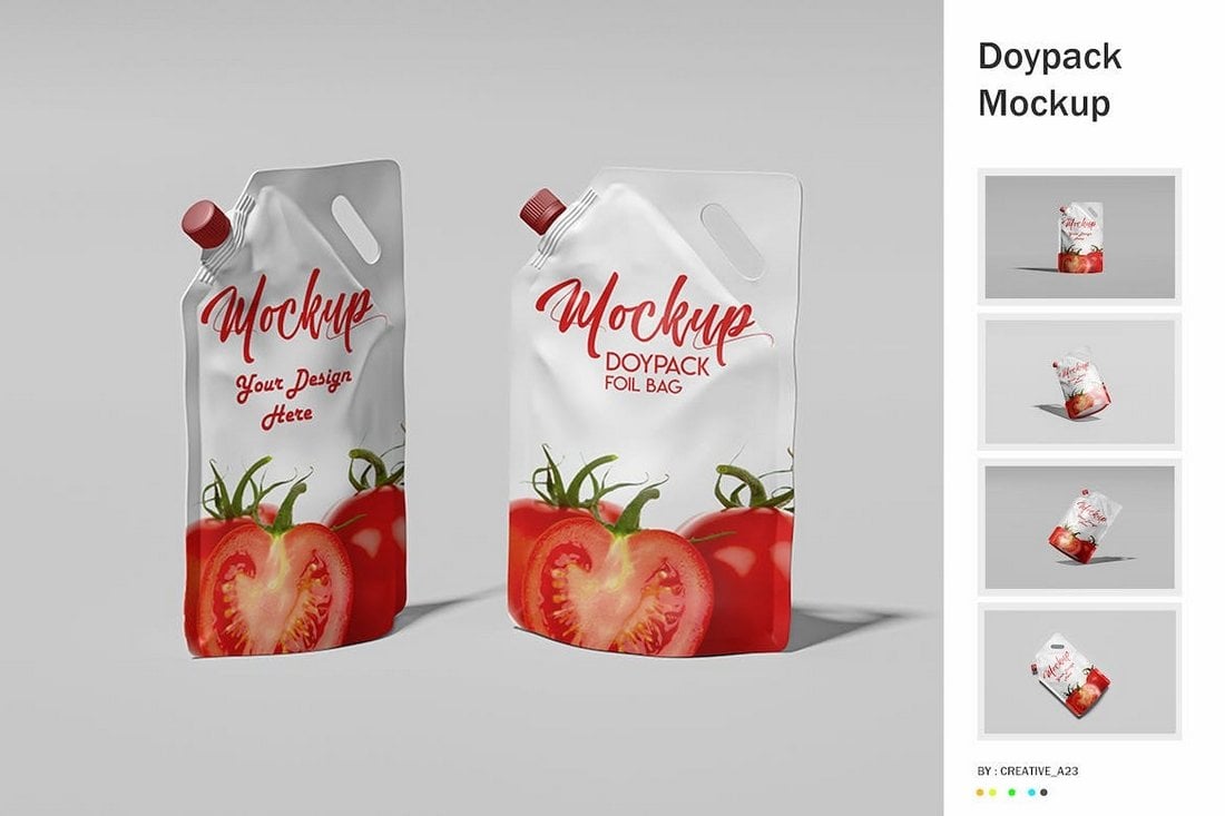
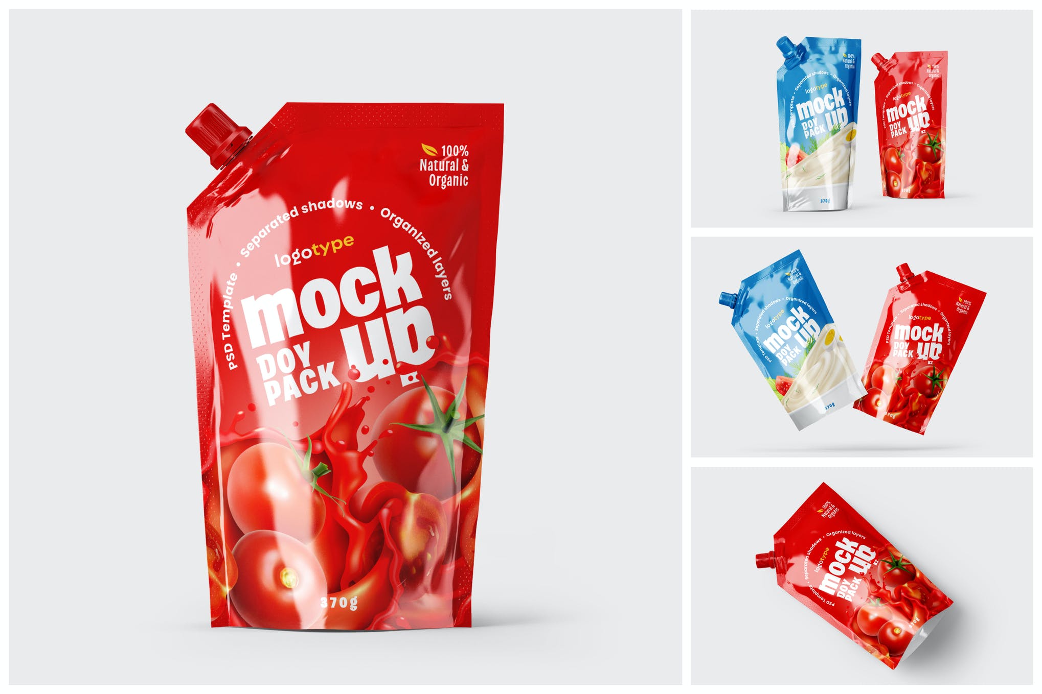
The doypack packaging design of this mockup features a very natural and realistic look. There are 6 different mockups in this bundle with different scenes. You can easily change the background and place your packaging designs using smart object layers.
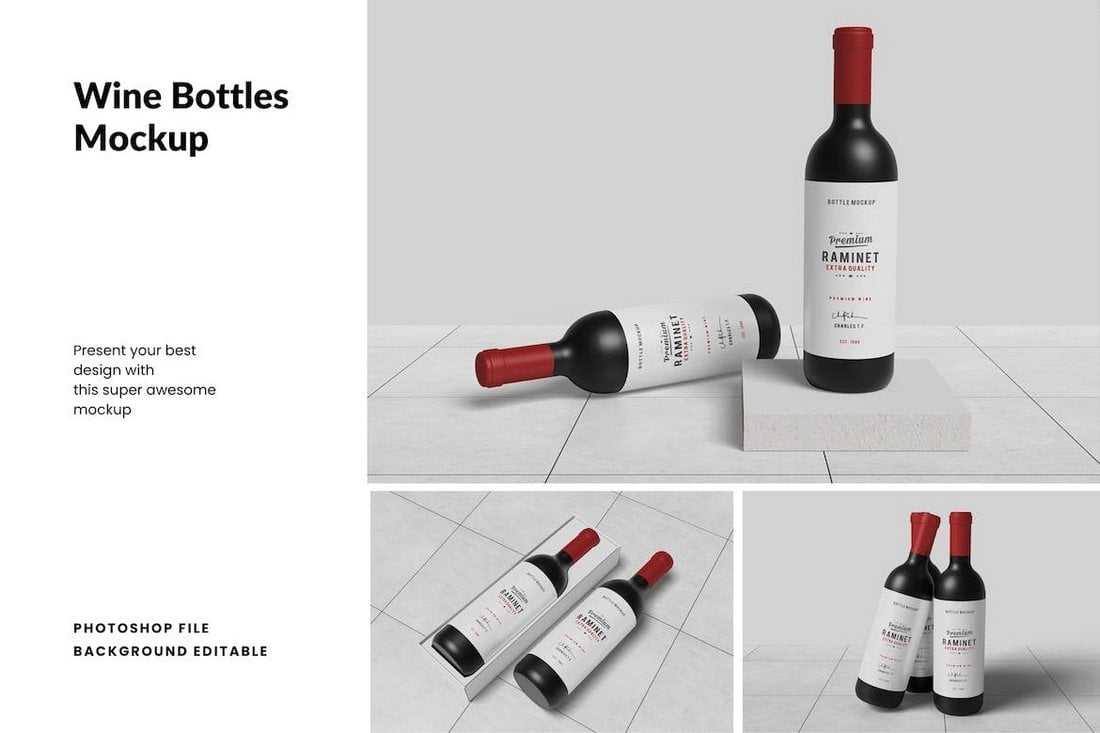
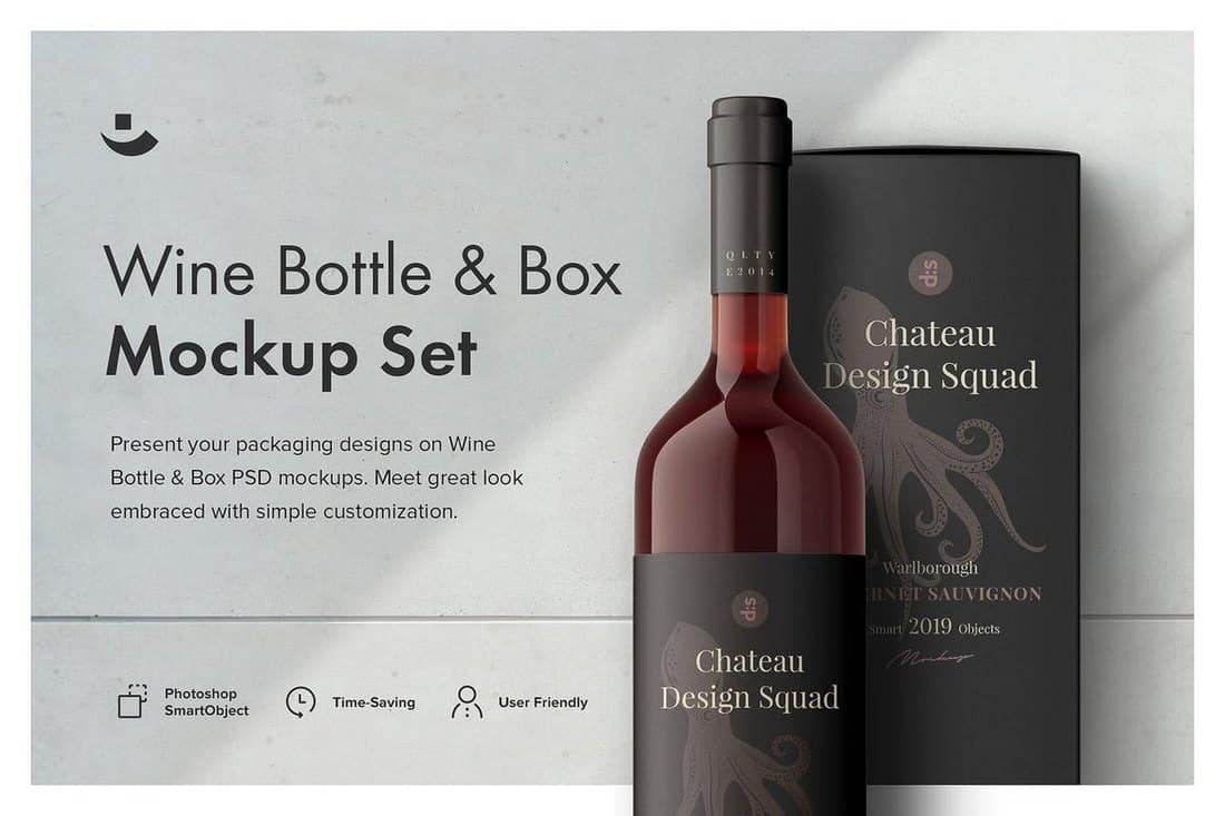
A set of simple and elegant wine bottle mockups for presenting your drink label designs. This pack includes 3 different mockups, which include a box packaging design for the wine. They feature shadows and objects in separate layers.
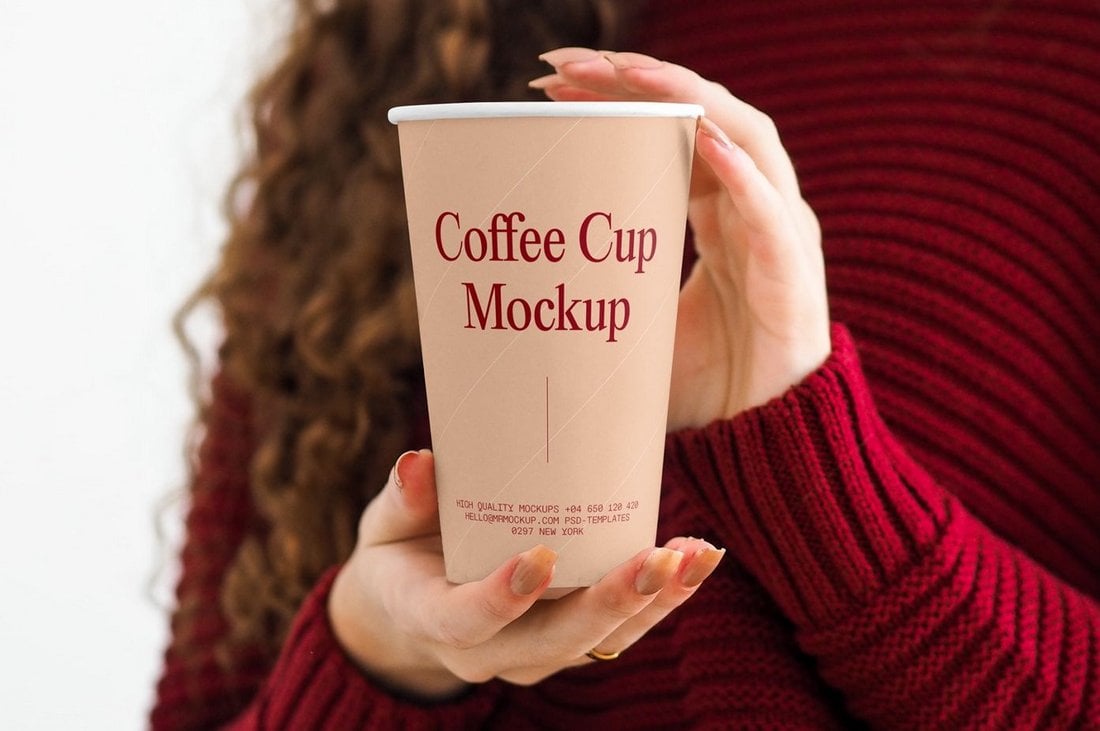
This is a free mockup that shows a coffee cup being held by a woman. The template is easy to customize and it’s ideal for coffee brands and coffee shops.
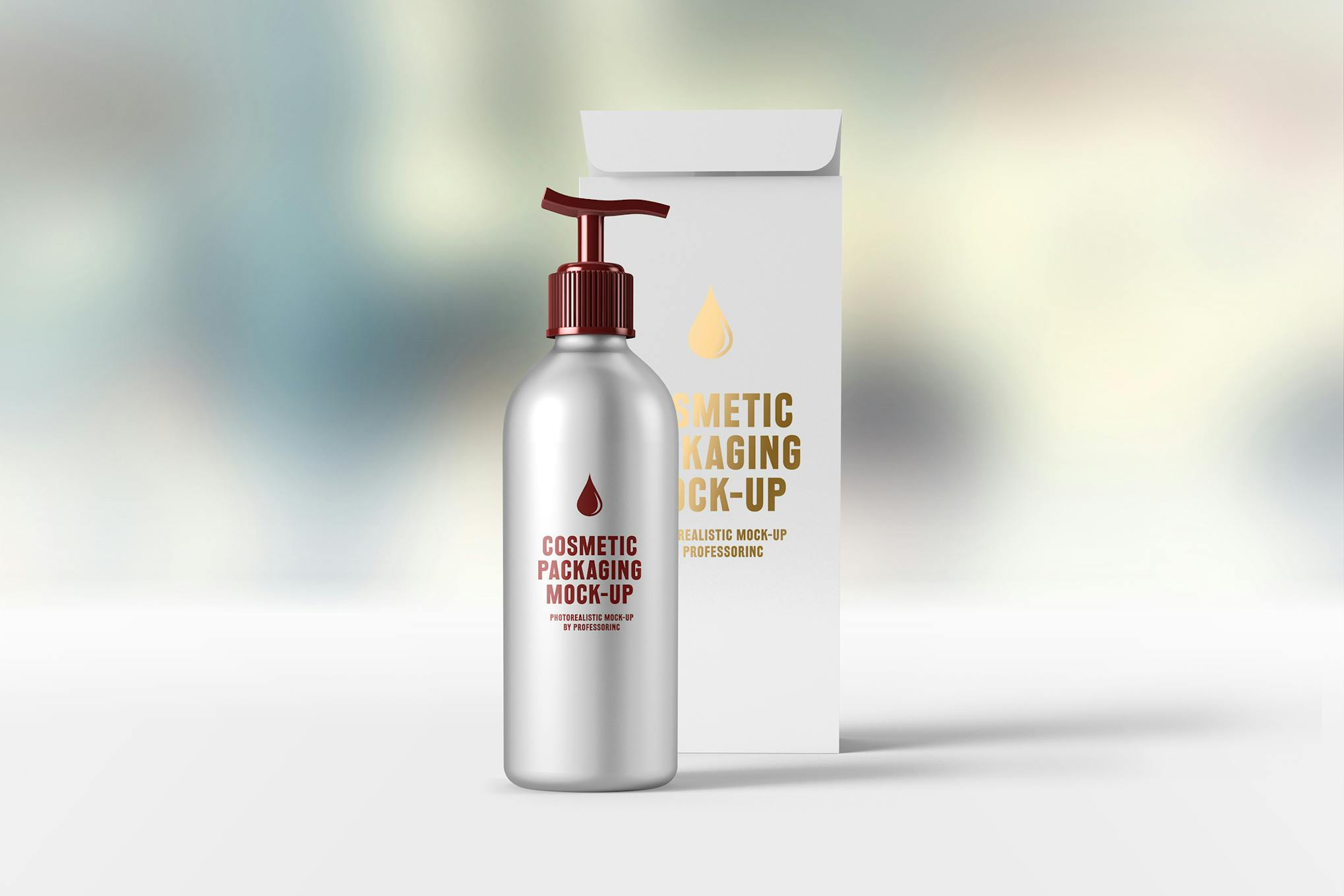
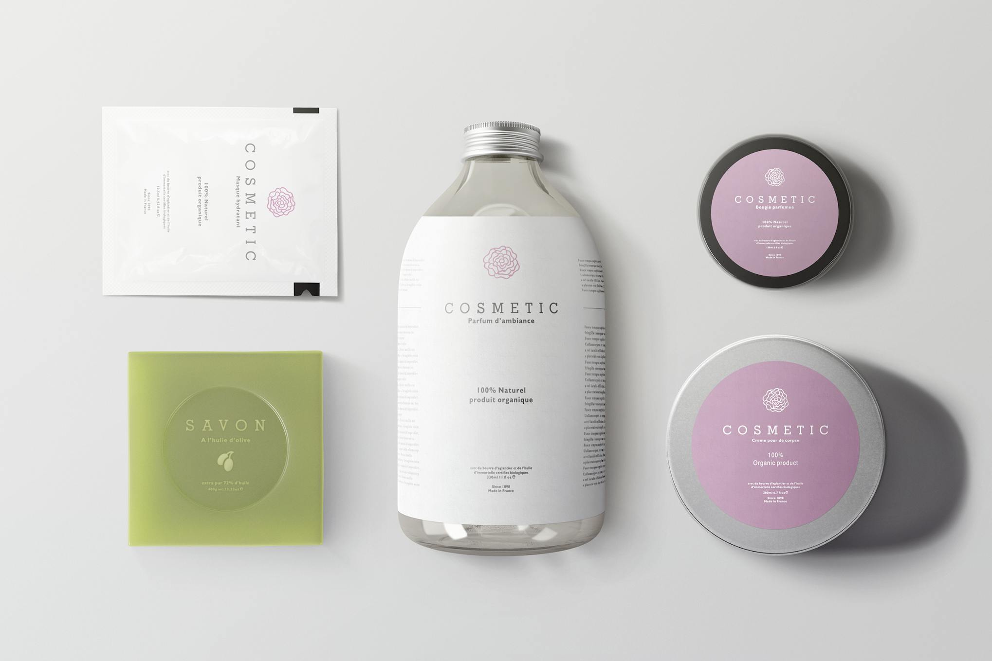
The Cosmetic Packaging Mock-Up is a well-crafted, photo-realistic asset that consists of four high-resolution (4000×3000px) PSD files. It’s user-friendly and features smart object backgrounds and foil layers, enhancing your design’s overall look. It also includes three photo-filters for further customisation, making it a highly recommended tool for showcasing your cosmetic products optimally.
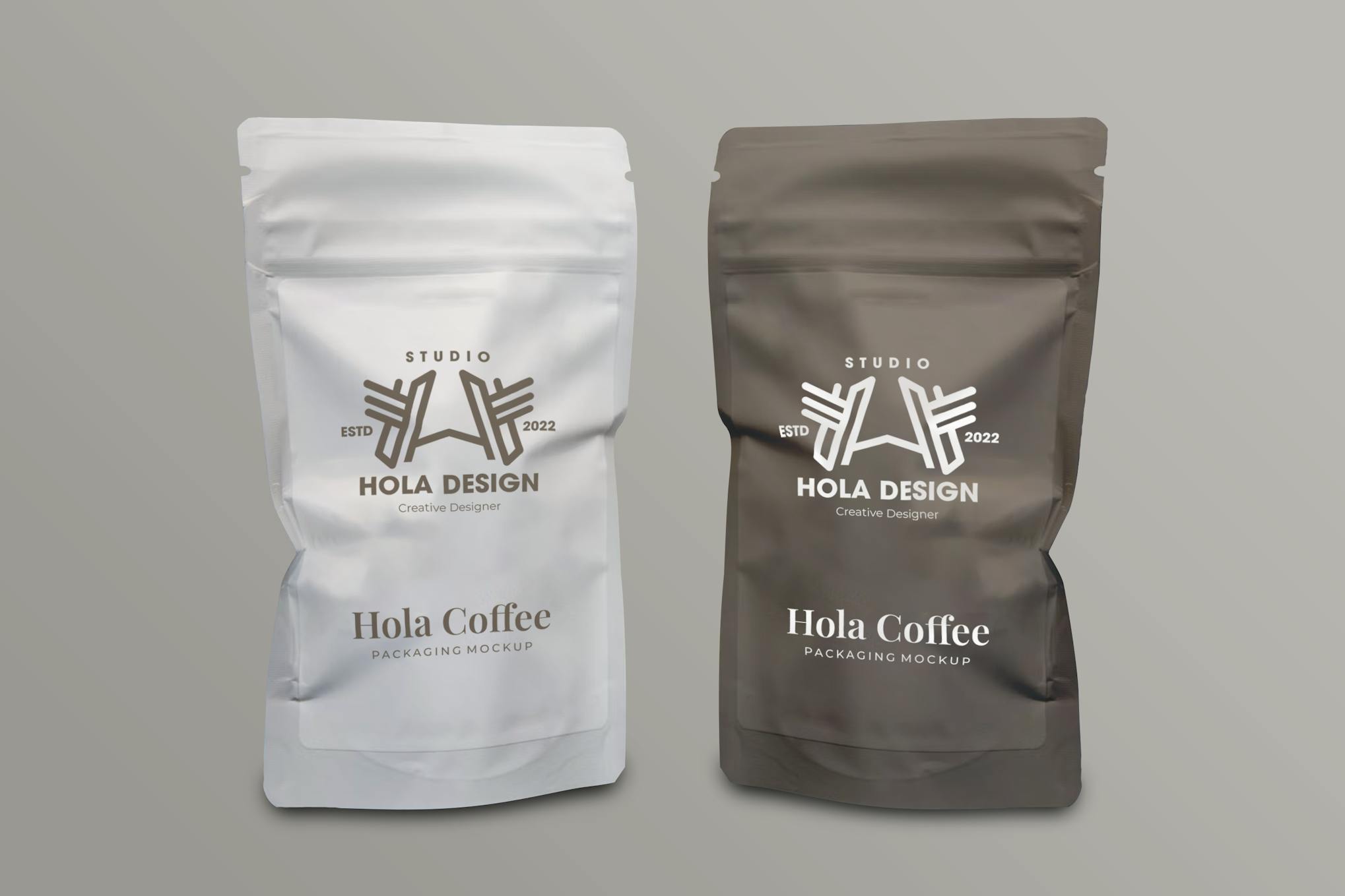
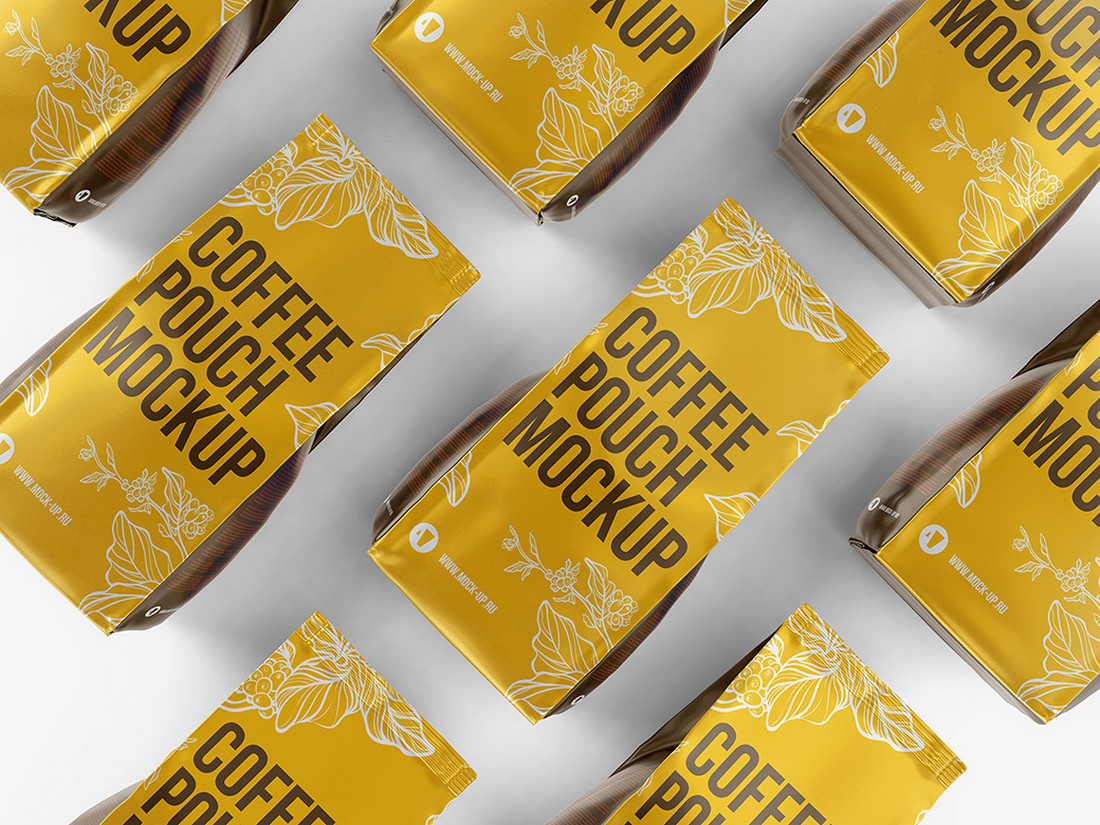
The Coffee Bag Packaging Mockup is a high-quality creative asset that helps visualize your packaging design. This user-friendly mockup comes in a 3000x2000px, 300 dpi PSD file that’s fully customizable. Its smart object feature enables quick and easy editing, while the organized layers provide a seamless design experience. However, remember that the image is not included.
The Natural Cosmetic Packaging Mockup is a versatile creative asset for showcasing cosmetic designs. It includes 20 layered PSD files, changeable backgrounds, realistic lighting and shadow effects, and allows you to easily edit via smart objects. It’s perfect for previewing your work in a realistic, detailed manner, with a high resolution of 3600x2600px at 300dpi. Please note, this requires Photoshop version: CS4 or later.
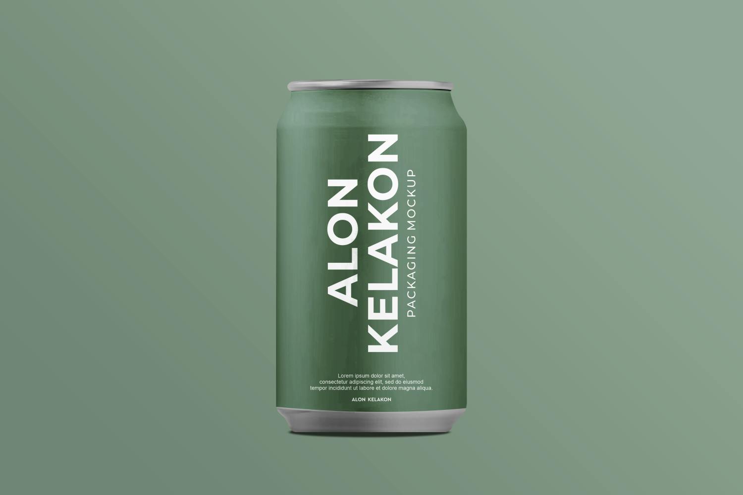
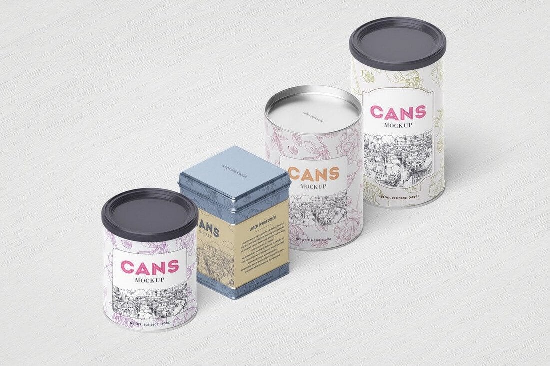
The Metal Can Mockup is a high-quality creative asset from a reliable third-party provider. It includes a single PSD file with a high resolution of 3000×2000 pixels and a 300 DPI resolution. The mockup is fully customizable, offering fast and easy editing through smart objects. It features organised layers for user-friendliness and even comes with a user guide for your convenience.
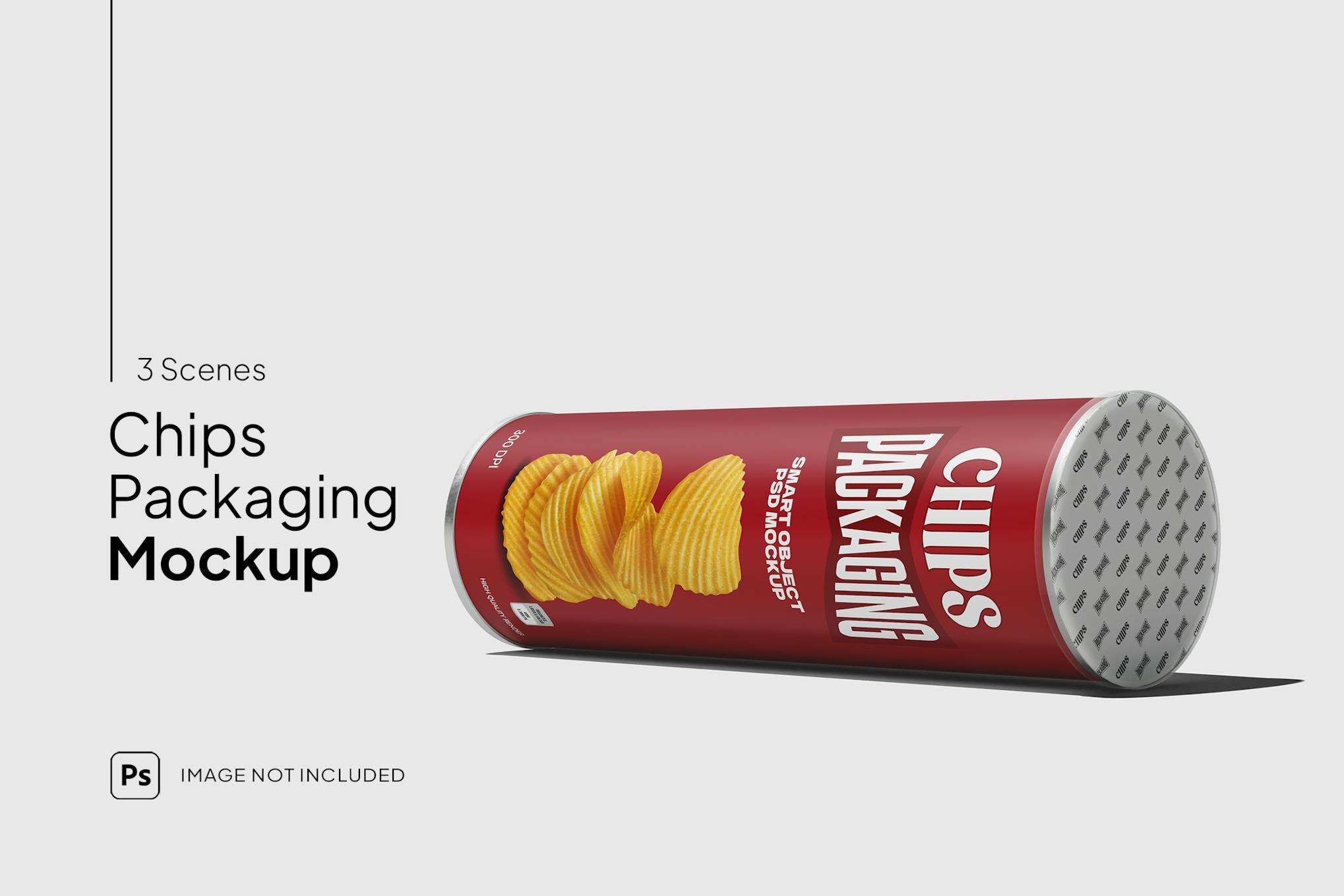
Elevate your snack brand with the dynamic, customizable Tube Packaging Mockup. Intuitively adjust designs on the tube and seal and experiment with vivid scenes and seal colors. Utilize smart object technology for seamless customization and an isolated background for total creative autonomy. This mockup not only provides the tools but also paves the way for a bold, snack-packaging revolution. Note, the images are preview-exclusive, not included in downloads.
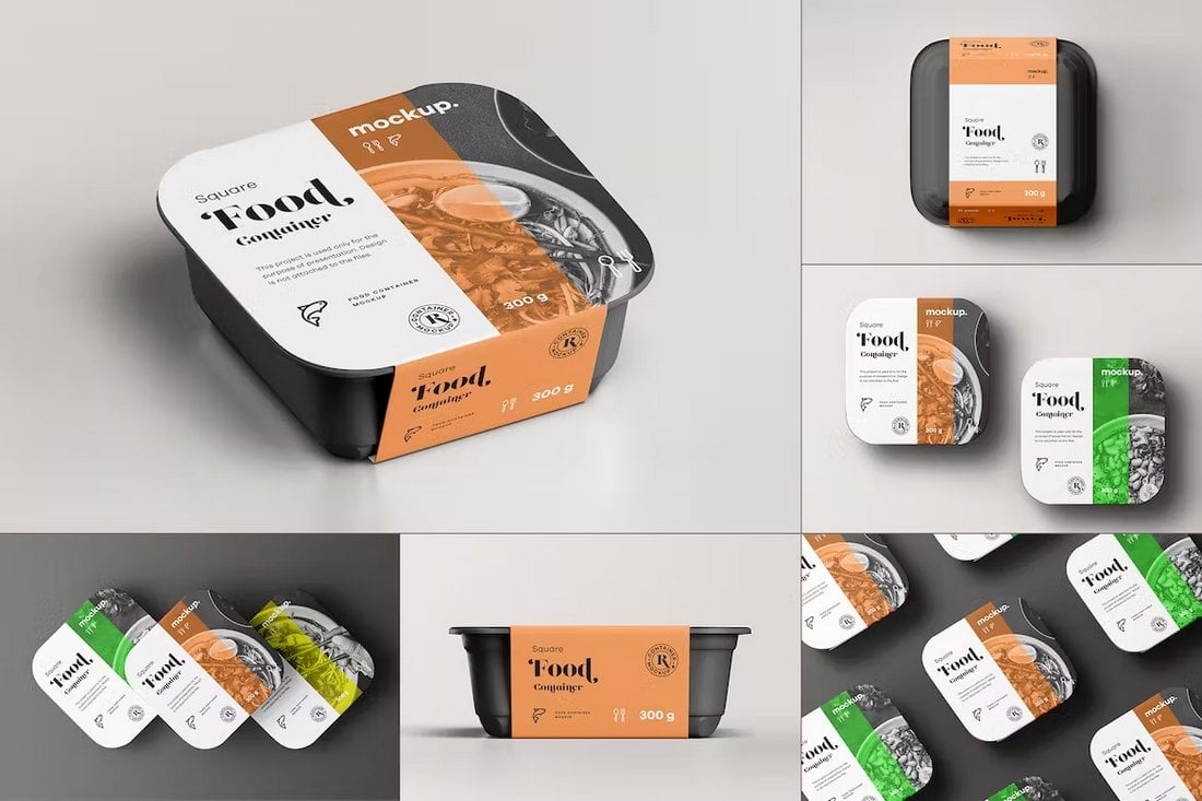
Use this food container mockup bundle to promote and showcase your food products in a professional way. They are perfect for restaurants for promoting takeaway food items as well. There are 8 PSD mockups in this pack.
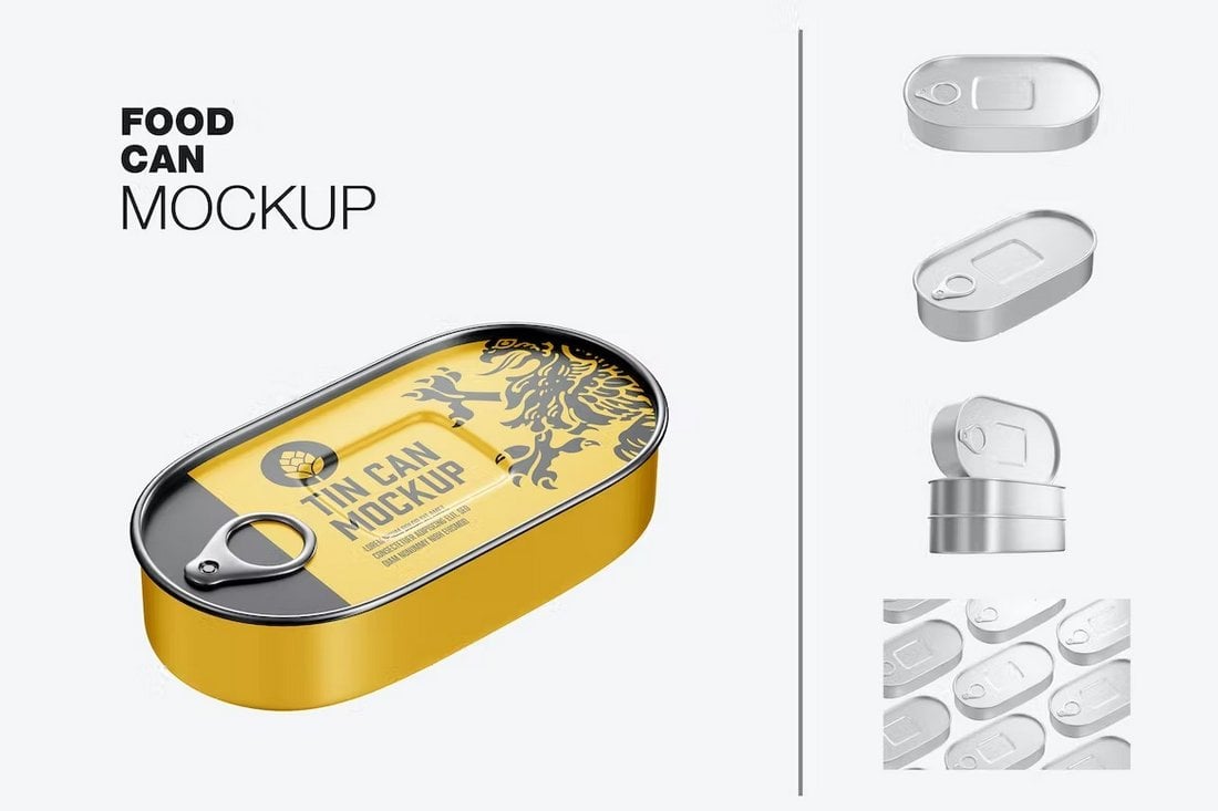
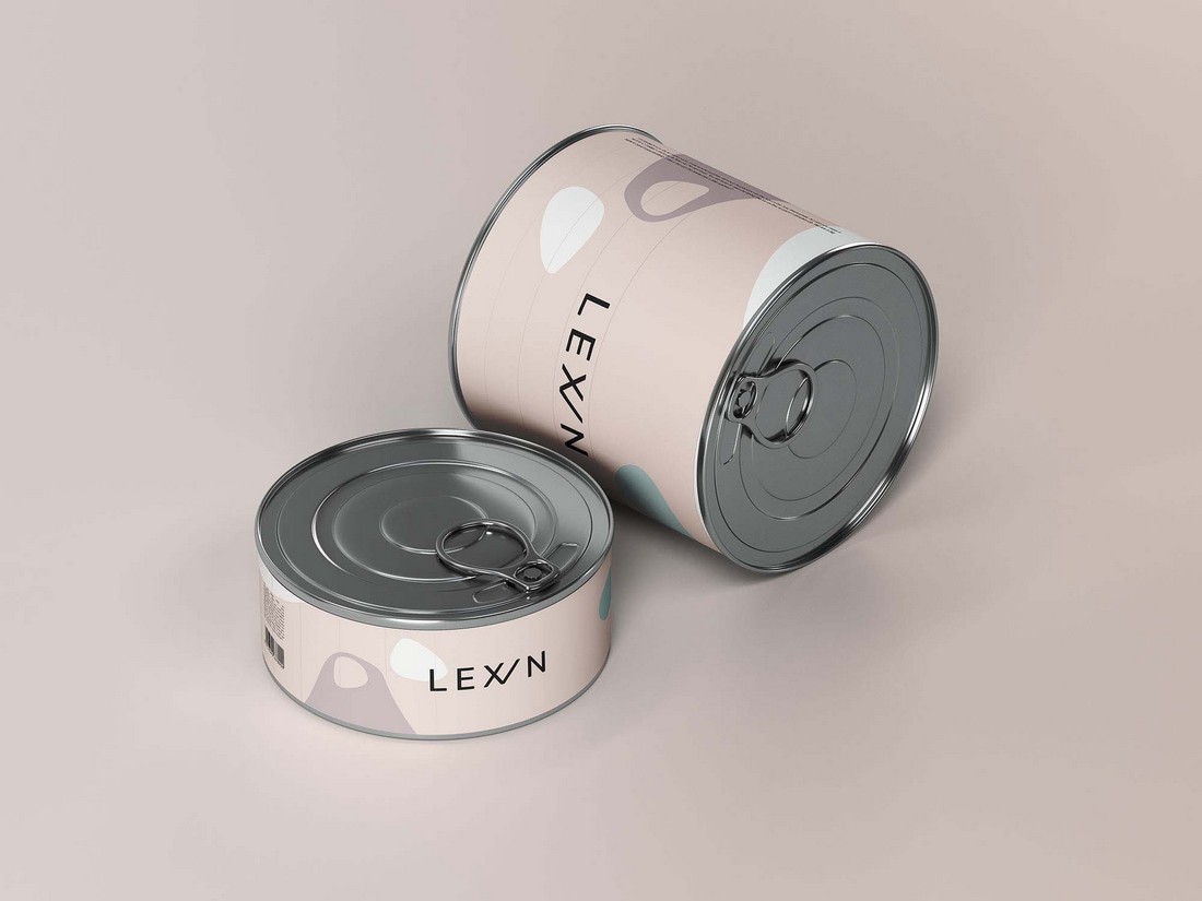
This is a packaging mockup template for canned food products. It features a stylish tin can design with rounded edges. The mockup includes isolated objects, allowing you to fully customize the design to your preference.
A modern and minimal food mockup perfect for coffee shops and restaurants. This mockup template features a simple layout that you can easily customize to change the colors and backgrounds however you like.
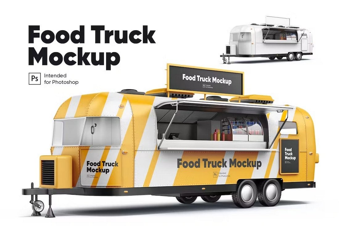
If you’re working on a branding or livery design for a food truck business, this mockup template will help showcase your designs better. It features a realistic food truck with an easily editable smart object layer for placing your livery designs.
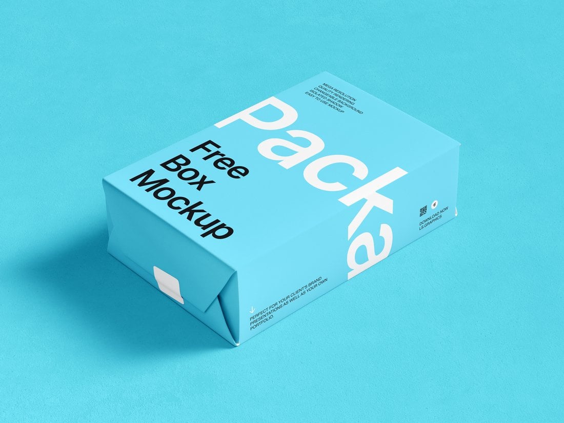
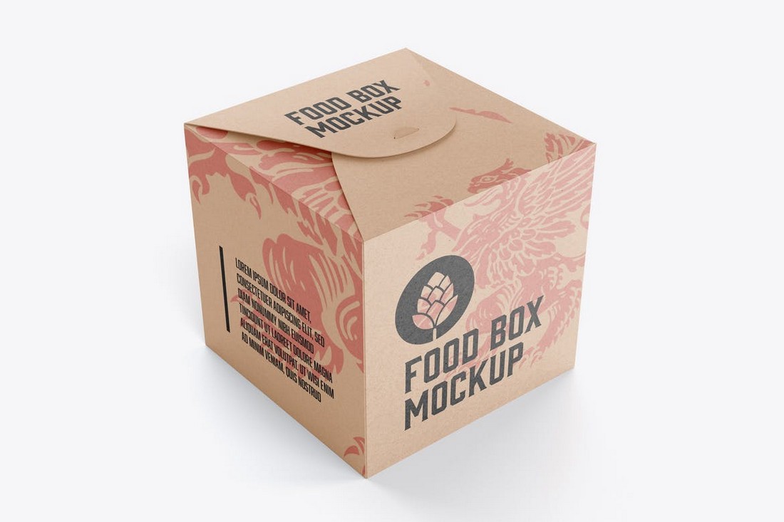
You can download this packaging box mockup for free to present your designs for food products or any other type of packaging design. It’s easy to customize and comes in a high-resolution PSD file.
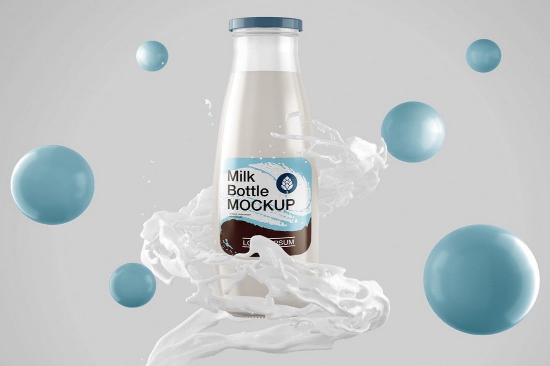
This mockup comes with a beautiful scene that lets you showcase your product in an attractive way. It has 3D spheres, splashing milk, and a realistic milk bottle mockup on isolated and organized layers. It’s perfect for promoting any milk-based product.
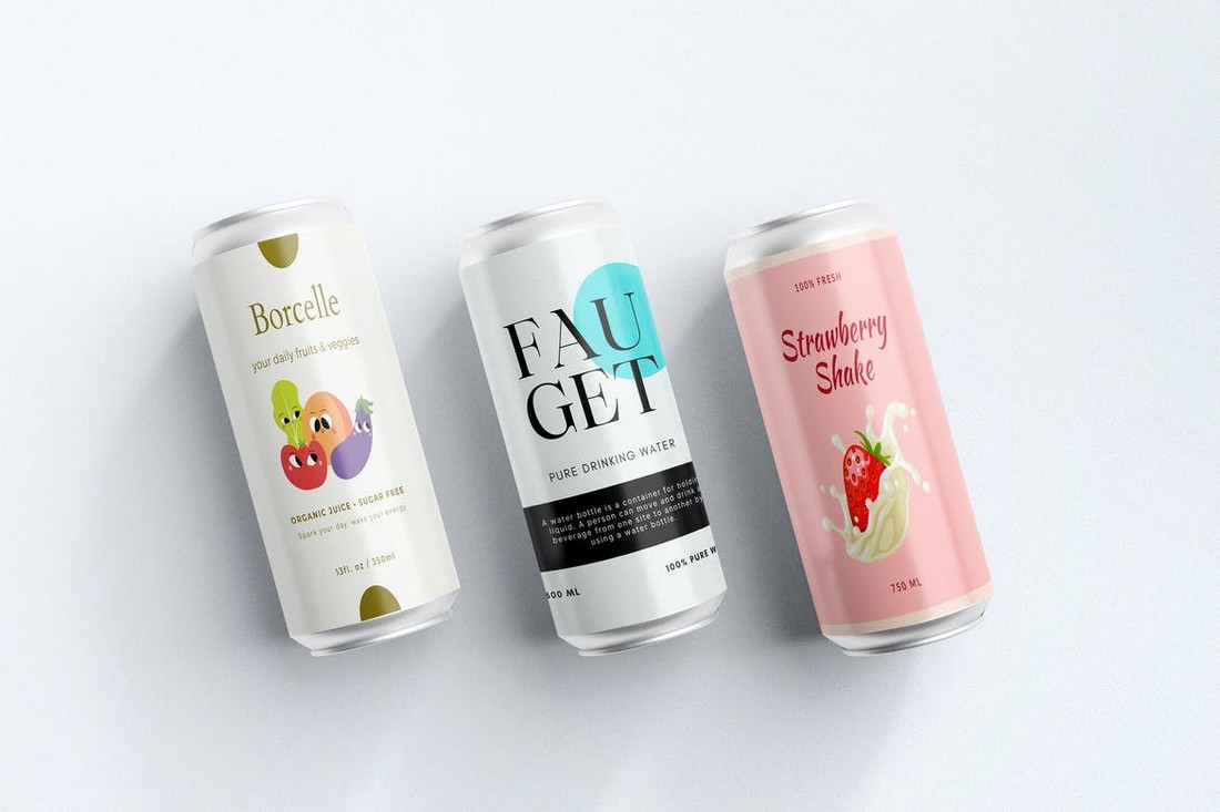
If you’re working on a drink can design, this mockup will help you present your design to clients like a pro. It includes 3 mockup templates that allow you to show different angles of the can. Each template comes in fully editable PSD files.
You can use this mockup to not only showcase your coffee packaging designs but also to promote products on social media. It features organized layers with isolated objects. You can easily customize them to your preference by changing colors.
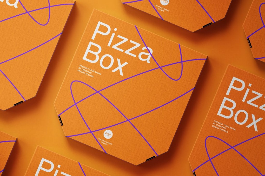
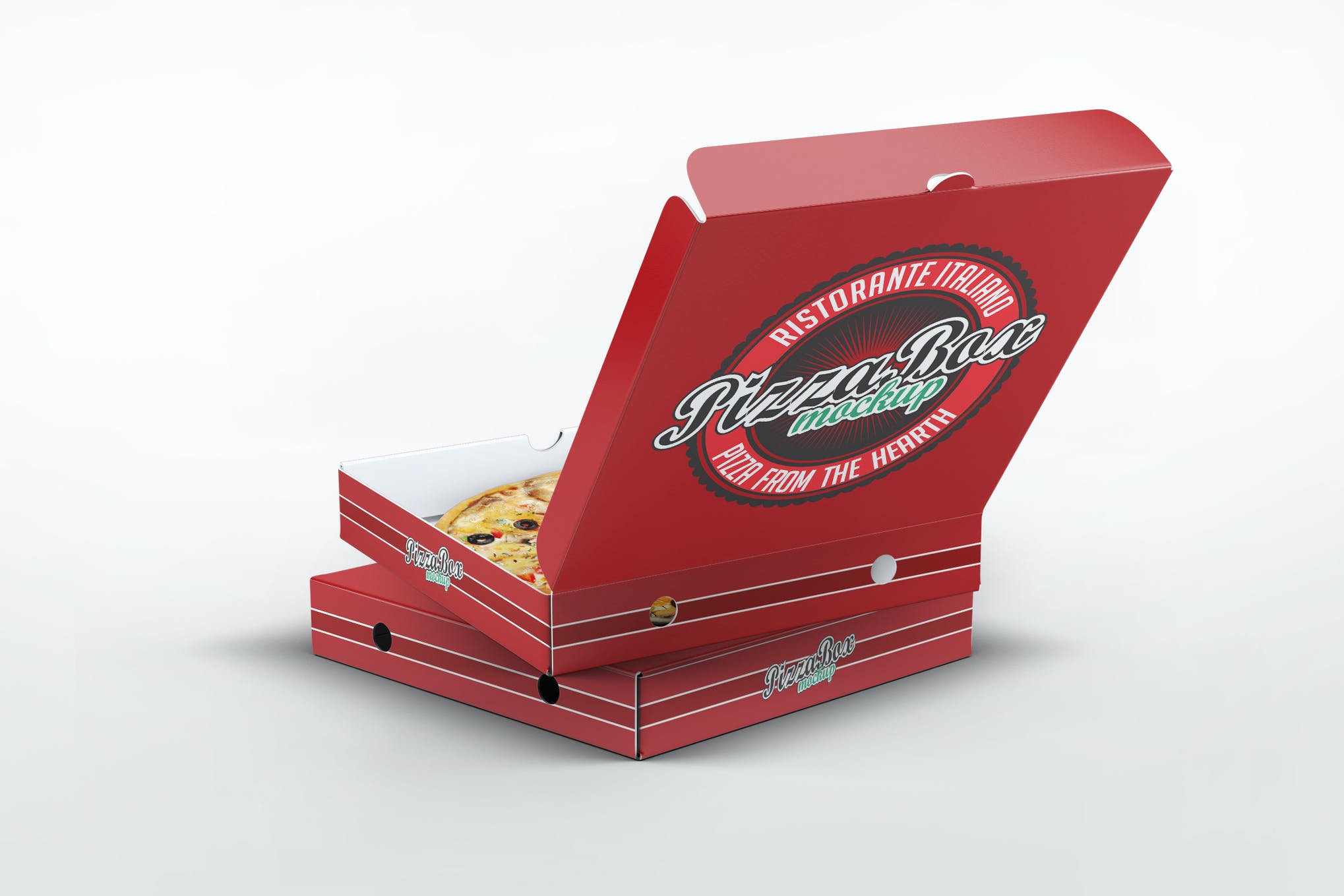
A stylish pizza box mockup for promoting new types of pizzas as well as pizzerias. This mockup comes in 2 templates, each with smart objects, organized layers, and fully editable designs. It can be customized with just a few clicks.
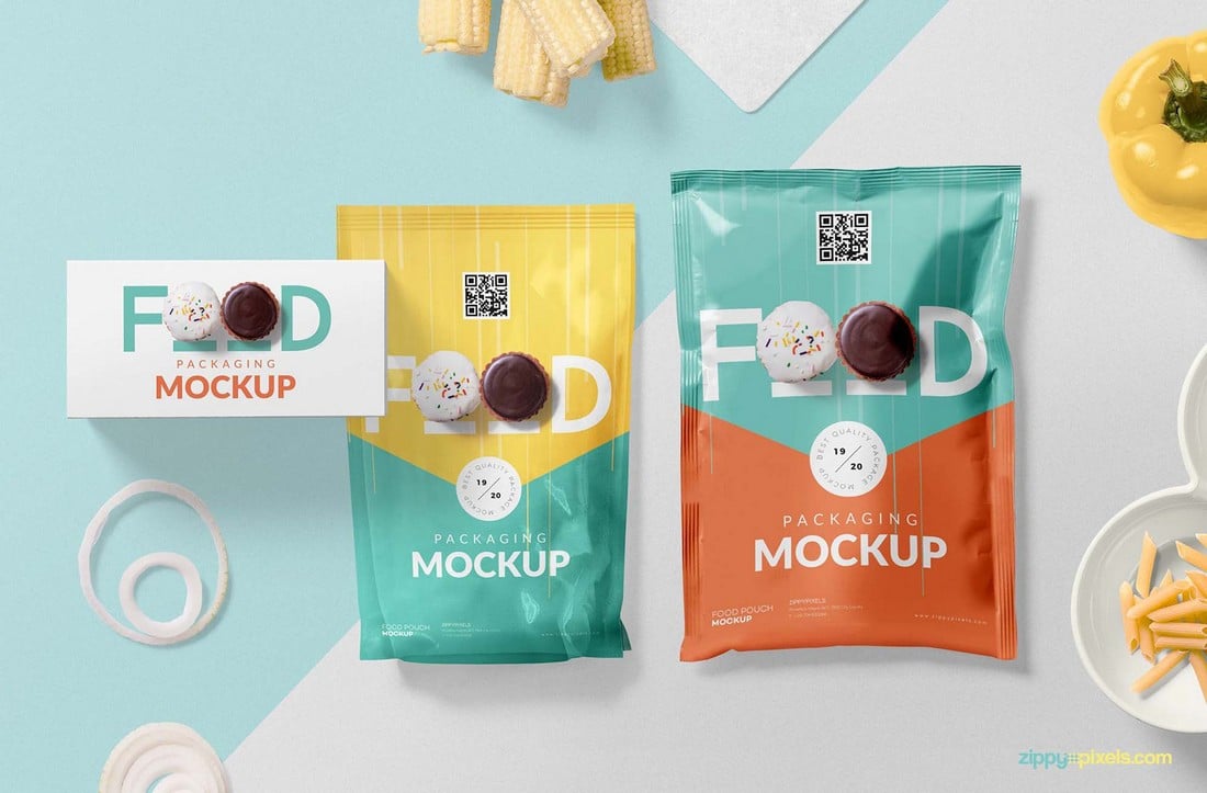
This stylish food packaging mockup is actually free to download and use. It has two sizes of packaging designs you can use to showcase various types of products, including snacks, biscuits, and more.
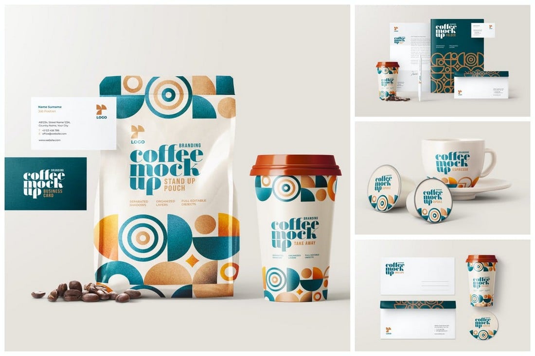
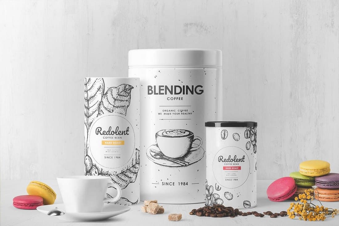
Looking for a matching set of mockups to showcase an entire coffee brand? Then this template kit is made just for you. It includes 5 mockups with different scenes for showing off your coffee packaging designs in many different ways.
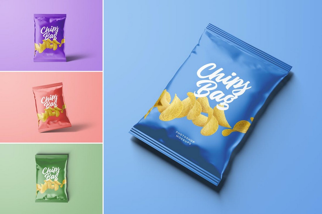
This bundle includes 4 different packaging designs you can use to present your packaging designs for chips and various other snacks. Each template features a different angle of the packaging with changeable backgrounds.
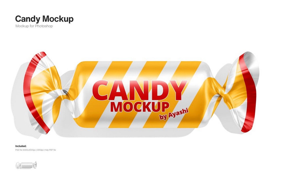
A simple yet effective wrapping mockup for candies. This mockup template is very easy to edit thanks to smart objects. It also comes with organized layers and an editable background.
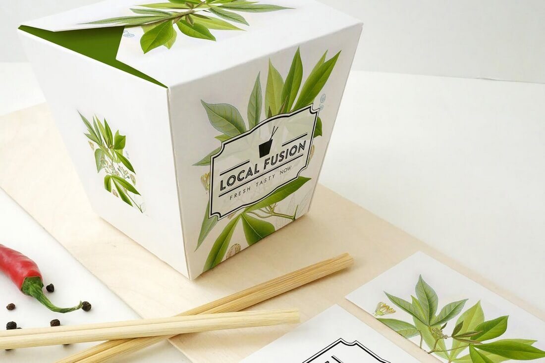
Whether you’re working on a packaging design for Chinese takeout or startup, this mockup template will help showcase your design better. The mockup is fully customizable. You can change colors and background however you like.
This is a free mockup template you can use to present your label designs for canned food products. The mockup features two sizes of cans showing different angles of the product.
This bundle of beautiful and elegant packaging mockups is made specifically for a modern coffee brand. It comes with 3 different mockup templates featuring separate shadows and foil stamping. The mockups are available in light and dark colors as well.
Featuring 22 different mockup templates, this massive bundle of mockups features fully editable designs with separate reflections and shadows. The mockups also include smart objects for easily placing your designs and supports custom backgrounds.
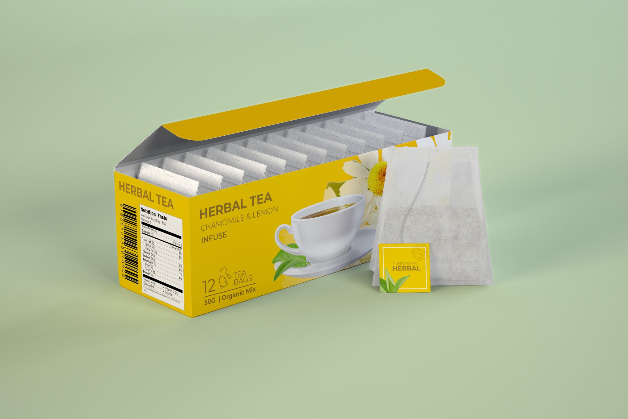
If you’re looking for a minimal yet eye-catching tea bag box mockup, we have the perfect design to suit your needs. It includes smart object for easy editing of box, bag tag design, and background color. One of the most popular tea bag packaging mockups there is!
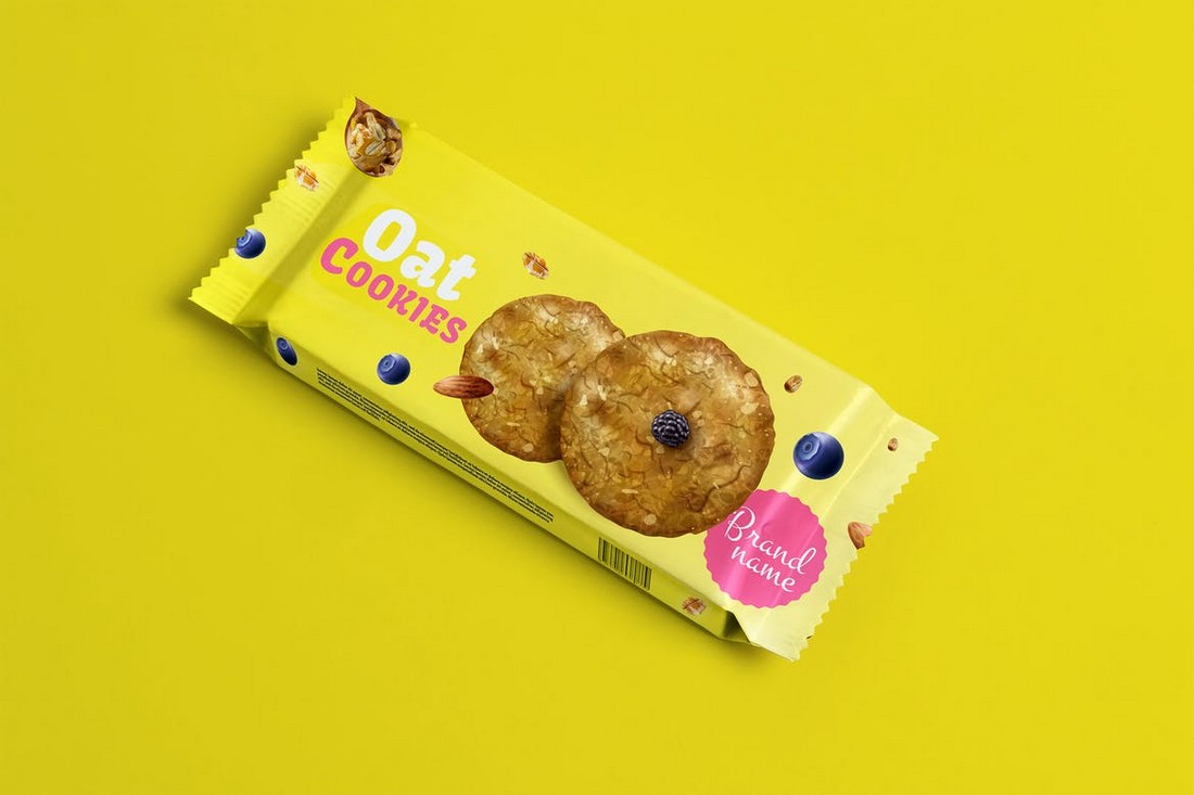
A bright and colorful packaging mockup for a cookie product. This mockup comes in 4 different PSD files featuring different angles. It’s perfect for showcasing a niche cookie brand.
This is a multipurpose packaging mockup you can use to promote and showcase various food products. You can use it to present ice cream, pre-cooked products, meat-based products, and much more. It includes 3 PSD files.
This is a free packaging mockup template you can use to showcase coffee branding designs. It features a very elegant packaging design with an isometric layout. And it comes in a fully layered PSD file.
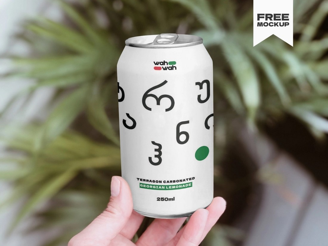
A simple but beautiful mockup template you can use to present various drink can designs. It features a real photo-based mockup showing the can being held by a hand. This mockup is free to use.
Wanting a stellar pizza box mockup for your new pizza eatery? Look no further than this set of eight photorealistic templates. The mockups are fully editable all thanks to the inclusion of smart object in the package, plus intensity control is a breeze, making it a super simple and fun to use food packaging mockup.
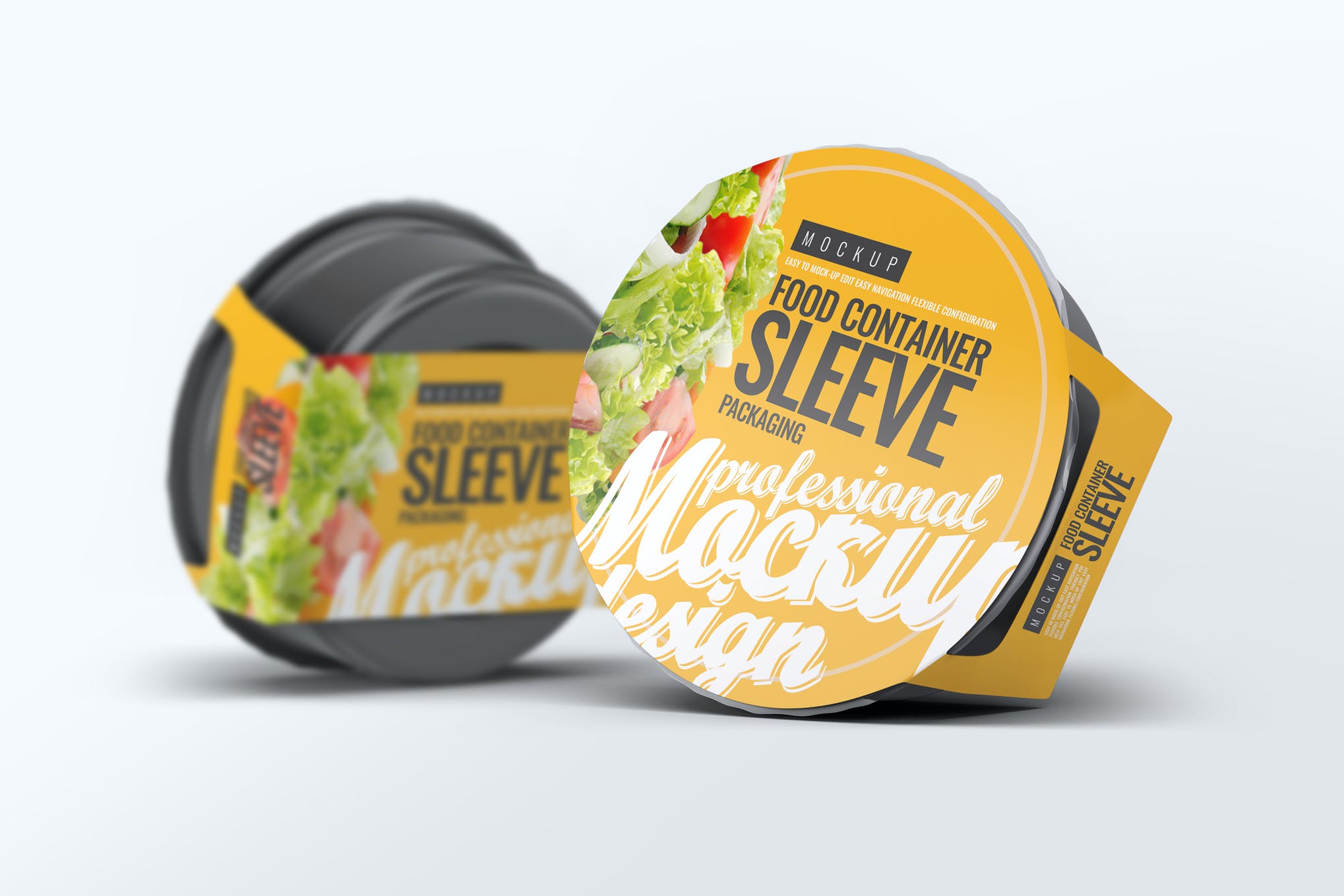
Next up, is a food container sleeve packaging mockup that is sure to make your presentation a hit. It offers six gorgeous templates, and a smorgasbord of customizable options for you to play around with. A truly impressive food packaging mockup!
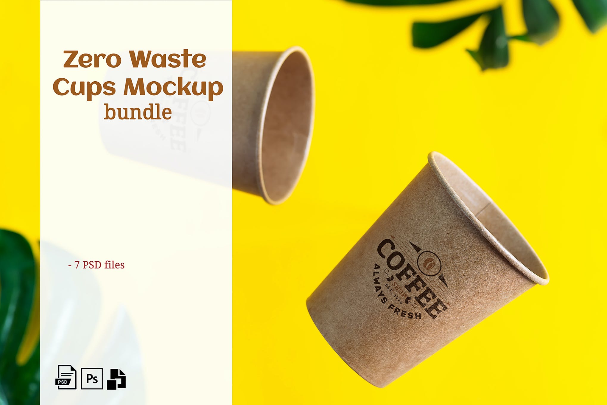
Here we have a collection of zero waste cups mockups which is hard to not notice and get impressed by. It comes with smart object to make your work ten times easier, and a high quality 300DPI for a realistic photo appearance.
Showcase your beautiful designs to the clients using this doypack packaging set of four mockups. This bundle can be used for ketchup, sauce, mayonnaise, yogurt and a range of other food packaging mockup designs. Cherry on the cake is smart object inclusion for easy customization.
If you’re working on a bottle or packaging design for a wine company, this elegant wine bottle mockup will come in handy. It comes with both a bottle and packaging mockups that are available in 4 colors, including white, rose, red and amber.
Be sure to download this stylish packaging mockup to showcase all kinds of food products in a pouch. It’s free to download and use with your personal projects.
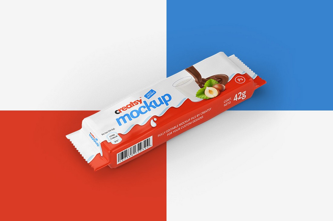
Whether you’re working on a design for a chocolate bar or snack bar, this mockup pack will help you showcase your design in a professional way. It includes multiple mockups in PSD format for free.
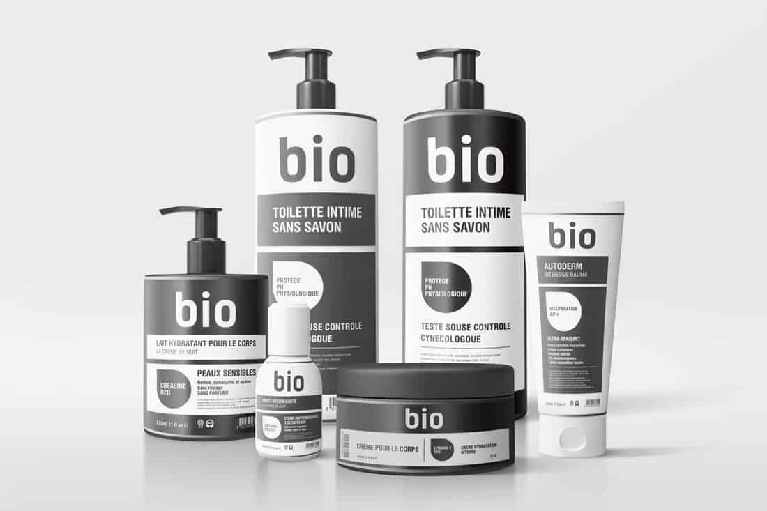
This is a complete collection of bottle and packaging mockups for showcasing your bottle and label designs for cosmetics products. The bundle includes 16 different mockups that feature 4 creative photo filters.
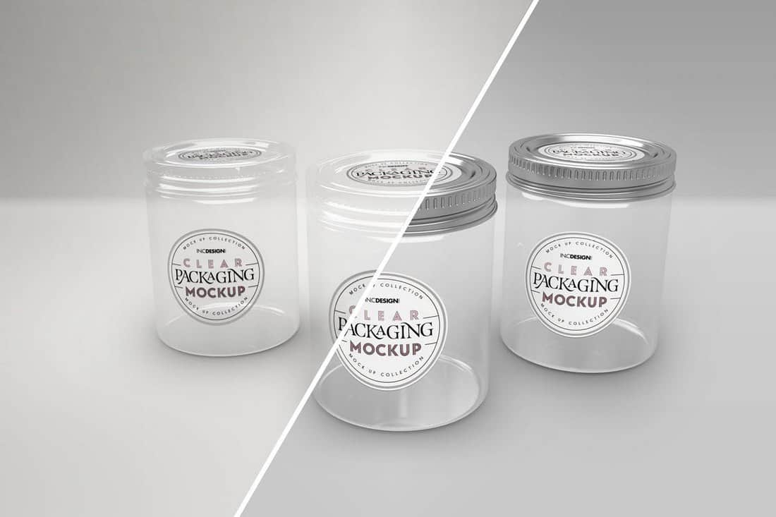
A multipurpose jar mockup template you can use to showcase many different types of jar label designs. The clear transparent jar mockups come with clear glass and metal lid variations as well.
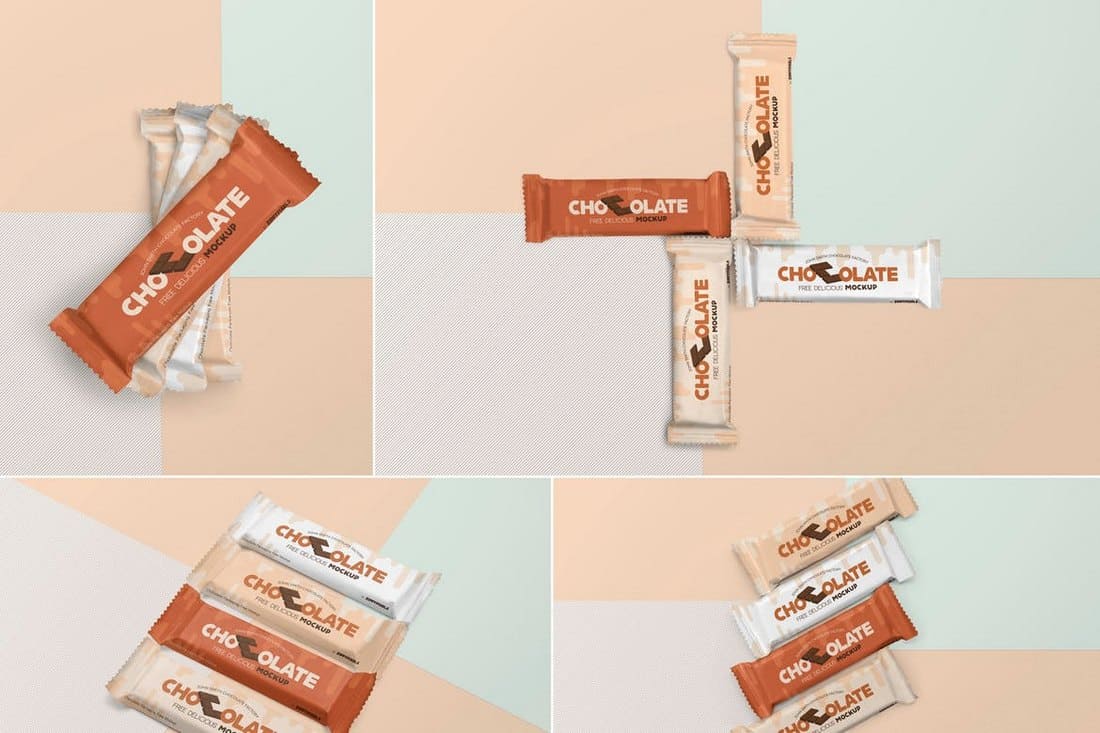
This pack of mockup templates comes with 4 different mockups you can use to showcase chocolate bar packaging designs. The mockups feature smart objects and organized layers for easily editing and placing your own designs as well.
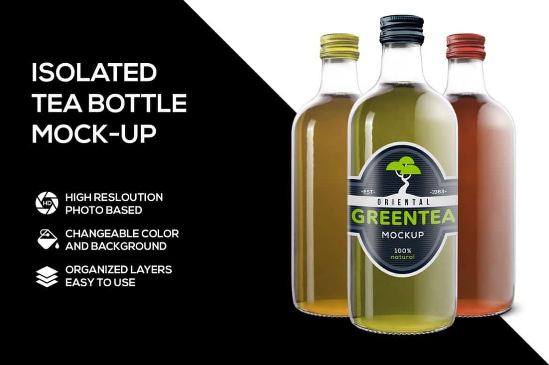
Even though this mockup is designed with tea bottles in mind you can use them to showcase other types of bottle and label designs as well. The mockup lets you edit the design with just one-click and change backgrounds to your preference.
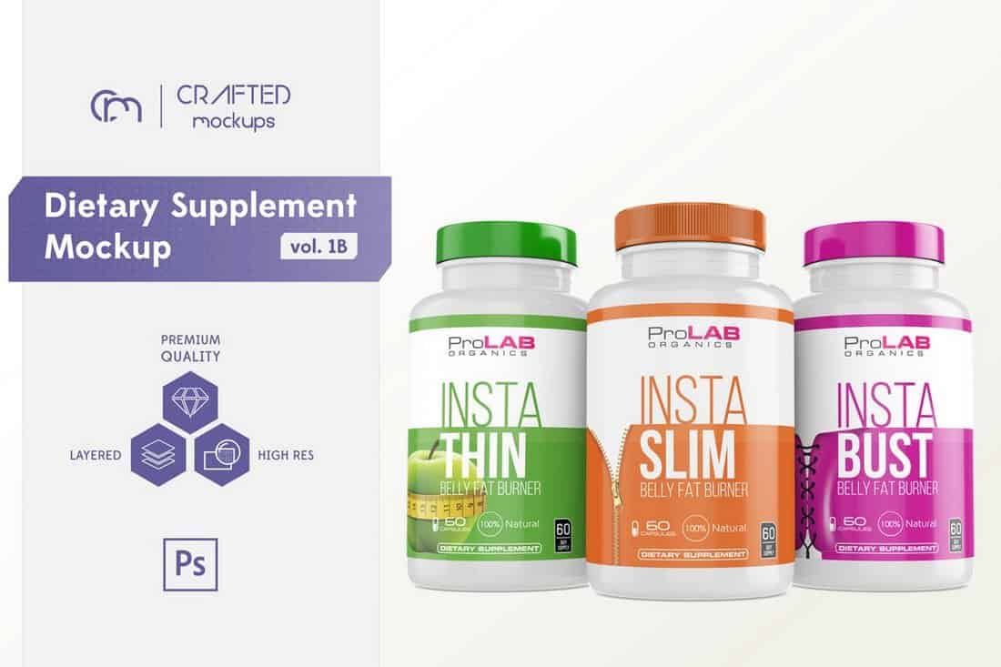
This style mockup template is ideal for showcasing various dietary supplement label and packaging designs. The template comes with various effects such as reflections and different lid types to customize the design.
A free box packaging mockup for presenting different types of food products. This template also features a creative perspective view of the box as well.
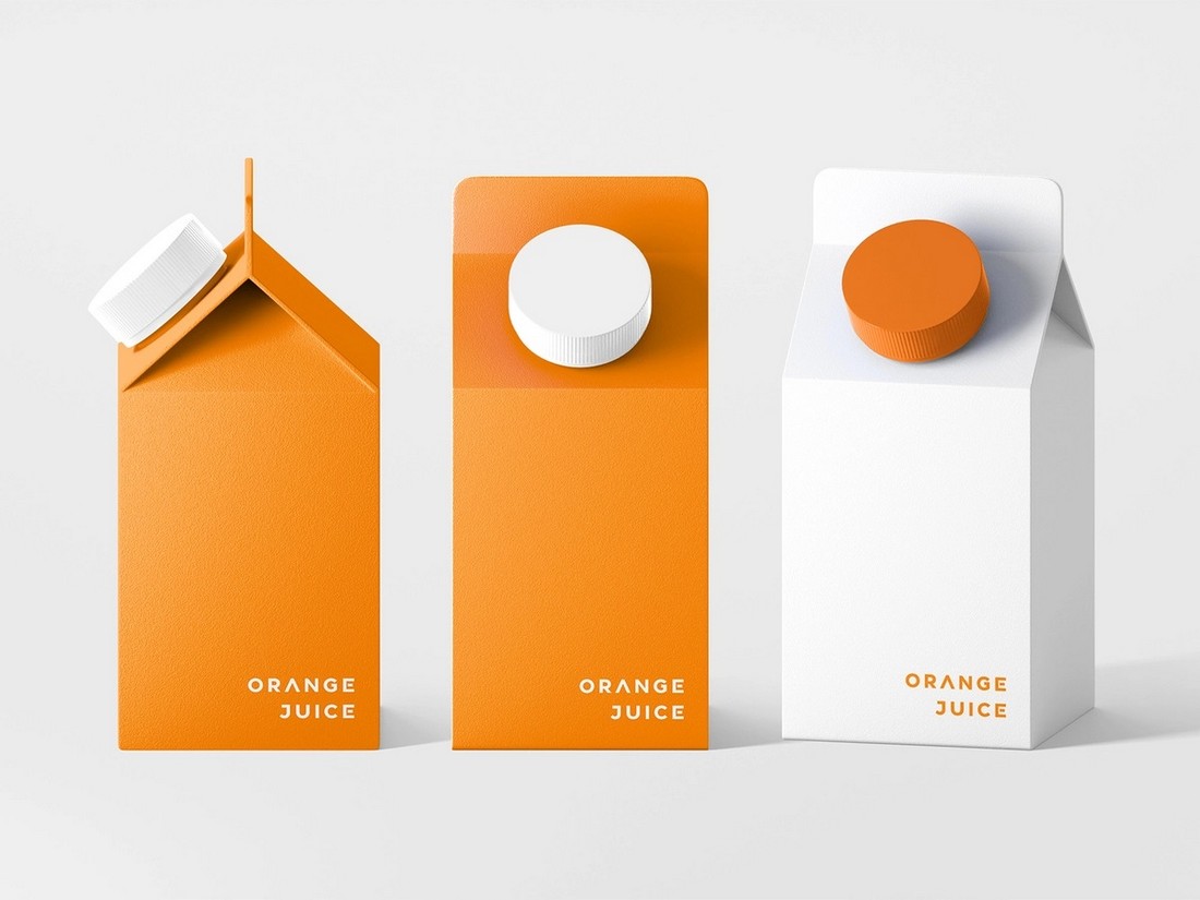
Another free mockup template for showcasing milk and juice products. The mockup includes multiple views of the carton, allowing you to show different sides of your design.
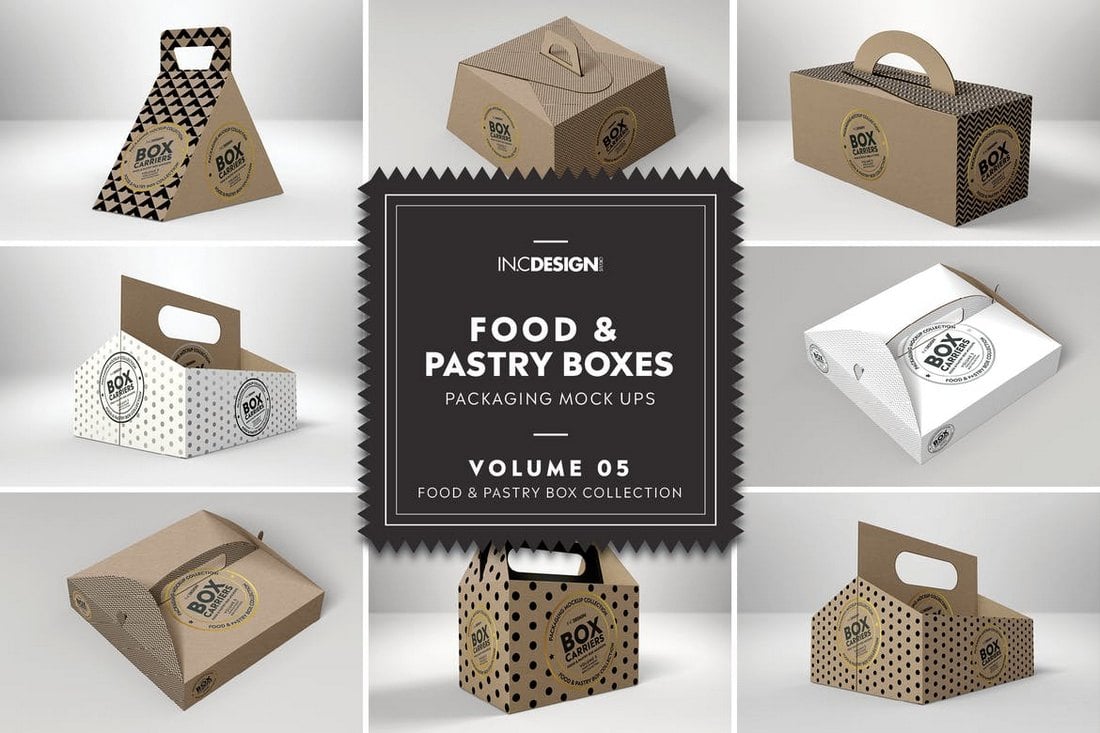
This is a bundle of 6 different food boxes mockups. It includes different types of carrier boxes used to deliver pastry and food. You’ll find drink boxes, square-shaped boxes, triangle boxes, and more mockups in this bundle.
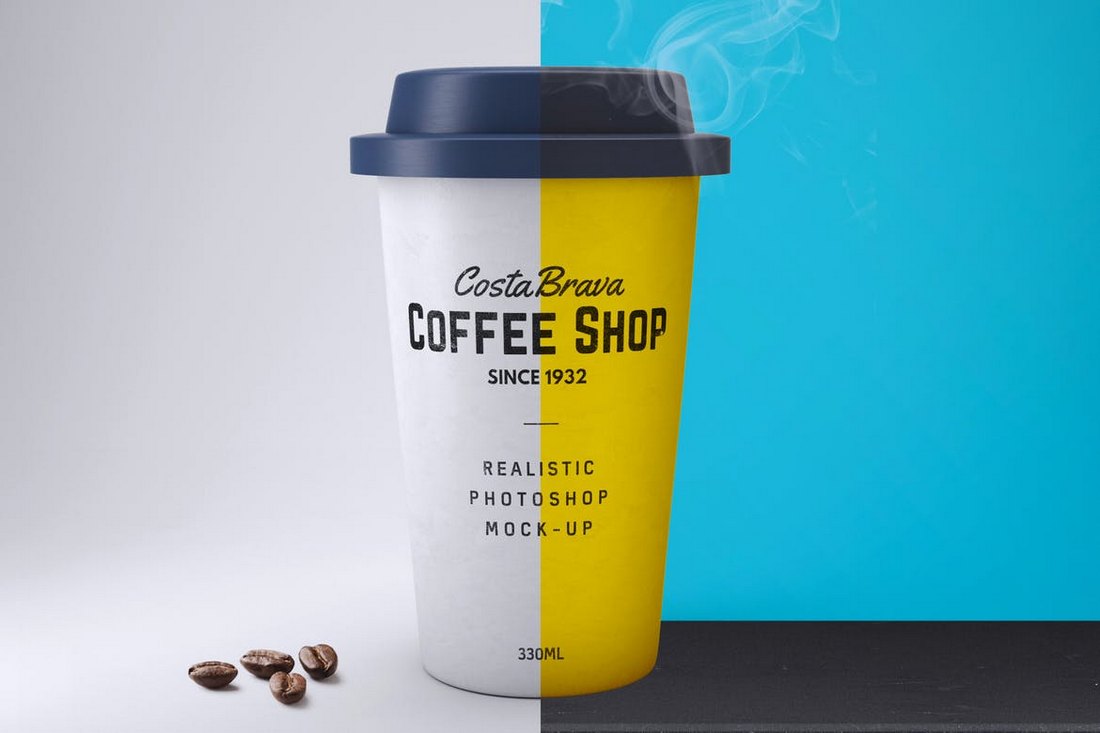
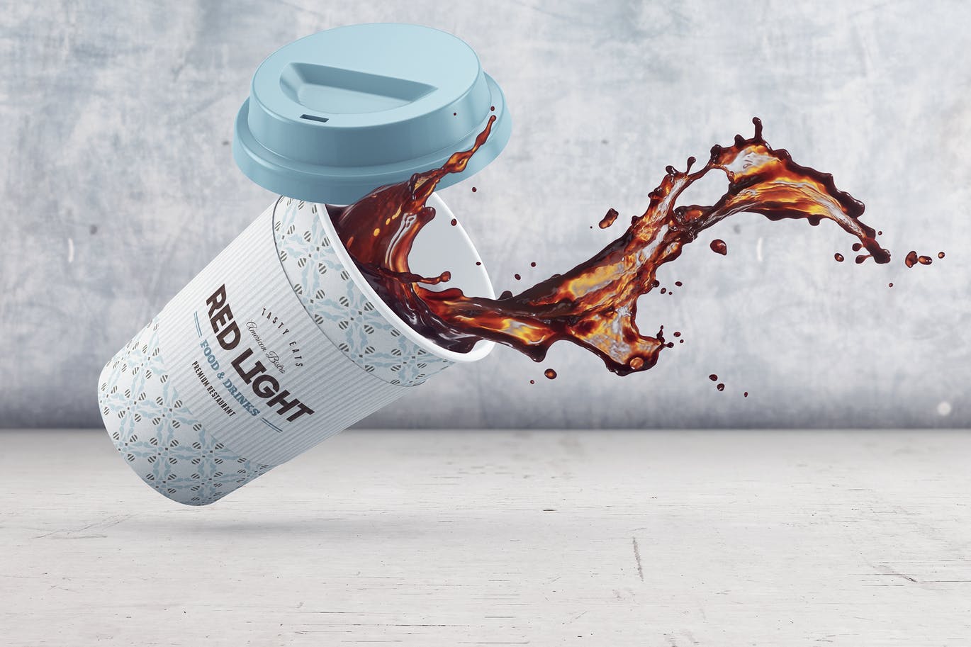
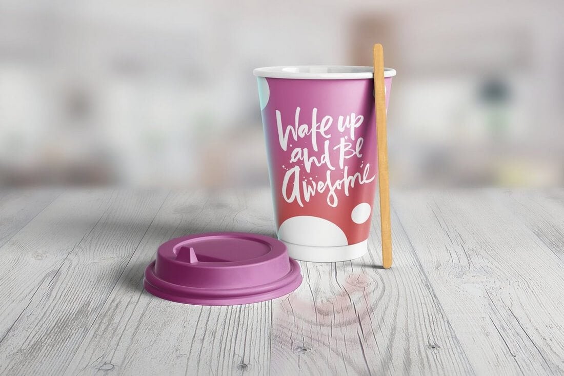
This unique mockup template features a realistic paper coffee cup that you can use to present your coffee branding designs. The mockup comes in an easily editable Photoshop file with smart objects and an editable background.
A high-resolution food container mockup you can use to present and promote different types of food, including instant noodles and ice cream products. The mockup includes background textures and isolated shadows as well.
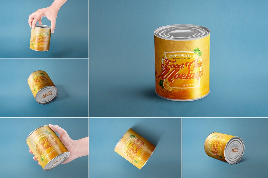
A set of 6 unique food can mockups featuring different angles and views of the product. The mockup PSDs arrive fully-layered with smart objects, editable background, and shadows.
A set of cardboard boxed drink packaging mockups. This pack includes 4 different mockups you can use to present and promote drinks and liquids such as juices and milk. The boxes are also scaled to 1-liter box, 500ml box, and 300ml box.
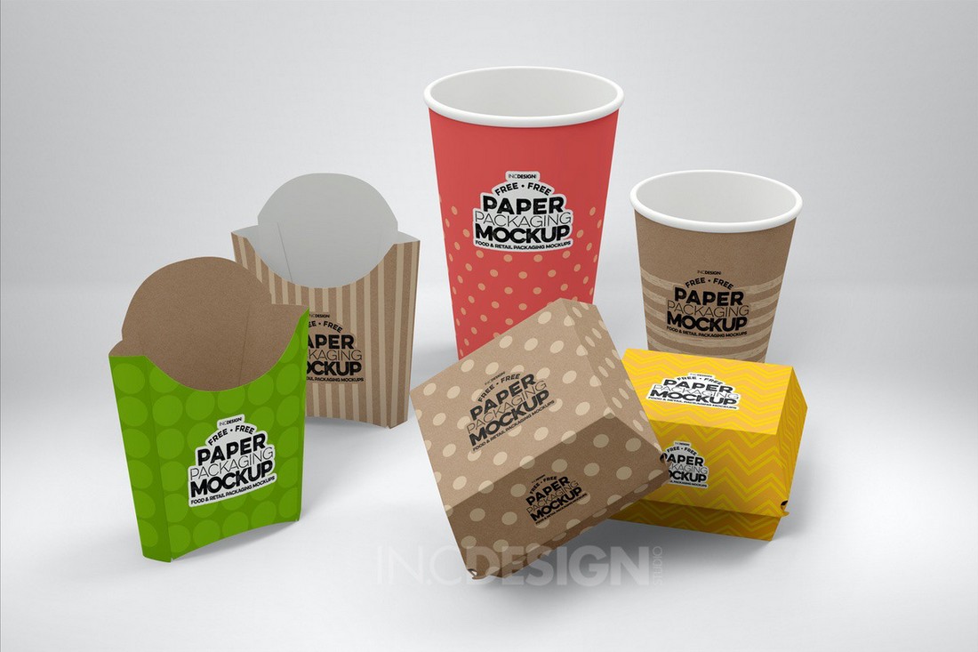
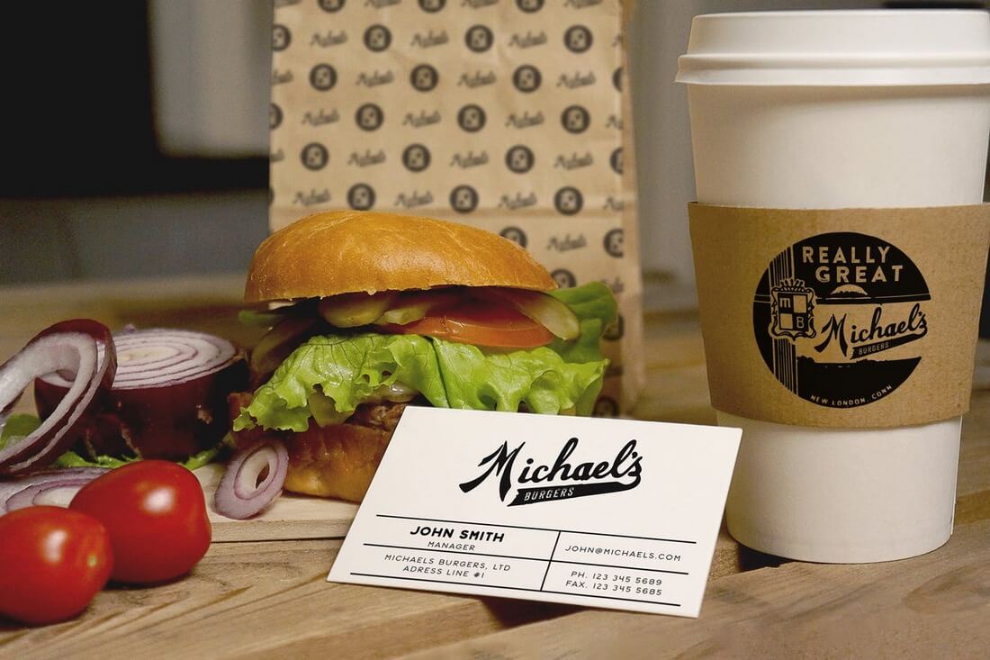
This mockup set is perfect for a fast-food branding project. It includes multiple mockups you can use to present your designs for different food and drink products. And it’s free!
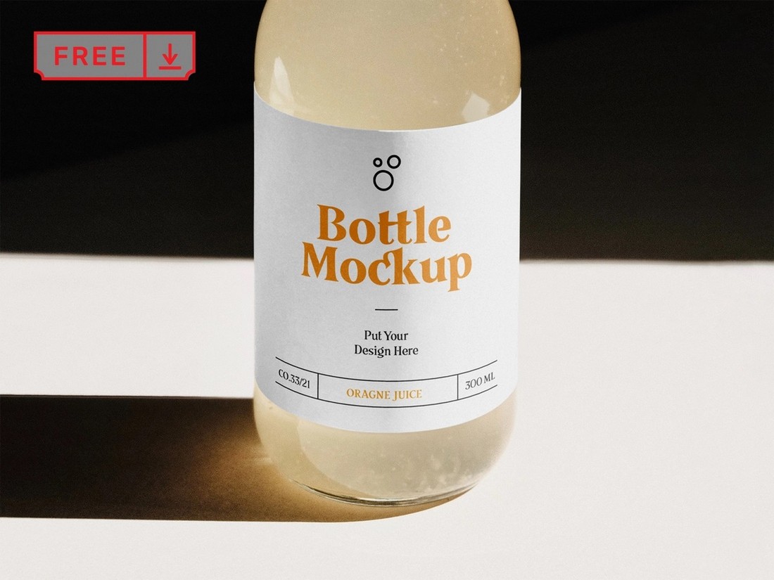
A simple and free mockup template featuring a glass bottle mockup. It’s ideal for presenting your juice and other types of drink product designs.
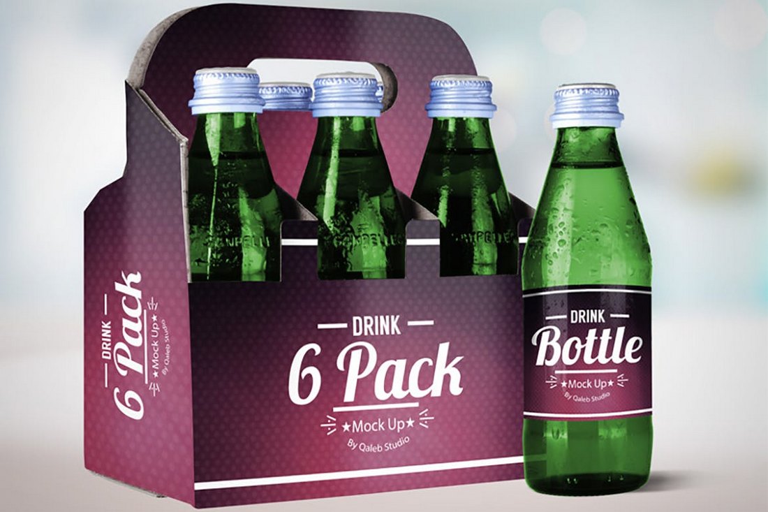
This mockup features an attractive design of a pack of drink bottles. You can easily edit and customize this design to showcase either soft drinks or beer products. The mockup comes in 2 PSD files with organized layers and smart objects.
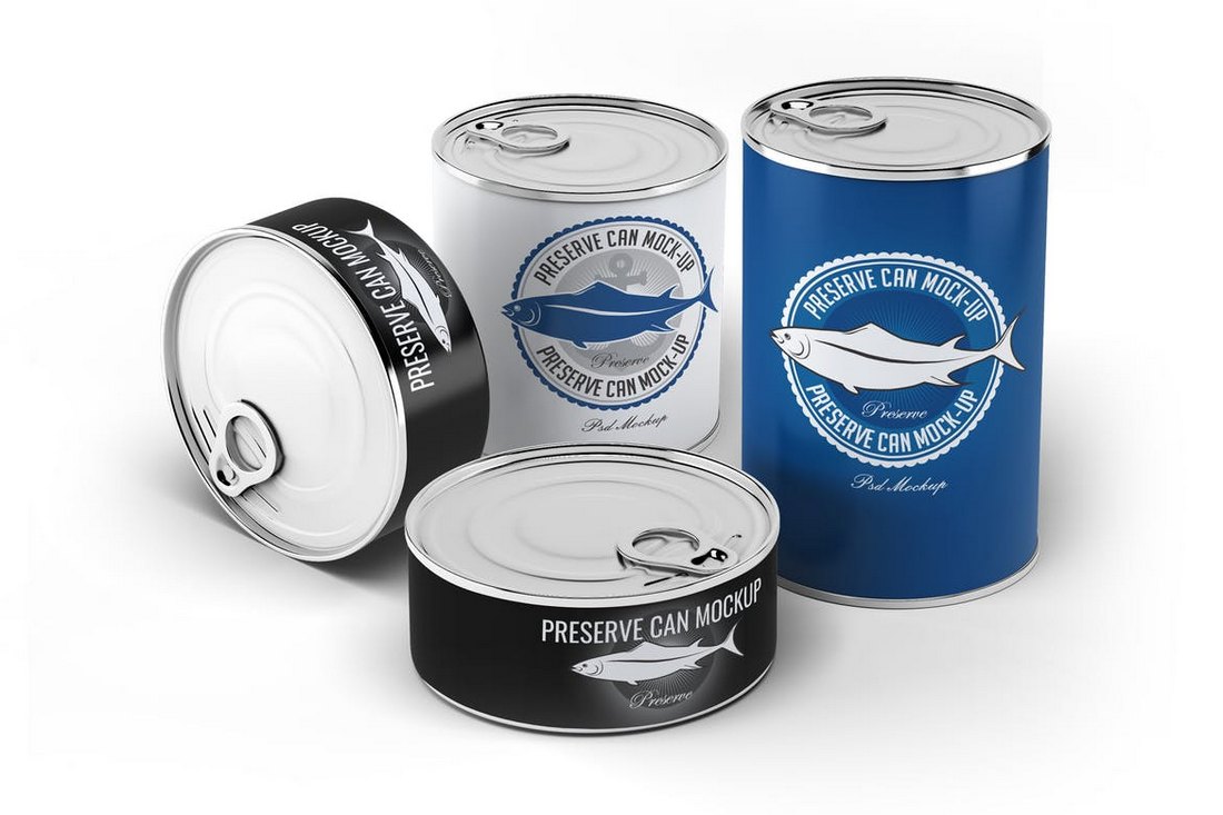
A set of food can mockups for promoting and presenting preserved food products. This bundle comes with 10 different mockups with photorealistic designs and easily customizable PSD files.
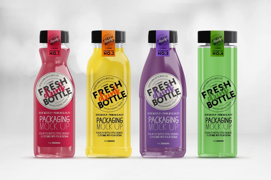
This set of stunning juice bottle mockups features 4 different bottle designs with unique shapes. You can use this template to promote juice, smoothies, soft drinks, and more. The color of the liquids inside the bottles can be customized as well.
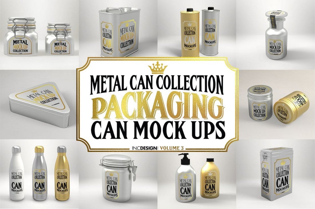
This is a bundle of metal can mockups featuring 10 different mockup templates. This set can be used to promote many kinds of products, including preserved food, coffee beans, tea leaves, cooking oil, and much more. The mockups arrive in 10 separate PSDs.
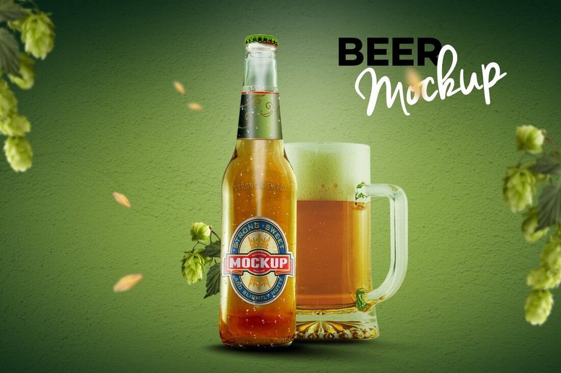
A complete set of mockups you can use to promote a beer brand. This bundle includes 9 different mockup templates, including a beer bottle, beer glass, and packaging. The mockups come to you in easily customizable PSD files equipped with smart objects.
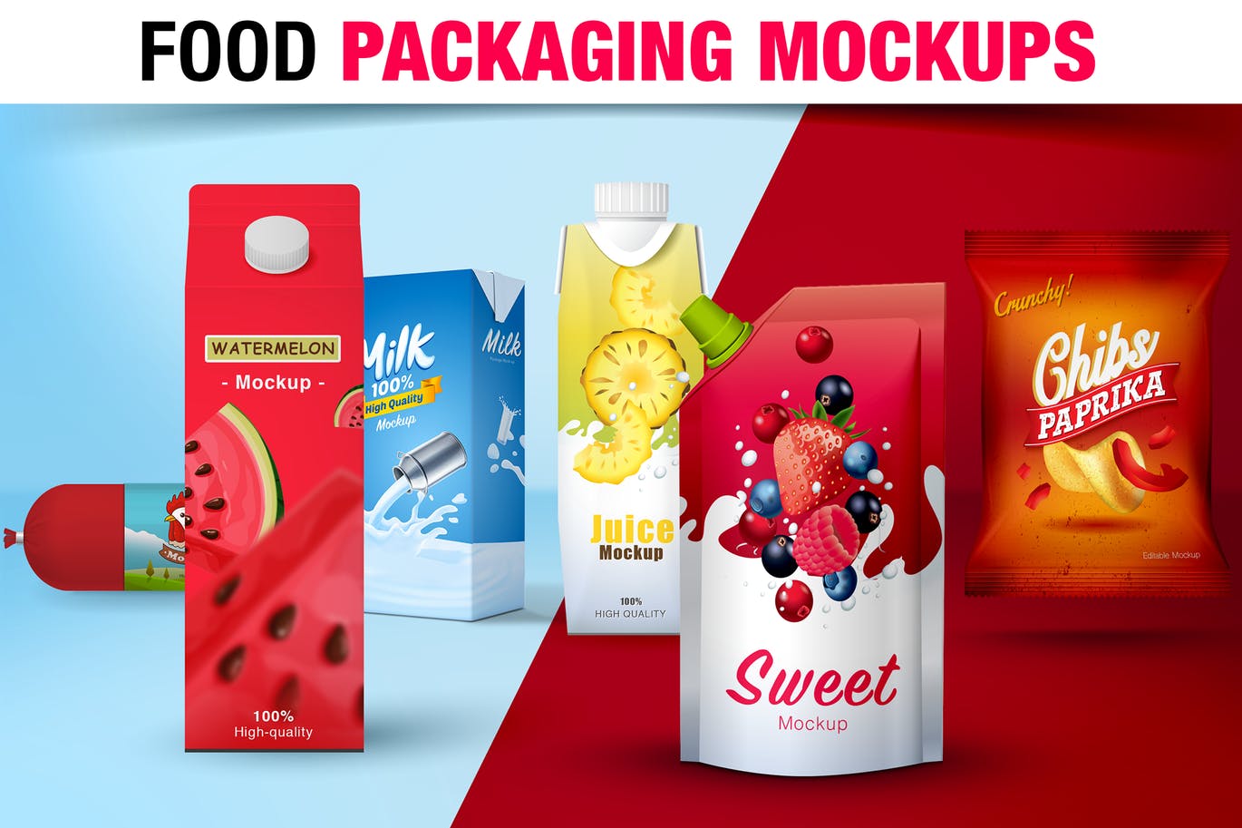
This is a collection of mockups that comes with several templates for showcasing designs related to drinks and a bag of chips. It has 7 mockups templates for everything from milk carton packaging to fresh juice packages and more.
Another bundle of coffee cup mockups featuring 24 different perspective shots. You’ll have plenty of ways to showcase your coffee cups with this mockups template pack. It also includes 15 background textures.
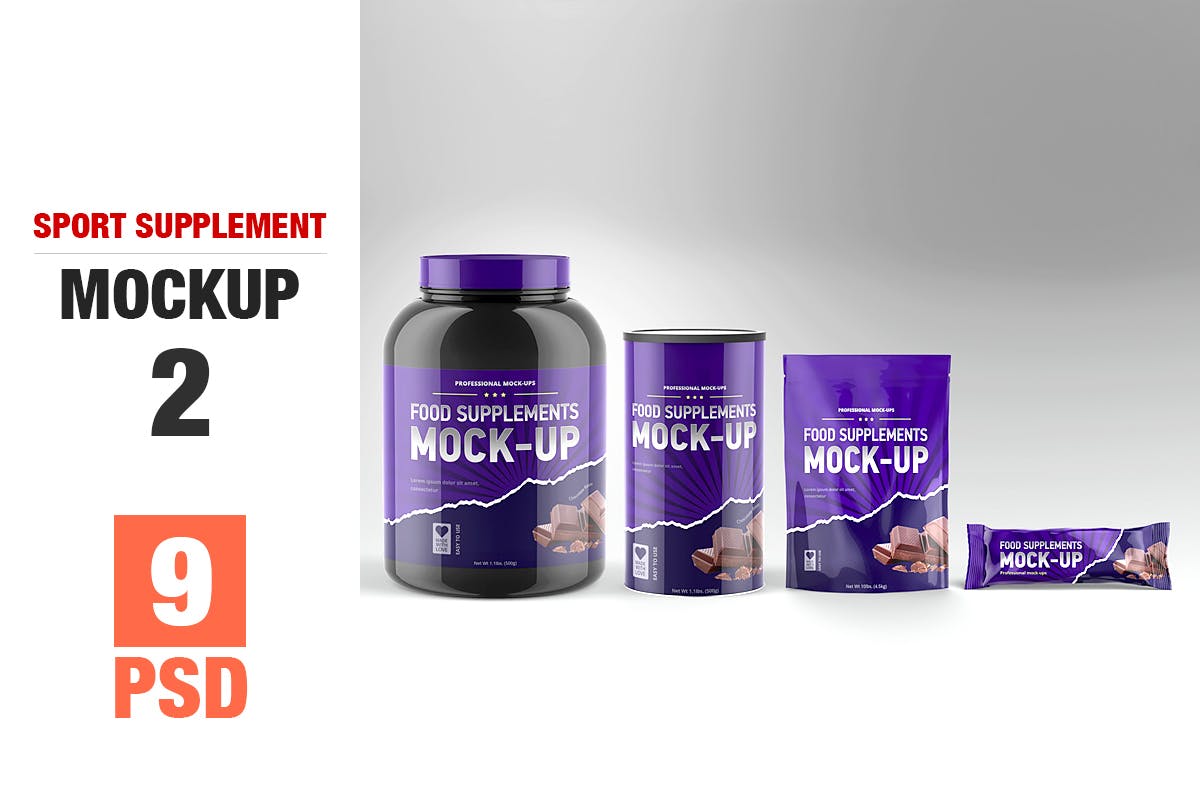
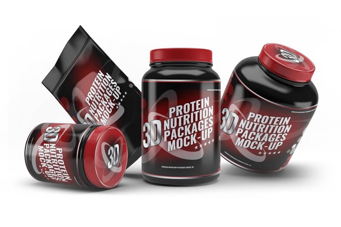
Working on a sports supplement product design? Then this mockups bundle will come in handy. This package comes with 9 mockup templates for showing your supplement products in different sizes and packages.
This is an easy to use mockup template for a packaging container. Mostly suitable for ice cream or an instant food product packaging. This template comes in 2 pre-made mockup templates with changeable backgrounds and smart objects for easier editing.
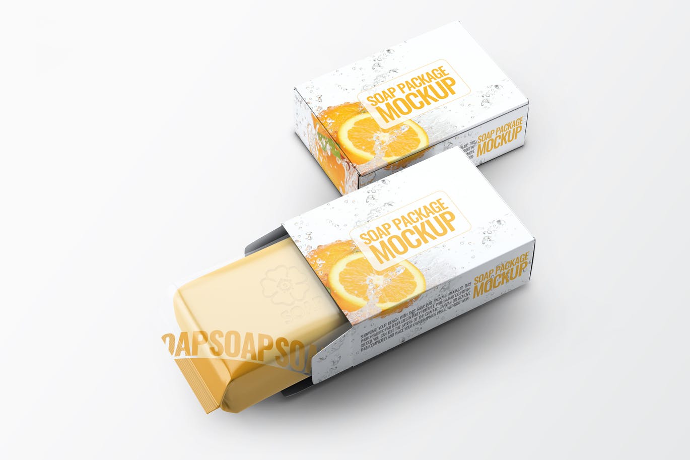
With 14 unique and photorealistic mockup templates, this bundle lets you show off soap product designs in a professional way. It also features customizable shadow, reflections, and lights.
This is a multipurpose packaging mockup that will work with many types of product packaging. It features 12 pre-made mockup templates for showing your products in different angles and adjustable shading and shadows.
Another great packaging templates for a toothpaste, a cream, or a cosmetics related product. This bundle comes with 7 packaging mockup templates featuring smart objects and photorealistic designs.
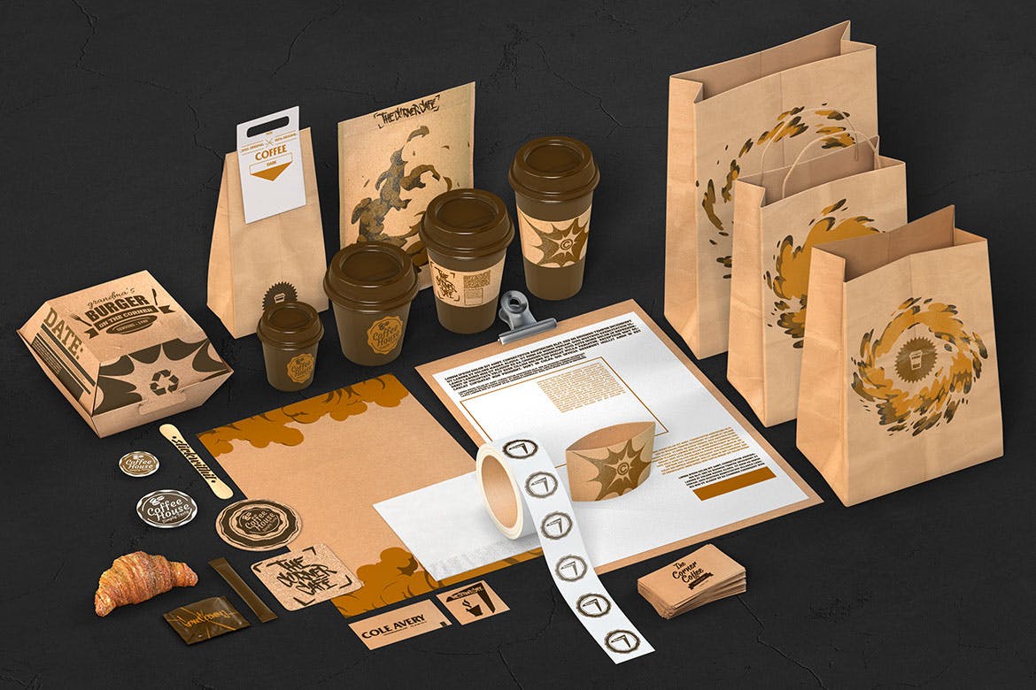
This bundle of branding mockups comes with all types of mockup templates you need for a coffee shop or a cafe, including packaging mockups. It includes over 20 different items and 3 pre-made scenes.
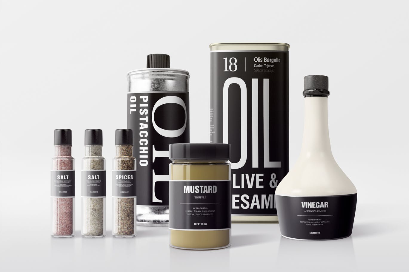
A collection of seasoning bottle mockup templates. This bundle includes 7 different mockup templates with adjustable shadows, reflections, and 7 photographic filters.
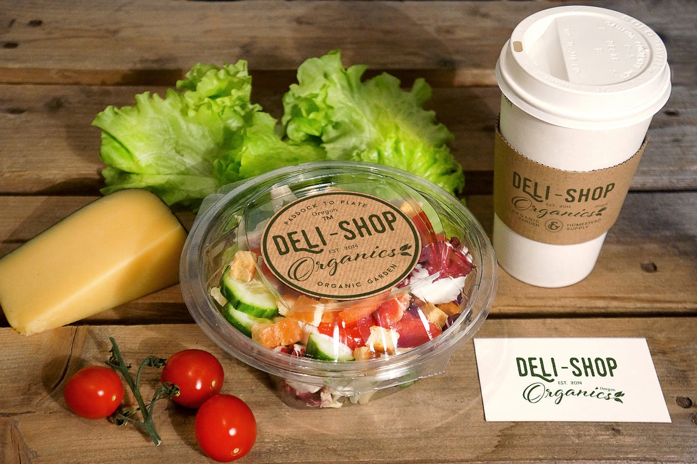
This photorealistic mockup template comes with several real photo items such as a coffee cup, a salad box, paper bag, and more. All of which are customizable to feature your product designs.
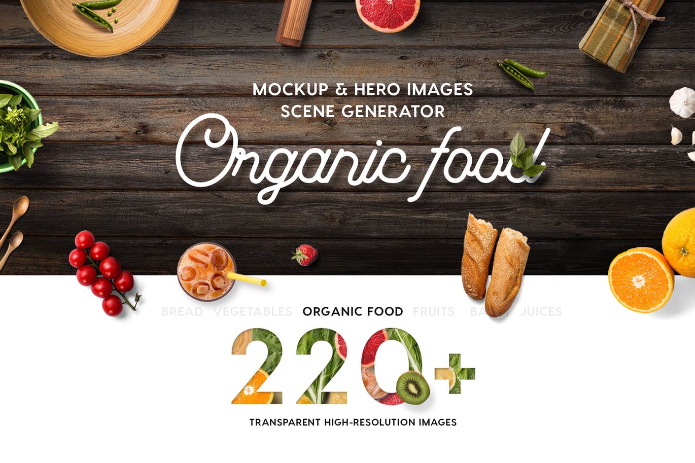
This is a massive bundle of organic food mockups that comes with over 200 unique food items. You can use them to create your own mockups or scenes for header images. The package also includes 21 pre-made scenes as well.
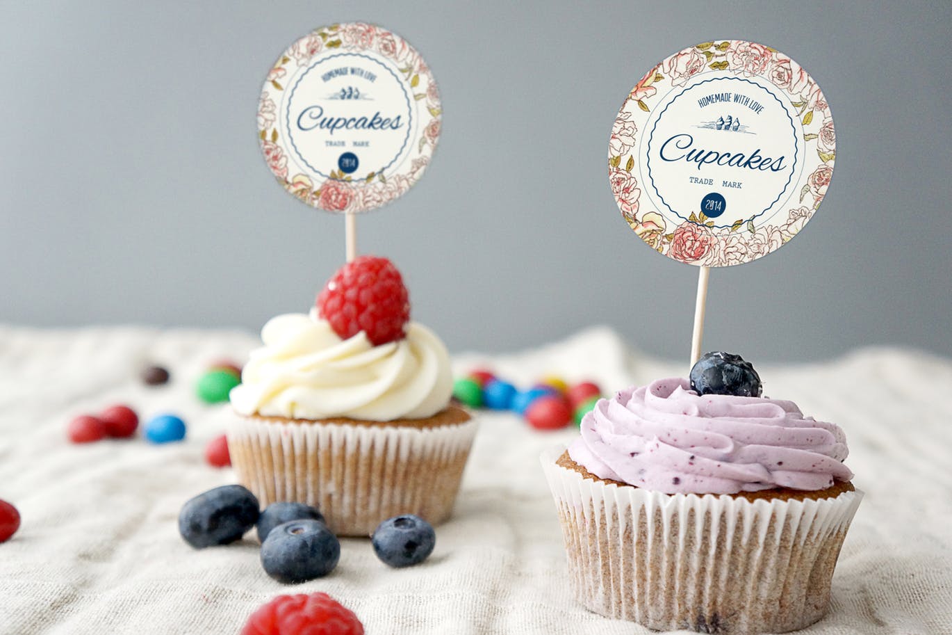
An adorable cupcake mockups with separate cupcake toppers and carton box. You can use this for showcasing cupcakes of your cake shop, restaurant, or cafe.
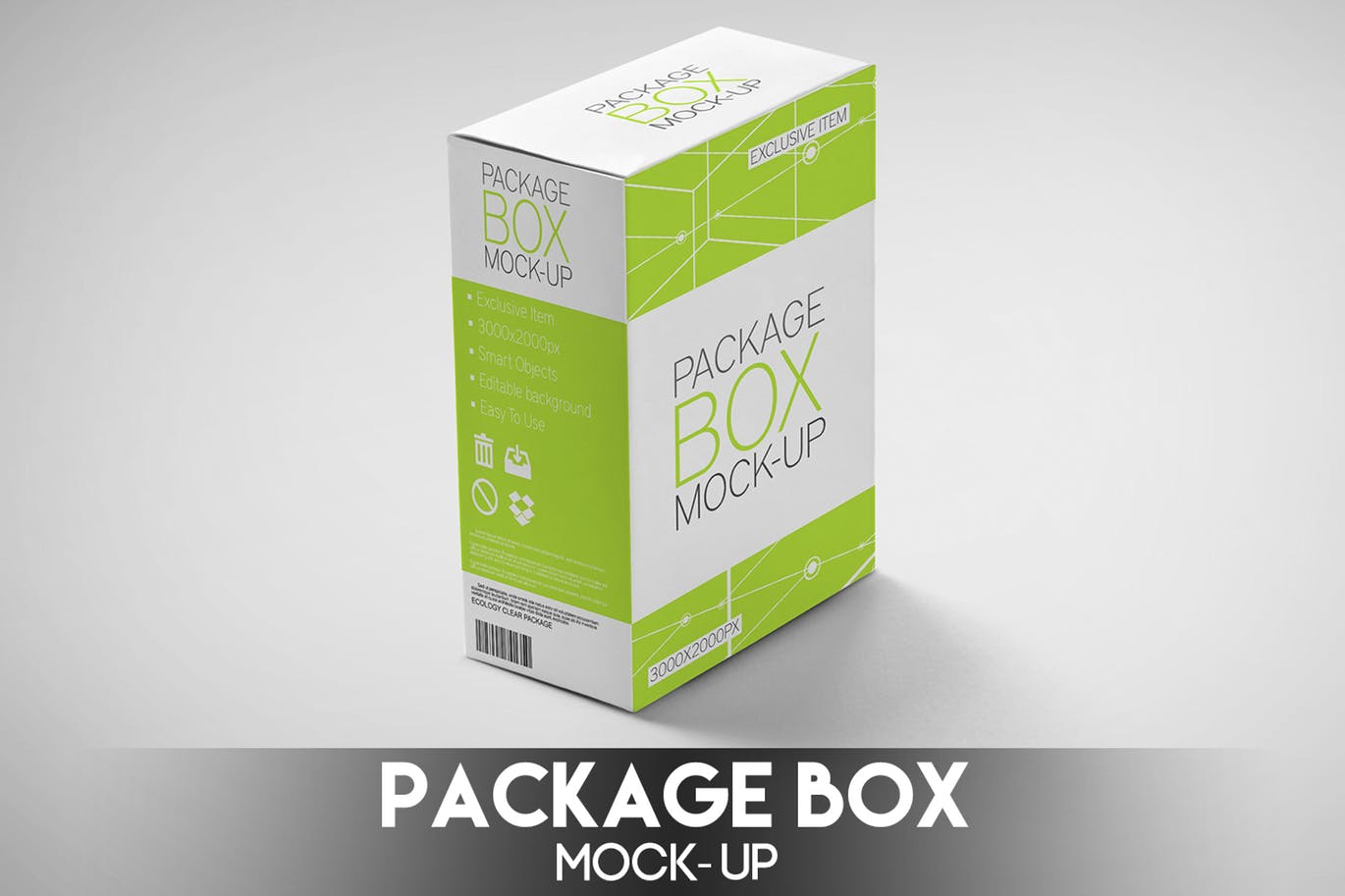
A simple, but an effective, packaging box mockup. This mockup template comes in 9 different PSDs with different angle shots of the box and with 5 background textures.
This bundle features 8 different mockup templates featuring real photo mockups, including coffee cup mockups, paper bags, and more. You can easily edit these PSDs with just one-click.
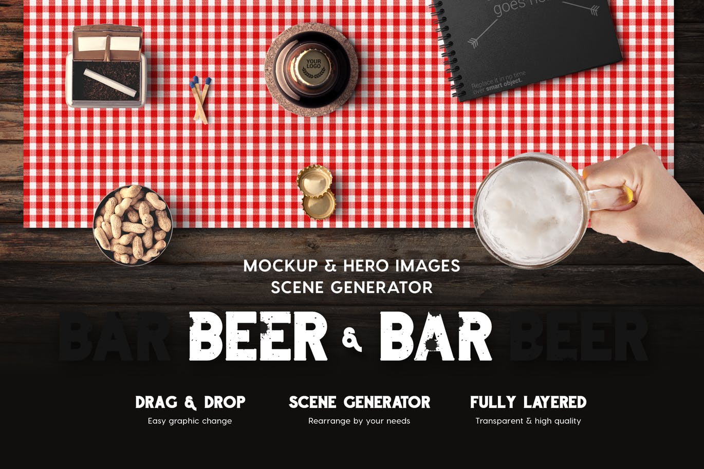
Yet another bundle of mockup templates that comes with over 150 different items for creating your own unique mockup templates or header image scenes for beer products or a pub. It also includes 12 pre-made scenes.
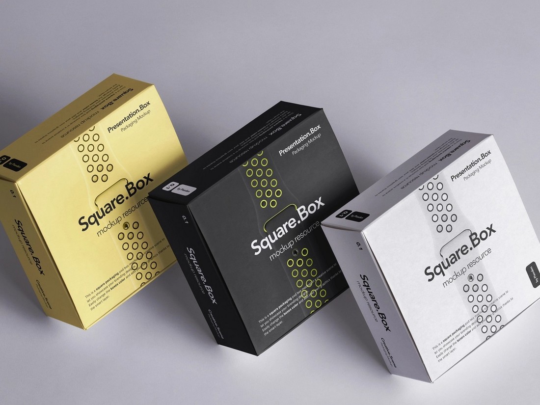
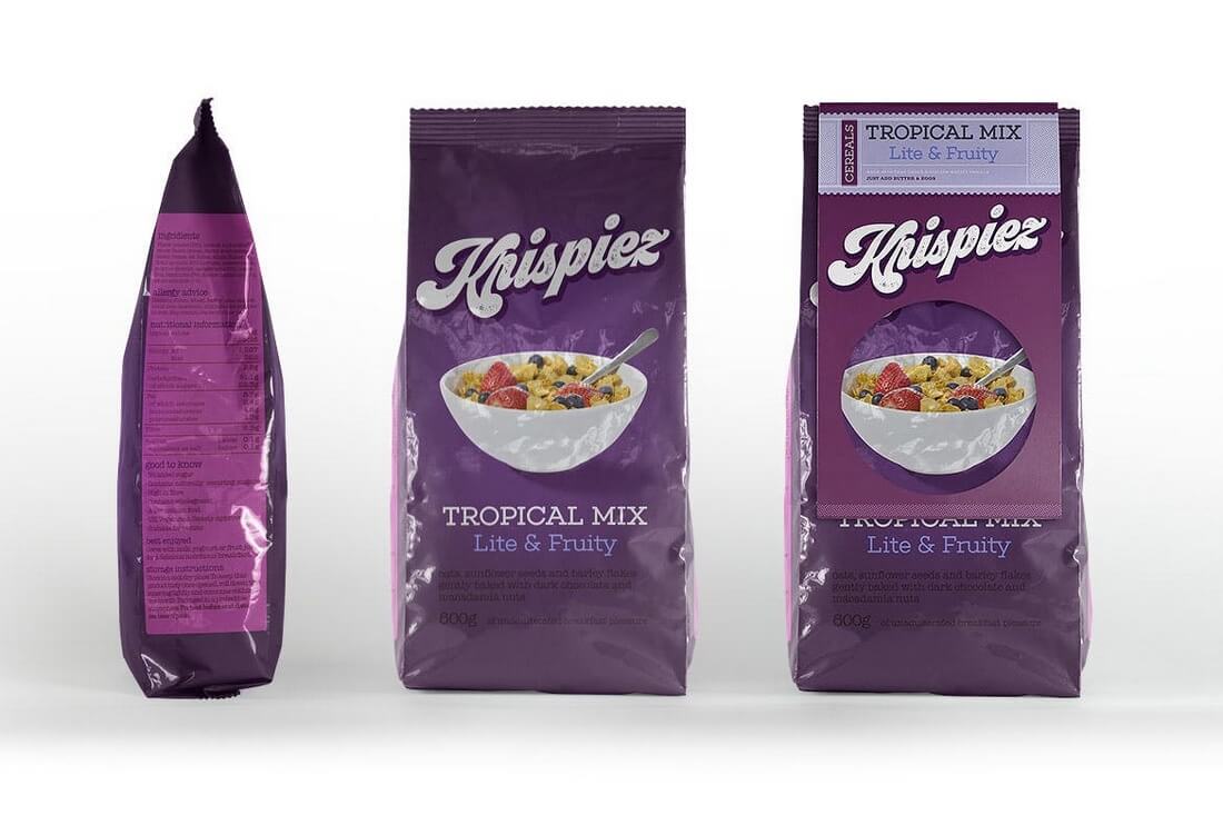
A box-shaped mockup with a modern design. Ideal for all types of packaging designs from cereal boxes to biscuits, snacks, and more. The mockup comes with 8 template files, including 2 black and white package designs.
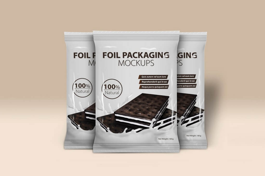
This foil packaging mockup is easy to customize as it’s been designed with smart objects and changeable backgrounds. It includes 4 pre-designed files with optional shading and shadows.
A highly customizable packaging design that features movable objects, shadows, and changeable backgrounds. It’s perfect for showcasing a candy or a chocolate wrapper design.
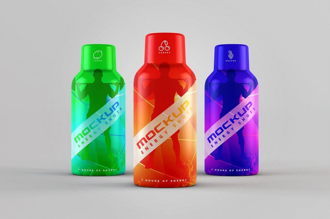
Featuring a realistic design, this energy drink bottle mockup allows you to showcase your design through 9 different shots and angles. The fully layered PSDs even feature automatic background perspectives and 10 background textures.
A unique feature of this mockup is its natural look. The realistic reflections and shadows used in this mockup give it the look of a real plastic pouch bag. The mockup comes in 14 fully layered PSD files with customizable colors.
A fully customizable mockup for presenting different types of cans. It comes with 9 pre-made designs and changeable backgrounds. This mockup template is ideal for presenting all types of can and label designs.
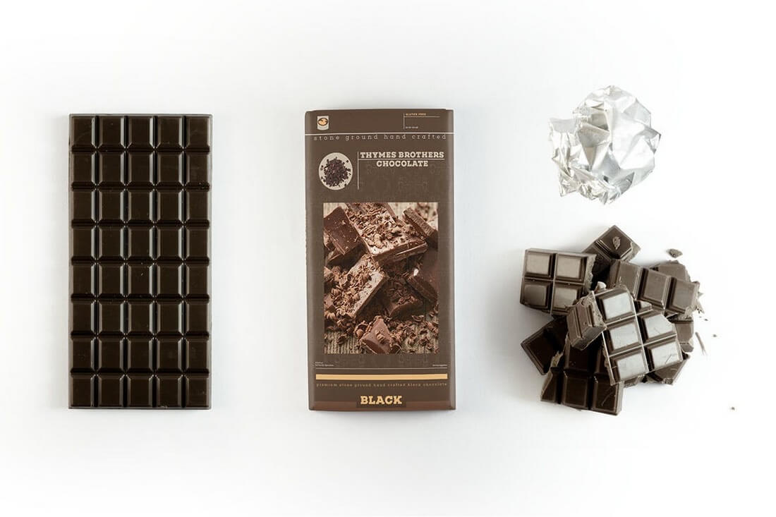
This mockup not only comes with a mockup template for the chocolate wrapper but also includes the chocolate itself as well. It features 18 PSD files, including separate files compatible with CS5 and Photoshop CC.
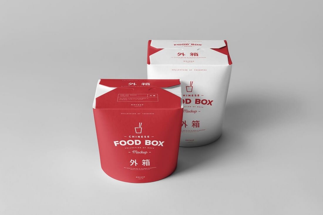
The perfect mockup for Chinese food containers, restaurant, or even for coffee shop related packaging designs. This mockup includes 8 designs based on real-life photography and unique backgrounds.
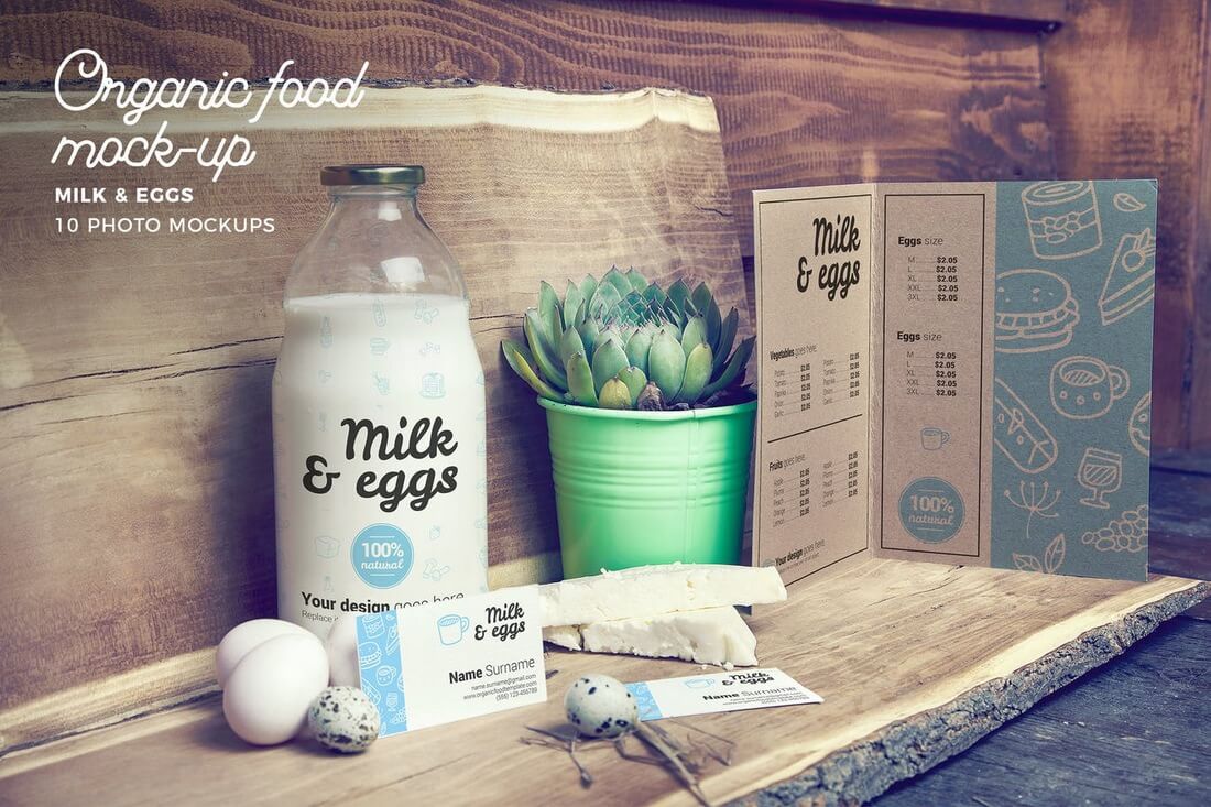
An organic food scene mockup featuring a milk bottle, a menu, business cards, and much more. The natural and vintage look of the design makes it ideal for designing a beautiful billboard for a restaurant or an organic food farm.
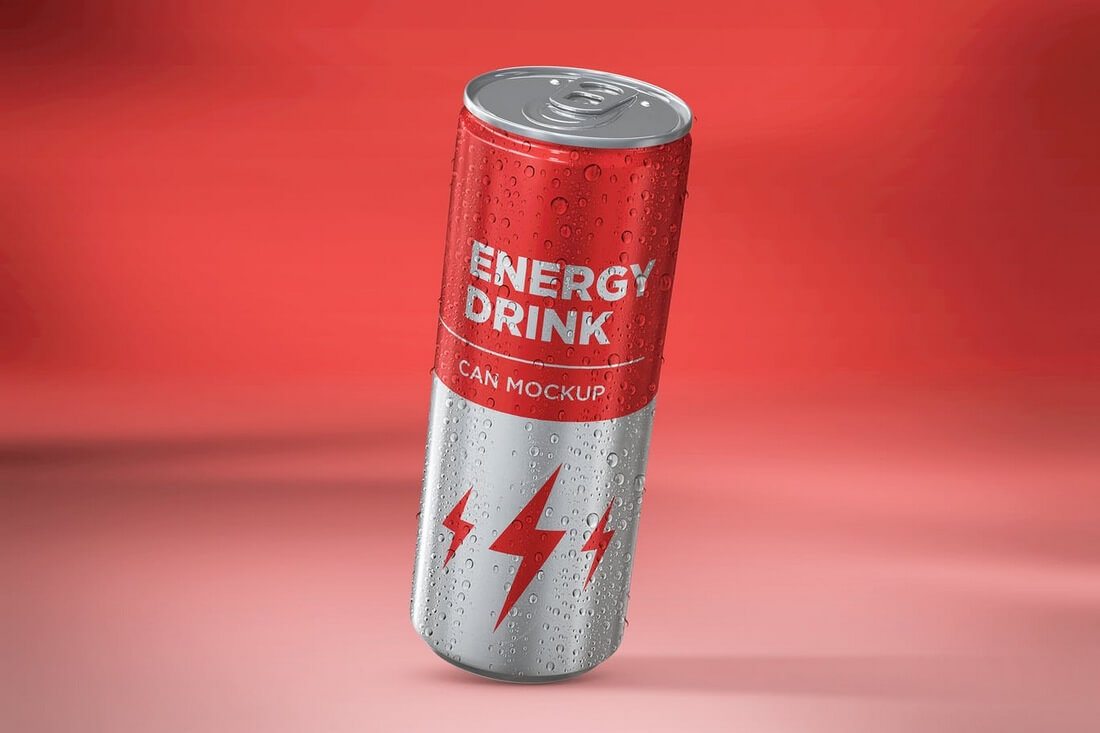
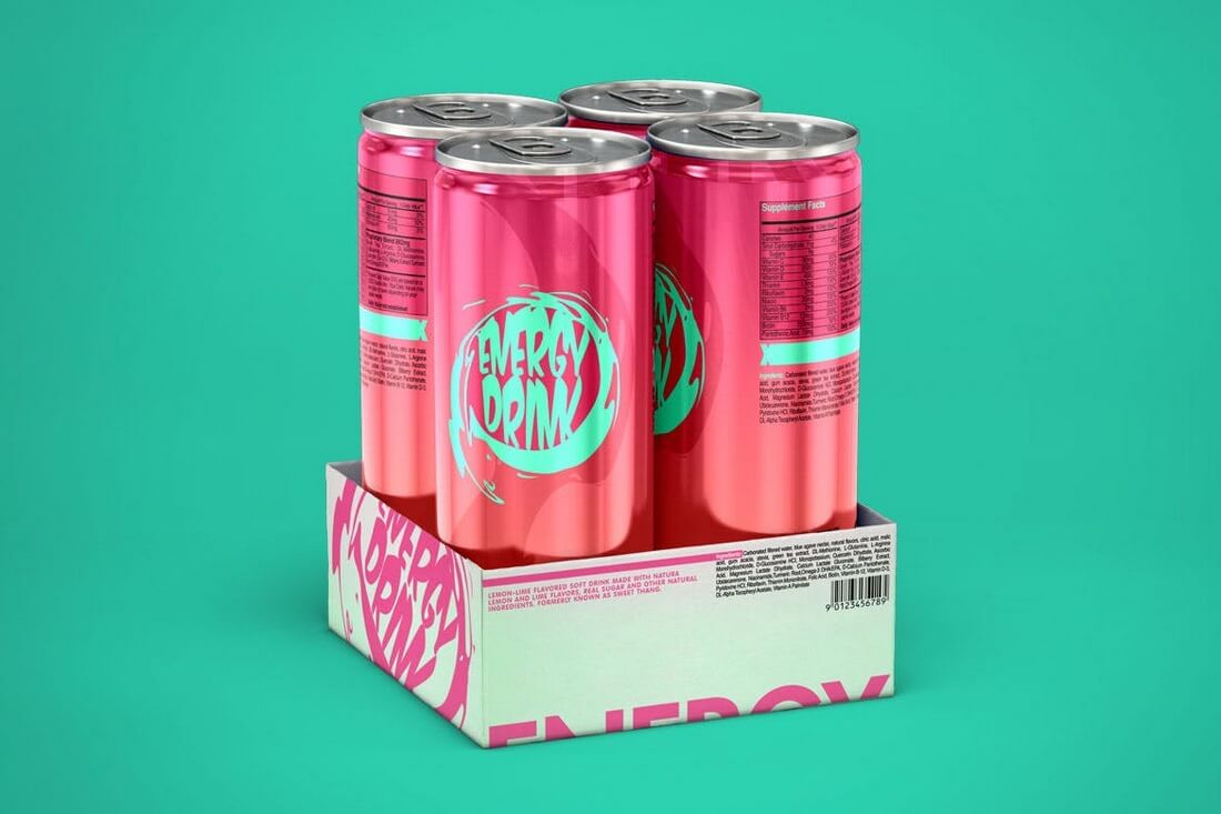
A realistic looking energy drink can mockup that seems to have achieved the perfect metal and condensation effect. It looks so life like. The mockup comes in 10 PSD files featuring different shots and angles of the can.
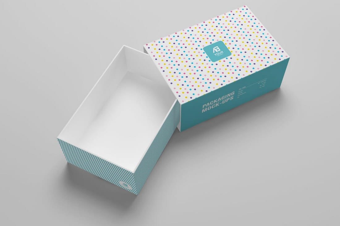
Another beautiful packaging mockup that comes in two designs, including one with an opened box that can be used to showcase both the product and the packaging at the same time. It’s fully layered and features smart objects for easy editing.
This food container mockup is also perfect for presenting your restaurant or a delivery service designs. It features 6 different photorealistic designs with automatic background perspective and editable light and shadows.
The photorealistic design of this mockup makes it perfect for presenting your energy drink and soda can designs. It comes with 7 PSD files featuring fully layered and editable designs.
Featuring 10 different scenes, a beautiful beer bottle design, and 4 glass elements, this mockup will give you everything you need to present your beer label designs in a way that will wow your clients.
This mockup looks ideal for chips and snack product designs. The mockup comes in 3 fully layered PSD files and features smart objects for easy editing with changeable backgrounds.
A great mockup for showcasing your sports and nutrition-related product designs, like supplements and bodybuilding products. The pack comes with 12 different mockup designs and 3 pre-designed scenes.
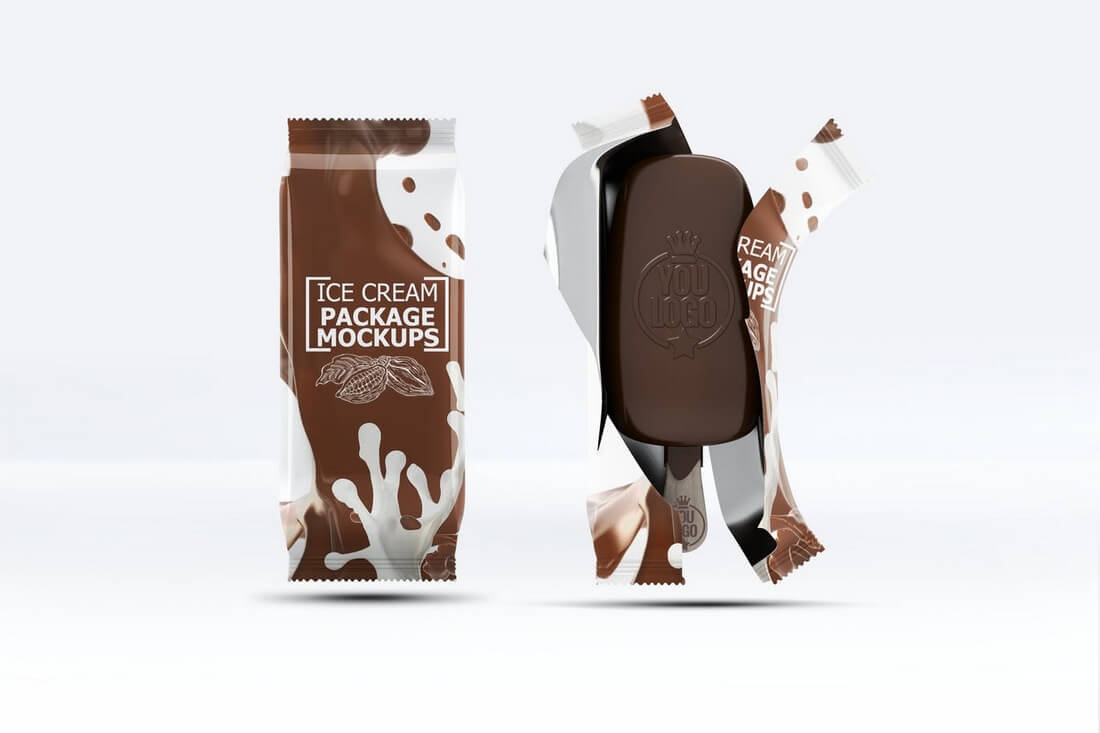
This ice cream mockup lets you showcase both your packaging design and the logo design on the ice cream as well. It comes in 6 mockups with customizable backgrounds.
An ideal packaging mockup for showcasing designs related to tea or coffee. This mockup comes with 7 designs, 3 textures, and changeable backgrounds.
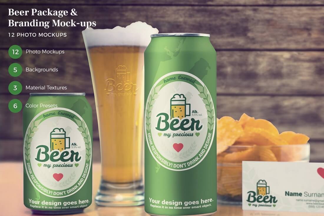
An all-in-one beer can and branding design mockup that features beer cans in two sizes, a business card, and a glass design, all in one mockup. It comes with 12 PSD files, including 4 types of bottles, a keg, menu, and more.
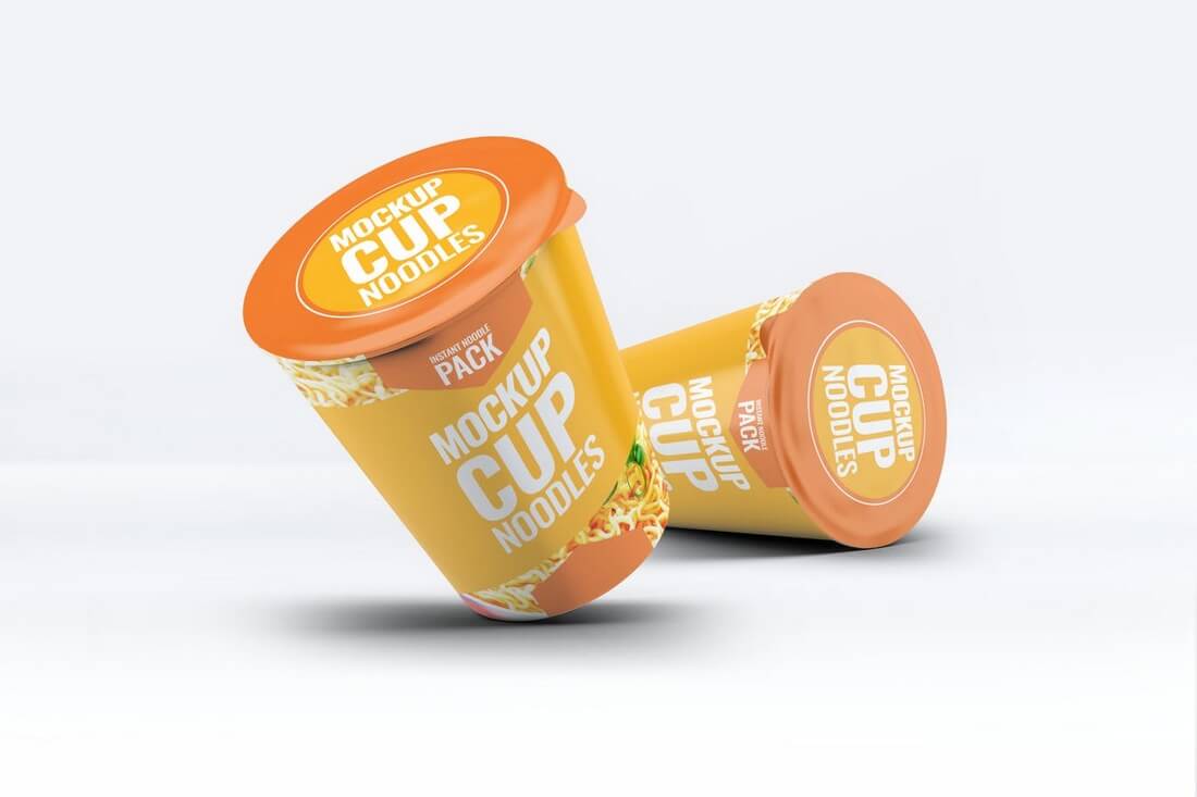
An instant food container mockup for presenting your instant noodles and other product designs. The pack features 6 photorealistic mockup designs with editable light, reflection, and shadow controls.
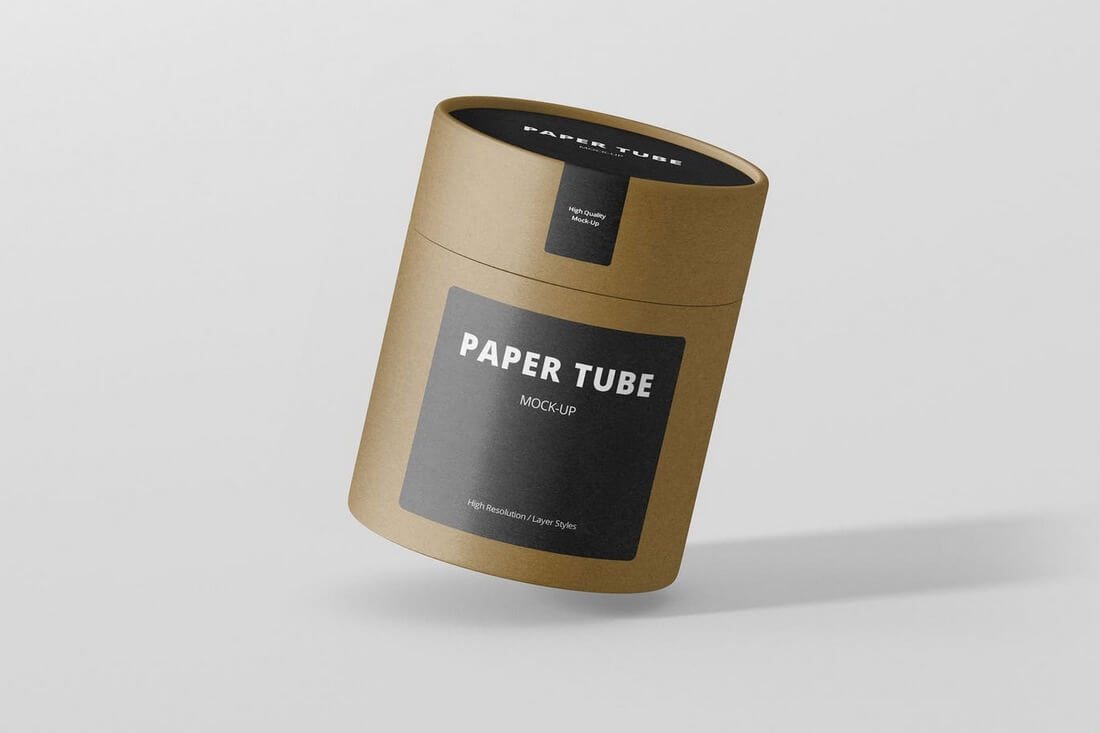
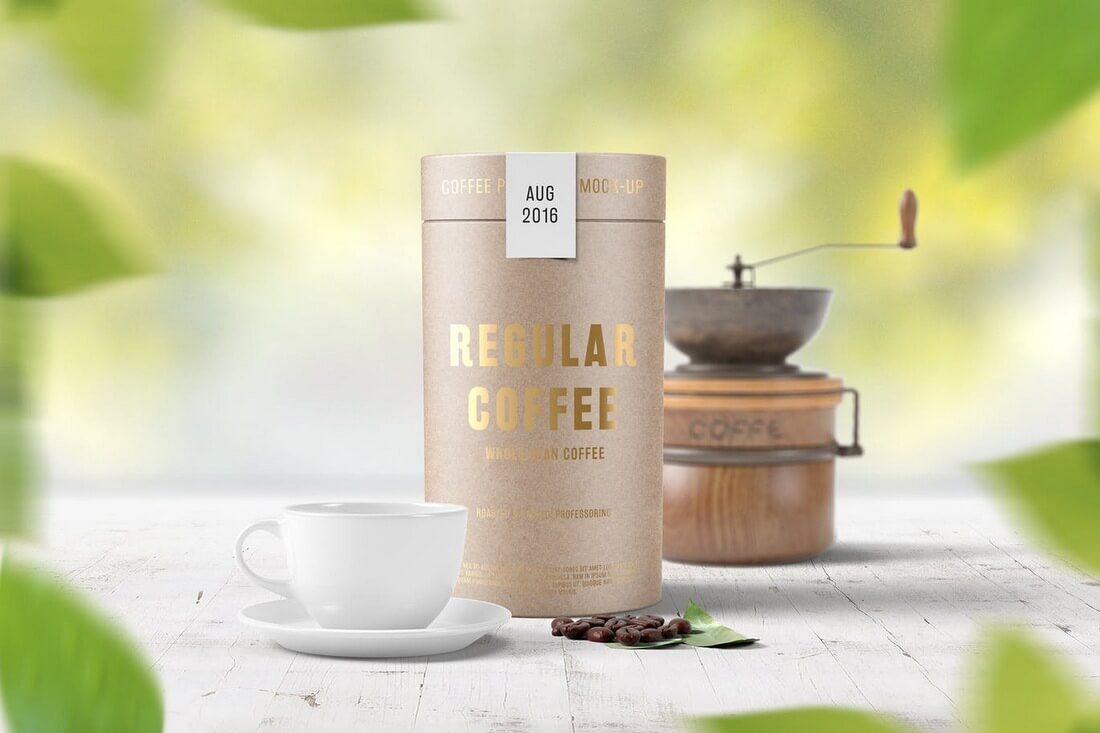
This paper tube package mockup is specially designed for showcasing coffee packaging designs. It features 4 mockups with beautiful scenes and 3 photo filters.
A unique mockup that’s been designed based on real photographs, this pack comes with 10 mockups with stunning sceneries. Perfect for showcasing coffee cup designs and branding.
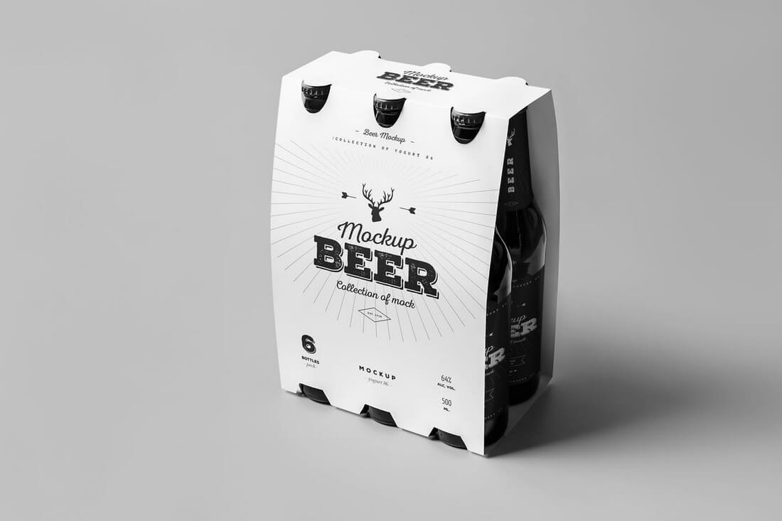
This mockup will help you present your six pack designs for beer packaging. The template features 8 mockups with organized layers and editable varnish.
A Starbucks-style cafe mockup design that features live photography. This mockup pack includes 12 different high-resolution designs.
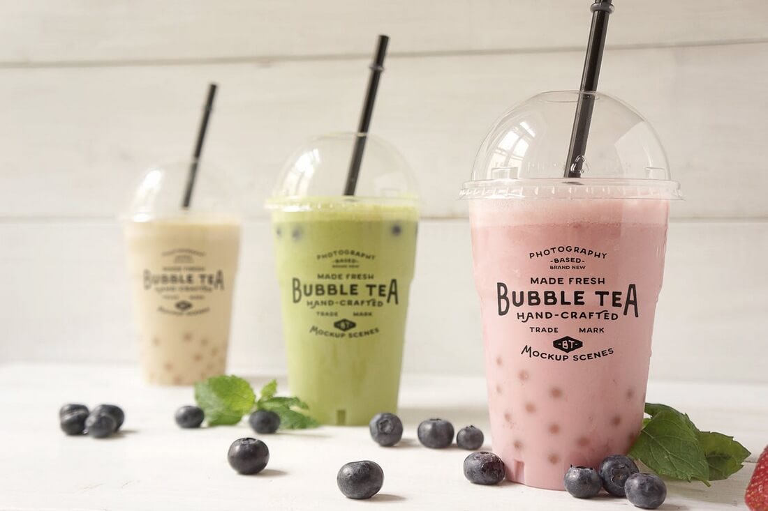
A photorealistic mockup for showcasing packaging designs for bubble tea, milkshake, cocktail, and many other types of beverages. It features 9 mockup designs.
A beautiful paper bag mockup that looks great for showcasing coffee shop or bakery-related packaging designs. This mockup has 9 files feature different shots and angles.
This paper cup mockup design will fit in nicely with many types of beverages for showcasing your packaging designs. It comes in 7 PSD files featuring different angles.
Perfect for snacks and chips related products, this packaging mockup includes 6 mockup files with customizable reflections, shadows, and separate files with Artboards feature for Photoshop CC.
Another paper bag mockup that’s suitable for not only food and grocery related packaging designs, but it will also fit in nicely with many other types of products as well. It comes with 3 high-resolution mockups.
An ideal mockup for preserved food designs. This mockup includes 7 designs with layered shadows, items, and backgrounds for easy customization.
What’s special about this mockup is its realistic scenery. It’s perfect for a total restaurant or food related branding presentation. The mockup comes with 7 different designs as well.
6 Frequently Asked Questions (FAQs) About Designing Packaging for Food and Drink
1. What factors should I consider when choosing materials for food and drink packaging?
The materials you choose for your food and drink packaging should be safe for food contact, durable, and capable of protecting the product from contamination. You should also consider the environmental impact of your materials — many consumers prefer packaging that is recyclable or compostable.
2. How important is the color scheme in food and drink packaging?
Color scheme is critical in food and drink packaging as it significantly impacts how consumers perceive your product. Different colors can evoke different emotions and associations. For example, green is often associated with natural or organic products, while red can create a sense of urgency or excitement.
3. How can I ensure my product stands out on the shelf?
Ensuring your product stands out on the shelf can be achieved through unique design elements, bold colors, and clear branding. The design should be attractive and eye-catching, but not at the expense of clarity and readability.
4. Should I include nutritional information on my packaging?
Yes, it is generally a requirement to include nutritional information on food and drink packaging, depending on the regulations in your region. Even if it’s not required, it’s a good practice to include it as many consumers make purchasing decisions based on this information.
5. How do I decide what information to include on my packaging?
You should include essential information such as the product name, ingredients, nutritional information, and your company’s name and contact information. Additionally, you might want to include marketing messages or other information that highlights what makes your product special.
6. What should I keep in mind when designing the packaging for a drink product?
In addition to general packaging considerations, for drink products you’ll need to consider functionality — how easy it is for the consumer to open, pour, and reseal the product. The design should also take into account the typical environments where your product will be displayed, such as coolers or ambient shelf space.
If you’re interested in exploring more mockups, be sure to check out our collection of the best poster mockups for more great designs from Envato Elements.















































![Download Now: 150+ Content Creation Templates [Free Kit]](https://no-cache.hubspot.com/cta/default/53/5478fa12-4cc3-4140-ba96-bc103eeb873e.png)
![Download Now: The Annual State of Artificial Intelligence in 2024 [Free Report]](https://no-cache.hubspot.com/cta/default/53/b72f2b25-8cc9-4642-9a1b-1e675d3d273b.png)


![“I will say it depends on the industry. I think that's one thing I don't hear enough of — [AI search] is not going to affect everyone equally.”—Braden Becker, Global SEO lead, Faire](https://knowledge.hubspot.com/hubfs/sge-seo-4-20241031-985154.webp)
![“Google is trying to react [to AI searches] accordingly without harming their business model, which is extra challenging.”](https://knowledge.hubspot.com/hubfs/sge-seo-5-20241031-6850259.webp)

























![New Data: Instagram Engagement Report [Free Download]](https://no-cache.hubspot.com/cta/default/53/9294dd33-9827-4b39-8fc2-b7fbece7fdb9.png)
